PRACTICE
On Walls
Public Theater (1994–2001, 2002–ONGOING)
More than other graphic design artifacts, posters serve as a chronicle of the mannerisms and artistic movements that have shaped graphic design history, from the wood type broadsides of the late nineteenth century to Art Nouveau posters at the opening of the twentieth, from the propaganda posters of the two World Wars to the New Wave and postmodernist posters of the 1980s, and beyond. For this legacy and for their potential for unbridled creativity, posters hold an idealized position in the design profession and are objects of constant reference and admiration.

Detail of THE GOLDEN GATE NATIONAL PARKS POSTER / creative direction, Rich Silverstein; art direction, Jami Spittler; design and illustration, Michael Schwab / USA, 1996
Public Theater
(1994–2001, 2002–ONGOING)
The first design Paula Scher › 182 produced for the Public Theater in 1994—the marketing campaign for the Shakespeare in the Park series of that summer—was developed in less than two weeks, but it laid the foundation for the new overall identity and visual language that came to define the Public Theater for the rest of the decade and beyond. Scher’s approach—based on the challenge to raise public awareness and attendance of the Public Theater as well as to appeal to a more diverse crowd—was to boldly differentiate it from its origins by stepping away from the illustration-based work of Paul Davis that had been used for the previous 19 years and moving into a typographic system.
Starting with the theater’s identity—inspired by samples found in Rob Roy Kelly’s American Wood Types › 72 and Victorian theater posters—Scher established an unmatched personality for the theater that permeated all the season’s marketing materials and culminated in the designs for the Shakespeare in the Park summer series that were applied to buses, subways, kiosks, billboards—basically, all across New York. Over the next several years, Scher created posters that became emblematic of her career: the explosive Bring in ’da Noise, Bring in ’da Funk posters, the simple use of Elvis Presley’s hairdo in the Him poster, and the highly adaptable interpretation of wood block typography.
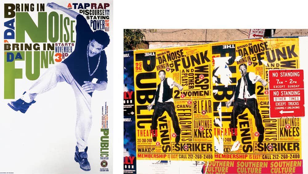
BRING IN ’DA NOISE, BRING IN ’DA FUNK PUBLIC THEATER POSTERS / Pentagram: Paula Scher / USA, 1995
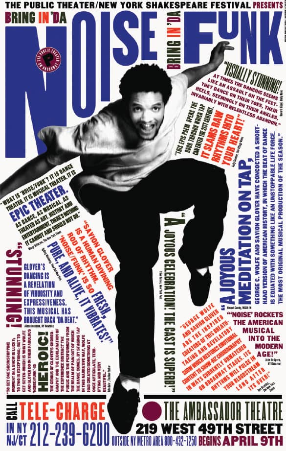
BRING IN ’DA NOISE, BRING IN ’DA FUNK ON BROADWAY POSTERS / Pentagram: Paula Scher / USA, 1996

BRING IN ’DA NOISE, BRING IN ’DA FUNK FINAL SEASON / Pentagram: Paula Scher / USA, 1997
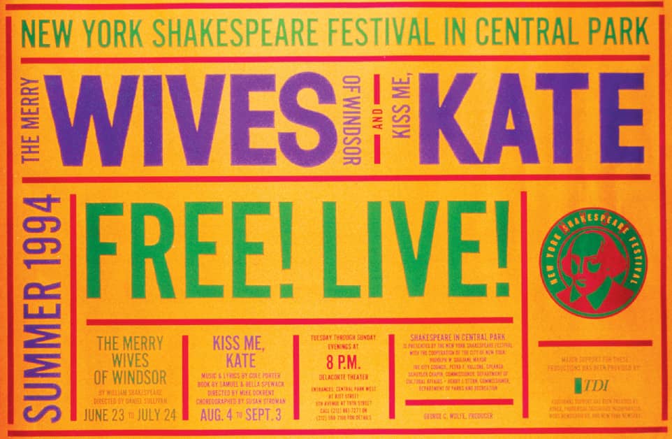
NEW YORK SHAKESPEARE FESTIVAL IN CENTRAL PARK / The first project Scher did for the Public Theater / Pentagram: Paula Scher / USA, 1994
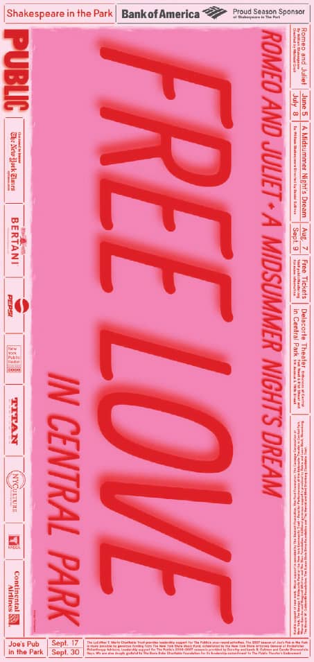
NEW YORK SHAKESPEARE FESTIVAL IN CENTRAL PARK POSTER / Pentagram: Paula Scher / USA, 2007
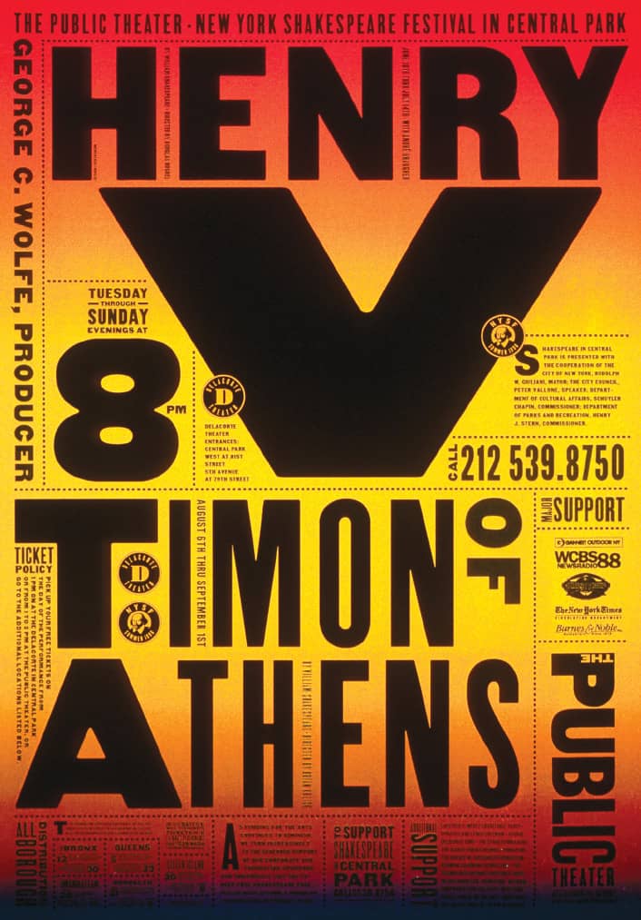
NEW YORK SHAKESPEARE FESTIVAL IN CENTRAL PARK POSTER / Pentagram: Paula Scher / USA, 1996
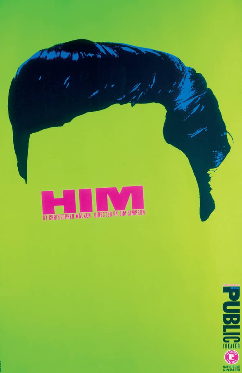
HIM POSTER / Pentagram: Paula Scher / USA, 1994
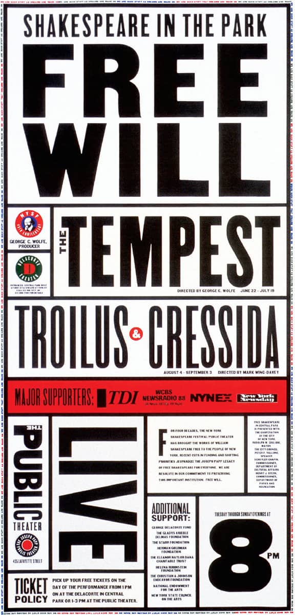
NEW YORK SHAKESPEARE FESTIVAL IN CENTRAL PARK POSTER / Pentagram: Paula Scher / USA, 1995
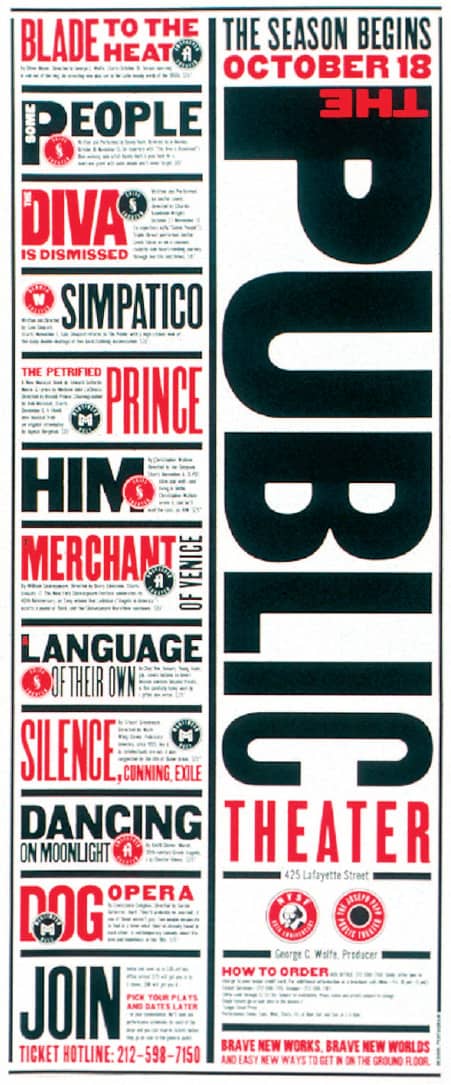
THE PUBLIC THEATER’S SEASON PRINT ADS, RENDERED IN THE NEW IDENTITY / Pentagram: Paula Scher / USA, 1994
Dylan
In 1967, Columbia Records › 300 released Bob Dylan’s Greatest Hits. Milton Glaser › 170 was commissioned to design a poster to go with the album. Inspired by a silhouetted self-portrait of Marcel Duchamp and Islamic paintings, Glaser created the immediately recognizable stark black-and-white profile of Dylan, with the infinitely memorable psychedelic and organic forms in the hair. Glaser’s own Baby Teeth typeface punctuates the poster with his unique flair. The six million copies that were printed helped make this poster one of Glaser’s most widely recognized—and parodied.
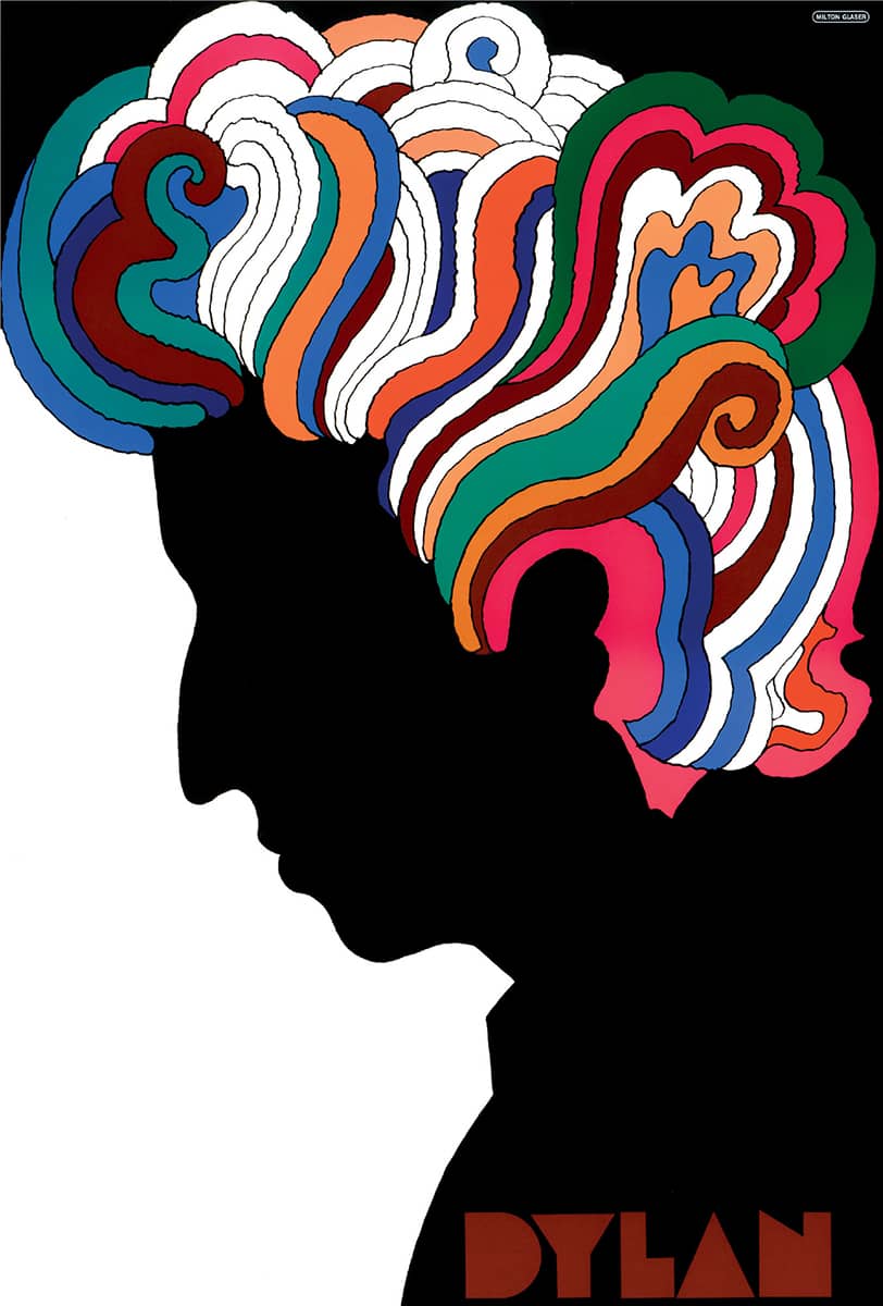
BOB DYLAN POSTER / Milton Glaser / USA, 1966
GSAPP Lecture Series
(1984–2003)
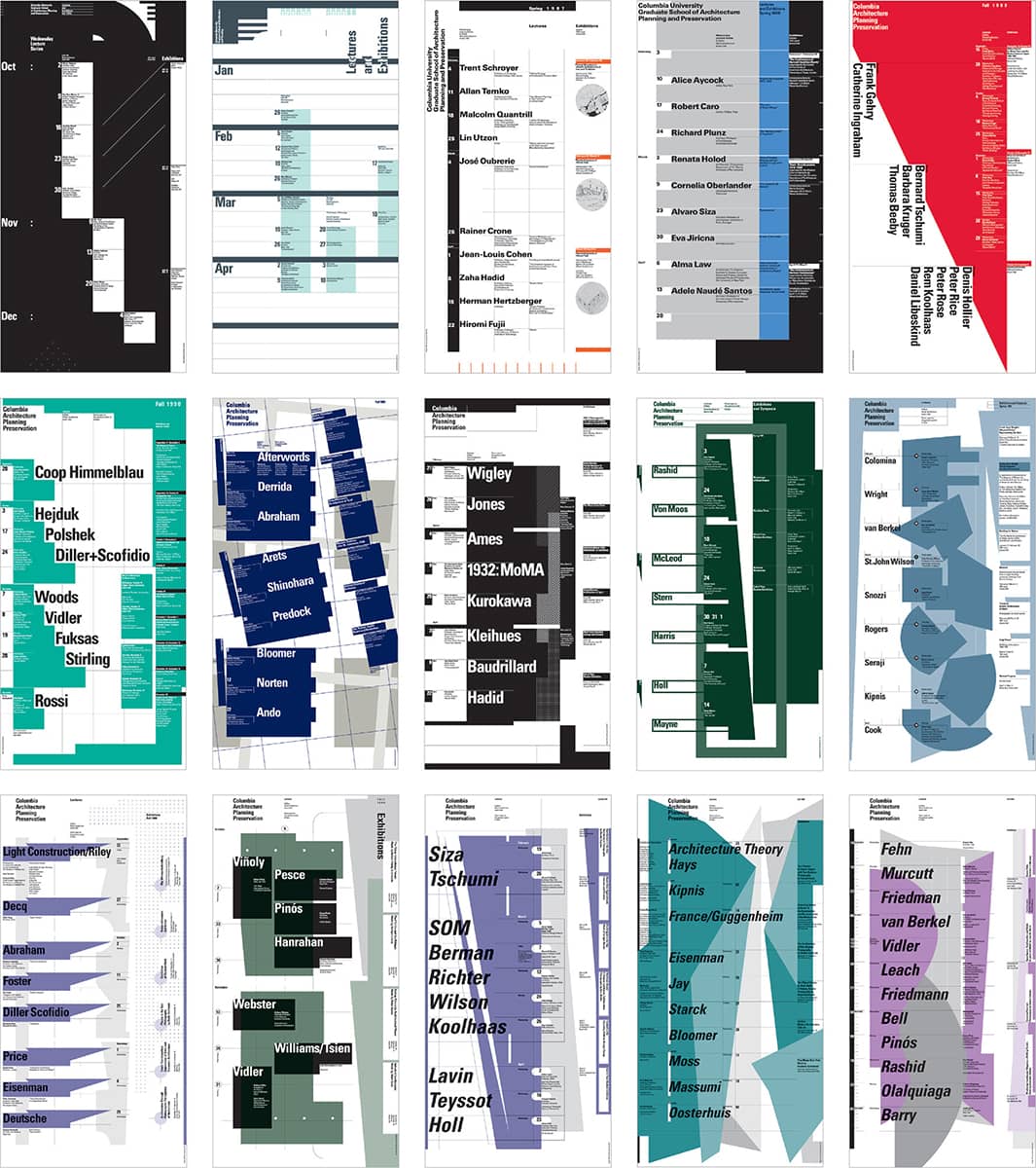
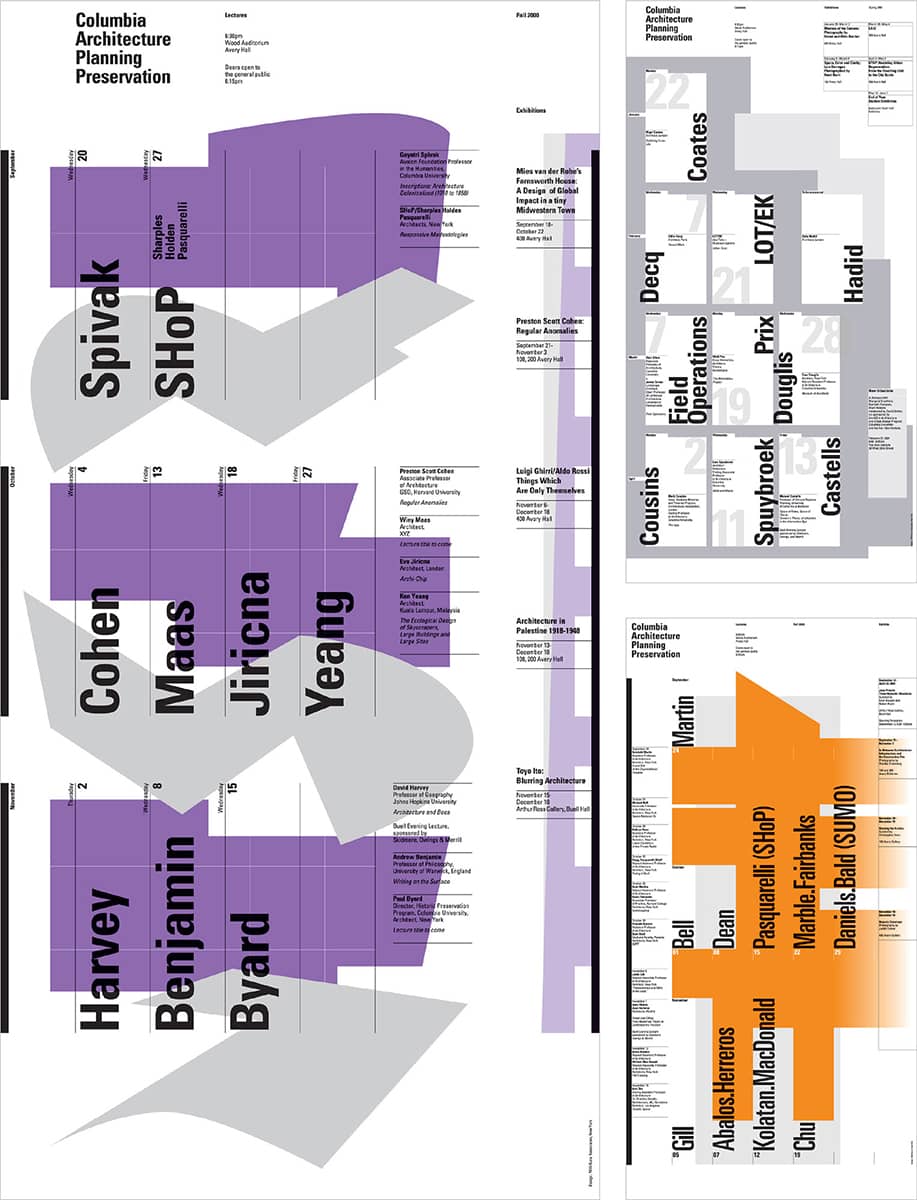
For two decades, Swiss-born Willi Kunz designed the posters for the Columbia University Graduate School of Architecture, Planning, and Preservation (GSAPP). Initiated in 1984 by James Stewart Polshek, Dean, to express a new identity for the school, the posters announce the lectures and exhibits taking place during the fall and spring semesters of each academic year. Working with a set of parameters—including a 12 × 24-inch (two squares) format, two-color printing, Univers › 372 type family, and visual material such as lines and geometric solids—Kunz used the 38 posters as a proving ground for his typographical ideas.
The poster design is based on two main principles: first, the use of type, lines, and geometric elements to simulate structural form or as analogs for architectural concepts; second, the dynamic placement of the typographic information. In 1989, under the direction of Bernard Tschumi, the school’s new dean, the posters’ focus shifted to the lineup of high-profile international speakers. By 2003, the number of posters printed each semester had increased to 10,000 from 2,000 in 1984. During the Tschumi era, the school’s graphics program was broadened to include more than 100 architecture, urban planning, historic preservation, special program, and symposium posters Kunz also designed.
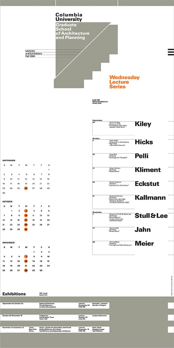
This page and overleaf COLUMBIA UNIVERSITY GRADUATE SCHOOL OF ARCHITECTURE, PLANNING, AND PRESERVATION LECTURE POSTERS / Willi Kunz / USA, 1984–2003
Light Years
The Architectural League of New York’s annual gala, known as the Beaux Arts Ball, has been accompanied by poster invitations designed by Michael Bierut › 203 since 1991, but it was the 1999 edition that caught designers’ attention. The theme, “Light Years,” enabled the translucent design (set in Interstate by Tobias Frere-Jones › 230) to create a “persistence of vision” effect. The ten evenly spaced letters interact to form a simple visual interpretation of the theme.
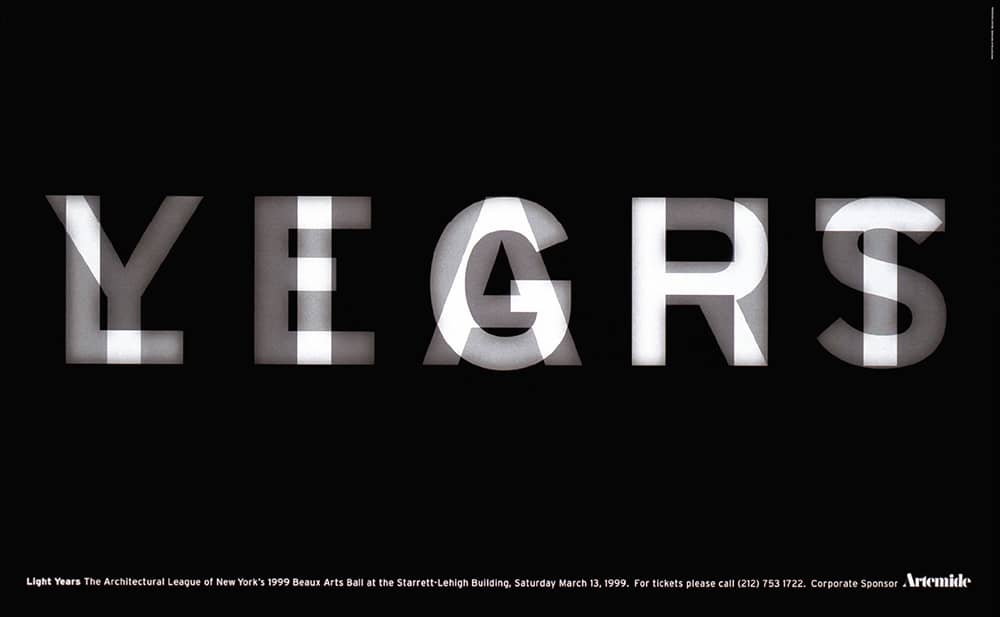
ARCHITECTURAL LEAGUE OF NEW YORK LIGHT YEARS POSTER / Pentagram: Michael Bierut; design, Nicole Trice / USA, 1999
The Spiritual Double
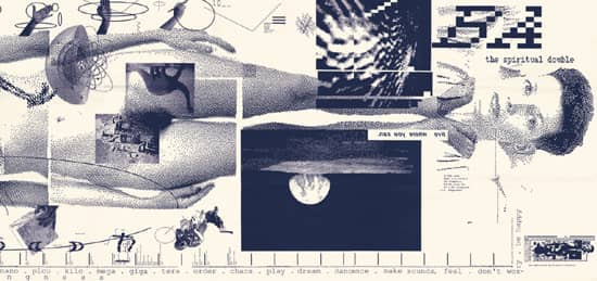
The subject of issue no. 133 of the Walker Art Center’s › 345 Design Quarterly (1986) was April Greiman › 179, which she was invited to design herself. As Greiman recalls, almost a year passed between the invitation and the final product—six months alone in deciding what to do with the opportunity. Opting out of the typical 32-page format of the magazine, Greiman created a single 6 × 2-foot poster that showed her naked, in actual size, overlayed with smaller images, a timeline, questions, and quotes—even a second portrait added at the last minute showing her new hairdo. Greiman explored and stretched the incoming technology of the Macintosh as far as she could: working with a Macvision video digitizer, spending months compositing on MacDraw, and printing out the result on a LaserWriter, the first laser printer compatible with Macintosh. In its excessive imagery, layering, and information, this poster represents an antithesis to design’s dedication to minimizing visual clutter and signaled a transition into the effervescent design that later characterized postmodernism.

DESIGN QUARTERLY NO. 133 FOR THE WALKER ART CENTER / April Greiman / USA, 1986
King Kong and Godzilla
In commemoration of the fortieth anniversary of the atomic bombing of Hiroshima, designers were asked to develop posters as part of a traveling exhibition, Images for Survival, a gift to the Museum of Modern Art in Hiroshima. Encouraging reconciliation between the United States and Japan, Steff Geissbuhler › 157 interpreted these two giants as Godzilla and King Kong, hand in hand, walking into the sunset, which is optimistically rendered as Japan’s flag.

PEACE POSTER / Steff Geissbuhler / USA, 1985
Chicago: The Musical
As a revival of the 1975 Broadway production and a precedent for the 2002 movie, Chicago: The Musical is the longest-running musical revival, with more than 4,500 performances in New York and 15,000 worldwide since its opening in November 1996. With stark, minimalist set and costume design, Drew Hodges, founder and creative director of SpotCo, an advertising agency specializing in the entertainment industry, devised a campaign that showcased and dramatized this minimalist aesthetic while selling the idea of a sexy, tantalizing, energetic show through black-and-white photography—shot by fashion photographer Max Vadukul—in spliced layouts, punctuated by the now instantly recognizable Chicago logo, which was built from samples found in Rob Roy Kelly’s American Wood Types › 72.
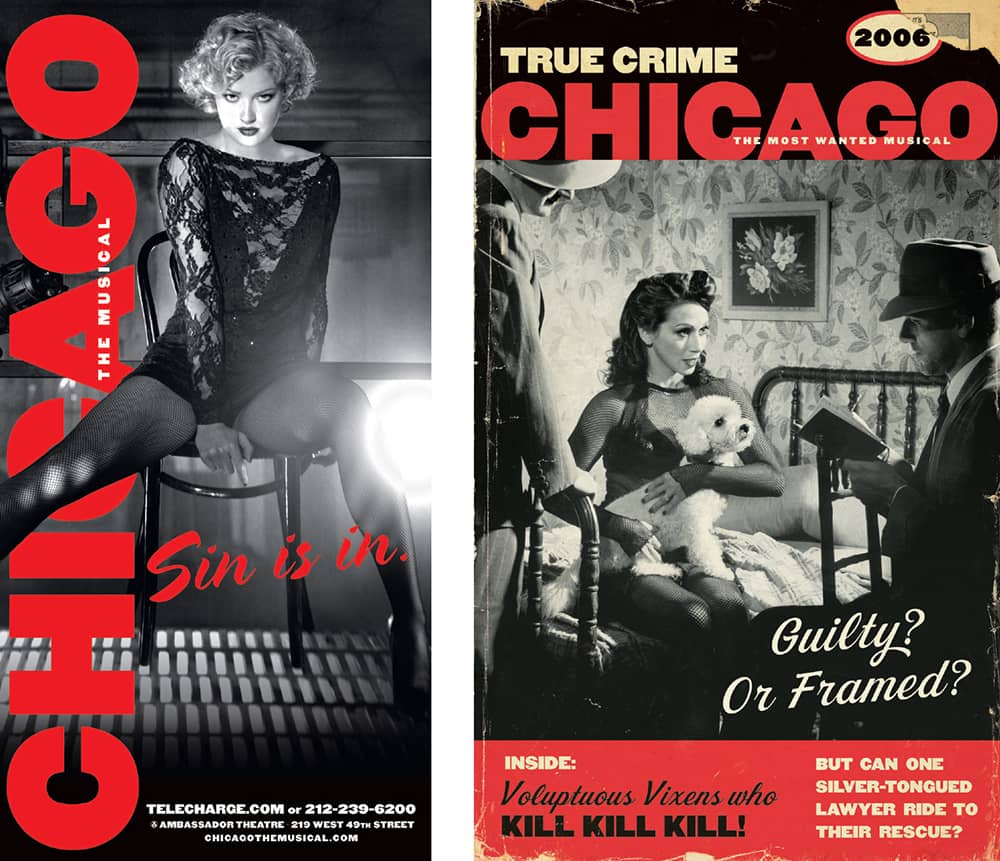
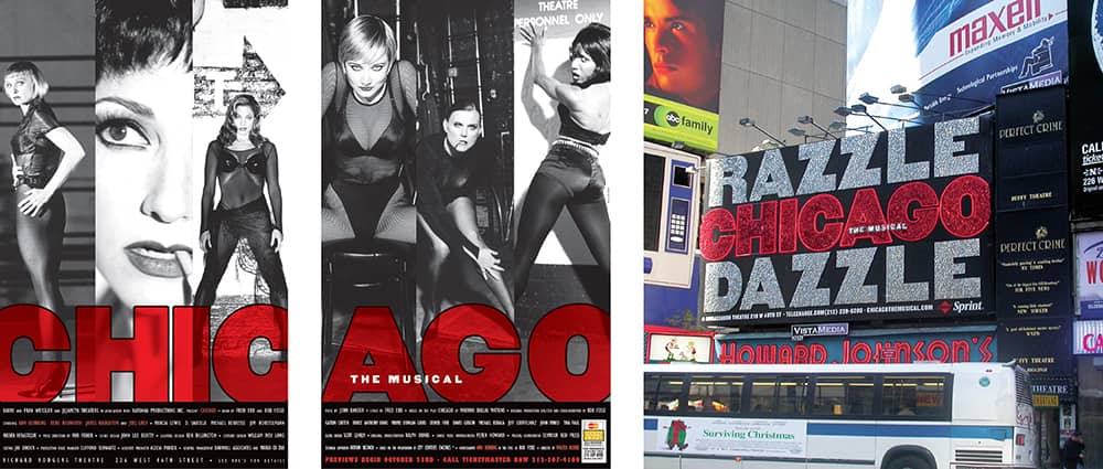
CHICAGO: THE MUSICAL BRANDING / SpotCo: art direction, Drew Hodges, Vinny Sainato; design, Jay Cooper; photography, Max Vadukul, Len Prince, Richie Fahey; producer, Mark Rheault / USA, 1997–2008
OBEY
(1989–Present)
Appearing in a spontaneous and combustive manner, stickers featuring the photocopied face of the enormous (now deceased) wrestler Andre the Giant, accompanied by the tagline “Andre the Giant Has a Posse” plus his stature and weight, appeared nationwide during the early 1990s. The first batch of stickers was created by Shepard Fairey, then a student at Rhode Island School of Design › 134; he was demonstrating to a skateboarder colleague how to do paper-cut stencils, happened upon an image of the wrestler in the newspaper, and adopted it as the mascot for their group of skateboarders. Their freshly printed stickers from Kinko’s spread all over the world and blossomed into a globally recognizable image and language.
In 1993, Titan Sports, Inc. (now World Wrestling Entertainment, Inc.), threatened to pursue legal action against Fairey for using Andre the Giant’s name and image, which they owned, sparking Fairey to create the stylized version of the wrestler’s face paired with the mandate “OBEY”—a trademark Fairey now owns. Using this new icon, Fairey and countless cohorts have pasted “OBEY” posters around the world. It has served as the foundation for dozens of derivatives Fairey built on its dramatic aesthetic—to the chagrin of critics, by appropriating historical imagery from Russian, Chinese, European, and American activist artists. “OBEY,” like many of the iconic brands it’s meant to mock and defy, has become one of the most recognizable icons of recent time.

ANDRE THE GIANT HAS A POSSE STICKER / USA / Photo: Kylie Johnson
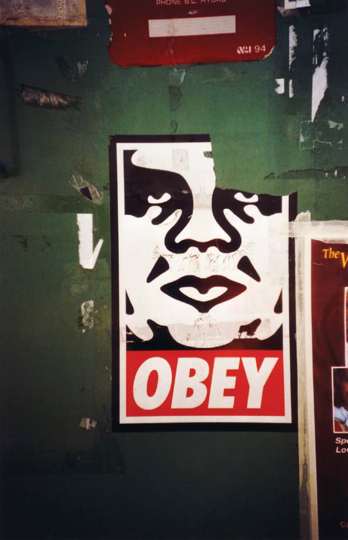
OBEY POSTER ON A DUMPSTER / Canada / Photo: Tanja Niggendijker
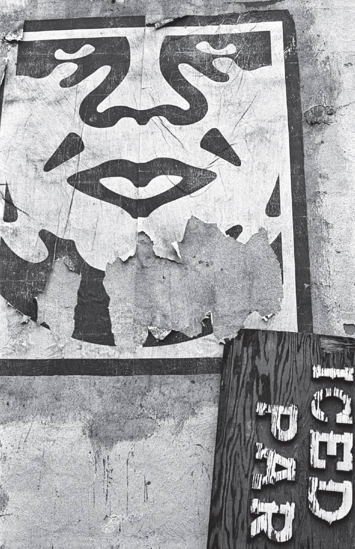
OBEY POSTER ON A JUNKYARD WALL / USA / Photo: Jeanne Lopez
Set the Twilight Reeling
Set the Twilight Reeling is an acutely personal album by Lou Reed, something Stefan Sagmeister › 202 was able to convey through the design by meshing lyrics and artist. The artist’s distress is readily apparent in the close-up portrait overlaid with hand-drawn lettering, not unlike scribbling doodles or a brooding mind. Here, the lyrics take center stage while the record information recedes into the background.
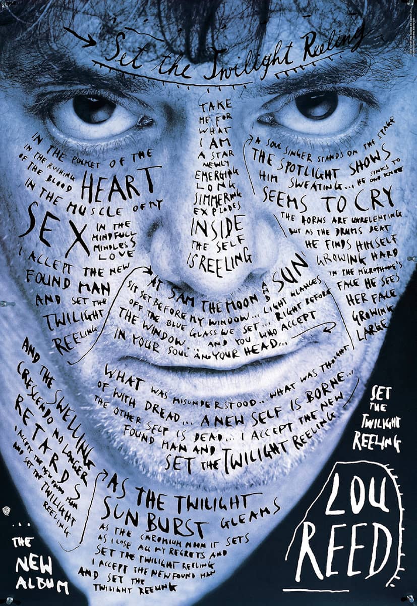
SET THE TWILIGHT REELING POSTER FOR WARNER BROS. MUSIC, INC. / Sagmeister, Inc.: art direction, Stefan Sagmeister; photography, Timothy Greenfield Sanders / USA, 1996
AIGA Detroit
After eight hours of tedious work by Martin Woodtli, the intern at the time, and incremental pain as sustained by Stefan Sagmeister › 202, an iconic poster was carved into design history. While the use of the poster in itself was of a small scale—to announce a lecture for the Detroit chapter of AIGA and Cranbrook Academy of Art › 130—its impact quickly extended through the design community. The audacity of its designer, the poster’s sexuality, and its personal stand all added fuel to its shock value.
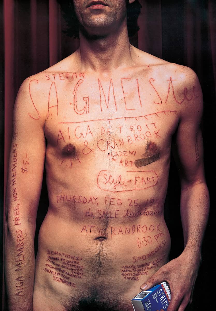
AIGA DETROIT POSTER / Sagmeister, Inc.: art direction, Stefan Sagmeister; photography, Tom Schierlitz; Skin Etching, Martin Woodtli / USA, 1999
Apartheid/ Racisme
For more than 40 years, South Africa suffered under the racial segregation of the National Party’s apartheid system, which made discrimination against nonwhites legal. In 1986, the Rencontre Nationale contre l’Apartheid (National Gathering Against Apartheid) was formed in France to support the abolition of apartheid and mobilize the public to take action—and the group used the power of the poster to communicate the message. Pierre Bernard, one of the founders of Grapus—a collective founded with François Miehe and Gérard Paris-Clavel that focused on creating socially conscious work, including a remarkable collection of streetbound posters—designed a strikingly resonant poster for the cause. Drawn with a black Pentel pen and ink in the familiar structure of a didactic map, the image, which at first glance looks like a skull, is meant to portray Africa as a human face missing its chin because of cancer, which Bernard likens to apartheid. The filled-in counterspaces of the words are not just a stylistic mannerism; rather, they are filled with the missing “flesh” of the face, of Africa.

APARTHEID/RACISME POSTER / Pierre Bernard / France, 1986
Racism
In August 1991, the Crown Heights neighborhood in Brooklyn, New York, was rattled by four days of riots between its Jewish and African-American residents, ignited by a car accident in which Yosef Lifsh struck a young Guyanese boy. Two years later, during the race for New York City mayor, Rudolph Giuliani used the riots as a key issue against his competitor, Mayor David Dinkins, questioning his management, or lack thereof, of the situation. The news was awash again in this polemic, the term racism thoroughly aired in the media and designer James Victore took notice. This poster was his response, hoping to instill gravitas back into the word. On February 26, 1993, while on press at Ambassador Arts, Inc., for this poster, Victore heard the news of the World Trade Center bombing and immediately heard the police and fire truck sirens blaring down Eleventh avenue. The poster was put up in Brooklyn soon after, giving it an enhanced timeliness.
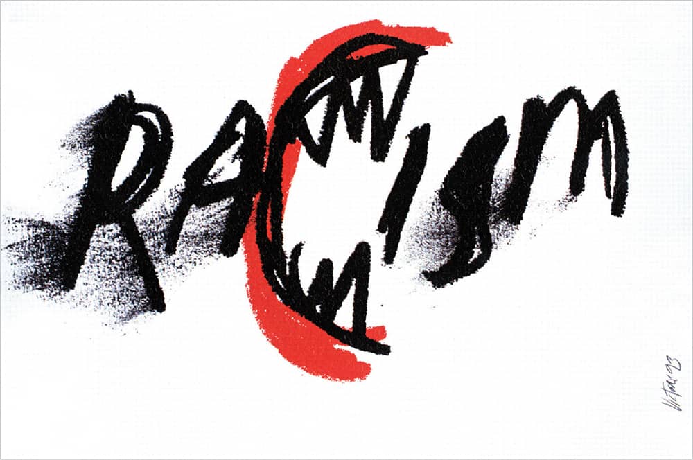
RACISM POSTER / James Victore / USA, 1993
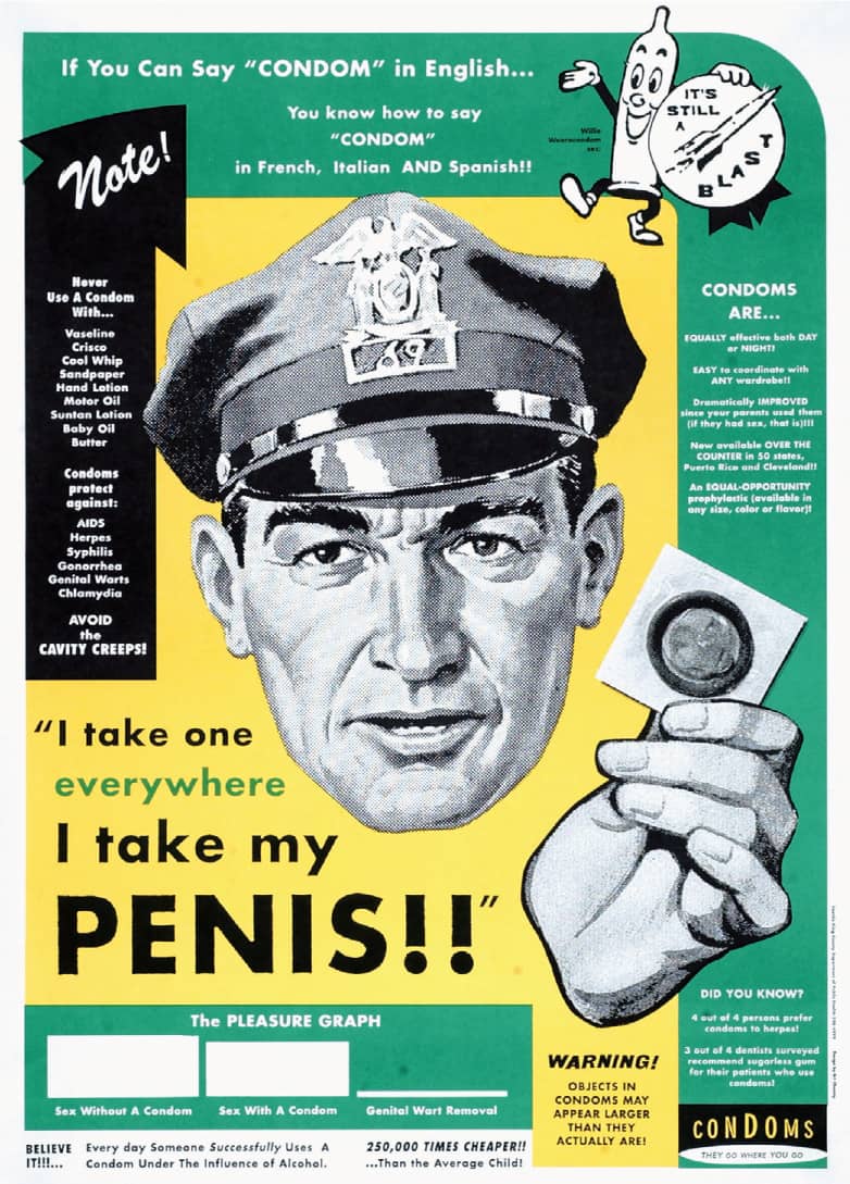
PUBLIC SERVICE AIDS POSTER PROMOTING THE USE OF CONDOMS / Art Chantry / USA, 1997

THURSDAY POETRY READINGS POSTER FOR BIBLIO’S IN NEW YORK / Alexander Gelman / USA, 1995
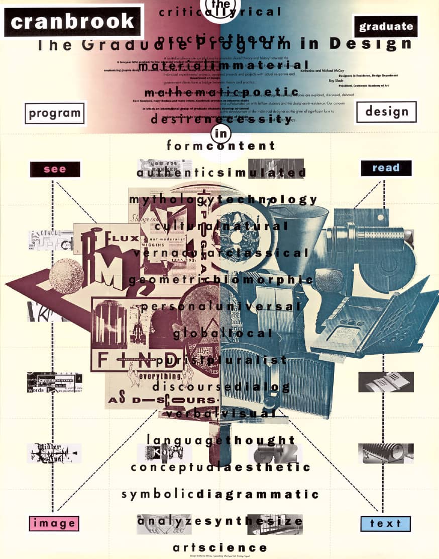
CRANBROOK DESIGN POSTER / Where McCoy layers student projects with a communications theory diagram and a listing of polemic oppositions / Katherine McCoy / USA, 1989
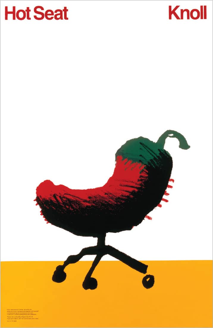
KNOLL HOT SEAT POSTER / This poster served a dual purpose—as an invitation for a special chili cook-off and to introduce a new seating collection by Bill Stephens for Knoll / Woody Pirtle / USA, 1982
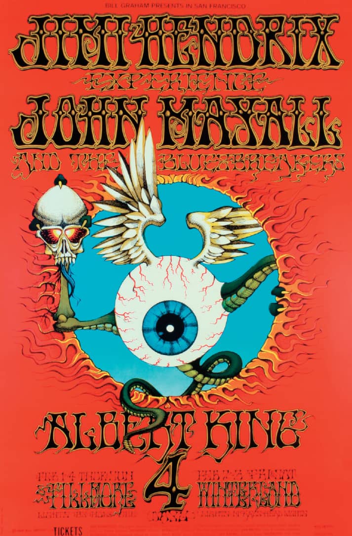
FOR A JIMI HENDRIX, JOHN MAYALL, AND ALBERT KING SHOW, GRIFFIN’S PSYCHEDELIC TRADEMARKS—THE SUNGLASS-WEARING SKULL AND THE EYEBALL—GAIN CENTER STAGE / Richard Griffin / USA, 1968
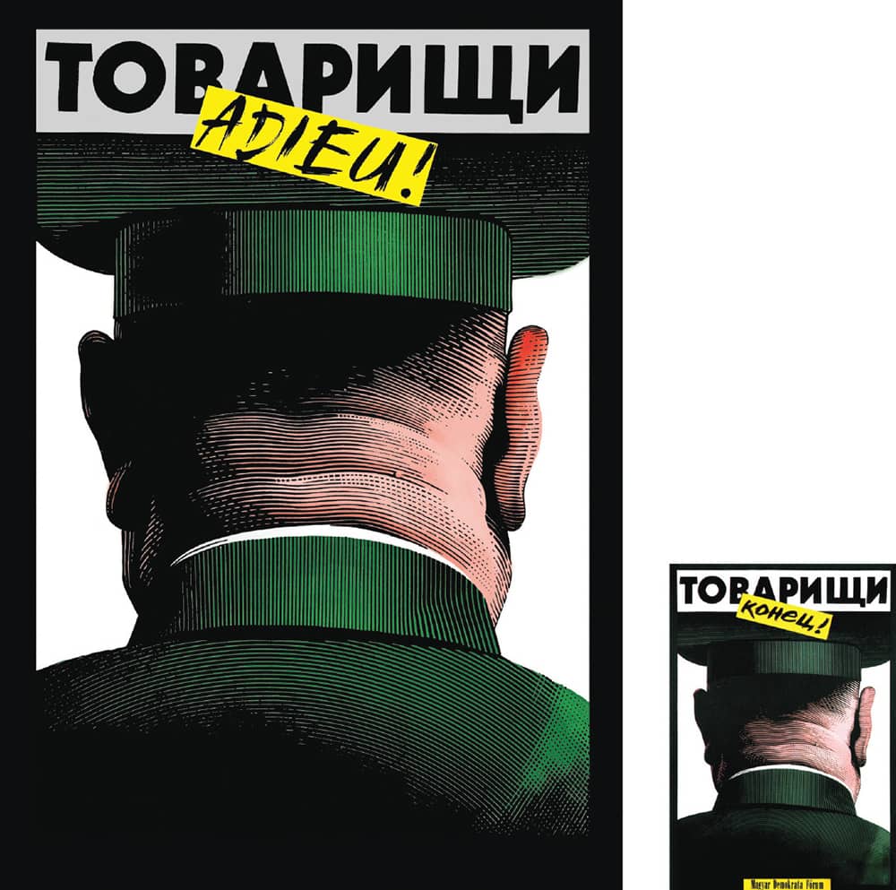
COMRADES, IT’S OVER! POSTER FOR THE HUNGARIAN DEMOCRATIC FORUM, AS THE COUNTRY EMBRACED DEMOCRACY / A year later, the poster was translated into Russian / Istvan Orosz / Hungary, 1989
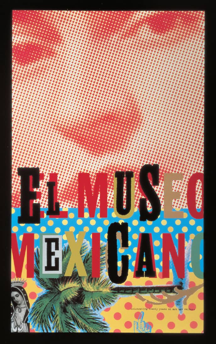
MEXICAN MUSEUM TWENTIETH ANNIVERSARY POSTER FOR BACCHUS PRESS / Jennifer Morla, Craig Bailey / USA, 1995
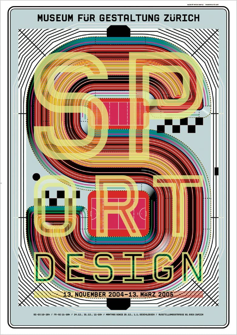
WITH THE GROWING ATTRACTION OF ALL THINGS ATHLETIC, THE EXHIBITION SPORTDESIGN AT THE MUSEUM FüR GESTALTUNG ZüRICH DELVES INTO THE SOCIAL, CULTURAL, AND TECHNICAL ASPECTS OF THE EAGER AMATEUR AND THE PROFESSIONAL ARENAS / Martin Woodtli / Switzerland, 2004
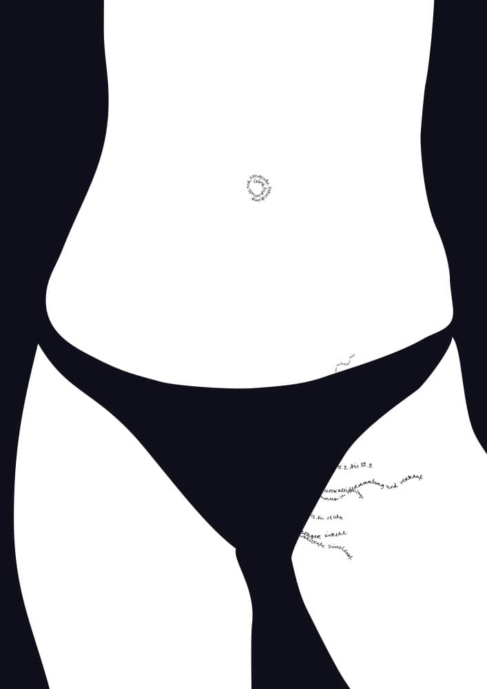
CLOTHING COLLECTION POSTER FOR LABORATORY FOR SOCIAL AND AESTHETIC DEVELOPMENT / Fons Hickmann / Germany, 2002
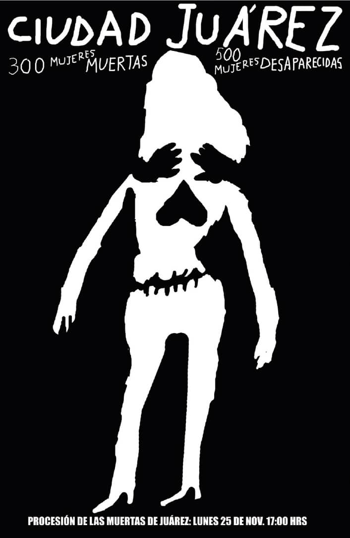
CIUDAD JUÁREZ: 300 WOMEN KILLED, 500 WOMEN MISSING POSTER / Alejandro Magallanes / Mexico, 1997
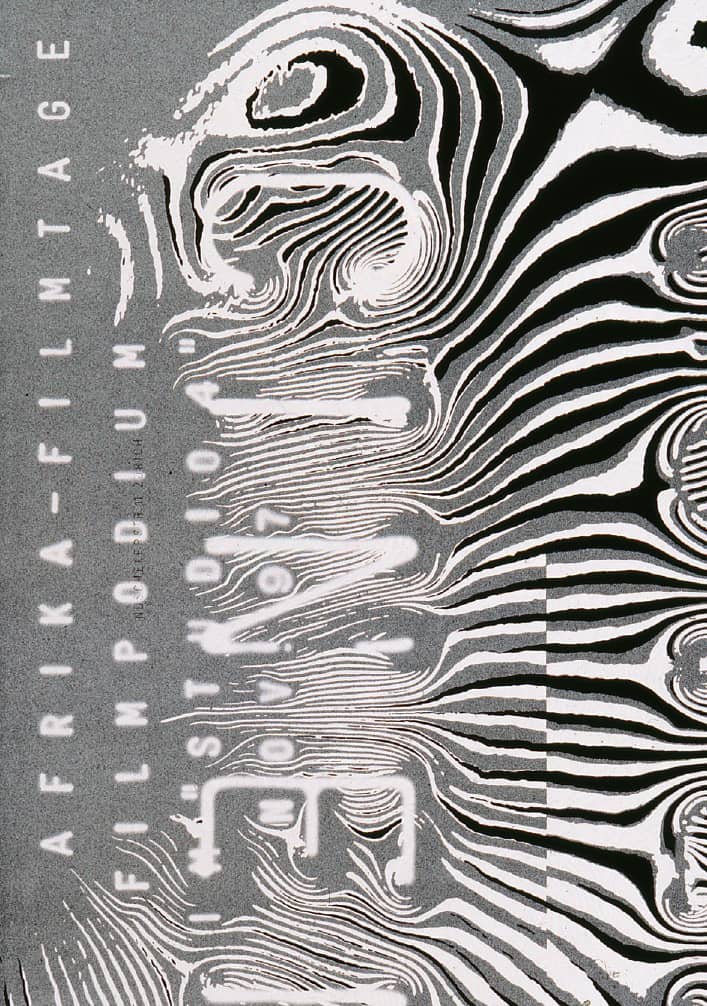
THE CINEMAFRICA FILM FESTIVAL PROMOTES FILMS MADE BY AFRICANS IN ORDER TO BRING AWARENESS TO THE CURRENT REALITY OF THE CONTINENT / Ralph Schraivogel / Sweden, 2007
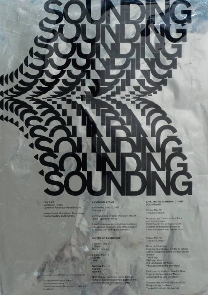
SOUNDING: PAUL EARLS, COMPOSER, FELLOW, CENTER FOR ADVANCED VISUAL STUDIES POSTER / Printed black on metallic paper, the reproduction shows the actual item’s imperfections and glare
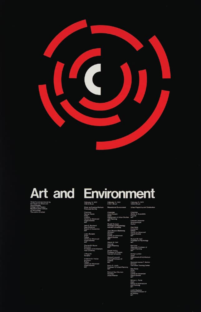
ART AND ENVIRONMENT: THREE FORUMS SPONSORED BY THE CENTER FOR ADVANCED VISUAL STUDIES POSTER, Kresge Little Theatre
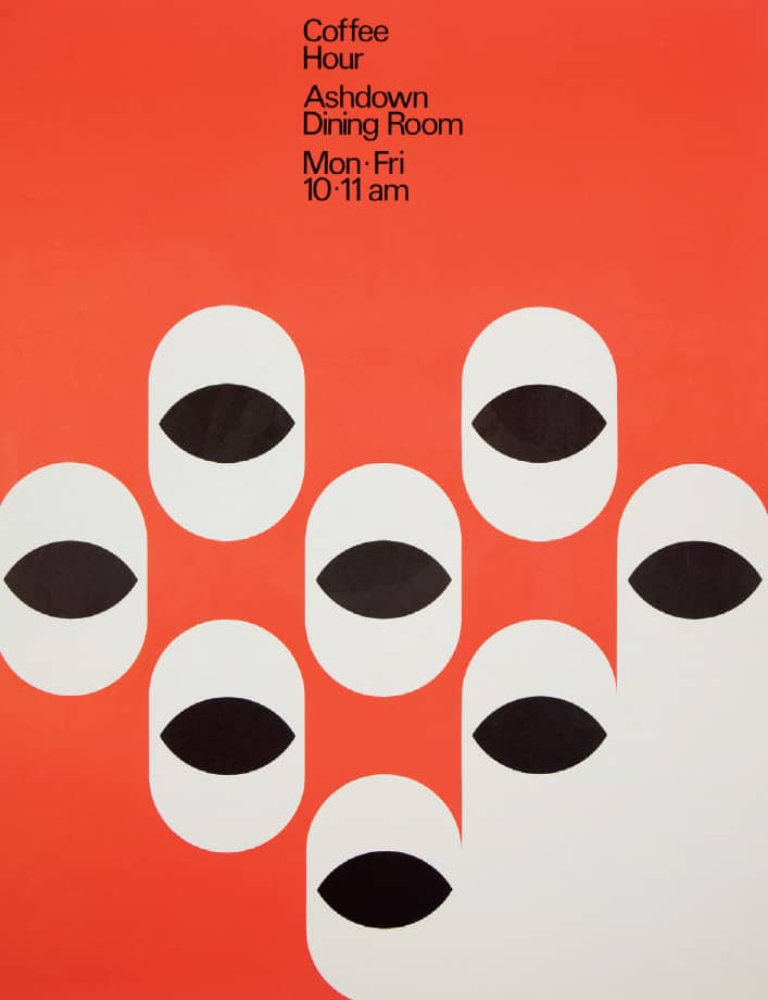
COFFEE HOUR POSTER
Massachusetts Institute of Technology event posters / MIT Office of Design Services: design director, Jacqueline Casey / USA, 1972
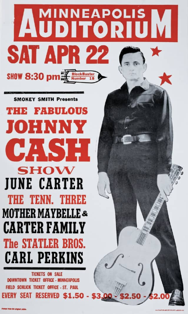
JOHNNY CASH SHOW POSTER / Hatch Show Print: Jim Sherraden / USA, 1967
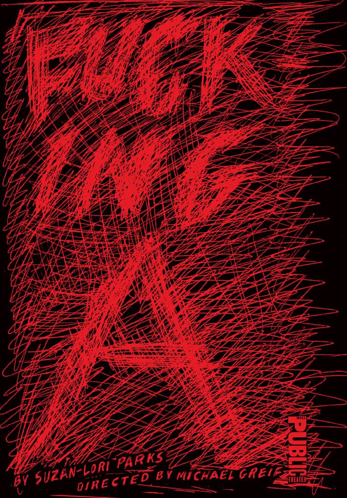
FUCKING A, A CONTEMPORARY TAKE ON THE SCARLET LETTER, POSTER / Pentagram: Paula Scher / USA, 2002
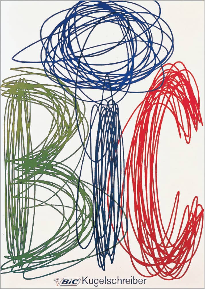
BIC BIROS ADVERTISING POSTER / Ruedi Külling / Switzerland, 1970
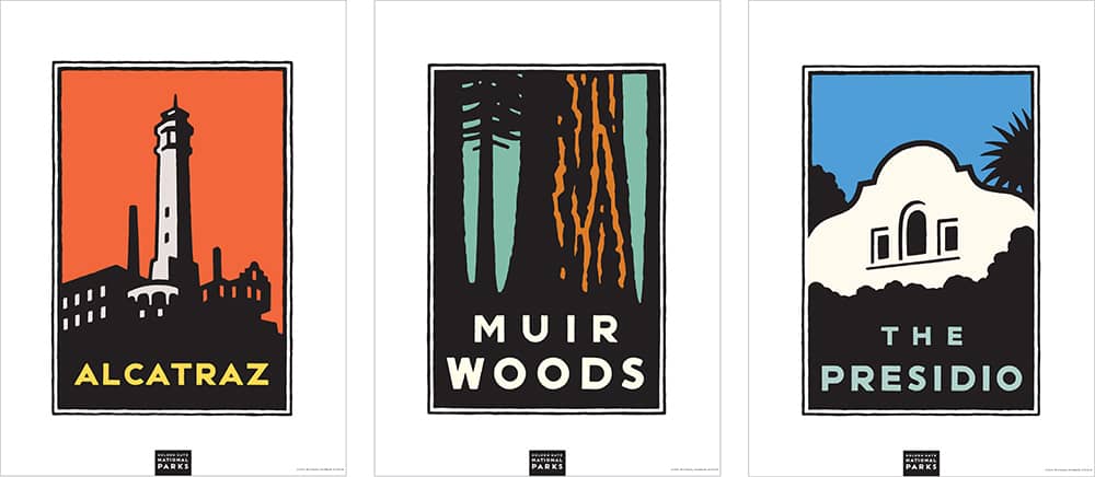
THE GOLDEN GATE NATIONAL PARKS POSTER SERIES / creative direction, Rich Silverstein; art direction, Jami Spittler; design and illustration, Michael Schwab / USA, 1996
SUBWAY MAPS
Subway maps present a tough design problem: devising the simplest and most accessible design representation of a complex system. In addition, the maps must convey a multitude of functions, from connections to the physical location of stations, and be understood by thousands of commuters every day. Luckily, Harry Beck (né Henry C. Beck), an engineering draftsman employed with the London Transport, solved this problem more than 70 years ago, and his solution is the foundation for many of today’s subway maps.
In 1908, Frank Pick was appointed publicity officer for the London Underground › 346, and in the following two decades he drastically improved the system’s uncoordinated presentation, communication, advertising, and signage. He commissioned some of the era’s most influential artists, like Man Ray, to create artwork for the Underground’s advertising, and calligrapher Edward Johnston to develop a unifying typeface in 1916. The resulting Johnston Sans typeface was used throughout the system and advertising and, of course, became part of the visual landscape of London, still visible today. Johnston also redesigned the famed roundel logo for the Underground in 1918.
In 1933, the London Underground was merged with other underground railway companies, tramways, and bus companies, forming the London Passenger Transport Board (known as the London Transport), and Pick was appointed its managing director. With an increasingly complex underground service, Pick commissioned Beck to design a map. Beck solved the problem by ignoring the geography above ground and focusing instead on establishing the relationship between stations; the only sense of place or scale included was an abstraction of the River Thames. Set solely in 90- and 45-degree angles, the map depicted the different lines by assigning each one color, and the stations were clearly marked by small nibs protruding from the lines. As the city and underground system has evolved, so too has the map, but the original design is still in use.
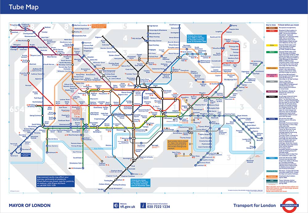
LONDON UNDERGROUND MAP / Harry C. Beck / UK, 1933 / version shown: 2008
Almost 40 years later, in 1970, on the other side of the Atlantic, Massimo Vignelli › 160 was working on a comprehensive signage system for New York’s subway through the Metropolitan Transit Authority. Vignelli, with Unimark International at the time, redesigned the existing subway map, designed by George Salomon in 1959. Like Beck’s, Vignelli’s map used strictly 90- and 45-degree lines, color-coded lines, and a geographical abstraction of the city above the subway—Central Park, for example, was rendered as a square, instead of the 3-to-1 ratio it actually is. Unlike Beck’s map, Vignelli’s did not last long in its service to commuters, mostly due to its liberties with the geography, and it was replaced in 1979 by an anatomically correct map, still in use today.
As part of a five-year relationship with the Transportation Authority of Berlin (BVG), Erik Spiekermann › 226, with MetaDesign in 1992, designed a thorough corporate identity and signage project that unified every aspect of the transportation system, from subway to light rail to buses, including the design of all related maps. While the other maps required slightly different approaches, the subway map was a new interpretation of Beck’s design, utilizing the same design principles and foregoing geographical accuracy, without complaints from government or commuters. From these examples, it may be possible to conclude that Europeans have a more acute understanding of spatial relationships than New Yorkers do.
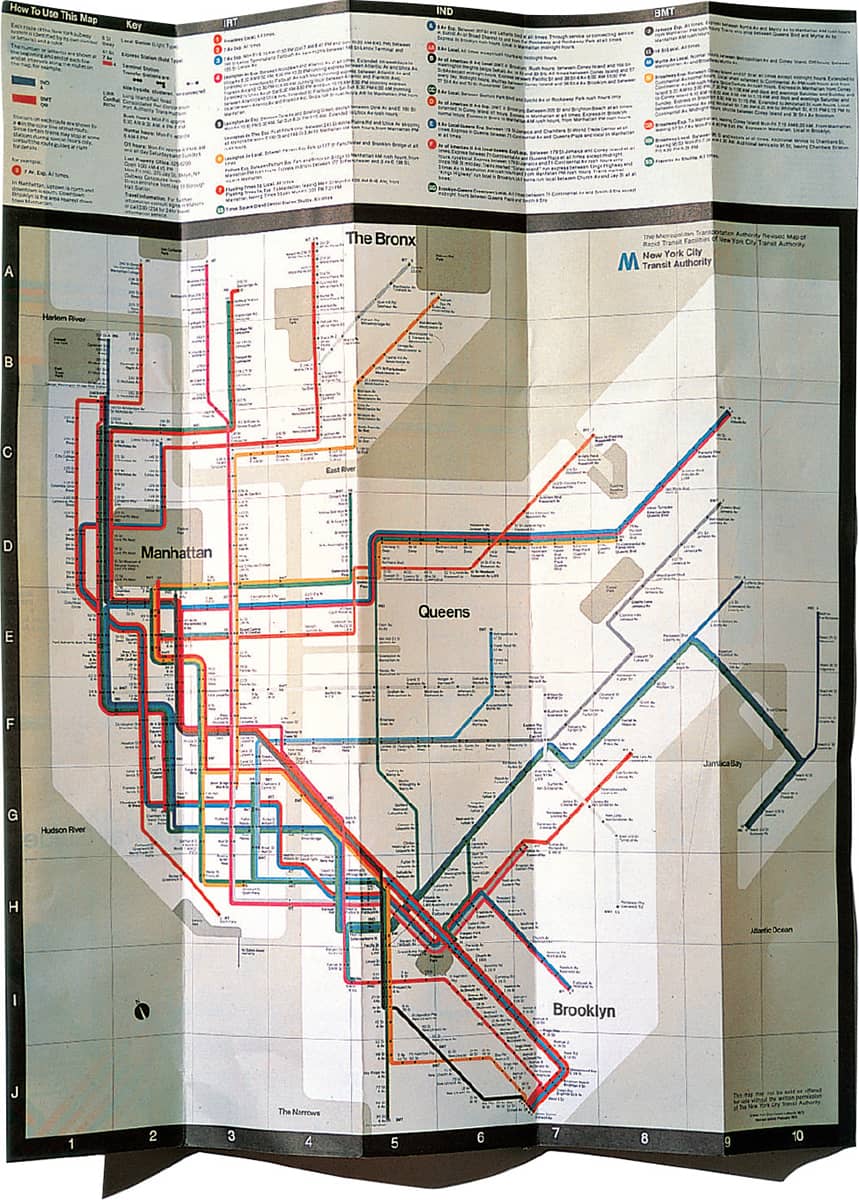
NEW YORK CITY SUBWAY MAP / Unimark International: Massimo Vignelli / USA, 1970

BERLIN SUBWAY MAP / MetaDesign: Erik Spiekermann / Germany, 1992
