
Hands-on ASP.NET AJAX Control Toolkit
In the world of web development, developers have always tried to achieve a rich user interface that blurred the lines between thick and thin client applications. The ASP.NET AJAX Control Toolkit empowers developers to create rich interfaces with easy-to-use controls. However, before jumping right into the ASP.NET AJAX Control Toolkit, take a closer look at how the industry got here.
Many different technologies over the years (or collections of technologies) have assisted developers in achieving this goal, but there is always room for improvement. One of the major issues with these previous aids is that they require users to download and install add-ins that run inside a user’s browser. A few examples that fit into this group include Adobe (previously Macromedia) Flash, Sun Microsystems Java (Applets), and Microsoft’s ActiveX. Some of these technologies, namely, ActiveX, were specifically targeted toward certain browsers, thereby limiting their adaptation. ActiveX specifically targeted Internet Explorer, but it is possible to get it to run with other browsers after complicated tweaks and hacks. Even with a wide distribution, users or corporate policies often disable these technologies for fear of security issues. The fear of add-ins spawns from the power that they provide coupled with an unsecure environment. As you all know, the Internet is not even close to being secure; otherwise there would be no firewalls and other protections. Oftentimes, malicious intent exploits the powers of add-ins, for example, the ability to access a user’s computer without his or her knowledge. Knowing this as well as understanding the importance of wide-scale usage, developers often shy away from developing applications that include these technologies. Without add-ins, developers are left to use tools that are a part of the user’s browser; however, even in that realm, there are potential issues, namely, JavaScript. In the past, JavaScript was widely regarded as unsecure, and even though it was a part of the web browsers, users disabled it. Another issue that plagued developers in regard to JavaScript was the differences in support between browsers. Thankfully, times have changed. More users have JavaScript enabled to enhance their browsing experience, and manufacturers have accepted standard implementations for JavaScript support in their browsers. User acceptance and standards make JavaScript attractive, but corporations have typically regarded JavaScript as “fluff” with no real benefit in its usage. Again, this attitude has shifted thanks to the acceptance of client-side enhancements in web applications. One of the powerful forces driving many of these changes is a technology known as AJAX. The lack of innovation in the browser world, coupled with the goal of making the web a richer experience for users, led to the change in attitudes toward JavaScript and DHTML, giving AJAX a new spotlight.
AJAX (or Ajax) is an acronym for Asynchronous JavaScript And XML. While users may not know the specifics of the technology, most are very familiar with the results thanks to applications like Google Maps, Meebo (web-based messenger), Gmail, Yahoo Mail, and Windows Live. AJAX is nothing new, but rather a technique for development comprising a collection of well-accepted tools:
- XMLHttpRequest — The heart of the “A” in AJAX; the asynchronous transport mechanism.
- JavaScript — Obvious choice for client-side scripting; after all, it is the “J.”
- XML — Another obvious one here, used for sending/receiving messages from the server. The use of XMLHttpRequest implies that you are using XML for communication, although you can use any text-based communication such as JSON or just plain text.
- XHTML and CSS — Well-formed, standards-based technologies used for presentation.
- Document Object Model (DOM) — For interaction between the user and the page (e.g., drag drop, dynamic validation).
As developers, most of these should be familiar to us; however, one thing that may not be clear is the shift in paradigm from server-centric development to a more client-centric model. Luckily, to help with the transition, there are several tools out there to help with the transition; this is where ASP.NET AJAX comes into the equation.
Do not underestimate or disregard this change, thinking that the software architecture and development will stay constant. The shift from server to client development means new patterns and practices and new problems that developers and architects will face.
ASP.NET AJAX is Microsoft’s framework for creating rich, interactive Web applications. As ASP.NET revolutionized web development, ASP.NET AJAX is positioning itself to do the same.
You should be aware that there is a plethora of AJAX frameworks in the marketplace, for example, the Yahoo UI Library or the Prototype JavaScript Framework. One compelling reason for opting to use the ASP.NET AJAX framework is its seamless integration with .NET. The .NET Framework 3.5 includes Microsoft’s AJAX Extensions, and the client-side enhancements found in these closely resemble .NET Framework classes and libraries.
The ASP.NET AJAX framework comprises both client and server components. For server components in ASP.NET 2.0, there is the ASP.NET AJAX Extensions 1.0, which is an addition to the ASP.NET Framework; however, ASP.NET 3.5 includes these extensions inherently in the .NET 3.5 Framework. On the client side, there is the Microsoft AJAX Library, which assists developers in creating scripts for rich user interfaces. You will find the client-side enhancements integrated into the ASP.NET AJAX Extensions1.0 and .NET 3.5 Framework, but they are also available for development on non-.NET platforms as a separate download.
Setting up ASP.NET AJAX
Before getting into the ASP.NET AJAX Control Toolkit, you need to set up the environment and understand the other key components that support the Toolkit. While installation is not a big issue, it does seem to cause some developers problems, thus it is a good idea to review the steps. Note that these steps assume that you are using ASP.NET 2.0. As stated above, ASP.NET 3.5 includes ASP.NET AJAX.
1. Install the IDE. As developers, one can assume you already have Visual Studio set up. If you do not have a full version of Visual Studio, ASP.NET AJAX also supports Visual Web Developer Express. Visual Web Developer Express is available as a free download from Microsoft.
2. Install Visual Studio 2005 SP1. SP1 for Visual Studio 2005 includes several fixes as well as new project templates, which will assist with AJAX development. While installing SP1 is not required, it is strongly recommended (found in the Pre-Installation section of the ASP.NET AJAX Extensions Release Notes). If you choose not to install SP1, you can still develop with AJAX; but again, it is strongly recommended.
3. Download and Install the ASP.NET AJAX Extensions 1.0. You can obtain these from www.asp.net/ajax/downloads/. Once you have downloaded the setup file, you can go ahead and execute it to install the package.
Just three steps and painless, with the exception of the time it takes to install Visual Studio 2005 SP1. Assuming that you are creating new applications using the two new templates that the ASP.NET AJAX Extensions include (ASP.NET AJAX-Enabled Web Site and ASP.NET AJAX-Enabled Web Application), you should have an easy transition to ASP.NET AJAX. However, if you are trying to enable ASP.NET AJAX in an existing, non-ASP.NET AJAX-enabled site, you will need to make modifications to your web application’s web.config. You can find the complete list of changes in the ASP.NET AJAX Documentation’s Configuring ASP.NET AJAX section: www.asp.net/AJAX/Documentation/Live/ConfiguringASPNETAJAX.aspx. If you end up having issues with configuring your web.config from the guide, my recommendation is to copy the default ASP.NET AJAX web.config and make the specific changes to that copy that you need for your particular site (e.g., Connection String, etc). Then use this new web.config in your old site. By default, you can find the ASP.NET AJAX web.config in the following location:
<DRIVE LETTER>:Program FilesMicrosoft ASP.NETASP.NET 2.0 AJAX
Extensionsv1.0.nnnn
ASP.NET AJAX Extensions
The ASP.NET AJAX Extensions provide developers with powerful server controls allowing developers to create AJAX enabled applications very easily with little knowledge of the technologies that compose AJAX.
As developers, many of us have not had the opportunities to become experts in things like client-side development. ASP.NET AJAX greatly assists developers in this regard, allowing many to get up and running without a vast knowledge of client-side development, but this can be a double-edged sword. Always remember that ease of use typically comes at a price, and there are always multiple ways of designing solutions. If you are not an expert with JavaScript, I recommend taking the time to understand JavaScript and work on mastering it. JavaScript is not going away in the near future and remains popular today. Aside from just web development discussed in this Wrox Blox, well-known applications like Microsoft SilverLight, Adobe Acrobat, and Adobe Photoshop expose their APIs to JavaScript.
Before getting into the details of the ASP.NET AJAX Extensions, the following section looks at an example of the ASP.NET AJAX controls in action. Remember, in order to use ASP.NET AJAX, you need to create an AJAX-Enabled project or manually modify the web.config as discussed in the previous section.
ScriptManager
The first control you’ll be looking at is the ScriptManager, the core of the ASP.NET AJAX Extensions. As you may have guessed from the name, one of the primary functions of the ScriptManager is to manage the ASP.NET AJAX scripts (built-in and custom created). Beyond management of the scripts, it runs as a broker for all ASP.NET AJAX interactions. This fact makes the ScriptManager a critical control of most ASP.NET AJAX controls, including those found in the ASP.NET AJAX Toolkit.
You can think of the ScriptManager along the lines of the server form (<form runat="server">) found in ASP.NET. As ASP.NET controls rely on the server form, ASP.NET AJAX controls rely on the ScriptManager. In addition, there can only be one ScriptManager defined on a page, just like that of the server form.
As you start using the ScriptManager, you may think, “Why not add this to my master page?” This design can work (and I use it frequently), but you may encounter issues when you try to load multiple custom scripts or you need to load a specific script on a page; this is where the ScriptManagerProxy control comes into play. You can find more information about the ScriptManagerProxy in the ASP.NET AJAX Documentation.
This example (AJAXExtGettingStarted.aspx) illustrates using a ScriptManager to perform a server callback to retrieve a user message. Typically, AJAX callbacks use web service calls or Windows Communication Framework (WCF). One extremely useful function that the ScriptManager performs is creating the necessary JavaScript proxies so that calling out to web service is nothing but an intuitive method call for you. Services are great, but there are many times when a full web service seems like overkill. I am sure you can think of an instance in your code where the scope of the logic really only applies to a single page. A very nice, often overlooked feature of the ScriptManager and ASP.NET AJAX is PageMethods. Since there is an abundance of web service examples out there, I will use PageMethods for this example.
Do not confuse ASP.NET AJAX PageMethods with the metaSapiens PageMethods product. Often when this is mentioned, people do a search, and the metaSapiens’ web site comes up. In fact, it is somewhat difficult to find good ASP.NET AJAX PageMethods examples out there.
A PageMethod is a special type of WebMethod that belongs solely to the ASP.NET Page object. A WebMethod is a method that ends up being exposed by the WSDL of a .NET Web Service (.asmx files). To declare a PageMethod, we will use the WebMethod attribute to decorate the server-side method, just as we would in a standard Web Service. The only other requirement for the PageMethod is that the method must be marked as static, which essentially equates to a “standalone” method. This means that we will not be able to access resources on the Page from code-behind (e.g., <asp:textbox />) or any other nonstatic member of the class. You need to use client-side JavaScript code for any interaction with the Page objects.
In order to use PageMethods, first you must declare the ScriptManager on the page. The ScriptManager, like other ASP.NET Controls, must be a child of the server-side form as shown. I have also added the EnablePageMethods attribute for the ScriptManager; this is what allows you to use PageMethods within JavaScript. The following code snippets come from the sample file AJAXExtGettingStarted.aspx:
<form id="form1" runat="server">
<asp:ScriptManager ID="ScriptManager1" runat="server" EnablePageMethods="true" />
</form>
Now, in the code-behind for the WebForm, inside the Page class, we define a method and decorate it with the [WebMethod] attribute.
namespace Wrox.AJAXToolkit.Samples
{
public partial class AJAXExtGettingStarted : System.Web.UI.Page
{
[WebMethod]
public static string GetServerMessage(int msgId) { ... }
}
}
Finally, thanks to the magic of the ScriptManager’s EnablePageMethods attribute, we are able to perform an asynchronous callback to the server and call the GetServerMessage method. The syntax for a PageMethod accepts any parameters that you may need for your WebMethod as well as a function pointer for a success callback handler and a function pointer for an error callback handler. This example retrieves one of three messages back from the server each time the function getServerMethod() is called.
<script type="text/javascript">
var _msgToGet = -1; // Initialize the message counter
function getServerMessage() {
// Get the next message Id to retrieve, if we are at the end, restart.
var msgId = (_msgToGet == 2) ? _msgToGet = 0 : ++_msgToGet;
// Call the server-side method using PageMethods
PageMethods.GetServerMessage(msgId, _pageMethodSuccess, _pageMethodError);
}
function _pageMethodSuccess(result) {
$get('Label1').innerHTML = result;
}
function _pageMethodError(result) {
$get('Label1').innerHTML = 'An error has occurred.';
}
</script>
Running the sample, you will see that there is a delay between when you click and when the text changes/appears. This is a byproduct of asynchronous operations. Typically, you would display something along the lines of a wait message or an animated gif to notify the user that the application is busy. If you are looking for some nice animated gifs for your AJAX applications, check out www.AJAXload.info.
Other ASP.NET AJAX Server Controls
Since this Wrox Blox focuses on the AJAX Control Toolkit, I do not want to spend an abundance of time on the other server controls found in the ASP.NET AJAX Extensions; however, they do deserve a mention before we move on.
UpdatePanel
The UpdatePanel control allows developers to AJAX-Enable an application without knowing anything about technologies behind AJAX (e.g., JavaScript, XML, DOM). This control is truly amazing and hides the complexity of what is happening under the hood, making AJAX development a breeze. Once you use the UpdatePanel and show an example to your users, they will want similar functionality on everything you develop. The UpdatePanel, coupled with the ScriptManager, allows partial rendering for your UI (through DOM manipulation, none of which you need to write) and intercepts standard postbacks, replacing them with asynchronous callbacks to the server. If you are not familiar with partial rendering, an example would be to simply retrieve a string message from the server and add it the page dynamically, client side. With normal rendering, you would re-render the entire page just to load the string. Of course, the UpdatePanel and an ASP.NET page add far more complex functionality than just adding a string. As you may imagine, with all this automated functionality, you are going to incur a penalty for using the control. When the UpdatePanel posts back, controls on your page are participating in their standard life cycle — for example, ViewState is loaded, data binding, events fire, and so forth. The rendering methods are all that really change. For something simple, like displaying some text, you are better off using an approach like the last example than using the UpdatePanel. When used in the proper design, the UpdatePanel really shines.
When we start using the AJAX Control Toolkit, you’ll notice that the controls in the Toolkit do not require an UpdatePanel for their functionality. The controls handle all the aspects of AJAX (e.g., JavaScript and DOM manipulation) without the need for an UpdatePanel. This fact makes using these controls a best practice in my mind, for various patterns that you may encounter in your development. You will see an example of this below in this Wrox Blox with a comparison between the UpdatePanel and the Cascading-DropDown Toolkit Control.
UpdateProgress
The UpdateProgress works in conjunction with the UpdatePanel to provide users with feedback while an update is in progress. When rendered to the Page, the UpdateProgress is an HTML DIV element that uses styles to show and hide itself automatically based on the life cycle of the UpdatePanel. The control is effectively just an advanced panel; thus you need to add your own content inside it. Typically, you will have a message and perhaps an animated gif. The UpdateProgress also allows you to customize the time (using the DisplayAfter property) that needs to pass before the visibility of the UpdateProgress changes to visible. The DisplayAfter property defaults to half a second, meaning that you will not see your UpdateProgress for something that returns quickly. The default delay should be sufficient for most cases.
Timer
The AJAX Timer control allows you to perform a scheduled refresh on the controls on your page. When paired with an UpdatePanel, the Timer can refresh just the UpdatePanel. Again, here is another place where developers often overuse a technology. The UpdatePanel and Timer are great controls, but depending on what you need to do, JavaScript’s setInterval method and DOM manipulation are usually more efficient.
The ASP.NET AJAX Control Toolkit is equivalent to many of the pay control packages out there; however, they are a community effort licensed under the Microsoft Permissive License (Ms-PL) agreement; thus in short, they are free. The Toolkit is a joint project between Microsoft and the community, and it aims to be the biggest and best collection of the web-client components. Since this is a joint effort, the Toolkit will continue to evolve, and there already are a large number of controls in Toolkit, as you will soon see.
Installing the ASP.NET AJAX Control Toolkit
The first step in learning the Toolkit is to download it. Browse to http://AJAX.asp.net/downloads, and once there, you can follow the Download the Control Toolkit link to the CodePlex project site. There are a few versions here — One contains the full source code, and the other only contains the complied versions. Both of these versions exist for .NET 2.0 and .NET 3.5, so choose the appropriate one. I recommend getting the full source code so that you can get an in-depth look at the code behind the magic. Once downloaded, you will need to unzip the file to a folder on your hard drive. Once unzipped, the recommended next step is that you navigate to the SampleWebSite folder, which will be in the folder you created, followed by the Bin folder. In the Bin folder, copy the AJAXControlToolkit.dll and the associated PDB file out to the Binaries directory (or another directory of your choice) found in the root folder where you unzipped all the files. In doing this, it will give you a centralized place to find the DLLs when importing the reference into your applications.
You will notice there are many other folders located in the Bin folder. These folders are language resources for the Toolkit. If you need to support any of these other languages in your application, you will want to copy these as well.
It’s time to fire up Visual Studio and create a new ASP.NET AJAX-Enabled Web Site or ASP.NET AJAX-Enabled Web Application. Now, you need to add the controls to Visual Studio’s Toolbox. To do this:
1. Right-click in your Toolbox and choose “Add Tab.”
2. For a caption, type in AJAX Control Toolkit, although this name can be whatever you wish.
3. Now that the new tab is there for us, right-click in the content area of the tab and choose the “Choose Items” menu item, which will bring up the “Choose Toolbox Items” dialog.
4. In the dialog, select “Browse” to navigate out to the AJAXControlToolkit.dll.
5. Once you are back on the “Choose Toolbox Items” dialog, select “OK” to add the items. You should now be set to start creating applications with the Toolkit.
Toolkit Controls — Overview
Before taking a closer look at some of the more complex, commonly used controls, the following table briefly reviews the controls that the Toolkit contains:
Table 1: Toolkit Control List
| Toolkit Control | Description |
| Accordion | Controls layout by allowing for multiple panes where only one pane can be visible at a time. |
| AlwaysVisibleControl | Extender control that allows a panel to be pinned on the screen. |
| Animation | A full framework that allows complex custom animations and visual effects, extending controls on your web page. |
| AutoComplete | Extender control that offers suggestions to a user as they type. |
| Calendar | Popup dynamic calendar that extends a textbox. |
| CascadingDropDown | Dropdown content is filtered based on selections from a parent dropdown, a very common task in a web application. |
| CollapsiblePanel | Panel extender; allows users to collapse sections of the web page. |
| ConfirmButton | Extender control; pops up a confirm dialog (modal or JavaScript confirm) when a user clicks a button (or LinkButton). |
| DragPanel | Extends a panel allowing it to be dragged by the user. |
| DropDown | Extender that emulates the SharePoint style of dropdown. |
| DropShadow | Extender that automatically adds a drop shadow to a panel. |
| DynamicPopulate | Extender that replaces contents of a control with the result of a PageMethod or web service call. |
| FilteredTextBox | Extender that prevents entering invalid characters based on a list of valid characters. |
| HoverMenu | Extender that associates a popup to a control that will appear when the user hovers over the extended control. |
| ListSearch | Extender for a ListBox or DropDownList, lets users search the list by typing. |
| MaskedEdit | TextBox extender that restricts entry based on a pattern. |
| ModalPopup | A modal popup window that renders inside the current browser instance instead of creating a new browser window. |
| MutuallyExclusiveCheckBox | CheckBox extender that is similar to a radio button but allows you to check and uncheck an item, unlike a radio button. |
| NoBot | CAPTCHA-like control without requiring user input. |
| NumericUpDown | Extender; Up/Down buttons that allow users to increment a value in a TextBox. |
| PagingBulletList | Extends a BulletedList and provides client-side sorted paging. |
| PasswordStrength | Extends a TextBox showing the strength of a password entered. |
| PopupControl | Extender control that can be added to any ASP control in order to open a popup window that displays extra information. |
| Rating | An intuitive rating experience as used on many sites on the Web. |
| ReorderList | Data-bound list that allows users to dynamically reorder items. |
| ResizableControl | Extender that allows users to resize any control. |
| RoundedCorners | Extender that applies rounded corners to an existing element. |
| Slider | TextBox extender that changes to a graphical slider allowing users to choose a numeric value in a range. |
| SlideShow | Allows the transition of images and can be controlled by buttons. |
| Tabs | A tab-based layout control that optimizes organization of a page. |
| TextBoxWatermark | TextBox extender that “watermarks” it until a user enters a value. |
| ToggleButton | Extends a CheckBox with custom images to indicate the value. |
| UpdatePanelAnimation | Allows you to use the Animation framework to create advance animations in conjunction with an UpdatePanel. |
| ValidatorCallout | Extends a Validator control; displays a callout and changes the control’s background if the validation fails. |
As you can see, there is quite an extensive list of controls found in the Toolkit. For an interactive demo, as well as the source code for these controls, you can run the SampleWebSite found in the folder where you unzipped the Toolkit. If you are only interested in the samples and do not want to run it locally, navigate your web browser to www.asp.net/AJAX/AJAXcontroltoolkit/samples/, where you will find samples and documentation for each control in the Toolkit.
The ASP.NET AJAX Control Toolkit Sample Website illustrates simple examples of each control, and you have the full source code at your disposal. Because of this, we will focus on some of the more advanced topics surrounding the controls.
One reoccurring concept you will see throughout the discussion of controls is that of an Extender control. An Extender is a control that extends another control by enhancing it with behaviors. In the table above, you see that most of the controls in the Toolkit are actually Extenders. In the Toolkit, all Extenders inherit from AJAXControlToolkit.ExtenderControlBase.
Layout Controls
The Toolkit provides an extensive selection of layout controls, which allows developers to create complex, interactive layouts on a page. Oftentimes, your customer will require you to place an abundance of information on a page creating something that is overrun and confusing to a user. With the Toolkit, you can take great steps toward alleviating these problems.
CollapsiblePanel
The CollapsiblePanel is an Extender control that extends a standard ASP.NET Panel. The possibilities for this control span quite a range because of its versatility. I’m sure you’ve written some code like this, or at least have seen it in apps you’ve encountered. You may see the approach used in configuration-type software, for example, building a computer online, in a portal, or even in a menu. A great example of the CollapsiblePanel’s usage is a FAQ. Often the content for something like this ends up being very large, and it is distracting to the user to see all the content at once. Within the Toolkit samples, you will see that the CollapsiblePanel appears on every page to provide an overview of the control and a listing of its properties.
First you’ll read about a common example, and then follow that up by duplicating it using an approach that is often overlooked. Typically, you will see an example similar to two panels, one header, and one content (as shown in the example below) and in the sample file CollapsiblePanelTypical.aspx.
<asp:ScriptManager ID="ScriptManager1" runat="server" />
<asp:Panel ID="HeaderPanel1" runat="server">
<div class="panelHeader">Typical CollapsiblePanel Sample</div>
</asp:Panel>
<asp:Panel ID="ContentPanel1" runat="server">
<div class="panelContent">
<!-- Content Removed for Brevity -->
</div>
</asp:Panel>
<AJAX:CollapsiblePanelExtender ID="CPExt1" CollapseControlID="HeaderPanel1"
ExpandControlID="HeaderPanel1" TargetControlID="ContentPanel1" runat="server" />
The code here is very straightforward. You need a ScriptManager on the page as stated above, and we have two panels for layout. I have added a div to both the header and footer so that I could add some CSS styles and content in these. In addition, in the above example, I have just stuck with most of the default settings for the CollapsiblePanel, although there are many more attributes we could have set. The attributes we did set are really the bare minimum of what you need for a CollapsiblePanel.
- ID and runat — Like all server controls, you always need to provide an ID and runat attribute.
- CollapseControlID — This attribute is the ID of the control that will trigger the collapsing action.
- ExpandControlID — This attribute is the ID of the control that will trigger the expanding action.
- TargetControlID — This attribute is the ID of the control that should be collapsed. This is the Extended Control (ASP.NET Panel), hence the name CollapsiblePanelExtender.
This simple syntax allows us to click in the header to toggle hiding or showing the content area. However, for something simple like this, multiple server controls seem a bit wasteful to me — not to mention that you must click the header to collapse the content. Wouldn’t it be more user-friendly to be able to click the content area as well as to collapse the control? Well, you can accomplish both these goals by simplifying this code and using a single Panel control, modifying a few attributes, and adding one. The following code is from CollapsiblePanelSimplified.aspx, which is found in the samples.
<asp:Panel ID="ContentPanel1" runat="server">
<div class="panelHeader">Simplified CollapsiblePanel Sample</div>
<div class="panelContent">
<!-- Content Removed for Brevity -->
</div>
</asp:Panel>
<AJAX:CollapsiblePanelExtender ID="CPExt1"CollapseControlID="ContentPanel1"
ExpandControlID="ContentPanel1" TargetControlID="ContentPanel1" runat="server"
CollapsedSize="27" />
So there you have it, a bit cleaner code. This code may look a little strange to you since we assign the ContentPanel1 for the CollapseControlID, ExpandControlID, and TargetControlID! By doing this, we are saying, “Make the whole panel a trigger for expanding and collapsing.” You’ll see that you encounter an issue with this design: Once you click on the header or the content area, everything disappears. Thankfully, there is an easy solution for this using the CollapsedSize attribute. What I’ve done is calculate the size of the header; in the CSS, we have a height of 15 pixels, a top and bottom padding of 5 pixels, and a border of 1 pixel. Adding this all up, we come up with a total of 27 pixels [15 + (5 × 2) + (1 × 2)]. We need to double the padding and the border because they are at the top and bottom. By setting this attribute, we are telling the control to set a fixed height of 27 when the Panel is collapsed, and this is the exact height of the header block.
There are many other useful properties of the CollapsiblePanel, but instead of repeating the definitions here, you can find the full descriptions on the Toolkit’s sample pages as mentioned above.
Before finishing the CollapsiblePanel, it’s time to tackle a commonly requested sample: making CollapsiblePanels dynamic. This really is not any different from creating a normal dynamic control, but I think developers often get confused because unlike a standard control, extenders need to be assigned to a target control. For this example, I’ll recreate the “simplified” CollapsiblePanel example from above, but just dynamically in the code-behind. You can find this code in the CollapsiblePanelDynamic.aspx page.
CollapsiblePanelExtender panelExtender = new CollapsiblePanelExtender();
panelExtender.ID = "CPExt1";
Panel contentPanel1 = new Panel();
contentPanel1.ID = "ContentPanel1";
contentPanel1.Controls.Add(...);
panelExtender.CollapseControlID = contentPanel1.ID;
panelExtender.ExpandControlID = contentPanel1.ID;
panelExtender.TargetControlID = contentPanel1.ID;
panelExtender.CollapsedSize = 27;
ContentArea.Controls.Add(contentPanel1);
ContentArea.Controls.Add(panelExtender);
This example is very straightforward. You create the Panel and the CollapsiblePanelExtender controls, wire up the properties similar to what we did in the markup above, and finally add both controls to the Page (in this case, a PlaceHolder control named ContentArea).
Accordion
The Accordion is one of the “full” controls in the Toolkit, meaning that it acts like a standard server control. The Accordion inherits from System.Web.UI.WebControls.WebControl, which is one of the base classes for an ASP.NET Server Control. The Accordion control is a close relative of the CollapsiblePanel’s concept. You can think of an Accordion as a group of multiple CollapsiblePanels where only one is visible at a time. This can greatly enhance a complex layout in which you may be a bit tight on real estate.
When I get a chance, I spend quite a bit of time on the ASP.NET Forums, specifically the AJAX-related ones, and one of the most common questions on the Accordion comes from attempting to create the control dynamically. So let us end the mystery and look at how this is accomplished. You can see this code in action in the file AccordionDynamic.aspx.
Accordion acc = new Accordion();
acc.ID = "Accordion1";
acc.HeaderCssClass = "panelHeader";
acc.ContentCssClass = "panelContent";
acc.HeaderSelectedCssClass = "panelSelectedHeader";
AccordionPane pane1 = new AccordionPane();
pane1.HeaderContainer.Controls.Add(new LiteralControl("Sample Header 1"));
pane1.ContentContainer.Controls.Add(new LiteralControl("Sample Content 1"));
AccordionPane pane2 = new AccordionPane();
pane2.HeaderContainer.Controls.Add(new LiteralControl("Sample Header 2"));
pane2.ContentContainer.Controls.Add(new LiteralControl("Sample Content 2"));
acc.Panes.Add(pane1);
acc.Panes.Add(pane2);
ContentArea.Controls.Add(acc);
The code is relatively straightforward. Start by creating the Accordion object and set a few of the styles just to make things look nice. Next, move on to creating a Pane object that is composed of both a header and content area. In this example, I am just adding a simple LiteralControl with a string, but you can use a much more elaborate layout if you wish. Once Panes are created, you need to add them to the Accordion’s Panes collection. Like most collections, there is an Add method, which accepts the Pane objects that we created. Finally, add the completed Accordion object to the Page. Don’t forget that you need to include a ScriptManager on your Page; remember, all the AJAX Controls require this. This example has the ScriptManager declared in the ASPX file.
Another way that we can dynamically work with the Accordion is to utilize data binding. This often-overlooked technique is very powerful. Look at the following sample scenario where this could be useful.
You have been given the task of creating an Accordion-based menu for your customer’s web site. They have given you an XML document that contains the categorize links they want to show (AccordionDataSource.xml in this sample). The links are categorized by the section element, and the title attribute should be added to the header. Each link element contains two attributes, name and url, which will be used to build an HTML anchor (e.g., <A href="url">name</A>). This is a perfect candidate for data binding, and couldn’t be easier.
Here is a snippet of the XML document used in this sample (from the file AccordionDataSource.xml):
<menu>
<section title="Wrox">
<link name="P2P" url="http://p2p.wrox.com" />
...
</section>
</menu>
Since this is an XML document, you can easily load this using the declarative XmlDataSource. We’ll use the XPath attribute of the XmlDataSource to return the section elements to the Accordion when we finally bind it. In this example, the XPath states retrieve the section element, which is found as a child of the menu element. The following code can be found in AccordionDataBinding.aspx.
<asp:xmldatasource ID="accordionDS"
DataFile="~/AccordionDataSource.xml"
XPath="/menu/section" runat="server"></asp:xmldatasource>
Now that you have the data all set, let’s move onto the Accordion.
<asp:ScriptManager ID="ScriptManager1" runat="server" />
<AJAX:Accordion ID="Accordion1" HeaderCssClass="panelHeader"
ContentCssClass="panelContent" DataSourceID="accordionDS" runat="server">
</AJAX:Accordion>
Again, this is very straightforward code. You should be familiar with the ScriptManager by now. Next, declare the Accordion, set the CSS class for the header and the content, and finally wire up the XmlDataSource to the Accordion using the DataSourceID property.
There is a potential "gotcha" when declaring the Accordion control. The ID attribute must appear immediately after the declaration of the Accordion element or else you will get an error when you run your application. The message you will see is: "The TargetControlID of ‘_AccordionExtender’ is not valid. The value cannot be null or empty." This may be fixed in the future, but it still occurs in version 10920 of the Toolkit. Another "gotcha" appears in prior versions of the Toolkit along with DataBind. You used to need to add an empty Panes element inside the (<Panes></Panes>) Accordion element. In version 10920, this is no longer required.
Finally, we need to add the data-binding code. You may be used to using the Eval method to do your data binding, but since we are using the XmlDataSource and the data are hierarchical, we need something a bit more sophisticated to get at the data. The XPath method is used to query the document using standard XPath expressions. If you aren’t familiar with XPath, it is a language for retrieving information from an XML document like T-SQL for a SQL database. Without giving a full overview of the XPath, let’s just look at the basic syntax used in this example in Table 2.
Table 2: XPath Overview
| Expression | Description |
| Node Name | Retrieves the node. |
| / | Selects nodes from the root, for example, /menu/section retrieves the section nodes that are children of the menu node. |
| // | Selects all children nodes regardless of where they are; for example, we could use //link to retrieve every link element without having to navigate down through the section. |
| @ | Selects an attribute, so in the example, this is how we retrieve the section title, and the link’s url and name. |
Now that we understand XPath, let’s add the data-binding code to the Accordion.
<AJAX:Accordion ID="Accordion1" HeaderCssClass="panelHeader"
ContentCssClass="panelContent" DataSourceID="accordionDS" runat="server">
<HeaderTemplate><%# XPath("@title") %></HeaderTemplate>
<ContentTemplate>
<asp:DataList id="MyDataList" DataSource='<%# XPathSelect("link") %>'
runat="server">
<ItemTemplate>
<a href='<%# XPath("@url")%>'><%# XPath("@name")%></a>
<br />
</ItemTemplate>
</asp:DataList>
</ContentTemplate>
</AJAX:Accordion>
Inside the HeaderTemplate, simply show the section’s title. Since the XmlDataSource was already filtered to the section element using the XPath you provided when you declared the data source, you can simply say <%# XPath("@title") %>. Moving on to the ContentTemplate is a bit more complex. The complexity comes into play here because there is a collection of links under each section. You need some way to retrieve this collection declaratively, and the ASP.NET standard DataList control will work well. The only special thing that you are doing is assigning the DataSource to the result of the XPathSelect data-binding method. This method allows us to pass an XPath statement to retrieve the desired nodes, in this case, all the link elements under the current section. Finally, inside the DataList’s ItemTemplate, create the HTML anchors for the links.
Tabs
One of the most common techniques for displaying data to a user involves using a tab-based layout. On the Web, tabs are often emulated by using a tab-like menu and changing pages. The Tabs control in the Toolkit, however, uses containers (e.g., DIV and SPAN tags) to create the layout on a single page. The advantage to this is that switching between tabs does not require a postback. The Tab control uses CSS styles to show/hide tab panels, which means that each tab exists in the rendered HTML even if it does not appear to the user. This is an important concept to note. If you don’t keep this in mind when designing your Page, you can easily create something that becomes a problem. If you are under the impression that hidden equates do not render, you could easily overload the client with data or cause your Page to load slowly.
Out of the box, the Tabs are styled to emulate the tab style found in Windows XP. If you look at the Toolkit sample, you will see that it discusses theming the tabs, but this is often a point of issue with many developers. To understand how theming works with relation to the Tab control, I believe that you should first understand the structure of the tabs and their operation.
Note that reference to the term “theming” here is not the same thing as ASP.NET 2.0 Themes. Theming related to the Tabs control is the process of customizing the look and feel of the control, and the ASP.NET 2.0 Themes take this to the next level by allowing us to change the look and feel based on a set of styles. The term theming is coined in the Tabs sample within the Toolkit samples.
To dig into the code, I like to use a program called Firebug, which is an add-on for Firefox. If you are using Internet Explorer, you can also use the IE Developer Toolbar; however, after using both for quite some time, I constantly find myself debugging the tough problems using Firebug. I suggest that you try out both and find what works best for you, and I’ll leave my comments at that.
This example starts with a very simple layout and analyzes the code a bit. I have added my ScriptManager and a very basic Tab structure, one TabContainer with four TabPanels. You can follow along with the file TabsTheming.aspx found in the samples.
<asp:ScriptManager ID="ScriptManager1" runat="server" />
<AJAX:TabContainer ID="tabs" runat="server">
<AJAX:TabPanel ID="TabPanel1" HeaderText="Tab1" runat="server"></AJAX:TabPanel>
<AJAX:TabPanel ID="TabPanel2" HeaderText="Tab2" runat="server"></AJAX:TabPanel>
<AJAX:TabPanel ID="TabPanel3" HeaderText="Tab3" runat="server"></AJAX:TabPanel>
<AJAX:TabPanel ID="TabPanel4" HeaderText="Tab4" runat="server"></AJAX:TabPanel>
</AJAX:TabContainer>
This renders the following HTML to the browser (note that I have excluded some of the redundant code). You can view this by running the sample and viewing the source in your browser.
<div style="visibility: visible;" id="tabs" class="AJAX__tab_xp AJAX__tab_container
AJAX__tab_default">
<div id="tabs_header" class="AJAX__tab_header">
<span id="tabs_TabPanel1_tab" class="AJAX__tab_active">
<span class="AJAX__tab_outer">
<span class="AJAX__tab_inner">
<span id="__tab_tabs_TabPanel1" class="AJAX__tab_tab">Tab1</span>
</span>
</span>
</span>
<span id="tabs_TabPanel2_tab">
<span class="AJAX__tab_outer">
<span class="AJAX__tab_inner">
<span id="__tab_tabs_TabPanel2" class="AJAX__tab_tab">Tab2</span>
</span>
</span>
</span>
<!-- Extra tab code excluded -->
</div>
<div id="tabs_body" class="AJAX__tab_body">
<div id="tabs_TabPanel1" class="AJAX__tab_panel" style="visibility:
visible;"></div>
<div style="display: none; visibility: hidden;" id="tabs_TabPanel2"
class="AJAX__tab_panel"></div>
<!-- Extra tab code excluded -->
</div>
</div>
There is quite a bit going on here, and some of it may look a bit confusing, but I’ll go over everything in detail. The first line is a DIV, which contains the entire Tabs control. There is nothing too special going on here in terms of code, but the class attribute does warrant some investigation. You will see that three different styles are specified for the class of the outermost DIV, AJAX__tab_xp, AJAX__tab_container, and AJAX__tab_default. When you theme the tabs, the AJAX__tab_default style is always rendered as the base; however, these styles provide very little beyond some simple structure such as whitespace: nowrap and display: inline-block. This is often a point of confusion for developers, since the Toolkit documentation states:
Tabs has a predefined set of CSS classes that can be overridden. It has a default style that is embedded as a WebResource and is a part of the Toolkit assembly that has styles set for all the sub-classes. You can find the default styles in the Toolkit solution in the “AJAXControlToolkitTabsTabs.css” file. If your CssClass does not provide values for any of those then it falls back to the default value.
Developers often confuse the “default style” with the WindowsXP styles. The AJAX__tab_xp class is what causes the tabs to have the WindowsXP style, and when you assign your own CssClass, the AJAX__tab_xp style does not get rendered. The last style AJAX__tab_container is used if you would like to assign a style to the outermost container, but in the default and XP case, no styles are defined for this class.
If you aren’t familiar with CSS, there are many good resources on the Web. A few of my favorites include W3Schools (www.w3schools.com/css/), CSS Zen Garden (www.csszengarden.com/), and Stu Nicholls’s CSS Play (www.cssplay.co.uk/).
While you’re looking at the container is a good time to review how theming is accomplished using CSS, which stands for “Cascading Style Sheets.” The concept that developers often forget is “Cascading.” I’ve seen numerous posts on various forums where some CSS style defined in one of their style sheets wreaks havoc on an element, which they had no intent of styling. The concept of cascading is powerful but needs some intense planning when designing a structure. The Tab control uses a very clean CSS design that is easy to understand and lends itself very nicely for CSS “theming.” The whole concept of theming in CSS revolves around CSS subclasses. A CSS subclass is a special way of selecting styles to apply. An easy example of this is to look at an HTML table.
<table class="myTable">
<tr class="row">
<td>Cell1</td>
<td>Cell2</td>
</tr>
<tr class="altrow">
<td>Cell1</td>
<td>Cell2</td>
</tr>
</table>
Now that the simple code is done, let’s build out some example styles.
.myTable .row { background-color:blue; }
.myTable .altrow { background-color:white; }
The concept illustrated in this snippet is how we perform subclassing. This states: “Match a class named row where the parent class equals myTable." This concept also holds true for other types of matching that you can do with CSS, for example, tag names, such as .myTable td, where this would only match a <td> under a parent that had the class myTable assigned to it. Subclassing is a good way to stop those problems of a style causing problems to an element where you did not intend to apply a style.
Another note on CSS is that multiple style classes can be assigned to an element. You will see this when you look at the tab source a bit later. Assigning multiple classes is as simple as class="class1 class2 class3", where all you have is a space separating the class names.
Now that you fully understand CSS subclasses, when you look at a style applied to the Tabs, it should be clearer. Here is a sample of one style from the default tab styles:
.AJAX__tab_default .AJAX__tab_header
{
white-space:nowrap;
}
As you can see, AJAX__tab_header will only be applied when a parent element is assigned the AJAX__tab_default style. You will create your own “parent" class and use the subclasses defined to do the theming a bit later, but for now this should help as we dig further into the HTML structure of the Tabs.
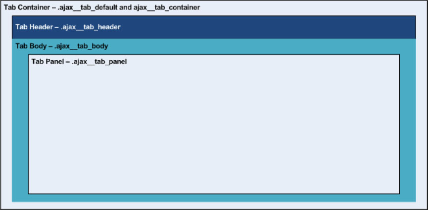
Moving on through the Tab control’s HTML, after the container definition, we have both the header and content container.
<div style="visibility: visible;" id="tabs" class="AJAX__tab_xp AJAX__tab_container
AJAX__tab_default">
<div id="tabs_header" class="AJAX__tab_header">
<!-- Tab code excluded -->
</div>
<div id="tabs_body" class="AJAX__tab_body">
<!-- Tab panel code excluded -->
</div>
</div>
As you can see, this is just two DIV declarations, with a single class assigned to each. The header defines the section where the tabs are, and the body is where tab content panels reside. Typically, on these containers you want to add some form of border to them in order to define the shape of the tab container. For example, the .AJAX__tab_xp .AJAX__tab_header style provides a small background image that acts as the bottom line of the tabs (and the top line of the tabs_body), while the .AJAX__tab_body provides a left, right, and bottom border. These two techniques combined offer a full box for the body portion of the tabs. You may be wondering why a background image is being used instead of just a bottom border on the header or a border around the whole body. The reason for this has to do with adding the tabs. If there was a bottom border on the entire header, there would always be a line, and you wouldn’t be able to create the effect of the active tab, where the tab and the panel are a seamless unit. The border would always remain there, but with the background image, you can overlay an image over the top of this, creating the seamless transition. If you bring up Mozilla Firefox and use Firebug, you can experiment with the CSS styles in real time to see how this all fits together.
Before getting into the complex design of the actual tabs, it’s a good time to examine each tab panel because these are easier to understand.
<div style="visibility: visible;" id="tabs" class="AJAX__tab_xp AJAX__tab_container
AJAX__tab_default">
<!-- Header code excluded -->
<div id="tabs_body" class="AJAX__tab_body">
<div id="tabs_TabPanel1" class="AJAX__tab_panel" style="visibility:
visible;"></div>
<div style="display: none; visibility: hidden;" id="tabs_TabPanel2"
class="AJAX__tab_panel"></div>
<!-- Extra tab code excluded -->
</div>
</div>
As you can see, each of the panels has the style AJAX__tab_panel assigned to it. You can also see that specified inline is the visibility style; this is how the Tab control specifies which tab panel is actually shown. The visibility is toggled in client-side code (JavaScript) based on the tab that you click on.
Now that you have tackled the bulk of the Tab control, you can refer to Figure 1, which shows each style applied to each container.
Figure 1: The Tab Control container components and their styles.
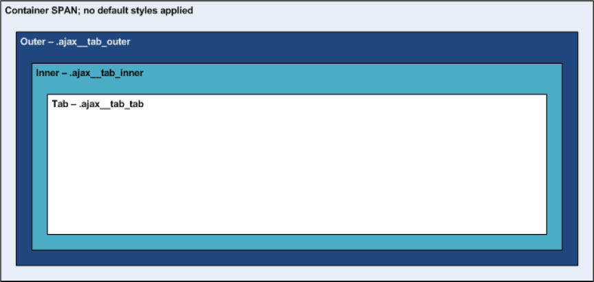
Finally, it’s time to discuss the tabs, analyze their structure, and see how we can theme these. The structure of the tabs is a bit complex and often difficult for developers to understand; with a bit of luck, by the end of this, you will have a very good understanding of what is going on. Start by looking at the code for the tabs. Again, this is from the source of the rendered HTML.
<div style="visibility: visible;" id="tabs" class="AJAX__tab_xp AJAX__tab_container AJAX__tab_default">
<div id="tabs_header" class="AJAX__tab_header">
<span id="tabs_TabPanel1_tab" class="AJAX__tab_active">
<span class="AJAX__tab_outer">
<span class="AJAX__tab_inner">
<span id="__tab_tabs_TabPanel1" class="AJAX__tab_tab">Tab1</span>
</span>
</span>
</span>
<span id="tabs_TabPanel2_tab">
<span class="AJAX__tab_outer">
<span class="AJAX__tab_inner">
<span id="__tab_tabs_TabPanel2" class="AJAX__tab_tab">Tab2</span>
</span>
</span>
</span>
<!-- Extra tab code excluded -->
</div>
<!-- Extra tab code excluded -->
</div>
Four span tags are nested together in order to create a single tab. Figure 2 illustrates this structure and the default styles applied to each.
Figure 2: The Tab Control’s tab components and their styles.
Now with the structure down, all you need to do is figure out how to style these to emulate just about any desired tab style. The easiest way to learn these is to look at the WindowsXP styles that come with the Toolkit. If you want to look specifically at what is going on, you can look at the CSS, which is located in the AJAXControlToolkitTabs folder of where you deployed your Toolkit with a file name of Tabs.css.
Starting with the root SPAN element, this acts as a container and is usually used for theming like the tab container that you looked at earlier. Two class definitions are added to the SPAN while you are interacting with the control; these are AJAX__tab_active and AJAX__tab_hover. The active style is for the currently selected cell, and hover obviously represents when a user hovers over a tab. These two classes are typically absent of any styles but categorize the subclasses.
The “outer”SPAN is the next element. This element’s class is AJAX__tab_outer. Typically, this SPAN is used to define the right side of the tab, and this holds true for the XP styles. In the XP styles, and in custom ones that we create, the outer SPAN contains styles for background image, height, and padding-right. The padding definition here typically throws developers off a bit. Padding in this instance pads the outer SPAN from its background image, not the padding between the tabs.
If you want to modify the space between each tab, you can use the margin-right style in your AJAX__tab_outer definition.
The padding value should be the width of your right-side image. The images you use in your tabs will be defined as fixed background images (in CSS, fixed to right, no-repeat) within the SPAN, leaving the rest of the SPAN as transparent.
There is a potential “gotcha" here. As stated, the padding-right value should be equal to your right background image; however, the default .AJAX__tab_default .AJAX__tab_tab declares a margin-right of 4px. Usually the custom tab styles end up rendered before the defaults, and often this will throw off the padding. If you notice that your right side doesn’t match up correctly, change the padding-right to your image’s width minus 4 to accommodate the extra 4px margin.
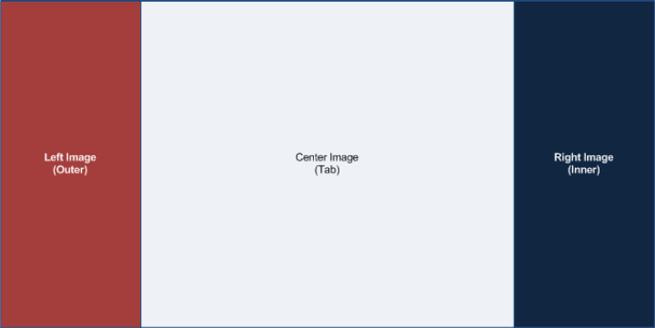
Figure 3 illustrates how this technique will work.
Figure 3: Stylized tab structure.
The “inner”SPAN, assigned the class AJAX__tab_inner, typically defines the left side of the tab. This mimics the outer SPAN in terms of attributes, but it doesn’t require a height, and the padding is set for the left (padding-left), not the right side.
Finally, to finish this all off, there’s the “tab”SPAN, class name AJAX__tab_tab, which defines the inner content of the tab. This is where the header text appears, and with the styles here, you can manipulate the width of the tab easily. Unlike the other SPANs, you repeat the background image across the X-axis. You usually need to provide some padding to center the text in the middle of the cell. The left and right padding will modify the width of the tab, and the top and bottom will be used to center the text vertically. Figure 4 shows a layered version of all the pieces put together.
Figure 4: Tab — Putting it all together.

Now that you have a solid understanding of what goes on in the HTML code, you should be able to become a tab-theming expert. This section wraps up by creating a sample theme that you can use as a base for custom themes that you create. When creating my CSS files, I usually break the styles into a background section and another section for the rest of the styles. By doing this, it makes it easy to change out the backgrounds if I create a new theme. You can find the following CSS styles in the main.css file in the Wrox folder under the App_Themes directory in the sample project.
/* Wrox Tabs - Backgrounds */
.wrox_tab .AJAX__tab_header { background:url() repeat-x bottom; }
.wrox_tab .AJAX__tab_outer { background:url() no-repeat right; }
.wrox_tab .AJAX__tab_inner { background:url() no-repeat; }
.wrox_tab .AJAX__tab_tab { background:url() repeat-x; }
.wrox_tab .AJAX__tab_hover .AJAX__tab_outer { background:url() no-repeat right; }
.wrox_tab .AJAX__tab_hover .AJAX__tab_inner { background:url() no-repeat; }
.wrox_tab .AJAX__tab_hover .AJAX__tab_tab { background:url() repeat-x; }
.wrox_tab .AJAX__tab_active .AJAX__tab_outer { background:url() no-repeat right; }
.wrox_tab .AJAX__tab_active .AJAX__tab_inner { background:url() no-repeat; }
.wrox_tab .AJAX__tab_active .AJAX__tab_tab { background:url() repeat-x; }
.wrox_tab .AJAX__tab_body { background-color:#CC0033; }
In this code sample, you can see the CSS for the backgrounds. Note that I have excluded the path to the background image to save space. Take note of the position of each background image. The outer container has its image positioned to the right, and the inner should be positioned to the left (the default, so we don’t need to provide the position explicitly). The header and the tab styles repeat the image across the X-axis.
/* Wrox Tabs - Other Styles */
.wrox_tab .AJAX__tab_header {
font-family:verdana,tahoma,helvetica; /* Arbitrary Value */
font-size: 11px; /* Arbitrary Value */
}
.wrox_tab .AJAX__tab_outer {
height:35px; /* The height of the tab, typically your image size */
padding-right:6px; /* Right image; this is 10 - 4 in our case */
margin-right:1px; /* Spacing between the tabs */
}
.wrox_tab .AJAX__tab_inner {
padding-left:10px; /* Left image; this is 10px in our case */
}
.wrox_tab .AJAX__tab_tab {
margin:0; /* Attempt to clear the default 4px margin */
padding:14px 40px; /* Arbitrary Value (14px = top/bottom; 40px = left/right */
color:#FDF001; /* Arbitrary Value */
font-weight:bold; /* Arbitrary Value */
}
.wrox_tab .AJAX__tab_body {
border:1px solid #272122; /* This color should match your header background */
border-top:0; /* We don't want a top border for the box */
padding:8px; /* Arbitrary Value */
font-family:verdana,tahoma,helvetica; /* Arbitrary Value */
font-size:10pt; /* Arbitrary Value */
height:400px; /* Arbitrary Value */
}
The above styles put the finishing touches on the tabs. I have commented each line, but .wrox_tab .AJAX__tab_outer padding-right:6px; needs a bit more explanation because I’m sure this will cause you grief at some point. I told you above about this “gotcha” and want to make sure you understand what is happening here. There is a problem with the cascading part of CSS. Depending on when they render to the browser, style sheets further down the page take precedence. In the sample’s case, I have my styles for the tabs in my ASP.NET Themes folder, which are automatically registered by ASP.NET when I assign a theme to the page. These styles render on the page first, and then the default Tab styles are rendered. Because of this, the 4px margin-right declared in the .AJAX__tab_default .AJAX__tab_tab takes precedence over the margin:0; specified in the .wrox_tab .AJAX__tab_tab style. To compensate for this offset, we can shorten up the padding-right for the outer container. To get this number, I took the width of my right side image (10px) and subtracted 4px.
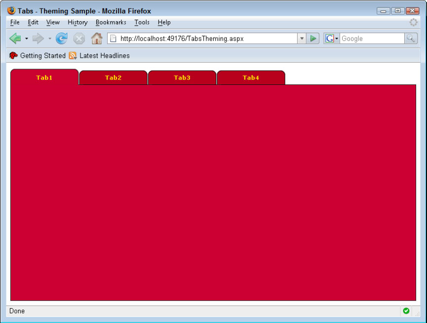
Now that styles are completed, all we need to do is assign the CssClass to the TabContainer. The complete code can be found in the sample, TabsTheming.aspx.
<AJAX:TabContainer ID="tabs" runat="server" CssClass="wrox_tab">
<!-- Tab Code Excluded -->
</AJAX:TabContainer>
That’s it! Figure 5 shows the finished product.
Figure 5: Custom themed tabs.
Data Controls
As developers, we are always looking for intuitive ways to assist users with data entry. The Toolkit aids us when it comes to designing some common solutions to data problems. For example, I’m sure all of you have encountered giving users multiple lists of values, where one item depends on another. I have run into this requirement so many times that I’ve lost count. Another requirement, made popular by Google Suggests, is the concept of providing suggestions when a user is entering data. Both of these problems have been solved by controls in the Toolkit that are solid design patterns for implementing solutions.
AutoComplete
Think back to an application that you have worked on in which users would pull up a customer or other data. How would you accomplish this? Perhaps you presented the user with a ListBox or DropDownList, or maybe a general Search box. All of these are potential solutions. But wouldn’t it be nice to present your users with a dynamic list, filtered as they type? Well, that’s exactly what the AutoComplete control does. The versatility of the AutoComplete control allows you to fill many different requirements.
The AutoComplete control is an Extender for the ASP.NET TextBox. You obviously need some way for a user to enter freeform text, thus a TextBox is the obvious choice for this. The AutoComplete control automatically wires up a popup panel that will appear when the user enters some text.
Here’s an example of how to use the AutoComplete control. This example uses PageMethods again to keep all the logic incorporated in a single class (Page). The data source for this example will be an XML file, but obviously, you can use a database for this. This sample will retrieve customer names from the XML file. The customer list here is from the Microsoft Adventure Works database; thus all the company names relate to bicycles. The complete sample is named AutoComplete.aspx.
<asp:ScriptManager ID="ScriptManager1" runat="server" />
<div>Customer Name: <asp:TextBox ID="TextBox1" runat="server"
Width="500"></asp:TextBox></div>
<AJAX:AutoCompleteExtender
ID="AutoCompleteExtender1" runat="server"
ServiceMethod="GetCompletionList"
TargetControlID="TextBox1"
EnableCaching="true" >
</AJAX:AutoCompleteExtender>
Like all the AJAX controls, you need to have a ScriptManager on the page. Then, because the AutoComplete is a TextBox Extender, you have your TextBox control. Finally, there is the AutoCompleteExtender control definition. The properties set here are just about the bare minimum needed to get the AutoComplete up and running. The ServiceMethod and the ServicePath attribute form the heart of the data functionality found in the AutoCompleteExtender. In this case, you don’t need to provide a ServicePath since we are using PageMethods, but if you were using a web service, you would need to add the ServicePath.
Note that we don’t need to set the EnablePageMethods attribute on the ScriptManager here. The Toolkit handles the logic of calling the method in the Page automatically when we exclude the ServicePath.
The TargetControlID refers the extend control, in this case a TextBox. The final attribute, EnableCaching, dramatically improves overall performance by caching queries on the client. The EnableCaching property defaults to True if we don’t set it; thus it actually could be eliminated from the code above. Before getting into the details of the caching mechanism, look at some of the other commonly used attributes.
- MinimumPrefixLength — Sets the number of characters that a user must enter before looking up the values; by default, the value is set to three characters.
- CompletionInterval — The number of milliseconds before the timer goes to get suggestions from the web service; the default is 1000.
- CompletionSetCount — The number of suggestions to return; the default is 10.
- CompletionListCssClass — Allows you to style the fly-out completion container.
- CompletionListItemCssClass — Allows you to style each item in the completion list.
- CompletionListHighlightedItemCssClass — Allows you to style the highlighted item in the list.
I find the easiest way to master the AJAX Control Toolkit is to dig into the code. If you ever run into an issue, remember that you can always step into the code and debug it or modify it if need be. This is a great feature of the Toolkit.
Despite the fact that you can modify the AJAX Control Toolkit to your heart’s content, you should really exhaust other techniques before compiling your own version of the Toolkit. The reason for this is that when a new version is released, you will have a lot of reworking to perform before you can update your code. Knowing when to do what is very important, and comes with experience and knowledge. For example, let’s say you wanted to execute a client-side function when the completion list disappears. You may be tempted to modify the Toolkit’s source to accommodate this change; however, you can attach a client-side handler to the “hidden” event exposed by the control in your own code.
Assuming that you downloaded the standard Toolkit package, you will find all the source code for the Toolkit in the /AJAXControlToolkit folder from the root of where you extracted the package. Once you are in this directory, you will notice that there is a folder represented for each control. In this case, we are interested in the AutoComplete folder. You will find four files for the AutoComplete control; these are the typical base files for any control in the Toolkit (although there may be more for more complex controls). The files you will find are as follows:
- AutoComplete.ico (*.ico) — The icon that represents the control in the Visual Studio Toolbox.
- AutoCompleteBehavior.js (*Behavior.js) — The client-side behaviors; the naming convention “Behavior” denotes client-side enhancements akin to the term “Extender” used to convey a meaning of extending a control.
- AutoCompleteDesigner.js (*Designer.cs) — The class used to represent the control at design time in Visual Studio.
- AutoCompleteExtender.cs (*Extender.cs) — Represents the server-side portion of the behaviors, for example, public Properties.
Let’s look in the AutoCompleteBehavior.js file to investigate how the caching mechanism works. When you open up the file, don’t be completely overwhelmed, especially if you aren’t an expert in JavaScript. There are some good resources in the AJAX documents that discuss creating AJAX-enhanced controls, which explain most of what is going on here. You will also find documentation on creating a new extender on the Toolkit’s sample site. As you become more exposed to the code, you will begin to understand JavaScript more and more.
OK, since we know we want to look for the caching technique, let’s just start by doing a Find in Visual Studio for the term cache. The first line we come to is the declaration of the private this._cache variable in the AutoCompleteBehavior’s constructor.
In JavaScript, there is no concept of protection levels for code (e.g., public, private, etc.) like the .NET languages. Because of this, the notation of underscores prefixing a member indicates that this should be private.
JavaScript does not support true class-based inheritance as we are used to in the .NET Languages, but it does allow simulation of a class. JavaScript uses prototype-based inheritance, which is a process in which everything is based on a base object. For more information on the differences, I recommend having a look at Douglas Crockford’s article on the topic (www.crockford.com/javascript/inheritance.html). You’ll notice that the object’s constructor is a function, and members are added inside the function’s body using the this keyword.
You can assume from this that the client-side cache is stored in this variable. Moving to the next few “Find Next” actions, you encounter a comment /*cacheResults */ on calls to the this._update method. Since it seems like this method is where the cache is updated, let’s jump to this function. The _update function accepts the prefixText (the text the user typed), the completionItems object (which is the result retrieved from service call), and the cacheResults flag. As you venture into this function, you see right at the top a test of the cacheResults parameter and another function, this.get_enabledCaching().
This is another instance in which JavaScript is missing a feature that we are familiar with in .NET classes. In JavaScript, there is no concept of a Property (e.g., <Property Name> { get; set; }); thus the accepted way to emulate this is to create two functions, get_<propertyName> and set_<propertyName>.
The get_enabledCaching function returns the value of the private variable _enableCaching. This variable is actually set server side as done in the earlier example (and can be set client side as well via set_enableCaching) and passed down to the client control. Assuming that both values evaluate to True, the caching logic is performed.
if (cacheResults && this.get_enableCaching()) {
if (!this._cache) {
this._cache = {};
}
this._cache[prefixText] = completionItems;
}
From the code, you can see that the _cache object is instantiated if it is null, and then using the prefixText provided by the user as a key, it stores the values in sort of a HashTable-like object. Now you’ve seen how the values are stored, but where are they retrieved? Well, in the _onTimerTick function, you’ll find where it’s used.
if ((text != "") && this._cache && this._cache[text]) {
this._update(text, this._cache[text], /* cacheResults */ false);
return;
}
As you can see, if the condition results to True, this._update is called (note that cacheResults is set to False in this instance), and the list is rendered and the function returns.
While complete dissection of a control is well beyond the scope of this Wrox Blox, I hope that this section gave insight into exploring the controls a bit more on your own, and perhaps whetted your appetite to investigate creating your own controls.
CascadingDropDown
The CascadingDropDown control is a frequent feature that users request. With hierarchical data, it makes sense to filter a user’s choices to only ones that apply for the parent. Think of Intellisense in Visual Studio. Wouldn’t it be annoying if when you typed a period after an object, the list that came up contained members for every object in the .NET framework? The same concept occurs in a web application; developers have always implemented some form of filtering of multiple selections. The CascadingDropDown control makes short work of this somewhat difficult task.
As I stated above, I spend quite a bit of time on the ASP.NET AJAX forums answering questions. One thing that constantly comes up is with developers using the UpdatePanel when there are much more efficient patterns available. The CascadingDropDown falls into this category. I can’t even begin to tell you how many developers have started posts with something along the lines of, “I have X number of DropDownLists inside an UpdatePanel and I’m trying to filter the second DropDownList. . . .” Even without the whole “reinventing the wheel” argument, there is a definite advantage to using one technique over the other. Let’s investigate this a little further, and I think you will understand.
For both examples, I have simplified the code down so that you aren’t focusing on complexities of using other technologies, and you can focus on the matter at hand: interaction efficiency. The sample here shows three DropDownLists breaking down the NFL teams into Conference (AFC or NFC), Division (e.g., NFC East, AFC East), and finally Team (e.g., New York Giants). This sample could be something you might see on a sports web site. Normally, if you were going to code something like this, you would use an XML document or a database to house the data. Both of these concepts are shown in the Toolkit sample site, but again, in this case, you are after the efficiency of the interactions between the server and the client, not the architecture of the code. That being said, you will just manually add the needed values.
You know the basics of the task, and you have been given the requirement that this must use AJAX. Start this experiment with the UpdatePanel as the “baseline,” not to mention how many developers would begin to code this. In the section on the UpdatePanel from above, you discovered that you could add “AJAX” to a site without really modifying the way you design standard server Pages. The UpdatePanel intercepts standard postbacks and does the heavy lifting of modifying the rendering of the changes. The server-side code is very simple and is written as if you are just doing standard postbacks. You can find the following code in the file CascadingDropDownUpdatePanel.aspx (and the related .cs file) in the sample application.
<asp:ScriptManager ID="ScriptManager1" runat="server" />
<asp:UpdatePanel ID="UpdatePanel1" runat="server">
<ContentTemplate>
<asp:DropDownList ID="DropDownList1" runat="server"
AutoPostBack="True"
OnSelectedIndexChanged="DropDownList1_SelectedIndexChanged"
Width="250px">
</asp:DropDownList><br />
<asp:DropDownList ID="DropDownList2" runat="server"
AutoPostBack="True" Enabled="false"
OnSelectedIndexChanged="DropDownList2_SelectedIndexChanged"
Width="250px">
</asp:DropDownList><br />
<asp:DropDownList ID="DropDownList3" runat="server"
Enabled="false"
Width="250px">
</asp:DropDownList>
</ContentTemplate>
</asp:UpdatePanel>
Here you see that everything inside the <ContentTemplate> looks very familiar. You have three dropdown lists, two of which have AutoPostback enabled and are disabled out of the gate since these are dependent on their parent. In the code-behind, you add the list items that you need in the respective DropDownList.
protected void Page_Load(object sender, EventArgs e)
{
if (!Page.IsPostBack)
{
DropDownList1.Items.Add("Select a Conference");
DropDownList1.Items.Add("AFC");
DropDownList1.Items.Add("NFC");
}
}
protected void DropDownList1_SelectedIndexChanged(object sender, EventArgs e)
{
DropDownList2.Items.Clear();
DropDownList2.Items.Add("Select a Division");
if (DropDownList1.SelectedValue == "AFC")
{
DropDownList2.Items.Add("AFC East");
DropDownList2.Items.Add("AFC West");
DropDownList2.Items.Add("AFC North");
DropDownList2.Items.Add("AFC South");
}
// Rest of code excluded for brevity
}
protected void DropDownList2_SelectedIndexChanged(object sender, EventArgs e)
{
DropDownList3.Items.Clear();
DropDownList3.Items.Add("Select a Team");
if (DropDownList2.SelectedValue == "AFC East")
{
DropDownList3.Items.Add("New England Patriots");
DropDownList3.Items.Add("New York Jets");
DropDownList3.Items.Add("Miami Dolphins");
DropDownList3.Items.Add("Buffalo Bills");
}
// Rest of code excluded for brevity
}
Now that the code is written, it’s time to focus on interaction between the server and client. Utilizing the Firebug add-in for Firefox, you can analyze the partial postback transactions. The Console area of Firebug is where you will find the partial postback Header, Post, and Response.
You can clearly see in Figure 6 that the UpdatePanel is a bit "chatty.” In this case, the entire page is being re-rendered on each partial postback. As stated above, the UpdatePanel certainly sets the bar for rapid AJAX development, but obviously with ease comes overhead. Now while this example may not make or break an application in terms of performance, using the UpdatePanel (or multiple UpdatePanels) on a more complex page may cause you headaches. Instead of re-rendering the HTML server side, passing it to the client, and having it replace blocks of code, a better approach would be to just pass the data and handle the UI changes client side. That is what the CascadingDropDown does, as illustrated in Figure 7.
Figure 6: Server response from selecting the NFL Division.

Figure 7: CascadingDropDown response.
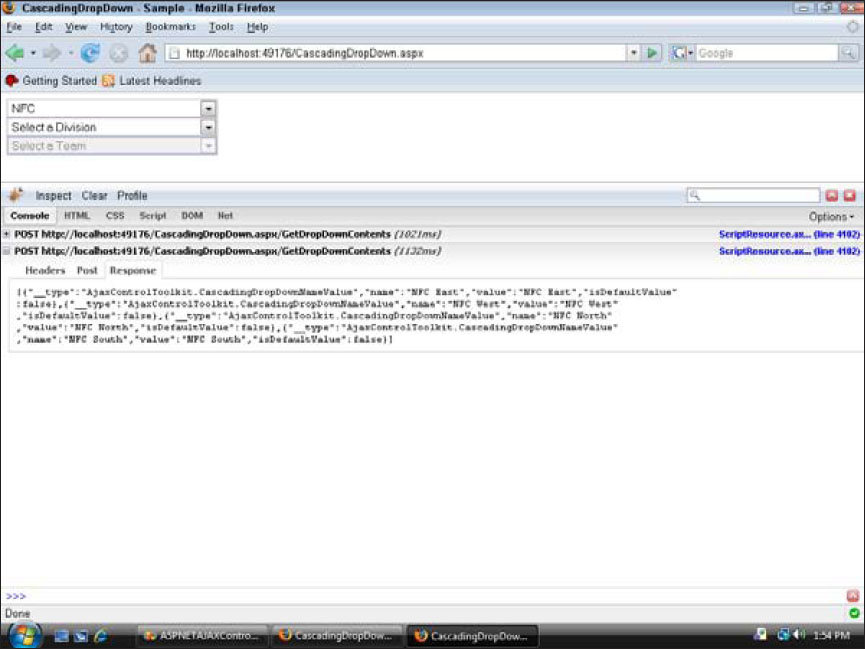
By using the CascadingDropDown, you decreased the Content-Length of the Response down to 63 bytes compared to 464 bytes for the UpdatePanel. Once again, it may not be such a big deal in this example, but a valid point to be aware of when designing your pages. Let’s look at the code needed to accomplish this using the CascadingDropDown. The following snippet can be found in the file CascadingDropDownSample.aspx.
<asp:ScriptManager ID="ScriptManager1" runat="server" />
<asp:DropDownList ID="DropDownList1" runat="server" Width="250px">
</asp:DropDownList><br />
<asp:DropDownList ID="DropDownList2" runat="server" Width="250px">
</asp:DropDownList><br />
<asp:DropDownList ID="DropDownList3" runat="server" Width="250px">
</asp:DropDownList>
<AJAX:CascadingDropDown ID="CascadingDropDown1" runat="server"
TargetControlID="DropDownList1"
ServiceMethod="GetDropDownContents"
Category="Conference"
PromptText="Select a Conference"
LoadingText="[Loading Conferences...]" />
<AJAX:CascadingDropDown ID="CascadingDropDown2" runat="server"
TargetControlID="DropDownList2"
ParentControlID="DropDownList1"
ServiceMethod="GetDropDownContents"
Category="Division"
PromptText="Select a Division"
LoadingText="[Loading Divisions...]" />
<AJAX:CascadingDropDown ID="CascadingDropDown3" runat="server"
TargetControlID="DropDownList3"
ParentControlID="DropDownList2"
ServiceMethod="GetDropDownContents"
Category="Team"
PromptText="Select a Team"
LoadingText="[Loading Teams...]" />
The code is similar to the UpdatePanel example, especially with the DropDownLists, although you don’t need to enable AutoPostback, nor do you need to perform any enabling logic for the child controls. After the DropDownList declarations, you have the code for the CascadingDropDown extender controls. You have one CascadingDropDown for each of the DropDownLists that handles all the logic for filling the DropDownLists dynamically, controlling the hierarchical enabling/disabling of the controls, providing UI feedback when the DropDownList is being asynchronously loaded, and adding a prompt when the fill is completed. That’s quite a few features packed into the control. The properties that are being set are as follows:
- TargetControlID — The DropDownList that you are extending.
- ParentControlID — The parent DropDownList; note that the first CascadingDropDown in the example does not have the parent set.
- ServiceMethod — The server-side method to call in order to fill the DropDownList; in this example, you are using a PageMethod so that you do not need to specify the ServicePath attribute.
- Category — The category of the list to retrieve; this attribute allows us to use a single server method to handle requests for all of the DropDownLists.
- PromptText — Adds a default item with this text to the first index of the DropDownList.
- LoadingText — Text to display in the DropDownList, while the request from the server is called asynchronously.
Server side, I have kept the code simple as stated before, just hard coding values. All of the logic for returning values lies in a single server method, GetDropDownContents.
[WebMethod]
public static CascadingDropDownNameValue[] GetDropDownContents(
string knownCategoryValues,
string category)
The signature for this method takes two string parameters, knownCategoryValues and category. The knownCategoryValues parameter holds an array of currently selected keys and values, and the category parameter passes the category that you assigned to the CascadingDropDown. The return type is an array of CascadingDropDownNameValue structure, which is a specialized collection of name/value pairs.
List<CascadingDropDownNameValue> results = new List<CascadingDropDownNameValue>();
StringDictionary kv =
CascadingDropDown.ParseKnownCategoryValuesString(knownCategoryValues);
Moving on into the body of the method, you declare a generic List of type CascadingDropDownNameValue to use to store the results that you will pass back to the client. The purpose of the List is to facilitate in creation of the return array. The second line uses a static method provided by the CascadingDropDown, which parses a JSON object into a StringDictonary object. If you aren’t familiar with the StringDictionary, it is a strongly typed string-based hash table instead of the typical object-based HashTable.
If you aren’t familiar with JSON, I recommend that you check out www.json.org/.
switch (category)
{
case "Conference":
results.Add(new CascadingDropDownNameValue("AFC", "AFC"));
results.Add(new CascadingDropDownNameValue("NFC", "NFC"));
break;
case "Division":
if (kv.ContainsValue("AFC"))
{
results.Add(new CascadingDropDownNameValue("AFC East", "AFC East"));
results.Add(new CascadingDropDownNameValue("AFC West", "AFC West"));
results.Add(new CascadingDropDownNameValue("AFC North", "AFC North"));
results.Add(new CascadingDropDownNameValue("AFC South", "AFC South"));
}
// Code excluded for brevity
break;
case "Team":
if (kv.ContainsValue("AFC East"))
{
results.Add(new CascadingDropDownNameValue("New England Patriots", "1"));
results.Add(new CascadingDropDownNameValue("New York Jets", "2"));
results.Add(new CascadingDropDownNameValue("Miami Dolphins", "3"));
results.Add(new CascadingDropDownNameValue("Buffalo Bills", "4"));
}
// Code excluded for brevity
break;
}
return results.ToArray();
The rest of the code that you have is encapsulated as a switch statement. In this simple example, you simply add the appropriate name/value pairs into the results.
With the features as well as the performance benefits of the CascadingDropDown, it lives up to being a best practice when creating hierarchical relationships between DropDownLists. You also exhibited the ease of use of the UpdatePanel, but again, with ease comes overhead. My goal in showing you this is to challenge you to evaluate design practices in your applications.
One of my favorite blog postings on the topic of UpdatePanels is by Dave Ward entitled, “Why ASP.NET AJAX UpdatePanels are dangerous.” His article shows a similar example to the one shown here, but involves updating a simple label. I have referred many developers to this article, and you can also read it at Dave’s blog, http://encosia.com. The direct link to the article is http://encosia.com/2007/07/11/why-aspnet-AJAX-updatepanels-are-dangerous/.
Presentation Enhancements
The final section involves Toolkit controls that enhance presentation in your applications. Developers are always looking for ways to make applications more usable — after all, usability is a big factor in making or breaking a successful application. The Toolkit contains some controls that can take your applications to the next level.
TextBoxWatermark
When creating a data entry form in an application, it would be nice to give users extra instructions beyond just a label (e.g., First Name, Date of Birth, etc.). This problem is often solved by adding text instructions to a form, possibly interrupting the flow of the document, or perhaps with a link to help that may be in another window. Another possibility, which does not interrupt the document flow and is always visible, is a watermark. The concept of the TextBoxWatermark is not a new one. It involves some JavaScript, a bit of CSS, and such. Its function is to overlay an empty TextBox seamlessly and display more information to a user. Once the user adds his or her entry, the watermark disappears. The TextBoxWatermark allows developers to simply extend any TextBox with the watermark functionality in their application with ease. This code is found in TextBoxWatermarkSample.aspx.
<asp:ScriptManager ID="ScriptManager1" runat="server" />
<div>Display Name: <asp:TextBox ID="TextBox1" runat="server"
Width="200"></asp:TextBox></div>
<AJAX:TextBoxWatermarkExtender ID="TextBoxWatermarkExtender1" runat="server"
TargetControlID="TextBox1" WatermarkText="Typically Last Name, First Name." />
Code doesn’t get much simpler than that. The only new attribute shown here is the WatermarkText, which is obviously the message that you want to display in the watermark. The TargetControlID, as with all the extender controls, relates to the control that you are extending. Another useful attribute is the WatermarkCssClass, which allows us to add some style to the watermark; otherwise, the text would just appear as if it were entered in the textbox. Figure 8 shows both examples.
Figure 8: TextBoxWatermark, with and without a WatermarkCssClass applied.
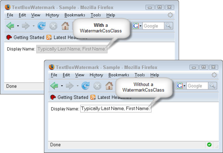
To keep the TextBoxWatermark style the same across the site, you are able to utilize an app theme skin. Themes and Skins are a feature that was added in ASP.NET 2.0; if you aren’t familiar with them, I recommend looking them up in MSDN (http://msdn2.microsoft.com/en-us/library/ykzx33wh.aspx). Themes and Skins work across all of the AJAX Control Toolkit controls, and work just as they do with standard ASP.NET controls. For example, let’s set the WatermarkCssClass for all the TextBoxWatermark controls in the site. Start by creating a skin file named as the control and drop it in your theme folder (under the App_Themes folder on your site). In this case, the file would be named TextBoxWatermarkExtender.skin. Finally, add the code inside the skin file.
<%@ Register Assembly="AJAXControlToolkit" Namespace="AJAXControlToolkit"
TagPrefix="AJAX" %>
<AJAX:TextBoxWatermarkExtender runat="server" WatermarkCssClass="textWaterMark" />
Skinning a Toolkit control is a bit different from other skin files since the tag isn’t registered in the app; thus you can add this to the skin file itself. Also, note that you could use a SkinId and assign the specific SkinId to certain TextBoxWatermarkExtenders, but in this case, you want this style to be the default.
ModalPopup
No doubt, in every web application you’ve created, there is some time when the often dreaded popup window made sense. Even when they are justified, the popup window can be problematic. I have encountered situations in which users “lose” the popup behind the main browser window. One potential way to combat this is to use a modal popup, but this has cross-browser compatibility issues. Thankfully, there is another hybrid-type popup available. Enter the ModalPopup control found in the AJAX Control Toolkit. The difference between the popup window and ModalPopup is that the ModalPopup emulates a window inside the browser. The ModalPopup consists of a DIV that is rendered to block out the controls on the page and a target control of your choosing, which typically will be a Panel control since it acts as a container. Figure 9 illustrates the structure of the ModalPopup.
Figure 9: The structure of the ModalPopup, layered to show detail.

The ModalPopup is very versatile and has many options associated with it. The ModalPopup gives us the opportunity to create a custom window exactly to the specs. Using various different controls, you can emulate just about anything you can possibly design. First, let’s start with code to emulate the window. This structure consists of an ASP.NET control and would be designed according to your spec. The following code snippets can be found in the file ModalPopuSample.aspx:
<asp:ScriptManager ID="ScriptManager1" runat="server" />
<asp:Panel ID="ModalWindow" runat="server" CssClass="window" style="display:none;">
<asp:Panel ID="ModalHeader" runat="server" CssClass="windowTitleBar">
Modal Popup Window
</asp:Panel>
<div class="windowContent">
<asp:Label ID="lblContent" runat="server"></asp:Label>
</div>
<div class="windowButtons">
<asp:Button ID="btnOK" runat="server" Text="OK" />
<asp:Button ID="btnCancel" runat="server" Text="Cancel" />
</div>
</asp:Panel>
I’ve created a simple window structure, complete with a header, an area for some content, and a panel where the OK and Cancel buttons will go. Again, this structure can be whatever you wish. The only real required elements are the container (in this case, a Panel) and some way to close the popup, which could just be either an OK or a Cancel button. One other thing that I have done is add style="display:none;" to the outer Panel. If I did not do this, when you loaded the page, you would see the window flicker on the page. This is because the extender control manipulates the Panel after the page is loaded, so that it would go through and hide it then, but you would see it visible for a second and then disappear. By adding this style, you are telling the browser not to show it from the beginning, so no flicker.
<asp:Button ID="btnShowPopup" Text="Show Popup" runat="server" />
<AJAX:ModalPopupExtender ID="ModalPopupExtender1" runat="server"
BackgroundCssClass="modalBackground"
CacheDynamicResults="true"
CancelControlID="btnCancel"
DropShadow="true"
DynamicControlID="lblContent"
DynamicServiceMethod="GetDynamicContent"
OkControlID="btnOK"
PopupControlID="ModalWindow"
PopupDragHandleControlID="ModalHeader"
TargetControlID="btnShowPopup">
</AJAX:ModalPopupExtender>
Finally, you have the ModalPopup control. In the first line of the above code, I have included a button on the page. This isn’t directly related to the ModalPopup, but you do need some sort of trigger to showing the popup and in this example, a button is as good as any control.
As you can see, the ModalPopup has quite a few properties associated with it, and there are still more than what I’ve set. Since the ones listed in the code sample are the most frequently used, I’ll go through them in detail here.
- BackgroundCssClass — The CSS class to apply to the modal background DIV. This typically throws developers off since they see demos of the ModalPopup where the background grays out the page, and they think this happens automatically. It doesn’t, but by providing the right styles, you can achieve this design.
- CacheDynamicResults — The ModalPopup allows us to obtain dynamic results from the server (using web services or a PageMethod; in this example, a PageMethod). This property tells the control whether to cache the results, similar to that of the AutoComplete control covered above.
- CancelControlID — The ID of the control that will cancel the ModalPopup.
- DropShadow — If set to True, the ModalPopup renders a drop shadow behind your container.
- DynamicControlID — This is the ID of the control that will be dynamically filled; in this case, you are just setting a Label.
- DynamicServiceMethod — This should look familiar to you; it is the server-side method to call to retrieve the dynamic results. You are using a PageMethod again, but you could set the ServicePath property and use a web service if you wanted.
- OkControlID — The ID of the control that will confirm the ModalPopup.
- PopupControlID — This is required; this is the ID of the control to pop up.
- PopupDragHandleControlID — The ModalPopup allows us to drag the window around the Page. To do this, all you need to provide it with is a “drag handle” control ID to enable this functionality. In this case, I have assigned the header Panel as the drag control.
- TargetControlID — This is required, the trigger that shows the ModalPopup. This can be any control on your Page.
The control itself is straightforward; let us add some styles to it now to make it look like a “real” window.
.modalBackground
{
background-color: #000000;
filter: alpha(opacity=40);
opacity: .4;
}
.window
{
background-color: #DDDDDD;
border: 2px solid #000000;
width: 400px;
}
.windowTitleBar
{
background-color: #CC0033;
border-bottom: 2px solid #000000;
height: 25px;
padding: 0pt 5px;
line-height: 25px;
font-weight: bold;
color: #FDF001;
}
.windowContent
{
background-color: #F6F6F6;
border: 1px solid #999999;
margin: 5px;
padding: 5px;
text-align: center;
height: 100px;
}
.windowButtons
{
padding: 0pt 5px 5px 0pt;
text-align: right;
}
.windowButtons input
{
width: 80px;
font-size: .95em;
}
The important one here is the modalBackground. This is what gives us the transparent blanket effect over the Page, as shown in Figure 10. Note that the popup is shown to the user even though IE’s popup protection is enabled. This is because you aren’t spawning a new window, but just displaying a stylized DIV.
Figure 10: The final ModalPopup in Mozilla Firefox and Internet Explorer 7

One other idea to note on the ModalPopup: Since it is such a versatile control, if using the Dynamic Content feature is not enough, you could always add an UpdatePanel inside the content area.
AJAX is all the buzz right now. As you saw, there are many different approaches to AJAX-enabling your applications. You must consider a balance between rapid development and design efficiency in your approach, especially with complex page designs. The AJAX Control Toolkit controls fulfill both of these requirements. I would recommend that you explore the Toolkit fully so that you can make wise decisions when designing your next page, versus reverting to just using an UpdatePanel for every AJAX design pattern.
This Wrox Blox explored some of the controls in the AJAX Control Toolkit, but obviously it couldn’t explore each and every one in detail. That being said, I think you will find that it explored a good sampling and touched on quite of few of the features that the Toolkit provides. Because of base classes in the Toolkit, much of the functionality provided in one control spans across multiple controls. An example of this is the dynamic population of control, theming/skinning, and so forth. As I said above, since the source code for these controls is available to us, it is a good idea to explore it to see what is going on under the hood as you did with the AutoComplete control. Learning from others’ code is an excellent way to become good at something yourself. After a while, you will start asking questions and perhaps challenging a design pattern, and that is when you know you have a rock-solid understanding of the concepts. Remember that the Toolkit is a community project in association with Microsoft; therefore, the next control found in the Toolkit could be one of yours! In addition, if you don’t want to create a new control, there is also opportunity for you to contribute. If you do discover an issue, the CodePlex site allows you to submit your bug fixes to the Toolkit team.
One final note — The code in this Wrox Blox relates to ASP.NET 2.0; however, you can also use this with ASP.NET 3.5. As of this writing, ASP.NET 3.5 and Visual Studio 2008 are still in beta. The difference between ASP 2.0 implementation of AJAX and ASP.NET 3.5 is that the ASP.NET AJAX 1.0 Extensions are built in to ASP.NET 3.5 and are an “add-on” in ASP.NET 2.0 as you saw above. To get the Toolkit to work with ASP.NET 3.5, you will need to download the appropriate .NET 3.5 Toolkit code and reference the new AJAXControlToolkit assembly, but you should find the transition fairly seamless. You will find the .NET 3.5 versions of the samples in the file ASPNETAJAXControlToolkit35.zip.
Damien White is the founder and President of Visoft, Inc., a solution development corporation specializing in all aspects of the software development life cycle, with a strong focus on Microsoft technologies. Damien’s passion for the Microsoft .NET Framework began with very early betas of the 1.0 release, roughly seven years ago, and still continues today. Damien is also a Microsoft Certified Application Developer on .NET (MCAD .NET). He has always been an early adopter of innovative technologies and constantly looks toward the next big thing. Damien lives in central Connecticut with his wife and spends his free time reading, writing, and coding, much of which can be found in the ASP.NET forums or on his blog (http://blogs.visoftinc.com).