
Chapter 6: Plotting with Seaborn and Customization Techniques
In the previous chapter, we learned how to create many different visualizations using matplotlib and pandas on wide-format data. In this chapter, we will see how we can make visualizations from long-format data, using seaborn, and how to customize our plots to improve their interpretability. Remember that the human brain excels at finding patterns in visual representations; by making clear and meaningful data visualizations, we can help others (not to mention ourselves) understand what the data is trying to say.
Seaborn is capable of making many of the same plots we created in the previous chapter; however, it also makes quick work of long-format data, allowing us to use subsets of our data to encode additional information into our visualizations, such as facets and/or colors for different categories. We will walk through some implementations of what we did in the previous chapter that are easier (or just more aesthetically pleasing) using seaborn, such as heatmaps and pair plots (the seaborn equivalent of the scatter plot matrix). In addition, we will explore some new plot types that seaborn provides to address issues that other plot types may be susceptible to.
Afterward, we will change gears and begin our discussion on customizing the appearance of our data visualizations. We will walk through the process of creating annotations, adding reference lines, properly labeling our plots, controlling the color palette used, and tailoring the axes to meet our needs. This is the final piece we need to make our visualizations ready to present to others.
In this chapter, we will cover the following topics:
- Utilizing seaborn for more advanced plot types
- Formatting plots with matplotlib
- Customizing visualizations
Chapter materials
The materials for this chapter can be found on GitHub at https://github.com/stefmolin/Hands-On-Data-Analysis-with-Pandas-2nd-edition/tree/master/ch_06. We will be working with three datasets once again, all of which can be found in the data/ directory. In the fb_stock_prices_2018.csv file, we have Facebook's stock price for all trading days in 2018. This data is the OHLC data (opening, high, low, and closing price), along with the volume traded. It was gathered using the stock_analysis package, which we will build in Chapter 7, Financial Analysis – Bitcoin and the Stock Market. The stock market is closed on the weekends, so we only have data for the trading days.
The earthquakes.csv file contains earthquake data pulled from the United States Geological Survey (USGS) API (https://earthquake.usgs.gov/fdsnws/event/1/) for September 18, 2018, through October 13, 2018. For each earthquake, we have the magnitude (the mag column), the scale it was measured on (the magType column), when (the time column), and where (the place column) it occurred; we also have the parsed_place column, which indicates the state or country in which the earthquake occurred (we added this column back in Chapter 2, Working with Pandas DataFrames). Other unnecessary columns have been removed.
In the covid19_cases.csv file, we have an export from the daily number of new reported cases of COVID-19 by country worldwide dataset provided by the European Centre for Disease Prevention and Control (ECDC), which can be found at https://www.ecdc.europa.eu/en/publications-data/download-todays-data-geographic-distribution-covid-19-cases-worldwide. For scripted or automated collection of this data, the ECDC makes the current day's CSV file available via this link: https://opendata.ecdc.europa.eu/covid19/casedistribution/csv. The snapshot we will be using was collected on September 19, 2020 and contains the number of new COVID-19 cases per country from December 31, 2019 through September 18, 2020 with partial data for September 19, 2020. For this chapter, we will look at the 8-month span from January 18, 2020 through September 18, 2020.
Throughout this chapter, we will be working through three Jupyter Notebooks. These are all numbered according to their order of use. We will begin exploring the capabilities of seaborn in the 1-introduction_to_seaborn.ipynb notebook. Next, we will move on to the 2-formatting_plots.ipynb notebook as we discuss formatting and labeling our plots. Finally, in the 3-customizing_visualizations.ipynb notebook, we will learn how to add reference lines, shade regions, include annotations, and customize our visualizations. The text will prompt us when to switch notebooks.
Tip
The supplementary covid19_cases_map.ipynb notebook walks through an example of plotting data on a map using COVID-19 cases worldwide. It can be used to get started with maps in Python and also builds upon some of the formatting we will discuss in this chapter.
In addition, we have two Python (.py) files that contain functions we will use throughout the chapter: viz.py and color_utils.py. Let's get started by exploring seaborn.
Utilizing seaborn for advanced plotting
As we saw in the previous chapter, pandas provides implementations for most visualizations we would want to create; however, there is another library, seaborn, that provides additional functionality for more involved visualizations and makes creating visualizations with long-format data much easier than pandas. These also tend to look much nicer than standard visualizations generated by matplotlib.
For this section, we will be working with the 1-introduction_to_seaborn.ipynb notebook. First, we must import seaborn, which is traditionally aliased as sns:
>>> import seaborn as sns
Let's also import numpy, matplotlib.pyplot, and pandas, and then read in the CSV files for the Facebook stock prices and earthquake data:
>>> %matplotlib inline
>>> import matplotlib.pyplot as plt
>>> import numpy as np
>>> import pandas as pd
>>> fb = pd.read_csv(
... 'data/fb_stock_prices_2018.csv',
... index_col='date',
... parse_dates=True
... )
>>> quakes = pd.read_csv('data/earthquakes.csv')
While seaborn offers alternatives to many of the plot types we covered in the previous chapter, for the most part, we will only cover new types that seaborn makes possible and leave learning about the rest as an exercise. Additional available functions using the seaborn API can be found at https://seaborn.pydata.org/api.html.
Categorical data
There was a devastating tsunami in Indonesia on September 28, 2018; it came after a 7.5 magnitude earthquake occurred near Palu, Indonesia (https://www.livescience.com/63721-tsunami-earthquake-indonesia.html). Let's create a visualization to understand which magnitude types are used in Indonesia, the range of magnitudes recorded, and how many of the earthquakes were accompanied by a tsunami. To do this, we need a way to plot relationships in which one of the variables is categorical (magType) and the other is numeric (mag).
Important note
Information on the different magnitude types can be found at https://www.usgs.gov/natural-hazards/earthquake-hazards/science/magnitude-types.
When we discussed scatter plots in Chapter 5, Visualizing Data with Pandas and Matplotlib, we were limited to both variables being numeric; however, with seaborn, we have two additional plot types at our disposal that allow us to have one categorical and one numeric variable. The first is the stripplot() function, which plots the points in strips that denote each category. The second is the swarmplot() function, which we will see later.
Let's create this visualization with stripplot(). We pass the subset of earthquakes occurring in Indonesia to the data parameter, and specify that we want to put magType on the x-axis (x), magnitudes on the y-axis (y), and color the points by whether the earthquake was accompanied by a tsunami (hue):
>>> sns.stripplot(
... x='magType',
... y='mag',
... hue='tsunami',
... data=quakes.query('parsed_place == "Indonesia"')
... )
Using the resulting plot, we can see that the earthquake in question is the highest orange point in the mww column (don't forget to call plt.show() if not using the Jupyter Notebook provided):
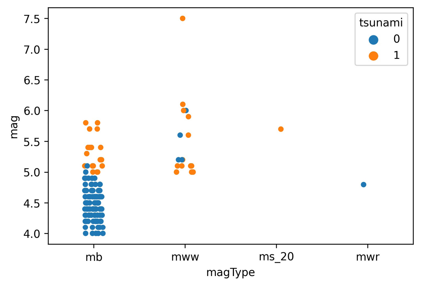
Figure 6.1 – Seaborn's strip plot
For the most part, the tsunamis occurred with higher magnitude earthquakes, as we would expect; however, due to the high concentration of points at lower magnitudes, we can't really see all the points. We could try to adjust the jitter argument, which controls how much random noise to add to the point in an attempt to reduce overlaps, or the alpha argument for transparency, as we did in the previous chapter; fortunately, there is another function, swarmplot(), that will reduce the overlap as much as possible, so we will use that instead:
>>> sns.swarmplot(
... x='magType',
... y='mag',
... hue='tsunami',
... data=quakes.query('parsed_place == "Indonesia"'),
... size=3.5 # point size
... )
The swarm plot (or bee swarm plot) also has the bonus of giving us a glimpse of what the distribution might be. We can now see many more earthquakes in the lower section of the mb column:
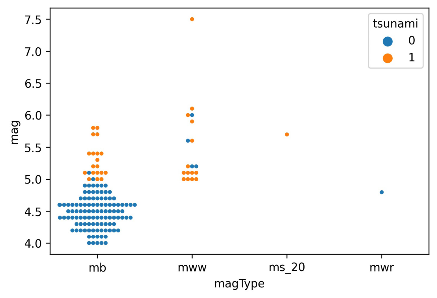
Figure 6.2 – Seaborn's swarm plot
In the Plotting with pandas section in the previous chapter, when we discussed how to visualize distributions, we discussed the box plot. Seaborn provides an enhanced box plot for large datasets, which shows additional quantiles for more information on the shape of the distribution, particularly in the tails. Let's use the enhanced box plot to compare earthquake magnitudes across different magnitude types, as we did in Chapter 5, Visualizing Data with Pandas and Matplotlib:
>>> sns.boxenplot(
... x='magType', y='mag', data=quakes[['magType', 'mag']]
... )
>>> plt.title('Comparing earthquake magnitude by magType')
This results in the following plot:
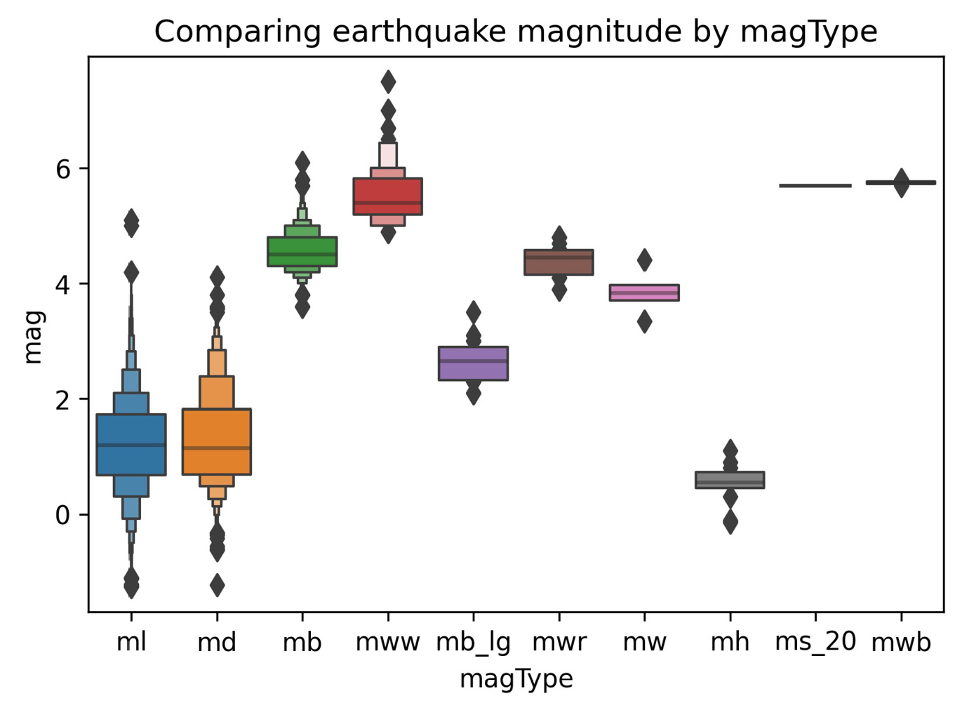
Figure 6.3 – Seaborn's enhanced box plot
Tip
The enhanced box plot was introduced in the paper Letter-value plots: Boxplots for large data, by Heike Hofmann, Karen Kafadar, and Hadley Wickham, which can be found at https://vita.had.co.nz/papers/letter-value-plot.html.
Box plots are great for visualizing the quantiles of our data, but we lose information about the distribution. As we saw, an enhanced box plot is one way to address this—another strategy is to use a violin plot, which combines a kernel density estimate (estimation of the underlying distribution) and a box plot:
>>> fig, axes = plt.subplots(figsize=(10, 5))
>>> sns.violinplot(
... x='magType', y='mag', data=quakes[['magType', 'mag']],
... ax=axes, scale='width' # all violins have same width
... )
>>> plt.title('Comparing earthquake magnitude by magType')
The box plot portion runs through the center of each violin plot; the kernel density estimate (KDE) is then drawn on both sides using the box plot as its x-axis. We can read the KDE from either side of the box plot since it is symmetrical:
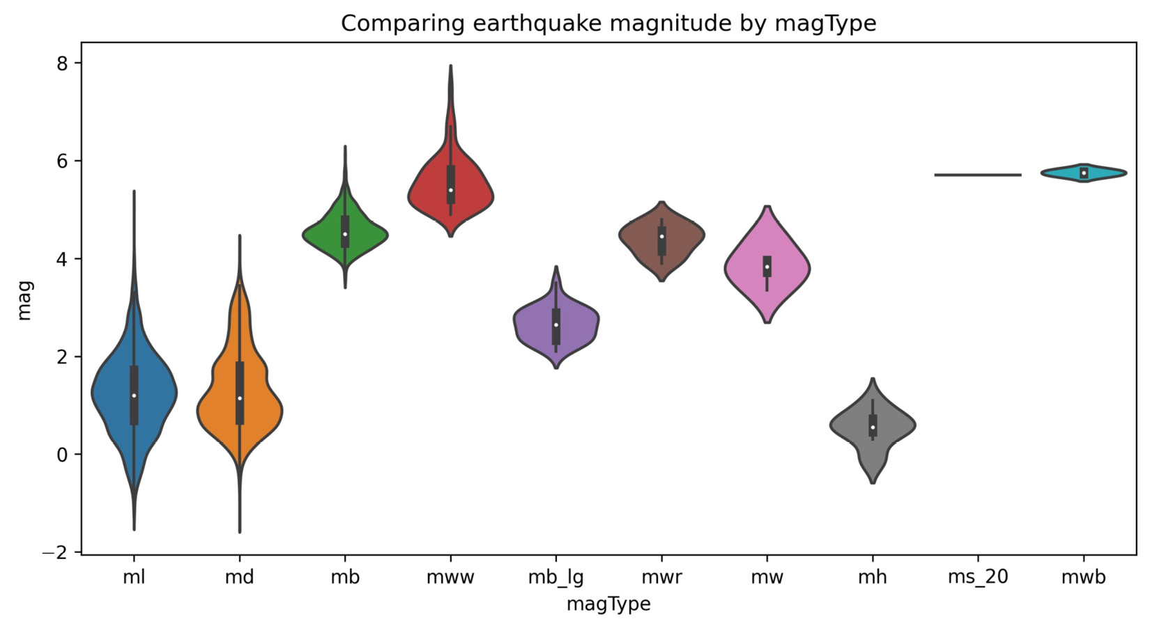
Figure 6.4 – Seaborn's violin plot
The seaborn documentation also lists out the plotting functions by the type of data being plotted; the full offering of categorical plots is available at https://seaborn.pydata.org/api.html#categorical-plots. Be sure to check out the countplot() and barplot() functions for variations on the bar plots we created with pandas in the previous chapter.
Correlations and heatmaps
As promised, let's learn an easier way to generate heatmaps compared to what we had to do in Chapter 5, Visualizing Data with Pandas and Matplotlib. Once again, we will make a heatmap of the correlations between the OHLC stock prices, the log of volume traded, and the daily difference between the highest and lowest prices (max_abs_change); however, this time, we will use seaborn, which gives us the heatmap() function for an easier way to produce this visualization:
>>> sns.heatmap(
... fb.sort_index().assign(
... log_volume=np.log(fb.volume),
... max_abs_change=fb.high - fb.low
... ).corr(),
... annot=True,
... center=0,
... vmin=-1,
... vmax=1
... )
Tip
When using seaborn, we can still use functions from matplotlib, such as plt.savefig() and plt.tight_layout(). Note that if there are issues with plt.tight_layout(), pass bbox_inches='tight' to plt.savefig() instead.
We pass in center=0 so that seaborn puts values of 0 (no correlation) at the center of the colormap it uses. In order to set the bounds of the color scale to that of the correlation coefficient, we need to provide vmin=-1 and vmax=1 as well. Notice that we also passed in annot=True to write the correlation coefficients in each box—we get the benefit of the numerical data and the visual data all in one plot with a single function call:
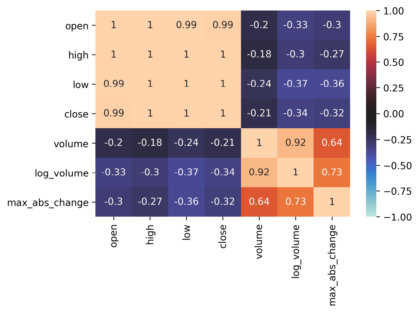
Figure 6.5 – Seaborn's heatmap
Seaborn also provides us with an alternative to the scatter_matrix() function provided in the pandas.plotting module, called pairplot(). We can use this to see the correlations between the columns in the Facebook data as scatter plots instead of the heatmap:
>>> sns.pairplot(fb)
This result makes it easy to understand the near-perfect positive correlation between the OHLC columns shown in the heatmap, while also showing us histograms for each column along the diagonal:
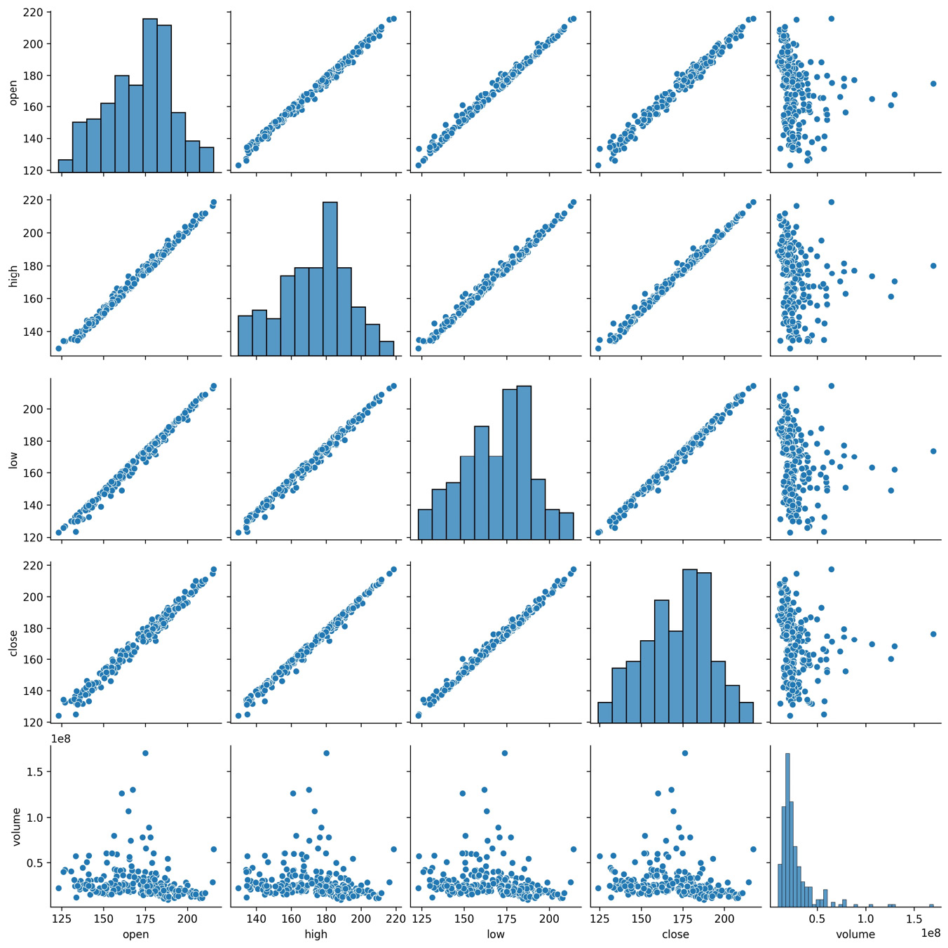
Figure 6.6 – Seaborn's pair plot
Facebook's performance in the latter half of 2018 was markedly worse than in the first half, so we may be interested to see how the distribution of the data changed each quarter of the year. As with the pandas.plotting.scatter_matrix() function, we can specify what to do along the diagonal with the diag_kind argument; however, unlike pandas, we can easily color everything based on other data with the hue argument. To do so, we just add the quarter column and then provide it to the hue argument:
>>> sns.pairplot(
... fb.assign(quarter=lambda x: x.index.quarter),
... diag_kind='kde', hue='quarter'
... )
We can now see how the distributions of the OHLC columns had lower standard deviations (and, subsequently, lower variances) in the first quarter and how the stock price lost a lot of ground in the fourth quarter (the distribution shifts to the left):

Figure 6.7 – Utilizing the data to determine plot colors
Tip
We can also pass kind='reg' to pairplot() to show regression lines.
If we only want to compare two variables, we can use jointplot(), which will give us a scatter plot along with the distribution of each variable along the side. Let's look once again at how the log of volume traded correlates with the difference between the daily high and low prices in Facebook stock, as we did in Chapter 5, Visualizing Data with Pandas and Matplotlib:
>>> sns.jointplot(
... x='log_volume',
... y='max_abs_change',
... data=fb.assign(
... log_volume=np.log(fb.volume),
... max_abs_change=fb.high - fb.low
... )
... )
Using the default value for the kind argument, we get histograms for the distributions and a plain scatter plot in the center:

Figure 6.8 – Seaborn's joint plot
Seaborn gives us plenty of alternatives for the kind argument. For example, we can use hexbins because there is a significant overlap when we use the scatter plot:
>>> sns.jointplot(
... x='log_volume',
... y='max_abs_change',
... kind='hex',
... data=fb.assign(
... log_volume=np.log(fb.volume),
... max_abs_change=fb.high - fb.low
... )
... )
We can now see the large concentration of points in the lower-left corner:

Figure 6.9 – Joint plot using hexbins
Another way of viewing the concentration of values is to use kind='kde', which gives us a contour plot to represent the joint density estimate along with KDEs for each of the variables:
>>> sns.jointplot(
... x='log_volume',
... y='max_abs_change',
... kind='kde',
... data=fb.assign(
... log_volume=np.log(fb.volume),
... max_abs_change=fb.high - fb.low
... )
... )
Each curve in the contour plot contains points of a given density:

Figure 6.10 – Joint distribution plot
Furthermore, we can plot a regression in the center and get KDEs in addition to histograms along the sides:
>>> sns.jointplot(
... x='log_volume',
... y='max_abs_change',
... kind='reg',
... data=fb.assign(
... log_volume=np.log(fb.volume),
... max_abs_change=fb.high - fb.low
... )
... )
This results in a linear regression line being drawn through the scatter plot, along with a confidence band surrounding the line in a lighter color:

Figure 6.11 – Joint plot with linear regression and KDEs
The relationship appears to be linear, but we should look at the residuals to check. Residuals are the observed values minus the values predicted using the regression line. We can look directly at the residuals that would result from the previous regression with kind='resid':
>>> sns.jointplot(
... x='log_volume',
... y='max_abs_change',
... kind='resid',
... data=fb.assign(
... log_volume=np.log(fb.volume),
... max_abs_change=fb.high - fb.low
... )
... )
# update y-axis label (discussed next section)
>>> plt.ylabel('residuals')
Notice that the residuals appear to be getting further away from zero at higher quantities of volume traded, which could mean this isn't the right way to model this relationship:
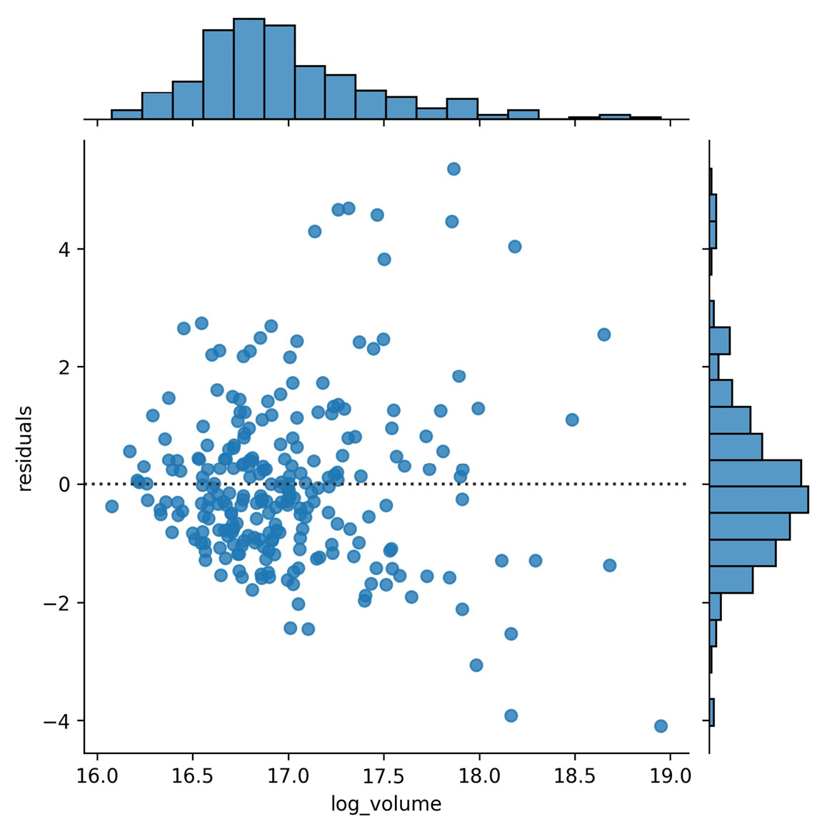
Figure 6.12 – Joint plot showing linear regression residuals
We just saw that we can use jointplot() to get a regression plot or a residuals plot; naturally, seaborn exposes functions to make these directly without the overhead of creating the entire joint plot. Let's discuss those next.
Regression plots
The regplot() function will calculate a regression line and plot it, while the residplot() function will calculate the regression and plot only the residuals. We can write a function to combine these for us, but first, some setup.
Our function will plot all permutations of any two columns (as opposed to combinations; order matters with permutations, for example, (open, close) is not equivalent to (close, open)). This allows us to see each column as the regressor and as the dependent variable; since we don't know the direction of the relationship, we let the viewer decide after calling the function. This generates many subplots, so we will create a new dataframe with just a few columns from our Facebook data.
We'll be looking at the logarithm of the volume traded (log_volume) and the daily difference between the highest and lowest price of Facebook stock (max_abs_change). Let's use assign() to create these new columns and save them in a new dataframe called fb_reg_data:
>>> fb_reg_data = fb.assign(
... log_volume=np.log(fb.volume),
... max_abs_change=fb.high - fb.low
... ).iloc[:,-2:]
Next, we need to import itertools, which is part of the Python standard library (https://docs.python.org/3/library/itertools.html). When writing plotting functions, itertools can be extremely helpful; it makes it very easy to create efficient iterators for things such as permutations, combinations, and infinite cycles or repeats:
>>> import itertools
Iterables are objects that can be iterated over. When we start a loop, an iterator is created from the iterable. At each iteration, the iterator provides its next value, until it is exhausted; this means that once we complete a single iteration through all its items, there is nothing left, and it can't be reused. Iterators are iterables, but not all iterables are iterators. Iterables that aren't iterators can be used repeatedly.
The iterators we get back when using itertools can only be used once through:
>>> iterator = itertools.repeat("I'm an iterator", 1)
>>> for i in iterator:
... print(f'-->{i}')
-->I'm an iterator
>>> print(
... 'This printed once because the iterator '
... 'has been exhausted'
... )
This printed once because the iterator has been exhausted
>>> for i in iterator:
... print(f'-->{i}')
A list, on the other hand, is an iterable; we can write something that loops over all the elements in the list, and we will still have a list for later reuse:
>>> iterable = list(itertools.repeat("I'm an iterable", 1))
>>> for i in iterable:
... print(f'-->{i}')
-->I'm an iterable
>>> print('This prints again because it's an iterable:')
This prints again because it's an iterable:
>>> for i in iterable:
... print(f'-->{i}')
-->I'm an iterable
Now that we have some background on itertools and iterators, let's write the function for our regression and residuals permutation plots:
def reg_resid_plots(data):
"""
Using `seaborn`, plot the regression and residuals plots
side-by-side for every permutation of 2 columns in data.
Parameters:
- data: A `pandas.DataFrame` object
Returns:
A matplotlib `Axes` object.
"""
num_cols = data.shape[1]
permutation_count = num_cols * (num_cols - 1)
fig, ax =
plt.subplots(permutation_count, 2, figsize=(15, 8))
for (x, y), axes, color in zip(
itertools.permutations(data.columns, 2),
ax,
itertools.cycle(['royalblue', 'darkorange'])
):
for subplot, func in zip(
axes, (sns.regplot, sns.residplot)
):
func(x=x, y=y, data=data, ax=subplot, color=color)
if func == sns.residplot:
subplot.set_ylabel('residuals')
return fig.axes
In this function, we can see that all the material covered so far in this chapter and from the previous chapter is coming together; we calculate how many subplots we need, and since we will have two plots for each permutation, we just need the number of permutations to determine the row count. We take advantage of the zip() function, which gives us values from multiple iterables at once in tuples, and tuple unpacking to easily iterate over the permutation tuples and the 2D NumPy array of Axes objects. Take some time to make sure you understand what is going on here; there are also resources on zip() and tuple unpacking in the Further reading section at the end of this chapter.
Important note
If we provide different length iterables to zip(), we will only get a number of tuples equal to the shortest length. For this reason, we can use infinite iterators, such as those we get when using itertools.repeat(), which repeats the same value infinitely (when we don't specify the number of times to repeat the value), and itertools.cycle(), which cycles between all the values provided infinitely.
Calling our function is effortless, with only a single parameter:
>>> from viz import reg_resid_plots
>>> reg_resid_plots(fb_reg_data)
The first row of subsets is what we saw earlier with the joint plots, and the second row is the regression when flipping the x and y variables:
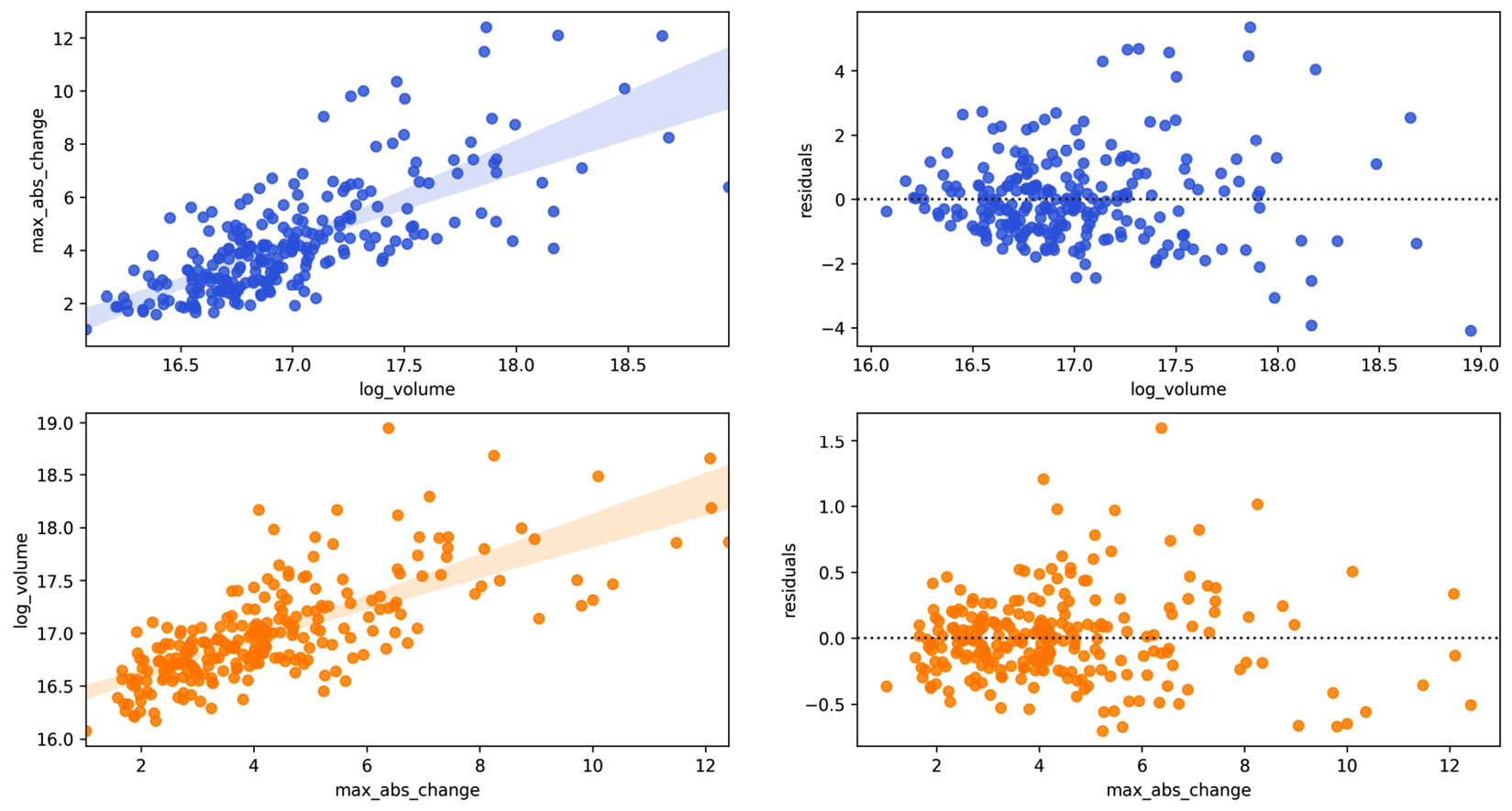
Figure 6.13 – Seaborn linear regression and residual plots
Tip
The regplot() function supports polynomial and logistic regression through the order and logistic parameters, respectively.
Seaborn also makes it easy to plot regressions across different subsets of our data with lmplot(). We can split our regression plots with hue, col, and row, which will color by values in a given column, make a new column for each value, and make a new row for each value, respectively.
We saw that Facebook's performance was different across each quarter of the year, so let's calculate a regression per quarter with the Facebook stock data, using the volume traded and the daily difference between the highest and lowest price, to see whether this relationship also changes:
>>> sns.lmplot(
... x='log_volume',
... y='max_abs_change',
... col='quarter',
... data=fb.assign(
... log_volume=np.log(fb.volume),
... max_abs_change=fb.high - fb.low,
... quarter=lambda x: x.index.quarter
... )
... )
Notice that the regression line in the fourth quarter has a much steeper slope than previous quarters:
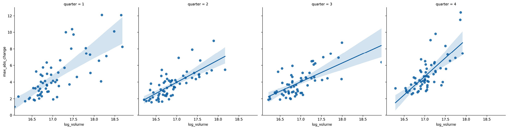
Figure 6.14 – Seaborn linear regression plots with subsets
Note that the result of running lmplot() is a FacetGrid object, which is a powerful feature of seaborn. Let's now discuss how we can make these directly with any plot inside.
Faceting
Faceting allows us to plot subsets (facets) of our data across subplots. We already saw a few as a result of some seaborn functions; however, we can easily make them for ourselves for use with any plotting function. Let's create a visualization that will allow us to compare the distributions of earthquake magnitudes in Indonesia and Papua New Guinea depending on whether there was a tsunami.
First, we create a FacetGrid object with the data we will be using and define how it will be subset with the row and col arguments:
>>> g = sns.FacetGrid(
... quakes.query(
... 'parsed_place.isin('
... '["Indonesia", "Papua New Guinea"]) '
... 'and magType == "mb"'
... ),
... row='tsunami',
... col='parsed_place',
... height=4
... )
Then, we use the FacetGrid.map() method to run a plotting function on each of the subsets, passing along any necessary arguments. We will make histograms with KDEs for the location and tsunami data subsets using the sns.histplot() function:
>>> g = g.map(sns.histplot, 'mag', kde=True)
For both locations, we can see that tsunamis occurred when the earthquake magnitude was 5.0 or greater:
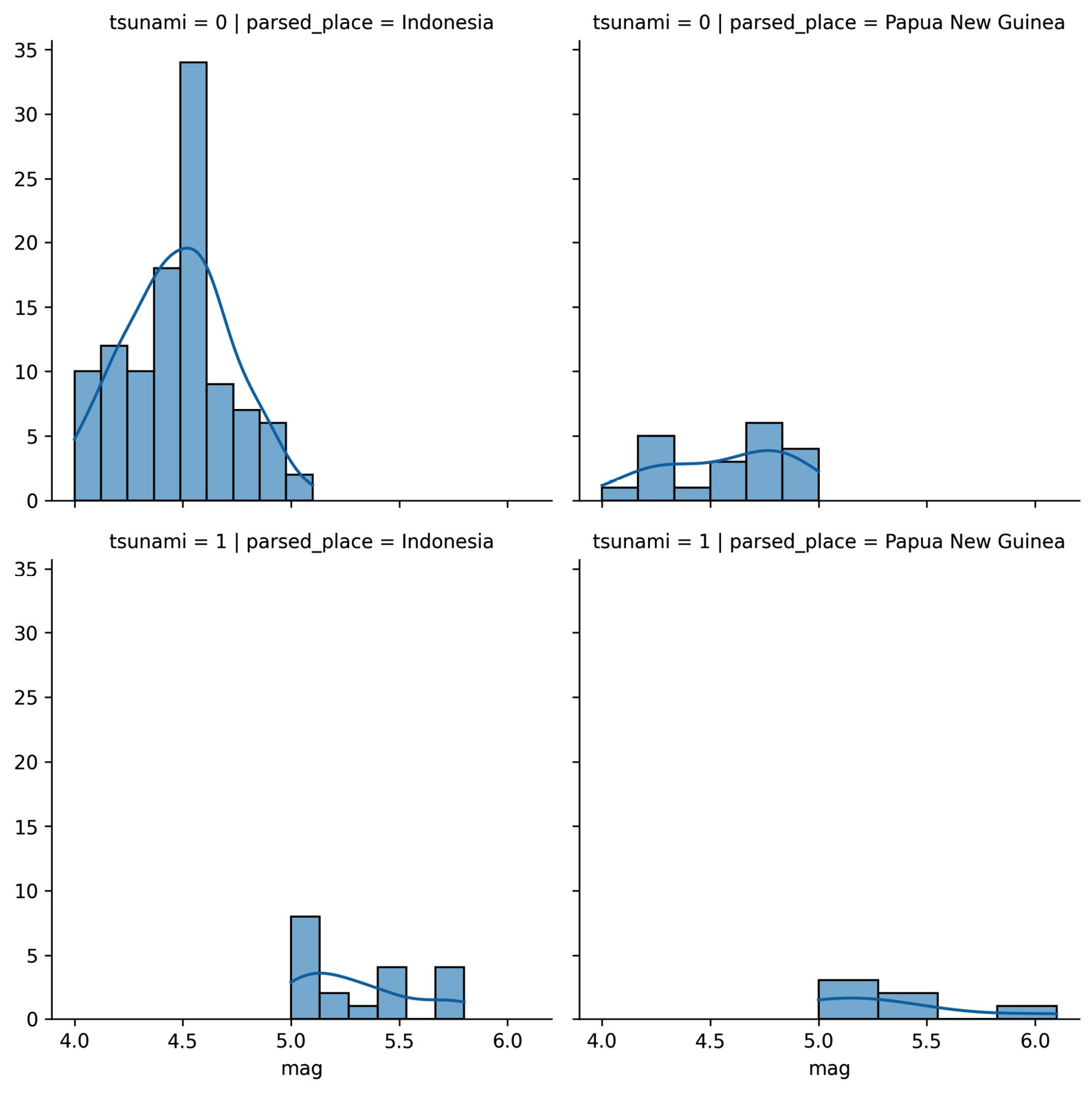
Figure 6.15 – Plotting with facet grids
This concludes our discussion of the plotting capabilities of seaborn; however, I encourage you to check out the API (https://seaborn.pydata.org/api.html) to see additional functionality. Also, be sure to consult the Choosing the appropriate visualization section in the Appendix as a reference when looking to plot some data.
Formatting plots with matplotlib
A big part of making our visualizations presentable is choosing the right plot type and having them well labeled so they are easy to interpret. By carefully tuning the final appearance of our visualizations, we make them easier to read and understand.
Let's now move to the 2-formatting_plots.ipynb notebook, run the setup code to import the packages we need, and read in the Facebook stock data and COVID-19 daily new cases data:
>>> %matplotlib inline
>>> import matplotlib.pyplot as plt
>>> import numpy as np
>>> import pandas as pd
>>> fb = pd.read_csv(
... 'data/fb_stock_prices_2018.csv',
... index_col='date',
... parse_dates=True
... )
>>> covid = pd.read_csv('data/covid19_cases.csv').assign(
... date=lambda x:
... pd.to_datetime(x.dateRep, format='%d/%m/%Y')
... ).set_index('date').replace(
... 'United_States_of_America', 'USA'
... ).sort_index()['2020-01-18':'2020-09-18']
In the next few sections, we will discuss how to add titles, axis labels, and legends to our plots, as well as how to customize the axes. Note that everything in this section needs to be called before running plt.show() or within the same Jupyter Notebook cell if using the %matplotlib inline magic command.
Titles and labels
Some of the visualizations we have created thus far didn't have titles or axis labels. We know what is going on in the figure, but if we were to present them to others, there could be some confusion. It's good practice to be explicit with our labels and titles.
We saw that, when plotting with pandas, we could add a title by passing the title argument to the plot() method, but we can also do this with matplotlib using plt.title(). Note that we can pass x/y values to plt.title() to control the placement of our text. We can also change the font and its size. Labeling our axes is just as easy; we can use plt.xlabel() and plt.ylabel(). Let's plot the Facebook closing price and label everything using matplotlib:
>>> fb.close.plot()
>>> plt.title('FB Closing Price')
>>> plt.xlabel('date')
>>> plt.ylabel('price ($)')
This results in the following plot:

Figure 6.16 – Labeling plots with matplotlib
When working with subplots, we have to take a different approach. To see this firsthand, let's make subplots of Facebook stock's OHLC data and use plt.title() to give the entire plot a title, along with plt.ylabel() to give each subplot's y-axis a label:
>>> fb.iloc[:,:4]
... .plot(subplots=True, layout=(2, 2), figsize=(12, 5))
>>> plt.title('Facebook 2018 Stock Data')
>>> plt.ylabel('price ($)')
Using plt.title() puts the title on the last subplot, instead of being the title for the plots as a whole, as we intended. The same thing happens to the y-axis label:
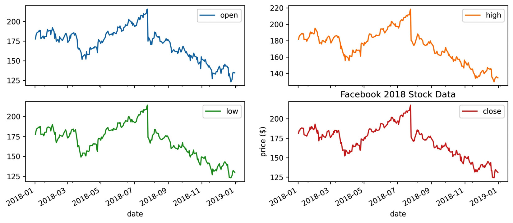
Figure 6.17 – Labeling subplots can be confusing
In the case of subplots, we want to give the entire figure a title; therefore, we use plt.suptitle() instead. Conversely, we want to give each subplot a y-axis label, so we use the set_ylabel() method on each of the Axes objects returned by the call to plot(). Note that the Axes objects are returned in a NumPy array of the same dimensions as the subplot layout, so for easier iteration, we call flatten():
>>> axes = fb.iloc[:,:4]
... .plot(subplots=True, layout=(2, 2), figsize=(12, 5))
>>> plt.suptitle('Facebook 2018 Stock Data')
>>> for ax in axes.flatten():
... ax.set_ylabel('price ($)')
This results in a title for the plot as a whole and y-axis labels for each of the subplots:
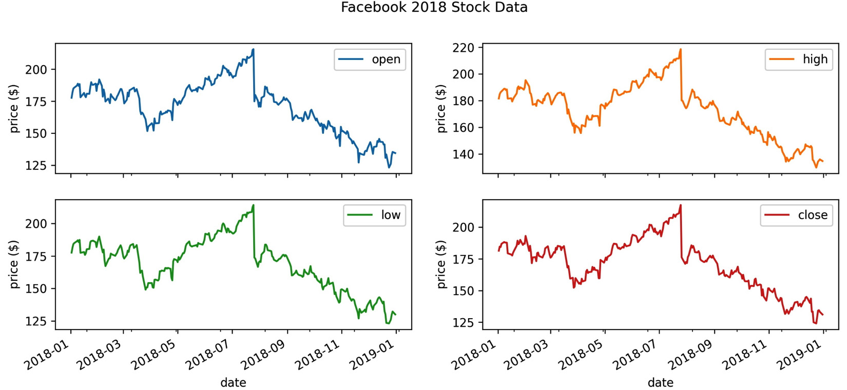
Figure 6.18 – Labeling subplots
Note that the Figure class also has a suptitle() method and that the Axes class's set() method lets us label the axes, title the plot, and much more in a single call, for example, set(xlabel='…', ylabel='…', title='…', …). Depending on what we are trying to do, we may need to call methods on Figure or Axes objects directly, so it's important to be aware of them.
Legends
Matplotlib makes it possible to control many aspects of the legend through the plt.legend() function and the Axes.legend() method. For example, we can specify the legend's location and format how the legend looks, including customizing the fonts, colors, and much more. Both the plt.legend() function and the Axes.legend() method can also be used to show a legend when the plot doesn't have one initially. Here is a sampling of some commonly used parameters:
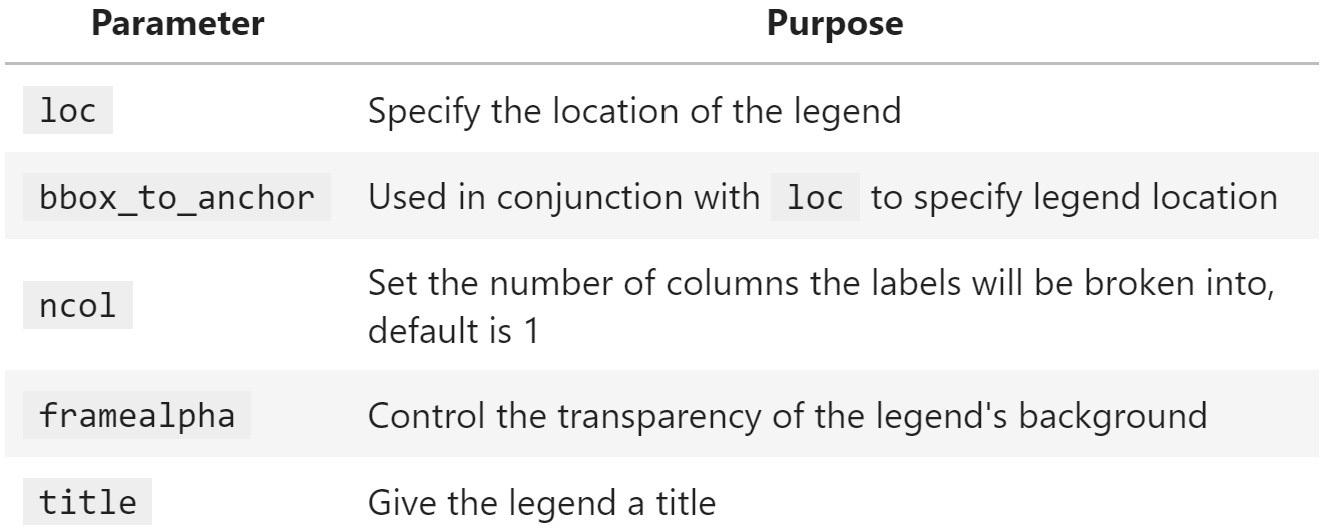
Figure 6.19 – Helpful parameters for legend formatting
The legend will use the label of each object that was plotted. If we don't want something to show up, we can make its label an empty string. However, if we simply want to alter how something shows up, we can pass its display name through the label argument. Let's plot Facebook stock's closing price and the 20-day moving average, using the label argument to provide a descriptive name for the legend:
>>> fb.assign(
... ma=lambda x: x.close.rolling(20).mean()
... ).plot(
... y=['close', 'ma'],
... title='FB closing price in 2018',
... label=['closing price', '20D moving average'],
... style=['-', '--']
... )
>>> plt.legend(loc='lower left')
>>> plt.ylabel('price ($)')
By default, matplotlib tries to find the best location for the plot, but sometimes it covers up parts of the plot as in this case. Therefore, we chose to place the legend in the lower-left corner of the plot. Note that the text in the legend is what we provided in the label argument to plot():
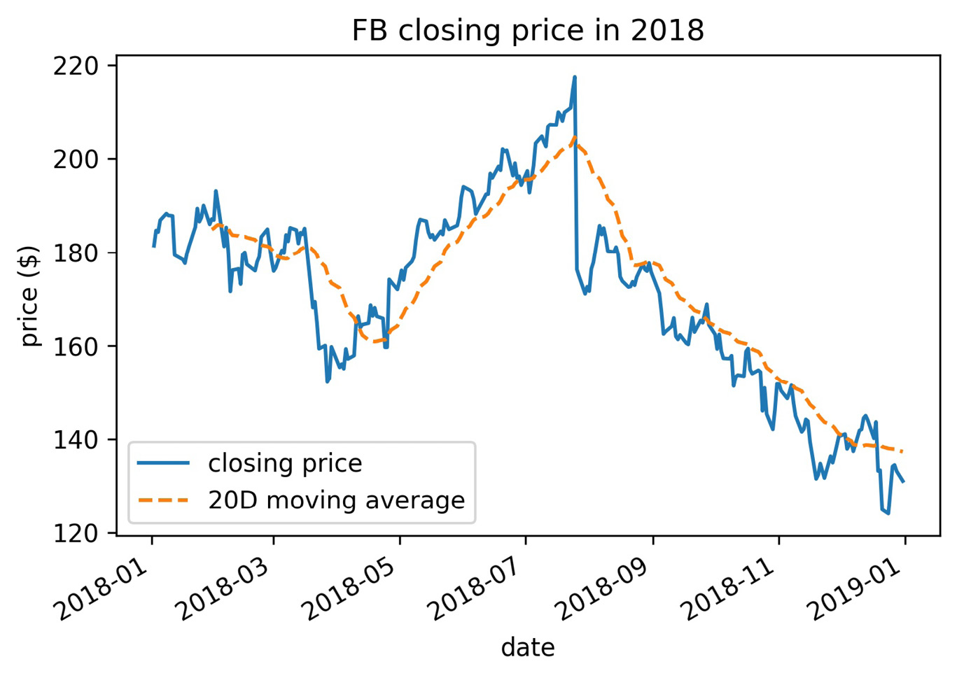
Figure 6.20 – Moving the legend
Notice that we passed a string to the loc argument to specify the legend location; we also have the option of passing the code as an integer or a tuple for the (x, y) coordinates to draw the lower-left corner of the legend box. The following table contains the possible location strings:
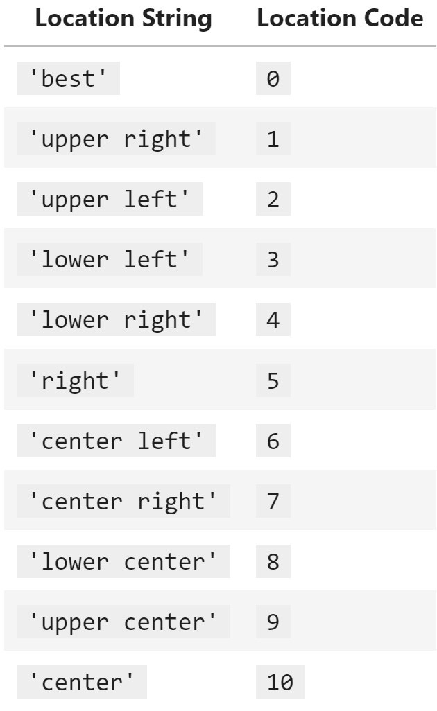
Figure 6.21 – Common legend locations
Let's now take a look at styling the legend with the framealpha, ncol, and title arguments. We will plot the percentage of the world's daily new COVID-19 cases that occurred in Brazil, China, Italy, Spain, and the USA over the 8-month period from January 18, 2020 through September 18, 2020. In addition, we will remove the top and right spines of the plot to make it look cleaner:
>>> new_cases = covid.reset_index().pivot(
... index='date',
... columns='countriesAndTerritories',
... values='cases'
... ).fillna(0)
>>> pct_new_cases = new_cases.apply(
... lambda x: x / new_cases.apply('sum', axis=1), axis=0
... )[
... ['Italy', 'China', 'Spain', 'USA', 'India', 'Brazil']
... ].sort_index(axis=1).fillna(0)
>>> ax = pct_new_cases.plot(
... figsize=(12, 7),
... style=['-'] * 3 + ['--', ':', '-.'],
... title='Percentage of the World's New COVID-19 Cases'
... ' (source: ECDC)'
... )
>>> ax.legend(title='Country', framealpha=0.5, ncol=2)
>>> ax.set_xlabel('')
>>> ax.set_ylabel('percentage of the world's COVID-19 cases')
>>> for spine in ['top', 'right']:
... ax.spines[spine].set_visible(False)
Our legend is neatly arranged in two columns and contains a title. We also increased the transparency of the legend's border:
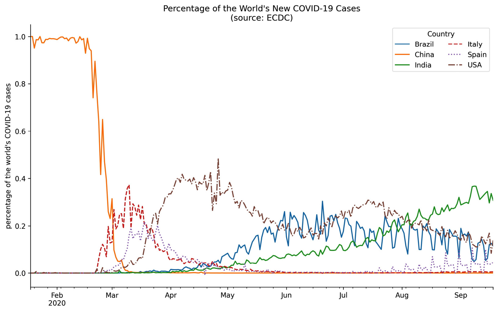
Figure 6.22 – Formatting the legend
Tip
Don't get overwhelmed trying to memorize all of the available options. It is easier if we don't try to learn every possible customization, but rather look up the functionality that matches what we have in mind for our visualization when needed.
Formatting axes
Back in Chapter 1, Introduction to Data Analysis, we discussed how our axis limits can make for misleading plots if we aren't careful. We have the option of passing this as a tuple to the xlim/ylim arguments when using the plot() method from pandas. Alternatively, with matplotlib, we can adjust the limits of each axis with the plt.xlim()/plt.ylim() function or the set_xlim()/set_ylim() method on an Axes object. We pass values for the minimum and maximum, separately; if we want to keep what was automatically generated, we can pass in None. Let's modify the previous plot of the percentage of the world's daily new COVID-19 cases per country to start the y-axis at zero:
>>> ax = pct_new_cases.plot(
... figsize=(12, 7),
... style=['-'] * 3 + ['--', ':', '-.'],
... title='Percentage of the World's New COVID-19 Cases'
... ' (source: ECDC)'
... )
>>> ax.legend(framealpha=0.5, ncol=2)
>>> ax.set_xlabel('')
>>> ax.set_ylabel('percentage of the world's COVID-19 cases')
>>> ax.set_ylim(0, None)
>>> for spine in ['top', 'right']:
... ax.spines[spine].set_visible(False)
Notice that the y-axis now begins at zero:
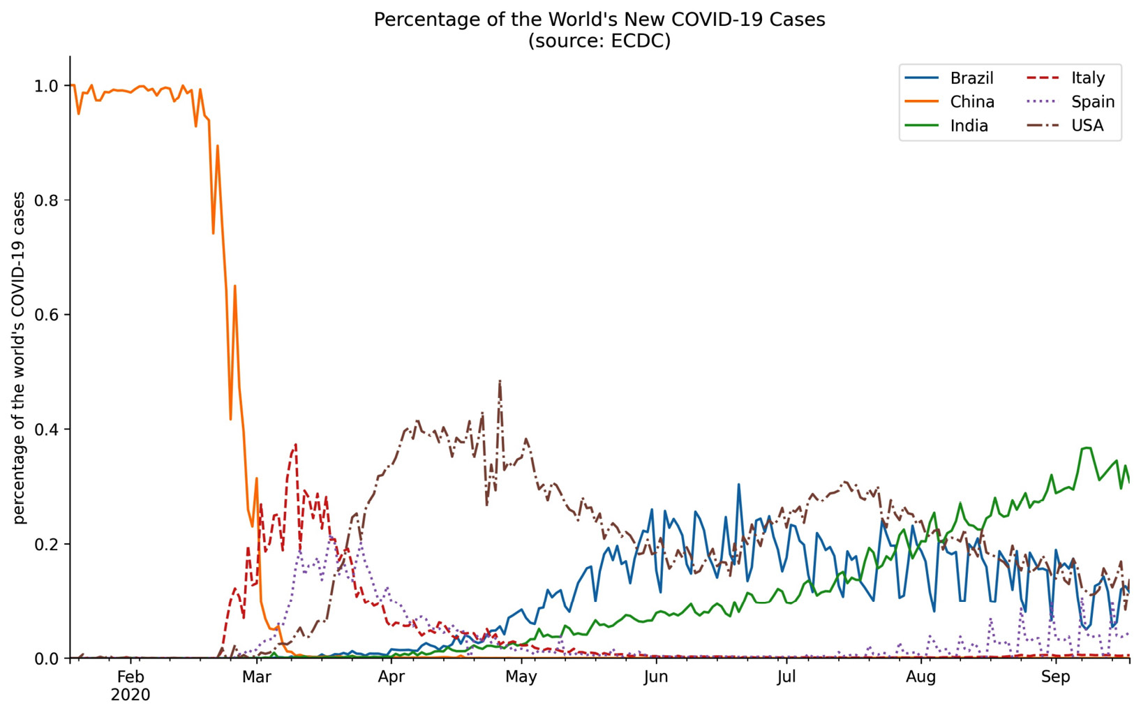
Figure 6.23 – Updating axis limits with matplotlib
If we instead want to change the scale of the axis, we can use plt.xscale()/plt.yscale() and pass the type of scale we want. So, plt.yscale('log'), for example, will use the log scale for the y-axis; we saw how to do this with pandas in the previous chapter.
We can also control which tick marks show up and what they are labeled as by passing in the tick locations and labels to plt.xticks() or plt.yticks(). Note that we can also call these functions to obtain the tick locations and labels. For example, since our data starts and ends on the 18th of the month, let's move the tick marks in the previous plot to the 18th of each month and then label the ticks accordingly:
>>> ax = pct_new_cases.plot(
... figsize=(12, 7),
... style=['-'] * 3 + ['--', ':', '-.'],
... title='Percentage of the World's New COVID-19 Cases'
... ' (source: ECDC)'
... )
>>> tick_locs = covid.index[covid.index.day == 18].unique()
>>> tick_labels =
... [loc.strftime('%b %d %Y') for loc in tick_locs]
>>> plt.xticks(tick_locs, tick_labels)
>>> ax.legend(framealpha=0.5, ncol=2)
>>> ax.set_xlabel('')
>>> ax.set_ylabel('percentage of the world's COVID-19 cases')
>>> ax.set_ylim(0, None)
>>> for spine in ['top', 'right']:
... ax.spines[spine].set_visible(False)
After moving the tick marks, we have a tick label on the first data point in the plot (January 18, 2020) and on the last (September 18, 2020):
Figure 6.24 – Editing tick labels
We are currently representing the percentages as decimals, but we may wish to format the labels to be written using the percent sign. Note that there is no need to use the plt.yticks() function to do so; instead, we can use the PercentFormatter class from the matplotlib.ticker module:
>>> from matplotlib.ticker import PercentFormatter
>>> ax = pct_new_cases.plot(
... figsize=(12, 7),
... style=['-'] * 3 + ['--', ':', '-.'],
... title='Percentage of the World's New COVID-19 Cases'
... ' (source: ECDC)'
... )
>>> tick_locs = covid.index[covid.index.day == 18].unique()
>>> tick_labels =
... [loc.strftime('%b %d %Y') for loc in tick_locs]
>>> plt.xticks(tick_locs, tick_labels)
>>> ax.legend(framealpha=0.5, ncol=2)
>>> ax.set_xlabel('')
>>> ax.set_ylabel('percentage of the world's COVID-19 cases')
>>> ax.set_ylim(0, None)
>>> ax.yaxis.set_major_formatter(PercentFormatter(xmax=1))
>>> for spine in ['top', 'right']:
... ax.spines[spine].set_visible(False)
By specifying xmax=1, we are indicating that our values should be divided by 1 (since they are already percentages), before multiplying by 100 and appending the percent sign. This results in percentages along the y-axis:

Figure 6.25 – Formatting tick labels as percentages
Another useful formatter is the EngFormatter class, which will automatically handle formatting numbers as thousands, millions, and so on using engineering notation. Let's use this to plot the cumulative COVID-19 cases per continent in millions:
>>> from matplotlib.ticker import EngFormatter
>>> ax = covid.query('continentExp != "Other"').groupby([
... 'continentExp', pd.Grouper(freq='1D')
... ]).cases.sum().unstack(0).apply('cumsum').plot(
... style=['-', '-', '--', ':', '-.'],
... title='Cumulative COVID-19 Cases per Continent'
... ' (source: ECDC)'
... )
>>> ax.legend(title='', loc='center left')
>>> ax.set(xlabel='', ylabel='total COVID-19 cases')
>>> ax.yaxis.set_major_formatter(EngFormatter())
>>> for spine in ['top', 'right']:
... ax.spines[spine].set_visible(False)
Notice that we didn't need to divide the cumulative case counts by 1 million to get these numbers—the EngFormatter object that we passed to set_major_formatter() automatically figured out that it should use millions (M) based on the data:
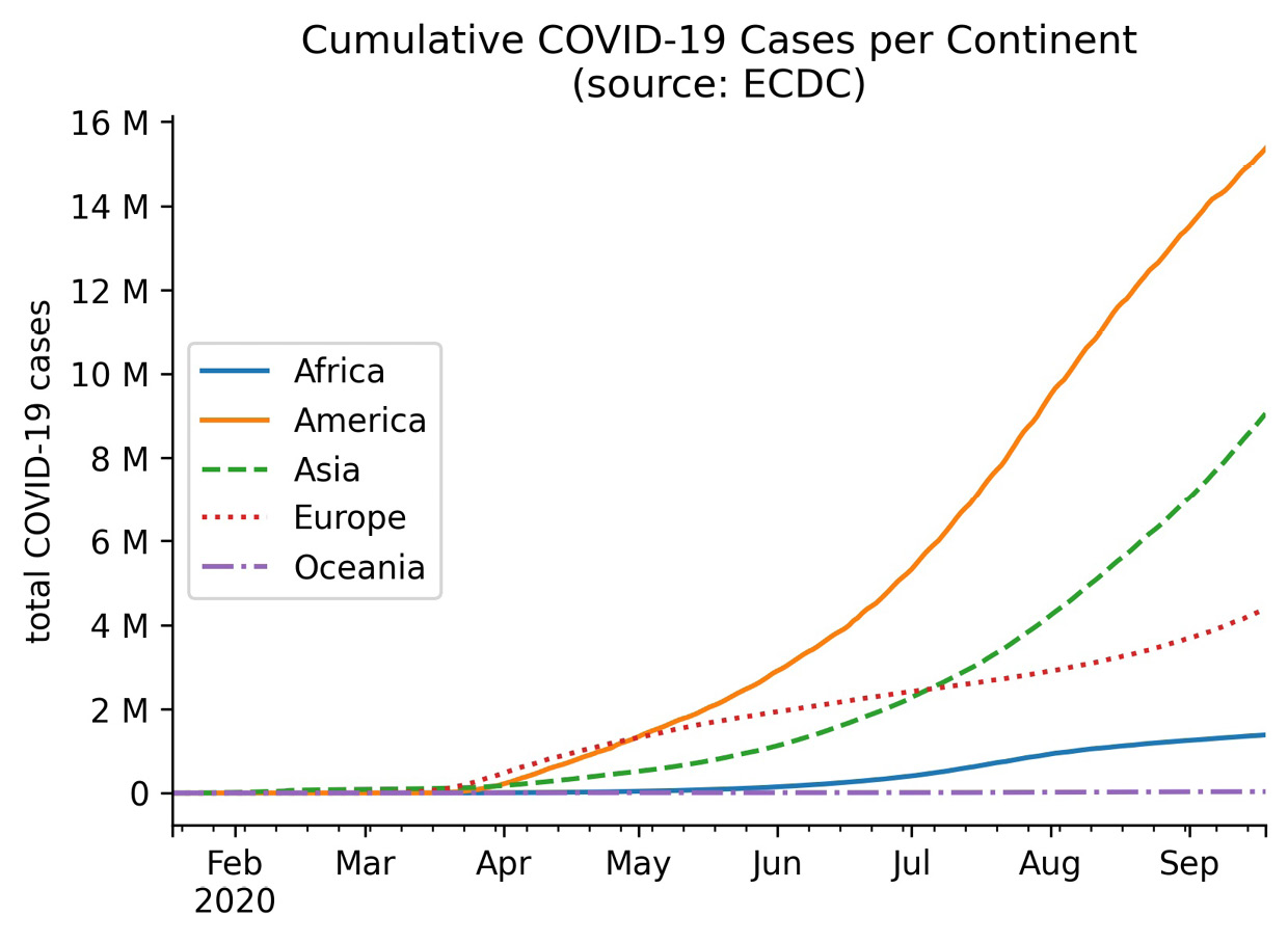
Figure 6.26 – Formatting tick labels with engineering notation
Both the PercentFormatter and EngFormatter classes format the tick labels, but sometimes we want to change the location of the ticks rather than format them. One way of doing so is with the MultipleLocator class, which makes it easy for us to place the ticks at multiples of a number of our choosing. To illustrate how we could use this, let's take a look at the daily new COVID-19 cases in New Zealand from April 18, 2020 through September 18, 2020:
>>> ax = new_cases.New_Zealand['2020-04-18':'2020-09-18'].plot(
... title='Daily new COVID-19 cases in New Zealand'
... ' (source: ECDC)'
... )
>>> ax.set(xlabel='', ylabel='new COVID-19 cases')
>>> for spine in ['top', 'right']:
... ax.spines[spine].set_visible(False)
Without us intervening with the tick locations, matplotlib is showing the ticks in increments of 2.5. We know that there is no such thing as half of a case, so it makes more sense to show this data with only integer ticks:
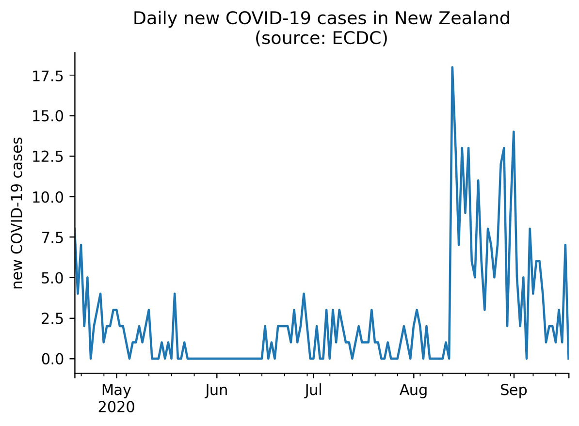
Figure 6.27 – Default tick locations
Let's fix this by using the MultipleLocator class. Here, we aren't formatting the axis labels, but rather controlling which ones are shown; for this reason, we have to call the set_major_locator() method instead of set_major_formatter():
>>> from matplotlib.ticker import MultipleLocator
>>> ax = new_cases.New_Zealand['2020-04-18':'2020-09-18'].plot(
... title='Daily new COVID-19 cases in New Zealand'
... ' (source: ECDC)'
... )
>>> ax.set(xlabel='', ylabel='new COVID-19 cases')
>>> ax.yaxis.set_major_locator(MultipleLocator(base=3))
>>> for spine in ['top', 'right']:
... ax.spines[spine].set_visible(False)
Since we passed in base=3, our y-axis now contains integers in increments of three:

Figure 6.28 – Using integer tick locations
These were only three of the features provided with the matplotlib.ticker module, so I highly recommend you check out the documentation for more information. There is also a link in the Further reading section at the end of this chapter.
Customizing visualizations
So far, all of the code we've learned for creating data visualizations has been for making the visualization itself. Now that we have a strong foundation, we are ready to learn how to add reference lines, control colors and textures, and include annotations.
In the 3-customizing_visualizations.ipynb notebook, let's handle our imports and read in the Facebook stock prices and earthquake datasets:
>>> %matplotlib inline
>>> import matplotlib.pyplot as plt
>>> import pandas as pd
>>> fb = pd.read_csv(
... 'data/fb_stock_prices_2018.csv',
... index_col='date',
... parse_dates=True
... )
>>> quakes = pd.read_csv('data/earthquakes.csv')
Tip
Changing the style in which the plots are created is an easy way to change their look and feel without setting each aspect separately. To set the style for seaborn, use sns.set_style(). With matplotlib, we can use plt.style.use() to specify the stylesheet(s) we want to use. These will be used for all visualizations created in that session. If, instead, we only want it for a single plot, we can use sns.set_context() or plt.style.context(). Available styles for seaborn can be found in the documentation of the aforementioned functions and in matplotlib by taking a look at the values in plt.style.available.
Adding reference lines
Quite often, we want to draw attention to a specific value on our plot, perhaps as a boundary or turning point. We may be interested in whether the line gets crossed or serves as a partition. In finance, horizontal reference lines may be drawn on top of the line plot of a stock's price, marking the support and resistance.
The support is a price level at which a downward trend is expected to reverse because the stock is now at a price level at which buyers are more enticed to purchase, driving the price up and away from this point. On the flip side, the resistance is the price level at which an upward trend is expected to reverse since the price is an attractive selling point; thus, the price falls down and away from this point. Of course, this is not to say these levels don't get surpassed. Since we have Facebook stock data, let's add the support and resistance reference lines to our line plot of the closing price.
Important note
Going over how support and resistance are calculated is beyond the scope of this chapter, but Chapter 7, Financial Analysis – Bitcoin and the Stock Market, will include some code for calculating these using pivot points. Also, be sure to check out the Further reading section for a more in-depth introduction to support and resistance.
Our two horizontal reference lines will be at the support of $124.46 and the resistance of $138.53. Both these numbers were derived using the stock_analysis package, which we will build in Chapter 7, Financial Analysis – Bitcoin and the Stock Market. We simply need to create an instance of the StockAnalyzer class to calculate these metrics:
>>> from stock_analysis import StockAnalyzer
>>> fb_analyzer = StockAnalyzer(fb)
>>> support, resistance = (
... getattr(fb_analyzer, stat)(level=3)
... for stat in ['support', 'resistance']
... )
>>> support, resistance
(124.4566666666667, 138.5266666666667)
We will use the plt.axhline() function for this task, but note that this will also work on the Axes object. Remember that the text we provide to the label arguments will be populated in the legend:
>>> fb.close['2018-12']
... .plot(title='FB Closing Price December 2018')
>>> plt.axhline(
... y=resistance, color='r', linestyle='--',
... label=f'resistance (${resistance:,.2f})'
... )
>>> plt.axhline(
... y=support, color='g', linestyle='--',
... label=f'support (${support:,.2f})'
... )
>>> plt.ylabel('price ($)')
>>> plt.legend()
We should already be familiar with the f-string format from earlier chapters, but notice the additional text after the variable name here (:,.2f). The support and resistance are stored as floats in the support and resistance variables, respectively. The colon (:) precedes the format specifier (commonly written as format_spec), which tells Python how to format that variable; in this case, we are formatting it as a decimal (f) with a comma as the thousands separator (,) and two digits of precision after the decimal (.2). This will also work with the format() method, in which case it would look like '{:,.2f}'.format(resistance). This formatting makes for an informative legend in our plot:
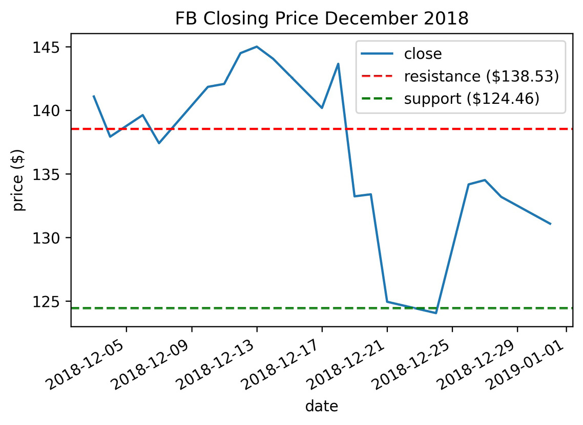
Figure 6.29 – Creating horizontal reference lines with matplotlib
Important note
Those with personal investment accounts will likely find some literature there on support and resistance when looking to place limit orders or stop losses based on the stock hitting a certain price point since these can help inform the feasibility of the target price. In addition, these reference lines may be used by traders to analyze the stock's momentum and decide whether it is time to buy/sell the stock.
Turning back to the earthquake data, let's use plt.axvline() to draw vertical reference lines for the number of standard deviations from the mean on the distribution of earthquake magnitudes in Indonesia. The std_from_mean_kde() function located in the viz.py module in the GitHub repository uses itertools to easily make the combinations of the colors and values we need to plot:
import itertools
def std_from_mean_kde(data):
"""
Plot the KDE along with vertical reference lines
for each standard deviation from the mean.
Parameters:
- data: `pandas.Series` with numeric data
Returns:
Matplotlib `Axes` object.
"""
mean_mag, std_mean = data.mean(), data.std()
ax = data.plot(kind='kde')
ax.axvline(mean_mag, color='b', alpha=0.2, label='mean')
colors = ['green', 'orange', 'red']
multipliers = [1, 2, 3]
signs = ['-', '+']
linestyles = [':', '-.', '--']
for sign, (color, multiplier, style) in itertools.product(
signs, zip(colors, multipliers, linestyles)
):
adjustment = multiplier * std_mean
if sign == '-':
value = mean_mag – adjustment
label = '{} {}{}{}'.format(
r'$mu$', r'$pm$', multiplier, r'$sigma$'
)
else:
value = mean_mag + adjustment
label = None # label each color only once
ax.axvline(
value, color=color, linestyle=style,
label=label, alpha=0.5
)
ax.legend()
return ax
The product() function from itertools will give us all combinations of items from any number of iterables. Here, we have zipped the colors, multipliers, and line styles since we always want a green dotted line for a multiplier of 1; an orange dot-dashed line for a multiplier of 2; and a red dashed line for a multiplier of 3. When product() uses these tuples, we get positive- and negative-signed combinations for everything. To keep our legend from getting too crowded, we only label each color once using the ± sign. Since we have combinations between a string and a tuple at each iteration, we unpack the tuple in our for statement for easier use.
Tip
We can use LaTeX math symbols (https://www.latex-project.org/) to label our plots if we follow a certain pattern. First, we must mark the string as raw by preceding it with the r character. Then, we must surround the LaTeX with $ symbols. For example, we used r'$mu$' for the Greek letter μ in the preceding code.
Let's use the std_from_mean_kde() function to see which parts of the estimated distribution of earthquake magnitudes in Indonesia are within one, two, or three standard deviations from the mean:
>>> from viz import std_from_mean_kde
>>> ax = std_from_mean_kde(
... quakes.query(
... 'magType == "mb" and parsed_place == "Indonesia"'
... ).mag
... )
>>> ax.set_title('mb magnitude distribution in Indonesia')
>>> ax.set_xlabel('mb earthquake magnitude')
Notice the KDE is right-skewed—it has a longer tail on the right side, and the mean is to the right of the mode:
Figure 6.30 – Including vertical reference lines
Tip
To make a straight line of arbitrary slope, simply pass the endpoints of the line as two x values and two y values (for example, [0, 2] and [2, 0]) to plt.plot() using the same Axes object. For lines that aren't straight, np.linspace() can be used to create a range of evenly-spaced points on [start, stop), which can be used for the x values and to calculate the y values. As a reminder, when specifying a range, square brackets mean inclusive of both endpoints and round brackets are exclusive, so [0, 1) goes from 0 to as close to 1 as possible without being 1. We see these when using pd.cut() and pd.qcut() if we don't name the buckets.
Shading regions
In some cases, the reference line itself isn't so interesting, but the area between two of them is; for this purpose, we have axvspan() and axhspan(). Let's revisit the support and resistance of Facebook stock's closing price. We can use axhspan() to shade the area that falls between the two:
>>> ax = fb.close.plot(title='FB Closing Price')
>>> ax.axhspan(support, resistance, alpha=0.2)
>>> plt.ylabel('Price ($)')
Note that the color of the shaded region is determined by the facecolor argument. For this example, we accepted the default:
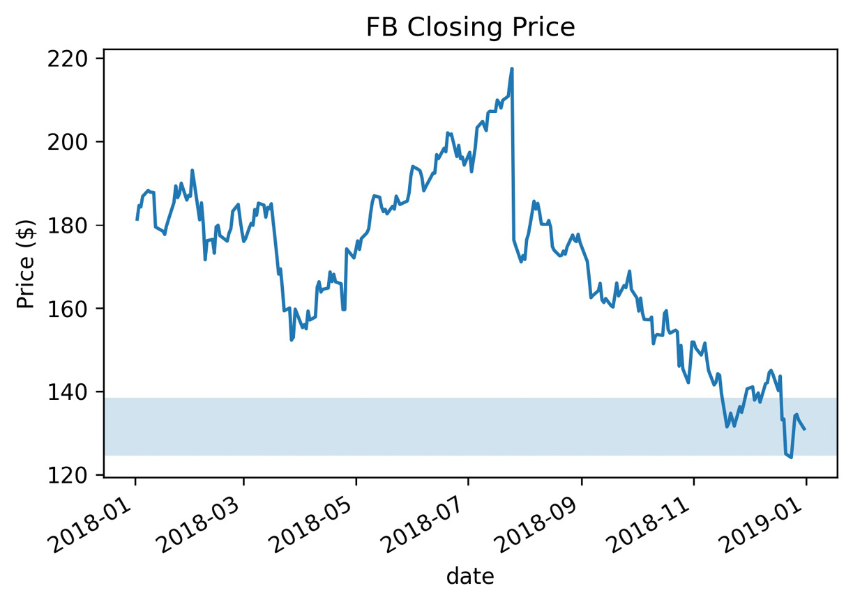
Figure 6.31 – Adding a horizontal shaded region
When we are interested in shading the area between two curves, we can use the plt.fill_between() and plt.fill_betweenx() functions. The plt.fill_between() function accepts one set of x values and two sets of y values; we can use plt.fill_betweenx() if we require the opposite. Let's shade the area between Facebook's high price and low price each day of the fourth quarter using plt.fill_between():
>>> fb_q4 = fb.loc['2018-Q4']
>>> plt.fill_between(fb_q4.index, fb_q4.high, fb_q4.low)
>>> plt.xticks([
... '2018-10-01', '2018-11-01', '2018-12-01', '2019-01-01'
... ])
>>> plt.xlabel('date')
>>> plt.ylabel('price ($)')
>>> plt.title(
... 'FB differential between high and low price Q4 2018'
... )
This gives us a better idea of the variation in price on a given day; the taller the vertical distance, the higher the fluctuation:
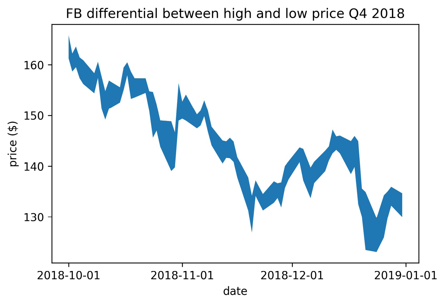
Figure 6.32 – Shading between two curves
By providing a Boolean mask to the where argument, we can specify when to fill the area between the curves. Let's fill in only December from the previous example. We will add dashed lines for the high price curve and the low price curve throughout the time period to see what is happening:
>>> fb_q4 = fb.loc['2018-Q4']
>>> plt.fill_between(
... fb_q4.index, fb_q4.high, fb_q4.low,
... where=fb_q4.index.month == 12,
... color='khaki', label='December differential'
... )
>>> plt.plot(fb_q4.index, fb_q4.high, '--', label='daily high')
>>> plt.plot(fb_q4.index, fb_q4.low, '--', label='daily low')
>>> plt.xticks([
... '2018-10-01', '2018-11-01', '2018-12-01', '2019-01-01'
... ])
>>> plt.xlabel('date')
>>> plt.ylabel('price ($)')
>>> plt.legend()
>>> plt.title(
... 'FB differential between high and low price Q4 2018'
... )
This results in the following plot:
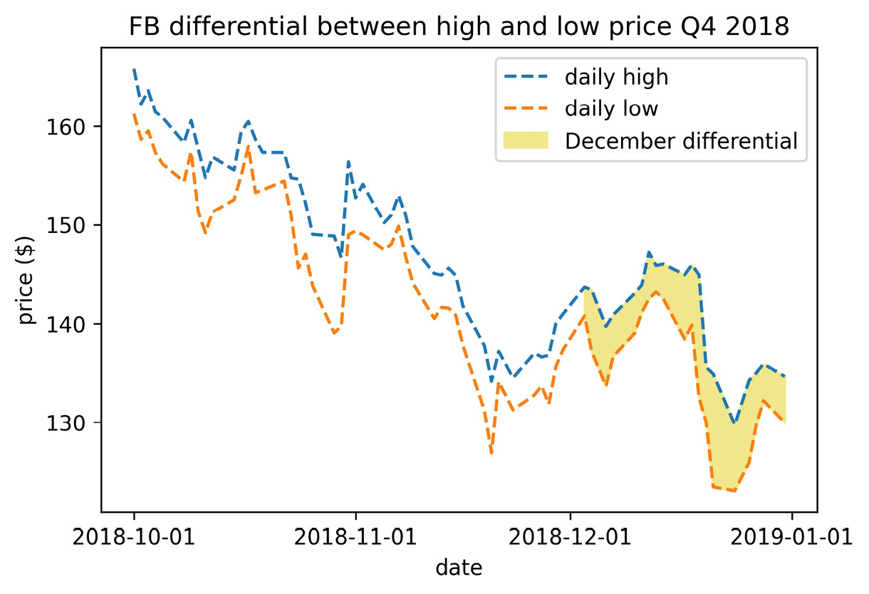
Figure 6.33 – Selectively shading between two curves
With reference lines and shaded regions, we are able to draw attention to certain areas, and can even label them in the legend, but we are limited in the text we can use to explain them. Let's now discuss how to annotate our plot for additional context.
Annotations
We will often find the need to annotate specific points in our visualizations either to point out events, such as the days on which Facebook's stock price dropped due to certain news stories breaking, or to label values that are important for comparisons. For example, let's use the plt.annotate() function to label the support and resistance:
>>> ax = fb.close.plot(
... title='FB Closing Price 2018',
... figsize=(15, 3)
... )
>>> ax.set_ylabel('price ($)')
>>> ax.axhspan(support, resistance, alpha=0.2)
>>> plt.annotate(
... f'support (${support:,.2f})',
... xy=('2018-12-31', support),
... xytext=('2019-01-21', support),
... arrowprops={'arrowstyle': '->'}
... )
>>> plt.annotate(
... f'resistance (${resistance:,.2f})',
... xy=('2018-12-23', resistance)
... )
>>> for spine in ['top', 'right']:
... ax.spines[spine].set_visible(False)
Notice the annotations are different; when we annotated the resistance, we only provided the text for the annotation and the coordinates of the point being annotated with the xy argument. However, when we annotated the support, we also provided values for the xytext and arrowprops arguments; this allowed us to put the text somewhere other than where the value occurred and add an arrow indicating where it occurred. By doing so, we avoid obscuring the last few days of data with our label:

Figure 6.34 – Including annotations
The arrowprops argument gives us quite a bit of customization over the type of arrow we want, although it might be difficult to get it perfect. As an example, let's annotate the big decline in the price of Facebook in July with the percentage drop:
>>> close_price = fb.loc['2018-07-25', 'close']
>>> open_price = fb.loc['2018-07-26', 'open']
>>> pct_drop = (open_price - close_price) / close_price
>>> fb.close.plot(title='FB Closing Price 2018', alpha=0.5)
>>> plt.annotate(
... f'{pct_drop:.2%}', va='center',
... xy=('2018-07-27', (open_price + close_price) / 2),
... xytext=('2018-08-20', (open_price + close_price) / 2),
... arrowprops=dict(arrowstyle='-[,widthB=4.0,lengthB=0.2')
... )
>>> plt.ylabel('price ($)')
Notice that we were able to format the pct_drop variable as a percentage with two digits of precision by using .2% in the format specifier of the f-string. In addition, by specifying va='center', we tell matplotlib to vertically center our annotation in the middle of the arrow:

Figure 6.35 – Customizing the annotation's arrow
Matplotlib provides a lot of flexibility to customize these annotations—we can pass any option that the Text class in matplotlib supports (https://matplotlib.org/api/text_api.html#matplotlib.text.Text). To change colors, simply pass the desired color in the color argument. We can also control font size, weight, family, and style through the fontsize, fontweight, fontfamily, and fontstyle arguments, respectively.
Colors
For the sake of consistency, the visualizations we produce should stick to a color scheme. Companies and academic institutions alike often have custom color palettes for presentations. We can easily adopt the same color palette in our visualizations too.
So far, we have either been providing colors to the color argument with their single character names, such as 'b' for blue and 'k' for black, or their names ('blue' or 'black'). We have also seen that matplotlib has many colors that can be specified by name; the full list can be found in the documentation at https://matplotlib.org/examples/color/named_colors.html.
Important note
Remember that if we are providing a color with the style argument, we are limited to the colors that have a single-character abbreviation.
In addition, we can provide a hex code for the color we want; those who have worked with HTML or CSS in the past will no doubt be familiar with these as a way to specify the exact color (regardless of what different places call it). For those unfamiliar with a hex color code, it specifies the amount of red, green, and blue used to make the color in question in the #RRGGBB format. Black is #000000 and white is #FFFFFF (case-insensitive). This may be confusing because F is most definitely not a number; however, these are hexadecimal numbers (base 16, not the base 10 we traditionally use), where 0-9 still represents 0-9, but A-F represents 10-15.
Matplotlib accepts hex codes as a string to the color argument. To illustrate this, let's plot Facebook's opening price in #8000FF:
>>> fb.plot(
... y='open',
... figsize=(5, 3),
... color='#8000FF',
... legend=False,
... title='Evolution of FB Opening Price in 2018'
... )
>>> plt.ylabel('price ($)')
This results in a purple line plot:

Figure 6.36 – Changing line color
Alternatively, we may be given the values in RGB or red, green, blue, alpha (RGBA) values, in which case we can pass them to the color argument as a tuple. If we don't provide the alpha, it will default to 1 for opaque. One thing to note here is that, while we will find these numbers presented in the range [0, 255], matplotlib requires them to be in the range [0, 1], so we must divide each by 255. The following code is equivalent to the preceding example, except we use the RGB tuple instead of the hex code:
fb.plot(
y='open',
figsize=(5, 3),
color=(128 / 255, 0, 1),
legend=False,
title='Evolution of FB Opening Price in 2018'
)
plt.ylabel('price ($)')
In the previous chapter, we saw several examples in which we needed many different colors for the varying data we were plotting, but where do these colors come from? Well, matplotlib has numerous colormaps that are used for this purpose.
Colormaps
Rather than having to specify all the colors we want to use upfront, matplotlib can take a colormap and cycle through the colors there. When we discussed heatmaps in the previous chapter, we considered the importance of using the proper class of colormap for the given task. There are three types of colormaps, each with its own purpose, as shown in the following table:
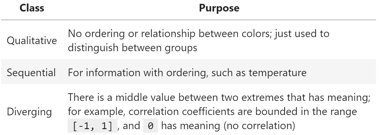
Figure 6.37 – Types of colormaps
Tip
Browse colors by name, hex, and RGB values at https://www.color-hex.com/, and find the full color spectrum for the colormaps at https://matplotlib.org/gallery/color/colormap_reference.html.
In Python, we can obtain a list of all the available colormaps by running the following:
>>> from matplotlib import cm
>>> cm.datad.keys()
dict_keys(['Blues', 'BrBG', 'BuGn', 'BuPu', 'CMRmap', 'GnBu',
'Greens', 'Greys', 'OrRd', 'Oranges', 'PRGn',
'PiYG', 'PuBu', 'PuBuGn', 'PuOr', 'PuRd', 'Purples',
'RdBu', 'RdGy', 'RdPu', 'RdYlBu', 'RdYlGn',
'Reds', ..., 'Blues_r', 'BrBG_r', 'BuGn_r', ...])
Notice that some of the colormaps are present twice where one is in the reverse order, signified by the _r suffix on the name. This is very helpful since we don't have to invert our data to map the values to the colors we want. Pandas accepts these colormaps as strings or matplotlib colormaps with the colormap argument of the plot() method, meaning we can pass in 'coolwarm_r', cm.get_cmap('coolwarm_r'), or cm.coolwarm_r and get the same result.
Let's use the coolwarm_r colormap to show how Facebook stock's closing price oscillates between the 20-day rolling minimum and maximum prices:
>>> ax = fb.assign(
... rolling_min=lambda x: x.low.rolling(20).min(),
... rolling_max=lambda x: x.high.rolling(20).max()
... ).plot(
... y=['rolling_max', 'rolling_min'],
... colormap='coolwarm_r',
... label=['20D rolling max', '20D rolling min'],
... style=[':', '--'],
... figsize=(12, 3),
... title='FB closing price in 2018 oscillating between '
... '20-day rolling minimum and maximum price'
... )
>>> ax.plot(
... fb.close, 'purple', alpha=0.25, label='closing price'
... )
>>> plt.legend()
>>> plt.ylabel('price ($)')
Notice how easy it was to get red to represent hot performance (rolling maximum) and blue for cold (rolling minimum), by using the reversed colormap, rather than trying to make sure pandas plotted the rolling minimum first:
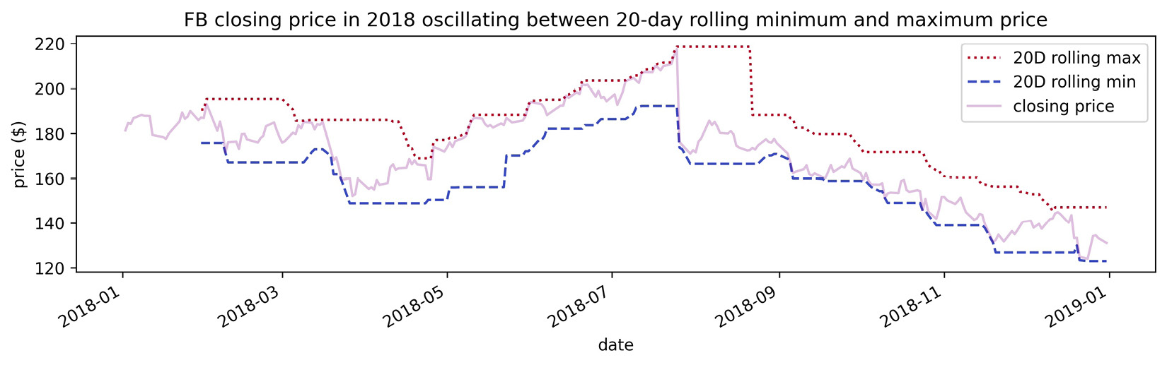
Figure 6.38 – Working with colormaps
The colormap object is a callable, meaning we can pass it values in the range [0, 1] and it will tell us the RGBA value for that point on the colormap, which we can use for the color argument. This gives us more fine-tuned control over the colors that we use from the colormap. We can use this technique to control how we spread the colormap across our data. For example, we can ask for the midpoint of the ocean colormap to use with the color argument:
>>> cm.get_cmap('ocean')(.5)
(0.0, 0.2529411764705882, 0.5019607843137255, 1.0)
Tip
There's an example of using a colormap as a callable in the covid19_cases_map.ipynb notebook, where COVID-19 case counts are mapped to colors, with darker colors indicating more cases.
Despite the wealth of colormaps available, we may find the need to create our own. Perhaps we have a color palette we like to work with or have some requirement that we use a specific color scheme. We can make our own colormaps with matplotlib. Let's make a blended colormap that goes from purple (#800080) to yellow (#FFFF00) with orange (#FFA500) in the center. All the functions we need for this are in color_utils.py. We can import the functions like this if we are running Python from the same directory as the file:
>>> import color_utils
First, we need to translate these hex colors to their RGB equivalents, which is what the hex_to_rgb_color_list() function will do. Note that this function can also handle the shorthand hex codes of three digits when the RGB values use the same hexadecimal digit for both of the digits (for example, #F1D is the shorthand equivalent of #FF11DD):
import re
def hex_to_rgb_color_list(colors):
"""
Take color or list of hex code colors and convert them
to RGB colors in the range [0,1].
Parameters:
- colors: Color or list of color strings as hex codes
Returns:
The color or list of colors in RGB representation.
"""
if isinstance(colors, str):
colors = [colors]
for i, color in enumerate(
[color.replace('#', '') for color in colors]
):
hex_length = len(color)
if hex_length not in [3, 6]:
raise ValueError(
'Colors must be of the form #FFFFFF or #FFF'
)
regex = '.' * (hex_length // 3)
colors[i] = [
int(val * (6 // hex_length), 16) / 255
for val in re.findall(regex, color)
]
return colors[0] if len(colors) == 1 else colors
Tip
Take a look at the enumerate() function; this lets us grab the index and the value at that index when we iterate, rather than looking up the value in the loop. Also, notice how easy it is for Python to convert base 10 numbers to hexadecimal numbers with the int() function by specifying the base. (Remember that // is integer division—we have to do this since int() expects an integer and not a float.)
The next function we need is one to take those RGB colors and create the values for the colormap. This function will need to do the following:
- Create a 4D NumPy array with 256 slots for color definitions. Note that we don't want to change the transparency, so we will leave the fourth dimension (alpha) alone.
- For each dimension (red, green, and blue), use the np.linspace() function to create even transitions between the target colors (that is, transition from the red component of color 1 to the red component of color 2, then to the red component of color 3, and so on, before repeating this process with the green components and finally the blue components).
- Return a ListedColormap object that we can use when plotting.
This is what the blended_cmap() function does:
from matplotlib.colors import ListedColormap
import numpy as np
def blended_cmap(rgb_color_list):
"""
Create a colormap blending from one color to the other.
Parameters:
- rgb_color_list: List of colors represented as
[R, G, B] values in the range [0, 1], like
[[0, 0, 0], [1, 1, 1]], for black and white.
Returns:
A matplotlib `ListedColormap` object
"""
if not isinstance(rgb_color_list, list):
raise ValueError('Colors must be passed as a list.')
elif len(rgb_color_list) < 2:
raise ValueError('Must specify at least 2 colors.')
elif (
not isinstance(rgb_color_list[0], list)
or not isinstance(rgb_color_list[1], list)
) or (
(len(rgb_color_list[0]) != 3
or len(rgb_color_list[1]) != 3)
):
raise ValueError(
'Each color should be a list of size 3.'
)
N, entries = 256, 4 # red, green, blue, alpha
rgbas = np.ones((N, entries))
segment_count = len(rgb_color_list) – 1
segment_size = N // segment_count
remainder = N % segment_count # need to add this back later
for i in range(entries - 1): # we don't alter alphas
updates = []
for seg in range(1, segment_count + 1):
# handle uneven splits due to remainder
offset = 0 if not remainder or seg > 1
else remainder
updates.append(np.linspace(
start=rgb_color_list[seg - 1][i],
stop=rgb_color_list[seg][i],
num=segment_size + offset
))
rgbas[:,i] = np.concatenate(updates)
return ListedColormap(rgbas)
We can use the draw_cmap() function to draw a colorbar, which allows us to visualize our colormap:
import matplotlib.pyplot as plt
def draw_cmap(cmap, values=np.array([[0, 1]]), **kwargs):
"""
Draw a colorbar for visualizing a colormap.
Parameters:
- cmap: A matplotlib colormap
- values: Values to use for the colormap
- kwargs: Keyword arguments to pass to `plt.colorbar()`
Returns:
A matplotlib `Colorbar` object, which you can save
with: `plt.savefig(<file_name>, bbox_inches='tight')`
"""
img = plt.imshow(values, cmap=cmap)
cbar = plt.colorbar(**kwargs)
img.axes.remove()
return cbar
This function makes it easy for us to add a colorbar with a custom colormap for any visualization we choose; the covid19_cases_map.ipynb notebook has an example using COVID-19 cases plotted on a world map. For now, let's use these functions to create and visualize our colormap. We will be using them by importing the module (which we did earlier):
>>> my_colors = ['#800080', '#FFA500', '#FFFF00']
>>> rgbs = color_utils.hex_to_rgb_color_list(my_colors)
>>> my_cmap = color_utils.blended_cmap(rgbs)
>>> color_utils.draw_cmap(my_cmap, orientation='horizontal')
This results in the following colorbar showing our colormap:
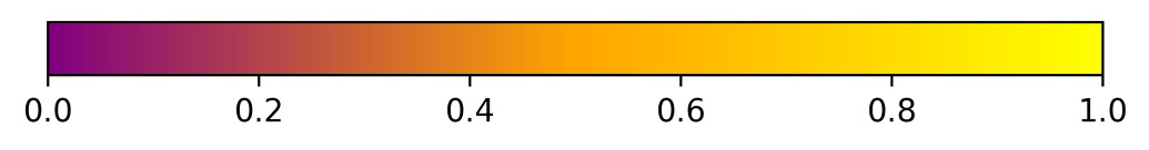
Figure 6.39 – Custom blended colormap
Tip
Seaborn also provides additional color palettes, along with handy utilities for picking colormaps and making custom ones for use with matplotlib interactively in a Jupyter Notebook. Check out the Choosing color palettes tutorial (https://seaborn.pydata.org/tutorial/color_palettes.html) for more information. The notebook also contains a short example.
As we have seen in the colorbar we created, these colormaps have the ability to show different gradients of the colors to capture values on a continuum. If we merely want each line in our line plot to be a different color, we most likely want to cycle between different colors. For that, we can use itertools.cycle() with a list of colors; they won't be blended, but we can cycle through them endlessly because it will be an infinite iterator. We used this technique earlier in the chapter to define our own colors for the regression residuals plots:
>>> import itertools
>>> colors = itertools.cycle(['#ffffff', '#f0f0f0', '#000000'])
>>> colors
<itertools.cycle at 0x1fe4f300>
>>> next(colors)
'#ffffff'
Even simpler would be the case where we have a list of colors somewhere, but rather than putting that in our plotting code and storing another copy in memory, we can write a simple generator that just yields from that master list. By using generators, we are being efficient with memory without crowding our plotting code with the color logic. Note that a generator is defined as a function, but instead of using return, it uses yield. The following snippet shows a mock-up for this scenario, which is similar to the itertools solution; however, it is not infinite. This just goes to show that we can find many ways to do something in Python; we have to find the implementation that best meets our needs:
from my_plotting_module import master_color_list
def color_generator():
yield from master_color_list
Using matplotlib, the alternative would be to instantiate a ListedColormap object with the color list and define a large value for N so that it repeats for long enough (if we don't provide it, it will only go through the colors once):
>>> from matplotlib.colors import ListedColormap
>>> red_black = ListedColormap(['red', 'black'], N=2000)
>>> [red_black(i) for i in range(3)]
[(1.0, 0.0, 0.0, 1.0),
(0.0, 0.0, 0.0, 1.0),
(1.0, 0.0, 0.0, 1.0)]
Note that we can also use cycler from the matplotlib team, which adds additional flexibility by allowing us to define combinations of colors, line styles, markers, line widths, and more to cycle through. The API details the available functionality and can be found at https://matplotlib.org/cycler/. We will see an example of this in Chapter 7, Financial Analysis – Bitcoin and the Stock Market.
Conditional coloring
Colormaps make it easy to vary color according to the values in our data, but what happens if we only want to use a specific color when certain conditions are met? In that case, we need to build a function around color selection.
We can write a generator to determine plot color based on our data and only calculate it when it is asked for. Let's say we wanted to assign colors to years from 1992 to 200018 (no, that's not a typo) based on whether they are leap years, and distinguish why they aren't leap years (for example, we want a special color for years divisible by 100 but not 400, which aren't leap years). We certainly don't want to keep a list this size in memory, so we create a generator to calculate the color on demand:
def color_generator():
for year in range(1992, 200019): # integers [1992, 200019)
if year % 100 == 0 and year % 400 != 0:
# special case (divisible by 100 but not 400)
color = '#f0f0f0'
elif year % 4 == 0:
# leap year (divisible by 4)
color = '#000000'
else:
color = '#ffffff'
yield color
Important note
The modulo operator (%) returns the remainder of a division operation. For example, 4 % 2 equals 0 because 4 is divisible by 2. However, since 4 is not divisible by 3, 4 % 3 is non-zero; it is 1 because we can fit 3 into 4 once and will have 1 left over (4 - 3). The modulo operator can be used to check the divisibility of one number by another and is often used to check whether a number is odd or even. Here, we are using it to see whether the conditions for being a leap year (which depend on divisibility) are met.
Since we defined year_colors as a generator, Python will remember where we are in this function and resume when next() is called:
>>> year_colors = color_generator()
>>> year_colors
<generator object color_generator at 0x7bef148dfed0>
>>> next(year_colors)
'#000000'
Simpler generators can be written with generator expressions. For example, if we don't care about the special case anymore, we can use the following:
>>> year_colors = (
... '#ffffff'
... if (not year % 100 and year % 400) or year % 4
... else '#000000' for year in range(1992, 200019)
... )
>>> year_colors
<generator object <genexpr> at 0x7bef14415138>
>>> next(year_colors)
'#000000'
Those not coming from Python might find it strange that our Boolean conditions in the previous code snippet are actually numbers (year % 400 results in an integer). This is taking advantage of Python's truthy/falsey values; values that have zero value (such as the number 0) or are empty (such as [] or '') are falsey. Therefore, while in the first generator, we wrote year % 400 != 0 to show exactly what was going on, the more Pythonic way is year % 400, since if there is no remainder (evaluates to 0), the statement will be evaluated as False, and vice versa. Obviously, we will have times where we must choose between readability and being Pythonic, but it's good to be aware of how to write Pythonic code, as it will often be more efficient.
Tip
Run import this in Python to see the Zen of Python, which gives some ideas of what it means to be Pythonic.
Now that we have some exposure to working with colors in matplotlib, let's consider another way we can make our data stand out. Depending on what we are plotting or how our visualization will be used (for example, in black and white), it might make sense to use textures along with, or instead of, colors.
Textures
In addition to customizing the colors used in our visualizations, matplotlib also makes it possible to include textures with a variety of plotting functions. This is achieved via the hatch argument, which pandas will pass down for us. Let's create a bar plot of weekly volume traded in Facebook stock during Q4 2018 with textured bars:
>>> weekly_volume_traded = fb.loc['2018-Q4']
... .groupby(pd.Grouper(freq='W')).volume.sum()
>>> weekly_volume_traded.index =
... weekly_volume_traded.index.strftime('W %W')
>>> ax = weekly_volume_traded.plot(
... kind='bar',
... hatch='*',
... color='lightgray',
... title='Volume traded per week in Q4 2018'
... )
>>> ax.set(
... xlabel='week number',
... ylabel='volume traded'
... )
With hatch='*', our bars are filled with stars. Notice that we also set the color for each of the bars, so there is a lot of flexibility here:
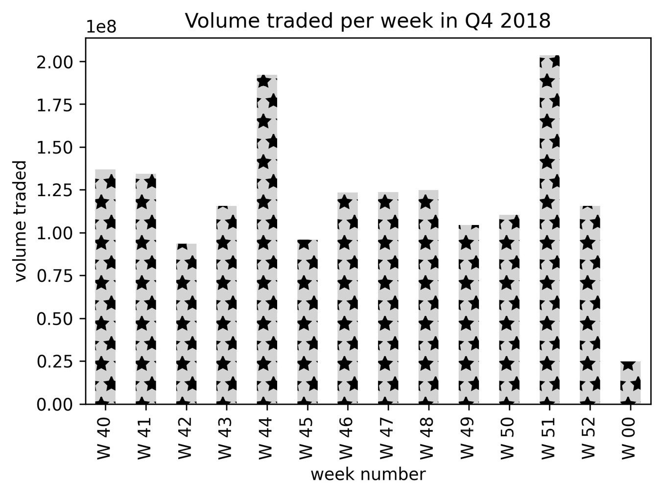
Figure 6.40 – Using textured bars
Textures can also be combined to make new patterns and repeated to intensify the effect. Let's revisit the plt.fill_between() example where we colored the December section only (Figure 6.33). This time we will use textures to distinguish between each month, rather than only shading December; we will fill October with rings, November with slashes, and December with small dots:
>>> import calendar
>>> fb_q4 = fb.loc['2018-Q4']
>>> for texture, month in zip(
... ['oo', '/\/', '...'], [10, 11, 12]
... ):
... plt.fill_between(
... fb_q4.index, fb_q4.high, fb_q4.low,
... hatch=texture, facecolor='white',
... where=fb_q4.index.month == month,
... label=f'{calendar.month_name[month]} differential'
... )
>>> plt.plot(fb_q4.index, fb_q4.high, '--', label='daily high')
>>> plt.plot(fb_q4.index, fb_q4.low, '--', label='daily low')
>>> plt.xticks([
... '2018-10-01', '2018-11-01', '2018-12-01', '2019-01-01'
... ])
>>> plt.xlabel('date')
>>> plt.ylabel('price ($)')
>>> plt.title(
... 'FB differential between high and low price Q4 2018'
... )
>>> plt.legend()
Using hatch='o' would yield thin rings, so we used 'oo' to get thicker rings for October. For November, we wanted a crisscross pattern, so we combined two forward slashes and two backslashes (we actually have four backslashes because they must be escaped). To achieve the small dots for December, we used three periods—the more we add, the denser the texture becomes:
Figure 6.41 – Combining textures
This concludes our discussion of plot customizations. By no means was this meant to be complete, so be sure to explore the matplotlib API for more.
Summary
Whew, that was a lot! We learned how to create impressive and customized visualizations using matplotlib, pandas, and seaborn. We discussed how we can use seaborn for additional plotting types and cleaner versions of some familiar ones. Now we can easily make our own colormaps, annotate our plots, add reference lines and shaded regions, finesse the axes/legends/titles, and control most aspects of how our visualizations will appear. We also got a taste of working with itertools and creating our own generators.
Take some time to practice what we've discussed with the end-of-chapter exercises. In the next chapter, we will apply all that we have learned to finance, as we build our own Python package and compare bitcoin to the stock market.
Exercises
Create the following visualizations using what we have learned so far in this book and the data from this chapter. Be sure to add titles, axis labels, and legends (where appropriate) to the plots:
- Using seaborn, create a heatmap to visualize the correlation coefficients between earthquake magnitude and whether there was a tsunami for earthquakes measured with the mb magnitude type.
- Create a box plot of Facebook volume traded and closing prices, and draw reference lines for the bounds of a Tukey fence with a multiplier of 1.5. The bounds will be at Q1 − 1.5 × IQR and Q3 + 1.5 × IQR. Be sure to use the quantile() method on the data to make this easier. (Pick whichever orientation you prefer for the plot, but make sure to use subplots.)
- Plot the evolution of cumulative COVID-19 cases worldwide, and add a dashed vertical line on the date that it surpassed 1 million. Be sure to format the tick labels on the y-axis accordingly.
- Use axvspan() to shade a rectangle from '2018-07-25' to '2018-07-31', which marks the large decline in Facebook price on a line plot of the closing price.
- Using the Facebook stock price data, annotate the following three events on a line plot of the closing price:
a) Disappointing user growth announced after close on July 25, 2018
b) Cambridge Analytica story breaks on March 19, 2018 (when it affected the market)
c) FTC launches investigation on March 20, 2018
- Modify the reg_resid_plots() function to use a matplotlib colormap instead of cycling between two colors. Remember, for this use case, we should pick a qualitative colormap or make our own.
Further reading
Check out the following resources for more information on the topics covered in this chapter:
- Choosing Colormaps: https://matplotlib.org/tutorials/colors/colormaps.html
- Controlling figure aesthetics (seaborn): https://seaborn.pydata.org/tutorial/aesthetics.html
- Customizing Matplotlib with style sheets and rcParams: https://matplotlib.org/tutorials/introductory/customizing.html
- Format String Syntax: https://docs.python.org/3/library/string.html#format-string-syntax
- Generator Expressions (PEP 289): https://www.python.org/dev/peps/pep-0289/
- Information Dashboard Design: Displaying Data for At-a-Glance Monitoring, Second Edition, by Stephen Few: https://www.amazon.com/Information-Dashboard-Design-At-Glance/dp/1938377001/
- Matplotlib Named Colors: https://matplotlib.org/examples/color/named_colors.html
- Multiple assignment and tuple unpacking improve Python code readability: https://treyhunner.com/2018/03/tuple-unpacking-improves-python-code-readability/
- Python: range is not an iterator!: https://treyhunner.com/2018/02/python-range-is-not-an-iterator/
- Python zip() function: https://www.journaldev.com/15891/python-zip-function
- Seaborn API reference: https://seaborn.pydata.org/api.html
- Show Me the Numbers: Designing Tables and Graphs to Enlighten, by Stephen Few: https://www.amazon.com/gp/product/0970601972/
- Style sheets reference (Matplotlib): https://matplotlib.org/gallery/style_sheets/style_sheets_reference.html
- Support and Resistance Basics: https://www.investopedia.com/trading/support-and-resistance-basics/
- The Iterator Protocol: How "For Loops" Work in Python: https://treyhunner.com/2016/12/python-iterator-protocol-how-for-loops-work/
- The Visual Display of Quantitative Information, by Edward R. Tufte: https://www.amazon.com/Visual-Display-Quantitative-Information/dp/1930824130
- Tick formatters: https://matplotlib.org/gallery/ticks_and_spines/tick-formatters.html
- What does Pythonic mean?: https://stackoverflow.com/questions/25011078/what-does-pythonic-mean