Chapter 9: Fundamental Algorithmic Trading Strategies
This chapter outlines several algorithms profitable on the given stock, given a time window and certain parameters, with the aim of helping you to formulate an idea of how to develop your own trading strategies.
In this chapter, we will discuss the following topics:
- What is an algorithmic trading strategy?
- Learning momentum-based/trend-following strategies
- Learning mean-reversion strategies
- Learning mathematical model-based strategies
- Learning time series prediction-based strategies
Technical requirements
The Python code used in this chapter is available in the Chapter09/signals_and_strategies.ipynb notebook in the book's code repository.
What is an algorithmic trading strategy?
Any algorithmic trading strategy should entail the following:
- It should be a model based on an underlying market theory since only then can you find its predictive power. Fitting a model to data with great backtesting results is simple, but usually does not provide sound predictions.
- It should be as simple as possible – the more complex the strategy, the less likely it is to perform well in the long term (overfitting).
- It should restrict the strategy for a well-defined set of financial assets (trading universe) based on the following:
a) Their returns profile.
b) Their returns not being correlated.
c) Their trading patterns – you do not want to trade an illiquid asset; you restrict yourself just to significantly traded assets.
- It should define the relevant financial data:
a) Frequency: Daily, monthly, intraday, and suchlike
b) Data source
- It should define the model's parameters.
- It should define their timing, entry, exit rules, and position sizing strategy – for example, we cannot trade more than 10% of the average daily volume; usually, the decision to enter/exit is made by a composition of several indicators.
- It should define the risk levels – how much of a risk a single asset can bear.
- It should define the benchmark used to compare performance against.
- It should define its rebalancing policy – as the markets evolve, the position sizes and risk levels will deviate from their target levels and then it is necessary to adjust the portfolios.
Usually, you have a large library of algorithmic trading strategies, and backtesting will suggest which of these strategies, on which assets, and at what point in time they may generate a profit. You should keep a backtesting journal to keep track of what strategies did or didn't work, on what stock, and during what period.
How do you go about finding a portfolio of stocks to consider for trading? The options are as follows:
- Use ETF/index components – for example, the members of the Dow Jones Industrial Average.
- Use all listed stocks and then restrict the list to the following:
a) Those stocks that are traded the most
b) Just non-correlated stocks
c) Those stocks that are underperforming or overperforming using a returns model, such as the Fama-French three-factor model
- You should classify each stock into as many categories as possible:
a) Value/growth stocks
b) By industry
Each trading strategy depends on a number of parameters. How do you go about finding the best values for each of them? The possible approaches are as follow:
- A parameter sweep by trying each possible value within the range of possible values for each parameter, but this would require an enormous amount of computing resources.
- Very often, a parameter sweep that involves testing many random samples, instead of all values, from the range of possible values provides a reasonable approximation.
To build a large library of algorithmic trading strategies, you should do the following:
- Subscribe to financial trading blogs.
- Read financial trading books.
The key algorithmic trading strategies can be classified as follows:
- Momentum-based/trend-following strategies
- Mean-reversion strategies
- Mathematical model-based strategies
- Arbitrage strategies
- Market-making strategies
- Index fund rebalancing strategies
- Trading timing optimization strategies (VWAP, TWAP, POV, and so on)
In addition, you yourself should classify all trading strategies depending on the environment where they work best – some strategies work well in volatile markets with strong trends, while others do not.
The following algorithms use the freely accessible Quandl data bundle; thus, the last trading date is January 1, 2018.
You should accumulate many different trading algorithms, list the number of possible parameters, and backtest the stocks on a number of parameters on the universe of stocks (for example, those with an average trading volume of at least X) to see which may be profitable. Backtesting should happen in a time window such as the present and near future – for example, the volatility regime.
The best way of reading the following strategies is as follows:
- Identify the signal formula of the strategy and consider it for an entry/exit rule for your own strategy or for a combination with other strategies – some of the most profitable strategies are combinations of existing strategies.
- Consider the frequency of trading – daily trading may not be suitable for all strategies due to the transaction costs.
- Each strategy works for different types of stocks and their market – some work only for trending stocks, some work only for high-volatility stocks, and so on.
Learning momentum-based/trend-following strategies
Momentum-based/trend-following strategies are types of technical analysis strategies. They assume that the near-time future prices will follow an upward or downward trend.
Rolling window mean strategy
This strategy is to own a financial asset if its latest stock price is above the average price over the last X days.
In the following example, it works well for Apple stock and a period of 90 days:
%matplotlib inline
from zipline import run_algorithm
from zipline.api import order_target_percent, symbol, set_commission
from zipline.finance.commission import PerTrade
import pandas as pd
import pyfolio as pf
import warnings
warnings.filterwarnings('ignore')
def initialize(context):
context.stock = symbol('AAPL')
context.rolling_window = 90
set_commission(PerTrade(cost=5))
def handle_data(context, data):
price_hist = data.history(context.stock, "close",
context.rolling_window, "1d")
order_target_percent(context.stock, 1.0 if price_hist[-1] > price_hist.mean() else 0.0)
def analyze(context, perf):
returns, positions, transactions =
pf.utils.extract_rets_pos_txn_from_zipline(perf)
pf.create_returns_tear_sheet(returns,
benchmark_rets = None)
start_date = pd.to_datetime('2000-1-1', utc=True)
end_date = pd.to_datetime('2018-1-1', utc=True)
results = run_algorithm(start = start_date, end = end_date,
initialize = initialize,
analyze = analyze,
handle_data = handle_data,
capital_base = 10000,
data_frequency = 'daily',
bundle ='quandl')
The outputs are as follows:

Figure 9.1 – Rolling window mean strategy; summary return and risk statistics
When assessing a trading strategy, the preceding statistics are the first step. Each provides a different view on the strategy performance:
- Sharpe ratio: This is a measure of excess return versus standard deviation of the excess return. The higher the ratio, the better the algorithm performed on a risk-adjusted basis.
- Calmar ratio: This is a measure of the average compounded annual rate of return versus its maximum drawdown. The higher the ratio, the better the algorithm performed on a risk-adjusted basis.
- Stability: This is defined as the R-squared value of a linear fit to the cumulative log returns. The higher the number, the higher the trend in the cumulative returns.
- Omega ratio: This is defined as the probability weighted ratio of gains versus losses. It is a generalization of the Sharpe ratio, taking into consideration all moments of the distribution. The higher the ratio, the better the algorithm performed on a risk-adjusted basis.
- Sortino ratio: This is a variation of the Sharpe ratio – it uses only the standard deviation of the negative portfolio returns (downside risk). The higher the ratio, the better the algorithm performed on a risk-adjusted basis.
- Tail ratio: This is defined as the ratio between the right 95% and the left tail 5%. For example, a ratio of 1/3 means that the losses are three times worse than the profits. The higher the number, the better.
In this example, we see that the strategy has a very high stability (.92) over the trading window, which somewhat offsets the high maximum drawdown (-59.4%). The tail ratio is most favorable:

Figure 9.2 – Rolling window mean strategy; worst five drawdown periods
While the worst maximum drawdown of 59.37% is certainly not good, if we adjusted the entry/exit strategy rules, we would most likely avoid it. Notice the duration of the drawdown periods – more than 3 years in the maximum drawdown period.
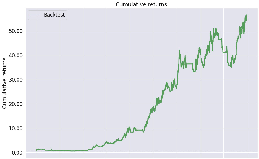
Figure 9.3 – Rolling window mean strategy; cumulative returns over the investment horizon
As the stability measure confirms, we see a positive trend in the cumulative returns over the trading horizon.
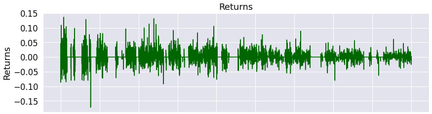
Figure 9.4 – Rolling window mean strategy; returns over the investment horizon
The chart confirms that the returns oscillate widely around zero.
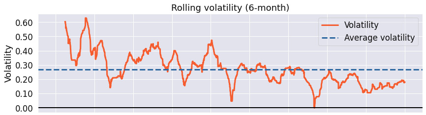
Figure 9.5 – Rolling window mean strategy; 6-month rolling volatility over the investment horizon
This chart illustrates that the strategy's return volatility is decreasing over the time horizon.

Figure 9.6 – Rolling window mean strategy; 6-month rolling Sharpe ratio over the investment horizon
We see that the maximum Sharpe ratio of the strategy is above 4, with its minimum value below -2. If we reviewed the entry/exit rules, we should be able to improve the strategy's performance.
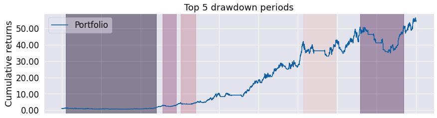
Figure 9.7 – Rolling window mean strategy; top five drawdown periods over the investment horizon
A graphical representation of the maximum drawdown indicates that the periods of maximum drawdown are overly long.
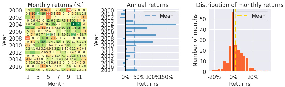
Figure 9.8 – Rolling window mean strategy; monthly returns, annual returns, and the distribution of monthly returns over the investment horizon
The Monthly returns chart shows that we have traded during most months. The Annual returns bar chart shows that the returns are overwhelmingly positive, while the Distribution of monthly returns chart shows that the skew is positive to the right.
The rolling window mean strategy is one of the simplest strategies and is still very profitable for certain combinations of stocks and time frames. Notice that the maximum drawdown for this strategy is significant and may be improved if we added more advanced entry/exit rules.
Simple moving averages strategy
This strategy follows a simple rule: buy the stock if the short-term moving averages rise above the long-term moving averages:
%matplotlib inline
from zipline import run_algorithm
from zipline.api import order_target_percent, symbol, set_commission
from zipline.finance.commission import PerTrade
import pandas as pd
import pyfolio as pf
import warnings
warnings.filterwarnings('ignore')
def initialize(context):
context.stock = symbol('AAPL')
context.rolling_window = 90
set_commission(PerTrade(cost=5))
def handle_data(context, data):
price_hist = data.history(context.stock, "close",
context.rolling_window, "1d")
rolling_mean_short_term =
price_hist.rolling(window=45, center=False).mean()
rolling_mean_long_term =
price_hist.rolling(window=90, center=False).mean()
if rolling_mean_short_term[-1] > rolling_mean_long_term[-1]:
order_target_percent(context.stock, 1.0)
elif rolling_mean_short_term[-1] < rolling_mean_long_term[-1]:
order_target_percent(context.stock, 0.0)
def analyze(context, perf):
returns, positions, transactions =
pf.utils.extract_rets_pos_txn_from_zipline(perf)
pf.create_returns_tear_sheet(returns,
benchmark_rets = None)
start_date = pd.to_datetime('2000-1-1', utc=True)
end_date = pd.to_datetime('2018-1-1', utc=True)
results = run_algorithm(start = start_date, end = end_date,
initialize = initialize,
analyze = analyze,
handle_data = handle_data,
capital_base = 10000,
data_frequency = 'daily',
bundle ='quandl')

Figure 9.9 – Simple moving averages strategy; summary return and risk statistics
The statistics show that the strategy is overwhelmingly profitable in the long term (high stability and tail ratios), while the maximum drawdown can be substantial.

Figure 9.10 – Simple moving averages strategy; worst five drawdown periods
The worst drawdown periods are rather long – more than 335 days, with some even taking more than 3 years in the worst case.
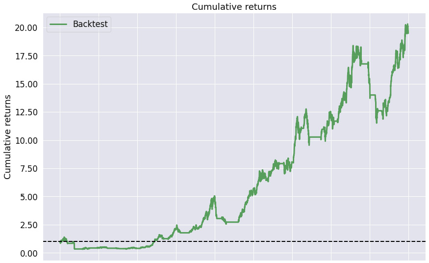
Figure 9.11 – Simple moving averages strategy; cumulative returns over the investment horizon
This chart does, however, confirm that this long-term strategy is profitable – we see the cumulative returns grow consistently after the first drawdown.
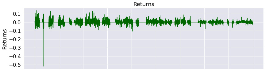
Figure 9.12 – Simple moving averages strategy; returns over the investment horizon
The chart illustrates that there was a major negative return event at the very start of the trading window and then the returns oscillate around zero.
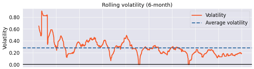
Figure 9.13 – Simple moving averages strategy; 6-month rolling volatility over the investment horizon
The rolling volatility chart shows that the rolling volatility is decreasing with time.

Figure 9.14 – Simple moving averages strategy; 6-month rolling Sharpe ratio over the investment horizon
While the maximum Sharpe ratio was over 4, with the minimum equivalent being below -4, the average Sharpe ratio was 0.68.
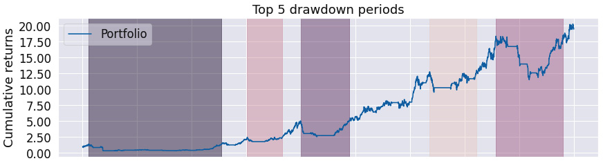
Figure 9.15 – Simple moving averages strategy; top five drawdown periods over the investment horizon
This chart confirms that the maximum drawdown periods were very long.
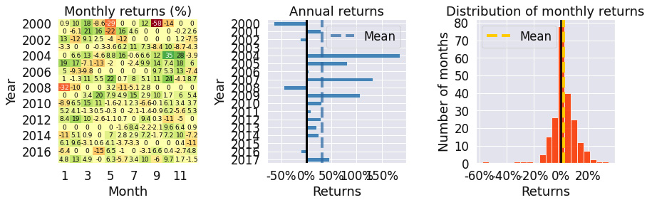
Figure 9.16 – Simple moving averages strategy; monthly returns, annual returns, and the distribution of monthly returns over the investment horizon
The monthly returns table shows that there was no trade across many months. The annual returns were mostly positive. The Distribution of monthly returns chart confirms that the skew is negative.
The simple moving averages strategy is less profitable and has a greater maximum drawdown than the rolling window mean strategy. One reason may be that the rolling window for the moving averages is too large.
Exponentially weighted moving averages strategy
This strategy is similar to the previous one, with the exception of using different rolling windows and exponentially weighted moving averages. The results are slightly better than those achieved under the previous strategy.
Some other moving average algorithms use both simple moving averages and exponentially weighted moving averages in the decision rule; for example, if the simple moving average is greater than the exponentially weighted moving average, make a move:
%matplotlib inline
from zipline import run_algorithm
from zipline.api import order_target_percent, symbol, set_commission
from zipline.finance.commission import PerTrade
import pandas as pd
import pyfolio as pf
import warnings
warnings.filterwarnings('ignore')
def initialize(context):
context.stock = symbol('AAPL')
context.rolling_window = 90
set_commission(PerTrade(cost=5))
def handle_data(context, data):
price_hist = data.history(context.stock, "close",
context.rolling_window, "1d")
rolling_mean_short_term =
price_hist.ewm(span=5, adjust=True,
ignore_na=True).mean()
rolling_mean_long_term =
price_hist.ewm(span=30, adjust=True,
ignore_na=True).mean()
if rolling_mean_short_term[-1] > rolling_mean_long_term[-1]:
order_target_percent(context.stock, 1.0)
elif rolling_mean_short_term[-1] < rolling_mean_long_term[-1]:
order_target_percent(context.stock, 0.0)
def analyze(context, perf):
returns, positions, transactions =
pf.utils.extract_rets_pos_txn_from_zipline(perf)
pf.create_returns_tear_sheet(returns,
benchmark_rets = None)
start_date = pd.to_datetime('2000-1-1', utc=True)
end_date = pd.to_datetime('2018-1-1', utc=True)
results = run_algorithm(start = start_date, end = end_date,
initialize = initialize,
analyze = analyze,
handle_data = handle_data,
capital_base = 10000,
data_frequency = 'daily',
bundle ='quandl')
The outputs are as follows:
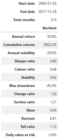
Figure 9.17 – Exponentially weighted moving averages strategy; summary return and risk statistics
The results show that the level of maximum drawdown has dropped from the previous strategies, while still keeping very strong stability and tail ratios.
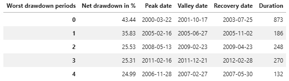
Figure 9.18 – Exponentially weighted moving averages strategy; worst five drawdown periods
The magnitude of the worst drawdown, as well as its maximum duration in days, is far better than for the previous two strategies.

Figure 9.19 – Exponentially weighted moving averages strategy; cumulative returns over the investment horizon
As the stability indicator shows, we see consistent positive cumulative returns.
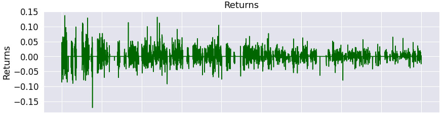
Figure 9.20 – Exponentially weighted moving averages strategy; returns over the investment horizon
The returns oscillate around zero, being more positive than negative.

Figure 9.21 – Exponentially weighted moving averages strategy; 6-month rolling volatility over the investment horizon
The rolling volatility is dropping over time.
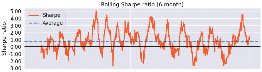
Figure 9.22 – Exponentially weighted moving averages strategy; 6-month rolling Sharpe ratio over the investment horizon
We see that the maximum Sharpe ratio reached almost 5, while the minimum was slightly below -2, which again is better than for the two previous algorithms.
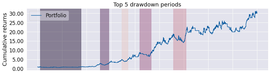
Figure 9.23 – Exponentially weighted moving averages strategy; top five drawdown periods over the investment horizon
Notice that the periods of the worst drawdown are not identical for the last three algorithms.

Figure 9.24 – Exponentially weighted moving averages strategy; monthly returns, annual returns, and the distribution of monthly returns over the investment horizon
The Monthly returns table shows that we have traded in most months. The Annual returns chart confirms that most returns have been positive. The Distribution of monthly returns chart is positively skewed, which is a good sign.
The exponentially weighted moving averages strategy performs better for Apple's stock over the given time frame. However, in general, the most suitable averages strategy depends on the stock and the time frame.
RSI strategy
This strategy depends on the stockstats package. It is very instructive to read the source code at https://github.com/intrad/stockstats/blob/master/stockstats.py.
To install it, use the following command:
pip install stockstats
The RSI indicator measures the velocity and magnitude of price movements and provides an indicator when a financial asset is oversold or overbought. It is a leading indicator.
It is measured from 0 to 100, with values over 70 indicating overbought, and values below 30 oversold:
%matplotlib inline
from zipline import run_algorithm
from zipline.api import order_target_percent, symbol, set_commission
from zipline.finance.commission import PerTrade
import pandas as pd
import pyfolio as pf
from stockstats import StockDataFrame as sdf
import warnings
warnings.filterwarnings('ignore')
def initialize(context):
context.stock = symbol('AAPL')
context.rolling_window = 20
set_commission(PerTrade(cost=5))
def handle_data(context, data):
price_hist = data.history(context.stock,
["open", "high",
"low","close"],
context.rolling_window, "1d")
stock=sdf.retype(price_hist)
rsi = stock.get('rsi_12')
if rsi[-1] > 90:
order_target_percent(context.stock, 0.0)
elif rsi[-1] < 10:
order_target_percent(context.stock, 1.0)
def analyze(context, perf):
returns, positions, transactions =
pf.utils.extract_rets_pos_txn_from_zipline(perf)
pf.create_returns_tear_sheet(returns,
benchmark_rets = None)
start_date = pd.to_datetime('2015-1-1', utc=True)
end_date = pd.to_datetime('2018-1-1', utc=True)
results = run_algorithm(start = start_date, end = end_date,
initialize = initialize,
analyze = analyze,
handle_data = handle_data,
capital_base = 10000,
data_frequency = 'daily',
bundle ='quandl')
The outputs are as follows:

Figure 9.25 – RSI strategy; summary return and risk statistics
The first look at the strategy shows an excellent Sharpe ratio, with a very low maximum drawdown and a favorable tail ratio.

Figure 9.26 – RSI strategy; worst five drawdown periods
The worst drawdown periods were very short – less than 2 months – and not substantial – a maximum drawdown of only -10.55%.
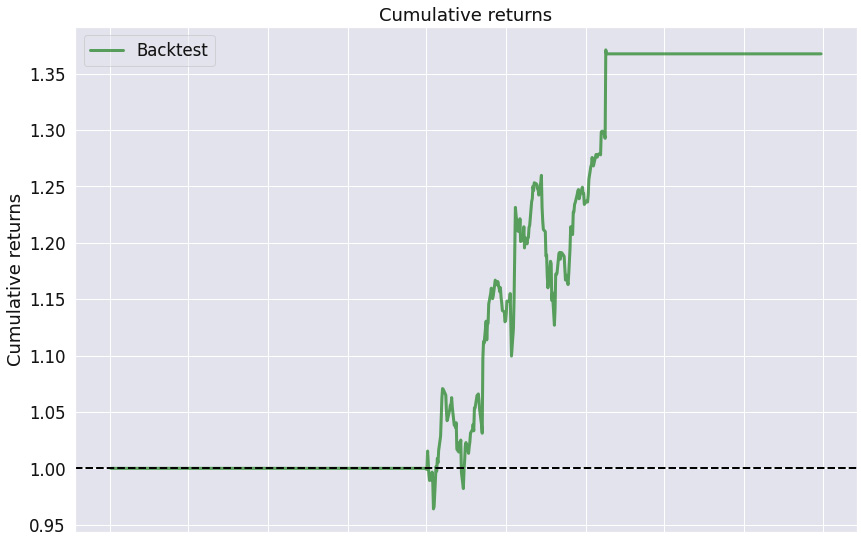
Figure 9.27 – RSI strategy; cumulative returns over the investment horizon
The Cumulative returns chart shows that we have not traded across most of the trading horizon and when we did trade, there was a positive trend in the cumulative returns.

Figure 9.28 – RSI strategy; returns over the investment horizon
We can see that when we traded, the returns were more likely to be positive than negative.
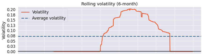
Figure 9.29 – RSI strategy; 6-month rolling volatility over the investment horizon
Notice that the maximum rolling volatility of 0.2 is far lower than for the previous strategies.
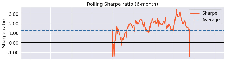
Figure 9.30 – RSI strategy; 6-month rolling Sharpe ratio over the investment horizon
We can see that Sharpe's ratio has consistently been over 1, with its maximum value over 3 and its minimum value below -1.
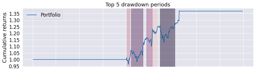
Figure 9.31 – RSI strategy; top five drawdown periods over the investment horizon
The chart illustrates short and insignificant drawdown periods.
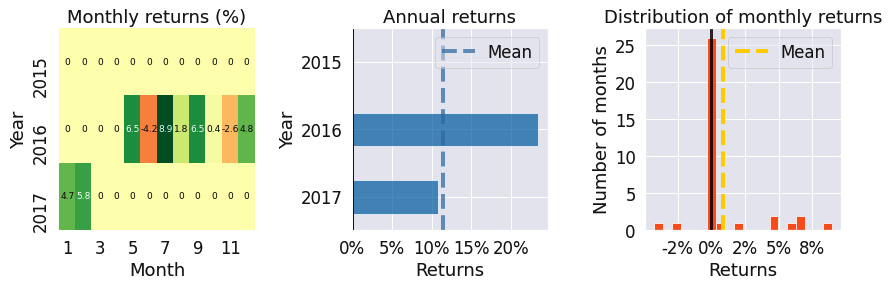
Figure 9.32 – RSI strategy; monthly returns, annual returns, and the distribution of monthly returns over the investment horizon
The Monthly returns table states that we have not traded in most months. However, according to the Annual returns chart, when we traded, we were hugely profitable. The Distribution of monthly returns chart confirms that the skew is hugely positive, with a large kurtosis.
The RSI strategy is highly performant in the case of Apple's stock over the given time frame, with a Sharpe ratio of 1.11. Notice, however, that the success of the strategy depends largely on the very strict entry/exit rules, meaning we are not trading in certain months at all.
MACD crossover strategy
Moving Average Convergence Divergence (MACD) is a lagging, trend-following momentum indicator reflecting the relationship between two moving averages of stock prices.
The strategy depends on two statistics, the MACD and the MACD signal line:
- The MACD is defined as the difference between the 12-day exponential moving average and the 26-day exponential moving average.
- The MACD signal line is then defined as the 9-day exponential moving average of the MACD.
The MACD crossover strategy is defined as follows:
- A bullish crossover happens when the MACD line turns upward and crosses beyond the MACD signal line.
- A bearish crossover happens when the MACD line turns downward and crosses under the MACD signal line.
Consequently, this strategy is best suited for volatile, highly traded markets:
%matplotlib inline
from zipline import run_algorithm
from zipline.api import order_target_percent, symbol, set_commission
from zipline.finance.commission import PerTrade
import pandas as pd
import pyfolio as pf
from stockstats import StockDataFrame as sdf
import warnings
warnings.filterwarnings('ignore')
def initialize(context):
context.stock = symbol('AAPL')
context.rolling_window = 20
set_commission(PerTrade(cost=5))
def handle_data(context, data):
price_hist = data.history(context.stock,
["open","high",
"low","close"],
context.rolling_window, "1d")
stock=sdf.retype(price_hist)
signal = stock['macds']
macd = stock['macd']
if macd[-1] > signal[-1] and macd[-2] <= signal[-2]:
order_target_percent(context.stock, 1.0)
elif macd[-1] < signal[-1] and macd[-2] >= signal[-2]:
order_target_percent(context.stock, 0.0)
def analyze(context, perf):
returns, positions, transactions =
pf.utils.extract_rets_pos_txn_from_zipline(perf)
pf.create_returns_tear_sheet(returns,
benchmark_rets = None)
start_date = pd.to_datetime('2015-1-1', utc=True)
end_date = pd.to_datetime('2018-1-1', utc=True)
results = run_algorithm(start = start_date, end = end_date,
initialize = initialize,
analyze = analyze,
handle_data = handle_data,
capital_base = 10000,
data_frequency = 'daily',
bundle ='quandl')
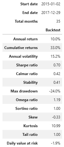
Figure 9.33 – MACD crossover strategy; summary return and risk statistics
The tail ratio illustrates that the top gains and losses are roughly of the same magnitude. The very low stability indicates that there is no strong trend in cumulative returns.
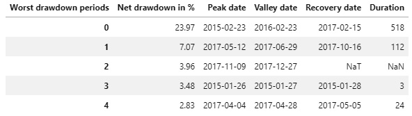
Figure 9.34 – MACD crossover strategy; worst five drawdown periods
Apart from the worst drawdown period, the other periods were shorter than 6 months, with a net drawdown lower than 10%.

Figure 9.35 – MACD crossover strategy; cumulative returns over the investment horizon
The Cumulative returns chart confirms the low stability indicator value.
The following is the Returns chart:
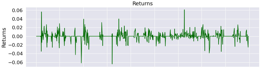
Figure 9.36 – MACD crossover strategy; returns over the investment horizon
The Returns chart shows that returns oscillated widely around zero, with a few outliers.
The following is the Rolling volatility chart:

Figure 9.37 – MACD crossover strategy; 6-month rolling volatility over the investment horizon
The rolling volatility has been oscillating around 0.15.
The following is the rolling Sharpe ratio chart:

Figure 9.38 – MACD crossover strategy; 6-month rolling Sharpe ratio over the investment horizon
The maximum rolling Sharpe ratio of about 4, with a minimum ratio of -2, is largely favorable.
The following is the top five drawdown periods chart:

Figure 9.39 – MACD crossover strategy; top five drawdown periods over the investment horizon
We see that the worst two drawdown periods have been rather long.

Figure 9.40 – MACD crossover strategy; monthly returns, annual returns, and the distribution of monthly returns over the investment horizon
The Monthly returns table confirms that we have traded across most months. The Annual returns chart indicates that the most profitable year was 2017. The Distribution of monthly returns chart shows a slight negative skew and large kurtosis.
The MACD crossover strategy is an effective strategy in trending markets and can be significantly improved by raising the entry/exit rules.
RSI and MACD strategies
In this strategy, we combine the RSI and MACD strategies and own the stock if both RSI and MACD criteria provide a signal to buy.
Using multiple criteria provides a more complete view of the market (note that we generalize the RSI threshold values to 50):
%matplotlib inline
from zipline import run_algorithm
from zipline.api import order_target_percent, symbol, set_commission
from zipline.finance.commission import PerTrade
import pandas as pd
import pyfolio as pf
from stockstats import StockDataFrame as sdf
import warnings
warnings.filterwarnings('ignore')
def initialize(context):
context.stock = symbol('MSFT')
context.rolling_window = 20
set_commission(PerTrade(cost=5))
def handle_data(context, data):
price_hist = data.history(context.stock,
["open", "high",
"low","close"],
context.rolling_window, "1d")
stock=sdf.retype(price_hist)
rsi = stock.get('rsi_12')
signal = stock['macds']
macd = stock['macd']
if rsi[-1] < 50 and macd[-1] > signal[-1] and macd[-2] <= signal[-2]:
order_target_percent(context.stock, 1.0)
elif rsi[-1] > 50 and macd[-1] < signal[-1] and macd[-2] >= signal[-2]:
order_target_percent(context.stock, 0.0)
def analyze(context, perf):
returns, positions, transactions =
pf.utils.extract_rets_pos_txn_from_zipline(perf)
pf.create_returns_tear_sheet(returns,
benchmark_rets = None)
start_date = pd.to_datetime('2015-1-1', utc=True)
end_date = pd.to_datetime('2018-1-1', utc=True)
results = run_algorithm(start = start_date, end = end_date,
initialize = initialize,
analyze = analyze,
handle_data = handle_data,
capital_base = 10000,
data_frequency = 'daily',
bundle ='quandl')
The outputs are as follows:
Figure 9.41 – RSI and MACD strategies; summary return and risk statistics
The high stability value, with a high tail ratio and excellent Sharpe ratio, as well as a low maximum drawdown, indicates that the strategy is excellent.
The following is the worst five drawdown periods chart:

Figure 9.42 – RSI and MACD strategies; worst five drawdown periods
We see that the worst drawdown periods were short – less than 4 months – with the worst net drawdown of -10.36%.
The following is the Cumulative returns chart:
Figure 9.43 – RSI and MACD strategies; cumulative returns over the investment horizon
The high stability value is favorable. Notice the horizontal lines in the chart; these indicate that we have not traded.
The following is the Returns chart:
Figure 9.44 – RSI and MACD strategies; returns over the investment horizon
The Returns chart shows that when we traded, the positive returns outweighed the negative ones.
The following is the Rolling volatility chart:
Figure 9.45 – RSI and MACD strategies; 6-month rolling volatility over the investment horizon
The rolling volatility has been decreasing over time and has been relatively low.
The following is the Rolling Sharpe ratio chart:

Figure 9.46 – RSI and MACD strategies; 6-month rolling Sharpe ratio over the investment horizon
The maximum rolling Sharpe ratio was over 3, with a minimum of below -2 and an average above 1.0 indicative of a very good result.
The following is the Top 5 drawdown periods chart:
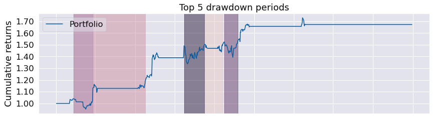
Figure 9.47 – RSI and MACD strategies; top five drawdown periods over the investment horizon
We see that the drawdown periods were short and not significant.
The following are the Monthly returns, Annual returns, and Distribution of monthly returns charts:
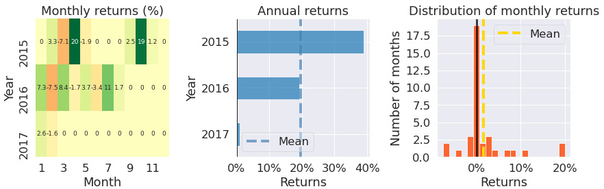
Figure 9.48 – RSI and MACD strategies; monthly returns, annual returns, and the distribution of monthly returns over the investment horizon
The Monthly returns table confirms we have not traded in most months. However, according to the Annual returns chart, when we did trade, it was hugely profitable. The Distribution of monthly returns chart is positive, with high kurtosis.
The RSI and MACD strategy, as a combination of two strategies, demonstrates excellent performance, with a Sharpe ratio of 1.27 and a maximum drawdown of -10.4%. Notice that it does not trigger any trading in some months.
Triple exponential average strategy
The Triple Exponential Average (TRIX) indicator is an oscillator oscillating around the zero line. A positive value indicates an overbought market, whereas a negative value is indicative of an oversold market:
%matplotlib inline
from zipline import run_algorithm
from zipline.api import order_target_percent, symbol, set_commission
from zipline.finance.commission import PerTrade
import pandas as pd
import pyfolio as pf
from stockstats import StockDataFrame as sdf
import warnings
warnings.filterwarnings('ignore')
def initialize(context):
context.stock = symbol('MSFT')
context.rolling_window = 20
set_commission(PerTrade(cost=5))
def handle_data(context, data):
price_hist = data.history(context.stock,
["open","high",
"low","close"],
context.rolling_window, "1d")
stock=sdf.retype(price_hist)
trix = stock.get('trix')
if trix[-1] > 0 and trix[-2] < 0:
order_target_percent(context.stock, 0.0)
elif trix[-1] < 0 and trix[-2] > 0:
order_target_percent(context.stock, 1.0)
def analyze(context, perf):
returns, positions, transactions =
pf.utils.extract_rets_pos_txn_from_zipline(perf)
pf.create_returns_tear_sheet(returns,
benchmark_rets = None)
start_date = pd.to_datetime('2015-1-1', utc=True)
end_date = pd.to_datetime('2018-1-1', utc=True)
results = run_algorithm(start = start_date, end = end_date,
initialize = initialize,
analyze = analyze,
handle_data = handle_data,
capital_base = 10000,
data_frequency = 'daily',
bundle ='quandl')
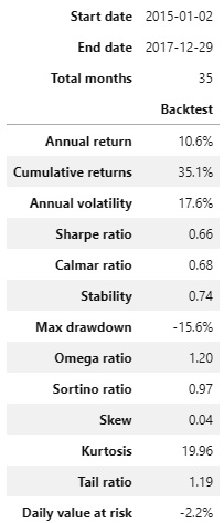
Figure 9.49 – TRIX strategy; summary return and risk statistics
The high tail ratio with an above average stability suggests, in general, a profitable strategy.
The following is the worst five drawdown periods chart:

Figure 9.50 – TRIX strategy; worst five drawdown periods
The second worst drawdown period was over a year. The worst net drawdown was -15.57%.
The following is the Cumulative returns chart:
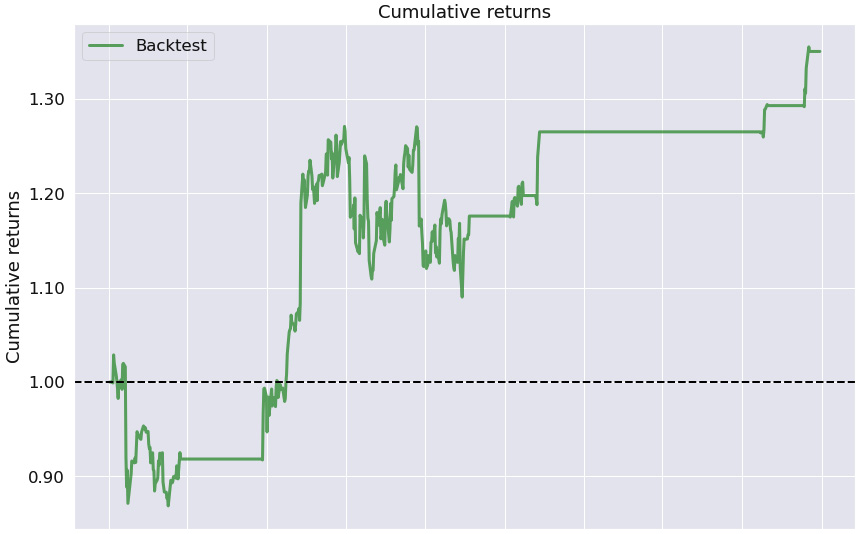
Figure 9.51 – TRIX strategy; cumulative returns over the investment horizon
The Cumulative returns chart indicates that we have not traded in many months (the horizontal line) and that there is a long-term positive trend, as confirmed by the high stability value.
The following is the Returns chart:
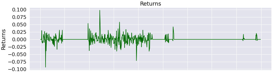
Figure 9.52 – TRIX strategy; returns over the investment horizon
This chart suggests that when we traded, we were more likely to reach a positive return.
The following is the Rolling volatility chart:
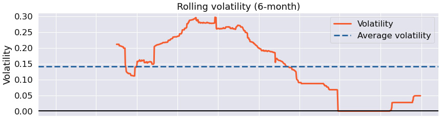
Figure 9.53 – TRIX strategy; 6-month rolling volatility over the investment horizon
The Rolling volatility chart shows that the rolling volatility has been decreasing with time, although the maximum volatility has been rather high.
The following is the Rolling Sharpe ratio chart:

Figure 9.54 – TRIX strategy; 6-month rolling Sharpe ratio over the investment horizon
The rolling Sharpe ratio has been more likely to be positive than negative, with its maximum value in the region of 3 and a minimum value slightly below -1.
The following is the top five drawdown periods chart:
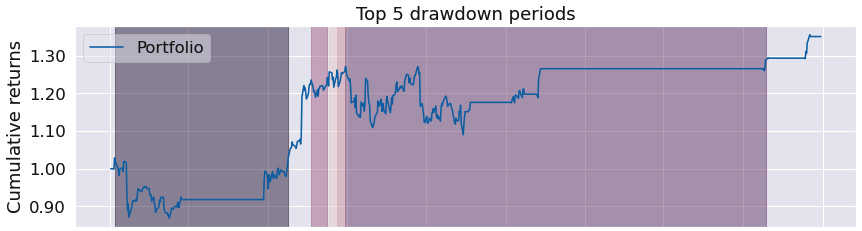
Figure 9.55 – TRIX strategy; top five drawdown periods over the investment horizon
The top five drawdown periods confirm that the worst drawdown periods have been long.
The following are the Monthly returns, Annual returns, and Distribution of monthly returns charts:

Figure 9.56 – TRIX strategy; monthly returns, annual returns, and the distribution of monthly returns over the investment horizon
The Monthly returns table confirms that we have not traded in many months. The Annual returns chart shows that the maximum return was in the year 2015. The Distribution of monthly returns chart shows a very slightly positive skew with a somewhat large kurtosis.
The TRIX strategy's performance for some stocks, such as Apple, is very bad over the given time frame. For other stocks such as Microsoft, included in the preceding report, performance is excellent for certain years.
Williams R% strategy
This strategy was developed by Larry Williams, and the William R% oscillates from 0 to -100. The stockstats library has implemented the values from 0 to +100.
The values above -20 indicate that the security has been overbought, while values below -80 indicate that the security has been oversold.
This strategy is hugely successful for Microsoft's stock, while not so much for Apple's stock:
%matplotlib inline
from zipline import run_algorithm
from zipline.api import order_target_percent, symbol, set_commission
from zipline.finance.commission import PerTrade
import pandas as pd
import pyfolio as pf
from stockstats import StockDataFrame as sdf
import warnings
warnings.filterwarnings('ignore')
def initialize(context):
context.stock = symbol('MSFT')
context.rolling_window = 20
set_commission(PerTrade(cost=5))
def handle_data(context, data):
price_hist = data.history(context.stock,
["open", "high",
"low","close"],
context.rolling_window, "1d")
stock=sdf.retype(price_hist)
wr = stock.get('wr_6')
if wr[-1] < 10:
order_target_percent(context.stock, 0.0)
elif wr[-1] > 90:
order_target_percent(context.stock, 1.0)
def analyze(context, perf):
returns, positions, transactions =
pf.utils.extract_rets_pos_txn_from_zipline(perf)
pf.create_returns_tear_sheet(returns,
benchmark_rets = None)
start_date = pd.to_datetime('2015-1-1', utc=True)
end_date = pd.to_datetime('2018-1-1', utc=True)
results = run_algorithm(start = start_date, end = end_date,
initialize = initialize,
analyze = analyze,
handle_data = handle_data,
capital_base = 10000,
data_frequency = 'daily',
bundle ='quandl')
The outputs are as follows:

Figure 9.57 – Williams R% strategy; summary return and risk statistics
The summary statistics show an excellent strategy – high stability confirms consistency in the returns, with a large tail ratio, a very low maximum drawdown, and a solid Sharpe ratio.
The following is the worst five drawdown periods chart:

Figure 9.58 – Williams R% strategy; worst five drawdown periods
Apart from the worst drawdown period lasting about 3 months with a net drawdown of -10%, the other periods were insignificant in both duration and magnitude.
The following is the Cumulative returns chart:
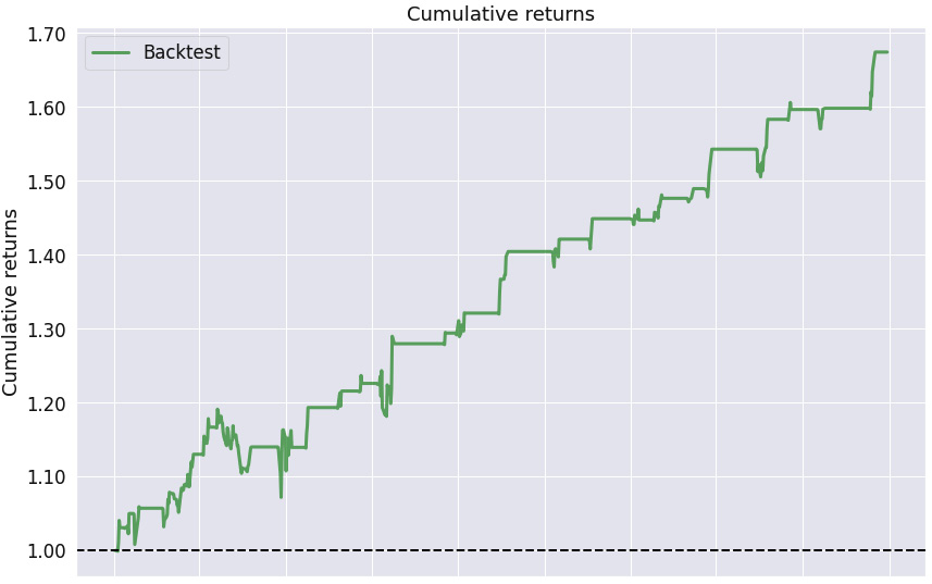
Figure 9.59 – Williams R% strategy; cumulative returns over the investment horizon
This chart confirms the high stability value of the strategy – the cumulative returns are growing at a steady rate.
The following is the Returns chart:
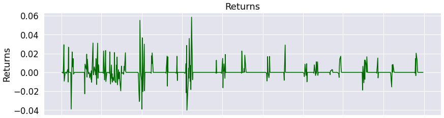
Figure 9.60 – Williams R% strategy; returns over the investment horizon
The Returns chart indicates that whenever we traded, it was more profitable than not.
The following is the Rolling volatility chart:
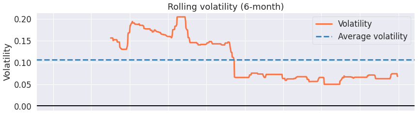
Figure 9.61 – Williams R% strategy; 6-month rolling volatility over the investment horizon
The Rolling volatility chart shows a decreasing value of rolling volatility over time.
The following is the Rolling Sharpe ratio chart:

Figure 9.62 – Williams R% strategy; 6-month rolling Sharpe ratio over the investment horizon
The Rolling Sharpe ratio chart confirms that the Sharpe ratio has been positive over the trading horizon, with a maximum value of 3.0.
The following is the top five drawdown periods chart:

Figure 9.63 – Williams R% strategy; top five drawdown periods over the investment horizon
The Top 5 drawdown periods chart shows that apart from one period, the other worst drawdown periods were not significant.
The following are the Monthly returns, Annual returns, and Distribution of monthly returns charts:

Figure 9.64 – Williams R% strategy; monthly returns, annual returns, and the distribution of monthly returns over the investment horizon
The Monthly returns table suggests that while we have not traded in every month, whenever we did trade, it was largely profitable. The Annual returns chart confirms this. The Distribution of monthly returns chart confirms a positive skew with a large kurtosis.
The Williams R% strategy is a highly performant strategy for the Microsoft stock with a Sharpe ratio of 1.53 and a maximum drawdown of only -10% over the given time frame.
Learning mean-reversion strategies
Mean-reversion strategies are based on the assumption that some statistics will revert to their long-term mean values.
Bollinger band strategy
The Bollinger band strategy is based on identifying periods of short-term volatility.
It depends on three lines:
- The middle band line is the simple moving average, usually 20-50 days.
- The upper band is the 2 standard deviations above the middle base line.
- The lower band is the 2 standard deviations below the middle base line.
One way of creating trading signals from Bollinger bands is to define the overbought and oversold market state:
- The market is overbought when the price of the financial asset rises above the upper band and so is due for a pullback.
- The market is oversold when the price of the financial asset drops below the lower band and so is due to bounce back.
This is a mean-reversion strategy, meaning that long term, the price should remain within the lower and upper bands. It works best for low-volatility stocks:
%matplotlib inline
from zipline import run_algorithm
from zipline.api import order_target_percent, symbol, set_commission
from zipline.finance.commission import PerTrade
import pandas as pd
import pyfolio as pf
import warnings
warnings.filterwarnings('ignore')
def initialize(context):
context.stock = symbol('DG')
context.rolling_window = 20
set_commission(PerTrade(cost=5))
def handle_data(context, data):
price_hist = data.history(context.stock, "close",
context.rolling_window, "1d")
middle_base_line = price_hist.mean()
std_line = price_hist.std()
lower_band = middle_base_line - 2 * std_line
upper_band = middle_base_line + 2 * std_line
if price_hist[-1] < lower_band:
order_target_percent(context.stock, 1.0)
elif price_hist[-1] > upper_band:
order_target_percent(context.stock, 0.0)
def analyze(context, perf):
returns, positions, transactions =
pf.utils.extract_rets_pos_txn_from_zipline(perf)
pf.create_returns_tear_sheet(returns,
benchmark_rets = None)
start_date = pd.to_datetime('2000-1-1', utc=True)
end_date = pd.to_datetime('2018-1-1', utc=True)
results = run_algorithm(start = start_date, end = end_date,
initialize = initialize,
analyze = analyze,
handle_data = handle_data,
capital_base = 10000,
data_frequency = 'daily',
bundle ='quandl')

Figure 9.65 – Bollinger band strategy; summary return and risk statistics
The summary statistics do show that the stability is solid, with the tail ratio favorable. However, the max drawdown is a substantial -27.3%.
The following is the worst five drawdown periods chart:
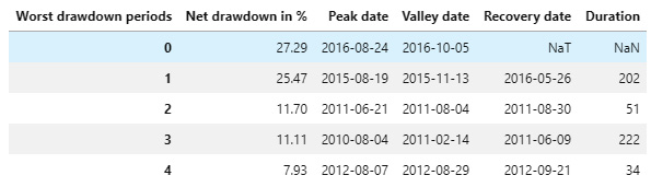
Figure 9.66 – Bollinger band strategy; worst five drawdown periods
The duration of the worst drawdown periods is substantial. Maybe we should tweak the entry/exit rules to avoid entering the trades in these periods.
The following is the Cumulative returns chart:
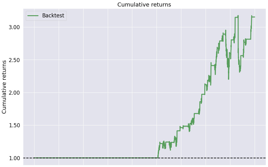
Figure 9.67 – Bollinger band strategy; cumulative returns over the investment horizon
The Cumulative returns chart show we have not traded for 10 years and then we have experienced a consistent positive trend in cumulative returns.
The following is the Returns chart:

Figure 9.68 – Bollinger band strategy; returns over the investment horizon
The Returns chart shows that the positive returns have outweighed the negative ones.
The following is the Rolling volatility chart:
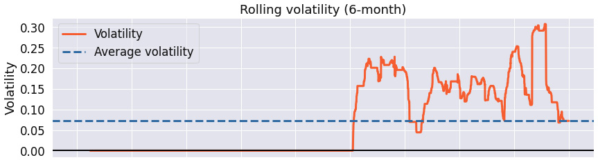
Figure 9.69 – Bollinger band strategy; 6-month rolling volatility over the investment horizon
The Rolling volatility chart suggests that the strategy has substantial volatility.
The following is the Rolling Sharpe ratio chart:

Figure 9.70 – Bollinger band strategy; 6-month rolling Sharpe ratio over the investment horizon
The Rolling Sharpe ratio chart shows that the rolling Sharpe ratio fluctuates widely with a max value of close to 4 and a minimum below -2, but on average it is positive.
The following is the Top 5 drawdown periods chart:
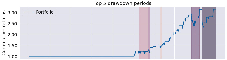
Figure 9.71 – Bollinger band strategy; top five drawdown periods over the investment horizon
The Top 5 drawdown periods chart confirms the drawdown periods duration has been substantial.
The following are the Monthly returns, Annual returns, and Distribution of monthly returns charts:
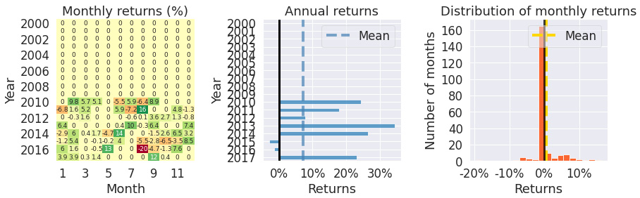
Figure 9.72 – Bollinger band strategy; monthly returns, annual returns, and the distribution of monthly returns over the investment horizon
The Monthly returns table shows that there has been no trade from 2000 to 2010 due to our entry/exit rules. The Annual returns chart, however, shows that whenever a trade did happen, it was profitable. The Distribution of monthly returns chart shows slight negative skew with enormous kurtosis.
The Bollinger band strategy is a suitable strategy for oscillating stocks. Here, we applied it to the stock of Dollar General (DG) Corp.
Pairs trading strategy
This strategy became very popular some time ago and ever since, has been overused, so is barely profitable nowadays.
This strategy involves finding pairs of stocks that are moving closely together, or are highly co-integrated. Then, at the same time, we place a BUY order for one stock and a SELL order for the other stock, assuming their relationship will revert back. There are a wide range of varieties of tweaks in terms of how this algorithm is implemented – are the prices log prices? Do we trade only if the relationships are very strong?
For simplicity, we have chosen the Pepsi Cola (PEP) and Coca-Cola (KO) stocks. Another choice could be Citibank (C) and Goldman Sachs (GS). We have two conditions: first, the p-value of cointegration has to be very strong, and then the z-score has to be very strong:
%matplotlib inline
from zipline import run_algorithm
from zipline.api import order_target_percent, symbol, set_commission
from zipline.finance.commission import PerTrade
import pandas as pd
import pyfolio as pf
import numpy as np
import statsmodels.api as sm
from statsmodels.tsa.stattools import coint
import warnings
warnings.filterwarnings('ignore')
def initialize(context):
context.stock_x = symbol('PEP')
context.stock_y = symbol('KO')
context.rolling_window = 500
set_commission(PerTrade(cost=5))
context.i = 0
def handle_data(context, data):
context.i += 1
if context.i < context.rolling_window:
return
try:
x_price = data.history(context.stock_x, "close",
context.rolling_window,"1d")
x = np.log(x_price)
y_price = data.history(context.stock_y, "close",
context.rolling_window,"1d")
y = np.log(y_price)
_, p_value, _ = coint(x, y)
if p_value < .9:
return
slope, intercept = sm.OLS(y, sm.add_constant(x, prepend=True)).fit().params
spread = y - (slope * x + intercept)
zscore = (
spread[-1] - spread.mean()) / spread.std()
if -1 < zscore < 1:
return
side = np.copysign(0.5, zscore)
order_target_percent(context.stock_y,
-side * 100 / y_price[-1])
order_target_percent(context.stock_x,
side * slope*100/x_price[-1])
except:
pass
def analyze(context, perf):
returns, positions, transactions =
pf.utils.extract_rets_pos_txn_from_zipline(perf)
pf.create_returns_tear_sheet(returns,
benchmark_rets = None)
start_date = pd.to_datetime('2015-1-1', utc=True)
end_date = pd.to_datetime('2018-01-01', utc=True)
results = run_algorithm(start = start_date, end = end_date,
initialize = initialize,
analyze = analyze,
handle_data = handle_data,
capital_base = 10000,
data_frequency = 'daily',
bundle ='quandl')
The outputs are as follows:
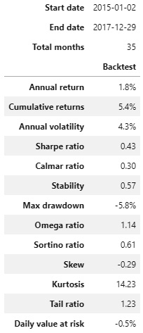
Figure 9.73 – Pairs trading strategy; summary return and risk statistics
While the Sharpe ratio is very low, the max drawdown is also very low. The stability is average.
The following is the worst five drawdown periods chart:

Figure 9.74 – Pairs trading strategy; worst five drawdown periods
The worst five drawdown periods table shows that the max drawdown was negligible and very short.
The following is the Cumulative returns chart:
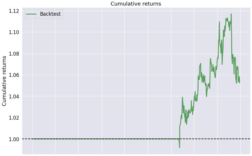
Figure 9.75 – Pairs trading strategy; cumulative returns over the investment horizon
The Cumulative returns chart indicates that we have not traded for 2 years and then were hugely profitable until the last period.
The following is the Returns chart:
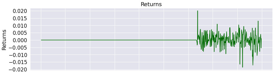
Figure 9.76 – Pairs trading strategy; returns over the investment horizon
The Returns chart shows that the returns have been more positive than negative for the trading period except for the last period.
The following is the Rolling volatility chart:

Figure 9.77 – Pairs trading strategy; 6-month rolling volatility over the investment horizon
The Rolling volatility chart shows an ever-increasing volatility though the volatility magnitude is not significant.
The following is the Rolling Sharpe ratio chart:
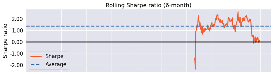
Figure 9.78 – Pairs trading strategy; 6-month rolling Sharpe ratio over the investment horizon
The Rolling Sharpe ratio chart shows that if we improved our exit rule and exited earlier, our Sharpe ratio would higher than 1.
The following is the Top 5 drawdown periods chart:
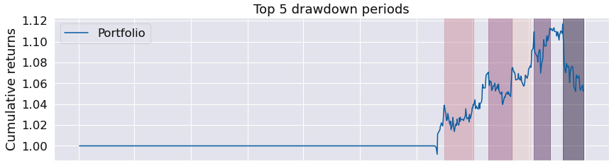
Figure 9.79 – Pairs trading strategy; top five drawdown periods over the investment horizon
The Top 5 drawdown periods chart tells us the same story – the last period was the cause of why this backtesting result is not as successful as it could have been.
The following are the Monthly returns, Annual returns, and Distribution of monthly returns charts:
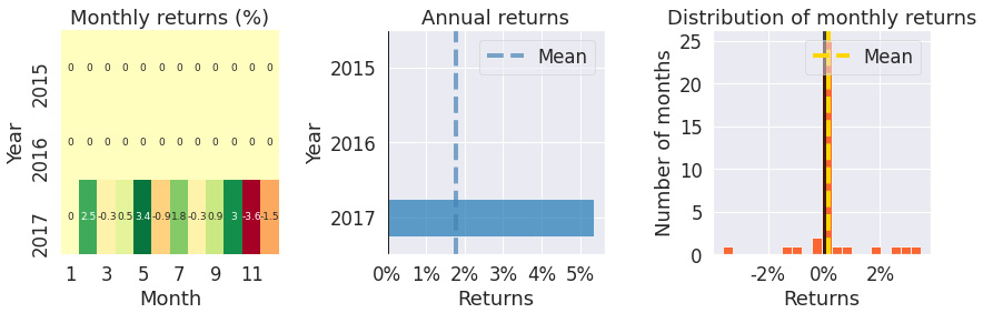
Figure 9.80 – Pairs trading strategy; monthly returns, annual returns, and the distribution of monthly returns over the investment horizon
The Monthly returns table confirms we have not traded until the year of 2017. The Annual returns chart shows that the trading in 2017 was successful and the Distribution of monthly returns chart shows a slightly negatively skewed chart with small kurtosis.
The pairs trading strategy has been overused over the last decade, and so is less profitable. One simple way of identifying the pair is to look for competitors – in this example, PepsiCo and the Coca-Cola Corporation.
Learning mathematical model-based strategies
We will now look at the various mathematical model-based strategies in the following sections.
Minimization of the portfolio volatility strategy with monthly trading
The objective of this strategy is to minimize portfolio volatility. It has been inspired by https://github.com/letianzj/QuantResearch/tree/master/backtest.
In the following example, the portfolio consists of all stocks in the Dow Jones Industrial Average index.
The key success factors of the strategy are the following:
- The stock universe – perhaps a portfolio of global index ETFs would fare better.
- The rolling window – we go back 200 days.
- The frequency of trades – the following algorithm uses monthly trading – notice the construct.
The code is as follows:
%matplotlib inline
from zipline import run_algorithm
from zipline.api import order_target_percent, symbol, set_commission, schedule_function, date_rules, time_rules
from zipline.finance.commission import PerTrade
import pandas as pd
import pyfolio as pf
from scipy.optimize import minimize
import numpy as np
import warnings
warnings.filterwarnings('ignore')
def initialize(context):
context.stocks = [symbol('DIS'), symbol('WMT'),
symbol('DOW'), symbol('CRM'),
symbol('NKE'), symbol('HD'),
symbol('V'), symbol('MSFT'),
symbol('MMM'), symbol('CSCO'),
symbol('KO'), symbol('AAPL'),
symbol('HON'), symbol('JNJ'),
symbol('TRV'), symbol('PG'),
symbol('CVX'), symbol('VZ'),
symbol('CAT'), symbol('BA'),
symbol('AMGN'), symbol('IBM'),
symbol('AXP'), symbol('JPM'),
symbol('WBA'), symbol('MCD'),
symbol('MRK'), symbol('GS'),
symbol('UNH'), symbol('INTC')]
context.rolling_window = 200
set_commission(PerTrade(cost=5))
schedule_function(handle_data,
date_rules.month_end(),
time_rules.market_open(hours=1))
def minimum_vol_obj(wo, cov):
w = wo.reshape(-1, 1)
sig_p = np.sqrt(np.matmul(w.T,
np.matmul(cov, w)))[0, 0]
return sig_p
def handle_data(context, data):
n_stocks = len(context.stocks)
prices = None
for i in range(n_stocks):
price_history =
data.history(context.stocks[i], "close",
context.rolling_window, "1d")
price = np.array(price_history)
if prices is None:
prices = price
else:
prices = np.c_[prices, price]
rets = prices[1:,:]/prices[0:-1, :]-1.0
mu = np.mean(rets, axis=0)
cov = np.cov(rets.T)
w0 = np.ones(n_stocks) / n_stocks
cons = ({'type': 'eq',
'fun': lambda w: np.sum(w) - 1.0},
{'type': 'ineq', 'fun': lambda w: w})
TOL = 1e-12
res = minimize(minimum_vol_obj, w0, args=cov,
method='SLSQP', constraints=cons,
tol=TOL, options={'disp': False})
if not res.success:
return;
w = res.x
for i in range(n_stocks):
order_target_percent(context.stocks[i], w[i])
def analyze(context, perf):
returns, positions, transactions =
pf.utils.extract_rets_pos_txn_from_zipline(perf)
pf.create_returns_tear_sheet(returns,
benchmark_rets = None)
start_date = pd.to_datetime('2010-1-1', utc=True)
end_date = pd.to_datetime('2018-1-1', utc=True)
results = run_algorithm(start = start_date, end = end_date,
initialize = initialize,
analyze = analyze,
capital_base = 10000,
data_frequency = 'daily'
bundle ='quandl')
The outputs are as follows:

Figure 9.81 – Minimization of the portfolio volatility strategy; summary return and risk statistics
The results are positive – see the strong stability of 0.91 while the tail ratio is just over 1.
Notice the results are including the transaction costs and they would be much worse if we traded daily. Always experiment with the optimal trading frequency.
The following is the worst five drawdown periods chart:
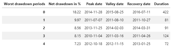
Figure 9.82 – Minimization of the portfolio volatility strategy; worst five drawdown periods
The worst drawdown period was over a year with the net drawdown of -18.22%. The magnitude of the net drawdown for the other worst periods is below -10%.
The following is the Cumulative returns chart:
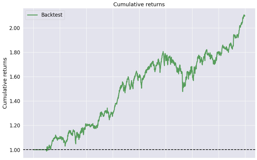
Figure 9.83 – Minimization of the portfolio volatility strategy; cumulative returns over the investment horizon
We see that the cumulative returns are consistently growing, which is expected given the stability of 0.91.
The following is the Returns chart:
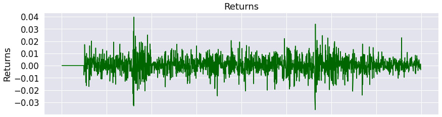
Figure 9.84 – Minimization of the portfolio volatility strategy; returns over the investment horizon
The Returns chart shows the returns' oscillation around zero within the interval -0.3 to 0.04.
The following is the Rolling volatility chart:
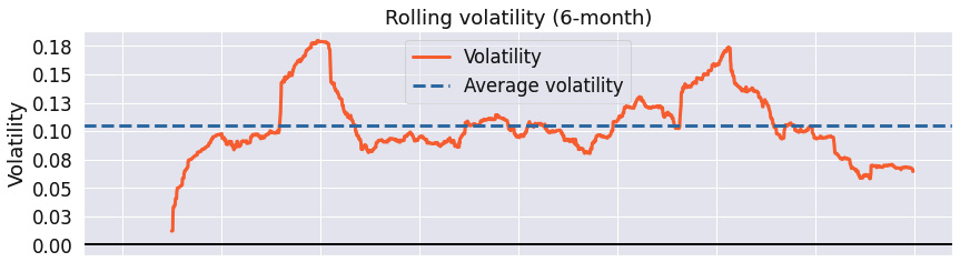
Figure 9.85 – Minimization of the portfolio volatility strategy; 6-month rolling volatility over the investment horizon
The Rolling volatility chart illustrates that the max rolling volatility was 0.18 and that the rolling volatility was cycling around 0.1.
The following is the Rolling Sharpe ratio chart:
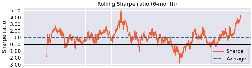
Figure 9.86 – Minimization of the portfolio volatility strategy; 6-month rolling Sharpe ratio over the investment horizon
The Rolling Sharpe ratio chart shows the maximum rolling Sharpe ratio of 5.0 with the minimum slightly above -3.0.
The following is the Top 5 drawdown periods chart:

Figure 9.87 – Minimization of the portfolio volatility strategy; top five drawdown periods over the investment horizon
The Top 5 drawdown periods chart confirms that if we avoided the worst drawdown period by smarter choice of entry/exit rules, we would have dramatically improved the strategy's performance.
The following are the Monthly returns, Annual returns, and Distribution of monthly returns charts:
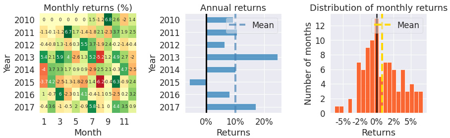
Figure 9.88 – Minimization of the portfolio volatility strategy; monthly returns, annual returns, and the distribution of monthly returns over the investment horizon
The Monthly returns table illustrates that we have not traded for the first few months of 2010. The Annual returns chart shows that the strategy has been profitable every year, but 2015. The Distribution of monthly returns chart draws a slightly negatively skewed strategy with small kurtosis.
Minimization of the portfolio volatility strategy is usually only profitable for non-daily trading. In this example, we used monthly trading and achieved a Sharpe ratio of 0.93, with a maximum drawdown of -18.2%.
Maximum Sharpe ratio strategy with monthly trading
This strategy is based on ideas contained in Harry Markowitz's 1952 paper Portfolio Selection. In brief, the best portfolios lie on the efficient frontier – a set of portfolios with the highest expected portfolio return for each level of risk.
In this strategy, for the given stocks, we choose their weights so that they maximize the portfolio's expected Sharpe ratio – such a portfolio lies on the efficient frontier.
We use the PyPortfolioOpt Python library. To install it, either use the book's conda environment or the following command:
pip install PyPortfolioOpt
%matplotlib inline
from zipline import run_algorithm
from zipline.api import order_target_percent, symbols, set_commission, schedule_function, date_rules, time_rules
from zipline.finance.commission import PerTrade
import pandas as pd
import pyfolio as pf
import numpy as np
from pypfopt.efficient_frontier import EfficientFrontier
from pypfopt import risk_models
from pypfopt import expected_returns
import warnings
warnings.filterwarnings('ignore')
def initialize(context):
context.stocks =
symbols('DIS','WMT','DOW','CRM','NKE','HD','V','MSFT',
'MMM','CSCO','KO','AAPL','HON','JNJ','TRV',
'PG','CVX','VZ','CAT','BA','AMGN','IBM','AXP',
'JPM','WBA','MCD','MRK','GS','UNH','INTC')
context.rolling_window = 252
set_commission(PerTrade(cost=5))
schedule_function(handle_data, date_rules.month_end(),
time_rules.market_open(hours=1))
def handle_data(context, data):
prices_history = data.history(context.stocks, "close",
context.rolling_window,
"1d")
avg_returns =
expected_returns.mean_historical_return(prices_history)
cov_mat = risk_models.sample_cov(prices_history)
efficient_frontier = EfficientFrontier(avg_returns,
cov_mat)
weights = efficient_frontier.max_sharpe()
cleaned_weights = efficient_frontier.clean_weights()
for stock in context.stocks:
order_target_percent(stock, cleaned_weights[stock])
def analyze(context, perf):
returns, positions, transactions =
pf.utils.extract_rets_pos_txn_from_zipline(perf)
pf.create_returns_tear_sheet(returns,
benchmark_rets = None)
start_date = pd.to_datetime('2010-1-1', utc=True)
end_date = pd.to_datetime('2018-1-1', utc=True)
results = run_algorithm(start = start_date, end = end_date,
initialize = initialize,
analyze = analyze,
capital_base = 10000,
data_frequency = 'daily',
bundle ='quandl')
The outputs are as follows:

Figure 9.89 – Maximum Sharpe ratio strategy; summary return and risk statistics
The strategy shows solid stability of 0.76 with the tail ratio close to 1 (1.01). However, the annual volatility of this strategy is very high (17.0%).
The following is the worst five drawdown periods chart:

Figure 9.90 – Maximum Sharpe ratio strategy; worst five drawdown periods
The worst drawdown period lasted over 2 years and had a magnitude of net drawdown of -21.14%. If we tweaked the entry/exit rules to avoid this drawdown period, the results would have been dramatically better.
The following is the Cumulative returns chart:

Figure 9.91 – Maximum Sharpe ratio strategy; cumulative returns over the investment horizon
The Cumulative returns chart shows positive stability.
The following is the Returns chart:
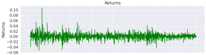
Figure 9.92 – Maximum Sharpe ratio strategy; returns over the investment horizon
The Returns chart show that the strategy was highly successful at the very beginning of the investment horizon.
The following is the Rolling volatility chart:
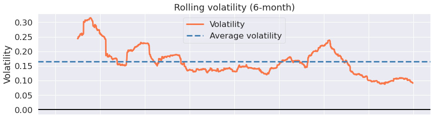
Figure 9.93 – Maximum Sharpe ratio strategy; 6-month rolling volatility over the investment horizon
The Rolling volatility chart shows that the rolling volatility has subsidized with time.
The following is the Rolling Sharpe ratio chart:

Figure 9.94 – Maximum Sharpe ratio strategy; 6-month rolling Sharpe ratio over the investment horizon
The Rolling Sharpe ratio chart illustrates that the rolling Sharpe ratio increased with time to the max value of 5.0 while its minimum value was above -3.0.
The following is the Top 5 drawdown periods chart:
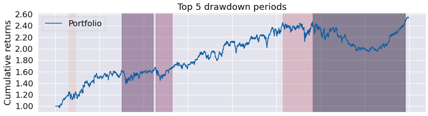
Figure 9.95 – Maximum Sharpe ratio strategy; top five drawdown periods over the investment horizon
The Top 5 drawdown periods chart shows that the maximum drawdown periods have been long.
The following are the Monthly returns, Annual returns, and Distribution of monthly returns charts:
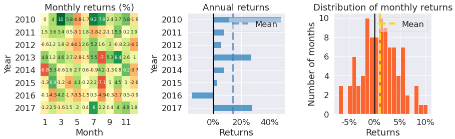
Figure 9.96 – Maximum Sharpe ratio strategy; monthly returns, annual returns, and the distribution of monthly returns over the investment horizon
The Monthly returns table proves that we have traded virtually in every month. The Annual returns chart shows that the annual returns have been positive for every year but 2016. The Distribution of monthly returns chart is positively skewed with minor kurtosis.
The maximum Sharpe ratio strategy is again usually only profitable for non-daily trading.
Learning time series prediction-based strategies
Time series prediction-based strategies depend on having a precise estimate of stock prices at some time in the future, along with their corresponding confidence intervals. A calculation of the estimates is usually very time-consuming.
The simple trading rule then incorporates the relationship between the last known price and the future price, or its lower/upper confidence interval value.
More complex trading rules incorporate decisions based on the trend component and seasonality components.
SARIMAX strategy
This strategy is based on the most elementary rule: own the stock if the current price is lower than the predicted price in 7 days:
%matplotlib inline
from zipline import run_algorithm
from zipline.api import order_target_percent, symbol, set_commission
from zipline.finance.commission import PerTrade
import pandas as pd
import pyfolio as pf
import pmdarima as pm
import warnings
warnings.filterwarnings('ignore')
def initialize(context):
context.stock = symbol('AAPL')
context.rolling_window = 90
set_commission(PerTrade(cost=5))
def handle_data(context, data):
price_hist = data.history(context.stock, "close",
context.rolling_window, "1d")
try:
model = pm.auto_arima(price_hist, seasonal=True)
forecasts = model.predict(7)
order_target_percent(context.stock, 1.0 if price_hist[-1] < forecasts[-1] else 0.0)
except:
pass
def analyze(context, perf):
returns, positions, transactions =
pf.utils.extract_rets_pos_txn_from_zipline(perf)
pf.create_returns_tear_sheet(returns,
benchmark_rets = None)
start_date = pd.to_datetime('2017-1-1', utc=True)
end_date = pd.to_datetime('2018-1-1', utc=True)
results = run_algorithm(start = start_date, end = end_date,
initialize = initialize,
analyze = analyze,
handle_data = handle_data,
capital_base = 10000,
data_frequency = 'daily',
bundle ='quandl')
The outputs are as follows:
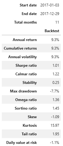
Figure 9.97 – SARIMAX strategy; summary return and risk statistics
Over the trading horizon, the strategy exhibited a high tail ratio of 1.95 with a very low stability of 0.25. The max drawdown of -7.7% is excellent.
The following is the worst five drawdown periods chart:
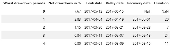
Figure 9.98 – SARIMAX strategy; worst five drawdown periods
The worst drawdown periods have displayed the magnitude of net drawdown below -10%.
The following is the Cumulative returns chart:

Figure 9.99 – SARIMAX strategy; cumulative returns over the investment horizon
The Cumulative returns chart proves that we have traded only in the first half of the trading horizon.
The following is the Returns chart:
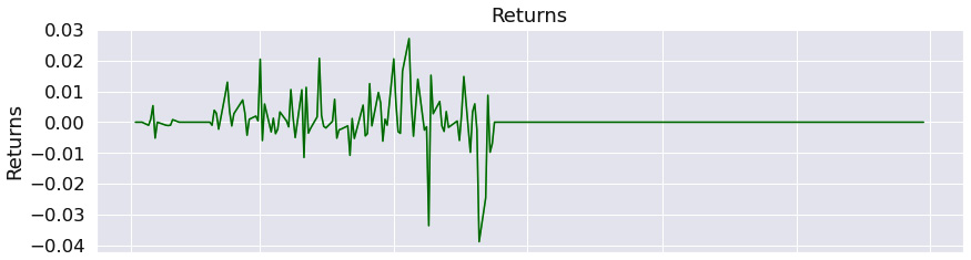
Figure 9.100 – SARIMAX strategy; returns over the investment horizon
The Returns chart shows that the magnitude of returns swing has been larger than with other strategies.
The following is the Rolling volatility chart:
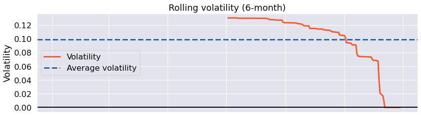
Figure 9.101 – SARIMAX strategy; 6-month rolling volatility over the investment horizon
The Rolling volatility chart shows that the rolling volatility has decreased with time.
The following is the Rolling Sharpe ratio chart:
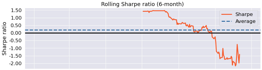
Figure 9.102 – SARIMAX strategy; 6-month rolling Sharpe ratio over the investment horizon
The Rolling Sharpe ratio chart shows that the Sharpe ratio in the first half of the trading horizon was excellent and then started to decrease.
The following is the Top 5 drawdown periods chart:
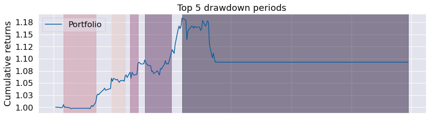
Figure 9.103 – SARIMAX strategy; top five drawdown periods over the investment horizon
The Top 5 drawdown periods chart demonstrates that the worst drawdown period was the entire second half of the trading window.
The following are the Monthly returns, Annual returns, and Distribution of monthly returns charts:
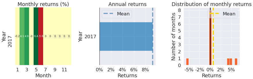
Figure 9.104 – Monthly returns, annual returns, and the distribution of monthly returns over the investment horizon
The Monthly returns table confirms we have not traded in the second half of 2017. The Annual returns chart shows a positive return for 2017 and the Distribution of monthly returns chart is negatively skewed with large kurtosis.
The SARIMAX strategy entry rule has not been triggered over the tested time horizon on a frequent basis. Still, it produced a Sharpe ratio of 1.01, with a maximum drawdown of -7.7%.
Prophet strategy
This strategy is based on the prediction confidence intervals, and so is more robust than the previous one. In addition, Prophet predictions are more robust to frequent changes than SARIMAX. The backtesting results are all identical, but the prediction algorithms are significantly better.
We only buy the stock if the last price is below the lower value of the confidence interval (we anticipate that the stock price will go up) and sell the stock if the last price is above the upper value of the predicted confidence interval (we anticipate that the stock price will go down):
%matplotlib inline
from zipline import run_algorithm
from zipline.api import order_target_percent, symbol, set_commission
from zipline.finance.commission import PerTrade
import pandas as pd
import pyfolio as pf
from fbprophet import Prophet
import logging
logging.getLogger('fbprophet').setLevel(logging.WARNING)
import warnings
warnings.filterwarnings('ignore')
def initialize(context):
context.stock = symbol('AAPL')
context.rolling_window = 90
set_commission(PerTrade(cost=5))
def handle_data(context, data):
price_hist = data.history(context.stock, "close",
context.rolling_window, "1d")
price_df = pd.DataFrame({'y' : price_hist}).rename_axis('ds').reset_index()
price_df['ds'] = price_df['ds'].dt.tz_convert(None)
model = Prophet()
model.fit(price_df)
df_forecast = model.make_future_dataframe(periods=7,
freq='D')
df_forecast = model.predict(df_forecast)
last_price=price_hist[-1]
forecast_lower=df_forecast['yhat_lower'].iloc[-1]
forecast_upper=df_forecast['yhat_upper'].iloc[-1]
if last_price < forecast_lower:
order_target_percent(context.stock, 1.0)
elif last_price > forecast_upper:
order_target_percent(context.stock, 0.0)
def analyze(context, perf):
returns, positions, transactions =
pf.utils.extract_rets_pos_txn_from_zipline(perf)
pf.create_returns_tear_sheet(returns,
benchmark_rets = None)
start_date = pd.to_datetime('2017-1-1', utc=True)
end_date = pd.to_datetime('2018-1-1', utc=True)
results = run_algorithm(start = start_date, end = end_date,
initialize = initialize,
analyze = analyze,
handle_data = handle_data,
capital_base = 10000,
data_frequency = 'daily',
bundle ='quandl')
The outputs are as follows:
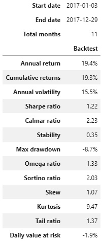
Figure 9.105 – Prophet strategy; summary return and risk statistics
In comparison with the SARIMAX strategy, the Prophet strategy shows far better results – tail ratio of 1.37, Sharpe ratio of 1.22, and max drawdown of -8.7%.
The following is the worst five drawdown periods chart:

Figure 9.106 – Prophet strategy; worst five drawdown periods
The worst five drawdown periods confirms that the magnitude of the worst net drawdown was below 10%.
The following is the Cumulative returns chart:

Figure 9.107 – Prophet strategy; cumulative returns over the investment horizon
The Cumulative returns chart shows that while we have not traded in certain periods of time, the entry/exit rules have been more robust than in the SARIMAX strategy – compare both the Cumulative returns charts.
The following is the Returns chart:

Figure 9.108 – Prophet strategy; returns over the investment horizon
The Returns chart suggests that the positive returns outweighed the negative returns.
The following is the Rolling volatility chart:
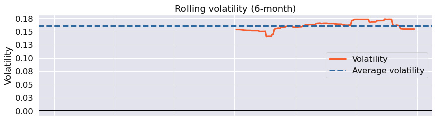
Figure 9.109 – Prophet strategy; 6-month rolling volatility over the investment horizon
The Rolling volatility chart shows virtually constant rolling volatility – this is the hallmark of the Prophet strategy.
The following is the Rolling Sharpe ratio chart:
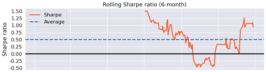
Figure 9.110 – Prophet strategy; 6-month rolling Sharpe ratio over the investment horizon
The Rolling Sharpe ratio chart shows that the max rolling Sharpe ratio was between -.50 and 1.5.
The following is the Top 5 drawdown periods chart:
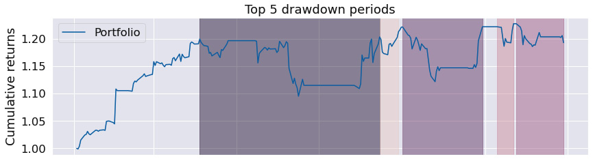
Figure 9.111 – Prophet strategy; top five drawdown periods over the investment horizon
The Top 5 drawdown periods chart shows that even though the drawdown periods were substantial, the algorithm was able to deal with them well.
The following are the Monthly returns, Annual returns, and Distribution of monthly returns charts:
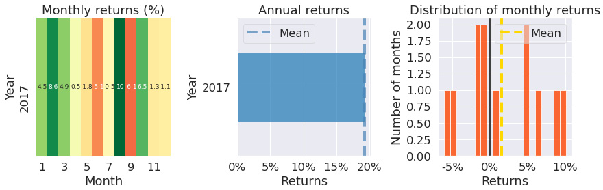
Figure 9.112 – Prophet strategy; monthly returns, annual returns, and the distribution of monthly returns over the investment horizon
The Monthly returns table confirms we have traded in every single month, with an excellent annual return as confirmed by the Annual returns chart. The Distribution of monthly returns chart is positively skewed with minor kurtosis.
The Prophet strategy is one of the most robust strategies, quickly adapting to market changes. Over the given time period, it produced a Sharpe ratio of 1.22, with a maximum drawdown of -8.7.
Summary
In this chapter, we have learned that an algorithmic trading strategy is defined by a model, entry/leave rules, position limits, and further key properties. We have demonstrated how easy it is in Zipline and PyFolio to set up a complete backtesting and risk analysis/position analysis system, so that you can focus on the development of your strategies, rather than wasting your time on the infrastructure.
Even though the preceding strategies are well published, you can construct highly profitable strategies by means of combining them wisely, along with a smart selection of the entry and exit rules.
Bon voyage!