I often get the question if there is still use in learning desktop technologies like WPF or WinForms. My answer is always the same: of course there is! There has been a big movement toward the Web the past few years, which definitely makes sense in regard to ease of deployment and installation. No need to juggle MSI files around, making sure every client computer has the correct version of .NET installed, finding out what version of the software a customer is using, and so on. With web applications, we install the software on a server, and all of our users just use their browsers to use the application. So why are native apps (both desktop and mobile apps) still a thing? The answer is simple, performance and capabilities. The Web, for now, does not have the same level of access to peripherals and operating system as a native app does. As for performance, let’s look at the way an operating system renders its applications. Rendering happens in steps, layer by layer. A WPF application, for example, will render its main window followed by the controls on that specific window; the whole rendering of an application is optimized to draw the user interface as fast as possible to not make the user feel like the application is hanging. If we apply that same logic to a web browser, you’ll understand that the browser’s main window and controls like the back and forward buttons, favorite bar, extension icons, and so on are rendered first. Once everything is on the screen, the browser will start interpreting and rendering the HTML, so the actual user interface of your web application is last to render. Another major difference is threading, JavaScript is single-threaded, so it’s not possible to schedule heavy work on a separate thread. The advice there is to have a server handle the heavy lifting and make your frontend wait for the response, which is a very valid argument, except for applications that need real-time heavy processing, like the software stock brokers use, for example. Every millisecond of delay caused by a request going over the network can cost them money. A native desktop application, running on a powerful client computer, can handle these calculations with ease.
.NET 6 comes with multiple choices for desktop development, WPF, WinForms, Windows App SDK, CLI, Blazor Desktop, and MAUI. In this chapter, we’ll take a look at these options, except for Blazor Desktop, and we will discuss that option in the Blazor chapter of this book.
WinAPI
Win32 and Win64, depending on the OS and CPU architecture, are the APIs in Windows that allow applications to run. The API is responsible for everything going on in Windows, from rendering applications and access to the operating system to installation/configuration and so on. It’s the engine under the hood of Windows. Without WinAPI, we simply wouldn’t be able to run applications on Windows. WinAPI is a native C/C++ API, meaning we’d need to write applications in those languages to leverage the WinAPI API set.
With WinAPI, we can build applications that have incredible performance, because we are in an unmanaged world. Languages like C# and Java, for example, are managed languages, meaning that there is a runtime taking care of recovering and managing memory. Unmanaged code, like C or C++, runs much closer to the metal, leaving the responsibility of reclaiming memory to the developer but gaining performance in return. But this performance comes with a price. It takes longer to develop these types of applications, and since they are unmanaged they are more prone to memory-related bugs. Listing 4-1 shows an example of the C++ code needed to simply draw an empty window on screen. Feel free to copy, compile, and run the code in Listing 4-1 if you have a C++ environment setup, and you will notice that it just works but shows an empty screen.
WinForms was introduced in 2002 as part of the initial release of .NET. It was meant to be the successor of the very popular Visual Basic 6. WinForms provided the same graphical editor that allowed developers to drag and drop a user interface onto a canvas, specifying anchor points to specify resizing behavior.
WinForms is a managed wrapper around Win32, enabling .NET as an option to create Windows applications.
Within Win32 is an API set responsible for drawing 2D vector graphics and formatted text on the screen; this API is called GDI+ (or simply GDI on Windows versions older than Windows XP). GDI+ stands for Graphics Device Interface. It is an abstraction layer between applications and the graphics hardware. WinForms relies heavily on GDI+ to perform its rendering. As .NET developers, we usually don’t come into direct contact with GDI+; instead, we use the abstractions provided by WinForms and let the framework handle all the low-level drawing code. Before .NET 6, WinForms was strictly using GDI+ for drawing on the screen, which made development easier as it creates an abstraction of the graphical device; while this made development easier, it also slowed down performance because of the abstraction overhead. To solve this, the WinForms team opted to use the classic GDI in specific cases, for example, when rendering brushes.
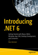
Let’s explore WinForms. From Visual Studio 2022, start a new project and select WinForms as project template. Give it a good name and let the project generate. Building a user interface in WinForms is usually done through the designer surface in Visual Studio; the designer generates C# code that is used to actually draw all elements on screen. We can write the C# directly should we need to, but the designer greatly simplifies creating complex screens. To open the designer, double-click Form1.cs in the solution explorer.
Figure 4-1
The WinForms designer
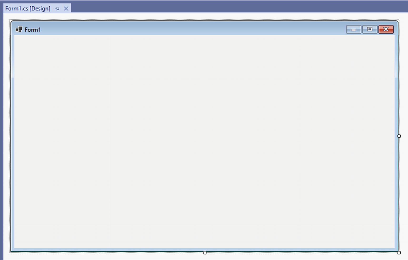
Figure 4-2 shows the basic layout of a new WinForms project in .NET 6.
Figure 4-2
A new .NET 6 WinForms project
In the Frameworks section, you’ll notice an entry for .NET, Microsoft.NETCore.App, and another reference called Microsoft.WindowsDesktop.App.WindowsForms. This is the desktop pack needed to be able to run and develop Windows native desktop applications with .NET 6. More information on extensibility packs can be found in Chapter 2 of this book. Program.cs contains the entry point of our application. Listing 4-2 shows the default Program class.
internal static class Program
{
/// <summary>
/// The main entry point for the application.
/// </summary>
[STAThread]
static void Main()
{
ApplicationConfiguration.Initialize();
Application.Run(new Form1());
}
}
Listing 4-2
Default Program class
Program is a static class; just like any other .NET 6 project, it is the starting point of our application.
STAThread
First thing to note here is the STAThread attribute. STA stands for single-threaded apartment; to understand what this does, we need to make a sidestep into the world of the apartment model process, but before we get into that we need to make sure we’ve got the meaning of a few concepts right.
Process: A set of resources, code, data, and virtual memory
Thread: Code that is executed within a process in a linear way
An application typically has one process that can contain one or more threads. Creating multiple threads within a process allows our application to execute code in parallel; do keep in mind that running code in parallel does not automatically guarantee an increase in performance. Multithreading can be hard to get right and comes with its own set of challenges like thread safety, preventing deadlocks and race conditions.
Component Object Model, or COM, enables application to open up their functionality to other applications in an API-like manner, by generating wrappers that can be called in other application. Windows exposes COM wrappers, for example, for the file and folder dialogs or message boxes.
WinForms relies on the COM wrappers exposed by Windows, and COM runs in a process with a single thread (the UI thread); however, new threads can be created from that point on. This is needed, for example, when you need to execute a long-running operation and you want to prevent the UI from freezing.
The final concept we need to know is the apartment. An apartment is a group of COM objects in a process. Every COM object lives in exactly one apartment, meaning that the methods on a COM object can only be called from a thread that belongs to the same apartment; should any other thread need to call into that COM object, it needs to pass through a proxy.
The WinForms process contains a single thread for rendering the UI; to render the UI, it needs to call into COM wrappers, which means that the COM wrappers and the single thread in our application’s process need to belong to the same apartment. Since apartments come in two flavors, single-threaded and multithreaded, and we only have one thread, we need a single-threaded apartment. However, we are building a C# application; C# applications ever since .NET Framework 2.0 by default use a multithreaded apartment. That’s why the STAThread attribute is set on the Program class, to indicate that this application needs a single-threaded apartment.
WinForms Startup
To keep the Program class clean and tidy, some configuration is abstracted away since .NET 6. The Initialize method that you can see in Program.cs, or Listing 4-2, that is called on ApplicationConfiguration calls three configuration methods, shown in Listing 4-3.
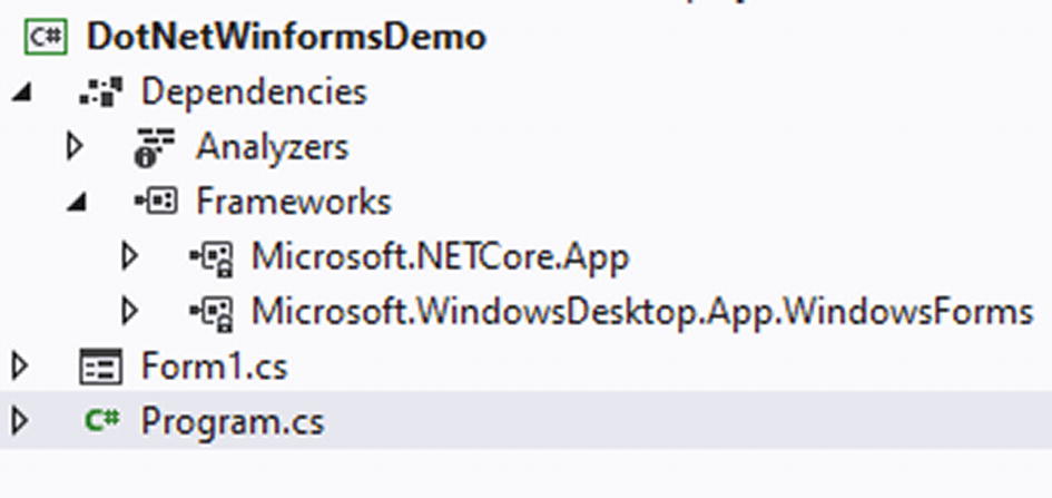
After the STAThread attribute, we see some default configuration being set, starting with high DPI mode. DPI, or dots per inch, specifies how many pixels a screen can render on a one inch line; nowadays, the term DPI is often used together with PPI, pixels per inch. Strictly speaking, DPI is a term used for printers and PPI for screens, but DPI seems to be the term most often used in both contexts. So in short, the higher the DPI of a monitor, the more pixels can be placed upon the screen. So why does this matter? Let’s compare two surfaces with different DPI values and draw a rectangle of 8 by 2 pixels on them.
Figure 4-3
Comparing different DPI
Figure 4-3 shows the same rectangle but drawn on surfaces of the same physical size, but with different DPI values; notice that the higher the DPI of a surface is, the smaller the objects drawn on that surface seem to appear. Operating systems, including mobile operating systems, solve this problem by implementing logical pixels per inch. It’s sort of a virtual screen that is laid over the actual screen; this technique exists to ensure that applications look the same across different screens; aspect ratios are a different problem of course; but that’s beside the point here.
So what was the problem with WinForms applications? Windows tried to make sure that an application looked the same size on every monitor; in a multi-monitor setup that combines high DPI monitors with normal DPI monitors, this means that applications will be “zoomed in” if you will, instead of being scaled natively. This results in a blurry, pixelated image. We can simulate this in Windows by changing the scale factor in the display settings, shown in Figure 4-4.
Figure 4-4
Display scale settings in Windows
Figures 4-5 and 4-6 show the difference in application sharpness when high DPI support is switched off in a WinForms application. The screenshots were taken on 175% size.
Figure 4-5
A sharp looking application
Figure 4-6
The same application at a different scale factor
Notice that Figure 4-6 shows a very blurry experience, not what you want to see on an expensive, fancy 4k ultrawide monitor is it? To fix this, Microsoft updated the GDI API with multiple modes for high DPI. The work on high DPI mode started in .NET Core 3 and kept improving with each release.
DPI Unaware – this is the “old” behavior; applications assume 100% scaling at 96 DPI; this will result in the blurry applications that are demonstrated in Figure 4-6.
System DPI Aware – apps will scale according to the DPI of the main monitor at the time of login into Windows. This can still result in blurry applications on the other monitors, but the application will look great on the main monitor.
Per Monitor DPI Aware – this enables applications to update their rendering according to the DPI of the monitor they are currently on. These applications can update immediately when moved to a monitor with a different DPI; this does require developers to test their UI at different DPI settings.
Mixed Mode DPI Aware – in mixed mode, we can set one of the above three modes on every top-level window, meaning that we can have different application windows behave differently on different monitors.
DPI mode in a WinForms application can be set in the app.config file, through an API call or via a static method that needs to be called at startup. The default template in .NET 6 includes setting the DPI mode to System Aware through the static method, which is now the recommended way of setting the DPI mode. Depending on what version of Windows your application is running on, you can have three or four modes.
Unaware
Unaware GDI Scaled
System Aware
Per Monitor
Per Monitor v2
Most of these match perfectly on the list of modes supported in the GDI+ API, but what about Per Monitor v2? This is a mode that only works on Windows 10 version 1607 and later. Per Monitor v2 extends the Per Monitor option into the non-client areas, meaning that title bars and scroll bars, for example, will keep DPI scaling in mind as well. It also extends scaling events to child windows while Per Monitor limits this for parent windows only.
Responding to Scale Events
WinForms provides some events, helper methods, and properties to allow us to react to DPI changes and update the UI where needed.
DpiChanged – an event that fires when the DPI is changed for the monitor the form is currently on.
DpiChangedAfterParent – an event that fires when the parent control or form changed DPI from code after receiving a DpiChanged event.
DpiChangedBeforeParent – an event that fires when the parent control or form changed DPI from code before receiving a DpiChanged event.
LogicalToDeviceUnits – a helper method that converts a logical size to device units, keeping the current DPI in mind, and returns a System.Drawing.Size object.
ScaleBitmapLogicalToDevice – a helper method that scales a System.Drawing.Bitmap to device units after a DPI change.
DeviceDpi – a property that gets the current DPI value for the monitor the form is currently displayed on. This property comes in as a parameter on a DpiChanged event.
Listing 4-4 shows an example of a form that uses some of these events and properties to show a form that displays DPI information. If you still have the designer window open from the first part of this chapter, you can press F7 to switch to the code behind. From there we can add an eventhandler to the DpiChanged event, shown here in the constructor. From that eventhandler, we update the text on a label that we dropped on the form using the designer.
DpiLabel.Text = $"DPI changed from {e.DeviceDpiOld} to {e.DeviceDpiNew}";
}
}
Listing 4-4
Reacting to DPI changes
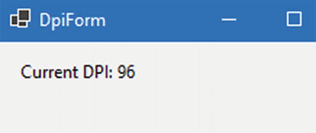
Figure 4-7 shows the result of the form when it starts up.
Figure 4-7
Form displaying the current DPI
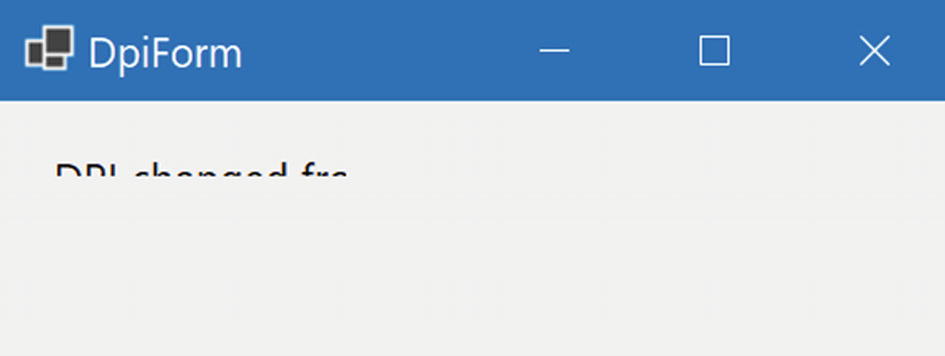
If we set High DPI mode to DpiUnaware and change the scaling of the monitor, you’ll notice that the form seems to zoom in; it will get blurry but the text in the label will remain the same. This means that the system still calculates the size according to 96 DPI, instead of the new value. Figure 4-8 shows this result.
Figure 4-8
Result when scaling set to 175%
After setting High DPI mode to PerMonitorV2, we expect the DPI to change when we adjust scaling, and it does exactly that, but we get a new problem as shown in Figure 4-9.
Figure 4-9
Result after changing scaling
You’ll notice that the text we do see is rendered sharp; however, the label didn’t resize, so our text is being cut off. This is because the WinForms designer, by default, sets autoscale mode to Font. However, our font size is not changing; our scale factor is. We can solve this by changing the autoscale mode as shown in Listing 4-5; Figure 4-10 shows the result.
DpiLabel.Text = $"DPI changed from {e.DeviceDpiOld} to {e.DeviceDpiNew}";
}
Listing 4-5
Setting autoscale mode to DPI instead of font
Figure 4-10
Result after changing autoscale mode
Visual Styles
Let’s continue with the startup calls; the next step is Application.EnableVisualStyles.
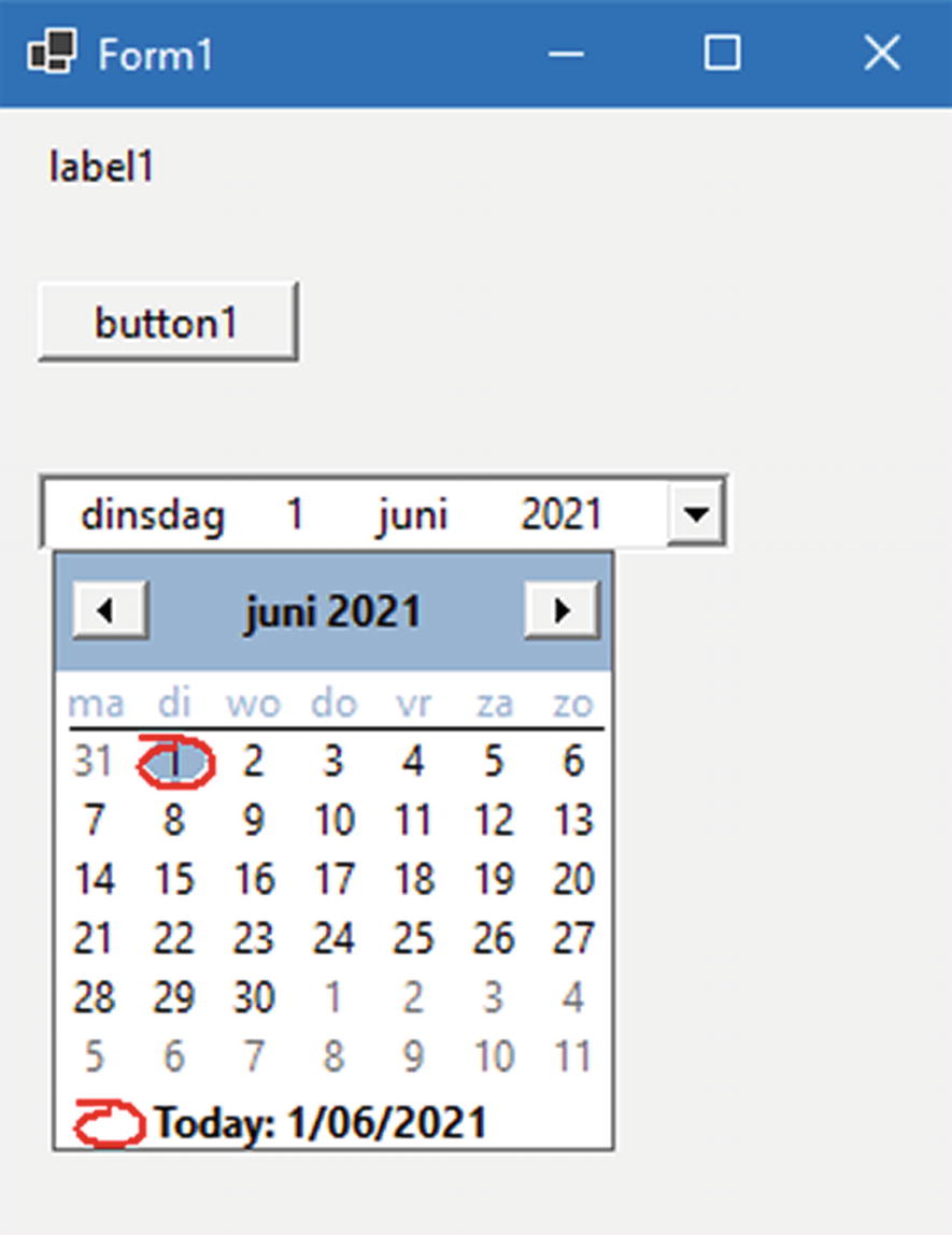
EnableVisualStyles simply prepares all the colors, fonts, and other visual elements in the theme of the current operating system. Let’s take a form with a label, datepicker, and a button as shown in Figure 4-11.
Figure 4-11
Form with default controls
The elements on this form automatically take the styling of Windows 10, the operating system the application was running on when taking this screenshot. We can disable loading the visual styles by replacing the call to Initialize with Listing 4-3 and commenting out Application.EnableVisualStyles method we get the result from Figure 4-12.
Figure 4-12
Same application without Windows 10 theme
The application still runs, but visually it looks very old; that is because all the controls fallback to their default look and feel. Application.EnableVisualStyles will keep the user’s preference in mind; if it runs on a Windows system with visual styles disabled, it will respect this setting and load the application without visual styles.
Text Rendering
The next call in our WinForms application’s startup cycle is Application.SetCompatibleTextRenderingDefault(false).
Before I can explain what SetCompatibleTextRenderingDefault does, we’ll need to take a small history lesson. Back in .NET Framework version older than .NET 2.0, text was rendered using GDI+ and its Graphics class. From .NET Framework 2.0 onward, this was switched to GDI and the TextRenderer class. TextRenderer fixed a number of problems with performance and localization. Because WinForms prides itself on backward compatibility, we had two different ways text on WinForms controls could be rendered, and they were visually different. To fix this, the SetCompatibleTextRenderingDefault method was introduced, and when the bool value is set to true, all text will be rendered using the old Graphics class in the GDI+ library. The default WinForms template passes false as parameter so that text in our applications is rendered using TextRenderer in GDI instead of Graphic in GDI+. The only time this parameter needs to be true is when you’re migrating an old .NET Framework 1.0 or 1.1 app to a newer version, and even then it might be worth seeing how many controls and logic need to be changed to just make the app run on GDI.
The Message Loop
The final call before our application appears on screen is Application.Run(new Form1()).
The Run method starts what’s called the message loop. A Windows desktop application needs a loop where it handles user events. The application exits once the loop exits, and this can be done programmatically by calling Exit() to terminate the application or ExitThread() to terminate the current thread, which will exit the application only if no other foreground threads are running. Applications can be exited manually by the user clicking the close button, pressing ALT-F4 or any other way to close an application on Windows. The Run method takes in a form as parameter; this form will be the startup form of the application. The message loop will end once this form is closed, effectively exiting the application.
The Form Designer
Building a form is usually done through the form designer. The designer is a visual canvas where controls can be dropped from the toolbox and laid out. Doing this visually makes for a powerful and fast developer loop. Figure 4-13 shows dropping a button from the toolbox onto the designer surface.
Figure 4-13
Dropping a button onto the designer
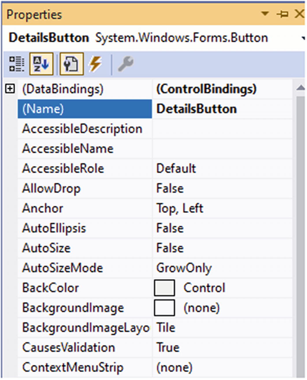
Feel free to double-click a form to open the designer and play around with the toolbox. Drop some components, move some controls around, and have a look at the properties. You’ll notice that the designer tries to help you by snapping the controls to align with the margins of the other controls to make for a consistent layout. Once a control is placed, we can use the properties window (F4 is the shortcut key to open the properties for the selected control) to set different properties and hook up event handlers. For example, click on the dropdown for BackColor and try some different values. You will notice that the designer reacts immediately to your changes.
Figure 4-14
Properties window
Responding to Events
There are a few different ways to make a button react to a click. The fastest way is to double click on the button in the designer; this will generate a click event handler in the code behind of the form. Double-clicking any control will hook up an event handler to the default event for that control; click event for buttons, textchanged for textboxes, selectionchanged for combobox, and so on. Should we want to hook up another event, we can do this through the events pane in the properties window, found behind the lightning icon that can be seen in Figure 4-14. Look for the event you need and double-click the space beside it, as shown in Figure 4-15.
Figure 4-15
Hooking up an event through the properties window
Another way is to do programmatically as shown in Listing 4-6.
Programmatically reacting to a button getting focus
Once our design looks good in the designer, it’s time to see what it actually looks like on screen. The first results are very good, until we resize the window.
Figure 4-16
Resized window
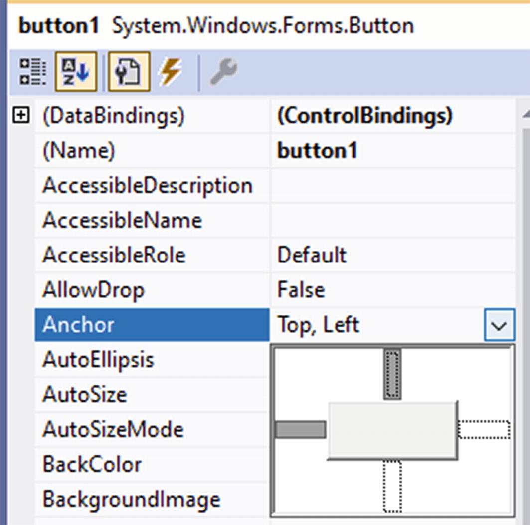
Looks like our application is not very responsive yet. Making controls resized in WinForms is done through anchors; anchor is a property set on every control that determines what border is anchored to the side of the form.
Figure 4-17
Anchoring a button to the left and top
After applying the correct anchor points, which is all anchor points in this case, we can make the form behave like Figure 4-18.
Figure 4-18
Form that resizes using anchor points
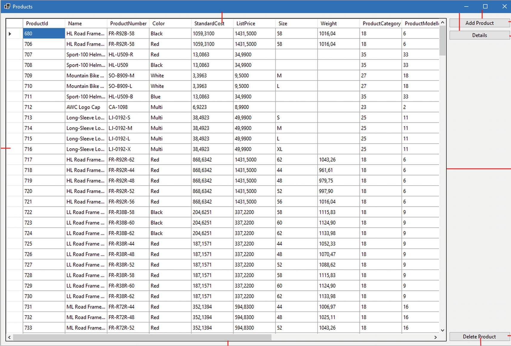
Figure 4-19 shows the used anchor points for every control.
Figure 4-19
Anchor points on the form
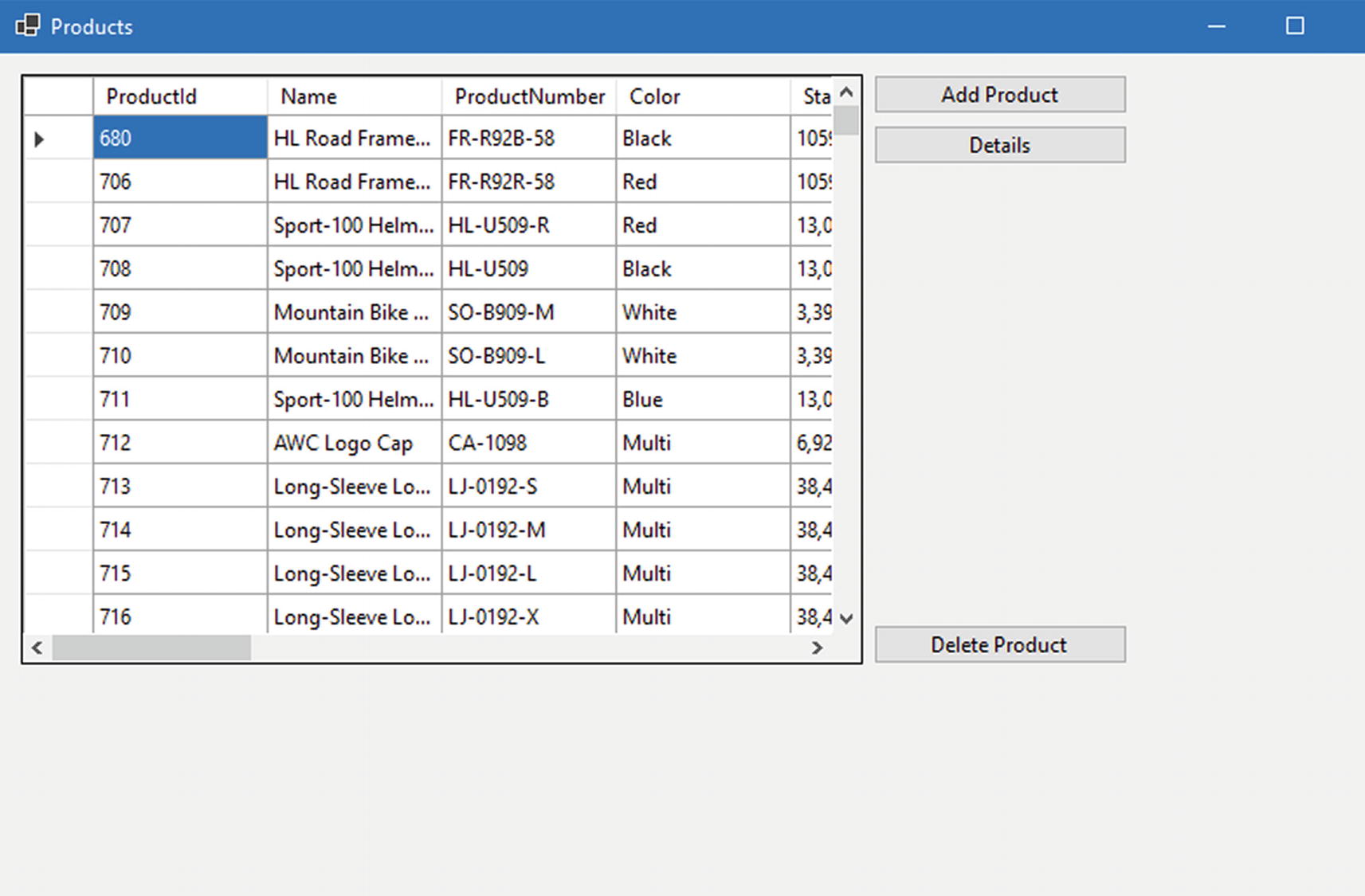
The grid that is on the form in Figures 4-18 and 4-19 is the DataGridView. The classic DataGrid control has not been ported from .NET Framework; DataGridView is based on DataGrid and extends it, for example, in the data sources it accepts. Listing 4-7 shows a simple example of setting data to the DataGridView named ProductsDataGrid.
We’re using an Entity Framework datacontext to easily get to our data. Once data is loaded, we assign it to the DataGridView’s DataSource property, and that is all that’s needed to show the data in the grid.
Let’s add the possibility to add new products to the dataset; Listing 4-8 shows a first attempt at this.
The click event handler is triggered when the Add Product button is clicked; nothing seems to happen however. Should you set a breakpoint in the event handler, you’ll notice that the event is triggered and new products are added to the list but that change is not reflected in the UI. That is because in WinForms the UI is not reactive; it does not monitor every property to see if it might need to update; instead, it waits for an event that tells it what property has changed. Listing 4-9 shows a working example.
Only one thing changed; the List<Product> has changed into a BindingList<Product>; a BindingList triggers an event whenever the data in the list changes, allowing our UI to respond to that change.
WPF
Windows Presentation Foundation, WPF for short, is the spiritual successor of WinForms. It was known under the codename “Avalon” and was announced in .NET Framework 3.0 timeframe. WPF relies on DirectX for its rendering, compared to WinForm’s GDI. The biggest difference between WinForms and WPF is the UI, while there still is a graphical designer, it no longer generates C# code to build its UI but instead generates eXtended Application Markup Language, or XAML.
WPF was ported from the classic .NET Framework to .NET Core 3.0. After the initial port, a new visual designer was created and has evolved with every release of .NET.
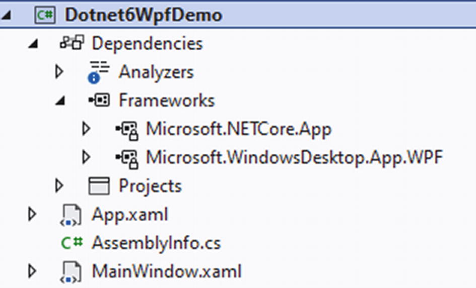
After creating a new WPF project with .NET 6, we end with the solution as shown in Figure 4-20.
Figure 4-20
A blank WPF project
That is a very lightweight project structure; it contains only three files! And we can even remove AssemblyInfo should we want to. AssemblyInfo contains theming information for our WPF application. It sets the ThemeInfo assembly attribute; this attribute specifies if there is an assembly containing resource definitions for the controls used in your application. Resource definitions include templates, styles, and colors. The ThemeInfoattribute takes two parameters, a theme-specific dictionary location and a generic dictionary location. Resource dictionaries in XAML are comparable to CSS files in web development; they contain style definitions, converters, and so on. The ThemeInfo resource dictionary locations can be set to one of three values.
ExternalAssembly
None
SourceAssembly
External assemblies live outside of your code base. WPF will search for assemblies according to a naming convention. For example, take an application called DotnetSixWpf. If we want to place theming in a separate assembly, we can name that assembly, or assemblies, DotnetSixWpf.Dark.dll or DotnetSixWpf.Light.dll, for example, to define dark and light themes. The names of your themes are whatever you want them to be, but the naming of the assembly needs to be <assembly>.<themename>. SourceAssembly refers to resource dictionaries that are included within your application. In our project, we need to have a themes folder where WPF will look for our style definitions.
WPF Startup
Moving on to App.xaml, this file is the starting point of our application. You’ll notice that it consists of two files, App.xaml and App.xaml.cs. The xaml file and the code behind code file are both the same partial class. When compiling, the XAML code gets transformed into C# code; this is very important to know because if you change the namespace or class name in the code behind, you’ll also need to change it on the XAML side of things.
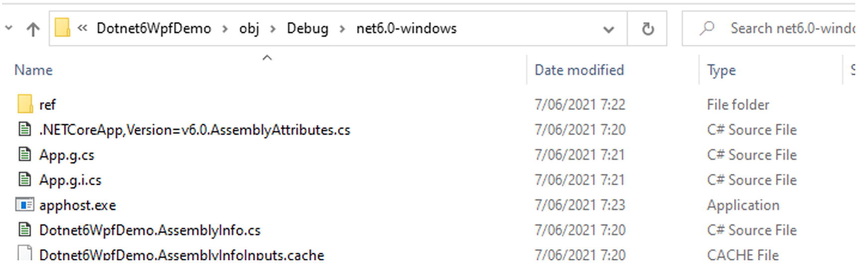
Listing 4-10 shows the XAML part of App.xaml. The important part here is the StartupUri; this property sets the first window to show when launching the application. You’ll notice that the code behind of App.xaml is quite empty. That is because the bootstrapping and launching of the WPF application is done in the generated App class that combines both the XAML and the code parts. You can inspect this file by going to your project in Windows Explorer and take a look in the obj folder.
Figure 4-21
Generated files on disk
Every file in this folder that has .g. in its filename has been generated by the compiler. Listing 4-11 shows the generated App.g.cs file, the actual starting point of the application.
public partial class App : System.Windows.Application {
Dotnet6WpfDemo.App app = new Dotnet6WpfDemo.App();
app.InitializeComponent();
app.Run();
}
}
Listing 4-11
Generated application startup code
Even in the generated startup code, there is not a lot going on; you will notice the StartupUri property being set to the value that was defined in App.xaml. Next to that there is the Main method that every application in .NET 6 has as a starting point. Main initializes our App class and calls its Run method; that method is part of WPF’s Application base class. It contains the logic for creating the window wrapper and creates the first window to be shown. The application base class also contains some virtual methods that can be overridden for configuring lifecycle events; some examples of these methods are OnActivated, OnDeactivated, OnLoadCompleted, OnExit, OnStartup, OnSessionEnding, and OnNavigated.
XAML Layout
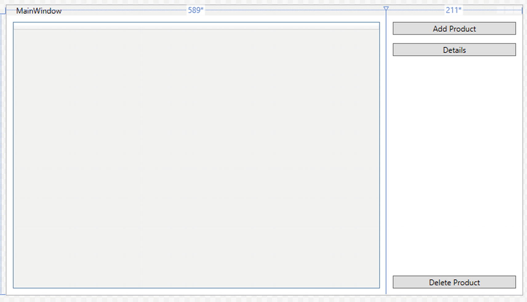
Moving on to MainWindow. MainWindow also consists of two files, just like the App class. Building your UI in a WPF application can be done quite similar to WinForms; WPF also has a graphical designer, for example. Visual Studio by default shows the XAML editor when opening a XAML file. We can switch to the designer by pressing shift-F7 or selecting Design on the bottom left of Visual Studio.
Figure 4-22
WPF graphical designer
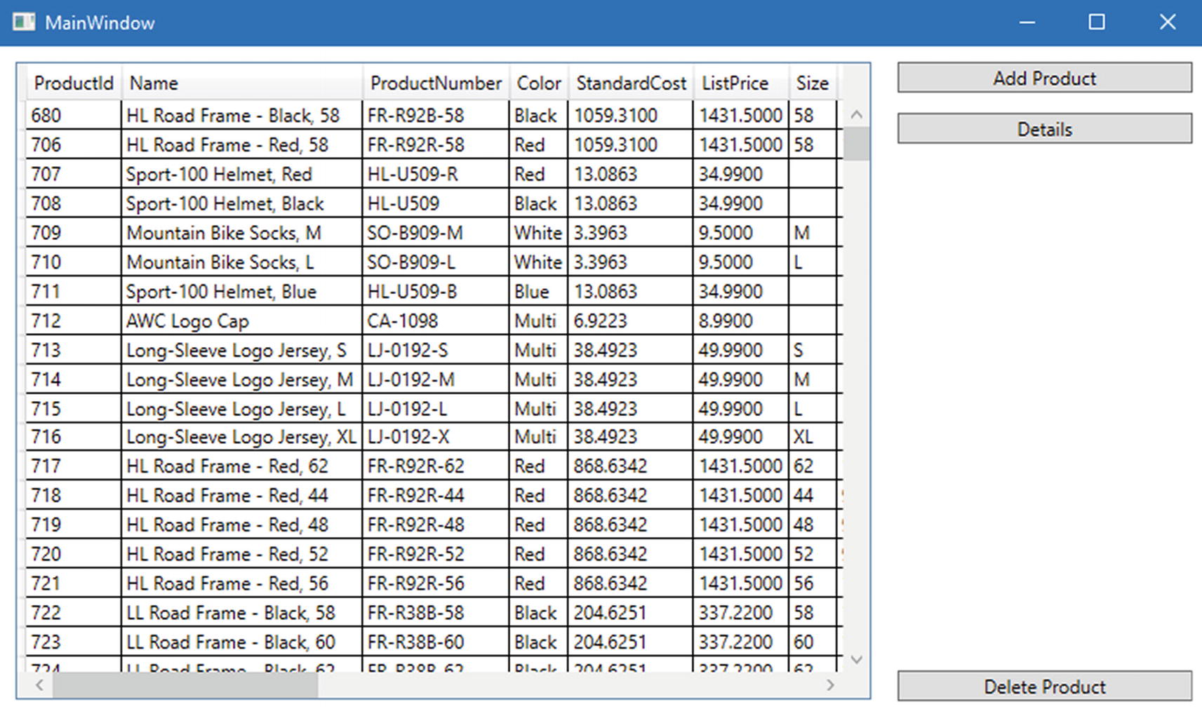
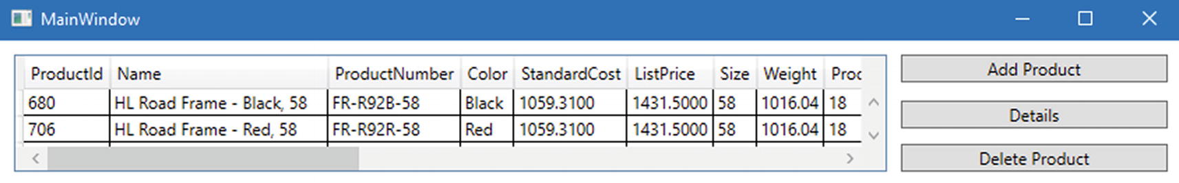
As you can see in Figure 4-22, it allows us to drag and drop controls from the toolbox and position them in a very graphical way, just like with WinForms. Figure 4-23 shows the running application; don’t worry about the logic to get data in the datagrid; we’re only looking at the design in this example.
Figure 4-23
The application
It really does look very similar to the WinForms version, so why does WPF even exist if it’s just a copy of WinForms? Because it really is not a copy of WinForms. The designer was created to make it easier for WinForms developers to cross over to WPF, but if you blindly follow the way you are used to doing things, you will not get very performant generated code. That brings us to another big difference between WinForms and WPF, the WinForms designer generated C# or Visual Basic code, and the WPF designer generates XAML code. XAML is an XML-based language that allows us to define layouts in a nested way, similar to HTML. Listing 4-12 shows the XAML code that was generated by using the designer.
XAML works with layout containers; one of those is the grid. A grid can get divided into rows and columns; elements in a grid get placed in a certain row and a certain column. The height of the rows and the width of the columns can be set in three ways. We can hardcode it in pixels, for example, <ColumnDefinition Width="150" /> creates a column that is 150 pixels wide. We can make the column size itself automatically by using <ColumnDefinition Width="Auto" />. Or we can use star notation to make a column by either taking up all available space or dividing all available space over a set of columns relatively as shown in Listing 4-13.
<Grid.ColumnDefinitions>
<ColumnDefinition Width="1*" />
<ColumnDefinition Width="2*" />
</Grid.ColumnDefinitions>
Listing 4-13
Relative sizing of columns
In Listing 4-13, we see two columns defined using star notation. In total we get 3, meaning that the available space will be divided into three equal parts. The first column will get one part, hence 1*. The second column will get two parts, hence 2*.
If we go back to Listing 4-12, we will see that the columns of that grid are defined as 589* and 211*. That is because of the designer; I have created those columns by clicking in the designer. What happens is that the grid is divided up into 800 columns, 589 for the first column and 211 for the second column. This can be greatly simplified by changing the column definitions to Listing 4-14. Keep in mind that this will change the width ratio between the different columns. Always verify the result when changing values in XAML.
<Grid.ColumnDefinitions>
<ColumnDefinition Width="3*" />
<ColumnDefinition Width="1*" />
</Grid.ColumnDefinitions>
Listing 4-14
Simplified columndefinitions
This can also be done from the designer; if you select the grid, its sizings become visible and can be adjusted as shown in Figure 4-24.
Figure 4-24
Changing grid layout from the designer
The next optimalization is easily spotted if we try to resize the form; notice what happens to the delete button.
Figure 4-25
Delete button is not responsive
As you can see, the button does not respond nicely to resizing the form. Listing 4-15 shows the XAML for this specific button.
<Button
Grid.Column="1"
Width="191"
Margin="0,404,0,0"
HorizontalAlignment="Center"
VerticalAlignment="Top"
Content="Delete Product" />
Listing 4-15
XAML for the delete button
The button is vertically aligned to the top, meaning that it will appear as close to the top of its parent as it is allowed. The margin property pushed the button down from the top. Margin takes four values, respectively, left, top, right, and bottom. Do take care not to mix this order up with the order in CSS, which is different! By setting the VerticalAligment to Bottom, we can force the button down; by using the bottom margin, we can push it back up a bit to align with the datagrid. Figure 4-26 shows the improved responsiveness.
Figure 4-26
Delete button stays in relative place after resizing
One last thing to improve is the XAML for the other two buttons; just like with the delete product button, their positioning is done with absolute values. What we could do is use a StackPanel within our Grid. A StackPanel is a container that will take all its children and stack them in a vertical or horizontal list, giving the exact outcome we need for the two top buttons. However, every time you think of nesting containers, think twice. WPF has a layouting cycle; the grid will start calculating the size of every row, every column. If we place a StackPanel in Row index 0, column index 1, it will start calculating the sizing of the grid; if it reaches the StackPanel, it will need to do a new layout cycle on the Grid because of the relative sizing of the panel, resulting in lower performance of the application. In other words, try to prevent nesting of layout containers as much as possible, even if it means more manual XAML work. The problem we’re facing can be fixed easily by adding extra rows to our grid. Listing 4-17 shows the full XAML code for the grid.
<Grid>
<Grid.ColumnDefinitions>
<ColumnDefinition Width="3*" />
<ColumnDefinition />
</Grid.ColumnDefinitions>
<Grid.RowDefinitions>
<RowDefinition Height="Auto" />
<RowDefinition Height="Auto" />
<RowDefinition Height="*" />
</Grid.RowDefinitions>
<DataGrid
x:Name="ProductsDataGrid"
Grid.Row="0"
Grid.RowSpan="3"
Grid.Column="0"
Margin="10,10,0,10" />
<Button
Grid.Row="0"
Grid.Column="1"
Margin="10"
HorizontalAlignment="Stretch"
VerticalAlignment="Top"
Content="Add Product" />
<Button
Grid.Row="1"
Grid.Column="1"
Margin="10"
HorizontalAlignment="Stretch"
VerticalAlignment="Top"
Content="Details" />
<Button
Grid.Row="2"
Grid.Column="1"
Margin="10"
HorizontalAlignment="Stretch"
VerticalAlignment="Bottom"
Content="Delete Product" />
</Grid>
Listing 4-17
Full responsive XAML
Looking at the rowdefinitions, you will notice three rows. The top two have height set to Auto; the third one takes on all available space. This combined with the correct VerticalAlignments and some margins results in exactly the layout we want, including responsiveness. A small extra performance optimalization could be to give the top two rows an absolute value. Those rows exist solely to contain one button each; if there is absolutely no reason for the buttons to grow in height, we can set the row height to a fixed value so that the layout cycle doesn’t need to calculate the height.
Visual Tree
The WPF designer includes some tools to speed up the process of developing a UI. Figure 4-27 shows the toolbar in the title bar of a WPF application running in debug.
Figure 4-27
Visual Tree toolbar
Much like the DOM in HTML, WPF builds a visual tree of elements that are created in a window. That visual tree can be inspected and even adjusted at runtime. Listing 4-18 shows a generic method that can be used to find ancestors of a certain type; these methods will traverse the visual tree in search for the specific type.
public static T FindParentOfType<T>(this DependencyObject element) where T : DependencyObject
This example uses the VisualTreeHelper to traverse the visual tree in search for a specific type. Being able to inspect and traverse the visual tree from code gives us a great flexibility. No matter what control or part of the UI we are in, we can always find specific control instances. This allows us to create dynamic views where classic databinding, where you need to know everything up front, would not suffice.
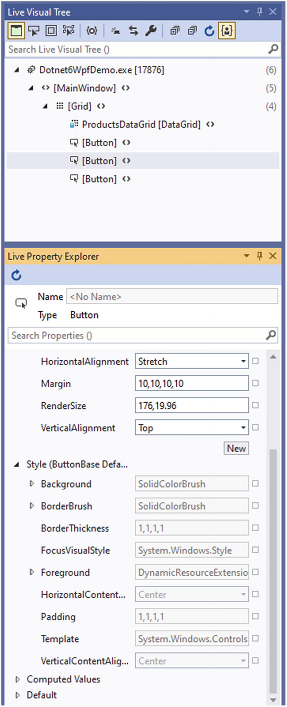
Back to the toolbar, the Select Element on the toolbar allows us to select an element in the running application and inspect its runtime values, much like the developer tools in a browser. First select the Select Element button on the toolbar, select an element in the running application, and switch back to Visual Studio. In Visual Studio is a Live Visual Tree pane; it might be collapsed by default. If you can’t find it, use the Search box in the title bar to search for Live Visual Tree. In the Live Visual Tree pane, we can see the actual current visual tree. Right-clicking an element and selecting Show Properties will open the Live Property Explorer pane showing the properties of the selected element. The properties that are not calculated by WPF can be changed here and will impact the running application. Do note that your changes here will not automatically reflect in your XAML code. These are great tools to find the exact values you need, or debugging a visual issue while running your application, but it is not a real-time editor.
Figure 4-28
Inspecting the visual tree
We can even use the toolbar to show us the layout adorners like margins and paddings of a selected element, as demonstrated in Figure 4-29. By toggling the layout adorners, we can inspect the margins and paddings of selected elements, again very similar to what you might be used to from browser developer tools.
Figure 4-29
Layout adorners for the selected button
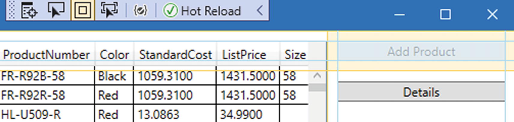
The Hot Reload check in the toolbar shows that we can edit our XAML and save it, and the changes will be reflected in the running application without restarting it. We will dive deeper into Hot Reload later in this chapter.
Data Binding
One of the greatest strengths of XAML is its binding framework. XAML bindings allow us to bind UI properties to C# properties so that the UI updates whenever the property changes, or vice versa. In the example, we’ve been using so far the items in the datagrid loaded in a WinForms style of working, as demonstrated in Listing 4-19.
While this does work, it does not use any binding. Converting this is as simple as turning the private field into a public property and remove setting the itemssource manually.
A very important line that has snuck in here is DataContext = this. This line tells the binding framework in what instance it can resolve its bindings; in this case, we set it to the code behind of the window. Now we just need to set the binding statement in the datagrid.
<DataGrid
x:Name="ProductsDataGrid"
Grid.Row="0"
Grid.RowSpan="3"
ItemsSource="{Binding Products}"
Grid.Column="0"
Margin="10,10,0,10" />
Listing 4-21
Setting a binding in XAML
That should do it! However, when we run the application, you’ll notice that the datagrid is still empty. Did we miss something? Are bindings broken in .NET 6? Do not worry; this is a result of the order in which things are happening and a result of the fact that we aren’t notifying the UI of a change yet.
The binding framework is not constantly monitoring its bound properties for changes; this would really tear down any performance. Instead, it listens to property changed events coming from its datacontext. To fire these events, we need to implement the INotifyPropertyChanged interface. Listing 4-22 shows the changes to make it work.
public partial class MainWindow : Window, INotifyPropertyChanged
{
private List<Product> _products;
//INotifyPropertyChanged member
public event PropertyChangedEventHandler PropertyChanged;
public List<Product> Products
{
get => _products;
set
{
if (value == _products)
{
return;
}
_products = value;
PropertyChanged?.Invoke(this, new PropertyChangedEventArgs(nameof(Products)));
}
}
...
Listing 4-22
Implementing INotifyPropertyChanged
The INotifyPropertyChanged interface contains one member, the PropertyChanged event. We fire this in the set method of the Products property. By firing this event, we notify the datagrid that its data has changed and that it needs to refresh its UI. We dive deeper into XAML, binding, and the MVVM design pattern in Chapter 6 of this book. Chapter 6 handles MAUI, Microsoft’s cross-platform framework.
Windows App SDK
As we have seen, there are different ways of building desktop applications for Windows. Each platform, being it WinForms or WPF, comes with its own specific way of interacting with the operating system. Back when .NET 6 was in its planning phase, a new project was announced by Microsoft under the name Project Reunion. Project Reunion promised to unify the way desktop applications were build and were interacting with the operating system. Eventually Project Reunion got renamed to the Windows App SDK.
The Windows App SDK is a set of components, tools, and a unified API that can be used to build applications for Windows 10 and Windows 11. The Windows App SDK does not replace any frameworks; it’s more of an add-on, something that complements current frameworks to provide a more consistent way of working.
The Windows App SDK consists of several features.
Table 4-1
Windows App SDK features
Feature
Description
WinUI 3
The UI components for building Windows applications
DWriteCore
Cleartype text rendering using a device-independent text layout system
MRT core
Manage translations and images in multiple languages and scales
App instancing
Control over applications being able to run multiple instances of themselves
Rich activation
Launch your app through a URI or from another app
Power management
Inspect how your app affects the device’s power usage
App windows management
Create and manage app windows
Push notifications
Send rich push notifications from Azure to your app
Deployment
Deploy the Windows App SDK runtime with your app
The easiest way to get started with the Windows App SDK is by downloading and installing the Visual Studio 2022 extension from https://aka.ms/windowsappsdk/stable-vsix-2022-cs. This extension will install the WinUI project templates in Visual Studio.
Besides the extension, we also need the Universal Windows Platform, .NET Desktop, and Desktop Development with C++ workloads installed from the Visual Studio Installer.
Building a Windows App SDK application
From Visual Studio, we create a new solution. In the project type selection window, we can filter on WinUI. The WinUI 3 templates contain the references to the Windows App SDK. The SDK is fully wired up and ready to go.
Figure 4-30
WinUI templates
There are two types of WinUI applications, packaged applications and unpackaged applications. Unpackaged applications result in an executable that we ourselves are responsible for to put into an installer; these types of applications are used when installing through an MSI or setup.exe wizard. Packaged applications on the other hand are fully prepared to be installed using MSIX. MSIX is Microsoft’s packaging format; it is an easy way for users to install, update, and uninstall applications on their system. The biggest advantage to MSIX is that every application installed through MSIX works with a sandboxed registry and a sandboxed filesystem, meaning if we uninstall the application, all traces of it are effectively removed from the system. This prevents the slowing down of computers because of registry keys that keep floating around.
There are two app templates, one packaged with MSIX and one packaged with MSIX using a Windows Application Packaging (WAP) project. The second type will generate a solution with two projects. The second project is only there to configure and generate the MSIX file using the package manifest. This is mostly there for backward compatibility reasons since the WAP projects have been around ever since MSIX was introduced with UWP.
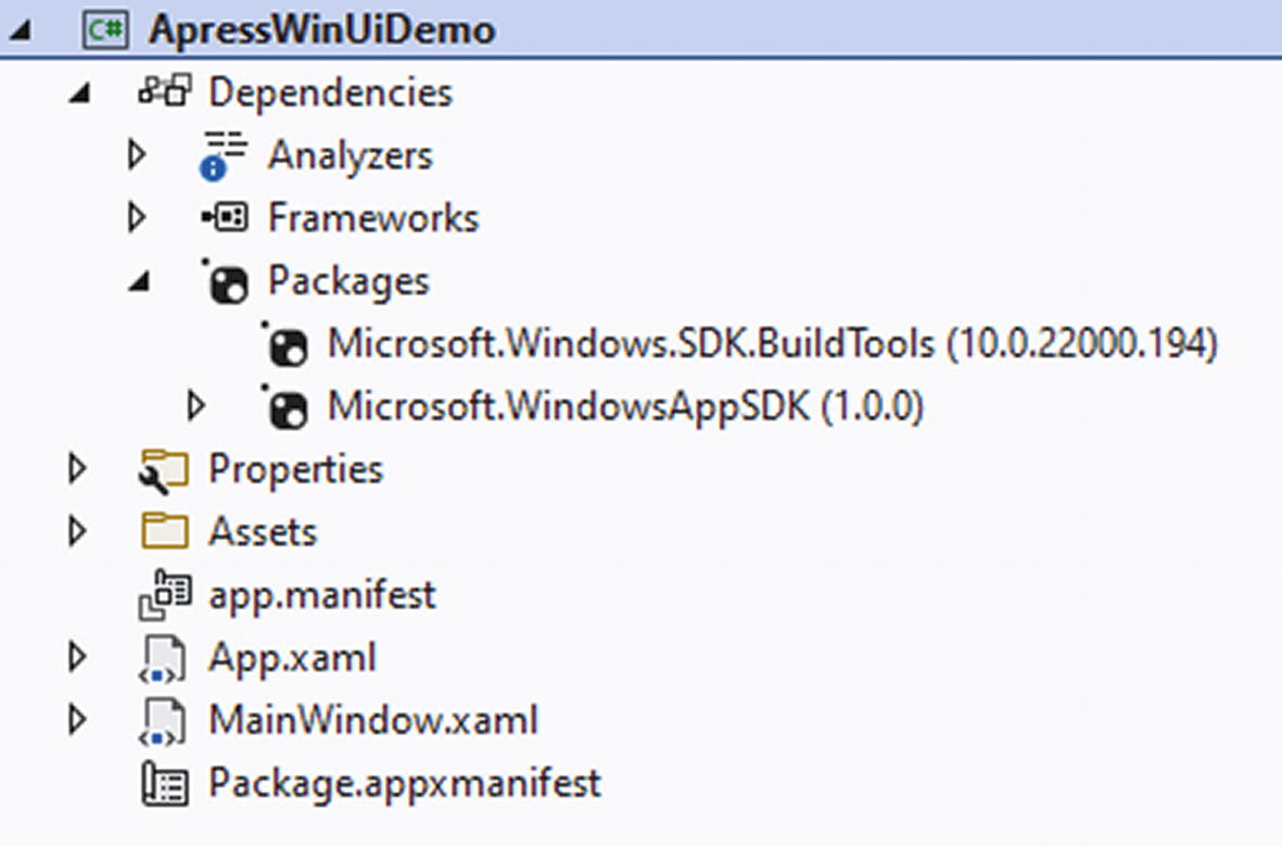
As you might have seen, there is no template for creating unpackaged apps. An unpackaged app can be created by selecting the packaged app without WAP template and adding the WindowsPackageType setting with value None to the project file. For this example, we will use the Blank App, Packaged project type, without a WAP project. Select the template and create a new solution. Figure 4-31 shows the generated project.
Figure 4-31
Packaged Windows App SDK project
The dependencies clearly show the reference to the Windows App SDK. The Package.appxmanifest is used for setting app preferences, like preferred orientation, the icons to be shown in the Microsoft Store should we want to publish our application there, and package versioning. The app.manifest file is an XML file that contains some startup settings. Listing 4-23 shows the default content.
Those DPI values sure look familiar; they are the same values we have set back when we were talking about WinForms.
Let’s have a look at MainWindow.xaml. It looks very similar to what we had in WPF, so how do we know we really are using the Windows App SDK with WinUI 3? Figure 4-32 shows what the namespaces for a button in XAML; on the left is the WinUI 3 project we just created, while on the right is a .NET 6 WPF application.
Figure 4-32
WinUI 3 namespaces vs. WPF namespaces
Every control in WinUI 3 lives in the Microsoft.UI.Xaml.Controls namespace. With this, we have confirmation that we are using the controls from the WinUI 3 library, coming from the Windows App SDK NuGet package. No longer do we need to wait for a Windows update whenever a bug is found in a control or when new controls are announced. Thanks to WinUI 3, the controls are now shipped out of band with Windows, through NuGet.
Using Windows APIs with Windows App SDK
An often-requested feature for WinUI was access to the Windows APIs, for example, to set the title in the window’s title bar or to automatically center a window when launching. This functionality has been released with the Windows App SDK. Listing 4-24 shows how we can use the Windows App SDK to get a reference to the AppWindow object for the current window. This code can be copied directly in the code behind of any WinUI window, for example, the default MainWindow in the project template.
Thanks to the Windows App SDK, we get access to the Windows Runtime, or WinRT, interop capabilities. We first fetch a pointer to where the window lives in memory (window is the name given to the window element in XAML). With that pointer we can grab the window ID, and finally with that ID we can fetch the actual AppWindow instance.
Now that we have an AppWindow instance we can start using it to manipulate the window. Listing 4-25 shows the code to set a title in the titlebar and to resize the window into a square of 500 by 500 pixels.
This code replaces the button’s event handler that was in MainWindow when it was created. When we run this and click the button, you will see the title change, and the window will resize to the result in Figure 4-33.
Once your application is ready to be shipped, we can package it as an MSIX. Make sure to verify the Packaging tab in Package.appxmanifest. Before we can create our MSIX, we need to select a certificate to sign our application. MSIX requires this to prevent attacks on the user’s system through altered software. The toolchain does allow us to create a test certificate, but I would strongly advice to get a real trusted certificate to sign your applications. For now, for the sake of this demo, a self-signed certificate will suffice. Click on the Choose Certificate option and select Create. This will create a self-signed certificate and add it to your project as a *.pfx file. Figure 4-34 shows the certificate window.
Figure 4-34
Selecting a certificate for signing
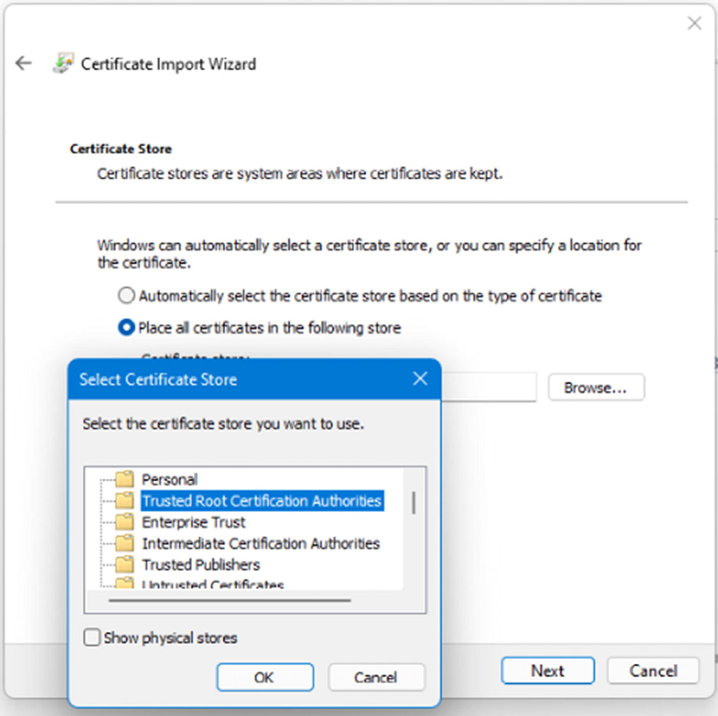
This certificate will now be used to sign your application before packaging it as an MSIX. But certificates only work when they are trusted by the machine they are used on. Navigate to the pfxfile in Windows Explorer and double-click it. This will launch the Certificate Import Wizard. Select Local Machine as store location in step 1. The certificate’s filename in step 2 should already be filled in with your pfx file. In step 3 you are asked to select a password; this is optional and can be left blank. In the final step we will select the certificate store ourselves and browse to Trusted Root Certificate Authorities.
Figure 4-35
Selected the trusted root authorities
Select Next and Finish to import the certificate into your Trusted Root Authority.
A quick but very important sidenote. We have just imported a self-signed certificate into our Trusted Root store of our machine. This is not the way certificates are meant to be used, and we are potentially opening up our machine for malicious software. Keep this in mind and remove the certificate from your store as soon as possible.
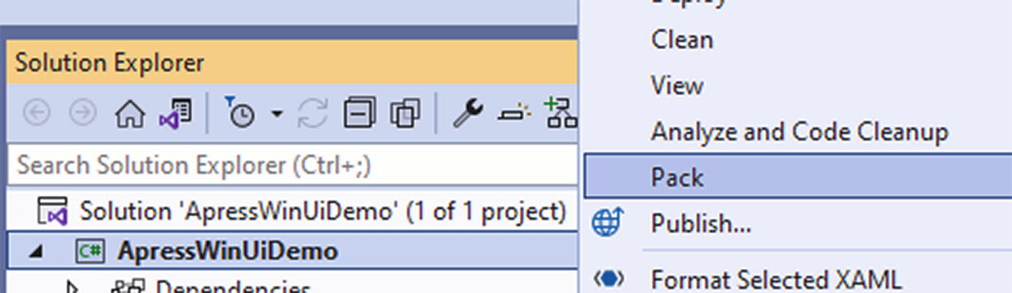
Once everything is in order, right-click the project and select Pack.
Figure 4-36
Pack option in Visual Studio
Once Visual Studio is done packaging your application, you will find an MSIX file in your project’s bin<cpu architecture>Release
et6.0-windows10.0.19041.0win10-x86AppPackagesApressWinUiDemo_1.0.0.0_x86_Test.
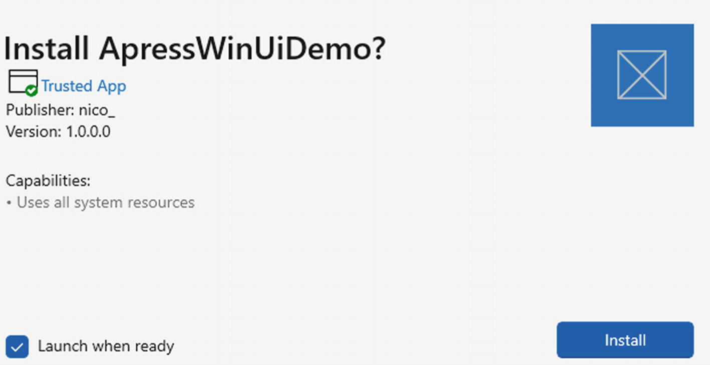
Double-click the MSIX file and an installer will popup. If you did everything correctly, the installer will say that this is a trusted app, which means that the certificate that was used for signing the application is trusted by your machine. Figure 4-37 shows the installer.
Figure 4-37
Installing an MSIX packaged application
After installing, the application will show up in the list of installed applications on your Windows installation. Remember, this application is using sandboxed registry and filesystem, so uninstalling it shouldn’t leave a trace behind.
Migrating to .NET 6
The basics of migrating an existing desktop application to .NET 6 is straightforward, of course depending on the complexity of the application. Migration comes in six steps.
1.
Run the portability analyzer.
2.
Migrate to PackageReference.
3.
Update to .NET 4.8.
4.
Switch the desktop project to .NET 6.
5.
Switch any class libraries to .NET 6.
6.
Run the application and test thoroughly.
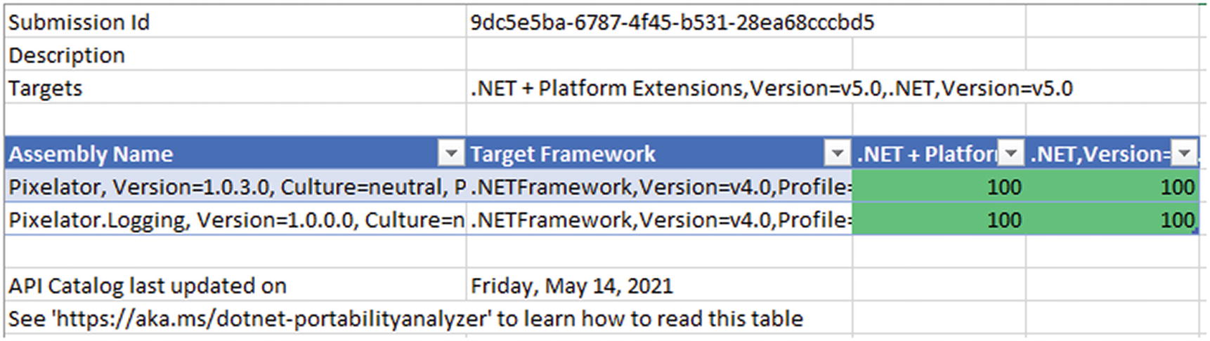
First step is usually running a Visual Studio extension called “Portability Analyzer.” The documentation can be found at https://docs.microsoft.com/en-us/dotnet/standard/analyzers/portability-analyzer. This extension will scan your code base and generate a report that gives an overview of how portable your code is and what assemblies are compatible with which version of .NET. The report in Excel looks like in Figure 4-38.
Figure 4-38
Portability Analyzer
I’ve used a demo application that was built in WinForms with .NET 4.0; in the analyzer settings, I’ve checked .NET 5 as target framework. The analyzer tells me that my application is 100% compatible with .NET 5; since .NET 6 is the successor of .NET 5, it should work just fine. Do keep in mind that all this analyzer does is checking if the framework APIs you use and and the references you have are compatible with the selected target framework. It does not compile, run, or test your application in any way.
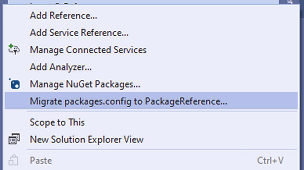
The next step in the porting process is moving away from the old packages.config file to PackageReference. NuGet references used to be stored in an xml file called packages.config in older versions of .NET. After a while those referenced moved to a section in the csproj file called PackageReference. Migration to PackageReference is straightforward in Visual Studio; right-click references and select Migrate packages.config to PackageReference.
Figure 4-39
Migrating to PackageReference
Visual Studio will uninstall all NuGet packages from the project; remove the packages.config and reinstall the NuGet packages in PackageReference. After migration it will show an HTML report detailing any compatibility issues. Don’t forget to build your application after this step to make sure all packages are restored from the NuGet package feed. Make sure that your NuGet packages have the correct version installed. You might need to update some to have .NET 6 support.
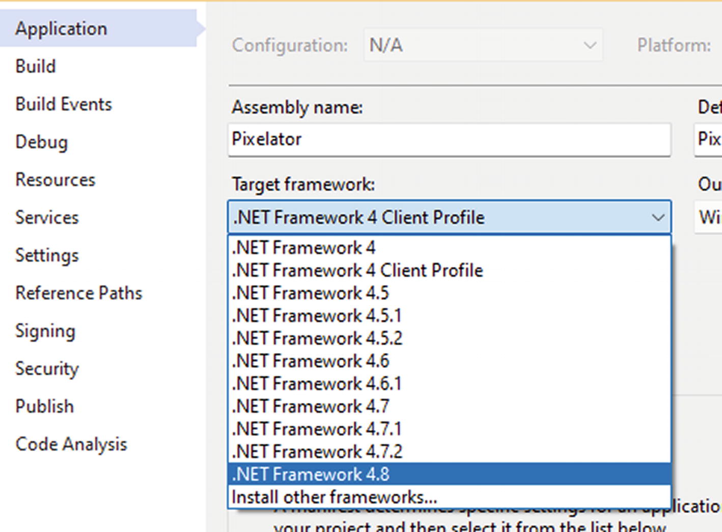
After upgrading to PackageReference, the next step is to update your application to the latest version of the classic .NET Framework, .NET 4.8. Upgrading to .NET 4.8 first will bring you closer to “the new .NET” that started with .NET Core. This is done easily from the properties of each project, as shown in Figure 4-40.
Figure 4-40
Updating to .NET 4.8
If you don’t see the .NET Framework 4.8 option, you need to download and install the .NET Framework 4.8 SDK from this link https://dotnet.microsoft.com/en-us/download/visual-studio-sdks . Make sure your application still compiles and runs after this step.
With that, we’re finally ready for the big migration! There’s quite an easy trick to move an application to .NET 6.
Create a new .NET 6 application of the same type (WPF, WinForms, Class Library, etc.) as the project you’re trying to migrate.
Copy the csproj of the new project to the location of the old project.
Rename the new csproj to have the same name as the csproj of the old application.
Open in Visual Studio, recreate the references, and add the NuGet packages again.
And that’s it! Because of the new project structure since .NET Core, it’s as easy as replacing the csproj with a .NET 6 version. There is one more step after migrating all projects within your solution: test every single button, textbox, and flow in your application. No matter how insignificant the code seems, or whether or not it compiles, test everything! For example, Process.Start("https://www.apress.com") might seem like a very trivial piece of code that couldn’t break, but it does. Since .NET Core, this no longer works and crashes the application.
Upgrade Assistant
There is an alternative to doing the migration manually. Microsoft has created a command line tool called Upgrade Assistant. It basically does the same steps as described above but automatically. The upgrade assistant is open source and can be found at https://github.com/dotnet/upgrade-assistant. Upgrading a project using the upgrade assistant is as easy as calling upgrade assistant upgrade .Pixelator.csproj. The upgrade assistant is a wizard that guides you through the process step by step, allowing you to skip whatever step you want or see more details.
Figure 4-41
Upgrade assistant
Just like with the manual process, test every single nook and cranny of your application after migrating to .NET 6!
Wrapping Up
The desktop remains a very important platform to this day. Microsoft knows this and provides us as developers with several options for building great desktop experiences. Classic frameworks like WinForms and WPF have received updates to bring them in the modern era, with support for high-DPI monitors. Tools like the Windows App SDK unify the API surface of Windows so that we have a common way of interacting with Windows, no matter the desktop framework we are using. In this chapter, we have explored all three options. We have seen that each of the three options has its own strengths and that there is no best option.