
The first thing that many developers (and more designers) worry about when first researching Flex 2 is the default appearance of Flex applications. So many Flex 2 demos use the default theme that it may look like you have no options: your application can look like whatever you want, as long as it's blue-green with rounded edges and Verdana. If this were the case, then you'd have a hard time convincing any client to let you use Flex 2!
Thankfully, that's not the case. Without too much effort, you can make Flex 2 applications that look nothing like the defaults. In the real world, making your application look good can be just as important as making it functional.
There's only so much you can do with the built-in style properties. You can change borders, colors and spacing, but to really change the appearance of your application, you'll need assets.
Flex 2 handles assets very differently from, say, Flash 8. For one thing, Flex 2 compiles straight from source files. The IDE doesn't have any library panel or interface for importing assets. Though it may not appear so at first glance, Flex 2 is quite capable of including multimedia content with your code in compiled SWFs.
You can embed fonts, sounds, graphics, and even other SWFs in your application. When embedding assets into an application, you don't get an opportunity to control quality settings, so if you have control over the compression settings of these files, you must tweak these using external programs.
You can embed the following content:
JPG/JPEG image files
GIF image files
PNG image files
SVG/SVGZ vector image files (supports a subset of SVG 1.1)
MP3 sound files
TTF font files
Installed system fonts
SWF files and specific symbols inside SWFs
Of these, SVG files and font files may not be loaded at runtime.
The easiest, and typical, way to get assets into your
application is to use styles. By placing the image embed right where
it will be used, this approach becomes intuitive and easily
manageable. Flex 2 uses the Embed()
notation, a Flex extension to CSS in the vein of url().
The Embed() functional
notation can take multiple parameters, some of which apply only to
certain types of assets. The default parameter is source, which if there are no other
parameters, can be left out.
When writing CSS in a style sheet, use the Embed notation normally:
<mx:Style>
       MonaLisa {
              background-image: Embed("/assets/monalisa.jpg");
              background-size: "100%";
       }
</mx:Style>
<louvre:MonaLisa/>
And when writing styles inline as attributes of a tag, write
@Embed() instead:
<mx:Image source="@Embed('/assets/monalisa.jpg')" width="100%" height="100%"/>Embed() uses paths relative
to the file they are written in, and the root of the path is the
source folder as set in Flex Builder 2's project preferences. Unless
you have a good reason not to, you should use absolute paths so moving
source (code) files has no impact.
Assets that you embed become part of the application, and are
available both to code you write and the application at runtime. The
greatest part about assets is that they are turned into
classes! While it seems far out at first, this
makes sense in the context of Flash Player 9's new display
architecture. The method for creating any kind of display object is
simply new. When you create new
components that extend existing ones, they are still created with
new. So bitmap assets are
subclasses of BitmapAsset (which
are sub-sub-classes of Bitmap),
which happen to extend the functionality of a blank Bitmap by displaying some particular image
instead:
var a:Button = new Button(); addChild(a);
var b:Panel = new Panel(); addChild(b);
var c:TextInput = new TextInput(); addChild(c);
var d:InboxView = new InboxView(); addChild(d); //custom component
var e:MonaLisaBitmap = new MonaLisaBitmap(); addChild(e); //asset!
When you embed assets in CSS, the Flex 2 compiler automatically generates names for the classes. If you want to access them from outside CSS, you can embed assets using metadata in ActionScript.
You can use the Embed
metadata tag to embed assets in ActionScript. Embedded assets are
associated with the Class reference you provide. You can also use
curly brace binding to reference that class in inline CSS
attributes:
[Embed(source="assets/delete.gif")]
private const DeleteAsset:Class;

<!-- embedding directly in inline CSS -->
<mx:Button icon="@Embed(source='/assets/delete.gif')" label="Delete"/>
<!-- binding to class embedded using metadata -->
<mx:Button icon="{DeleteAsset}" label="Delete"/>
Because variables referencing classes can't be used for typing,
you can't type var foo:DeleteAsset.
When passing references to assets, use their superclass instead.
Bitmaps are imported as BitmapAssets, fonts as FontAssets, SVG as SpriteAsset, etc. You may also use the
common interface IFlexAsset for
typing.
Whether you use Embed() in a
metadata tag, in an inline style, or a style sheet, you can use
parameters with it. With every kind of asset it supports the source and mimeType properties, used to specify the
source file and MIME type of the object.
Graphical assets also support properties for scale-9 slicing. Scale-9 allows you to scale an image discontinuously, typically for use as a background or skin for a resizable component. By scaling the middle and keeping the corners at their original size, you can stretch many images without deforming the important details at the corners. You define two lines on each axis, which split the image into a grid of nine subdivisions. The vertical lines' positions are measured in pixels from the left, and the vertical lines' positions are measured from the top (as the origin in Flash Player is at the top left). For example, we could use this to preserve the size of a frame in a framed painting:
<mx:Image source="@Embed(source='/assets/monalisa-framed.jpg',
       scaleGridTop=22, scaleGridLeft=22, scaleGridRight=395, scaleGridBottom=575)"
width="100%" height="100%"/>To embed a font in a style sheet, you can use url() instead of Embed(). Use the special selector @font-face to define the font, and set
font-family to create its
name:
/* embedding the font */
@font-face {
       src: url("/assets/fonts/caecilia-light.ttf");
       font-family: "Caecilia";
}
/* using the font */
.partlyhuman {
       font-family: "Caecilia";
       font-size: 32;
}
Using the font is as simple as referencing the font-family you declared in your
embed.
You can embed a font from a TTF file, from a TrueType font
installed on your system, or from a font embedded in a SWF. If you
have to use PostScript or OTF fonts, embed them in a SWF and use the
SWF as the target of your src
property. When using fonts from a SWF, you must create a @font-face item for every style you wish to
use (bold, italic, bold italic):
@font-face {
       src: url("assets/fonts/caecilia.swf");
       font-family: "Caecilia";
}
@font-face {
       src: url("assets/fonts/caecilia.swf");
       font-family: "Caecilia";
       font-style: italic
}
@font-face {
       src: url("assets/fonts/caecilia.swf");
       font-family: "Caecilia";
       font-weight: bold;
}
@font-face {
       src: url("assets/fonts/caecilia.swf");
       font-family: "Caecilia";
       font-style: italic;
       font-weight: bold;
}You can embed both SWFs themselves, and symbols from a SWF's
library into your Flex application. When you embed an entire SWF, you
can use code in it if it was published with ActionScript 3 for Flash
Player 9 or later, or you can communicate with older SWFs using a
LocalConnection in both the host and the embedded SWF. Embedded SWFs
are created as subclasses of mx.core.MovieClipLoaderAsset, which extends
MovieClip.
You can also use SWFs as libraries to organize graphical assets
that your Flex application uses, and use the Flash authoring tool to
manage your assets. All symbols exported for ActionScript as Button or
MovieClip types are available by their linkage name. Embedded symbols
have all code extracted from them, so they are best used for graphics
only. To specify which symbol to embed from a SWF, use the symbol parameter of the Embed() notation. For example, to use a
symbol from a SWF with a collection of paintings, you might use the
following:
<mx:Image id="laJoconde" source="@Embed(source='paintings.swf', symbol='monaLisa')"/>
Embedding images by itself can increase the visual impact of your application. Typically, images are applied as backgrounds, free-floating images, and icons on buttons. But to change the appearance of the interface itself, you must use the skinning facilities of Flex 2.
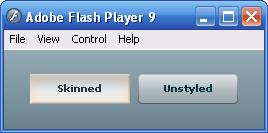
Skinning can be performed as easily as embedding images in skin style properties. Built-in Flex UI components all have several style properties exposed for skinning. These are easy to identify, as they end in "-skin." Skin style properties come in sets based on the component's interaction. For example, a button's skins enumerate its eight possible states: up, down, over, disabled, and all of those while selected (to support buttons which toggle on and off). Below is the CSS for a custom button style seen in Figure 14.
Button {
       up-skin: Embed("/assets/button-up.png");
       down-skin: Embed("/assets/button-down.png");
       over-skin: Embed("/assets/button-over.png");
}
If you are sure that no Buttons in the application will be disabled or selected, those three styles will suffice; otherwise, your carefully skinned button might blow its cover and show up using the default style if it is disabled or selected. So even if you don't use every state in your skins, it may be a good practice to assign all the skin properties, for instance, pointing the selected skin properties to the same images as the non-selected skin properties. Check the documentation for each component under the styles section to see its skinnable properties.
There may also be other styles associated with the states of the
component that go along with its skins. Buttons have disabled-color, text-rollover-color, and text-selected-color properties to change the
color of the text with respect to those states.
One requirement of skin styles is that they must be embedded
images. While other image styles like background-image may either be specified with
a url() notation and loaded at
runtime, or with an Embed() notation
and embedded, skin properties are always embedded. This assures that you
don't have to deal with the loading process and the possibility of your
interface being invisible or unusable until loading is complete.
You can tell when an image style allows runtime loading by looking
at the type of the style. When you see a style property with type
Class, you can assume that it is
expecting an embedded asset. Remember that the result of an [Embed] metadata tag is a Class reference: so an inline Embed() notation satisfies the style
property's requirement for a Class
type.
Bitmap Smoothing
Flash Player 9 and Flex 2 really want to
help your application run fast. Whether you embed an image, load it at
runtime, or set the stage quality to BEST, Flash Player 9 transforms bitmaps
using a fast nearest-neighbor algorithm. This means that you may see
jaggies on a scaled image. This sacrifice of display quality for speed
is usually a good thing, and is a sensible default: in animations,
framerate is more important than each frame's quality.
However, Flex doesn't provide you with an easy remedy to this if
image quality is tantamount for a particular image. There is a boolean
property smoothing which exists on
Bitmap instances that will enable
bilinear filtering, yielding a smooth image at the cost of more
computation. The actual Bitmap, however, is always buried deep within
the component which actually uses it, nor is there a common way to
retrieve the inner Bitmap.
Provided with this Short Cut is a class, com.partlyhuman.fx.SmoothingEnabler, which
finds all Bitmaps buried within a component and enables smoothing on
them. You may use it on any display object:
import com.partlyhuman.fx.SmoothingEnabler;
SmoothingEnabler.enableSmoothing(myDisplayObject);
The static method recursively builds a list of the contents of the object, and enables smoothing on all bitmaps found, including externally loading images.
By using the ActionScript 3.0 drawing API, you can procedurally draw graphics on the screen. If your intended look and feel can be accomplished with strokes, fills, gradients; if you require a customizable theme; if you might apply themes to elements of wildly differing size; or if file size is tantamount, you should consider using code to generate your skins.
The built-in "halo" theme of Flex 2 is entirely programmatic. This means:
You can customize the color and gradients of the skin with styles.
Appearance does not degrade as you zoom in or apply the theme to extremely large or extremely small components. Vector graphics created with the drawing API are rendered with the same fidelity regardless of scale.
The file size for the entire theme is very small. No bitmap graphics are embedded, and compiled code is extremely compact.
To create a programmatic skin for a style, create a class that
extends an appropriate abstract class provided in the mx.skins package, and implement the updateDisplayList() method to draw itself.
By examining the styles set on your class (which are passed in from
the styles set on the component it is theming), you can modify the way
your skin is drawn.
Once your skin class is created, you can set it to skin styles
with an additional notation called ClassReference(), which also may be inserted
in inline CSS by prepending an at symbol (@):
Button {
       up-skin: ClassReference('com.partlyhuman.books.flexshortcut.CustomButtonSkin'),
}It is possible to compile all of your skinned classes, assets, and styles into a SWC file and reuse this file across multiple SWFs, or distribute it, as a theme. A SWC file is an archive containing compiled code and assets, which can be linked in by the compiler without recompiling its contents. If you decide to link a SWC file dynamically, it can exist outside the SWF file, being loaded in on demand. This is an excellent tactic when splitting an application into multiple SWFs, because the shared theme will be downloaded once, rather than compiled into all SWFs. This results in smaller download size.
Use the command-line Flex compiler, mxmlc, with the –theme command-line argument to create theme
files. The Flex 2 documentation explains this process in depth.
A few well-placed reactive animations can have a notable impact on a user's impression of a piece of software. Animations can provide user feedback through visual responsiveness. Thankfully, Flex 2 gives developers a silver bullet with Effects. Using Effects and effect triggers, you can dress up your application without breaking a sweat.
Effects are classes in the mx.effect package that extend Effect. By setting properties of an Effect
instance, you can change what the effect applies to, and the parameters
of the animation. Then you can set the effect to start on certain
triggers by assigning the Effect to an effect trigger on your
components.
Below we have added a simple effect to make the images in our Flickr grid fade in when they are completed loading:
<mx:Image id="img" width="75" height="75" source="{photoToImage(data)}">
       <mx:completeEffect>
              <mx:Fade alphaFrom="0" duration="500" easingFunction="{Cubic.easeOut}"/>
       </mx:completeEffect>
</mx:Image>
This code uses a child node to assign an attribute, so that we can
embed an object in it. The effect trigger here is completeEffect, and the effect is a Fade: fade in when loading is complete. You
can tell that an attribute is an effect trigger by its icon in Flex
Builder 2's autocomplete dropdown, by looking under the effects section
of the Flex 2 documentation on a component, or by the fact that it ends
in –Effect. Often, like in this case, an effect trigger is named after
the event it mirrors: when loading is complete, the component will fire
a complete event as well as playing
the completeEffect, if there is
one.
Effects try to help you out by having sensible defaults. The above
code specifies that the starting alpha value should be 0 (completely
transparent), but leaves out the ending alpha value (alphaTo). In actuality, you could leave out
alphaFrom as well, because the effect
defaults to fading from 0 to 1.
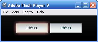
Below, multiple effects are applied to different triggers on the same Button:
<mx:Button styleName="skinnedButton" label="Effect">
       <mx:rollOverEffect>
              <mx:Glow color="#ffa0a0" duration="500"
easingFunction="{Cubic.easeOut}"
                     blurXFrom="20" blurXTo="20"
                     blurYFrom="20" blurYTo="20"
                     alphaFrom="0" alphaTo="0.5"/>
       </mx:rollOverEffect>
       <mx:rollOutEffect>
              <mx:Glow color="#ffa0a0" duration="500" easingFunction="{Cubic.easeIn}"
                     blurXFrom="20" blurXTo="20"
                     blurYFrom="20" blurYTo="20"
                     alphaFrom="0.5" alphaTo="0"/>
       </mx:rollOutEffect>
       <mx:addedEffect>
              <mx:Resize heightFrom="0" widthFrom="0"
                     duration="500"
                     easingFunction="{Cubic.easeOut}"/>
       </mx:addedEffect>
</mx:Button>
The button scales up from a point when it is added, and glows in reaction to your mouse. More than the glow simply appearing, though, it fades in and out with easing (Figure 15). You are not advised to tell your boss how easy this is.
Most Effect attributes are specific to what effect they represent, but there are common ones that control the animation in general. The most useful ones are:
- duration
The time the animation will take to complete in milliseconds.
- easingFunction
Reference to a function which controls how the animated properties are interpolated through time. You can reference the built-in functions provided in the
mx.effecs.easingpackage, which are Robert Penner's easing functions used in most tweening packages for Flash and Flex.- startDelay
How long to delay before the animation starts, in milliseconds.
- repeatCount and repeatDelay
The number of times the effect should be repeated, and the delay between repetitions in milliseconds.
- target or targets
The instance or array of instances the Effect should affect. Defaults to the object that triggered the event.
A word on easing functions: since you can only set this property to a function reference, it's not immediately clear how to customize properties of tweening functions that take extra parameters. The solution is to use a partial function, a function for which some of the inputs are already defined. In some functional programming languages this is supported directly in the syntax, but in ActionScript 3.0 we simply construct a container function:
private const CUSTOM_BACK_S:Number = 100;
private const backEaseOutCustom:Function =
       function(a:Number, b:Number, c:Number, d:Number):Number
       {
              return Back.easeOut(a, b, c, d, CUSTOM_BACK_S);
       };

<mx:Resize duration="1000" easingFunction="{backEaseOutCustom}"/>Effects do not limit you to single-property animations. By composing together different Effects you can create arbitrarily complex animations. The effects system uses the same general style of declarative animation as that standardized in W3C's Synchronized Multimedia Integration Language (SMIL).
There are only two classes that control timing of animation
groups, Parallel and Sequence, and they are simple to understand.
Children of a <mx:Parallel>
tag will start at the same time and all play at the same time, in
parallel. Children of a <mx:Sequence> tag will play one by one
in order. These two classes extend Effect as well, so the Effect you
assign to an effect trigger may have a root node of Parallel or
Sequence.
The suite of provided Effect classes and the ability to compose them into more complex effects means that you will rarely need to write your own Effect subclasses.
- Filter Effects
Fadechanges the transparency of the target.BlurandGlowapply their respective filters to their target and change the properties of that filter.Dissolvecreates a color matte above the target and fades that to show or hide the target.- Transformation Effects
Resize,Rotate, andMovechange the size, rotation, and position of their target. TheRotateeffect may provide a center of rotation. TheZoomeffect also changes the size of its target likeResize, but allows you to provide a center point.- Mask Effects
WipeLeft,WipeRight,WipeUp, andWipeDowncreate rectangular masks and slide them to hide or reveal their target. These all extendMaskEffect, which you can also subclass to provide different mask shapes.- Sound Effects
The literally named
SoundEffectwill play a sound effect in your Effect. By composing these with your visual animations in a Sequence or Parallel effect, you can add aural feedback to your application as well.
The Flex 2 framework exposes a wide variety of useful triggers for your effects. Though you may not subscribe to all of them, Flex 2's built-in components send all sorts of events flying about as it does its work of building and managing a UI for you. Many of these double as effect triggers, so there are very natural places to put effects. Below is a by-no-means-exhaustive list of ideas for places to apply effects.
- Focus feedback
Use the
rollOutEffectandrollOverEffecton any component. You might consider using the same effects forfocusInEffectandfocusOutEffectto apply your animations to keyboard navigation as well.- Smooth out resizes
You can use a
Resizeeffect along with theresizeEffecttrigger to make sure that any changes in the size of a container are not abrupt.- Abracadabra! Appear and disappear with flair
Use
addedEffect/removedEffectfor children added to a component orcreationCompleteEffectotherwise, to make a component pop into or out of existence with some pizazz.- Transition views
Toggle between children of a
ViewStack(likeTabNavigator) by switching theirvisibleproperty. Changes to thevisibleproperty can trigger ahideEffectandshowEffect, so you can use these to slide in and out panels or dissolve between tabs.
Writing effect instances directly inside the tags that trigger them is fine for demonstrations, but is not a good practice for creating reusable, readable code. There are several things you can do to make your effect code compact.
First, you can remove literal numbers from the effect tags and replace them with constants, which you bind to using curly braces. Many of these numbers end up being linked; for example, effects that turn on and off symmetrically will use the same values for durations and swap from- and to- properties. By moving these into constants in a Script block, you can modify these to your liking from one place:
private const GLOW_BLUR_MAX:Number = 20;
private const GLOW_BLUR_MIN:Number = 0;
private const GLOW_ALPHA_MIN:Number = 0;
private const GLOW_ALPHA_MAX:Number = 0.5;
private const GLOW_DURATION:Number = 500;
private const GLOW_COLOR:uint = 0xffa0a0;
private const GLOW_EASE:Function = mx.effects.easing.Cubic.easeOut;

<mx:Button>
       <mx:rollOverEffect>
              <mx:Glow color="{GLOW_COLOR}"
                     duration="{GLOW_DURATION}"
                     easingFunction="{GLOW_EASE}"
                     blurXFrom="{GLOW_BLUR_MIN}" blurXTo="{GLOW_BLUR_MAX}"
                     blurYFrom="{GLOW_BLUR_MIN}" blurYTo="{GLOW_BLUR_MAX}"
                     alphaFrom="{GLOW_ALPHA_MIN}" alphaTo="{GLOW_ALPHA_MAX}"/>
       </mx:rollOverEffect>
       <mx:rollOutEffect>
              <mx:Glow color="{GLOW_COLOR}"
                     duration="{GLOW_DURATION}"
                     easingFunction="{GLOW_EASE}"
                     blurXFrom="{GLOW_BLUR_MAX}" blurXTo="{GLOW_BLUR_MIN}"
                     blurYFrom="{GLOW_BLUR_MAX}" blurYTo="{GLOW_BLUR_MIN}"
                     alphaFrom="{GLOW_ALPHA_MAX}" alphaTo="{GLOW_ALPHA_MIN}"/>
       </mx:rollOutEffect>
</mx:Button>
If you reuse the same effect for multiple instances, as you are
likely to do, you can put an id on
your effect instances and use binding to refer to the whole
effect:
<mx:Glow id="buttonGlowIn" ... />
<mx:Button rollOverEffect="{buttonGlowIn}" ... />
The next step you could take is to move all of your common
effects into a class, and include and bind to that every place you
need an effect from it. You might create a CommonEffects.mxml:
<mx:Object xmlns:mx="http://www.adobe.com/2006/mxml">
       <mx:Glow id="buttonGlowIn" ... />
       <mx:Glow id="buttonGlowOut" ... />
</mx:Object>
And use it:
<fx:CommonEffects id="common"/>
<mx:Button
       rollOverEffect="{common.buttonGlowIn}" rollOutEffect="{common.buttonGlowOut}"/>
Or you could create a "microclass" for a Button of the proper
style: create an MXML class that extends Button and has all the
effects you want set on it. Then, use the tag for your class where you
would normally use <mx:Button>.
If you are reusing effects this much, what you might
really want is to style effects. Little known
fact: effect triggers are internally implemented as styles! You can
use setStyle("effectTrigger",
EffectClass) on a component in ActionScript to set effects.
To use effects inside stylesheets, use the ClassReference() notation to locate either a
built-in Effect class, or a subclass which you create. Note that
because Effect constructors must take a parameter, you cannot create
an Effect subclass in MXML. You could write custom effects like
ButtonGlowIn.as below:
package com.partlyhuman.books.flexshortcut.effects
{
       import mx.effects.Glow;
       import mx.effects.easing.Cubic;

       public class ButtonGlowIn extends Glow
       {
              public function ButtonGlowIn(target:Object = null)
              {
                     super(target);
                     duration = 500;
                     color = 0xffa0a0;
                     //...
                     alphaTo = 0.5;
              }
       }
}
And apply them in your CSS files:
Button {
       up-skin: Embed("/assets/button-up.png");
       down-skin: Embed("/assets/button-down.png");
       over-skin: Embed("/assets/button-over.png");
       roll-over-effect:
ClassReference('com.partlyhuman.books.flexshortcut.effects.ButtonGlowIn'),
       roll-out-effect:
ClassReference('com.partlyhuman.books.flexshortcut.effects.ButtonGlowOut'),
}
This lets you combine the power of styles and effects to create styles that are not just about appearance, but motion and even sound.
Transitions apply the animation
power of Effects with the reconfiguration power of States. A Transition allows you to animate the
properties that a State changes; to define how a state transformation
may take place over time.
A Transition is an object that specifies which States will trigger
it, and an Effect that will play. Specify the Transition's fromState, toState or both to create rules for triggering
it. We upgraded the Flickr grid application with some styles and
transitions, creating one transition triggered by the active state and one by the inactive state, by setting the toState properties of the Transitions.
When using effects as transitions, you can order the operations
required by a state change as part of your effect. In other words,
Transitions cannot only animate the properties which are changed by a
State, but trigger them as part of a larger timeline. To schedule the
changes, there are special effects you can insert in a Sequence
composite effect, one for each possible state action: an AddChildAction effect triggers an AddChild in the corresponding state, SetStyleAction triggers a SetStyle, and so forth. In the example, the
SetPropertyAction is unnecessary
because all the actions are parallel—the SetProperty is executed at the beginning, no
matter what. When there are multiple overrides of the same type, you can
specify which one by binding to the same target, as shown in the following code and
Figure
16:
<mx:transitions>
       <mx:Transition toState="inactive">
              <mx:Parallel>
                     <mx:SetPropertyAction/>
                     <mx:Blur target="{img}" blurXTo="{BLUR_AMT}" blurYTo="{BLUR_AMT}"
                           duration="{DURATION}"/>
                     <mx:Fade target="{caption}" alphaFrom="0"
alphaTo="{CAPTION_ALPHA}"
                           duration="{DURATION}"/>
              </mx:Parallel>
       </mx:Transition>
       <mx:Transition toState="active">
              <mx:Parallel>
                     <mx:SetPropertyAction/>
                     <mx:Fade target="{caption}" alphaTo="0" duration="{DURATION}"/>
                     <mx:Blur target="{img}" blurXTo="0" blurYTo="0"
duration="{DURATION}"/>
              </mx:Parallel>
       </mx:Transition>
</mx:transitions>
For more complex transitions, the filter property of Effects may
help. Instead of specifying concrete references as targets, the filter
property can be used to define targets based on a rule. For example, if
a state adds several children among other actions, you can create a Fade
effect with the filter property set
to "add", and all the added
components will be faded. Possible filters are hide, show,
add, remove, move, and resize.
While Flex 2 adds a lot on top of the Flash Player 9 display
architecture, all Flex components still extend DisplayObject, and as such, you can still take
advantage of these lower-level abilities.
A filters array is available on
every DisplayObject—and therefore every Flex component—to hold an
arbitrary number of filters. Flash Player 9 supports a variety of
built-in filters that can be useful, including blurs, glows, drop
shadows, bevels, convolution filters, color transforms, and displacement
maps. Look for these in the flash.filters package.
You can apply masks to components as well: assign a second
DisplayObject to the mask property,
and the visible area of the second object will reveal the first.
Each component, as a DisplayObject, also has a blendMode property, which, when set, changes
the way in which the object affects the graphics beneath it. Flash
Player 9, and by extension Flex 2, provides plenty of blend modes,
giving you the ability to reproduce effects from Photoshop or a similar
program at runtime.
If you have skinned every last corner of your application, if you have pages of stylesheets and effects, if you have rid your application of every last gradient, every instance of Verdana, every Flex-looking scrollbar, one remnant still gives away your application: the preloader (Figure 17).
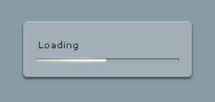
If you have gone to those lengths, you will be happy to know that
you can also write a custom preloader. Create a subclass of the DownloadProgressBar class, subscribing to its
own progress events to update its display. Because this is displayed
before the Flex framework fully initializes, the DownloadProgressBar is
a Sprite instead of a UIComponent, and you can't use Flex components
inside of it. Once you have a custom DownloadProgressBar subclass,
assign its class name to the preloader attribute of your Application, and your skinning will be
complete:
<mx:Application xmlns:mx="http://www.adobe.com/2006/mxml"
       preloader="com.partlyhuman.books.flexshortcut.CustomPreloader">