
In this chapter, we will look at Forms and Tables in UIkit. We will begin with Forms and learn about the various types of form features before moving on to Tables and their various types.
Forms
Forms are excellent resources that enable users to enter information, followed by data being sent to the servers to be processed. UIkit has a plethora of form elements that simplify creation of varying types of forms.
Forms are a handy resource that eliminate the need of displaying email addresses on sites, which are an easy target for spam bulk mails and phishing. We will look at the various form utilities before designing an easy-to-code sign-up form.
All the resulting code outputs have been taken on a mid-sized tablet screen for all the code examples (just demonstrates the ingrained responsive nature of UIkit). The code output for the Sign-Up form in the last section is taken on a mobile screen.
Simple Input Textbox
Simple Input textbox
In Listing 5-1, we have defined a <form> element inside where we will create an input textbox.
First, we create a title for the form using the <h4> heading class within a parent <div> element. Thereon, we create a <div> element and assign the uk-margin class to it. Next, we create an <input> tag and assign the uk-input class to it. We assign the type attribute and assign the text value to it. Then, we enter the placeholder value inside the textbox using a placeholder attribute.
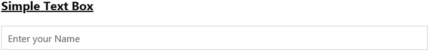
Form input textbox
Contextual Colored-Form Textboxes
Feedback states using contextual colors
We create a title for this example using the <h3> heading class. We create a parent <div> element, within which we define four <div> elements to assign the ingrained default, danger, success, and disabled classes.
For the first default contextual color, we create a <div> element and assign the uk-margin class to it. Then we use an <input> tag and assign the uk-input class to it. Then similar to the previous listing, we assign the type and placeholder attribute with their respective values.
For the second <div> element, we use the uk-form-danger class in conjunction with the uk-input tag. Then we define the type and placeholder attributes with their respective values.
Similarly, for the third <div>, we assign the uk-form-success class in conjunction with the uk-input tag. Then we define the type and placeholder attributes with their respective values.
For the fourth <div> element, we use just the disabled attribute. The rest of the code for the fourth <div> is similar to the default input textbox.
On executing the code, the respective contextual colors will be applied to the four input textboxes.
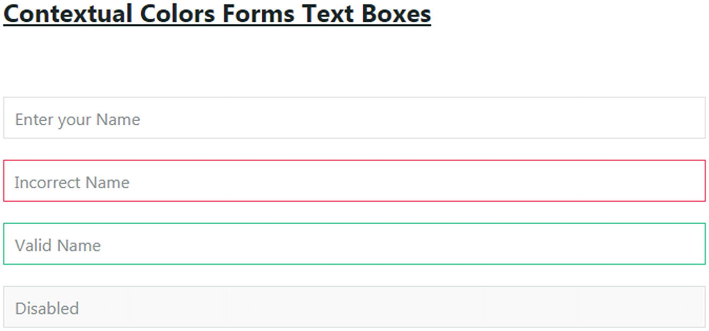
Contextual-colored form input textboxes
Pre-defined widths for input form elements with contextual colors
For the first input textbox, we use the uk-form-width-xsmall class in conjunction with the uk-input class and the disabled attribute alongside the type and placeholder attribute and their respective values.
For the second input element, we use the uk-form-width-small class in conjunction with the uk-input class. We then assign the type and placeholder attribute in tandem. Similarly, we create two more input textboxes with the danger and success contextual colors. We assign the uk-form-width-medium and the uk-form-width-large classes respectively in tandem.
This will result in textboxes having the pre-defined widths mentioned earlier in this listing.
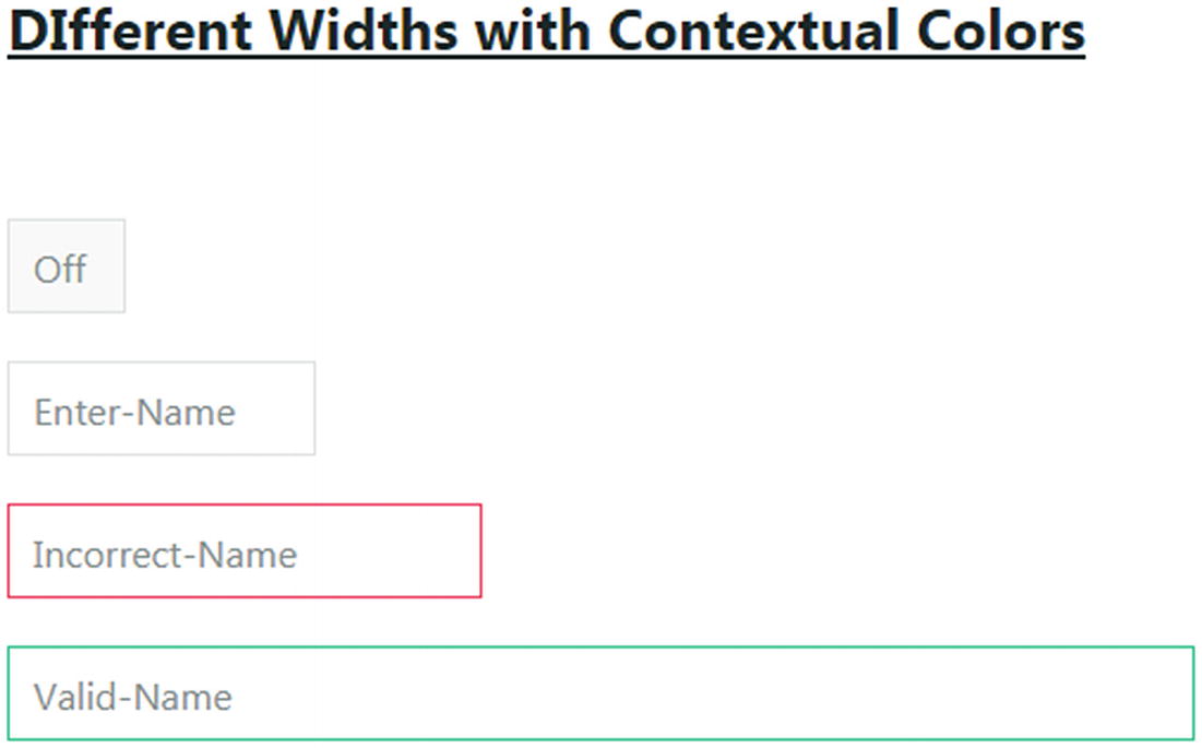
Pre-defined widths for form input textboxes with contextual colors
Grid-Width Input Textboxes
Grid-Width form layouts
Listing 5-4 depicts grid and width facilities for form layouts. We create a <form> tag and assign the uk-grid-medium class to it in tandem with the uk-grid attribute. Then we create the first form input textbox and assign the uk-width-2-3 class to it. Thereon, we create three more textboxes and assign the same uk-width-1-3 class to all of them.
Next, we create a textarea box for comments. For it, we assign the uk-width-2-3 class to define its width. Thereon, we create a <textarea> tag and assign the uk-textarea class to it in conjunction with the rows attribute, to which we assign the value 5. This will ensure that the textarea input form element will have an area of five rows for the defined width. Finally, we allocate a placeholder attribute with a value to it.
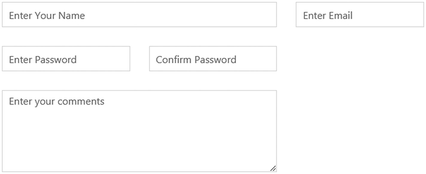
Grid-Width Form layout
Select Options
Form Select Options Dropdown
In Listing 5-5, we create a parent <form> tag and then include an <h1> tag inside it. Then we create a <div> class and assign a uk-width-1-3 class to allocate a length of 1/3rd of the 12-column default grid to the form dropdown option selector.
Next, we use the <select> tag and assign the uk-select class to it. Then we define the different options for different engineering branches using the <option> tags. We define the value attribute and assign the numerical values to each <option> element.
The output of the code will result in a textbox with a dropdown selector-function arrow inside the right end of the input textbox. On clicking that selector arrow, you can see the different engineering options within for you to choose.
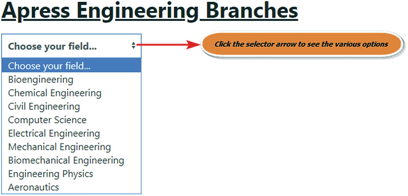
Select Form Options
Icons within Textboxes
Icons within Forms
Firstly, we create a <form> element in Listing 5-6. Then we use a parent <div> and assign the uk-inline class to it so that the icon can be positioned inside the form. Next we create a <span> element and use the uk-form-icon class to it. Then we use the uk-icon attribute and use the icon: user value to it. Then we create an input textbox to it and assign the uk-input class in conjunction with the uk-form-success class. To the same input textbox, we include the type and placeholder attribute with their corresponding values.
Similarly, we create another textbox and assign the uk-form-icon-flip in conjunction with the uk-form-icon class in the <span> tag. We append the flip word to the icon so that the icon is placed to the right in the input element. By default, the icon is placed to the left of the input textbox. In this case, we use the warning icon. We add the necessary placeholders and type attributes with their respective values.
Moving forward, we create a button and use the unlock icon with a ratio value of 2 to increase the size twofold.
Icons within Form input elements
As you can see from Figure 5-6, we can place the icons to the left and right of the form input element.
Forms with Stacked Labels
Forms with labels stacked over Form Text Boxes
In Listing 5-7, we create the <form> tag and assign the uk-form-stacked class to it. Then we define the parent <div> and assign the uk-margin class to it. Thereon, we create a <label> element and assign the uk-form-label class to it. Then we add a for attribute and assign the form-horizontal-text value to it. Next we assign the label name.
Moving forward, below the same label, we create a <div> class and assign the uk-form-controls class to it. Then we add an id and assign the same value to it as we had done pertaining to the for attribute of its label. We then add the placeholder and type attributes with their respective values to it.
We move on to create two more input textboxes and assign the labels respectively to them.
When we execute the code, the labels will be positioned above their respective textboxes.
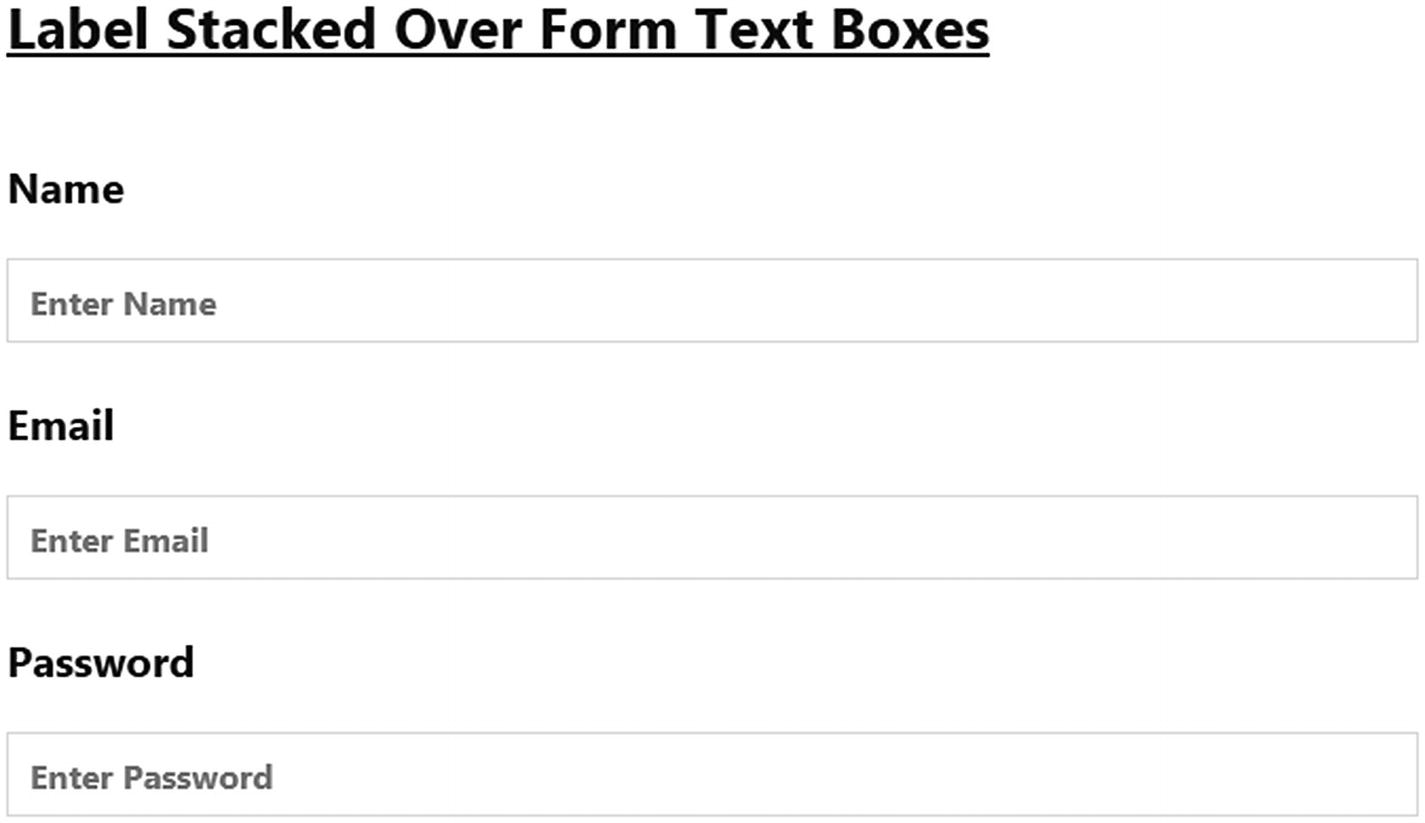
Form Input textboxes with labels stacked
If, however, you need the labels and input elements next to each other, then you need to use the uk-form-horizontal class instead of the uk-form-stacked class.
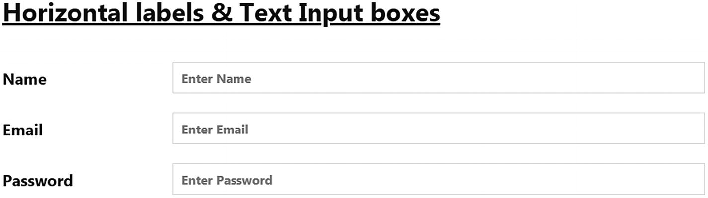
Horizontal Labels next to Input elements
Sign-Up Form
Creating a simple Sign-Up Form
In Listing 5-8, we initially create a <form> tag and assign the uk-form-stacked class to it, which will ensure that the defined labels will be displayed first and the respective input element will be stacked below just like the example in Listing 5-7. In fact, we have used the same Name, Email, and Password labels and their corresponding input textboxes as in Listing 5-7.
Once we assign the stacked class to the form, we jot down a <fieldset> tag and assign the uk-fieldset class to it. Then we assign a caption to that <fieldset> element by using the <legend> tag with the uk-legend class associated with it. What the fieldset property does is provide a grouping for a part for the UIkit form. You can disable all the contents of the fieldset section in one go using Boolean attributes, meaning this will ensure no browsing instances like mouse clicks, touch, or focus-based occurrences. However, the <legend> and its contents will not be disabled in this case.
As we mentioned earlier in this section, we create the labels and the input elements, which will be stacked over each other. Next, we create a <div> element, to which we assign the uk-margin, uk-grid-small, and uk-child-width-auto classes alongside the uk-grid attribute. Within it, we create three label elements and assign the uk-radio class to it along with the radio type attribute and name property to it. The three radio buttons are named as Male, Female, and Other. We use the checked attribute inside the input element for the label of the first radio button named as Male. This will keep it as the default checked radio button.
Moving forward, we create a similar <div> as the preceding one, but instead of the radio attributes, we use the uk-checkbox as the input class alongside the checkbox type attribute. We name the checkbox as Subscribe Newsletters.
Following this, we create a paragraph <p> element and create a normal button and assign the primary contextual color to it. Then we create an adjacent <span> element with UIkit’s built-in Sign-In Icon (we use the ratio property and set it to 2 to increase the size of the Sign-In Icon). Next, we use the closing <fieldset> tag and the <form> container tag.
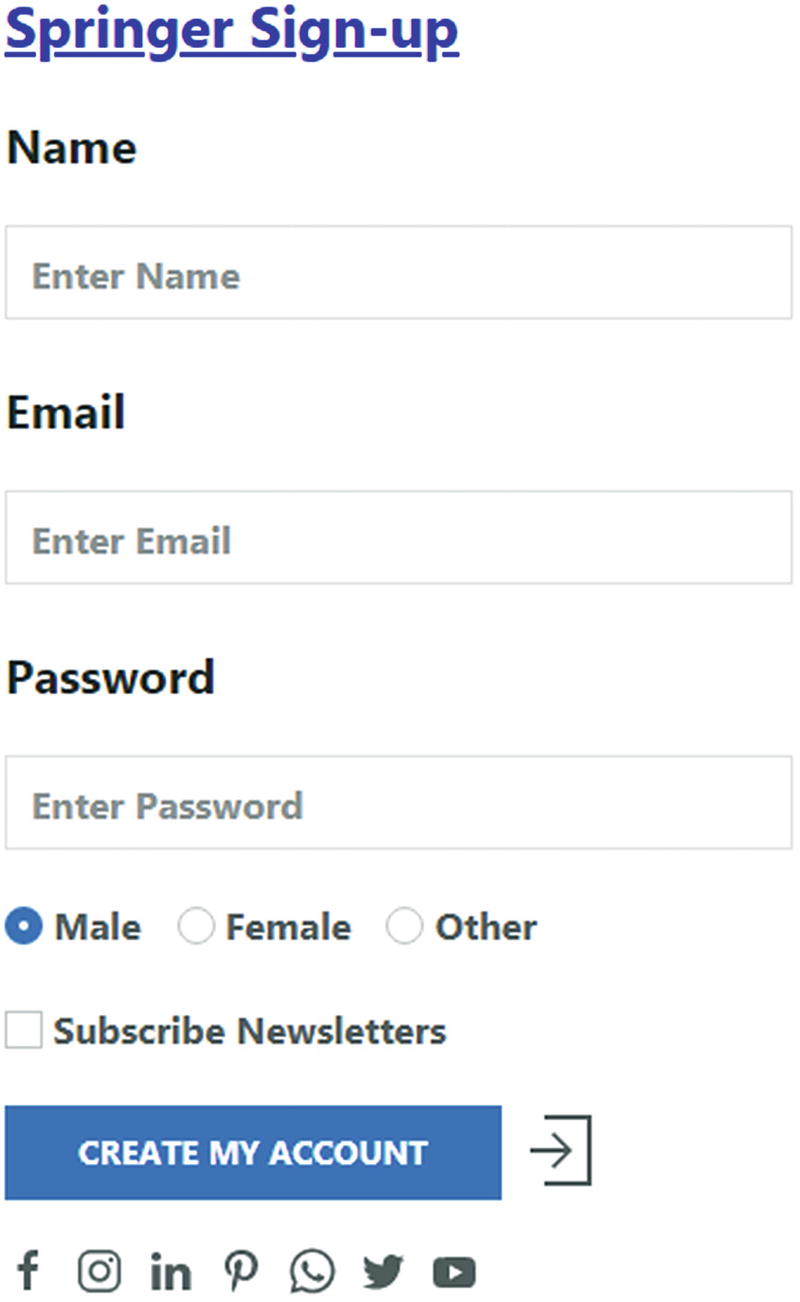
Sign-Up Form
Tables
Normal Tables
In Listing 5-9, we have defined the entire table code within the <table> element. We have assigned the uk-table class to the table element. Thereon, we add the uk-table-divider class in conjunction to create a divider between the table rows.
Next, we define the header section of the table with the <thead> element. Within the <thead> element, we define the table row using the <tr> element. We have assigned the Cyan background inline css style to differentiate it from the body rows. Then, we define the table headings within the <tr> element using the <th> tags.
After defining the headings for the table, we move forward with the body section. The table body is defined within the <tbody> element. We create the rows using the <tr> element. Within each <tr> element, we enter the data or description for that row within the <td> element.
We create three rows within the body section of the table.
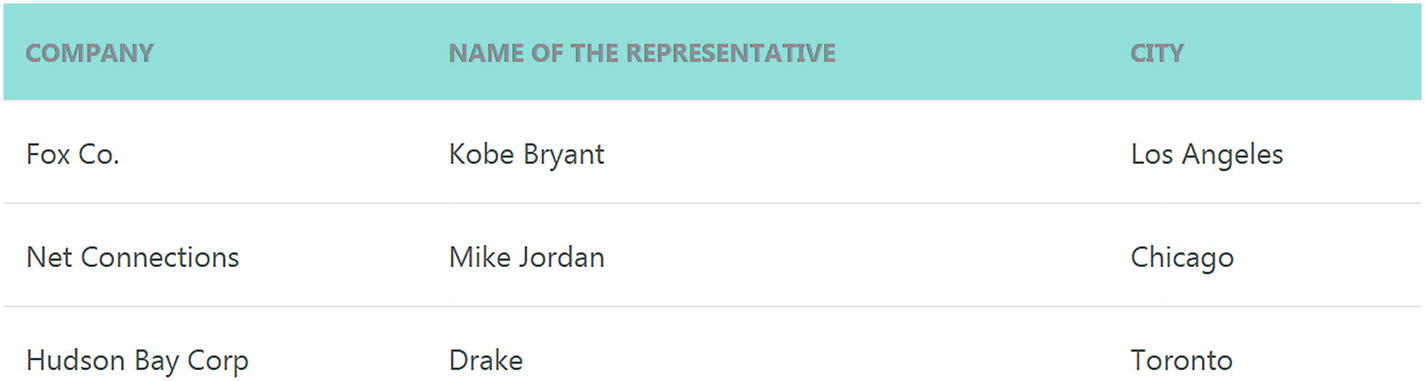
In Figure 5-10, we can see the table rows and columns displayed as explained in the code. You can also see a divider between the table rows owing to the divider class we used in the example.
Striped Tables
In Listing 5-10, we have added the uk-table-striped class in conjunction with the uk-table class. The rest of the code is the same as that in the previous Listing 5-9, where we had defined normal tables.
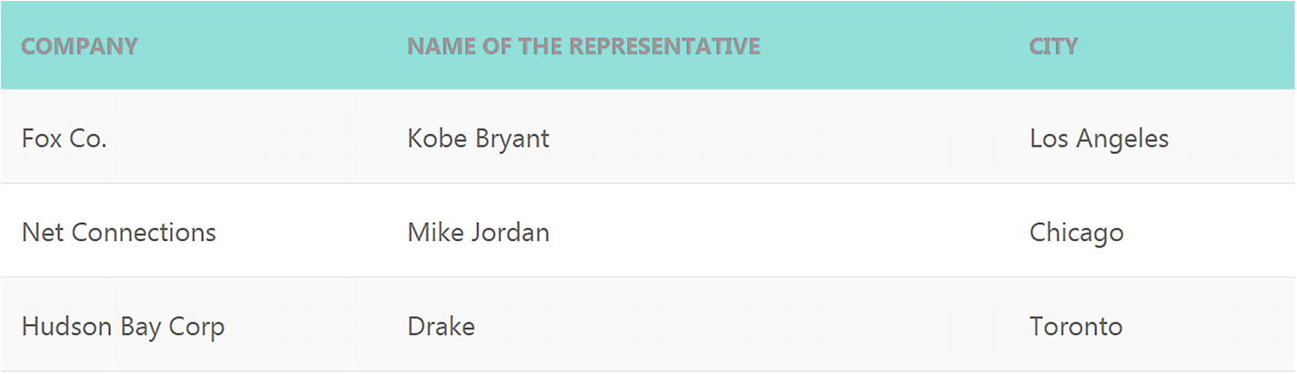
Zebra-striped styled tables
In Figure 5-11, you can see a Zebra-striped styling applied to the rows of the tables.
Hover functionality on tables
In Listing 5-11, we have added the uk-table-hover class in conjunction with the uk-table and uk-table-divider classes. The rest of the code is the same as in Listing 5-9 for normal tables.
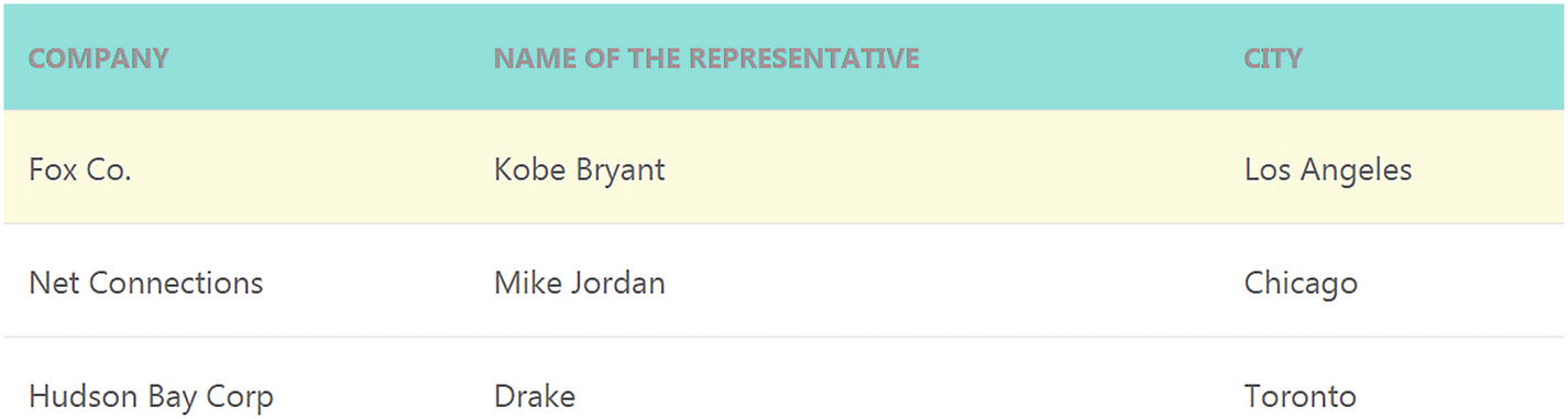
Hover functionality
The code on being executed will show the normal tables. When you hover over any row, it will result in a light yellow shade over that row highlighting it. As you can see, we have hovered over the first row as a result of which the first row is highlighted in a light yellow shade.
Large-sized Table
In Listing 5-12, we have added the uk-table-large class to the uk-table and uk-table-divider classes for the table element. The rest of the code is the same as that of the normal tables.

Large-sized modified table
In Figure 5-13, the table is relatively larger than the default table size as defined in the code.
Vertically-centered content alignment
In Listing 5-13, we have used the uk-table-middle class in conjunction with the uk-table and uk-table-divider classes. The rest of the code structure is the same as normal tables except for the sample content and the description.
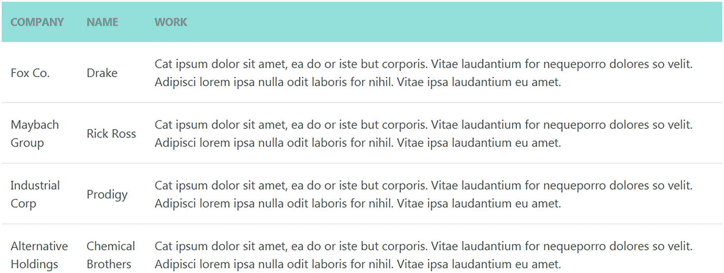
Vertically-centered content alignment
In Figure 5-14, the content description is centered vertically as defined in the code.
Table overflow responsiveness
In Listing 5-14, we have wrapped the table in a <div> parent container and assigned the uk-overflow-auto class to the parent <div> element. Then, we have defined a normal table similar to previous examples, except for the sample description - in addition, we have added more rows in the body section.
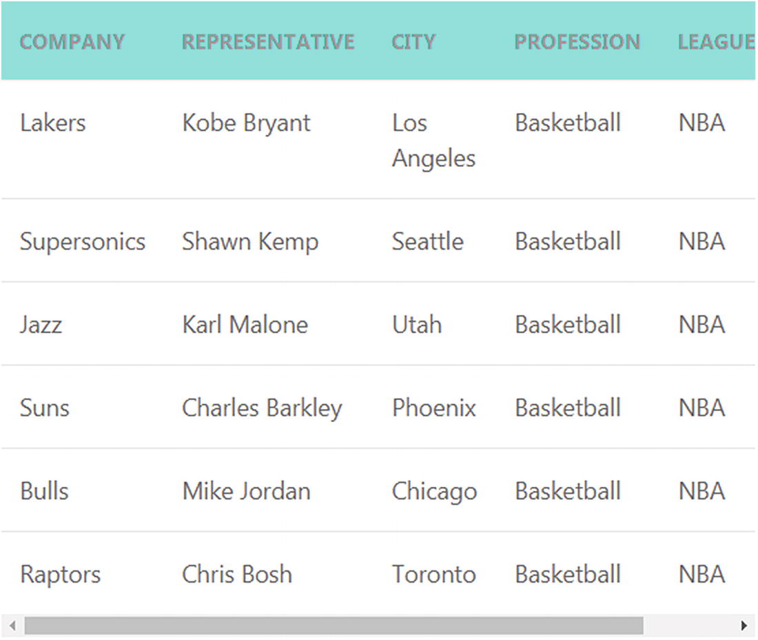
Responsiveness on table overflow
In Figure 5-15, you can see that a horizontal scroll bar is introduced when the elements inside the table are wider than the tablet screen. This illustrates its responsiveness.
Summary
In this chapter, we learned about the different kinds of form elements in UIkit. We then created a Springer Sign-Up Form sample. Next, we learned about the different features and styling of Tables. In the next chapter, we will look as well as forecast some upcoming trends and tacks in the web design niche circa 2020.