
UIkit is a lightweight web design framework with modular components that help you rapidly design robust user interfaces. It comes with a slew of ready-to-use elements like cards, buttons, and navigation helpers among other power-packed utilities to build clean and fully functional web pages. Responsive by default, it removes the guesswork out of developing mobile-friendly layouts in a minimalistic way. The set of tools that is ingrained in this front-end framework is quite simple to use, customize, and extend. It enables you to create consistent feature-rich sites, without the bloat or clutter associated with popular heavyweight frameworks like Bootstrap and Foundation.
Before we take our first steps in UIkit, let’s look at the evolution of responsive web design.
Evolution of Responsive Web Design
Web design initially started with sites built for a screen size. As a result, the output resulted in web pages optimized for that device/screen size only. When the resulting output was viewed on smaller or wider screens, it looked inappropriate in terms of readability, aesthetics, and usability. The layout showed congested content on smaller screens and excessive whitespace on larger screens. This led to a shabby user experience when designers attempted to present more information on the web page.
Apart from a fixed width, the other alternative approach during that era was liquid design wherein the web pages would flow and stretch depending on the browser space. However, designers had to compromise on aesthetics due to the irregular display of content and excessive whitespace. In addition, this caused usability issues. More so, the elastic nature of the output made designing quite difficult. The guesswork resulted in designers performing innumerable testing procedures just to get the basic view right.
With the massive technological advances in mobile phones, more users started using the mobile platform. Then a new trend began with web designers creating two sites: one for the desktop and the other for the mobile phone with different URLs (read Web Addresses ). Multiple sites caused usability issues as end users expected the mobile platform to display all the attributes and features found in the desktop version of the site.
There was a crucial requirement for flexible methodologies that could ensure a satisfying user experience across both the mobile as well as the desktop site versions. Resolution-dependent layout seemed more like the need of the hour. However, this meant that web designers had to use a lot of tedious JavaScript code to fix the resulting web pages on different platforms, based on the screen resolution.
It was then that the seeds of responsive web design were sown. Initially, the concepts were quite obscure - ultimately, they narrowed down to the use of Fluid Grids, Fluid Images, and Media Queries. Subsequently, Media Queries were decisive in addressing the fluidity processes required for site optimization across multiple platforms as they enabled building efficient layouts using CSS rather than complicated JavaScript code. Responsive web design then started becoming a norm for website development. Responsive web design is device- and screen-size agnostic - meaning it creates a seamless user experience on mobile or desktop platforms without too much compromise on varying factors like usability, performance, functionality, and aesthetics, just to mention a few. Moreover, it abstracted the need to create multiple site versions for the desktop as well as mobile phones. Modern layouts include diverse approaches such as Multi-columns, FlexBox, and Grids, which empowered the responsive web design paradigm.
In the coming years, the rapid rise of mobile technologies resulted in smartphones becoming the preferred media for accessing or browsing the information on the web. Soon, a mobile-first paradigm became the de facto norm. Mobile-first design involves building a website/app for the mobile platform. Once the site has been designed, it is tweaked for the bigger screens/bigger devices like tablets, desktops, or large display screens. It is all about creating an immersive user experience on smartphones and other small-screen mobile devices. If the majority of your users are mobile users, then this approach will be optimal. Also, it is tailored to fill all the gaps specifically for mobile devices but may lack in certain aspects when it comes to traditional desktop site versions.
Coming back to responsive web design, user experience is the pivotal factor. You need to create and develop a site that will consider usability and user environment as the focal points. Responsive web design not only makes site design faster but also delivers on the uniformity and code maintenance fronts.
In the next section, we will learn about Responsive vs. Adaptive web design in brief and the varying concepts associated with them.
Responsive vs. Adaptive Web Design
Responsive web design is an intuitive approach where the layout dynamically alters depending on the screen size and orientation. Responsive web design is a good choice if you are building a website from scratch. But it can be a quite complex process as the site has to fit into every device window and resolution. More than aesthetics, usability is an imperative concern in responsive design. Nowadays, the complexities related to responsive design have reduced significantly due to a plethora of visually appealing, effective themes, which can be used with popular content management systems (CMS) such as WordPress and Drupal.
Adaptive web design is slightly different from responsive design as it loads static layouts based on the respective screen size. In adaptive design, breakpoints are used for defining multiple viewports. The most common practice in adaptive design methodology is developing based on the following screen widths, namely - 320, 480, 760, 960, 1200, and 1600. However, this is just a popular approach, meaning you can design it for more viewports than the preceding screen sizes.
Both responsive and adaptive web design concepts come with their high points and low points. In responsive layouts, the site speed is slower as the layout changes dynamically in accordance with the device/browser window. Also, due to this type of elasticity, there is less control over how the content restructures and is eventually displayed on the screen.
In adaptive design, due to static layouts, the page loading times are quicker. In addition, you have more control over the content as you can optimize layouts for a particular screen-width setting or user group much better. Gaining actionable and meaningful insights using analytics, you can determine the site layout that gets the maximum hits. Lesser bounce rates and satisfying user experiences have been observed in adaptive layouts compared to responsive layouts - mainly as you can build powerful layouts catering to a specific user base or user preferences.
Scalability, code upkeep, testing, and upgrades/updates in adaptive design can be tedious as you have to modify and manage several layouts compared to a single layout in responsive design. Moreover, responsive sites are more SEO friendly.
In traditional desktop sites, users are accustomed to a specific look, feel, and usability quotient. However, you may need to overhaul these websites in line with the current trends and upcoming technologies. In such cases that need retrofitting, adaptive design is quite useful compared to responsive design. This is mainly because in responsive design, you need to do a complete overhaul of the site design, whereas in adaptive design, you just need to customize, optimize, and modify design styles to create an immersive end-user experience.
To infer, responsive web design is suitable for designing a new website, whereas adaptive design is favorable for retrofitting. Ultimately, it all boils down to user experience in this digital age - especially with the new generation preferring a function-over-form approach where the emphasis is more on ease of use and fruitful functionality than visual appeal. As we learned quite a bit about responsive design and adaptive design, moving forward, we will look at an overview of the potent UIkit framework in the next section.
Getting Started with UIkit
UIkit is an open source framework that helps you design sleek websites faster and easier. UIkit has baked-in cross-browser compatibility, default responsiveness, and handy CSS and JavaScript components, including proficient helper classes. You can build interactive, sophisticated designs; and in this book, we are going to show that in an organized step-by-step approach.

UIkit Mobile site
UIkit Desktop website
Both the preceding images clearly show the responsive nature of the UIkit website. For same/similar content, there is a difference in layout styles for the mobile and desktop platforms. As you can see, there is a hamburger icon on the mobile site, which on being clicked will show the different menu items defined as per the functionality for the mobile platform. In the next section, we will look at the different ways of installing UIkit.
Installing UIkit
There are many ways you can install UIkit for your web projects.
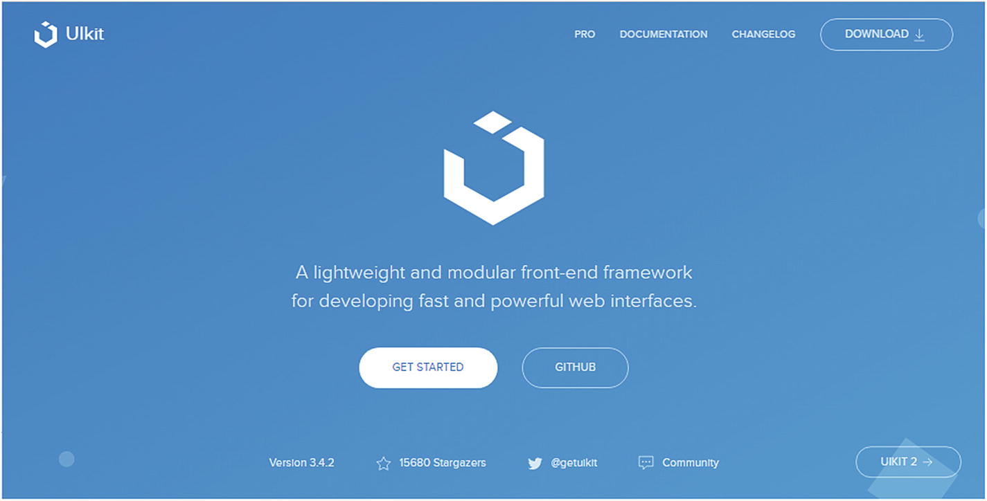
Method I

Download button highlighted in red box

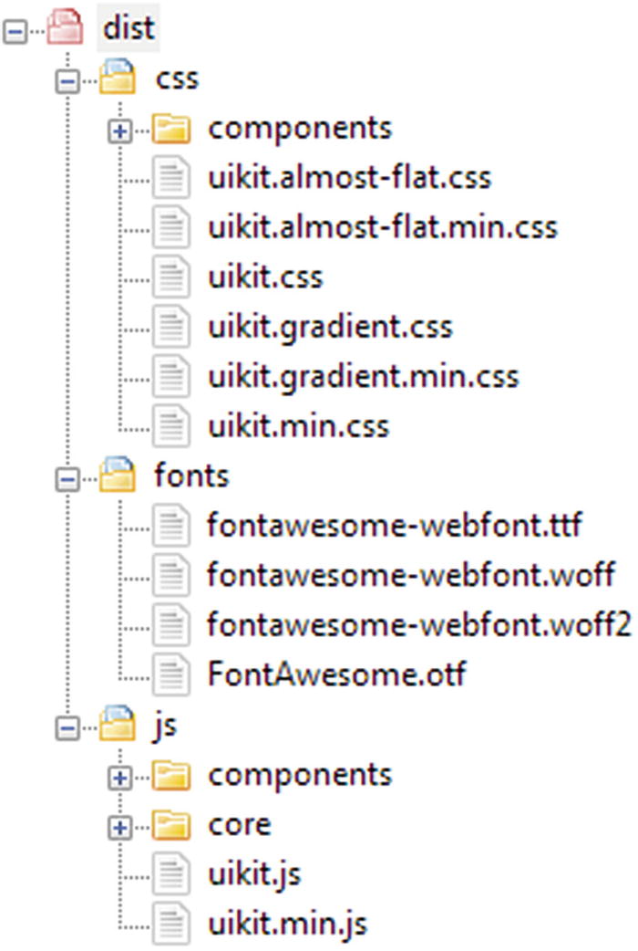
Unzipped UIkit file structure
You can define the path to the CSS and JS files in your HTML page for your web projects.
Method II
CDN links
More servers
Easy maintenance
More bandwidth with high performance
Redundancy for Fail-safe protection
Optimized Caching settings
Parallelized downloads
Method III
You can use Yarn to get the pre-built JavaScript, CSS, and LESS source files.
Yarn is a popular JavaScript package manager that automates the process of installing, updating, configuring, and removing pieces of software (packages) retrieved from a global registry. LESS (which stands for Leaner Style Sheets) is a backward-compatible language extension for CSS.
Installing using Yarn
yarn add uikit
Alternatively, you can clone the GitHub repository to get all source files including build scripts.
git clone git://github.com/uikit/uikit.git
The GitHub project contains the source files in a compiled dist folder that contains a lot of additional files, which are not available by downloading the default Download link. If you use a custom UIkit theme, compiling will include other essential files too.
/src - contains all JavaScript and image sources, including the Less files.
/dist - contains all the compiled CSS and JS, which are incidentally updated on every release.
/tests - contains HTML test files for all components.
You can also compile UIkit yourself using the following build scripts, which are included in the GitHub files. The entire process is defined in the following link:
https://getuikit.com/docs/less
Initially, you need to run Yarn once to install all dependencies:
yarn install
To compile all source files, you need to use the following command:
yarn compile
To automate the compiling process each time a file changes or some updates are made, like modifying LESS files or updating the JavaScript code, you need to use the following command:
yarn watch
For the latest setup, you need to use Node.js version 8.2.0 or higher.
Remember, UIkit’s core framework doesn’t include some advanced components such as date pickers or Lightbox. So, if you are using UIkit’s core framework, then you will find all the additional components in separate /css and /js folders.
File structure illustration of UIkit core framework with additional component folders
The file structure contains the core and components folder; but by using it, you can include only those components that you will need to use in your website.
Summary
In this chapter, we saw an overview of the easy-to-use UIkit framework. We looked at the evolution of responsive web design. Next, we touched base with the basic ideologies of responsive and adaptive web design. Thereon, we looked at the different methods of installing UIkit in your web projects. In the next chapter, we will explain the Grid and Container layouts, ingrained FlexBox support characteristic, and utility helper classes that will help jumpstart your dive into the inner workings of this robust framework.
References
https://developer.mozilla.org/en-US/docs/Learn/CSS/CSS_layout/Responsive_Design
https://www.uxpin.com/studio/blog/responsive-vs-adaptive-design-whats-best-choice-designers/
https://learn.onemonth.com/responsive-vs-adaptive-vs-fluid-design/