
Chapter 9. Doherty Threshold
Productivity soars when a computer and its users interact at a pace (<400ms) that ensures that neither has to wait on the other.
Overview
Amongst the features that are quintessential to good user experiences lives performance. Emotions can quickly turn to frustration and leave a negative lasting impact when faced trying to achieve a task, only to be met with slow processing, feedback, or load times. Often overlooked as more a technical best practice, speed should be considered an essential design feature that is core to good user experiences. Whether it’s the amount of time the product or service takes to initially load, how quickly subsequent pages load, or how fast it is to respond to interaction and provide feedback, the speed at which a system responds is critical to the overall user experience.
There are several factors that can impact the performance of websites and apps, but the most significant is overall page weight. Unfortunately when it comes to page weight on the Web, the average has exponentially increased over the years. According to HTTP Archive, the average page weight on desktop in 2019 is approaching 2 Megabytes, with mobile not too far behind at 1745 KB (1.7 Megabytes). Compare that to the average page weight in 2010-11, the increase is evident: 481.0 KB on desktop and ~200 KB on mobile (Figure 9-1).

Figure 9-1. Average page weight is increasing each year (Source: HTTP Archive)
This trend means longer weight times, and waiting is not something people like to do when trying to complete a task. Countless studies reinforce the fact that the longer wait times people are subjected to, the more likely it is they will grow frustrated and even abandon a task altogether.
Additionally, slow response times from the system leads to a slow down from the people using an interface. While a 100 millisecond response feels instantaneous, a delay between 100 and 300 milliseconds begins to be perceptible by the human eye and people begin to feel less in control. Once the delay extends past 1000 milliseconds (1 second), people begin thinking about other things. Information crucial to performing a task begins to get lost, leading to an inevitable reduction in performance. The resulting cognitive load required to continue with a task increases, and the overall user experience begins to suffer.
Origins
In the early days of desktop computing, 2 seconds was considered an acceptable threshold for response time from the computer when performing tasks. The reason for this widely accepted standard was it provided time for the user to think about their next task. Then in 1982, a paper published by two IBM employees challenged this previous standard by stating that “productivity increases in more than direct proportion to a decrease in response time” when the threshold is under 400 milleseconds1. The paper was authored by Walter J. Doherty, Manager of Systems Performance and Technology Transfer for the Computing Systems Department, and Ahrvind J. Thadani, Advisory Engineer at IBM’s General Products Division, and it set the new standard to <400ms. In their study, they claimed that “when a computer and its users interact at a pace that ensures that neither has to wait on the other, productivity soars, the cost of the work done on the computer tumbles, employees get more satisfaction from their work, and its quality tends to improve”. This new standard would come to be known as the Doherty Threshold and was based on Doherty’s observation that computer response times make a disproportionate impact on productivity.
Examples
In some cases, the amount of time required for processing is longer than what is prescribed by the Doherty Threshold and there simply isn’t much that can be done about it. That doesn’t mean we can’t provide feedback to users in a timely fashion while the necessary processing is happening in the background. This technique, known as Perceived Performance, helps to create the perception that a website or app is faster than it actually is.
One common example of perceived performance is the use of a skeleton screen when content is loading, which is used by platforms such as Facebook (Figure 10-2). This technique makes the site appear to load faster by instantly displaying grey blocks in the place where content will eventually load. The blocks are progressively replaced with actual text and images once they are loaded and allows people to see content as it’s loaded. The benefits of this approach are that it reduces the feeling of waiting and by extension increases the perception of speed and responsiveness — even if it’s not actually true. Additionally, skeleton screens prevent the jarring and disorienting experience of content jumping around once adjacent content is loaded by reserving space for each item.
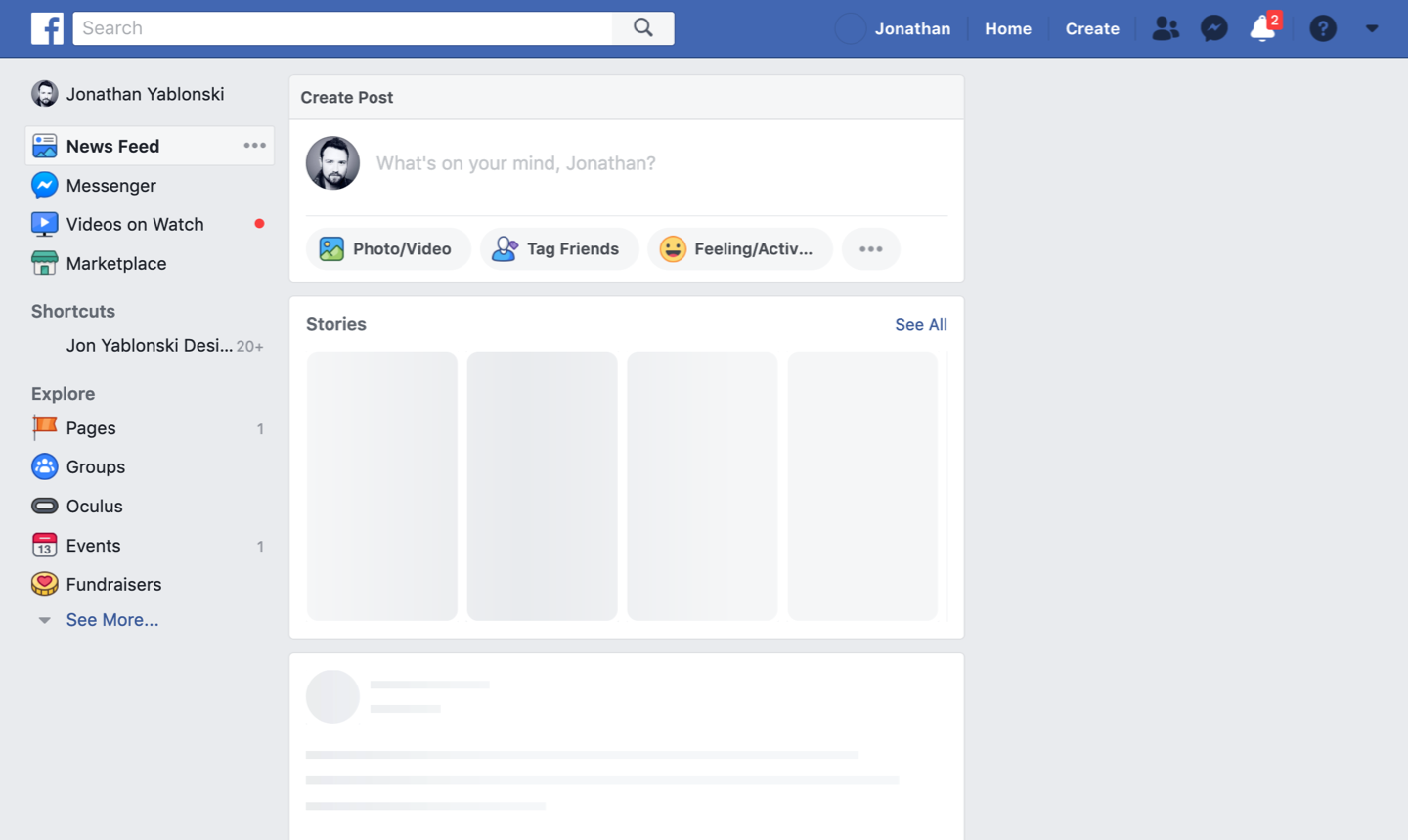
Figure 9-2. Facebook skeleton screen helps the site appear to load faster. (Source: Facebook.com)
Alternatively, animation can be used as a way to visually engage people while loading or processing is happening in the background. Take for example Gmail (Figure 10-3), which leverages an animated version of its logo in combination with a simple progress bar while the app loads. The effect of this simple yet distinctive animation is the perception of a shorter wait time.

Figure 9-3. Gmail uses a simple yet distinctive animation to shorten the perceived wait time (source: Gmail)
Another great use of perceived performance is the use of optimistic UI. This clever technique works by optimistically providing feedback that an action was successfully while it is being processed, as opposed to providing feedback only once the action has been resolved. Take for example Instagram, which displays comments on a photo before they are actually posted (Figure 10-4). By doing this, Instagram makes the response time of the app seem faster than it actually is by immediately providing visual feedback that assumes the comment will be successfully posted, and only displaying an error after in the case the action isn’t successful. The resulting illusion makes the app feel faster, even though the required processing still happened in the background.

Figure 9-4. Instagram optimistically displays comments on photos before they are actually posted to create perceived performance. (Source: Instagram)
Key Consideration: When Response Times are Too Fast

[Note: this section will address the downsides to response times that are too fast]
Key Takeaways
Provide system feedback within 400ms in order to keep users’ attention and increase productivity.
Use perceived performance to increase response time and reduce the perception of waiting.
Conclusion
Performance is not just a technical consideration or our development colleagues — it is an essential design feature. As designers, it is our responsibility to help ensure people can achieve their tasks as quickly and efficiently as possible. To ensure we are designing interfaces that achieve this, it is important that we provide the appropriate feedback and leverage perceived performance to reduce the overall sense of waiting.