About classes whose instances represent controls in JavaFX
About controls such as Label, Button, CheckBox, RadioButton, Hyperlink, ChoiceBox, ComboBox, ListView, ColorPicker, DatePicker, TextField, TextArea, and Menu
How to style controls using a CSS
How to use the FileChooser and DirectoryChooser dialogs
The examples of this chapter lie in the com.jdojo.control package. In order for them to work, you must add a corresponding line to the module-info.java file:
...
opens com.jdojo.control to javafx.graphics, javafx.base;
...
There are many controls in JavaFX, and there is a lot to say about controls. For this reason, the example code for the controls is only presented in an abbreviated manner. For the complete listings, please consult the download area for the book.
What Is a Control?
JavaFX lets you create applications using GUI components. An application with a GUI performs three tasks:
Accepts inputs from the user through input devices such as a keyboard or a mouse
Processes the inputs (or takes actions based on the input)
Displays outputs
The UI provides a means to exchange information in terms of input and output between an application and its users. Entering text using a keyboard, selecting a menu item using a mouse, clicking a button, or other actions are examples of providing input to a GUI application. The application displays outputs on a computer monitor using text, charts, dialog boxes, and so forth.
Users interact with a GUI application using graphical elements called controls or widgets. Buttons, labels, text fields, text area, radio buttons, and check boxes are a few examples of controls. Devices like a keyboard, a mouse, and a touch screen are used to provide input to controls. Controls can also display output to the users. Controls generate events that indicate an occurrence of some kind of interaction between the user and the control. For example, pressing a button using a mouse or a spacebar generates an action event indicating that the user has pressed the button.
JavaFX provides a rich set of easy-to-use controls. Controls are added to layout panes that position and size them. Layout panes were discussed in Chapter 10. This chapter discusses how to use the controls available in JavaFX.
Typically, the MVP pattern (discussed in Chapter 11) is used to develop a GUI application in JavaFX. MVP requires you to have at least three classes and place your business logic in a certain way and in certain classes. Generally, this bloats the application code, although for the right reason. This chapter will focus on the different types of controls, not on learning the MVP pattern. You will embed classes required for MVP patterns into one class to keep the code brief and save a lot of space in this book as well!
Understanding the Control Class Hierarchy
Each control in JavaFX is represented by an instance of a class. If multiple controls share basic features, they inherit from a common base class. Control classes are included in the javafx.scene.control package. A control class is a subclass, direct or indirect, of the Control class, which in turn inherits from the Region. Recall that the Region class inherits from the Parent class. Therefore, technically, a Control is also a Parent. All our discussions about the Parent and Region classes in the previous chapters also apply to all control-related classes.
A Parent can have children. Typically, a control is composed of another node (sometimes, multiple nodes), which is its child node. Control classes do not expose the list of its children through the getChildren() method, and, therefore, you cannot add any children to them.
Control classes expose the list of their internal unmodifiable children through the getChildrenUnmodifiable() method, which returns an ObservableList<Node>. You are not required to know about the internal children of a control to use the control. However, if you need the list of their children, the getChildrenUnmodifiable() method will give you that.
Figure 12-1 shows a class diagram for classes of some commonly used controls. The list of control classes is a lot bigger than the one shown in the class diagram.
Figure 12-1
A class diagram for control classes in JavaFX
The Control class is the base class for all controls. It declares three properties, as shown in Table 12-1, that are common to all controls.
Table 12-1
Properties Declared in the Control Class
Property
Type
Description
contextMenu
ObjectProperty<ContextMenu>
Specifies the content menu for the control.
skin
ObjectProperty<Skin<?>>
Specifies the skin for the control.
tooltip
ObjectProperty<Tooltip>
Specifies the tool tip for the control.
The contextMenu property specifies the context menu for the control. A context menu gives a list of choices to the user. Each choice is an action that can be taken on the control in its current state. Some controls have their default context menus. For example, a TextField, when right-clicked, displays a context menu with choices like Undo, Cut, Copy, and Paste. Typically, a context menu is displayed when the user presses a combination of keys (e.g., Shift + F10 on Windows) or clicks the mouse (right-click on Windows) when the control has focus. I will revisit the contextMenu property when I discuss the text input controls.
At the time of this writing, JavaFX doesn’t allow access or customization of the default context menu for controls. The contextMenu property is null even if the control has a default context menu. When you set the contextMenu property, it replaces the default context for the control. Note that not all controls have a default context menu, and a context menu is not suitable for all controls. For example, a Button control does not use a context menu.
The visual appearance of a control is known as its skin. A skin responds to the state changes in a control by changing its visual appearance. A skin is represented by an instance of the Skin interface. The Control class implements the Skinnable interface, giving all controls the ability to use a skin.
The skin property in the Control class specifies the custom skin for a control. Developing a new skin is not an easy task. For the most part, you can customize the appearance of a control using CSS styles. All controls can be styled using CSS. The Control class implements the Styleable interface, so all controls can be styled. Please refer to Chapter 8 for more details on how to use a CSS. I will discuss some commonly used CSS attributes for some controls in this chapter.
Controls can display a short message called a tool tip when the mouse hovers over the control for a short period. An object of the Tooltip class represents a tool tip in JavaFX. The tooltip property in the Control class specifies the tool tip for a control.
Labeled Controls
A labeled control contains a read-only textual content and optionally a graphic as part of its UI. Label, Button, CheckBox, RadioButton, and Hyperlink are some examples of labeled controls in JavaFX. All labeled controls are inherited, directly or indirectly, from the Labeled class, which is declared abstract. The Labeled class inherits from the Control class. Figure 12-2 shows a class diagram for labeled controls. Some of the classes have been left out in the diagram for brevity.
Figure 12-2
A class diagram for labeled control classes
The Labeled class declares text and graphic properties to represent the textual and graphic contents, respectively. It declares several other properties to deal with the visual aspects of its contents, for example, alignment, font, padding, and text wrapping. Table 12-2 contains the list of those properties with their brief descriptions. I will discuss some of these properties in the subsequent sections.
Table 12-2
Properties Declared in the Labeled Class
Property
Type
Description
alignment
ObjectProperty<Pos>
It specifies the alignment of the content of the control within the content area. Its effect is visible when the content area is bigger than the content (text + graphic). The default value is Pos.CENTER_LEFT.
contentDisplay
ObjectProperty<ContentDisplay>
It specifies positioning of the graphic relative to the text.
ellipsisString
StringProperty
It specifies the string to display for the ellipsis when the text is truncated because the control has a smaller size than the preferred size. The default value is "..." for most locales. Specifying an empty string for this property does not display an ellipsis string in truncated text.
font
ObjectProperty<Font>
It specifies the default font for the text.
graphic
ObjectProperty<Node>
It specifies an optional icon for the control.
graphicTextGap
DoubleProperty
It specifies the amount of text between the graphic and text.
labelPadding
ReadOnlyObjectProperty<Insets>
It is the padding around the content area of the control. By default, it is Insets.EMPTY.
lineSpacing
DoubleProperty
It specifies the space between adjacent lines when the control displays multiple lines.
mnemonicParsing
BooleanProperty
It enables or disables text parsing to detect a mnemonic character. If it is set to true, the text for the control is parsed for an underscore (_) character. The character following the first underscore is added as the mnemonic for the control. Pressing the Alt key on Windows computers highlights mnemonics for all controls.
textAlignment
ObjectProperty<TextAlignment>
It specifies the text alignment within the text bounds for multiline text.
textFill
ObjectProperty<Paint>
It specifies the text color.
textOverrun
ObjectProperty<OverrunStyle>
It specifies how to display the text when the text content exceeds the available space.
text
StringProperty
It specifies the text content.
underline
BooleanProperty
It specifies whether the text content should be underlined.
wrapText
BooleanProperty
It specifies whether the text should be wrapped if the text cannot be displayed in one line.
Positioning Graphic and Text
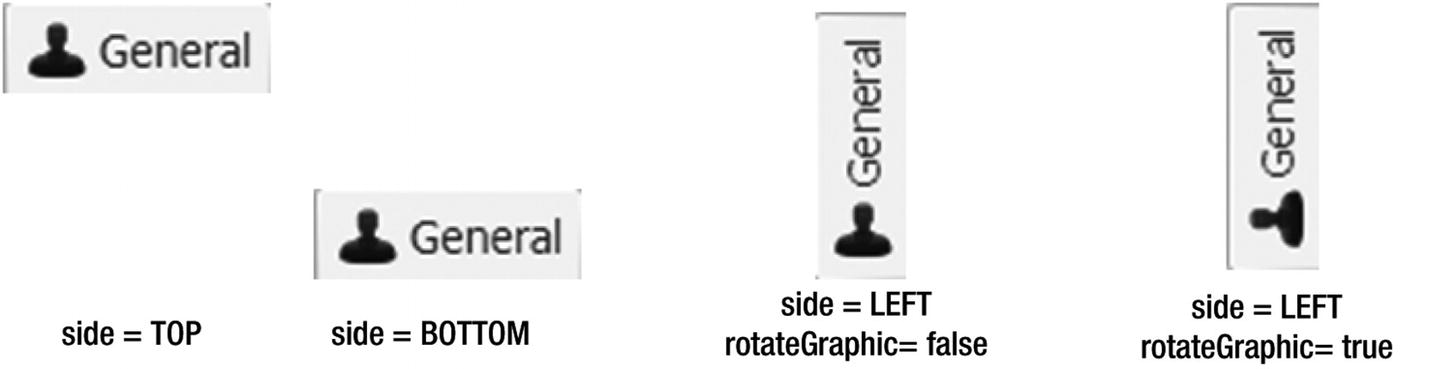
The contentDisplay property of labeled controls specifies the positioning of the graphic relative to the text. Its value is one of the constants of the ContentDisplay enum: TOP, RIGHT, BOTTOM, LEFT, CENTER, TEXT_ONLY, and GRAPHIC_ONLY. If you do not want to display the text or the graphic, you can use the GRAPHIC_ONLY and TEXT_ONLY values instead of setting the text to an empty string and the graphic to null. Figure 12-3 shows the effects of using different values for the contentDisplay property of a Label. The Label uses Name: as the text and a blue rectangle as the graphic. The value for the contentDisplay property is displayed at the bottom of each instance.
Figure 12-3
Effects of the contentDisplay property on labeled controls
Understanding Mnemonics and Accelerators
Labeled controls support keyboard mnemonics, which is also known as a keyboard shortcut or keyboard indicator. A mnemonic is a key that sends an ActionEvent to the control. The mnemonic key is often pressed in combination with a modifier key such as an Alt key. The modifier key is platform dependent; however, it is usually an Alt key. For example, suppose you set the C key as a mnemonic for a Close button. When you press Alt + C, the Close button is activated.
Finding the documentation about mnemonics in JavaFX is not easy. It is buried in the documentation for the Labeled and Scene classes. Setting a mnemonic key for a labeled control is easy. You need to precede the mnemonic character with an underscore in the text content and make sure that the mnemonicParsing property for the control is set to true. The first underscore is removed, and the character following it is set as the mnemonic for the control. For some labeled controls, the mnemonic parsing is set to true by default, and for others, you will need to set it.
Tip
Mnemonics are not supported on all platforms. Mnemonic characters in the text for controls are not underlined, at least on Windows, until the Alt key is pressed.
The following statement will set the C key as the mnemonic for the Close button:
// For Button, mnemonic parsing is true by default
Button closeBtn = new Button("_Close");
When you press the Alt key, the mnemonic characters for all controls are underlined, and pressing the mnemonic character for any controls will set focus to the control and send it an ActionEvent.
JavaFX provides the following four classes in the javafx.scene.input package to set mnemonics for all types of controls programmatically:
Mnemonic
KeyCombination
KeyCharacterCombination
KeyCodeCombination
An object of the Mnemonic class represents a mnemonic. An object of the KeyCombination class, which is declared abstract, represents the key combination for a mnemonic. The KeyCharacterCombination and KeyCodeCombination classes are subclasses of the KeyCombination class. Use the former to construct a key combination using a character; use the latter to construct a key combination using a key code. Note that not all keys on the keyboard represent characters. The KeyCodeCombination class lets you create a key combination for any key on the keyboard.
The Mnemonic object is created for a node and is added to a Scene. When the Scene receives an unconsumed key event for the key combination, it sends an ActionEvent to the target node.
The following snippet of code achieves the same result that was achieved using one statement in the preceding example:
Button closeBtn = new Button("Close");
// Create a KeyCombination for Alt + C
KeyCombination kc = new KeyCodeCombination(KeyCode.C, KeyCombination.ALT_DOWN);
// Create a Mnemonic object for closeBtn
Mnemonic mnemonic = new Mnemonic(closeBtn, kc);
Scene scene = create a scene...;
scene.addMnemonic(mnemonic); // Add the mnemonic to the scene
The KeyCharacterCombination class can also be used to create a key combination for Alt + C:
KeyCombination kc = new KeyCharacterCombination("C", KeyCombination.ALT_DOWN);
The Scene class supports accelerator keys. An accelerator key, when pressed, executes a Runnable task. Notice the difference between mnemonics and accelerator keys. A mnemonic is associated with a control, and pressing its key combination sends an ActionEvent to the control. An accelerator key is not associated with a control, but rather to a task. The Scene class maintains an ObservableMap<KeyCombination, Runnable>, whose reference can be obtained using the getAccelerators() method.
The following snippet of code adds an accelerator key (Ctrl + X on Windows and Meta + X on Mac) to a Scene, which closes the window associated with the Scene. The SHORTCUT key represents the shortcut key on the platform—Ctrl on Windows and Meta on Mac:
Scene scene = create a scene object...;
...
KeyCombination kc = new KeyCodeCombination(KeyCode.X,
KeyCombination.SHORTCUT_DOWN);
Runnable task = () -> scene.getWindow().hide();
scene.getAccelerators().put(kc, task);
The program in Listing 12-1 shows how to use mnemonics and accelerator keys. Press Alt + 1 and Alt + 2 to activate Button 1 and Button 2, respectively. Pressing these buttons changes the text for the Label. Pressing the shortcut key + X will close the window.
// MnemonicTest.java
package com.jdojo.control;
import javafx.application.Application;
import javafx.scene.Scene;
import javafx.scene.control.Button;
import javafx.scene.control.Label;
import javafx.scene.input.KeyCode;
import javafx.scene.input.KeyCodeCombination;
import javafx.scene.input.KeyCombination;
import javafx.scene.input.Mnemonic;
import javafx.scene.layout.VBox;
import javafx.stage.Stage;
public class MnemonicTest extends Application {
public static void main(String[] args) {
Application.launch(args);
}
@Override
public void start(Stage stage) {
VBox root = new VBox();
root.setSpacing(10);
root.setStyle("-fx-padding: 10;" +
"-fx-border-style: solid inside;" +
"-fx-border-width: 2;" +
"-fx-border-insets: 5;" +
"-fx-border-radius: 5;" +
"-fx-border-color: blue;");
Scene scene = new Scene(root);
Label msg = new Label(
"Press Ctrl + X on Windows
and " +
"
Meta + X on Mac to close the window");
Label lbl = new Label("Press Alt + 1 or Alt + 2");
stage.setTitle("Using Mnemonics and Accelerators");
stage.show();
}
}
Listing 12-1
Using Mnemonics and Accelerator Keys
Understanding the Label Control
An instance of the Label class represents a label control. As the name suggests, a Label is simply a label that is used to identify or describe another component on a screen. It can display a text, an icon, or both. Typically, a Label is placed next to (to the right or left) or at the top of the node it describes.
A Label is not focus traversable. That is, you cannot set the focus to a Label using the Tab key. A Label control does not generate any interesting events that are typically used in an application.
A Label control can also be used to display text in situations where it is acceptable to truncate the text if enough space is not available to display the entire text. Please refer to the API documentation on the textOverrun and ellipsisString properties of the Labeled class for more details on how to control the text truncation behavior in a Label control.
Figure 12-4 shows a window with two Label controls with text First Name: and Last Name:. The Label with the text First Name: is an indicator for the user that they should enter a first name in the field that is placed right next to it. A similar argument goes for the Last Name: Label control.
Figure 12-4
A window with two Label controls
The Label class has a very useful labelFor property of ObjectProperty<Node> type. It is set to another node in the scene graph. A Label control can have a mnemonic. Mnemonic parsing for Label controls is set to false by default. When you press the mnemonic key for a Label, the focus is set to the labelFor node for that Label. The following snippet of code creates a TextField and a Label. The Label sets a mnemonic, enables mnemonic parsing, and sets the TextField as its labelFor property. When the Alt + F keys are pressed, focus is moved to the TextField:
TextField fNameFld = new TextField();
Label fNameLbl = new Label("_First Name:"); // F is mnemonic
fNameLbl.setLabelFor(fNameFld);
fNameLbl.setMnemonicParsing(true);
The program in Listing 12-2 produces the screen shown in Figure 12-4. Press Alt + F and Alt + L to shift focus between the two TextField controls.
// LabelTest.java
// ... find in the book's download area.
Listing 12-2
Using the Label Control
Understanding Buttons
JavaFX provides three types of controls that represent buttons:
Buttons to execute commands
Buttons to make choices
Buttons to execute commands as well as make choices
All button classes inherit from the ButtonBase class. Please refer to Figure 12-2 for a class diagram. All types of buttons support the ActionEvent. Buttons trigger an ActionEvent when they are activated. A button can be activated in different ways, for example, by using a mouse, a mnemonic, an accelerator key, or other key combinations.
A button that executes a command when activated is known as a command button. The Button, Hyperlink, and MenuButton classes represent command buttons. A MenuButton lets the user execute a command from a list of commands. Buttons used for presenting different choices to users are known as choice buttons. The ToggleButton, CheckBox, and RadioButton classes represent choice buttons. The third kind of button is a hybrid of the first two kinds. They let users execute a command or make choices. The SplitMenuButton class represents a hybrid button.
Tip
All buttons are labeled controls. Therefore, they can have a textual content, a graphic, or both. All types of buttons are capable of firing an ActionEvent.
Understanding Command Buttons
You have already used command buttons in several instances, for example, a Close button to close a window. In this section, I will discuss buttons that are used as command buttons.
Understanding the Button Control
An instance of the Button class represents a command button. Typically, a Button has text as its label, and an ActionEvent handler is registered to it. The mnemonicParsing property for the Button class is set to true by default.
A Button can be in one of three modes:
A normal button
A default button
A cancel button
For a normal button, its ActionEvent is fired when the button is activated. For a default button, the ActionEvent is fired when the Enter key is pressed and no other node in the scene consumes the key press. For a cancel button, the ActionEvent is fired when the Esc key is pressed and no other node in the scene consumes the key press.
By default, a Button is a normal button. The default and cancel modes are represented by the defaultButton and cancelButton properties. You would set one of these properties to true to make a button a default or cancel button. By default, both properties are set to false.
The following snippet of code creates a normal Button and adds an ActionEvent handler. When the button is activated, for example, by clicking using a mouse, the newDocument() method is called:
// A normal button
Button newBtn = new Button("New");
newBtn.setOnAction(e -> newDocument());
The following snippet of code creates a default button and adds an ActionEvent handler. When the button is activated, the save() method is called. Note that a default Button is also activated by pressing the Enter key if no other node in the scene consumes the key press:
// A default button
Button saveBtn = new Button("Save");
saveBtn.setDefaultButton(true); // Make it a default button
saveBtn.setOnAction(e -> save());
The program in Listing 12-3 creates a normal button, a default button, and a cancel button. It adds an ActionEvent listener to all three buttons. Notice that all buttons have a mnemonic (e.g., N for the New button). When the buttons are activated, a message is displayed in a Label. You can activate the buttons by different means:
Clicking the buttons
Setting focus to the buttons using the Tab key and pressing the spacebar
Pressing the Alt key and their mnemonics
Pressing the Enter key to activate the Save button
Pressing the Esc key to activate the Cancel button
No matter how you activate the buttons, their ActionEvent handler is called. Typically, the ActionEvent handler for a button contains the command for the button.
// ButtonTest.java
// ... find in the book's download area.
Listing 12-3
Using the Button Class to Create Command Buttons
Tip
It is possible to set more than one button in a scene as a default or cancel button. However, only the first one is used. It is poor designing to declare multiple buttons as default and cancel buttons in a scene. By default, JavaFX highlights the default button with a light shade of color to give it a unique look. You can customize the appearance of default and cancel buttons using CSS styles. Setting the same button as a default button and a cancel button is also allowed, but it is a sign of bad design when this is done.
The default CSS style class name for a Button is button. The Button class supports two CSS pseudo-classes: default and cancel. You can use these pseudo-classes to customize the look for default and cancel buttons. The following CSS style will set the text color for default buttons to blue and cancel buttons to gray:
An instance of the Hyperlink class represents a hyperlink control, which looks like a hyperlink in a web page. In a web page, a hyperlink is used to navigate to another web page. However, in JavaFX, an ActionEvent is triggered when a Hyperlink control is activated, for example, by clicking it, and you are free to perform any action in the ActionEvent handler.
A Hyperlink control is simply a button styled to look like a hyperlink. By default, mnemonic parsing is off. A Hyperlink control can have focus, and by default, it draws a dashed rectangular border when it has focus. When the mouse cursor hovers over a Hyperlink control, the cursor changes to a hand, and its text is underlined.
The Hyperlink class contains a visited property of BooleanProperty type. When a Hyperlink control is activated for the first time, it is considered “visited,” and the visited property is set to true automatically. All visited hyperlinks are shown in a different color than the not visited ones. You can also set the visited property manually using the setVisited() method of the Hyperlink class.
The following snippet of code creates a Hyperlink control with the text "JDojo" and adds an ActionEvent handler for the Hyperlink. When the Hyperlink is activated, the www.jdojo.com web page is opened in a WebView, which is another JavaFX control to display a web page. Here, I will use it without any explanation:
The program in Listing 12-4 adds three Hyperlink controls to the top region of a BorderPane. A WebView control is added in the center region. When you click one of the hyperlinks, the corresponding web page is displayed.
// HyperlinkTest.java
// ... find in the book's download area.
Listing 12-4
Using the Hyperlink Control
Understanding the MenuButton Control
A MenuButton control looks like a button and behaves like a menu. When it is activated (by clicking or other means), it shows a list of options in the form of a pop-up menu. The list of options in the menu is maintained in an ObservableList<MenuItem> whose reference is returned by the getItems() method. To execute a command when a menu option is selected, you need to add the ActionEvent handler to the MenuItems.
The following snippet of code creates a MenuButton with two MenuItems. Each menu item has an ActionEvent handler attached to it. Figure 12-5 shows the MenuButton in two states: not showing and showing.
// Create two menu items with an ActionEvent handler.
The popupSide property is of the ObjectProperty<Side> type, and the showing property is of the ReadOnlyBooleanProperty type.
The popupSide property determines which side of the menu should be displayed. Its value is one of the constants in the Side enum: TOP, LEFT, BOTTOM, and RIGHT. The default value is Side.BOTTOM. An arrow in the MenuItem shows the direction set by the popupSide property. The arrow in Figure 12-5 is pointing downward, indicating that the popupSide property is set to Side.BOTTOM. The menu is opened in the direction set in the popupSide property only if space is available to display the menu in that side. If space is not available, the JavaFX runtime will make a smart decision as to which side the menu should be displayed. The value of the showing property is true when the pop-up menu is showing. Otherwise, it is false.
The program in Listing 12-5 creates an application using a MenuButton control that works similar to the one in Listing 12-4 that used a Hyperlink control. Run the application, click the Visit MenuButton at the top right of the window, and select a page to open.
// MenuButtonTest.java
// ... find in the book's download area.
Listing 12-5
Using the MenuButton Control
Understanding Choice Buttons
JavaFX provides several controls to make one or more selections from a list of available choices:
ToggleButton
CheckBox
RadioButton
Tip
JavaFX also provides ChoiceBox, ComboBox, and ListView controls to allow the user to make a selection from multiple available choices. I will discuss these controls in a separate section.
All three controls are labeled controls, and they help you present multiple choices to the user in different formats. The number of available choices may vary from two to N, where N is a number greater than two.
Selection from the available choices may be mutually exclusive. That is, the user can only make one selection from the list of choices. If the user changes the selection, the previous selection is automatically deselected. For example, the list of gender selection with three choices, Male, Female, and Unknown, is mutually exclusive. The user must select only one of the three choices, not two or more of them. The ToggleButton and RadioButton controls are typically used in this case.
There is a special case of selection where the number of choices is two. In this case, the choices are of boolean type: true or false. Sometimes, it is also referred to as a Yes/No or On/Offchoice. The ToggleButton and CheckBox controls are typically used in this case.
Sometimes, the user can have multiple selections from a list of choices. For example, you may present the user with a list of hobbies to choose zero or more hobbies from the list. The ToggleButton and CheckBox controls are typically used in this case.
Understanding the ToggleButton Control
ToggleButton is a two-state button control. The two states are selected and unselected. Its selected property indicates whether it is selected. The selected property is true when it is in the selected state. Otherwise, it is false. When it is in the selected state, it stays depressed. You can toggle between the selected and unselected states by pressing it, and hence it got the name ToggleButton. For ToggleButtons, mnemonic parsing is enabled by default.
Figure 12-6 shows four toggle buttons with Spring, Summer, Fall, and Winter as their labels. Two of the toggle buttons, Spring and Fall, are selected, and the other two are unselected.
Figure 12-6
A window showing four toggle buttons
You create a ToggleButton the same way you create a Button, using the following code:
ToggleButton springBtn = new ToggleButton("Spring");
A ToggleButton is used to select a choice, not to execute a command. Typically, you do not add ActionEvent handlers to a ToggleButton. Sometimes, you can use a ToggleButton to start or stop an action. For that, you will need to add a ChangeListener for its selected property.
Tip
The ActionEvent handler for a ToggleButton is invoked every time you click it. Notice that the first click selects a ToggleButton, and the second click deselects it. If you select and deselect a ToggleButton, the ActionEvent handler will be called twice.
Toggle buttons may be used in a group from which zero or one ToggleButton can be selected. To add toggle buttons to a group, you need to add them to a ToggleGroup. The ToggleButton class contains a toggleGroup property. To add a ToggleButton to a ToggleGroup, set the toggleGroup property of the ToggleButton to the group. Setting the toggleGroup property to null removes a ToggleButton from the group. The following snippet of code creates four toggle buttons and adds them to a ToggleGroup:
ToggleButton springBtn = new ToggleButton("Spring");
ToggleButton summerBtn = new ToggleButton("Summer");
ToggleButton fallBtn = new ToggleButton("Fall");
ToggleButton winterBtn = new ToggleButton("Winter");
// Create a ToggleGroup
ToggleGroup group = new ToggleGroup();
// Add all ToggleButtons to the ToggleGroup
springBtn.setToggleGroup(group);
summerBtn.setToggleGroup(group);
fallBtn.setToggleGroup(group);
winterBtn.setToggleGroup(group);
Each ToggleGroup maintains an ObservableList<Toggle>. Note that Toggle is an interface that is implemented by the ToggleButton class. The getToggles() method of the ToggleGroup class returns the list of Toggles in the group. You can add a ToggleButton to a group by adding it to the list returned by the getToggles() method. The preceding snippet of code may be rewritten as follows:
ToggleButton springBtn = new ToggleButton("Spring");
ToggleButton summerBtn = new ToggleButton("Summer");
ToggleButton fallBtn = new ToggleButton("Fall");
ToggleButton winterBtn = new ToggleButton("Winter");
The ToggleGroup class contains a selectedToggle property that keeps track of the selected Toggle in the group. The getSelectedToggle() method returns the reference of the Toggle that is selected. If no Toggle is selected in the group, it returns null. Add a ChangeListener to this property if you are interested in tracking the change in selection inside a ToggleGroup.
Tip
You can select zero or one ToggleButton in a ToggleGroup. Selecting a ToggleButton in a group deselects the already selected ToggleButton. Clicking an already selected ToggleButton in a group deselects it, leaving no ToggleButton in the group selected.
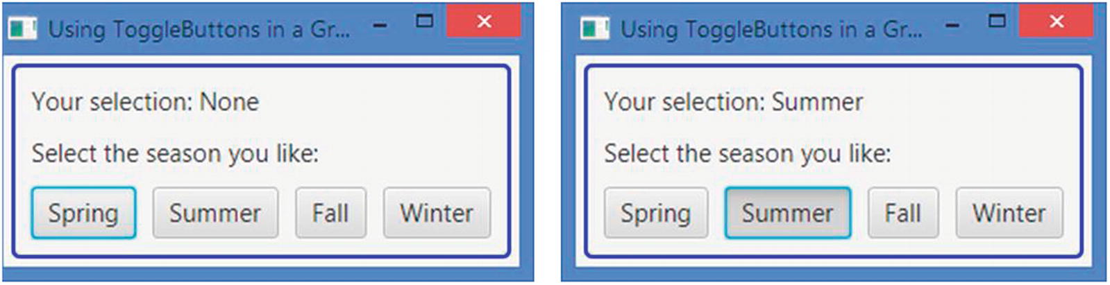
The program in Listing 12-6 adds four toggle buttons to a ToggleGroup. You can select none or at the most one ToggleButton from the group. Figure 12-7 shows two screenshots: one when there is no selection and one when the ToggleButton with the label Summer is selected. The program adds a ChangeListener to the group to track the change in selection and displays the label of the selected ToggleButton in a Label control.
Figure 12-7
Four toggle buttons in a ToggleGroup allowing selection of one button at a time
// ToggleButtonTest.java
// ... find in the book's download area.
Listing 12-6
Using Toggle Buttons in a ToggleGroup and Tracking the Selection
Understanding the RadioButton Control
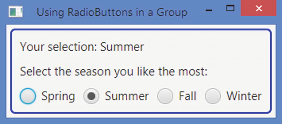
An instance of the RadioButton class represents a radio button. It inherits from the ToggleButton class. Therefore, it has all of the features of a toggle button. A radio button is rendered differently compared to a toggle button. Like a toggle button, a radio button can be in one of the two states: selected and unselected. Its selected property indicates its current state. Like a toggle button, its mnemonic parsing is enabled by default. Like a toggle button, it also sends an ActionEvent when it is selected and unselected. Figure 12-8 shows a RadioButton with Summer as its text in selected and unselected states.
Figure 12-8
Showing a radio button in selected and unselected states
There is a significant difference in the use of radio buttons compared to the use of toggle buttons. Recall that when toggle buttons are used in a group, there may not be any selected toggle button in the group. When radio buttons are used in a group, there must be one selected radio button in the group. Unlike a toggle button, clicking a selected radio button in a group does not unselect it. To enforce the rule that one radio button must be selected in a group of radio buttons, one radio button from the group is selected programmatically by default.
Tip
Radio buttons are used when the user must make a selection from a list of choices. Toggle buttons are used when the user has an option to make one selection or no selection from a list of choices.
The program in Listing 12-7 shows how to use radio buttons inside a ToggleGroup. Figure 12-9 shows the window with the results of running the code. The program is very similar to the previous program that used toggle buttons. With the following code, Summer is set as the default selection:
// Select the default season as Summer
summerBtn.setSelected(true);
You set the default season in the radio button after you have added the change listener to the group, so the message to display the selected season is updated correctly.
// RadioButtonTest.java
// ... find in the book's download area.
Listing 12-7
Using Radio Buttons in a ToggleGroup and Tracking the Selection
Figure 12-9
Four radio buttons in a ToggleGroup
Understanding the CheckBox Control
CheckBox is a three-state selection control: checked, unchecked, and undefined. The undefined state is also known as an indeterminatestate. A CheckBox supports a selection of three choices: true/false/unknown or yes/no/unknown. Usually, a CheckBox has text as a label, but not a graphic (even though it can). Clicking a CheckBox transitions it from one state to another cycling through three states.
A box is drawn for a CheckBox. In the unchecked state, the box is empty. A tick mark (or a check mark) is present in the box when it is in the checked state. In the undefined state, a horizontal line is present in the box. Figure 12-10 shows a CheckBox labeled Hungry in its three states.
Figure 12-10
Showing a check box in unchecked, checked, and undefined states
By default, the CheckBox control supports only two states: checked and unchecked. The allowIndeterminate property specifies whether the third state (the undefined state) is available for selection. By default, it is set to false:
// Create a CheckBox that supports checked and unchecked states only
CheckBox hungryCbx = new CheckBox("Hungry");
// Create a CheckBox and configure it to support three states
CheckBox agreeCbx = new CheckBox("Hungry");
agreeCbx.setAllowIndeterminate(true);
The CheckBox class contains selected and indeterminate properties to track its three states. If the indeterminate property is true, it is in the undefined state. If the indeterminate property is false, it is defined and it could be in a checked or unchecked state. If the indeterminate property is false and the selected property is true, it is in a checked state. If the indeterminate property is false and the selected property is false, it is in an unchecked state. Table 12-3 summarizes the rules for determining the state of a check box.
Table 12-3
Determining the State of a Check Box Based on Its Indeterminate and Selected Properties
indeterminate
selected
State
false
true
Checked
false
false
Unchecked
true
true/false
Undefined
Sometimes, you may want to detect the state transition in a check box. Because a check box maintains the state information in two properties, you will need to add a ChangeListener to both properties. An ActionEvent is fired when a check box is clicked. You can also use an ActionEvent to detect a state change in a check box. The following snippet of code shows how to use two ChangeListeners to detect a state change in a CheckBox. It is assumed that the changed() method and the rest of the code are part of the same class:
// Create a CheckBox to support three states
CheckBox agreeCbx = new CheckBox("I agree");
agreeCbx.setAllowIndeterminate(true);
// Add a ChangeListener to the selected and indeterminate properties
// A change listener to track the selection in the group
public void changed(ObservableValue<? extends Boolean> observable,
Boolean oldValue,
Boolean newValue) {
String state = null;
if (agreeCbx.isIndeterminate()) {
state = "Undefined";
} else if (agreeCbx.isSelected()) {
state = "Checked";
} else {
state = "Unchecked";
}
System.out.println(state);
}
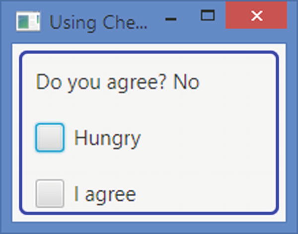
The program in Listing 12-8 shows how to use CheckBox controls. Figure 12-11 shows the window that results from running this code. The program creates two CheckBox controls. The Hungry CheckBox supports only two states. The I agree CheckBox is configured to support three states. When you change the state for the I agree CheckBox by clicking it, the Label at the top displays the description of the state.
// CheckBoxTest.java
// ... find in the book's download area.
Listing 12-8
Using the CheckBox Control
Figure 12-11
Two check boxes: one uses two states and one uses three states
The default CSS style class name for a CheckBox is check-box. The CheckBox class supports three CSS pseudo-classes: selected, determinate, and indeterminate. The selected pseudo-class applies when the selected property is true. The determinate pseudo-class applies when the indeterminate property is false. The indeterminate pseudo-class applies when the indeterminate property is true.
The CheckBox control contains two substructures: box and mark. You can style them to change their appearance. You can change the background color and border for the box, and you can change the color and shape of the tick mark. Both box and mark are an instance of StackPane. The tick mark is shown giving a shape to the StackPane. You can change the shape for the mark by supplying a different shape in a CSS. By changing the background color of the mark, you change the color of the tick mark. The following CSS will show the box in tan and tick mark in red:
.check-box .box {
-fx-background-color: tan;
}
.check-box:selected .mark {
-fx-background-color: red;
}
Understanding the Hybrid Button Control
With our definitions of different button types, a SplitMenuButton falls under the hybrid category. It combines the features of a pop-up menu and a command button. It lets you select an action like a MenuButton control and execute a command like a Button control. The SplitMenuButton class inherits from the MenuButton class.
A SplitMenuButton is divided into two areas: the action area and the menu-open area. When you click in the action area, ActionEvent is fired. The registered ActionEvent handlers execute the command. When the menu-open area is clicked, a menu is shown from which the user will select an action to execute. Mnemonic parsing for SplitMenuButton is enabled by default.
Figure 12-12 shows a SplitMenuButton in two states. The picture on the left shows it in the collapsed state. In the picture on the right, it shows the menu items. Notice the vertical line dividing the control in two halves. The half containing the text Home is the action area. The other half containing the down arrow is the menu-open area.
Figure 12-12
A SplitMenuButton in the collapsed and showing states
You can create a SplitMenuButton with menu items or without them using its constructors with the following code:
// Create an empty SplitMenuItem
SplitMenuButton splitBtn = new SplitMenuButton();
splitBtn.setText("Home"); // Set the text as "Home"
// Create MenuItems
MenuItem jdojo = new MenuItem("JDojo");
MenuItem yahoo = new MenuItem("Yahoo");
MenuItem google = new MenuItem("Google");
// Add menu items to the MenuButton
splitBtn.getItems().addAll(jdojo, yahoo, google);
You need to add an ActionEvent handler to execute an action when the SplitMenuButton is clicked in the action area:
// Add ActionEvent handler when "Home" is clicked
splitBtn.setOnAction(e -> /* Take some action here */);
The program in Listing 12-9 shows how to use a SplitMenuButton. It adds a SplitMenuButton with the text Home and three menu items in the top-right region of a BorderPane. A WebView is added in the center region. When you click Home, the www.jdojo.com web page is opened. When you select a website using the menu by clicking the down arrow, the corresponding website is opened. The program is very similar to the ones you developed earlier using MenuButton and Hyperlink controls.
// SplitMenuButtonTest.java
// ... find in the book's download area.
Listing 12-9
Using the SplitMenuButton Control
Making Selections from a List of Items
In the previous sections, you have seen how to present users with a list of items, for example, using toggle buttons and radio buttons. Toggle and radio buttons are easier to use because all options are always visible to the users. However, they use a lot of space on the screen. Think about using radio buttons to show the names of all 50 states in the United States to the user. It would take a lot of space. Sometimes, none of the available items in the list is suitable for selection, so you will want to give users a chance to enter a new item that is not in the list.
JavaFX provides some controls that let users select an item(s) from a list of items. They take less space compared to buttons. They provide advanced features to customize their appearance and behaviors. I will discuss the following such controls in subsequent sections:
ChoiceBox
ComboBox
ListView
ColorPicker
DatePicker
ChoiceBox lets users select an item from a small list of predefined items. ComboBox is an advanced version of ChoiceBox. It has many features, for example, the ability to be editable or change the appearance of the items in the list, which are not offered in ChoiceBox. ListView provides users an ability to select multiple items from a list of items. Typically, all or more than one item in a ListView is visible to the user all the time. ColorPicker lets users select a color from a standard color palette or define a custom color graphically. DatePicker lets users select a date from a calendar pop-up. Optionally, users can enter a date as text. ComboBox, ColorPicker, and DatePicker have the same superclass ComboBoxBase.
Understanding the ChoiceBox Control
ChoiceBox is used to let a user select an item from a small list of items. The items may be any type of objects. ChoiceBox is a parameterized class. The parameter type is the type of the items in its list. If you want to store mixed types of items in a ChoiceBox, you can use its <Object> type, as shown in the following code:
// Create a ChoiceBox for any type of items
ChoiceBox<Object> seasons = new ChoiceBox<>();
// Instead create a ChoiceBox for String items
ChoiceBox<String> seasons = new ChoiceBox<>();
You can specify the list items while creating a ChoiceBox with the following code:
ChoiceBox<String> seasons = new ChoiceBox<>(seasonList);
After you create a ChoiceBox, you can add items to its list of items using the items property, which is of the ObjectProperty<ObservableList<T>> type in which T is the type parameter for the ChoiceBox. The following code will accomplish this:
Figure 12-13 shows a choice box in four different states. It has four names of seasons in the list of items. The first picture (labeled #1) shows it in its initial state when there is no selection. The user can open the list of items using the mouse or the keyboard. Clicking anywhere inside the control opens the list of items in a pop-up window, as shown in the picture labeled #2. Pressing the down arrow key when the control has focus also opens the list of items. You can select an item from the list by clicking it or using the up/down arrow and the Enter key. When you select an item, the pop-up window showing the items list is collapsed and the selected item is shown in the control, as shown in the picture labeled #3. The picture labeled #4 shows the control when an item is selected (Spring in this case) and the list items are shown. The pop-up window displays a check mark with the item already selected in the control. Table 12-4 lists the properties declared in the ChoiceBox class.
Figure 12-13
A choice box in different states
Table 12-4
Properties Declared in the ChoiceBox Class
Property
Type
Description
converter
ObjectProperty <StringConverter<T>>
It serves as a converter object whose toString() method is called to get the string representation of the items in the list.
items
ObjectProperty <ObservableList<T>>
It is the list of choices to display in the ChoiceBox.
selectionModel
ObjectProperty <SingleSelectionModel<T>>
It serves as a selection model that keeps track of the selections in a ChoiceBox.
showing
ReadOnlyBooleanProperty
Its true value indicates that the control is showing the list of choices to the user. Its false value indicates that the list of choices is collapsed.
value
ObjectProperty<T>
It is the selected item in the ChoiceBox.
Tip
You are not limited to showing the items list using the mouse or keyboard. You can show and hide the list programmatically using the show() and hide() methods, respectively.
The value property of the ChoiceBox stores the selected item in the control. Its type is ObjectProperty<T>, where T is the type parameter for the control. If the user has not selected an item, its value is null. The following snippet of code sets the value property:
// Create a ChoiceBox for String items
ChoiceBox<String> seasons = new ChoiceBox<String>();
When you set a new value using the setValue() method, the ChoiceBox selects the specified value in the control if the value exists in the list of items. It is possible to set a value that does not exist in the list of items. In that case, the value property contains the newly set item, but the control does not show it. The control keeps showing the previously selected item, if any. When the new item is later added to the list of items, the control shows the item set in the value property.
The ChoiceBox needs to track the selected item and its index in the list of items. It uses a separate object, called the selection model, for this purpose. The ChoiceBox class contains a selectionModel property to store the item selection details. ChoiceBox uses an object of the SingleSelectionModel class as its selection model, but you can use your own selection model. The default selection model works in almost all cases. The selection model provides you selection-related functionality:
It lets you select an item using the index of the item in the list.
It lets you select the first, next, previous, or last item in the list.
It lets you clear the selection.
Its selectedIndex and selectedItem properties track the index and value of the selected item. You can add a ChangeListener to these properties to handle a change in selection in a ChoiceBox. When no item is selected, the selected index is –1, and the selected item is null.
The following snippet of code forces a value in a ChoiceBox by selecting the first item in the list by default:
Use the selectNext() method of the selection model to select the next item from the list. Calling the selectNext() method when the last item is already selected has no effect. Use the selectPrevious() and selectLast() methods to select the previous and the last item in the list, respectively. The select(int index) and select(T item) methods select an item using the index and value of the item, respectively. Note that you can also use the setValue() method of the ChoiceBox to select an item from the list by its value. The clearSelection() method of the selection model clears the current selection, returning the ChoiceBox to a state as if no item had been selected.
The program in Listing 12-10 displays a window as shown in Figure 12-14. It uses a ChoiceBox with a list of four seasons. By default, the program selects the first season from the list. The application forces the user to select one season name by selecting one by default. It adds ChangeListeners to the selectedIndex and selectedItem properties of the selection model. They print the details of the selection change on the standard output. The current selection is shown in a Label control whose text property is bound to the value property of the ChoiceBox. Select a different item from the list and watch the standard output and the window for the details.
// ChoiceBoxTest.java
// ... find in the book's download area.
Listing 12-10
Using ChoiceBox with a Preselected Item
Figure 12-14
A choice box with a preselected item
Using Domain Objects in ChoiceBox
In the previous example, you used String objects as items in the choice box. You can use any object type as items. ChoiceBox calls the toString() method of every item and displays the returned value in the pop-up list. The following snippet of code creates a choice box and adds four Person objects as its items. Figure 12-15 shows the choice box in the showing state. Notice the items are displayed using the String object returned from the toString() method of the Person class.
A choice box showing four Person objects as its list of items
Typically, the toString() method of an object returns a String that represents the state of the object. It is not meant to provide a customized string representation of the object to be displayed in a choice box. The ChoiceBox class contains a converter property. It is an ObjectProperty of the StringConverter<T> type. A StringConverter<T> object acts as a converter from the object type T to a string and vice versa. The class is declared abstract, as in the following snippet of code:
public abstract class StringConverter<T> {
public abstract String toString(T object);
public abstract T fromString(String string);
}
The toString(T object) method converts the object of type T to a string. The fromString(String string) method converts a string to a T object.
By default, the converter property in a choice box is null. If it is set, the toString(T object) method of the converter is called to get the list of items instead of the toString() method of the class of the item. The PersonStringConverter class shown in Listing 12-11 can act as a converter in a choice box. Notice that you are treating the argument string in the fromString() method as the name of a person and trying to construct a Person object from it. You do not need to implement the fromString() method for a choice box. It will be used in a ComboBox, which I will discuss next. The ChoiceBox will use only the toString(Person p) method.
// PersonStringConverter.java
package com.jdojo.control;
import com.jdojo.mvc.model.Person;
import javafx.util.StringConverter;
public class PersonStringConverter extends StringConverter<Person> {
@Override
public String toString(Person p) {
return p == null?
null : p.getLastName() + ", " + p.getFirstName();
}
@Override
public Person fromString(String string) {
Person p = null;
if (string == null) {
return p;
}
int commaIndex = string.indexOf(",");
if (commaIndex == -1) {
// Treat the string as first name
p = new Person(string, null, null);
} else {
// Ignoring string bounds check for brevity
String firstName =
string.substring(commaIndex + 2);
String lastName = string.substring(
0, commaIndex);
p = new Person(firstName, lastName, null);
}
return p;
}
}
Listing 12-11
A Person to String Converter
The following snippet of code uses a converter in a ChoiceBox to convert Person objects in its list of items to strings. Figure 12-16 shows the choice box in the showing state.
import com.jdojo.mvc.model.Person;
import javafx.scene.control.ChoiceBox;
...
ChoiceBox<Person> persons = new ChoiceBox<>();
// Set a converter to convert a Person object to a String object
Sometimes, a choice box may allow the user to select null as a valid choice. This can be achieved by using null as an item in the list of choices, as shown in the following code:
The preceding snippet of code produces a choice box as shown in Figure 12-17. Notice that the null item is shown as an empty space.
Figure 12-17
Null as a choice in a choice box
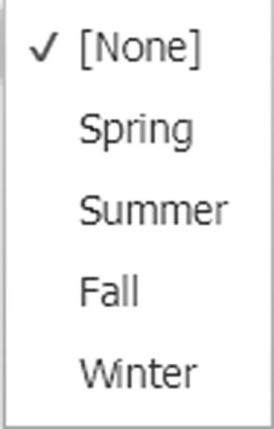
It is often required that the null choice be shown as a custom string, for example, "[None]". This can be accomplished using a converter. In the previous section, you used a converter to customize the choices for Person objects. Here, you will use the converter to customize the choice item for null. You can do both in one converter as well. The following snippet of code uses a converter with a ChoiceBox to convert a null choice as "[None]". Figure 12-18 shows the resulting choice box.
A null choice in a choice box converted as "[None]"
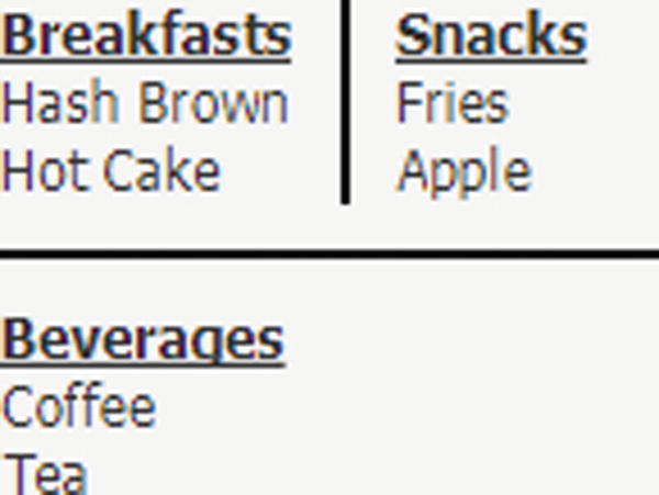
Using Separators in ChoiceBox
Sometimes, you may want to separate choices into separate groups. Suppose you want to show fruits and cooked items in a breakfast menu, and you want to separate one from the other. You would use an instance of the Separator class to achieve this. It appears as a horizontal line in the list of choices. A Separator is not selectable. The following snippet of code creates a choice box with one of its items as a Separator. Figure 12-19 shows the choice box in the showing state.
The default CSS style class name for a ChoiceBox is choice-box. The ChoiceBox class supports a showing CSS pseudo-class, which applies when the showing property is true.
The ChoiceBox control contains two substructures: open-button and arrow. You can style them to change their appearance. Both are instances of StackPane. ChoiceBox shows the selected item in a Label. The list of choices is shown in a ContextMenu whose ID is set to choice-box-popup-menu. Each choice is displayed in a menu item whose IDs are set to choice-box-menu-item. The following styles customize the ChoiceBox control. Currently, there is no way to customize the pop-up menu for an individual choice box. The style will affect all instances of the ChoiceBox control at the level (scene or layout pane) at which it is set.
/* Set the text color and font size for the selected item in the control */
.choice-box .label {
-fx-text-fill: blue;
-fx-font-size: 8pt;
}
/* Set the text color and text font size for choices in the popup list */
#choice-box-menu-item * {
-fx-text-fill: blue;
-fx-font-size: 8pt;
}
/* Set background color of the arrow */
.choice-box .arrow {
-fx-background-color: blue;
}
/* Set the background color for the open-button area */
.choice-box .open-button {
-fx-background-color: yellow;
}
/* Change the background color of the popup */
#choice-box-popup-menu {
-fx-background-color: yellow;
}
Understanding the ComboBox Control
ComboBox is used to let a user select an item from a list of items. You can think of ComboBox as an advanced version of ChoiceBox. ComboBox is highly customizable. The ComboBox class inherits from the ComboBoxBase class, which provides the common functionality for all ComboBox-like controls, such as ComboBox, ColorPicker, and DatePicker. If you want to create a custom control that will allow users to select an item from a pop-up list, you need to inherit your control from the ComboBoxBase class.
The items list in a ComboBox may comprise any type of objects. ComboBox is a parameterized class. The parameter type is the type of the items in the list. If you want to store mixed types of items in a ComboBox, you can use its <Object> type, as in the following code:
// Create a ComboBox for any type of items
ComboBox<Object> seasons = new ComboBox<>();
// Instead create a ComboBox for String items
ComboBox<String> seasons = new ComboBox<>();
You can specify the list items while creating a ComboBox, as in the following code:
ComboBox<String> seasons = new ComboBox<>(seasonList);
After you create a combo box, you can add items to its list of items using the items property, which is of the ObjectProperty<ObservableList<T>> type, in which T is the type parameter for the combo box, as in the following code:
Like ChoiceBox, ComboBox needs to track the selected item and its index in the list of items. It uses a separate object, called selection model, for this purpose. The ComboBox class contains a selectionModel property to store the item selection details. ComboBox uses an object of the SingleSelectionModel class as its selection model. The selection model lets you select an item from the list of items and lets you add ChangeListeners to track changes in index and item selections. Please refer to the section “Understanding the ChoiceBox Control” for more details on using a selection model.
Unlike ChoiceBox, ComboBox can be editable. Its editable property specifies whether or not it is editable. By default, it is not editable. When it is editable, it uses a TextField control to show the selected or entered item. The editor property of the ComboBox class stores the reference of the TextField, and it is null if the combo box is not editable, as shown in the following code:
// By making the control editable, let users enter an item
breakfasts.setEditable(true);
ComboBox has a value property that stores the currently selected or entered value. Note that when a user enters a value in an editable combo box, the entered string is converted to the item type T of the combo box. If the item type is not a string, a StringConverter<T> is needed to convert the String value to type T. I will present an example of this shortly.
You can set a prompt text for a combo box that is displayed when the control is editable, it does not have focus, and its value property is null. The prompt text is stored in the promptText property, which is of the StringProperty type, as in the following code:
breakfasts.setPromptText("Select/Enter an item"); // Set a prompt text
The ComboBox class contains a placeholder property, which stores a Node reference. When the items list is empty or null, the placeholder node is shown in the pop-up area. The following snippet of code sets a Label as a placeholder:
Label placeHolder = new Label("List is empty.
Please enter an item");
breakfasts.setPlaceholder(placeHolder);
The program in Listing 12-12 creates two ComboBox controls: seasons and breakfasts. The combo box having the list of seasons is not editable. The combo box having the list of breakfast items is editable. Figure 12-20 shows the screenshot when the user selected a season and entered a breakfast item, Donut, which is not in the list of breakfast items. A Label control displays the user selection. When you enter a new value in the breakfast combo box, you need to change the focus, press the Enter key, or open the pop-up list to refresh the message Label.
// ComboBoxTest.java
// ... find in the book's download area.
Listing 12-12
Using ComboBoxControls
Figure 12-20
Two ComboBox controls: one noneditable and one editable
Detecting Value Change in ComboBox
Detecting an item change in a noneditable combo box is easily performed by adding a ChangeListener to the selectedIndex or selectedItem property of its selection model. Please refer to the “Understanding the ChoiceBox Control” section for more details.
You can still use a ChangeListener for the selectedItem property to detect when the value in an editable combo box changes by selecting from the items list or entering a new value. When you enter a new value, the selectedIndex property does not change because the entered value does not exist in the items list.
Sometimes, you want to perform an action when the value in a combo box changes. You can do so by adding an ActionEvent handler, which is fired when the value changes by any means. You would do this by setting it programmatically, selecting from items list, or entering a new value, as in the following code:
In an editable ComboBox<T> where T is something other than String, you must set the converter property to a valid StringConverter<T>. Its toString(T object) method is used to convert the item object to a string to show it in the pop-up list. Its fromString(String s) method is called to convert the entered string to an item object. The value property is updated with the item object converted from the entered string. If the entered string cannot be converted to an item object, the value property is not updated.
The program in Listing 12-13 shows how to use a StringConverter in a combo box, which uses domain objects in its items list. The ComboBox uses Person objects. The PersonStringConverter class, as shown in Listing 12-11, is used as the StringConverter. You can enter a name in the format LastName, FirstName or FirstName in the ComboBox and press the Enter key. The entered name will be converted to a Person object and shown in the Label. The program ignores the error checking in name formatting. For example, if you enter Kishori as the name, it displays null, Kishori in the Label. The program adds a ChangeListener to the selectedItem and selectedIndex properties of the selection model to track the selection change. Notice that when you enter a string in the ComboBox, a change in the selectedIndex property is not reported. An ActionEvent handler for the ComboBox is used to keep the values in the combo box and the text in the Label in sync.
// ComboBoxWithConverter.java
// ... find in the book's download area.
Listing 12-13
Using a StringConverter in a ComboBox
Customizing the Height of a Pop-Up List
By default, ComboBox shows only ten items in the pop-up list. If the number of items is more than ten, the pop-up list shows a scrollbar. If the number of items is less than ten, the height of the pop-up list is shortened to show only the available items. The visibleRowCount property of the ComboBox controls how many rows are visible in the pop-up list, as in the following code:
ComboBox<String> states = new ComboBox<>();
...
// Show five rows in the popup list
states.setVisibleRowCount(5);
Using Nodes As Items in ComboBox
A combo box has two areas:
Button area to display the selected item
Pop-up area to display the items list
Both areas use ListCells to display items. A ListCell is a Cell. A Cell is a Labeled control to display some form of content that may have text, a graphic, or both. The pop-up area is a ListView that contains an instance of ListCell for each item in the list. I will discuss ListView in the next section.
Elements in the items list of a combo box can be of any type, including Node type. It is not recommended to add instances of the Node class directly to the items list. When nodes are used as items, they are added as the graphic to the cells. Scene graphics need to follow the rule that a node cannot be displayed in two places at the same time. That is, a node must be inside one container at a time. When a node from the items list is selected, the node is removed from the pop-up ListView cell and added to the button area. When the pop-up is displayed again, the selected node is not shown in the list as it is already showing in the button area. To avoid this inconsistency in display, avoid using nodes directly as items in a combo box.
Figure 12-21 shows three views of a combo box created using the following snippet of code. Notice that the code adds three instances of HBox, which is a node to the items list. The figure labeled #1 shows the pop-up list when it is opened for the first time, and you see all three items correctly. The figure labeled #2 shows up after the second item is selected, and you see the correct item in the button area. At this time, the second item in the list, an HBox with a rectangle, was removed from the cell in the ListView and added to the cell in the button area. The figure labeled #3 shows the pop-up list when it is open for the second time. At this time, the second item is missing from the list because it is already selected. This problem was discussed in the previous paragraph.
Label shapeLbl = new Label("Shape:");
ComboBox<HBox> shapes = new ComboBox<>();
shapes.getItems().addAll(new HBox(new Line(0, 10, 20, 10), new Label("Line")),
new HBox(new Rectangle(0, 0, 20, 20), new Label("Rectangle")),
new HBox(new Circle(20, 20, 10), new Label("Circle")));
Figure 12-21
Three views of a combo box with nodes in the items list
You can fix the display issue that occurs when you use nodes as items. The solution is to add nonnode items in the list and supply a cell factory to create the desired node inside the cell factory. You need to make sure that the nonnode items will provide enough pieces of information to create the node you wanted to insert. The next section explains how to use a cell factory.
Using a Cell Factory in ComboBox
The ComboBox class contains a cellFactory property, which is declared as follows:
public ObjectProperty<Callback<ListView<T>, ListCell<T>>> cellFactory;
Callback is an interface in the javafx.util package. It has a call() method that takes an argument of type P and returns an object of type R, as in the following code:
public interface Callback<P,R> {
public R call(P param);
}
The declaration of the cellFactory property states that it stores a Callback object whose call() method receives a ListView<T> and returns a ListCell<T>. Inside the call() method, you create an instance of the ListCell<T> class and override the updateItem(T item, boolean empty) method of the Cell class to populate the cell.
Let’s use a cell factory to display nodes in the button area and the pop-up area of a combo box. Listing 12-14 will be our starting point. It declares a StringShapeCell class, which inherits from the ListCell<String> class. You need to update its content in its updateItem() method, which is automatically called. The method receives the item, which in this case is String, and a boolean argument indicating whether the cell is empty. Inside the method, you call the method in the superclass first. You derive a shape from the string argument and set the text and graphic in the cell. The shape is set as the graphic. The getShape() method returns a Shape from a String.
// StringShapeCell.java
package com.jdojo.control;
import javafx.scene.control.ListCell;
import javafx.scene.shape.Circle;
import javafx.scene.shape.Line;
import javafx.scene.shape.Rectangle;
import javafx.scene.shape.Shape;
public class StringShapeCell extends ListCell<String> {
@Override
public void updateItem(String item, boolean empty) {
// Need to call the super first
super.updateItem(item, empty);
// Set the text and graphic for the cell
if (empty) {
setText(null);
setGraphic(null);
} else {
setText(item);
Shape shape = this.getShape(item);
setGraphic(shape);
}
}
public Shape getShape(String shapeType) {
Shape shape = null;
switch (shapeType.toLowerCase()) {
case "line":
shape = new Line(0, 10, 20, 10);
break;
case "rectangle":
shape = new Rectangle(0, 0, 20, 20);
break;
case "circle":
shape = new Circle(20, 20, 10);
break;
default:
shape = null;
}
return shape;
}
}
Listing 12-14
A Custom ListCell That Displays a Shape and Its Name
The next step is to create a Callback class, as shown in Listing 12-15. The program in this listing is very simple. Its call() method returns an object of the StringShapeCell class. The class will act as a cell factory for ComboBox.
// ShapeCellFactory.java
package com.jdojo.control;
import javafx.scene.control.ListCell;
import javafx.scene.control.ListView;
import javafx.util.Callback;
public class ShapeCellFactory implements Callback<ListView<String>, ListCell<String>> {
@Override
public ListCell<String> call(ListView<String> listview) {
return new StringShapeCell();
}
}
Listing 12-15
A Callback Implementation for Callback<ListView<String>, ListCell<String>>
The program in Listing 12-16 shows how to use a custom cell factory and button cell in a combo box. The program is very simple. It creates a combo box with three String items. It sets an object of the ShapeCellFactory as the cell factory, as in the following code:
// Set the cellFactory property
shapes.setCellFactory(new ShapeCellFactory());
Setting the cell factory is not enough in this case. It will only resolve the issue of displaying the shapes in the pop-up area. When you select a shape, it will display the String item, not the shape, in the button area. To make sure, you see the same item in the list for selection, and after you select one, you need to set the buttonCell property, as in the following code:
// Set the buttonCell property
shapes.setButtonCell(new StringShapeCell());
Notice the use of the StringShapeCell class in the buttonCell property and ShapeCellFactory class.
Run the program in Listing 12-16. You should be able to select a shape from the list, and the shape should be displayed in the combo box correctly. Figure 12-22 shows three views of the combo box.
// ComboBoxCellFactory.java
package com.jdojo.control;
import javafx.application.Application;
import javafx.scene.Scene;
import javafx.scene.control.ComboBox;
import javafx.scene.control.Label;
import javafx.scene.layout.HBox;
import javafx.stage.Stage;
public class ComboBoxCellFactory extends Application {
Using a custom cell factory and button cell in a combo box gives you immense power to customize the look of the pop-up list and the selected item. If using a cell factory looks hard or confusing to you, keep in mind that a cell is a Labeled control, and you are setting the text and graphic in that Labeled control inside the updateItem() method. The Callback interface comes into play because the ComboBox control needs to give you a chance to create a cell when it needs it. Otherwise, you would have to know how many cells to create and when to create them. There is nothing more to it.
The ComboBoxBase class provides four properties that can also be used with ComboBox:
onShowing
onShown
onHiding
onHidden
These properties are of the type ObjectProperty<EventHandler<Event>>. You can set an event handler to these properties, which will be called before the pop-up list is shown, after it is shown, before it is hidden, and after it is hidden. For example, the onShowing event handlers are handy when you want to customize the pop-up list just before it is shown.
Styling ComboBox with CSS
The default CSS style class name for a ComboBox is combo-box. A combo box contains several CSS substructures, as shown in Figure 12-23.
Figure 12-23
Substructures of a combo box that can be styled separately using CSS
The CSS names for the substructure are
arrow-button
list-cell
text-input
combo-box-popup
An arrow-button contains a substructure called arrow. Both arrow-button and arrow are instances of StackPane. The list-cell area represents the ListCell used to show the selected item in a noneditable combo box. The text-input area is the TextField used to show the selected or entered item in an editable combo box. The combo-box-popup is the Popup control that shows the pop-up list when the button is clicked. It has two substructures: list-view and list-cell. The list-view is the ListView control that shows the list of items, and list-cell represents each cell in the ListView. The following CSS styles customize the appearance of some substructures of ComboBox:
/* The ListCell that shows the selected item in a non-editable ComboBox */
.combo-box .list-cell {
-fx-background-color: yellow;
}
/* The TextField that shows the selected item in an editable ComboBox */
.combo-box .text-input {
-fx-background-color: yellow;
}
/* Style the arrow button area */
.combo-box .arrow-button {
-fx-background-color: lightgray;
}
/* Set the text color in the popup list for ComboBox to blue */
.combo-box-popup .list-view .list-cell {
-fx-text-fill: blue;
}
Understanding the ListView Control
ListView is used to allow a user to select one item or multiple items from a list of items. Each item in ListView is represented by an instance of the ListCell class, which can be customized. The items list in a ListView may contain any type of objects. ListView is a parameterized class. The parameter type is the type of the items in the list. If you want to store mixed types of items in a ListView, you can use its <Object> type, as shown in the following code:
// Create a ListView for any type of items
ListView<Object> seasons = new ListView<>();
// Instead create a ListView for String items
ListView<String> seasons = new ListView<>();
You can specify the list items while creating a ListView, as in the following code:
ListView<String> seasons = new ListView<>(seasonList);
After you create a ListView, you can add items to its list of items using the items property, which is of the ObjectProperty<ObservableList<T>> type in which T is the type parameter for the ListView, as in the following code:
ListView sets its preferred width and height, which are normally not the width and height that you want for your control. It would have helped developers if the control had provided a property such as visibleItemCount. Unfortunately, the ListView API does not support such a property. You need to set them to reasonable values in your code, as follows:
// Set preferred width = 100px and height = 120px
seasons.setPrefSize(100, 120);
If the space needed to display items is larger than what is available, a vertical, a horizontal, or both scrollbars are automatically added.
The ListView class contains a placeholder property, which stores a Node reference. When the items list is empty or null, the placeholder node is shown in the list area of the ListView. The following snippet of code sets a Label as a placeholder:
Label placeHolder = new Label("No seasons available for selection.");
seasons.setPlaceholder(placeHolder);
ListView offers a scrolling feature. Use the scrollTo(int index) or scrollTo(T item) method to scroll to a specified index or item in the list. The specified index or item is made visible, if it is not already visible. The ListView class fires a ScrollToEvent when scrolling takes place using the scrollTo() method or by the user. You can set an event handler using the setOnScrollTo() method to handle scrolling.
Each item in a ListView is displayed using an instance of the ListCell class. In essence, a ListCell is a labeled control that is capable of displaying text and a graphic. Several subclasses of ListCell exist to give ListView items a custom look. ListView lets you specify a Callback object as a cell factory, which can create custom list cells. A ListView does not need to create as many ListCell objects as the number of items. It can have only as many ListCell objects as the number of visible items on the screen. As items are scrolled, it can reuse the ListCell objects to display different items. Figure 12-24 shows a class diagram for ListCell-related classes.
Figure 12-24
A class diagram for ListCell-related classes
Cells are used as building blocks in different types of controls. For example, ListView, TreeView, and TableView controls use cells in one form or another to display and edit their data. The Cell class is the superclass for all cells. You can override its updateItem(T object, boolean empty) and take full control of how the cell is populated. This method is called automatically by these controls when the item in the cell needs to be updated. The Cell class declares several useful properties: editable, editing, empty, item, and selected. When a Cell is empty, which means it is not associated with any data item, its empty property is true.
The IndexedCell class adds an index property, which is the index of the item in the underlying model. Suppose a ListView uses an ObservableList as a model. The list cell for the second item in the ObservableList will have index 1 (index starts at 0). The cell index facilitates customization of cells based on their indexes, for example, using different colors for cells at odd and even index cells. When a cell is empty, its index is –1.
Orientation of a ListView
The items in a ListView may be arranged vertically in a single column (default) or horizontally in a single row. It is controlled by the orientation property, as shown in the following code:
// Arrange list of seasons horizontally
seasons.setOrientation(Orientation.HORIZONTAL);
Figure 12-25 shows two instances of ListView: one uses vertical orientation and one horizontal orientation. Notice that the odd and even rows or columns have different background colors. This is the default look of the ListView. You can change the appearance using a CSS. Please refer to the “Styling ListView with CSS” section for details.
Figure 12-25
Two instances of ListView having the same items but different orientations
Selection Model in ListView
ListView has a selection model that stores the selected state of its items. Its selectionModel property stores the reference of the selection model. By default, it uses an instance of the MultipleSelectionModel class. You can use a custom selection model, however, that is rarely needed. The selection model can be configured to work in two modes:
Single selection mode
Multiple selection mode
In single selection mode, only one item can be selected at a time. If an item is selected, the previously selected item is deselected. By default, a ListView supports single selection mode. An item can be selected using a mouse or a keyboard. You can select an item using a mouse click. Using a keyboard to select an item requires that the ListView have focus. You can use the up/down arrow in a vertical ListView and the left/right arrow in a horizontal ListView to select items.
In multiple selection mode, multiple items can be selected at a time. Using only a mouse lets you select only one item at a time. Clicking an item selects the item. Clicking an item with the Shift key pressed selects all contiguous items. Clicking an item with the Ctrl key pressed selects a deselected item and deselects a selected item. You can use the up/down or left/right arrow key to navigate and the Ctrl key with the spacebar or Shift key with the spacebar to select multiple items. If you want a ListView to operate in multiple selection mode, you need to set the selectionMode property of its selection model, as in the following code:
The MultipleSelectionModel class inherits from the SelectionModel class, which contains selectedIndex and selectedItem properties.
The selectedIndex property is –1 if there is no selection. In single selection mode, it is the index of the currently selected item. In multiple selection mode, it is the index of the last selected item. In multiple selection mode, use the getSelectedIndices() method that returns a read-only ObservableList<Integer> containing the indexes of all selected items. If you are interested in listening for selection change in a ListView, you can add a ChangeListener to the selectedIndex property or a ListChangeListener to the ObservableList returned by the getSelectedIndices() method.
The selectedItem property is null if there is no selection. In single selection mode, it is the currently selected item. In multiple selection mode, it is the last selected item. In multiple selection mode, use the getSelectedItems() method that returns a read-only ObservableList<T> containing all selected items. If you are interested in listening for selection change in a ListView, you can add a ChangeListener to the selectedItem property or a ListChangeListener to the ObservableList<T> returned by the getSelectedItems() method.
The selection model of ListView contains several methods to select items in different ways:
The selectAll() method selects all items.
The selectFirst() and selectLast() methods select the first item and the last item, respectively.
The selectIndices(int index, int... indices) method selects items at the specified indexes. Indexes outside the valid range are ignored.
The selectRange(int start, int end) method selects all indexes from the start index (inclusive) to the end index (exclusive).
The clearSelection() and clearSelection(int index) methods clear all selection and the selection at the specified index, respectively.
The program in Listing 12-17 demonstrates how to use the selection model of a ListView for making selections and listening for selection change events. Figure 12-26 shows the window that results from running this code. Run the application and use a mouse or buttons on the window to select items in the ListView. The selection details are displayed at the bottom.
// ListViewSelectionModel.java
// ... find in the book's download area.
Listing 12-17
Using a ListViewSelection Model
Figure 12-26
A ListView with several buttons to make selections
Using Cell Factory in ListView
Each item in a ListView is displayed in an instance of ListCell, which is a Labeled control. Recall that a Labeled control contains text and a graphic. The ListView class contains a cellFactory property that lets you use custom cells for its items. The property type is ObjectProperty<Callback<ListView<T>,ListCell<T>>>. The reference of the ListView is passed to the call() method of the Callback object, and it returns an instance of the ListCell class. In a large ListView, say 1000 items, the ListCell returned from the cell factory may be reused. The control needs to create only the number of cells that are visible. Upon scrolling, it may reuse the cells that went out of the view to display newly visible items. The updateItem() method of the ListCell receives the reference of the new item.
By default, a ListView calls the toString() method of its items, and it displays the string in its cell. In the updateItem() method of your custom ListCell, you can populate the text and graphic for the cell to display anything you want in the cell based on the item in that cell.
Tip
You used a custom cell factory for the pop-up list of the combo box in the previous section. The pop-up list in a combo box uses a ListView. Therefore, using a custom cell factory in a ListView would be the same as discussed in the earlier combo box section.
The program in Listing 12-18 shows how to use a custom cell factory to display the formatted names of Person items. Figure 12-27 shows the resulting window after running the code. The snippet of code in the program creates and sets a custom cell factory. The updateItem() method of the ListCell formats the name of the Person object and adds a serial number that is the index of the cell plus one.
// ListViewDomainObjects.java
// ... find in the book's download area.
Listing 12-18
Using a Custom Cell Factory for ListView
Figure 12-27
A ListView displaying Person objects in its list of items using a custom cell factory
Using Editable ListView
The ListView control offers many customizations, and one of them is its ability to let users edit the items. You need to set two properties for a ListView before it can be edited:
Set the editable property of the ListView to true.
Set the cellFactory property of the ListView to a cell factory that produces an editable ListCell.
Select a cell and click to start editing. Alternatively, press the spacebar when a cell has focus to start editing. If a ListView is editable and has an editable cell, you can also use the edit(int index) method of the ListView to edit the item in the cell at the specified index.
Tip
The ListView class contains a read-only editingIndex property. Its value is the index of the item being edited. Its value is –1 if no item is being edited.
JavaFX provides cell factories that let you edit a ListCell using TextField, ChoiceBox, ComboBox, and CheckBox. You can create a custom cell factory to edit cells in some other way. Instances of the TextFieldListCell, ChoiceBoxListCell, ComboBoxListCell, and CheckBoxListCell classes, as list cells in a ListView, provide editing support. These classes are included in the javafx.scene.control.cell package.
Using a TextField to Edit ListView Items
An instance of the TextFieldListCell is a ListCell that displays an item in a Label when the item is not being edited and in a TextField when the item is being edited. If you want to edit a domain object to a ListView, you will need to use a StringConverter to facilitate the two-way conversion. The forListView() static method of the TextFieldListCell class returns a cell factory configured to be used with String items. The following snippet of code shows how to set a TextField as the cell editor for a ListView:
The following snippet of code shows how to set a TextField as the cell editor with a converter for a ListView that contains Person objects. The converter used in the code was shown in Listing 12-11. The converter object will be used to convert a Person object to a String for displaying and a String to a Person object after editing.
ListView<Person> persons = new ListView<>();
...
persons.setEditable(true);
// Set a TextField as the editor.
// Need to use a StringConverter for Person objects.
StringConverter<Person> converter = new PersonStringConverter();
The program in Listing 12-19 shows how to edit a ListView item in a TextField. It uses a ListView of domain objects (Person) and a ListView of String objects. After running the program, double-click any items in the two ListViews to start editing. When you are done editing, press the Enter key to commit the changes.
// ListViewEditing.java
// ... find in the book's download area.
Listing 12-19
Using an Editable ListView
Using a ChoiceBox/ComboBox to Edit ListView Items
An instance of the ChoiceBoxListCell is a ListCell that displays an item in a Label when the item is not being edited and in a ChoiceBox when the item is being edited. If you want to edit a domain object to a ListView, you will need to use a StringConverter to facilitate two-way conversion. You need to supply the list of items to show in the choice box. Use the forListView() static method of the ChoiceBoxListCell class to create a cell factory. The following snippet of code shows how to set a choice box as the cell editor for a ListView:
ListView<String> breakfasts = new ListView<>();
...
breakfasts.setEditable(true);
// Set a cell factory to use a ChoiceBox for editing
The program in Listing 12-20 uses a choice box to edit items in a ListView. Double-click an item in a cell to start editing. In edit mode, the cell becomes a choice box. Click the arrow to show the list of items to select. Using a combo box for editing is similar to using a choice box.
// ListViewChoiceBoxEditing.java
// ... find in the book's download area.
Listing 12-20
Using a ChoiceBox for Editing Items in a ListView
Using a Check Box to Edit ListView Items
The CheckBoxListCell class provides the ability to edit a ListCell using a check box. It draws a check box in the cell, which can be selected or deselected. Note that the third state, the indeterminate state, of the check box is not available for selection while using a check box to edit ListView items.
Using a check box to edit ListView items is a little different. You need to provide the CheckBoxListCell class with an ObservableValue<Boolean> object for each item in the ListView. Internally, the observable value is bound bidirectionally to the selected state of the check box. When the user selects or deselects an item in the ListView using the check box, the corresponding ObservableValue object is updated with a true or false value. If you want to know which item is selected, you will need to keep the reference of the ObservableValue object.
Let’s redo our earlier breakfast example using a check box. The following snippet of code creates a map and adds all items as a key and a corresponding ObservableValue item with false value. Using a false value, you want to indicate that the items will be initially deselected:
Map<String, ObservableValue<Boolean>> map = new HashMap<>();
map.put("Apple", new SimpleBooleanProperty(false));
map.put("Banana", new SimpleBooleanProperty(false));
map.put("Donut", new SimpleBooleanProperty(false));
map.put("Hash Brown", new SimpleBooleanProperty(false));
Now, you create an editable ListView with all keys in the map as its items:
ListView<String> breakfasts = new ListView<>();
breakfasts.setEditable(true);
// Add all keys from the map as items to the ListView
breakfasts.getItems().addAll(map.keySet());
The following snippet of code creates a Callback object. Its call() method returns the ObservableValue object for the specified item passed to the call() method. The CheckBoxListCell class will call the call() method of this object automatically:
Now it is time to create and set a cell factory for the ListView. The forListView() static method of the CheckBoxListCell class takes a Callback object as an argument. If your ListView contains domain objects, you can also provide a StringConverter to this method, using the following code:
When the user selects or deselects an item using the check box, the corresponding ObservableValue in the map will be updated. To know whether an item in the ListView is selected, you need to look at the value in the ObservableValue object for that item.
The program in Listing 12-21 shows how to use a check box to edit items in a ListView. Figure 12-28 shows the resulting window after running the code. Select items using a mouse. Pressing the Print Selection button prints the selected items on the standard output.
// ListViewCheckBoxEditing.java
// ... find in the book's download area.
Listing 12-21
Using a Check Box to Edit ListView Items
Figure 12-28
A ListView with a check box for editing its items
Handling Events While Editing a ListView
An editable ListView fires three kinds of events:
An editStart event when the editing starts
An editCommit event when the edited value is committed
An editcancel event when the editing is cancelled
The ListView class defines a ListView.EditEvent<T> static inner class to represent edit-related event objects. Its getIndex() method returns the index of the item that is edited. The getNewValue() method returns the new input value. The getSource() method returns the reference of the ListView firing the event. The ListView class provides onEditStart, onEditCommit, and onEditCancel properties to set the event handlers for these methods.
The following snippet of code adds an editStart event handler to a ListView. The handler prints the index that is being edited and the new item value:
Listing 12-22 contains a complete program to show how to handle edit-related events in a ListView. Run the program and double-click an item to start editing. After changing the value, press Enter to commit editing or Esc to cancel editing. Edit-related event handlers print messages on the standard output.
// ListViewEditEvents.java
// ... find in the book's download area.
Listing 12-22
Handling Edit-Related Events in a ListView
Styling ListView with CSS
The default CSS style class name for a ListView is list-view, and for ListCell it is list-cell. The ListView class has two CSS pseudo-classes: horizontal and vertical. The -fx-orientation CSS property controls the orientation of the ListView, which can be set to horizontal or vertical.
You can style a ListView as you style any other controls. Each item is displayed in an instance of ListCell. ListCell provides several CSS pseudo-classes:
empty
filled
selected
odd
even
The empty pseudo-class applies when the cell is empty. The filled pseudo-class applies when the cell is not empty. The selected pseudo-class applies when the cell is selected. The odd and even pseudo-classes apply to cells with an odd and even index, respectively. The cell representing the first item is index 0, and it is considered an even cell.
The following CSS styles will highlight even cells with tan and odd cells with light gray:
.list-view .list-cell:even {
-fx-background-color: tan;
}
.list-view .list-cell:odd {
-fx-background-color: lightgray;
}
Developers often ask how to remove the default alternate cell highlighting in a ListView. In the modena.css file, the default background color for all list cells is set to -fx-control-inner-background, which is a CSS-derived color. For all odd list cells, the default color is set to derive(-fx-control-inner-background,-5%). To keep the background color the same for all cells, you need to override the background color of odd list cells as follows:
This only solves half of the problem; it only takes care of the background colors of the list cells in a normal state inside a ListView. A list cell can be in several states, for example, focused, selected, empty, or filled. To completely address this, you will need to set the appropriate background colors for list cells for all states. Please refer to the modena.css file for a complete list of states that you will need to modify the background colors for list cells.
The ListCell class supports an -fx-cell-size CSS property that is the height of the cells in a vertical ListView and the width of cells in a horizontal ListView.
The list cell could be of the type ListCell, TextFieldListCell, ChoiceBoxListCell, ComboBoxListCell, or CheckBoxListCell. The default CSS style class names for subclasses of ListCell are text-field-list-cell, choice-box-list-cell, combo-box-list-cell, and check-box-list-cell. You can use these style class names to customize their appearance. The following CSS style will show the TextField in an editable ListView in yellow background:
.list-view .text-field-list-cell .text-field {
-fx-background-color: yellow;
}
Understanding the ColorPicker Control
ColorPicker is a combo box–style control that is especially designed for users to select a color from a standard color palette or create a color using a built-in color dialog. The ColorPicker class inherits from the ComboBoxBase<Color> class. Therefore, all properties declared in the ComboBoxBase class apply to the ColorPicker control as well. I have discussed several of these properties earlier in the “Understanding the ComboBox Control” section. If you want to know more about those properties, please refer to that section. For example, the editable, onAction, showing, and value properties work the same way in a ColorPicker as they do in a combo box. A ColorPicker has three parts:
ColorPicker control
Color palette
Custom color dialog
A ColorPicker control consists of several components, as shown in Figure 12-29. You can customize their looks. The color indicator is a rectangle displaying the current color selection. The color label displays the color in text format. If the current selection is one of the standard colors, the label displays the color name. Otherwise, it displays the color value in hex format. Figure 12-30 shows a ColorPicker control and its color palette.
Figure 12-29
Components of a ColorPicker control
Figure 12-30
ColorPicker control and its color palette dialog box
The color palette is shown as a pop-up when you click the arrow button in the control. The color palette consists of three areas:
A color palette area to show a set of standard colors
A custom color area showing the list of custom colors
A hyperlink to open the custom color dialog box
The color palette area shows a set of predefined standard colors. If you click one of the colors, it closes the pop-up and sets the selected color as the value for the ColorPicker control.
The custom color area shows a set of custom colors. When you open this pop-up for the first time, this area is absent. There are two ways to get colors in this area. You can load a set of custom colors, or you can build and save custom colors using the custom color dialog box.
When you click the Custom Color… hyperlink, a custom color dialog box, as shown in Figure 12-31, is displayed. You can use the HSB, RGB, or Web tab to build a custom color using one of these formats. You can also define a new color by selecting a color from the color area or the color vertical bar, which are on the left side of the dialog box. When you click the color area and the color bar, they show a small circle and rectangle to denote the new color. Clicking the Save button selects the custom color in the control and saves it to display later in the custom color area when you open the pop-up again. Clicking the Use button selects the custom color for the control.
Figure 12-31
Custom color dialog box of ColorPicker
Using the ColorPicker Control
The ColorPicker class has two constructors. One of them is the default constructor, and the other takes the initial color as an argument. The default constructor uses white as the initial color, as in the following code:
// Create a ColorPicker control with an initial color of white
ColorPicker bgColor1 = new ColorPicker();
// Create a ColorPicker control with an initial color of red
ColorPicker bgColor2 = new ColorPicker(Color.RED);
The value property of the control stores the currently selected color. Typically, the value property is set when you select a color using the control. However, you can also set it directly in your code, as follows:
ColorPicker bgColor = new ColorPicker();
...
// Get the selected color
Color selectedCOlor = bgColor.getValue();
// Set the ColorPicker color to yellow
bgColor.setValue(Color.YELLOW);
The getCustomColors() method of the ColorPicker class returns a list of custom colors that you save in the custom color dialog box. Note that custom colors are saved only for the current session and the current ColorPicker control. If you need to, you can save custom colors in a file or database and load them on startup. You will have to write some code to achieve this:
Typically, when a color is selected in a ColorPicker, you want to use the color for other controls. When a color is selected, the ColorPicker control generates an ActionEvent. The following snippet of code adds an ActionEvent handler to a ColorPicker. When a color is selected, the handler sets the new color as the fill color of a rectangle:
ColorPicker bgColor = new ColorPicker();
Rectangle rect = new Rectangle(0, 0, 100, 50);
// Set the selected color in the ColorPicker as the fill color of the Rectangle
The program in Listing 12-23 shows how to use ColorPicker controls. When you select a color using the ColorPicker, the fill color for the rectangle is updated.
// ColorPickerTest.java
// ... find in the book's download area.
Listing 12-23
Using the ColorPicker Control
The ColorPicker control supports three looks: combo-box look, button look, and split-button look. The combo-box look is the default look. Figure 12-32 shows a ColorPicker in these three looks, respectively.
Figure 12-32
Three looks of a ColorPicker
The ColorPicker class contains two string contents that are the CSS style class name for the button and split-button looks. The constants are
STYLE_CLASS_BUTTON
STYLE_CLASS_SPLIT_BUTTON
If you want to change the default look of a ColorPicker, add one of the preceding constants as its style class, as follows:
It is possible to add both STYLE_CLASS_BUTTON and STYLE_CLASS_SPLIT_BUTTON as style classes for a ColorPicker. In such a case, the STYLE_CLASS_BUTTON is used.
Styling ColorPicker with CSS
The default CSS style class name for a ColorPicker is color-picker. You can style almost every part of a ColorPicker, for example, color indicator, color label, color palette dialog, and custom color dialog. Please refer to the modena.css file for complete reference.
The -fx-color-label-visible CSS property of the ColorPicker sets whether the color label is visible or not. Its default value is true. The following code makes the color label invisible:
.color-picker {
-fx-color-label-visible: false;
}
The color indicator is a rectangle, which has a style class name of picker-color-rect. The color label is a Label, which has a style class name of color-picker-label. The following code shows the color label in blue and sets a 2px thick black stroke around the color indicator rectangle:
.color-picker .color-picker-label {
-fx-text-fill: blue;
}
.color-picker .picker-color .picker-color-rect {
-fx-stroke: black;
-fx-stroke-width: 2;
}
The style class name for the color palette is color-palette. The following code hides the Custom Colors… hyperlink on the color palette:
.color-palette .hyperlink {
visibility: hidden;
}
Understanding the DatePicker Control
DatePicker is a combo-box style control. The user can enter a date as text or select a date from a calendar. The calendar is displayed as a pop-up for the control, as shown in Figure 12-33. The DatePicker class inherits from the ComboBoxBase<LocalDate> class. All properties declared in the ComboBoxBase class are also available to the DatePicker control.
Figure 12-33
Calendar pop-up for a DatePicker control
The first row of the pop-up displays the month and year. You can scroll through months and years using the arrows. The second row displays the short names of weeks. The first column displays the week number of the year. By default, the week number column is not displayed. You can use the context menu on the pop-up to display it, or you can set the showWeekNumbers property of the control to show it.
The calendar always displays dates for 42 days. Dates not applicable to the current month are disabled for selection. Each day cell is an instance of the DateCell class. You can provide a cell factory to use your custom cells. You will have an example of using a custom cell factory later.
Right-clicking the first row, week names, week number column, or disabled dates displays the context menu. The context menu also contains a Show Today menu item, which scrolls the calendar to the current date.
Using the DatePicker Control
You can create a DatePicker using its default constructor; it uses null as the initial value. You can also pass a LocalDate to another constructor as the initial value, as in the following code:
// Create a DatePicker with null as its initial value
DatePicker birthDate1 = new DatePicker();
// Use September 19, 1969 as its initial value
DatePicker birthDate2 = new DatePicker(LocalDate.of(1969, 9, 19));
The value property of the control holds the current date in the control. You can use the property to set a date. When the control has a null value, the pop-up shows the dates for the current month. Otherwise, the pop-up shows the dates of the month of the current value, as with the following code:
// Get the current value
LocalDate dt = birthDate.getValue();
// Set the current value
birthDate.setValue(LocalDate.of(1969, 9, 19));
The DatePicker control provides a TextField to enter a date as text. Its editor property stores the reference of the TextField. The property is read-only. If you do not want users to enter a date, you can set the editable property of the DatePicker to false, as in the following code:
DatePicker birthDate = new DatePicker();
// Users cannot enter a date. They must select one from the popup.
birthDate.setEditable(false);
The DatePicker has a converter property that uses a StringConverter to convert a LocalDate to a string and vice versa. Its value property stores the date as LocalDate, and its editor displays it as a string, which is the formatted date. When you enter a date as text, the converter converts it to a LocalDate and stores it in the value property. When you pick a date from the calendar pop-up, the converter creates a LocalDate to store in the value property, and it converts it to a string to display in the editor. The default converter uses the default Locale and chronology to format the date. When you enter a date as text, the default converter expects the text in the default Locale and chronology format.
Listing 12-24 contains the code for a LocalDateStringConverter class that is a StringConverter for LocalDate. By default, it formats dates in MM/dd/yyyy format. You can pass a different format in its constructor.
// LocalDateStringConverter.java
package com.jdojo.control;
import javafx.util.StringConverter;
import java.time.LocalDate;
import java.time.format.DateTimeFormatter;
public class LocalDateStringConverter extends StringConverter<LocalDate> {
You can configure the DatePicker control to work with a specific chronology instead of the default one. The following statement sets the chronology to Thai Buddhist chronology:
You can change the default Locale for the current instance of the JVM, and the DatePicker will use the date format and chronology for the default Locale:
// Change the default Locale to Canada
Locale.setDefault(Locale.CANADA);
Each day cell in the pop-up calendar is an instance of the DateCell class, which is inherited from the Cell<LocalDate> class. The dayCellFactory property of the DatePicker class lets you provide a custom day cell factory. The concept is the same as discussed earlier for providing the cell factory for the ListView control. The following statement creates a day cell factory. It changes the text color of weekend cells to blue and disables all future day cells. If you set this day cell factory to a DatePicker, the pop-up calendar will not let users select a future date because you will have disabled all future day cells:
Callback<DatePicker, DateCell> dayCellFactory =
new Callback<DatePicker, DateCell>() {
public DateCell call(final DatePicker datePicker) {
return new DateCell() {
@Override
public void updateItem(LocalDate item, boolean empty) {
// Must call super
super.updateItem(item, empty);
// Disable all future date cells
if (item.isAfter(LocalDate.now())) {
this.setDisable(true);
}
// Show Weekends in blue
DayOfWeek day = DayOfWeek.from(item);
if (day == DayOfWeek.SATURDAY ||
day == DayOfWeek.SUNDAY) {
his.setTextFill(Color.BLUE);
}
}
};
}
};
The following snippet of code sets a custom day cell factory for a birth date DatePicker control. It also makes the control noneditable. The control will force the user to select a nonfuture date from the pop-up calendar:
DatePicker birthDate = new DatePicker();
// Set a day cell factory to disable all future day cells
// and show weekends in blue
birthDate.setDayCellFactory(dayCellFactory);
// Users must select a date from the popup calendar
birthDate.setEditable(false);
The DatePicker control fires an ActionEvent when its value property changes. The value property may change when a user enters a date, selects a date from the pop-up, or a date is set programmatically, as provided in the following code:
Listing 12-25 has a complete program showing how to use a DatePicker control. It uses most of the features of the DatePicker. It displays a window as shown in Figure 12-34. The control is noneditable, forcing the user to select a nonfuture date from the pop-up.
// DatePickerTest.java
// ... find in the book's download area.
Listing 12-25
Using the DatePicker Control
Figure 12-34
A DatePicker control to select a nonfuture date
Styling DatePicker with CSS
The default CSS style class name for a DatePicker is date-picker, and for its pop-up, the class name is date-picker-popup. You can style almost every part of a DatePicker, for example, the month-year pane in the top area of the pop-up, day cells, week number cells, and current day cell. Please refer to the modena.css file for complete reference.
The CSS style class name for day cell is day-cell. The day cell for the current date has the style class name as today. The following styles display the current day number in bold and all day numbers in blue:
/* Display current day numbers in bolder font */
.date-picker-popup > * > .today {
-fx-font-weight: bolder;
}
/* Display all day numbers in blue */
.date-picker-popup > * > .day-cell {
-fx-text-fill: blue;
}
Understanding Text Input Controls
JavaFX supports text input controls that let users work with single line or multiple lines of plain text. I will discuss TextField, PasswordField, and TextArea text input controls in this section. All text input controls are inherited from the TextInputControl class. Please refer to Figure 12-1 for a class diagram for the text input controls.
Tip
JavaFX provides a rich text edit control named HTMLEditor. I will discuss HTMLEditor later in this chapter.
The TextInputControl class contains the properties and methods that apply to all types of text input controls. Properties and methods related to the current caret position and movement and text selection are in this class. Subclasses add properties and methods applicable to them. Table 12-5 lists the properties declared in the TextInputControl class.
Table 12-5
Properties Declared in the TextInputControl Class
Property
Type
Description
anchor
ReadOnlyIntegerProperty
It is the anchor of the text selection. It is at the opposite end of the caret position in the selection.
caretPosition
ReadOnlyIntegerProperty
It is the current position of the caret within the text.
editable
BooleanProperty
It is true if the control is editable. Otherwise, it is false.
font
ObjectProperty<Font>
It is the default font for the control.
length
ReadOnlyIntegerProperty
It is the number of characters in the control.
promptText
StringProperty
It is the prompt text. It is displayed in the control when control has no content.
redoable
ReadOnlyBooleanProperty
Tells whether it is possible to redo the latest change.
selectedText
ReadOnlyStringProperty
It is the selected text in the control.
selection
ReadOnlyObjectProperty <IndexRange>
It is the selected text index range.
text
StringProperty
It is the text in the control.
textFormatter
ObjectProperty<TextFormatter<?>>
The currently attached text formatter.
undoable
ReadOnlyBooleanProperty
Tells whether it is possible to undo the latest change.
Positioning and Moving Caret
All text input controls provide a caret. By default, a caret is a blinking vertical line when the control has focus. The current caret position is the target for the next input character from the keyboard. The caret position starts at zero, which is before the first character. Position 1 is after the first character and before the second character and so on. Figure 12-35 shows the caret positions in a text input control that has four characters. The number of characters in the text determines the valid range for the caret position, which is zero to the length of the text. Zero is the only valid caret position if the control does not contain text.
Figure 12-35
Caret positions in a text input control having four characters
Several methods take a caret position as an argument. Those methods clamp the argument value to the valid caret position range. Passing a caret position outside the valid range will not throw an exception. For example, if the control has four characters and you want to move the caret to position 10, the caret will be positioned at position 4.
The read-only caretPosition property contains the current caret position. Use the positionCaret(int pos) method to position the caret at the specified pos. The backward() and forward() methods move the caret one character backward and forward, respectively, if there is no selection. If there is a selection, they move the caret position to the beginning and end and clear the selection. The home() and end() methods move the caret before the first character and after the last character, respectively, and clear the selection. The nextWord() method moves the caret to the beginning of the next word and clears the selection. The endOfNextWord() method moves the caret to the end of the next word and clears the selection. The previousWord() method moves the caret to the beginning of the previous word and clears the selection.
Making Text Selection
The TextInputControl class provides a rich API through its properties and methods to deal with text selection. Using the selection API, you can select the entire or partial text and get the selection information.
The selectedText property contains the value of the selected text. Its value is an empty string if there is no selection. The selection property contains an IndexRange that holds the index range of the selection. The getStart() and getEnd() methods of the IndexRange class return the start index and end index of the selection, respectively, and its getLength() method returns the length of the selection. If there is no selection, the lower and upper limits of the range are the same, and they are equal to the caretPosition value.
The anchor and caretPosition properties play a vital role in text selection. The value of these properties defines the selection range. The same value for both properties indicates no selection. Either property may indicate the start or end of the selection range. The anchor value is the caret position when the selection started. You can select characters by moving the caret backward or forward. For example, you can use the left or right arrow key with the Shift key pressed to select a range of characters. If you move the caret forward during the selection process, the anchor value will be less than the caretPosition value. If you move the caret backward during the selection process, the anchor value will be greater than the caretPosition value. Figure 12-36 shows the relation between the anchor and caretPosition values.
Figure 12-36
Relation between the anchor and caretPosition properties of a text input control
In Figure 12-36, the part labeled #1 shows a text input control with the text BLESSINGS. The caretPosition value is 1. The user selects four characters by moving the caret four positions forward, for example, by pressing the Shift key and right arrow key or by dragging the mouse. The selectedText property, as shown in the part labeled #2, is LESS. The anchor value is 1, and the caretPosition value is 5. The selection property has an IndexRange of 1 to 5.
In the part labeled #3, the caretPosition value is 5. The user selects four characters by moving the caret backward as shown in the part labeled #4. The selectedText property, as shown in part labeled #4, is LESS. The anchor value is 5, and the caretPosition value is 1. The selection property has an IndexRange of 1 to 5. Notice that in the parts labeled #2 and #4, the anchor and caretPosition values are different, and the selectedText and selection properties are the same.
Apart from the selection properties, the TextInputControl contains several useful selection-related methods:
selectAll()
deselect()
selectRange(int anchor, int caretPosition)
selectHome()
selectEnd()
extendSelection(int pos)
selectBackward()
selectForward()
selectPreviousWord()
selectEndOfNextWord()
selectNextWord()
selectPositionCaret(int pos)
replaceSelection(String replacement)
Notice that you have a positionCaret(int pos) method and a selectPositionCaret(int pos) method. The former positions the caret at the specified position and clears the selection. The latter moves the caret to the specified pos and extends the selection if one exists. If no selection exists, it forms a selection by the current caret position as the anchor and moving the caret to the specified pos.
The replaceSelection(String replacement) method replaces the selected text by the specified replacement. If there is no selection, it clears the selection and inserts the specified replacement at the current caret position.
Modifying the Content
The text property of the TextInputControl class represents the textual content of text input controls. You can change the content using the setText(String text) method and get it using the getText() method. The clear() method sets the content to an empty string.
The insertText(int index, String text) method inserts the specified text at the specified index. It throws an IndexOutOfBoundsException if the specified index is outside the valid range (zero to the length of the content). The appendText(String text) method appends the specified text to the content. The deleteText() method lets you delete a range of characters from the content. You can specify the range as an IndexRange object or start and end index. The deleteNextChar() and deletePreviousChar() methods delete the next and previous character, respectively, from the current caret position if there is no selection. If there is a selection, they delete the selection. They return true if the deletion was successful. Otherwise, they return false.
The read-only length property represents the length of the content. It changes as you modify the content. Practically, the length value can be very big. There is no direct way to restrict the number of characters in a text input control. I will cover an example of restricting the length of text shortly.
Cutting, Copying, and Pasting Text
The text input controls support cut, copy, and paste features programmatically, using the mouse and keyboard. To use these features using the mouse and keyboard, use the standard steps supported on your platform. Use the cut(), copy(), and paste() methods to use these features programmatically. The cut() method transfers the currently selected text to the clipboard and removes the current selection. The copy() method transfers the currently selected text to the clipboard without removing the current selection. The paste() method replaces the current selection with the content in the clipboard. If there is no selection, it inserts the clipboard content at the current caret position.
An Example
The program in Listing 12-26 demonstrates how the different properties of text input control change. It displays a window as shown in Figure 12-37. The program uses a TextField, which is a text input control, to display one line of text. Each property is displayed in a Label by binding the text properties to the properties of the TextField. After running the program, change the text in the name field, move the caret, and change the selection to see how the properties of the TextField change.
// TextControlProperties.java
// ... find in the book's download area.
Listing 12-26
Using the Properties of Text Input Controls
Figure 12-37
Using properties of text input controls
Styling TextInputControl with CSS
The TextInputControl class introduces a CSS pseudo-class named readonly, which applies when the control is not editable. It adds the following style properties:
-fx-font
-fx-text-fill
-fx-prompt-text-fill
-fx-highlight-fill
-fx-highlight-text-fill
-fx-display-caret
The -fx-font property is inherited from the parent by default. The value for the -fx-display-caret property could be true or false. When it is true, the caret is displayed when the control has focus. Otherwise, the caret is not displayed. Its default value is true. Most of the other properties affect background and text colors.
Understanding the TextField Control
TextField is a text input control. It inherits from the TextInputControl class. It lets the user enter a single line of plain text. If you need a control to enter multiline text, use TextArea instead. Newline and tab characters in the text are removed. Figure 12-38 shows a window with two TextFields having the text Layne and Estes.
Figure 12-38
A window with two TextField controls
You can create a TextField with an empty initial text or with a specified initial text, as shown in the following code:
// Create a TextField with an empty string as initial text
TextField nameFld1 = new TextField();
// Create a TextField with "Layne Estes" as an initial text
TextField nameFld2 = new TextField("Layne Estes");
As I have already mentioned, the text property of the TextField stores the textual content. If you are interested in handling the changes in a TextField, you need to add a ChangeListener to its text property. Most of the time, you will be using its setText(String newText) method to set new text and the getText() method to get the text from it. TextField adds the following properties:
alignment
onAction
prefColumnCount
The alignment property determines the alignment of the text within the TextField area when there is empty space. Its default value is CENTER_LEFT if the node orientation is LEFT_TO_RIGHT and CENTER_RIGHT if the node orientation is RIGHT_TO_LEFT. The onAction property is an ActionEvent handler, which is called when the Enter key is pressed in the TextField, as shown in the following code:
TextField nameFld = new TextField();
nameFld.setOnAction(e -> /* Your ActionEvent handler code...*/ );
The prefColumnCount property determines the width of the control. By default, its value is 12. A column is wide enough to display an uppercase letter W. If you set its value to 10, the TextField will be wide enough to display ten letter Ws, as shown in the following code:
// Set the preferred column count to 10
nameFld.setPrefColumnCount(10);
TextField provides a default context menu, as shown in Figure 12-39, that can be displayed by clicking the right mouse button. Menu items are enabled or disabled based on the context. You can replace the default context menu with a custom context menu. Currently, there is no way to customize the default context menu.
Figure 12-39
The default context menu for TextField
The following snippet of code sets a custom context menu for a TextField. It displays a menu item stating that the context menu is disabled. Selecting the menu item does nothing. You will need to add an ActionEvent handler to the menu items in the context menu to perform some action.
ContextMenu cm = new ContextMenu();
MenuItem dummyItem = new MenuItem("Context menu is disabled");
cm.getItems().add(dummyItem);
TextField nameFld = new TextField();
nameFld.setContextMenu(cm);
The program in Listing 12-27 shows how to use TextField controls. It displays two TextFields. It shows ActionEvent handlers, a custom context menu, and ChangeListeners added to TextFields.
// TextFieldTest.java
// ... find in the book's download area.
Listing 12-27
Using the TextField Control
Styling TextField with CSS
The default CSS style class name for a TextField is text-field. It adds an -fx-alignment property that is the alignment of its text within its content area. There is nothing special that needs to be said about styling TextField.
Understanding the PasswordField Control
PasswordField is a text input control. It inherits from TextField and it works much the same as TextField except it masks its text, that is, it does not display the actual characters entered. Rather, it displays an echo character for each character entered. The default echo character is a bullet. Figure 12-40 shows a window with a PasswordField.
Figure 12-40
A window using a PasswordField control
The PasswordField class provides only one constructor, which is a no-args constructor. You can use the setText() and getText() methods to set and get, respectively, the actual text in a PasswordField, as in the following code. Typically, you do not set the password text. The user enters it.
// Create a PasswordField
PasswordField passwordFld = new PasswordField();
...
// Get the password text
String passStr = passwordFld.getText();
The PasswordField overrides the cut() and copy() methods of the TextInputControl class to make them no-op methods. That is, you cannot transfer the text in a PasswordField to the clipboard using the keyboard shortcuts or the context menu.
The default CSS style class name for a PasswordField is password-field. It has all of the style properties of TextField. It does not add any style properties.
Understanding the TextArea Control
TextArea is a text input control. It inherits from the TextInputControl class. It lets the user enter multiline plain text. If you need a control to enter a single line of plain text, use TextField instead. If you want to use rich text, use the HTMLEditor control. Unlike the TextField, newline and tab characters in the text are preserved. A newline character starts a new paragraph in a TextArea. Figure 12-41 shows a window with a TextField and a TextArea. The user can enter a multiline résumé in the TextArea.
Figure 12-41
A window with a TextArea control
You can create a TextArea with an empty initial text or with a specified initial text using the following code:
// Create a TextArea with an empty string as its initial text
TextArea resume1 = new TextArea();
// Create a TextArea an initial text
TextArea resume2 = new TextArea("Years of Experience: 19");
As already discussed in the previous section, the text property of the TextArea stores the textual content. If you are interested in handling the changes in a TextArea, you need to add a ChangeListener to its text property. Most of the time, you will be using its setText(String newText) method to set new text and its getText() method to get the text from it.
TextArea adds the following properties:
prefColumnCount
prefRowCount
scrollLeft
scrollTop
wrapText
The prefColumnCount property determines the width of the control. By default, its value is 32. A column is wide enough to display an uppercase letter W. If you set its value to 80, the TextArea will be wide enough to display 80 letter Ws. The following code accomplishes this:
// Set the preferred column count to 80
resume1.setPrefColumnCount(80);
The prefRowCount property determines the height of the control. By default, it is 10. The following code sets the row count to 20:
// Set the preferred row count to 20
resume.setPrefColumnCount(20);
If the text exceeds the number of columns and rows, the horizontal and vertical scroll panes are automatically displayed.
Like TextField, TextArea provides a default context menu. Please refer to the “Understanding Text Input Controls” section for more details on how to customize the default context menu.
The scrollLeft and scrollTop properties are the number of pixels that the text is scrolled to at the top and left. The following code sets it to 30px:
// Scroll the resume text by 30px to the top and 30 px to the left
resume.setScrollTop(30);
resume.setScrollLeft(30);
By default, TextArea starts a new line when it encounters a newline character in its text. A newline character also creates a new paragraph except for the first paragraph. By default, the text is not wrapped to the next line if it exceeds the width of the control. The wrapText property determines whether the text is wrapped to another line when its run exceeds the width of the control. By default, its value is false. The following code would set the default to true:
// Wrap the text if needed
resume.setWrapText(true);
The getParagraphs() method of the TextArea class returns an unmodifiable list of all paragraphs in its text. Each element in the list is a paragraph, which is an instance of CharSequence. The returned paragraph does not contain the newline characters. The following snippet of code prints the details, for example, paragraph number, and number of characters, for all paragraphs in the resume TextArea:
ObservableList<CharSequence> list = resume.getParagraphs();
The program in Listing 12-28 shows how to use TextArea. It displays a window with a button to print the details of the text in the TextArea.
// TextAreaTest.java
// ... find in the book's download area.
Listing 12-28
Using TextArea Controls
Styling TextArea with CSS
The default CSS style class name for a TextArea is text-area. It does not add any CSS properties to the ones present in its ancestor TextInputControl. It contains scroll-pane and content substructures, which are a ScrollPane and a Region, respectively. The scroll-pane is the scroll pane that appears when its text exceeds its width or height. The content is the region that displays the text.
The following styles set the horizontal and vertical scrollbar policies to always, so the scrollbars should always appear in TextArea. Padding for the content area is set to 10px:
.text-area > .scroll-pane {
-fx-hbar-policy: always;
-fx-vbar-policy: always;
}
.text-area .content {
-fx-padding: 10;
}
Tip
At the time of this writing, setting the scrollbar policy for the scroll-pane substructure is ignored by the TextArea.
Showing the Progress of a Task
When you have a long-running task, you need to provide a visual feedback to the user about the progress of the task for a better user experience. JavaFX offers two controls to show the progress:
ProgressIndicator
ProgressBar
They differ in the ways they display the progress. The ProgressBar class inherits from the ProgressIndicator class. ProgressIndicator displays the progress in a circular control, whereas ProgressBar uses a horizontal bar. The ProgressBar class does not add any properties or methods. It just uses a different shape for the control. Figure 12-42 shows a ProgressIndicator in indeterminate and determinate states. Figure 12-43 shows a ProgressBar in indeterminate and determinate states. Both figures use the same progress values in the four instances of the determinate states.
Figure 12-42
A ProgressIndicator control in indeterminate and determinate states
Figure 12-43
A ProgressBar control in indeterminate and determinate states
The current progress of a task may be determined or not. If the progress cannot be determined, it is said to be in an indeterminate state. If the progress is known, it is said to be in a determinate state. The ProgressIndicator class declares two properties:
indeterminate
progress
The indeterminate property is a read-only boolean property. If it returns true, it means it is not possible to determine the progress. A ProgressIndicator in this state is rendered with some kind of repeated animation. The progress property is a double property. Its value indicates the progress between 0% and 100%. A negative value indicates that the progress is indeterminate. A value between 0 and 1.0 indicates a determinate state with a progress between 0% and 100%. A value greater than 1.0 is treated as 1.0 (i.e., 100% progress).
Both classes provide default constructors that create controls in the indeterminate state, as shown in the following code:
// Create an indeterminate progress indicator and a progress bar
ProgressIndicator indeterminateInd = new ProgressIndicator();
ProgressBar indeterminateBar = new ProgressBar();
The other constructors that take the progress value create controls in the indeterminate or determinate state. If the progress value is negative, they create controls in the indeterminate state. Otherwise, they create controls in the determinate state, as shown in the following code:
// Create a determinate progress indicator with 10% progress
ProgressIndicator indeterminateInd = new ProgressIndicator(0.10);
// Create a determinate progress bar with 70% progress
ProgressBar indeterminateBar = new ProgressBar(0.70);
The program in Listing 12-29 shows how to use ProgressIndicator and ProgressBar controls. Clicking the Make Progress button increases the progress by 10%. Clicking the Complete Task button completes the indeterminate tasks by setting their progress to 100%. Typically, the progress properties of these controls are updated by a long-running task when the task progresses to a milestone. You used a button to update the progress property to keep the program logic simple.
// ProgressTest.java
// ... find in the book's download area.
Listing 12-29
Using the ProgressIndicator and ProgressBar Controls
Styling ProgressIndicator with CSS
The default CSS style class name for a ProgressIndicator is progress-indicator. ProgressIndicator supports determinate and indeterminate CSS pseudo-classes. The determinate pseudo-class applies when the indeterminate property is false. The indeterminate pseudo-class applies when the indeterminate property is true.
ProgressIndicator has a CSS style property named -fx-progress-color, which is the color of the progress. The following styles set the progress color to red for the indeterminate progress and blue for determinate progress:
.progress-indicator:indeterminate {
-fx-progress-color: red;
}
.progress-indicator:determinate {
-fx-progress-color: blue;
}
The ProgressIndicator contains four substructures:
An indicator substructure, which is a StackPane
A progress substructure, which is a StackPane
A percentage substructure, which is a Text
A tick substructure, which is a StackPane
You can style all substructures of a ProgressIndicator. Please refer to the modena.css file for sample code.
Styling ProgressIndicator and ProgressBar with CSS
The default CSS style class name for a ProgressBar is progress-bar. It supports the CSS style properties:
-fx-indeterminate-bar-length
-fx-indeterminate-bar-escape
-fx-indeterminate-bar-flip
-fx-indeterminate-bar-animation-time
All properties apply to the bar that shows the indeterminate progress. The default bar length is 60px. Use the -fx-indeterminate-bar-length property to specify a different bar length.
When the -fx-indeterminate-bar-escape property is true, the bar starting edge starts at the starting edge of the track, and the bar trailing edge ends at the ending edge of the track. That is, the bar is displayed beyond the track length. When this property is false, the bar moves within the track length. The default value is true.
The -fx-indeterminate-bar-flip property indicates whether the bar moves only in one direction or both. The default value is true, which means the bar moves in both directions by flipping its direction at the end of each edge.
The -fx-indeterminate-bar-animation-time property is the time in seconds that the bar should take to go from one edge to the other. The default value is 2.
The ProgressBar contains two substructures:
A track substructure, which is a StackPane
A bar substructure, which is a region
The following styles modify the background color and radius of the bar and track of the ProgressBar control to give it a look as shown in Figure 12-44:
.progress-bar .track {
-fx-background-color: lightgray;
-fx-background-radius: 5;
}
.progress-bar .bar {
-fx-background-color: blue;
-fx-background-radius: 5;
}
Figure 12-44
Customizing the bar and track of the ProgressBar control
Understanding the TitledPane Control
TitledPane is a labeled control. The TitledPane class inherits from the Labeled class. A labeled control can have text and a graphic, so it can have a TitledPane. TitledPane displays the text as its title. The graphic is shown in the title bar.
Besides text and a graphic, a TitledPane has content, which is a Node. Typically, a group of controls is placed in a container, and the container is added as the content for the TitledPane. TitledPane can be in a collapsed or expanded state. In the collapsed state, it displays only the title bar and hides the content. In the expanded state, it displays the title bar and the content. In its title bar, it displays an arrow that indicates whether it is expanded or collapsed. Clicking anywhere in the title bar expands or collapses the content. Figure 12-45 shows a TitledPane in both states along with all of its parts.
Figure 12-45
A TitledPane in the collapsed and expanded states
Use the default constructor to create a TitledPane without a title and content. You can set them later using the setText() and setContent() methods. Alternatively, you can provide the title and content as arguments to its constructor, using the following code:
// Create a TitledPane and set its title and content
TitledPane infoPane1 = new TitledPane();
infoPane1.setText("Personal Info");
infoPane1.setContent(new Label("Here goes the content."));
// Create a TitledPane with a title and content
TitledPane infoPane2 = new TitledPane("Personal Info", new Label("Content"));
You can add a graphic to a TitledPane using the setGraphic() method, which is declared in the Labeled class, as shown in the following code:
The animated property is a boolean property that indicates whether collapse and expand actions are animated. By default, it is true and those actions are animated. The collapsible property is a boolean property that indicates whether the TitledPane can collapse. By default, it is set to true and the TitledPane can collapse. If you do not want your TitledPane to collapse, set this property to false. A noncollapsible TitledPane does not display an arrow in its title bar. The content property is an Object property that stores the reference of any node. The content is visible when the control is in the expanded state. The expanded property is a boolean property. The TitledPane is in an expanded state when the property is true. Otherwise, it is in a collapsed state. By default, a TitledPane is in an expanded state. Use the setExpanded() method to expand and collapse the TitledPane programmatically, as shown in the following code:
// Set the state to expanded
infoPane2.setExpanded(true);
Tip
Add a ChangeListener to its expanded property if you are interested in processing the expanded and collapsed events for a TitledPane.
Typically, TitledPane controls are used in a group in an Accordion control, which displays only one TitledPane from the group in the expanded state at a time to save space. You can also use a stand-alone TitledPane if you want to show controls in groups.
Tip
Recall that the height of a TitledPane changes as it expands and collapses. Do not set its minimum, preferred, and maximum heights in your code. Otherwise, it may result in an unspecified behavior.
The program in Listing 12-30 shows how to use the TitledPane control. It displays a window with a TitledPane, which lets the user enter the first name, last name, and birth date of a person.
// TitledPaneTest.java
// ... find in the book's download area.
Listing 12-30
Using the TitledPane Control
Styling TitledPane with CSS
The default CSS style class name for a TitledPane is titled-pane. TitledPane adds two style properties of boolean type:
-fx-animated
-fx-collapsible
The default values for both properties are true. The -fx-animated property indicates whether the expanding and collapsing actions are animated. The -fx-collapsible property indicates whether the control can be collapsed.
TitledPane supports two CSS pseudo-classes:
collapsed
expanded
The collapsed pseudo-class applies when the control is collapsed, and the expanded pseudo-class applies when it is expanded.
TitledPane contains two substructures:
title
Content
The title substructure is a StackPane that contains the content of the title bar. The title substructure contains text and arrow-button substructures. The text substructure is a Label, and it holds the title text and the graphic. The arrow-button substructure is a StackPane that contains an arrow substructure, which is also a StackPane. The arrow substructure is an indicator that shows whether the control is in an expanded or collapsed state. The content substructure is a StackPane that contains the content of the control.
Let’s look at an example of the effects of applying the four different styles to a TitledPane control, as presented in the following code:
/* #1 */
.titled-pane > .title {
-fx-background-color: lightgray;
-fx-alignment: center-right;
}
/* #2 */
.titled-pane > .title > .text {
-fx-font-size: 14px;
-fx-underline: true;
}
/* #3 */
.titled-pane > .title > .arrow-button > .arrow {
-fx-background-color: blue;
}
/* #4 */
.titled-pane > .content {
-fx-background-color: burlywood;
-fx-padding: 10;
}
Style #1 sets the background color of the title to light gray and places the graphic and title at the center right in the title bar. Style #2 changes the font size of the title text to 14px and underlines it. Setting the text color of the title using the -fx-text-fill property does not work at the time of this writing, and setting the -fx-text-fill property on the TitledPane itself affects the text color of the content as well. Style #3 sets the background color of the arrow to blue. Style #4 sets the background color and padding of the content region. Figure 12-46 shows the same window as shown in Figure 12-45 after applying the preceding styles.
Figure 12-46
Effects of applying styles to a TitledPane
Understanding the Accordion Control
Accordion is a simple control. It displays a group of TitledPane controls where only one of them is in the expanded state at a time. Figure 12-47 shows a window with an Accordion, which contains three TitledPanes. The General TitledPane is expanded. The Address and Phone TitledPanes are collapsed.
Figure 12-47
An Accordion with three TitledPanes
The Accordion class contains only one constructor (a no-args constructor) to create its object:
// Create an Accordian
Accordion root = new Accordion();
Accordion stores the list of its TitledPane controls in an ObservableList<TitledPane>. The getPanes() method returns the list of the TitledPane. Use the list to add or remove any TitledPane to the Accordion, as shown in the following code:
The Accordion class contains an expandedPane property, which stores the reference of the currently expanded TitledPane. By default, an Accordion displays all of its TitledPanes in a collapsed state, and this property is set to null. Click the title bar of a TitledPane or use the setExpandedPane() method to expand a TitledPane. Add a ChangeListener to this property if you are interested in when the expanded TitledPane changes. The program in Listing 12-31 shows how to create and populate an Accordion.
// AccordionTest.java
// ... find in the book's download area.
Listing 12-31
Using the Accordion Control
Styling Accordion with CSS
The default CSS style class name for an Accordion is accordion. Accordion does not add any CSS properties. It contains a first-titled-pane substructure, which is the first TitledPane. The following style sets the background color and insets of the title bar of all TitledPanes:
.accordion > .titled-pane > .title {
-fx-background-color: burlywood;
-fx-background-insets: 1;
}
The following style sets the background color of the title bar of the first TitledPane of the Accordion:
.accordion > .first-titled-pane > .title {
-fx-background-color: derive(red, 80%);
}
Understanding the Pagination Control
Pagination is used to display a large single content by dividing sections of it into smaller chunks called pages, for example, the results of a search. Figure 12-48 shows a Pagination control. A Pagination control has a page count, which is the number of pages in it. If the number of pages is not known, the page count may be indeterminate. Each page has an index, which starts at zero.
Figure 12-48
A Pagination control
A Pagination control is divided into two areas:
Content area
Navigation area
The content area displays the content of the current page. The navigation area contains parts to allow the user to navigate from one page to another. You can navigate between pages sequentially or randomly. The parts of a Pagination control are shown in Figure 12-49.
Figure 12-49
Parts of a Pagination control
The previous and next page arrow buttons let the user navigate to the previous and next pages, respectively. The previous page button is disabled when you are on the first page. The next page button is disabled when you are on the last page. Page indicators also let you navigate to a specific page by showing all of the page numbers. By default, page indicators use a tool tip to show the page number, which you have the option to disable using a CSS property. The selected page indicator shows the current page. The selected page label shows the current page selection details.
The Pagination class provides several constructors. They configure the control differently. The default constructor creates a control with an indeterminate page count and zero as the index for the selected page, as in the following code:
// Indeterminate page count and first page selected
Pagination pagination1 = new Pagination();
When the page count is indeterminate, the page indicator label displays x/..., where x is the current page index plus 1.
You use another constructor to specify a page count, as in the following code:
// 5 as the page count and first page selected
Pagination pagination2 = new Pagination(5);
You can use yet another constructor to specify the page count and the selected page index, as in the following code:
// 5 as the page count and second page selected (page index starts at 0)
Pagination pagination3 = new Pagination(5, 1);
The Pagination class declares an INDETERMINATE constant that can be used to specify an indeterminate page count, as in the following code:
// Indeterminate page count and second page selected
Pagination pagination4 = new Pagination(Pagination.INDETERMINATE, 1);
The Pagination class contains the following properties:
currentPageIndex
maxPageIndicatorCount
pageCount
pageFactory
The currentPageIndex is an integer property. Its value is the page index of the page to display. The default value is zero. You can specify its value using one of the constructors or using the setCurrentPageIndex() method. If you set its value to less than zero, the first page index, which is zero, is set as its value. If you set its value to greater than the page count minus 1, its value is set to page count minus 1. If you want to know when a new page is displayed, add a ChangeListener to the currentPageIndex property.
The maxPageIndicatorCount is an integer property. It sets the maximum number of page indicators to display. It defaults to ten. Its value remains unchanged if it is set beyond the page count range. If its value is set too high, the value is reduced so that the number of page indicators fits the control. You can set its value using the setMaxPageIndicatorCount() method.
The pageCount is an integer property. It is the number of pages in the Pagination control. Its value must be greater than or equal to one. It defaults to indeterminate. Its value can be set in the constructors or using the setPageCount() method.
The pageFactory is the most important property. It is an object property of the Callback<Integer, Node> type. It is used to generate pages. When a page needs to be displayed, the control calls the call() method of the Callback object passing the page index. The call() method returns a node that is the content of the page. The following snippet of code creates and sets a page factory for a Pagination control. The page factory returns a Label:
// Create a Pagination with an indeterminate page count
Pagination pagination = new Pagination();
// Create a page factory that returns a Label
Callback<Integer, Node> factory =
pageIndex -> new Label("Content for page " + (pageIndex + 1));
// Set the page factory
pagination.setPageFactory(factory);
Tip
The call() method of the page factory should return null if a page index does not exist. The current page does not change when the call() method returns null.
The program in Listing 12-32 shows how to use a Pagination control. It sets the page count to five. The page factory returns a Label with text that shows the page number. It will display a window with a Pagination control similar to the one shown in Figure 12-48.
// PaginationTest.java
// ... find in the book's download area.
Listing 12-32
Using the Pagination Control
The page indicators may be numeric buttons or bullet buttons. Numeric buttons are used by default. The Pagination class contains a String constant named STYLE_CLASS_BULLET, which is the style class for the control if you want to use bullet buttons. The following snippet of code creates a Pagination control and sets its style class to use bullet buttons as page indicators. Figure 12-50 shows a Pagination control with bullet buttons as page indicators.
A Pagination control using bullet buttons as page indicators
Styling Pagination with CSS
The default CSS style class name for a Pagination control is pagination. Pagination adds several CSS properties:
-fx-max-page-indicator-count
-fx-arrows-visible
-fx-tooltip-visible
-fx-page-information-visible
-fx-page-information-alignment
The -fx-max-page-indicator-count property specifies the maximum number of page indicators to display. The default value is ten. The -fx-arrows-visible property specifies whether the previous and next page buttons are visible. The default value is true. The -fx-tooltip-visible property specifies whether a tool tip is displayed when the mouse hovers over a page indicator. The default value is true. The -fx-page-information-visible specifies whether the selected page label is visible. The default value is true. The -fx-page-information-alignment specifies the location of the selected page label relative to the page indicators. The possible values are top, right, bottom, and left. The default value is bottom, which displays the selected page indicator below the page indicators.
The Pagination control has two substructures of the StackPane type:
page
pagination-control
The page substructure represents the content area. The pagination-control substructure represents the navigation area, and it has the following substructures:
left-arrow-button
right-arrow-Button
bullet-button
number-button
page-information
The left-arrow-button and right-arrow-button substructures are of the Button type. They represent the previous and next page buttons, respectively. The left-arrow-buttonsubstructure has a left-arrow substructure, which is a StackPane, and it represents the arrow in the previous page button. The right-arrow-button substructure has a right-arrow substructure, which is a StackPane, and it represents the arrow in the next page button. The bullet-button and number-button are of the ToggleButton type, and they represent the page indicators. The page-information substructure is a Label that holds the selected page information. The pagination-controlsubstructure holds the previous and next page buttons and the page indicators in a substructure called control-box, which is an HBox.
The following styles make the selected page label invisible, set the page background to light gray, and draw a border around the previous, next, and page indicator buttons. Please refer to the modena.css file for more details on how to style a Pagination control.
A tool tip is a pop-up control used to show additional information about a node. It is displayed when a mouse pointer hovers over the node. There is a small delay between when the mouse pointer hovers over a node and when the tool tip for the node is shown. The tool tip is hidden after a small period. It is also hidden when the mouse pointer leaves the control. You should not design a GUI application where the user depends on seeing tool tips for controls, as they may not be shown at all if the mouse pointer never hovers over the controls. Figure 12-51 shows a window with a tool tip, which displays Saves the data text.
Figure 12-51
A window showing a tool tip
A tool tip is represented by an instance of the Tooltip class, which inherits from the PopupControl class. A tool tip can have text and a graphic. You can create a tool tip using its default constructor, which has no text and no graphic. You can also create a tool tip with text using the other constructor, as in the following code:
// Create a Tooltip with No text and no graphic
Tooltip tooltip1 = new Tooltip();
// Create a Tooltip with text
Tooltip tooltip2 = new Tooltip("Closes the window");
A tool tip needs to be installed for a node using the install() static method of the Tooltip class. Use the uninstall() static method to uninstall a tool tip for a node:
Button saveBtn = new Button("Save");
Tooltip tooltip = new Tooltip("Saves the data");
// Install a tooltip
Tooltip.install(saveBtn, tooltip);
...
// Uninstall the tooltip
Tooltip.uninstall(saveBtn, tooltip);
Tool tips are frequently used for UI controls. Therefore, installing tool tips for controls has been made easier. The Control class contains a tooltip property, which is an object property of the Tooltip type. You can use the setTooltip() method of the Control class to set a Tooltip for controls. If a node is not a control, for example, a Circle node, you will need to use the install() method to set a tool tip as shown earlier. The following snippet of code shows how to use the tooltip property for a button:
Button saveBtn = new Button("Save");
// Install a tooltip
saveBtn.setTooltip(new Tooltip("Saves the data"));
...
// Uninstall the tooltip
saveBtn.setTooltip(null);
Tip
A tool tip can be shared among multiple nodes. A tool tip uses a Label control to display its text and graphic. Internally, all content-related properties set on a tool tip are delegated to the Label control.
The Tooltip class contains several properties:
text
graphic
contentDisplay
textAlignment
textOverrun
wrapText
graphicTextGap
font
activated
hideDelay
showDelay
showDuration
The text property is a String property, which is the text to be displayed in the tool tip. The graphic property is an object property of the Node type. It is an icon for the tool tip. The contentDisplay property is an object property of the ContentDisplay enum type. It specifies the position of the graphic relative to the text. The possible value is one of the constants in the ContentDisplay enum: TOP, RIGHT, BOTTOM, LEFT, CENTER, TEXT_ONLY, and GRAPHIC_ONLY. The default value is LEFT, which places the graphic left to the text.
The following snippet of code uses an icon for a tool tip and places it above the text. The icon is just a Label with X as its text. Figure 12-52 shows how the tool tip looks.
// Create and configure the Tooltip
Tooltip closeBtnTip = new Tooltip("Closes the window");
Using an icon and placing it at the top of the text in a tool tip
The textAlignment property is an object property of the TextAlignment enum type. It specifies the text alignment when the text spans multiple lines. The possible value is one of the constants in the TextAlignment enum: LEFT, RIGHT, CENTER, and JUSTIFY.
The textOverrun property is an object property of the OverrunStyle enum type. It specifies the behavior to use when there is not enough space in the tool tip to display the entire text. The default behavior is to use an ellipsis.
The wrapText is a boolean property. It specifies whether text should be wrapped onto another line if its run exceeds the width of the tool tip. The default value is false.
The graphicTextGap property is a double property that specifies the space between the text and graphic in pixel. The default value is four. The font property is an object property of the Font type. It specifies the default font to use for the text. The activated property is a read-only boolean property. It is true when the tool tip is activated. Otherwise, it is false. A tool tip is activated when the mouse moves over a control, and it is shown after it is activated.
The program in Listing 12-33 shows how to create, configure, and set tool tips for controls. After you run the application, place the mouse pointer over the name field, Save button, and Close button. After a short time, their tool tips will be displayed. The tool tip for the Close button looks different from that of the Save button. It uses an icon and different background and text colors.
// TooltipTest.java
// ... find in the book's download area.
Listing 12-33
Using the Tooltip Control
Styling Tooltip with CSS
The default CSS style class name for a Tooltip control is tooltip. Tooltip adds several CSS properties:
-fx-text-alignment
-fx-text-overrun
-fx-wrap-text
-fx-graphic
-fx-content-display
-fx-graphic-text-gap
-fx-font
All of the CSS properties correspond to the content-related properties in the Tooltip class. Please refer to the previous section for the description of all these properties. The following code sets the background color, text color, and the wrap text properties for Tooltip:
.tooltip {
-fx-background-color: yellow;
-fx-text-fill: black;
-fx-wrap-text: true;
}
Providing Scrolling Features in Controls
JavaFX provides two controls named ScrollBar and ScrollPane that provide scrolling features to other controls. Typically, these controls are not used alone. They are used to support scrolling in other controls.
Understanding the ScrollBar Control
ScrollBar is a basic control that does not provide the scrolling feature by itself. It is represented as a horizontal or vertical bar that lets users choose a value from a range of values. Figure 12-53 shows a horizontal and a vertical scrollbar.
Figure 12-53
Horizontal and vertical scrollbars with their parts
A ScrollBar control consists of four parts:
An increment button to increase the value
A decrement button to decrease the value
A thumb (or knob) to show the current value
A track where the thumb moves
The increment and decrement buttons in a vertical ScrollBar are on the bottom and top, respectively.
The ScrollBar class provides a default constructor that creates a horizontal scrollbar. You can set its orientation to vertical using the setOrientation() method:
// Create a horizontal scroll bar
ScrollBar hsb = new ScrollBar();
// Create a vertical scroll bar
ScrollBar vsb = new ScrollBar();
vsb.setOrientation(Orientation.VERTICAL);
The min and max properties represent the range of its value. Its value property is the current value. The default values for min, max, and value properties are 0, 100, and 0, respectively. If you are interested in knowing when the value property changes, you need to add a ChangeListener to it. The following code would set the value properties to 0, 200, and 150:
ScrollBar hsb = new ScrollBar();
hsb.setMin(0);
hsb.setMax(200);
hsb.setValue(150);
The current value of a scrollbar may be changed in three different ways:
Programmatically using the setValue(), increment(), and decrement() methods
By the user dragging the thumb on the track
By the user clicking the increment and decrement buttons
The blockIncrement and unitIncrement properties specify the amount to adjust the current value when the user clicks the track and the increment or decrement buttons, respectively. Typically, the block increment is set to a larger value than the unit increment.
The default CSS style class name for a ScrollBar control is scroll-bar. ScrollBar supports two CSS pseudo-classes: horizontal and vertical. Some of its properties can be set using CSS.
ScrollBar is rarely used directly by developers. It is used to build complete controls that support scrolling, for example, the ScrollPane control. If you need to provide scrolling capability to a control, use the ScrollPane, which I will discuss in the next section.
Understanding the ScrollPane Control
A ScrollPane provides a scrollable view of a node. A ScrollPane consists of a horizontal ScrollBar, a vertical ScrollBar, and a content node. The node for which the ScrollPane provides scrolling is the content node. If you want to provide a scrollable view of multiple nodes, add them to a layout pane, for example, a GridPane, and then add the layout pane to the ScrollPane as the content node. ScrollPane uses a scroll policy to specify when to show a specific scrollbar. The area through which the content is visible is known as viewport. Figure 12-54 shows a ScrollPane with a Label as its content node.
Figure 12-54
A ScrollPane with a Label as its content node
Tip
Some of the commonly used controls that need scrolling capability, for example, a TextArea, provide a built-in ScrollPane, which is part of such controls.
You can use the constructors of the ScrollPane class to create an empty ScrollPane or a ScrollPane with a content node, as shown in the following code. You can set the content node later using the setContent() method.
Label poemLbl1 = ...
Label poemLbl2 = ...
// Create an empty ScrollPane
ScrollPane sPane1 = new ScrollPane();
// Set the content node for the ScrollPane
sPane1.setContent(poemLbl1);
// Create a ScrollPane with a content node
ScrollPane sPane2 = new ScrollPane(poemLbl2);
Tip
The ScrollPane provides the scrolling for its content based on the layout bounds of the content. If the content uses effects or transformation, for example, scaling, you need to wrap the content in a Group and add the Group to the ScrollPane to get proper scrolling.
The ScrollPane class contains several properties, most of which are commonly not used by developers:
content
pannable
fitToHeight
fitToWidth
hbarPolicy
vbarPolicy
hmin
hmax
hvalue
vmin
vmax
vvalue
prefViewportHeight
prefViewportWidth
viewportBounds
The content property is an object property of the Node type, and it specifies the content node. You can scroll the content using the scrollbars or by panning. If you use panning, you need to drag the mouse while left, right, or both buttons are pressed to scroll the content. By default, a ScrollPane is not pannable, and you need to use the scrollbars to scroll through the content. The pannable property is a boolean property that specifies whether the ScrollPane is pannable. Use the setPannable(true) method to make a ScrollPane pannable.
The fitToHeight and fitToWidth properties specify whether the content node is resized to match the height and width of the viewport, respectively. By default, they are false. These properties are ignored if the content node is not resizable. Figure 12-55 shows the same ScrollPane as shown in Figure 12-54 with its fitToHeight and fitToWidth properties set to true. Notice that the Label content node has been resized to fit into the viewport.
Figure 12-55
A ScrollPane with fitToHeight and fitToWidth properties set to true
The hbarPolicy and vbarPolicy properties are object properties of the ScrollPane.ScrollBarPolicy enum type. They specify when to show the horizontal and vertical scrollbars. The possible values are ALWAYS, AS_NEEDED, and NEVER. When the policy is set to ALWAYS, the scrollbar is shown all the time. When the policy is set to AS_NEEDED, the scrollbar is shown when required based on the size of the content. When the policy is set to NEVER, the scrollbar is never shown.
The hmin, hmax, and hvalue properties specify the min, max, and value properties of the horizontal scrollbar, respectively. The vmin, vmax, and vvalue properties specify the min, max, and value properties of the vertical scrollbar, respectively. Typically, you do not set these properties. They change based on the content and as the user scrolls through the content.
The prefViewportHeight and prefViewportWidth are the preferred height and width, respectively, of the viewport that is available to the content node.
The viewportBounds is an object property of the Bounds type. It is the actual bounds of the viewport. The program in Listing 12-34 shows how to use a ScrollPane. It sets a Label with four lines of text as its content. It also makes the ScrollPane pannable. That is, you can drag the mouse clicking its button to scroll through the text.
// ScrollPaneTest.java
// ... find in the book's download area.
Listing 12-34
Using ScrollPane
The default CSS style class name for a ScrollPane control is scroll-pane. Please refer to the modena.css file for sample styles and the online JavaFX CSS Reference Guide for the complete list of CSS properties and pseudo-classes supported by the ScrollPane.
Keeping Things Separate
Sometimes, you may want to place logically related controls side by side horizontally or vertically. For better appearance, controls are grouped using different types of separators. Sometimes, using a border suffices, but sometimes you will use the TitledPane controls. The Separator and SplitPane controls are solely meant for visually separating two controls or two groups of controls.
Understanding the Separator Control
A Separator is a horizontal or vertical line that separates two groups of controls. Typically, they are used in menus or combo boxes. Figure 12-56 shows menu items of a restaurant separated by horizontal and vertical separators.
Figure 12-56
Using horizontal and vertical separators
The default constructor creates a horizontal Separator. To create a vertical Separator, you can specify a vertical orientation in the constructor or use the setOrientation() method, as shown in the following code:
// Create a horizontal separator
Separator separator1 = new Separator();
// Change the orientation to vertical
separator1.setOrientation(Orientation.VERTICAL);
// Create a vertical separator
Separator separator2 = new Separator(Orientation.VERTICAL);
A separator resizes itself to fill the space allocated to it. A horizontal Separator resizes horizontally, and a vertical Separator resizes vertically. Internally, a Separator is a Region. You can change its color and thickness using a CSS.
The Separator class contains three properties:
orientation
halignment
valignment
The orientation property specifies the orientation of the control. The possible values are one of the two constants of the Orientation enum: HORIZONTAL and VERTICAL. The halignment property specifies the horizontal alignment of the separator line within the width of a vertical separator. This property is ignored for a horizontal separator. The possible values are one of the constants of the HPos enum: LEFT, CENTER, and RIGHT. The default value is CENTER. The valignment property specifies the vertical alignment of the separator line within the height of a horizontal separator. This property is ignored for a vertical separator. The possible values are one of the constants of the VPos enum: BASELINE, TOP, CENTER, and BOTTOM. The default value is CENTER.
Styling Separator with CSS
The default CSS style class name for a Separator control is separator. Separator contains CSS properties, which correspond to its Java properties:
-fx-orientation
-fx-halignment
-fx-valignment
Separator supports horizontal and vertical CSS pseudo-classes that apply to horizontal and vertical separators, respectively. It contains a line substructure that is a Region. The line you see in a separator is created by specifying the border for the line substructure. The following style was used to create the separators in Figure 12-56:
.separator > .line {
-fx-border-style: solid;
-fx-border-width: 1;
}
You can use an image as a separator. Set the appropriate width or height of the separator and use an image as the background image. The following code assumes that the separator.jpg image file exists in the same directory as the CSS file containing the style. The styles set the preferred height of the horizontal separator and the preferred width of the vertical separator to 10px:
.separator {
-fx-background-image: url("separator.jpg");
-fx-background-repeat: repeat;
-fx-background-position: center;
-fx-background-size: cover;
}
.separator:horizontal {
-fx-pref-height: 10;
}
.separator:vertical {
-fx-pref-width: 10;
}
Understanding the SplitPane Control
SplitPane arranges multiple nodes by placing them horizontally or vertically separated by a divider. The divider can be dragged by the user, so the node on one side of the divider expands, and the node on the other side shrinks by the same amount. Typically, each node in a SplitPane is a layout pane containing some controls. However, you can use any node, for example, a Button. If you have used Windows Explorer, you are already familiar with using a SplitPane. In a Windows Explorer, the divider separates the tree view and the list view. Using the divider, you can resize the width of the tree view, and the width of the list view resizes with the equal amount in the opposite direction. A resizable HTML frameset works similar to a SplitPane. Figure 12-57 shows a window with a horizontal SplitPane. The SplitPane contains two VBox layout panes; each of them contains a Label and a TextArea. Figure 12-57 shows the divider dragged to the right, so the left VBox gets more width than the right one.
Figure 12-57
A window with a horizontal SplitPane
You can create a SplitPane using the default constructor of the SplitPane class:
SplitPane sp = new SplitPane();
The getItems() method of the SplitPane class returns the ObservableList<Node> that stores the list of nodes in a SplitPane. Add all your nodes to this list, as shown in the following code:
// Create panes
GridPane leftPane = new GridPane();
GridPane centerPane = new GridPane();
GridPane rightPane = new GridPane();
/* Populate the left, center, and right panes with controls here */
By default, SplitPane places its nodes horizontally. Its orientation property can be used to specify the orientation:
// Place nodes vertically
sp.setOrientation(Orientation.VERTICAL);
A divider can be moved between the leftmost and rightmost edges or topmost and bottommost edges provided it does not overlap any other divider. The divider position can be set between 0 and 1. The position 0 means topmost or leftmost. The position 1 means bottommost or rightmost. By default, a divider is placed in the middle with its position set to 0.5. Use either of the following two methods to set the position of a divider:
The setDividerPositions() method takes the positions of multiple dividers. You must provide positions for all dividers from starting up to the one you want to set the positions.
If you want to set the position for a specific divider, use the setDividerPosition() method. The first divider has the index 0. Positions passed in for an index outside the range are ignored.
The getDividerPositions() method returns the positions of all dividers. It returns a double array. The index of dividers matches the index of the array elements.
By default, SplitPane resizes its nodes when it is resized. You can prevent a specific node from resizing with the SplitPane using the setResizableWithParent() static method:
// Make node1 non-resizable
SplitPane.setResizableWithParent(node1, false);
The program in Listing 12-35 shows how to use SplitPane. It displays a window as shown in Figure 12-57. Run the program and use the mouse to drag the divider to the left or right to adjust the spacing for the left and right nodes.
// SplitPaneTest.java
// ... find in the book's download area.
Listing 12-35
Using SplitPane Controls
Styling SplitPane with CSS
The default CSS style class name for a SplitPane control is split-pane. SplitPane contains -fx-orientation CSS properties, which determine its orientation. The possible values are horizontal and vertical.
SplitPane supports horizontal and vertical CSS pseudo-classes that apply to horizontal and vertical SplitPanes, respectively. The divider is a split-pane-divider substructure of the SplitPane, which is a StackPane. The following code sets a blue background color for dividers, 5px preferred width for dividers in a horizontal SplitPane, and 5px preferred height for dividers in a vertical SplitPane:
.split-pane > .split-pane-divider {
-fx-background-color: blue;
}
.split-pane:horizontal > .split-pane-divider {
-fx-pref-width: 5;
}
.split-pane:vertical > .split-pane-divider {
-fx-pref-height: 5;
}
The split-pane-divider substructure contains a grabber substructure, which is a StackPane. Its CSS style class name is horizontal-grabber for a horizontal SplitPane and vertical-grabber for a vertical SplitPane. The grabber is shown in the middle of the divider.
Understanding the Slider Control
A Slider lets the user select a numeric value from a numeric range graphically by sliding a thumb (or knob) along a track. A slider can be horizontal or vertical. Figure 12-58 shows a horizontal slider.
Figure 12-58
A horizontal Slider control and its parts
A slider has minimum and maximum values that determine the range of the valid selectable values. The thumb of the slider indicates its current value. You can slide the thumb along the track to change the current value. Major and minor tick marks show the location of values along the track. You can also show tick labels. Custom labels are also supported.
The following code creates a Slider control using its default constructor that sets 0, 100, and 0 as the minimum, maximum, and current values, respectively. The default orientation is horizontal.
// Create a horizontal slider
Slider s1 = new Slider();
Use another constructor to specify the minimum, maximum, and current values:
// Create a horizontal slider with the specified min, max, and value
double min = 0.0;
double max = 200.0;
double value = 50.0;
Slider s2 = new Slider(min, max, value);
A Slider control contains several properties. I will discuss them by categories.
The orientation property specifies the orientation of the slider:
// Create a vertical slider
Slider vs = new Slider();
vs.setOrientation(Orientation.VERTICAL);
The following properties are related to the current value and the range of values:
min
max
value
valueChanging
snapToTicks
The min, max, and value properties are double properties, and they represent the minimum, maximum, and current values, respectively, of the slider. The current value of the slider can be changed by dragging the thumb on the track or using the setValue() method. The following snippet of code creates a slider and sets its min, max, and value properties to 0, 10, and 3, respectively:
Slider scoreSlider = new Slider();
scoreSlider.setMin(0.0);
scoreSlider.setMax(10.0);
scoreSlider.setValue(3.0);
Typically, you want to perform an action when the value property of the slider changes. You will need to add a ChangeListener to the value property. The following statement adds a ChangeListener using a lambda expression to the scoreSlider control and prints the old and new values whenever the value property changes:
scoreSlider.valueProperty().addListener(
(ObservableValue<? extends Number> prop, Number oldVal,
Number newVal) -> {
System.out.println("Changed from " + oldVal + " to " + newVal);
});
The valueChanging property is a boolean property. It is set to true when the user presses the thumb and is set to false when the thumb is released. As the user drags the thumb, the value keeps changing, and the valueChanging property is true. This property helps you avoid repeating an action if you want to take the action only once when the value changes.
The snapToTicks property is a boolean property, which is false by default. It specifies whether the value property of the slider is always aligned with the tick marks. If it is set to false, the value could be anywhere in the min to max range.
Be careful in using the valueChanging property inside a ChangeListener. The listener may be called several times for what the user sees as one change. Expecting that the ChangeListener will be notified when the valueChanging property changes from true to false, you wrap the main logic for the action inside an if statement:
if (scoreSlider.isValueChanging()) {
// Do not perform any action as the value changes
} else {
// Perform the action as the value has been changed
}
The logic works fine when the snapToTicks property is set to true. The ChangeListener for the value property is notified when the valueChanging property changes from true to false only when the snapToTicks property is set to true. Therefore, do not write the preceding logic unless you have set the snapToTicks property to true as well.
The following properties of the Slider class specify the tick spacing:
majorTickUnit
minorTickCount
blockIncrement
The majorTickUnit property is a double property. It specifies the unit of distance between two major ticks. Suppose the min property is set to 0 and the majorTickUnit to 10. The slider will have major ticks at 0, 10, 20, 30, and so forth. An out-of-range value for this property disables the major ticks. The default value for the property is 25.
The minorTickCount property is an integer property. It specifies the number of minor ticks between two major ticks. The default value for the property is 3.
You can change the thumb position by using keys, for example, using left and right arrow keys in a horizontal slider and up and down arrow keys in a vertical slider. The blockIncrement property is a double property. It specifies the amount by which the current value of the slider is adjusted when the thumb is operating by using keys. The default value for the property is 10.
The following properties specify whether the tick marks and tick labels are shown; by default, they are set to false:
showTickMarks
showTickLabels
The labelFormatter property is an object property of the StringConverter<Double> type. By default, it is null and the slider uses a default StringConverter that displays the numeric values for the major ticks. The values for the major ticks are passed to the toString() method, and the method is supposed to return a custom label for that value. The following snippet of code creates a slider with custom major tick labels, as shown in Figure 12-59:
The program in Listing 12-36 shows how to use Slider controls. It adds a Rectangle, a Label, and three Slider controls to a window. It adds a ChangeListener to the Sliders. Sliders represent red, green, and blue components of a color. When you change the value for a slider, the new color is computed and set as the fill color for the rectangle.
// SliderTest.java
// ... find in the book's download area.
Listing 12-36
Using the Slider Control
Styling Slider with CSS
The default CSS style class name for a Slider control is slider. Slider contains the following CSS properties; each of them corresponds to its Java property in the Slider class:
-fx-orientation
-fx-show-tick-labels
-fx-show-tick-marks
-fx-major-tick-unit
-fx-minor-tick-count
-fx-snap-to-ticks
-fx-block-increment
Slider supports horizontal and vertical CSS pseudo-classes that apply to horizontal and vertical sliders, respectively. A Slider control contains three substructures that can be styled:
axis
track
thumb
The axis substructure is a NumberAxis. It displays the tick marks and tick labels. The following code sets the tick label color to blue, major tick length to 15px, minor tick length to 5px, major tick color to red, and minor tick color to green:
.slider > .axis {
-fx-tick-label-fill: blue;
-fx-tick-length: 15px;
-fx-minor-tick-length: 5px
}
.slider > .axis > .axis-tick-mark {
-fx-stroke: red;
}
.slider > .axis > .axis-minor-tick-mark {
-fx-stroke: green;
}
The track substructure is a StackPane. The following code changes the background color of track to red:
.slider > .track {
-fx-background-color: red;
}
The thumb substructure is a StackPane. The thumb looks circular because it is given a background radius. If you remove the background radius, it will look rectangular, as shown in the following code:
.slider .thumb {
-fx-background-radius: 0;
}
You can make an image like a thumb by setting the background of the thumb substructure to an image as follows (assuming that the thumb.jpg image file exists in the same directory as the CSS file containing the style):
.slider .thumb {
-fx-background-image: url("thumb.jpg");
}
You can give the thumb any shape using the -fx-shape CSS property. The following code gives the thumb a triangular shape. The triangle is inverted for a horizontal slider and is pointed to the right for a vertical slider. Figure 12-60 shows a horizontal slider with the thumb.
/* An inverted triangle */
.slider > .thumb {
-fx-shape: "M0, 0L10, 0L5, 10 Z";
}
/* A triangle pointing to the right, only if orientation is vertical */
.slider:vertical > .thumb {
-fx-shape: "M0, 0L10, 5L0, 10 Z";
}
Figure 12-60
A slider with an inverted triangle thumb
The following code gives the thumb a shape of a triangle placed beside a rectangle. The triangle is inverted for a horizontal slider and is pointed to the right for a vertical slider. Figure 12-61 shows a horizontal slider with the thumb.
/* An inverted triangle below a rectangle*/
.slider > .thumb {
-fx-shape: "M0, 0L10, 0L10, 5L5, 10L0, 5 Z";
}
/* A triangle pointing to the right by the right side of a rectangle */
.slider:vertical > .thumb {
-fx-shape: "M0, 0L5, 0L10, 5L5, 10L0, 10 Z";
}
Figure 12-61
A slider with a thumb of an inverted triangle below a rectangle
Understanding Menus
A menu is used to provide a list of actionable items to the user in a compact form. You can also provide the same list of items using a group of buttons, where each button represents an actionable item. It is a matter of preference which one you use: a menu or a group of buttons.
There is a noticeable advantage of using a menu. It uses much less space on the screen, compared to a group of buttons, by folding (or nesting) the group of items under another item. For example, if you have used a file editor, the menu items such as New, Open, Save, and Print are nested under a top-level File menu. A user needs to click the File menu to see the list of items that are available under it. Typically, in cases of a group of buttons, all items are visible to the user all the time, and it is easy for users to know what actions are available. Therefore, there is little trade-off between the amount of space and usability when you decide to use a menu or buttons. Typically, a menu bar is displayed at the top of a window.
Tip
There is another kind of menu, which is called a context menu or pop-up menu, which is displayed on demand. I will discuss context menus in the next section.
A menu consists of several parts. Figure 12-62 shows a menu and its parts when the Save As submenu is expanded. A menu bar is the topmost part of the menu that holds menus. The menu bar is always visible. File, Edit, Options, and Help are the menu items shown in Figure 12-62. A menu contains menu items and submenus. In Figure 12-62, the File menu contains four menu items: New, Open, Save, and Exit; it contains two separator menu items and one Save As submenu. The Save As submenu contains two menu items: Text and PDF. A menu item is an actionable item. A separator menu item has a horizontal line that separates a group of related menu items from another group of items in a menu. Typically, a menu represents a category of items.
Figure 12-62
A menu with a menu bar, menus, submenus, separators, and menu items
Using a menu is a multistep process. The following sections describe the steps in detail. The following is the summary of steps:
1.
Create a menu bar and add it to a container.
2.
Create menus and add them to the menu bar.
3.
Create menu items and add them to the menus.
4.
Add ActionEvent handlers to the menu items to perform actions when they are clicked.
Using Menu Bars
A menu bar is a horizontal bar that acts as a container for menus. An instance of the MenuBar class represents a menu bar. You can create a MenuBar using its default constructor:
MenuBar menuBar = new MenuBar();
MenuBar is a control. Typically, it is added to the top part of a window. If you use a BorderPane as the root for a scene in a window, the top region is the usual place for a MenuBar:
// Add the MenuBar to the top region
BorderPane root = new BorderPane();
root.setBottom(menuBar);
The MenuBar class contains a useSystemMenuBar property, which is of the boolean type. By default, it is set to false. When set to true, it will use the system menu bar if the platform supports it. For example, Mac supports a system menu bar. If you set this property to true on Mac, the MenuBar will use the system menu bar to display its items:
// Let the MenuBar use system menu bar
menuBar.setUseSystemMenuBar(true);
A MenuBar itself does not take any space unless you add menus to it. Its size is computed based on the details of the menus it contains. A MenuBar stores all of its menus in an ObservableList of Menu whose reference is returned by its getMenus() method:
// Add some menus to the MenuBar
Menu fileMenu = new Menu("File");
Menu editMenu = new Menu("Edit");
menuBar.getMenus().addAll(fileMenu, editMenu);
Using Menus
A menu contains a list of actionable items, which are displayed on demand, for example, by clicking it. The list of menu items is hidden when the user selects an item or moves the mouse pointer outside the list. A menu is typically added to a menu bar or another menu as a submenu.
An instance of the Menu class represents a menu. A menu displays text and a graphic. Use the default constructor to create an empty menu, and, later, set the text and graphic:
// Create a Menu with an empty string text and no graphic
You can create a menu with its text, or text and a graphic, using other constructors:
// Create a File Menu
Menu fileMenu1 = new Menu("File");
// Create a File Menu
Menu fileMenu2 = new Menu("File", new ImageView(new Image("file.jpg")));
The Menu class is inherited from the MenuItem class, which is inherited from the Object class. Menu is not a node, and, therefore, it cannot be added to a scene graph directly. You need to add it to a MenuBar. Use the getMenus() method to get the ObservableList<Menu> for the MenuBar and add instances of the Menu class to the list. The following snippet of code adds four Menu instances to a MenuBar:
When a menu is clicked, typically its list of menu items is displayed, but no action is taken. The Menu class contains the following properties that can be set to handle when its list of options is showing, shown, hiding, and hidden, respectively:
onShowing
onShown
onHiding
onHidden
showing
The onShowing event handler is called just before the menu items for the menu is shown. The onShown event handler is called after the menu items are displayed. The onHiding and onHidden event handlers are the counterparts of the onShowing and onShown event handlers, respectively.
Typically, you add an onShowing event handler that enables or disables its menu items based on some criteria. For example, suppose you have an Edit menu with Cut, Copy, and Paste menu items. In the onShowing event handler, you would enable or disable these menu items depending on whether the focus is in a text input control, if the control is enabled, or if the control has selection:
editMenu.setOnAction(e -> {/* Enable/disable menu items here */});
Tip
Users do not like surprises when using a GUI application. For a better user experience, you should disable menu items instead of making them invisible when they are not applicable. Making them invisible changes the positions of other items, and users have to relocate them.
The showing property is a read-only boolean property. It is set to true when the items in the menu are showing. It is set to false when they are hidden.
The program in Listing 12-37 puts this all together. It creates four menus, a menu bar, adds menus to the menu bar, and adds the menu bar to the top region of a BorderPane. Figure 12-63 shows the menu bar in the window. But you have not seen anything exciting about menus yet! You will need to add menu items to the menus to experience some excitement.
// MenuTest.java
package com.jdojo.control;
import javafx.application.Application;
import javafx.scene.Scene;
import javafx.scene.control.Menu;
import javafx.scene.control.MenuBar;
import javafx.scene.layout.BorderPane;
import javafx.stage.Stage;
public class MenuTest extends Application {
public static void main(String[] args) {
Application.launch(args);
}
@Override
public void start(Stage stage) {
// Create some menus
Menu fileMenu = new Menu("File");
Menu editMenu = new Menu("Edit");
Menu optionsMenu = new Menu("Options");
Menu helpMenu = new Menu("Help");
// Add menus to a menu bar
MenuBar menuBar = new MenuBar();
menuBar.getMenus().addAll(
fileMenu, editMenu, optionsMenu, helpMenu);
BorderPane root = new BorderPane();
root.setTop(menuBar);
root.setStyle("""
-fx-padding: 10;
-fx-border-style: solid inside;
-fx-border-width: 2;
-fx-border-insets: 5;
-fx-border-radius: 5;
-fx-border-color: blue;""");
Scene scene = new Scene(root);
stage.setScene(scene);
stage.setTitle("Using Menus");
stage.show();
}
}
Listing 12-37
Creating a Menu Bar and Adding Menus to It
Figure 12-63
A menu bar with four menus
Using Menu Items
A menu item is an actionable item in a menu. The action associated with a menu item is performed by the mouse or keys. Menu items can be styled using a CSS.
An instance of the MenuItem class represents a menu item. The MenuItem class is not a node. It is inherited from the Object class and, therefore, cannot be added directly to a scene graph. You need to add it to a menu.
You can add several types of menu items to a menu. Figure 12-64 shows the class diagram for the MenuItem class and its subclasses that represent a specific type of menu item.
Figure 12-64
A class diagram for the MenuItem class and its subclasses
You can use the following types of menu items:
A MenuItem for an actionable option
A RadioMenuItem for a group of mutually exclusive options
A CheckMenuItem for a toggle option
A Menu, when used as a menu item and acts as a submenu that holds a list of menu items
A CustomMenuItem for an arbitrary node to be used as a menu item
A SeparatorMenuItem, which is a CustomMenuItem, to display a separator as a menu item
I will discuss all menu item types in detail in the sections to follow.
Using a MenuItem
A MenuItem represents an actionable option. When it is clicked, the registered ActionEvent handlers are called. The following snippet of code creates an Exit MenuItem and adds an ActionEvent handler that exits the application:
MenuItem exitItem = new MenuItem("Exit");
exitItem.setOnAction(e -> Platform.exit());
A MenuItem is added to a menu. A menu stores the reference of its MenuItems in an ObservableList<MenuItem> whose reference can be obtained using the getItems() method:
Menu fileMenu = new Menu("File");
fileMenu.getItems().add(exitItem);
The MenuItem class contains the following properties that apply to all types of menu items:
text
graphic
disable
visible
accelerator
mnemonicParsing
onAction
onMenuValidation
parentMenu
parentPopup
style
id
The text and graphic properties are the text and graphics for the menu item, respectively, which are of String and Node types. The disable and visible properties are boolean properties. They specify whether the menu item is disabled and visible. The accelerator property is an object property of the KeyCombination type that specifies a key combination that can be used to execute the action associated with the menu item in one keystroke. The following snippet of code creates a Rectangle menu item and sets its accelerator to Alt + R. The accelerator for a menu item is shown next to it, as shown in Figure 12-65, so the user can learn about it by looking at the menu item. The user can activate the Rectangle menu item directly by pressing Alt + R.
MenuItem rectItem = new MenuItem("Rectangle");
KeyCombination kr = new KeyCodeCombination(KeyCode.R, KeyCombination.ALT_DOWN);
rectItem.setAccelerator(kr);
Figure 12-65
A menu item with an accelerator Alt + R
The mnemonicParsing property is a boolean property. It enables or disables text parsing to detect a mnemonic character. By default, it is set to true for menu items. If it is set to true, the text for the menu item is parsed for an underscore character. The character following the first underscore is added as the mnemonic for the menu item. Pressing the Alt key on Windows highlights mnemonics for all menu items. Typically, mnemonic characters are shown in an underlined font style. Pressing the key for the mnemonic character activates the menu item.
// Create a menu item with x as its mnemonic character
MenuItem exitItem = new MenuItem("E_xit");
The onAction property is an ActionEvent handler that is called when the menu item is activated, for example, by clicking it with a mouse or pressing its accelerator key:
// Close the application when the Exit menu item is activated
exitItem.setOnAction(e -> Platform.exit());
The onMenuValidation property is an event handler that is called when a MenuItem is accessed using its accelerator or when the onShowing event handler for its menu (the parent) is called. For a menu, this handler is called when its menu items are shown.
The parentMenu property is a read-only object property of the Menu type. It is the reference of the Menu, which contains the menu item. Using this property and the items list returned by the getItems() method of the Menu class, you can navigate the menu tree from top to bottom and vice versa.
The parentPopup property is a read-only object property of the ContextMenu type. It is the reference of the ContextMenu in which the menu item appears. It is null for a menu item appearing in a normal menu.
The style and ID properties are included to support styling using a CSS. They represent the CSS style and ID.
Using a RadioMenuItem
A RadioMenuItem represents a mutually exclusive option. Typically, you add RadioMenuItem in multiples to a ToggleGroup, so only one item is selected. RadioMenuItem displays a check mark when selected. The following snippet of code creates three instances of RadioMenuItem and adds them to a ToggleGroup. Finally, they are all added to a File Menu. Typically, a RadioMenuItem in a group is selected by default. Figure 12-66 shows the group of RadioMenuItems: once when Rectangle is selected and once when Circle is selected.
// Create three RadioMenuItems
RadioMenuItem rectItem = new RadioMenuItem("Rectangle");
RadioMenuItem circleItem = new RadioMenuItem("Circle");
RadioMenuItem ellipseItem = new RadioMenuItem("Ellipse");
// Select the Rantangle option by default
rectItem.setSelected(true);
// Add them to a ToggleGroup to make them mutually exclusive
Add an ActionEvent handler to the RadioMenuItem if you want to perform an action when it is selected. The following snippet of code adds an ActionEvent handler to each RadioMenuItem, which calls a draw() method:
rectItem.setOnAction(e -> draw());
circleItem.setOnAction(e -> draw());
ellipseItem.setOnAction(e -> draw());
Using a CheckMenuItem
Use a CheckMenuItem to represent a boolean menu item that can be toggled between selected and unselected states. Suppose you have an application that draws shapes. You can have a Draw Stroke menu item as a CheckMenuItem. When it is selected, a stroke will be drawn for the shape. Otherwise, the shape will not have a stroke, as indicated in the following code. Use an ActionEvent handler to be notified when the state of the CheckMenuItem is toggled.
CheckMenuItem strokeItem = new CheckMenuItem("Draw Stroke");
strokeItem.setOnAction( e -> drawStroke());
When a CheckMenuItem is selected, a check mark is displayed beside it.
Using a Submenu Item
Notice that theMenu class is inherited from the MenuItem class. This makes it possible to use a Menu in place of a MenuItem. Use a Menu as a menu item to create a submenu. When the mouse hovers over a submenu, its list of options is displayed.
The following snippet of code creates a MenuBar, adds a File menu, adds New and Open MenuItems and a Save As submenu to the File menu, and adds Text and PDF menu items to the Save As submenu. It produces a menu as shown in Figure 12-67.
Typically, you do not add an ActionEvent handler for a submenu. Rather, you set an event handler to the onShowing property that is called before the list of items for the submenu is displayed. The event handler is used to enable or disable menu items.
Using a CustomMenuItem
CustomMenuItem is a simple yet powerful menu item type. It opens the door for all kinds of creativity for designing menu items. It lets you use any node. For example, you can use a Slider, a TextField, or an HBox as a menu item. The CustomMenuItem class contains two properties:
content
hideOnClick
The content property is an object property of the Node type. Its value is the node that you want to use as the menu item.
When you click a menu item, all visible menus are hidden, and only top-level menus in the menu bar stay visible. When you use a custom menu item that has controls, you do not want to hide menus when the user clicks it because the user needs to interact with the menu item, for example, to enter or select some data. The hideOnClick property is a boolean property that lets you control this behavior. By default, it is set to true, which means clicking a custom menu hides all showing menus.
The CustomMenuItem class provides several constructors. The default constructor creates a custom menu item setting the content property to null and the hideOnClick property to true, as shown in the following code:
// Create a Slider control
Slider slider = new Slider(1, 10, 1);
// Create a custom menu item and set its content and hideOnClick properties
CustomMenuItem cmi1 = new CustomMenuItem();
cmi1.setContent(slider);
cmi1.setHideOnClick(false);
// Create a custom menu item with a Slider content and
// set the hideOnClick property to false
CustomMenuItem cmi2 = new CustomMenuItem(slider);
cmi1.setHideOnClick(false);
// Create a custom menu item with a Slider content and false hideOnClick
CustomMenuItem cmi2 = new CustomMenuItem(slider, false);
The following snippet of code produces a menu as shown in Figure 12-68. One of the menu items is a CustomMenuItem, which uses a slider as its content:
CheckMenuItem strokeItem = new CheckMenuItem("Draw Stroke");
strokeItem.setSelected(true);
Slider strokeWidthSlider = new Slider(1, 10, 1);
strokeWidthSlider.setShowTickLabels(true);
strokeWidthSlider.setShowTickMarks(true);
strokeWidthSlider.setMajorTickUnit(2);
CustomMenuItem strokeWidthItem = new CustomMenuItem(strokeWidthSlider, false);
There is nothing special to discuss about the SeparatorMenuItem. It inherits from the CustomMenuItem. It uses a horizontal Separator control as its content and sets the hideOnClick to false. It is used to separate menu items belonging to different groups, as shown in the following code. It provides a default constructor:
// Create a separator menu item
SeparatorMenuItem smi = SeparatorMenuItem();
Putting All Parts of Menus Together
Understanding the parts of menus is easy. However, using them in code is tricky because you have to create all parts separately, add listeners to them, and then assemble them.
The program in Listing 12-38 creates a shape drawing application using menus. It uses all types of menu items. The program displays a window with a BorderPane as the root of its scene. The top region contains a menu, and the center region contains a canvas on which shapes are drawn.
Run the application and use the File menu to draw different types of shapes; clicking the Clear menu item clears the canvas. Clicking the Exit menu item closes the application.
Use the Options menu to draw or not to draw the strokes and set the stroke width. Notice that a slider is used as a custom menu item under the Options menu. When you adjust the slider value, the stroke width of the drawn shape is adjusted accordingly. The Draw Stroke menu item is a CheckMenuItem. When it is unselected, the slider menu item is disabled, and the shape does not use a stroke.
// MenuItemTest.java
// ... find in the book's download area.
Listing 12-38
Using Menus in a Shape Drawing Application
Styling Menus Using CSS
There are several components involved in using a menu. Table 12-6 lists the default CSS style class names for components related to menus.
Table 12-6
CSS Default Style Class Names for Menu-Related Components
Menu Component
Style Class Name
MenuBar
menu-bar
Menu
menu
MenuItem
menu-item
RadioMenuItem
radio-menu-item
CheckMenuItem
check-menu-item
CustomMenuItem
custom-menu-item
SeparatorMenuItem
separator-menu-item
MenuBar supports an -fx-use-system-menu-bar property, which is set to false by default. It indicates whether to use a system menu for the menu bar. It contains a menu substructure that holds the menus for the menu bar. Menu supports a showing CSS pseudo-class, which applies when the menu is showing. RadioMenuItem and CheckMenuItem support a selected CSS pseudo-class, which applies when the menu items are selected.
You can style several components of menus. Please refer to the modena.css file for the sample styles.
Understanding the ContextMenu Control
ContextMenu is a pop-up control that displays a list of menu items on request. It is also known as a context or pop-up menu. By default, it is hidden. The user has to make a request, usually by right-clicking the mouse button, to show it. It is hidden once a selection is made. The user can dismiss a context menu by pressing the Esc key or clicking outside its bounds.
A context menu has a usability problem. It is difficult for users to know about its existence. Usually, nontechnical users are not accustomed to right-clicking the mouse and making selections. For those users, you can present the same options using toolbars or buttons instead. Sometimes, a text message is included on the screen stating that the user needs to right-click to view or show the context menu.
An object of the ContextMenu class represents a context menu. It stores the reference of its menu items in an ObservableList<MenuItem>. The getItems() method returns the reference of the observable list.
You will use the following three menu items in the examples presented as follows. Note that the menu items in a context menu could be an object of the MenuItem class or its subclasses. For the complete list of menu item types, please refer to the “Understanding Menus” section.
MenuItem rectItem = new MenuItem("Rectangle");
MenuItem circleItem = new MenuItem("Circle");
MenuItem ellipseItem = new MenuItem("Ellipse");
The default constructor of the ContextMenu class creates an empty menu. You need to add the menu items later:
You can use the other constructor to create a context menu with an initial list of menu items:
ContextMenu ctxMenu = new ContextMenu(rectItem, circleItem, ellipseItem);
Typically, context menus are provided for controls for accessing their commonly used features, for example, Cut, Copy, and Paste features of text input controls. Some controls have default context menus. The control class makes it easy to display a context menu. It has a contextMenu property. You need to set this property to your context menu reference for the control. The following snippet of code sets the context menu for a TextField control:
ContextMenu ctxMenu = ...
TextField nameFld = new TextField();
nameFld.setContextMenu(ctxMenu);
When you right-click the TextField, your context menu will be displayed instead of the default one.
Tip
Activating an empty context menu does not show anything. If you want to disable the default context menu for a control, set its contextMenu property to an empty ContextMenu.
Nodes that are not controls do not have a contextMenu property. You need to use the show() method of the ContextMenu class to display the context menu for these nodes. The show() method gives you full control of the position where the context menu is displayed. You can use it for controls as well if you want to fine-tune the positioning of the context menu. The show() method is overloaded:
void show(Node anchor, Side side, double dx, double dy)
The first version takes the node for which the context menu is to be displayed with the x and y coordinates relative to the screen. Typically, you display a context menu in the mouse-clicked event where the MouseEvent object provides you the coordinates of the mouse pointer relative to the screen through the getScreenX() and getScreenY() methods.
The following snippet of code shows a context menu for a canvas at (100, 100) relative to the screen coordinate system:
Canvas canvas = ...
ctxMenu.show(canvas, 100, 100);
The second version lets you fine-tune the position of the context menu relative to the specified anchor node. The side parameter specifies on which side of the anchor node the context menu is displayed. The possible values are one of the constants—TOP, RIGHT, BOTTOM, and LEFT—of the Side enum. The dx and dy parameters specify the x and y coordinates, respectively, relative to the anchor node coordinate system. This version of the show() method requires a little more explanation.
The side parameter has an effect of shifting the x-axis and y-axis of the anchor node. The dx and dy parameters are applied after the axes are shifted. Note that the axes are shifted only for computing the position of the context menu when this version of the method is called. They are not shifted permanently, and the anchor node position does not change at all. Figure 12-69 shows an anchor node and its x- and y-axes for the values of the side parameter. The dx and dy parameters are the x and y coordinates of the point relative to the shifted x-axis and y-axis of the node.
Figure 12-69
Shifting the x-axis and y-axis of the anchor node with the side parameter value
Note that the LEFT and RIGHT values for the side parameter are interpreted based on the node orientation of the anchor node. For a node orientation of RIGHT_TO_LEFT, the LEFT value means the right side of the node.
When you specify TOP, LEFT, or null for the side parameter, the dx and dy parameters are measured relative to the original x- and y-axes of the node. When you specify BOTTOM for the side parameter, the bottom of the node becomes the new x-axis, and the y-axis remains the same. When you specify RIGHT for the side parameter, the right side of the node becomes the new y-axis, and the x-axis remains the same.
The following call to the show() method displays a context menu at the upper-left corner of the anchor node. The value of Side.LEFT or null for the side parameter would display the context menu at the same location:
ctxMenu.show(anchor, Side.TOP, 0, 0);
The following call to the show() method displays a context menu at the lower-left corner of the anchor node:
ctxMenu.show(anchor, Side.BOTTOM, 0, 0);
Values for dx and dy can be negative. The following call to the show() method displays a context menu 10px above the upper-left corner of the anchor node:
ctxMenu.show(myAnchor, Side.TOP, 0, -10);
The hide() method of the ContextMenu class hides the context menu, if it was showing. Typically, the context menu is hidden when you select a menu item. You need to use the hide() method when the context menu uses a custom menu item with the hideOnClick property set to true.
Typically, an ActionEvent handler is added to the menu items of a context menu. The ContextMenu class contains an onAction property, which is an ActionEvent handler. The ActionEvent handler, if set, for a ContextMenu is called every time a menu item is activated. You can use this ActionEvent to execute a follow-up action when a menu item is activated.
The program in Listing 12-39 shows how to use a context menu. It displays a Label and a Canvas. When you right-click the canvas, a context menu with three menu items—Rectangle, Circle, and Ellipse—is displayed. Selecting one of the shapes from the menu items draws the shape on the canvas. The context menu is displayed when the mouse pointer is clicked.
// ContextMenuTest.java
// ... find in the book's download area.
Listing 12-39
Using the ContextMenu Control
Styling ContextMenu with CSS
The default CSS style class name for a ContextMenu is context-menu. Please refer to the modena.css file for sample styles for customizing the appearance of context menus. By default, a context menu uses a drop shadow effect. The following style sets the font size to 8pt and removes the default effect:
.context-menu {
-fx-font-size: 8pt;
-fx-effect: null;
}
Understanding the ToolBar Control
ToolBar is used to display a group of nodes, which provide the commonly used action items on a screen. Typically, a ToolBar control contains the commonly used items that are also available through a menu and a context menu.
A ToolBar control can hold many types of nodes. The most commonly used nodes in a ToolBar are buttons and toggle buttons. Separators are used to separate a group of buttons from others. Typically, buttons are kept smaller by using small icons, preferably 16px by 16px in size.
If the items in a toolbar overflow, an overflow button appears to allow users to navigate to the hidden items. A toolbar can have the orientation of horizontal or vertical. A horizontal toolbar arranges the items horizontally in one row. A vertical toolbar arranges the items in one column. Figure 12-70 shows two toolbars: one has no overflow, and one has an overflow. The one with an overflow displays an overflow button (>>). When you click the overflow button, the hidden toolbar items are displayed for selection.
Figure 12-70
A horizontal toolbar with three buttons
You will use the following four ToolBar items in the examples in this chapter:
Button rectBtn = new Button("", new Rectangle(0, 0, 16, 16));
Button circleBtn = new Button("", new Circle(0, 0, 8));
Button ellipseBtn = new Button("", new Ellipse(8, 8, 8, 6));
Button exitBtn = new Button("Exit");
A ToolBar control stores the reference of items in an ObservableList<Node>. Use the getItems() method to get the reference of the observable list.
The default constructor of the ToolBar class creates an empty toolbar:
ToolBar toolBar = new ToolBar();
toolBar.getItems().addAll(circleBtn, ellipseBtn, new Separator(), exitBtn);
The ToolBar class provides another constructor that lets you add items:
ToolBar toolBar = new ToolBar(
rectBtn, circleBtn, ellipseBtn,
new Separator(),
exitBtn);
The orientation property of the ToolBar class specifies its orientation: horizontal or vertical. By default, a toolbar uses the horizontal orientation. The following code sets it to vertical:
// Create a ToolBar and set its orientation to VERTICAL
ToolBar toolBar = new ToolBar();
toolBar.setOrientation(Orientation.VERTICAL);
Tip
The orientation of a separator in a toolbar is automatically adjusted by the default CSS. It is good practice to provide tool tips for items in a toolbar, as they are small in size and typically do not use text content.
The program in Listing 12-40 shows how to create and use ToolBar controls. It creates a toolbar and adds four items. When you click one of the items with a shape, it draws the shape on a canvas. The Exit item closes the application.
// ToolBarTest.java
// ... find in the book's download area.
Listing 12-40
Using the ToolBar Control
Styling a Toolbar with CSS
The default CSS style class name for a ToolBar is tool-bar. It contains an -fx-orientation CSS property that specifies its orientation with the possible values of horizontal and vertical. It supports horizontal and vertical CSS pseudo-classes that apply when its orientation is horizontal and vertical, respectively.
A toolbar uses a container to arrange the items. The container is an HBox for a horizontal orientation and a VBox for a vertical orientation. The CSS style class name for the container is container. You can use all CSS properties for the HBox and VBox for the container. The -fx-spacing CSS property specifies the spacing between two adjacent items in the container. You can set this property for the toolbar or the container. Both of the following styles have the same effect on a horizontal toolbar:
.tool-bar {
-fx-spacing: 2;
}
.tool-bar > .container {
-fx-spacing: 2;
}
A toolbar contains a tool-bar-overflow-button substructure to represent the overflow button. It is a StackPane. The tool-bar-overflow-button contains an arrow substructure to represent the arrow in the overflow button. It is also a StackPane.
Understanding TabPane and Tab
A window may not have enough space to display all of the pieces of information in one page view. JavaFX provides several controls to break down large content into multiple pages, for example, Accordion and Pagination controls. TabPane and Tab let you present information in a page much better. A Tab represents a page, and a TabPane contains the Tab.
A Tab is not a control. An instance of the Tab class represents a Tab. The Tab class inherits from the Object class. However, the Tab supports some features as controls do, for example, they can be disabled, styled using CSS, and can have context menus and tool tips.
A Tab consists of a title and content. The title consists of text, an optional graphic, and an optional close button to close the tab. The content consists of controls. Typically, controls are added to a layout pane, which is added to the Tab as its content.
Typically, the titles of the Tab in a TabPane are visible. The content area is shared by all Tabs. You need to select a Tab, by clicking its title, to view its content. You can select only one tab at a time in a TabPane. If the titles of all tabs are not visible, a control button is displayed automatically that assists the user in selecting the invisible tabs.
Tabs in a TabPane may be positioned at the top, right, bottom, or left side of the TabPane. By default, they are positioned at the top.
Figure 12-71 shows two instances of a window. The window contains a TabPane with two tabs. In one instance, the General tab is selected, and in another, the Address tab is selected.
Figure 12-71
A window with a TabPane, which contains two tabs
A TabPane is divided into two parts: header area and content area. The header area displays the titles of tabs; the content area displays the content of the selected tab. The header area is subdivided into the following parts:
Headers region
Tab header background
Control buttons tab
Tab area
Figure 12-72 shows parts of the header area of a TabPane. The headers region is the entire header area. The tab header background is the area occupied by the titles of the tabs. The control buttons tab contains control buttons that are displayed when the width of the TabPane cannot display all of the tabs. The control buttons tab lets you select the tabs that are currently not visible. The tab area contains a Label and a close button (the X icon next to the tab label). The Label displays the text and icon for a tab. The close button is used to close a selected tab.
Figure 12-72
Different parts of the header of a TabPane
Creating Tabs
You can create a tab using the default constructor of the Tab class with an empty title:
Tab tab1 = new Tab();
Use the setText() method to set the title text for the tab:
tab1.setText("General");
The other constructor takes the title text as an argument:
Tab tab2 = new Tab("General");
Setting the Title and Content of Tabs
The Tab class contains the following properties that let you set the title and content:
text
graphic
closable
content
The text, graphic, and closableproperties specify what appears in the title bar of a tab. The text property specifies a string as the title text. The graphic property specifies a node as the title icon. Notice that the type of the graphic property is Node, so you can use any node as a graphic. Typically, a small icon is set as the graphic. The text property can be set in the constructor or using the setText() method. The following snippet of code creates a tab with text and sets an image as its graphic (assuming the file resources/picture/address_icon.png is included in the package):
The closable property is a boolean property that specifies whether the tab can be closed. If it is set to false, the tab cannot be closed. Closing of tabs is also controlled by the tab-closing policy of the TabPane. If the closable property is set to false, the tab cannot be closed by the user, irrespective of the tab-closing policy of the TabPane. You will learn about tab-closing policy when I discuss the TabPane later.
The content property is a node that specifies the content of the tab. The content of the tab is visible when the tab is selected. Typically, a layout pane with controls is set as the content of a tab. The following snippet of code creates a GridPane, adds some controls, and sets the GridPane as the content of a tab:
// Create a GridPane layout pane with some controls
GridPane grid = new GridPane();
grid.addRow(0, new Label("Street:"), streetFld);
grid.addRow(1, new Label("City:"), cityFld);
grid.addRow(2, new Label("State:"), stateFld);
grid.addRow(3, new Label("ZIP:"), zipFld);
Tab addressTab = new Tab("Address");
addressTab.setContent(grid); // Set the content
Creating TabPanes
The TabPane class provides only one constructor—the default constructor. When you create a TabPane, it has no tabs:
TabPane tabPane = new TabPane();
Adding Tabs to a TabPane
A TabPane stores the references of its tabs in an ObservableList<Tab>. The getTabs() method of the TabPane class returns the reference of the observable list. To add a tab to the TabPane, you need to add it to the observable list. The following snippet of code adds two tabs to a TabPane:
Tab generalTab = new Tab("General");
Tab addressTab = new Tab("Address");
...
TabPane tabPane = new TabPane();
// Add the two Tabs to the TabPane
tabPane.getTabs().addAll(generalTab, addressTab);
When a tab is not supposed to be part of a TabPane, you need to remove it from the observable list. The TabPane will update its view automatically:
// Remove the Address tab
tabPane.getTabs().remove(addressTab);
The read-only tabPane property of the Tab class stores the reference of the TabPane that contains the tab. If a tab has not yet been added to a TabPane, its tabPane property is null. Use the getTabPane() method of the Tab class to get the reference of the TabPane.
Putting TabPanes and Tabs Together
I have covered enough information to allow you to see a TabPane with Tabs in action. Typically, a tab is reused. Inheriting a class from the Tab class helps when reusing a tab. Listings 12-41 and 12-42 create two Tab classes. You will use them as tabs in subsequent examples. The GeneralTab class contains fields to enter the name and birth date of a person. The AddressTab class contains fields to enter an address.
// GeneralTab.java
package com.jdojo.control;
import javafx.scene.Node;
import javafx.scene.control.DatePicker;
import javafx.scene.control.Label;
import javafx.scene.control.Tab;
import javafx.scene.control.TextField;
import javafx.scene.layout.GridPane;
public class GeneralTab extends Tab {
TextField firstNameFld = new TextField();
TextField lastNameFld = new TextField();
DatePicker dob = new DatePicker();
public GeneralTab(String text, Node graphic) {
this.setText(text);
this.setGraphic(graphic);
init();
}
public void init() {
dob.setPrefWidth(200);
GridPane grid = new GridPane();
grid.addRow(0, new Label("First Name:"), firstNameFld);
grid.addRow(1, new Label("Last Name:"), lastNameFld);
grid.addRow(2, new Label("DOB:"), dob);
this.setContent(grid);
}
}
Listing 12-41
A GeneralTab Class That Inherits from the Tab Class
// AddressTab.java
package com.jdojo.control;
import javafx.scene.Node;
import javafx.scene.control.Label;
import javafx.scene.control.Tab;
import javafx.scene.control.TextField;
import javafx.scene.layout.GridPane;
public class AddressTab extends Tab {
TextField streetFld = new TextField();
TextField cityFld = new TextField();
TextField stateFld = new TextField();
TextField zipFld = new TextField();
public AddressTab(String text, Node graphic) {
this.setText(text);
this.setGraphic(graphic);
init();
}
public void init() {
GridPane grid = new GridPane();
grid.addRow(0, new Label("Street:"), streetFld);
grid.addRow(1, new Label("City:"), cityFld);
grid.addRow(2, new Label("State:"), stateFld);
grid.addRow(3, new Label("ZIP:"), zipFld);
this.setContent(grid);
}
}
Listing 12-42
An AddressTab Class That Inherits from the Tab Class
The program in Listing 12-43 creates two tabs. They are instances of the GeneralTab and AddressTab classes. They are added to a TabPane, which is added to the center region of a BorderPane. The program displays a window as shown in Figure 12-71.
// TabTest.java
// ... find in the book's download area.
Listing 12-43
Using a TabPane and Tabs Together
Understanding Tab Selection
TabPane supports a single selection model, which allows selecting only one tab at a time. If a tab is selected by the user or programmatically, the previously selected tab is unselected. The Tab class provides the API to allow working with the selection state of an individual tab. The TabPane class provides the API that allows working with the selection of all of its tabs.
The Tab class contains a read-only selected property of the boolean type. It is true when the tab is selected. Otherwise, it is false. Note that it is a property of the Tab, not the TabPane.
Tab lets you add event handlers that are notified when the tab is selected or unselected. The onSelectionChanged property stores the reference of such an event:
Tab generalTab = ...
generalTab.setOnSelectionChanged(e -> {
if (generalTab.isSelected()) {
System.out.println("General tab has been selected.");
} else {
System.out.println("General tab has been unselected.");
}
});
TabPane tracks the selected tab and its index in the list of tabs. It uses a separate object, called selection model, for this purpose. The TabPane class contains a selectionModel property to store the tab selection details. The property is an object of the SingleSelectionModel class. You can use your own selection model, which is almost never needed. The selection model provides the selection-related functionalities:
It lets you select a tab using the index of the tab. The first tab has an index of zero.
It lets you select the first, next, previous, or last tab in the list.
It lets you clear the selection. Note that this feature is available, but is not commonly used. A TabPane should always typically have a selected tab.
The selectedIndex and selectedItem properties track the index and reference of the selected tab. You can add a ChangeListener to these properties to handle a change in tab selection in a TabPane.
By default, a TabPane selects its first tab. The following snippet of code selects the last Tab in a TabPane:
tabPane.getSelectionModel().selectLast();
Use the selectNext() method of the selection model to select the next tab from the list. Calling this method when the last tab is already selected has no effect.
Use the selectPrevious() and selectLast() methods to select the previous and the last tabs in the list. The select(int index) and select(T item) methods select a tab using the index and reference of the tab.
The program in Listing 12-44 adds two tabs to a TabPane. It adds a selection-changed event handler to both tabs. A ChangeListener is added to the selectedItem property of the selectionModel property of the TabPane. When a selection is made, a detailed message is printed on the standard output. Notice that a message is printed when you run the application because the TabPane selection model selects the first tab by default.
// TabSelection.java
// ... find in the book's download area.
Listing 12-44
Tracking Tab Selection in a TabPane
Closing Tabs in a TabPane
Sometimes, the user needs to add tabs to a TabPane on demand, and they should be able to close tabs as well. For example, all modern web browsers use tabs for browsing and let you open and close tabs. Adding tabs on demand requires some coding in JavaFX. However, closing tabs by the user is built in the Tab and TabPane classes.
Users can close Tabs in a TabPane using the close button that appears in the title bar of Tabs. The tab-closing feature is controlled by the following properties:
The closable property of the Tab class
The tabClosingPolicy property of the TabPane class
The closable property of a Tab class specifies whether the tab can be closed. If it is set to false, the tab cannot be closed, irrespective of the value for the tabClosingPolicy. The default value for the property is true. The tabClosingPolicy property specifies how the tab-closing buttons are available. Its value is one of the following constants of the TabPane.TabClosingPolicy enum:
ALL_TABS
SELECTED_TAB
UNAVAILABLE
ALL_TABS means the close button is available for all tabs. That is, any tab can be closed at any time provided the closable property of the tab is true. SELECTED_TAB means the close button appears only for the selected tab. That is, only the selected tab can be closed at any time. This is the default tab-closing policy of a TabPane. UNAVAILABLE means the close button is not available for any tabs. That is, no tabs can be closed by the user, irrespective of their closable properties.
A distinction has to be made between:
Closing tabs by the user using the close button
Removing them programmatically by removing them from the observable list of Tabs of the TabPane
Both have the same effect, that Tabs are removed from the TabPane. The discussion in this section applies to closing tabs by the user.
The user action to closing tabs can be vetoed. You can add event handlers for the TAB_CLOSE_REQUEST_EVENT event for a tab. The event handler is called when the user attempts to close the tab. If the event handler consumes the event, the closing operation is cancelled. You can use the onCloseRequest property of the Tab class to set such an event:
Tab myTab = new Tab("My Tab");
myTab.setOnCloseRequest(e -> {
if (SOME_CONDITION_IS_TRUE) {
// Cancel the close request
e.consume();
}
});
A tab also generates a closed event when it is closed by the user. Use the onClosed property of the Tab class to set a closed event handler for a tab. The event handler is typically used to release resources held by the tab:
myTab.setOnClosed(e -> {/* Release tab resources here */});
The program in Listing 12-45 shows how to use the tab-closing–related properties and events. It displays two tabs in a TabPane. A check box lets you veto the closing of tabs. Unless the check box is selected, an attempt to close tabs is vetoed on the close request event. If you close tabs, you can restore them using the Restore Tabs button. Use the tab-closing policy ChoiceBox to use a different tab-closing policy. For example, if you select UNAVAILABLE as the tab-closing policy, the close buttons will disappear from all tabs. When a tab is closed, a message is printed on the standard output.
// TabClosingTest.java
// ... find in the book's download area.
Listing 12-45
Using Properties and Events Related to Closing Tabs by Users
Positioning Tabs in a TabPane
Tabs in a TabPane may be positioned at the top, right, bottom, or left. The side property of the TabPane specifies the position of tabs. It is set to one of the constants of the Side enum:
TOP
RIGHT
BOTTOM
LEFT
The default value for the side property is Side.TOP. The following snippet of code creates a TabPane and sets the side property to Side.LEFT to position tabs on the left:
TabPane tabPane = new TabPane();
tabPane.setSide(Side.LEFT);
Tip
The actual placement of tabs also uses the node orientation. For example, if the side property is set to Side.LEFT and the node orientation of the TabPane is set to RIGHT_TO_LEFT, the tabs will be positioned on the right side.
The TabPane class contains a rotateGraphic property, which is a boolean property. The property is related to the side property. When the side property is Side.TOP or Side.BOTTOM, the graphics of all tabs in their title bars are in the upright position. By default, when the side property changes to Side.LEFT or Side.RIGHT, the title text is rotated, keeping the graphic upright. The rotateGraphic property specifies whether the graphic is rotated with the text, as shown in the following code. By default, it is set to false.
// Rotate the graphic with the text for left and right sides
tabPane.setRotateGraphic(true);
Figure 12-73 shows the title bar of a tab in a TabPane with the side property set to TOP and LEFT. Notice the effect on the graphics when the side property is LEFT and the rotateGraphic property is false and true. The rotateGraphic property has no effect when tabs are positioned at the top or bottom.
Figure 12-73
Effects of the side and rotateGraphic properties of the TabPane
Sizing Tabs in a TabPane
TabPane divides its layout into two parts:
Header area
Content area
The header area displays the titles of tabs. The content area displays the content of the selected tab. The size of the content area is automatically computed based on the content of all tabs. TabPane contains the following properties that allow you to set the minimum and maximum sizes of the title bars of tabs:
tabMinHeight
tabMaxHeight
tabMinWidth
tabMaxWidth
The default values are zero for minimum width and height, and Double.MAX_VALUE for maximum width and height. The default size is computed based on the context of the tab titles. If you want all tab titles to be of a fixed size, set the minimum and maximum width and height to the same value. Note that for the fixed size tabs, the longer text in the title bar will be truncated.
The following snippet of code creates a TabPane and sets the properties, so all tabs are 100px wide and 30px tall:
TabPane tabPane = new TabPane();
tabPane.setTabMinHeight(30);
tabPane.setTabMaxHeight(30);
tabPane.setTabMinWidth(100);
tabPane.setTabMaxWidth(100);
Using Recessed and Floating TabPanes
A TabPane can be in recessed or floating mode. The default mode is recessed mode. In the recessed mode, it appears to be fixed. In floating mode, its appearance is changed to make it look like it is floating. In the floating mode, the background color of the header area is removed, and a border around the content area is added. Here is a rule of thumb in deciding which mode to use:
If you are using a TabPane along with other controls in a window, use floating mode.
If the TabPane is the only one control on the window, use recessed mode.
Figure 12-74 shows two windows with the same TabPane: one in the recessed mode and one in the floating mode.
Figure 12-74
A TabPane in recessed and floating modes
The floating mode of a TabPane is specified by a style class. The TabPane class contains a STYLE_CLASS_FLOATING constant. If you add this style class to a TabPane, it is in the floating mode. Otherwise, it is in the recessed mode. The following snippet of code shows how to turn the floating mode for a TabPane on and off:
The default CSS style class name for a tab and for a TabPane is tab-pane. You can style Tabs directly using the tab style class or using the substructure of TabPane. The latter approach is commonly used.
TabPane supports four CSS pseudo-classes, which correspond to the four values for its side property:
top
right
bottom
left
You can set the minimum and maximum sizes of the tab titles in a TabPane using the following CSS properties. They correspond to the four properties in the TabPane class. Please refer to the “Sizing Tabs in a TabPane” section for a detailed discussion of these properties:
-fx-tab-min-width
-fx-tab-max-width
-fx-tab-min-height
-fx-tab-max-height
A TabPane divides its layout bounds into two areas: header area and content area. Please refer to Figure 12-72 for the different subparts in the header area. The header area is called the tab-header-area substructure, which contains the following substructures:
headers-region
tab-header-background
control-buttons-tab
tab
The control-buttons-tab substructure contains a tab-down-button substructure, which contains an arrow substructure. The tab substructure contains tab-label and tab-close-button substructures. The tab-content-area substructure represents the content area of the TabPane. Substructures let you style different parts of TabPane.
The following code removes the background color for the header area as is done when the TabPane is in the floating mode:
The following code shows the text of the selected tab in boldface. Notice the use of the selected pseudo-class for the tab in the selector .tab:selected:
Use the floating style-class for the TabPane when styling it for the floating mode. The following style sets the border color to blue in floating mode:
.tab-pane.floating > .tab-content-area {
-fx-border-color: blue;
}
Please refer to the modena.css file for the complete list of styles used for TabPane.
Understanding the HTMLEditor Control
The HTMLEditor control provides a rich text editing capability to a JavaFX application. It uses HTML as its data model. That is, the formatted text in HTMLEditor is stored in HTML format. An HTMLEditor control can be used for entering formatted text in a business application, for example, product description, or comments. It can also be used to enter email content in an email client application. Figure 12-75 shows a window with an HTMLEditor control.
Figure 12-75
An HTMLEditor control
An HTMLEditor displays formatting toolbars with it. You cannot hide the toolbars. They can be styled using a CSS. Using the toolbars, you can
Copy, cut, and paste text using the system clipboard
Apply text alignment
Indent text
Apply bulleted list and numbered list styles
Set foreground and background colors
Apply paragraph and heading styles with font family and font size
Apply formatting styles such as bold, italic, underline, and strikethrough
Add horizontal rulers
The control supports HTML5. Note that the toolbars do not allow you to apply all kinds of HTML. However, if you load a document that uses those styles, it allows you to edit them. For example, you cannot create an HTML table directly in the control. However, if you load HTML content having HTML tables into the control, you will be able to edit the data in the tables.
The HTMLEditor does not provide an API to load HTML content from a file to save its content to a file. You will have to write your own code to accomplish this.
Creating an HTMLEditor
An instance of the HTMLEditor class represents an HTMLEditor control. The class is included in the javafx.scene.web package. Use the default constructor, which is the only constructor provided, to create an HTMLEditor:
HTMLEditor editor = new HTMLEditor();
Using an HTMLEditor
The HTMLEditor class has a very simple API that consists of only three methods:
getHtmlText()
setHtmlText(String htmlText)
print(PrinterJob job)
The getHTMLText() method returns the HTML content as a string. The setHTMLText() method sets the content of the control to the specified HTML string. The print() method prints the content of the control.
The program in Listing 12-46 shows how to use an HTMLEditor. It displays an HTMLEditor, a TextArea, and two Buttons. You can use the buttons to convert text in the HTMLEditor to HTML code and vice versa.
// HTMLEditorTest.java
// ... find in the book's download area.
Listing 12-46
Using the HTMLEditor Control
Styling HTMLEditor with CSS
The default CSS style class name for an HTMLEditor is html-editor. The HTMLEditor uses styles of a Control such as padding, borders, and background color.
You can style each button in the toolbar separately. The following are the list of style class names for the toolbar buttons. The names are self-explanatory, for example, html-editor-align-right and html-editor-hr are the style class names for the toolbar buttons used to right align text and draw a horizontal ruler, respectively.
html-editor-cut
html-editor-copy
html-editor-paste
html-editor-align-left
html-editor-align-center
html-editor-align-right
html-editor-align-justify
html-editor-outdent
html-editor-indent
html-editor-bullets
html-editor-numbers
html-editor-bold
html-editor-italic
html-editor-underline
html-editor-strike
html-editor-hr
The following code sets a custom image for the Cut button in the toolbar:
.html-editor-cut {
-fx-graphic: url("my_html_editor_cut.jpg");
}
Use the button and toggle-button style class names if you want to apply styles to all toolbar buttons and toggle buttons:
/* Set the background colors for all buttons and toggle buttons */
The HTMLEditor shows two ColorPickers for users to select the background and foreground colors. Their style class names are html-editor-background and html-editor-foreground. The following code shows the selected color labels in the ColorPickers:
.html-editor-background {
-fx-color-label-visible: true;
}
.html-editor-foreground {
-fx-color-label-visible: true;
}
Choosing Files and Directories
JavaFX provides the FileChooser and DirectoryChooser classes in the javafx.stage package that are used to show file and directory dialogs. The dialogs have a platform-dependent look and feel and cannot be styled using JavaFX. They are not controls. I am discussing them in this chapter because they are typically used along with controls. For example, a file or directory dialog is displayed when a button is clicked. On some platforms, for example, some mobile and embedded devices, users may not have access to the file systems. Using these classes to access files and directories on such devices does nothing.
The FileChooser Dialog
A FileChooser is a standard file dialog. It is used to let the user select files to open or save. Some of its parts, for example, the title, the initial directory, and the list of file extensions, can be specified before opening the dialogs. There are three steps in using a file dialog:
1.
Create an object of the FileChooser class.
2.
Set the initial properties for the file dialog.
3.
Use one of the showXXXDialog() methods to show a specific type of file dialog.
Creating a File Dialog
An instance of the FileChooser class is used to open file dialogs. The class contains a no-args constructor to create its objects:
// Create a file dialog
FileChooser fileDialog = new FileChooser();
Setting Initial Properties of the Dialog
You can set the following initial properties of the file dialog:
Title
initialDirectory
initialFileName
Extension filters
The title property of the FileChooser class is a string, which represents the title of the file dialog:
// Set the file dialog title
fileDialog.setTitle("Open Resume");
The initialDirectory property of the FileChooser class is a File, which represents the initial directory when the file dialog is shown:
// Set C: as initial directory (on Windows)
fileDialog.setInitialDirectory(new File("C:\"));
The initialFileName property of the FileChooser class is a string that is the initial file name for the file dialog. Typically, it is used for a file save dialog. Its effect depends on the platform if it is used for a file open dialog. For example, it is ignored on Windows:
// Set the initial file name
fileDialog.setInitialFileName("untitled.htm");
You can set a list of extension filters for a file dialog. Filters are displayed as a drop-down box. One filter is active at a time. The file dialog displays only those files that match the active extension filter. An extension filter is represented by an instance of the ExtensionFilter class, which is an inner static class of the FileChooser class. The getExtensionFilters() method of the FileChooser class returns an ObservableList<FileChooser.ExtensionFilter>. You add the extension filters to the list. An extension filter has two properties: a description and a list of file extension in the form *.<extension>:
new ExtensionFilter("HTML Files", "*.htm", "*.html"),
new ExtensionFilter("Text Files", "*.txt"),
new ExtensionFilter("All Files", "*.*"));
By default, the first extension filter in the list is active when the file dialog is displayed. Use the selectedExtensionFilter property to specify the initial active filter when the file dialog is opened:
// Continuing with the above snippet of code, select *.txt filter by default
fileDialog.setSelectedExtensionFilter(
fileDialog.getExtensionFilters().get(1));
The same selectedExtensionFilter property contains the extension filter that is selected by the user when the file dialog is closed.
Showing the Dialog
An instance of the FileChooser class can open three types of file dialogs:
A file open dialog to select only one file
A file open dialog to select multiple files
A file save dialog
The following three methods of the FileChooser class are used to open three types of file dialogs:
showOpenDialog(Window ownerWindow)
showOpenMultipleDialog(Window ownerWindow)
showSaveDialog(Window ownerWindow)
The methods do not return until the file dialog is closed. You can specify null as the owner window. If you specify an owner window, the input to the owner window is blocked when the file dialog is displayed.
The showOpenDialog() and showSaveDialog() methods return a File object, which is the selected file, or null if no file is selected. The showOpenMultipleDialog() method returns a List<File>, which contains all selected files, or null if no files are selected:
// Show a file open dialog to select multiple files
The program in Listing 12-47 shows how to use open and save file dialogs. It displays a window with an HTMLEditor and three buttons. Use the Open button to open an HTML file in the editor. Edit the content in the editor. Use the Save button to save the content in the editor to a file. If you chose an existing file in the Save Resume dialog, the content of the file will be overwritten. It is left to the reader as an exercise to enhance the program, so it will prompt the user before overwriting an existing file.
// FileChooserTest.java
// ... find in the book's download area.
Listing 12-47
Using Open and Save File Dialogs
The DirectoryChooser Dialog
Sometimes, you may need to let the user browse a directory from the available file systems on the computer. The DirectoryChooser class lets you display a platform-dependent directory dialog.
The DirectoryChooser class contains two properties:
title
initialDirectory
The title property is a string, and it is the title of the directory dialog. The initialDirectory property is a File, and it is the initial directory selected in the dialog when the dialog is shown.
Use the showDialog(Window ownerWindow) method of the DirectoryChooser class to open the directory dialog. When the dialog is opened, you can select at most one directory or close the dialog without selecting a directory. The method returns a File, which is the selected directory, or null if no directory is selected. The method is blocked until the dialog is closed. If an owner window is specified, input to all windows in the owner window chain is blocked when the dialog is shown. You can specify a null owner window.
The following snippet of code shows how to create, configure, and display a directory dialog:
DirectoryChooser dirDialog = new DirectoryChooser();
A user interface is a means to exchange information in terms of input and output between an application and its users. Entering text using a keyboard, selecting a menu item using a mouse, and clicking a button are examples of providing input to a GUI application. The application displays output on a computer monitor using text, charts, and dialog boxes, among others. Users interact with a GUI application using graphical elements called controls or widgets. Buttons, labels, text fields, text area, radio buttons, and check boxes are a few examples of controls. JavaFX provides a rich set of easy-to-use controls. Controls are added to layout panes that position and size them.
Each control in JavaFX is represented by an instance of a class. Control classes are included in the javafx.scene.control package. A control class in JavaFX is a subclass, direct or indirect, of the Control class, which in turn inherits from the Region class. Recall that the Region class inherits from the Parent class. Therefore, technically, a Control is also a Parent. A Parent can have children. However, control classes do not allow adding children. Typically, a control consists of multiple nodes that are internally maintained. Control classes expose the list of their internal unmodifiable children through the getChildrenUnmodifiable() method, which returns an ObservableList<Node>.
A labeled control contains a read-only textual content and optionally a graphic as part of its user interface. Label, Button, CheckBox, RadioButton, and Hyperlink are some examples of labeled controls in JavaFX. All labeled controls are inherited, directly or indirectly, from the Labeled class that, in turn, inherits from the Control class. The Labeled class contains properties common to all labeled controls, such as content alignment, positioning of text relative to the graphic, and text font.
JavaFX provides button controls that can be used to execute commands, make choices, or both. All button control classes inherit from the ButtonBase class. All types of buttons support the ActionEvent. Buttons trigger an ActionEvent when they are activated. A button can be activated in different ways, for example, by using a mouse, a mnemonic, an accelerator key, or other key combinations. A button that executes a command when activated is known as a command button. The Button, Hyperlink, and MenuButton classes represent command buttons. A MenuButton lets the user execute a command from a list of commands. Buttons used for presenting different choices to users are known as choice buttons. The ToggleButton, CheckBox, and RadioButton classes represent choice buttons. The third kind of button is a hybrid of the first two kinds. They let users execute a command or make choices. The SplitMenuButton class represents a hybrid button.
JavaFX provides controls that let users select an item(s) from a list of items. They take less space compared to buttons. Those controls are ChoiceBox, ComboBox, ListView, ColorPicker, and DatePicker. ChoiceBox lets users select an item from a small list of predefined items. ComboBox is an advanced version of ChoiceBox. It has many features, for example, an ability to be editable or changing the appearance of the items in the list, which are not offered in ChoiceBox. ListView provides users an ability to select multiple items from a list of items. Typically, all or more than one item in a ListView are visible to the user all of the time. ColorPicker lets users select a color from a standard color palette or define a custom color graphically. DatePicker lets users select a date from a calendar pop-up. Optionally, users can enter a date as text. ComboBox, ColorPicker, and DatePicker have the same superclass that is the ComboBoxBase class.
Text input controls let users work with single line or multiple lines of plain text. All text input controls are inherited from the TextInputControl class. There are three types of text input controls: TextField, PasswordField, and TextArea. TextField lets the user enter a single line of plain text; newlines and tab characters in the text are removed. PasswordField inherits from TextField. It works much the same as TextField, except it masks its text. TextArea lets the user enter multiline plain text. A newline character starts a new paragraph in a TextArea.
For a long-running task, you need to provide visual feedback to the user indicating the progress of the task for a better user experience. The ProgressIndicator and ProgressBar controls are used to show the progress of a task. They differ in the ways they display the progress. The ProgressBar class inherits from the ProgressIndicator class. ProgressIndicator displays the progress in a circular control, whereas ProgressBar uses a horizontal bar.
TitledPane is a labeled control. It displays the text as its title. The graphic is shown in the title bar. Besides text and a graphic, it has content, which is a node. Typically, a group of controls is placed in a container, and the container is added as the content for the TitledPane. TitledPane can be in a collapsed or expanded state. In the collapsed state, it displays only the title bar and hides the content. In the expanded state, it displays the title bar and the content.
Accordion is a control that displays a group of TitledPane controls where only one of them is in the expanded state at a time.
Pagination is a control that is used to display a large single content by dividing it into smaller chunks called pages, for example, the results of a search.
A tool tip is a pop-up control used to show additional information about a node. It is displayed when a mouse pointer hovers over the node. There is a small delay between when the mouse pointer hovers over a node and when the tool tip for the node is shown. The tool tip is hidden after a small period. It is also hidden when the mouse pointer leaves the control. You should not design a GUI application where the user depends on seeing tool tips for controls, as they may not be shown at all if the mouse pointer never hovers over the controls.
The ScrollBar and ScrollPane controls provide scrolling features to other controls. These controls are not used alone. They are always used to support scrolling in other controls.
Sometimes, you want to place logically related controls side by side horizontally or vertically. For better appearance, controls are grouped using different types of separators. The Separator and SplitPane controls are used for visually separating two controls or two groups of controls.
The Slider control lets the user select a numeric value from a numeric range graphically by sliding a thumb (or knob) along a track. A Slider can be horizontal or vertical.
A menu is used to provide a list of actionable items to the user in a compact form. A menu bar is a horizontal bar that acts as a container for menus. An instance of the MenuBar class represents a menu bar. A menu contains a list of actionable items, which are displayed on demand, for example, by clicking it. The list of menu items is hidden when the user selects an item or moves the mouse pointer outside the list. A menu is typically added to a menu bar or another menu as a submenu. An instance of the Menu class represents a menu. A Menu displays text and a graphic. A menu item is an actionable item in a menu. The action associated with a menu item is performed by a mouse or keys. Menu items can be styled using CSS. An instance of the MenuItem class represents a menu item. The MenuItem class is not a node. It is inherited from the Object class and, therefore, cannot be added directly to a scene graph. You need to add it to a Menu.
ContextMenu is a pop-up control that displays a list of menu items on request. It is known as a context or pop-up menu. By default, it is hidden. The user has to make a request, usually by right-clicking the mouse button, to show it. It is hidden once a selection is made. The user can dismiss a context menu by pressing the Esc key or clicking outside its bounds. An object of the ContextMenu class represents a context menu.
ToolBar is used to display a group of nodes, which provide the commonly used action items on a screen. Typically, a ToolBar contains the commonly used items that are also available through a menu and a context menu. A ToolBar can hold many types of nodes. The most commonly used nodes in a ToolBar are buttons and toggle buttons. Separators are used to separate a group of buttons from others. Typically, buttons are kept smaller by using small icons, preferably 16px by 16px in size.
A window may not have enough space to display all of the pieces of information in a one-page view. TabPanes and Tabs let you present information in a page much better. A Tab represents a page, and a TabPane contains the tabs. A Tab is not a control. An instance of the Tab class represents a Tab. The Tab class inherits from the Object class. However, a Tab supports some features as controls do, for example, they can be disabled, styled using CSS, and have context menus and tool tips.
A Tab consists of a title and content. The title consists of text, an optional graphic, and an optional close button to close the tab. The content consists of controls. Typically, the titles of tabs in a TabPane are visible. The content area is shared by all tabs. Tabs in a TabPane may be positioned at the top, right, bottom, or left side of the TabPane. By default, they are positioned at the top.
The HTMLEditor control provides a rich text editing capability to a JavaFX application. It uses HTML as its data model. That is, the formatted text in HTMLEditor is stored in HTML format.
JavaFX provides the FileChooser and DirectoryChooser classes in the javafx.stage package that are used to show file and directory dialogs, respectively. The dialogs have a platform-dependent look and feel and cannot be styled using JavaFX. They are not controls. A FileChooser is a standard file dialog. It is used to let the user select files to open or save. A DirectoryChooser lets the user browse a directory from the available file systems on the machine.
The next chapter will discuss the TableView control that is used to display and edit data in tabular format.