
Main Scene and Game State
So far we’ve fully neglected the main scene, where the game’s main menu ought to be. The main menu is a good place to add a Settings menu that allows you to change the volume of background music and sound effects.
The settings popover requires a grid-based layout, which is why you’ll use the Box Layout node for the first time. You’ll also add a way to store the game state permanently—for instance, unlocked levels and audio volumes—so that it doesn’t get lost if the app is terminated.
It’s time to give the game’s main menu a make-over. Right now MainScene.ccb is still the pale, blue scene with the SpriteBuilder label and a play button.
Designing the Background Images
In the previous chapter, you already added the Menu and UserInterface Sprite Sheets. Switch to the Tileless Editor View and, at the bottom, check the Menu folder so that it isn’t filtered out. You should find the Menu images like they are in Figure 7-1.
Figure 7-1. The Menu images as seen in the Tileless Editor View
If you want to provide your own images, you should have about three screen-sized images forming the menu’s background layers. Screen-sized means the lowest common denominator size—that is, 568x384 points if your app should run on both iPhones and iPads. Considering that the iPad is scaled by a factor of two and that there are Retina iPads that add another scale factor of two, the full-screen images should be 2272x1536 pixels in size. If you design your app to run only on iPhones, your reference size should be 568x320 points. Thus, you only need images that fit the iPhone Retina screen—in other words, the full-screen images should be 1136x640 pixels in size. See Chapter 3 if you need a refresher on resolution and image sizes.
You may be wondering why all of the background layer images should be screen-sized. Isn’t this a waste of memory and doesn’t it increase file size? Actually, no. If you place these images in a Sprite Sheet, SpriteBuilder will cut off any excess transparent areas. It will crop off the transparent parts and store only the smallest possible rectangle that encloses any and all nontransparent pixels. Figure 7-2 illustrates this.
Figure 7-2. SpriteBuilder crops images in Sprite Sheets so that only the smallest possible rectangle enclosing all nontransparent pixels remain. Here the dark gray area at the top is cut off
Figure 7-2 is the M_frontsmoke.png image with colorized highlights. The gray rectangle at the top is the area SpriteBuilder cuts off because it contains only transparent pixels. The image also highlights the semi-transparent pixels by using a solid color for any pixel that isn’t fully transparent. This emphasizes how even a single or just barely visible pixel can significantly reduce how much SpriteBuilder can crop. The image in Figure 7-2 could be optimized to increase the amount of cropping by removing the semi-transparent clouds of pixels smeared upwards on both sides of the image.
This is a constant struggle for game developers: visual quality vs. memory usage/performance.
Figure 7-3 shows the Menu Sprite Sheet’s preview image. You’ll notice that the M_bg.png image uses about the same space as the two M_monsters.png and M_frontsmoke.png images. Furthermore, some images are rotated to pack the images more efficiently in the Sprite Sheet.
Figure 7-3. SpriteBuilder automatically optimized the Menu Sprite Sheet by cropping transparent, rectangular areas and by rotating individual images
As a result of these Sprite Sheet optimizations, screen-sized or generally large images that contain mainly transparent areas consume just as much memory and occupy just as much space in the Sprite Sheet as if their size had been cropped by an image program.
I’m telling you this because drawing all images on the same-sized canvas while relying on SpriteBuilder to crop transparent areas makes graphics design for games a lot easier.
For one, you can place each screen-sized sprite at the same position (typically 0, 0 or the center of the screen) and they will overlap just like they do in the image program. No fiddling with positions necessary. Cocos2D considers the cropped-off areas and offsets the sprite textures accordingly.
You can then do the entire layout of a scene or layer in the image program. Many artists prefer to do so. The artist will be able to move the elements within this 2272x1536 canvas as she sees fit, and they will appear the same way in the game. Just save the images, publish, and run the app to see the new layout in the game.
Since you may want to re-use the menu’s background layer in other scenes, it’s a good idea to design it in a separate layer.
Right-click the UserInterface folder—the folder, not the Sprite Sheet of the same name—and select New File. Name this new document MainMenuBackground.ccb, set its type to Layer with the default 568x384 size, and then click Create.
As usual, the first thing to do to a Layer CCB’s root node is set its Content size types to % and Content size values to 100. This ensures the layer properly scales with varying screen resolutions while remaining centered on all devices.
Add a regular Node from the Node Library View onto the MainMenuBackground.ccb stage. Set the node’s position types to % and its values to 50 so that the node is centered on the layer. You may also want to rename the node in the timeline to background. The background node will be the container for the background images.
You can now drag and drop the background images from the Tileless Editor View onto the background node. Add the images in this order (see also Figure 7-4):
- M_bg
- M_monsters
- M_frontsmoke
Figure 7-4. A scary animation. Doesn’t look like it. Doesn’t look like much either, but it has its effect. It’s not shown here because you have to see it in motion
They should all be children of the centered background node so that the sprites will automatically be centered on the layer. The sprites center automatically because the anchor point for sprites defaults to 0.5x0.5, meaning the texture is drawn centered on the sprite’s position.
Note Changing a node’s anchor point affects scale and rotate operations, as well as bounding box and collision detection. The anchor point only shifts the visual representation of a node, and this change may not be represented by, say, physics. You should never mistake the anchor point as a way to position nodes. Always use the position to move nodes. In well-designed Cocos2D apps, it should be very rare to find any anchor point having any values other than 0, 0.5 or 1. In general, anchor points set to 0x0 and 0.5x0.5 are by far the most commonly used.
Nothing is as unexciting as a static background. Anything can be made more attractive with just a bit of motion. And this is even more true if the images were designed with a little motion in mind, which is why the background images are split into separate layers in the first place. Otherwise, you could have just used a single, static, and boring background image.
Consider, for instance, the OS X screen savers—specifically, the Classic screen saver that draws images without animating them. Then compare it with the Ken Burns screen saver, where the images are panning and zooming slowly. Which one looks more lively?
If you need another example, consider TV programs. Any time there isn’t a human being or animal in focus and the scene is largely static, if not a photograph, the camera always pans or zooms slowly, perhaps both. And they say you can’t learn anything from watching TV.
In Figure 7-4, you can see how little it takes to make the background images even scarier through the use of a few scale animations and moving the monsters slowly up and down—of course, with easing.
Specifically, you should add three keyframes to each of the background images and the background node. Start by adding three scale keyframes to the background node by pressing S. One keyframe should be at either end, and the third should be in the middle at the 5-seconds mark. Move the Timeline Cursor over the keyframe in the middle and, on the Item Properties tab, for the background node, set both Scale values to 1.02.
It’s a miniscule amount of scaling, but once you play the animation, you’ll notice the effect already. Then right-click a Keyframe Segment and select Ease In/Out. Repeat this for the other Keyframe Segment too. Play the animation again, and you’ll notice it will be even smoother now.
Next, repeat adding three scale keyframes with Ease In/Out easing to the M_bg and M_frontsmoke sprites. For M_bg, set the middle keyframe’s scale values to 1.01 and 1.02 for X and Y. And for M_frontsmoke, set the middle keyframe’s Scale values to 1.02 and 1.06 for X and Y. I’m sure you’ll notice how this enhances the animation further.
Now select the M_monsters node and change its Y position property to –15. This will move the node down a bit. Then add three position keyframes by pressing the P key—again, one keyframe at either end and one at the center. Move the Timeline Cursor over the center keyframe, and then edit the Y position property to 0. Don’t forget to apply the Ease In/Out mode to both Keyframe Segments. This will make the monsters move up and down synchronized with the scale movement.
Last, you’ll want this animation to loop forever. To do so, left-click on the bottom bar that reads No chained timeline in Figure 7-4 and select Default Timeline from the list to chain the animation to itself, thus looping it.
The resulting animation shows the entire background layer slowly coming at you while the monsters rise out of the smoke. As the background recedes, so will the monsters as they drop down into the smoke.
Try to intensify this animation effect or make it even more subtle by increasing the timeline duration and moving the keyframes accordingly. There’s a lot to be gained with subtlety in animations. And synchronicity. Therefore, while you may want to try different easing modes for this animation, the best effect is when all nodes use the same easing mode. Otherwise, the movements will not be synchronized, diminishing the desired effect.
Launching with the Menu
To try this animation in the game you need to complete a few more housekeeping steps. For one, you haven’t yet added the background to the MainScene.ccb, which still contains the original nodes.
Open the MainScene.ccb, and remove the gradient and label nodes. In fact, remove any excess nodes except for the play button; otherwise, you won’t be able to play a level until the next chapter. But you may want to move the play button out of the way, near the lower-left corner.
With the MainScene cleared, drag and drop the MainMenuBackground onto the stage, either by dragging it from the Tileless Editor View or by dragging the MainMenuBackground.ccb from the File View. Then set the position of the newly created CCBFile instance to 0, 0. You should also rename the CCBFile instance to background in the Timeline.
The original play button should be drawn in front of the background. It should be underneath the background node in the Timeline. If it’s not, drag the play button downward in the Timeline to change the draw order.
After you publish the project, you can run Xcode and try it out—though it’s a bit awkward to go through the pause menu and then exit the game to the main menu. Open AppDelegate.m, and locate the startScene method. Then change the line it contains so that it loads MainScene.ccb, as seen in Listing 7-1.
Listing 7-1. Launching the app with MainScene.ccb
-(CCScene*) startScene
{
    return [CCBReader loadAsScene:@“MainScene"];
}
The game will now launch with the MainScene, but it’s still missing the logo and buttons.
Let’s add some buttons and the logo. Since the button images play.png and settings.png from the Menu Sprite Sheet should have a rotation animation, you need to get a little creative regarding how they work as buttons.
Also, you’ll want to use the Timeline Chain to have an intro sequence where the buttons come flying in from the side of the screen.
But first things first. Once more, create a new CCB file for the buttons. Right-click the UserInterface folder and select New File. Name the document MainMenuButtons.ccb, make it a Layer, leave the default size, and click Create. You should probably change the stage color right away, too. Go to Document  Stage Color White to better see the images.
Again, the first thing to do on a Layer CCB is to select the root node and change its Content size types to % with values of 100 to ensure proper scaling and centering.
As it has so many times before, a grouping node will come in handy for both positioning and animation. Add a regular Node from the Node Library View onto the stage. Change the node’s position types to % and its values to 50. Give the node a nice name, let’s say logoAndButtons. I bet you can do these steps in your sleep after just a few days of working with SpriteBuilder.
From the Tileless Editor View, you can now drag and drop the play, settings, and title images onto the logoAndButtons node. The actual position for these sprites are not really important, but I’ll give you the values I used.
The title sprite should be slightly above center, so change its position to 0, 50. The play sprite’s position should be at –50, –60, and the settings sprite’s position at 50, –60. Negative positions are absolutely okay since the position of a node is always relative to the parent node—in this case, logoAndButtons. The three sprites should now have some space between them, as you can see in Figure 7-5.
Figure 7-5. The MainMenuButtons.ccb contents
Tip If you need to see the background to properly align buttons and logos, you can always drag and drop MainMenuBackground.ccb onto the stage and move it to the top of the Timeline so that it is drawn in the background. However, you should not forget to remove that background layer or at least uncheck its Visible property. Merely unchecking the eye symbol will only hide it from SpriteBuilder, but it will still render two instances of MainMenuBackground.ccb. That would be a major drag on performance.
The buttons could use some text on them because the images alone do not really convey meaning. From the Node Library View, drag one Label TTF node onto the play sprite, and then drag another Label TTF onto the settings sprite. The labels should be child nodes of the play and sprite nodes, respectively.
For both labels, you first select the label and then change its position type to % and value to 50. This centers the label on the respective sprite. Then enter appropriate Label text—for example, PLAY (all caps) for the play label and Settings for the settings label. The play label could use a Font size of 20, while the settings label allows for no more than Font size 16 if the text is not supposed to draw beyond the gear image. The result should look similar to Figure 7-5.
Animating will be a tad more interesting this time. You’ll create an intro Timeline that moves the logo and buttons in place, before they start rotating.
Left-click the Timeline List (as shown in Figure 5-1 in Chapter 5), and select Edit Timelines to bring up the dialog shown in Figure 5-9. Click the + button to create a second Timeline and name it loop. Double-click Default Timeline in the list to change its name to entry. Leave the Autoplay check box as is. Then click Done.
The goal is to have the entry animation play automatically. The entry animation is then chained to run the loop animation, while the loop animation is chained to itself to loop forever. Overall, this is a very convenient way to create a looping animation with a one-time entry animation. Let’s set this up first.
The Timeline List should read entry, showing that the entry Timeline is selected. If it’s not, left-click the Timelines List and select the entry Timeline.
At the bottom of the Timeline, left-click No chained timeline and set it to loop. Left-click on the Timeline List again and, from the Timelines submenu, choose the loop animation. Again, at the bottom where it says No chained timeline, perform a left-click and select loop. This will properly chain the entry Timeline to loop, and loop on itself to repeat forever.
Note SpriteBuilder will not play back chained Timelines in sequence. SpriteBuilder will play only the currently selected Timeline, and optionally loop it. To test chained Timelines, you’ll have to actually run the app.
Editing the Entry Animation
Select the entry Timeline again. This is the first one you’ll animate. The idea is that the buttons are initially off-screen and come zapping in. This mandates a very short animation—after all, the user will want to use your app quickly and not wait for its animations to finish, no matter how hard you worked on them.
Click the duration box as seen in Figure 5-2 to edit the Timeline duration. Set it to 1 second and 15 frames, or 00:01:15. This equals 1.5 seconds since SpriteBuilder plays back animations at 30 frames per second.
Select the logoAndButtons node, and move it just outside the left side of the layer. An X position of –20 (in %) will do fine. Then move the Timeline Cursor to the far left, and press the P key to create a keyframe. Move the Timeline Cursor to the far right, and press P again to create a second keyframe. Edit the logoAndButtons node position so it has an X position of 50 (in %). This will create a dull, slide-in motion, but the good thing is that logo and buttons follow suit.
To spice up the movement, right-click the Keyframe Segment and select the Elastic Out easing mode. This will be a bit too bouncy initially. Right-click the Keyframe Segment again. With either one of the Elastic or regular Ease modes selected, the Easing Setting menu item will be enabled; click it to open a tiny popup window that allows you to set an ambiguous floating-point value.
In this case, the value is called Period, and it defines how springy the animation is. The lower the value is, the more the node will move back and forth before coming to rest. In this case, enter a value of 0.9, click Done, and play the animation again. It’s less springy now.
Caution The Easing Setting value will be reset to its default value if you change the Keyframe Segment’s easing mode to another easing mode. I’m afraid you will have to re-enter the setting value whenever you select another easing mode.
The entry animation can certainly be spiced up some more. A nice effect is to scale in the buttons at the appropriate time. Repeat the following steps for both the play and settings sprite nodes:
- Select the sprite node (play or settings).
- Move the Timeline Cursor to about the middle of the timeline.
- Add a Scale keyframe by pressing S. Set both Scale X and Y properties to 0.
- Move the Timeline Cursor to the far right end of the timeline.
- Press S to add another Scale keyframe. Set both Scale X and Y properties to 1.
- Right-click the Keyframe Segment, and choose the Bounce Out easing mode.
You may want to try moving the first keyframes for the play and settings sprites so that their scale animations start at slightly different time stamps. See Figure 7-6 to see what the entry Timeline might look like.
Figure 7-6. The entry Timeline moves the nodes in from the left and, at some point, scales the buttons in too
Editing the Loop Animation
So much for the entry Timeline. Now switch to the loop Timeline. You’ll notice that, for one, all of the existing keyframes disappeared. You are editing an as-of-yet blank Timeline. In addition, the logoAndButtons node—and, with it, both the logo and button sprites—have moved to their original location just left of the layer.
This shouldn’t bother you too much, but it’s worth considering that whatever you animate in one Timeline is not reflected in another Timeline. So if you want to chain two Timelines, you have to design the start of the next Timeline in exactly the way the previous Timeline leaves the node to prevent the nodes from making any sudden movements.
In this instance, it’s an easy fix, just select the logoAndButtons node and change its position to 50%x50%. Since you have the loop animation selected, this position change will not affect the logoAndButtons position in the entry Timeline.
Change the Timeline duration as described earlier, and make it 2 seconds long. Then, for both the play and settings sprites, do the following:
- Select the sprite node (play or settings).
- Move the Timeline Cursor to the far left.
- Press R to create a Rotation keyframe.
- Move the Timeline Cursor to the far right.
- Press R to create another Rotation keyframe.
- Change the value for the Rotation property to 360. This applies the value to the rightmost keyframe.
Play the animation. Notice how the sprites rotate. Also notice how the labels rotate with their parent sprites. Argh. Perhaps, on second thought, it wasn’t such a good idea to make the labels child nodes of the play and settings sprites?
Not quite. You could still apply a trick: if you play the same animation of a parent node on the child node, but backwards, the two animations will cancel each other out! So if you rotate each label in the opposite direction of their parent sprites, they will stop rotating! Try this for both labels:
- Select the label of the sprite node (play or settings).
- Move the Timeline Cursor to the far left.
- Press R to create a Rotation keyframe.
- Change the value for the Rotation property to 360. This applies the value to the leftmost keyframe.
- Move the Timeline Cursor to the far right.
- Press R to create another Rotation keyframe.
- Change the value for the Rotation property to 0. This applies the value to the rightmost keyframe.
The result is that the sprites now rotate clockwise while their child labels rotate counter-clockwise. Since both animations start and stop at the same time, and both animate a full revolution, the label’s rotation cancels out their parent sprites’ rotation, and thus the labels remain fixed.
Now I wouldn’t have told you to do it in this seemingly dumb way if there wasn’t a neat side-effect to it as well. Right-click the Keyframe Segments for each label, and change their easing modes to Ease In/Out. You can optionally right-click again and change the Easing settings to a slightly lower Rate value—for instance, in the range 1,3 to 1,8.
In any case, since the two animations are no longer synchronized—the label’s rotation speeds up and slows down over time thanks to easing—the labels now sway left and right.
Though this is just an odd example you are encouraged to experiment with such stacked animations. You’ll find the most curious ways to animate nodes if you animate the parent differently than the child.
For instance, imagine you were to move a regular node 200 points to the right with one easing mode, and move its child sprite node 150 points to the left using a different easing mode so that the sprite ultimately moves 50 points to the right but has the combined effect of two different easing modes.
If you run the app now, you should see the logo slide in from the left. The buttons then appear with their scale animation while the logo is still moving. Once this timeline has ended, the buttons start rotating.
Tip What if you wanted to have the buttons rotate even while the entry Timeline is running? There are generally two ways to do so.
One is to duplicate the rotation keyframes for the sprites and their labels in the entry Timeline. That works well here but would amount to twice the work, and even more if you ever changed how the buttons rotate.
The alternative is to create a custom CCB document for each button and create the rotation animation there. However, this means you would have to create a Custom class for each button’s CCB document, though you can use the same class for both buttons. Obtaining a reference to the MainScene class is still possible in more than one way. For instance, the following code in the class’ onEnter method obtains a reference to the MainScene object: MainScene* mainScene = (MainScene*)self.scene.children.firstObject;
Adding the Buttons to MainScene
If you want to see the new logo and buttons in the game, you still have to add the MainMenuButtons.ccb to the MainScene.ccb. Do so as described earlier for the MainMenuBackground.ccb by either dragging the .ccb file itself onto the MainScene.ccb stage or by dragging it from the Tileless Editor View.
Either way, you should change the new CCBFile node’s position to 0,0 and give it a proper name—for instance, logoAndButtons.
Creating Buttons Out of Ordinary Sprites
Hmmm, isn’t there something amiss? So far the buttons aren’t really buttons, just a sprite with a label. How do you make them click?
Easy, by adding a button! And then removing the button’s frame and label so that it’s just an invisible touch area that runs a selector. The only downside is that you can’t animate the button’s highlighted state because there’s no notification sent by the button when it’s merely highlighted. But at least you’ll have a way to create buttons without having to make the images play by the rules of the Button node.
Note Try using play.png or settings.png as the button’s normal-state sprite frame and you’ll know what I mean by said rules. Or create a Sprite 9 Slice and assign it the SpriteSheets/Menu/play.png. Internally, the Button node uses a Sprite 9 Slice, which is responsible for scaling the nine different regions of the sprite, well, differently.
Open MainMenuButtons.ccb, and repeat the following steps for both the play and settings sprites:
8. Drag and drop a Button from the Node Library View onto the sprite (play or settings) in the timeline so the button becomes a child of the sprite.
9. Change the button’s position types to % and the values to 50 to center the button on the sprite.
10. Clear the button’s Title field on the Item Properties tab by removing all characters. This makes the button’s label disappear.
11. For both Normal State and Highlighted State, change the Sprite frame property to the <NULL> item. This removes the button’s background images. It is now an invisible button.
12. The size of the button will be a bit too small. Change the button’s Preferred size property to 60x60.
You now have two invisible buttons on both the play and settings sprites. The fact that the buttons rotate along with the sprites won’t matter much since the buttons are square and cover the sprite’s circular-shaped images well enough, regardless of rotation. Though you could, of course, apply the same reverse-animation trick you used for the sprite’s labels.
Connecting the Buttons
To connect the buttons with selectors, switch to the Item Code Connections tab. Then select each button in order and, in the Selector field, enter shouldPlayGame for the play button and shouldShowSettings for the settings button.
There’s one more thing missing though. The selectors need to be sent somewhere, and that somewhere is the Document root. This term refers to the root node of the MainMenuButtons.ccb. Select its root node, and enter MainMenuButtons in the Custom class field.
Now open the Xcode project and add a new Objective-C class. Do so as described in Chapter 2, Figure 2-9 and following. The class’ name must be MainMenuButtons, and it should be a subclass of CCNode.
Edit the MainMenuButtons.m file to add the methods in Listing 7-2.
Listing 7-2. Testing that the button selectors work
#import "MainMenuButtons.h"

@implementation MainMenuButtons

-(void) shouldPlayGame
{
    NSLog(@"PLAY");
}

-(void) shouldShowSettings
{
    NSLog(@"SETTINGS”);
}

@end
This code is just to test that the buttons work. If you run the app and tap the buttons, you’ll see the preceding NSLog statements printed to the Xcode console.
Settings Menu
The settings menu will be implemented as a popover, much like the pause and game over menus of the game. There are several notable new features here. One is a universal close button that closes the overlay it is added to by simply removing the corresponding parent node. To ease creating the settings menu layout, the Box Layout node is used to arrange the nodes in rows and columns.
Another feature is the Slider controls, and I’ll describe how they can be used to change a property’s value—in this case, audio volume levels. Because the audio volumes should be persisted across app launches, the GameState singleton class is introduced at the end of this chapter.
Designing the Settings Menu with Box Layout
Right-click the UserInterface folder, select New File to create a new CCB document named SettingsLayer.ccb of type Layer with the default size of 568x384. Start by changing the root node’s Content size types to % for the layer to shrink and expand with its parent node’s size and, thus, the screen size. The content size width and height values should be 100, 100.
As you have so frequently done before, drag a Node from the Node Library View onto the stage, change its position type to %, and position values to 50. Then rename the node to settingsLayer. This node will act as the screen-centering container node for the rest of the items.
From the UserInterface section in the Tileless Editor View, drag the S_bg image onto the settingsLayer node. Alternatively, drag a sprite node from the Node Library View and change its Sprite frame to S_bg.png. The new sprite must be a child node of settingsLayer. It should automatically center on the stage.
Introducing Box Layout Nodes
Now for the Box Layout node. It can position nodes in either a horizontal or vertical layout, meaning the nodes will either be stacked vertically or aligned horizontally. The settings menu is supposed to have a label and two volume sliders for music and effects, all aligned vertically. But the sliders will have a label next to them, aligned horizontally.
This grid-like layout can be emulated using the parent-child relationship. A vertical Box Layout node has two horizontal Box Layout nodes for the sliders as children.
From the Node Library View, drag and drop a Box Layout node onto the settingsLayer so that it becomes a child of the settingsLayer node. On the Item Properties tab, change the Direction property under the CCLayoutBox section from its default Horizontal setting to the Vertical setting. To differentiate the layout nodes, you should rename the layout node in the Timeline to verticalLayout.
Then you should add a Label TTF and two additional Box Layout nodes as children of the verticalLayout node. You should rename the two CCLayoutBox entries in the Timeline to horizontalLayoutMusic and horizontalLayoutSfx. As for the label, change its Label text to Settings and increase its Font Size to 32.
Each slider will be added to one of the horizontal layout nodes, together with a label node. From the Node Library View, drag a Label TTF and a Slider node to the horizontalLayoutMusic node, and then repeat this step for the horizontalLayoutSfx node. Select each label, and change its text to Music Volume or Effects Volume, depending on whether the label is a child of the horizontalLayoutMusic or horizontalLayoutSfx node, respectively.
The initial result will not look too good, just like in Figure 7-7.
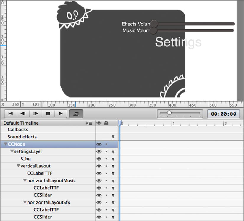
Figure 7-7. The initial result using Box Layout nodes won’t look too good
Let’s quickly dissect what’s happening in Figure 7-7. The verticalLayout node vertically aligns its children: the settings label and the two horizontal layout nodes, each of which contains a Label TTF and a Slider node.
Alignment and spacing leave a lot to be desired. Also, the contents of the verticalLayout node are in reverse order, with the label at the bottom and the horizontalLayoutSfx at the top. This is an unfortunate behavior of Box Layout nodes whose Direction is set to Vertical. It can be easily worked around by dragging the verticalLayout child nodes in the Timeline so that they are in reverse order as they appear on the layer.
The nodes are also not centered on the layer but offset to the right and up. This is because the anchor point of Box Layout nodes defaults to 0, 0. So even though the verticalLayout node’s position is centered on the stage, its content extends to the right and up because of the anchor point. Select the verticalLayout node, and change its Anchor point property to 0.5 for both the X axis and Y axis. This will center the nodes. You should also change the verticalLayout node’s Spacing property to 30 to increase the vertical space between the sliders and the labels.
The sliders are still too wide, though, and they are overlapping the labels. You can decrease the slider’s size by selecting a slider, and then changing the Width of the Preferred size property from its default 200 to 150. Do this for both CCSlider nodes.
The labels still overlap with the sliders, however. This is a spacing issue, and fixed by editing the Spacing property for both the horizontalLayoutMusic and horizontalLayoutSfx box layout nodes. Set the spacing to 20 for both.
Left-Alignment with Box Layout
If you have eagle eyes, you may have spotted that the two labels and sliders still do not align perfectly. The music volume label seems to be slightly more indented than the effects volume label, while the sliders do not start and end at the same X position either. If you want to pronounce this effect, select the effects volume label and change its text to FX Volume. I bet now you can see it. See Figure 7-8 for an example.
Figure 7-8. The labels and sliders do not align correctly
The problem here is that the size of the labels will be different unless they use the exact same text. Even if both labels had the same number of characters, they might still be different in size unless you are using a fixed-width font such as Courier. But Courier is an ugly font: It looks like this.
Fortunately, this can be fixed easily by ensuring that both the horizontalLayoutMusic and horizontalLayoutSfx box layout nodes have the same content size. If you select one and the other, you’ll notice their content size properties differ. The horizontalLayoutMusic node has a width of 246, while the width of horizontalLayoutSfx is just 230 if you’ve set its child label’s text to FX Volume.
This means that the horizontalLayoutSfx content size is 16 points less wide. So you merely need to make it 16 points wider. Consider the Spacing property that you’ve set to 20 for both horizontal layout nodes. You need to increase the spacing for the horizontalLayoutSfx node only.
Select the horizontalLayoutSfx node, and change Spacing to 36—that’s the original 20 plus the missing 16 points. That is all: alignment fixed.
Check the content size of the two horizontal layout nodes to confirm that their width is now the same. Both labels are now left-aligned, as are the sliders.
Center-Alignment with Box Layout
But what if you wanted the labels to be center-aligned and not have to worry about adjusting the Box Layout node’s spacing properties whenever you change a label’s text?
As of now, you have each label and slider aligned horizontally in a Box Layout node, and the two box layout nodes are aligned vertically in another Box Layout node. You can always reverse this setup. In this instance, you could have both labels in a vertically aligned Box Layout node, and both sliders in another vertically aligned Box Layout node. You would then add both vertical box layout nodes to a horizontally aligned Box Layout node.
The result will be different in so far that each vertical column’s width is defined by the node with the largest width. In other words, the widest label now defines the alignment of all labels in relation to all sliders next to the labels.
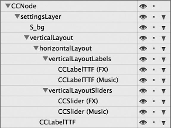
Give this a shot by first removing the horizontalLayoutSfx and horizontalLayoutMusic nodes. This will also remove their child nodes.
Then drag and drop a Box Layout node onto the existing verticalLayout node and name it horizontalLayout. Drag and drop two more Box Layout nodes onto the horizontalLayout node, change their Direction property to Vertical and change their names in the Timeline to verticalLayoutLabels and verticalLayoutSliders.
Then add two Label TTF nodes to the verticalLayoutLabels node, and change their label text to FX Volume and Music Volume, respectively. Also, add two Slider nodes to the verticalLayoutSliders node. You may want to edit the label and slider names in the Timeline so that they reflect whether they refer to music or effects volume. See Figure 7-9 for reference.
Figure 7-9. Labels and sliders aligned in separate vertical columns
Now you still have the same problem as before: the sliders and labels are positioned too tightly. Therefore, set the Spacing property to 25 for the Box Layout nodes named horizontalLayout and verticalLayoutSliders, while verticalLayoutLabels should use a Spacing of 18. Observe how each change affects the nodes involved.
The advantage of this setup is that it behaves a little more like auto-layout, at least considering horizontal alignment, which tends to be more important than vertical alignment. You still have the same problem as before, but now with vertical alignment—hence, the spacing of verticalLayoutLabels needed to be set to 18 to better align them with the sliders.
It’s difficult to get the alignment correct either way when there are Label TTF nodes involved.
Still, if you change a label’s text or font size, or a slider’s width, this new setup will shift the position of the nodes in the other column accordingly. The result will be like those shown in Figure 7-10. Notice the labels are now center-aligned inside their vertical column.
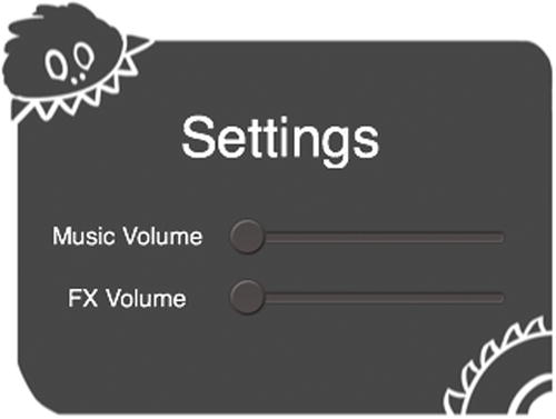
Figure 7-10. The labels are now center-aligned
It’s not possible to give a general recommendation as to which type of layout is preferable—columns first, rows second as in the first example, or rows first and columns second as in the second example. Sometimes one is easier to work with; at other times, the other way is easier. It definitely helps if you can make all nodes involved in a grid-based layout the same dimensions.
But, alas, with labels this is almost never possible unless you are using a fixed-width font. Sometimes padding labels with space characters can help, though, if the alignment doesn’t have to be perfect.
Tip There’s one thing you can experiment with if you need to specify the dimensions of a label really badly: use Button nodes in place of Label TTF! You can set the button’s sprite frames to <NULL> in order to hide the background sprites, and you’ll still be able to change the button’s size via the Preferred size and Max size properties, as well as the label’s Horizontal padding and Vertical padding. You would end up with a label whose extents you can modify.
Changing the Slider Visuals
The default sliders look a bit dull. If you select a slider and go to the Item Properties tab, you’ll notice the CCSlider section shown in Figure 7-11. These settings allow you to change the images associated with the slider’s background (the stretchable line) and the slider’s handle.
Figure 7-11. Slider image settings
Change the Background image to SpriteSheets/UserInterface/S_bar.png, and set the Handle image to SpriteSheets/UserInterface/S_ball.png for the normal state (the topmost setting in Figure 7-11).
Set both the Background and Handle images to <NULL> for the Highlighted State. This means the highlighted state—the state while the user is dragging the handle—will use the same images as the normal state.
Note that the slider background image should have a specific size, since it is stretched as needed. This goes for other stretchable CCControl images as well, such as the button background image. Internally, the slider and button use the CCSprite 9 Slice node for the images; however, that sprite’s properties are not exposed. So if you use an incorrectly sized slider or button background image, it will look anywhere between “not quite correct” to abhorrent—or just not what it’s supposed to look like.
You will find the default slider and button images in any SpriteBuilder project in the ccbResources folder if you need to look up the sizes of the built-in images.
The ccbSliderBgNormal.png and ccbSliderBgHighlighted.png images are used as the slider’s default background images. The images are 28x10 pixels in size but have their Scale from property (shown in Figure 3-8 in Chapter 3) set to 2x. You can use the 28x10 size for your own background images and set the Scale from property for those images to 2x, or you can design them with a 56x20-pixel resolution and not worry about changing the Scale from setting.
Connecting the Sliders
This should be almost second nature by now: Select the effects slider and switch to the Item Code Connections tab. Enter volumeDidChange: in the Selector field, and check the Continuous check box. Also enter _effectsSlider in the Doc root var field.
Repeat this for the music slider: set its Selector to volumeDidChange:, also check the Continuous check box, and then enter _musicSlider in the Doc root var field.
Yes, both sliders use the same selector. Also note the trailing colon in both selectors—if there’s a colon at the end of a selector, the method receives a parameter. The CCControl class that sends these selectors supports sending parameterless methods, as you’ve used before, as well as methods with a single parameter, as in this case. The parameter is always the CCControl object running the selector—in this case, the CCSlider instances. I’ll say more on this shortly.
What’s missing? The custom class for the root node of course! Select the root node, and enter SettingsLayer in the Custom class field.
Now you can move over to Xcode and create the SettingsLayer class in the Source group. See Figure 2-9 in Chapter 2. The SettingsLayer subclass should be CCNode.
Edit SettingsLayer.h to add a property that holds a reference to a MainMenuButtons instance like in Listing 7-3. The @class avoids having to #import the corresponding header file in the SettingsLayer.h header file—something you should strive to avoid when possible.
Listing 7-3. The SettingsLayer interface
#import "CCNode.h"

@class MainMenuButtons;

@interface SettingsLayer : CCNode

@property (weak) MainMenuButtons* mainMenuButtons;

@end
SettingsLayer.m needs the additions highlighted in Listing 7-4.
Listing 7-4. The slider selectors receive the sender as an input parameter
#import "SettingsLayer.h"
#import "MainMenuButtons.h"

@implementation SettingsLayer
{
    __weak CCSlider* _musicSlider;
    __weak CCSlider* _effectsSlider;
}

-(void) volumeDidChange:(CCSlider*)sender
{
    NSLog(@"volume changed, sender: %@", sender);
}

@end
The sender parameter is always of type CCControl*, but since you can be certain that only sliders run this selector, you can safely assume the parameter to be of type CCSlider*. CCSlider is, of course, a subclass of CCControl. The two CCSlider ivars will be used to determine which slider performed the volumeDidChange: selector.
Before you can try out the sliders, you need to load and show the settings layer in MainMenuButtons.m. Specifically, replace the existing shouldShowSettings method with the one in Listing 7-5.
Listing 7-5. Show the settings layer
-(void) shouldShowSettings
{
    SettingsLayer* settingsLayer = (SettingsLayer*)[CCBReader load:
                                                    @"UserInterface/SettingsLayer"];
    settingsLayer.mainMenuButtons = self;
    [self.parent addChild:settingsLayer];

    self.visible = NO;
}
SettingsLayer is loaded by CCBReader, using the full path to the SettingsLayer.ccb file. Then the mainMenuButtons reference is assigned, and the settingsLayer is added as a child not to the MainMenuButtons class but to its parent (the MainScene instance). This is because the MainMenuButtons instance itself is set to invisible—if the settings layer were a child of MainMenuButtons it, too, would be hidden. That would be counterproductive.
You can now run the game and tap the Settings button to open the settings popover. If you move the sliders, you will see lines like the following (shortened) lines logged to the Xcode Console:
[..] volume changed, sender: <CCSlider = 0x10a13ebf0 | Name = musicSlider>
[..] volume changed, sender: <CCSlider = 0x10a135f70 | Name = effectsSlider>
Each sender object is a different instance of CCSlider. If you gave the sliders a name on the Item Properties tab, this name will also be logged.
Dismissing the Settings Popover
You can’t currently dismiss the settings popover. You should fix that by introducing a generic close button. You can use the same button for other layers, and you can use the same concept in general for buttons that should instead forward their selectors to a specific parent class.
But in many cases, you can’t do that because buttons and other CCControl nodes send their selector to the document root—the CCB root node’s custom class. Especially if the Button would be in its own CCB file, you would have to create a separate button for each specific task—perhaps even separate buttons for the same task but different use cases. There’s a simple solution.
Right-click the UserInterface folder and select New File. Name the new document CloseButton.ccb and, for a change, use the Node type before clicking Create. With the root node selected, switch to the Item Code Connections tab and set its custom class. Here it should be named CloseButton.
Then drag a Button node from the Node Library View onto the stage. On the Item Properties tab, you need to change only the button’s sprite frame for the normal state and the Highlighted State to SpriteSheets/UserInterface/S_back.png and change the Background color of the Highlighted State to a light gray color. And, on the Item Code Connections tab, enter shouldClose in the Selector field. You should also clear the Title field to remove all text from the button.
That’s all there is to the button’s CCB file. You should open SettingsLayer.ccb and drag and drop CloseButton.ccb onto the settingsLayer node. Drag and move the button so that it is in the upper right corner of the S_bg background image (position 140x75) as seen in Figure 7-12. Or, if you would rather align it with the corner, you can change the position types to % and use 100, 100 or a little less for the position.
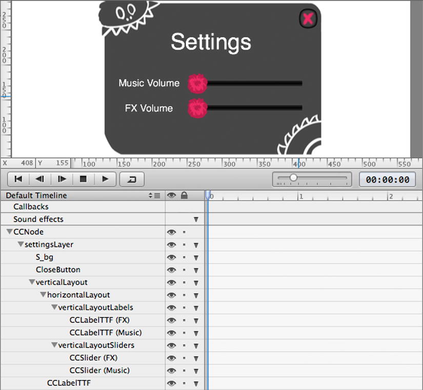
Figure 7-12. The final version of the SettingsLayer.ccb
In Xcode, create yet another Objective-C class with the name CloseButton and using CCNode as the subclass. Open the CloseButton.m file to add the method highlighted in Listing 7-6.
Listing 7-6. Forwarding the CloseButton message to the nearest parent node
#import "CloseButton.h"

@implementation CloseButton

-(void) shouldClose
{
    CCNode* aParent = self.parent;

    do
    {
        if ([aParent respondsToSelector:_cmd])
        {
            [aParent performSelector:_cmd];
            break;
        }

        aParent = aParent.parent;
    }
    while (aParent != nil);
}

@end
The shouldClose method takes the button’s parent before entering the do/while loop. It checks if the parent responds to the _cmd selector, which refers to the shouldClose selector. The use of _cmd simply makes it easier to use this code in other buttons—you don’t have to update the code to use each specific selector. In fact, this code cries out to be added to a class method like in the SceneManager, or maybe a category on CCNode. I’ll leave this as an exercise for you.
If the given parent does respond to the same selector, that selector is performed and the loop ends at the break statement. Otherwise, the aParent variable is set to aParent’s parent, traversing ever closer toward the CCScene instance in the node hierarchy. If, in fact, the CCScene instance is reached before a parent implementing the given selector was found, the loop will also end because the scene’s parent is guaranteed to be nil.
Tip As with the previous use of performSelector, you can ignore the “may cause a leak” warning since the selector does not return an object. (It returns void.)
You can get rid of the warning by using [aParent performSelector:_cmd withObject:nil afterDelay:0] instead. This tells the compiler to set up a timer which, in turn, performs the selector when it fires. When a timer is involved, there can’t be a value returned by the selector; therefore, the compiler stops complaining. The extraneous nil object sent as parameter to the selector is simply ignored if the selector is declared to take no parameters, as in this case. But because there is now a timer involved, and despite the delay being 0, the selector may not necessarily be performed before the current frame gets rendered. So this may introduce an additional delay of a single frame before the selector runs—though that won’t be a problem when dismissing a popover.
What’s left now is to implement the same shouldClose method in a CCB’s custom class that is an ancestor of CloseButton.ccb. In this case, we needn’t go very far, the SettingsLayer should handle it. Move over to SettingsLayer.m to implement the method in Listing 7-7 in its implementation.
Listing 7-7. The shouldClose selector is forwarded to the SettingsLayer instance
-(void) shouldClose
{
    [self removeFromParent];
    [_mainMenuButtons show];
}
So why not just remove aParent directly in the CloseButton’s shouldClose method? (See Listing 7-6.)
Note Separation of concerns is one of the most fundamental programming principles. The close button should notify and leave the implementation to the affected class, rather than assuming that “close” means removeFromParent and nothing else—and not even giving the removed node a chance to know what is being done to it. That would be rude! For more information on separation of concerns, see http://en.wikipedia.org/wiki/Separation_of_concerns.
In the same light, just as the _mainMenuButtons.visible state could have been set from within the SettingsLayer method in Listing 7-7, it’s best to let the MainMenuButtons class handle it in the way it sees fit. Therefore, add the method declaration of Listing 7-8 to MainMenuButtons.h.
Listing 7-8. Declaring the show method
#import "CCNode.h"

@interface MainMenuButtons : CCNode

-(void) show;

@end
And, of course, add the corresponding show method (Listing 7-9) to the MainMenuButtons.m file.
Listing 7-9. The show implementation
-(void) show
{
    self.visible = YES;
}
I’ve added a suggestion as a comment about what you could be doing when the SettingsLayer closes, besides removing the settings layer and showing the buttons. What if both CCB classes needed to play a Timeline animation of their own, one that animates the SettingsLayer out and the MainMenuButtons in?
Whatever that may look like, they would both need to run the animation using their own animationManager instances, and the SettingsLayer would have to respond to a Callbacks selector in order to properly remove itself for good.
Of course, playing an animation is just one of many reasons why a class might want to respond to an event in its own way, rather than having it dictated by some other class. If you follow the principle of separation of concerns, you will find it a lot easier to re-use classes and individual CCB files, within the same project and even in future projects.
The result of your work can be seen in Figure 7-13. Notice that the settings background image is transparent—that’s because the image has been designed to be slightly transparent. You could as well use a fully opaque background and then lower the opacity of the sprite. Same difference.
Figure 7-13. The Main Scene with background and Settings menu
Persisting Game States
Since you’ll want the app settings to persist across launches, and because you’ll soon need to persist other data such as unlocked levels, it’s time to introduce the GameState class that persists the game’s various states.
Introducing the GameState Class
The GameState class will be a wrapper for NSUserDefaults, in order to avoid injecting the same code with the same string keys all over the code. Just like NSUserDefaults, it will be a singleton class. A singleton is a class that can be instantiated only once.
Did I hear you think, “Finally!”? Or was it “Eeww!?!”? I am aware that singletons are a hotly debated topic—some people even have extremely subjective opinions about it. Singletons are frequently overused and/or misused, and especially for beginning programmers they are tempting constructs since the global accessibility makes them super-simple workarounds for passing along data and references between objects.
I just have one plea: before you use a singleton, make sure you have exhausted all other options or dismissed them as impractical. Only relatively few variables and methods need to be global.
Tip For object references in particular, avoid having them at all in a singleton class. Any property of type id or a concrete class pointer is referenced strongly by default, preventing the object from deallocating. Since the singleton itself will never (normally) deallocate during the runtime of the app, any object reference retained by the singleton will also practically become a permanent instance unless explicitly set to nil. And if you have to set a reference to nil explicitly, you’re back to how programming was before ARC—that is, manual reference counting (MRC) and manual memory management in general.
This said, in this particular case with the class being a wrapper for the already-singleton class NSUserDefaults, the use of the GameState class is sound and justifiable. So go ahead and create another Objective-C class in Xcode. You know the drill: right-click the Source group, choose New File, and enter GameState as the name, but make it a subclass of NSObject since singletons need not be, nor should they ever be, CCNode subclasses.
After creating the class, open the GameState.h file and add the lines highlighted in Listing 7-10.
Listing 7-10. Declaring the GameState methods and properties
#import <Foundation/Foundation.h>

@interface GameState : NSObject

+(GameState*) sharedGameState;

@property CGFloat musicVolume;
@property CGFloat effectsVolume;

@end
The sharedGameState class is prefixed with a +, which makes it a class method accessible from any other class. It will return, and if necessary create, the single instance of the GameState class. The properties will enable you to change and retrieve the volumes as if they were properties of the class, when in fact they will run custom setter and getter methods instead of referring to ivars.
Add the code in Listing 7-11 just below the @implementation GameState line in the GameState.m file. This creates a single instance of the class if there is no instance yet. It will then return the instance.
Listing 7-11. Creating a single instance of the class and returning it
+(GameState*) sharedGameState
{
    static GameState* sharedInstance;
    static dispatch_once_t onceToken;

    dispatch_once(&onceToken, ^{
        sharedInstance = [[GameState alloc] init];
    });

    return sharedInstance;
}
Note This version of creating and returning a singleton instance is compliant with ARC. You may have seen Objective-C class singletons done differently on the Internet. Those refer to outdated variants, typically predating ARC, which shouldn’t be used and may not even work anymore.
First, this method declares two static (global) variables. Whether you place them inside the method definition or above and outside doesn’t make a difference for static variables. If it bothers you that they are declared inside the method because that makes them seem like local variables, move them above the method definition. Either way is fine, and in both cases both variables will be initialized to 0 (nil) by default because they are declared static.
The sharedInstance stores the reference to the single class instance, while the onceToken with its funny data type dispatch_once_t is nothing else but an integer variable of type long.
The dispatch_once method runs a block once and only once. The &onceToken means to take the address of the onceToken variable; in other words, a pointer to onceToken is passed in. Only if onceToken is 0 will the block run, and when dispatch_once has run the block once, it will change onceToken to a non-zero value.
The block itself simply allocates and initializes an instance of the class via the familiar alloc/init sequence and assigns the created instance to the static sharedInstance, which retains the instance indefinitely. Any other time the sharedGameState method runs, the block does not run again and the already existing sharedInstance is returned.
Now add the musicVolume property setter and getter methods of Listing 7-12 below the sharedGameState method.
Listing 7-12. The musicVolume property setter and getter methods
static NSString* KeyForMusicVolume = @"musicVolume";

-(void) setMusicVolume:(CGFloat)volume
{
    [[NSUserDefaults standardUserDefaults] setDouble:volume
                                              forKey:KeyForMusicVolume];
}

-(CGFloat) musicVolume
{
    NSNumber* number = [[NSUserDefaults standardUserDefaults]
                        objectForKey:KeyForMusicVolume];
    return (number ? number.doubleValue : 1.0);
}
The NSUserDefaults key is declared as a static NSString* variable so that you don’t have to write the string twice. If you ever made a typo writing the same thing twice over, you’ll understand the value of declaring frequently used strings as static variables.
Property setter and getter methods follow a consistent naming scheme. The getter has the same name as the property; the setter prefixes the property name with set, and the property’s first letter is capitalized.
NSUserDefaults is the class that persists any integral data type and so-called property list objects: NSData, NSString, NSNumber, NSDate, NSArray, or NSDictionary. So it won’t save your custom class just like that. But you can save individual properties of your classes, like the volumes here.
The standardUserDefaults is a singleton accessor just like sharedGameState. The setDouble:forKey: method stores a value of type double for the given key, which must be an NSString* object. The same key is then used in objectForKey: to receive the NSNumber object associated with that key. NSUserDefaults will always return integral data types wrapped in NSNumber objects so that it can return nil to signal that there’s no entry for the given key, which will be the case when you first launch the app.
This fact is used in the return statement in the ?: ternary operator. It reads: if number is nil, return the statement after the question mark (number.doubleValue); otherwise, return the statement after the colon (1.0). So if number is nil, it just returns a safe default value—in this case, the highest possible volume level of 1.0. The parentheses are optional and used only to enhance readability, to clarify that the result of the expression is returned rather than number.
Note The CGFloat type is defined as float on 32-bit devices (for example, iPhone 5C) but is a double type on 64-bit devices (such as iPhone 5S). It is good practice to use setDouble: and doubleValue when the type involved is CGFloat. This prevents the value from being truncated in NSUserDefaults. It is not an issue to store a float value as double, nor is returning a double that will then be truncated to float. In the same light, it is a best practice to always use CGFloat in place of float and use double only if the type has to be double even on 32-bit devices.
Without further ado, add the methods in Listing 7-13 to GameState.m just below the music volume methods. They are the equivalent setter and getter methods for the effectsVolume property.
Listing 7-13. The equivalent setter and getter methods for the effectsVolume property
static NSString* KeyForEffectsVolume = @"effectsVolume";

-(void) setEffectsVolume:(CGFloat)volume
{
    [[NSUserDefaults standardUserDefaults] setDouble:volume
                                              forKey:KeyForEffectsVolume];
}

-(CGFloat) effectsVolume
{
    NSNumber* number = [[NSUserDefaults standardUserDefaults]
                        objectForKey:KeyForEffectsVolume];
    return (number ? number.doubleValue : 1.0);
}
Persisting the Volume Slider Values
With the GameState class in place, you can now connect the sliders with the two volume properties in the GameState singleton to persist their values.
Add the lines highlighted in Listing 7-14 to SettingsLayer.m.
Listing 7-14. Connecting the slider values with GameState properties
#import "SettingsLayer.h"
#import "MainMenuButtons.h"
#import "GameState.h"

@implementation SettingsLayer
{
    __weak CCSlider* _musicSlider;
    __weak CCSlider* _effectsSlider;
}

-(void) didLoadFromCCB
{
    GameState* gameState = [GameState sharedGameState];
    _musicSlider.sliderValue = gameState.musicVolume;
    _effectsSlider.sliderValue = gameState.effectsVolume;
}

-(void) volumeDidChange:(CCSlider*)sender
{
    if (sender == _musicSlider)
    {
        [GameState sharedGameState].musicVolume = _musicSlider.sliderValue;
    }
    else if (sender == _effectsSlider)
    {
        [GameState sharedGameState].effectsVolume = _effectsSlider.sliderValue;
    }
}

-(void) shouldClose
{
    [[NSUserDefaults standardUserDefaults] synchronize];
    [self removeFromParent];
    [_mainMenuButtons show];
}

@end
In didLoadFromCCB, the volume values are assigned to the slider values. Coincidentally, both sliderValue and volumes use the same value range between 0.0 and 1.0. Initially, the GameState volumes will return 1.0, which will position both volume slider handles to the far right. Whenever the volumeDidChange: method runs, the received sender is compared with the existing ivars in order to determine whether it was the music or the effects volume that changed. In both cases, the corresponding GameState property is assigned the current sliderValue.
The shouldClose method now also calls the NSUserDefaults method synchronize to ensure the data in GameState is persisted to disk when the settings popover is closed. This is just a precaution. NSUserDefaults does synchronize its data periodically, but it may not do so soon enough if the app were to crash shortly after closing the settings popover—or if you hit the stop button in Xcode.
Note You certainly should not call synchronize every time an NSUserDefaults value changes, because disk access is a comparatively slow operation. And like I said before about separation of concerns: should a developer really concern himself with the fact that synchronizing NSUserDefaults is required to write the values in GameState to disk? You can certainly improve this by adding a corresponding synchronize method to GameState and call that instead.
If you run the project now and open the settings menu, you’ll notice the slider handles start out at the far right. Drag the slider handles, close the settings popover, and then quit the app or hit the stop button in Xcode.
You can then relaunch the app from Xcode, and you’ll see the slider positions (and thus their values) will have been persisted. You can also try hitting the stop button in Xcode while the settings popover is still open, and any changes to the sliders will most likely have been reverted to their previous state on the next relaunch.
Note Connecting the volume sliders with actual audio volumes will be done in the upcoming audio chapter.
Summary
You now have a nicely animated main menu with a functional settings menu. The volume values are persistently stored by the GameState class, which will be enhanced in the next chapter to store unlocked levels as well.
You also learned about structuring code in the process, as well as how to turn any node into a button and how to forward button events to classes that actually need to handle the event.
You can find the current state of the project in the 08 - Main Menu and Settings folder.