Chapter Four: Laying the groundwork
At some point down the road, you may find yourself educating your client about design, but first you must educate yourself about your client. Without knowing the nitty-gritty details of your client’s business, his reasons for seeking a brand identity, and expectations of the process and the final design, you cannot possibly be successful.
Gathering these details takes a significant investment of time, and more than a little patience, especially when you’re itching to get started on the fun part—the act of designing. But if you scrimp on the time and attention required at this early stage and dive right into the design work, you risk completely missing your client’s mark.
Shaking out the jitters
At the onset of just about any design project, you or your client, or sometimes both of you, will likely be feeling some anxiety. That’s because, as any designer with a bit of experience can attest, the client-designer relationship doesn’t always run smoothly.
For your part, you need to be careful choosing clients, in the same way that clients often choose from a number of designers. Always remember that you’re being hired because you’re the expert. The client should not assume the role of telling you what to do. He should be comfortable simply letting you do what you do best—create iconic brand identities.
If you feel uneasy in any way about the relationship, you should definitely find a way to discuss it with the client. There’s nothing like healthy dialogue to get a clear sense of what is expected, both on your part and on the part of your client.
Most clients will be anxious about the process of having a brand identity created for their business. They see ideas as a risk, and not as a way to secure their mortgage. So the more indepth your initial discussions, the more at ease you will make your clients. It may be that it’s their first time working on an identity project, and it’s up to you to show them how smoothly the process can flow.
It’s all in the design brief
Understanding your client’s motivations involves a lot more than simply setting minds at ease, however. You’re not a mind reader, so a series of very specific questions and answers about your client’s needs and desires is the first order of business. You then turn this information into a design brief that reflects the expectations of both you and your client for the project.
The design brief plays a pivotal role in guiding both you and the client to an effective outcome. There may be stumbling blocks that crop up along the way—your client may disagree with a decision you’ve made, for instance. It’s at points like this when you can return to the details of the brief to back up your stance.
That’s not to say you won’t make design changes as a result of a disagreement—you want to please your client, after all. But the design brief exists to provide both of you with concrete reasons for making decisions throughout the design process.
There are several ways you might obtain the information you need from your client: by telephone, video chat, in person, or by email. I find that with many of my clients, it’s useful to pose questions in the form of an online questionnaire or email. With others, I might feel that more face-to-face time is necessary. What matters most is that you’re able to extract as much relevant information as possible, and at the beginning of the process.
Gathering preliminary information
You’ll want to note the following basic information before posing your more indepth questions:
• The organization’s name
• Its location
• Number of years in business
• Number of employees
• The product or service sold
• The challenges faced
• Who the competitors are
In addition, you need to determine who the decision-maker is and whether you will be dealing directly with that person throughout the project. Dealing with the decision-maker—in other words, the person or committee who has the final say over the company’s brand identity—isn’t as critical during the information-gathering stage as it is when you present your ideas. We’ll talk more about this in Chapter 8.
When working with larger organizations, it will be likely that your point of contact is an employee, rather than the CEO or marketing director. This person will help you to gather all the necessary information to be included in the design brief. Later in the process, he most likely will introduce you to the decision-maker or a committee. But for now, the focus is on information gathering.
Asking the tougher questions
The crux of a healthy design brief lies in the questions you pose. Obtaining this information isn’t difficult. You just need to ask.
What follows are some suggested questions to use as a starting point. Keep in mind, however, as you form your own list, that the needs of each industry and every company vary.
What does your audience care about?
Asking this question not only helps focus and orient your creative efforts around what appeals to your client’s customers, but it also shows that you have an interest in your client’s customers, and not a simple wish to please personal tastes.
How do people learn about your product, organization, or service?
Knowing how your client reaches out to its customer base will help you picture how and where the new logo will be used. This knowledge will affect the type of design you suggest and ultimately create. If the company promotes itself via leaflets at trade events, you might remind the decision-maker that his multicolor rainbow effect will cost more to produce than, say, a cool gray monotone design. Having an understanding of the client’s promotional strategies not only allows you to play a role in helping the company stay on track, but also enables you to deliver a cost-effective design that works on many levels.
Why does your audience need a new brand identity?
In answering this question, your client is forced to articulate why a new identity design is necessary. Sometimes companies are reacting to their competitors—a rival may have launched a new visual system, for instance—and the company wants to respond by doing the same. In this case, encourage your client to proceed slowly and cautiously, and refrain from responding to a gut reaction. The company may have built enormous equity around a strong and longstanding brand identity, so it’s vital not to disregard it entirely and all at once.
A better idea might be to refine or refresh the current system, rather than opt for a complete overhaul. We’ll talk more about this in the next chapter.
What words do you want people to associate with your company?
You may want to suggest a few adjectives, such as “creative,” “professional,” “traditional,” or “playful,” to help get your client started. The replies can direct you towards specific styles of design.
Generally, what logos do you think will appeal to your customers, and why?
By switching the focus away from your client’s individual design tastes and onto those of the customer, you keep the process aimed at the good of the company as a whole, and not just the personal preference of one person.
How many people are responsible for use of the brand identity?
It’s important for your client to keep a tight reign over the use of the work you create. As an extreme example, you don’t want a low resolution “saved for web” logo file to be enlarged and used on the cover of a printed sales manual. It defeats the purpose of hiring a specialist. By asking this question, you invite a followup conversation about the importance of brand guidelines. You might even, at some point, offer to create a logo style guide that illustrates for the company how to use, and not use, the design.
Give your client time and space
These questions will be enough to get you started. You likely will have more to add, given that every industry has its own specific requirements, quirks, and expectations.
As you pose your set of questions, make sure that you don’t rush the client to answer them. We all appreciate some space to consider answers in our own time, and you’ll end up gaining more insight, too. Welcome the opportunity to answer seemingly off-topic questions, because at this stage every detail helps.
But maintain the focus
In addition, don’t allow your client to confuse this as a chance to dictate terms; instead it’s an opportunity to really focus on the project, and on the benefits the outcome will achieve. It’s precisely this level of focus that will provide you with all of the information you need to do your job.
The answers you’re provided should spur some ongoing discussion about design ideas.
Homework time
Once you’ve gathered all of the preliminary information you’ve sought, spend some time very carefully reviewing it. What are your client’s concerns?
What does the company want to play up? What is it truly selling? And how does the company want to present itself in the market? Logos that are pretty may win awards, but they don’t always win marketshare.
The next step of the information-gathering stage involves conducting your own field research. Learn as much as you can about the company, its history, its current brand identity and the effect it has had on market perception. And don’t forget to review any brand identities it has used in the past. These additional insights are critical. You also need to focus on how your client’s competitors have branded themselves, picking up on any weaknesses you perceive and using them to your advantage in your design. After all, if your client is to win, there needs to be a loser.
Assembling the design brief
Documenting the information can be a matter of taking notes during a meeting (having a minute taker present can be a big help), recording telephone conversations, editing an email back-and-forth, and stripping the chat down to just the meaty parts. Did I mention that designers need to be editors, too?
It’s wise to create a succinct, easily accessed, and easily shared document that you or your client can refer to at any time. You’ll want to send a copy to those involved in the project. And keep a copy in hand to use in followup meetings.
For your part, you want to use the brief to help you keep your designs focused. I’m sure that I’m not the only designer to have ever entertained some pretty far-fetched ideas every now and then. Relevancy—one of the elements we’ve already discussed—is key, and your brief can help you stay on track.
Let’s look at a few instances in which designers extracted critical information from their clients and then used it to create very effective results.
A mission and some objectives hold the key
Clive’s is a specialist organic bakery set in the heart of Devon, England. Since 1986, the company has been making pies stuffed to the bursting point with unique fillings inspired by culinary traditions from around the world.
In 2005, Clive’s asked English studio biz-R to rebrand Clive’s (at the time the company was named Buckfast Organic Bakery) because its existing identity had become dated, inconsistent, and uninspiring. The brand was also failing to communicate the vibrancy behind the company and its unique range of vegetarian and gluten-free pies, cakes, and pastries.
biz-R got the creative process rolling by creating a design brief that included a description of Clive’s mission, as well as the project’s objectives.
The mission was to contemporize the bakery’s image and emphasize the uniqueness of the product. The new brand objectives aimed to communicate the dynamic personality of the company, highlight the organic nature of the products and their homemade quality, convey the healthy, yet fun and tasty recipes, and introduce Clive’s to a new generation of health-conscious, brand-aware consumers.
Clive’s
By biz-R 2005
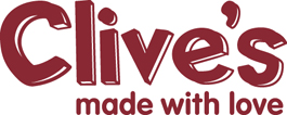
biz-R’s solution was to create a logo that combined a handrawn typeface with clean modern type, communicating the forward-thinking values of the company, together with the homemade qualities of the products.
The strapline “made with love” emphasizes the handmade, healthy, natural, and organic quality of Clive’s products.
The company wanted Clive’s new identity applied to its packaging, marketing materials, website, and company vehicles. Biz-R created a new design for the packaging that combined the logo with “Pot of” typography and colorful graphics.
Clive’s
Clive’s implemented its new identity across the entire business.

Large, distinctive typography, bright colors, and bold photography focusing on fresh organic ingredients make the brand easily identifiable, giving it a contemporary, confident appearance and appealing to a much wider audience than before.
Field research to the rescue
When Federal Express Corporation invented the overnight shipping business in 1973, the market was one-dimensional: one country (USA), one package type (letter), and one delivery time (10:30 a.m.). By 1992, the company had added new services (end of next business day, and two-day economy) and was shipping packages and freight to 186 countries. But by then, a host of competitors had emerged and created the perception of a commodity industry driven by price. As the most expensive service, Federal Express was losing market share.
Federal Express Corporation
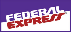
An earlier brand identity
The company clearly needed to better communicate its broad service offering and reaffirm its position as the industry leader. It hired global design firm Landor in 1994 to create a new brand identity that would help reposition the delivery corporation.
For Landor, market research was key in producing an enduring and effective design. Landor and Federal Express assigned both their internal research groups to collaborate for a nine-month global research study. The study revealed that businesses and consumers were unaware of the global scope and full-service capabilities offered by FedEx, believing that the company shipped only overnight and only within the United States.
Landor conducted additional research about the Federal Express name itself. It found that many people negatively associated the word “federal” with government and bureaucracy, and the word “express” was overused. In the United States alone, over 900 company names were employing this word.
On a more upbeat note for Federal Express, the research also revealed that businesses and consumers had been shortening the company’s name and turning it into a generic verb—as in “I need to FedEx a package,” regardless which shipper was being used. In addition, research questions posed to the company’s target audience confirmed that the shortened form of the name, “FedEx,” conveyed a greater sense of speed, technology, and innovation than the formal name.
Landor advised Federal Express senior management to adopt “FedEx” as its communicative name—to better communicate the breadth of its services—while retaining “Federal Express Corporation” as the full legal name of the organization.
Over 300 designs were created in the exploratory phase, ranging from evolutionary (developed from the original) to revolutionary (altogether different concepts).
FedEx logo options

The new visual identity and abbreviated company name that Landor designed allows for greater consistency and impact in different applications, ranging from packages and drop boxes to vehicles, aircraft, customer service centers, and uniforms.
Federal Express Corporation
By Lindon Leader (while at Landor) 1994

Landor and FedEx spent a great deal of time and energy researching the marketplace, discovering how the Federal Express brand was perceived, where they needed to improve, and how to do it. This is a fine example in which indepth preparation led to an iconic solution.
Bringing the details of client discussions to life
Designer Maggie Macnab was asked to create a new logo for the Heart Hospital of New Mexico. As a teacher who has taught brand identity at the University of New Mexico for more than 10 years and is a past president of the Communication Artists of New Mexico, Maggie felt it was vital to clarify her client’s expectations from the very outset.
During the information gathering stage, Maggie had meetings with the hospital design committee (comprising doctors from merging small practices and the funding insurance company). She asked what was required from the brand project, and was given these criteria:
• The identity must have a New Mexico “look and feel.”
• It must (obviously) be directly related to cardiology.
• The patients need to know that they’re in very good hands.
Broader research on New Mexico told Maggie that the Zia symbol was being used as the state logo, and had been for more than 100 years. The Zia are an indigenous tribe centered at Zia Pueblo, an Indian reservation in New Mexico. They are known for their pottery and the use of the Zia emblem. Zia Pueblo claims this design; it’s a prevalent indigenous pictograph found in the New Mexico area.
The Zia sun symbol

“I knew there was something about all three project criteria in the Zia symbol, so I encouraged the doctors to ask for an audience with the elders at Zia Pueblo to request the use of their identifying mark,” said Maggie. “The Zia is an ancient and sacred design, and I was well aware of Zia Pueblo’s issue with people randomly slapping it on the side of any old work truck as an identity, which happens often in New Mexico.”
After dozens of experimental iterations and sketches, Maggie integrated the palm of a hand with a heart shape, and the Zia became the mark symbolizing both New Mexico and the ministering of hands-on care.
Heart Hospital of New Mexico
By Maggie Macnab 1998

Maggie’s thoroughness during the initial project stages not only convinced Zia Pueblo to grant the use of the Zia symbol, but they also blessed the hospital grounds and danced at the groundbreaking ceremony. Excellent PR for the fledgling heart hospital.
“It’s always a good idea to be sensitive to things like this,” added Maggie. “Not only are you doing the right thing by showing common courtesy, but respecting traditions and differences can bring great and unexpected things together—very important for collective acceptance.”
Culling the adjectives supplied by the client
Earlier in the chapter, I mentioned the importance of asking clients which words they want people to associate with their brand identity. This can be very fruitful information for a designer.
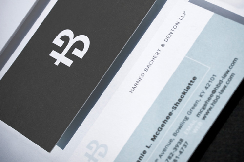
Executives at Harned, Bachert & Denton (HBD), a law firm in Bowling Green, Kentucky, felt that HBD’s brand identity didn’t effectively portray the experience, history, and integrity that the firm had built over nearly 20 years. They wanted a logo that distinguished them as a professional and unified group of ethical attorneys.
Harned, Bachert & Denton, LLP
Old logo design
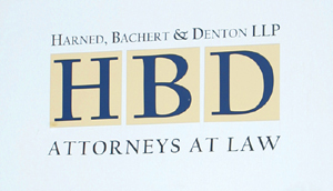
The old HBD monogram lacked any sense of design style and was very easy to forget, so designer Stephen Lee Ogden was given the task of creating an effective redesign. Meetings, chats, and email between client and design team helped Stephen learn what was needed for the new identity.
The following words were specified as the ideal fit: professional, ethical, strong, competent, unified, relevant, experienced, detail-oriented, and approachable. Ogden relied heavily on these adjectives to help him shape the new icon.
Harned Bachert & Denton, LLP
By Stephen Lee Ogden, during employment at Earnhart+Friends of Bowling Green, Kentucky 2007
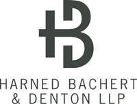
The rational behind the icon was that the simple, bold shape would come to symbolize a unified firm. All of the firm’s partners bought into the idea.
When you take the time up front to really get to know your client and the related industry, you not only stand a much greater chance of delivering a design you respect and they love, but you also place yourself in an optimal position for educating them about designs at some point down the road. Once they see what you’re made of, they may start to really listen to your feedback and even follow your lead.
HBD business card design
Contemporary and professional, the mark works equally well without the accompanying business name.
