
Chapter 2. Data Exploration
Exploration vs. Confirmation
Whenever you work with data, it’s helpful to imagine breaking up your analysis into two completely separate parts: exploration and confirmation. The distinction between exploratory data analysis and confirmatory data analysis comes down to us from the famous John Tukey,[6] who emphasized the importance of designing simple tools for practical data analysis. In Tukey’s mind, the exploratory steps in data analysis involve using summary tables and basic visualizations to search for hidden patterns in your data. In this chapter, we’ll describe some of the basic tools that R provides for summarizing your data numerically and then we’ll teach you how to make sense of the results. After that, we’ll show you some of the tools that exist in R for visualizing your data; at the same time, we’ll give you a whirlwind tour of the basic visual patterns that you should keep an eye out for in any visualization.
But, before you start searching through your first data set, we should warn you about a real danger that’s present whenever you explore data: you’re likely to find patterns that aren’t really there. The human mind is designed to find patterns in the world and will do so even when those patterns are just quirks of chance. You don’t need a degree in statistics to know that we human beings will easily find shapes in clouds after looking at them for only a few seconds. And plenty of people have convinced themselves that they’ve discovered hidden messages in run-of-the-mill texts like Shakespeare’s plays. Because we humans are vulnerable to discovering patterns that won’t stand up to careful scrutiny, the exploratory step in data analysis can’t exist in isolation: it needs to be accompanied by a confirmatory step. Think of confirmatory data analysis as a sort of mental hygiene routine that we use to clean off our beliefs about the world after we’ve gone slogging through the messy—and sometimes lawless—world of exploratory data visualization.
Confirmatory data analysis usually employs two methods:
Testing a formal model of the pattern that you think you’ve found on a new data set you didn’t use to find the pattern
Using probability theory to test whether the patterns you’ve found in your original data set could reasonably have been produced by chance.
Because confirmatory data analysis requires more math than exploratory data analysis, this chapter is exclusively concerned with exploratory tools. In practice, that means that we’ll focus on numeric summaries of your data and some standard visualization tools. The numerical summaries we’ll describe are the stuff of introductory statistics courses: means, modes, percentiles, medians, standard deviations, and variances. The visualization tools we’ll use are also some of the most basic tools that you would learn about in an “Intro to Stats” course: histograms, kernel density estimates, and scatterplots. We think simple visualizations are often underappreciated and we hope we can convince you that you can often learn a lot about your data using only these basic tools. Much more sophisticated techniques will come up in the later chapters of this book, but the intuitions for analyzing data are best built up while working with the simplest of tools.
What is Data?
Before we start to describe some of the basic tools that you can use to explore your data, we should agree on what we mean when we use the word “data”. It would be easy to write an entire book about the possible definitions of the word “data,” because there are so many important questions you might want to ask about any so-called data set. For example, you often would want to know how the data you have was generated and whether the data can reasonably be expected to be representative of the population you truly want to study: while you could learn a lot about the social structure of the Amazonian Indians by studying records of their marriages, it’s not clear that you’d learn something that applied very well to other cultures in the process. The interpretation of data requires that you know something about the source of your data: often the only way to separate causation from correlation is to know whether the data you’re working with was generated experimentally or was only recorded observationally because experimental data wasn’t available.
While these sorts of concerns are interesting issues that we hope
you’ll want to learn about some day,[7] we’re going to completely avoid issues of data collection
during this book. For our purposes, the subtler philosophical issues of
data analysis are going to be treated as if they were perfectly
separable from the sorts of prediction problems for which we’re going to
use machine learning techniques. In the interest of pragmatism, we’re
therefore going to use the following definition throughout the rest of
this book: A “data set” is nothing more than a big table of numbers and
strings in which every row describes a single observation of the real
world and every column describes a single attribute that was measured
for each of the observations represented by the rows. If you’re at all
familiar with databases, this definition of data should match your
intuitions about the structure of database tables pretty closely. If
you’re worried that your data set isn’t really a single table, let’s
just pretend that you’ve used R’s merge, SQL’s
JOIN family of operations, or some of the other tools we
described earlier to create a data set that looks like a single
table.
We’ll call this the “data as rectangles” model. While this viewpoint is clearly a substantial simplification, it will let us motivate many of the big ideas of data analysis visually, which we hope makes what are otherwise very abstract ideas a little more tangible. And the “data as rectangles” model serves another purpose: it lets us freely exploit ideas from database design as well as ideas from pure mathematics. If you’re worried that you don’t know much about matrices, don’t worry: throughout this book you’ll always be able to think of matrices as nothing more than two-dimensional arrays, i.e., a big table. As long as we assume we’ve working with rectangular arrays, we’ll be able to use lots of powerful mathematical techniques without having to think very carefully about the actual mathematical operations being performed. For example, we won’t explicitly use matrix multiplication anywhere in this book, even though almost every technique we’re going to exploit can be described in terms of matrix multiplications, whether it’s the standard linear regression model or the modern matrix factorization techniques that have become so popular lately thanks to the Netflix prize.
Because we’ll treat data rectangles, tables, and matrices interchangeably, we ask for your patience when we switch back and forth between those terms throughout this book. Whatever term we use, you should just remember that we’re thinking of something like Table 2-1 when we talk about data.
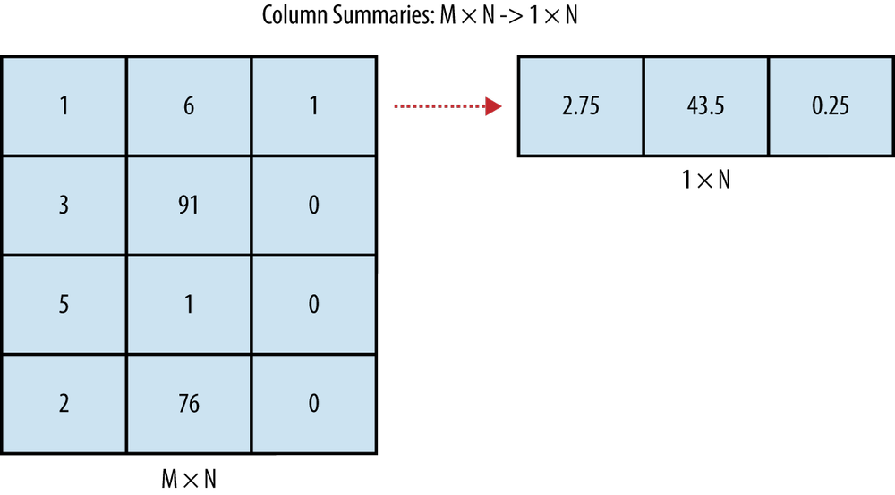
Since data consists of rectangles, we can actually draw pictures of the sorts of operations we’ll perform pretty easily. A numerical data summary involves reducing all of the rows from your table into a few numbers—often just a single number for each column in your data set. An example of this type of data summary is shown in Figure 2-1.
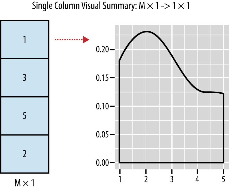
In contrast to a numerical summary, a visualization of a single column’s contents usually involves reducing all of the rows from a single column in your data into one image. An example of a visual summary of a single column is shown in Figure 2-2.
Beyond the tools you can use for analyzing isolated columns, there are lots of tools you can use to understand the relationships between multiple columns in your data set. For example, computing the correlation between two columns turns all of the rows from two columns of your table into a single number that summarizes the strength of the relationship between those two columns. An example of this is shown in Figure 2-3.

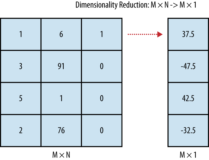
And there are other tools that go further: beyond relating pairs of columns together, you might want to reduce the number of columns in your data set if you think there’s a lot of redundancy. Replacing many columns in your data set with a few columns or even just one is called dimensionality reduction. An example of what dimensionality reduction techniques achieve is shown in Figure 2-4.
As the pictures in Figures 2-1 to 2-4 suggest, summary statistics and dimensionality reduction move along opposite directions: summary statistics tell you something about how all of the rows in your data set behave when you move along a single column, while dimensionality reduction tools let you replace all of the columns in your data with a small number of columns that have a unique value for every row. When you’re exploring data, both of these approaches can be helpful, because they allow you to turn the mountains of data you sometimes get handed into something that’s immediately comprehensible.
Inferring the Types of Columns in Your Data
Before you do anything else with a new data set, you should try to find out what each column in your current table represents. Some people like to call this information a data dictionary, by which they mean that you might be handed a short verbal description of every column in the data set. For example, imagine that you had the unlabeled data set in Table 2-2 given to you.
| ... | ... | ... |
| “1” | 73.847017017515 | 241.893563180437 |
| “0” | 58.9107320370127 | 102.088326367840 |
Without any identifying information, it’s really hard to know what to make of these numbers. Indeed, as a starting point you should figure out the type of each column: is the first column really a string, even though it looks like it contains only 0’s and 1’s? In the UFO example in the first chapter, we immediately labeled all of the columns of the data set we were given. When we’re given a data set without labels, we can use some of the type determination functions built into R. Three of most important of these functions are shown in Table 2-3.
| R function | Description |
is.numeric | Returns TRUE if the entries of the vector are numbers, which can be either integers or floating points. Returns FALSE otherwise. |
is.character | Returns TRUE if the entries of the vector are character strings. R does not provide a single character data type. Returns FALSE otherwise. |
is.factor | Returns TRUE if the entries of the vector are levels of a factor, which is a data type used by R to represent categorical information (and FALSE otherwise). If you’ve used enumerations in SQL, a factor is somewhat analogous. It differs from a character vector in both its hidden internal representation and semantics: most statistical functions in R work on numeric vectors or factor vectors, but not on character vectors. |
Having basic type information about each column can be very important as we move forward, because a single R function will often do different things depending of the type of its inputs. Those 0’s and 1’s stored as characters in our current data set need to be translated into numbers before we can use some of the built-in functions in R, but they actually need to be converted into factors if we’re going to use some other built-in functions. In part, this tendency to move back and forth between types comes from a general tradition in machine learning for dealing with categorical distinctions. Many variables that really work like labels or categories are encoded mathematically as 0 and 1. You can think of these numbers as if they were Boolean values: 0 might indicate that an email is not spam, while a 1 might indicate that the email is spam. This specific use of 0’s and 1’s to describe qualitative properties of an object is often called dummy coding in machine learning and statistics. The dummy coding system should be distinguished from R’s factors, which express qualitative properties using explicit labels.
Warning
Factors in R can be thought of as labels, but the labels are actually encoded numerically in the background: when the programmer accesses the label, the numeric values are translated into the character labels specified in an indexed array of character strings. Because R uses a numeric coding in the background, naive attempts to convert the labels for an R factor into numbers will produce strange results, since you’ll be given the actual encoding scheme’s numbers rather than the numbers associated with the labels for the factor.
Tables 2-4 to 2-6 show the same data, but the data has been described with three different encoding schemes:
In the first table, IsSpam is meant to be treated directly as a
factor in R, which is one way to express qualitative distinctions. In
practice, it might be loaded as a factor or as a string depending on the
data loading function you use: see the stringsAsFactors
parameter that was described in Loading libraries and the data for details. With every new data
set, you’ll need to figure out whether the values are being loaded
properly as factors or as strings after you’ve decided how you would
like each column to be treated by R.
Note
If you are unsure, it is often better to begin by loading things as strings. You can always convert a string column to a factor column later.
In the second table, IsSpam is still a qualitative concept, but
it’s being encoded using numeric values that represent a Boolean
distinction: 1 means IsSpam is true, while 0 means IsSpam is false. This
style of numeric coding is actually required by some machine learning
algorithms. For example, glm, the default function in R for
using logistic regression, assumes that your variables are dummy
coded.
Finally, in the third table, we show another type of numeric encoding for the same qualitative concept: in this encoding system, people use +1 and -1 instead of 1 and 0. This style of encoding qualitative distinctions is very popular with physicists, so you will eventually see it as you read more about machine learning. In this book, though, we’ll completely avoid using this style of notation since we think it’s a needless source of confusion to move back and forth between different ways of expressing the same distinctions.
Inferring Meaning
Even after you’ve figured out the type of each column, you may still not know what a column means. Determining what an unlabeled table of numbers describes can be surprisingly difficult. Let’s return to the table that we showed earlier.
| ... | ... | ... |
| “1” | 73.847017017515 | 241.893563180437 |
| “0” | 58.9107320370127 | 102.088326367840 |
How much more sense does this table make if we tell you that (a) the rows describe individual people, (b) the first column is a dummy code indicating whether the person is male (written as a 1) or female (written as 0), (c) the second column is the person’s height in inches and (d) the third column is the person’s weight in pounds? The numbers suddenly have meaning when they’re put into proper context and that will shape how you think about them.
But, sadly, you will sometimes not be given this sort of interpretative information. In those cases, human intuition, aided by liberally searching through Google, is often the only tool that we can suggest to you. Thankfully, your intuition can be substantially improved after you’ve looked at some numerical and visual summaries of the columns whose meaning you don’t understand.
Numeric Summaries
One of the best ways to start making sense of a new data set is to
compute simple numeric summaries of all of the columns. R is very well
suited to doing this. If you’ve got just one column from a data set as a
vector, summary will spit out the most obvious values you
should look at first:
data.file <- file.path('data', '01_heights_weights_genders.csv')
heights.weights <- read.csv(data.file, header = TRUE, sep = ',')
heights <- with(heights.weights, Height)
summary(heights)

# Min. 1st Qu.  Median    Mean 3rd Qu.    Max.
#54.26   63.51   66.32   66.37   69.17   79.00
Asking for the summary of a vector of numbers from R
will give you the numbers you saw above:
The minimum value in the vector.
The first quartile (which is also called the 25th percentile and is the smallest number that’s bigger than 25% of your data).
The median (aka the 50th percentile).
The mean.
The 3rd quartile (aka the 75th percentile).
The maximum value.
This is close to everything you should ask for when you want a
quick numeric summary of a data set. All that’s really missing is the
standard deviation of the column entries, a numeric summary we’ll define
later on in this chapter. In the following pages, we’ll describe how to
compute each of the numbers that summary produces
separately and then we’ll show you how to interpret them.
Means, Medians, and Modes
Learning to tell means and medians apart is one of the most tedious parts of the typical “Intro to Stats” class. It can take a little while to become familiar with those concepts, but we really do believe that you’ll need to be able to tell them apart if you want to seriously work with data. In the interests of better pedagogy, we’ll try to hammer home the meaning of those terms in two pretty different ways. First, we’ll show you how to compute the mean and the median algorithmically. For most hackers, code is a more natural language to express ideas than mathematical symbols, so we think that rolling your own functions to compute means and medians will probably make more sense than showing you the defining equations for those two statistics. And later in this chapter, we’ll show you how you can tell when the mean and median are different, by looking at the shape of your data in histograms and density plots.
Computing the mean is incredibly easy. In R, you would normally
use the mean function. Of course, telling you to use a
black-box function doesn’t convey much of the intuition for what a mean
is, so let’s implement our own version of mean, which we’ll
call my.mean. It’s just one line of R code, because the
relevant concepts are already available as two other functions in R:
sum and length.
my.mean <- function(x) {
  return(sum(x) / length(x))
}
That single line of code is all there is to a mean: you just add
up all the numbers in your vector and then divide the sum by the length
of the vector. As you’d expect, this function produces the average value
of the numbers in your vector, x. The mean is so easy to
compute in part because it doesn’t have anything to do with the sorted
positions of the numbers in your list.
The median is just the opposite: it entirely depends upon the
relative position of the numbers in your list. In R, you would normally
compute the median using median, but let’s write our
version, which we’ll call my.median:
my.median <- function(x) {
  sorted.x <- sort(x)

  if (length(x) %% 2 == 0)
  {
    indices <- c(length(x) / 2, length(x) / 2 + 1)
    return(mean(sorted.x[indices]))
  }
  else
  {
    index <- ceiling(length(x) / 2)
    return(sorted.x[index])
  }
}
Just counting lines of code should tell you that the median takes a little bit more work to compute than the mean. As a first step, we had to sort the vector, because the median is essentially the number that’s in the middle of your sorted vector. That’s why the median is also called the 50th percentile or the 2nd quartile. Once you’ve sorted a vector, you can easily compute any of the other percentiles or quantiles just by splitting the list into two parts somewhere else along its length. To get the 25th percentile (also known as the 1st quartile), you can split the list at one quarter of its length.
The only problem with these informal definitions in terms of length is that they don’t exactly make sense if your list has an even number of entries. When there’s no single number that’s exactly in the middle of your data set, you need to do some trickery to produce the median. The code we wrote above handles the even length vector case by taking the average of the two entries that would have been the median if only the list had contained an odd number of entries.
To make that point clear, here is a simple example in which the median has to be invented by averaging entries and another case in which the median is exactly equal to the middle entry of the vector:
my.vector <- c(0, 100)
my.vector
# [1]   0 100
mean(my.vector)
#[1] 50
median(my.vector)
#[1] 50
my.vector <- c(0, 0, 100)
mean(my.vector)
#[1] 33.33333
median(my.vector)
#[1] 0
Returning to our original heights and weights data set, let’s compute the mean and median of the heights data. This will also give us an opportunity to test our code:
my.mean(heights)
#[1] 66.36756
my.median(heights)
#[1] 66.31807
mean(heights) - my.mean(heights)
#[1] 0
median(heights) - my.median(heights)
#[1] 0
The mean and median in this example are very close to each other. In a little bit, we’ll explain why we should expect that to be the case given the shape of the data we’re working with.
Since we’ve just described two of the three most prominent numbers from an intro stats course, you may be wondering why we haven’t mentioned the mode. We’ll talk about modes in a bit, but there’s a reason we’ve ignored it so far: the mode, unlike the mean or median, doesn’t always have a simple definition for the kinds of vectors we’ve been working with. Because it’s not easy to automate, R doesn’t have a built-in function that will produce the mode of a vector of numbers.
Note
The reason that it’s complicated to define the mode of an arbitrary vector is that you need the numbers in the vector to repeat if you’re going to define the mode numerically. When the numbers in a vector could be arbitrary floating point values, it’s unlikely that any single numeric value would ever be repeated in the vector. For that reason, modes are only really defined visually for many kinds of data sets.
All that said, if you’re still not sure about the math and are wondering what the mode should be in theory, it’s supposed to be the number that occurs most often in your data set.
Quantiles
As we said just a moment ago, the median is the number that occurs
at the 50% point in your data. To get a better sense of the range of
your data, you might want to know what value is the lowest point in your
data. That’s the minimum value of your data set, which is computed using
min in R:
min(heights)
#[1] 54.26313
And to get the highest/maximum point in your data set, you should
use max in R:
max(heights)
#[1] 78.99874
Together, the min and max define the
range of your data:
c(min(heights), max(heights))
#[1] 54.26313 78.99874
range(heights)
#[1] 54.26313 78.99874
Another way of thinking of these numbers is to think of the
min as the number which 0% of your data is below and the
max as the number which 100% of your data is below.
Thinking that way leads to a natural extension: how can you find the
number which N% of your data is below? The answer to that question is to
use the quantile function in R. The Nth quantile is exactly
the number which N% of your data is below.
By default, quantile will tell you the 0%, 25%, 50%,
75% and 100% points in your data:
quantile(heights)
#      0%      25%      50%      75%     100%
#54.26313 63.50562 66.31807 69.17426 78.99874
To get other locations, you can pass in the cut-offs you want as
another argument to quantile called
probs:
quantile(heights, probs = seq(0, 1, by = 0.20))
#      0%      20%      40%      60%      80%     100%
#54.26313 62.85901 65.19422 67.43537 69.81162 78.99874
Here we’ve used the seq function to produce a
sequence of values between 0 and 1 that grows in 0.20 increments:
seq(0, 1, by = 0.20)
#[1] 0.0 0.2 0.4 0.6 0.8 1.0
Quantiles don’t get emphasized as much in traditional statistics texts as means and medians, but they can be just as useful. If you run a customer service branch and keep records of how long it takes to respond to a customer’s concerns, you might benefit a lot more from worrying about what happens to the first 99% of your customers than worrying about what happens to the median customer. And the mean customer might be even less informative if your data has a strange shape.
Standard Deviations and Variances
The mean and median of a list of numbers are both measures of something central: the median is literally in the center of list, while the mean is only effectively in the center once you’ve weighted all the items in the list by their values.
But central tendencies are only one thing you might want to know
about your data. Equally important is to ask how far apart you expect
the typical values to be, which we’ll call the spread of your data. You
can imagine defining the range of your data in a lot of ways. As we
already said, you could use the definition that the range
function implements: the range is defined by the min and
max values. This definition misses two things we might want
from a reasonable definition of spread:
The spread should only include most of the data, not all of it.
The spread shouldn’t be completely determined by the two most extreme values in your data set, which are often outlier values that are not representative of your data set as a whole.
The min and max will match the outliers
perfectly, which makes them fairly brittle definitions of spread.
Another way to think about what’s wrong with the min and
max definition of range is to consider what happens if you
change the rest of your data while leaving those two extreme values
unchanged. In practice, you can move the rest of the data as much as
you’d like inside those limits and still get the same min
and max. In other words, the definition of range based on
min and max effectively only depends on two of
your data points, whether or not you have two data points or two million
data points. Because you shouldn’t trust any summary of your data that’s
insensitive to the vast majority of the points in the data, we’ll move
on to a better definition of the spread of a data set.
Now, there are a lot of ways you could try to meet the requirements we described above for a good numeric summary of data. For example, you could see what range contains 50% of your data and is centered around the median. In R, this is quite easy to do:
c(quantile(heights, probs = 0.25), quantile(heights, probs = 0.75))
Or you might want to be more inclusive and find a range that contains 95% of the data:
c(quantile(heights, probs = 0.025), quantile(heights, probs = 0.975))
These are actually really good measures of the spread of your data. When you work with more advanced statistical methods, these sorts of ranges will come up again and again. But, historically, statisticians have used a somewhat different measure of spread: specifically, they’ve used a definition called the variance. The idea is roughly to measure how far, on average, a given number in your data set is from the mean value. Rather than give a formal mathematical definition, let’s define the variance computationally by writing our own variance function:
my.var <- function(x) {
  m <- mean(x)
  return(sum((x - m) ^ 2) / length(x))
}
As always, let’s check that our implementation works by comparing
it with R’s var:
my.var(heights) - var(heights)
We’re only doing a so-so job of matching R’s implementation of
var. In theory, there could be a few reasons for this, most
of which are examples of how things can go wrong when you assume
floating point arithmetic is perfectly accurate. But there’s actually
another reason that our code isn’t working the same way that the
built-in function does in R: the formal definition of variance doesn’t
divide out by the length of a vector, but rather by the length of the
vector minus one. This is done
because the variance that you can estimate from empirical data turns
out, for fairly subtle reasons, to be biased downwards from its true
value. To fix this for a data set with n points, you
normally multiply your estimate of the variance by a scaling factor of
n / (n - 1), which leads to an improved version of
my.var:
my.var <- function(x) {
  m <- mean(x)
  return(sum((x - m) ^ 2) / (length(x) - 1))
}
my.var(heights) - var(heights)
With this second version of my.var, we match R’s
estimate of the variance perfectly. The floating point concerns we
raised above could easily come up if had used longer vectors, but they
didn’t seem to matter with a data set of this size.
Now, the variance is a very natural measure of the spread of our data, but it’s unfortunately much larger than almost any of the values in our data set. One obvious way to see this mismatch in scale is to look at the values that are one unit of variance away from the mean:
c(mean(heights) - var(heights), mean(heights) + var(heights))
#[1] 51.56409 81.17103
This range is actually larger than the range of the entire original data set:
c(mean(heights) - var(heights), mean(heights) + var(heights))
#[1] 51.56409 81.17103
range(heights)
#[1] 54.26313 78.99874
The reason we’re so far out of bounds from our original data is that we defined variance by measuring the squared distance of each number in our list from the mean value, but we never undid that squaring step. To put everything back on the original scale, we need to replace the variance with the standard deviation, which is just the square root of the variance:
my.sd <- function(x) {
  return(sqrt(my.var(x)))
}
Before we do anything else, it’s always good to check that your
implementation makes sense relative to R’s, which is called
sd:
my.sd(heights) - sd(heights)
Since we’re now computing values on the right scale, it’ll be informative to recreate our estimate of the range of our data by looking at values that are one unit of standard deviation away from the mean:
c(mean(heights) - sd(heights), mean(heights) + sd(heights))
# [1] 62.52003 70.21509
range(heights)
#[1] 54.26313 78.99874
Now that we’re using units of standard deviations instead of units of variances, we’re solidly inside the range of our data. Still, it would be nice to get a sense of how tightly inside the data we are. One way to do this is to compare the standard deviation based range against a range defined using quantiles:
c(mean(heights) - sd(heights), mean(heights) + sd(heights))
# [1] 62.52003 70.21509

c(quantile(heights, probs = 0.25), quantile(heights, probs = 0.75))
#     25%      75%
#63.50562 69.17426
By using the quantile function, we can see that
roughly 50% of our data is less than one standard deviation away from
the mean. This is quite typical, especially for data with the shape that
our heights data has. But to finally make that idea about the shape of
our data precise, we need to start visualizing our data and define some
formal terms for describing the shape of data.
Exploratory Data Visualization
Computing numerical summaries of your data is clearly valuable: it’s the stuff of classical statistics after all. But, for many people, numbers don’t convey the information they want to see very efficiently. Visualizing your data is often a more effective way to discover patterns in it. In this chapter, we’ll cover the two simplest forms of exploratory data visualization: single column visualizations, which highlight the shape of your data, and two column visualizations, which highlight the relationship between pairs of columns. Beyond showing you the tools for visualizing your data, we’ll also describe some of the canonical shapes you can expect to see when you start looking at data. These idealized shapes, also called distributions, are standard patterns that statisticians have studied over the years. When you find one of these shapes in your data, you can often make broad inferences about your data: how it originated, what sort of abstract properties it will have, and so on. Even when you think the shape you see is only a vague approximation to your data, the standard distributional shapes can provide you with building blocks that you can use to construct more complex shapes that match your data more closely.
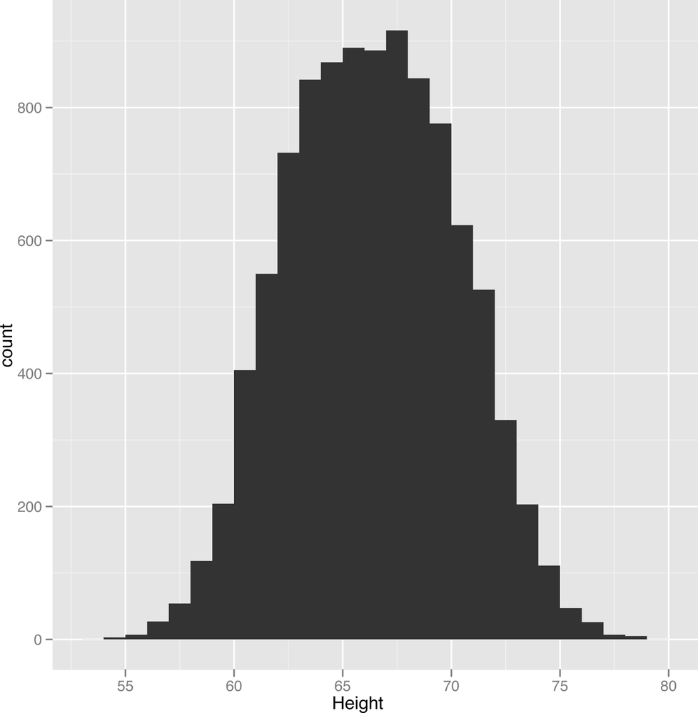
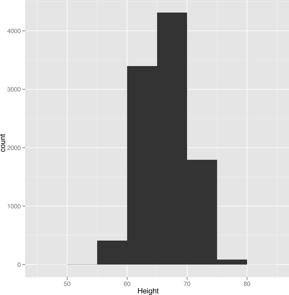
All that said, let’s get started by just visualizing the heights and weights data that we’ve been working with so far. It’s actually a fairly complex data set that illustrates many of the ideas we’ll come up against again and again throughout this book. The most typical single column visualization technique that people use is the histogram. In a histogram, you divide your data set into bins and then count the number of entries in your data that fall into each of the bins. For instance, we might use one inch bins to visualize our height data. We can do that in R as follows:
library('ggplot2')

data.file <- file.path('data', '01_heights_weights_genders.csv')

heights.weights <- read.csv(data.file, header = TRUE, sep = ',')

ggplot(heights.weights, aes(x = Height)) + geom_histogram(binwidth = 1)
Looking at Figure 2-5, something should jump out at you: there’s a bell curve shape in your data. Most of the entries are in the middle of your data, near the mean and median height. But there’s a danger that this shape is an illusion caused by the type of histogram we’re using. One way to check this is to try using several other binwidths. This is something you should always keep in mind when working with histograms: the binwidths you use impose external structure on your data at the same time that they reveal internal structure in your data. The patterns you find, even when they’re real, can go away very easily if you use the wrong settings for building a histogram:
ggplot(heights.weights, aes(x = Height)) + geom_histogram(binwidth = 5)
When we use too broad a binwidth, a lot of the structure in our data goes away (Figure 2-6). There’s still a peak, but the symmetry we saw before seems to mostly disappear. This is called oversmoothing. And the opposite problem, called undersmoothing (Figure 2-7), is just as dangerous:
ggplot(heights.weights, aes(x = Height)) + geom_histogram(binwidth = 0.001)
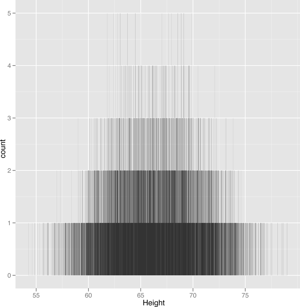
Here we’ve undersmoothed the data because we’ve used incredibly small bins. Because we have so much data, you can still learn something from this histogram, but a data set with 100 points would be basically worthless if you had used this sort of binwidth.
Because setting binwidths can be tedious and because even the best histogram is too jagged for our taste, we prefer an alternative to histograms called kernel density estimates (KDEs), or density plots. While density plots suffer from most of the same problems of oversmoothing and undersmoothing that plague histograms, we generally find them aesthetically superior—especially since density plots for large data sets look a more like the theoretical shapes we expect to find in our data. Additionally, density plots have some theoretical superiority over histograms: in theory, using a density plot should require fewer data points to reveal the underlying shape of your data than a histogram. And, thankfully, density plots (an example of which is shown in Figure 2-8) are just as easy to generate in R as histograms:
ggplot(heights.weights, aes(x = Height)) + geom_density()
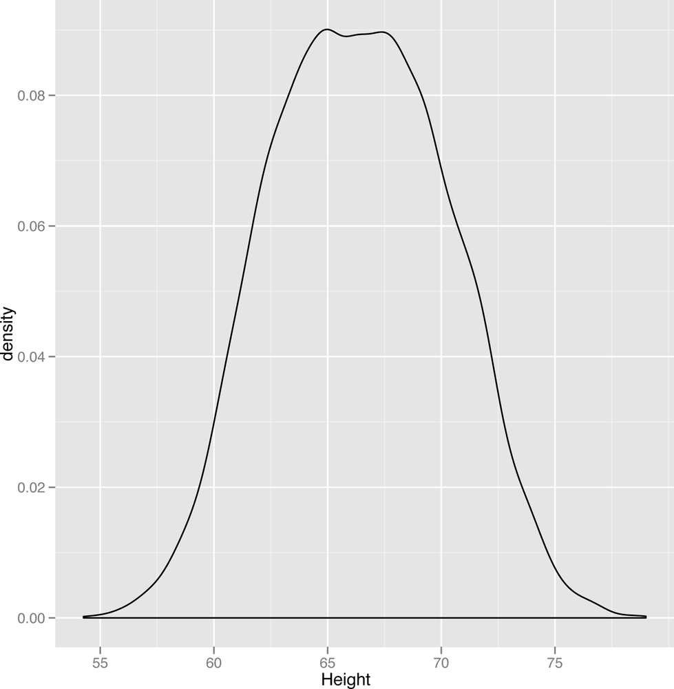
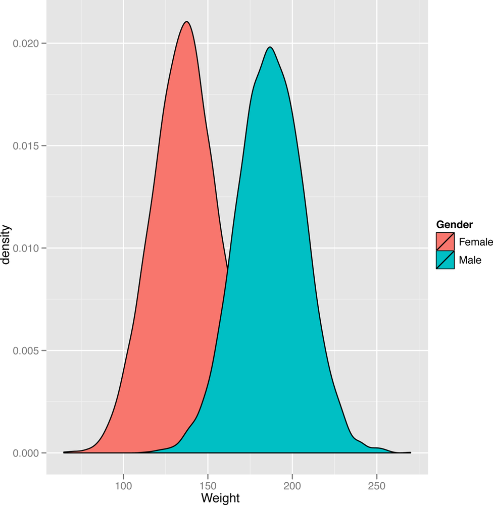
The smoothness of the density plot helps us discover the sorts of patterns that we personally find harder to see in histograms. Here, the density plot suggests that the data are suspiciously flat at the peak value. Since the standard bell curve shape we might expect to see isn’t flat, this leads us to wonder if there might be more structure hidden in this data set. One thing you might try doing when you think there’s some structure you’re missing is to split up your plot by any qualitative variables you have available. Here, we use the gender of each point to split up our data into two parts. Then we create a density plot in which there are two densities that get superimposed, but colored in differently to indicate the gender they represent. The resulting plot is shown in Figure 2-9:
ggplot(heights.weights, aes(x = Height, fill = Gender)) + geom_density()
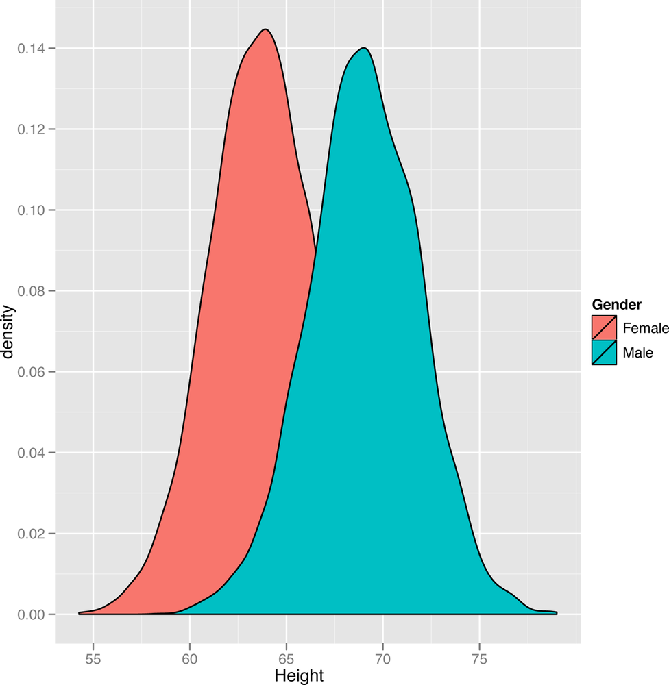
In this plot, we suddenly see a hidden pattern that was totally missing before: we’re not looking at one bell curve, but at two different bell curves that partially overlap. This isn’t surprising: men and women have different mean heights. We might expect to see the same bell curve structure in the weights for both genders, so let’s make a new density plot for the weights column of our data set:
ggplot(heights.weights, aes(x = Weight, fill = Gender)) + geom_density()
Looking at Figure 2-10, we see the same mixture of bell curves structure. In future chapters, we’ll cover this sort of mixture of bell curves in some detail, but it’s worth giving a name to the structure we’re looking at right now: it’s a mixture model in which two standard distributions have been mixed to produce a non-standard distribution.
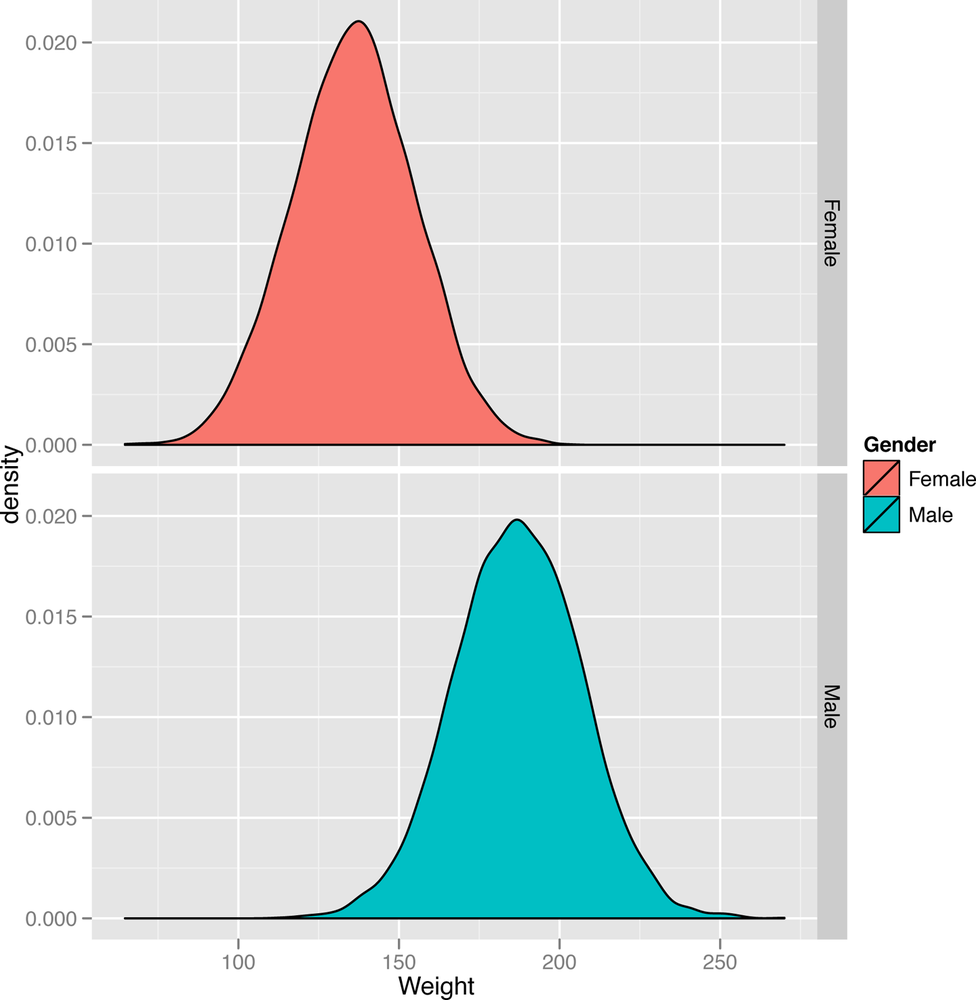
Of course, we need to describe our standard distributions more clearly to give sense to that sentence, so let’s start with our first idealized data distribution: the normal distribution, which is also called the Gaussian distribution or the bell curve. We can easily see an example of the normal distribution by simply splitting up the plot into two pieces, called facets. We’ll do this with the density plots we’ve shown you so far so that you can see the two bell curves in isolation from one another. In R, we can build this sort of faceted plot as follows:
ggplot(heights.weights, aes(x = Weight, fill = Gender)) + geom_density() + facet_grid(Gender ~ .)
Once we’ve run this code, we can look at Figure 2-11 and clearly see one bell curve centered at 64” for women and another bell curve centered at 69” for men. This specific bell curve is the normal distribution, a shape that comes up so often that it’s easy to think that it’s the “normal” way for data to look. This isn’t quite true: lots of things we care about, from people’s annual incomes to the daily changes in stock prices, aren’t very well described using the normal distribution. But the normal distribution is very important in the mathematical theory of statistics, so it’s much better understood than most other distributions.
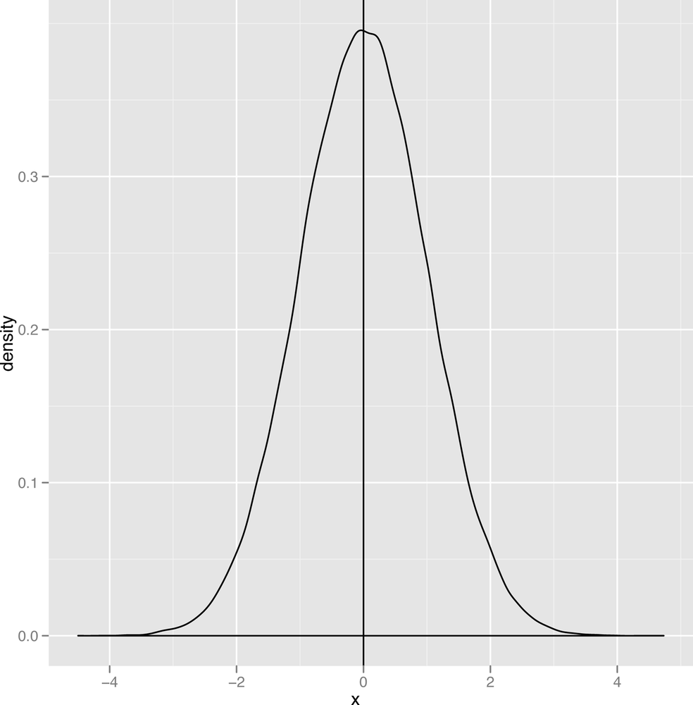
On a more abstract level, a normal distribution is just a type of bell curve. It might be any of the bell curves shown in Figures 2-12 through Figure 2-14.

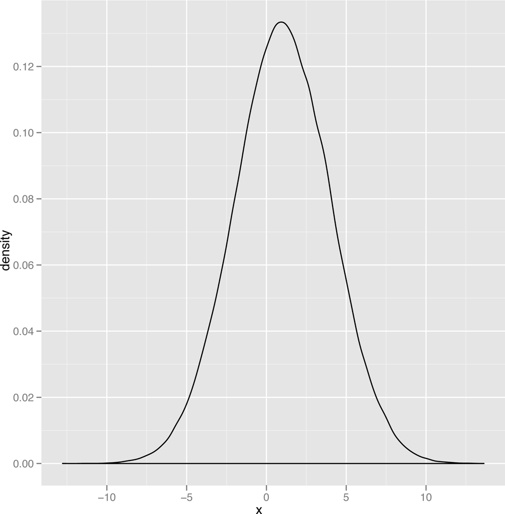
In these graphs, two parameters vary: the mean of the
distribution, which determines the center of the bell curve, and the
variance of the distribution, which determines the width of the bell
curve. You should play around with visualizing various versions of the
bell curve by playing with the parameters in the following code until
you feel comfortable with how the bell curve looks. To do that, play
with the values of m and s in the code
below:
m <- 0
s <- 1
ggplot(data.frame(X = rnorm(100000, m, s)), aes(x = X)) + geom_density()
All of the curves you can generate with this code have the same
basic shape: changing m and s only moves the
center around and contracts or expands the width. Unfortunately, seeing
this general bell shape isn’t sufficient to tell you that your data is
normal: there are other bell-shaped distributions, one of which we’ll
describe in just a moment. For now, let’s do a quick jargon lesson,
since the normal distribution lets us define several qualitative ideas
about the shape of data.

Modes
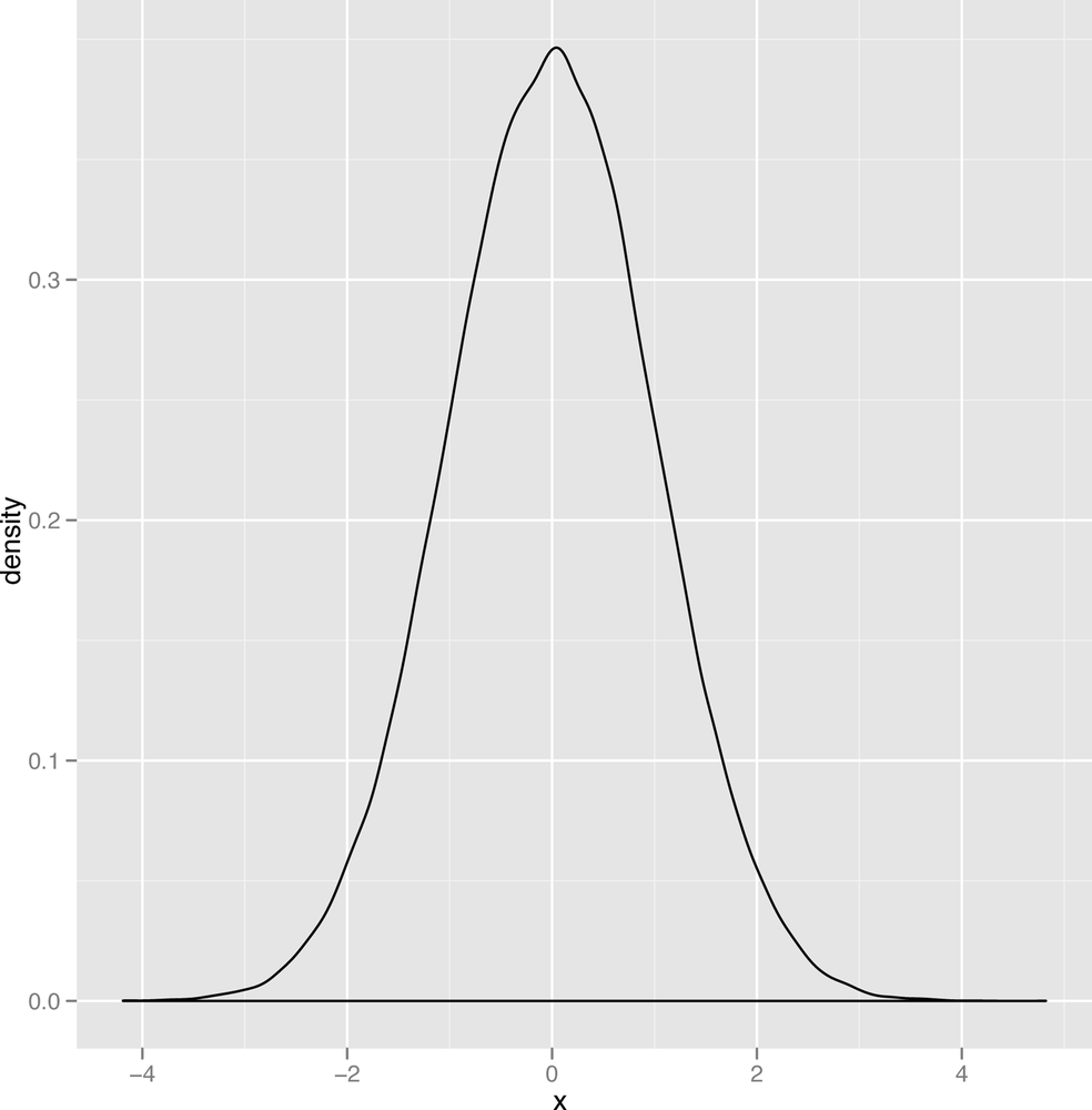
First, let’s return to the topic of modes that we put off until now. As we said earlier, the mode of a continuous list of numbers isn’t well defined, since no numbers repeat. But the mode has a clear visual interpretation: when you make a density plot, the mode of the data is the peak of the bell. For an example, look at Figure 2-15.
Estimating modes visually is much easier to do with a density plot than with a histogram, which is one of the reasons we prefer density plots over histograms. And modes make sense almost immediately when you look at density plots, whereas they often make very little sense if you try to work with the numbers directly.
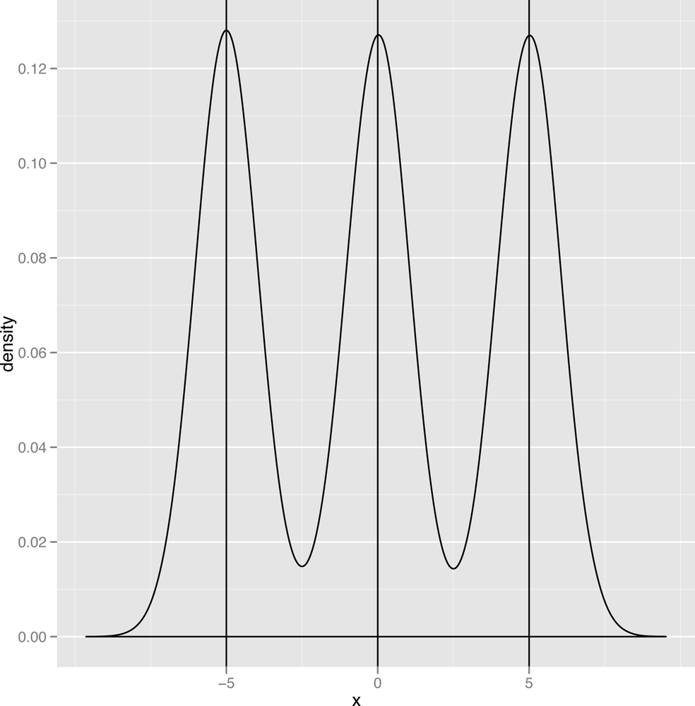
Now that we’ve defined a mode, we should point out one of the defining traits of the normal distribution is that it has a single mode, which is also the mean and the median of the data it describes. In contrast, a graph like the one shown in Figure 2-16 has two modes, and the graph in Figure 2-17 has three modes.
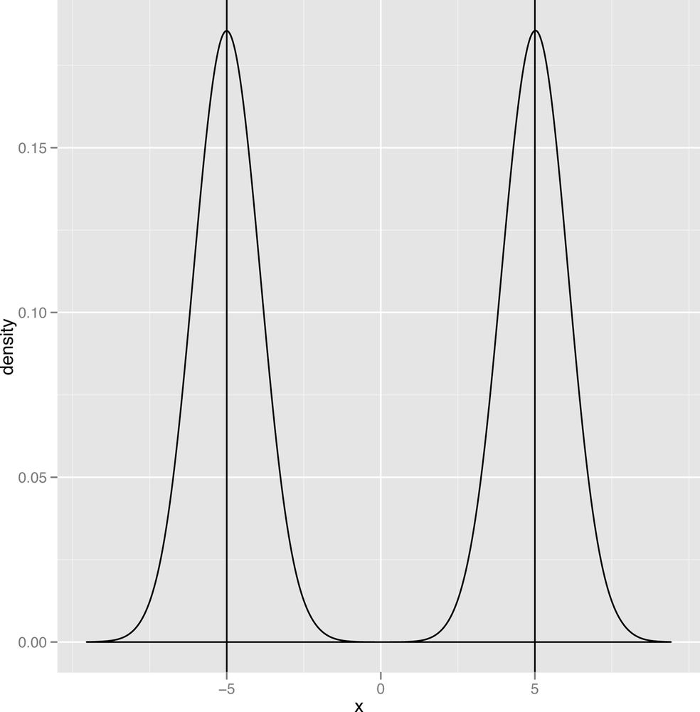
When we talk about the number of modes that we see in our data, we’ll use the following terms: a distribution with one mode is unimodal; a distribution with two modes is bimodal; and a distribution with two or more modes is multimodal.
Skewness
Another important qualitative distinction can be made between data that’s symmetric and data that’s skewed. Figures 2-18 and 2-19 show images of symmetric and skewed data to make these terms clear.
A symmetric distribution has the same shape whether you move to the left of the mode or to the right of the mode. The normal distribution has this property, which tells us that we’re as likely to see data that’s below the mode as we are to see data that’s above the mode. In contrast, the second graph, which is called the gamma distribution, is skewed to the right: you’re much more likely to see extreme values to the right of the mode than you are to see extreme values to the left of the mode.

Thin Tails vs. Heavy Tails
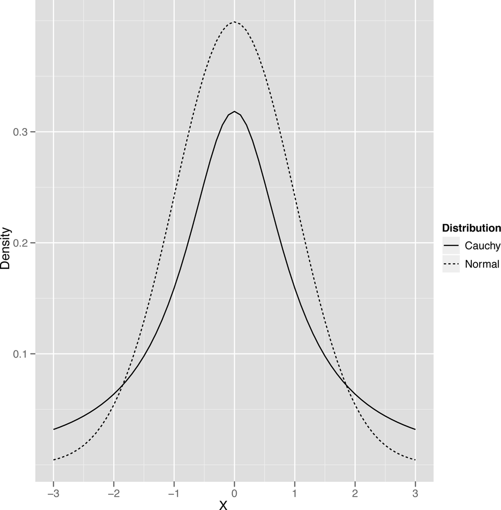
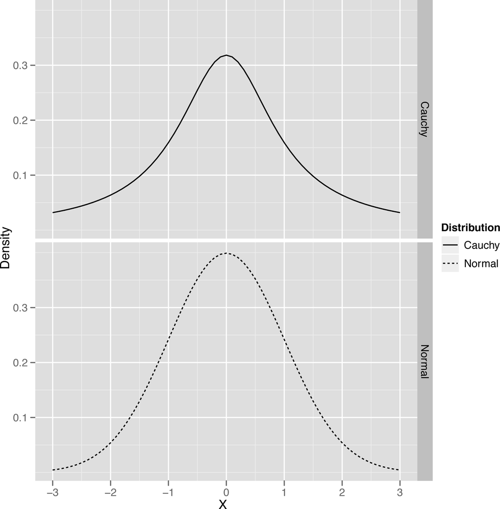
The last qualitative distinction we’ll make is between data that’s thin-tailed and data that’s heavy-tailed. We’ll show the standard graph that’s meant to illustrate this distinction in a second, but this distinction is probably easier to make in words: a thin-tailed distribution usually produces values that are not far from the mean: let’s say that it does so 99% of the time. The normal distribution, for example, produces values that are no more than three standard deviations away from the mean about 99% of the time. In contrast, another bell shaped distribution called the Cauchy distribution produces only 90% of its values inside those three standard deviation bounds. And, as you get further away from the mean value, the two types of distributions become even more different: a normal distribution almost never produces values that are six standard deviations away from the mean, while a Cauchy will do it almost 5% of the time.
The canonical images that are usually used to explain this distinction between the thin-tailed normal and the heavy-tailed Cauchy are shown in Figure 2-20 and Figure 2-21.
But we think you’ll get more intuition by just generating lots of data from both of those distributions and seeing the results for yourself. R makes this quite easy, so you should try the following:
set.seed(1)
normal.values <- rnorm(250, 0, 1)
cauchy.values <- rcauchy(250, 0, 1)

range(normal.values)
range(cauchy.values)
Plotting these will also make the point clearer:
df <- data.frame(X = c(x, x), Distribution = c(rep('Normal', length(x)), rep('Cauchy', length(x))), Density = c(y, z))
ggplot(df, aes(x = X, y = Density, linetype = Distribution, group = Distribution)) +
  geom_line()

ggplot(df, aes(x = X, y = Density, linetype = Distribution, group = Distribution)) +
  geom_line() +
  facet_grid(Distribution ~ .)
To end this section on the normal distribution and its cousin the Cauchy distribution, let’s summarize the qualitative properties of the normal once more: it’s unimodal, symmetric, and has a bell shape with thin tails. The Cauchy is unimodal, symmetric, and has a bell shape with heavy tails.
After the normal distribution, there are two more canonical images we want to show you before we bring this section on density plots to a close: a mildly skewed distribution called the gamma and a very skewed distribution called the exponential. We’ll use both later on since they occur in real data, but it’s worth describing them now to illustrate the skew visually.
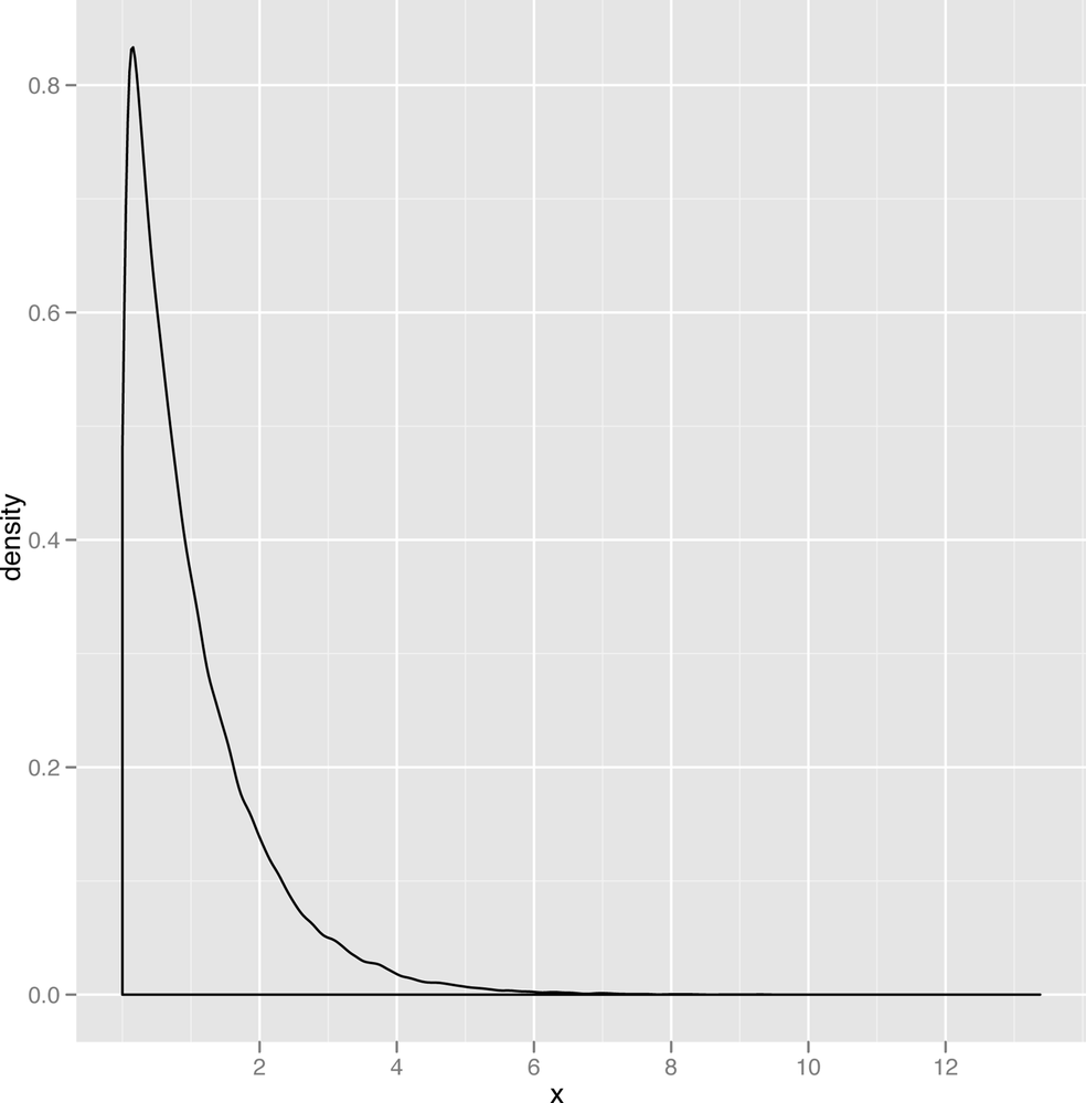
Let’s start with the gamma distribution. It’s quite flexible, so we’d encourage you to play with it on your own for a bit. Here’s a starting point:
gamma.values <- rgamma(100000, 1, 0.001)
ggplot(data.frame(X = gamma.values), aes(x = X)) + geom_density()
The resulting plot of the gamma data is shown in Figure 2-22.
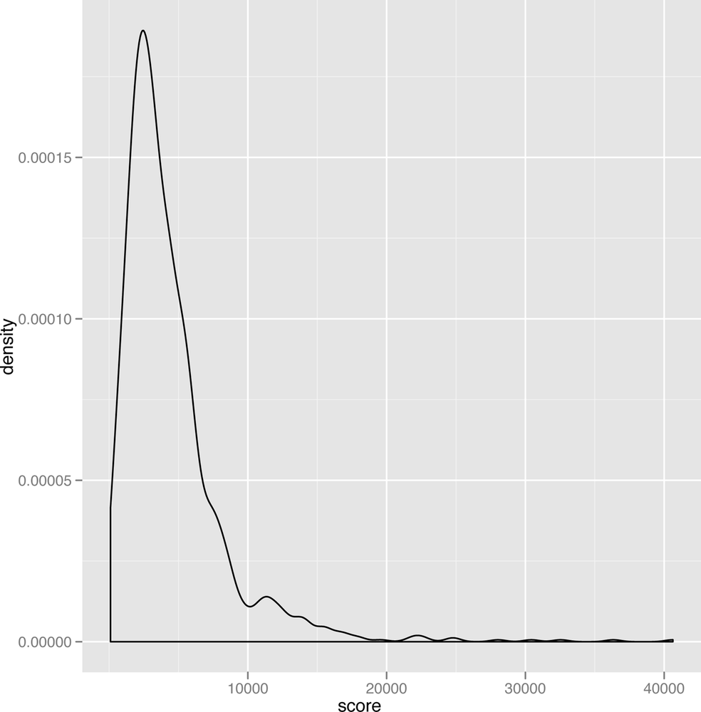
As you can see, the gamma distribution is skewed to the right, which means that the median and the mean can sometimes be quite different. In Figure 2-23, we’ve plotted some scores we spidered from people playing the iPhone game Canabalt.
This real data set looks remarkably like data that could have been produced by a theoretical gamma distribution. We also bet that you’ll see this sort of shape in the density plots for scores in lot of other games as well, so it seems like a particularly useful theoretical tool to have in your belt if you want to analyze game data.
One other thing to keep in mind is that the gamma distribution only produces positive values. When we describe how to use stochastic optimization tools near the end of this book, having an all positive distribution will come in very handy.
The last distribution we’ll describe is the exponential distribution, which is a nice example of a powerfully skewed distribution. An example data set drawn from the exponential distribution is shown in Figure 2-24.
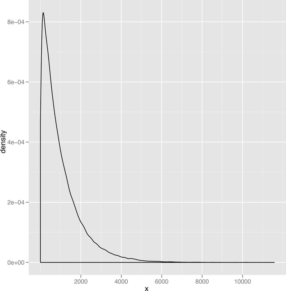
Because the mode of the exponential distribution occurs at zero, it’s almost like you had cut off the positive half of a bell to produce the exponential curve. This distribution comes up quite a lot when the most frequent value in your data set is zero and only positive values can ever occur. For example, corporate call centers often find that the length of time between the calls they receive looks like an exponential distribution.
As you build up a greater familiarity with data and learn more about the theoretical distributions that statisticians have studied, these distributions will become more familiar to you — especially because the same few distributions come up over and over again. For right now, what you really take away form this section are the simple qualitative terms that you can use to describe your data to others: unimodal vs. multimodal, symmetric vs. skewed, and thin-tailed vs. heavy-tailed.
Visualizing the Relationships between Columns
So far we’ve only covered strategies for thinking carefully about individual columns in your data set. This is clearly worth doing: often just seeing a familiar shape in your data tells you a lot about your data. Seeing a normal distribution tells us that you can use the mean and median interchangeably and it also tells you that you can trust that most of the time you won’t see data more than three standard deviations away from the mean. That’s a lot to learn just from a single visualization.
But all of the material we just reviewed is what you’d expect to learn in a traditional statistics class: it doesn’t have the feel of the machine learning applications that you’re presumably itching to start getting involved with. To do real machine learning, we need to find relationships between multiple columns in our data and use those relationships to make sense of our data and to predict things about the future. Some examples we’ll touch on over the course of this book include the following prediction problems:
Predicting someone’s weight from their height.
Predicting whether an email is spam or not using the text of the email.
These sorts of problems break down into two sorts: regression problems, in which you need to predict some number (like weight) given a bunch of other numbers (like height); and classification problems, in which you need to assign a label, like spam, given a bunch of numbers, like word counts for spammy words such as “viagra” and “cialis”. The tools we can use to perform regression and classification are many, but there are two motivating types of data visualizations we’d like you to carry around in your head as we move forward.
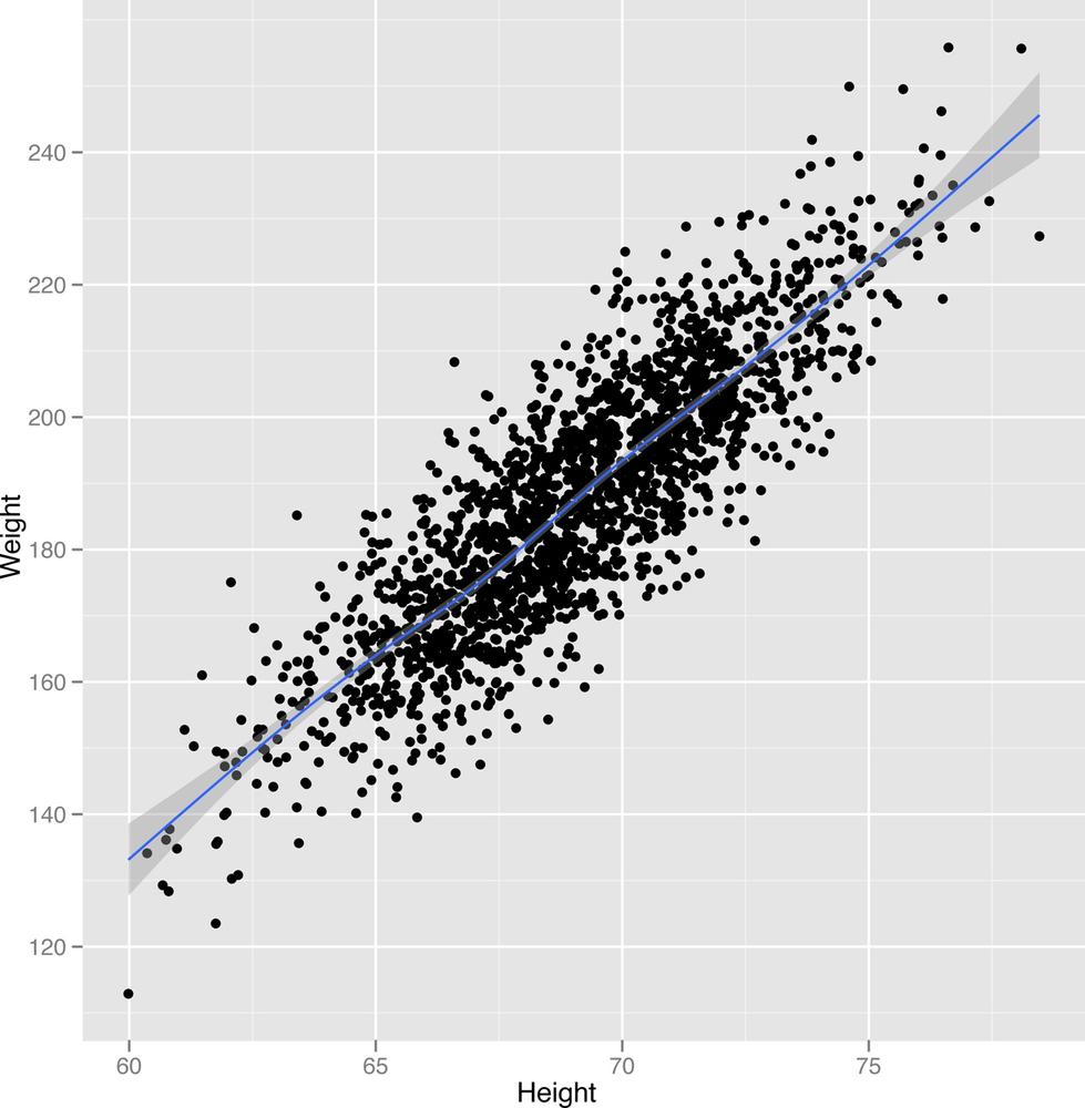
The first is the stereotypical regression picture. In the regression picture, we make a scatterplot of our data and see that there’s a hidden shape that relates two columns in data set. Returning to our beloved heights and weights data, let’s make a scatterplot of weights against heights.
If you’re not familiar with them, you should know that a
scatterplot is a two-dimensional image in which one dimension
corresponds to a variable X and another corresponds to a variable Y. To
make our scatterplots, we’ll continue using ggplot.
ggplot(heights.weights, aes(x = Height, y = Weight)) + geom_point()
The scatterplot that ggplot generates is shown in
Figure 2-25.
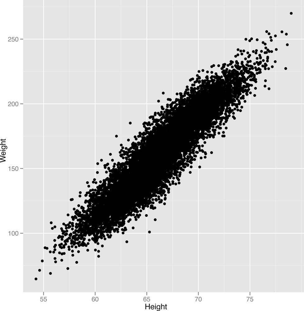
Looking at this image, it seems pretty clear that there’s a
pattern relating heights with weights: people who are taller also weigh
more. To get started at examining the pattern more carefully, we can use
a smoothing tool in ggplot2 to get a visual depiction of
the linear pattern we’re seeing:
ggplot(heights.weights, aes(x = Height, y = Weight)) + geom_point() + geom_smooth()
The new scatterplot with a smooth pattern superimposed is shown in Figure 2-26.
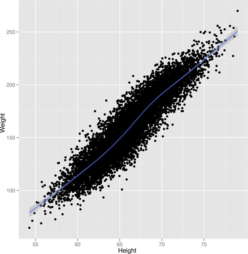
geom_smooth will generate predictions for people’s
weights given their heights as an input. In this case, the predictions
are simply a line. Around the line there is a shaded region, which
describes other plausible predictions that could have been made for
someone’s weight based on the data you’ve seen. As you get more data,
these guesses become more accurate and the shaded region shrinks. Since
we already used all of the data, the best way to see the effect happen
is to go in the opposite direction: remove some of our data and see how
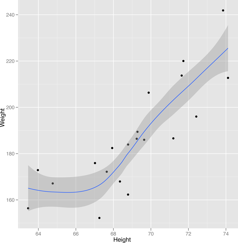
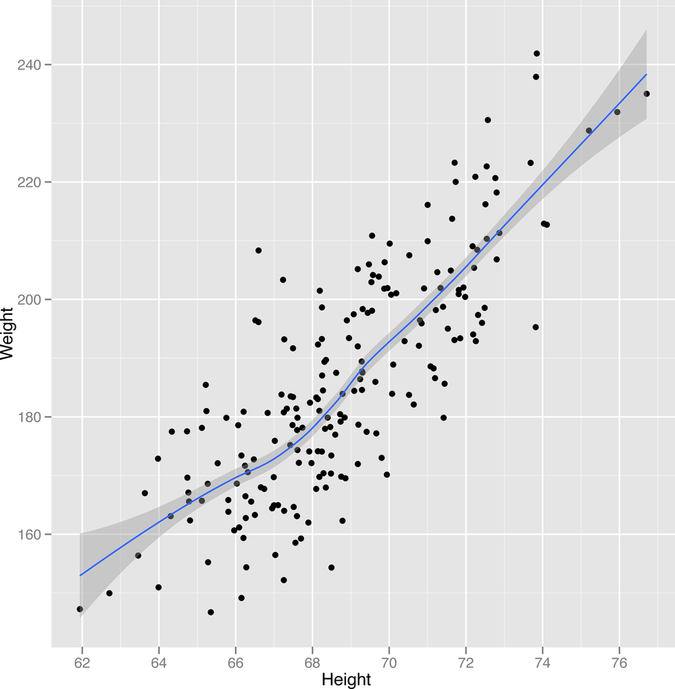
the pattern gets weaker and weaker. The results are shown in Figures
2-27 to Figure 2-29.
ggplot(heights.weights[1:20,], aes(x = Height, y = Weight)) + geom_point() + geom_smooth()
ggplot(heights.weights[1:200,], aes(x = Height, y = Weight)) + geom_point() + geom_smooth()
ggplot(heights.weights[1:2000,], aes(x = Height, y = Weight)) + geom_point() + geom_smooth()
Recall that predicting the values in one column using another column is called regression when the values you’re trying to predict are numbers. In contrast, when you’re trying to predict labels, we call that classification. For classification, Figure 2-30 is the image you should keep in mind.

In this image, we’ve shown the heights and weights of every person in our data set, but we’ve also visualized their gender as the color of each point. That makes it clear that we see two distinct groups of people in our data. To generate this image in ggplot2, we run the following code:
ggplot(heights.weights, aes(x = Height, y = Weight)) + geom_point(aes(color = Gender, alpha=0.25)) +
    scale_alpha(legend=FALSE)+scale_color_manual(values=c("Male"="black", "Female"="gray"))+theme_bw()
This image is the standard classification picture. In the classification picture, we make a scatterplots of our data, but use a third column to color in the points with different labels. For our height and weight data, we added a third column, which is the sex of each person in our data set. Looking at this picture, it probably seems like we could guess people’s gender using only their height and weight. Making guesses about categorical variables like gender from other data is exactly what classification is meant to do and we’ll describe algorithms for it in some detail in the next chapter. For now, we’ll just show you in Figure 2-31 what the results would look like after running a standard classification algorithm.
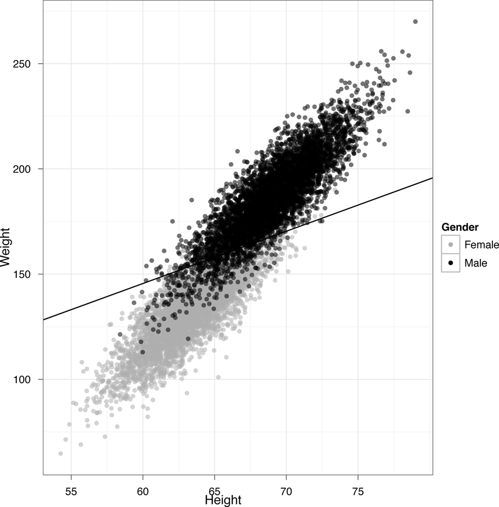
The line we’ve drawn has a very fancy sounding name: it’s called the “separating hyperplane.” It’s a “separating” hyperplane because it splits the data into two groups: on one side, you guess that someone is female given their height and weight, and on the other side you guess that they’re male. This is a pretty good way to make guesses: for this data set, you’d be right about 92% of the time. In our mind, that’s not bad performance when you’re only using the simplest classification model that’s out there, with only heights and weights as inputs to your prediction algorithm. In our real classification tasks, we’ll often have tens, hundreds, or even thousands of inputs to use for predicting classes. This data set just happens to be particularly easy to work with, which is why we started with it.
That’s the end of this chapter. As a teaser to get you excited for the next chapter, we’ll show you the R code that generated the predictions you just saw. As you can see, you need almost no code at all to get pretty impressive results:
heights.weights <- transform(heights.weights, Male = ifelse(Gender == 'Male', 1, 0))
logit.model <- glm(Male ~  Weight + Height, data = heights.weights, family = binomial(link = 'logit'))

ggplot(heights.weights, aes(x = Height, y = Weight)) + geom_point(aes(color = Gender, alpha=0.25)) +
  scale_alpha(legend=FALSE)+scale_color_manual(values=c("Male"="black", "Female"="gray"))+theme_bw() +
  stat_abline(intercept = - coef(logit.model)[1] / coef(logit.model)[2],
        slope = - coef(logit.model)[3] / coef(logit.model)[2],
        geom = 'abline',
        color = 'black')
In the next chapter, we’ll more thoroughly show you how to build your own classifiers using off-the-shelf machine learning tools.