
Chapter 2. Illustrate: Make it Visual
“Graphical excellence is that which gives to the viewer the greatest number of ideas in the shortest time with the least ink in the smallest space.”
Edward R. Tufte The Visual Display of Quantitative Information
IN THIS CHAPTER
-
Layout and form of a diagram
-
Consolidating the content
-
Designing the information
-
Tools and software
-
Case Study: Mapping the Lab Test Experience
“I’m not a graphic designer and can’t draw. How can I possibly create a diagram?” I get that reaction a lot in my experience mapping workshops.
There’s good news: mapping is not about artistic talent. It’s about bringing all of your findings into a single, cohesive storyline. The hard part isn’t the styling, it’s creating an insightful narrative of the experience.
Consider the diagram in Figure 2-1, created by Eric Berkman, author of Designing Mobile Interfaces (O’Reilly, 2011). It’s visually minimal but reveals key insights about both negative and positive service aspects at a Starbucks coffee shop. Diagrams don’t need to have elaborate graphics to be effective.
In some cases, a mere row of sticky notes on a wall may be all that’s needed, for instance, a small startup working closely together informally. Other times, you’ll want something more polished, for example, if you’re presenting to the CEO of a large bank on a formal project. Regardless of the level of fidelity your illustration requires, a few principles of design go a long way toward creating a compelling visual story.
This chapter discusses three interdependent factors in illustrating experiences:
Laying out the diagram, or determining the overall form
Compiling the content into a reduced format
Designing the information for a compelling visualization
There may be movement back and forth between these aspects, so be prepared to iterate. After this chapter, you should be able to transform the insights from your investigation into a meaningful diagram.
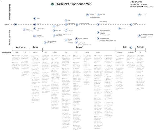
Figure 2-1. Eric Berkman’s simple but effective diagram for a visit to Starbucks reveals important insights with minimal graphic design.
Lay Out the Diagram
Some methods prescribe a layout in advance. Mental model diagrams, for instance, are organized hierarchically into towers. Or, a formal service blueprint will have prescribed rows of information by default. Otherwise, the layout and structure of the diagram are up to you, the mapmaker.
I recommend a simple table or timeline, which works in most situations. But it’s worthwhile considering alternative forms as well. As discussed in Chapter 2, typical organizational schemes (chronological, hierarchical, spatial, or a network) will impact on the layout of your diagram. Figure 2-2 shows some possible layouts.

Figure 2-2. Consider alternative layouts for your diagram to enhance the storyline.
Regardless of the layout you use, the important thing to remember is how the form of the information enhances the overall message or not. For instance, Sofia Hussain, a leading design strategist in Norway, created the diagram in Figure 2-3. She intentionally chose a circular form to show that success of this event planning app relies on repeat use. The form amplifies the message.
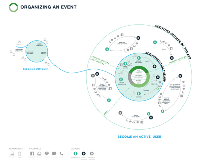
Figure 2-3. Make the shape of your diagram meaningful, e.g., a circular diagram in this case reflects a desire for repeat use of an event planning app.
Displaying Chronology
Chronological maps are simple for others to grasp, but present a challenge: not all aspects of an experience may be sequential. Some events are ongoing, some have a variable order, and others may have different sub-flows. You’ll have to overcome what I call “the chronology problem,” or showing irregularities in a strict timeline. Some tactics are shown in Figure 2-4 through Figure 2-7.
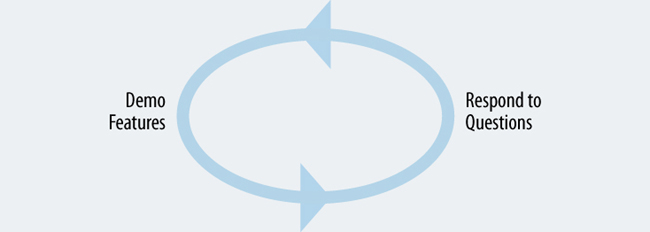
Figure 2-4. a. REPEAT BEHAVIOR: Use arrows and circles to show repeating actions. For instance, during a sales call, the salesperson may alternate between showing a product and responding to customer questions.
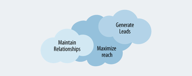
Figure 2-5. b. VARIABLE ORDER: A cloud-like form can indicate that activities don’t happen sequentially. For instance, a salesperson may generate new leads, maintain existing relationships, and maximize reach all at the same time.
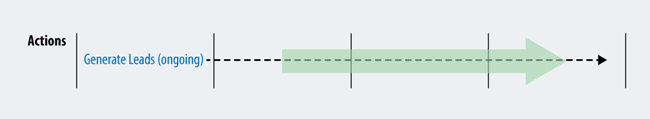
Figure 2-6. c. ONGOING ACTIVITY: Indicate the first time that an ongoing behavior occurs, and then show that it continues to avoid repetition. For instance, a salesperson may continually look for new leads throughout.
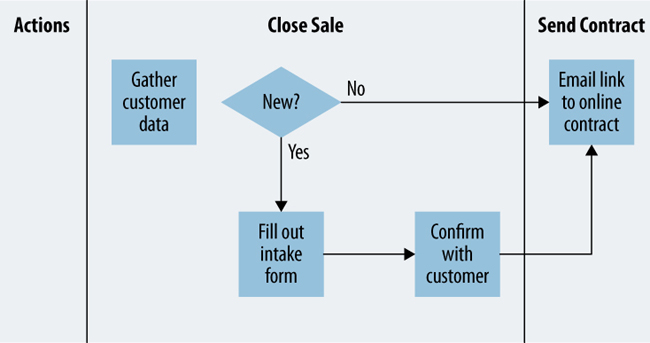
Figure 2-7. d. ALTERNATE FLOWS: You may come across distinct sub-flows in the experience. Insert a decision point if needed, but keep this to a minimum to avoid over-complication. For instance, a salesperson may have distinct activities based on the customer type.
Compile the Content
At this stage in the overall process, your aim is to map the current state of an experience. Mapping future states and coming up with solutions comes later, as outlined in Chapter 7 and Chapter 8.
Reduce the data you’ve gathered to the most salient points and find common patterns. Work both from the bottom-up and from the top-down, alternating between the two (Figure 2-8). Start by clustering and grouping findings repeatedly until you’ve reduced your research to just key insights. At the same time, work from the top down using your draft map to help direct your consolidation.
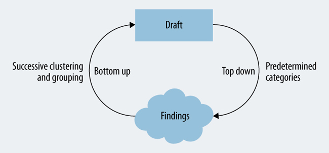
Figure 2-8. Work iteratively from the bottom up and from the top down to consolidate your research findings.
Be prepared to shift things around. Your goal is first to create a prototype of the diagram, taking qualitative and quantitative information into account.
Qualitative Information
A majority of information to describe experiences is qualitative—rich descriptions of the why and the how, rather than quantitative data about how many. The following are the primary qualitative elements to include.
- Create phases, categories, and divisions
-
Determine the major “joints” of the model you’re creating. In chronological maps, this means creating phases, e.g., become aware, purchase, use, get support. There are typically anywhere from four to twelve phases. For spatial maps and hierarchical diagrams you need to create categories. Try to find what feels natural for you and for stakeholders. Also keep in mind that the phase labels should be formulated from the perspective of the individual, not the organization. For instance, if you’re mapping the experience of getting a new job, the first phase could be “Start Search” (what the individual does) and not “Recruit” (what the organization does).
- Describe the experience
-
Decide what aspects to show to describe the experience. Core elements include actions, thoughts, and feelings. Consider ways to make the description as rich as possible. For instance, you can include direct quotes from customers or photos from your investigation. It’s up to you to determine what is most relevant for your given effort. The aim is to demonstrate what is valuable to both the individual and the organization through condensed findings of your investigation.
- Show touchpoints
-
Describe the interfaces between the individual and organization for each phase. Think about their context of use. Remember, a touchpoint takes place within a given set of circumstances. Be sure that the information in the map surrounding the list of interfaces provides the context for those touchpoints.
- Include aspects of the organization
-
Indicate which roles or departments are involved at each touchpoint. Other elements you can map are the goals of the organization, strategic imperatives, and even policies. Show what is valuable to the organization.
Format the content
Formatting the content is one of the trickiest parts of mapping. After being steeped in data and research, you may want to include everything you found. Resist this urge. Favor brevity. It takes practice to be able to express an experience in a compact form.
Table 2-1 lists some of the guidelines to follow and shows two examples through the process of iteratively transforming research insights into concise content for a diagram. Notice how insights from research at the top of the table reduce down to concise statements to include in a diagram. In this example, assume you are creating a customer journey map for a software company.
The top row of Table 2-1 starts with insights that might be found from research. This isn’t what gets included directly in the diagram. Instead, the aim is to compress the raw insight down to its essence by transforming it with the process suggested in the table.
It’s also important to keep the same syntax for each type of information. A cohesive system of content will make the diagram more readable and more cohesive. You can come up with your own patterns, but make sure you stick to the system for consistency.
Here are example formats I often use in mapping for some of the most common information types:
-
Actions: start each with a verb, e.g., download software, call customer service.
-
Thoughts: phrase as a question, e.g., Are there hidden fees? Who else do I need to involve?
-
Feelings: use adjectives, e.g., nervous, unsure, relieved, delighted.
-
Pain points: start each with a gerund, e.g., waiting for installation, paying invoice.
-
Touchpoints: use nouns to describe the interface, e.g., email, customer hotline.
-
Opportunities: begin each with a verb that shows change, e.g., increase the ease of installation, eliminate unnecessary steps.
| Guideline | Description | Example 1 | Example 2 |
| Start with insights | Start with clusters of raw observations from your research. | Research cluster 1: People indicated they sometimes hesitate and reconsider during the customer acquisition phase because of our premium pricing model. | Research cluster 2: There is a clear pain point around deploying the solution, primarily due to lack of necessary technical knowledge. |
| Use natural language | Use language that reflects the individual’s experience in terms they would use. | People reconsider when making a purchase because they may be nervous or anxious about the high cost. | Users struggle to install the software for the first time if they don’t have the required technical skills. |
| Keep voice consistent | Rewrite the insights in either the first person or third person (pick one), but don’t mix voice. | I reconsider when making a purchase because I’m anxious and nervous about the high cost. | I struggle to install the software for the first time because I don’t have the necessary technical skills. |
| Omit pronouns and articles | To save space, omit articles and pronouns, which are implied. | Reconsider when making a purchase due to anxiousness and nervousness over high cost. | Struggle to install software for first time without the necessary technical skills. |
| Focus on the root cause | Reduce the information to reflect underlying motivations and emotions. | Feel anxious and nervous when making a purchase due to high cost, and then reconsider. | Struggle during installation due to lack of necessary technical skills. |
| Be concise | Rewrite the descriptions to use as few words as possible. Use a thesaurus if needed. | Feel anxious during purchase about cost, and then reconsider. | Struggle due to lack of technical skills during installation. |
| Use abbreviations sparingly | Abbreviations can be OK if they are widely used and accepted. | Feel anxious during purchase about cost, and then reconsider. | Struggle due to lack of tech skills during installation. |
| Rely on context of map | Some information can be inferred from its position. Rely on the row and column headers if you have a table-like diagram. | anxious about cost (In the cell for the column for “purchase” and row for “feelings”) Reconsider (In the cell of a column for “purchase and a row for “actions”) |
Struggle due to lack of tech skills OR Lack tech skills (assuming a column for “installation” and a row for “pain points”) |
Quantitative Information
Including quantitative content adds validity to your diagram. Consider how to include metrics, survey results, and other data into the diagram. There are several ways to represent quantitative data, shown in Figure 2-9 through Figure 2-12.
.

Figure 2-9. a. SHOW NUMBERS AS TEXT: Include numbers and figures to show absolute values. For instance, you may have quantitative data on how people find your service.
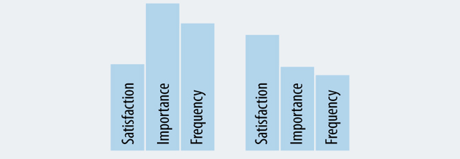
Figure 2-10. b. USE BARS TO AMOUNTS: Vertical bars show relative quantities. Absolute values can be included in text if needed.

Figure 2-11. c. PLOT VALUES ON A GRAPH: A simple graph shows rise and fall of a given measure across a diagram. For instance, you may have quantitative data for customer satisfaction at the end touchpoint in a journey.
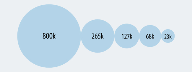
Figure 2-12. d. USE SIZE TO INDICATE QUANTITY: It’s also possible to show quantity with the size of a shape. For instance, the example in this figure could be used to indicate the number of customers that move through a typical purchase funnel.
Design the Information
People like information that is rich in presentation. Content that is presented with color, texture, and style has relevance to our lives and our work. The visual presentation of a diagram influences how others understand the information.
Strive to create a consistent visual language that enhances your overall message. What insights should be highlighted? What are the key messages you wish to communicate? How can you make the diagram approachable, aesthetically pleasing, and more compelling?
Even if you are not a graphic designer, there are some basic decisions you can make to help the clarity of the diagram. Stay true to these principles:
-
Simplify. Avoid frivolous and decorative graphics. Strive for efficiency in display.
-
Amplify. The design should intensify the goals of project and expectations of the sponsors.
-
Clarify. Strive to be as clear as possible.
-
Unify. Use consistency to show a well-rounded appearance and cohesive visualization.
The key aspects to pay attention to are typography, graphics, and visual hierarchy, each discussed in the following sections.
Typography
Typography refers to the selection of letter-forms and the general design of text. Since experience maps are mostly text, the typography of your diagram is paramount to facilitating its practical use.
Options with typography can overwhelm. Let function and purpose guide your choice. When in doubt, favor legibility and intelligibility over flair and expression. Consider typeface, size and width, case, and bold and italic styling (Figure 2-13 through Figure 2-16)

Figure 2-13. a. SELECT A TYPEFACE: There are two major categories of typefaces: serif and sans-serif. Typically, diagrams make use of sans-serif typeface for the bulk of the information, but you can find serif typefaces being used as well. It’s best to use only one or two different typefaces in a diagram.
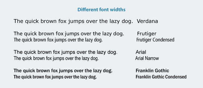
Figure 2-14. b. CONSIDER FONT SIZE AND WIDTH: You will be motivated to use a small font size to get more information into the diagram. Avoid making the size so small it can’t be read. Instead, work with the content to reduce it to its most meaningful essence. Also, be aware of the overall width of the font you’re using. For instance, Verdana is a very wide font and not recommended. Instead, try a condensed or narrow font. Pair these with their regular versions for greater consistency.

Figure 2-15. c. PAY ATTENTION TO CASE: Generally, longer texts are harder to read in capital letters than in mixed case. They will take up more space as well. Single words or short phrases, however, such as the title of a phase in a journey, may work well in uppercase. Use all caps sparingly to add emphasis or show differences.

Figure 2-16. d. EMPHASIZE WITH BOLD AND ITALIC STYLES: Use bold and italics to help distinguish different information types, but use them sparingly. Generally, the information will be more readable if you keep the same weight and style. A mix of bold and italics can get messy quickly. Legibility also changes with bold and italics. Making a text large and bold may not necessarily make it more readable. For instance, Frutiger UltraBlack draws attention but doesn’t make the text easier to read. Likewise, long texts in Frutiger Condensed italics are less legible.
Graphic Elements
After you have compiled the content, consider how to represent it visually. Graphic elements play an important part. You may not be able to create the graphics yourself but being aware of a few basics helps plan and critique the outcome. Figure 2-17 shows some of the key elements to consider.
Show relationships with lines
Lines are a principal means of showing visual alignment. They have four primary functions in alignment diagrams: dividing, containing, connecting, and showing paths.
Be careful of unnecessary lines. If every cell in a table-like diagram has a line border, for instance, the overall diagram will become unnecessarily heavy in feel. As a general rule of thumb, use as few lines as possible, and only use lines that carry meaning to the diagram.
Convey information with color
Color is more than just decoration. It helps create a sense of priority and facilitates overall understanding. Two key uses of color in experience mapping are color coding and showing background regions, as shown in Figure 2-17.
-
Color coding allows viewers to see individual facets of information across the diagram. This is crucial for creating a sense of visual alignment. For instance, pain points or moments of truth may have a consistent color throughout the diagram, as shown below. Even if they are not on the same line of sight, color will visually connect different facets of information throughout the diagram. Note that color blind viewers may not be able to distinguish colors well, and also that colors have different meanings in different cultures.
-
Use color to create backgrounds within the diagram. This avoids unnecessary use of lines. For instance, the phases of a journey may each have a different color to distinguish them. You can accomplish dividing and containing by using values of a single color, rather than introducing new colors. The background regions in this image, for instance, are different shades of the same grey tone.
The use of too many colors can have diminishing returns. Use color purposefully for emphasis, and be sure to make it consistent.
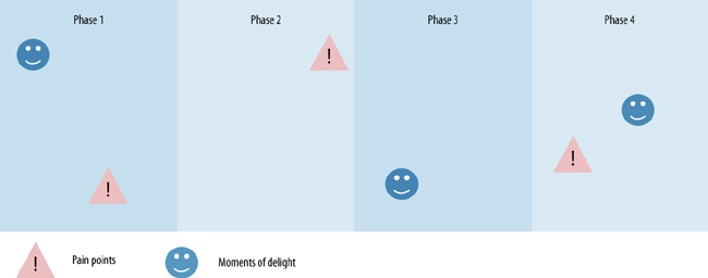
Figure 2-17. Convey information with color.
Add icons for efficiency
Icons not only communicate a great deal of information in a small amount of space, they also add visual interest. Typical icons found in maps of experiences include people, physical evidence of touchpoints, emotions, and moments of truth (see Figure 2-18). There are many directions you can take with near endless variation (e.g., solid backgrounds versus outlines only as seen in row a. of Figure 2-18). The intent is to come up with your own style for icons and keep that consistent throughout the diagram.
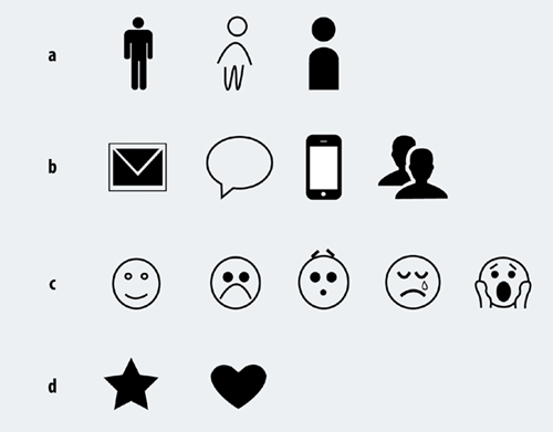
Figure 2-18. Add icons for efficiency.
Keep in mind that not all information types can be represented as icons. Create a key to explain the icons. However, keep in mind that if there are too many icons it will be difficult to comprehend the diagram: the reader will have to refer back and forth to a key to understand the information. Strive to represent the content of the diagram so it can be read without reference to a key or further explanation.
Also note that icons can have different meanings in different cultures. Consider how might express the thought or concept you’d like to iconize with as little bias or cultural implications as possible.
The Noun Project is a website that aggregates icons and symbols from contributors around the world (http://thenounproject.com). The images are readily accessible for use, either in the public domain or with a Creative Commons license. It’s a great resource for icons that helps you achieve consistency in your diagram.
Visual Hierarchy
Not all information in a diagram is of equal importance. Create a visual hierarchy to direct how the eye perceives the experience you’re mapping with good alignment, different visual weights for emphasis, and layering, as well as avoiding chartjunk, illustrated and explained in Figure 2-19 through Figure 2-22.

Figure 2-19. a. ALIGN ELEMENTS: Visual alignment is critical to your diagram. A grid is an invisible structure of equally spaced lines to which elements are justified. This creates clear lines and guides readers’ line of sight vertically and horizontally. Strive for alignment even if you are using a spreadsheet or mapping sticky notes on a wall.
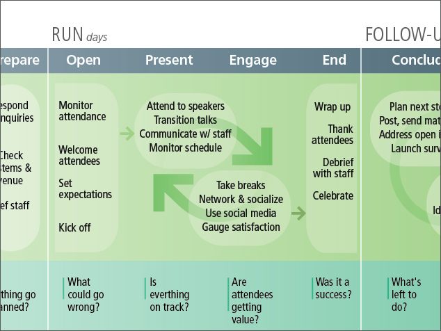
Figure 2-20. b5. CREATE EMPHASIS: Weight and size of both text and graphic elements provide focus and differentiation. For instance, in this image the phase headers (e.g., “RUN,” “FOLLOW-UP,” etc.) are larger than the text body, providing a sense of hierarchy. There are also different sizes of the arrows to show different aspects of the experience.

Figure 2-21. c. LAYER INFORMATION: Make some elements stand out more than others by layering different sized texts and different shading. In this example, “uncertainty” is shown with background shading, and specific emotions are shown as positive or negative, all within a small space on the diagram.

Figure 2-22. d. AVOID CHARTJUNK: Coined by information design expert Edward Tufte “Chartjunk” is anything unnecessary in an information display. Make every mark count.
Example Diagramming Process
Overall, the process of illustrating an experience in a single diagram is iterative. The insights you’ll map drive the visualization, and the visualization will impact the form of those insights.
Figure 2-23 shows an example draft diagram for organizing a conference event. It reflects a first pass at consolidating the research observations to include in the map. Thought has been given to the chronological phases, the wording and format of text, and the balance of content in general.
The next step is to add a more visually compelling narrative. Figure 2-24 shows an updated version of the draft diagram created by Hennie Farrow, VP of Design.
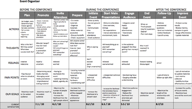
Figure 2-23. Before adding graphic detail, find the right layout and consolidate the insights from your investigation into a draft diagram.
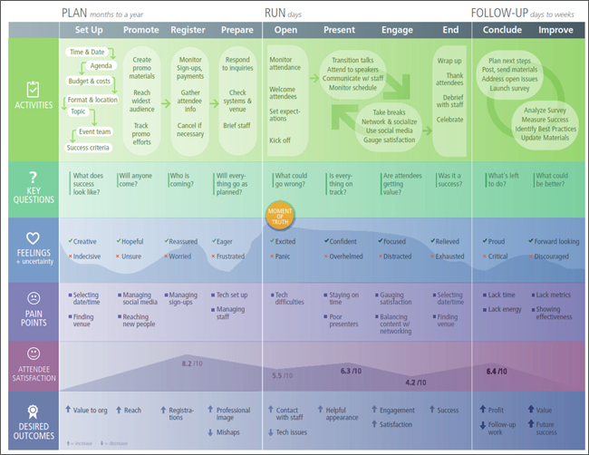
Figure 2-24. Use visual design elements to tell a more compelling story and guide your audience through the experience.
Various aspects of design come together in Figure 2-24 guide the audience through the experience in more engaging and compelling way.
- Typography
-
In addition to a regular font (Frutiger), this diagram also uses a condensed font (Frutiger Condensed) to make the best use of space. All capitals are used for row headers for emphasis and to set them off from other text. The text has even size and weighting for the most part, with bold and italics used sparingly for emphasis.
- Hierarchy
-
Horizontal and vertical alignment create a sense of rows and columns across the diagram. Different background shadings also set row headers off from the content of the map, as well as indicate the three larger phases of “Plan,” “Run,” and “Follow-Up.”
- Graphic elements
-
Color is used to distinguish the different facets of information in the rows. The first column with the row labels has darker backgrounds, providing depth to the overall diagram and giving that information priority.
-
Icons are added for visual interest. Each information type also includes a unique element to help provide a sense of cohesion. For instance, the organizational goals have arrows to show desired direction of the outcome, pain points have a square bullet, and key questions have a line. The moment of truth in this experience is indicated with a graphic element in the middle.
- Content
-
There is a consistent use of syntax—for instance, verbs for the main phase and adjectives for feelings. The voice is consistent as well.
Tools and Software
There are a range of tools and software you can use to illustrate a diagram depending on your skills and need. For informal efforts, a simple whiteboard with sticky notes may suffice. In other cases a more polished diagram may be presented to clients and stakeholders formally.
The following section reviews various types of tools you can use for mapping.
Desktop software
- Spreadsheets
-
It’s also possible to create diagrams in programs like MS Excel. The important thing to look for in alternative programs like this is the ability to work on a large, near-limitless canvas. Presentation programs, such as PowerPoint or Keynote, generally don’t extend far enough in width or height to be able to accommodate a full alignment diagram.
- Diagramming tools
-
Omnigraffle for Mac and Visio for Windows are often used to create workflow diagrams, flowcharts, and sitemaps. They have rich diagramming capabilities that can yield high-quality final diagrams.
- High-end graphics applications
-
The programs from Adobe Creative Suite are widespread applications, including Illustrator (shown in Figure 2-27), InDesign, and Photoshop. Sketch is a more recent tool that has become very popular, and Figma offers a powerful online graphics editing environment online directly through a browser. These programs require training and practice to use properly.
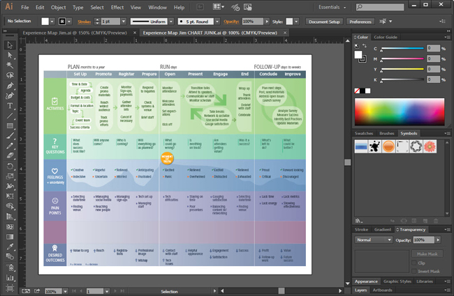
Figure 2-27. The experience map example in Figure 2-24 as created with Adobe Illustrator, a high-end graphics program.
Web-Based Tools
Web-based tools for mapping are becoming more powerful. They have the benefit of easy sharing and high portability. If you’re working with people in different locations, an online tool can support remote collaboration.
- Touchpoint management programs
-
Touchpoint Dashboard (www.touchpointdashboard.com) is a leading example of an online tool specifically for managing touchpoints (see Figure 2-28). This type of tool is best for tracking changes to touchpoints over time. Because it’s database-driven, it also allows for multiple views of information. For instance, you can filter and change views to see your data from multiple perspectives. This isn’t possible with graphics programs and other desktop software.

Figure 2-28. Touchpoint Dashboard is an online tool used to manage touchpoints.
- Online mapping tools
-
UXPressia (www.uxpressia.com) is a leading for-purpose online mapping tool that offers many templates to get started, as well as the ability to collaborate with colleagues directly in a map. Others include Smaply (www.smaply.com) and Canvanizer (www.canvanizer.com).
- Online diagramming tools
-
Lucidchart (www.lucidchart.com) is an online diagramming tool akin to Omnigraffle or Visio. It has the advantage of being integrated directly into Google Drive.
- Online whiteboards
-
Online whiteboards such as MURAL (http://mur.al) and other similar tools work well for all aspects of the mapping process. Their flexibility and large canvas area allow for the creation of detailed diagrams, all online. This opens up the process for active contributions from others on an ongoing basis.
-
Figure 2-29 shows a mapping exercise I completed using MURAL. First, you’ll see that multiple activities can be included on one diagram: value chain mapping, personas, empathy maps, and experience maps. Second, the large virtual service allowed us to compare two different experiences—in this case, going to the supermarket by bicycle and by car. Finally, working online allows for the integration of images to make a description of the experience even richer. MURAL also allows for multiple people to collaborate in real-time in the cloud.

Figure 2-29. Several mapping activities and a comparison of different experiences all in one place using MURAL (http://mur.al).
Summary
The goal at this stage in the process is to assemble the insights from investigation into a single diagram. Mapping the experience not only captures a great deal of information in a compact space, but it provides a compelling form of storytelling that stakeholders want to engage with.
The shape of your diagram conveys meaning. Typically, a chronological diagram will have a table-like or timeline layout. But there are alternative as well, such as circular layouts, spider-like networks, and “snakes and ladders.” Consider how the form of the diagram amplifies the overall message.
Getting the content to fit in a condensed format is challenging. This is an iterative process of clustering and grouping and clustering the groups. Your goal is to reduce the information to representative aggregate behavior for the target group. Thinking from the top-down helps this process. Use the form and structure of your diagram to guide compiling the content.
It is important to understand the basics of information design and importance of visualization, even if you are not a graphic designer. Typography is critical since much of the body is text. Graphic elements add visual interest and efficiency. Lines, shapes, icons, and colors enhance comprehension.
Visual hierarchy also plays a role. Not all elements are of equal importance. Use layering and different sizes to bring some aspects to the foreground and to push others into the background. If you need to hire a graphic designer, you should be able to discuss some of these basics with him or her.
There are a variety of tools for illustrating a diagram. Using spreadsheets and diagramming tools provides an easy start and quick results. High-end graphic applications can produce polished maps, but require expert skills to operate. There are more and more online tools available, including for-purpose mapping solutions and multi-purpose whiteboarding solutions.
Further Reading
Robert Bringhurst, The Elements of Typographic Style, version 3.2 (Hartley & Marks, 2008)
This is an attractive, extremely wellwritten book that is considered by many to be a “bible of typography.” The illustrations and examples included are impeccable and engaging. There is a wealth of practical information, including a review of selected font specimens and a thorough glossary. This volume is a timeless reference to own.
Edward Tufte, Envisioning Information (Graphics Press, 1990), and Visual Explanations: Images and Quantities, Evidence and Narrative (Graphics Press, 1997)
Edward Tufte is the leading thinking in information design. These two books are a few of his many tomes outlining fundamental principles of information design. Understanding these concepts helps greatly in creating alignment diagrams.
Diagram and Image Credits
Figure 2-1: Customer journey diagram for Starbucks created by Eric Berkman, used with permission
Figure 2-3: Diagram created by Sofia Hussain, appearing in her article “Designing Digital Strategies, Part 1: Cartography,” UX Booth (Feb 2014), used with permission
Figure 2-24: An experience map for organizing a conference, created by Hennie Farrow, VP of Design, with Jim Kalbach
Figure 2-25: Journey map created Craig Goebel (https://www.linkedin.com/in/craiggoebel/), used with permission
Figure 2-25: Excerpt from a diagram appearing in Ed Thompson and Esteban Kolsky. “How to Approach Customer Experience Management” (Gartner Research Reports, 2004)
Figure 2-28: Image of Touchpoint Dashboard from www.touchpointdashboard.com
Figure 2-29: Screenshot of experience map by Jim Kalbach, created in MURAL
Figure 2-30 to Figure 2-33: Created by Jonathan Podolsky, Ebae Kim, Paul Kahn, and Samantha Louras at Mad*Pow, used with permission