
Chapter 8: Advanced Drawing and Painting Techniques
This chapter will look at some of the more esoteric functions that you'll find in Elements. I use the word esoteric simply because these features are more graphic than photographic, more illustrative than documentary; however, as you'll see here, these features can be used to create standalone designs, or they can be incorporated into your day-to-day photography projects to produce outstanding results.
The main topics that will be discussed in this chapter are as follows:
- Illustration – drawing and painting techniques
- The View menu
- Using a graphics tablet
- Using brushes
- Brush behavior
- Drawing a sphere from scratch
- The Impressionist Brush
- The Color Replacement Tool
- Working with Brushes
- Importing and using Custom Brushes
- Custom lightening brush exercise
- Adobe vectors – using Adobe clip art
- Creating custom vector illustrations
- Working with effects filters
Illustration – drawing and painting techniques
For a Moms and Dads photo editing app, Adobe Photoshop Elements continues to amaze with what it can offer in terms of its processes, functions, and toolset. You'll find a staggering array of graphic elements that can be downloaded and installed directly from the Adobe servers, plus an impressive range of photo editing, design, and illustrative tools that go together to make it an all-in-one creative powerhouse.
Before I learned how to use Adobe InDesign, an industry-standard page layout application, I used Photoshop Elements to design, assemble, and produce my first 100-page magazine. It was quite hard work because Elements is basically designed for small tasks, snippets of text, and home projects, not commercial magazine production. Even so, the result, I might add, was excellent.
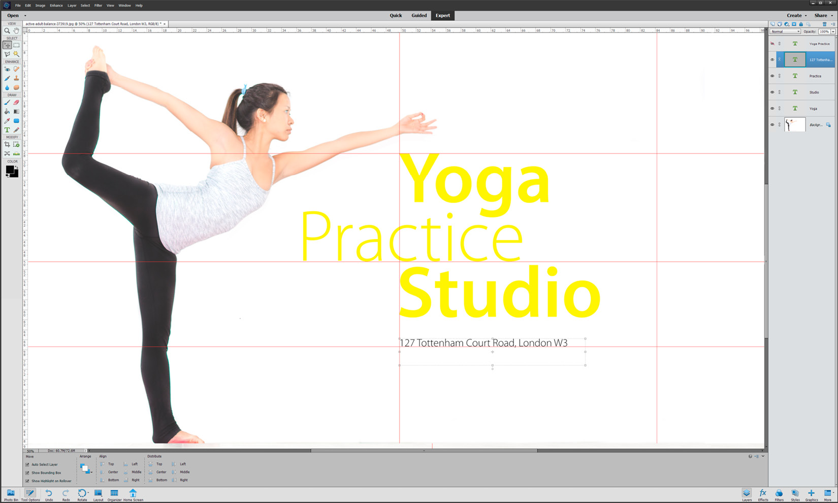
The following is a graphic illustration that was created using nothing but vector clip art picture frames and a background, downloaded from the Graphics panel (via the Adobe servers):

We'll look at its graphics capabilities in the following sections, but in the meantime, let's look at the illustrative capabilities of this program, starting with the essential design and layout helper: The View menu.
The View menu
Before you start any design project, it's important to have layout and lineup tools at your disposal – in the same way that before you start to type a letter, you need to have the margins, font and font styles set in place for a specific style or look.
The View menu repeats some of the keyboard shortcuts we've already mentioned elsewhere in this book, notably the Zoom in and Zoom out functions (Ctrl/Cmd + + and Ctrl/Cmd + -, respectively). These are two of the most important keyboard shortcuts because, as an image editor, you need to go in close to retouch, then zoom out to the see the global effect, then go in close again, then zoom out again, on a regular basis. Alternatively, you can use Ctrl/Cmd + 0 (zero) to fit the image to the main screen – another handy shortcut.
Zooming to Print Size will show you how large it will print. If you have adjusted the file resolution so that it matches the output requirement (in the Image Size panel), this should provide accurate feedback on the display size.
In the following screenshot, I have opened the Preferences program (Ctrl/Cmd + K) at the Guides and Grid tab and have changed the Grid so that it displays in red, every 25%, with four subdivisions. This produces a clearer-looking grid with an easy to see (slightly thicker) vertical and horizontal center line:

Tip
Many might find the "line of marching ants" active selection line a bit distracting, especially when viewing the selection up close. Press Ctrl/Cmd + H to temporarily hide an active selection line. Just don't forget to press Ctrl/Cmd + H a second time to bring the selection line back, or use Ctrl/Cmd + D to deselect the selection before moving on.
Snap To is another handy feature, especially if you are using Elements for page layout or design and need to precisely align multiple elements (text boxes, images, or other graphics). Position a Guide somewhere in the page, then drag each element one by one into the vicinity of the guide – providing Snap To is turned on, it will "snap" or stick to the guide. I use this feature all the time because it works so well. If you are working on a project where positioning elements freehand is necessary, turn Snap To off so as to specifically stop those elements sticking to Grids or Guides.
Rulers are self-explanatory, but the Guides aren't. A Guide is a moveable line that can be positioned anywhere in the main screen, vertically or horizontally. You can have as many of these as are needed for the design job; just mouse-click and drag them off the ruler one at a time. To get rid of them, either drag them back off the screen into the ruler or choose View | Clear Guides. In the following screenshot, you can see the Guides (red) in action. Guides (Ctrl/Cmd + ;) are brilliant for lining up text and image layers for precise positioning. Guides and Grids do not print:
Using a graphics tablet
We have already discussed several uses for the Brush tool, notably in creating layer masks, in previous chapters, but of course, it can also be used as a real brush. To do this, you need to be adept at drawing with a mouse (which is akin to sketching with a bar of soap), or you might consider buying a graphics tablet or graphics monitor.
Tablet devices are perfect for artists because, instead of drawing with a mouse, you use a pen stylus, which is roughly the same size and shape as a real pen, and draw onto the tablet as if it were the screen itself. Interestingly, tablets are also available in the form of graphics monitors – digital screens onto which you draw – but these are significantly more expensive.
Tablets come in a range of sizes, though the larger the better since they provide more drawing accuracy and features, but nevertheless, even a $50 model will serve you well. One leading name in tablets is a company called Wacom, which produces a complete range of products from entry level to very expensive $700+ professional versions. If you just need a different and more accurate way to control your mouse actions, it's probably best to invest in a small or medium-sized tablet, which will set you back up to $300 or so:

Bluetooth-enabled models are slightly more expensive than non-Bluetooth models. If you can survive with a USB cable connection, you could save $40 or so. Larger models (8.5 x 5.5 inches and up) are easier to use because the active part of the tablet reflects the size of the screen more accurately. At the top end of town are tablets specially designed to work with real paper. Clip your favorite paper to the tablet and use the electronic stylus to either trace or draw through the paper to create an electronic file. Expect to pay over $600 for one of these bad boys.
If your work is 100% reliant on your penmanship (and your boss is OK with buying one for you), consider the top-of-the-range monitor tablet, which is essentially a 4K screen that you draw, design, and animate on. This is a beautiful product, but at $4,500+, it's out of the price range of most mere mortals:

Tips for getting the most from a graphics tablet
Unless you're incredibly gifted with manual dexterity, a graphics tablet is never a complete replacement for the mouse.
Buy the largest one you can afford – the larger the surface, the more realistic your drawing motion will be.
More expensive tablets have programmable buttons that aid productivity.
Make use of the Tablet Menu in Photoshop Element's Brush Options panel.
Despite being primarily a photo editing application, Photoshop Elements has an amazing range of graphic tools that are offered specifically to photographers and designers so that they can extend their creativity.
Here's a terrific graphic illustration that was created from a photo and over-painted with several different watercolor effects:

When using the Brush tool, note that Elements has a special Tablet menu (located in its Options Panel) that allows you to get more from the graphics tablet.
I have used tablets for many years and still find it hard to get exactly the right feel for drawing on a computer – but then again, I'm no artist and struggle to draw anything more basic than a loose sketch. That said, I have worked with designers who possess a masterful skill with the medium – they can churn out illustrations with these tablets that are truly beautiful.
Using brushes
Elements has several types of what I class as artist's brush tools. These are the Pencil tool, the Brush tool, the Impressionist Brush tool, and the Color Change tool.
The Pencil tool, all alone on its own peg on the Tool bar, is possibly the least used of all of Element's many tools because, as I mentioned previously, unless you are a skilled graphic artist experienced with a pen tablet, it's very hard to use:

Brush behavior
Though Elements is mostly a photo editing program, many of its tools rely on the use of a brush (and in my opinion, brush-based tools such as Dodge, Burn, and Sponge are some of the most creative in Elements).
But it doesn't end with these three excellent retouching brush tools. Elements contains a wide range of "real" (digital) brushes to paint, sketch, draw, and illustrate with, either by brushing on top of an existing image or starting from scratch with a blank canvas.
If that is not enough, Elements allows the user to change the characteristics of each brush – the shape, orientation, opacity, color, pressure, and appearance, all of which we will look at over the following pages.
On top of the expected hard and soft brush tips (the top two lines in the following screenshot), Elements provides a number of other brush characteristics, which include Spacing – if you are drawing and the line looks a bit lumpy, this is possibly because the Spacing slider is incorrectly set – which is the third line from the top. You can also angle the brush tip for an oblique look – this is more for users of a graphics tablet:

The following screenshot illustrates feature effects such as Fade (top), Jitter, and Scatter (which spreads the paint around, a little like the Impressionist Brush):

Now, let's learn how to draw the perfect square or rectangle using any of the brush-based tools in Elements. An example of this is shown in the following screenshot:

This point-to-point drawing technique works with all the Eraser and retouching type brushes, as well as the Burn, Dodge, and Sponge tools:
- Turn on the Grid (Ctrl/Cmd + ').
- Choose a drawing brush (such as the Pencil or Brush tool).
- Mouse-click once on point A.
- Hold Shift and mouse-click point B. The pencil line joins point A to B in a straight line.
- Hold Shift and mouse-click point C. The pencil line joins point B to C in a straight line.
- Hold Shift and mouse-click point D. The pencil line joins point C to D in a straight line.
- Hold Shift and mouse-click point A. The pencil line joins point D back to point A.
Now, let's learn how to draw the perfect circle using the Elliptical Shape tool and the Elliptical Marquee Selection tools. An example of this is shown in the following screenshot:

Let's get started:
- Create a new blank document (File | New | Blank File).
- Choose the Elliptical tool – normally, you'd click and drag in the new canvas to draw the shape, but it's hard to get it precisely symmetrical doing this freehand.
- Hold the Shift key, then click and drag into the canvas. The Shift key locks the proportions, giving you a perfect circle. Note that if you want to add color to the graphic, you need to select the color first - in this case using the Color Picker, before moving on to draw the shape on the canvas.
Drawing a sphere from scratch
As a very simple exercise, the next few illustrations will show you how relatively easy it is to draw a three-dimensional sphere shape using Element's drawing tools:
.jpg)
Let's get started:
- Use the Custom Shape tool to draw a perfect vector circle, as highlighted in red in the preceding screenshot (tip: hold Shift when you do this to keep its proportions). Also, note that if you have not set your preferred color in the Tool bar's foreground Color Picker, it will default to black:


- Add a shading effect. Using a large, soft-edged brush, I "painted" a darker shade of green into the lower part of the circle with increasingly deeper-colored brush strokes. I reselected from the color picker again and again, darkening the tint each time, to get the gradation just right. The brush must be large, soft-edged, and set to an opacity of 25% or so.
It takes a while to slowly build up the shading effect that you can see in the following image, where the base is now almost black:
:


- Once the color had darkened nicely around the base of the sphere, I chose white to "paint" in a light highlight at the top of the sphere. Once the tonal areas were more or less complete, I applied a Gaussian Blur (Filter | Blur | Gaussian Blur) to the entire area in the selection to smooth the tones:

- Now, we need to add a shadow. I duplicated the floating sphere layer, dragged it to the bottom of the screen with the Move tool, then used the Transform feature and its Scale transform command to squish the shape, as you can see here:
.jpg)
- Then, I converted the squashed sphere to black using the rarely used Output Levels part of the regular Levels tool. Push the highlight slider all the way to the left (arrowed) to make it go black. This is now our shadow:

- Finally, I blurred the black shadow layer using the Gaussian Blur filter and reduced that layer's opacity to give it a more realistic shadowy look. Now, it's finished.
The Brush tool looks and works like an electronic version of an artist's brush: choose a color from the Color Picker on the Tool bar, pick out a brush tip (300+ on offer), adjust its diameter (size) and its opacity (the speed of the brush), and off you go.
You can also elect to paint in different Blend Modes, depending on how you'd like the pixels to merge into each other. The default is Normal, but you can choose from one of the other 20+ Blend Modes for a special effect:

With skill and the right brief, graphic artists can create impressive-looking artworks using Photoshop Elements' illustration tools: the Brush and Pencil in collaboration with a graphics tablet. Here's another illustration. Essentially, this is only made up of 10 colors and is a vector image, saved in the GIF file format. Due to this, the file size is tiny:

Impressionist Brush
The Impressionist Brush is fun as it sort of clones (copies) your image and paints it directly back into the canvas as large, fuzzy brush strokes, producing, I suppose, something that passes for an impressionist look. You can broaden your impressionist look a little using its Advanced button, which takes you to a range of other brush stroke options, Tolerance settings, and more. I'm not sure what Edouard Manet or Claude Monet might have thought of this process, but with the right image and textured paper to print on, the effects can be quite good.
This is the original picture:

I generally set the Impressionist Brush Tip to a large size when painting the background, but make the brush significantly smaller when working on the details – otherwise, the photo will just look out of focus or blurred. Another technique is to duplicate the layer first, apply the impressionist brush to the top layer, and then, with the Eraser tool (set to a low opacity of around 20%), carefully erase some of the top layer to reveal the real image beneath. Doing this produces a subtle blend of original image combined with the impressionist look. Sometimes this partial reveal process works better than just using the Impressionist Brush alone - but again, this does also depend on the nature of your original image:

Color Replacement tool
Lastly, we have the Color Replacement tool. Like many other tools, this one relies on applying the color change effect to similar-colored pixels. Take a look at this before and after illustration:

This isn't a bad result. I repainted the town hall in the background in a couple of minutes with the Color Replacement tool.
So, if I want to replace blue with red, providing all the blue pixels are the same value, it will work very well – but we all know that life in the digital editing realm is not like this, so that's why we have the Tolerance slider to make Elements be a bit more or less sensitive when it's applying a color change. Increase the tolerance and it will apply the change to lighter and darker shades of blue. You have different brush styles to choose from: four different Blend Modes (I find Color works best) and the inevitable Contiguous or Discontiguous check boxes.
Working with Brushes
Photoshop Elements comes with a number of artistic style tools, which includes a basic paintbrush. This tool has over 300 variants, which means you could spend a lot of time scratching your head deciding which style of brush you want to use.
The Preset Manager, which you'll find in the Expert edit mode, allows you to modify, monitor, import, delete, and rename Brushes, Swatches, Gradients, Styles, Patterns, and Effects.
Importing and using custom Brushes
If I were to download some custom brushes from the internet, I'd first open the Preset Manager, choose Brushes from the central drop-down menu, and then click the Add button, navigate to where the brush set has been downloaded to (such as into the computer's Downloads folder), and double-click to load them into Elements.
If I then click the Done button, this saves the brush (or brush set) into Elements for use later. I can, of course, rename that particular brush set, or even delete individual brushes that I don't like or use, in order to simplify my choice next time I'm looking for a brush type.
The following illustrations show the process of looking for, locating, loading, and then using custom brushes to enhance your images. Sometimes, this might just be the addition of something very small (such as a tiny cloud in an otherwise blue cloudless sky) or, at the other end of the scale, something far more dramatic, such as lightning bolts striking the Earth:
.jpg)
Let's learn how to import and work with Custom Brushes:
- Here's what you'll find if you Google Free Adobe brushes. In this example, I searched for free cloud brushes and downloaded a set from a site I have found to be very reliable (www.brusheezy.com). Before you do this, please note that if you're not following the download instructions perfectly, you may find that, not only do you download a brush set, but that you may also download other software (from any website). Just be careful when you download and install anything because it might not be everything you were expecting, especially if that website is giving away stuff for free:
.jpg)
- Here's the contents of my computer's Downloads folder – I download a lot of different brush sets! Here, you can see that some are in zipped folders waiting to be used, while the black and white icons named "brushes" are the unzipped brush sets waiting to be imported into Elements for use as a project:

- Right-click in the image to view the pop-out Brush panel. In the top right-hand corner, click the tiny button to view another pop-out contextual menu. This is where you can load newly-sourced brush files:

Once the new brush set has been loaded, you will see the new brushes in the Preset Manager, as shown in the following screenshot. Click Done:

- In this example, the default cloud brushes I've installed are quite large (they were labelled as being more than 1,000 pixels across – the width of the brush is denoted in pixels underneath the brush thumbnail).
They can, of course, be made smaller or larger as you can with any brush in Elements, either by changing the pixel width in the tool options panel or by tapping the left square bracket (to make it smaller) and the right square bracket to make it larger. By clicking once in the image, you add an image, not a brushstroke. If you click and drag, as you would when creating a normal brushstroke, the image of the cloud will be dragged across the canvas and would create a smeared line, which isn't what's wanted in this example. As you can see here, the single click has deposited a single black and white image of clouds over the surface of my seascape. The cloud is realistic but the positioning, over the sea, is definitely not!

- If the image you're working on has a very clear separation between the sky and the landmass, you can simply choose a suitable color (white or black is a good place to start), adjust the size of the brush tip so that it fits in the sky area, and click once. As this brush is essentially created from a photo of clouds, clicking once drops in a graphic of those clouds. You might want to modify the opacity of the brush (that is, the density) and the color, depending on the effect you are trying to create (that is, stormy or sunny).
In this example, the cloud brush is smaller than the previous illustration so that the cloud appears to fit neatly between the two rock stacks, exactly where you might expect to find a cloud – in the sky. In this example, I reduced the opacity of the brush slightly (to 85%) to make it appear as if it were blending with the tones in the original sky:

- Another way to make this fake cloud appear slightly more realistic is not to just stamp it in the middle of the sky, as in the previous example, but to try and integrate it behind the subject – in this example, behind the two dark rocks (this is the coast of southern Iceland).
Because the sky was essentially very pale in the original image, I can easily select it using the Magic Wand tool. Doing so means that if I now stamp my cloud brush into that sky area, the image will only appear in the sky, not on top of the dark rocks sticking up into the scene. This is because they are protected by the selection (this screen grab shows the extent of the selection in Mask mode).
Mask mode in Elements is the same as the Quick Mask mode in Adobe Photoshop CC and is a terrific way of checking the accuracy of the selection. However, it can also be edited as you see it here, using a brush to extend the mask or the eraser brush tool so that you can trim bits off it:
.jpg)
- To fine-tune this process further, you may want to add a Feather amount to the resulting selection line – this should only be set to one or two pixels maximum, and it should be added before you start stamping. This small Feather amount will go a long way in helping blend the edge of the cloud brush with whatever object you're trying to place it behind. In this example, it's those two dark rock stacks off the beach. How can you judge the right pixel number for feathering? Generally, it's experience that teaches you how to get this right – too much and you'll see some fuzzy weirdness around the subject, too little and it doesn't work at all. The best advice is to test it first. If that does not work, undo the last action (Ctrl/Cmd + Z), add a different pixel value, and try again:

As you will appreciate while Googling for Free Photoshop brushes, there are hundreds of other types of free brush sets that you can download and incorporate in your artistic projects.
In fact, you might have seen a range of different brush effects in Chapter 6, Advanced Editing Techniques, in the traveler's journal illustration, which was recreated from over 40 different visual assets. This also included a number of special custom brush sets that I used from the web, including coffee stains, watermarks, and sticky tape, which are illustrated in the following image:

Custom lightning brushes
Cloud brushes are just a tiny part of the resources Elements users have access to on the web. You'll find an amazing range of free stuff online – just Google Free Photoshop Brushes and you'll get hundreds of responses. It's an opportunity to waste a lot of time because there's so much cool stuff to choose from.
From experience, some websites are excellent (such as the one pictured here), while others, although genuine, tend to include 'other' software in the free download. Be vigilant when you download and install!
Like the cloud brushes we profiled earlier in this chapter, there are lightning brushes, and a whole lot more to be had if you have the time to look for them. Most of the brushes I have tried worked really well, but as with anything downloaded off the internet, it pays to be a little careful in case you accidentally download more than you bargained for:

As with the previous step-by-step description of how to incorporate a cloud brush into your workflow, let's add some electric drama to a landscape using a lightening brush set!
Let's take a look at some custom lightning brushes:
- I found a whole bunch of these brushes while searching for clouds. Again, these are from www.brusheezy.com, although there are many more sites offering similar brush files.
Here's that brush set, already loaded into the Preset Manager, and now visible in the Brush panel that opens when you right-click anywhere in the image (or by clicking the Brush Settings menu in the Brush tool's Options panel). Note that the size of the brush is itemized as a pixel width under the small graphic of each lightning image:

- Clearly just stamping one image of lightning into the main window isn't going to look genuine – lightning strikes never look like this because they emanate from the sky, generally from deep within a cloud system, so they will, more than likely, be part-obscured by more clouds - plus of course, this lightning bolt starts well below the top of the frame which looks somewhat fake:

- To make this effect appear a little more real, I duplicated the landscape image layer first. Then, I made a new (blank) layer and clicked one lightning stamp into it. Because it is on its own layer, I dragged this lightning layer to the middle of the layer stack – the flash of lighting disappears immediately because it's now hidden by the (duplicated, and 100% opaque) top layer. Next, I reduced the top layer's opacity to around 80% so that I could see the lightning layer showing through it and carefully erased pixels from the top layer (with the Eraser tool set to 25%) to reveal the lightning on the layer beneath it. The good part of this exercise is that you don't have to be precise about erasing the exact same shape as the lightning bolt. Use a soft brush and erase a bit on either side. Also, note that I didn't erase all the pixels, so it looks like part of the lightning is actually still behind some of the darker clouds, which I think lends a greater sense of authenticity to the finished product. A meteorologist might look at this and find fault but to a casual observer, this effect, which took only a few minutes to complete, stands up well.

Adobe vectors
Photoshop Elements comes packed with vector clip art that you can use in your various projects. Actually, these assets are not in Elements when it's first downloaded, but every time you click an item in the Graphics panel, it will automatically download from Adobe. Since these are vector graphics, their size is tiny, so they take no time at all to download. Vectors are made from a mathematical formula and not pixels. Images are made up of individual pixels, which is why they take up a lot more space.
As an example, I am going to show you how make a custom greeting card using vector clip art. Let's get started:
- To make your own custom greeting card, create a new document (File | New | Blank Document). Before you actually start the design process, I recommend that you search for envelopes that match your cards. It's very annoying if you go ahead and design a card and then find that no one makes envelopes to match the size of the card (yes, it's happened to me a couple of times). Find an envelope, measure its proportions, and create a new document that's twice its width or height, depending on whether you want the fold line at the top or on the left-hand edge of the card:
.jpg)
- You can add some very nice preset text effects using the Text submenu in the Graphics panel. Double-clicking the text style from the listing on the right-hand side immediately adds it to the document open on the page as Your Text Here. Click this text to add your own greeting:

As an example, I chose Backgrounds from the drop-down menu, which is at the top-right in the Graphics panel, and clicked one of the thumbnails to automatically download and install it into my document:

- My one problem with this otherwise good design feature is that it's hard to see what that design looks like before it is downloaded. But then, because it's only a small file, you can try one, and if it's no good, undo and try more.
- If Backgrounds are not your thing, you can also drag entire designs, plus picture windows and frames into your custom card artwork. Again, this is a hit-and-miss process because some of the designs look quite different once they're in place. Simply undo and try another style before saving and printing it on your local inkjet or laser device. I sometimes spend a little more time making up a card design - then I save it in the Photoshop (.psd) format as my 'master' file. Once saved I can return to that same 'master' document again and again, changing just the main image to make it look fresh each time I need a new greetings card:
.jpg)
Creating custom vector illustrations
Surprisingly, Photoshop Elements has an amazing range of vector tools – shapes, text, and more. The beauty of these tools is that, since they are essentially made up of nothing more than a mathematical formula, they occupy very little space and can be resized to any size with no loss of quality.
In these illustrations, I am making a design for a book on Japanese food, experimenting with a custom font (Paper Cuts, downloaded for this project), as well as vector shapes as text boxes, plus a range of special effects, such as Drop Shadows. Let's get started:
- In this example, I'm using scalable vectors to create a simple page design for a book on Japanese food. I have the main image open and have chosen a rounded edge panel as a starting point. Choose Custom Shapes from the Tool bar, select the Rounded Rectangle Tool (U), then click, hold, and drag into the image to add this vector shape to the document. It will go into its own layer automatically. Note that it doesn't matter if this is appearing at the right proportion or not because it can be resized at any time:
.jpg)
- With this, I've added the first of my type layers. You can see that there are now three layers in this file: the background foodie shot, the vector shape layer, and the type layer on the top. At this stage, the font is just the default:

I changed the default font to a custom one called Paper Cuts (from a free site called www.dafont.com), which kind of suits the Japanese theme. Note that the Rounded Rectangle acts like a text box, into which text can be typed. This can be rather restrictive, especially if you're using a non-standard font, as I was here. In this instance, I created the new type layer away from the Rectangular panel, then dragged it on top, ensuring that it remained independent of the vector panel beneath it:

In this step, I duplicated the text and the vector layers. This is a handy shortcut that can be used in a lot of projects. By duplicating these layers, I don't have to go back to the Tool bar, select the Custom Shape tool, choose the Rounded Rectangle tool, and draw another shape (or create another text layer, for that matter). It's always far quicker to duplicate what you already have and then adapt the duplicate:

I've dragged both newly duplicated layers to the bottom of the page using the Move tool, and with the Type tool, edited the copied text layer so that it reads Kaiseki (an exquisitely presented traditional Japanese multi-course lunch or dinner). This process is much faster than trying to create a new type layer:

- To add more irregularity to the shapes already created (I wanted it to look more retro), I transformed their shape. As these are vectors, you can resize them in any direction and to any magnification with no loss in terms of sharpness. Ctrl/Cmd + T puts the vector layer into transformation mode (confirmed by the appearance of corner handles around the shape). Grab any corner handle to stretch it larger, or push it in to make the shape smaller. Right-click inside the transform box to access the menu to change from Scale to Distort, Skew, or Perspective. I used Distort because it allows you to drag one corner only – which I did to reshape the rectangular proportions, as you can see here:

- I duplicated the vector and text layer one more time to add the third component to the design:

- Double-clicking the vector layer thumbnail brings up the Color Picker, allowing you to add any color you like to that panel:

- Adding color to the text is a slightly lengthier process. Select the text first, then choose a color from the Options panel. Alternatively, you can click in the Color Picker and add a color from there:

- In the final stage, I added a small black drop shadow to the three text elements, just to lift them off the background color slightly. Drop Shadows are located in the Styles panel. Then select the appropriate text layer, go to the Styles panel, choose Drop Shadows from the drop-down menu and click a specific style (icon). The shadow is instantly applied to that text layer. If it is not to your liking, its characteristics can be edited and fine-tuned using the 'fx' button that appears on every layer that has a special effect added to it. Double-click that 'fx' logo on the layer to open the Style settings panel.

Vector graphics – key points
Infinitely scalable, with no loss of quality
Contain smoother edges (than pixel-based images)
Small files – fast downloads
Excellent for web use
Effects filters
Photoshop Elements comes with a huge range of special effects filters, which are located under the Filter menu at the top of the main screen. Many of these are legacy items that have been left over from previous iterations of this application – often very early versions. Because many of these are quite long in the tooth, it's quite difficult to find a practical use for them – personally, I think a lot of them could be removed to make space for newer features – but this is just an opinion. Try them out for yourself and see what you think.
One reason for not being impressed with some effects filters is because there are many excellent software plugins on the market that do the job of special effects far better than what Elements has to offer. That being said, you'll probably note that I have written about the Gaussian Blur filter in particular, and how useful it is, on a number of occasions. The Filter Gallery exists so that, rather than applying filters to an image one at a time (which is quite laborious), you can try a lot of the effects in a short time, one after the other, inside the Gallery itself.
One of my favorite filter effects, Cutout, reduces the number of colors in the image to give a colorful, silk-screen-printed, graphic effect. With this filter, you can choose how many color levels are used, with tools such as Edge Fidelity and Edge Detail:

The Filter Gallery is subdivided into six sections: Artistic, Brushstrokes, Distort, Sketch, Stylize, and Texture. In all, the Filter Gallery contains 56 different effects. Each effect has its own Options panel, allowing you to vary the intensity of the process to match the style that's required:

To help you untangle the mess of options in this utility, the Filter menu features a dozen subcategories: Artistic, Blur, Brushstrokes, Distort, Noise, Pixellate, Render, Sketch, Stylize, and Other. If you were to purchase and install a third-party plugin application, you'd see it appear at the bottom of the Filter list in the main window.
Keyboard shortcuts
Here's a list of some of the best (or most appropriate) keyboard shortcuts for this chapter:
- Create a new document: File | New | Blank Document.
- Zoom in: Ctrl/Cmd + "+".
- Zoom out: Ctrl/Cmd + "-".
- Fit image to page: Ctrl/Cmd + 0 (zero).
- Grid (repeat the same to remove it): (Ctrl/Cmd + ').
- Show and hide the Guides: (Ctrl/Cmd + ;).
- Use this to temporarily hide the selection line of marching ants. Repeat to show it: Ctrl/Cmd + H.
- Puts any object on a layer into Transform (resize) mode: Ctrl/Cmd + T.
- Hold the Shift key down while drawing with the Elliptical tools, Rectangular tools, or any of the Custom Shapes to lock the proportions.
Summary
So far in this book, we have discovered how this software application not only produces some outstanding results on regular image files, but that it can also be used very effectively as a graphic design and illustration tool.
We have discovered that working with vectors can be a completely different experience to pixel-based photos because, as we saw in this chapter, vectors can be infinitely scalable – while raster images cannot.
What's more, even if you have no desire to become the world's best designer, you can still use Photoshop Elements to produce simple artworks, add special filter effects to images, add text to your projects, and take your editing capabilities to the next level with custom brushes.
In the next chapter, we'll look at finalizing the edited image by starting with a recap on the best resolution settings for social media and the printed page, saving images specifically for the web, several methods for sharpening images, exporting the files, singly or en masse, and finally look at how to process image files in bulk using the very handy but much underused Process Multiple Files feature.