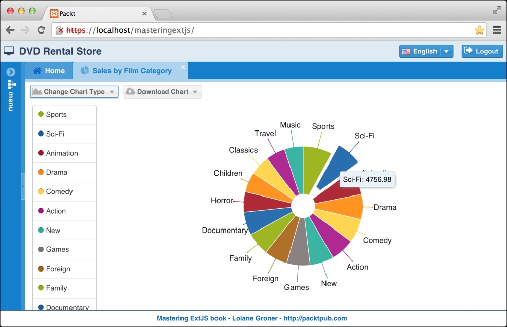
Ext JS provides a great set of visual charts we can implement, and users love things like this. For this reason, we will implement a chart using three different series (pie, column, and bar) where the user can see the Sales by Film Category.
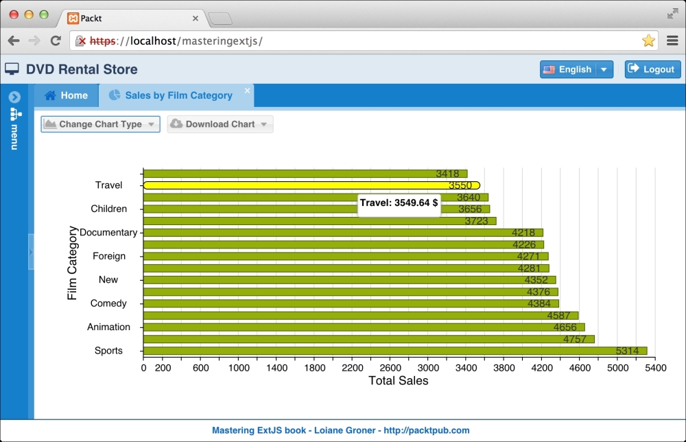
The following is a screenshot of the final result we will have at the end of this topic. As we can see in the following screenshot, we have the chart. Above it, we have a toolbar with two buttons: Change Chart Type, where the user will be able to change the chart series from Pie to Column or Bar, and the Download Chart button, where the user will be able to download the chart in the following formats: Download as Image or Download as PDF. Here's the screenshot we are discussing:
Before we start coding, let's understand a little bit about how Ext JS charts work. Ext JS 4 introduced great charting capabilities by leveraging the HTML5 canvas and SVG features. However, in Ext JS 5, the charts introduced in Ext JS 4 became deprecated. Ext JS 5 introduces a new Sencha Charts package that comes from Sencha Touch, with built-in support for touch, which means we can use touch gestures to interact with the charts.
You might ask, but why am I interested in touch support in the charts? There are many companies that want to use the same application in tablets without developing a new application with the same capabilities for touch devices. Ext JS 5 offers this capability. We will discuss more about touch support later.
Sencha Charts supports three types of charts:
- Cartesian chart: This represents a chart that uses cartesian coordinates. A cartesian chart has two directions, the x direction and y direction. The series and axes are coordinated along these directions. By default, the x direction is horizontal and the y direction is vertical (the directions can be flipped as well).
- Polar chart: This represents a chart that uses polar coordinates. A polar chart has two axes: an angular axis (which is a circle) and a radial axis (a straight line from the center to the edge of the circle). The angular axis is usually a category axis while the radial axis is typically numerical.
- Space Filling chart: This creates a chart that fills the entire area of the chart, for example, a gauge or a treemap chart.
A chart consists of a Legend, Axis, Series, Interaction, and Theme and can load data from a Store as displayed in the following image:
The Series contains the logic about how the data will be rendered in the chart. The series can be Pie, Line, Bar, Column, and so on.
The Axis is responsible for rendering the chart axis based on the type of data. There are three types of axes: numeric, category, and time. The numeric type is used to render numeric values, category is used to render data that is a finite set (for example, the names of the months of the year), and time is used to render data that represents time.
The Legend is responsible for displaying the legend box of the chart.
Sencha Charts also supports interactions. The available interactions are presented as follows:
- Crosshair: This allows the user to get precise values for a specific point on the chart. The values are obtained by single-touch dragging on the chart.
- CrossZoom: This allows the user to zoom in on a selected area of the chart.
- Item Highlight: This allows the user to highlight series items in the chart.
- Item Info: This allows displaying detailed information about a series data point in a popup panel.
- Pan/Zoom: This allows the user to navigate the data for one or more chart axes by panning or zooming.
- Rotate: This allows the user to rotate a polar chart about its central point. There is also a special rotate interaction for 3D pie charts.
Note
More information about charts can be obtained by diving into the Charts Kitchen Sink example (http://dev.sencha.com/ext/5.1.0/examples/kitchensink/?charts=true) and also into the charts package (http://docs.sencha.com/extjs/5.0/5.0.0-apidocs/#!/api/Ext.chart.AbstractChart) in the documentation.
A very important detail: Sencha Charts is available for use in Ext JS 5 applications via a package, meaning the source code of the charts is not available automatically to an application like the grids, forms, and other components. Packages in Sencha applications have a similar concept as gems in Ruby or JARs in Java.
To add Sencha Charts to our project, we need to open the app.json file located in the root folder of the application. Around line 34, we should find the requires declaration. We need to add sencha-charts to requires. It is going to look like the following:
"requires": [
    "sencha-charts"
],
After this change, if we start using charts in the project, our code should work.
Also, here's the last update we are going to do in the menu table to be able to see the report option in the application menu:
UPDATE `sakila`.`menu` SET `className`='salesfilmcategory' WHERE `id`='13';
Let's go back to our code and start implementing some charts. The Store is going to provide the charts with the data. No matter whether we want to create a pie chart or column chart or bar chart, we need a Store to provide the information we want to display.
As we are going to create charts, we need to create a Store that is going to hold the collection of data especially for the chart, which means it is not going to be used anywhere else in the application. For this reason, we can create it directly inside the ViewModel. So we are going to create a new package named reports inside the app/view folder, where we are going to place the files from this topic. We are going to start creating the ViewModel this time, as follows:
Ext.define('Packt.view.reports.SalesFilmCategoryModel', {
    extend: 'Ext.app.ViewModel',

    alias: 'viewmodel.sales-film-category',

    stores: {
        salesFilmCategory: {
            fields: [                  // #1
                {name: 'category'},
                {name: 'total_sales'}
            ],
            autoLoad: true,
            proxy: {                  // #2
                type: 'ajax',
                url: 'php/reports/salesFilmCategory.php',
                reader: {
                    type: 'json',
                    rootProperty: 'data'
                }
            }
        }
    }
});
For this Store, we will not declare a Model; we are going to declare its fields (#1) directly on it. As this Store is going to be used exclusively by the chart, there is no need to create a specific Model for it, as we do not intend to reuse it later.
We are also going to declare proxy (#2) with the ajax, url, and reader details on it. Most of the models we created in the previous chapters were part of a schema that contained a proxy. This time, we do not have this information available, so we need to declare it.
On the server side, we can query the data that will feed the chart from the sales_by_ film_category view from the Sakila database as follows:
SELECT * FROM sales_by_film_category
Now that we are able to retrieve the information we need from the server, let's work on the implementation of the chart. First, we will develop the pie chart, as follows:
Ext.define('Packt.view.reports.SalesFilmCategoryPie', {
    extend: 'Ext.chart.PolarChart',      //#1
    alias: 'widget.salesfilmcategorypie',

    legend: {
        docked: 'left'   //#2
    },
    interactions: ['rotate', 'itemhighlight'], //#3

    bind: '{salesFilmCategory}', //#4
    insetPadding: 40,
    innerPadding: 20,
    series: {
        type: 'pie',       //#5
        highlight: true,
        donut: 20,         //#6
        distortion: 0.6,
        style: {           //#7
            strokeStyle: 'white',
            opacity: 0.90
        },
        label: {
            field: 'category',   //#8
            display: 'rotate'
        },
        tooltip: {               //#9
            trackMouse: true,
            renderer: function(storeItem, item) {
                this.setHtml(storeItem.get('category') + ': '
                    + storeItem.get('total_sales'));
            }
        },
        xField: 'total_sales'  //#10
    }
});
Let's go through the most important parts of the preceding code; first, we need to extend the PolarChart class (#1) because we want to implement a chart with a pie series (#5).
Next, we are going to add legend to this chart, and we are going to dock it on the left (#2). We are also going to add some interactions to this chart (#3). The user is going to be able to rotate and highlight the slices of pie. We are going to bind the Store (#4) we declared in the ViewModel as well.
Next, there is the series configuration that defines what type of chart we are implementing (#5), which is the pie chart in this case. The pie chart needs a field that is going to be used to do the sum and then calculate the fraction of each piece. We only have two fields, and total_sales (#10) is the numeric one, so we will use this field. The donut configuration (#6) sets the radius of the donut. This chart is actually a donut chart (because of the hole in the middle of the pie).
We can also style our chart (#7). The style in this example will add some white lines separating each slice of the chart.
Inside each slice, we also want to display its film category so that we can easily identify it. We can do this by adding the label configuration (#8) to series.
On the tooltip configuration, we can define whether we want to display a quick tip or not (#9). In this case, we want Ext JS to track the movements of the mouse, and if the user does a mouseover over any item of the chart, Ext JS will display a tip with the name of category and the total_sales number.
Note
It is also possible to define theme in the chart. We can do so by adding the configuration theme in this class. The possible values we can set are: 'green', 'sky', 'red', 'purple', 'blue', 'yellow'—'category1' to 'category6'—and the mentioned theme names with the '-gradients' suffix ('green-gradients' and so on).
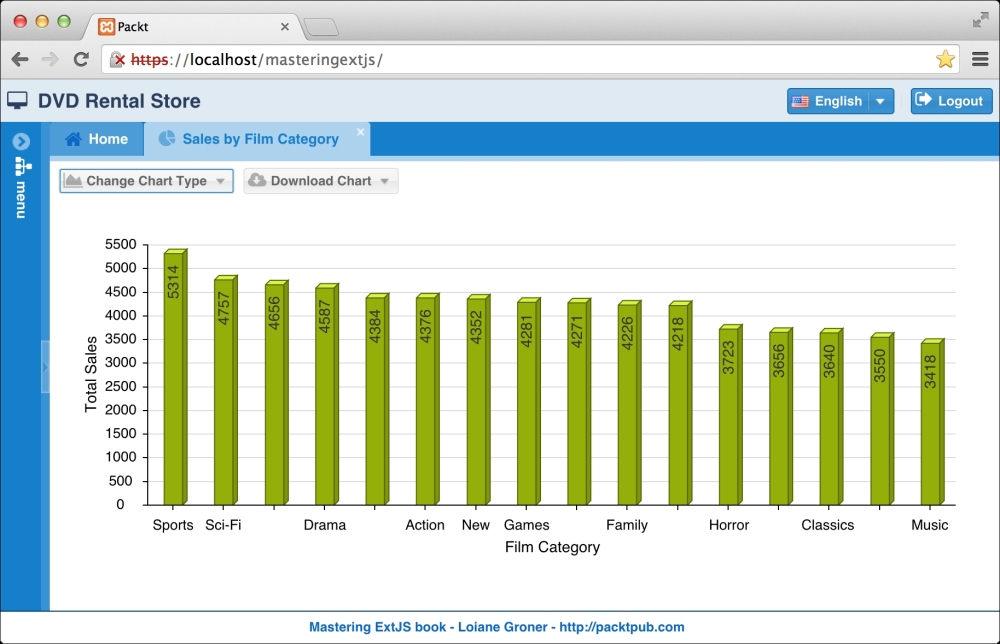
As we can change the chart type, we will also implement a column chart that looks like the following screenshot:
So let's get our hands on the code, which is as follows:
Ext.define('Packt.view.reports.SalesFilmCategoryColumn', {
    extend: 'Ext.chart.CartesianChart',  //#1
    alias: 'widget.salesfilmcategorycol',

    bind: '{salesFilmCategory}', //#2

    insetPadding: {
        top: 40,
        bottom: 40,
        left: 20,
        right: 40
    },
    interactions: 'itemhighlight', //#3

    //axes
    //series
});
The column chart extends from the CartesianChart class (#1) because we want to display a chart with x and y axes. We will also use the same Store we used in the pie chart (#2), and the user will also be able to highlight (#3) the columns in this chart.
Let's take a look at the axes declaration in the following code:
axes: [{
    type: 'numeric',   //#4
    position: 'left',
    fields: ['total_sales'],
    label: {
        renderer: Ext.util.Format.numberRenderer('0,0')
    },
    titleMargin: 20,
    title: {
        text: 'Total Sales',
        fontSize: 14
    },
    grid: true,
    minimum: 0
}, {
    type: 'category', //#5
    position: 'bottom',
    fields: ['category'],
    titleMargin: 20,
    title: {
        text: 'Film Category',
        fontSize: 14
    }
}],
We have two axes in a column chart. The x axis is going to display category (#5), which is going to be placed at the bottom, and the y axis is going to display the numeric (#4) data that is going to be displayed in the right or left (in this example, we chose left). In the case of a bar chart, all we have to do is swap the axes. The category value becomes the y axis and the numeric values become the x axis.
Let's take a look at the series configuration to finish configuring our chart:
series: [{
    type: 'bar3d', //#6
    highlight: true,
    style: {
        minGapWidth: 20
    },
    label: {
        display: 'insideEnd',
        'text-anchor': 'middle',
        field: 'total_sales',     //#7
        renderer: Ext.util.Format.numberRenderer('0'),
        orientation: 'vertical',
        color: '#333'
    },
    xField: 'category',   //#8
    yField: 'total_sales' //#9
}]
In this example, we are implementing a 3D column chart (#6) that can also be used as a 3D bar chart. If we want to implement the normal chart, the series type would be 'bar'. As mentioned before, column and bar charts are very similar; only the configuration of the x and y axes are swapped. If we want to display a label (#7), we can also configure one.
It is important to note that xField (#8) matches the Category axis (#5), and yField (#9) matches the Numeric axis (vertical/left position—(#4)).
The bar chart code is exactly the same as the column chart code with a small change. We need to invert Axis (Category will be left and Numeric will be bottom), xField (which will be total_sales instead of category), and yField (which will be category instead of total_sales).
The bar chart is going to look as follows:
As we want to display a panel and offer the user the possibility to change the chart type, we will create a panel and use the Card layout. To refresh our memory, the Card layout is mostly used for wizards and also when we have several items but want to display only one at a time. And the item that is currently being displayed uses the FitLayout.
So let's create a Chart panel, as follows:
Ext.define('Packt.view.reports.SalesFilmCategory', {
    extend: 'Ext.panel.Panel',
    alias: 'widget.salesfilmcategory',

    requires: [
        'Packt.view.reports.SalesFilmCategoryModel',
        'Packt.view.reports.SalesFilmCategoryController',
        'Packt.view.reports.SalesFilmCategoryPie',
        'Packt.view.reports.SalesFilmCategoryColumn',
        'Packt.view.reports.SalesFilmCategoryBar',
        'Packt.util.Glyphs'
    ],

    controller: 'sales-film-category', //#1
    viewModel: {
        type: 'sales-film-category'   //#2
    },

    layout: 'card',
    activeItem: 0,

    items: [{
        xtype: 'salesfilmcategorypie' //#3
    },{
        xtype: 'salesfilmcategorycol' //#4
    },{
        xtype: 'salesfilmcategorybar' //#5
    }],

    dockedItems: [{
        xtype: 'toolbar',
        flex: 1,
        dock: 'top',
        items: [
            //items of toolbar here #6
        ]
    }]
});
So we need to declare panel and declare each chart we created as an item. So we can declare the pie chart (#3), the column chart (#4), and the bar chart (#5) as items of a Sales by Film Category panel. By default, the item 0 (which is the first item—pie chart) is going to be the default item to be displayed when the Chart panel is rendered.
We also cannot forget to declare the ViewModel (#2) and the ViewController (#1), which we are going to create next.
All the classes we mention are xtype of which(#1 to #5) are inside requires declaration.
Next, we can declare the toolbar that will contain the button with the menu so that the user can choose Chart Type and Download Type. We will add the following code in the place where we have the comment in the preceding code (#6):
{
text: 'Change Chart Type',
glyph: Packt.util.Glyphs.getGlyph('menuReports'),
menu: {
xtype: 'menu',
defaults: {
listeners: {
click: 'onChangeChart' //#7
}
},
items: [
{
xtype: 'menuitem',
text: 'Pie',
itemId: 'pie', //#8
glyph: Packt.util.Glyphs.getGlyph('chartPie')
},
{
xtype: 'menuitem',
text: 'Column',
itemId: 'column', //#9
glyph: Packt.util.Glyphs.getGlyph('chartBar')
},
{
xtype: 'menuitem',
text: 'Bar',
itemId: 'bar', //#10
glyph: Packt.util.Glyphs.getGlyph('chartColumn')
}
]
}
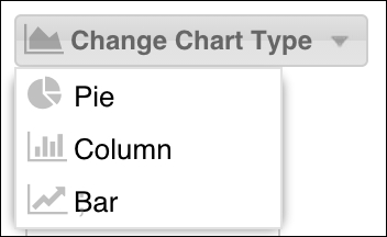
},For the preceding menu, all menu items have the same listener declaration (#7). Instead of having the same code declare three times, we will have it declare only once in the ViewController. To help us identify which menu item fired the event, we are also going to declare itemId for each menu item on lines #8, #9, and #10. The output of the preceding code is displayed in the following screenshot:
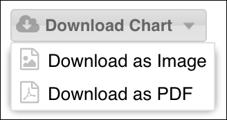
As the second item of the toolbar, we have the Download Chart button. Following the same behavior as the Change Chart Type button, the Download Chart button also has a menu with two menu items in it, one for each download type, as follows:
{
    text: 'Download Chart',
    glyph: Packt.util.Glyphs.getGlyph('download'),
    menu: {
        xtype: 'menu',
        defaults: {
            listeners: {
                click: 'onChartDownload' //#11
            }
        },
        items: [
            {
                xtype: 'menuitem',
                text: 'Download as Image',
                itemId: 'png',
                glyph: Packt.util.Glyphs.getGlyph('image')
            },
            {
                xtype: 'menuitem',
                text: 'Download as PDF',
                itemId: 'pdf',
                glyph: Packt.util.Glyphs.getGlyph('pdf')
            }
        ]
    }
}
We will have listener (#11) for this menu in the ViewController. The output for the preceding code will be the following:
Before we develop the two methods we need to implement to close this chapter, let's declare the structure of the ViewController for the reports module:
Ext.define('Packt.view.reports.SalesFilmCategoryController', {
    extend: 'Ext.app.ViewController',

    alias: 'controller.sales-film-category',

    //methods here
});
Next, we will see how to develop the onChangeChart and onChartDownload methods.
As the user has the capability to change the chart type by choosing an option from the menu, we will develop the following method:
onChangeChart: function(item, e, options) {
    var panel = this.getView(); // #1

    if (item.itemId == 'pie'){
        panel.getLayout().setActiveItem(0); // #2
    } else if (item.itemId == 'column'){
        panel.getLayout().setActiveItem(1); // #3
    } else if (item.itemId == 'bar'){
        panel.getLayout().setActiveItem(2); // #4
    }
}
First, we need to get the Chart panel. We can simply retrieve it by calling the getView method from the ViewController (#1).
As the menu item that was clicked on fired the event click, the first parameter this method receives is the item itself. We can get its itemId property to compare which itemId the user clicked on, and we set ActiveItem accordingly (#2, #3, and #4) to the option the user chose.
The setActiveItem method is from the Card layout. From the View, we can get the layout, which will return an instance of the Card layout, and the method will be available.
On the onChartDownload method, we will follow the same logic as we did for the Change Chart Type menu items. But in this case, we want to save the chart as an image (PNG) or PDF file. Here's how we go about the task:
onChartDownload: function(item, e, options) {
    var panel = this.getView();
    var chart = panel.getLayout().getActiveItem(); //#1

    if (item.itemId == 'png'){
        Ext.MessageBox.confirm('Confirm Download',
            'Would you like to download the chart as Image?', function(choice){
            if(choice == 'yes'){
                chart.download({   //#2
                    format: 'png',
                    filename: 'SalesXFilmCategory'
                });
            }
        });
    } else if (item.itemId == 'pdf'){
        Ext.MessageBox.confirm('Confirm Download',
            'Would you like to download the chart as PDF?', function(choice){
            if(choice == 'yes'){
                chart.download({  //#3
                    format: 'pdf',
                    filename: 'SalesXFilmCategory',
                    pdf: {
                        format: 'A4',
                        orientation: 'landscape',
                        border: '1cm'
                    }
                });
            }
        });
    }
}
The Chart class already has a method named download, which we can use to download the chart in different formats. This is a native feature from Ext JS.
So first, we need to get a reference of the Chart class, which we can get through ActiveItem of the Chart panel (#1).
Then, depending on the user's choice, we will first ask whether the user really wants to download the chart in the specific format, and if yes, we will ask Ext JS to generate the file. So, if the user chooses to download in PNG (#2) or PDF (#3), we simply need to call the method download from the chart reference, passing the specific type selected by the user. In this case, the application will send a request to http://svg.sencha.io and the download will start.
According to the documentation, we can pass an object configuration to the download method with some options:
url: This is the URL to post the data to. This defaults to the Sencha IO.format: This is the format of the image to export. This defaults to'png'. The possible values arepng,pdf,jpeg, andgif.width: This is a width value to send to the server to configure the image width. This defaults to the natural image width on the Sencha IO server.height: This is a height value to send to the server to configure the image height. This defaults to the natural image height on the Sencha IO server.filename: This is the filename of the downloaded image. This defaults to'chart'on the Sencha IO server. Theconfig.formatis used as a filename extension.pdf: This is a PDF-specific option. This configuration is only used ifconfig.formatis set to'pdf'. Check the documentation for more details.jpeg: This is a JPEG-specific option. This configuration is only used ifconfig.formatis set to'jpeg'. Check the documentation for more details.
Note
If you are planning to have the application running in a device with touch support, it is recommended that you use the method preview instead of download. The preview method opens a popup with the chart image, and in this case, the user can use the native capability of the device to save the image.
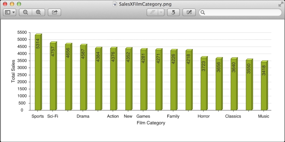
The following screenshot is from an image that was generated by choosing to save the chart as PNG:
If you want to generate the image or the PDF in your own server, you can specify the url where the data is going to be posted. In the server, you can retrieve a POST variable named data. The variable has the following content (it is a Base64 image) that can be manipulated in the server to return an image or PDF or other required format: