
No network graph is ever perfect, no matter how much time one spends tweaking it, but every graph can be substantially improved from the original output, whether you are using Gephi or any other graph analysis tool. Even a well-selected algorithm using carefully prepared data is unlikely to provide the exact output we seek. This is why the final modifications, either manually applied or executed using some broad criteria (clusters, partitions, and so on), invariably add more power to the finished graph. Whether the modifications address aesthetic, technical, or navigational aspects of the network, these final tweaks will lead to a better output than that provided by total dependence on the data and the layout algorithm.
Recall our earlier selection of the Yifan Hu output for the power grid network display. While the network had improved considerably from its original version, there are still some simple actions that will make the network far more useful for viewers. Let's begin with the simple steps to adjust the size of nodes based on their level of influence.
The first step is to find the Ranking tab, which is found on the left-hand side of the workspace in the default Gephi settings. The Size/Weight icon (second from the left-hand side) will enable adjustments of either the nodes or edges based on the tab that is selected. In this case, select the Nodes tab, click on the Size/Weight icon, and select Degree from the listbox. As there are so many nodes in this network with low degree levels, it helps if we increase the size settings. Let's try a range of 20 to 100 and see how it looks:

The network with size and color modifications
Notice how much more easily we can spot patterns in the network simply by employing these two changes. Now it is easy to see a cluster of high degree nodes to the extreme left of the graph (perhaps all interconnected) as well as a number of other high degree nodes that might serve as some sort of localized hub. These two findings alone can help in learning more about the network in an efficient manner, as opposed to a completely random approach.
We will make one more small change, and then we'll move on to learn more about exporting the graph. In this case, we'll focus on the cluster of nodes just identified in the prior step and apply one more modification to make them stand out. Recall that we just colored all nodes based on their respective degree levels. Now, for this selected group, we can apply a different color to draw attention to this part of the graph (this is most easily done by zooming in to that section of the graph) using the Painter tool on the main toolbar. Select a distinct color, and then click on each node while the Painter icon is highlighted to see something like this:
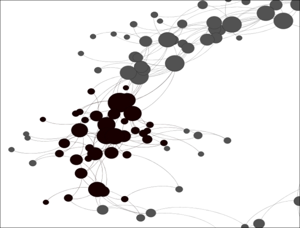
Manual coloring of specific nodes
Now, this portion of the graph has been more clearly identified for eventual users of the graph without the need to do postediting in Illustrator or Inkscape.
We'll explore the topic of modifications further in Chapter 3, Selecting the Layout and again in Chapter 7, Segmenting and Partitioning a Graph, but I hope this little exercise has helped show you the power of making some simple cosmetic changes to the graph.