
Now that you have seen the broad array of available layout options and a bit of their respective capabilities, it is time to step back and reconsider what story you want to tell through the data. As you have just seen, there are many directions you can take within Gephi, and there is no absolute standard for right or wrong in your layout selection. However, there are some simple guidelines that can be followed to help narrow the choices.
If you are experienced with Gephi or another network analysis tool, you might wish to dive directly into the next section and begin assessing each layout type using your very own dataset; I will not attempt to convince you otherwise. This is a great way to quickly learn the basics of every layout offering and can be a great experience. On the other hand, if you wish to take a more focused approach, I will offer you a brief checklist of considerations that might help to narrow your pool of layout candidates, allowing you to spend more time with those likely to provide the best results. Think of this as akin to shopping for clothes —you could try on every type of clothing on the rack, or you can quickly narrow your choices based on certain criteria—body type, complementary colors, preferred styles, and so on. So let's have a look at some of the basic points to consider while shopping for an appropriate layout:
- What is the goal of your analysis? Are you attempting to show complementarity within the network, as in the relationships between nodes or sets of nodes, or is the goal to display divisions within the data? Does geography play a critical role in the network? Perhaps you are seeking to sort or rank networks based on some attribute within the data. Each of these factors can play a determining role in which layout algorithm is best for your specific network.
- Is the dataset small, medium, or large? Admittedly, this is a subjective criteria, but we can put some general bounds around these definitions. In my mind, if the number of nodes is measured in tens or dozens, then this is likely a small dataset that can be easily displayed in a conventional space—the Gephi workspace window or a simple letter-sized paper for a printed version. If, however, the nodes run into the hundreds, we are now moving away from a very simple network and potentially reducing the number of practical layout options. When the number of nodes in a network moves into the thousands and beyond, we have what can practically be considered a large network, at least for display considerations. With datasets of this scope, additional display considerations come into play, such as judicious use of filters, layers, and interactivity.
- How densely connected is the network? In our previous example using the power grid data, we had a fairly large dataset numbering in the thousands, but one that was not highly connected, at least as compared to social networks. In that case, we might have an easier time selecting and applying an effective layout, while the highly connected nature of social networks presents an additional challenge.
- Does the network exhibit certain measurable behaviors such as clustering and homophily? In some cases, we might not know this until the network has been visually and programmatically analyzed, but in others we might already know that the data is likely to cluster based on certain attributes that influence the network structure, including geographic proximity, alumni networks, professional associations, and a host of other possibilities. Knowing some of these in advance might help guide us either toward or away from specific layout types.
- Will the network be displayed on a single level, or will it be bipartite or multipartite? In this case, as covered briefly in Chapter 1, Fundamentals of Complex Networks and Gephi, some networks might be hierarchical, with individuals (for example) linking only to an organization, and not to other individuals in the network. There are many instances where we will wish to present hierarchical networks in this fashion. This could be used to display corporate structures, academic hierarchies, player to team relationships, and so on, and requires some different considerations than networks without this structure.
- Does the data have a temporal element? In simple terms, will the story be told more effectively by viewing network changes over time? This can be very effective in showing diffusion/contagion patterns, random growth, and simple shifts in behavior within a network, for example—were Thomas and James friends at T1, but no longer so at T3 (where T equals time)? If our data has a specific time element, this leads to identify layouts that will best display these changes and tell an effective story.
- Will the network be interactive on the user end, or will it be static? This can ultimately lead to a different layout selection when users have the ability to navigate a network via the Web.
You might have additional considerations, including the speed of the layout algorithm, but the preceding list should help you to narrow the list of practical layouts, allowing you to test the remaining candidates.
Let's walk through a process following the preceding guidelines, and applying them to a project previously created by me. This will help us migrate from the theoretical constructs above to a practical application of many of these principles. The project I'll use as our example traces the studio albums recorded by the legendary jazz trumpeter, Miles Davis—48 in all. Here are the details for this project, following the above progression.
The goal of the analysis was to inform viewers, who might or might not be jazz fans, about the remarkable, far reaching recording legacy of Miles Davis. Since the career of Davis moved through many stages, he crossed paths with and employed an incredible number of artists across a diverse range of instruments that ranged far beyond the normal jazz instrumentation. Therefore, part of the goal of the analysis was to expose viewers to this great diversity, and give them the ability to see changes and patterns within the scope of his career.
The dataset in this case is not insignificant—while 48 albums would represent a small network if left on its own, we know from the data that there are typically at least four musicians per recording, and often far more, numbering into the 20s in some cases. Many of the musicians are represented on multiple recordings, but there is still a multiplicative impact on the size of the network, which turns out to have about 350 nodes. While this certainly doesn't rival the enormous datasets often seen in social networks, it is large enough that we need to be thoughtful about the layout and how users will interact with the project.
Here is a look at some of the underlying data for the nodes:
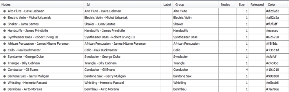
Miles Davis nodes
Notice that the nodes are a combination of an individual musician and a specific instrument, since so many of these musicians play a second (or even third) instrument. The data is then grouped by instrument, which allows you to partition and custom color the data.
Now, the following figure illustrates a partial view of the edge's data:
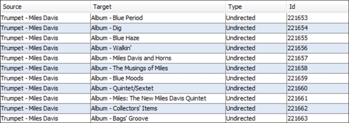
Miles Davis data edges
In the preceding screenshot, we see only album level connections, with Miles Davis as the source and each album as the target, although the edges are left undirected. If we move further into the edge's data, we can see how the network is structured a bit more clearly:
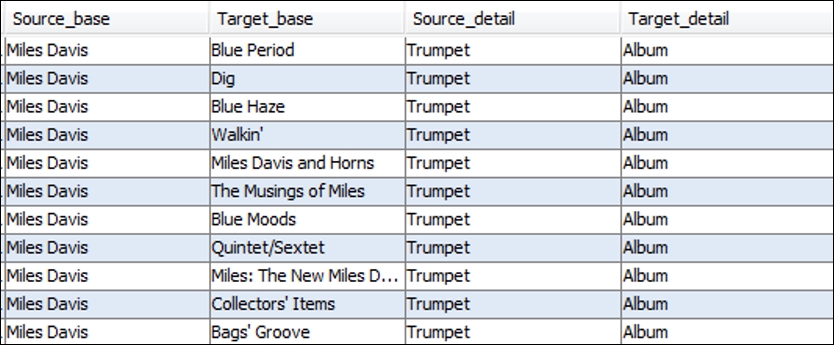
Miles Davis data edge details
This data shows some of the musician level connections to specific recordings, as well as the instrument played on that album. This completes the basic structure of the network, as each musician will have an edge connecting them to any and all albums they played on. So this gives us a basic understanding of how the data will be represented in the network—Miles at the core, all albums at a second level, followed by every contributing musician at a tertiary level.
We have all seen many highly connected networks with edges crossing between nodes or groups within a graph that become virtually impenetrable for the viewer. Fortunately, this was not a major concern with this network, given its relatively modest size, but it could still play a role in the final layout selection. As always, the goal is to provide clarity and understanding, regardless of the relative size of the network, so minimizing visual clutter is always a priority.
Examining the network behaviors can be an interesting exercise, as it often leads us to findings that were not necessarily anticipated. In the case of this project, we know from viewing the data that Miles played with certain musicians on a frequent basis, but would then often play with an entirely new group during his next phase, before switching yet again to a completely unrelated group of musicians. In other words, there were multiple aggregations of musicians who only occasionally intersected with one another. This is very nearly a proxy for homophily, with distinct clusters connected to each other through a single node (Miles Davis in this case) or perhaps a small subset of network members who act as bridges between various clusters.
Based on this knowledge, we would anticipate a highly clustered network with a significant level of connectedness within a given cluster, and a limited set of connections between clusters. The next decision to make was how best to display this network.
We just saw the underlying data structure, which had a bipartite nature to it, with each musician connecting to one or more albums, rather than to other musicians. Given this type of network, we want to select a layout that eases our ability to see not only the connections between Miles Davis and each recording, but also from each album to all of the participating musicians. This will require a layout that provides enough empty space to make for clear viewing, but also one that manages to combine this with a minimal number of edge crossings. Remember that many of these musicians played on multiple recordings, so they must be positioned in proximity to several albums at the same time, without adding to a cluttered look.
After testing several layouts, some of which simply didn't work effectively with the above two needs, I settled on the ARF algorithm for its visual clarity to display this particular network. The ability to see patterns within the network, even prior to adding interactivity, is a plus; if the network passes that test, it should be very effective once users interact with the information.
Another interesting aspect of the network that could have been utilized was the timeline for the recordings. With more than four decades of recordings, this could have provided a wealth of information about changes over time in the musicians' network and instrumentation on each album. This element was not highlighted, but it does make its presence felt in the final network, with albums from one period with a consistent cast of musicians occupying one sector of the graph, while other types of albums with many infrequently used musicians land in another area.
The final decision was whether to make the network interactive, giving users the ability to learn more through self-navigation of the graph. This was considered important from the very start, so that the viewers could see not only the body of work represented by the 48 recordings, but also the evolution of which musicians were involved, as well as shining a light on the wide array of instruments used as Miles' career evolved.
After each of these considerations was evaluated, and through a period of testing the network using multiple layouts, I settled on the ARF force-directed layout coupled with the Sigma.js plugin for interactivity. Here's a look at the final output, which includes options using the Sigma.js plugin:
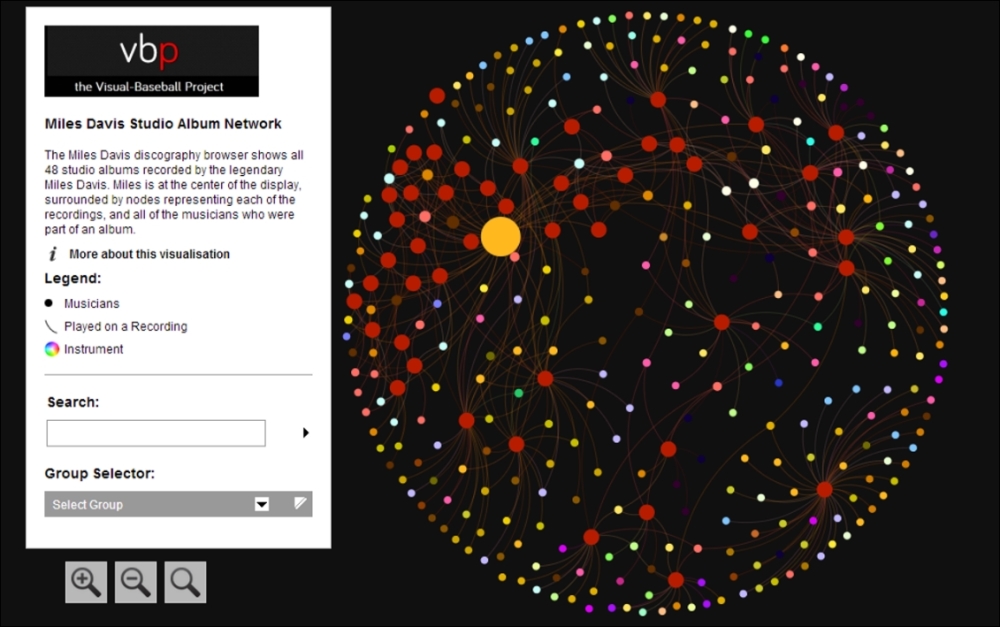
The Miles Davis network graph
The link to the project can be found at http://visual-baseball.com/gephi/jazz/miles_davis/.
I hope this example helps to generate some ideas or at least opens up the possibilities for what Gephi is capable of creating, and that the process illustrated earlier helps to provide at least a foundation for your own work. The data files used for this project are also available at the link in the Web Resources section of the book, so you can create your own version—and perhaps improve on the original!