With this application, we will use the power of JavaScript to provide a left-to-right panel-style page layout. We will use some Bootstrap transitions to slide panels in from the left, or from the right, in order to provide the user with a slightly different browsing experience. Let's take a look at what this will look like conceptually:
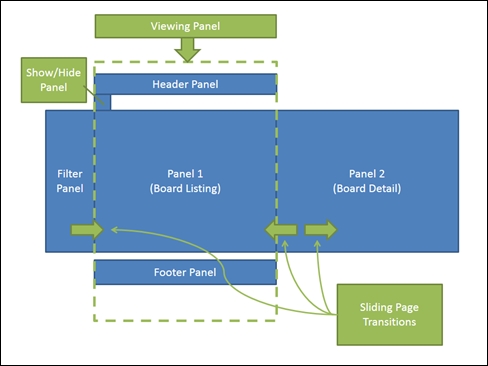
A conceptual view of page transitions for Board Sales
The viewing panel will be our main page, with a header panel, a board listing panel, and a footer panel. Hidden from view on the left-hand side will be the filter panel, with a button on the top-left of the main panel to show or hide this filter panel. The filter panel will slide in from the left when needed, and slide back to the left when hidden. Similarly, the board detail panel will slide in from the right when a board is clicked, and will slide back to the right when the back button is clicked, revealing the board listing panel.
When the site is viewed on a desktop device, the filter panel on the left will be shown by default, but when the site is viewed on a tablet device—with a smaller screen—then the filter panel will be hidden by default, in order to save on screen real estate.
Bootstrap is a collection of CSS styles and JavaScript functions that aid in building responsive websites rather simply and easily. The responsive nature of Boostrap means that pages will resize elements automatically, to allow rendering on the smaller screen sizes of mobile phones, as well as larger screens used on tablets and desktops. By using Bootstrap, we gain the additional benefit of being able to target mobile users and desktop users with very little change to our HTML or CSS style sheets.
Bootstrap can be installed with a NuGet package, along with the corresponding TypeScript definitions as follows:
Install-package bootstrap
Install-package bootstrap.TypeScript.DefinitelyTyped
Once Bootstrap has been installed, we can start building a sample web page that is purely written in HTML using Bootstrap. Building a demo page in this way helps us to figure out what Bootstrap elements we will use, and allows us to modify our CSS styles and structure our HTML correctly, before we start to build our application. This is where the Brackets editor really comes into its own. By using the live preview functionality of the editor, we can edit our HTML and CSS in one IDE, and have instant visual feedback in the preview pane. Working on sample HTML in this way is both a rewarding and fun experience, not to mention a massive time-saver.
Our page will use a couple of Bootstrap elements for the main page regions, as follows:
- A Navbar component to render the header panel.
- A Footer component to render the footer panel.
- A Carousel component to slide from the board list view to the board detail view.
- An Accordion component to render the filtering options in the left-hand side panel.
- Row and Column components to control the HTML layout of boards in our board list view, as well as in the board detail view.
- Table CSS elements to render tables.
In this chapter, we will not go into detail about how to build HTML pages with Bootstrap. We will instead start with a working version that you can find in the sample code under the directory /tscode/tests/brackets/TestBootstrap.html.
Our Bootstrap elements are as follows:
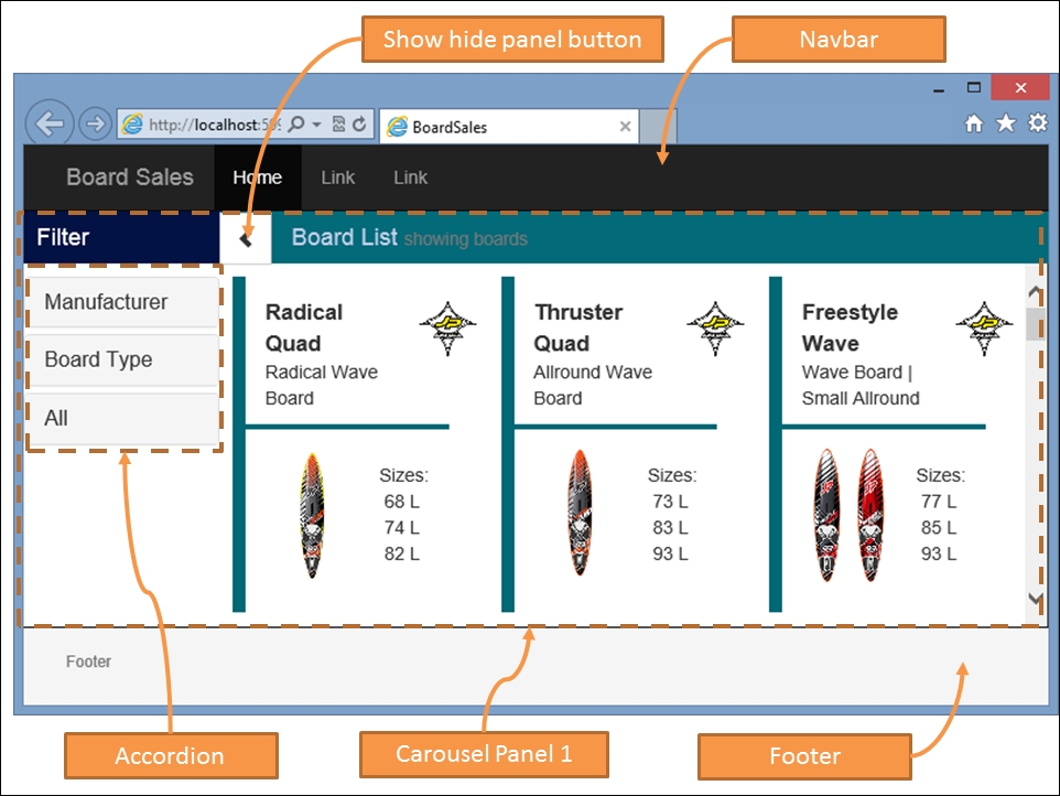
At the top of our page is the navbar element, which has been given a navbar-inverse style to render it with a black background. The
carousel panel 1 element is the first carousel panel, and contains the left-hand side filter panel, as well as the board list and the
show / hide panel button. The filter options on the left-hand side panel use the Bootstrap accordion component. Finally, our footer is styled to be a "sticky footer", meaning that it will always show on the page.
When we click on any one of the boards in the board list, our carousel component will slide the carousel panel over to the left, and slide in the board detail view from the right.
Our board detail panel is as follows:
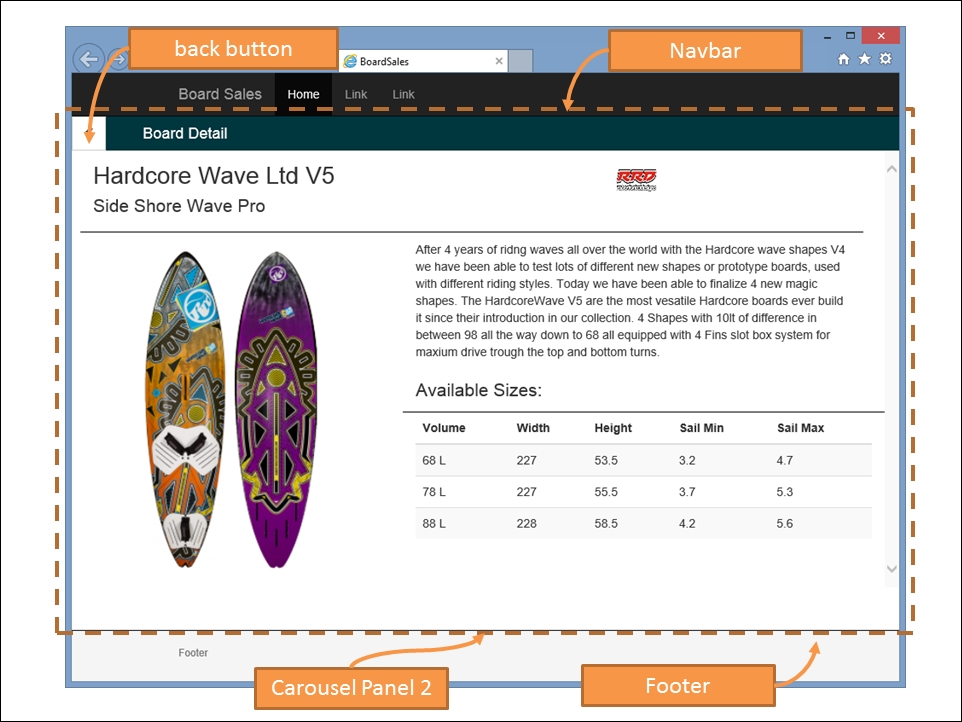
Again, we have the standard header and footer regions, but this time, we are viewing carousel panel 2. This panel has a back button on the top left-hand side, and shows the detailed information on the selected board.
You will notice when you run this test page, that there are four links in the footer region named next, prev, show, and hide. These buttons are used to test the cycling of the carousel panels, and the show / hide functionality for the left hand-side panel.
Bootstrap is ideal for building quick mock-ups of a working version of the site. This version can easily be taken to customers, or to project meetings for demo purposes. Showing a customer a demo mockup of a site will give you invaluable feedback on the overall site's flow and design. Ideally, this sort of work should be done by a senior web designer, or someone with equal skill set—who specializes in CSS styling.
We will be reusing and reworking this HTML later on when we start to build Marionette views. It is a good idea, however, to keep these demo HTML pages within your project, so that you can test their look and feel on different browsers and devices, all the while tweaking your HTML layout and CSS styles.