
CHAPTER 7
Sample Charts
On the following pages you will find examples of how to structure your graphics so that they are easy to read and send positive messages that can stand alone without being verbally augmented by a speaker. The comments on each chart stress important aspects to make you aware of salient points and techniques that may not be obvious to a casual reader who quickly flips through them. All charts shown here are fictitious and unrelated to each other—that is, they contain standalone messaging not intended to show a logical build-up progression. Using a graphic artist to format your charts is very important. Professionally prepared charts send a strong message to your audience, and conversely, poorly prepared charts send a strong message too! Do everything you can to make a positive impression on your audience including charts that look professional, are easy to read, and clearly support the winning messages that you are delivering. There is always a temptation to start building charts too early in the process. Resist this temptation and ensure you know the message that each chart will support before you actually draft the chart. Professionally prepared charts are not cheap, and they require a great deal of time to generate. Eliminate waste and rework; think through your messages first, rely on your presentation outline for guidance, and be sure to include your win themes and discriminators throughout your presentation. Here are a few tips that will help to make your presentation a winner:
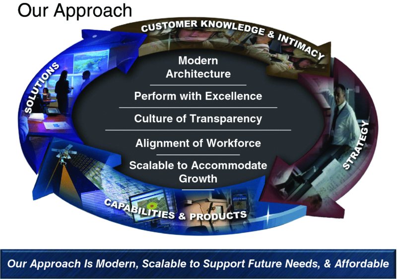
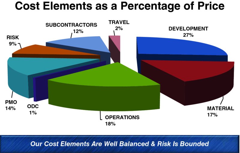
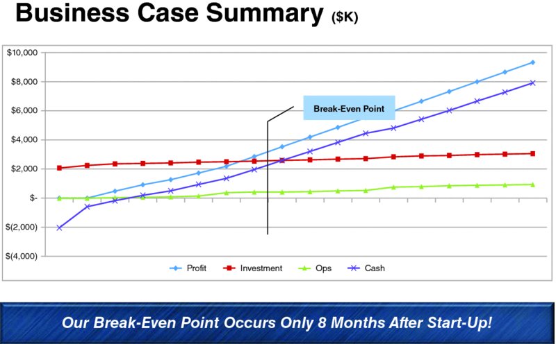
The chart displayed in Figure 7.1 summarizes the overall approach to a project. Generally a chart like this is used to kick off a presentation. When it is well done and resonates with the customer, this may become the single chart that is associated with you and your approach. Figure 7.1 Sample Chart —Overall Approach, Win Theme, and Discriminators The chart features your overall win theme and your discriminators. The words in the center represent the win theme, and the words around the perimeter are the enablers that you are offering. The takeaway is easy to read and it captures the overall approach. Words and phrases are action oriented. Organizational charts can be overly complicated and often times confusing. It’s always best to keep it simple and easy to understand (see Figure 7.2), regardless of the size or complexity of the project. Figure 7.2 Sample Chart—Organizational Chart When you have teammates, subcontractors, suppliers, and vendors, highlight the key ones on your chart. This shows that you are indeed a team and that you understand successful project execution depends on good management with clear lines of reporting and responsibility. Another good practice is to show the contractor reporting relationship with your customer. If you are certain of how this will work (and you should be based on preproposal discussions with your customer), you may choose to graphically show the relationship on the organizational chart. Doing this establishes lines of communication, reporting, and responsibility across the entire project. Short, impactful video clips can make a point that won’t be forgotten (see Figure 7.3). Be sure the video launches properly and the audio is clear. When using video clips, ensure that the content is appropriate for your audience and that the point is obvious to everyone. Before using a video, always test its use on your practice audience and get their feedback. If anyone in your practice audience doesn’t get the point or is offended by the content in any way, don’t use it. Figure 7.3 Sample Chart—Impact and Special Messages Build-up charts can be very effective when your message and your timing are intelligently and logically thought out. In this initial section of the build-up chart (see Figure 7.4a), the message couldn’t be clearer. The speaker is obviously talking about a loss and not punishing the failure – a sobering chart indeed. Figure 7.4 Build-Up Sample Charts The second part of this build-up chart, which appears with advancement to the next chart, (see Figure 7.4b addition to 7.4a), adds some words of wisdom. The impact of this is indeed profound and it’s very likely that it will have a positive, uplifting impact on every person in your audience. Think through your build-up charts carefully and use them wisely! Text-intensive charts should be avoided but are sometimes necessary (see Figure 7.5). Select your words carefully and ensure the chart doesn’t become too cluttered or textually dense. Pick key words and address each one of them in your own words. When categorical sections are needed as in this sample chart, use color, text size, and underlining to separate the categories. Figure 7.5 Text-Intensive Sample Chart Finally, remember that every word on the chart must be easy to read from any position in your presentation room. If you can’t see a word from the back of the room, make it bigger. If making it bigger clutters the chart or doesn’t fit, generate another chart. All charts must be easy to read. Mixing key words such as features, discriminators, and benefits with well-chosen photographs, drawings, or illustrations is very effective (see Figure 7.6). Using this technique lets you talk to each key point, and the image tells a story as well. Figure 7.6 Mixing Key Words and Graphics In this example, teamwork is clearly the main theme and the chart expands on this by identifying additional components of teamwork that are important to the corporate culture. The words support the graphic, and the graphic supports the words. Meaningless images will detract from your presentation and can actually set up conflicting messages. Select your words and your graphics carefully and make sure they complement each other in a logical and meaningful way. Highlighting the features of your approach is good practice, but it’s not enough! Sometimes we become so close to our approach we assume that the benefits to our customer are obvious. Be assured that this is not the case. Never ever assume that your audience understands the benefits of any feature or element of your approach. Almost all of us have at one time or another been in a meeting or discussion where one person says, “Gee, I didn’t think about that!” As you itemize your benefits to your customer, remember that they “may not have thought about that.” Always show your audience what you believe the benefits of your approach or solutions are to them (see Figure 7.7). Make sure that they tie back to key requirements, customer hot buttons, and your discriminators. Keep in mind that a single feature can lead to multiple benefits. As shown in this sample chart, there are more benefits listed than there are features. This is okay, and is in fact, a very good thing indeed. Figure 7.7 Features and Benefits Sample Chart In complex programs, address key risks directly (see Figure 7.8). Anyone who has made a financial investment or major purchase of any kind understands the importance of risk identification and how risks can be mitigated or eliminated. Identify each risk and then assess the impact it can have on the project if it isn’t mitigated. Next tell what you are doing to address each risk and what the resultant risk will be after your mitigation techniques are applied. Figure 7.8 Risks Chart You will never convince everyone that you can completely eliminate a major risk. There are always skeptics in the audience, so never say that there is no risk. Reduce risks by applying proven mitigation techniques and approaches. Be careful not to identify too many risks. Select those that are blatantly obvious, that your customer believes exist, and that may be unique to your competitor’s approach. Financial and statistical charts (see Figures 7.9 and 7.10) of any kind can easily overwhelm an audience if they are not done properly. Keep them as simple as possible and keep them legible. If tables, histograms, or line graphs are used, be sure they can be read from every position in the presentation room. Figure 7.9 A Sample Financial Chart Figure 7.10 A Sample Statistical Chart Tables can quickly become boring. Use a variety of graphic techniques to help keep them interesting and help your audience navigate them more easily. In the sample chart shown in Figure 7.11, you could insert company logos into the large blue boxes to make it more interesting while adding company branding at the same time. Get creative and keep your audience’s attention! Figure 7.11 A Sample Table Engineers, technicians, designers, and technical people of all kinds take great pride in their drawings and illustrations. One of the most difficult things to do in a presentation is to take their raw input and insert it into the presentation so that it communicates to the audience properly. The key is to simplify as much as possible without diminishing the technical content (see Figure 7.12). Figure 7.12 Sample Technical Illustrations and Drawings In some cases using multiple charts may be the answer. Using chart animation features to blow up each section of a detailed illustration is also very effective. Handing out a hard copy of a complex drawing to each member of the audience is another good way to go when projection of large illustrations becomes awkward. No matter what technique you use, test it out on your practice audience and see how they react. Ask if the right messages have been conveyed and ask if there are suggestions for improvement.Master’s Tip: There’s No Substitute for Years of Successful Experience—Capitalize on these Winning Tips
Overall Approach, Win Theme, and Discriminators Chart
Organizational Chart

Impact and Special Messages Chart

Build-Up

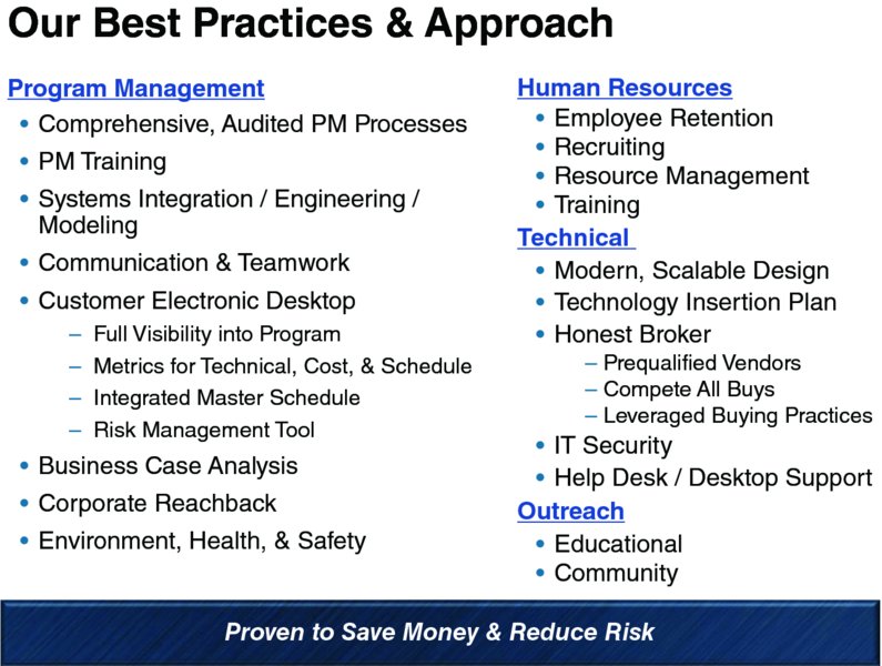
Text-Intensive Charts
Mixing Key Words and Graphics

Sample Chart—Features and Benefits

Risks Chart

Financial and Statistical Charts
Tables

Technical Illustrations and Drawings
