
Chapter 12. Shapes, Paths, and Effects
• Working with Shapes
• Understanding the difference between Shape Lines and Path Lines
• Converting Elements to Paths
• Working with Combination Functions
• Creating Clipping Paths
• Using the Silverlight PathListBox
• Applying Effects
Expression Blend 4 sees the inclusion of a Shape library and more effects than shared in previous versions.
In total, there are 18 shapes and 15 effects available now, which enable you to work effectively with customization of imagery in the case of clip masking as well as path creation.
In this chapter, you learn how to work with shapes and effects inside of Blend, taking advantage of the tooling built in. You also work with a very exciting new Silverlight 4 control called the PathListBox, which enables some pretty cool usage scenarios with extremely little effort.
Taking Shape
Ok, that sub-heading is a little cheesy, but I needed to start the chapter somehow.
This chapter will not cover every one of the 18 new Shape elements here. That would result in a lot of trees being culled just for the sake of pointing out the obvious, which is that once you learn how to work with a few of the core shapes, the others will become self-explanatory.
Before you skip ahead because shapes are not really that exciting, there are some handy workflow scenarios here to look at, especially for the Shaped challenged. Making a 10-point star is simple, fast, and flexible.
Some of the shapes are not actually shapes. Let me clarify that by saying, they are not shapes technically.
Shapes are a type in the .Net Framework. They should not be confused with the Path type or any other control type. The distinction is important because this “type” fact determines if you can modify the shape by converting to a Path; it also comes into play if you ever need to generate one of these shapes dynamically, because you need to know the Class family in order to reference a Shape object in code.
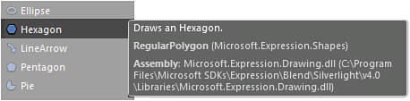
How can you tell? Figure 12.1 shows the MouseOver details for a Hexagon, which points out the Class family and gives you the definition of the control type.
Figure 12.1. The MouseOver information for the hexagon shape.
The following shapes are of type Shape:
• Arcs
• All Block Arrows
• Rectangle
• Hexagon
• Line Arrow
• Pentagon
• Pie
• Ring
• Star
• Triangle
Is it a Path or a Line?
Confusing as this question appears, there is such an object specifically named as a “line” and also a tool panel item that is titled “line” but generates a “Path” element.
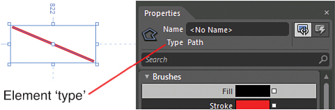
If you select the Line tool from the Tools panel, as shown in Figure 12.2, and draw it on the artboard, the Properties panel informs you that this is indeed a Path element, also shown in Figure 12.2.
Figure 12.2. A Line element from the Tools panel is indeed a type of Path element.
In the Shapes class, an object called ‘line’ is also present, but this isn’t represented in and easy to use drawing tool.
You never know when you might need to understand the difference, so the following will demonstrate this:
- Create a new Silverlight Application + Website project named “Chapter12_ShapesAndEffects”.
- Select the Line tool from the Tools panel and draw a
lineon the artboard of an arbitrary length. The piece you should note here is the properties, specifically in the Appearance category. Note the property type as aPathelement as well. - Remove the
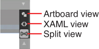
line. - Enter Split Screen mode on the artboard by clicking on the Split button, as shown in Figure 12.3.
Figure 12.3. The Split button function.
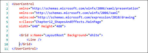
- Modify your XAML so it resembles that shown in Figure 12.4.
Figure 12.4. The XAML to replicate.
- You won’t be able to see anything yet, so don’t be alarmed. You should be able to see the element in the Objects and Timeline panel, so ensure that you have it selected. Note the Properties panel is now showing a property type of
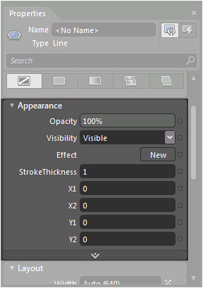
Line. - Open the Properties panel, and you should immediately see the difference of the Appearance category, which contains
X1, X2, Y1, andY2properties, as shown in Figure 12.5.Figure 12.5. The Appearance category properties for the Line element.
- These property values are key, but first you need to set the
WidthandHeightproperties in order to create a ShapeViewport. Set theHorizontalAlignmentandVerticalAlignmentproperties both toCenter. - Set the
WidthandHeightproperties to200each. - Ensure that your
Marginvalues are all set to0. - You should now see the
Viewportin the center of your artboard, but still no line. - Set the
Fillcolor property to a bright red and set theStrokeproperty to a bright blue. - Set the
X1andY1property values to100in the Appearance category. - You should now see a line appear in the
Viewport, as shown in Figure 12.6.Figure 12.6. The line and the leading point location.
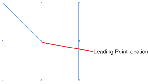
- Essentially, the
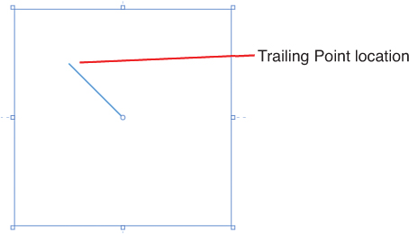
XandYproperties represent vector values that determine both the length of the line and the location.X1andY1determine the leading point location of the line, as also indicated in Figure 12.6, whereasX2,Y2determine the trailing point location. To demonstrate this, change theX2andY2values to50, which shows a shorterLineobject, as shown in Figure 12.7.Figure 12.7. The new locations of the leading and trailing points that result in the new Line representation.
You can now adjust the Viewport width and height so that the line will adapt to the Viewport bounds.
Altogether, you can probably understand why the Expression team chose to enable you to create a Path element from selecting the Line tool from the Tools panel—after all, the Line element is not very intuitive and the vast majority of times that you actually want to draw a line on the artboard, you will just want to draw a line without having to consider the additional properties that must be set.
The point here is to show you that there are a lot of hidden elements and objects in the .Net Framework that are not tooled in the Blend UI. It doesn’t mean you can’t work with those objects, but you need to be aware that they will not always be intuitive to use.
Converting Shapes to Paths
As previously mentioned, elements that belong to the Shape family are essentially path-based elements; the line is no exception.
The requirement to modify a shape appears frequently when quickly building out prototypes or having to knock up a UI on the fly. Although for almost all the Shape elements, the properties enable you a fantastic amount of control, sometimes you need to be able to go that little bit further in customization as shown in the following steps.
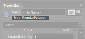
- Add a
hexagonshape to your artboard and note the object type, as shown in Figure 12.8.Figure 12.8. The RegularPolygon property type.
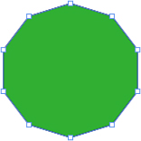
- Open the Properties panel and find the
Appearancecategory property calledPointCountand set it to10. - Right-click on the
Hexagonand find the Path menu; then select the Convert to Path submenu item. - You see that nothing much has changed except for the type shown in the Properties panel. Select the Direct Selection tool on the Tools panel, and you should now see all the anchor points of the polygon path, as shown in Figure 12.9.
Figure 12.9. The points on the polygon path.
You are now free to modify the points of the path as you see fit. The easiest way to do this is with the Pan tool from the Tools panel.
- Select the Pen tool from the Tools panel.
- Move the Pen tool cursor directly over the top of any of the
Polygonpoints, and you see that the cursor changes to show a small minus or negative sign, allowing you to delete the point. You can also move the cursor on top of anylinesegment and add a new point. Try to modify your polygon to look like Figure 12.10.Figure 12.10. A modified polygon.
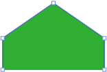
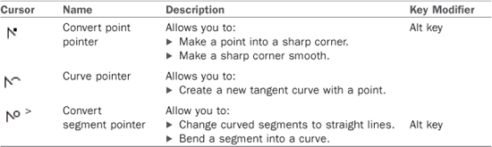
Table 12.1 shows the cursor modifications that occur while using the Pen tool, and Table 12.2 shows the functions of the Direct Selection tools. Some of these are available with key modifiers and represent mechanisms, enabling you to create tangents and curves against paths. It’s worth you having to play around to understand the usage, especially with Alt and Shift key variants.
Table 12.1. Path Modification Cursors Using the Pen Tool
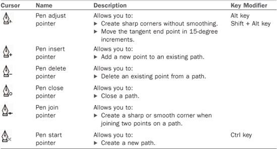
Table 12.2. Path Modification Cursors Using the Direct Selection Tool
Combine Functions
Expression Blend provides for several Path Combine functions that are applicable only when working with two or more Path elements selected at the same time. The functions are accessed by either selecting the Object->Combine menu items or by right-clicking on multiple selected Path elements, as shown in Figure 12.11.
Figure 12.11. The Combine context menu on two elements selected.
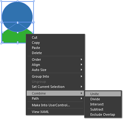
Table 12.3 represents these functions with an example of the result applied to the same two path elements. Note that I have increased the Stroke size of the two elements to accentuate the example results.
Table 12.3. Path Combine Functions*
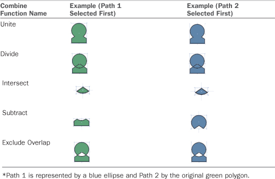
Warning: Does It Matter Which Element Is Selected First?
Yes. Table 12.3 shows the difference that is the result depending on the order of the Path elements selected. Sometimes, the result is merely a color change taken from the last selected element, but as Intersect shows, it can dramatically change the result.
Compound Path
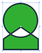
Compound paths are the result of two or more elements being combined, replacing the bottom-most element to result in a single Path element (see Figure 12.12).
Figure 12.12. A compound path result.
Make Clipping Path
Using any shape converted to path or path element that you create, you can apply that shape to other elements as a Clipping Path element.
A Clipping Path is the result of removing a visible area of one element based on the applied Path area of another.
The following steps show how to use this fun and functional feature:
- Create or continue to use a Silverlight Application + Website project.
- Insert an
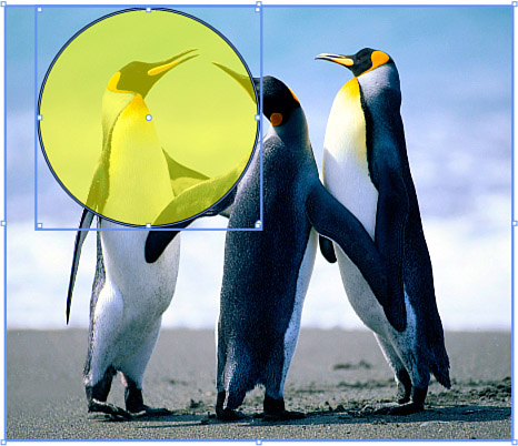
Imageinto your artboard by adding an existing image item to your Silverlight projects and dragging it onto your artboard. - Draw an
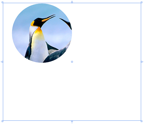
Ellipseelement onto your artboard and position it over yourImagewhere you want to capture inside the clipping region, as shown in Figure 12.13. You can also see in Figure 12.13 that I reduced the opacity of theEllipseelement so I can determine the ultimate clipping location, although aFillis not needed and is for demonstration purposes only.Figure 12.13. The Ellipse element applied in position on the image.
- With both the
Imageyou inserted and theEllipseelement selected, right-click, and under the Path menu item, select Make Clipping Path. You should see a result similar to Figure 12.14.Figure 12.14. The resultant clipping path applied to the image.
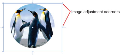
- You can readjust your image clip by resizing the image element using the selection tool and the
Imageelement adorners, as shown in Figure 12.15.Figure 12.15. The Image inside the clipping path adjusted.
You can apply a clipping path to not just images but also other panels, such as the Grid and ListBox, and of course, you can use any shape that you can think up to create the clip.
The New Silverlight PathListBox
There also exists several more advanced functions that you can perform with paths, such as animating objects around or along a path. In this section, you learn how to use a new Silverlight control called the PathListBox.
The PathListBox represents a lot of functionality that previously would require a developer to write hundreds if not thousands of lines of code to replicate. Using the control can be at times quite a complex set of procedures, but what you learn in the following steps is the basis of working with the control and a collection of objects that you can animate along a Path element.
- Create a new Silverlight Application + Website project.
- Draw an
Ellipseelement on your artboard and set itsWidthandHeightproperties to200. The quickest way to do this is to double-click on theEllipseelement in the Tools panel, which gives you anEllipseposition at the top left of the artboard with aWidthandHeightof100. Just adjust theWidthandHeightand set theHorizontalAlignmentandVerticalAlignmentproperties toCenter. - Center the
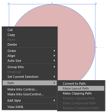
Ellipseand ensure that it has someFillcolor. - Right-click on the
Ellipseelement, and from the Path menu item on the context menu, select Make Layout Path, as shown in Figure 12.16.Figure 12.16. The context menu options for creating a layout path.
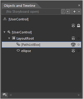
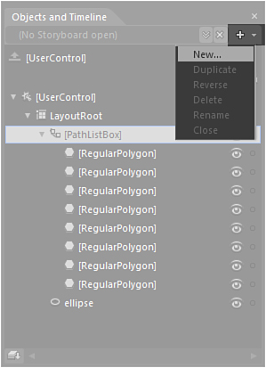
- On the artboard, it looks like nothing has happened, but if you look at the Objects and Timeline panel as shown in Figure 12.17, you see that a new element has now appeared called
PathListBox.Figure 12.17. The new PathListBox added to the Objects and Timeline panel.
- For the moment, ignore the Properties of the
PathListBox; you will investigate them shortly.Find and draw several
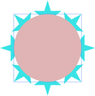
Starshapes and pepper them around the screen, as shown in Figure 12.18. You could line them all up next to each other; I have simply positioned the stars so I can figure a relative amount that will spread evenly around theEllipse.Figure 12.18. The random collection of star polygons.
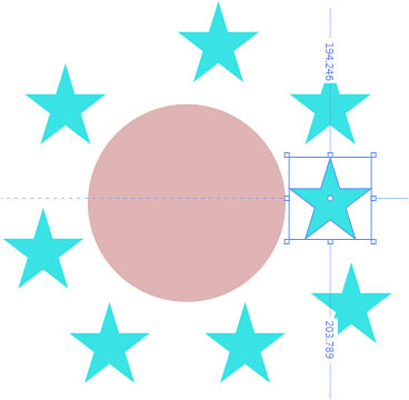
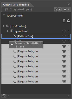
- In the Objects and Timeline panel, select all the
Polygonelements representing your star shapes and then drag that collection onto thePathListBoxelement, as shown in Figure 12.19. Ensure the tooltip is indicating that the collection of elements will be moved into thePathListBoxas child elements.Figure 12.19. The Polygons being added as child elements of the PathListBox.
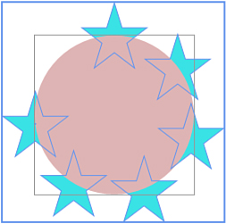
- Your
Starshapes should now have attached themselves to theEllipseelement, as shown in Figure 12.20, and be placed in a random type of spread around the element. Don’t worry about this, as you will fix it in a moment with thePathListBoxproperties.Figure 12.20. The polygons attached to the Ellipse path element.
- With the
PathListBoxelement selected, take a look at the Properties panel, and the Layout Paths category specifically, which is detailed in Figure 12.21.Figure 12.21. The PathListBox-specific properties.
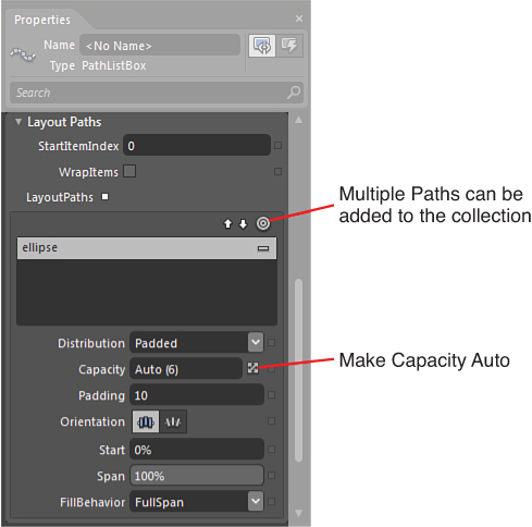
- Note that the current
Distributionproperty saysPadded, so with your mouse, move the value of thePaddingproperty up and down and note the effect that it has on your elements. - You could spend a lot of time trying to get all your elements evenly spaced around the
Ellipse, and those of you who are perfectionist have probably just tried to do that. Instead, to fix the layout of your stars, select the dropdown of theDistributionproperty, selectEven, and all should be sorted for you. ThePaddingproperty has no effect now. - Your stars still probably look a little strange, because they are all pointing straight up, so in the
Orientationproperty, select the iconOrientToPath, and you should have a result similar to Figure 12.22.Figure 12.22. The orientation change of the polygons to the Path element.
- You should now have a play with the
Spanproperty; note that this specific value constrain the maximum arc of theEllipsepath that thePolygonelements will cover. It is a percentage of your total path length, so for this example, make sure you return the value to100%when finished investigating. At the same time, modify theStartproperty, which in effect changes the location of the first element (in this case, theStarpolygon at the top of theEllipse) to a new % location position on thePathelement. Reset that value back to0%when finished. - Select the
Ellipseelement in the Objects and Timeline panel, removing any color brushes that are applied to bothFillandStrokeproperties.
You now have a collection of elements aligned to a Path, inside the PathListBox, which means you are ready to animate that collection around or along the path. In the following section, you create a simple storyboard that will animate the collection indefinitely.
Animating the PathListBox Collection
Animating the child collection of the PathListBox could not be easier. Remember the Start property you played around with? If you move the value all the way up to 100%, you would see that all your elements returned to their start position. That is effectively what you are going to do in your storyboard to create a never-ending animation, which is explained in the following steps.
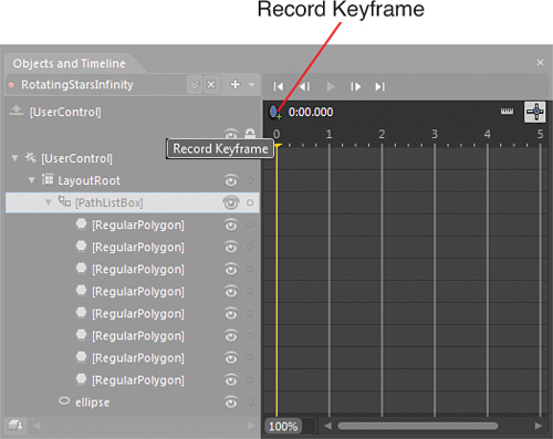
- In the Objects and Timeline panel, create a new storyboard using the New function or Storyboard action menu dropdown, as shown in Figure 12.23. Change the name from Storyboard1 to something more meaningful, such as “RotatingStarsInfinity.”
Figure 12.23. The New Storyboard menu item in the Storyboard action menu dropdown.
- With the
PathListBoxelement select, add a keyframe at Playhead position0.000using the Record Keyframe button, as shown in Figure 12.24.Figure 12.24. The Record Keyframe function.
- Move the Playhead position guide to
3and then, finding theStartproperty, change it to100. - You see a new
LayoutPathelement added to the Objects and Timeline panel with an indication of child elements. Drill down and open all the child elements until you see theStartelement, as shown in Figure 12.25.Figure 12.25. Where to click to modify the Repeat Count value for the specific animation.
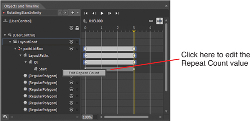
- Figure 12.25 also shows that if you right-click on the bar between
0and3for theStartelement, you will be presented with a single menu item context menu called Edit Repeat Count, which you should now select, presenting the Edit Repeat dialog shown in Figure 12.26.Figure 12.26. The Edit Repeat dialog.
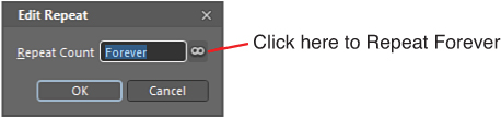
- You can enter an arbitrary number in here, but also note in Figure 12.26 that you can select “
Set to forever,” which you should do now.You are almost done here, but at the present, you don’t have anything calling or firing the animation you just created. If you run the application by hitting
F5, nothing will happen to your stars. This is easy to fix and requires the use of a Behavior to trigger the storyboard. - Close the storyboard using the Close function of the Storyboard action menu.
- Selecting the
PathListBoxelement again, open the Assets panel and navigate to the Behavior section. - Find the Behavior called “
ControlStoryboardAction” and drag it onto the ‘[UserControl]’ root element in the Objects and Timeline panel. - In the
EventNameproperty dropdown, you should select theLoadedevent, which is also shown in Figure 12.27.Figure 12.27. The Behavior property options.
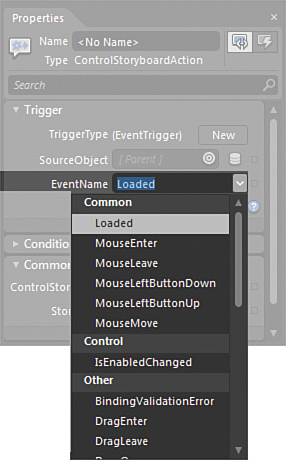
- Next, you simply need to select the storyboard you created from the Storyboard dropdown option, also shown in Figure 12.27.
That’s all there is to it!
You should be able to now run your application with F5, and your stars should rotate forever around the Ellipse path element you originally created.
Review of the PathListBox
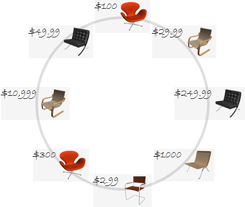
As the name suggests, the PathListBox control is a ListBox element, and you can bind a collection of data, using elements such as a collection of prices (in a TextBox) next to a product image, as shown in Figure 12.28 (see Chapter 9, “Working with SketchFlow”).
Figure 12.28. An example product and price in a PathListBox layout.
The PathListBox is extremely flexible in what it lets you do to control the elements shown, and you can also use it to make text conform to a Path, as shown in Figure 12.29 (see Chapter 9).
Figure 12.29. Text conforming to a path.
Some further resources to help you work with the PathListBox are shown in Appendix A, “Resources for Going Further,” including a very nice sample solution that turns the PathListBox into a Carousel-type object as created by Joanna Mason, one of the Expression Blend team PMs.
The Magic of Effects
Earlier versions of the .Net Framework did include some simple effects that you could use, such as DropShadow and Blur. Unfortunately, those effects were also software rendered, which caused considerable performance loss to an application. Even worse still was the child relation scenario—for example, where an effect was applied to the LayoutRoot, all the child items of the LayoutRoot were also software rendered. It was a killer for the use of effects for sure.
No longer do you have this issue with .Net 4 with full hardware accelerated effects, but you should still use effects wisely in accordance to good design principles.
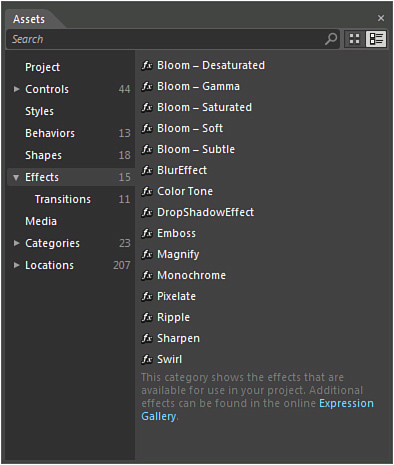
As previously stated, Expression Blend 4 comes with 15 effects for you to apply in various scenarios, as shown in Figure 12.30.
Figure 12.30. The Effects category in the Assets panel.
Note: What Are Transitions in the Assets Panel?
You will also note that a sub-category of effects is “transitions” (as shown in Figure 12.30), which is discussed in detail in Chapter 9.
Effects are for most extremely simple to work with, and in the following example, you apply a simple Ripple Effect to demonstrate so:
- Create a new Silverlight Application + Website project.
- Add a
Buttonelement to the center of the artboard. Make the button quite large with an increased font size. - Open the Assets panel and locate the Effects category, and then the
RippleEffect. - Drag the
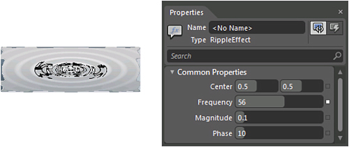
RippleEffect directly from the Assets panel to thebuttonon the artboard or theButtonelement shown in the Objects and Timeline panel. - You see in Figure 12.31 that the Properties panel now shows the four associated properties of the
RippleEffect you can modify at will to see the Effect that is applied to theButtoncontrol.Figure 12.31. The Ripple Effect applied to a Button control.
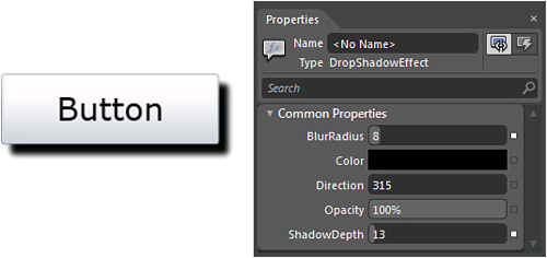
The DropShadowEffect Effect is shown in Figure 12.32 and again demonstrates how simple using effects in Expression Blend is.
Figure 12.32. The DropShadowEffect Effect applied to a Button control.
You can now animate the Ripple Effect in a storyboard by changing any of those four property values also.
Effects are simple and fun to use. Remember that you can animate most, if not all, the properties that are applied to them as well.
Warning: Only One Effect at a Time!
Unfortunately you can apply only one effect to a control at any given time; so, for instance, you can’t have a DropShadowEffect Effect applied to a Ripple Effect.
Summary
In this chapter, you have seen how simple it is to work with the new PathListBox element in Silverlight. You can certainly expect to see its use widely in future creations from people, as the functionality it provides allows for a stunning range of impressive visualization scenarios.
You have also used the very simple Effects features of Blend, which can add that certain little piece of flare to your application. Use Effects with caution, though, as too many can and will annoy your end user.
As with all good things in life, moderation is the key!