
In This Chapter
Discovering tonality
Making the easy Auto repairs
Making adjustments with Levels and Curves
Using advanced tonality correction
It's the difference between an Ansel Adams print and the snapshot of your grandfather as a boy. It's the difference between high-definition TV and the local public access channel's broadcast. It's the difference between a Ferrari and a minivan. It's that thing — that special something — that tells you that you're seeing the real deal, the genuine article, all that it can be. And it's something that you can do for your images.
When an image really pops — when it jumps off the page at you — it's generally because the shadows are dark, the highlights are light, and the colors are rich. I'm sure it's no surprise to you that Photoshop can handle the job. (That's one of the reasons why you bought the program, right?)
In this chapter, I introduce you to the concept of tonality, which is the range of brightness in your image. I also introduce to you the various commands that Photoshop offers for you to adjust your image's tonality. A couple of tools even give you pinpoint control of shadows and highlights. And along the way, I offer you a look at the Histogram palette — what it tells you, what it doesn't tell you, and how to use it best.
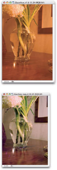
Most photos look better with a little tweaking. For pictures that look good to begin with, you might still want to perk them up a little with a tonal adjustment. Making the shadows a little darker and the highlights a bit lighter increases your image's perceived tonal range, which is sort of the distance between black and white. Take a look at Figure 5-1. It's a pleasant enough snapshot, with decent composition and an interesting subject (very interesting when you get to know her!). But it lacks pizzazz.
With Photoshop, you can darken the shadows and lighten the rest of the image to make it more interesting. By intensifying the difference between what the eye sees as dark and what the eye sees as light in the image, you add some semblance of depth to this simple picture. Comparing Figure 5-1 withFigure 5-2, you can see that one basic tonal adjustment can also make the colors (such as the shirt) seem richer and even produce a perceived increase in detail or sharpness (the fur at the muzzle, ear, nose, and eye).
Note
You might hear a number of words used for the same concept: the lightness and darkness of your image. Tonality, luminosity, and even brightness can be used virtually interchangeably when you're talking about the general subject. However, you generally use brightness when talking about specific pixels and tonality when referring to the image as a whole.
In most photographs of general subject matter, your eye sees the darkest neutral (gray) tone as black and the lightest neutral as white. (If the darkest color is obviously purple and the lightest a bright yellow, you probably wouldn't classify the photo's subject as "general.") In a given image, the shadow under the shoe might be just a dark gray, and the shirt looks like it might need some bleach, but your eye (in cooperation with your mind) compensates to some degree and lets you see black and white.
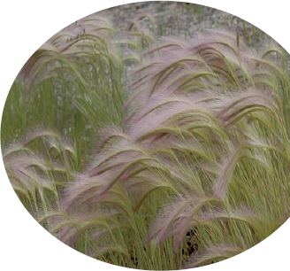
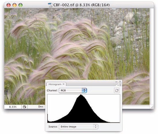
For a more accurate look at the tonal range of your image, Photoshop offers the Histogram palette (found nested with the Navigator and Info palettes in the upper-right corner of your screen), which displays the distribution of the pixels in your image at various luminosity values. The darker pixels (shadows) are stacked at the left end, the lighter pixels (highlights) are stacked at the right end, and the rest of the brightness values (midtones) are stacked between. The taller a column in the histogram, the more pixels at that luminosity value. Figure 5-3 shows an image with what some folks would call a near-perfect histogram distribution because of the beautiful bell curve centered in the graph.
But don't be seduced by a histogram distribution! Not every properly exposed image has such a bell curve. Many perfect images have wildly different histograms. The correct distribution in the histogram depends on two things: the image content and the artistic aims of the artist.
Consider, if you will, an image that consists primarily of white pixels, perhaps a beautiful Alpine snow scene or an ugly creepy-crawly thing on porcelain (as you can see in Figure 5-4). Either image has a histogram skewed dramatically to the right — what you call a high-key image. Nothing is wrong with the image (despite the histogram); it just happens to have a huge number of light-colored pixels.
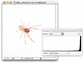
Figure 5.4. The histogram is skewed to the right because of the many white pixels. Or maybe it's trying to escape the spider.
Likewise, a low-key image has a preponderance of dark pixels, which skews the histogram to the left. Just about any night scene has a very large number of very dark pixels, pulling the distribution to the left in the histogram. But many night scenes also include lights, which produce a spike at the far right end.
Note
Keep in mind, too, that the heights of the individual columns in the histogram area are relative: The tallest goes all the way to the top of the box, and the others are scaled accordingly. For example, an image on a black background — say, a large black background — might have so many pixels in the left-most column that the other columns in the image appear tiny and almost unreadable, like the histogram shown in Figure 5-5.
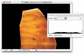
Figure 5.5. Too many pixels in the left-most column make the distribution for the midtones hard to see.
Tip
If the histogram is skewed to one end or the other, making it hard to read, you can make a selection within the image and the histogram updates to show information for only the selected area. (Read about making selections in Chapter 8.) If the image has multiple layers or adjustment layers, the little pop-up menu at the bottom of the Histogram palette (when in Expanded View mode) enables you to specify what layer to calculate.
Warning
If you see a little warning triangle to the upper-right of the histogram data in the palette, you're not necessarily seeing accurate information. The histogram is using information from the image cache rather than the image. Click the triangle to update the histogram. And, if you choose Preferences
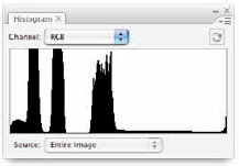
Sometimes a histogram seems to tell you absolutely nothing worthwhile. For example, take the histogram in Figure 5-6. The image doesn't have a bell curve distribution, with a gentle sloping to either side of the center peak. It's not a high-key image because the pixels aren't mashed together at the right. The image is somewhat low-key, but the histogram doesn't have a huge stack at the left end. It does tell you, however, that there are three distinct ranges of tonality in which you find most of the image's pixels.
Note
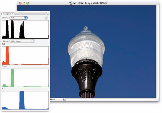
Using the menu, opened with the button in the upper-right corner of the Histogram palette, you can change the palette's configuration. (So far in this chapter, I show the Expanded View, which offers a little better look at the graph than does the Compact View.) In this case, switching to the All Channels View, which shows you a histogram for each color channel, helps solve The Mystery of the Wacky Histogram, especially when seen with the image itself, as shown in Figure 5-7. The image contains a large number of pixels of a rather consistent color. If you mixed that color in the kitchen, the recipe would call for one part red, two parts green, and four parts blue.
As you read later in this chapter (in the section "Level-headed you!"), you can use the histogram to help avoid degrading your image while making adjustments, and (as you read in Chapter 7) it's very important for working with the Camera Raw plug-in. But don't forget about your eyeballs — you don't need the Histogram palette to spot a low-key or high-key image.
Adjusting the tonality of your image can be as simple as selecting one of the Auto commands from Photoshop's Image
If you need to do something special with the image (for example, create an unusual effect) or if the image is in bad shape to begin with, the Auto commands might not be your best bet. But remember this: It never hurts to try an Auto command first. At worst, you use the Undo command, and you've wasted only a couple of seconds and a pair of keystrokes.
From least sophisticated to most, here are your three Auto correction choices:
Auto Contrast: Auto Contrast makes the dark pixels darker and the light pixels lighter, and it tries to avoid introducing any color shift (an overall change in the color appearance). The same adjustment is applied to all three of your image's color channels. You can use Auto Contrast with an image in which the colors already look good and you perhaps just need a bit of a boost to the contrast.
Auto Levels: Each of your image's color channels gets its own adjustment, maximizing the tonal range in the channel. If one of the color channels has very little to contribute to the original image, a color cast (an unwanted tint, as shown in Figure 5-8) might be introduced. Auto Levels is fine for most images that look good already and don't need to have exact colors.
Auto Color: Rather than using a single brightest pixel and a single darkest pixel to determine what should be white and what should be black, Auto Color averages a few pixels at each end. That averaging prevents one single stray pixel from throwing off the calculation used to adjust your image. Auto Color is great for most typical images. You might need that Undo command, however, on some photos with very brightly colored objects or images that have extreme color casts.
Sometimes you need (or simply want) more control than what's offered by the Auto commands. You might have a more demanding problem or a more expansive artistic vision. You might need to make major corrections or create stupendous effects. Photoshop, not surprisingly, offers that sort of control over your image. In fact (and also not surprisingly), you have several ways at your disposal to manipulate the tonality of your images. Two of the most commonly used are Levels and Curves, both found in the Image
Before I introduce you to those two commands, let me quickly explain and dismiss a couple of other available options. Since the early days of Photoshop, the Brightness/Contrast command has lurked among the Image
Also of limited use is the Equalize adjustment. It finds the lightest pixel in the image and calls that white and also finds the darkest pixel and calls that black. The rest of the pixels in the image are distributed between those values, creating an extended tonal range. In practice, you'll find that the adjustment results in extreme highlights and extreme shadows, with a rather garish image overall as well as a lack of details in the midtones.
Note
Always keep in mind that you don't have to make changes to the entire image. If only part of an image needs repair, make a selection of that area before opening the particular adjustment dialog box you want to use. (Read about making selections to isolate areas of your image in Chapter 8.) Say, for example, that you take a beautiful photo of a room in your house — "beautiful" except that the view out the window is far too bright. Isolate the window with a selection, and then use one of your image-adjustment commands to tone it down.
Tip
You can apply Levels, Curves, and Brightness/Contrast as adjustment layers. Adjustment layers make the same changes to your images as the commands in the Image
The Image
Tip
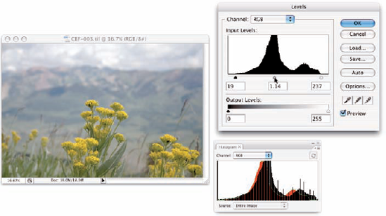
To perform the basic Levels correction, spreading the image's tonality over the full range of values available, you simply drag the slider controls under the histogram in the Levels dialog box inward until they're under the point where the histogram begins to rise in a mountain shape. Ignore those little flat tails that extend outward — they represent individual stray pixels — and drag the little pointers under columns that are at least a few pixels tall. The histogram in the Levels dialog box (as shown in Figure 5-9) is for reference as you make changes. Note, however, that while you work in Levels, the Histogram palette updates, showing you" the "after" in black, with the "before" histogram in color.
Note
Dragging the middle slider to the right moves the bulk of the histogram toward the left, indicating that the overall appearance of the image is slightly darker. Dragging the middle slider to the left lightens the overall image.
Also note the lower Output Levels slider in Figure 5-9. You generally use that only when preparing an image for a commercial printing press that requires you to compress the image's tonal range. Otherwise, ignore that slider and its two fields except for special effects. And make a mental note of that pop-up menu at the top of the Levels dialog box — you can apply Levels to each color channel of your image individually, changing this tonal adjustment tool to a color-correction feature. (Fixing the color in your image is covered in Chapter 6.)
Tip
When you're working in Levels (or just about any dialog box), remember that holding down the Option/Alt key changes the Cancel button to Reset. When you click Reset, all values in the dialog box are restored to the defaults, letting you start over without having to cancel and reselect the command.
Earlier in this chapter, I mention that you can use the Histogram palette to avoid introducing problems into the image. Note in Figure 5-9 that the Histogram palette shows slight gaps appearing among the darker columns in front. Technically called posterization, these gaps represent tonal values that are being squished together into a single value. The pixels at one brightness level are being shifted to the next higher or the next lower value, leaving that empty column in the Histogram. Is this a problem? No, as long as you don't see wide gaps, representing a number of consecutive tonal values not in use. (Extensive posterization ruins the subtle transitions between colors in your image.) And that's why you want to keep an eye on the Histogram palette — to make sure you're not creating wide gaps in the histogram and noticeable posterization in your image.
Tip
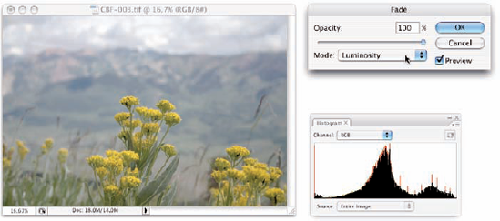
Here is an easy way to minimize that posterization, one that lets you make your Levels adjustment but keep a pretty histogram. Immediately after using Levels, choose Edit
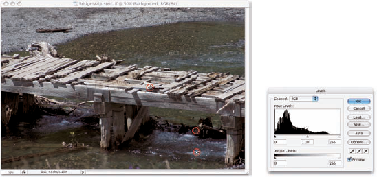
The Levels dialog box (and the Curves dialog box, too) offers another way to make tonal corrections to your image — sort of a half-automated technique, using the three eyedroppers in the lower-right corner of the dialog box. Open your image, open the Levels dialog box, and correct both tonality and color in your image with three little clicks:
Click the left eyedropper on something that should be black.
This might be a shadow, a piece of clothing, or the tire of a car. Generally, you click something in the image that's already quite dark.
Click the right eyedropper on something that should be white.
A cloud, the bride's dress, perhaps an eye . . . all are likely targets for the highlight eyedropper. You usually click something that's already quite light.
Click the middle eyedropper on something that should be gray.
Click something that should be neutral in color. It doesn't have to be midgray, just something that should be neutral. This reduces or eliminates any unwanted color cast in the image. If you don't like the result, click somewhere else in the image. Keep clicking until the colors in the image look right.
In Figure 5-11, the shadow under the bridge, the splash of water, and the weathered wood of the bridge itself provide excellent targets for the three eyedroppers.
Note
One step up from Levels in complexity, and about five steps ahead in terms of image control, is Image
At the very beginning of this chapter, I show you how a simple tonal adjustment can add some drama, some interest to a rather bland image. Figure 5-12 shows you the simple Curves adjustment that I applied to that image. Dragging the curve downward in the shadows makes them darker, dragging upward for the highlights makes them brighter. The midtones (that section of the tonal range between shadows and highlights) also gets lightened a bit in this adjustment.
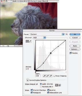
When you first open the Curves dialog box, you see a graph with a diagonal line running from an anchor point in the lower left to another in the upper right. You can click and drag that line up or down (not sideways) to add anchor points and make changes in the curve (and in your image). By default, the shadows are in the lower left, so dragging down darkens, and dragging up lightens. (In the Curves Display Options area, switching from Light to Pigment/Ink will reverse the shadows/highlights. Use this option when preparing CMYK images for page-layout programs.) You can add more than a dozen anchor points to the curve — although you generally need only between one and three new points.
Most snapshots can benefit from a slight tweak in Curves. Click at the intersection of the first vertical and horizontal gridlines in the lower left (the quarter tones) and drag down slightly. The Input field should read 64, and the Output field should be somewhere between 55 and 60 for a shot that looks pretty good to start. Next, click at the intersection of the grid lines in the upper right (the three-quarter tones) and drag up slightly. The Input field should show 192, and the Output field can be anywhere from 195 to 205. This is called a basic S-curve.
Tip
Both the Curves and Levels dialog boxes offer you the Load and Save options. (In Levels, you see prominent Load and Save buttons, whereas in Curves, you click the menu button to the right of the Preset menu.) If there's a correction that you'll use more than once or a correction that needs to be precise time after time, use Save. Then, later, you can click Load to apply that adjustment to another image. If, for example, you used the wrong setting in your camera while taking a series of shots all under the same lighting conditions, they probably all need the same correction. Make the adjustment once, save it, and then apply it to the other images with the Load button.
If you want to correct a specific area in the image, hold down the mouse button and move the cursor into the image window (where it appears as the Eyedropper tool). You'll see a circle on the curve (like the one near the middle of the curve in Figure 5-13), telling you where those pixels fall in the tonal range. To add an anchor point there,
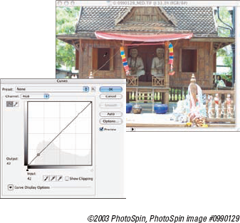
Figure 5.13. Hold down the mouse button with the cursor over the image to see that point on the curve.
When your curve has multiple anchor points, the active anchor point shows as a filled-in square. Deselected anchor points are hollow squares. For precision, you can use the arrow keys to move the active anchor point, or you can type specific values in the Input field (starting position for the anchor point) and Output field (where you want the anchor point to go).
Option+click/Alt+click in the grid area to toggle between a 4 × 4 grid and a 10 × 10 grid. And, rather than clicking and dragging on the curve, you can activate the Pencil tool (shown in Figure 5-14) and draw your curve by hand. When hand-drawing your curve, the Smooth button is available, too, to ensure that the transitions in your tonal adjustments aren't too severe.
The Image
Note
The Shadow/Highlight and Exposure adjustments are not the same as working with Raw images in the Camera Raw plug-in (see Chapter 7). Camera Raw works with unprocessed image data, the so-called digital negative. Using Photoshop's Adjustment commands, you're working with image data that has already been manipulated in the camera, in Photoshop, or both. When working with unprocessed data in Camera Raw, you truly have control over the exposure, the shadows, the highlights, and much more.
The Shadow/Highlight adjustment is not available as an adjustment layer. Changes that you make with the Shadow/Highlight feature are a permanent part of your image.
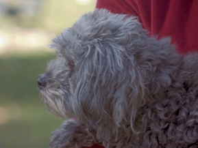
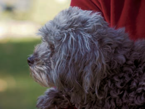
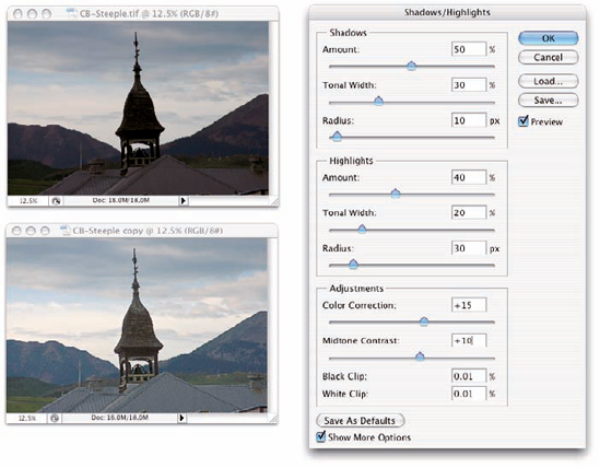
The Shadow/Highlight adjustment is designed to rescue two specific sorts of images — you've seen them (and maybe taken them): The background is perfectly exposed, and the person in the foreground is in horrible shadow. Or, equally bad, the background looks great, but the subject is washed out by a strong flash. (See both examples in Figure 5-15.) By controlling the shadows and highlights separately from the rest of the image, this feature helps you restore more balance to the image.
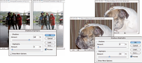
The default settings in Shadow/Highlight are intended to repair backlighting problems, as you see on the left in Figure 5-15. When the foreground lacks detail because of flash (as you can see in the top dog image on the right), minimize changes to the shadows and drag the Highlights slider to the right. And, as shown inFigure 5-16, with Show More Options selected, Shadows/ Highlights gives you incredible control over images that have problems at both ends of the tonal range.
Note
In the Shadows/Highlights dialog box, the Shadows slider lightens the darker areas of your image, and the Highlights slider darkens the lighter areas. Generally, you'll use one slider or the other to fix a specific problem in an image, but you can use both if you need to lighten shadows and tone down highlights in the same image.
When you enable the Show More Options check box, Shadow/Highlight has a rather intimidating set of controls. Not to worry! It's actually pretty simple:
Amount: For both Shadows and Highlights, the Amount slider is how much of a correction you're making. This is the nuts and bolts of the Shadow/Highlight adjustment. For a backlit subject, you'll use the Shadows slider a lot and not the Highlights slider. When working with a washed-out subject, you'll probably move the Shadows slider to 0% and work with the Highlights slider.
Tonal Width: Use the Tonal Width sliders to specify how much of the image's tonal range you want to include as shadows or highlights. If you drag either Tonal Width slider to 100%, you're working on the entire tonal range of the image — not a particularly appropriate job for Shadow/Highlight (use Curves instead). The default of 50% is rather too high most of the time. Instead, start your adjustment with a range of perhaps 20% and fine-tune from there.
Radius: You adjust the Radius sliders to tell Shadow/Highlight which pixels should be identified as being in the shadow or highlight. With too low of a Radius setting, an individual black pixel stuck in the middle of a light area in your image might get classified as a shadow area. Too high of a setting has a tendency to apply the adjustment to the entire image. Generally speaking, start with a Radius of perhaps 10 pixels for very small images and 30 pixels for large digital photos. After adjusting your Amount and Tonal Width sliders, move the Radius slider back and forth while watching some of the smaller patches of shadow or highlight (whichever you're correcting) to make sure that those areas are being included in the adjustment.
Color Correction/Brightness: This slider changes its name to match your image's color mode. When working with a color image, you see Color Correction. When you apply Shadow/Highlight to a grayscale image, the slider's name changes to Brightness. Don't bother with this slider until you make your Amount adjustment. In a color image, lightening the shadows or darkening the highlights shows the actual color of the pixels in those areas. Use this slider to increase (drag to the right) or decrease (drag to the left) the saturation of those pixels. Remember that Color Correction works only on the pixels that you identify with the Tonal Width and Radius sliders. (If you set both sets of Tonal Width and Radius sliders to 0%, Color Correction has no effect on the image at all.) When you correct a grayscale image, on the other hand, the Brightness slider affects all pixels except those that are already pure white or pure black.
Midtone Contrast: You can increase or decrease the contrast throughout the image with the Midtone Contrast slider. Much like clicking in the middle of the curve in the Curves dialog box and dragging up or down, you adjust the whole range of your image, including the shadows and highlights. When the overall appearance of your image needs improvement, start with Midtone Contrast and then work with your shadows and highlights individually.
Clip: Most of the time, you don't want to change the clipping values. Clipping takes pixels that are almost black and forces them to pure black, or it takes pixels that are almost white and forces them to pure white. Clipping your shadows or highlights reduces those subtle differences in color that provide the detail in the shadows and highlights. When would you want to clip shadows or highlights? When you don't care about detail in those areas of your image and need more contrast through the midtones.
Photoshop also offers the Exposure feature in the Image
Note
Earlier in this chapter, I mention that sometimes you want to apply an adjustment to only part of an image. The windows in Figure 5-17 certainly qualify! To best repair this image, I made a selection of the windows, improved their exposure, inverted the selection (select the areas of the image other than the windows), and corrected the room separately. (Chapter 8 has all the info on making selections.)
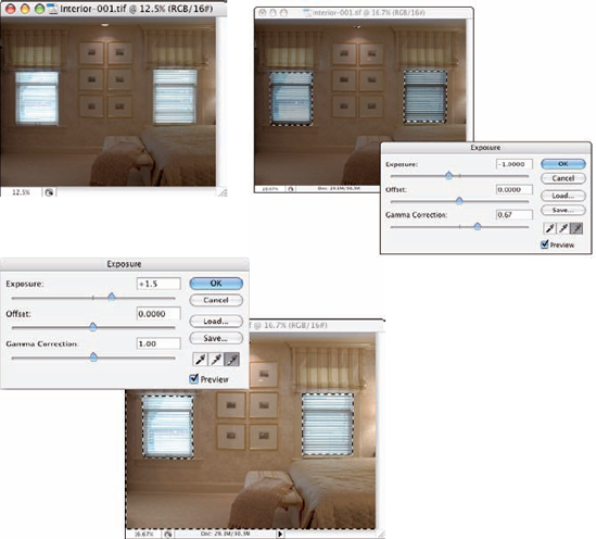
The Exposure dialog box offers a couple of additional controls, too. The Offset and Gamma Correction sliders are designed primarily to work with very high-bit images (the special 32-bit/channel high dynamic range images), and you likely will find them too sensitive to be of much use for most images.
Exposure is a rather specialized tool, and you probably won't find it nearly as user friendly or effective as Curves and Shadow/Highlight. If you do actually work with 32-bit/channel images, take it for a test drive; you might decide that it fills a need.
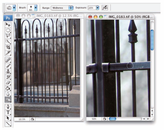
You have a couple more ways to work with tonality in Photoshop — the toning tools. These two brush-using tools let you paint corrections on your image, giving you incredible control over the appearance. Select the Burn tool to darken or the Dodge tool to lighten. Select a brush tip in the Options bar and drag the tool in your image to apply the correction. (You can read about controlling the brush-using tools and that incredibly complex Brushes palette in Chapter 14.) In Figure 5-18, you see the Burn tool darkening a specific area of the fence on the right.
Tip
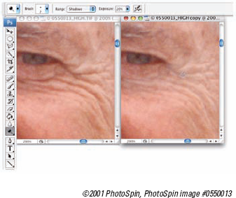
The Dodge tool is great for minimizing (without removing) shadows in an image. You'll find it particularly useful for reducing wrinkles in faces and other such jobs that require lightening specific areas of an image. Figure 5-19 compares the original (left) with a working copy in which I'm using the Dodge tool to reduce the appearance of the wrinkles. By reducing rather than eliminating those wrinkles completely, I retain the character of the man's face as well as prevent that phony, just-out-of-plastic-surgery look.
Note
For most of the work that you do with the Dodge and Burn tools, the default Exposure setting of 50% is way too strong. In the Options bar, reduce the Exposure to about 15–20% for most work. And unless you're specifically working on lightening shadows or toning down highlights, set the tools' Range to Midtones in the Options bar.