Chapter 3: Playing with Opacity and Blend Modes
In This Chapter
![]() Adjusting opacity
Adjusting opacity
![]() Applying Blend modes for effects
Applying Blend modes for effects
![]() Setting the blend options
Setting the blend options
In this chapter, we show you how to have a little fun and get those creative juices flowing. This chapter, along with Chapters 1 and 3 in Book VII, gives you a few ways to tweak the layers you’ve so diligently created. Maybe you want to make one of your layers semitransparent so that you can see the layer beneath it. Or perhaps you want to try blending the colors between a couple layers in a way that’s slightly offbeat. Look no further.
Take these techniques as far as you want. Remember: There’s no substitute for good old experimentation. Before you jump into these techniques, you should have a handle on the methods of layer creation and management that we explain in Chapters 1 and 2 of this minibook.
Adjusting Layer Opacity
One of the easiest ways by far to make your image look interesting is to have one image ghosted over another, as shown in Figure 3-1. Creating this effect is an easy task with the Opacity option in the Layers panel. You adjust the opacity by selecting a layer in the Layers panel. Then either access the slider by clicking the right arrow or enter a percentage value in the Opacity text box.
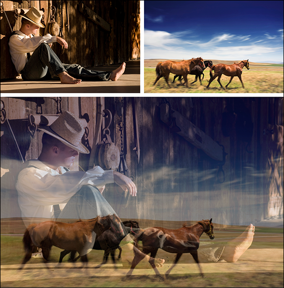
©istockphoto.com/babyblueut and Image#4266855 and muratkoc Image #3357562
Figure 3-1: Adjusting the opacity enables one image to ghost over another.
The Opacity setting allows you to mix the active layer with the layers below it in varying percentages from 100% (completely opaque) to 0% (completely transparent). Remember that you can adjust the opacity only on a layer, not on the Background.
 You can also use the scrubby slider by pressing and dragging your mouse over the word Opacity in the Layers panel. Finally, you can also change the Opacity percentage by using keyboard shortcuts. With any tool active, except a painting tool or an editing tool, press a number key. Press 5 for 50% or 25 for 25%. If you’re entering a 2-digit value, just be sure to type the numbers quickly, or else Elements interprets the numbers as two different values. You get the picture. Note that for the default of 100%, you must press 0.
Creatively Mixing with Blend Modes
Elements sports an impressive 25 Blend modes. Blend modes affect how colors interact between layers and how colors interact when you apply paint to a layer. Blend modes can produce a multitude of interesting, sometimes even bizarre, effects. What’s more, you can easily apply, edit, or discard Blend modes without modifying your image pixels one iota.
Blend modes are located on a drop-down menu at the top of the Layers panel in Expert mode. The best way to get a feel for the effect of Blend modes isn’t to memorize the descriptions we give you in the following sections. Instead, grab an image with some layers and apply each Blend mode to one or more of the layers to see what happens. In fact, try a few different images because the effects may be subtle or intense, depending on the colors in the image and the colors with which they’re blending. Throw in some different opacity percentages, and you’re on your way to endless hours of creative fun.
 You see Blend modes called Painting modes, Brush modes, Layer modes, calculations, or just plain modes. They’re usually referred to as Blend modes or Layer modes when used with layers and painting modes, and as Brush modes when used in conjunction with a painting or an editing tool.
General Blend modes
Normal Blend mode doesn’t require an explanation. It’s the one you probably use the most. Dissolve is the next one on the list and, ironically, is probably the one you use the least. (You can see both at work in Figure 3-2.)
![]() Normal: The default mode displays each pixel, unadjusted. Note that you can’t see the underlying layer at all with the Normal blend mode.
Normal: The default mode displays each pixel, unadjusted. Note that you can’t see the underlying layer at all with the Normal blend mode.
![]() Dissolve: You can see this mode only on a layer with an opacity setting of less than 100%. The lower the opacity, the more intense the effect. Dissolve allows some pixels from lower layers, which are randomized, to show through the target (selected) layer.
Dissolve: You can see this mode only on a layer with an opacity setting of less than 100%. The lower the opacity, the more intense the effect. Dissolve allows some pixels from lower layers, which are randomized, to show through the target (selected) layer.

©istockphoto.com/dlewis33 Image #2434140 and PhotoInc Image #464286
Figure 3-2: The Dissolve Blend mode enables pixels from one layer to peek randomly through another layer.
Blend modes that darken
Overall, all the Blend modes we cover in this section produce effects that darken an image, as shown in Figure 3-3.

©istockphoto.com/dlewis33 Image #2434140 and PhotoInc Image #464286
Figure 3-3: These Blend modes darken, or burn, your layers.
Here’s one of our favorite uses for the Darken Blend mode. Scan a handwritten letter or sheet of music and layer it over an image. Apply the Darken Blend mode to the letter or sheet music layer. The white areas of the paper become transparent, and only the letters or musical notes display, creating a nice composite image.
Here are the Blend modes that darken your image in some way:
![]() Darken: Turns lighter pixels transparent if the pixels on the target layer are lighter than those on layers below. If the pixels are darker, they’re unchanged.
Darken: Turns lighter pixels transparent if the pixels on the target layer are lighter than those on layers below. If the pixels are darker, they’re unchanged.
![]() Multiply: Burns the target layer onto the layers underneath, thereby darkening all colors where they mix. When you’re painting with the Brush or Pencil tool, each stroke creates a darker color, as though you’re drawing with markers.
Multiply: Burns the target layer onto the layers underneath, thereby darkening all colors where they mix. When you’re painting with the Brush or Pencil tool, each stroke creates a darker color, as though you’re drawing with markers.
![]() Color Burn: Darkens the layers underneath the target layer and burns them with color, creating an increased contrast effect, like applying a dark dye to an image. Blending with white pixels has no effect.
Color Burn: Darkens the layers underneath the target layer and burns them with color, creating an increased contrast effect, like applying a dark dye to an image. Blending with white pixels has no effect.
![]() Linear Burn: Darkens the layers underneath the target layer by decreasing the brightness. This effect is similar to Multiply but often makes portions of an image black. Blending with white has no effect.
Linear Burn: Darkens the layers underneath the target layer by decreasing the brightness. This effect is similar to Multiply but often makes portions of an image black. Blending with white has no effect.
![]() Dark Color: When blending two layers, the darker color of the two colors is visible. This mode comes in handy when you overlay elements like scanned sheets of music, handwritten letters, or logos over your images and you want the white portions to appear transparent.
Dark Color: When blending two layers, the darker color of the two colors is visible. This mode comes in handy when you overlay elements like scanned sheets of music, handwritten letters, or logos over your images and you want the white portions to appear transparent.
Blend modes that lighten
If you have Blend modes that darken, well, having modes that lighten just makes good sense. So, if you have the need to throw some digital bleach on your brightly colored pixels, try a couple of these Blend modes, as shown in Figure 3-4.
![]() Lighten: Turns darker pixels transparent if the pixels on the target layer are darker than those on layers below. If the pixels are lighter, they’re unchanged. This effect is the opposite of Darken.
Lighten: Turns darker pixels transparent if the pixels on the target layer are darker than those on layers below. If the pixels are lighter, they’re unchanged. This effect is the opposite of Darken.
![]() Screen: Lightens the target layer where it mixes with the layers underneath. Blending with black has no effect. This effect is the opposite of Multiply.
Screen: Lightens the target layer where it mixes with the layers underneath. Blending with black has no effect. This effect is the opposite of Multiply.
![]() Color Dodge: Lightens the pixels in the layers underneath the target layer and infuses them with colors from the top layer. Blending with black has no effect. This effect is similar to applying a bleach to an image.
Color Dodge: Lightens the pixels in the layers underneath the target layer and infuses them with colors from the top layer. Blending with black has no effect. This effect is similar to applying a bleach to an image.
![]() Lighter Color: When you’re blending two layers, the lighter color of the two colors is visible.
Lighter Color: When you’re blending two layers, the lighter color of the two colors is visible.
![]() Linear Dodge: Lightens the layers underneath the target layer by increasing the brightness. This effect is similar to Screen but often makes parts of an image pure white. Blending with black pixels has no effect.
Linear Dodge: Lightens the layers underneath the target layer by increasing the brightness. This effect is similar to Screen but often makes parts of an image pure white. Blending with black pixels has no effect.
©istockphoto.com/dlewis33 Image #2434140 and PhotoInc Image #464286
Figure 3-4: These Blend modes lighten, or dodge, your layers.
Lighting or Contrast Blend modes
This group of Blend modes plays with the lighting in your layers. Some of these Blend modes, such as Pin Light, are best reserved for the occasional wacky special effect. See these Blend modes in action in Figure 3-5.
![]() Overlay: Multiplies the dark pixels in the target layer and screens the light pixels in the underlying layers. Enhances the contrast and saturation of colors.
Overlay: Multiplies the dark pixels in the target layer and screens the light pixels in the underlying layers. Enhances the contrast and saturation of colors.
![]() Soft Light: Darkens the dark pixels (greater than 50% gray) and lightens the light pixels (less than 50% gray). Blending with black or white results in darker or lighter pixels but doesn’t make parts of your image pure black or pure white. It’s similar to Overlay, but is softer and subtler. The effect is like shining a soft spotlight on the image.
Soft Light: Darkens the dark pixels (greater than 50% gray) and lightens the light pixels (less than 50% gray). Blending with black or white results in darker or lighter pixels but doesn’t make parts of your image pure black or pure white. It’s similar to Overlay, but is softer and subtler. The effect is like shining a soft spotlight on the image.
![]() Hard Light: This mode multiplies the dark pixels (greater than 50% gray) and screens the light pixels (less than 50% gray). It can be used to add highlights and shadows to an image. Blending with black or white gives you black and white. The effect is similar to shining a bright, hard spotlight on the image.
Hard Light: This mode multiplies the dark pixels (greater than 50% gray) and screens the light pixels (less than 50% gray). It can be used to add highlights and shadows to an image. Blending with black or white gives you black and white. The effect is similar to shining a bright, hard spotlight on the image.
![]() Vivid Light: If the pixels on the top layer are darker than 50% gray, this mode darkens the colors by increasing the contrast. If the pixels on the top layer are lighter than 50% gray, the mode lightens the colors by decreasing the contrast. It’s a combination of Color Burn and Color Dodge.
Vivid Light: If the pixels on the top layer are darker than 50% gray, this mode darkens the colors by increasing the contrast. If the pixels on the top layer are lighter than 50% gray, the mode lightens the colors by decreasing the contrast. It’s a combination of Color Burn and Color Dodge.
![]() Linear Light: If the pixels on the top layer are darker than 50% gray, the mode darkens the colors by decreasing the brightness. If the pixels on the top layer are lighter than 50% gray, the mode lightens the colors by increasing the brightness. It’s a combination of Linear Burn and Linear Dodge.
Linear Light: If the pixels on the top layer are darker than 50% gray, the mode darkens the colors by decreasing the brightness. If the pixels on the top layer are lighter than 50% gray, the mode lightens the colors by increasing the brightness. It’s a combination of Linear Burn and Linear Dodge.
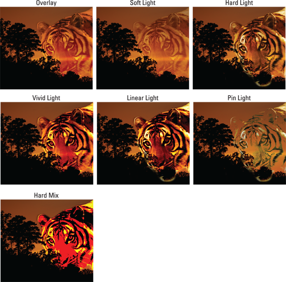
©istockphoto.com/dlewis33 Image #2434140 and PhotoInc Image #464286
Figure 3-5: These Blend modes adjust the lighting between image layers.
![]() Pin Light: Replaces the colors of pixels, depending on the colors in the top layer. If the pixels on the top layer are darker than 50% gray, the mode replaces the pixels that are darker than those on the top layer and doesn’t change pixels that are lighter. If the pixels on the top layer are lighter than 50% gray, the mode replaces the pixels that are lighter than those pixels on the top layer and doesn’t change pixels that are darker. It’s a combination of Darken and Lighten; useful for special effects.
Pin Light: Replaces the colors of pixels, depending on the colors in the top layer. If the pixels on the top layer are darker than 50% gray, the mode replaces the pixels that are darker than those on the top layer and doesn’t change pixels that are lighter. If the pixels on the top layer are lighter than 50% gray, the mode replaces the pixels that are lighter than those pixels on the top layer and doesn’t change pixels that are darker. It’s a combination of Darken and Lighten; useful for special effects.
![]() Hard Mix: Similar to Vivid Light but reduces the colors to a total of eight: cyan, magenta, yellow, black, red, green, blue, and white. Although the results depend on the mix of existing colors on the top and bottom layers, this mode usually creates a highly posterized (a cartoon or flat illustration) effect.
Hard Mix: Similar to Vivid Light but reduces the colors to a total of eight: cyan, magenta, yellow, black, red, green, blue, and white. Although the results depend on the mix of existing colors on the top and bottom layers, this mode usually creates a highly posterized (a cartoon or flat illustration) effect.
Blend modes that invert
If the Blend modes discussed in the preceding sections are a little too sedate for you, you may want to experiment with the inverters — Difference and Exclusion. These Blend modes, also referred to as Comparative blend modes, invert your colors and can produce some interesting special effects, as shown in Figure 3-6.
![]() Difference: Produces a negative, or inverted, effect according to the brightness values on the top layers. If the pixels on the top layer are black, no change occurs in the underlying layers. If the pixels on the top layer are white, the mode inverts the colors of the underlying layers. It can produce some intense effects.
Difference: Produces a negative, or inverted, effect according to the brightness values on the top layers. If the pixels on the top layer are black, no change occurs in the underlying layers. If the pixels on the top layer are white, the mode inverts the colors of the underlying layers. It can produce some intense effects.
![]() Exclusion: Like Difference, but with less contrast and saturation. If the pixels on the top layer are black, no change occurs in the underlying layers. If the pixels on the top layer are white, this mode inverts the colors of the underlying layers. Medium colors blend to create shades of gray.
Exclusion: Like Difference, but with less contrast and saturation. If the pixels on the top layer are black, no change occurs in the underlying layers. If the pixels on the top layer are white, this mode inverts the colors of the underlying layers. Medium colors blend to create shades of gray.

©istockphoto.com/dlewis33 Image #2434140 and PhotoInc Image #464286
Figure 3-6: The Difference and Exclusion Blend modes invert colors.
HSL color model Blend modes
These Blend modes, sometimes referred to as the Comparative blend modes, use the HSL (Hue, Saturation, Luminosity) color model to mix colors, as shown in Figure 3-7.
![]() Hue: Blends the luminance (brightness) and saturation (intensity of the color) of the underlying layers with the hue (color) of the top layer.
Hue: Blends the luminance (brightness) and saturation (intensity of the color) of the underlying layers with the hue (color) of the top layer.
![]() Saturation: Blends the luminance and hue of the underlying layers with the saturation of the top layer.
Saturation: Blends the luminance and hue of the underlying layers with the saturation of the top layer.

©istockphoto.com/dlewis33 Image #2434140 and PhotoInc Image #464286
Figure 3-7: These Blend modes use the Hue, Saturation, Luminosity color model to mix colors.
![]() Color: Blends the luminance of the underlying layers with the saturation and hue of the top layer. This mode enables you to paint color while preserving the shadows, highlights, and details of the underlying layers.
Color: Blends the luminance of the underlying layers with the saturation and hue of the top layer. This mode enables you to paint color while preserving the shadows, highlights, and details of the underlying layers.
Our favorite Blend mode in this group is Color; you use it to apply color to images without obscuring the tonality. Color mode is helpful for “hand painting” grayscale images. If you’ve ever admired those hand-tinted, black-and-white photos used in greeting cards and posters, you can create the same effect fairly easily. First, make sure that your black-and-white image is in RGB (red, green, blue) mode so that it can accept color. Create a new layer in the Layers panel and set it to the Color Blend mode. Grab the Brush tool (with a soft-edged tip), choose a color, and paint over the image. Adjust the opacity to less than 100% to create a softer effect. See details on this technique in Book V, Chapter 1.
![]() Luminosity: The opposite of Color, this mode blends the hue and saturation of the underlying layers with the luminance of the top layer. This mode also preserves the shadows, highlights, and details from the top layer and mixes them with the colors of the underlying layers.
Luminosity: The opposite of Color, this mode blends the hue and saturation of the underlying layers with the luminance of the top layer. This mode also preserves the shadows, highlights, and details from the top layer and mixes them with the colors of the underlying layers.
![]() Putting It Together
Putting It Together
Adjusting Opacity Settings in a Collage
If you’ve followed along with the Putting It Together projects we discuss in Chapters 1 and 2 of this minibook, you may have a collage that you’re satisfied with. You just need to make the final tweaks to get it to the state of perfection.
One of the most important tweaks you can make concerns opacity. Follow these steps to adjust the opacity settings on some of the layers:
1. In the Photo Editor, in Expert mode, open your saved collage file.
2. If the Layers panel isn’t already visible, choose Window⇒Layers to open it.
3. Select a layer in the collage and move the Opacity slider, located at the top of the Layers panel, to the left or right.
If you want the layer to be more opaque, move the slider to the right. If you’re interested in making the layer more transparent, move the slider to the left.
We chose our Japanese-characters layer and adjusted the opacity to 10%. We wanted the characters to create just a subtle texture, not to appear in full strength.
4. Save the file and then move to the next layer you want to adjust.
If you have more complicated opacity settings to adjust, keep reading.
5. Select another layer, choose Duplicate Layer from the Layers panel menu, and click OK to close the Duplicate Layer dialog box.
Making a copy of a layer is useful because you can add a Blend mode and then adjust it to create just the right amount of the effect.
For example, if you want to define an element in your collage but applying it directly on the layer makes the effect too intense, make a copy of the layer. We made a copy of our temple layer.
6. Select the duplicated layer and choose a mode (such as Soft Light) from the Blend Mode drop-down menu in the Layers panel.
Leaving our duplicated and blended layer at 100% opacity is a little too garish.
7. Adjust the opacity to tone it down as much as you want.
We brought ours down to 25%.

©istockphoto.com/PIKSEL Image #2300338 and tkorocky Image #1469545
8. When you’re satisfied with the opacity and contrast, save the collage file.
Oh, by the way, we added a dark green background box and a lucky cat to our collage.