
C H A P T E R 8
Enhancing SharePoint with jQuery
In the previous chapters, we have looked at creating artifacts, such as web parts and application pages. Now let's take a look at how it is possible to manipulate and extend existing functionality. In this chapter, you will learn how you can use jQuery to extend what is available out of the box with SharePoint.
SharePoint Enhancement Considerations when Using jQuery
Making changes to the HTML rendered by SharePoint comes with a few risks. SharePoint 2010 makes use of JavaScript to provide its own functionality, and you need to be careful whenever you are trying to customize that functionality. If you are working with HTML elements that you have not created yourself, you may not be fully aware of how and why they are used on the page, and your customizations could have an untoward effect. You will need to disable your custom JavaScript files before asking for Microsoft support.
If you find that you are making a lot of changes to the existing UI, that could be an indication that you are doing something wrong. Creating a custom master page and applying just the jQuery functionality required to that page is far more sensible than trying to contort the standard master page to fit your requirements. CSS can often be a better solutio if styling is all you are trying to do with jQuery.
One of the benefits of using jQuery to enhance SharePoint is that if your jQuery script cannot run for some reason, it will fail over to the standard SharePoint functionality.
Adding Functionality to the SharePoint UI
SharePoint does a lot of really cool things for you out of the box, and jQuery allows you to extend some of its offerings to enhance the user experience. By adding jQuery to a SharePoint page, you can change the behavior of elements that are typically out of your control. Here, we'll explore how to allow users to expand and collapse items in the Quick Launch menu, display graphs from SharePoint list data, use jQuery from the Ribbon, and filter the Quick Launch menu.
Expanding and Collapsing from Quick Launch
The first example we will look at is how to allow end users to collapse and expand items from the Quick Launch menu. As shown in Figure 8-1, with the Quick Launch menu expanded, you can see the categories of the items, such as Libraries, Lists, and Discussions, as well as the items from each of the categories, such as Site Pages, News, and Team Discussion.
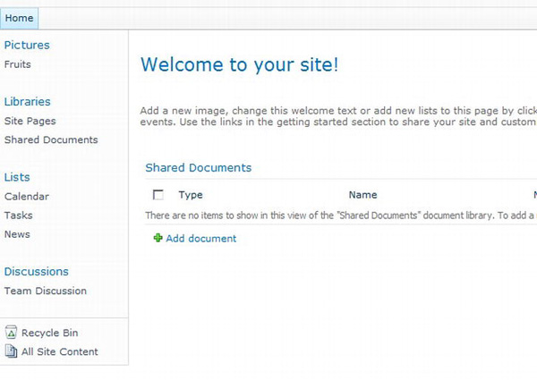
Figure 8-1. Quick Launch with expanded categories and items
Creating a Proof of Concept using a JavaScript File in the Layouts Folder
For this example, we are going to try a slightly different way of building the solution than we've used in previous chapters. This method makes it easy to put together a proof of concept before fleshing out a full solution. This approach will work only if you are developing directly on your SharePoint environment (no, not your production server, a development box). If you don't have this option, you can just put the whole code in a Content Editor web part instead of the JavaScript file, as you have seen in previous chapters.
- Navigate to the SharePoint root:
C:Program FilesCommon FilesMicrosoft SharedWeb Server Extensions14. - Continue to navigate to the
TemplateLayoutsfolder. - Create a new folder called
CustomScripts. - Create a new file called
ExpandCollapse.js. - Open the file in Notepad and add the following code, just so you can make sure it is being used:
$(document).ready(function(){

        alert("Hello from Expand & Collapse");

}); - Save the file.
- Navigate to your SharePoint page where you have a Quick Launch menu with some items in it.
- Add a Content Editor web part.
- In the Format Text section of the Ribbon, choose Edit HTML Source, as shown in Figure 8-2.
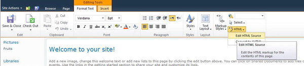
Figure 8-2. Editing the HTML source of a Content Editor web part
- In the dialog that opens, add the
scripttag to the path to the JavaScript file, as follows:<script src="/_layouts/CustomScripts/ExpandCollapse.js" type="text/javascript"></script>This means that you can make changes to the
ExpandCollapse.jsfile and save it, and those changes will be reflected in the SharePoint page immediately. - Once the script link has been added, click OK and exit edit mode. You should be presented with the lovely alert that you added earlier, letting you know that the link to the JavaScript file has been made, as shown in Figure 8-3.
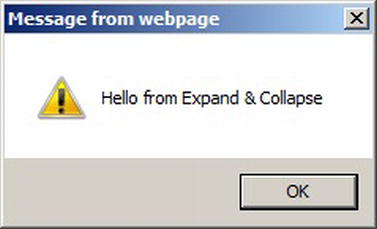
Figure 8-3. Alert to show that the JavaScript file is being read
With the JavaScript now working, it is time to explore how to add the functionality to expand and collapse the menu items.
Getting and Hiding Quick Launch Items
From your experience so far, you should realize that the simplest way of adding the expand/collapse functionality is to show or hide the child elements of the titles. The first question to explore is how, in jQuery, you can get the container of the elements that should be manipulated. This is easy to do with whichever browser tool you are using that allows you to inspect elements in a page. This example uses the Internet Explorer 9 F12 Developer Tools to inspect the elements.
- Press F12 to open the Developer Tools.
- Click the Select element by click button, as shown in Figure 8-4.
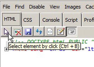
Figure 8-4. Choosing the element-selection function using the F12 Developer Tools
- Move the cursor over the elements on the page, and you will see that the one that is currently under the cursor is highlighted, as shown in Figure 8-5.
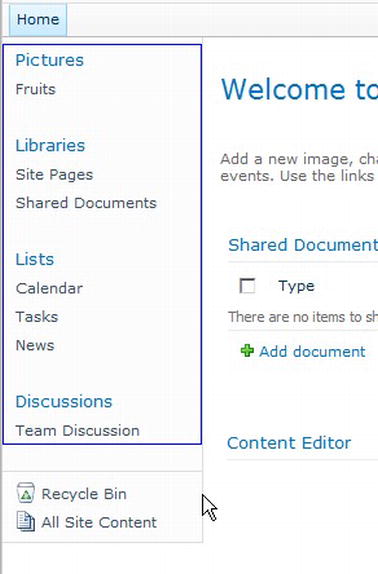
Figure 8-5. The div element has been selected.
- Once you have found the correct element, left-click, and the corresponding element will be shown in the tool pane. For this example, it makes sense to find the element that has an ID you can use as close to the elements you want to manipulate as possible. In Figure 8-6, you can see that there is a
divwith an ID ofzz17_V4QuickLaunchMenu.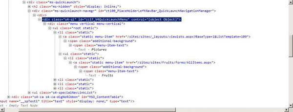
- Looking down the structure of the menu, you will see another child
div, which you can ignore. Further down, there is an unordered list that contains the categories. Each item contains a header anchor link and also another unordered list that holds the subitems. This sublist is what should be shown or hidden as each category is expanded or collapsed. - Now it is time to write some code. Open the
ExpandCollapse.jsfile, which is neatly stored in theCustomScriptsfolder. - The file will still contain the test script. Remove the alert line but keep the rest.
- Add the following lines:
$(document).ready(function () {


    // Get the quick launch menu items

    var menuItems = $('#zz17_V4QuickLaunchMenu>div>ul>li>ul')

    // Hide the items

    menuItems.hide();

});
The first line is a jQuery selector that walks down the path mentioned in step 5, by selecting the outer
divby using its ID. Looking at it in reverse from right to left, it is selecting allulitems that have a parent of a list item that has a parent of anotherulthat has a parent of adivthat has a parent of thedivwith the ID specified! Oh my! The second line will promptly hide the matching elements (a bit easier to understand). - Save the JavaScript file.
- Refresh your SharePoint page. You will see that the subitems have been hidden, as shown in Figure 8-7.
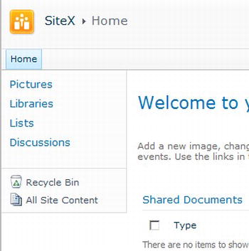
Figure 8-7. Hiding the Quick Launch subitems
You may notice that when the page loads, the subitems are there and then they disappear. This occurs because jQuery waits until the whole document has loaded before running the code inside the document.ready event. This can cause some odd-looking behavior. If you're working with your own elements, you are better off with elements starting off hidden and then showing them when required. However, when enhancing elements that you haven't created, you are likely to come across this behavior.
Adding Expand and Collapse Icons
The next step is to allow your end users to expand and collapse the categories. The most common user experience for this is to click a + (expand) or a – (collapse) icon to the left of the element. As you are making use of jQuery, this functionality can be added dynamically by injecting some clever code.
Insert the following code in the ExpandCollapse.js file:
$(document).ready(function(){

        // Get the quick launch menu items

    var menuItems = $('#zz17_V4QuickLaunchMenu>div>ul>li>ul')


    // Hide the items

    menuItems.hide();


        // Create element for expandcollapse icon

        // Float left to keep it inline

        // Add expandCollapseMe class to use to add event handler later

        // Use existing SharePoint image as image

        var expandCollapseButtonElement = $('<img style="float:left" style="cursor:hand" class="expandCollapseMe" src="/_layouts/images/TPMax2.gif">'),
        // Add the new button to all menu items from selector query

        menuItems.siblings('a').before(expandCollapseButtonElement);


});
The code creates a new img tag, which contains the expandcollapse image. The img tag has a class that can be used to wire up the click event. The last line finds the header a tag, which is a sibling of the unordered list and inserts the new image before it—all very clever stuff.
Save the file again and refresh the SharePoint page. You will see the new image, as shown in Figure 8-8.
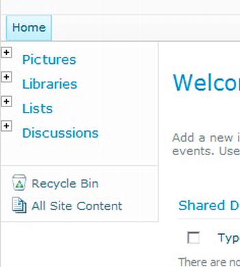
Figure 8-8. Showing the dynamically added icons
You could click the expand icon until your finger gets sore, but nothing will happen. That's because you have not told it to do anything when clicked. The next logical step is to wire up the button. When you click the icon, the subitems should appear, and the icon should change to reflect the new state of expanded by showing a collapse icon. When you click a collapse icon, it should do the reverse.
The event handler and code are incredibly simple. Add the following into the document.ready function:
    // When Element is clicked

    // use on() for 1.7 or live() for 1.6

    $('.expandCollapseMe').live('click', function () {

        // Get the list containing the subitems

        var subItemMenu = $(this).siblings('ul'),


        // Check visibility

        if ($(subItemMenu).is(':visible')) {
            // Hide all items

            subItemMenu.hide();


            // Update expandcollapse image to expand

            $(this).prop('src', '/_layouts/images/TPMax2.gif'),

        } else {


            // Show all items

            subItemMenu.show();


            // Update expandcollapse image to collapse

            $(this).prop('src', '/_layouts/images/TPMin2.gif'),

        }

    });
The code binds the expandcollapse behavior to all current and future elements that match the query selector. The selector here is returning elements with the class of expandCollapseMe. The first line inside the event handler gets the list of the subitems. As with the insertion of the image element, you are able to use the sibling method, as it sits at the same level in the Document Object Model (DOM) tree. Next, the is method can check if the element is visible. If it is visible, then the code hides the subitems list and updates the src property of the a tag to reference the expand image. If the subitem is not visible, then the code shows the items and sets the image to the collapse icon.
Once the changes have been made, the complete code for this task should look like the following.
$(document).ready(function(){

        // Get the quick launch menu items

    var menuItems = $('#zz17_V4QuickLaunchMenu>div>ul>li>ul')


    // Hide the Items

    menuItems.hide();


        // create element for expandcollapse icon

        // float left to keep it inline

        // Add expandCollapseMe class to use to add event handler later

        // use existing SharePoint image as image

        var expandCollapseButtonElement = $('<img style="float:left" style="cursor:hand" class="expandCollapseMe" src="/_layouts/images/TPMax2.gif">'),


        // Add the new button to all menu items

        menuItems.siblings('a').before(expandCollapseButtonElement);


        // When Element is clicked

    // use on() for 1.7 or live() for 1.6

    $('.expandCollapseMe').live('click', function () {

        // Get the list containing the sub items

        var subItemMenu = $(this).siblings('ul'),


        // Check visibility

        if ($(subItemMenu).is(':visible')) {
            // Hide all items

            subItemMenu.hide();


            // Update expandcollapse image to expand

            $(this).prop('src', '/_layouts/images/TPMax2.gif'),

        } else {


            // Show all items

            subItemMenu.show();


            // Update expandcollapse image to collapse

            $(this).prop('src', '/_layouts/images/TPMin2.gif'),

        }

    });

});
I am sure you will agree that this nifty little piece of functionality is achieved with a fairly simple solution.
If you wanted to apply this as a solution to all your SharePoint pages, you could deploy and activate it in any of the methods used for the main jQuery library itself.
 Tip To make sure that jQuery has been deployed, you can always add a Feature activation dependency for the jQuery feature. See
 http://msdn.microsoft.com/en-us/library/aa543162.aspx for details.
This expandcollapse example demonstrates how building a proof of concept using an external JavaScript file can speed up the development process. Remember that this is only for your proof of concepts. Once it is working, you should create your Visual Studio solution. This way, you will be able to activate and deactivate your solutions as features and control their usage.
Next, you'll look at an example that can turn a regular SharePoint list into a visual feast (of sorts).
Showing SharePoint List Data As a Graph
Sometimes users will want to view information differently from what is output by SharePoint by default.
As an example, suppose that you have been tasked with making a list of sales figures more visually appealing in the display. The managers are interested in how the best-selling product is doing and how other products compare. They want to see products doing similar sales (75 percent and above) and products that are way off the mark (25 percent and below) easily, so they don't need to waste time poring over the list data. In this example, you'll use a simple jQuery script to turn numerical information into a graph-like visual representation.
Creating the Custom List
To begin, create the sales figures list for this example.
- Create a new custom list in SharePoint called Sales Figures.
- Go to List Settings for the list.
- Rename the Title column to Product.
- Add a new column called Units Sold and set the column type as Number.
- Add a few sample items to the list using the New Item dialog, as shown in Figure 8-9.
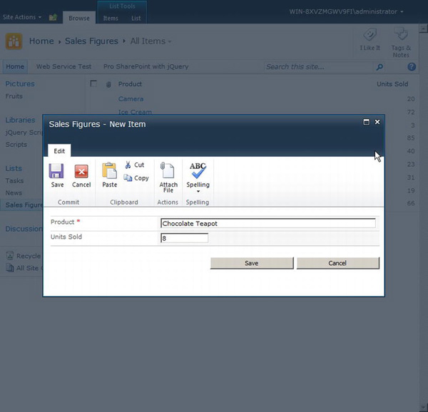
Figure 8-9. Adding items to the list
The complete list for this example with ten sample items is shown in Figure 8-10. Notice that even though the numbers are available, it is not particularly easy to see which are the better-selling products compared to the others.
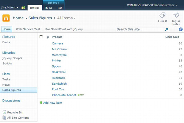
Figure 8-10. List with ten test items
Displaying a List Column in Graph Format
To be able to add the jQuery script to just this page, you can add a Content Editor web part to the list page and place the code in there. In Chapter 10, you will see how you can make it easier to reuse such functionality for other lists without needing to repeat a lot of code.
With the Content Editor web part added to the page, navigate to Edit HTML Source from the Format Text section of the Ribbon. Then add the following code into the newly opened window:
<script type="text/javascript" >


$(document).ready(function () {

    GraphItems();

});


function GraphItems() {
    // Retrieve the table cells in the 4th column ('Units Sold')

    var listItems = $('.ms-listviewtable>tbody>tr.ms-itmhover>td:nth-child(4)'),


    var count = listItems.length;

    var total = 0;

    var numbers = [];


    // Iterate through each unit sold value

    listItems.each(function (index) {

        if ($(this).text() != "") {

            number = parseInt($(this).text())

            numbers.push(number)

        }

    });


    // Get the most popular product unit count using

    // JavaScript method on the numbers array

    var largest = Math.max.apply(Math, numbers);


    // Iterate through each table cell for item

    listItems.each(function (index) {


        // Create a new empty div

        var div = $('<div/>'),


        // get the number of the table cell

        number = parseInt($(this).text())


        // Work out the average compared to largest

        // number of units sold

        var average = parseInt(number / largest * 100);


        // Set CSS properties on the new div

        div.css('font-weight', 'bolder'),

        div.css('color', 'white'),


        // Set width to average % to give

        // div a graph look

        div.css('width', average + '%'),


        // Switch to set color based on

        // Comparison to the average

        switch (true) {

            case (average >= 75):

                div.css('background-color', 'green'),

                break;

            case (average >= 25):

                div.css('background-color', 'orange'),

                break;

            default: div.css('background-color', 'red'),

                break;

        }
        // Wrap the existing contents of the td

        // with the new formatted div

        $(this).wrapInner(div);

    });


}

</script>
The script uses a jQuery selector to get the table and the cells required. Using the nth-child, it is easy to select the column to use. Once the columns have been returned to the listItems variable from the selector query, several things happen. The first is that each Unit Sold value is retrieved using the each function and stored in an array. Math.max.apply(Math, numbers) is a useful method that will return the highest value from the array. This highest number is used as the 100 percent value in the graph, so that all others show as a percentage of that value. With the highest value found, the code iterates through each item again and creates a div, which is styled depending on the values. Its width is set as the average, and its color is determined by whether its value is greater than or equal to 75 percent, greater than or equal to 25 percent, or less than 25 percent of the average. The final step is to wrap the contents of the td with the new div.
Save your changes and exit edit mode. You will now be presented with an easy-to-view representation of the data, as shown in Figure 8-11.
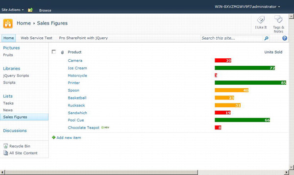
Figure 8-11. Units Sold column data displaying as a graph
This simple example showed how you can read data from the page and, using your own business logic, transform or enhance SharePoint to fit your own business requirements. You may encounter many situations where you can take the data provided by SharePoint and transform it to provide the information that you require. You will need to consider whether it is more suitable to create your own web part and read the SharePoint data from the Client Object Model or web services, or just use jQuery to manipulate the rendered HTML elements. Obviously, the benefits of the latter are that the hard work of the data retrieval has been done for you already.
Using jQuery from the SharePoint 2010 Ribbon
In this example, you will look at how you can call jQuery code from the SharePoint 2010 Ribbon. This simple example will allow the end user to select items and make them highlighted.
Creating a Highlighting Function
Begin by setting up a new project and then adding the JavaScript function to highlight selected items.
- Open Visual Studio 2010.
- Create a new Empty SharePoint 2010 project and call it MyjQueryRibbonButton.
- Deploy the project as a Farm Solution.
- Add a new SharePoint Layouts mapped folder. This will add the mapped folder and a subfolder based on the project name.
- Add a
.jsfile to the folder calleddocumenthighlighter.js, as shown in Figure 8-12.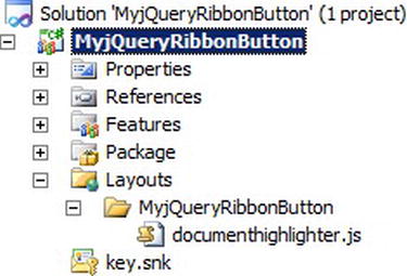
Figure 8-12. Adding the Layouts folder for the script
- Add the following code to the JavaScript file:
function highlightSelected()

{

    // Select items based on if they're checked

    var citems =  $('#onetidDoclibViewTbl0>tbody>.ms-itmhover>.ms-vb-itmcbx>input:checked'),


    // Iterate through each checked item

    citems.each(function(index, element)

    {

        // Find the table row

        var tr =  $(element).closest('tr'),


                // Toggle the highlight class

                tr.toggleClass('ms-rteStyle-Highlight'),

        });

}
The simple function, called highlightSelected, uses a jQuery selector to find the document table on the page, and then drills down to find all items that have been checked by using the :checked selector. Once the list of elements has been found, it iterates through each of them using the each utility, and uses the element to find the table row to highlight. The toggleClass method means that if the element already has the class, the code will remove it; if it does not exist, the code will add it.
Adding a Ribbon Button
With the JavaScript file added, it is time to add a new Empty Element item from the SharePoint 2010 category to the project, as shown in Figure 8-13. This element will be used to deploy the Ribbon button.
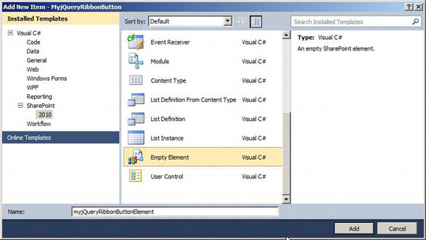
Figure 8-13. Inserting an empty element for the Ribbon button
Open the newly added Elements file and replace the contents with the following:
<?xml version="1.0" encoding="utf-8"?>

<Elements xmlns="http://schemas.microsoft.com/sharepoint/">


  <CustomAction

    ScriptSrc="/_layouts/MyjQueryRibbonButton/documentHighlighter.js"

           Location="ScriptLink"

           Sequence="100">

  </CustomAction>


  <CustomAction

    Id="myjQueryRibbon"

    RegistrationType="List"

    RegistrationId="101"

    Location="CommandUI.Ribbon">

    <CommandUIExtension>

      <CommandUIDefinitions>

        <CommandUIDefinition

         Location="Ribbon.Documents.New.Controls._children">

          <Button

           Id="Ribbon.Documents.New.Controls.myJqueryButton"

           Alt="jQuery Ribbon Button"

           Sequence="10"

           Image32by32="/_layouts/images/OBJECTIV.GIF"

           Command="highlightUsingjQuery"

           LabelText="jQuery Highlight"

           TemplateAlias="o2"/>

        </CommandUIDefinition>

      </CommandUIDefinitions>

      <CommandUIHandlers>

        <CommandUIHandler

         Command="highlightUsingjQuery"

         CommandAction="javascript:highlightSelected()"/>

      </CommandUIHandlers>

    </CommandUIExtension>

  </CustomAction>


</Elements>
The first CustomAction loads the JavaScript file, which contains the highlightSelected method. This method of loading JavaScript to the page is the same as how the jQuery library itself can be loaded. Note that as with the jQuery library, this JavaScript will be loaded every time the Ribbon is loaded where the feature has been activated. If you want to have the code load only at the same time as the Ribbon button, you can put the JavaScript in the CommandAction of the Ribbon button's CustomAction, as follows:
<CommandUIHandlers>

        <CommandUIHandler

         Command="highlightUsingjQuery"

         CommandAction="javascript:


         var example = "I am an example";

         alert(example);


         "/>

</CommandUIHandlers>
If you have the JavaScript inline, there is no need for the first custom action.
The second CustomAction contains the necessary XML to load the Ribbon button. This button is targeted to a document library, and the button will be added to the New section. The CommandAction is what will call the highlightSelected method.
Tip You can find more information about Ribbon customization at http://msdn.microsoft.com/en-us/library/ff630938.aspx. Also, Chris O'Brien has a fantastic series of articles on Ribbon customization available at http://www.sharepointnutsandbolts.com/2010/01/customizing-ribbon-part-1-creating-tabs.html.
With the changes made, you're ready to test the new Ribbon button. Deploy the solution, navigate to a document library that has a few items in it, and select a couple of the items. Then navigate to the Documents tab and find the New section. Click the jQuery Highlight button, and then uncheck the boxes. You should see that the items that were checked now have a highlighting applied to them, as shown in Figure 8-14.
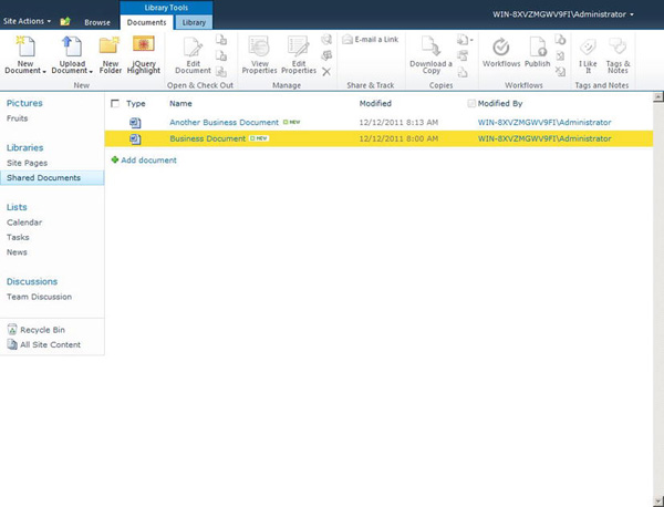
Figure 8-14. Viewing highlighted item in list
This example demonstrates how you can call your jQuery code from the Ribbon. This is a lightweight addition, but by working with the Client Object Model—particularly SP.ListOperation.Selection methods (see http://msdn.microsoft.com/en-us/library/ff407815.aspx)—you will find that you can really extend the functionality provided. You have also learned how to make functions available globally by adding a CustomAction and how to add JavaScript functionality to just a single Ribbon button.
Filtering Quick Launch
The final example in this chapter demonstrates how to easily filter items in the Quick Launch menu by using the contains selector.
As an example, suppose that your end users have started complaining that due to the high numbers of lists and libraries on the page, they are having trouble finding the items that they want. The solution you have come up with is a text box that allows end users to type in part of the list or library name, and the Quick Launch menu will be filtered accordingly.
Adding the JavaScript File Link
You will be using the same technique as used earlier in this chapter to allow you to build a proof of concept for this solution.
- Navigate to the
LayoutsCustomScriptsfolder in the SharePoint root (the same folder that was used in the first couple of examples). - Create a new
.jsfile (rename a .txtfile) calledQuickLaunchFilter.js. Leave it blank for now. - Navigate to a SharePoint page that has a few lists and libraries available, such as the page shown in Figure 8-15.
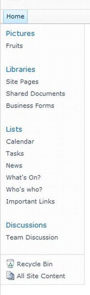
Figure 8-15. Quick Launch with its many items
- Add a Content Editor web part and enter Edit HTML Source mode.
- Add the following
scripttag to read in the JavaScript file that you will be adding to later:<script src="/_layouts/CustomScripts/QuickLaunchFilter.js" type="text/javascript"></script> - Click OK and exit edit mode.
Adding a Quick Launch Filter
Next, open the QuickLaunchFilter.js file and add the following document.ready code:
$(document).ready(function () {

    QuickLaunchFilter();

});
It should be well and truly ingrained into your brain now that this will call the QuickLaunchFilter method once the document (the HTML page) has been completely loaded and has indicated that it is ready.
Add the following function beneath the closing bracket of the ready function:
function QuickLaunchFilter() {

    // Select the QuickLaunch div

    var div = $('#zz17_V4QuickLaunchMenu>div'),


    // Find all of the subitems in the menu

    var menuItems = div.find('ul>li>ul>li')


    // Create text box to perform the filtering

    var tb = $('<input type="text" name="find" />'),


    // Attach handler on the keyup event

    tb.keyup(function () {


        // Read the text box value

        var typedText = $(this).val();


        // Find all of the spans that contain the entered text

        // The 'contains' method is case-sensitive

        var matching = menuItems.find('span.menu-item-text:contains("' + typedText + '")'),


        // Hide all of the menu items first

        menuItems.hide();


        // Show the list item for the span that contains

        // the matching text

        matching.closest('li').show();

    });


    // Add the text box as the first item

    // in the div element

    div.children(':first').before(tb);

}
The code is relatively simple. First, the Quick Launch div is retrieved by using its ID, and then the child div is selected. From the div, all submenu items are found and stored in a variable. A text box is then created in memory. The text box has an event handler registered on the keyup event. The keyup event retrieves the current value in the text box, and then using another selector, it finds all of the menu-item-text span elements that contain the value that was entered by the user. All of the submenu items are hidden. Then, using the spans returned from the text-match query, the parent list items of the span elements are shown. The contains selector is case-sensitive, so T will find Tasks, but not tasks or Sites. If you need it to be case-insensitive, you can iterate over the items in an each loop and do your own comparison.
Finally, the text box is added before the first child of the div, so it's at the top.
Save the JavaScript file and navigate back to the SharePoint page. You may need to refresh the page if it was already open. You should now see a text box at the top of Quick Launch, as shown in Figure 8-16.
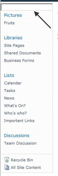
Figure 8-16. Unfiltered Quick Launch menu items
Enter some text into the text box, and the Quick Launch elements will be filtered, as shown in the example in Figure 8-17.
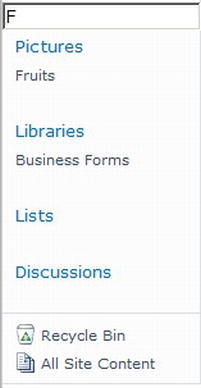
Figure 8-17. Quick Launch menu items filtered by the letter F
In this example, you have seen how to filter elements on the page using jQuery. The text box used does not need to be added dynamically. If this were to be used as a full solution, the text box could be added to the master page, and the JavaScript could be loaded by any of the other means you have learned.
Summary
In this chapter, you have looked at a few of the different ways that SharePoint can be enhanced using jQuery—from expanding and collapsing the Quick Launcher menu to displaying list items in a graph. The examples demonstrated how various the solutions can be.
As mentioned early in the chapter, you should always think about the impact the extra functionality will have on the page. You need to make sure that the functionality is deployed only to the correct scope and will not interfere with any other functionality on the page.
The next chapter covers jQuery plug-ins, which offer a whole new range of enhancement functionality.