
Chapter 4
Planning and Building Your Application's User Interface
What's in This Chapter?
- Mobile UI guidelines
- Building a UI for Android
- Examining the layout of controls
- Exploring the UI controls
- Designing screen-independent UI
In this chapter you'll learn about creating your application's user interface (UI). You'll get a look at a base set of guidelines for building a successful user interface on Android, examine the options for building a user interface, and see how controls are laid out in Android. Finally, you'll get to explore the controls available to Android developers.
Guidelines for a Successful Mobile UI
Before you dig into building a user interface, it's important to understand some guidelines for doing so successfully. These guidelines affect how users will use applications when they are mobile, as well as how your applications can be good citizens when running:
- The device's screen size is much smaller than that on a desktop system. As such, applications should limit the number of screen controls presented to the user at one time.
- Applications should require the users to enter the smallest amount of data possible. A spinner control (similar to a drop-down list box), where the user is required to select a pre-entered value, is preferable to requiring the user to type in some amount of text. Typing on a mobile device is problematic. Tapping several times is preferable to entering 30 letters into a text form.
- Be a good citizen on the device. Caching data locally is preferred to pulling data over a wireless connection. For example, a spinner control is populated once with data from a web service. The next time that data is needed, there is no reason to pull that data from the web service. The data should be cached locally on the device and reused from the cache as much as possible.
- Users typically are moving when they are using their devices. Think about the number of users who are walking through an airport, walking the halls of an office, or exercising when accessing an application. An application's user interface needs to take movement and jarring into account. For example, presenting data in a listview is common. The user expects to select a cell and get more detailed information. The size of the cell should be such that there is some margin for error when selecting a cell. This will improve the user's ability to select the correct item.
- Because mobile devices have small screens, the text that is presented to the user needs to be large enough for the user to easily view the data presented.
- There is no control over where a mobile device is located when it is running an application. It may be directly in the sunlight, or it could be in a parking lot at midnight. The application needs to be easily readable when it runs. This may involve a combination of screen colors or the application's theme.
Building an Android UI
Developers who are building a user interface in Android will find concepts that are similar to those of their existing .NET applications. Android uses the concept of controls that programmers are familiar with. Here are some characteristics of controls that will seem familiar:
- Properties can be set to get a control's value or change a control's default functionality.
- A program can process events, such as a button click or value change.
- Controls can be grouped in a hierarchy known as a View or ViewGroup.
- Controls can be themed so that the look of a set of controls can be changed in a group.
Views
An Android user interface is based on View and ViewGroup objects. A View class is the basis for widgets, which are UI objects such as text fields, spinners, buttons, clocks, and date pickers. A ViewGroup is the basis for layout subclasses. An Activity's user interface consists of a tree of View and ViewGroup nodes. The top of the tree is a ViewGroup. To display a view hierarchy, an Activity calls SetContentView(Resource) to load the Resource view and begin drawing the tree.
Design Surface
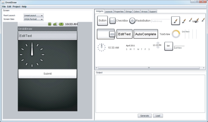
.NET developers building a user interface with WebForms, WinForms, or other applications are familiar with the concept of a design surface. With a design surface, you can use a set of controls to display data to the user. The Android Developer Tools contain an Eclipse plug-in that lets you create a user interface. However, this has not been integrated into Mono for Android and does not work with Visual Studio. Mono for Android does not have its own design surface at the time of this writing. It does offer IntelliSense for manually creating the user interface. However, given that manually creating the user interface is prone to errors, we recommend that you look for a high-level tool for creating your user interface, such as DroidDraw. DroidDraw has a website that you can use to build your app's UI, as well as a downloadable Java application. For more information on DroidDraw, go to http://droiddraw.org.
Figure 4.1 shows DroidDraw. The left side displays the user interface that has been defined. The top-right section shows the options you can set, allowing you to set the properties of the UI elements. The bottom-right section shows the XML generated for the UI. The XML is not updated automatically; you must create it by clicking the Generate button.
Choosing a Control Layout
Android UIs have different layouts that can be used. A layout defines how its child controls are arranged onscreen. Android has five standard layouts:
- AbsoluteLayout places all controls at a defined location. This layout has been deprecated. FrameLayout or RelativeLayout is suggested instead.
- FrameLayout displays a single item, such as an image.
- LinearLayout displays child controls along a single line, either horizontal or vertical.
- RelativeLayout places controls at a location relative to other controls.
- TableLayout displays controls in a row/column-style layout.
AbsoluteLayout
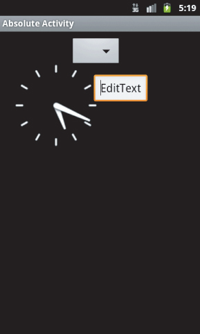
The AbsoluteLayout is the layout that allows a developer to place views at a defined location. The AbsoluteLayout has been deprecated. The FrameLayout or RelativeLayout is suggested instead. Having said that, if you need to use the AbsoluteLayout, Listing 4.1 shows the necessary XML.
 Listing 4.1: AbsoluteLayout XML
<?xml version="1.0" encoding="utf-8"?>
<AbsoluteLayout
android:id="@+id/widget31"
android:layout_width="fill_parent"
android:layout_height="fill_parent"
xmlns:android="http://schemas.android.com/apk/res/android"
>
  <Spinner
  android:id="@+id/widget27"
  android:layout_width="wrap_content"
  android:layout_height="wrap_content"
  android:layout_x="170px"
  android:layout_y="12px"
>
  </Spinner>
  <EditText
  android:id="@+id/widget29"
  android:layout_width="wrap_content"
  android:layout_height="wrap_content"
  android:text="EditText"
  android:textSize="18sp"
  android:layout_x="225px"
  android:layout_y="102px"
>
  </EditText>
  <AnalogClock
  android:id="@+id/widget30"
  android:layout_width="wrap_content"
  android:layout_height="wrap_content"
  android:layout_x="20px"
  android:layout_y="62px"
>
  </AnalogClock>
</AbsoluteLayout>
This code is contained in LayoutsLayoutsResourcesLayoutabsolute.axml
Figure 4.2 shows the output of the AbsoluteLayout previously defined.
FrameLayout
FrameLayout is the simplest layout option. It is designed to display a single object on the screen. All elements within the FrameLayout are pinned to the top-left corner of the layout. If multiple elements are within a FrameLayout, they are drawn in the same location, and their displays interfere with each other.
LinearLayout
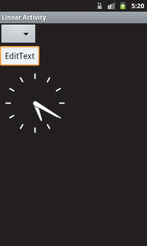
LinearLayout aligns all objects either vertically or horizontally. The direction displayed depends on the orientation attribute. All the elements are displayed one after the other. If the orientation attribute of LinearLayout is set to vertical (as shown in Listing 4.2), the UI displays vertically. If the orientation attribute of LinearLayout is set to horizontal, the UI displays horizontally.
Listing 4.2: LinearLayout XML
<?xml version="1.0" encoding="utf-8"?>
<LinearLayout
android:id="@+id/widget28"
android:layout_width="fill_parent"
android:layout_height="fill_parent"
xmlns:android="http://schemas.android.com/apk/res/android"
android:orientation="vertical"
>
  <Spinner
  android:id="@+id/widget27"
  android:layout_width="wrap_content"
  android:layout_height="wrap_content"
>
  </Spinner>
  <EditText
  android:id="@+id/widget29"
  android:layout_width="wrap_content"
  android:layout_height="wrap_content"
  android:text="EditText"
  android:textSize="18sp"
>
  </EditText>
  <AnalogClock
  android:id="@+id/widget30"
  android:layout_width="wrap_content"
  android:layout_height="wrap_content"
>
  </AnalogClock>
</LinearLayout>
This code is contained in LayoutsLayoutsResourcesLayoutlinear.axml
Figure 4.3 shows a sample LinearLayout displaying items vertically.
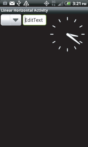
Creating a horizontal LinearLayout is simple. The value of android:orientation is changed to horizontal, as shown in Listing 4.3.
Listing 4.3: LinearLayout XML oriented horizontally
<?xml version="1.0" encoding="utf-8"?>
<LinearLayout
android:id="@+id/widget289"
android:layout_width="fill_parent"
android:layout_height="fill_parent"
xmlns:android="http://schemas.android.com/apk/res/android"
android:orientation="horizontal"
>
  <Spinner
  android:id="@+id/widget279"
  android:layout_width="wrap_content"
  android:layout_height="wrap_content"
>
  </Spinner>
  <EditText
  android:id="@+id/widget299"
  android:layout_width="wrap_content"
  android:layout_height="wrap_content"
  android:text="EditText"
  android:textSize="18sp"
>
  </EditText>
  <AnalogClock
  android:id="@+id/widget309"
  android:layout_width="wrap_content"
  android:layout_height="wrap_content"
>
  </AnalogClock>
</LinearLayout>
Figure 4.4 shows a sample horizontal LinearLayout.
RelativeLayout
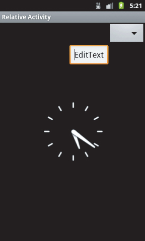
With RelativeLayout, the child elements are positioned relative to the parent element or to each other, depending on the ID that is specified (see Listing 4.4):
Listing 4.4: RelativeLayout XML
<?xml version="1.0" encoding="utf-8"?>
<RelativeLayout
android:id="@+id/widget32"
android:layout_width="fill_parent"
android:layout_height="fill_parent"
xmlns:android="http://schemas.android.com/apk/res/android"
>
  <Spinner
  android:id="@+id/widget27"
  android:layout_width="wrap_content"
  android:layout_height="wrap_content"
  android:layout_alignParentTop="true"
  android:layout_alignParentRight="true"
>
  </Spinner>
  <EditText
  android:id="@+id/widget29"
  android:layout_width="wrap_content"
  android:layout_height="wrap_content"
  android:text="EditText"
  android:textSize="18sp"
  android:layout_below="@+id/widget27"
  android:layout_toLeftOf="@+id/widget27"
>
  </EditText>
  <AnalogClock
  android:id="@+id/widget30"
  android:layout_width="wrap_content"
  android:layout_height="wrap_content"
  android:layout_centerVertical="true"
  android:layout_toLeftOf="@+id/widget27"
>
  </AnalogClock>
</RelativeLayout>
This code is contained in LayoutsLayoutsResourcesLayout elative.axml
Figure 4.5 shows the output from a RelativeLayout.
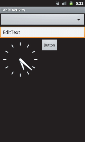
TableLayout
TableLayout arranges its elements into rows and columns. Conceptually, this is similar to an HTML table. With TableLayout, a number of TableRows are used to define the TableLayout. Listing 4.5 shows an example of TableLayout:
Listing 4.5: TableLayout XML
<?xml version="1.0" encoding="utf-8"?>
<TableLayout
android:id="@+id/widget33"
android:layout_width="fill_parent"
android:layout_height="fill_parent"
xmlns:android="http://schemas.android.com/apk/res/android"
android:orientation="vertical"
>
  <Spinner
  android:id="@+id/widget27"
  android:layout_width="wrap_content"
  android:layout_height="wrap_content"
>
  </Spinner>
  <EditText
  android:id="@+id/widget29"
  android:layout_width="wrap_content"
  android:layout_height="wrap_content"
  android:text="EditText"
  android:textSize="18sp"
>
  </EditText>
  <TableRow>
    <AnalogClock
    android:id="@+id/widget30"
    android:layout_width="wrap_content"
    android:layout_height="wrap_content"
>
    </AnalogClock>
    <Button
    android:id="@+id/widget34"
    android:layout_width="fill_parent"
    android:layout_height="wrap_content"
    android:text="Button"
>
    </Button>
  </TableRow>
</TableLayout>
This code is contained in LayoutsLayoutsResourcesLayout able.axml
Figure 4.6 shows a sample TableLayout.
Optimizing Layouts
Opening layouts in an Activity, called “inflating,” is an expensive operation. Each layout that is nested and each view that is displayed requires additional CPU processing and memory consumption on the device. The general idea is to keep layouts as simple as possible. Here are some general rules for layouts:
- Avoid nesting layouts to the extreme. Sometimes applications have a business need for nested layouts. However, the nesting of layouts should be kept to a minimum.
- Watch out for unnecessary nesting. Two layouts set to FILL_PARENT will add unnecessary time to the inflation of the layouts.
- Watch for an extreme number of Views. A layout with too many Views will confuse the user and will take a long time to display due to the need to inflate the Views.
Obviously, this is not an exhaustive list of rules. The key is to create simple user interfaces that meet the users' needs and that do not overload the processor's and device's memory.
Designing Your User Interface Controls
For the user, the most important part of any application is the user interface; in essence, for the user the user interface is the application. Desktop applications can have rather complicated user interfaces, but creating a user interface for a mobile device is the single most important feature of an application.
Here are some guidelines for creating a successful mobile user interface:
- Number of form elements: Because of the display size of a mobile device, the user should not be subjected to a large number of form elements.
- Size of form elements: Mobile devices are, by definition, mobile. Users may be in an industrial plant, on the elliptical at the gym, or taking their children for a walk in the park. Form elements must be large enough to be readable and to allow users to make selections when they are not standing still. At the same time, form elements must be small enough to fit on the screen rather easily.
- Testing: Android devices have different screen sizes and resolutions. As a result, thinking about and testing your application on various screen sizes and capabilities is important.
Android provides a set of controls that developers can use to create a user interface. These controls can be used individually or as part of a composite control. In addition, these controls allow you to create an application with a consistent look and feel as well as simplify and speed development. Here are some of the more valuable controls:
- TextView is similar to a label. It allows data to be displayed to the user.
- EditText is similar to a .NET textbox. It allows for multiline entry and word wrapping.
- AutoCompleteTextView is a textbox that will display a set of items that a user can pick from. As the user enters more data, the set of items displayed narrows. At any point, the user may select on the displayed items.
- ListView is a view group that creates a vertical list of views. This is similar to a gridview in .NET. The ListView is covered in Chapter 6.
- Spinner is a composite control. It contains a textview and an associated listview for selecting items that will be displayed in the textview. This control is similar to a drop-down list box in .NET.
- Button is a standard push button, which should be familiar to .NET developers.
- Checkbox is a button that contains two states — checked and unchecked. The check box should be familiar to all .NET developers.
- RadioButton is a two-state button in a group. The group of radio buttons allows only one item to be selected at a time. The radio button should be familiar to all .NET developers as a radio button list.
- Clock has digital and analog clock controls. They are time picker controls and allow the developer to get or set the time.
- TimePicker is associated with the clock controls. The time picker is an up/down control along with a button.
- Image(s) are a series of controls that are used to deal with images. These controls include a single image, an image button, and an image gallery.
- While not available in all devices, virtual keyboards are a feature available for touch devices like the HTC and Motorola lines of Android devices.
These are just some of the controls that are available to a developer. Many more are available with Android. They are contained within the Android.Widget namespace.
The next sections examine the definition of these controls, the values they support, and the controls themselves.
TextView
TextView is a control that displays text to the user. By default, the TextView class does not allow editing. For the .NET developer, this control is similar in concept to a label in WinForms or WebForms. Take a look at a couple members that the class exposes from a programmability standpoint:
- The Text property of the TextView allows a program to get/set the value that is displayed in the TextView.
- The Width property sets the width of the TextView. This can be set with the value fill_parent or in pixels as an integer.
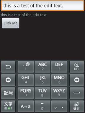
EditText
EditText is a subclass that allows the user to input and edit text. Figure 4.7 shows sample output for EditText.
AutoCompleteTextView
AutoCompleteTextView is an editable TextView that shows suggestions while the user is typing. The list of suggestions is displayed in a drop-down menu. As the user types, he or she can choose an item. If an item is chosen, the text is then displayed in the text view. The list of suggestions that is displayed to the user is formed from a data adapter.
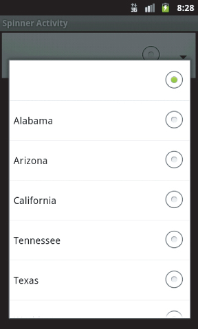
Spinner
The spinner control is used to present the user with a defined set of data from which he or she can choose. The data in the spinner control is loaded from an Adapter that is associated with the spinner control. Listing 4.6 shows the XML UI for a spinner activity:
Listing 4.6: Spinner XML
<?xml version="1.0" encoding="utf-8"?>
<LinearLayout
android:id="@+id/widget28"
android:layout_width="fill_parent"
android:layout_height="fill_parent"
android:orientation="vertical"
xmlns:android="http://schemas.android.com/apk/res/android"
>
  <Spinner
  android:id="@+id/Sp"
  android:layout_width="fill_parent"
  android:layout_height="wrap_content"
>
  </Spinner>
  <TextView
  android:id="@+id/tvSp"
  android:layout_width="193px"
  android:layout_height="35px"
  android:text="TextView"
>
  </TextView>
</LinearLayout>
This code is contained in UIControlsResourcesLayoutspinner.axml
Listing 4.7 provides the code for a spinner control:
Listing 4.7: Spinner code
        Spinner state;
        TextView tvSp;
        ArrayAdapter<String> aas;

        protected override void OnCreate(Bundle bundle)
        {
            base.OnCreate(bundle);
            SetContentView(Resource.Layout.spinner);

            state = FindViewById<Spinner>(Resource.Id.Sp);
            tvSp = FindViewById<TextView>(Resource.Id.tvSp);
            aas = new ArrayAdapter<String>(this,
                 Android.Resource.Layout.SimpleSpinnerDropDownItem);
            state.Adapter = aas;
            aas.Add(String.Empty);
            aas.Add("Alabama");
            aas.Add("Arizona");
            aas.Add("California");
            aas.Add("Tennessee");
            aas.Add("Texas");
            aas.Add("Washington");
            state.ItemSelected += new EventHandler<ItemEventArgs>(sp_ItemSelected);
        }

        void sp_ItemSelected(object sender, ItemEventArgs e)
        {
            tvSp.Text = Convert.ToString(aas.GetItem(e.Position));
        }
This code is contained in UIControlsUIControlsspinneract.cs
In this example, an ArrayAdapter that contains type String is created and associated with the spinner control. The ArrayAdapter has strings added to it, and then the strings are added to the spinner control and ultimately are presented to the user.
Figure 4.8 shows opening a spinner.
Button
The user can press the button control to perform some type of action. This button is the Android equivalent of a button in WinForms and WebForms. It supports an OnClick event that developers can use to process code when the button is clicked.
Check Box
A check box is a button control that supports two states — checked and unchecked. This is similar to a check box in WinForms/WebForms for .NET developers. This control supports an OnClick event that developers can use to process code when an item is clicked.
Radio Buttons and Groups
A radio button is a button control that supports two states — checked and unchecked. However, this control is slightly different from a check box. Once a radio button is checked, it cannot be unchecked.
A radio group is a class that creates a set of radio buttons. When one radio button within a radio group is checked, any other checked radio button is unchecked. The initial state of a radio group has all items unchecked. The radio group is a container control for a group of radio buttons that work together. Programmatically, the radio group is created by creating individual radio buttons and adding them to the radio group.
Listing 4.8 provides a short example of XML with the check box, radio button, and radio group.
Listing 4.8: Radio buttons and check boxes XML
<?xml version="1.0" encoding="utf-8"?>
<LinearLayout
xmlns:android="http://schemas.android.com/apk/res/android"
    android:orientation="vertical"
    android:layout_width="fill_parent"
    android:layout_height="fill_parent">
  <CheckBox
  android:id="@+id/cb1"
  android:layout_width="wrap_content"
  android:layout_height="wrap_content"
  android:text="CheckBox"
></CheckBox>
  <TextView
  android:id="@+id/tvcb"
  android:layout_width="wrap_content"
  android:layout_height="wrap_content"
  android:text=""
></TextView>
  <RadioButton
  android:id="@+id/rb"
  android:layout_width="wrap_content"
  android:layout_height="wrap_content"
  android:text="RadioButton"
></RadioButton>
  <TextView
  android:id="@+id/rbtv"
  android:layout_width="wrap_content"
  android:layout_height="wrap_content"
  android:text=""
></TextView>
  <RadioGroup
  android:id="@+id/rg"
  android:layout_width="wrap_content"
  android:layout_height="wrap_content"
  android:orientation="vertical"
/>
    <TextView
  android:id="@+id/rgtv"
  android:layout_width="wrap_content"
  android:layout_height="wrap_content"
  android:text=""
></TextView>
  <Button
  android:id="@+id/btnCloseRadioCheckBoxes"
   android:layout_width="fill_parent"
   android:layout_height="wrap_content"
   android:text="Close" />
</LinearLayout>
This code is contained in UIControlsResourcesLayout adiocheckboxes.axml
Listing 4.9 gives the code listing for buttons, check boxes, radio buttons, and radio groups:
Listing 4.9: Radio buttons, radio groups, and check boxes
[Activity(Label = "Radio & Checkboxes", Name="uicontrols.radiocheckboxes")]
public class radiocheckboxes : Activity
{
Button btn;
RadioButton rb;
CheckBox cb;
RadioGroup rg;
TextView rbtv, cbtv, rgtv;
protected override void OnCreate(Bundle bundle)
{
    base.OnCreate(bundle);
    SetContentView(Resource.Layout.radiocheckboxes);
    // Create your application here
    rg = FindViewById<RadioGroup>(Resource.Id.rg);
    rg.Click += new EventHandler(rg_Click);
    cb = FindViewById<CheckBox>(Resource.Id.cb1);
    rb = FindViewById<RadioButton>(Resource.Id.rb);
    btn = FindViewById<Button>(Resource.Id.btnCloseRadioCheckBoxes);
    rbtv = FindViewById<TextView>(Resource.Id.rbtv);
    cbtv = FindViewById<TextView>(Resource.Id.tvcb);
    rgtv = FindViewById<TextView>(Resource.Id.rgtv);
    btn.Click += new EventHandler(btn_Click);
    cb.Click += new EventHandler(cb_Click);

    rb.Click += new EventHandler(rb_Click);

    RadioButton rb1;
    for (int i = 0; i < 3; i++)
    {
        rb1 = new RadioButton(this);
        rb1.Text = "Item " + i.ToString();
        rb1.Click += new EventHandler(rb1_Click);
        rg.AddView(rb1, i);
    }
}

void rg_Click(object sender, EventArgs e)
{
    rgtv.Text = ((RadioButton)sender).Text;
}void rb1_Click(object sender, EventArgs e)
{
    RadioButton rb1 = (RadioButton)sender;
    rgtv.Text = rb1.Text + " was clicked.";
}

void rb_Click(object sender, EventArgs e)
{
    rbtv.Text = "Radio Button Click";
}

void cb_Click(object sender, EventArgs e)
{
    cbtv.Text = "Checkbox Clicked";
}

void btn_Click(object sender, EventArgs e)
{
    this.Finish();
}
This code is contained in UIControls adiocheckboxes.cs
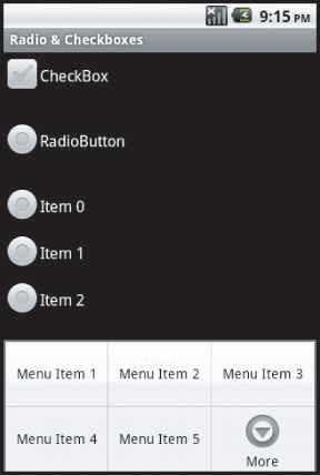
Figure 4.9 shows the display and output associated with a check box, radio button, and radio group.
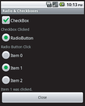
This example contains a check box, a single radio button, and a radio group. Here are a few things to note:
- A loop is used to add radio buttons to the radio group.
- Click events are set up for each screen control.
- The Click event of the radio group is set up on the Click event of the individual radio buttons.
Clocks
Clocks and time are important in many mobile applications. Many mobile phone users don't wear a watch, so they depend on their phone and its applications for the current time. Applications depend on the time to know when to fire scheduled events through background services.
For user interaction, Android can display two types of clocks. These types are:
- Analog Clock: The analog clock displays hands for hours and minutes.
- Digital Clock: The digital clock is similar to the analog clock, except that the display is digital. The hours, minutes, and seconds are contained in separate views.
Pickers
Android provides a time picker and a date picker. These controls allow the user to select the date and time.
- Time Picker: The time picker allows the user to select the hours and minutes. The time picker can be configured for 12- or 24-hour days, with a.m./p.m. as necessary.
- Date Picker: The date picker allows the user to select the month, day, and year. Thankfully, the date picker exposes the selected day, month, and year in the control as properties.
Listing 4.10 shows a sample XML layout involving date and time pickers.
Listing 4.10: Date and time pickers XML
<?xml version="1.0" encoding="utf-8"?>
<LinearLayout
xmlns:android="http://schemas.android.com/apk/res/android"
    android:orientation="vertical"
    android:layout_width="fill_parent"
    android:layout_height="fill_parent">
  <DigitalClock
  android:id="@+id/dc"
  android:layout_width="wrap_content"
  android:layout_height="wrap_content"
  android:text="11:00 PM"
></DigitalClock>
  <TextView
  android:id="@+id/dctv"
  android:layout_width="wrap_content"
  android:layout_height="wrap_content"
  android:text="TextView"
></TextView>
  <DatePicker
  android:id="@+id/dp"
  android:layout_width="wrap_content"
  android:layout_height="wrap_content"
></DatePicker>
  <TextView
  android:id="@+id/dptv"
  android:layout_width="wrap_content"
  android:layout_height="wrap_content"
  android:text="TextView"
></TextView>
  <TimePicker
  android:id="@+id/tp"
  android:layout_width="wrap_content"
  android:layout_height="wrap_content"
></TimePicker>
  <TextView
  android:id="@+id/tptv"
  android:layout_width="wrap_content"
  android:layout_height="wrap_content"
  android:text="TextView"
></TextView>
  <Button
  android:id="@+id/btnTimeValues"
  android:layout_width="wrap_content"
  android:layout_height="wrap_content"
  android:text="Get Values"
></Button>
  <Button
  android:id="@+id/btnTimeClose"
  android:layout_width="wrap_content"
  android:layout_height="wrap_content"
  android:text="Close"
></Button>
</LinearLayout>
This code is contained in UIControlsResourcesLayout ime.axml
Listing 4.11 shows an example of the class for the date controls:
Listing 4.11: Date and time pickers
[Activity(Label = "Time Activity")]
public class timeact : Activity
{
    Button btnClose, btnTimeValues;
    int nowHour, nowMinute;
    TimePicker tp;
    protected override void OnCreate(Bundle bundle)
    {
        base.OnCreate(bundle);
        SetContentView(Resource.Layout.time);
        btnClose = FindViewById<Button>(Resource.Id.btnTimeClose);
        btnClose.Click += new EventHandler(btnClose_Click);
        btnTimeValues = FindViewById<Button>(Resource.Id.btnTimeValues);
        btnTimeValues.Click += new EventHandler(btnTimeValues_Click);
        nowHour = DateTime.Now.Hour;
        nowMinute = DateTime.Now.Minute;
        tp = FindViewById<TimePicker>(Resource.Id.tp);
    }
    void btnTimeValues_Click(object sender, EventArgs e)
    {
        TextView tv = FindViewById<TextView>(Resource.Id.dctv);
        DigitalClock dc = FindViewById<DigitalClock>(Resource.Id.dc);
        tv.Text = dc.Text;
        TextView tptv = FindViewById<TextView>(Resource.Id.tptv);
        DatePicker dp = FindViewById<DatePicker>(Resource.Id.dp);
        TextView dptv = FindViewById<TextView>(Resource.Id.dptv);
        DateTime dt = new DateTime(dp.Year, dp.Month + 1,
             dp.DayOfMonth, nowHour, nowMinute, 0);
        dptv.Text = dt.ToString();
    }
    void tp_TimeChanged(TimePicker view, int hourOfDay, int minute)
    {
        nowHour = hourOfDay;
        nowMinute = minute;
    }
    void btnClose_Click(object sender, EventArgs e)
    {
        this.Finish();
    }
}
This code is contained in UIControls imeact.cs
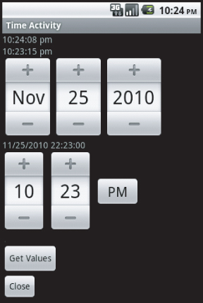
The time and date examples show how to get the time and date properties of the various controls. One thing to note in the code is that the time picker's TimeChanged event is used to get the values. Those values are saved as private variables in the Activity's class and can be used as needed. Figure 4.10 shows the Activity with its output from the date and time picker controls.
Images
Applications tend to be about the information users digest. Typically, this information is presented in the form of text. However, as the saying goes, a picture is worth a thousand words. As such, the appropriate use of images can provide tremendous value to users. With this fact in mind, Android provides several image controls. Here are a few points to keep in mind when working with images:
- Images can be of types png, jpg, gif, and bmp.
- Images should be placed in the /Resources/drawable directory.
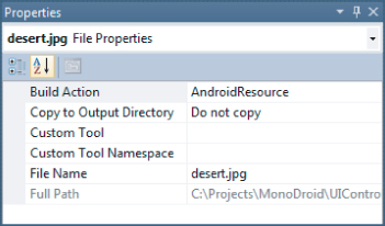
- Images should be marked as AndroidResource, as shown in Figure 4.11. This should happen automatically.
- IntelliSense is provided for images. The association between the images and their values is stored in the file ResourcesDesigner.cs, as long as the build action of the image is set to AndroidResource.
- The IntelliSense provided for images does not contain file extensions.
- Loading an image over WiFi or a wireless network requires more power than loading an image locally. Don't load an image from a remote resource unless absolutely necessary.
ImageView
The ImageView class is used to display an image. Images can be loaded from various resources and content providers. ImageView computes the images' measurements. In addition, it supports various options such as scaling.
ImageButton
The ImageButton class displays an image in place of text in a button. An ImageButton looks like a regular Button. The ImageButton supports several states. An image can be associated with the states of a Button, such as the default state, focused, and pressed.
Gallery
The Gallery is a View that is used to show items in a center-locked horizontal scrolling list. Listing 4.12 shows the XML user interface for images:
Listing 4.12: Images XML
<?xml version="1.0" encoding="utf-8"?>
<LinearLayout
xmlns:android="http://schemas.android.com/apk/res/android"
    android:orientation="vertical"
    android:layout_width="fill_parent"
    android:layout_height="fill_parent">
  <ImageButton
  android:id="@+id/ib"
  android:layout_width="wrap_content"
  android:layout_height="wrap_content"
></ImageButton>
  <TextView
  android:id="@+id/ibtv"
  android:layout_width="fill_parent"
  android:layout_height="wrap_content"
></TextView>
  <Gallery
  android:id="@+id/gal"
  android:layout_width="wrap_content"
  android:layout_height="wrap_content"
></Gallery>
  <TextView
  android:id="@+id/galtv"
  android:layout_width="wrap_content"
  android:layout_height="wrap_content"
></TextView>
  <ImageView
  android:id="@+id/iv"
  android:layout_width="fill_parent"
  android:layout_height="wrap_content"
></ImageView>
  <Button
  android:id="@+id/btnImageClose"
  android:layout_width="wrap_content"
  android:layout_height="wrap_content"
  android:text="Close"
></Button>
</LinearLayout>
This code is contained in UIControlsResourcesLayoutimages.axml
Listing 4.13 exemplifies the Activity for displaying images:
Listing 4.13: Working with images
[Activity(Label = "Image Activity")]
public class imagesact : Activity
{
    Button btnImageClose;
    ImageButton ib;
    ImageView iv;
    Gallery g;

    protected override void OnCreate(Bundle bundle)
    {
        base.OnCreate(bundle);
        SetContentView(Resource.layout.images);
        btnImageClose = FindViewById<Button>(Resource.Id.btnImageClose);
        btnImageClose.Click += new EventHandler(btnClose_Click);
        g = FindViewById<Gallery>(Resource.Id.gal);
        TextView gtv = FindViewById<TextView>(Resource.Id.galtv);
        ib = FindViewById<ImageButton>(Resource.Id.ib);
        ib.SetImageResource(Resource.Drawable.blue);
        ib.Click += new EventHandler(ib_Click);
        ib.FocusChange += new EventHandler<View.FocusChangeEventArgs>
             (ib_FocusChange);
        iv = FindViewById<ImageView>(Resource.id.iv);
        iv.SetImageResource(Resource.drawable.desert);
        g.Adapter = new ImageAdapter(this);
    }

    void ib_FocusChange(object sender, View.FocusChangeEventArgs e)
    {
        if (e.HasFocus)
        {
            ib.SetImageResource(Resource.drawable.red);
        }
        else
        {
            ib.SetImageResource(Resource.drawable.purple);
        }
    }
    void ib_Click(object sender, EventArgs e)
    {
        ib.SetImageResource(Resource.drawable.purple);
    }
    void btnClose_Click(object sender, EventArgs e)
    {
        this.Finish();
    }
//menu items are included in this .cs file; however
// they are not used in this section.
}
This code is contained in UIControlsimagesact.cs
Listing 4.14 gives a custom image array class for filling an image gallery.
Listing 4.14: ImageAdapter for the gallery
public class ImageAdapter : BaseAdapter
{
    Context context;
    Dictionary<int, ImageView> dict;
    public ImageAdapter(Context c)
    {
      context = c;
      dict = new Dictionary<int, ImageView>();
    }

    public override int Count { get { return thumbIds.Length; } }

    public override Java.Lang.Object GetItem(int position){ return null; }

    public override long GetItemId(int position){ return 0; }

    // create a new ImageView for each item referenced by the Adapter
    public override View GetView(int position, View convertView, ViewGroup parent)
    {
        bool bOut;
        ImageView i;// = new ImageView(context);
        bOut = dict.TryGetValue(position, out i);

        if (bOut == false)
        {
            i = new ImageView(context);
            i.SetImageResource(thumbIds[position]);
            i.LayoutParameters = new Gallery.LayoutParams(150, 100);
            i.SetScaleType(ImageView.ScaleType.CenterInside);
            dict.Add(position, i);
        }

        return i;
    }

    // references to our images
    int[] thumbIds = {
        Resource.Drawable.chrysanthemum,
        Resource.Drawable.desert,
        Resource.Drawable.hydrangeas,
        Resource.Drawable.jellyfish,
        Resource.Drawable.koala,
        Resource.Drawable.lighthouse
    };
}
This code is contained in UIControlsImagesArray.cs
Here are a few points to note about the custom image array class:
- The class inherits from the BaseAdapter.
- The class overrides the Count property. The count returns the total number of items that will be provided by the image array class.
- The GetItem method returns an item. In this case, the value is not needed, so a null is returned.
- The GetItemId method returns the item's unique identifier at a position. It is not needed in this example, so a value of 0 is returned.
- The GetView method returns the View necessary for an image view. This code stores the various image views in a dictionary. As the user scrolls through the images, the image view is pulled from the dictionary if it exists in the dictionary. If the image view does not exist within the dictionary, the image view is created and stored in the dictionary.
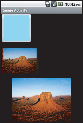
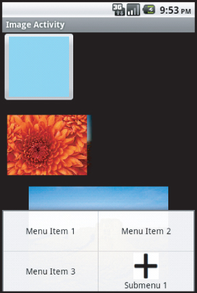
Figure 4.12 shows an ImageButton, ImageView, and a Gallery.
Virtual Keyboards
As we've already said many times in this book, mobile devices have limits. These include limits regarding their displays and keyboards. As a result, developers need to provide the users with some type of help inputting data into an application. Android provides this functionality through an attribute on the controls named inputType, as shown in Listing 4.15.
Listing 4.15: Setup for virtual keyboards
<?xml version="1.0" encoding="utf-8"?>
<LinearLayout
android:id="@+id/ll1"
android:layout_width="fill_parent"
android:layout_height="fill_parent"
android:orientation="vertical"
xmlns:android="http://schemas.android.com/apk/res/android"
>
  <EditText
    android:id="@+id/UriAddress"
    android:layout_width="fill_parent"
    android:layout_height="wrap_content"
    android:hint="Url"
    android:textSize="18sp"
    android:inputType="text|textUri" />
  <EditText
  android:id="@+id/To"
  android:layout_width="fill_parent"
  android:layout_height="wrap_content"
  android:hint="To"
  android:textSize="18sp"
  android:inputType="text|textEmailAddress"
/>
  <EditText
  android:id="@+id/subject"
  android:layout_width="fill_parent"
  android:layout_height="wrap_content"
  android:hint="Subject"
  android:textSize="18sp"
/>
  <EditText
    android:id="@+id/Message"
    android:layout_width="fill_parent"
    android:layout_height="240px"
    android:hint="Message"
    android:textSize="18sp"
    android:gravity="top"
/>
  <Button
  android:id="@+id/btn"
  android:layout_width="fill_parent"
  android:layout_height="wrap_content"
  android:text="Send"
  android:textSize="18sp"/>
</LinearLayout>
This code is contained in softkeyboardsResourcesLayoutMain.axml
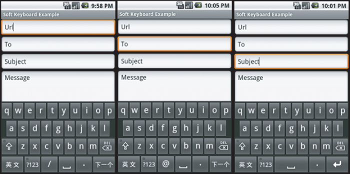
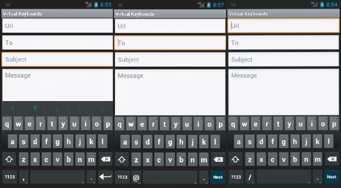
Figure 4.13 shows the three different virtual keyboards that are presented to the user in Android 2.x. Figure 4.14 shows the three different virtual keyboards that are presented to the user in the Android 4.0 emulator. These keyboards are set up based on the inputType attribute in the XML layout file. These virtual keyboards have only a few subtle differences among them.
Selecting Your Virtual Keyboard
Many types of keyboards can be used to help users input data. These keyboards fall into the areas of text, number, phone, and date/time. Here are some of the possible virtual keyboards:
- none: The text is not editable.
- datetime: The input will be used for a date/time.
- number: The input text will be a number.
- phone: The input will be used as a phone number.
- text: Plain text with a basic keyboard.
- textAutoCorrect: Autocorrection support is provided.
- textCapCharacters: Text with all the characters in uppercase.
- textEmailAddress: The text will be used as an e-mail address.
- textPassword: The text will be displayed as a password input.
- textUri: The text will be used as a URI.
Many more input types can be specified, of course.
Removing the Keyboard
When the user is done with input, he or she wants the virtual keyboard to slide away. There is a user interface control within a virtual keyboard that allows the user to specify when the keyboard should slide away. If this needs to be performed programmatically, the following code will make the virtual keyboard slide away:
Android.Views.InputMethods.InputMethodManager imm =
      (Android.Views.InputMethods.InputMethodManager)
GetSystemService(Context.InputMethodService);
imm.HideSoftInputFromWindow(btn.WindowToken,
       Android.Views.InputMethods.HideSoftInputFlags.None);
This code can be placed in a number of locations that are particular to a specific application.
Controlling Your Menus
Because screen real estate is at a premium with a mobile application, Android exposes a mechanism to provide application functionality without sacrificing too much screen real estate. Android allows each Activity to display its own menu when the device's menu button is selected. In addition, Android supports a context menu system that can be assigned to any View. Context menus are triggered when the user holds the touch screen for 3 seconds or longer within a View, presses the trackball, or presses the middle D-pad button; this depends on the device's input mechanism. Activity and context menus support additional submenus and context menus on the UI controls.
Introducing the Menu System
Given the small screen and the need to navigate applications that may have a large number of onscreen options, Android provides a multistage menu system. This menu system is optimized for small screens and the input they allow. These menu stages are as follows:
- The icon menu: The icon menu appears along the bottom of an Activity when the Menu button is pressed and an Activity has the menu setup. The icon menu does not display check boxes, radio buttons, or shortcut keys for menu items. When an Activity's menu has more items than the maximum, an option to display more is shown.
- The expanded menu: The expanded menu appears when the user clicks the More option on a menu. The expanded menu displays items not shown in the icon menu's first set of options.
- The submenu: Faced with the icon menu and the possible expanded menu, the user can be overwhelmed with menus. Thankfully, Android implements a submenu system. This allows an application to present the user with a simple hierarchical set of menus that the user may drill into. At this time, submenus cannot be nested. Note that controls may be displayed, but icons are not displayed within the submenu items.
- The context menu: Context menus are associated with a View. A context menu offers options associated with that view.
Menus
The first issue in creating a menu is to understand where and when it is created. Menus are associated with an Activity. The menu is created by overriding the OnCreateOptionsMenu method of an Activity. The method is called when the device's Menu button is pressed while the Activity is being displayed. When the Menu button is pressed, the method is called, and a menu is displayed. Take a look at some sample code in Listing 4.16:
Listing 4.16: Adding menu items
public override bool OnCreateOptionsMenu(Android.Views.IMenu menu)
{
    base.OnCreateOptionsMenu(menu);
    int groupId = 0;
    // Unique menu item Identifier. Used for event handling.
    int menuItemId = Android.Views.Menu.First;
    // The order position of the item
    int menuItemOrder = Android.Views.Menu.None;
    // Text to be displayed for this menu item.
    int menuItemText = Resource.String.menuitem1;
    // Create the menu item and keep a reference to it.
    IMenuItem menuItem1 = menu.Add(groupId, menuItemId, menuItemOrder,
        menuItemText);
    menuItem1.SetShortcut(‘1’, ‘a’);
    Int32 MenuGroup = 10;
    IMenuItem menuItem2 =
        menu.Add(MenuGroup, menuItemId + 10, menuItemOrder + 1,
        new Java.Lang.String("Menu Item 2"));
    IMenuItem menuItem3 =
        menu.Add(MenuGroup, menuItemId + 20, menuItemOrder + 2,
        new Java.Lang.String("Menu Item 3"));
    ISubMenu sub = menu.AddSubMenu(0, menuItemOrder + 30,
        menuItemOrder + 3, new Java.Lang.String("Submenu 1"));
    sub.SetHeaderIcon(Resource.Drawable.plussign);
    sub.SetIcon(Resource.Drawable.plussign);
    IMenuItem submenuItem = sub.Add(0, menuItemId + 40, menuItemOrder + 4,
        new Java.Lang.String("Submenu Item"));
    IMenuItem submenuItem2 =
        sub.Add(MenuGroup, menuItemId + 50, menuItemOrder + 5,
        new Java.Lang.String("sub-1")).SetCheckable(true);
    IMenuItem submenuItem3 =
        sub.Add(MenuGroup, menuItemId + 60, menuItemOrder + 6,
        new Java.Lang.String("sub-2")).SetCheckable(true);
     return true;
}
This code is contained in UIControlsmenus.cs
There are a few things to notice when a menu item is created:
- Calling the .Add() method creates a menu item and returns a reference to that item.
- The first parameter is the group value. It separates the menu's items for ordering and processing.
- The second parameter is an identifier that makes a menu item unique. The OnOptionsItemSelected() method uses this value to determine which menu item was clicked.
- The third parameter is an order parameter in which the order will be displayed.
- The final parameter is the text that the menu item displays — either a string resource or a string.
- After the menu items are created and populated, true should be returned.
- Check boxes and radio buttons are available on expanded menus and submenus. These are set in the SetCheckable method.
- A radio button group is created by SetGroupCheckable, by passing the group identifier, and by passing true to the exclusive parameter.
- Shortcut keys are set by calling the SetShortcut method.
- An icon can be set by calling the SetIcon method and passing a drawable resource.
- A condensed title can be set by calling an IMenuItem's .SetTitleCondensed() method and passing a string. Because the state of a check box/radio button is not shown, the condensed title can be used to communicate the state to the user.
When a menu item is selected — including a submenu item, the menu item that represents the submenu, and an expanded menu item — the event OnMenuItemSelected() handles a selection. The application can tell which item was selected by looking at the item.ItemID property. The code in Listing 4.17 shows the OnMenuItemSelected() method:
Listing 4.17: Processing a menu item selection
public override bool OnMenuItemSelected(int featureId, IMenuItem item)
{
    switch (item.ItemId)
    {
        case(0):
        //menu id 0 was selected.
            return (true);
        case(1):
        //menu id 1 was selected
            return (true);
        // additional items can go here.
    }
    return (false);
}
This code is contained inUIControlsmenus.cs
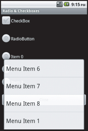
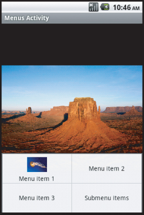
Figure 4.15 shows the menu items running in the emulator.
As mentioned previously, when two menu items need to appear on one screen, items are displayed in an expanded menu. Figure 4.16 shows the menu items that are displayed as part of the expanded menu.
Submenus
Submenus are menu items that logically and hierarchically appear under menu items. Submenus are displayed when a menu item is selected and programmed to display the items. Here are some important points about submenus:
- Submenus are created by calling the AddSubMenu() method of an IMenuItem.
- The AddSubMenu() method uses the same parameters as when adding a menu item.
- Adding icons and the rest of the submenu items is the same as with a menu item.
Selecting the Menu button on the device brings up the menu items shown in Figure 4.17.
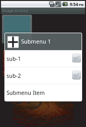
The submenu item is displayed along with a graphic signifying that additional information is displayed when the item is selected. Figure 4.18 shows Submenu 1 selected.
Context Menus
Context menus are displayed for a given view, such as a control. They are within the view's “context.” In this source code, the context menu is created when the user selects the ImageView control. This is done within the OnCreate() method of a view that is displayed.
iv.SetImageResource(Resource.drawable.desert);
RegisterForContextMenu(iv);
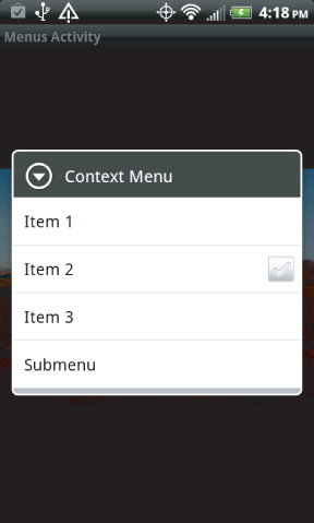
After the view has been passed to the RegisterForContextMenu() method, when the user selects the view through some action, such as by pressing the trackball, selecting the middle D-pad button, or selecting the view for at least 3 seconds, the context menu is shown. Figure 4.19 shows an example of the context menu that is displayed when selecting an image view.
The code in Listing 4.18 creates the context menu. Note that the methods to add items accept the same parameters and allow for the same options as the menus and submenus.
Listing 4.18: Creating a context menu
public override void OnCreateContextMenu(Android.Views.IContextMenu menu, View v,
        Android.Views.IContextMenuContextMenuInfo menuInfo)
{
    base.OnCreateContextMenu(menu, v, menuInfo);
    Java.Lang.ICharSequence str0 = new Java.Lang.String("Context Menu");
    Java.Lang.ICharSequence str1 = new Java.Lang.String("Item 1");
    Java.Lang.ICharSequence str2 = new Java.Lang.String("Item 2");
    Java.Lang.ICharSequence str3 = new Java.Lang.String("Item 3");
    Java.Lang.ICharSequence strSubMenu = new Java.Lang.String("Submenu");
    Java.Lang.ICharSequence strSubMenuItem = new Java.Lang.String("Submenu Item");
    menu.SetHeaderTitle(str0);
    menu.Add(0, Android.Views.Menu.First,
        Android.Views.Menu.None, str1).SetIcon(Resource.Drawable.koala);
    menu.Add(0, Android.Views.Menu.First + 1, Android.Views.Menu.None, str2)
        .SetCheckable(true);
    menu.Add(0, Android.Views.Menu.First + 2, Android.Views.Menu.None, str3)
        .SetShortcut(‘3’, ‘3’);
    ISubMenu sub = menu.AddSubMenu(strSubMenu);
    sub.Add(strSubMenuItem);
}
This code is contained in UIControlsmenus.cs
When the user selects a context menu item, the following code determines which menu item was selected:
public override bool OnContextItemSelected(IMenuItem item)
{
    base.OnContextItemSelected(item);
    switch (item.ItemId)
    {
        case (0):
            return (true);
         case (1):
            return (true);
    }
    return (false);
}
This code is contained in UIControlsmenus.cs
Defining Menus as a Resource
In addition to manually creating menus programmatically, you can create menus from an XML resource. The menus that are created can be either standard menus created when the user clicks the menu item or context menus.
Menus
Menu resources are stored as XML files in the layout directory and have their build attribute set to AndroidResource. The menu starts with the <menu> tag as the root, along with the <item> tag for menu items and the <menu> and <item> tags shown on item04 for submenu items. Listing 4.19 shows the XML used for an embedded resource.
Listing 4.19: Menu defined in XML
<menu xmlns:android="http://schemas.android.com/apk/res/android"
android:name="Embedded Resource - Context Menu">
  <item
  android:id="@+id/item01"
  android:icon="@drawable/jellyfishsmall"
  android:title="Menu item 1">
  </item>
  <item
  android:id="@+id/item02"
  android:checkable="true"
  android:title="Menu item 2">
  </item>
  <item
  android:id="@+id/item03"
  android:numericShortcut="3"
  android:alphabeticShortcut="3"
  android:title="Menu item 3">
  </item>
  <item
  android:id="@+id/item04"
  android:title="Submenu items">
    <menu>
      <item
      android:id="@+id/item05"
      android:title="Submenu item 1">
      </item>
    </menu>
  </item>
</menu>
This code is contained in UIControlsResourcesLayoutmenu.xml
The following code shows the menu being loaded and inflated into the display when the user clicks the Menu button when an Activity is loaded:
public override bool OnCreateOptionsMenu(Android.Views.IMenu menu)
{
    base.OnCreateOptionsMenu(menu);
    MenuInflater inflater = new Android.Views.MenuInflater(this);
    inflater.Inflate(Resource.layout.menu, menu);
    return (true);
}
This code is contained in UIControlsmenu.cs
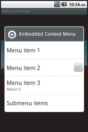
Figure 4.20 shows the output of loading the embedded menu into the display.
Context Menus
An embedded resource can be used as a context menu and then be created from a View, just like when a context menu is created programmatically. Listing 4.20 shows the creation of the context menu from an embedded resource.
Listing 4.20: OnCreateContextMenu method with an XML resource
public override void OnCreateContextMenu(Android.Views.IContextMenu menu, View v,
     Android.Views.IContextMenuContextMenuInfo menuInfo)
     {
        base.OnCreateContextMenu(menu, v, menuInfo);
        MenuInflater inflater = new Android.Views.MenuInflater(this);
        inflater.Inflate(Resource.layout.menu, menu);
        menu.SetHeaderTitle("My Context Menu");
     }
This code is contained in UIControlsmenu.cs
Figure 4.21 shows the context menu that is created when an embedded resource is used.
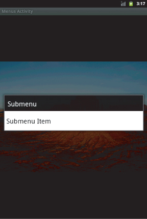
From the embedded resource, Figure 4.22 shows the context menu's submenu item.
Resolution-Independent UI
Initially, designing a UI for Android was simple. All the initial devices had the same screen size and pixel density. Basically, if you designed a UI for a single device layout, it worked across the rest of the devices.
Unfortunately, the marketplace is a fickle beast. As the saying goes, “One size fits all” never fits you. Starting with Android 2.0 in late 2009, the marketplace has seen a tremendous increase in the number of devices. Each of these devices seems to have a slightly different screen size and pixel density. Creating a UI that looks good across all the devices you want to support is not difficult, but it can take some thought. This section looks at some of the features in Mono for Android (and Android) that help developers write a resolution-independent UI. These include supporting various resources, supporting varying screen sizes, and working from a set of best practices.
Supporting Various Screen Resources
In general, resources dealing with the screen can be divided into two areas — screen sizes and pixel density.
Supporting Screen Sizes
There are three generalized screen sizes. Based on the device's screen size, an application can provide various layouts. The currently supported screen sizes are as follows:
- Extra Large: An extra large screen in Android is a screen that is larger than a large screen.
- Large: A large screen typically is much larger than the screen on a standard-sized smartphone. Usually this is a tablet—or netbook-size screen or larger.
- Medium: A medium screen equates to the typical screen size of a smartphone.
- Small: A small screen is smaller than a standard 3.2-inch smartphone screen.
Screen size support for an application can be placed within the AndroidManifest.xml file that is stored within the Properties folder of an Android application. The support is set by the following XML:
<supports-screens android:smallScreens="false" android:normalScreens="true"
 android:largeScreens="true" android:xlargeScreens="true"
 android:anyDensity="true" />
The attributes have the following meanings:
- android:smallScreens indicates whether the application supports screen form factors with a smaller aspect ratio than the traditional HVGA screen (smaller than “normal”). If an application does not support small screen sizes, it will be unavailable to a device with a small screen. By default, this value is true for API level 4 and later, so it is true for Mono for Android.
- android:normalScreens indicates whether a normal size screen is supported. By default, this attribute is true.
- android:largeScreens indicates whether a larger-than-normal (tablet or netbook) screen size is supported. By default, this setting is true for API level 4 and later, so it is true for Mono for Android.
- android:xlargeScreens indicates whether or not an extra large screen is supported. By default, this setting is false for API level below 9. This attribute will require the API level to be 9 or higher.
- android:anyDensity indicates whether an application can support any screen density. This is true by default for API level 4 and later, so it is true for Mono for Android.
Supporting Pixel Densities
Pixel density is another issue that must be figured into an application. Resources are stored in the drawable directory and may be stored in several subdirectories, depending on their screen resolution. Android has these standard pixel densities:
- ldpi: Low-density resources are designed for devices with a screen pixel density of 100 to 140 dpi. These resources are stored in the Resources/drawable-ldpi folder.
- mdpi: Medium-density resources are designed for devices with a screen pixel density of 140 to 190 dpi. These resources are stored in the Resources/drawable-mdpi folder.
- hdpi: High-density resources are designed for devices with a screen pixel density of 190 dpi and higher. These resources are stored in the Resources/drawable-hdpi folder.
- xhdpi: Extra high-density resources are designed for devices with a screen pixel density of 320 dpi. These resources are stored in the Resources/drawable-xhdpi folder.
Mono for Android running in Visual Studio provides a drawable folder. The other directories may be created manually based on the need. Mono for Android running in MonoDevelop on the Mac provides the drawable-hdpi, drawable-mdpi, drawable-ldpi folders. These are optional directories and are provided as a convention to provide alternative resources depending on the device's capabilities. The decision as to which resources to use is determined at runtime. The order for determining the resources is ldpi, mdpi, hdpi, xhdpi, and nodpi.
Using Android Market Support
In addition to application support for various screen sizes and pixel densities, the Android Market uses the <support-screens /> attributes. Applications that specify these values are filtered within the marketplace so that the user is presented with only applications that fit the device that is currently being used to connect to the Market. If an application does not support a small screen, the application will not be listed when a small screen device searches the Android Market.
Multiple Screen Resolution Best Practices
The following are best practices for building an application that supports multiple screen resolutions:
- AbsoluteLayout should not be used. AbsoluteLayout uses the concept of specific positions for controls. Although this will work for the initial screen design, it will most likely cause problems when an application is run on a different device with a different screen resolution. It is suggested that developers use RelativeLayout and FrameLayout and set layout_margin attributes within the child controls.
- Use fill_parent, wrap_content, and dip (density-independent pixel) units instead of pixel sizes in UI attributes.
- Avoid placing pixel values directly in code. Although the Android framework uses pixel values in code for performance reasons, it is suggested that dips be used for calculations and conversions as necessary. The class Android.Util.DisplayMetrics can be used to get the necessary screen dimensions for the currently running device.
- Use the density and image-specific resources.
- Test your application in the simulator in various configurations as well as on multiple devices.
Constructing a User Interface: A Phone and Tablet Example
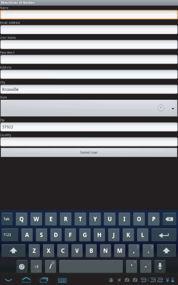
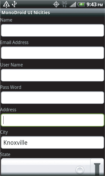
Putting together an application's user interface using these standard controls and having that application run across multiple form factors is the goal of any Android application. In this example, the user is presented with a user registration screen. The user is provided with assistance during the registration process. The assistance provided in this app is as follows:
- Scrolling is turned on via the ScrollView control. This allows for the user interface of an application to scroll as needed. (For a tablet, or larger screen device, this is not an issue.) The ScrollView enables the controls to be scrolled.
- Virtual keyboards are used in the various input fields. For example, the e-mail field provides the keyboard layout optimized for e-mail, while the phone number field provides the keyboard optimized for numeric input.
- A spinner is used to provide a list of states. Instead of typing the state in, the user selects the spinner, navigates to the appropriate state, and then selects the state.
- An autocomplete is used to enter the country of the user.
- Location services are used to calculate the user's current location. From this location, the user's city and zip code are then prefilled. Once the location is determined, the location services are no longer used and are turned off.
Figures 4.23 and 4.24 show the same application running in a tablet device (the Motorola Xoom) and on a phone (an HTC EVO 4G device).
Listing 4.21 shows the XML layout for this user interface, which runs across the Motorola Xoom and the HTC EVO 4G.
Listing 4.21: XML layout with inputType attributes
<?xml version="1.0" encoding="utf-8"?>
<ScrollView  xmlns:android="http://schemas.android.com/apk/res/android"
  android:id="@+id/sv"
  android:layout_width="fill_parent"
  android:layout_height="wrap_content"
>
  <LinearLayout
    android:orientation="vertical"
    android:layout_width="fill_parent"
    android:layout_height="fill_parent"
    android:isScrollContainer="true"
    >
  <TextView android:id="@+id/tvName"
      android:layout_width="fill_parent"
      android:layout_height="wrap_content"
      android:text="@string/Name"
/>
  <EditText android:id="@+id/Name"
    android:layout_width="fill_parent"
    android:layout_height="wrap_content"
    android:inputType="text|textCapWords" />

    <TextView android:id="@+id/tvEmail"
      android:layout_width="fill_parent"
      android:layout_height="wrap_content"
      android:text="@string/Email"
/>
  <EditText android:id="@+id/Email"
  android:layout_width="fill_parent"
  android:layout_height="wrap_content"
  android:inputType="text|textEmailAddress"
/>

  <TextView android:id="@+id/tvUserName"
      android:layout_width="fill_parent"
      android:layout_height="wrap_content"
      android:text="@string/UserName"
/>
  <EditText android:id="@+id/UserName"
  android:layout_width="fill_parent"
  android:layout_height="wrap_content"
/>
  <TextView android:id="@+id/tvPassWord"
    android:layout_width="fill_parent"
    android:layout_height="wrap_content"
    android:text="@string/PassWord"
/>
  <EditText android:id="@+id/PassWord"
  android:layout_width="fill_parent"
  android:layout_height="wrap_content"
  android:inputType="text|textPassword"
/>
  <TextView android:id="@+id/tvAddress"
      android:layout_width="fill_parent"
      android:layout_height="wrap_content"
      android:text="@string/Address"
/>
  <EditText android:id="@+id/Address"
  android:layout_width="fill_parent"
  android:layout_height="wrap_content"
/>
  <TextView android:id="@+id/tvCity"
    android:layout_width="fill_parent"
    android:layout_height="wrap_content"
    android:text="@string/City"
    android:inputType="text|textAutoCorrect"
            />
  <EditText android:id="@+id/City"
    android:layout_width="fill_parent"
    android:layout_height="wrap_content"
/>
  <TextView android:id="@+id/tvState"
      android:layout_width="fill_parent"
      android:layout_height="wrap_content"
      android:text="@string/State"
/>
  <Spinner android:id="@+id/State"
        android:layout_width="fill_parent"
        android:layout_height="wrap_content"
/>
  <TextView android:id="@+id/tvZip"
      android:layout_width="fill_parent"
      android:layout_height="wrap_content"
      android:text="@string/Zip"
/>
  <EditText android:id="@+id/Zip"
  android:layout_width="fill_parent"
  android:layout_height="wrap_content"
  android:inputType="number"
/>
  <Button
    android:id="@+id/Submit"
    android:layout_width="fill_parent"
    android:layout_height="wrap_content"
    android:text="@string/Submit"
    />
</LinearLayout>
</ScrollView>
This code is contained in MonoDroidUiNicitiesResourcesLayoutui.axml
Now that you have created a user interface, you can create the activity code (Listing 4.22). The key items of note in the code are:
- The spinner control is populated from a resource.
- The autocomplete textbox control is populated from a resource.
- A location manager object is created to get the location updates.
- Once a location is detected, the location manager no longer sends updates to the application. This keeps the UI from being updated by the application and the user wondering why the update occurred.
Listing 4.22: Code listing for setting up the user interface
[[Activity(Label = "Mono for Android UI Nicities", MainLauncher = true)]
public class Activity1 : Activity, ILocationListener
{
    private Spinner States;
    private Button button;
    private EditText etAddress;
    private EditText etCity;
    private EditText etZipCode;
    private AutoCompleteTextView actvCountry;
    private LocationManager lm;
    protected override void OnCreate(Bundle bundle)
    {
        base.OnCreate(bundle);
        SetContentView(Resource.Layout.ui);
        try
        {
            button = FindViewById<Button>(Resource.Id.Submit);
            button.Click += new EventHandler(button_Click);
            States = FindViewById<Spinner>(Resource.Id.State);
            var fAdapter = ArrayAdapter.CreateFromResource(this,
                  Resource.Array.states,
            Android.Resource.Layout.SimpleSpinnerDropDownItem);
            int spinner_dd_item = Android.Resource.
                  Layout.SimpleSpinnerDropDownItem;
            fAdapter.SetDropDownViewResource(spinner_dd_item);
            States.Adapter = fAdapter;
            Criteria cr = new Criteria();
            cr.Accuracy = Accuracy.Fine;
            cr.AltitudeRequired = false;
            cr.BearingRequired = false;
            cr.SpeedRequired = false;
            cr.CostAllowed = true;
            String serviceString = Context.LocationService;
            lm = (LocationManager)GetSystemService(serviceString);
            string bestProvider = lm.GetBestProvider(cr, false);
            actvCountry = FindViewById<AutoCompleteTextView>(Resource.Id.Country);
            etAddress = FindViewById<EditText>(Resource.Id.Address);
            etCity = FindViewById<EditText>(Resource.Id.City);
            etZipCode = FindViewById<EditText>(Resource.Id.Zip);
            string[] countries = Resources.GetStringArray(
                   Resource.Array.Countries);
            var adapter = new ArrayAdapter<String>(this,
                   Resource.Layout.ListItem, countries);
            actvCountry.Adapter = adapter;
            lm.RequestLocationUpdates(bestProvider, 5000, 1f, this);
        }
        catch (System.Exception sysExc)
        {
            Toast.MakeText(this, sysExc.Message, ToastLength.Short).Show();
        }
    }

    void GetAddress(double Lat, double Lon)
    {
        try
        {
            IList<Address> al;
            Geocoder geoc = new Geocoder(this, Java.Util.Locale.Default);
            al = geoc.GetFromLocation(Lat, Lon, 10);

            if ((al != null) && (al.Count > 0))
            {
                var firstAddress = al[0];
                var addressLine0 = firstAddress.GetAddressLine(0);
                var City = firstAddress.Locality;
                var zip = firstAddress.PostalCode;

                if (!String.IsNullOrEmpty(City))
                {
                    RunOnUiThread(() => etCity.Text = City);
                }
                else
                {
                    RunOnUiThread(() => etCity.Text = String.Empty);
                }
                if (!String.IsNullOrEmpty(zip))
                {
                    RunOnUiThread(() => etZipCode.Text = zip);
                }
                else
                {
                    RunOnUiThread(() => etZipCode.Text = String.Empty);
                }
                lm.RemoveUpdates(this);
            }
        }
        finally { }
    }
    void button_Click(object sender, EventArgs e)
    {
        EditText ev = FindViewById<EditText>(Resource.Id.Name);
        string message = "Your values will now be processed.";
        Toast.MakeText(this, message, ToastLength.Short).Show();
    }
    public void OnLocationChanged(Location location)
    {
        GetAddress(location.Latitude, location.Longitude);
    }
    public void OnProviderDisabled(string provider)
    {    }
    public void OnProviderEnabled(string provider)
    {    }
    public void OnStatusChanged(string provider, Availability status,
        Bundle extras)
    {    }
}
This code is contained in MonoDroidUiNicitiesActivity1.cs
Summary
This chapter has introduced some of the ideas, concepts, and controls you can use in building your Android user interface. Some of the key concepts presented include the following:
- Views and ViewGroups
- Layouts for placing controls on an Activity
- Some of the key controls used to build a user interface
- Some of the key ideas behind building a successful user interface
This chapter completes the first part of the book on building the basics of an application with Mono for Android.