
1.2. Tip to Remember
When not using Flash Builder or IntelliJ IDEA, leverage the Flex ANT Tasks, which are bundled with the free Flex 3.2 SDK, to compile Flex applications. When using ANT Tasks, you can avoid tediously specifying all necessary parameters on the command line.
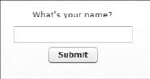
When this compiled swf is accessed via a web browser (which hosts a Flash Player plug-in of version 9 and above), the initial screen shows up, as in Figure 1-3.
Figure 1.3. Figure 1-3
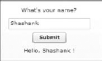
In the screen, I put in my name and click the Submit button, and I see the application greeting me by my name, as was expected. Figure 1-4 depicts this output.
Figure 1.4. Figure 1-4
Next, we refactor this simple application a bit just to emphasize the flexible data-binding aspects of Flex. The Submit button and the click handler are actually superfluous code and can be gotten rid of. The TextInput control can directly be bound to the Label that displays the output. The refactored code for the visual control takes the following form:
<mx:Label text="What's your name?"/>
<mx:TextInput id="textInput"/>
<mx:Label text="Hello, {textInput.text} !"/>
Actually, this code does not just represent the visual control but is pretty much the entire code. The only thing missing is the enclosing Application tags, which form the essential container that houses all Flex applications. The Application class also works as the entry point for Flex applications in a manner analogous to the main method in an executable Java or C++ program.
In the refactored code, none of the click handlers or the extra variables is required. This was possible because the Flex framework under the hood is implicitly triggering and handling events when we bind the text property of the TextInput control to the text property of the display Label.
On the contrary, an intermediate variable was used earlier to pass the value from the TextInput control to the display Label. This intermediate variable was declared Bindable to make sure that its value was propagated through whenever it changed. A variable, when annotated as Bindable, implicitly creates an underlying set of events and event handlers, which facilitate the data update from the source of the data to the destination at which it is consumed. Destination variables are wrapped in curly braces that represent data binding.
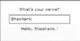
Before we move forward to surveying the list of available controls, let's see the new output of the refactored application in Figure 1-5.
Figure 1.5. Figure 1-5
I guess the simple example has whetted your appetite and gotten you curious to learn more. Next, we dive into the set of controls that come off the shelf with Flex.
1.2.1. Getting to Know the Controls
Controls, or UI controls, are the user interface components in the Flex framework. On the basis of functionality they could be classified into the following bundles:
Menus
Lists
Grids and tabular representations
Data entry and user input controls
Tree
Progress and range indicators
Image, SWF Loader, and video display
Alert
In the following subsections, we dig in a bit deeper into each of these controls and see them in use.
1.2.1.1. Buttons and Clickable Links
Buttons and links are typically suited for triggering an action. In some cases, this can facilitate navigation within and without the application. Six different types of buttons and clickable links are available in Flex for ready use. More such controls can be created by combining and extending these available components. In addition, you have the choice to create some from scratch by extending the UIComponent class, which, by the way, lies at the root of the entire set of Flex user interface classes' hierarchy.
The seven different prebuilt button and clickable link controls are:
Button
LinkButton
ButtonBar
ToggleButtonBar
LinkBar
TabBar
PopUpButton
To demonstrate the capabilities of these controls and understand their usage pattern, let's build an application showcase that puts them together in one place. It's aptly called the ButtonShowcase and its code corresponds to an MXML file by the same name. You will find this and all other code in the downloadable bundle of code associated with this book.
The first of the seven button types is a Button. A Button is a clickable control that all of us are familiar with. Creating a Button using Flex is simple and involves only a line or two of code, as follows:
<mx:Button id="button" label="Just a Button! You can click me."
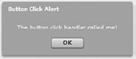
click="buttonClickHandler(event)"/>Clicking a Button triggers a click event. A function could be defined as an event handler for this click event. This function is invoked every time the click event is triggered. In the button showcase, the click handler function merely pops up an alert on-screen, but you are likely to do more useful things within this function in a real application. The event handler for the simple button is:
public function buttonClickHandler(event:Event):void {
    Alert.show("The button click handler called me!", "Button Click
Alert",Alert.OK,this);
}
A traditional button could be replaced with a link, which could demonstrate the same set of features as that of a button. Using the LinkButton class, you can quickly create a link that behaves like a button. Here is the code for it:
<mx:LinkButton id="linkButton" label="I am a Link! You can click me too."
        click="linkButtonClickHandler(event)"/>
Once you have two or more buttons, you may desire to group them together, especially if they are related. The ButtonBar class comes handy in grouping a bunch of buttons. For our button showcase, we will create four buttons labeled Flex, AIR, Flash, and Acrobat, respectively, and add them together to a bar of buttons. The process of creating this aggregation is quite simple. In our code, we don't really create each of these four buttons individually and add them one by one. Instead, we use the dataProvider property of the ButtonBar. An Array of strings is defined and bound to a bar of buttons by assigning it as the value of the bar's data provider. Here is the code for your reference:
<mx:ButtonBar id="buttonBar1" itemClick="itemClickHandler(event);">
        <mx:dataProvider>
            <mx:Array>
                <mx:String>Flex</mx:String>
                <mx:String>AIR</mx:String>
                <mx:String>Flash</mx:String>
                <mx:String>Acrobat</mx:String>
            </mx:Array>
        </mx:dataProvider>
    </mx:ButtonBar>
The dataProvider property allows for a loosely coupled architecture that facilitates the separation of data and its view in the context of a control.
NOTE
Data providers further the purpose of separating sources of data from the ways they are manipulated and consumed within user interface controls.
Buttons in a ButtonBar are laid out horizontally by default. Setting the direction property of the ButtonBar control to vertical lays out the constituent buttons vertically. On clicking any of the buttons in the bar, an itemClick event is dispatched. An item click handler function can be defined and bound as the event handler for this event. Our example application itemClick handler is programmed to pop up an alert dialog box, showing the selected index and the associated label. Here is the source code for it:
public function itemClickHandler(event:ItemClickEvent):void {
    Alert.show("The item click handler at index " + String(event.index) + " with label "
+ event.label + " called me!",
    "Item Click Alert",Alert.OK,this);
}
The ButtonBar stacks constituent buttons together and acts as a convenient navigation aid. It does not maintain state though. This means it does not remember the current selection. However, another control called ToggleButtonBar comes to your rescue in situations where you need to remember the last selection. A ToggleButtonBar allows only one button from the group to be selected at a time. Making a new selection deselects the last choice and sets the new choice as the selected one. Setting the toggleOnClick property to true deselects a selected item on clicking it.
Like buttons, link buttons can be grouped in a LinkBar. Doing it is easy. Here is some code that demonstrates how to do it:
<mx:LinkBar id="linkBar" itemClick="itemClickHandler(event)">
        <mx:dataProvider>
            {dataArray}
        </mx:dataProvider>
    </mx:LinkBar>
Like buttons and links, tabs are a common artifact used for navigation. Typically, different independent views of an application are navigated to using tabs. A TabBar control lets you define a set of tabs, where each tab is effectively an element, like a button or a link. The TabBar control has a data provider property, which helps attach data elements to the control.
So far, you have seen buttons, links, and the bars that can contain buttons and links. In addition to these Flex also includes a unique button, which has two parts, the first of which is the standard button and the second of which can be used to pop up any UIComponent. Such a button is called a PopUpButton. The typical use case is to pop up a list or menu and have the selection in the list or menu update the first button label. For our example, though, we don't show this use case. We pop up a date chooser instead. Figure 1-6 shows the date chooser popping up on clicking the second button.
Figure 1.6. Figure 1-6
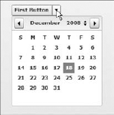
The PopUpButton can be created in a line or two of code, as follows:
<mx:PopUpButton id="popUpButton" label="First Button"
click="firstButtonClickHandler(event)"
    creationComplete="initDateChooser()"/>
The click handler for the first button just brings up an alert component, while that of the second button pops the date chooser component. Here is the code for it:
private function initDateChooser():void {
                var dateChooser:DateChooser = new DateChooser();
                dateChooser.yearNavigationEnabled = true;
                popUpButton.popUp = dateChooser;
            }

            public function firstButtonClickHandler(event:Event):void {
    Alert.show("The first button click handler called me!",
    "First Button Click Alert",Alert.OK,this);
}
To reinforce what has been stated about the seven button controls so far, they are put together in one place in Figure 1-7.
Figure 1.7. Figure 1-7
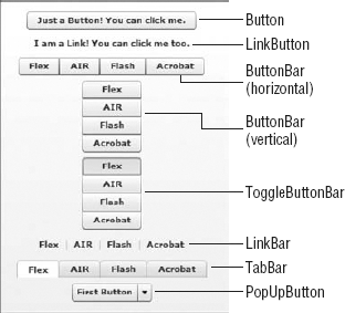
A pictorial representation always helps when talking about user interface components.
Next, we look at menu controls, which are another useful set of controls for navigation and triggering actions.
1.2.1.2. Menus
A Menu navigation control, in Flex, pops up in response to a user's action. It has a set of selectable units or items within it. A menu may have any number of nested submenus inside it.
Once a user selects a menu item, the Menu, by default, becomes invisible. In addition a Menu also becomes invisible when the Menu.hide method is explicitly called or a user clicks outside of the Menu component or selects another component in the application. Figure 1-8 shows what a Menu looks like.
Figure 1.8. Figure 1-8
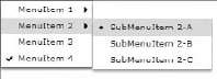
The menu can include other controls such as radio buttons, as shown in the example in Figure 1-8. Here is the data that defines the menu items:
<mx:XML format="e4x" id="menuData">
        <root>
            <menuitem label="MenuItem 1">
                <menuitem label="SubMenuItem 1-A"/>
                <menuitem label="SubMenuItem 1-B"/>
            </menuitem>
            <menuitem label="MenuItem 2">
                <menuitem label="SubMenuItem 2-A" type="radio"groupName=
                   "radioMenuItemGroup1" toggled="true"/>
                <menuitem label="SubMenuItem 2-B" type="radio"groupName=
                   "radioMenuItemGroup1"/>
                <menuitem label="SubMenuItem 2-C" type="radio"groupName=
                   "radioMenuItemGroup1"/>
            </menuitem>
            <menuitem label="MenuItem 3" type="check" toggled="false"/>
            <menuitem label="MenuItem 4" type="check" toggled="true"/>
        </root>
    </mx:XML>
Remember that this menu pops when you click a button. It's standard practice not to paint the menu upfront but to bring it up on some user-initiated action. This practice is one of the main reasons why you will not find an MXML component for a menu. The only way to create a menu is to do so programmatically using AS3.
An alternative to popping up a menu dynamically is to assemble it statically within a menu bar. A MenuBar component lays out the top-level menu items in a row horizontally. Again, each of the menus can have nested submenus. Figure 1-9 shows the earlier menu example within a menu bar.
Figure 1.9. Figure 1-9

To reuse the data from the Menu control in a MenuBar control you need to collate the menu items as an XMLList, which is a list of XML objects or elements. The Menu data exists as an XML document or object. In an XML document there is a single element at the root node and that does not accommodate multiple members at the main level. A MenuBar can have multiple members at the primary level. All top-level elements in an XMLList are added as primary members on the menu bar.
Menus can also appear within a PopUpMenuButton. A PopUpMenuButton is a PopUpButton that pops up a menu when its secondary button is clicked. When a menu item is selected, the primary button label is updated with the label of the selected item. The popped-up menu cannot contain submenus in it. Listing 1-1 shows the code for a PopUpMenuButton.
Example 1.1. A PopUpMenuButton
<?xml version="1.0"?>
<!-- APopUpMenuButton.mxml -->
<mx:Application xmlns:mx="http://www.adobe.com/2006/mxml">
    <mx:Script>
        <![CDATA[
            import mx.controls.Menu

            private function init():void {
                Menu(popUpMenuButton.popUp).selectedIndex=0;
            }
        ]]>
    </mx:Script>

   <mx:XML format="e4x" id="menuData">
        <root>
            <menuitem label="MenuItem 1"/>
            <menuitem label="MenuItem 2"/>
            <menuitem label="MenuItem 3" type="check" toggled="false"/>
            <menuitem label="MenuItem 4" type="check" toggled="true"/>
        </root>
    </mx:XML>

    <mx:PopUpMenuButton id="popUpMenuButton"
        dataProvider="{menuData}"
        labelField="@label"
        showRoot="false"
        creationComplete="init();"/>
</mx:Application> |
That briefly covers the menus; now we move on to lists.
1.2.1.3. Lists
There are three types of lists available as a part of the Flex controls. These are List, HorizontalList, and TileList. A List is a vertical display of a list of items. A user can select one or more of these items. The allowMultipleSelection property value governs if multiple selections are allowed or not. A List could be created as follows:
<mx:Model id="listItems">
    <technologies>
        <technology label="Flex" data="1"/>
        <technology label="AIR" data="2"/>
<technology label="Flash" data="3"/>
<technology label="Acrobat" data="4"/>
</technologies>
</mx:Model>
<mx:List id="source" dataProvider="{listItems.technology}"
change="this.selectedItem=List(event.target).selectedItem"/>These same items in the list can be arranged horizontally in a HorizontalList as follows:
<mx:HorizontalList id="horizontalList" dataProvider="{listItems.technology}"
    columnWidth="65"/>
Alternatively, these items could be laid out in a grid using the TileList as follows:
<mx:TileList id="tileList" dataProvider="{listItems.technology}"
     columnWidth="65" columnCount="2"/>
List items can use an icon along with the text description. These icons, when set for the list items, are rendered in the list. Figure 1-10 depicts all the three list types. (It shows a TileList with text only, no icons.)
Figure 1.10. Figure 1-10

After lists, it's time to survey the grid and tabular representation controls.
1.2.1.4. Grids and Tabular Representations
Data grids and tabular representations are one of the most popular sets of controls for data-driven Flex applications. The simplest, yet most powerful and flexible, control in this set is the DataGrid. Besides the DataGrid, the AdvancedDataGrid and the OLAPDataGrid are members of this control family. For an introductory chapter like this, we will exclude a discussion on either AdvancedDataGrid or the OLAPDataGrid.
Before we get deeper into the data grid, let's first see a pictorial representation of a sample data grid in Figure 1-11. Then, we'll jump right into the code that's making it work, in Listing 1-2.
Figure 1.11. Figure 1-11

Example 1.2. A Sample DataGrid
<?xml version="1.0" encoding="utf-8"?>
<mx:Application xmlns:mx="http://www.adobe.com/2006/mxml" layout="vertical">
    <mx:XMLList id="flashPlayerPenetration">
        <playerVersion>
            <playerVersionNumber>
                Flash Player 7
            </playerVersionNumber>
            <matureMarkets>98.6%</matureMarkets>
            <usAndCanada>98.7%</usAndCanada>
            <europe>99.1%</europe>
            <japan>97.5%</japan>
        </playerVersion>
        <playerVersion>
            <playerVersionNumber>
                Flash Player 8
            </playerVersionNumber>
            <matureMarkets>98.3%</matureMarkets>
            <usAndCanada>98.3%</usAndCanada>
            <europe>98.9%</europe>
            <japan>97.3%</japan>
        </playerVersion>
        <playerVersion>
            <playerVersionNumber>
                Flash Player 9
            </playerVersionNumber>
            <matureMarkets>97.7%</matureMarkets>
            <usAndCanada>98.1%</usAndCanada>
            <europe>98.0%</europe>
            <japan>96.3%</japan>
        </playerVersion>
        <playerVersion>
            <playerVersionNumber>
                Flash Player 9 Update 3
            </playerVersionNumber>
            <matureMarkets>89.4%</matureMarkets>
            <usAndCanada>90.0%</usAndCanada>
            <europe>88.6%</europe>
            <japan>88.3%</japan>
        </playerVersion>
    </mx:XMLList>

    <mx:DataGrid id="dataGrid" width="100%" height="100%"
        dataProvider="{flashPlayerPenetration}" editable="true">
<mx:columns>
<mx:DataGridColumn dataField="playerVersionNumber"
headerText="Player Version Number"/>
<mx:DataGridColumn dataField="matureMarkets" headerText="Mature Markets"/>
<mx:DataGridColumn dataField="usAndCanada" headerText="US and Canada"/>
<mx:DataGridColumn dataField="europe" headerText="Europe"/>
<mx:DataGridColumn dataField="japan" headerText="Japan"/>
</mx:columns>
</mx:DataGrid>
</mx:Application> |
A data grid allows for a lot of customization. For example, columns can use item renderers to display image data types. An application containing a data grid can listen and respond to data changes. Columns can be made resizable, and data in the columns can be sorted using user-defined logic. Considering that we are merely touching upon the exhaustive set of controls in this chapter, discussing all the features of data grid is out of scope.
The data grid in our example is editable, so it also acts as a data entry component. This supplements well the existing set of data entry components, which we talk about next.
1.2.1.5. Data Entry and User Input Controls
In this section I briefly present a number of data entry controls, namely:
Text
Label
CheckBox
ComboBox
RadioButton
NumericStepper
DateChooser
DateField
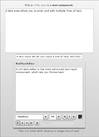
Text and Label are noneditable text-rendering components. A Label can display a single line of text, whereas Text can show multiple lines. Both of them can render HTML as well as plain text. TextInput, TextArea, and RichTextEditor are all editable text input components. TextInput accepts a single line of editable text, while TextArea allows multiple lines of editable text. RichTextEditor is the most powerful of the text entry controls. It can accept HTML syntax and has many ready-to-use utilities for the formatted entry and rendering of text. Figure 1-12 shows all of these five text-data-entry-related components stacked together.
Users make selections and choices among data sets as often as they enter and edit text. Some of the most common controls that facilitate users' making choices are CheckBox, ComboxBox, and RadioButton. A check box is a very handy control for making a selection and can be created with a few lines of code, like this:
<mx:Script>
    <![CDATA[
        import mx.controls.Alert;

        public function clickHandler(event:Event):void {
            if(checkBox.selected == true) {
                Alert.show("Check Box is selected",
                    "Check Box Click Alert",Alert.OK,this);
        } else {
                    Alert.show("You deselected the Check Box now",
                        "Check Box Click Alert",Alert.OK,this);
        }
    }
    ]]>
    </mx:Script>
   <mx:CheckBox id="checkBox" label="A Sample Check Box" click="clickHandler(event)"/>
Figure 1.12. Figure 1-12
Sometimes, selection is not about choosing an individual item but making a choice from among a list or group of items. This is where a ComboBox and RadioButtons are more appropriate than a CheckBox. Both the RadioButton and the ComboBox allow a user to make a single exclusive selection. A ComboBox is like a drop-down list and in some ways is a better component to go with when the list is fairly long. Besides, it can be made editable and can allow for the addition of new items to the list if required. Figure 1-13 shows a CheckBox, a ComboBox, and a group of RadioButton controls.
Figure 1.13. Figure 1-13

Two more types of user input artifacts are included in this subsection. The first is a NumericStepper, and it facilitates users' incrementing and decrementing numbers. It can be created as follows:
<mx:NumericStepper id="numericStepper" minimum="1"
    maximum="100" stepSize="1" value="50" width="45"/>
The next types of controls, DateChooser and DateField, deal with date and calendar elements. A DateChooser brings up a calendar component and makes it convenient for a user to select a date from it. A date field, on the other hand, is a text component with a calendar icon on its right. Clicking inside the date field or on the calendar icon brings up the date chooser component. Creating a date field could be done with just the following single line:
<mx:DateField id="dateField" yearNavigationEnabled="true" >
Next, you will learn about the Tree.
1.2.1.6. Tree
Hierarchical data can be bound to a Tree. A Tree can have two types of elements, a leaf and a branch. A branch can contain other branches and leafs. A leaf is a terminating element and has no further branches or leafs within it. Branches have a folder icon and a label, whereas leaves have a file icon and a label. The icons can be customized if required. Listing 1-3 depicts the core features of a tree.
Example 1.3. A Tree Control
<?xml version="1.0" encoding="utf-8"?>
<mx:Application xmlns:mx="http://www.adobe.com/2006/mxml">
    <mx:Script>
        <![CDATA[
            import mx.controls.Alert;

            [Bindable]
            public var selectedNode:Object;

            public function treeChanged(event:Event):void {
                selectedNode=Tree(event.target).selectedItem;
Alert.show(selectedNode.@label,"Node Alert", Alert.OK, this);
}
]]>
</mx:Script>
<mx:XMLList id="treeData">
<node label="Folder A">
<node label="Folder A-1">
<node label="Leaf A-1-1"/>
<node label="Leaf A-1-2"/>
<node label="Leaf A-1-3"/>
</node>
<node label="Folder A-2">
<node label="Leaf A-2-1"/>
<node label="Leaf A-2-2"/>
</node>
</node>
<node label="Folder B">
<node label="Leaf B-1"/>
</node>
</mx:XMLList>
<mx:Tree id="myTree" width="50%" height="100%" labelField="@label"
showRoot="false" dataProvider="{treeData}" change="treeChanged(event)"/>
</mx:Application> |
Opening and closing of branches dispatches itemOpen, itemOpening, and itemClose events, which can be handled to implement behavior linked to the opening and closing of branch nodes. Selection of a node triggers a change event. In Listing 1-3, we use the change event listener to read the value of the current selection and pop up an alert with that data.
A tree can be used effectively like a file explorer or a navigator for any type of hierarchical data. It can be used in combination with a data grid or charts to filter and search through data.
In this rapid review, that's all on the Tree control. Let's keep moving on with our list of controls. We discuss the progress and range indicators next.
1.2.1.7. Progress and Range Indicators
The Flash platform is a dynamic engaging platform and there are numerous occasions, including application download and startup, when an effect, an action, or an animation is in progress for a short duration. At such times, it's handy to know how far you are into the process. A ProgressBar is just the right display component to use to dynamically show the status of this progress. A sample progress bar that is updated through manual button clicks can be created effortlessly with a few lines of code, like this:
<mx:Script>
        <![CDATA[

        private var i:int = 1;

        private function incrementIt(event:Event):void {
if(i<=100) {
progressBar.setProgress(i,100);
progressBar.label = "Current Progress " + i + "%";
i+=1;
} else if(i>100) {
i = 0;
}
}
]]>
</mx:Script>
<mx:ProgressBar id="progressBar" labelPlacement="top" themeColor="#F20D7A"
minimum="0" visible="true" maximum="100" label="Current Progress 0%"
direction="right" mode="manual" width="100%"/>
<mx:Button id="incrementProgressBar" label="Increment the Progress Bar"
click="incrementIt(event)"/>The progress bar can be determinate if the bounds are known ahead of time or it can be indeterminate initially and can move to a determinate state once the range is assessed. This is useful when showing updates for processes like file downloads or audio and video streaming, where the total expected runtime is not known ahead of time.
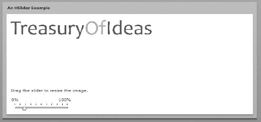
Like the progress bar, the HSlider and the VSlider work over a range of data. Unlike the progress bar, though, they are not about showing the update or status of a running process. They are, instead, useful tools to help users skim over a range. For example, a user could manipulate the size of an image by moving over a possible range of resizing combinations or modify the color luminosity by gently moving over a range of possibilities. Figure 1-14 shows a horizontal slider used to manipulate an image size.
Figure 1.14. Figure 1-14
This nifty little trick with the image size is attractive, but this isn't the only thing you can do with images.
1.2.1.8. Image, SWF Loader, and Video Display
In our example on the sliders, we embedded an image and played with its size to demonstrate the slider's capabilities. When we embedded the image, it became part of the application's .swf and bloated it because of its size. This may not always be a desirable situation, especially if you aim to reduce the initial download and startup footprint.
The Image control makes it possible to load JPEG, PNG, GIF, and SWF files at runtime. The SWF file loading may surprise you, considering that the control is called Image. However, when you traverse the Image class hierarchy, things begin to make sense immediately when you notice that its immediate parent is the SWFLoader class, which can be used to load other Flex applications into the current one.
The image could be local and be available on the same web server that that the application's .swf is served from or it could be at a remote destination and accessed over the network using HTTP.
SWFLoader can also load images like the Image class does, although it's better to use the image control for the purpose. The image control lends itself well to being used in item renderers and item editors.
In addition to these resource loaders, you can also use the VideoDisplay control to load and play videos, which are available in the FLV file format. The VideoDisplay control includes advanced features like progressive downloading and has the capability to play a streaming video feed from a camera or the Flash Media Server. Flash Media Server is an advanced feature-rich media-streaming server from Adobe.
Listing 1-4 shows a VideoDisplay component in use.
Example 1.4. A Simple VideoDisplay Control
<?xml version="1.0" encoding="utf-8"?>
<mx:Application xmlns:mx="http://www.adobe.com/2006/mxml"
       backgroundColor="0xFFFFFF">
       <mx:VideoDisplay id="videoDisplay" height="285" width="250"
              source="20051210-w50s.flv" autoPlay="false"/>

       <mx:HBox>
             <mx:Button label="Play" click="videoDisplay.play()"/>
             <mx:Button label="Pause" click="videoDisplay.pause()"/>
             <mx:Button label="Stop" click="videoDisplay.stop()"/>
       </mx:HBox>

</mx:Application> |
Now we are ready to pick up the last of the controls as far as our current exposition goes. It's the Alert control, which is not a complete stranger to you because although it was never introduced, you have seen it pop up in the very first example on controls.
1.2.1.9. Alert
An Alert is a modal display component that pops up to display some text and solicit user feedback. Being modal, it forces a user to click a button to make a choice before focus is returned to the main application area. There is plenty of code already that illustrates an alert. Figure 1-15 shows a sample alert.
By now, you are exposed to a fair number of user interface components of the Flex framework and are possibly ready to start using these components together to create interesting applications. As a first step, we need to lay two or more of these components out in a way that is user-friendly and effectively spaced out in the available screen real estate.
Figure 1.15. Figure 1-15
In order to lay the components out effectively, we need to leverage the layout containers available in the framework. Layout containers are precisely the topic for the next section.
1.2.2. Laying Out the Controls
The Application enclosing element that every Flex application lies within is itself a container. It can behave as an absolute canvas or a horizontal or a vertical box. Its layout property, which decides how it should behave, takes the following as valid values:
absolute: Absolute layout implies a container's children are positioned as per their explicit x and y coordinates. If no coordinates are specified, they all stack up at the top left corner.
horizontal: Horizontal layout positions a container's children horizontally in the sequence in which they appear.
vertical: Vertical layout positions a container's children vertically. An Application container by default lays its children out vertically.
Apart from this essential and ubiquitous container, Flex offers you a varied choice from among the following:
Box
HBox
VBox
DividedBox
HDividedBox
VDividedBox
Tile
Grid
Panel
Canvas
ViewStack
TabNavigator
Accordion
ApplicationControlBar
Repeater
Form
TitleWindow
Let's start our journey, which will explore each of them. We will follow the order in which they are listed.
1.2.2.1. All the Boxes
In this subsection, we cover all the six types of boxes: Box, HBox, VBox, DividedBox, HDividedBox, and VDividedBox.
A Box container puts its child elements in a vertical or horizontal box. The direction property decides this orientation. In addition, HBox and VBox subclass the Box container class and provide ready-to-use horizontal and vertical boxes. Figure 1-16 shows a few button components in an HBox and a VBox.
Figure 1.16. Figure 1-16
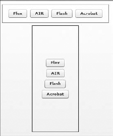
Using MXML, arranging a few components in any of the box containers implies enclosing those component tags within the specific box type tags, for example:
<mx:HBox borderStyle="solid" borderColor="black"
    width="285" height="50"
    horizontalAlign="center" verticalAlign="middle">
    <mx:Button label="Flex"/>
    <mx:Button label="AIR"/>
    <mx:Button label="Flash"/>
    <mx:Button label="Acrobat"/>
</mx:HBox>
There are three more box containers like the ones mentioned earlier that, apart from being a box, include a draggable divider in the gap between their immediate child elements. These three containers are the DividedBox, HDividedBox, and the VDividedBox. Figure 1-17 shows the buttons from the last HBox example within an HDividedBox.
Figure 1.17. Figure 1-17
Like the Box, the DividedBox's direction property determines the horizontal or vertical orientation of its child components. HDividedBox and VDividedBox, as their names suggest, lay out their children horizontally and vertically, respectively. Both these divided boxes inherit from the DividedBox component.
The boxes are extremely useful containers and used often in Flex applications. Sometimes though, the requirement is to arrange the child components in a grid-and-matrix-like structure. Such grid-based structures can be thought of as boxes with constraints along two dimensions instead of one.
1.2.2.2. Grid and Tile
The Grid container extends the Box container. It allows for arrangement of child components in a tabular layout. The layout has one or many rows, and each row can have a different number of columns. Each row is defined and identified by a GridRow component. Each row contains a number of items, which are wrapped up in GridItem components. Each GridItem can contain any number of components. Listing 1-5 is a program that creates a grid of two rows, the first row with three columns and the second with two.
Example 1.5. A Grid Container Example
<?xml version="1.0" encoding="utf-8"?>
<mx:Application xmlns:mx="http://www.adobe.com/2006/mxml"
    backgroundColor="0xFFFFFF">
        <mx:Script>
        <![CDATA[
            import mx.controls.Alert;

            [Bindable]
            public var selectedNode:Object;

            public function treeChanged(event:Event):void {
                selectedNode=Tree(event.target).selectedItem;
                Alert.show(selectedNode.@label,"Node Alert", Alert.OK, this);
            }
        ]]>
        </mx:Script>
    <mx:Grid>
        <mx:GridRow>
            <mx:GridItem>

                <mx:Button id="row1col1button" label="Row 1 Column 1"/>
                <mx:TextInput id="row1col1textInput" text="Type Here" />
            </mx:GridItem>
            <mx:GridItem>

                <mx:Button id="row1col2button" label="Row 1 Column 2"/>
                <mx:ColorPicker id="row1col2colorPicker" />
            </mx:GridItem>
            <mx:GridItem>

                <mx:ComboBox id="row1col3comboBox">
                    <mx:dataProvider>
<mx:Array>
<mx:String>Flex</mx:String>
<mx:String>AIR</mx:String>
<mx:String>Flash</mx:String>
<mx:String>Acrobat</mx:String>
</mx:Array>
</mx:dataProvider>
</mx:ComboBox>
</mx:GridItem>
<mx:GridItem>
<mx:RadioButton groupName="adobeTechnologies"
id="option1" label="Flex"/>
<mx:RadioButton groupName="adobeTechnologies"
id="option2" label="AIR"/>
<mx:RadioButton groupName="adobeTechnologies"
id="option3" label="Flash"/>
<mx:RadioButton groupName="adobeTechnologies"
id="option4" label="Acrobat"/>
</mx:GridItem>
</mx:GridRow>
<mx:GridRow>
<mx:GridItem>
<mx:List>
<mx:dataProvider>
<mx:Array>
<mx:String>Flex</mx:String>
<mx:String>AIR</mx:String>
<mx:String>Flash</mx:String>
<mx:String>Acrobat</mx:String>
</mx:Array>
</mx:dataProvider>
</mx:List>
</mx:GridItem>
<mx:GridItem>
<mx:Tree id="aTree" labelField="@label" showRoot="false"
dataProvider="{treeData}" change="treeChanged(event)"/>
</mx:GridItem>
</mx:GridRow>
</mx:Grid>
<mx:XMLList id="treeData">
<node label="Folder A">
<node label="Folder A-1">
<node label="Leaf A-1-1"/>
<node label="Leaf A-1-2"/>
<node label="Leaf A-1-3"/>
</node>
<node label="Folder A-2">
<node label="Leaf A-2-1"/>
<node label="Leaf A-2-2"/>
</node>
</node>
</mx:XMLList></mx:Application> |
The height of all cells in a row is equal, but different rows can have different heights. Similarly, the width of all cells in a column is the same, but different columns can have different widths.
When you need to create a grid layout and need equal-sized cells throughout, it may be advisable to use a Tile instead of a Grid. Figure 1-18 shows a set of buttons spread out in a tile.
Figure 1.18. Figure 1-18

That's about it as far as the grid-based layout is concerned; next, we explore the Panel container.
1.2.2.3. Panel
A Panel is a sophisticated layout container that can serve well as a top-level application container or a container for a distinct subpart of the application. Apart from the usual area for its child components, it has additional features such as a title, a status message, and a prominent set of borders. To see it in action is to understand what it's good for. Figure 1-19 puts the buttons from the previous example in a Panel.
Figure 1.19. Figure 1-19
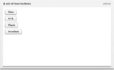
A Panel can be created as effortlessly as any other container. To testify to this claim, let's peek into the code behind the screen in Figure 1-19 here:
<mx:Panel id="title" title="A set of four buttons" status="active"
        width="50%" height="50%" paddingTop="10" paddingLeft="10" paddingRight="10"
           paddingBottom="10">
        <mx:Button label="Flex"/>
        <mx:Button label="AIR"/>
        <mx:Button label="Flash"/>
        <mx:Button label="Acrobat"/>
    </mx:Panel>
A panel is a very useful component in most situations. Sometimes, though, all you need is an area to spread out a few controls, and in doing so you prefer to explicitly specify the position or coordinates where these contained controls need to be. The only Flex container that gives you the complete freedom to locate constituents by specifying their raw positions, that is, the x and y coordinates, is the Canvas, which is our next container on the list.
1.2.2.4. Canvas
Let's go back to our four buttons, and this time anchor them at four different locations on a canvas. Intentionally, two of the buttons have a small overlap to show that the canvas isn't doing any constraint-based layout and is just pasting its constituents where you instruct it to. In cases like the Panel or the Box container the layout is governed by rules or constraints and such layout schemes are called constraint-based layout. Look at Figure 1-20, which has the four buttons on a canvas.
Figure 1.20. Figure 1-20
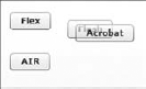
The size of a child component in a canvas is set to the preferred size, that is, the preferred height and width. During the layout phase a component's measure method is called to determine the preferred dimensions and the maximum and minimum values of such dimensions. You could override this by explicitly specifying the height and width either in pixels or in percentage terms in relation to the canvas.
We have been exploring single containers so far, but this is not always sufficient, as applications sometimes need to stack multiple containers and have users access them from a single entry point. Flex has a rich set of containers, which allows users to stack multiple containers.
1.2.2.5. Stackable Container for Multiple Containers
ViewStack, TabNavigator, and Accordion are the three off-the-shelf Flex containers that can host multiple containers quite elegantly. These containers stack multiple containers on top of each other and leave only one container visible at a time. ViewStack is a slightly raw container compared to TabNavigator and Accordion. A ViewStack does not come with a built-in navigator to navigate among its views like the other two. A LinkBar, a TabBar, or a ToggleButtonBar can act as a ViewStack's navigator. This association between a ViewStack and any of these three link and button bars can be established just by assigning the ViewStack as the data provider for these navigation button sets. A simple ViewStack can be created as follows:
<mx:LinkBar dataProvider="{aViewStack}"/>
    <mx:ViewStack id="aViewStack">
            <mx:Canvas id="canvas1" label="Canvas 1">
                <mx:Label text="Canvas 1"/>
            </mx:Canvas>

            <mx:Canvas id="canvas2" label="Canvas 2">
                <mx:Label text="Canvas 2"/>
            </mx:Canvas>
<mx:Canvas id="canvas3" label="Canvas 3">
<mx:Label text="Canvas 3"/>
</mx:Canvas>
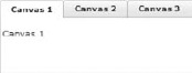
</mx:ViewStack>The same three canvases can be wrapped in a TabNavigator instead of a ViewStack. When the canvases are hosted within a tab navigator, a link bar is not required. Tabs appear automatically for each immediate container within a tab navigator. Figure 1-21 is a view of such a tab navigator.
Figure 1.21. Figure 1-21
The TabNavigator class extends the ViewStack class and, therefore, exhibits all of the properties and behavior of a view stack container. The Accordion also implements all the properties and behaviors of a ViewStack, although unlike the TabNavigator it does not inherit these from the ViewStack.
Next, we put our three canvases within an Accordion. Figure 1-22 portrays a view of such an Accordion.
Figure 1.22. Figure 1-22

In all three of these containers, the selectedIndex and selectedChild properties keep track of the current visible container.
The ViewStack containers are extremely useful containers for navigating through large applications, which usually involve multiple distinct views. Sometimes, though, it's important to keep a few application-level elements always visible across all possible views. This is where the ApplicationControlBar fits in.
1.2.2.6. ApplicationControlBar
An ApplicationControlBar is an application-wide container that contains elements that help navigate or provide some information that is relevant at all points of interaction with the application. An application control bar can either be docked, in which case it's stuck to the top of the application display area or can be freely floating, in which case it can be anywhere on the screen. A docked application control bar with a button, an input text control, and a label can be created as follows:
<mx:ApplicationControlBar dock="true">
        <mx:Button id="aButton" label="A Button"/>
        <mx:TextInput id="aTextInput" text="Enter something...."/>
        <mx:Label id="aLabel" text="A label"/>
    </mx:ApplicationControlBar>
Next, we look at another interesting container called the Repeater.
1.2.2.7. Repeater
A Repeater, as the name suggests, repeats a control; that is, it repeatedly places a control. Therefore, if you wanted to create a set of buttons that were numbered from 1 to 11, it would be useful to use a repeater. Such an application can be created by using some elementary code, such as this:
<mx:Script>
        <![CDATA[
            [Bindable]
            public var anArray:Array=[1,2,3,4,5,6,7,8,9,10,11];
        ]]>
    </mx:Script>
    <mx:Repeater id="aRepeater" dataProvider="{anArray}">
        <mx:Button id="aButton" label="Button {aRepeater.currentIndex + 1}"/>
    </mx:Repeater>
Next, you will learn about a container that is ubiquitous on the Web: a Form.
1.2.2.8. Form
We are all familiar with the forms for data entry on the Web so forms need little or no introduction. The Form container, along with FormHeading and FormItem, allows you to control the layout and behavior of the form elements within a Flex application. Figure 1-23 shows a simple form for data input.
Figure 1.23. Figure 1-23
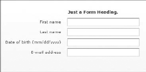
The code behind this form is:
<mx:Form width="100%" height="100%">
            <mx:FormHeading label="Just a Form Heading."/>
            <mx:FormItem label="First name">

                <mx:TextInput id="firstName" width="200"/>
            </mx:FormItem>
<mx:FormItem label="Last name">
<mx:TextInput id="lastName" width="200"/>
</mx:FormItem>
<mx:FormItem label="Date of birth (mm/dd/yyyy)">
<mx:TextInput id="dob" width="200"/>
</mx:FormItem>
<mx:FormItem label="E-mail address">
<mx:TextInput id="email" width="200"/>
</mx:FormItem>
</mx:Form>It's easy to specify elements as mandatory or optional in a form and attach validators and formatters to them where required.
In this brief tour of containers, we have come close to the end of the journey. Our last container in the list is TitleWindow, which we look at next.
1.2.2.9. TitleWindow
Resembling a Panel to some extent, a TitleWindow is a container that includes a title bar, a border, a caption, and a content area. Distinct and independent parts of an application can be housed in a TitleWindow. Figure 1-24 shows a TitleWindow.
Figure 1.24. Figure 1-24

A TitleWindow can appear as a regular container in an application or as a pop-up for the duration of the interaction. Its usage really depends on the demands of the application.
In the last few pages, we surveyed the containers that come with Flex. Each of these containers can be extended to create new containers. In addition, these containers can be combined and used together to create many different types of layouts.
So far you have seen the controls and the containers. Together, these cover the heart of the Flex user interface story. However, the controls and containers are not enough to create a fully functional rich application. Our next topic is about the ways and means to consume external data and interface with the world outside a Flash Player.