
Chapter 3. Making it Fell Like an App

Jeremy Keith once observed, “Like obscenity and brunch, web apps can be described but not defined” (http://bkaprt.com/pwa/03-01/). But what does that mean for a team that begins work on a progressive web app?
Even if everyone in your organization believes that building a progressive web app is important, there is little chance that everyone has the same idea of what that app should look like, feel like, and do.
Creating a shared vision of what it means for your site to feel like an app is a crucial part of the process. How far you chase that dream will determine your scope, your features, your outcomes—everything.
So what does it mean to make something that is app-like? And—perhaps a better question—should that even be the goal?
“Being app-like” isn’t a goal unto itself. Whether or not your progressive web app is more of an “app” or a “site” is not something your users are going to be thinking about as they interact with it.
It’s better to focus on the characteristics of the experience that your users will notice. When we say “feel like an app,” what we often mean is that the website should exhibit:
- a native look and feel,
- an immersive experience,
- speed and fluidity, and
- polish and personality.
The list of characteristics for you and your team may be different. But if you can translate your team’s abstract sense of what makes something feel like an app into more concrete directions, then you can explore ways to achieve those characteristics.
Because I don’t have your list handy, let’s use my list for now and take a closer look at how we can make progressive web apps “feel” the way we want them to.
Native Look and Feel
Owen Campbell-Moore, a former product manager for progressive web apps at Google, believes it is important to make progressive web apps fit in with their native app siblings, “since native apps have given users expectations around touch interactions and information hierarchy which are important to match to avoid creating a jarring experience” (http://bkaprt.com/pwa/03-02/).
There’s something to be said for matching a user’s expectations of their device. If someone launches your progressive web app from an icon on their Android phone, it would be nice if your app feels like an Android app. Or feels like an iOS app on an iPhone. Or a Windows app on Windows. You get the idea.
Fitting it visually with the device OS is certainly an option. For instance, you could use the system fonts provided by each operating system to make your app feel more like other apps on that platform. Geoff Graham maintains a reference on CSS-Tricks that describes how you can set the font in CSS to match the operating system font (http://bkaprt.com/pwa/03-03/):
body {
font-family: -apple-system,BlinkMacSystemFont,"Segoe UI",Roboto,Oxygen-Sans,Ubuntu,Cantarell,"Helvetica Neue",sans-serif
}
The CSS Working Group has started to standardize on a new font-family value called system-ui that would always give you the operating system font (http://bkaprt.com/pwa/03-04/). While this new standard has been adopted by several browsers (http://bkaprt.com/pwa/03-05/), there have been issues with internationalization on Windows that have caused GitHub and Bootstrap to remove system-ui from their font list (http://bkaprt.com/pwa/03-06/). So be sure to test carefully if you use the new system-ui value.
If you want to go beyond fonts, you could adopt the platform’s design language. Google’s Material Design system has both official and unofficial ports to various CSS and JavaScript frameworks (http://bkaprt.com/pwa/03-07/). While there are no official web libraries from Apple to replicate the iOS design language on the web, there are plenty of third parties that try to mimic iOS look and feel using web technology. Microsoft’s Fluent Design system is fairly new and, as of this writing, isn’t licensed for web use.
While fitting in on the underlying platform makes some sense, it can be challenging to do well. Each platform has its own design language and guidelines that are extensively documented. How many platform design languages should you try to adapt to? What happens when the recommended design of one platform conflicts with the recommendations for another? What happens when the design language changes? Do you have to keep your progressive web app in sync with every new operating system release?
Don’t forget, your progressive web app won’t only be accessed via an icon on a mobile device. People will still be visiting your website in browsers and on other devices. Should we start making our widescreen responsive designs feel like Mac or Windows apps?
The uncanny valley
Even if you manage to keep on top of the evolving design language of multiple platforms, there’s still a chance that your progressive web app will fall into the app equivalent of the uncanny valley—the idea that the closer robots, androids, and other humanoid objects get to appearing like real humans, the more real humans feel unsettled by them. We’re much more likely to accept and feel warm towards a cartoony version of a human than we are one that looks nearly perfect, but feels off in subtle ways.
I suspect that something similar is true for web apps. The closer we get to trying to pass something off as a native app, the more glaring it will be when we don’t match the design guidelines exactly. I believe we’re much better off designing something that fits our own brand and provides an exceptional user experience across devices than we are trying to map the specific design aesthetics of any given platform.
We also don’t know yet if people expect progressive web apps to behave similarly to native apps on their devices. Most people who add a progressive web app to their homescreen will do so after visiting the progressive web app in a browser. If they thought enough of the experience in their browser to add it to their homescreen, why would they expect that experience to morph into something different just because they are now launching the app from an icon on their device?
Unless there is a compelling business benefit, trying to make your progressive web app feel like a specific native platform is likely to be more pain than it is worth. Focus on making your app feel great no matter what operating system it’s being used on.
Immersive Experiences
When someone visits your progressive web app in the friendly confines of their preferred browser, they’ll see the site within the browser’s chrome—that is, the window frame, toolbar, scroll bar, and other parts of the browser interface (Fig 3.1). In fact, Google’s browser was ironically named Chrome because a stated objective of the browser’s design was to reduce the amount of browser chrome (http://bkaprt.com/pwa/03-08/).

As long as someone accesses your progressive web app inside a browser, you have no say over how much browser chrome they see. But the moment they add your progressive web app to their homescreen, you get to dictate how much of the browser user interface (UI) remains by declaring a display mode in the progressive web app’s manifest file.
There are four display modes you can choose from (Fig 3.2) (http://bkaprt.com/pwa/03-09/):
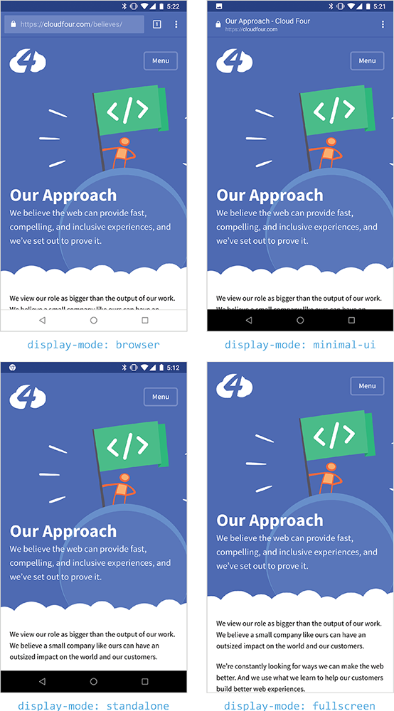
Fig 3.2: Notice the differences in the Cloud Four website in Chrome with each of the four display modes.
browser: Opens in a normal browser tab or new window.minimal-ui: Provides a minimal set of UI elements for controlling navigation and perhaps a way to view the URL of the page.standalone: The application will look like a standalone application. There may be system UI elements like the status bar and system back button.fullscreen: All available screen real estate belongs to your app.
Other than fullscreen, where nothing is visible except for the app itself, browsers have some discretion on how they implement each display mode and which display modes might satisfy the browser’s installation criteria. Some browsers don’t currently support all of the display modes. Because progressive web apps are fairly new, browser makers are still experimenting to see what features work best in each mode.
Removing browser chrome
Given the chance to finally break free of our browser shackles, it’s hard to resist the fullscreen display mode. It’s our chance to build the sort of rich, all-encompassing applications that used to require native code. Who wouldn’t want to have the entire screen dedicated to showcasing your fabulous progressive web app?
But we should tread carefully when it comes to display modes. Those of us who build for the web have been spoiled by our browsers. It’s easy to take for granted all of the things that browsers provide to us. As we move from the browser to fullscreen display mode, each step means the removal of functionality that our users rely on: the address bar, the back button, sharing options, printing, and much more.
Replicating these browser features inside a progressive web app is more difficult than it appears. Even the ubiquitous back button is complex. If you provide a back button, you will need to keep track of the browser’s history and manage the application state to make sure that they go to the correct preceding page. The History API can be used to manage and update the browser’s history, but if you’ve never had to worry about tracking history because the browser took care of it for you, adding this functionality could be an unexpected hurdle.
If, as part of your progressive web app, you decide to switch to a single-page application structure (more on this and the app shell model soon), then you have an additional challenge of retaining scroll positions when implementing your back button. If you don’t do this, then when someone hits your back button, they will be back at the top page instead of wherever they left off.
The back button in native mobile apps often supports a stricter navigation hierarchy than is typically present on the web. For example, a native ecommerce app might allow someone to drill down from the homescreen to a list of products, and then to a product detail page (Fig 3.3).
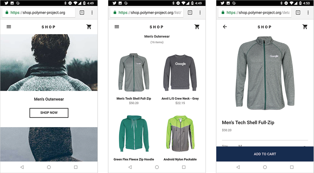
In this case, what the back button does is clear from the context: it takes you up the navigation hierarchy. And you know the hierarchy because you just successfully traversed it to reach the product detail page. People are accustomed to bouncing back and forth between the product detail and the product listing pages as they search for the right product.
Browsing the web is typically much less linear. It is just as likely that someone arrived on the product detail page from a search result or a tweeted link than it is that someone navigated through the hierarchy of categories and product listings. When that happens, where do they expect a back button provided by the progressive web app to go? Should it go up the navigation hierarchy to the product listing page like the native app does? Or should it go back to the search results (Fig 3.4)?

What happens if the progressive web app isn’t being viewed on a mobile device? Where does the back button provided by the app go? Does it go to the same place that the back button provided by the browser goes? In the case of the Polymer demo ecommerce site, the back button provided by the progressive web app goes to a different location—up the navigation hierarchy—than the back button provided by the browser, which goes back to the previous search result page (Fig 3.5).
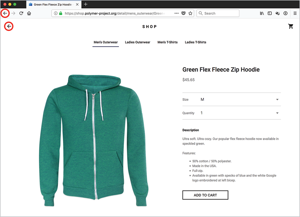
Switching between the browser navigation and the in-app navigation in the Polymer demo creates funny results. For example, if you use the in-app back button to move up the navigation hierarchy to the product listing page and then use the browser’s back button to get back to the product detail page, you’ll now have arrows pointing in opposite directions—the in-app back button and a browser forward button—that both go to the product listing page. All roads lead to Rome indeed.
Detecting display modes
Each team that aspires to provide a fullscreen experience needs to ask itself what the experience should be when the progressive web app isn’t viewed fullscreen. Does providing an in-app back button make sense if the browser back button is present?
Thankfully, there is a new media query that can be used to test for what display mode the progressive web app is currently being viewed in and then modify the layout accordingly. The following sample code could be used to display a back button only if the app were being viewed in fullscreen mode:
.backButton {
display: none;
}
@media (display-mode: fullscreen) {
.backButton {
display: block;
}
}
Note that in this example, the default experience assumes the visitor is viewing the page in a browser. More people are likely to view your progressive web app from inside a browser’s chrome than a fullscreen experience.
Losing our URLs
When you declare your display mode to be either standalone or fullscreen, you lose the address bar and, with it, one of the cornerstones of the web: URLs.
That may not seem like much of a tradeoff to get access to more screen real estate. Who pays attention to ugly URLs anyways? But URLs are a key part of the web for good reason. They help users identify what site they are on. They help people know that the site is secure. They can be modified by users to get to other pages on a site.
Perhaps most importantly, URLs are what people share with others. If you find something you think someone else would like, you send them a URL. If you want to share an article on Facebook or Twitter, you share a URL. It becomes much more difficult for people to share the wonderful things they find on your site if the address bar has been removed and there are no URLs available.
Just like the back button, if you go standalone or fullscreen, you will need to replicate the features that the browser’s chrome provides inside your progressive web app.
One possible solution for sharing could be to add social network icons to your web page. Many websites feature a cacophony of social icons in an attempt to entice people to share their content—but there’s little evidence that these icons are effective. One study found that only 0.2 percent of mobile users tap on social sharing buttons (http://bkaprt.com/pwa/03-10/). Additionally, if the JavaScript and images used to display the buttons come from a third-party source (like Facebook), then that third party knows what pages you have visited and can track your browsing experience (http://bkaprt.com/pwa/03-11/). In other words: these icons don’t always work, and they sell out your visitors.
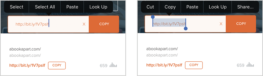
Another option is to make it easy for someone to access the URL and copy it. One UX pattern that works well is to place the URL in a form field that makes it easy to select and copy. Depending on the browser, you may also provide a copy button via the Clipboard API (Fig 3.6) (http://bkaprt.com/pwa/03-12/).
Chrome has added a notification on Android to help users copy and share URLs (Fig 3.7). However, because this is a low-priority notification, it doesn’t draw much attention—it uses smaller text, doesn’t buzz the device, and may get buried in the notification tray. Users will have to discover that this option exists, so you can’t depend on them knowing about it.
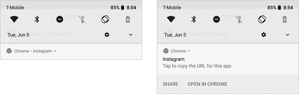
Fig 3.7: Chrome’s new low-priority notification is designed to allow users access to copy and share the URL of a progressive web app in standalone or fullscreen mode—so long as they can find the notification. The notification (left) for Instagram’s PWA is smaller than typical notifications, and doesn’t explain what purpose it serves until the user opens it (right).
In the future, it may be possible to use the Web Share API to connect to native sharing features on a given platform from within a web page. As of this writing, only Chrome and Opera currently support this standard (Fig 3.8) (http://bkaprt.com/pwa/03-13/).
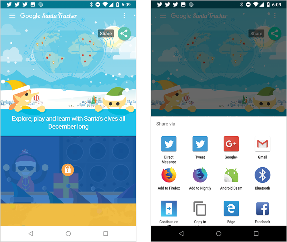
Fig 3.8: The 2017 version of Google’s Santa Tracker (left) used the Web Share API. They saw a 20 percent increase in sharing (right) for users who had the API available to them (http://bkaprt.com/pwa/03-14/).
Consider carefully whether the tradeoff of removing the sharing tools is worth it to gain the benefits of the additional screen real estate. You might find that the browser or minimal-ui display modes are better choices for your progressive web app. At a minimum, don’t jump blindly into standalone or fullscreen modes without a plan for how users will navigate and share your content—or access any of the other features found in the browser’s chrome.
It’s remarkable how much impact one simple declaration—display: fullscreen or display: standalone—can have on the size of our endeavor and, ultimately, our user experiences.
Context continuum
It’s easy to become fixated on what the experience is like when someone has installed our progressive web app. It’s fun to imagine our users tapping on our icon on their homescreen and launching the immersive experience we’ve envisioned.
But the reality is that for most progressive web apps, the majority of people will visit them from within a browser. That’s what makes progressive web apps powerful. People don’t have to install anything before they can access and gain benefit from your progressive web app. You can build a single web experience that serves both highly engaged people who have your app installed as well as first-time visitors. This means everyone gets the best experience and you save on development and maintenance costs.
Therefore, it’s important for us to keep in mind all of the varied ways in which someone will be interacting with our progressive web apps: in a mobile browser, on a desktop computer, in a web view inside a native app like Facebook, through an assistive device, and, hopefully, from an icon on their homescreen (Fig 3.9). There’s a reason why the first characteristic of a progressive web app is that it’s responsive.

Progressive web apps need to be considered from a continuum of browser contexts. A well-designed progressive web app will adapt to whatever the viewing context is.
Speed and Fluidity
One of the ways that Google suggests web developers make their website feel more “appy” is by using an app shell architecture. The shell refers to the common components necessary to build the user interface and power the app: navigation, header, footer, app logic—the things that should always be booted up when your app loads. Inside the shell is the content that changes from page to page (Fig 3.10).

Once the shell is separated from the content, it can be cached offline so that when someone opens the app, the shell loads instantly, no matter what the network conditions are like. All that the browser needs to retrieve to build that page, and any subsequent pages, is the new content. So not only does the skeleton of the page load quickly, but the amount of data necessary for each page is reduced significantly, and you can animate transitions between pages.
The app shell model has benefits even for browsers that don’t support service workers. The perceived speed of a web page matters more than the true speed. When app shell elements show up on the screen sooner, they create the perception of a faster browsing experience (Fig 3.11) (http://bkaprt.com/pwa/03-16/).
I believe this is one of the reasons why the Washington Post saw similar levels of engagement with its progressive web app test on iOS and Android. I conducted side-by-side tests of the Washington Post’s previous mobile web experience with its progressive web app. In one of my tests, I found that the progressive web app actually took more time to complete loading, but felt significantly faster than the old mobile website because the app shell model loaded the content that mattered sooner (http://bkaprt.com/pwa/03-17/).

Transitions between pages
In a traditional website architecture, each page loads as a unique item. You have no control over how the browser transitions between pages. But if you’ve built your progressive web app with an app shell, you gain the ability to control how your app transitions from page to page.
Controlling the way content comes into view can help users maintain a sense of the hierarchy in an application—particularly on a mobile device. When someone selects an item, you might slide the new content in from the right; when they select the back button, slide the content in from the left (Fig 3.12). This would reinforce the idea that moving to the right reveals more detailed information, while moving to the left backtracks up the app hierarchy (Fig 3.13).

Fig 3.12: Wego slides content in from the right as you dig deeper into the app.

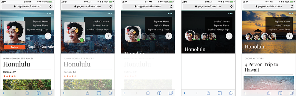
Page transitions aren’t limited to sliding from one direction or the other. Sarah Drasner recently described how to use web animation to create native-like transitions that keep one element of the page in focus as the page changes. On her demo site, the avatar remains visible and changes size and location as the user switches between pages in the application (Fig 3.14) (http://bkaprt.com/pwa/03-18/). Drasner explained:
Transitioning between two states can reduce cognitive load for your user, as when someone is scanning a page, they have to create a mental map of everything that’s contained on it. …Without these transitions, changes can be startling. They force the user to remap placement and even their understanding of the same element. It is for this reason that these effects become critical in an experience that helps the user feel at home and gather information quickly on the web. (http://bkaprt.com/pwa/03-19/)
Smooth scrolling
As mentioned earlier, the perception of speed matters more than actual speed. If your progressive web app doesn’t feel smooth, then it is likely to be perceived as slow, no matter how fast it truly is.
Pages that jump around while loading or sputter while scrolling frustrate users and diminish the polish of your progressive web app. Avoid late-loading images and scripts that modify the page layout. If items are going to load later, provide the browser with enough information to save space for the item in the layout.
Skeleton screens are one way of making pages feel fast and smooth while saving space in the layout for later loading items. Skeleton pages put placeholders on the page until the actual content loads (Fig 3.15). With service workers, these placeholders can be stored offline and loaded nearly instantaneously.

Pay close attention to how smooth and interactive your progressive web app feels. Be sure to test on mobile and lower-end devices to make sure that your app continues to perform smoothly on devices that have slower CPUs and less memory available. Too much JavaScript or too many layers will result in slow loads, sticky transitions, and poor scrolling behavior (http://bkaprt.com/pwa/03-20/).
Over the years, there have been many attempts by browser makers and standards bodies to enable page transitions without adopting an app shell model. Unfortunately, none of these alternatives have gotten off the ground. If you want to control how your app transitions from page to page, you’ll need to adopt an app shell model, or something similar like Barba.js (http://bkaprt.com/pwa/03-21/).
Single-page applications
The app shell model has obvious advantages, but it isn’t a no-brainer decision to build a progressive web app using an app shell. Using app shell frequently implies that you’re building a single-page application (sometimes referred to as a SPA). If your current website isn’t using the single-page application model, moving to one can be a major undertaking.
Traditional websites were designed to support the idea that people download multiple HTML documents in sequence. A person might view the homepage, product listing, and product detail page in succession. For each page viewed, the browser would request and download a new HTML document and render an entirely new page. Even if the experience feels similar from page to page, the browser treats each document independently and replaces the previous document with a new one (Fig 3.16).

With a single-page application, the first HTML document downloaded contains the information needed to power the application. Then, when any subsequent pages are requested, the application takes over from the browser and uses JavaScript to request the new content. The application then replaces the content of the current page with the new content (Fig 3.17).
This single-page application approach dovetails nicely with the app shell model because the app shell can stay in place after the JavaScript application boots up. But moving from traditional website architecture to a single-page application could require major changes in everything from the technology you use on your server to your team’s skill sets and composition.
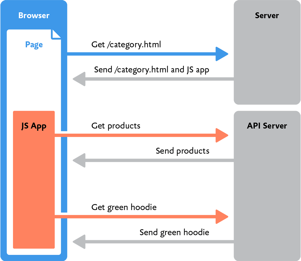
For example, to support a single-page application, the server must be able to respond to requests solely for content, rather than providing the full web page. This typically means that the server needs to provide application programming interfaces (APIs) that the application can consume. Ideally, these APIs will return content in a structured manner (such as a JSON file) that can be modified and manipulated by the JavaScript application. If your website has a traditional architecture, you may need to build those APIs before you can build a single-page application.
On the client-side, the complexity of the JavaScript required increases tremendously when you move to a single-page application. The JavaScript application must support history, routing, API calls, rendering content, and a host of other features that aren’t necessary in a traditional architecture. Because of this complexity, this is a point at which developers often seek out JavaScript frameworks (like Vue.js, Svelte, Preact, or Polymer) that have already solved these problems.
Server-rendered JavaScript
If you do decide to build a single-page application using app shell, that doesn’t mean you can ignore fundamental web principles such as progressive enhancement.
Single-page applications can speed up subsequent page loads after the application is up and running, but all of the application code still needs to be downloaded on that first page load. And if the application is complex, moving to a single-page application may slow down the site. You’ve likely encountered websites that seem like their pages should load quickly, but instead you’re forced to watch a loading indicator (Fig 3.18). Often these sites have been built as a single-page application unnecessarily, forcing you to wait while the JavaScript application is started.

To avoid this slowdown, make sure that the server delivers a full HTML document containing all of the content on the first load, and then have the JavaScript application take over for any subsequent requests.
A popular way to do this is to use a JavaScript framework that supports server-side rendering. That way, the JavaScript code you write to render pages in the browser can also be used to generate the initial HTML document sent by the server on a user’s first visit (Fig 3.19). This idea of using the same JavaScript on the server and in the browser is referred to as isomorphic JavaScript.
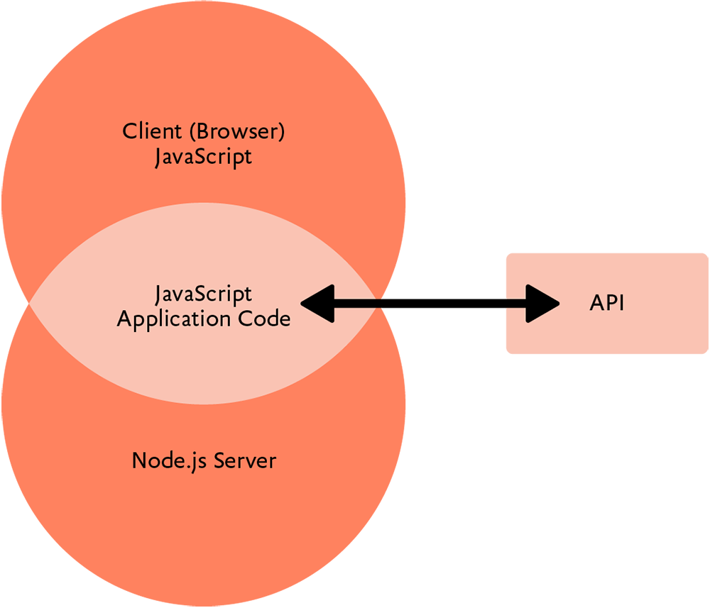
Isomorphic JavaScript can provide significant time savings. For example, a product page template might need to connect to an API to retrieve information about a specific product. In a traditional web architecture, the code running on the server to connect to the API might be written in a language like Ruby or Python. But the same page might also need to connect to the same API from inside the browser, so all of the code would have to be rewritten in JavaScript. If, instead, you use a web server that understands JavaScript (such as Node.js), you can write code to connect to the API once and use it in both places.
If you build a server-rendered, single-page application, take care to avoid silently breaking your user experience with too much JavaScript. Because JavaScript must be processed on the browser’s main thread, the time it takes to download and process it delays interactivity for your users. As Alex Russell wrote, “JavaScript is the single most expensive part of any page in ways that are a function of both network capacity and device speed” (http://bkaprt.com/pwa/03-22/). Too frequently, single-page applications will download the content necessary to render the first paint of the page, but because JavaScript continues to process, the page itself is not interactive. Users can see the page, but they can’t do anything with it— particularly on mobile devices where CPUs are slower.
A better approach for the performance of your progressive web app is what Google calls the PRPL pattern (http://bkaprt.com/pwa/03-23/):
- Push critical resources for the initial URL route.
- Render initial route.
- Pre-cache remaining routes.
- Lazy-load and create remaining routes on demand.
The pattern places an emphasis on making sure that the page is interactive as quickly as possible. Following the PRPL pattern allows you to defer loading JavaScript until much later when the service worker is installed. Doing so ensures that users will get always-interactive pixels on the first visit, and a better, more interactive experience on subsequent visits—all without suffering the lag of unknowably-large JavaScript download and evaluation.
In an ideal world, you have all of the APIs needed to support your progressive web app, your server supports isomorphic JavaScript, and your team is well versed on building performant single-page applications using the PRPL pattern.
But in my experience, few companies live in that ideal world. More likely, the move to an app shell model will require unforeseen, fundamental changes to your website’s infrastructure. It isn’t a change to be undertaken lightly, but there are substantial benefits to moving to an app shell model—particularly as part of a move towards more code reuse via isomorphic JavaScript and server-side rendering.
Shell-optional
Thankfully, app shell isn’t required for a progressive web app. It’s a common misconception that you need to use app shell if you want to build a progressive web app. Remember: all you need to convert a website into a progressive web app is to add HTTPS, a service worker, and a manifest file.
My company’s site, cloudfour.com, was built on top of WordPress. We optimized it for performance before we made it into a progressive web app. After we added service workers, our site was so fast that we decided it didn’t make sense to do the extra work to convert it to app shell.
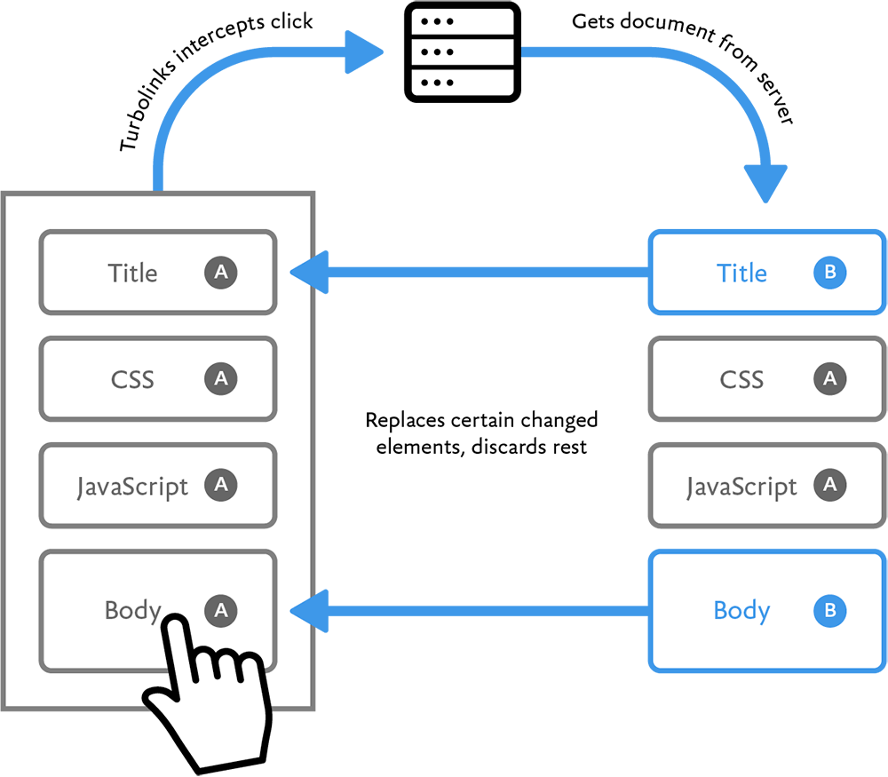
If you feel strongly that you want to utilize app shell, but cannot do so immediately due to technical constraints, you may be able to use a library like Turbolinks, which attempts to provide a single-page application experience without requiring a rebuild of your entire website (http://bkaprt.com/pwa/03-24/). It works by fetching the full HTML page for subsequent requests and swapping out the body content (Fig 3.20).
Another way to support fast loading experiences without creating a single-page application is to take advantage of the new Streams API. This allows you to stream portions of your HTML and other files to the browser separately, which allows the browser to start building the page more quickly. For an example of how this works, check out Paul Kinlan’s post on how he used the Streams API to create a feed reader application without an app shell (http://bkaprt.com/pwa/03-25/).
Bottom line: don’t let the lack of an app shell prevent you from converting your current website into a progressive web app. Your visitors will benefit immediately from your efforts—app shell or no app shell.
Polish and Personality
When people talk about why they prefer apps, they often come back to intangible sentiments like “they just feel better.” Apple talks about apps that “delight” users. In both cases, what this means is that the apps are providing a polished user interface imbued with personality. There’s no reason why you can’t provide the same with a progressive web app.
Native apps don’t have a monopoly on UI polish. Yes, the tools that Apple, Google, and Microsoft provide can make it easier to create polished interfaces than starting from scratch in a blank HTML document, but there are plenty of slow and ugly native apps. What makes a great app is attention to detail in the design—particularly details like interactive feedback and animation.
Feedback
Apple’s Human Interface Guidelines recommend providing “perceptible feedback in response to every user action” (http://bkaprt.com/pwa/03-26/). Immediate feedback—such as highlights, sounds, animations, and other responses to interaction—help users understand where they are, what they’re doing, and how they can interact with the app.
Google’s Material Design also places an emphasis on providing feedback with every interaction. For instance, selecting a button triggers a radial animation to let users know that their selection has been registered (Fig 3.21). You can take inspiration from the feedback guidelines for native platforms, but don’t limit yourself to them. Between CSS and SVG animations, nearly any animated feedback you might want to create is now possible.
Fig 3.21: Material Design uses a ripple effect when someone selects a button to provide instant feedback to the user that their action has been recognized (http://bkaprt.com/pwa/03-27/).
Sound and vibration are commonly used in desktop sites and native apps. Facebook and LinkedIn use sound on the web to notify users when messages arrive. Twitter’s native app also uses unobtrusive sound for notifications, and adds a vibration when users refresh their feeds—subtle touches that, unfortunately, aren’t present in Twitter’s progressive web app. Progressive web apps could easily include the same kinds of auditory and tactile feedback, but few do.
When designing feedback, try to convey not only that something has happened, but what, exactly, has happened. For example, Stripe’s payment submission buttons immediately give visual feedback by morphing into a progress indicator, before becoming a checkbox to indicate that the payment has been submitted successfully (Fig 3.22).

Animation
One thing that commonly sets native apps apart from web apps is native’s use of animation. For many years, browsers were incapable of displaying animations in a performant, stutter-free way. Now, however, web animations have reached a maturity level that make it possible to create the sort of polished interfaces we expect. Browser makers have moved as much animation as possible to the graphical processor unit (GPU) of the device so that the animation won’t compete for resources with the rest of the page. These GPU-accelerated animations can be as smooth and rich as those available in native applications—assuming we take advantage of them.
Frankly, not enough websites do, which is a shame: animation is a way to make your progressive web app stand out. It’s a powerful tool for providing feedback (as we’ve just seen), helping users understand how interfaces work, and enabling complex interactions on small screens. Best of all, it can play up your app’s personality.
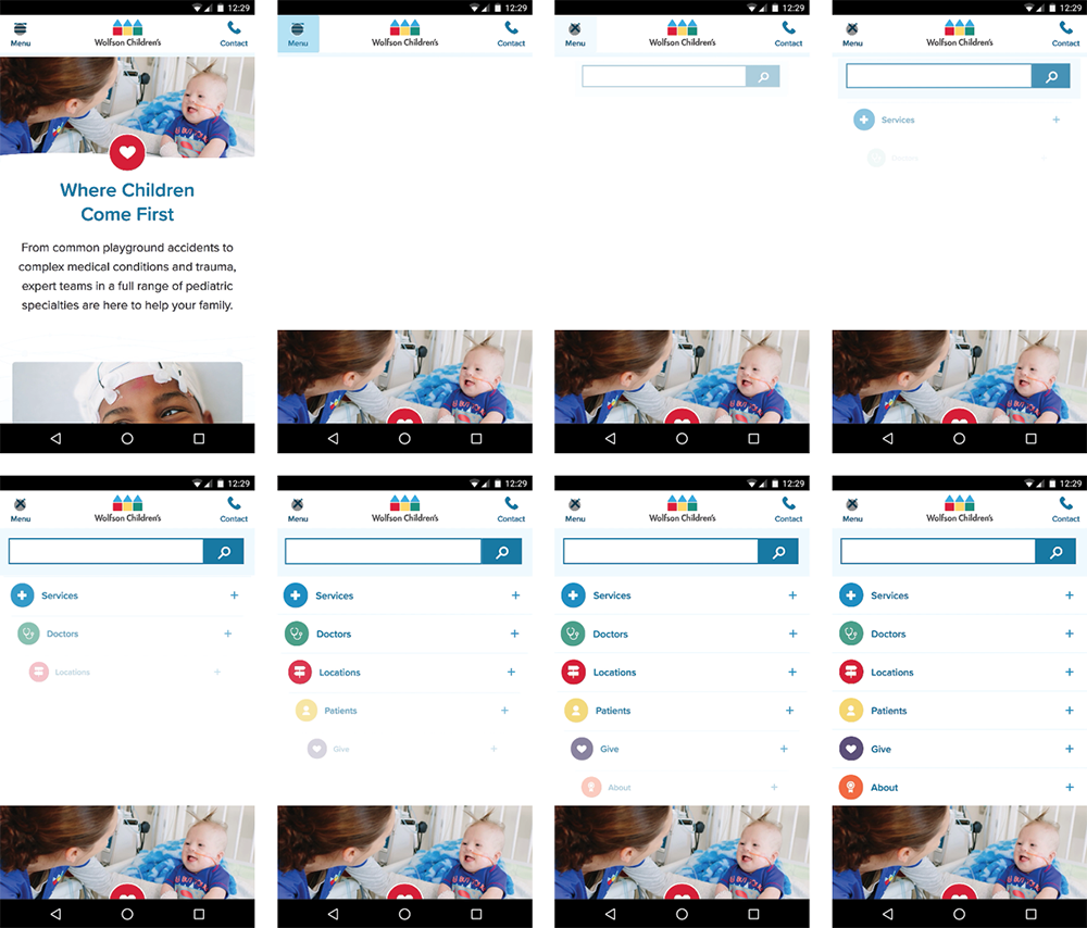
The opening and closing of menus, accordion interfaces, and carousels are places where some extra attention to the animation can make a difference. On a recent Cloud Four project, we redesigned the Wolfson Children’s Hospital website, showcasing cheerful photographs of the children and their inspiring stories. To match that personality, my colleague Tyler Sticka created a playful animation for opening the menu (Fig 3.23). The navigation animation bounced in a childlike way, and incorporated the bright, primary colors of the Wolfson brand.
When working with the small canvas of mobile devices, animation becomes a necessary tool to help users understand the relationship between objects—particularly objects that are hidden or exist offscreen. On another Cloud Four project, we converted a Walmart Grocery interface that allowed customers to select a time slot for delivery. The widescreen version of the chart showed several days of options, but when viewed on a mobile device, we only had room to show a single day (Fig 3.24).
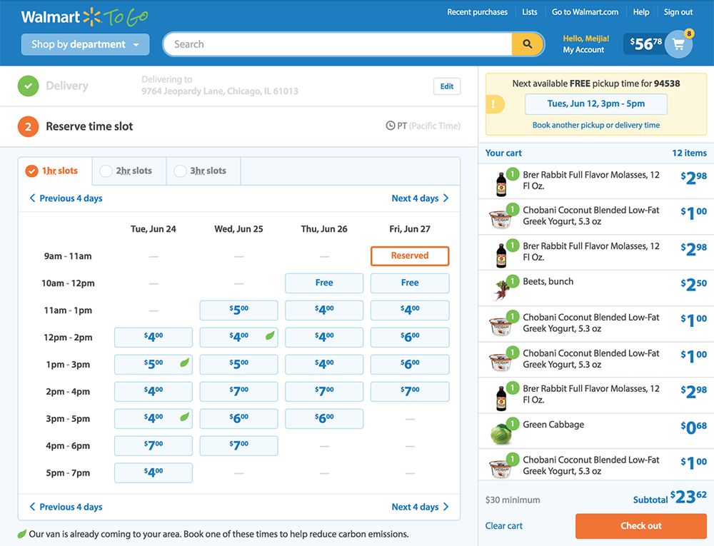
Our initial solution was to let users move quickly to the next and previous days via buttons and a horizontally scrolling list. However, when we prototyped the interaction, we found it was a jarring experience: because the number of time slots varied each day, switching days caused the page to suddenly change in size and move sideways, leaving users confused as to what had just happened.
To help users connect the dots, we added animations (Fig 3.25):
- After a user selects the button to go to another day, the page automatically scrolls up until the list of days is visible. By positioning the page at the top, the varying length of the content is less of an obstacle because the list of days is always in the same place. It provides a fixed object that gives users context for the animation.
- Then, the next day’s time slots slide in from the right.
- As the next day slides into view, the list of days also slides from the right, and the green highlight moves from the one date to the next.
- If there are fewer available time slots, the page shrinks at a rate consistent with the time it takes to slide in that day’s information.
All of these animations happen in a little over a second. People are unlikely to recognize the number of animations in use—nor the amount of testing and experimentation it took to find the right combination—but they would surely notice if the animation were missing.

Fig 3.25: Walmart Grocery’s time slot picker combines multiple animations to avoid a jarring experience.
Animation can also be fun and delight users, but when animation isn’t tied to a specific UX goal, striking the right balance can be tough. Too many websites attempt to show off with animation, like the current fad of animating objects as they scroll into view. Often animation like this gets in the way and annoys users—undermining the design’s objective.
However, it is possible to use animation that adds personality and doesn’t detract from the user experience. For example, Darin Senneff created a demo login form featuring a friendly creature who reacts as users complete the form (Fig 3.26). As the user enters their email address, the creature follows along and smiles in a way that encourages the user. When they enter a password, the creature covers its eyes—but peeks if the Show checkbox is selected. This is the sort of touch that can make a progressive web app stand out from the competition.
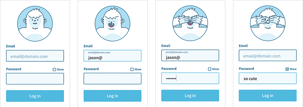
Fig 3.26: Darin Senneff’s animated login form demonstrates how animation done right can add personality and delight (http://bkaprt.com/pwa/03-28/).
As with page transitions and JavaScript enhancements, animations can generate lag if you’re not careful. Browsers have become much better at supporting animations on a wide range of mobile devices, but be sure to test on underpowered devices to make sure your animations remain smooth. Stick to GPU-composited animation properties (http://bkaprt.com/pwa/03-29/), and reduce the number of layers that need to be composited (http://bkaprt.com/pwa/03-30/).
Animations should always be treated as enhancements, not requirements. Not all devices can support animation, including some types of assistive technology; many people, such as those with motion sensitivity or vestibular disorders, may prefer to turn animations off. Make sure that your designs can serve all users, even if the animation can’t or won’t be seen. For more information on the how and why behind responsible animation use, check out Animation at Work by Rachel Nabors.
Build an Exceptional Experience
Remember that the more you push your progressive web app to “feel like an app,” the more work it will be. That’s not to say you shouldn’t commit to that investment. Things like the app shell model, particularly when coupled with server-rendered JavaScript applications, can make a big difference in how a progressive web app feels, and can have additional benefits for your code reuse as well. Just recognize that there are surprises behind even simple things, like going fullscreen.
For your website, perhaps the “appy” parts of progressive web apps aren’t necessary. You can still use progressive web app technology to speed up your site and provide a better user experience. There’s nothing wrong with this approach.
If you want to build something on the other end of the site-to-app spectrum, be specific about what you want to accomplish. Being able to say what you want for your app—to feel faster, to be more immersive, to have more personality—will help you evaluate which solutions make the most sense.
In the end, whether or not something feels like an app or a website matters much less to our users than whether or not it is an exceptional experience. Build something that works for people, and they’ll install it, use it, and won’t care what you call it. But before they can install it, they need to be able to find it—so we’ll look at making your app discoverable next.