The ggplot2 package contains a vast number of functions for creating a wide variety of plots. It would take an entire book to cover it all—there are already several that cover it—so I cannot attempt this here. In this chapter, I will only try to give you a flavor of how the package works.
The Basic Plotting Components in ggplot2
Unlike in R’s base graphics, with ggplot2 you do not create individual plot components by drawing lines, points, or whatever you need onto a graphics canvas. Instead, you specify how your data should be mapped to abstract graphical aesthetics, for example, x- and y-coordinates, colors, shapes, etc. Then you specify how aesthetics should be represented in the graphics, for example, whether x- and y-coordinates should be plotted as scatter plots or lines. On top of this, you can add graphics information such as which shapes points in a scatter plot should have, which colors the color aesthetics maps, and such. You add attributes as separate steps which makes it easy to change a plot. If you want to add a linear regression to your plot, you can do it with a single command; since ggplot2 already knows which of your data variables are mapped to the x- and y-coordinates, it simply computes the linear regression and adds it to the plot. If you want to plot your data on a log scale, you tell ggplot2 that the axis should be log-transformed.
At first, ggplot2 might seem more complicated than basic R’s graphics, but you will soon get used to it.
Data—Obviously, you have data you want to plot.
Aesthetics—Aesthetics map data to abstract graphical concepts such as x- and y-coordinates, colors, and fills.
Geometries—Geometries, geometric objects, determine which kind of plot you are making, for example, whether you will get a histogram, a scatter plot, or a boxplot.
Statistics—Statistics specify how the data should be summarized before plotting. Your data is not always summarized, that is, the statistics can be the identity mapping. A scatter plot doesn’t compute a summary for the x- and y-coordinates, but a regression line or a histogram does.
Scales—Scales specify how the data you mapped to graphical concepts with the aesthetics should actually be placed on a plot. Your x- and y-coordinate data might be measured in meters, but those meters should be mapped to points on your plot. The scales are responsible for this.
Coordinates—Coordinates allow you to transform the result of scaling your data to plot components. If, for example, you want your plot to show the y-axis on a log scale, then the coordinate transformation does this.
Faceting—Faceting splits your plot into subplots based on variables in your data.
To add components to a plot, you use addition. The ggplot2 package does not use pipelines. You often see data piped into the ggplot() call, though, but after that, you must remember to add rather than pipe.
A layer creates (part of) the graphics you can see. At a minimum, it must consist of data, aesthetics, a statistics (can be the identity), and a geometric object (that might specify the statistics). Your plot must have at least one layer before your plot shows your data.
Adding Components to a Plot Object
but in this case, the plot is empty—we didn’t add anything to it when we created p—so I haven’t shown the result.
Why would anyone create an empty plot object? You cannot print the empty object. Well, you can, but you will get an empty canvas, so there is not much point to that. You can, however, build up a plot by adding components to it. You can start with the empty plot and add all you want to it in separate commands.
Adding Data
You add data to a plot as an argument to ggplot(). If you want to add data to the empty plot, you will use geometries; see the following example. If you add data in the ggplot() function, then all components you add to the plot later will be able to see the data.
at the top. It shows you the variables in the data. They are not mapped to any graphical objects yet; that is the purview of aesthetics.
Adding Aesthetics
What we see in a plot are points, lines, colors, etc. To create these plots, ggplot2 needs to know which variables in the data should be interpreted as coordinates, which determines line thickness, which determines colors, and so on. Aesthetics do this.
Plotting (printing) this will give you an empty plot where the x- and y-axes match the range of the data’s x and y (foo and bar) values. The plot is otherwise empty because it does not have a geometry.
Adding Geometries
Geometries specify the type of the plot. They use the aesthetics’ maps from the data to graphical properties and create a plot based on them.
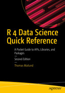
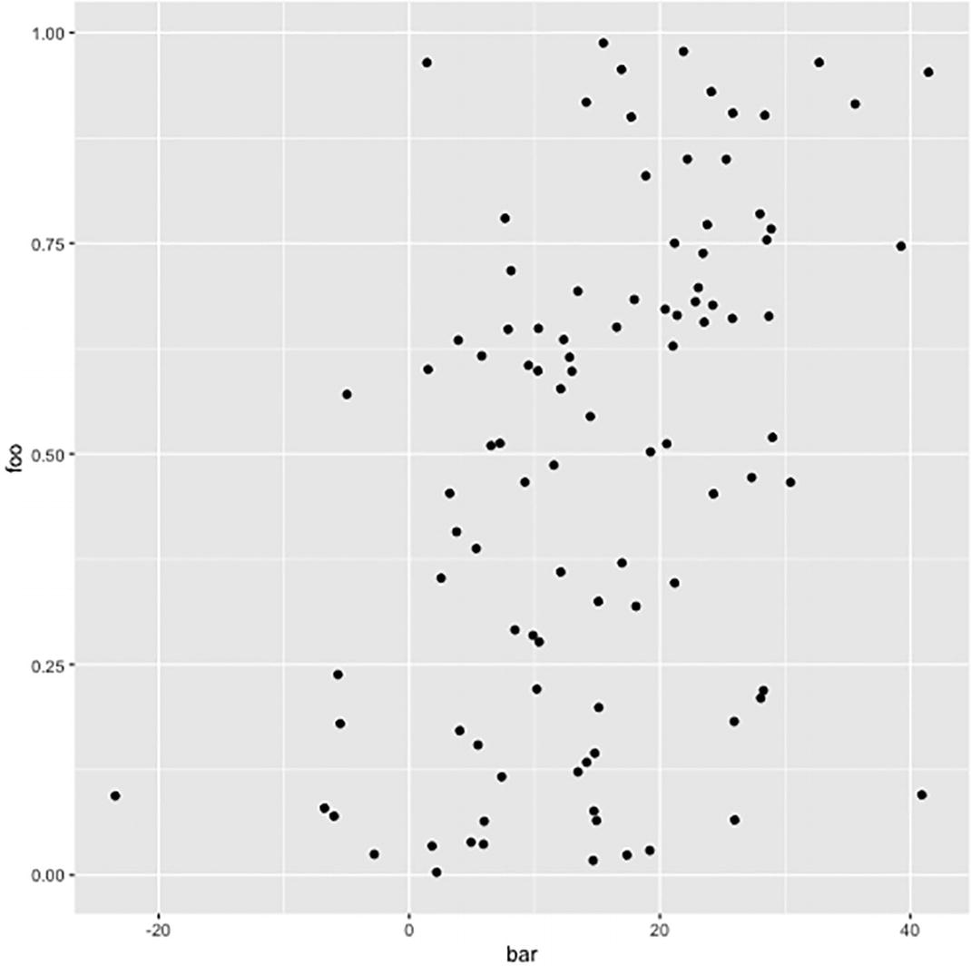
A scatter plot was created using g g plot 2. The dots with slight variation in the shades are scattered all over the plot.
Point geometry plot
but otherwise, there is little change. This can be used to add additional data to a plot. It also shows that it sometimes can make sense to start with an empty plot object and then add different data sets in different geometries.

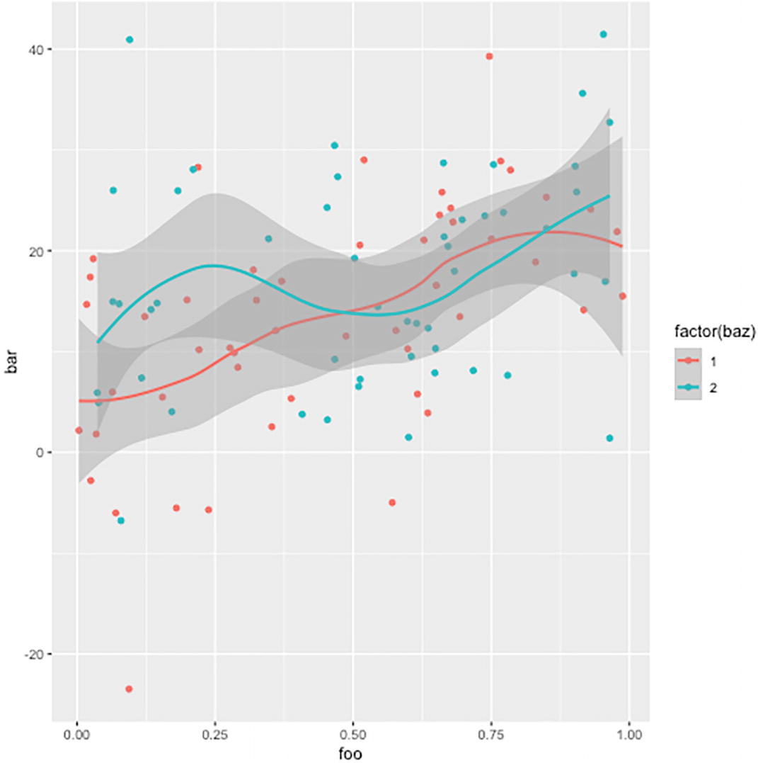
A scatterplot with an added aesthetic parameter of color change in g g plot 2. Two differently shaded dots labeled factors 1 and 2 are scattered.
Discrete color aesthetics
You can change the levels in the factor to reorder the legend. See Chapter 10 for more on manipulating factors.
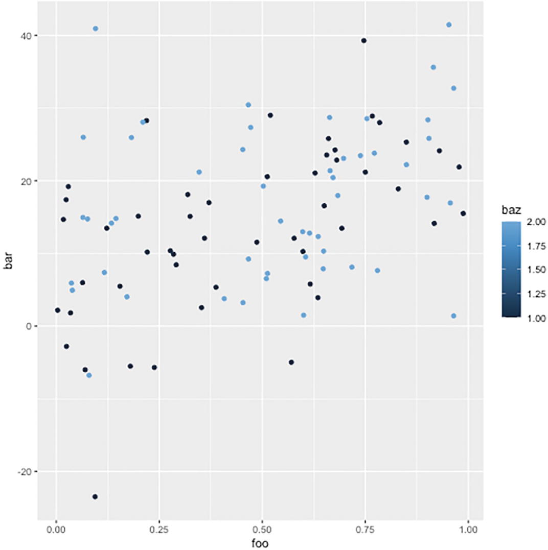
A line plot geometry in a g g plot 2. The differently shaded lines, labeled factors 1 and 2, rise and decline to form closely spaced sharp peaks.
A line plot
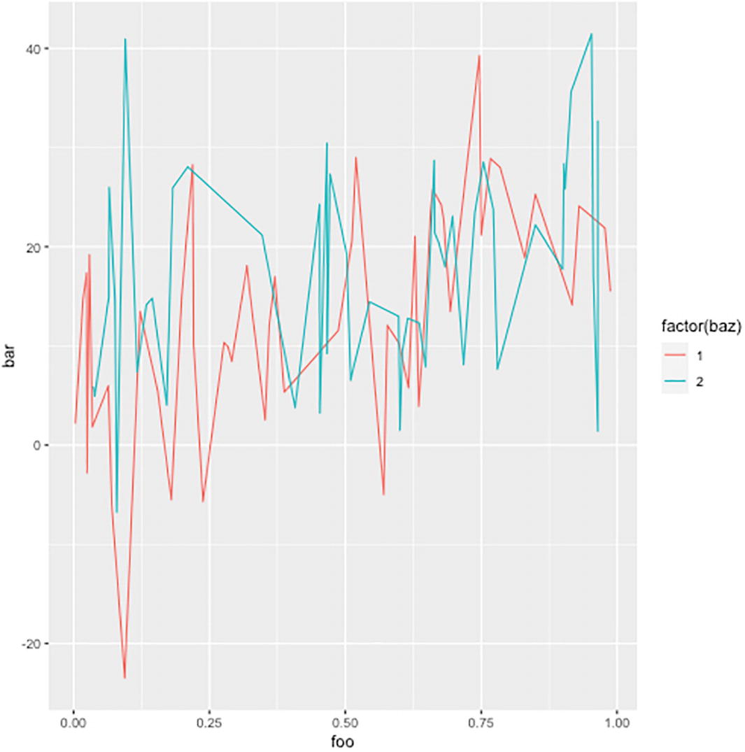
You can have more than one geometry; see the following example.
Observe that the smooth geometry does not have the identity statistics. It shows a summary of the data, and the mapping from the data to that summary is handled by a stat_smooth statistics .
A g g plot 2 with 2 added geometries. The plot of bar versus foo contains dots of different shades scattered throughout and a gradually inclined line.
Plot with two geometries
A g g plot 2 with 2 geometries and a color change aesthetic parameter. It has shaded scattered dots and 2 corresponding lines.
Plot with two geometries and a discrete color
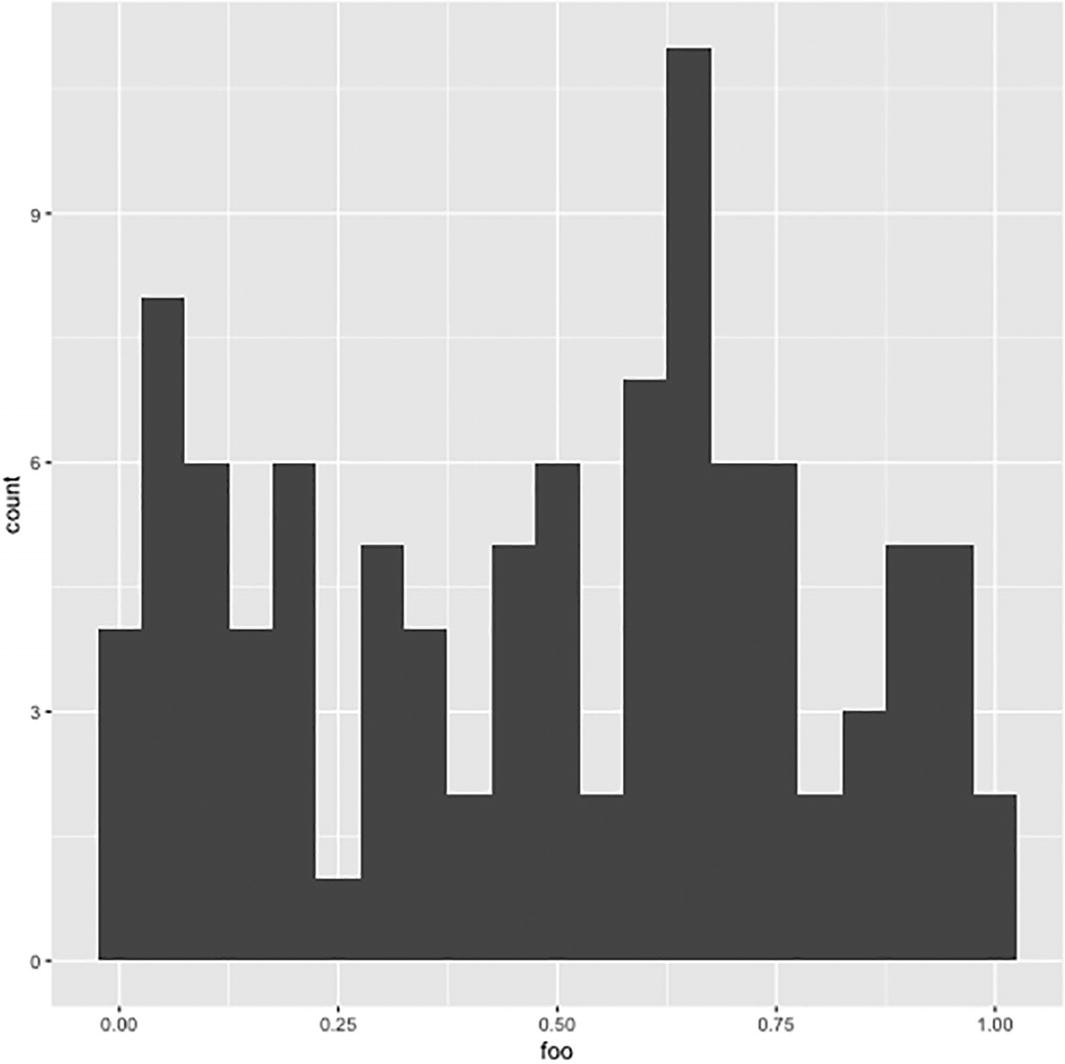
A histogram plotted using g g plot 2. The histogram plots count versus foo with the highest bar crossing 9 on the Y axis.
Histogram plot
Notice that you only need an x-axis for this geometry.
I think you see the pattern now.
Facets
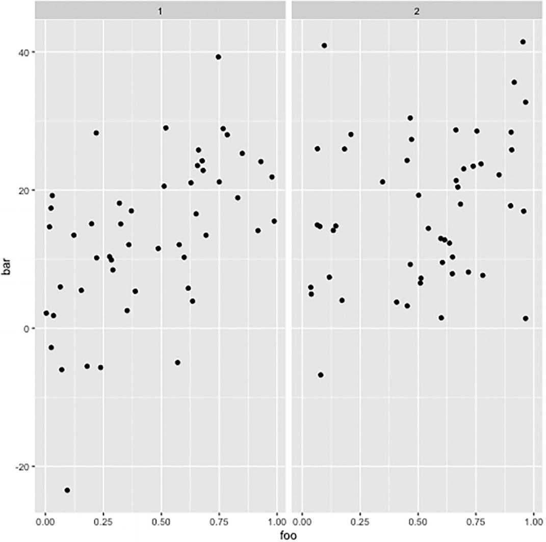
A scatterplot with a grid facet contains 2 subfigures. Plots 1 and 2 contain single-colored dots scattered all over the plot.
Faceting the plot
A scatterplot plot with a grid facet contains variables on two sides. Ten plots are arranged in 2 columns with dots in a straight line.
Facet grid for two variables
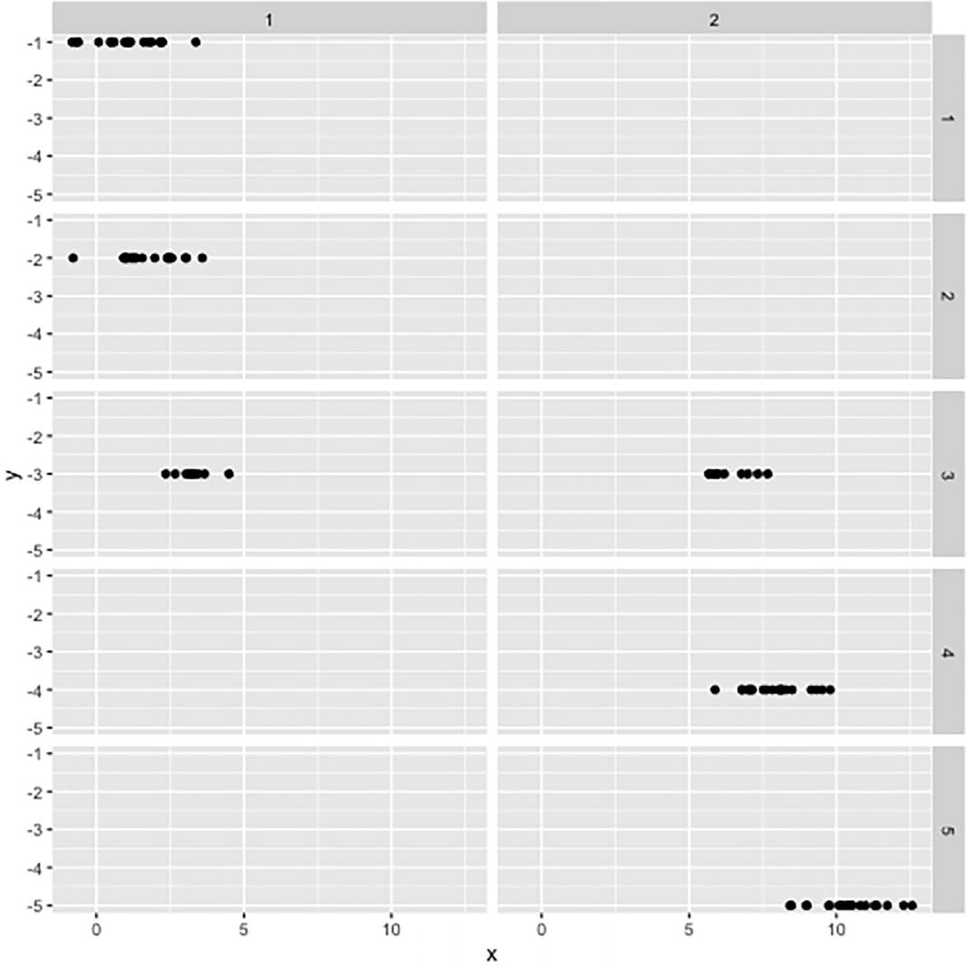
You can use more than two variables but (naturally) only two dimensions. If you use more than two variables, then the different categories will be shown as labels on the facet sides. You will see all combinations of factors that appear in the formula. As an example, consider this:

A g g plot with a grid facet contains 4 variables in g g plot 2. The plots are arranged in 10 columns and 6 rows with variables on both sides.
Facet with four variables
Adding Coordinates
A scatter plot of foo versus bar illustrates the feature of flipping the X axis in g g plot 2.
Plot with the x-coordinate flipped
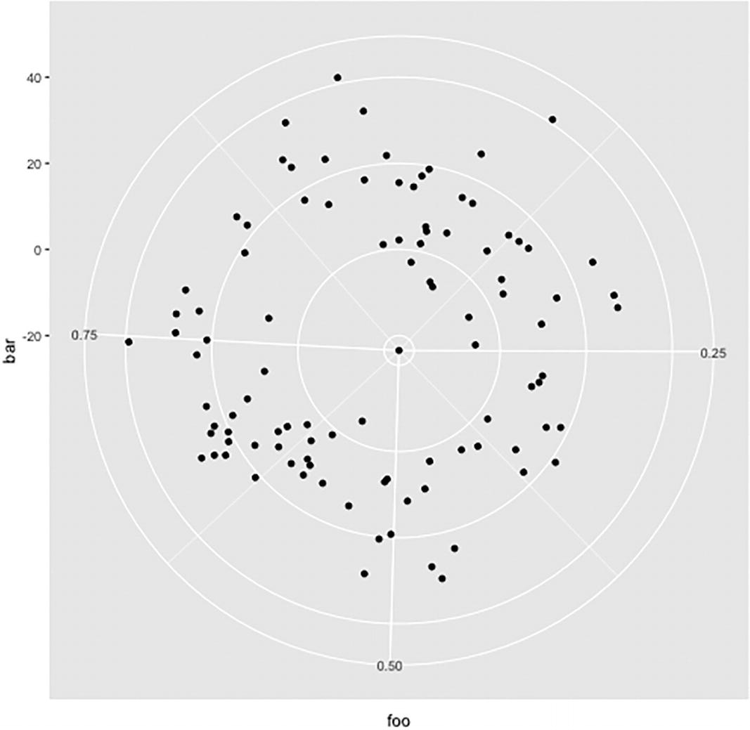
A radar plot with points plotted in polar coordinates using g g plot 2. The left, bottom, and right radii measure 0.75, 0.50, and 0.25, respectively.
Plot in polar coordinates
Modifying Scales
The way ggplot2 maps data to coordinates or colors is quite flexible. The aesthetics maps data to either x or y coordinate or to colors or fills (colors used to fill areas), but after that you can modify the corresponding plot properties. The functions for doing this start with scale_, then the property you want to change, and then what you want to do. The operations you modify depend on what you are changing, for example, a coordinate or a color or such.

A scatter plot of foo versus bar indicates the feature of modifying the range of axes and color variation in the baz scale in g g plot 2.
Plot with rescaled y-coordinate and colors
The list of all these transformation functions is too long to list in this chapter, so I refer you to the package documentation for more information.
With the space available here, I am only able to give you an idea of what you can do with the grammar of graphs implementing in ggplot2, but I hope that I have conveyed that with this package you have access to a powerful language for constructing plots. There is much more to it than what I have shown, and I urge you to explore the package in more detail on your own.