
Chapter 14. Time Series Analysis
Time series analysis has become a hot topic with the rise of quantitative finance and automated trading of securities. Many of the facilities described in this chapter were invented by practitioners and researchers in finance, securities trading, and portfolio management.
Before you start any time series analysis in R, a key decision is your choice of data representation (object class). This is especially critical in an object-oriented language such as R, because the choice affects more than how the data is stored; it also dictates which functions (methods) will be available for loading, processing, analyzing, printing, and plotting your data. When many people start using R they simply store time series data in vectors. That seems natural. However, they quickly discover that none of the coolest analytics for time series analysis work with simple vectors. We’ve found when users switch to using an object class intended for time series data, the analysis gets easier, opening a gateway to valuable functions and analytics.
This chapter’s first recipe recommends using the zoo or xts packages
for representing time series data. They are quite general and should
meet the needs of most users. Nearly every subsequent recipe assumes you
are using one of those two representations.
Note
The xts implementation is a superset of zoo, so xts can do
everything that zoo can do. In this chapter, whenever a recipe works
for a zoo object, you can safely assume (unless stated otherwise) that
it also works for an xts object.
Other Representations
Other representations of time series data are available in the R universe, including:
-
The
ftspackage -
The
irtsclass from thetseriespackage -
The
timeSeriespackage -
The
tsclass in the base distribution -
The
tsibblepackage, a tidyverse style package for time series
In fact, there is a whole toolkit, called tsbox, just for converting
between representations.
Two representations deserve special mention.
ts (base distribution)
The base distribution of R includes a time series class called ts. We
don’t recommend this representation for general use because the
implementation itself is too limited and restrictive.
However, the base distribution includes some important time series
analytics that depend upon ts, such as the autocorrelation function
(acf) and the cross-correlation function (ccf). To use those base
functions on xts data, use the to.ts function to “downshift” your
data into the ts representation before calling the function. For
example, if x is an xts object, you can compute its autocorrelation
like this:
acf(as.ts(x))
tsibble package
The tsibble package is a recent extension to the tidyverse,
specifically designed for working with time series data within the
tidyverse. We find it useful for cross-sectional data—that is, data
for which the observations are grouped by date, and you want to perform
analytics within dates more than across dates.
Date Versus Datetime
Every observation in a time series has an associated date or time. The
object classes used in this chapter, zoo and xts, give you the
choice of using either dates or datetimes for representing the data’s
time component. You would use dates to represent daily data, of course,
and also for weekly, monthly, or even annual data; in these cases, the
date gives the day on which the observation occurred. You would use
datetimes for intraday data, where both the date and time of observation
are needed.
In describing this chapter’s recipes, we found it pretty cumbersome to keep saying “date or datetime.” So, we simplified the prose by assuming that your data is daily and thus uses whole dates. Please bear in mind, of course, that you are free and able to use timestamps below the resolution of a calendar date.
See Also
R has many useful functions and packages for time series analysis. You’ll find pointers to them in the task view for Time Series Analysis.
14.1 Representing Time Series Data
Solution
We recommend the zoo and xts packages. They define a data structure
for time series, and they contain many useful functions for working with
time series data. Create a zoo object this way, where x is a vector,
matrix, or data frame, and dt is a vector of corresponding dates or
datetimes:
library(zoo)ts<-zoo(x,dt)
Create an xts object in this way:
library(xts)ts<-xts(x,dt)
Convert between representations of the time series data by using
as.zoo and as.xts:
as.zoo(ts)-
Converts
tsto azooobject as.xts(ts)-
Converts
tsto anxtsobject
Discussion
R has at least eight different implementations of data structures for
representing time series. We haven’t tried them all, but we can say that
zoo and xts are excellent packages for working with time series data
and better than the others that we have tried.
These representations assume you have two vectors: a vector of
observations (data) and a vector of dates or times of those
observations. The zoo function combines them into a zoo object:
library(zoo)#>#> Attaching package: 'zoo'#> The following objects are masked from 'package:base':#>#> as.Date, as.Date.numericx<-c(3,4,1,4,8)dt<-seq(as.Date("2018-01-01"),as.Date("2018-01-05"),by="days")ts<-zoo(x,dt)(ts)#> 2018-01-01 2018-01-02 2018-01-03 2018-01-04 2018-01-05#> 3 4 1 4 8
The xts function is similar, returning an xts object:
library(xts)#>#> Attaching package: 'xts'#> The following objects are masked from 'package:dplyr':#>#> first, lastts<-xts(x,dt)(ts)#> [,1]#> 2018-01-01 3#> 2018-01-02 4#> 2018-01-03 1#> 2018-01-04 4#> 2018-01-05 8
The data, x, should be numeric. The vector of dates or datetimes,
dt, is called the index. Legal indices vary between the packages:
zoo-
The index can be any ordered values, such as
Dateobjects,POSIXctobjects, integers, or even floating-point values. xts-
The index must be a supported date or time class. This includes
Date,POSIXct, andchronobjects. Those should be sufficient for most applications, but you can also useyearmon,yearqtr, anddateTimeobjects. Thextspackage is more restrictive thanzoobecause it implements powerful operations that require a time-based index.
The following example creates a zoo object that contains the price of
IBM stock for the first five days of 2010; it uses Date objects for
the index:
prices<-c(132.45,130.85,130.00,129.55,130.85)dates<-as.Date(c("2010-01-04","2010-01-05","2010-01-06","2010-01-07","2010-01-08"))ibm.daily<-zoo(prices,dates)(ibm.daily)#> 2010-01-04 2010-01-05 2010-01-06 2010-01-07 2010-01-08#> 132 131 130 130 131
In contrast, the next example captures the price of IBM stock at one-second intervals. It represents time by the number of hours past midnight starting at 9:30 a.m. (1 second = 0.00027778 hours, more or less):
prices<-c(131.18,131.20,131.17,131.15,131.17)seconds<-c(9.5,9.500278,9.500556,9.500833,9.501111)ibm.sec<-zoo(prices,seconds)(ibm.sec)#> 10 10 10 10 10#> 131 131 131 131 131
Those two examples used a single time series, where the data came from a
vector. Both zoo and xts can also handle multiple, parallel time
series. For this, capture the several time series in a matrix or data
frame and then create a multivariate time series by calling the zoo
(or xts) function:
ts<-zoo(df,dt)# OR: ts <- xts(dfrm, dt)
The second argument is a vector of dates (or datetimes) for each observation. There is only one vector of dates for all the time series; in other words, all observations in each row of the matrix or data frame must have the same date. See Recipe 14.5 if your data has mismatched dates.
Once the data is captured inside a zoo or xts object, you can
extract the pure data via coredata, which returns a simple vector (or
matrix):
coredata(ibm.daily)#> [1] 132 131 130 130 131
You can extract the date or time portion via index:
index(ibm.daily)#> [1] "2010-01-04" "2010-01-05" "2010-01-06" "2010-01-07" "2010-01-08"
The xts package is very similar to zoo. It is optimized for speed,
so is especially well suited for processing large volumes of data. It is
also clever about converting to and from other time series
representations.
One big advantage of capturing data inside a zoo or xts object is
that special-purpose functions become available for printing, plotting,
differencing, merging, periodic sampling, applying rolling functions,
and other useful operations. There is even a function, read.zoo,
dedicated to reading time series data from ASCII files.
Remember that the xts package can do everything that the zoo package
can do, so everywhere that this chapter talks about zoo objects you
can also use xts objects.
If you are a serious user of time series data, we strongly recommend studying the documentation of these packages in order to learn about the ways they can improve your life. They are rich packages with many useful features.
See Also
See CRAN for documentation on
zoo and
xts, including reference
manuals, vignettes, and quick reference cards. If the packages are
already installed on your computer, view their documentation using the
vignette function:
vignette("zoo")vignette("xts")
The timeSeries package is another good implementation of a time series
object. It is part of the Rmetrics project for quantitative finance.
14.2 Plotting Time Series Data
Discussion
The generic plot function has a version for zoo objects and xts
objects. It can plot objects that contain a single time series or
multiple time series. In the latter case, it can plot each series in a
separate plot or together in one plot.
Suppose that ibm.infl is a zoo object that contains two time series.
One shows the quoted price of IBM stock from January 2000 through
December 2017, and the other is that same price adjusted for
inflation. If you plot the object, R will plot the two time series
together in one plot, as shown in Figure 14-1:
load(file="./data/ibm.rdata")library(xts)main<-"IBM: Historical vs. Inflation-Adjusted"lty<-c("dotted","solid")# Plot the xts objectplot(ibm.infl,lty=lty,main=main,legend.loc="left")
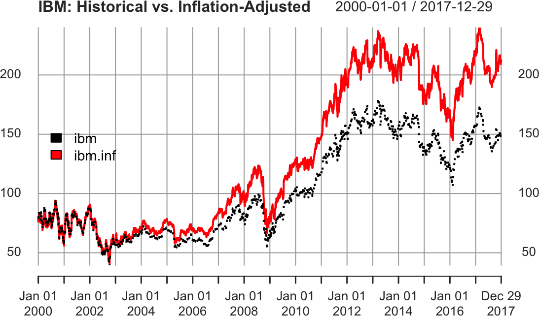
Figure 14-1. Example xts plot
The plot function for xts provides a default title as simply the
name of the xts object. As we show here, it’s common to set the main
parameter to a more meaningful title.
The code specifies two line types (lty) so that the two lines are
drawn in two different styles, making them easier to distinguish.
14.3 Extracting the Oldest or Newest Observations
Solution
Use head to view the oldest observations:
head(ts)
Use tail to view the newest observations:
tail(ts)
Discussion
The head and tail functions are generic, so they will work whether
your data is stored in a simple vector, a zoo object, or an xts
object.
Suppose you have an xts object with a multiyear history of the price of
IBM stock, like the one used in the prior recipe. You can’t display the
whole dataset because it would scroll off your screen. But you can view
the initial observations:
ibm<-ibm.infl$ibm# grab one column for illustrationhead(ibm)#> ibm#> 2000-01-01 78.6#> 2000-01-03 82.0#> 2000-01-04 79.2#> 2000-01-05 82.0#> 2000-01-06 80.6#> 2000-01-07 80.2
And you can view the final observations:
tail(ibm)#> ibm#> 2017-12-21 148#> 2017-12-22 149#> 2017-12-26 150#> 2017-12-27 150#> 2017-12-28 151#> 2017-12-29 150
By default, head and tail show (respectively) the six oldest and six
newest observations. You can see more observations by providing a second
argument—for example, tail(ibm, 20).
The xts package also includes first and last functions, which use
calendar periods instead of number of observations. We can use first
and last to select data by number of days, weeks, months, or even
years:
first(ibm,"2 week")#> ibm#> 2000-01-01 78.6#> 2000-01-03 82.0#> 2000-01-04 79.2#> 2000-01-05 82.0#> 2000-01-06 80.6#> 2000-01-07 80.2
At first glance this output might be confusing. We asked for "2 week"
and xts returned six days. That might seem off until we look at a
calendar of January 2000 (Figure 14-2).

Figure 14-2. January 2000 calendar
We can see from the calendar that the first week of January 2000 has
only one day, Saturday the 1st. Then the second week runs from the 2nd
to the 8th. Our data has no value for the 8th, so when we ask first
for the first "2 week" it returns all the values from the first two
calendar weeks. In our example dataset the first two calendar weeks
contain only six values.
Similarly, we can ask last to give us the last month’s worth of data:
last(ibm,"month")#> ibm#> 2017-12-01 152#> 2017-12-04 153#> 2017-12-05 152#> 2017-12-06 151#> 2017-12-07 150#> 2017-12-08 152#> 2017-12-11 152#> 2017-12-12 154#> 2017-12-13 151#> 2017-12-14 151#> 2017-12-15 149#> 2017-12-18 150#> 2017-12-19 150#> 2017-12-20 150#> 2017-12-21 148#> 2017-12-22 149#> 2017-12-26 150#> 2017-12-27 150#> 2017-12-28 151#> 2017-12-29 150
If we had been using zoo objects here, we would need to have converted
them to xts objects before passing the objects to first or last,
as those are xts functions.
See Also
See help(first.xts) and help(last.xts) for details on the first
and last functions, respectively.
14.4 Subsetting a Time Series
Solution
You can index a zoo or xts object by position. Use one or two
subscripts, depending upon whether the object contains one time series
or multiple time series:
ts[_i-]-
Selects the ith observation from a single time series
ts[j,i]-
Selects the ith observation of the jth time series of multiple time series
You can index the time series by date. Use the same type of object as
the index of your time series. This example assumes that the index
contains Date objects:
ts[as.Date("yyyy-mm-dd")]
You can index it by a sequence of dates:
dates<-seq(startdate,enddate,increment)ts[dates]
The window function can select a range by start and end date:
window(ts,start=startdate,end=enddate)
Discussion
Recall our xts object that is a sample of inflation-adjusted IBM stock
prices from the previous recipe:
head(ibm)#> ibm#> 2000-01-01 78.6#> 2000-01-03 82.0#> 2000-01-04 79.2#> 2000-01-05 82.0#> 2000-01-06 80.6#> 2000-01-07 80.2
We can select an observation by position, just like selecting elements from a vector (see Recipe 2.9):
ibm[2]#> ibm#> 2000-01-03 82
We can also select multiple observations by position:
ibm[2:4]#> ibm#> 2000-01-03 82.0#> 2000-01-04 79.2#> 2000-01-05 82.0
Sometimes it’s more useful to select by date. Simply use the date itself as the index:
ibm[as.Date("2010-01-05")]#> ibm#> 2010-01-05 103
Our ibm data is an xts object, so we can use date-like subsetting,
too (the zoo object does not offer this flexibility):
ibm['2010-01-05']ibm['20100105']
We can also select by a vector of Date objects:
dates<-seq(as.Date("2010-01-04"),as.Date("2010-01-08"),by=2)ibm[dates]#> ibm#> 2010-01-04 104#> 2010-01-06 102#> 2010-01-08 103
The window function is easier for selecting a range of consecutive
dates:
window(ibm,start=as.Date("2010-01-05"),end=as.Date("2010-01-07"))#> ibm#> 2010-01-05 103#> 2010-01-06 102#> 2010-01-07 102
We can select a year/month combination using yyyymm subsetting:
ibm['201001']# Jan 2010
Select year ranges using / like so:
ibm['2009/2011']# all of 2009 - 2011
Or use / to select ranges including months:
ibm['2009/201001']# all of 2009 plus Jan 2010ibm['200906/201005']# June 2009 through May 2010
14.5 Merging Several Time Series
Solution
Use a zoo or xts object to represent the time series, then use the
merge function to combine them:
merge(ts1,ts2)
Discussion
Merging two time series is an incredible headache when the two series have differing timestamps. Consider these two time series, with the daily price of IBM stock from 1999 through 2017 and the monthly Consumer Price Index (CPI) for the same period:
load(file="./data/ibm.rdata")head(ibm)#> ibm#> 1999-01-04 64.2#> 1999-01-05 66.5#> 1999-01-06 66.2#> 1999-01-07 66.7#> 1999-01-08 65.8#> 1999-01-11 66.4head(cpi)#> cpi#> 1999-01-01 0.938#> 1999-02-01 0.938#> 1999-03-01 0.938#> 1999-04-01 0.945#> 1999-05-01 0.945#> 1999-06-01 0.945
Obviously, the two time series have different timestamps because one is daily data and the other is monthly data. Even worse, the downloaded CPI data is timestamped for the first day of every month, even when that day is a holiday or weekend (e.g., New Year’s Day).
Thank goodness for the merge function, which handles the messy details
of reconciling the different dates:
head(merge(ibm,cpi))#> ibm cpi#> 1999-01-01 NA 0.938#> 1999-01-04 64.2 NA#> 1999-01-05 66.5 NA#> 1999-01-06 66.2 NA#> 1999-01-07 66.7 NA#> 1999-01-08 65.8 NA
By default, merge finds the union of all dates: the output contains
all dates from both inputs, and missing observations are filled with
NA values. You can replace those NA values with the most recent
observation by using the na.locf function from the zoo package:
head(na.locf(merge(ibm,cpi)))#> ibm cpi#> 1999-01-01 NA 0.938#> 1999-01-04 64.2 0.938#> 1999-01-05 66.5 0.938#> 1999-01-06 66.2 0.938#> 1999-01-07 66.7 0.938#> 1999-01-08 65.8 0.938
(Here locf stands for “last observation carried forward.”) Observe
that the NAs were replaced. However, na.locf left an NA in the first
observation (1999-01-01) because there was no IBM stock price on that
day.
You can get the intersection of all dates by setting all = FALSE:
head(merge(ibm,cpi,all=FALSE))#> ibm cpi#> 1999-02-01 63.1 0.938#> 1999-03-01 59.2 0.938#> 1999-04-01 62.3 0.945#> 1999-06-01 79.0 0.945#> 1999-07-01 92.4 0.949#> 1999-09-01 89.8 0.956
Now the output is limited to observations that are common to both files.
Notice, however, that the intersection begins on February 1, not January 1. The reason is that January 1 is a holiday, so there is no IBM stock price for that date and hence no intersection with the CPI data. To fix this, see Recipe 14.6.
14.6 Filling or Padding a Time Series
Discussion
The zoo package includes a handy feature in the constructor for zoo
objects: you can omit the data and build a zero-width object. The object
contains no data, just dates. We can use these “Frankenstein” objects to
perform such operations as filling and padding on other time series
objects.
Suppose you download monthly CPI data used in the last recipe. The data is timestamped with the first day of each month:
head(cpi)#> cpi#> 1999-01-01 0.938#> 1999-02-01 0.938#> 1999-03-01 0.938#> 1999-04-01 0.945#> 1999-05-01 0.945#> 1999-06-01 0.945
As far as R knows, we have no observations for the other days of the months. However, we know that each CPI value applies to the subsequent days through month-end. So first we build a zero-width object with every day of the decade, but no data:
dates<-seq(from=min(index(cpi)),to=max(index(cpi)),by=1)empty<-zoo(,dates)
We use min(index(cpi)) and max(index(cpi)) to get the minimum
and maximum index values from our cpi data. So our resulting empty
object is just an index of daily dates with the same range as our cpi
data.
Then we take the union of the CPI data and the zero-width object, yielding
a dataset filled with NA values:
filled.cpi<-merge(cpi,empty,all=TRUE)head(filled.cpi)#> cpi#> 1999-01-01 0.938#> 1999-01-02 NA#> 1999-01-03 NA#> 1999-01-04 NA#> 1999-01-05 NA#> 1999-01-06 NA
The resulting time series contains every calendar day, with NAs where
there was no observation. That might be what you need. However, a more
common requirement is to replace each NA with the most recent
observation as of that date. The na.locf function from the zoo
package does exactly that:
filled.cpi<-na.locf(merge(cpi,empty,all=TRUE))head(filled.cpi)#> cpi#> 1999-01-01 0.938#> 1999-01-02 0.938#> 1999-01-03 0.938#> 1999-01-04 0.938#> 1999-01-05 0.938#> 1999-01-06 0.938
January’s value of 1 is carried forward until February 1, at which
time it is replaced by the February value. Now every day has the latest
CPI value as of that date. Note that in this dataset, the CPI is based
on January 1, 1999 = 100% and all CPI values are relative to the value
on that date:
tail(filled.cpi)#> cpi#> 2017-11-26 1.41#> 2017-11-27 1.41#> 2017-11-28 1.41#> 2017-11-29 1.41#> 2017-11-30 1.41#> 2017-12-01 1.41
We can use this recipe to fix the problem mentioned in Recipe 14.5.
There, the daily price of IBM stock and the monthly CPI data had no
intersection on certain days. We can fix that using several different
methods. One way is to pad the IBM data to include the CPI dates and
then take the intersection (recall that index(cpi) returns all the
dates in the CPI time series):
filled.ibm<-na.locf(merge(ibm,zoo(,index(cpi))))head(merge(filled.ibm,cpi,all=FALSE))#> ibm cpi#> 1999-01-01 NA 0.938#> 1999-02-01 63.1 0.938#> 1999-03-01 59.2 0.938#> 1999-04-01 62.3 0.945#> 1999-05-01 73.6 0.945#> 1999-06-01 79.0 0.945
That gives monthly observations. Another way is to fill out the CPI data (as described previously) and then take the intersection with the IBM data. That gives daily observations, as follows:
filled_data<-merge(ibm,filled.cpi,all=FALSE)head(filled_data)#> ibm cpi#> 1999-01-04 64.2 0.938#> 1999-01-05 66.5 0.938#> 1999-01-06 66.2 0.938#> 1999-01-07 66.7 0.938#> 1999-01-08 65.8 0.938#> 1999-01-11 66.4 0.938
Another common method for filling missing values uses the cubic spline
technique, which interpolates smooth intermediate values from the known
data. We can use the zoo function na.spline to fill our missing
values using a cubic spline:
combined_data<-merge(ibm,cpi,all=TRUE)head(combined_data)#> ibm cpi#> 1999-01-01 NA 0.938#> 1999-01-04 64.2 NA#> 1999-01-05 66.5 NA#> 1999-01-06 66.2 NA#> 1999-01-07 66.7 NA#> 1999-01-08 65.8 NAcombined_spline<-na.spline(combined_data)head(combined_spline)#> ibm cpi#> 1999-01-01 4.59 0.938#> 1999-01-04 64.19 0.938#> 1999-01-05 66.52 0.938#> 1999-01-06 66.21 0.938#> 1999-01-07 66.71 0.938#> 1999-01-08 65.79 0.938
Notice that both the missing values for cpi and ibm were filled.
However, the value filled in for January 1, 1999 for the ibm column
seems out of line with the January 4th observation. This illustrates one
of the challenges with cubic splines: they can become quite unstable if
the value that is being interpolated is at the very beginning or the
very end of a series. To get around this instability, we could get some
data points from before January 1, 1999, then interpolate using
na.spline, or we could simply choose a different interpolation method.
14.7 Lagging a Time Series
Discussion
Recall the zoo object containing five days of IBM stock prices from
Recipe 14.1:
ibm.daily#> 2010-01-04 2010-01-05 2010-01-06 2010-01-07 2010-01-08#> 132 131 130 130 131
To shift the data forward one day, we use k = +1:
lag(ibm.daily,k=+1,na.pad=TRUE)#> 2010-01-04 2010-01-05 2010-01-06 2010-01-07 2010-01-08#> NA 132 131 130 130
We also set na.pad = TRUE to fill the trailing dates with NA.
Otherwise, they would simply be dropped, resulting in a shortened time
series.
To shift the data backward one day, we use k = -1. Again we use
na.pad = TRUE to pad the beginning with NAs:
lag(ibm.daily,k=-1,na.pad=TRUE)#> 2010-01-04 2010-01-05 2010-01-06 2010-01-07 2010-01-08#> NA 132 131 130 130
If the sign convention for k seems odd to you, you are not alone.
Warning
The function is called lag, but a positive k actually generates
leading data, not lagging data. Use a negative k to get lagging
data. Yes, this is bizarre. Perhaps the function should have been called
lead.
The other thing to be careful with when using lag is that the dplyr
package contains a function named lag as well. The arguments for
dplyr::lag are not exactly the same as for the Base R lag function. In
particular, dplyr uses n instead of k:
dplyr::lag(ibm.daily,n=1)#> 2010-01-04 2010-01-05 2010-01-06 2010-01-07 2010-01-08#> NA 132 131 130 130
14.8 Computing Successive Differences
Solution
Use the diff function:
diff(x)
Discussion
The diff function is generic, so it works on simple vectors, xts
objects, and zoo objects. The beauty of differencing a zoo or xts
object is that the result is the same type of object you started with and
the differences have the correct dates. Here we compute the differences
for successive prices of IBM stock:
ibm.daily#> 2010-01-04 2010-01-05 2010-01-06 2010-01-07 2010-01-08#> 132 131 130 130 131diff(ibm.daily)#> 2010-01-05 2010-01-06 2010-01-07 2010-01-08#> -1.60 -0.85 -0.45 1.30
The difference labeled 2010-01-05 is the change from the previous day (2010-01-04), which is usually what you want. The differenced series is shorter than the original series by one element because R can’t compute the change as of 2010-01-04, of course.
By default, diff computes successive differences. You can compute
differences that are more widely spaced by using its lag parameter.
Suppose you have monthly CPI data and want to compute the change from
the previous 12 months, giving the year-over-year change. Specify a
lag of 12:
head(cpi,24)#> cpi#> 1999-01-01 0.938#> 1999-02-01 0.938#> 1999-03-01 0.938#> 1999-04-01 0.945#> 1999-05-01 0.945#> 1999-06-01 0.945#> 1999-07-01 0.949#> 1999-08-01 0.952#> 1999-09-01 0.956#> 1999-10-01 0.957#> 1999-11-01 0.959#> 1999-12-01 0.961#> 2000-01-01 0.964#> 2000-02-01 0.968#> 2000-03-01 0.974#> 2000-04-01 0.973#> 2000-05-01 0.975#> 2000-06-01 0.981#> 2000-07-01 0.983#> 2000-08-01 0.983#> 2000-09-01 0.989#> 2000-10-01 0.990#> 2000-11-01 0.992#> 2000-12-01 0.994head(diff(cpi,lag=12),24)# Compute year-over-year change#> cpi#> 1999-01-01 NA#> 1999-02-01 NA#> 1999-03-01 NA#> 1999-04-01 NA#> 1999-05-01 NA#> 1999-06-01 NA#> 1999-07-01 NA#> 1999-08-01 NA#> 1999-09-01 NA#> 1999-10-01 NA#> 1999-11-01 NA#> 1999-12-01 NA#> 2000-01-01 0.0262#> 2000-02-01 0.0302#> 2000-03-01 0.0353#> 2000-04-01 0.0285#> 2000-05-01 0.0296#> 2000-06-01 0.0353#> 2000-07-01 0.0342#> 2000-08-01 0.0319#> 2000-09-01 0.0330#> 2000-10-01 0.0330#> 2000-11-01 0.0330#> 2000-12-01 0.0330
14.9 Performing Calculations on Time Series
Discussion
When you perform arithmetic on zoo or xts objects, R aligns the
objects according to date so that the results make sense. Suppose we
want to compute the percentage change in IBM stock. We need to divide
the daily change by the price, but those two time series are not
naturally aligned—they have different start times and different lengths.
Here’s an illustration with a zoo object:
ibm.daily#> 2010-01-04 2010-01-05 2010-01-06 2010-01-07 2010-01-08#> 132 131 130 130 131diff(ibm.daily)#> 2010-01-05 2010-01-06 2010-01-07 2010-01-08#> -1.60 -0.85 -0.45 1.30
Fortunately, when we divide one series by the other, R aligns the series
for us and returns a zoo object:
diff(ibm.daily)/ibm.daily#> 2010-01-05 2010-01-06 2010-01-07 2010-01-08#> -0.01223 -0.00654 -0.00347 0.00994
We can scale the result by 100 to compute the percentage change, and the
result is another zoo object:
100*(diff(ibm.daily)/ibm.daily)#> 2010-01-05 2010-01-06 2010-01-07 2010-01-08#> -1.223 -0.654 -0.347 0.994
Functions work just as well. If we compute the logarithm or square root
of a zoo object, the result is a zoo object with the timestamps
preserved:
log(ibm.daily)#> 2010-01-04 2010-01-05 2010-01-06 2010-01-07 2010-01-08#> 4.89 4.87 4.87 4.86 4.87
In investment management, computing the difference of logarithms of prices is quite common. That’s a piece of cake in R:
diff(log(ibm.daily))#> 2010-01-05 2010-01-06 2010-01-07 2010-01-08#> -0.01215 -0.00652 -0.00347 0.00998
See Also
See Recipe 14.8 for the special case of computing the difference between successive values.
14.10 Computing a Moving Average
Solution
Use the rollmean function of the zoo package to calculate the
k-period moving average:
library(zoo)ma<-rollmean(ts,k)
Here ts is the time series data, captured in a zoo object, and k
is the number of periods.
For most financial applications, you want rollmean to calculate the
mean using only historical data; that is, for each day, you use only the
data available that day. To do that, specify align = right. Otherwise,
rollmean will “cheat” and use future data that was actually
unavailable at the time:
ma<-rollmean(ts,k,align="right")
Discussion
Traders are fond of moving averages for smoothing out fluctuations in
prices. The formal name is the rolling mean. You could calculate the
rolling mean as described in Recipe 14.12 by combining the
rollapply function and the mean function, but rollmean is much
faster.
Besides speed, the beauty of rollmean is that it returns the same type
of time series object it’s called on (i.e., xts or zoo). For each
element in the object, its date is the “as of” date for a calculated
mean. Because the result is a time series object, you can easily merge
the original data and the moving average and then plot them together as
in Figure 14-3:
ibm_year<-ibm["2016"]ma_ibm<-rollmean(ibm_year,7,align="right")ma_ibm<-merge(ma_ibm,ibm_year)plot(ma_ibm)
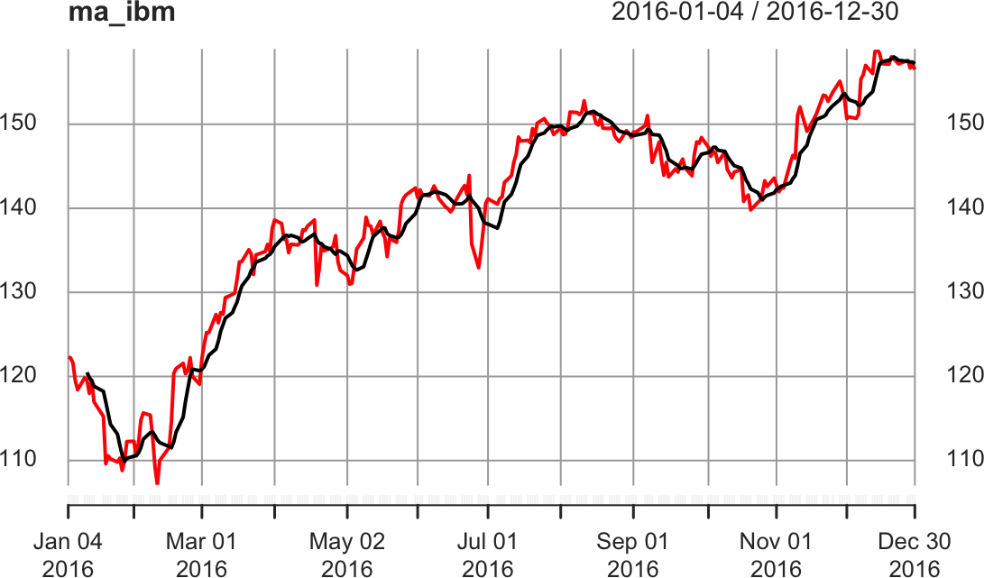
Figure 14-3. Rolling average plot
The output is normally missing a few initial data points, since
rollmean needs a full k observations to compute the mean.
Consequently, the output is shorter than the input. If that’s a problem,
specify na.pad = TRUE; then rollmean will pad the initial output
with NA values.
See Also
See Recipe 14.12 for more about the align parameter.
The moving average described here is a simple moving average. The
quantmod, TTR, and fTrading packages contain functions for
computing and plotting many kinds of moving averages, including simple
ones.
14.11 Applying a Function by Calendar Period
Solution
The xts package includes functions for processing a time series by
day, week, month, quarter, or year:
apply.daily(ts,f)apply.weekly(ts,f)apply.monthly(ts,f)apply.quarterly(ts,f)apply.yearly(ts,f)
Here ts is an xts time series, and f is the function to apply to
each day, week, month, quarter, or year.
If your time series is a zoo object, convert it to an xts object first
so you can access these functions; for example:
apply.monthly(as.xts(ts),f)
Discussion
It is common to process time series data according to calendar period. But figuring calendar periods is tedious at best and bizarre at worst. Let these functions do the heavy lifting.
Suppose we have a five-year history of IBM stock prices stored in an
xts object:
ibm_5<-ibm["2012/2017"]head(ibm_5)#> ibm#> 2012-01-03 152#> 2012-01-04 151#> 2012-01-05 150#> 2012-01-06 149#> 2012-01-09 148#> 2012-01-10 148
We can calculate the average price by month if we use apply.monthly
and mean together:
ibm_mm<-apply.monthly(ibm_5,mean)head(ibm_mm)#> ibm#> 2012-01-31 151#> 2012-02-29 158#> 2012-03-30 166#> 2012-04-30 167#> 2012-05-31 164#> 2012-06-29 159
Notice that the IBM data is in an xts object from the start. Had the
data been in a zoo object, we would have needed to convert it to xts
using as.xts.
A more interesting application is calculating volatility by calendar month, where volatility is measured as the standard deviation of daily log-returns. Daily log-returns are calculated this way:
diff(log(ibm_5))
We calculate their standard deviation, month by month, like this:
apply.monthly(as.xts(diff(log(ibm_5))),sd)
We can scale the daily number to estimate annualized volatility, as shown in Figure 14-4:
ibm_vol<-sqrt(251)*apply.monthly(as.xts(diff(log(ibm_5))),sd)plot(ibm_vol,main="IBM: Monthly Volatility")
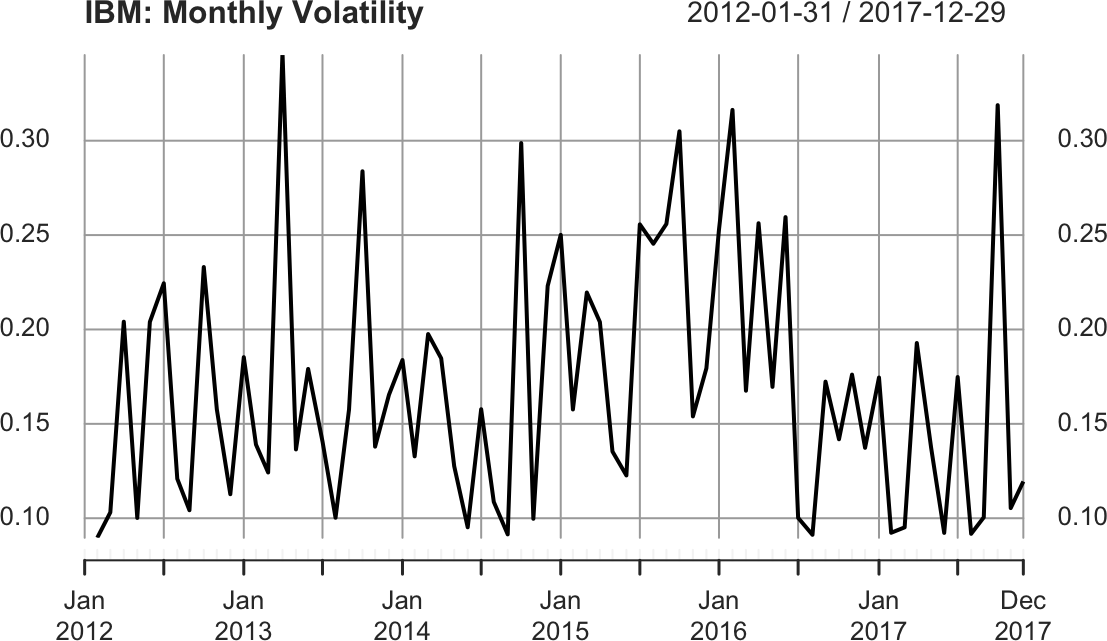
Figure 14-4. IBM volatility plot
14.12 Applying a Rolling Function
Solution
Use the rollapply function in the zoo package. The width parameter
defines how many data points from the time series (ts) should be
processed by the function (f) at each point:
library(zoo)rollapply(ts,width,f)
For many applications, you will likely set align = "right" to avoid
computing f with historical data that was unavailable at the time:
rollapply(ts,width,f,align="right")
Discussion
The rollapply function extracts a “window” of data from your time
series, calls your function with that data, saves the result, and moves
to the next window—and repeats this pattern for the entire input. As an
illustration, consider calling rollapply with a width of 21:
rollapply(ts,21,f)
rollapply will repeatedly call the function, f, with a sliding
window of data, like this:
-
f(ts[1:21]) -
f(ts[2:22]) -
f(ts[3:23]) -
…
etc.…
Observe that the function should expect one argument, which is a vector
of values. rollapply will save the returned values before packaging
them into a zoo object along with a timestamp for every value. The
choice of timestamp depends on the align parameter given to
rollapply:
align="right"-
The timestamp is taken from the rightmost value.
align="left"-
The timestamp is taken from the leftmost value.
align="center" (default)-
The timestamp is taken from the middle value.
By default, rollapply will recalculate the function at successive data
points. You may instead want to calculate the function at every nth
data point. Use the by = n parameter to have rollapply move ahead
n points after each function call. When we calculate the rolling
standard deviation of a time series, for example, we usually want each
window of data to be separate, not overlapping, so we set the by value
equal to the window size:
ibm_sds<-rollapply(ibm_5,width=30,FUN=sd,by=30,align="right")ibm_sds<-na.omit(ibm_sds)head(ibm_sds)
The rollapply function will, by default, return an object with as many
observations as your input data with the missing values filled with
NA. In the preceding example we use na.omit to drop the NA values
so that our resulting object has records only for the dates for which we
have values.
14.13 Plotting the Autocorrelation Function
Discussion
The autocorrelation function is an important tool for revealing the interrelationships within a time series. It is a collection of correlations, for k = 1, 2, 3, …, where is the correlation between all pairs of data points that are exactly k steps apart.
Visualizing the autocorrelations is much more useful than listing them,
so the acf function plots them for each value of k. The following
example shows the autocorrelation functions for two time series, one
with autocorrelations (Figure 14-5) and one without (Figure 14-6). The dashed line delimits the
significant and insignificant correlations: values above the line are
significant (the height of the line is determined by the amount
of data). We can plot them as follows:
load(file="./data/ts_acf.rdata")acf(ts1,main="Significant Autocorrelations")acf(ts2,main="Insignificant Autocorrelations")
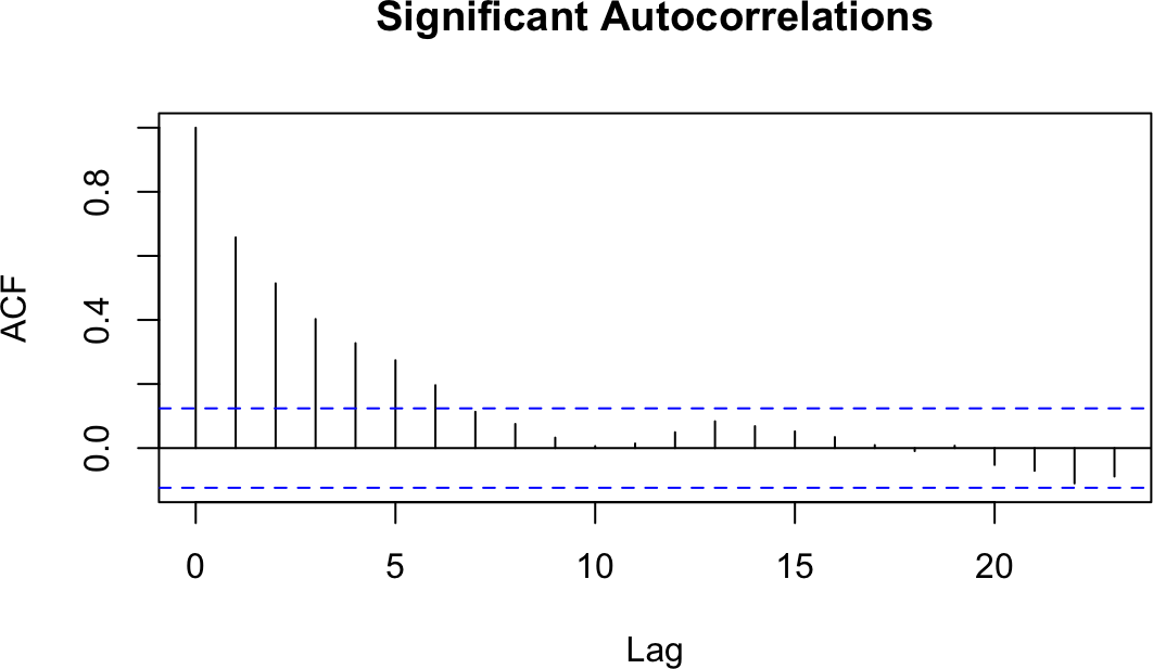
Figure 14-5. Autocorrelations at each lag: ts1
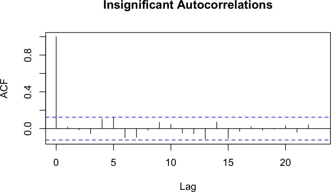
Figure 14-6. Autocorrelations at each lag: ts2
The presence of autocorrelations is one indication that an autoregressive integrated moving average (ARIMA) model could model the time series. From the ACF, you can count the number of significant autocorrelations, which is a useful estimate of the number of moving average (MA) coefficients in the model. Figure 14-5 shows seven significant autocorrelations, for example, so we estimate that its ARIMA model will require seven MA coefficients (MA(7)). That estimate is just a starting point, however, and must be verified by fitting and diagnosing the model.
14.14 Testing a Time Series for Autocorrelation
Solution
Use the Box.test function, which implements the Box–Pierce test for
autocorrelation:
Box.test(ts)
The output includes a p-value. Conventionally, a p-value of less than 0.05 indicates that the data contains significant autocorrelations, whereas a p-value exceeding 0.05 provides no such evidence.
Discussion
Graphing the autocorrelation function is useful for digging into your data. Sometimes, however, you just need to know whether or not the data is autocorrelated. A statistical test such as the Box–Pierce test can provide an answer.
We can apply the Box–Pierce test to the data whose autocorrelation function we plotted in Recipe 14.13. The test shows p-values for the two time series that are nearly 0 and 0.79, respectively:
Box.test(ts1)#>#> Box-Pierce test#>#> data: ts1#> X-squared = 100, df = 1, p-value <2e-16Box.test(ts2)#>#> Box-Pierce test#>#> data: ts2#> X-squared = 0.07, df = 1, p-value = 0.8
The p-value near 0 indicates that the first time series has significant autocorrelations. (We don’t know which autocorrelations are significant; we just know they exist.) The p-value of 0.8 indicates that the test did not detect autocorrelations in the second time series.
The Box.test function can also perform the Ljung–Box test, which is
better for small samples. That test calculates a p-value whose
interpretation is the same as that for the Box–Pierce p-value:
Box.test(ts,type="Ljung-Box")
See Also
See Recipe 14.13 to plot the autocorrelation function, a visual check of the autocorrelation.
14.15 Plotting the Partial Autocorrelation Function
Solution
Use the pacf function:
pacf(ts)
Discussion
The partial autocorrelation function is another tool for revealing the interrelationships in a time series. However, its interpretation is much less intuitive than that of the autocorrelation function. We’ll leave the mathematical definition of partial correlation to a textbook on statistics. Here, we’ll just say that the partial correlation between two random variables, X and Y, is the correlation that remains after accounting for the correlation shown by X and Y with all other variables. In the case of time series, the partial autocorrelation at lag k is the correlation between all data points that are exactly k steps apart, after accounting for their correlation with the data between those k steps.
The practical value of a PACF is that it helps you to identify the number of autoregression (AR) coefficients in an ARIMA model. The following example shows the PACF for the two time series used in Recipe 14.13. One of these series has partial autocorrelations and one does not. Lag values whose lines cross above the dotted line are statistically significant. In the first time series (Figure 14-7) there are two such values, at k = 1 and k = 2, so our initial ARIMA model will have two AR coefficients (AR(2)). As with autocorrelation, however, that is just an initial estimate and must be verified by fitting and diagnosing the model. The second time series (Figure 14-8) shows no such autocorrelation pattern. We can plot them as follows:
pacf(ts1,main="Significant Partial Autocorrelations")pacf(ts2,main="Insignificant Partial Autocorrelations")
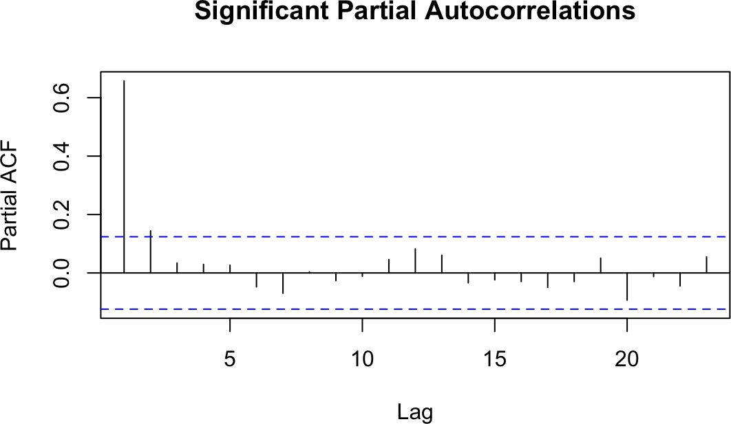
Figure 14-7. Autocorrelations at each lag: ts1

Figure 14-8. Autocorrelations at each lag: ts2
See Also
See Recipe 14.13.
14.16 Finding Lagged Correlations Between Two Time Series
Discussion
The cross-correlation function helps you discover lagged correlations between two time series. A lagged correlation occurs when today’s value in one time series is correlated with a future or past value in the other time series.
Consider the relationship between commodity prices and bond prices. Some analysts believe those prices are connected because changes in commodity prices are a barometer of inflation, one of the key factors in bond pricing. Can we discover a correlation between them?
Figure 14-9 shows a cross-correlation function generated from daily changes in bond prices and a commodity price index:1
library(forecast)load(file="./data/bnd_cmty.Rdata")b<-coredata(bonds)[,1]c<-coredata(cmdtys)[,1]Ccf(b,c,main="Bonds vs. Commodities")

Figure 14-9. Cross-correlation function
Note that since the objects we start with, bonds and cmdtys, are
xts objects, we extract from each the vector of data using
coredata()[1]. This is because the Ccf function expects inputs to be
simple vectors.
Every vertical line shows the correlation between the two time series at some lag, as indicated along the x-axis. If a correlation extends above or below the dotted lines, it is statistically significant.
Notice that the correlation at lag 0 is –0.24, which is the simple correlation between the variables:
cor(b,c)#> [1] -0.24
Much more interesting are the correlations at lags 1, 5, and 8, which are statistically significant. Evidently there is some “ripple effect” in the day-to-day prices of bonds and commodities because changes today are correlated with changes tomorrow. Discovering this sort of relationship is useful to short-term forecasters such as market analysts and bond traders.
14.17 Detrending a Time Series
Solution
Use linear regression to identify the trend component, and then subtract
the trend component from the original time series. These two lines show
how to detrend the zoo object ts and put the result in detr:
m<-lm(coredata(ts)~index(ts))detr<-zoo(resid(m),index(ts))
Discussion
Some time series data contains trends, which means that it gradually
slopes upward or downward over time. Suppose our time series object (a
zoo object in this case), yield, contains a trend as shown in Figure 14-10.
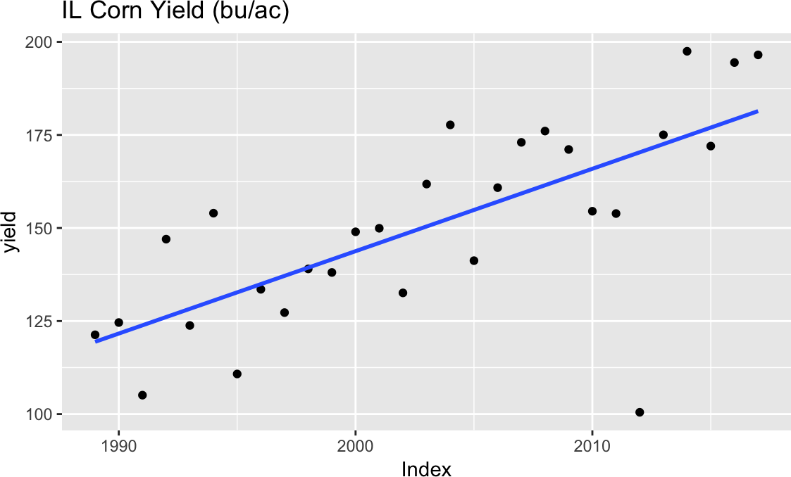
Figure 14-10. Time series with trend
We can remove the trend component in two steps. First, we identify the
overall trend by using the linear model function, lm. The model should
use the time series index for the x variable and the time series data
for the y variable:
m<-lm(coredata(yield)~index(yield))
Second, we remove the linear trend from the original data by subtracting
the straight line found by lm. This is easy because we have access to
the linear model’s residuals, which are defined by the difference
between the original data and the fitted line:
where is the ith residual and and are the model’s slope
and intercept, respectively. We can extract the residuals from the
linear model by using the resid function and then embed the residuals
inside a zoo object:
detr<-zoo(resid(m),index(yield))
Notice that we use the same time index as the original data. When we
plot detr it is clearly trendless, as is evident in Figure 14-11:
autoplot(detr)
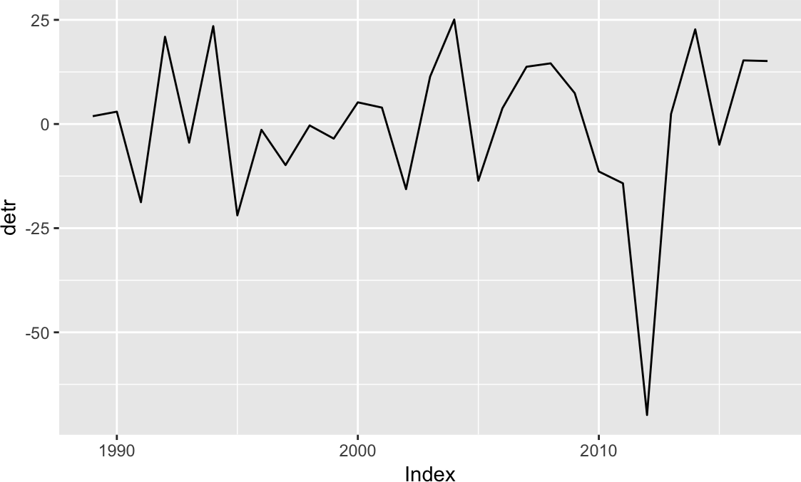
Figure 14-11. Residual plot
This data is the state average corn yield for Illinois in bushels per
acre (bu/ac), so detr is the difference between the actual yield and the
trend. Sometimes when detrending you may want to determine the percent
deviation from the trend. In that case you can divide by the initial
measure (see Figure 14-12):
library(patchwork)# y <- autoplot(yield) +# labs(x='Year', y='Yield (bu/ac)', title='IL Corn Yield')d<-autoplot(detr,geom="point")+labs(x="Year",y="Yield Dev (bu/ac)",title="IL Corn Yield Deviation from Trend (bu/ac)")dp<-autoplot(detr/yield,geom="point")+labs(x="Year",y="Yield Dev (%)",title="IL Corn Yield Deviation from Trend (%)")d/dp

Figure 14-12. Detrended plots
The top plot in Figure 14-12 shows the yield deviation from the trend in bu/ac (the original units), while the lower plot shows the percent deviation from the trend.
14.18 Fitting an ARIMA Model
Discussion
Creating an ARIMA model involves three steps:
-
Identify the model order.
-
Fit the model to the data, giving the coefficients.
-
Apply diagnostic measures to validate the model.
The model order is usually denoted by three integers, (p, d, q), where p is the number of autoregressive coefficients, d is the degree of differencing, and q is the number of moving average coefficients.
When most of us build an ARIMA model, we are usually clueless about the
appropriate order. Rather than tediously searching for the best
combination of p, d, and q, we typically use auto.arima, which
does the searching for us:
library(forecast)library(fpp2)# for example dataauto.arima(ausbeer)#> Series: ausbeer#> ARIMA(1,1,2)(0,1,1)[4]#>#> Coefficients:#> ar1 ma1 ma2 sma1#> 0.050 -1.009 0.375 -0.743#> s.e. 0.196 0.183 0.153 0.050#>#> sigma^2 estimated as 241: log likelihood=-886#> AIC=1783 AICc=1783 BIC=1800
In this case, auto.arima decided the best order was (1, 1, 2), which
means that it differenced the data once (d = 1) before selecting a
model with one AR coefficient (p = 1) and two MA coefficients (q = 2).
In addition, the auto.arima function determined that our data has
seasonality and included the seasonal terms P = 0, D = 1, Q = 1
and a period of m = 4. The seasonality terms are similar to the
nonseasonal ARIMA terms, but relate to the seasonality component of the
model. The m term tells us the periodicity of the seasonality, which
in this case is quarterly. We can see this more easily if we plot the
ausbeer data as in Figure 14-13:
autoplot(ausbeer)
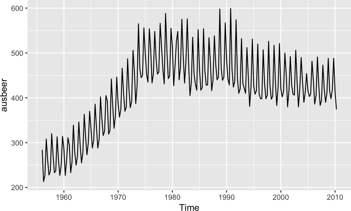
Figure 14-13. Australian beer consumption
By default, auto.arima limits p and q to the range 0 ≤ p ≤ 5 and
0 ≤ q ≤ 5. If you are confident that your model needs fewer than five
coefficients, use the max.p and max.q parameters to limit the search
further; this makes it faster. Likewise, if you believe that your model
needs more coefficients, use max.p and max.q to expand the search
limits.
If you want to turn off the seasonality component of auto.arima, you
can set seasonal = FALSE:
auto.arima(ausbeer,seasonal=FALSE)#> Series: ausbeer#> ARIMA(3,2,2)#>#> Coefficients:#> ar1 ar2 ar3 ma1 ma2#> -0.957 -0.987 -0.925 -1.043 0.142#> s.e. 0.026 0.018 0.024 0.062 0.062#>#> sigma^2 estimated as 327: log likelihood=-935#> AIC=1882 AICc=1882 BIC=1902
But notice that since the model fits a nonseasonal model, the coefficients are different than in the seasonal model.
If you already know the order of your ARIMA model, the arima function
can quickly fit the model to your data:
arima(ausbeer,order=c(3,2,2))#>#> Call:#> arima(x = ausbeer, order = c(3, 2, 2))#>#> Coefficients:#> ar1 ar2 ar3 ma1 ma2#> -0.957 -0.987 -0.925 -1.043 0.142#> s.e. 0.026 0.018 0.024 0.062 0.062#>#> sigma^2 estimated as 319: log likelihood = -935, aic = 1882
The output looks identical to that of auto.arima with the seasonal parameter
set to FALSE. What you can’t see here is that arima executes much
more quickly.
The output from auto.arima and arima includes the fitted
coefficients and the standard error (s.e.) for each coefficient:
Coefficients:
          ar1      ar2      ar3      ma1     ma2
      -0.9569  -0.9872  -0.9247  -1.0425  0.1416
s.e.   0.0257   0.0184   0.0242   0.0619  0.0623
You can find the coefficients’ confidence intervals by capturing the
ARIMA model in an object and then using the confint function:
m<-arima(x=ausbeer,order=c(3,2,2))confint(m)#> 2.5 % 97.5 %#> ar1 -1.0072 -0.907#> ar2 -1.0232 -0.951#> ar3 -0.9721 -0.877#> ma1 -1.1639 -0.921#> ma2 0.0195 0.264
This output illustrates a major headache of ARIMA modeling: not all the coefficients are necessarily significant. If one of the intervals contains zero, the true coefficient might be zero itself, in which case the term is unnecessary.
If you discover that your model contains insignificant coefficients, use Recipe 14.19 to remove them.
Note
The auto.arima and arima functions contain useful features for
fitting the best model. For example, you can force them to include or
exclude a trend component. See the help pages for details.
A final caveat: the danger of auto.arima is that it makes ARIMA
modeling look simple. ARIMA modeling is not simple. It is more art
than science, and the automatically generated model is just a starting
point. We urge you to review a good book about ARIMA modeling before
settling on a final model.
See Also
See Recipe 14.20 for performing diagnostic tests on the ARIMA model.
As a textbook on time series forecasting we highly recommend Forecasting: Principles and Practice, 2nd ed., by Rob J. Hyndman and George Athanasopoulos, which is freely available online.
14.19 Removing Insignificant ARIMA Coefficients
Solution
The arima function includes the parameter fixed, which is a vector.
The vector should contain one element for every coefficient in the
model, including a term for the drift (if any). Each element is either
NA or 0. Use NA for the coefficients to be kept and use 0 for
the coefficients to be removed. This example shows an ARIMA(2, 1, 2)
model with the first AR coefficient and the first MA coefficient forced
to be 0:
arima(x,order=c(2,1,2),fixed=c(0,NA,0,NA))
Discussion
The fpp2 package contains a dataset called euretail, which is a quarterly retail index for the Euro area. Let’s run auto.arima on the data and look at the 98% confidence intervals:
m<-auto.arima(euretail)m#> Series: euretail#> ARIMA(0,1,3)(0,1,1)[4]#>#> Coefficients:#> ma1 ma2 ma3 sma1#> 0.263 0.369 0.420 -0.664#> s.e. 0.124 0.126 0.129 0.155#>#> sigma^2 estimated as 0.156: log likelihood=-28.6#> AIC=67.3 AICc=68.4 BIC=77.7confint(m,level=.98)#> 1 % 99 %#> ma1 -0.0246 0.551#> ma2 0.0774 0.661#> ma3 0.1190 0.721#> sma1 -1.0231 -0.304
In this example, we can see that the 98% confidence interval for the ma1 parameter contains 0 and we can reasonably conclude that this parameter is insignificant at this level of confidence. We can set this parameter to 0 using the fixed parameter:
m<-arima(euretail,order=c(0,1,3),seasonal=c(0,1,1),fixed=c(0,NA,NA,NA)).m#>#> Call:#> arima(x = euretail,order=c(0,1,3),seasonal=c(0,1,1),fixed=c(0,#> NA, NA, NA))#>#> Coefficients:#> ma1 ma2 ma3 sma1#> 0 0.404 0.293 -0.700#> s.e. 0 0.129 0.107 0.135#>#> sigma^2 estimated as 0.156: log likelihood = -30.8, aic = 69.5
Observe that the ma1 coefficient is now 0. The
remaining coefficients (ma2, ma3, sma1) are still significant, as shown
by their confidence intervals, so we have a reasonable model:
confint(m,level=.98)#> 1 % 99 %#> ma1 NA NA#> ma2 0.1049 0.703#> ma3 0.0438 0.542#> sma1 -1.0140 -0.386
14.20 Running Diagnostics on an ARIMA Model
Discussion
The result of checkresiduals is a set of three graphs, as shown in
Figure 14-14. A good model should produce results like these:
#>#> Ljung-Box test#>#> data: Residuals from ARIMA(1,1,2)(0,1,1)[4]#> Q* = 5, df = 4, p-value = 0.3#>#> Model df: 4. Total lags used: 8
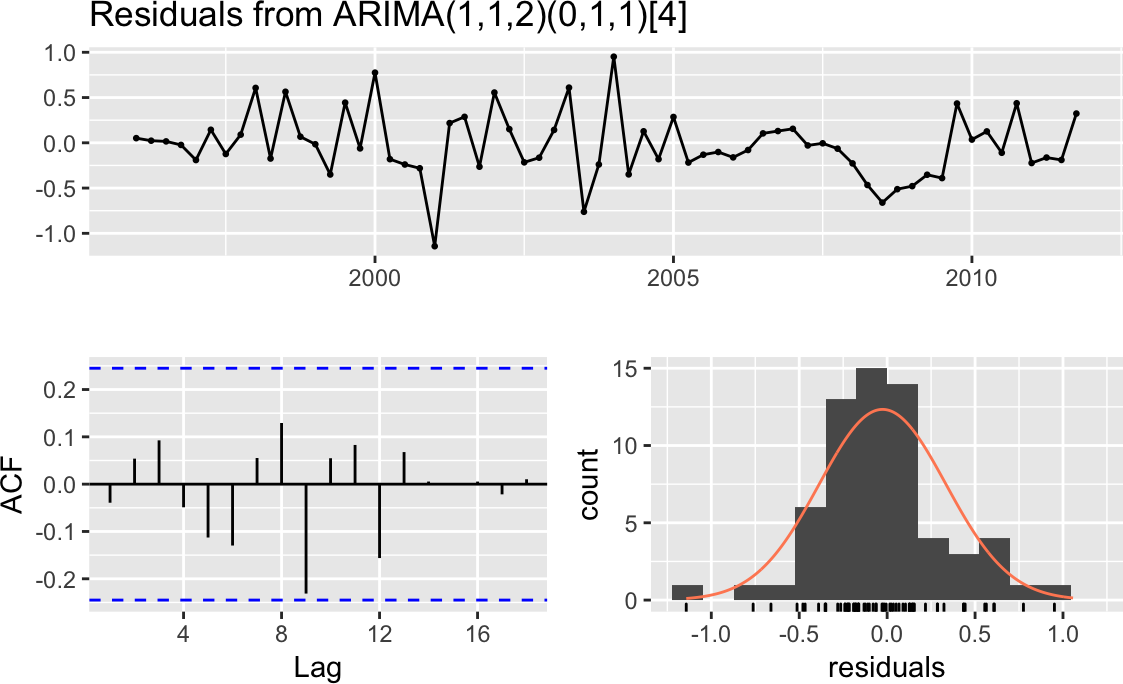
Figure 14-14. Residuals plots: good model
Here’s what’s good about the graphs:
-
The standardized residuals don’t show clusters of volatility.
-
The autocorrelation function (ACF) shows no significant autocorrelation between the residuals.
-
The residuals look bell-shaped, suggesting they are reasonably symmetrical.
-
The p-value in the Ljung–Box test is large, indicating that the residuals are patternless—meaning all the information has been extracted by the model and only noise is left behind.
For contrast, Figure 14-15 shows diagnostic charts with problems:
#>#> Ljung-Box test#>#> data: Residuals from ARIMA(1,1,1)(0,0,1)[4]#> Q* = 20, df = 5, p-value = 5e-04#>#> Model df: 3. Total lags used: 8
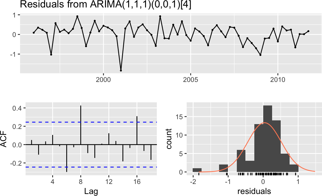
Figure 14-15. Residuals plots: problem model
The issues here are:
-
The ACF shows significant autocorrelations between residuals.
-
The p-values for the Ljung–Box statistics are small, indicating there is some pattern in the residuals (i.e., there is still information to be extracted from the data).
-
The residuals appear asymmetrical.
These are basic diagnostics, but they are a good start. Find a good book on ARIMA modeling and perform the recommended diagnostic tests before concluding that your model is sound. Additional checks of the residuals could include:
14.21 Making Forecasts from an ARIMA Model
Solution
Save the model in an object, and then apply the forecast function to
the object. This example saves the model from Recipe 14.19 and
predicts the next eight observations:
m<-arima(euretail,order=c(0,1,3),seasonal=c(0,1,1),fixed=c(0,NA,NA,NA))forecast(m)#> Point Forecast Lo 80 Hi 80 Lo 95 Hi 95#> 2012 Q1 95.1 94.6 95.6 94.3 95.9#> 2012 Q2 95.2 94.5 95.9 94.1 96.3#> 2012 Q3 95.2 94.2 96.3 93.7 96.8#> 2012 Q4 95.3 93.9 96.6 93.2 97.3#> 2013 Q1 94.5 92.8 96.1 91.9 97.0#> 2013 Q2 94.5 92.6 96.5 91.5 97.5#> 2013 Q3 94.5 92.3 96.7 91.1 97.9#> 2013 Q4 94.5 92.0 97.0 90.7 98.3
Discussion
The forecast function will calculate the next few observations and
their standard errors according to the model. It returns a list with 10
elements. When we print the model, as we just did, forecast returns
the time series points it is forecasting, the forecast, and two pairs of
confidence bands: high/low 80% and high/low 95%.
If we want to extract out just the forecast, we can do that by assigning
the results to an object, and then pulling out the list item named
mean:
fc_m<-forecast(m)fc_m$mean#> Qtr1 Qtr2 Qtr3 Qtr4#> 2012 95.1 95.2 95.2 95.3#> 2013 94.5 94.5 94.5 94.5
The result is a Time-Series object containing the forecasts created by
the forecast function.
14.22 Plotting a Forecast
Solution
Time series models created with the forecast package have a plotting
method that uses ggplot2 to create graphs easily, as shown in Figure 14-16:
fc_m<-forecast(m)autoplot(fc_m)
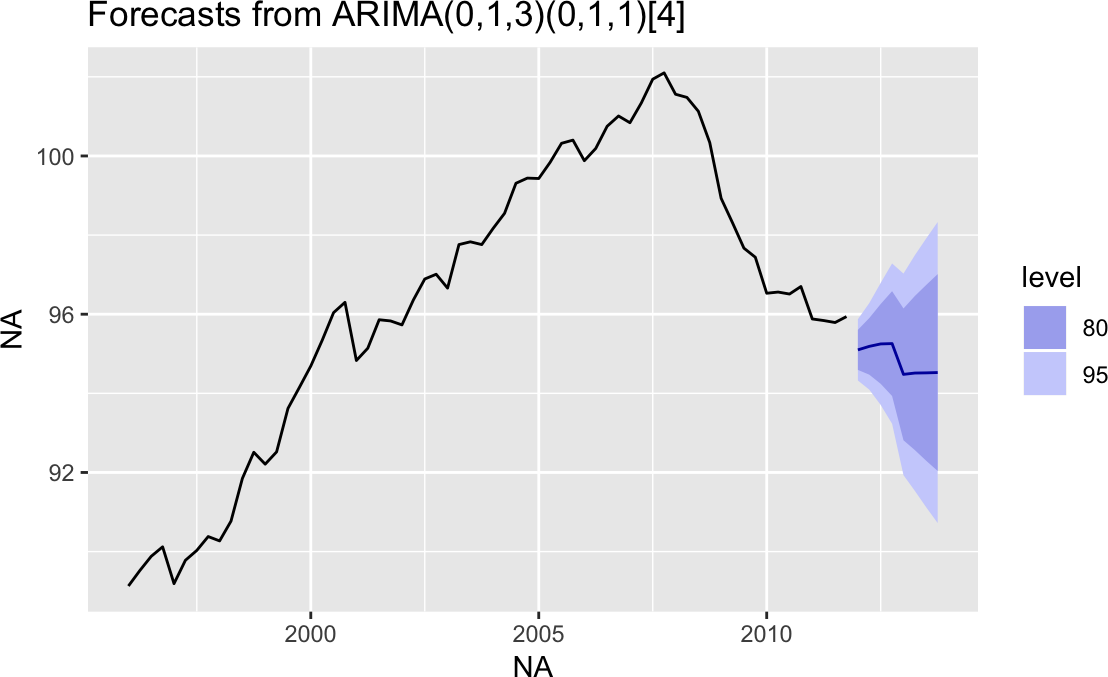
Figure 14-16. Forecast cone of uncertainty: default
Discussion
The autoplot function makes a very reasonable figure, as shown in
Figure 14-16. Since the resulting figure is a ggplot
object, we can adjust the plotting parameters the same way we would with any
other ggplot object. Here we add labels and a title and change the
theme, as shown in Figure 14-17:
autoplot(fc_m)+ylab("Euro Index")+xlab("Year/Quarter")+ggtitle("Forecasted Retail Index")+theme_bw()

Figure 14-17. Forecast cone of uncertainty: labeled
See Also
See Chapter 10 for more information on working with ggplot figures.
14.23 Testing for Mean Reversion
Solution
A common test for mean reversion is the Augmented Dickey–Fuller (ADF)
test, which is implemented by the adf.test function of the tseries
package:
library(tseries)adf.test(ts)
The output from adf.test includes a p-value. Conventionally, if p
< 0.05, the time series is likely mean-reverting, whereas a p > 0.05
provides no such evidence.
Discussion
When a time series is mean-reverting, it tends to return to its long-run average. It may wander off, but eventually it wanders back. If a time series is not mean-reverting, then it can wander away without ever returning to the mean.
Figure 14-18 appears to be wandering upward and not
returning. The large p-value from adf.test confirms that it is
not mean-reverting:
library(tseries)library(fpp2)autoplot(goog200)adf.test(goog200)#>#> Augmented Dickey-Fuller Test#>#> data: goog200#> Dickey-Fuller = -2, Lag order = 5, p-value = 0.7#> alternative hypothesis: stationary
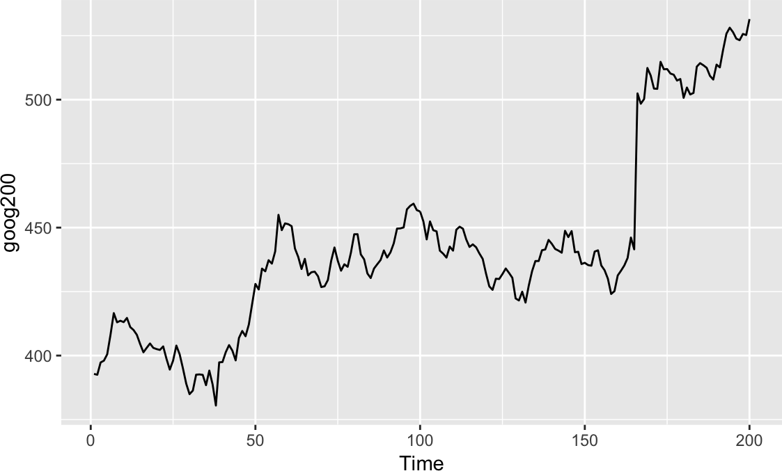
Figure 14-18. Time series without mean reversion
The time series in Figure 14-19, however, is just bouncing around its average value. The small p-value (0.01) confirms that it is mean-reverting:
autoplot(hsales)adf.test(hsales)#>#> Augmented Dickey-Fuller Test#>#> data: hsales#> Dickey-Fuller = -4, Lag order = 6, p-value = 0.01#> alternative hypothesis: stationary

Figure 14-19. Time series with mean reversion
The example data here comes from the fpp2 package and comprises all
Time-Series object types. If your data were in a zoo or xts
object, then you would need to call coredata to extract out the raw
data from the object before passing it to adf.test:
library(xts)data(sample_matrix)xts_obj<-as.xts(sample_matrix,dateFormat="Date")[,"Close"]# vector of dataadf.test(coredata(xts_obj))#>#> Augmented Dickey-Fuller Test#>#> data: coredata(xts_obj)#> Dickey-Fuller = -3, Lag order = 5, p-value = 0.3#> alternative hypothesis: stationary
The adf.test function massages your data before performing the ADF
test. First it automatically detrends your data, and then it recenters
the data, giving it a mean of zero.
If either detrending or recentering is undesirable for your application,
use the adfTest
function in the fUnitRoots package instead:
library(fUnitRoots)adfTest(coredata(ts1),type="nc")
With type = "nc", the function neither detrends nor recenters your
data. With type = "c", the function recenters your data but does not
detrend it.
Both the adf.test and adfTest functions let you specify a lag
value that controls the exact statistic they calculate. These functions
provide reasonable defaults, but serious users should study the textbook
description of the ADF test to determine the appropriate lag for their
application.
14.24 Smoothing a Time Series
Solution
The KernSmooth package contains functions for smoothing. Use the
dpill function to select an initial bandwidth parameter, and then use
the locpoly function to smooth the data:
library(KernSmooth)gridsize<-length(y)bw<-dpill(t,y,gridsize=gridsize)lp<-locpoly(x=t,y=y,bandwidth=bw,gridsize=gridsize)smooth<-lp$y
Here, t is the time variable and y is the time series.
Discussion
The KernSmooth package is a standard part of the R distribution. It
includes the locpoly
function, which constructs, around each data
point, a polynomial that is fitted to the nearby data points. These are
called local polynomials. The local polynomials are strung together to
create a smoothed version of the original data series.
The algorithm requires a bandwidth parameter to control the degree of smoothing. A small bandwidth means less smoothing, in which case the result follows the original data more closely. A large bandwidth means more smoothing, so the result contains less noise. The tricky part is choosing just the right bandwidth: not too small, not too large.
Fortunately, KernSmooth also includes the function dpill for
estimating the appropriate bandwidth, and it works quite well. We
recommend that you start with the dpill value and then experiment with
values above and below that starting point. There is no magic formula
here. You need to decide what level of smoothing works best in your
application.
The following is an example of smoothing. We’ll create some example data that is the sum of a simple sine wave and normally distributed “noise”:
t<-seq(from=-10,to=10,length.out=201)noise<-rnorm(201)y<-sin(t)+noise
Both dpill and locpoly require a grid size—in other words, the
number of points for which a local polynomial is constructed. We often
use a grid size equal to the number of data points, which yields a fine
resolution. The resulting time series is very smooth. You might use a
smaller grid size if you want a coarser resolution or if you have a very
large dataset:
library(KernSmooth)gridsize<-length(y)bw<-dpill(t,y,gridsize=gridsize)
The locpoly function performs the smoothing and returns a list. The
y element of that list is the smoothed data:
lp<-locpoly(x=t,y=y,bandwidth=bw,gridsize=gridsize)smooth<-lp$yggplot()+geom_line(aes(x=t,y=y))+geom_line(aes(x=t,y=smooth),linetype=2)
In Figure 14-20, the smoothed data is shown as a dashed
line, while the solid line is our original example data. The figure
demonstrates that locpoly did an excellent job of extracting the
original sine wave.
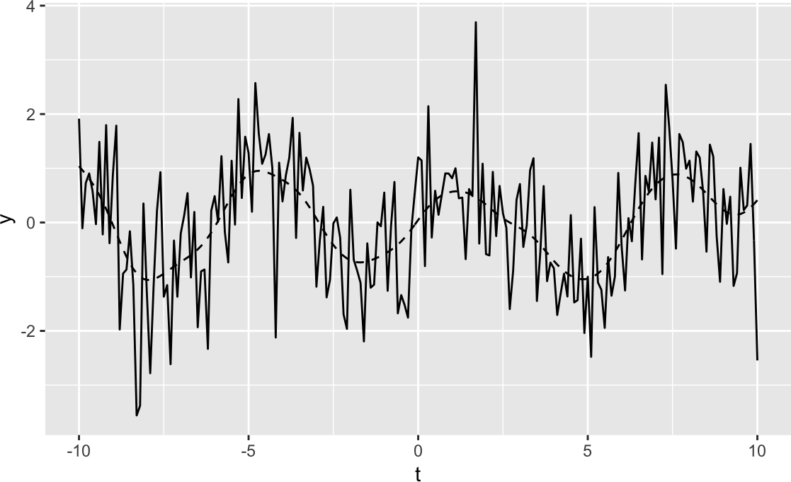
Figure 14-20. Example time series plot
1 Specifically, the bonds variable is the log-returns of the Vanguard Long-Term Bond Index Fund (VBLTX), and the cmdtys variable is the log-returns of the Invesco DB Commodity Tracking Fund (DBC). The data was taken from the period 2007-01-01 through 2017-12-31.