The ggplot2 package contains a vast number of functions for creating a wide variety of plots. It would take an entire book to cover it all—there are already several that cover it—so I cannot attempt this here. In this chapter, I will only try to give you a flavor of how the package works.
The ggplot2 package is loaded when you load tidyverse, but you can always include it on its own using
library(ggplot2)
The Basic Plotting Components in ggplot2
Unlike in R’s base graphics, with ggplot2 you do not create individual plot components by drawing lines, points, or whatever you need onto a graphics canvas. Instead, you specify how your data should be mapped to abstract graphical aesthetics, for example, x- and y-coordinates, colors, shapes, and so on. Then you specify how aesthetics should be represented in the graphics, for example, whether x- and y-coordinates should be plotted as scatter plots or lines. On top of this can add graphics information such as which shapes points in a scatter plot should have, which colors the color aesthetics maps, and such. You add attributes as separate steps which makes it easy to change a plot. If you want to add a linear regression to your plot, you can do it with a single command; since ggplot2 already knows which of your data variables are mapped to the x- and y-coordinates, it simply computes the linear regression and adds it to the plot. If you want to plot your data on a log scale, you tell ggplot2 that the axis should be log-transformed.
At first, ggplot2 might seem more complicated than basic R’s graphics, but you will soon get used to it.
The main components of ggplot2 are these:
Data—Obviously, you have data you want to plot.
Aesthetics—Aesthetics map data to abstract graphical concepts such as x- and y-coordinates, colors and fills.
Geometries—Geometries, geometric objects, determine which kind of plot you are making, for example, whether you will get a histogram, a scatter plot, or a boxplot.
Statistics—How should the data be summarized before plotting. Your data is not always summarized, that is, the statistics can be the identity mapping. A scatter plot doesn’t compute a summary for the x- and y-coordinates, but a regression line or a histogram does.
Scales—Scales specify how the data you mapped to graphical concepts with the aesthetics should actually be placed on a plot. Your x- and y-coordinate data might be measured in meters, but those meters should be mapped to points on your plot. The scales are responsible for this.
Coordinates—Coordinates allow you to transform the result of scaling your data to plot components. If, for example, you want your plot to show the y-axis on a log scale, then the coordinates transformation does this.
Faceting—Faceting splits your plot into subplots based on the variables in your data.
You create a ggplot2 plot using the ggplot() function. To that object, you add one or more of the preceding components. Nothing happens until you print the graphical object; printing it will make the plot. A typical pattern is to plot it right away and add the components in the same statement in which you create the graphical object.
ggplot(. . . ) + . . . components . . .
To add components to a plot, you use addition. The ggplot2 package does not use pipelines. You often see data piped into the ggplot() call, though, but after that, you must remember to add rather than pipe.
A layer creates (part of) the graphics you can see. At a minimum, it must consist of data, aesthetics, statistics (can be the identity), and a geometric object (that might specify the statistics). Your plot must have at least one layer before your plot shows your data.
Adding Components to Plot Objects
The simplest plot we can create is empty. You can create it by calling ggplot() without any arguments.
p <- ggplot()
You can see what it consists of by calling the summary() function, but most of the information is not relevant here. I will highlight lines relevant to the components we see in this section as we go along.
summary(p)
## data: [x]
## faceting: <ggproto object: Class FacetNull, Facet, gg>
## compute_layout: function
## draw_back: function
## draw_front: function
## draw_labels: function
## draw_panels: function
## finish_data: function
## init_scales: function
## map_data: function
## params: list
## setup_data: function
## setup_params: function
## shrink: TRUE
## train_scales: function
## vars: function
## super: <ggproto object: Class FacetNull, Facet, gg>
To create a plot, you print the plot object. You can do this explicitly
print(p)
or just type it into your R terminal.
p
Since putting an object at the outermost level in an R script will print an object, ggplot objects are not always assigned to a variable and then plotted later. You can just write the ggplot() object.
ggplot()
Why would anyone create an empty plot object? You cannot print the empty object. Well, you can, but you will get an empty canvas, so there is not much point to that. You can, however, build up a plot by adding components to it. You can start with the empty plot and add all you want to it in separate commands.
Adding Data
You add data to a plot as an argument to ggplot(). If you want to add data to the empty plot, you will use geometries; see the following example. If you add data in the ggplot() function, then all components you add to the plot later will be able to see the data.
With some random test data, we can create a plot object with associated data.
dat <- tibble(
foo = runif(100),
bar = 20 * foo + 5 + rnorm(100, sd = 10),
baz = rep(1:2, each = 50)
)
p <- ggplot(data = dat)
If you call summary(p) you can see the line:
data: foo, bar, baz [100x3]
It shows you the variables in the data. They are not mapped to any graphical objects yet; that is the purview of aesthetics.
Adding Aesthetics
What we see in a plot are points, lines, colors, and so on. To create these plots, ggplot2 needs to know which variables in the data should be interpreted as coordinates, which determines line thickness, which determines colors and so on. Aesthetics do this.
Consider this plot object:
p <- ggplot(data = dat, aes(x = foo, y = bar, color = baz))
Here, we have specified that foo determines the x-coordinate, bar the y-coordinate, and baz the color. If you check the summary of the plot, you can see the mapping from data variables to graphical objects below the data line:
data: foo, bar, baz [100x3]
mapping: x = ~foo, y = ~bar, colour = ~baz
Plotting (printing) this will give you an empty plot where the x- and y-axes match the range of the data’s x and y (foo and bar) values. The plot is otherwise empty because it does not have a geometry.
Adding Geometries
Geometries specify the type of the plot. They use the aesthetics’ maps from the data to graphical properties and create a plot based on them.
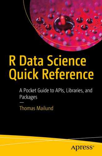
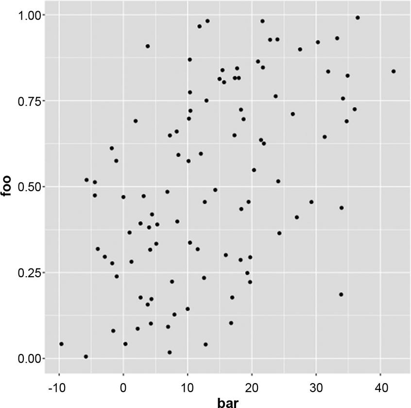
One of the most straightforward plots is a scatter plot. We can add the geom_point() geometry to the plot we created previously to get a scatter plot.
p <- ggplot(data = dat, aes(x = foo, y = bar, color = baz)) +
geom_point()
If you call summary(p), you will see these lines at the bottom of the output:
geom_point: na.rm = FALSE
stat_identity: na.rm = FALSE
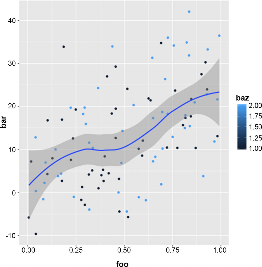
They tell you that you have a point geometry and that the statistic that maps from the data to a summary is the identity. We do not make any summary of the data when we plot it as points. You can create the plot by printing the plot object; you can see the result in Figure 12-1.
print(p)
You can add data and aesthetics directly to the geometry. This is especially useful if you want to overlay alternative data onto a plot but as an example consider moving the same data and aesthetics to the geom_point() call.
Figure 12-1
Point geometry plot
p <- ggplot() +
geom_point(data = dat, aes(x = foo, y = bar, color = baz))
If you look at the summary, you will see that the mapping from the aesthetics is now grouped with the geometry
mapping: x = ~foo, y = ~bar, colour = ~baz
geom_point: na.rm = FALSE
stat_identity: na.rm = FALSE
but otherwise, there is little change. This can be used to add additional data to a plot. It also shows that it sometimes can make sense to start with an empty plot object and then add different data sets in different geometries.
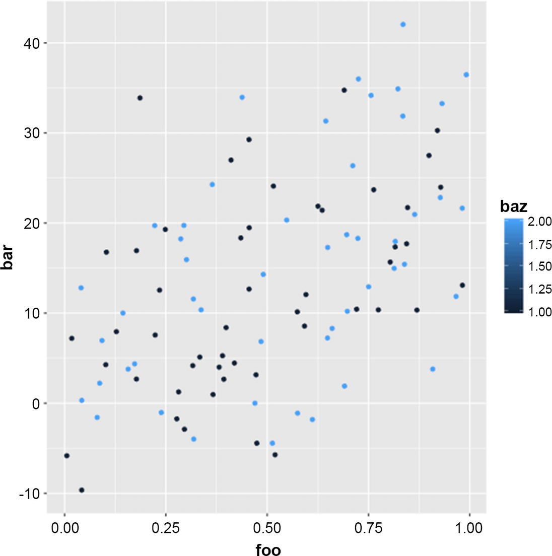
Since baz is numerical, it is interpreted as a continuous variable. You can get a discrete color mapping by transforming it into a factor.
ggplot(data = dat, aes(x = foo, y = bar, color = factor(baz))) + geom_point()
You can change the levels in the factor to reorder the legend. See Chapter 9 for more on manipulating factors.
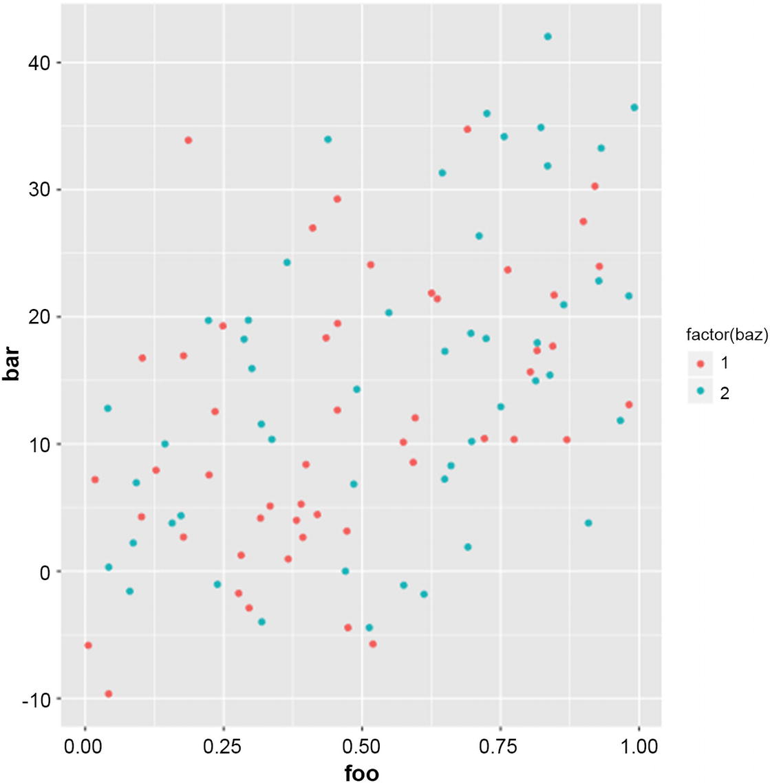
Another simple geometry is a line plot.
ggplot(data = arrange(dat, foo),
aes(x = foo, y = bar, color = factor(baz))) +
geom_line()
Figure 12-2
Discrete color aesthetics
Figure 12-3
A line plot
See the result in Figure 12-3. I sorted the data with respect to the x-axis before I plotted it using arrange(). Otherwise, the lines would not go left to right.
You can have more than one geometry, for example:
p <- ggplot(data = dat, aes(x = foo, y = bar, color = baz)) +
geom_point() + geom_smooth(method = "loess")
If you call summary(p), you will see two layers at the bottom of the output.
geom_point: na.rm = FALSE
stat_identity: na.rm = FALSE
position_identity
geom_smooth: na.rm = FALSE, se = TRUE
stat_smooth: na.rm = FALSE, se = TRUE, # more here. . .
position_identity
Observe that the smooth geometry does not have the identity statistics. It shows a summary of the data and the mapping from the data to that summary is handled by a stat_smooth statistics.
If we use a discrete color, it also groups the data, so if we make baz a factor again, we will get the data in a differently colored point and get two smoothed lines.
ggplot(data = dat, aes(x = foo, y = bar, color = factor(baz))) +
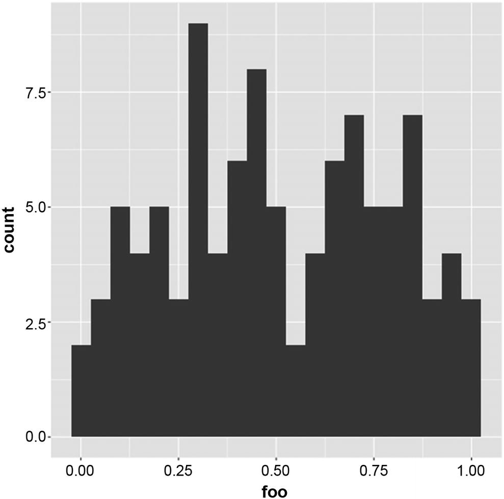
Notice that you only need an x-axis for this geometry. With summary(p) you will see that the statistic is stat_bin.
geom_bar: na.rm = FALSE
stat_bin: binwidth = NULL, # there is more here
If you want a density plot instead, you use geom_density().
ggplot(data = dat, aes(x = bar)) + geom_density()
There, you will see that the statistic is stat_density.
geom_density: na.rm = FALSE
stat_density: na.rm = FALSE
Figure 12-5
Plot with two geometries and a discrete color
Figure 12-6
Histogram plot
I think you see the pattern now.
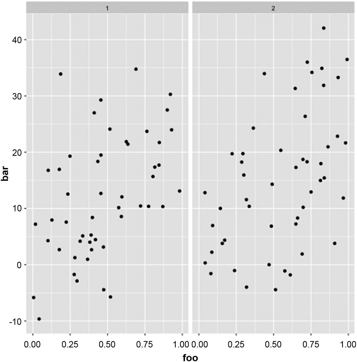
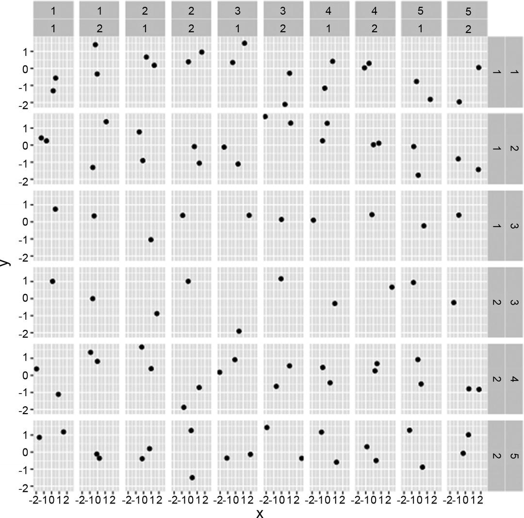
Facets
The effect of adding a grid facet is that we get sub-figures where the data is split into groups determined by the formula we give facet_grid(); see Figure 12-7.
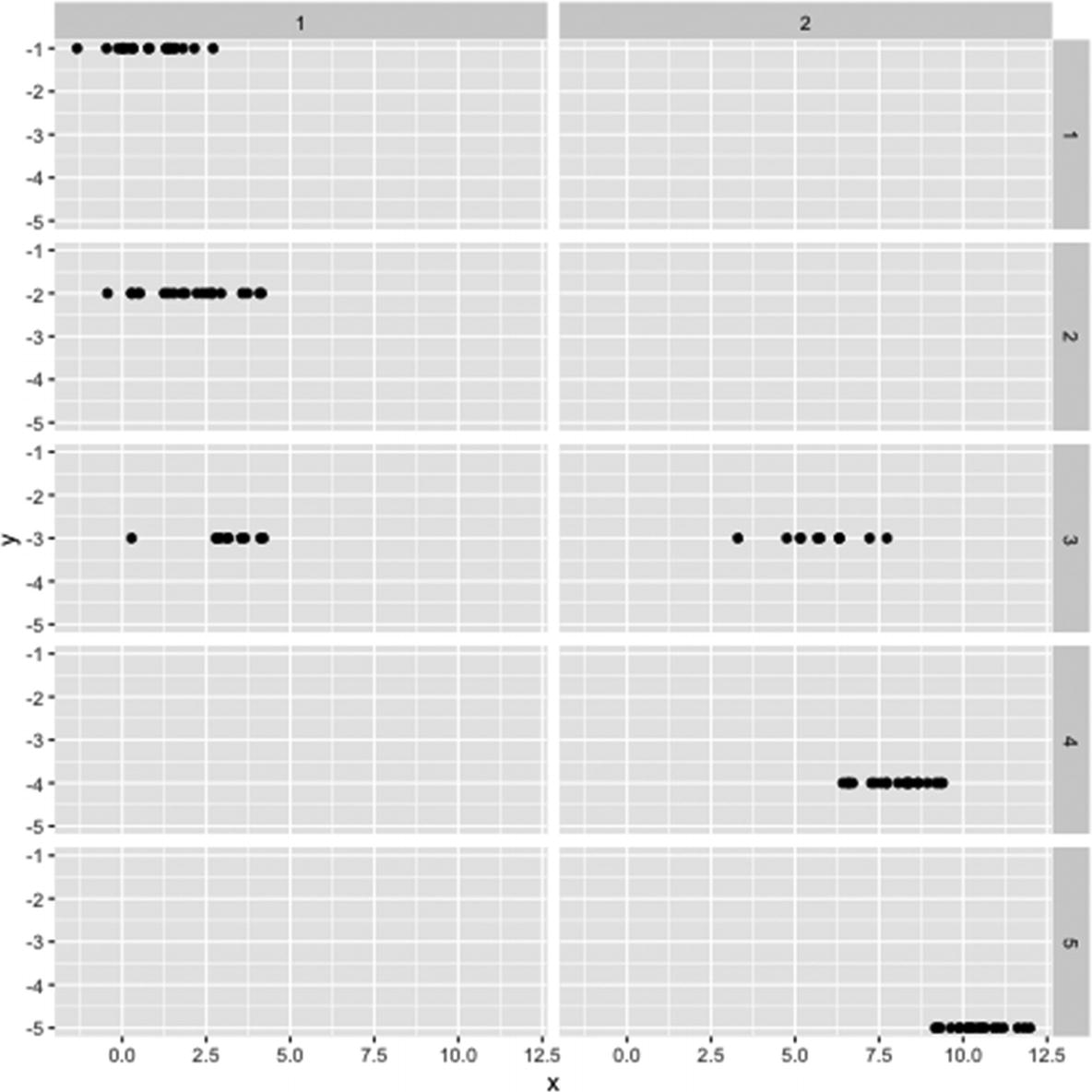
You can use more than two variables but (naturally) only two dimensions. If you use more than two variables, then the different categories will be shown as labels on the facet sides. You will see all combinations of factors that appear in the formula. As an example, consider this:
All the preceding plots were plotted in cartesian coordinates—the default coordinates. You can change the coordinates of a plot. For example, you can flip an axis, for example, the x-axis of a plot: