

Things are looking good so far: we’ve got a grid-based layout, one that doesn’t sacrifice complexity for flexibility. I have to admit that the first time I figured out how to build a fluid grid, I was feeling pretty proud of myself.
But then, as often happens with web design, despair set in. Currently, our page is awash in words, and little else. Actually, nothing else: our page is nothing but text. Why is this a problem? Well, text reflows effortlessly within a flexible container—and I don’t know if you’ve noticed, but the Internet seems to have one or two of those “image” things lying around. None of which we’ve incorporated into our fluid grid.
So what happens when we introduce fixed-width images into our flexible design?
Going back, back to markup, markup
To find an answer, let’s do another quick experiment: let’s drop an image directly into our blog module, and see how our layout responds. The first thing we’ll need to do is to clear some space for it in our markup.
Remember our little blockquote, comfortably tucked into
our blog article? Well, we’ve got way too much text on this
darned page, so let’s replace it with an inset image:
<div class="figure">
  <p>
    <img src="robot.jpg" alt="" />
    <b class="figcaption">Lo, the robot walks</b>
  </p>
</div>
Nothing fancy: an img element,
followed by a brief but descriptive caption wrapped in a b
element. I’m actually appropriating the HTML5
figure/figcaption tags as class names in this
snippet, which makes for a solidly semantic foundation.
(Sharp-eyed readers will note that I’m using a b element
for a non-semantic hook. Now, some designers might use a span
element instead. Me, I like the terseness of shorter tags like
b or i for non-semantic markup.)
With that HTML finished, let’s drop in some basic CSS:
.figure {
  float: right;
  margin-bottom: 0.5em;
  margin-left: 2.53164557%; /* 12px / 474px */
  width: 48.7341772%; /* 231px / 474px */
}
We’re creating a nice inset effect for our figure. It’ll be floated to the right, and will span roughly half the width of our article, or four columns of our flexible grid. Markup: check; style: check. Of course, all this HTML and CSS is for naught if there isn’t an actual image available.
Now, because I love you (and robots) dearly, not just any image will do. And after scouring the web for whole minutes, I found a fantastically imposing robo-portrait (FIG 3.1). The beautiful thing about this image (aside from the robot, of course) is that it’s huge. I’ve cropped it slightly, but I haven’t scaled it down at all, leaving it at its native resolution of 655×655. This image is much larger than we know its flexible container will be, making it a perfect case to test how robust our flexible layout is.
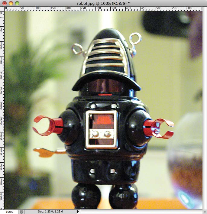
FIG. 3.1: An appropriately botty robot pic, courtesy of Jeremy Noble (http://bkaprt.com/rwd/10/).
So let’s drop our oversized image onto the server, reload the page, and—oh. Well. That’s pretty much the worst thing on the internet (FIG 3.2).
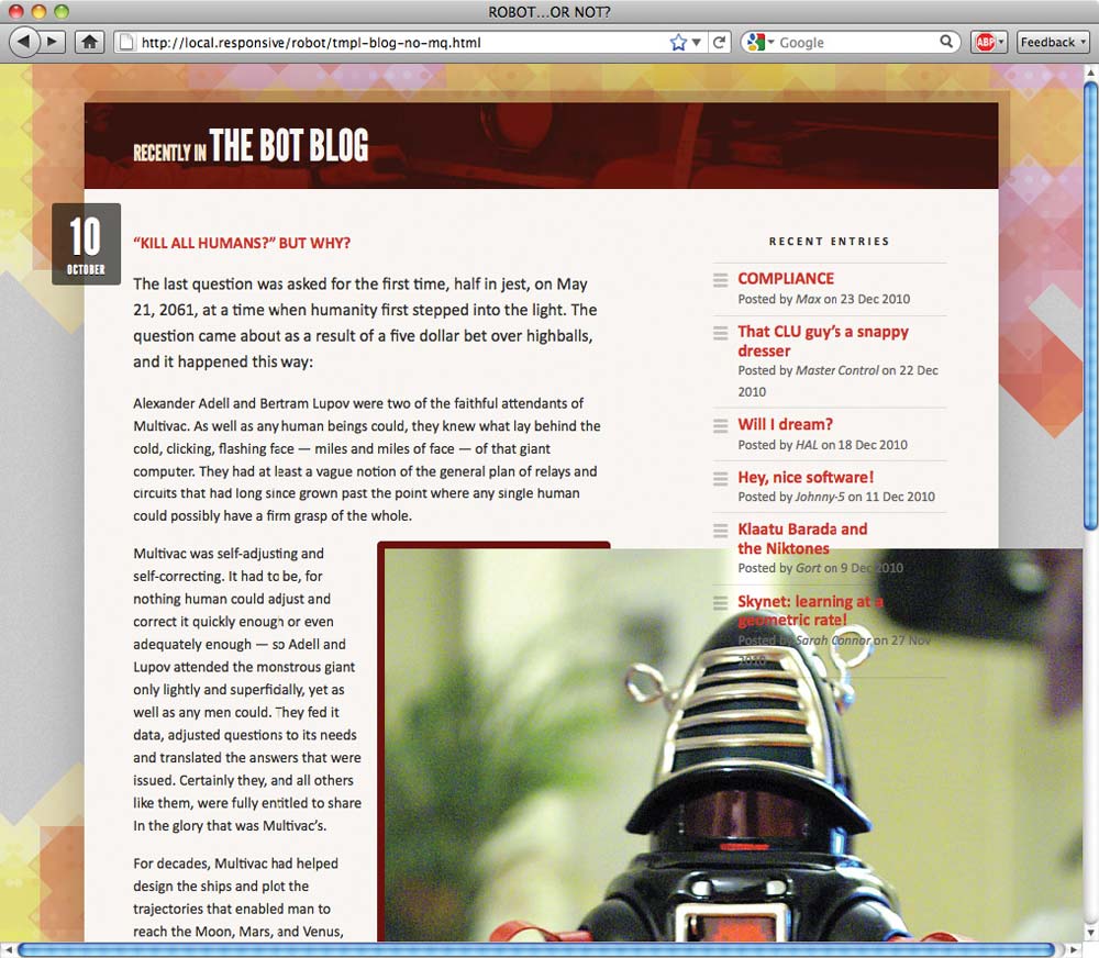
FIG 3.2: Our huge image is huge. Our broken layout is broken.
Actually, the result isn’t that surprising. Our layout isn’t broken
per se—our flexible container is working just fine, and the
proportions of our grid’s columns remain intact. But because our image is
much wider than its containing .figure, the excess content
simply overflows its container, and is visible to the user. There simply
aren’t any constraints applied to our image that could make it aware of
its flexible environment.
Fluid images
But what if we could introduce such a constraint? What if we could write a rule that prevents images from exceeding the width of their container?
Well, here’s the good news: that’s very easy to do:
img {
  max-width: 100%;
}
First discovered by designer Richard Rutter
(http://bkaprt.com/rwd/11/), this
one rule immediately provides an incredibly handy constraint for every
image in our document. Now, our img element will render at
whatever size it wants, as long as it’s narrower than its containing
element. But if it happens to be wider than its container, then the
max-width: 100% directive forces the image’s width to
match the width of its container. And as you can see, our image
has snapped into place (FIG 3.3).
FIG 3.3: Just by
including max-width: 100%, we’ve
prevented our image from escaping its flexible container. On a related
note, I love max-width: 100%.
What’s more, modern browsers have evolved to the point where they resize the images proportionally: as our flexible container resizes itself, shrinking or enlarging our image, the image’s aspect ratio remains intact (FIG 3.4).
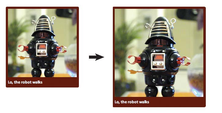
FIG 3.4: Regardless of how wide or small its flexible container becomes, the image resizes proportionally. Magic? Who can say.
I hope you’re not tired of all this good news because as it happens,
the max-width: 100% rule can also apply to most fixed-width
elements, like video and other rich media. In fact, we can beef up our
selector to cover other media-ready elements, like so:
img,
embed,
object,
video {
  max-width: 100%;
}
Whether it’s a cute little Flash video
(FIG 3.5), some other embedded media, or
a humble img, browsers do a fair job of resizing the content
proportionally in a flexible layout. All thanks to our lightweight
max-width constraint.
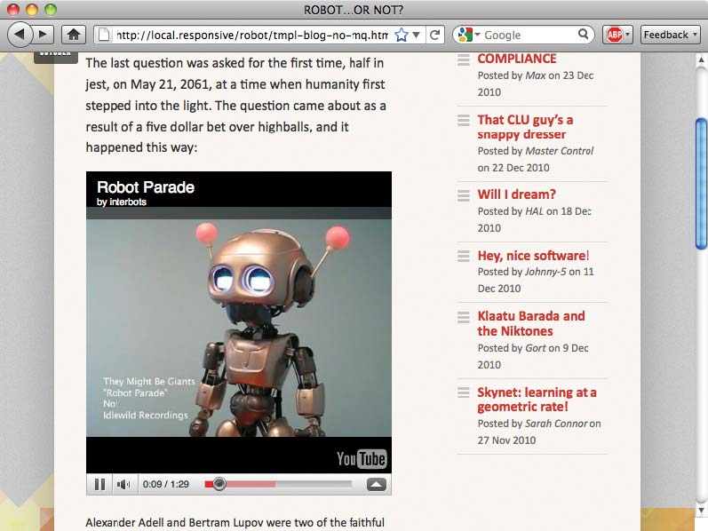
FIG 3.5: Other
media play nicely with max-width: 100%,
becoming flexible themselves. Did I mention I love max-width: 100%?
So we’ve cracked the problem of flexible images and media—right? One CSS rule and we’re done?
Because this job is never easy
Time to let the healing begin: we need to work through the pain, the tears, the rending of garments, and talk about a few browser-specific issues around flexible images.
max-width in Internet Explorer
The cold, hard truth is that Internet Explorer 6
and below don’t support the max-width property.
IE7 version and above? Oh, it is positively brimming with
support for max-width. But if you’re stuck supporting the
(cough) venerable IE6 or lower, our approach needs
refinement.
Now, there are several documented ways to get max-width
support working in IE6. Most are JavaScript-driven, usually relying on
Microsoft’s proprietary expression filter to dynamically
evaluate the width of an element, and to manually resize it if it exceeds a
certain threshold. For an example of these decidedly non-standard
workarounds, I’d recommend Svend Tofte’s classic blog entry on the
subject (http://bkaprt.com/rwd/12/).
Me? I tend to favor a more lo-fi, CSS-driven approach. Namely, all modern browsers get our max-width constraint:
img,
embed,
object,
video {
  max-width: 100%;
}
But in a separate IE6-specific stylesheet, I’ll include the following:
img,
embed,
object,
video {
  width: 100%;
}
See the difference? IE6 and lower get
width: 100%, rather than the max-width: 100%
rule.
A word of warning: tread carefully here, for these are drastically
different rules. Whereas max-width: 100% instructs our images
to never exceed the width of their containers, width: 100%
forces our images to always match the width of their containing
elements.
Most of the time, this approach will work just fine. For example, it’s
safe to assume that our oversized robot.jpg image will always
be larger than its containing element, so the width: 100% rule
works beautifully.
But for smaller images like thumbnails, or most embedded movies, it might not be appropriate to blindly up-scale them with CSS. If that’s the case, then a bit more specificity might be warranted for IE:
img.full,
object.full,
.main img,
.main object {
  width: 100%;
}
If you don’t want the width: 100%
rule to apply to every piece of fixed-width media in your page, we
can simply write a list of selectors that target certain kinds of images or
video (img.full), or certain areas of your document where
you know you’ll be dealing with oversized media (.main img
, .main object). Think of this like a whitelist: if images or
other media appear on this list, then they’ll be flexible; otherwise,
they’ll be fixed in their stodgy old pixel-y ways.
So if you’re still supporting legacy versions of Internet Explorer, a
carefully applied width: 100% rule can get those flexible
images working beautifully. But with that bug sorted, we’ve still got one
to go.
And boy, it’s a doozy.
In which it becomes clear that Windows hates us
If you look at our blog module with certain
Windows-based browsers, our robot.jpg has gone from looking
imposing to looking, well, broken (FIG 3.6).
But this isn’t a browser-specific issue as much as a
platform-specific one: Windows doesn’t scale images that well. In fact,
when they’re resized via CSS, images quickly develop artifacts on
Windows, dramatically impacting their quality. And not in a good way.

FIG 3.6: Seen here in IE6, our robot image has developed some unsightly artifacts. Guess Windows doesn’t much care for our flexible images.
For a quick test case, I’ve tossed a text-heavy graphic into a
flexible container, and then resized our image with the max-width:
100% fix, while IE6 and below receive the width: 100%
workaround. Now, you’d never actually put this amount of text in
an image. But it perfectly illustrates just how badly things can get in IE7 or lower.
As you can see, the image looks—if you’ll pardon the
technical term—downright nasty (FIG 3.7).
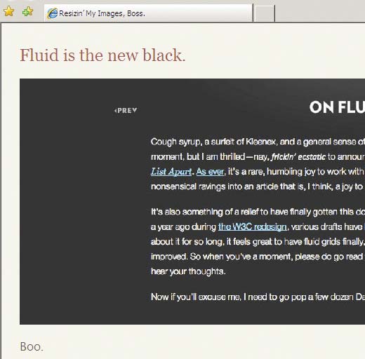
FIG 3.7: In certain Windows-based browsers, the image quickly develops too many artifacts to be readable.
But before you give up on the promise of scaleable, flexible images, it’s worth noting that this bug doesn’t affect every Windows-based browser. In fact, only Internet Explorer 7 and lower are affected, as is Firefox 2 and lower on Windows. More modern browsers like Safari, Firefox 3+, and IE8+ don’t exhibit a single problem with flexible images. What’s more, the bug seems to have been fixed in Windows 7, so that’s more good news.
So with the scope of the problem defined, surely there’s a patch we can apply? Thankfully, there is—with the exception of Firefox 2.
Now, this grizzled old browser was released in 2006, so I think it’s safe to assume it isn’t exactly clogging up your site’s traffic logs. At any rate, a patch for Firefox 2 would require some fairly involved browser-sniffing to target specific versions on a specific platform—and browser-sniffing is unreliable at best. But even if we did want to perform that kind of detection, these older versions of Firefox don’t have a switch that could fix our busted-looking images.
Internet Explorer, however, does have such a toggle. (Pardon me whilst I swallow my pride for this next section title.)
Hail AlphaImageLoader, the conquering hero
Ever tried to get transparent PNGs working in
IE6 and below? Chances are good you’ve encountered
AlphaImageLoader, one of Microsoft’s proprietary CSS filters
(http://bkaprt.com/rwd/13/). There
have since been more robust patches created for IE’s lack of support for
the PNG alpha channel (Drew Diller’s DD_belatedPNG library is a current
favorite of mine: http://bkaprt.com/rwd/14/), but
historically, if you had a PNG attached to an element’s background, you
could drop the following rule into an IE-specific stylesheet:
.logo {
background: none;
filter:
progid:DXImageTransform.Microsoft.AlphaImageLoader
(src="/path/to/logo.png",
sizingMethod="scale");
}
This AlphaImageLoader patch does a few things. First, it
removes the background image from the element, then inserts it into an
AlphaImageLoader object that sits “between” the proper
background layer and the element’s content. But the
sizingMethod property (http://bkaprt.com/rwd/15/) is the clever
bit, dictating whether the AlphaImageLoader object should
crop any parts of the image that overflow its container, treat
it like a regular image, or scale it to fit it
within its containing element.
I can hear you stifling your yawns by now: after all, what does an IE-specific PNG fix have to do with our broken image rendering?
Quite a bit, as it turns out. At one point I discovered that applying
AlphaImageLoader to an image dramatically improves
its rendering quality in IE, bringing it up to par with, well, every other
browser on the planet. Furthermore, by setting the
sizingMethod property to scale, we can use our
AlphaImageLoader object to create the illusion of a flexible
image.
So I whipped up some JavaScript to automate that process. Simply
download the script (available at http://bkaprt.com/rwd/16/) and include it
on any page with flexible images; it will scour your document to create a
series of flexible, high-quality AlphaImageLoader objects.
And with that fix applied, the difference in our rendered images is noticeable (FIG 3.8): in our example we’ve gone from an impossibly distorted image to an immaculately rendered one. And it works wonderfully in a flexible context.
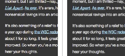
FIG 3.8: Our image is now
perfectly legible, and resizing wonderfully. A dab of AlphaImageLoader’ll do ya.
(It’s worth mentioning that many of Microsoft’s proprietary filters,
and AlphaImageLoader in particular, have some performance
overhead associated with them—Stoyan Stefanov covers the pitfalls in
more detail on the YUI blog: http://bkaprt.com/rwd/17/. What does this
mean for you? Just be sure to test the fix thoroughly on your site, gauge
its effect on your users, and evaluate whether or not the improved
rendering is worth the performance tradeoff.)
With the max-width: 100% fix in place (and aided by our
width: 100% and AlphaImageLoader patches), our
inset image is resizing beautifully across our target browsers. No matter
the size of the browser window, our image scales harmoniously along with
the proportions of our flexible grid.
But what about images that aren’t actually in our markup?
Flexibly tiled background images
Let’s say our dearly esteemed designer sends over a revised mockup of our blog module. Notice anything different about it? (FIG 3.9)
FIG 3.9: Our blog’s sidebar is now sporting a background graphic. Hot.
Up until now, our blog’s content has been sitting on a rather unassuming near-white background. But now the design has been modified slightly, adding a two-toned background to the blog entry to provide more contrast between the left- and right-hand columns. What’s more, there’s actually a subtle level of noise added to the background, adding an extra level of texture to our design (FIG 3.10).

FIG 3.10: A detailed look at our new background treatment.
So: how do we actually add this new background image to our template?
Back in 2004, Dan Cederholm wrote a brilliant article showing how a vertically repeating background graphic could be used to create a “faux column” effect (http://bkaprt.com/rwd/18/). The technique’s genius is in its simplicity: by tiling a colored background graphic vertically behind our content, we can create the illusion of equal height columns.
In Dan’s original technique, the background graphic was simply centered at the top of the content area and then tiled vertically, like so:
.blog {
background: #F8F5F2 url("blog-bg.png") repeat-y 50% 0;
}
And that technique works beautifully. But Dan’s technique assumes that your design is a fixed width, creating a graphic that matches the width of your design. Then how, pray, are we supposed to work in a background image that tiles over two flexible columns?
Thanks to some early research by designer Doug Bowman (http://bkaprt.com/rwd/19/), we can still
apply the faux column technique. It just requires a little bit of extra
planning, as well as a dash of your favorite formula, target ÷
context = result.
First, we’ll begin by taking a look at our mockup, to find the transition point in our background graphic, the exact pixel at which our white column transitions into the gray. And from the look of things, that switch happens at the 568 pixel mark (FIG 3.11).
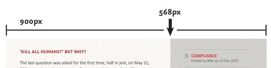
FIG 3.11: Our white
column switches over to gray at the 568px
mark. That’s our transition point.
Armed with that information, we can now adapt the “faux columns”
approach to our fluid grid. First, we’ll convert that transition point
into a percentage-based value relative to our blog module’s width. And to
do so, our target ÷ context = result formula comes into play
yet again. We have our target value of 568px, and
the width of the design—our context—is 900px.
And if we plug those two values into our stalwart formula:
568 ÷ 900 = 0.631111111111111
That’s right: another impossibly long number,
which converts to a percentage of 63.1111111111111%.
Keep that percentage in the back of your mind for a moment. Now, let’s
open up your favorite image editor, and create a foolishly wide
document—say, one that’s 3000 pixels across (FIG 3.12). And since we’re going to tile this
image vertically, its height is only 160px tall.
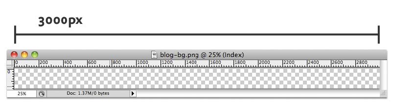
FIG 3.12: A monstrously large canvas that we’ll (shortly) turn into our background graphic.
In a moment, we’re going to turn this blank document into our background graphic. But why is it so large? Well, this image needs to be larger than we can reasonably assume the browser window will ever be. And unless you’re reading this from the 25th century on your wall-sized display made of, I don’t know, holograms or whatever, I’m assuming your monitor’s not quite that wide.
To create the columns themselves, we’ll need to apply the transition
point percentage (63.1111111111111%) to our new, wider
canvas. So if we’re working with a graphic that’s 3000px across, we
simply need to multiply that width by the percentage, like so:
3000 x 0.631111111111111 = 1893.333333333333
We’re left with 1893.333333333333 as our result. And
since Photoshop doesn’t deal in anything less than whole pixels, let’s
round that down to 1893 pixels. Armed with that number, we’ll recreate
our textures in our blank image, switching from white to gray at the 1893rd
pixel (FIG 3.13).
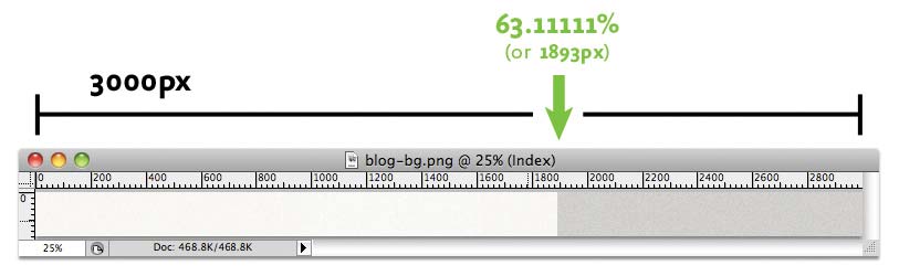
FIG 3.13: We’ve applied that percentage to our oh-so-wide background graphic, creating our tile-ready columns.
How does that help us? Well, what we’ve just done is to proportionally
scale our transition point up to this new, wider canvas. So we can
take that new pixel value, and use it to create our columns: the white
column will be 1893px wide, with the gray column filling up
the remainder.
So now there’s only one thing left to do: drop our newly minted graphic into our stylesheet.
.blog {
background: #F8F5F2 url("blog-bg.png") repeat-y 63.1111111111111% 0; /* 568px / 900px */
}
As in Dan’s original technique, we’re still
positioning the graphic at the very top of our blog, and then repeating it
vertically down the width of the module (repeat-y). But the
background-position value reuses our transition point
percentage (63.1111111111111% 0), keeping the columns
firmly in place as our design resizes itself.
And with that, we’ve got faux columns working beautifully in a fluid layout (FIG 3.14). All thanks to Dan Cederholm’s original approach, augmented with a little proportional thinking.
FIG 3.14: Our flexibly faux columns.
Fully flexible background images?
Of course, our flexible faux column isn’t really flexible: we’re simply using percentages to position a background image in such a way that the columns appear to resize with their container. The image’s dimensions haven’t changed at all.
But what about a background image that actually does need to resize with
the layout? Perhaps you’ve placed a logo on an h1
element’s background, or used sprites to create rollovers for your
site’s navigation. Can we resize images that need to live in the
background?
Well, sort of. There is a CSS3 property called
background-size (http://bkaprt.com/rwd/20/), which would
allow us to create truly flexible background images, but—you guessed
it—browser support is still pretty immature.
In the interim, there are some rather ingenious JavaScript-based
solutions out there: for example, Scott Robbin’s jQuery Backstretch
plugin (http://bkaprt.com/rwd/21/)
simulates resizable background images on the body element. And as
you’ll see in the next chapter, CSS3 media queries could also be used to
apply different background images tailored to different resolution ranges.
So while background-size might not be available yet, the sky
is, as the kids say, the limit.
Learning to love overflow
There are a few other options for working fixed-width images into a fluid context. In fact, you might consider browsing through Richard Rutter’s experiments with wide images placed in flexible layouts (http://bkaprt.com/rwd/11/). There are a number of promising experiments listed there, some of which might prove useful to you as you start tinkering with flexible layouts.
One method I’ve used on a few occasions is the overflow
property. As we saw earlier in the chapter, wide images will, by default,
simply bleed out of their containing elements. And in most cases, the
max-width: 100% rule is the best way to constrain them,
snapping them back down to a manageable size. But alternately, you could
simply clip off that excess image data by applying overflow:
hidden. So rather than setting our inset image to resize itself
automatically:
.feature img {
max-width: 100%;
}
We could instead simply clip off all that excess, overflowing data like so:
.feature {
overflow: hidden;
}
.feature img {
display: block;
max-width: auto;
}
And there you have it: one image, cropped to fit inside its container (FIG 3.15). The image is all still there, but the excess bits have just been hidden from view.
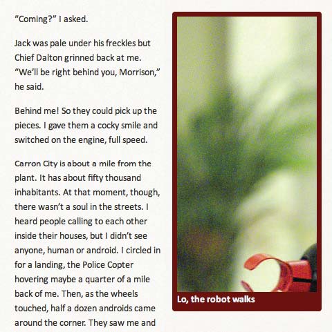
FIG 3.15: And with a dash
of overflow: hidden applied to our
image’s container, we’re left with an image that’s . . . well,
cropped. Yay, I guess?
Now, as you can see, this isn’t really a workable solution.
In fact, I’ve found that in the overwhelming majority of cases,
overflow is generally less useful than scaling the image via
max-width. But still, it’s an option to be considered, and
one you might find some use for.
Negotiate that content
It’s worth noting that both the
overflow and max-width: 100% approaches to
flexible images are actually pretty robust, and work remarkably well for
most kinds of media. In fact, I’ve used them successfully on a number of
complex fluid grids.
However, both approaches are ultimately “content-blind.” Each
establishes some basic rules for the way an image interacts with its
container: max-width: 100% scales oversized images down to
match the width of their containers, while controlling
overflow allows the designer to conceal any image data that
might bleed out of its containing element.
But what about especially complex graphics? If your image is especially information-rich (FIG 3.16), simply scaling or cropping it might be less than desirable—in fact, those approaches might actually impede your readers’ ability to understand the content contained in that image.
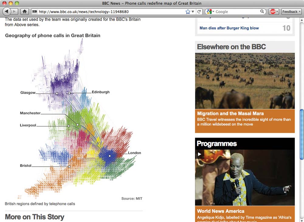
FIG 3.16: This rich infographic from the BBC News site (http://bkaprt.com/rwd/22/) contains information critical to the page’s content. Simply scaling it down could prove counterproductive.
If that’s the case, it might be worth investigating ways of delivering different versions of the same image to different resolution ranges. In other words, you could create multiple versions of your infographic—say, one ideal for desktop browsers, as well as another, more linearized version for small-screen devices. With those options established, a server-side solution could intelligently serve the most appropriate image for that resolution range.
Creating such a solution is beyond the scope of this book (and beyond the skill of your humble author), but designer/developer Bryan Rieger has outlined one possible approach on his blog (http://bkaprt.com/rwd/23/), and made his solution available for download.
If you decide to implement a back-end solution, it could be augmented by
the various client-side techniques we’ve discussed so far. For example,
you could serve images to a limited number of resolutions, and then use
max-width: 100% to smooth the transition to other devices,
browsers, and resolution ranges on an as-needed basis.
Flexible grids and images, up in the proverbial tree
At this point, we’ve explored everything you need to build complex but flexible grid-based layouts: the simple math behind flexible grids and some strategies for working images and other media into that framework. While we’ve been focusing on building a fairly simple blog module, we can actually use this to build the rest of the Robot or Not site, creating a design that’s founded on a system of proportions and percentages, with nary a pixel in sight (FIG 3.17).
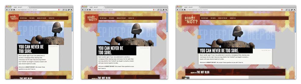
FIG 3.17: Two chapters later, and we’ve finally got a completed grid-based layout that can expand and contract with a changing viewport.
With this flexible foundation in place, we’re ready to add the final ingredient to our responsive design.
(And no, it’s not mixed metaphors.)