
15
Measuring Progress
There’s a challenge that we see consistently with our clients who struggle with determining how well their ART is performing using concrete measurements. This gets in the way of the vital Inspect and Adapt cycle that holds such an important place in the Agile methodology. After all, if there’s no established definition of success or consistent means of measuring performance against that goal, how will you know what needs to be improved? And, if you can’t prove your first ART is succeeding, how will you get approved to launch another ART?
To address this issue, many organizations make the mistake of tracking vanity metrics.
These are simple measurements that look good on paper but that don’t really say much about the success of the ART or track improvements that matter. Some examples include the following:
- How many ARTs have been launched
- How many people have been trained
- Velocity
These certainly are measurements you can (and probably should) track over the course of establishing and scaling your ARTs, but they don’t really have any bearing on how successful an ART is. They don’t identify opportunities for improvement in terms of an ART’s effectiveness. They just report how busy the portfolio has been.
How do we demonstrate that we have made improvements and that the new way of working is worth adopting? How do we show that the ART is sustainably improving in its ability to generate value?
The best way to demonstrate success is empirical. The Scaled Agile Framework (SAFe®) initially developed its metrics as a “menu” of metrics (a whole list of metrics that you could choose to measure) and then more recently as a series of flow metrics, taking a lot of inspiration from Mik Kersten’s book, Project to Product [5].
However, we wanted to give you a set of basic metrics that every organization should be able to collect and analyze without investing too much time and effort, but it’s not enough to look at one value in a vacuum. Rather, it requires a balanced view. In the end, we settled on four domains:
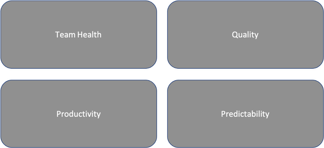
Figure 15.1 – Balanced scores for each ART
In this chapter, we will focus on the metrics that help determine whether the ARTs within your portfolio are performing well. At the end of the chapter, we will consider some additional portfolio measures as well.
We will look at each domain in turn but first, we need to understand the difference between Leading and Lagging Indicators.
Leading and Lagging Indicators
Lagging Indicators are typically output-oriented—easy to measure but hard to improve or influence. Leading Indicators, on the other hand, are typically input-oriented—hard to measure but easy to influence.
Let us illustrate this with a simple example:
For many of us, a personal goal is weight loss. Your weight is a clear Lagging Indicator that is easy to measure. You step on a scale and you have your answer, but how do you actually reach your goal? For weight loss, there are two Leading Indicators:
- Calories consumed
- Calories burned
These two indicators are easy to influence—you just need to eat less and move more. However, they’re challenging to measure. When you order lunch in a restaurant, the number of calories may not be listed on the menu. Even if you can secure a calorie count for everything you eat, accurate figures will require precise measurements—a digital food scale, measuring cups and spoons, an app to log every bite you take, and a fitness tracker (with its own app) to estimate the calories burned — and the self-discipline to keep up with it all.
Keep that example in mind as we break down useful metrics in the four domains from Figure 15.1 in the upcoming sections.
Domain 1 – Team Health
Increasingly, talent acquisition is becoming harder and harder in an ever more competitive world to attract the right people. And then, having secured the right people, it is even more important that you retain them.
Yet, according to Gallup, 87% of employees worldwide are neutral, disengaged, or actively disengaged at work. This disengagement correlates with the following:
- 37% higher absenteeism
- 18% lower productivity
- 15% lower profitability
Or, to put it another way, “34% of an employee’s annual salary is lost due to disengagement.” (Forbes: May 2019)
The three measures in this domain to monitor the health of your people are as follows:
Staff Turnover
Staff turnover is a Lagging Indicator—these staff members have already left. However, trending this metric over time (monthly and annually) might point to an underlying issue. It’s especially valuable when combined with anecdotal records of what led to the attrition. Independent Exit Interviews help employers understand the reasons why people leave. Working closely with your people function can increase the value of this metric.

Figure 15.2 – Annual employee turnover rate calculated monthly
Staff sickness
Staff sickness is less of a Lagging Indicator. At least they have not left, but they are still not at work. However, they might be at risk of leaving if ill health persists. This is a potential indicator that there might be an environmental hygiene factor, or maybe the individual or team is not working at a sustainable pace. Maybe burnout is to blame.
Caution
Importantly, this isn’t a metric that gets published or discussed in front of the group; we don’t want people to feel that they have to come to work. If they are ill, they need to recover.
Employee NPS
Most people will be familiar with NPS, but if you think you are not, you have probably experienced it. You take your car to the garage to be serviced or contact the customer service department for help with a product you’ve purchased. Soon afterward, you receive an email with a survey asking the following:
“On a scale of 0 to 10, would you recommend <XYZ service/company> to a friend?”
The NPS separates respondents into “promoters” who provide ratings of 9 or 10, “passives” who provide ratings of 7 or 8, and “detractors” who provide ratings of 6 or lower. The NPS is derived by subtracting the percentage of detractors from the percentage of promoters collected by the survey item.
So, with employees on an ART, we might ask the following:
“On a scale of 0 to 10, would you recommend a colleague to join this ART?”
The first few scores may be negative because of growing pains, so use your judgment when it comes to publishing the NPS. However, tracking the percentage improvement from one survey to the next and over time will produce a rolling average that can demonstrate Continuous Improvement.
Good follow-up questions would be the following:
- If you opted for 0 to 6, what do we need to do to improve?
- If you opted for 7 to 8, what do we need to get you to 9 or 10?
- If you opted for 9 or 10, what do we need to keep doing?
Let’s look at the next domain on our list.
Domain 2 – Quality
If you can reduce the number of escaped defects and the Mean Time To Recovery (MTTR) through test automation (%) and static code analysis, you open up more time for creating new and exciting Features to delight customers.
However, there’s also a clear financial benefit to reducing the number of escaped defects. The most recent numbers indicate software bugs cost the U.S. economy $2.08 trillion each year [1]. A 2003 study [2] commissioned by the Department of Commerce’s National Institute of Standards and Technology (NIST) offered the following figures to consider in Figure 15.3. The study is old, so these figures are low given the salaries and overheads of modern technical teams, but it illustrates the dramatic escalation of cost if bugs aren’t caught early on.
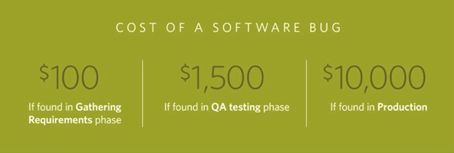
Figure 15.3 – The cost of a software bug
The four measures in this domain are the following:
Escaped Defects
The number of escaped defects is definitely a Lagging Indicator. It’s a simple metric to collect and track as work is released throughout multiple ARTs. Think about it as a measure of how much your customers have been upset.
There are several tools available for tracking escaped defects, including the following:
- Issue tracking systems such as JIRA or Asana: These tools allow you to create issues for escaped defects, assign them to specific team members, and track their progress through the resolution process.
- Test management tools such as TestRail or Zephyr: These tools can help you identify escaped defects by tracking test results and generating reports on the status of test cases.
- Bug tracking tools such as Bugzilla or Mantis: These tools are specifically designed for tracking and managing bugs and defects. They allow you to assign priority levels, track progress, and generate reports on the status of bugs.
MTTR
Closely related to the number of escaped defects, the MTTR tracks how long you leave your customers upset—how much time it takes your teams to resolve the escaped defects customers have experienced. To track MTTR, there are several tools you can use, including the following:
- Incident management platforms such as PagerDuty, OpsGenie, or VictorOps: These tools provide a centralized location to manage incidents and track MTTR. They allow you to assign and escalate incidents to the appropriate team members, and track the time it takes to resolve them.
- Service desk software such as JIRA Service Management or Freshservice: These tools provide a way to track and manage service requests and incidents. They allow you to track the time it takes to resolve incidents and provide reports on MTTR.
- Application performance monitoring (APM) tools such as New Relic or AppDynamics: These tools provide real-time monitoring of your applications and infrastructure. They can help you quickly identify and diagnose issues, and track the time it takes to resolve them.
Test automation percentage
As a foundational principle of DevOps, test automation is an important factor in reducing escaped defects and simplifying error resolution by catching bugs earlier in the development process. Automating testing allows for it to occur more quickly and more often at various stages, and it reduces the impact of human error in the QA process.
To track test automation, there are several tools you can use, including the following:
- Test management tools such as TestRail or Zephyr: These tools can help you track your test automation efforts by providing a centralized location to manage and execute automated test cases. They allow you to track the status of test cases, view results, and generate reports on test automation coverage.
- Continuous integration and deployment tools such as Jenkins or Travis CI: These tools can help you automate the execution of your test cases as part of your build and deployment process. They provide metrics on test results, including pass rates and failures, which can help you identify areas for improvement in your test automation.
- Test automation frameworks such as Cypress or Robot Framework: These tools provide a structure for organizing and executing your automated tests. They often include built-in reporting and tracking capabilities that can help you monitor the status of your test automation efforts.
Code Quality (static code analysis)
Static code analysis is a software debugging method that involves examining the code without executing the Program software. It can provide an understanding of the code structure and help ensure the code adheres to industry standards.
There are several tools available for code quality, including the following:
- Static code analysis tools such as SonarQube, CodeClimate, or PMD: These tools can analyze your code base to identify potential issues and suggest improvements. They can help you identify code smells, security vulnerabilities, and other potential issues that can impact code quality.
- Code review tools such as GitHub, Bitbucket, or GitLab: These tools can help you ensure that your code meets your team’s coding standards and best practices. They allow you to review code changes and suggest improvements before they are merged into your main codebase.
- IDE plugins such as IntelliJ IDEA, Eclipse, or Visual Studio: These tools can provide real-time feedback on code quality as you write and edit code. They can help you identify issues such as syntax errors, code duplication, and formatting issues before they become bigger problems.
Caution
Ultimately, the best tools for Escaped Defects, MTTR, Test Automation, and Code Quality will depend on the specific needs of your team and organization. It’s important to evaluate several options and choose the one that best fits your needs.
Let’s move on to the third domain.
Domain 3 – Productivity
As noted previously, it’s easy to get caught up in vanity metrics that just report how busy the ART is. That’s not what productivity metrics should be about. Rather, these productivity metrics should measure what value the ART produces and how effectively it does so.
As the Feature Lead Time, Story Cycle Time, and Flow Efficiency are tracked over time, ongoing successes can be celebrated and opportunities for improvement can be identified and resolved. Waste is eliminated and productivity increases. As that occurs, the number of releases—the measure of value reaching the customer — should first rise, then become predictable.
Most problems with your process will surface as delays. Most of the time spent getting to market is a result of these delays. Reducing delays is the fastest way to reduce time to market without anyone working any harder, but you need to identify the delays.
Visualizing your Continuous Delivery Pipeline is critical. An RTE’s primary responsibility is to manage and optimize the flow of value through the ART. This comes down to tracking and acting on these metrics.
This domain contains four measures:
- Feature Lead Time
- Story Cycle Time
- Activity Ratio (aka Flow Efficiency)
- Number of Deployments
Feature Lead Time
The Feature Lead Time encompasses the complete time period between when a Feature is requested and when it’s delivered. A Lean mindset requires that teams continuously strive to shrink this period since doing so is indicative of improving speed and efficiency and/or reducing waste in the system.
Story Cycle Time
The Story Cycle Time is a subset of the Feature Lead Time, focusing on just the period during which a given story or task is considered a work-in-progress, from the point it is pulled from the backlog to when it is considered done and ready for delivery.
Like the Feature Lead Time, a reduced Story Cycle Time indicates the team is working more efficiently and that wasted time—usually due to bottlenecks in the transition between states of work—is being eliminated.
If the iteration is two weeks, a story needs to be small enough to be completed within one iteration, ideally 1 to 5 days; a good average story cycle time is 2 to 3 days.
And yet we still see stories that take more than 10 days. Now, there may be delays that we need to focus on, or the story may have just been too big and we need to look at patterns for splitting User Stories [3].
Activity Ratio (aka Flow Efficiency)
Another subset of the story cycle time is the processing time. Process time refers to the time during which the story or Feature is being actively worked on.
By dividing the lead time into the process time, you can track the Activity Ratio or Flow Efficiency. This ratio describes how much of the total lead time is actually spent actively adding value—working on moving the Feature or story toward completion.
Tracking your team’s workflow efficiency is crucial for optimizing the whole process.
In the following example, the process time is 6 hours and the lead time is 7 weeks (or 280 hours, assuming a standard 40-hour workweek):

Figure 15.4 – Activity ratio (an example)
The Flow Efficiency is 2% (6/280 x 100). So, 98% of the time the work is in a waiting state. While this sounds incredibly low, the average worldwide Flow Efficiency is 1 to 5%.
To track Feature Lead Time, Story Cycle Time, and Activity Ratio, there are several tools you can use, including Agile Management Tools such as JIRA, TargetProcess, or Asana. These tools allow you to create and track User Stories and Features, and estimate the time it will take to complete them. They provide reports on progress and can help you identify areas where the Activity Ratio can be improved.
But heed the same caution as with quality – it’s important to evaluate several options and choose the one that best fits your needs.
Number of Deployments
First, let me explain the difference between Continuous Deployment and Release on Demand:
- Continuous Deployment is a process that takes validated Features in a staging environment and deploys them into the production environment, where they are readied for release – they are not released; they are in a passive state
- Release on Demand is a process that deploys new functionality to production and releases it immediately or incrementally to customers based on demand – it is now in the hands of customers, hopefully earning revenue
I generally recommend organizations focus on deployments rather than releases because deciding what to release and when requires careful consideration and a customer-centric mindset. However, depending on your context, there may be merit to tracking both.
There are several tools available for code deployment, including the following:
- Continuous Integration / Continuous Deployment (CI/CD) tools such as Jenkins, GitLab CI/CD, or CircleCI: These tools allow you to automatically build, test, and deploy your code changes to your development, staging, and production environments. They can help you ensure that your code is always up to date and functioning as expected.
- Configuration management tools such as Chef, Puppet, or Ansible: These tools allow you to manage the configuration of your servers and infrastructure as code. They can help you deploy and manage your code in a consistent and repeatable way across different environments.
- Cloud deployment tools such as AWS CodeDeploy, Google Cloud Deployment Manager, or Azure DevOps: These tools provide a centralized location for deploying your application to cloud-based infrastructure. They can help you automate your deployment process and scale your application as needed.
A final reminder that selecting any tool will depend on the specific needs of your organization and team. It’s important to evaluate several options and choose the one that best fits your needs.
Pro tip
According to Gene Kim (a co-author of The DevOps Handbook: How to Create World-Class Agility, Reliability, and Scalability in Technology Organizations), the table stakes for an organization is 10 deployments per day.
Finally, let’s look at the last domain.
Domain 4 – Predictability
Predictability measurements should never be used as a basis for saying, “You’re not doing enough” or for instigating competition between teams.
But, from the standpoint of supporting PI Planning and the long-term success of an ART, predictability is paramount. It’s never going to be an exact science—and it shouldn’t be—but having a solid basis for what and how much work the ART can commit to each PI is strategically valuable.
This final domain has three measures:
ART Predictability
The ART Predictability measures compare the Planned Business Value to the Actual Business Value achieved. Here’s how it’s determined:
- In the second team breakout on day 2 of PI Planning, Business Owners circulate and assign Business Value to the team’s PI Objectives from low (1) to high (10).
- As part of the PI System Demo at the end of PI, teams meet with their Business Owners to self-assess the Business Value they achieved for each objective. They ask, “Did we deliver all the functionality requested, to the required quality, and on time?”
- Each team’s planned versus Actual Business Value is then rolled up to the ART level in the ART Predictability Measure.
ART Predictability measures how well a Train can plan and meet its PI Objectives. For a business to plan and execute effectively, ARTs should generally satisfy most of the Committed PI Objectives and one or more of the Uncommitted PI Objectives. This approach typically results in an average of 80-100% of the total planned.
ART Predictability is an important measure for organizations that use SAFe®. The predictability of an ART refers to its ability to consistently deliver working software at the end of each PI, which is typically a 10-12 week period in SAFe®.
There are several reasons why ART Predictability is important. First, it allows the organization to plan and execute work more effectively. When an ART is predictable, the organization can rely on it to deliver working software at the end of each PI, which helps ensure that the overall solution stays on track. This predictability is particularly important in large, complex solutions where many teams are working together, as it helps to coordinate their efforts and ensure that everyone is working toward the same goal.
Second, ART Predictability helps build trust between the organization and its Business Owners. When Business Owners can rely on the ART to consistently deliver working software at the end of each PI, they are more likely to trust the organization’s ability to manage the solution effectively. This can lead to better relationships between the organization and its Business Owners.
Finally, ART Predictability is important for Continuous Improvement. When an ART is predictable, the organization can analyze its performance and identify areas for improvement. This can help the organization refine its processes and practices, which can lead to even greater predictability and improved outcomes over time.
Overall, ART Predictability is an important measure as it helps organizations to plan and execute solutions more effectively, build trust with Stakeholders, and continuously improve their processes and practices. Additional information about Predictability Measures can be found in Chapter 10.
Pro tip
If you are an SPC in good standing, you will have access to the PI Execution Toolkit, which includes a simple Excel Spreadsheet that allows you to track and calculate ART Predictability across the teams on the ART and then a rolled-up measure for the ART.
ART Velocity
As a measure of productivity, velocity alone is not a valuable metric. The raw data is limited in scope and ever-changing based on multiple factors. However, ART Velocity does factor into forecasting and road mapping, as it provides a reasonable average from which to derive each team’s general capacity and that of the entire ART.
ART Velocity is the summation of all the Story Points delivered by the teams for each PI.
There are several reasons why tracking ART Velocity is important:
- Helps with planning: By tracking the ART Velocity, organizations can better plan and forecast how much work the ART can deliver in future PIs. This allows the organization to set realistic expectations with Business Owners and ensure that the team is not over-committing to work that they cannot realistically deliver.
- Helps with Continuous Improvement: By tracking the ART Velocity over time, organizations can identify trends and patterns in the team’s performance. This can help the organization to identify areas where the team is struggling and make adjustments to improve their performance in future PIs.
- Helps with coordination: When multiple teams are working together on one or more large, complex solutions, tracking the ART Velocity can help ensure that everyone is working toward the same goal. By understanding how much work each team can deliver in a given PI, the organization can better coordinate the efforts of the teams and ensure that they are all aligned towards the same objectives.
- Helps with transparency: Tracking the ART Velocity can help improve transparency within the organization. By making the ART Velocity visible to Business Owners, the organization can demonstrate the team’s capacity for delivering value and build trust with Business Owners by providing evidence of progress and successful delivery.
Reviewed regularly as a trend, an ART’s Velocity can lay the foundation for greater predictability, which, in turn, supports more efficient and strategic productivity.
Caution
While it is possible to compare velocity between teams and ARTs, it is generally not recommended to do so for a number of reasons.
Comparing team or ART Velocity can be misleading. Velocity is influenced by a wide variety of factors, including team size, skill level, the complexity of the work being done, and the tools and processes used by the team. Comparing the velocity of two different teams or ARTs without taking these factors into account can be misleading and can result in unfair comparisons.
Velocity is intended to be used as an internal measure of a team’s or ART’s performance, rather than as a benchmark for comparison with other teams or ARTs. By focusing on improving their own velocity, teams and ARTs can continuously improve their performance and deliver more value to their Stakeholders. Comparing team velocity can distract teams from this focus and lead to a fixation on outperforming other teams rather than delivering value to Stakeholders.
Velocity is a measure of how much work a team can deliver in a given period of time, and it is specific to each individual team or ART. It is a planning aid, not a comparative performance measure!
Features/Enablers/Stories Planned versus Accepted
Similar to ART Velocity, the planned versus accepted metric is of little value on a per-iteration basis. Rather, it serves as context for the ART Predictability Measure.
One company we worked with said that their predictability was about 80%. However, they only completed four or five Features per PI when the business expected much more. Predictably underachieving isn’t what we’re aiming for. It was a signal to explore whether there was a problem.
Tracking the Features Planned and the Features Accepted is an important measure as it helps organizations to plan and prioritize their work effectively, measure their progress toward their goals, and identify areas for improvement. By focusing on delivering the Features that are most important to Business Owners and continuously improving their processes, organizations can ensure that they are delivering maximum value to their Business Owners and achieving their objectives.
Summary
At this point, we think it’s important to take a step back and note that all of the metrics we discussed—as important and helpful as all of them are—are not the “final answer” in terms of measuring the success of an ART. The overarching purpose of the ART—and really of everything we do as Agile organizations—is to deliver value to our customers.
While many businesses tend to oversimplify customer value by limiting it to saved time and money, the truth is that value means different things to different people. Bain & Company identified 30 different elements of value that fall in line with Maslow’s famous hierarchy of needs [4]. Saving time and money are both functional elements of value, and they’re important, but customers may actually yearn for emotional, life-changing, and social impact value even more.
So, consider the metrics we’ve discussed as Leading Indicators that you can use to gauge the value the ART delivers to customers, but, to make that work, you need to understand what value means to your customers. You need to plan and optimize the ART to focus on delivering that value. Doing so will translate to greater customer loyalty and increased revenue over time.
In Chapter 16, we’ll look at the dimensions of Leadership Alignment.
Further reading
- How much could software errors be costing your company? https://raygun.com/blog/cost-of-software-errors/
- The True Cost of a Software Bug: Part One: https://www.celerity.com/insights/the-true-cost-of-a-software-bug
- The humarzing work guide to splitting user stories (https://www.humanizingwork.com/the-humanizing-work-guide-to-splitting-user-stories/)
- Elements of Value: https://hbr.org/2016/09/the-elements-of-value
- Kersten, Mik (2018). Project to Product: How to Survive and Thrive in the Age of Digital Disruption with the Flow Framework. IT Revolution Press.