
Chapter 8: Building the Seemingly Impossible
8.1 Introduction to Patient Profile Plot
Most of the graphs that you produce are pretty straight forward with maybe one or two types of data. But what if you are asked to produce a patient profile plot? If you have never produced a patient profile plot before, you might ask yourself a series of questions.
● What is a patient profile plot?
● What type of data should be captured?
● What is the best approach for producing one?
A patient profile plot is a visual representation of the patient’s data. It is used to help obtain a better understanding of that particular patient’s data and can sometimes be used to help determine whether a patient has their medical condition under control or whether they are using medication or some intervention to keep it under control.
A patient profile plot typically contains several data sources that showcase the patient’s journey through the study. Typically, the data captured on the profile plot is the data that is key to understanding the condition that is considered the primary or secondary indication for the study.
The best approach for producing a profile plot depends on the type of data captured as well as what you are trying to convey. A patient profile plot can be a number of mini plots displayed on the same page or it can be one plot with a variety of data. In this chapter, a step-by-step approach is shown for a diabetic profile plot in one plot.
8.1.1 Walking Through a Diabetic Patient Profile Plot
What if you were asked to produce a plot like the one shown in Output 8-1? Would you even know where to begin? When encountered with something that seems almost impossible to do at first glance, take a step back and examine each component individually and start with what you know.
Output 8-1: Diabetic Patient Profile Plot for Patient 0001

8.1.1.1 Creation of Data Set with All Necessary Data to Build a Diabetic Patient Profile Plot
Regardless if you have a template that was created by another or you are creating your own template, you will need to ensure that the data is in a structure that the template can use. For the walk-through of the creation of the diabetic profile plot, you need to create a new template. The data might not be in a structure that is readily available to create the desired graph. Therefore, you need to think about the best approach for creating the data set. Program 8-1 illustrates the creation of the data set in a structure that can be used by the template. Display 8-1 provides a portion of the data that is produced by Program 8-1.
Program 8-1: Program to Structure the Data in a Format to be Used by Custom Template
options validvarname = upcase;
libname adam “<location of permanent SAS data sets>”;
proc sort data = adam.adlbdiab out = adlbdiab;
by usubjid ady paramcd;
where anl01fl = ‘Y’;
run;
proc transpose data = adlbdiab out = tadlb (drop = _:);
by usubjid ady adt;
var aval;
id paramcd;
run;
data all;
set tadlb adam.adaediab (drop = trtsdt)
adam.adcmdiab (drop = cmtrt trtsdt);
strtday = coalesce(ady, astdy);
/* create barbed arrow for ongoing events */
length cmcap $15;
if cmenrtpt = ‘ONGOING’ then cmcap = ‘FILLEDARROW’;
else cmcap = ‘SERIF’;
run;
/* sort reverse order so that can find last study day for ongoing events */
proc sort data = all;
by usubjid descending strtday;
run;
/* determine the last study day for ongoing events */
data adam.diabprof;
set all;
by usubjid descending strtday;
retain endday;
if first.usubjid then endday = .;
if ady ne . then endday = ady;
else if (aedecod ne ‘’ or acat ne ‘’) and aendy ne . then
endday = aendy;
else if (aedecod ne ‘’ and aeenrtpt = ‘ONGOING’) or
(acat ne ‘’ and cmenrtpt = ‘ONGOING’) then endday = endday + 20;
if index(aedecod, ‘Hypo’) then event1 = 8;
else if index(aedecod, ‘Hyper’) then event2 = 9;
if index(acat, ‘Supplement’) then med = 1;
else if index(acat, ‘Rapid’) then med = 3;
else if index(acat, ‘Fast’) then med = 5;
else if index(acat, ‘Elev’) then med = 7;
run;
u Because there can be multiple records for a subject, parameter, and time point combination, you need to make sure you are selecting only the lab records that are used for analysis (ADLBDIAB where ANL01FL = “Y”).
Since two lab results are of interest: Glucose and HbA1c, then these values need to be on the same record; therefore, the data is transposed.
w Based on the plot, you need to also include information about hyperglycemic and hypoglycemic events, which comes from the adverse event data set (ADAEDIAB) as well as information about the type of rescue medication the patient might have taken, which comes from the concomitant medication data set (ADCMDIAB).
x Due to the nature of the different data sources, ADLBDIAB captures the study day in ADY but ADAEDIAB and ADCMDIAB have a study start (ASTDY) and end (AENDY) day. Therefore, a variable needs to be created that will capture the start day. Note that since the data sets are being combined both ADY and ASTDY will not be populated at the same time. With the COALESCE function, the first nonmissing value in the list of arguments is used to populate the variable.
CMCAP is a variable that will be used in the template to indicate whether a medication is considered ongoing. The values correspond to possible values that can be used for GTL plots that have the LOWCAP or HIGHCAP option.
A new variable, ENDDAY, is created based on whether the end day already exists. For lab data, ADY is used to represent the end day. For AE and medication data, AENDY is used to represent the end day. If the end day does not exist and the event or the medication is considered ONGOING, then the end day of the previous record is used, and 20 days is added so that it extends beyond the last day, and an arrow can be used to indicate it is ongoing.
Each event is captured as a separate variable with a numeric value. Hypoglycemic events are denoted as EVENT1 = 8; while hyperglycemic events are denoted as EVENT2 = 9. Although you could create one variable to distinguish between the two events and assign them different numeric values (for example, EVENT = 8 for hypoglycemic and EVENT = 9 for hyperglycemic), it would be more difficult to control the color and symbols used to represent each event. Therefore, in order to get them to appear with different markers and different colors, each event had its own numeric variable. The values of 8 and 9 were chosen because you want the events to appear at the bottom of the graph and based on the lab data, you know that glucose ideally should not get below 10 mg/dL.
The medications used when a patient had an event are also assigned a numeric code. Unlike the events, one variable is needed to represent the different types of medication. The reason for this is explained in Section 8.1.1.4 Creation of Highlow Plot for Duration of Medication by Type of Medication.
Display 8-1: Portion of the Lab Data Produced by Program 8-1
|
Obs |
USUBJID |
ADY |
ADT |
HBA1C |
SGLUC |
AEDECOD |
ASTDT |
ASTDY |
AENDT |
AENDY |
|
1 |
ABC-DEF-0001 |
180 |
03MAY2017 |
4.88 |
142 |
. |
. |
. |
. |
|
|
2 |
ABC-DEF-0001 |
. |
. |
. |
. |
Hyperglycemia |
30APR2017 |
177 |
. |
. |
|
3 |
ABC-DEF-0001 |
. |
. |
. |
. |
30APR2017 |
177 |
. |
. |
|
|
4 |
ABC-DEF-0001 |
171 |
24APR2017 |
. |
70 |
. |
. |
. |
. |
|
|
5 |
ABC-DEF-0001 |
163 |
16APR2017 |
. |
150 |
. |
. |
. |
. |
|
|
6 |
ABC-DEF-0001 |
. |
. |
. |
. |
Hyperglycemia |
13APR2017 |
160 |
15APR2017 |
162 |
|
7 |
ABC-DEF-0001 |
. |
. |
. |
. |
12APR2017 |
159 |
18APR2017 |
165 |
|
|
8 |
ABC-DEF-0001 |
157 |
10APR2017 |
. |
75 |
. |
. |
. |
. |
|
|
9 |
ABC-DEF-0001 |
151 |
04APR2017 |
. |
90 |
. |
. |
. |
. |
|
|
10 |
ABC-DEF-0001 |
144 |
28MAR2017 |
. |
84 |
. |
. |
. |
. |
|
Obs |
AEENRTPT |
CMDECOD |
ACAT |
CMENRTPT |
STRTDAY |
CMCAP |
ENDDAY |
EVENT1 |
EVENT2 |
MED |
|
1 |
180 |
SERIF |
180 |
. |
. |
. |
||||
|
2 |
ONGOING |
177 |
SERIF |
200 |
. |
9 |
. |
|||
|
3 |
FlexPen |
Fast-acting |
ONGOING |
177 |
FILLEDARROW |
220 |
. |
. |
5 |
|
|
4 |
171 |
SERIF |
171 |
. |
. |
. |
||||
|
5 |
163 |
SERIF |
163 |
. |
. |
. |
||||
|
6 |
160 |
SERIF |
162 |
. |
9 |
. |
||||
|
7 |
NovoLog |
Rapid-acting |
159 |
SERIF |
165 |
. |
. |
3 |
||
|
8 |
157 |
SERIF |
157 |
. |
. |
. |
||||
|
9 |
151 |
SERIF |
151 |
. |
. |
. |
||||
|
10 |
144 |
SERIF |
144 |
. |
. |
. |
Once you have the data in the desired format to align with the needs to produce the graph, you can create a template that uses the variables and structure of the data set or if a template already exists you can associate the data with the template to render the graph. As mentioned previously for the purpose of this walk-through, you assume that no template exists and you need to create your own.
8.1.1.2 Creation of Series Plots for Glucose and HbA1c Lab Results
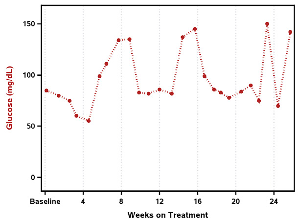
Upon examining the plot that you need to create, you notice that there are two series plots. Series plots are pretty straight forward, so you are able to create those using the SERIESPLOT statement in GTL. Although it would be easy enough to create the series plot using SGPLOT, you want to build your own custom template because the final plot contains more than a series plot. Before you create the series plots you need to determine what the axes will be. Looking at the data you notice that Glucose (mg/dL) levels are captured approximately every week; however, HbA1c (%) is captured approximately every two months. Therefore, not only do the two lab tests have different lab value ranges, they also have different time points. Let us start with creating one plot at a time. Program 8-2 uses the data created in Program 8-1 to generate a series plot for Glucose, as seen in Output 8-2.
Program 8-2: Template to Produce Series Plot for Glucose (mg/dL)
proc format;
picture dy2wk (round)
0 = ‘Baseline’ (noedit)
1 - high = 09 (mult = 0.142857);
run;
proc template;
define statgraph glucprof;
begingraph / border = false;
layout overlay / xaxisopts = (label = ‘Weeks on Treatment’
griddisplay = on
gridattrs = (pattern = 35 color = libgr)
labelattrs = (color = black weight = bold)
linearopts = (viewmin = 0 viewmax = 180
tickvaluesequence = (start = 0 end = 168
increment = 28)
tickvalueformat = dy2wk.))
yaxisopts = (label = ‘Glucose (mg/dL)’
offsetmin = 0.07 offsetmax = 0.07
labelattrs = (color = firebrick
weight = bold)
linearopts = (viewmin = 0 viewmax = 155));
seriesplot x = strtday y = sgluc / display = all
markerattrs = (symbol = circlefilled
color = firebrick size = 6)
lineattrs = (color = firebrick pattern = 34
thickness = 3);
endlayout;
endgraph;
end;
run;
proc sgrender data = adam.diabprof template = glucprof;
where usubjid = ‘ABC-DEF-0001’;
run;
In order to preserve the value of the study day, a picture format is created so that the time point displays as weeks instead of days.
Within the layout specified, you can indicate which axes are needed and use the various options associated with the axis to customize. Because Glucose is captured weekly, the label for the X axis is set to indicate “Weeks” and options are set to indicate that only values between study day 0 and 180 are to be displayed but the X axis will only display tick marks from 0 to 168 in increments of 28 days. The format that was created is applied to the tick marks to convert it from days to weeks.
Sometimes gridlines on the graph help to see where a particular point falls with respect to the values on the axis. In order to display, you can use GRIDDISPLAY = ON.
Each ODS style has different graph style elements that control the appearance of different aspects of the graph. The GraphGridLines style element is used for the appearance of the gridlines. In order, to modify the appearance of the gridlines, you can use GRIDATTRS option. Within the GRIDATTRS option, you can control attributes such as the line pattern and line color.
Similar to the X axis, the Y axis can be customized to provide a specific label as well as label attributes such as color. If OFFSETMIN and OFFSETMAX options are used on the Y axis, it signals how much space needs to be reserved from the bottom axis and top axis respectively. In addition, these options can be used on the X axis as well. If used on the X axis, then it reserves space from the left and right axis respectively.
The SERIESPLOT statement has its own set of options that will govern how the plot will be displayed. For the diabetic patient profile plot, the series line along with the markers are to be displayed, so you need to use DISPLAY = ALL. The default display option is STANDARD, which does not display the markers.
One of the options for the SERIESPLOT enables you to control the appearance of the markers: MARKERATTRS. You can control attributes such as color, size, and symbol. The marker is the symbol that is used to represent each data point on the series plot. As shown in Output 8-2, the markers are firebrick (red) filled circles.
The LINEATTRS options enables you to control the appearance of the series line. You can control attributes such as line color, line pattern, and line thickness.
} Typically, a patient profile plot is generated for all patients in the data set. For illustration purposes, SAS Program 8-2 is only subsetting for the one patient in order to produce the plot in Output 8-2.
Output 8-2: Series Plot for Glucose (mg/dL) for Patient 0001
Note the same process used to create the Glucose series plot is repeated to produce the HbA1c series plot. Program 8-3 highlights the modifications needed to produce the HbA1c plot, which is displayed in Output 8-3.
Program 8-3: Template to Produce Series Plot for HbA1c (%)
/* formats to display time point */
proc format;
picture dy2mo (round)
0 = ‘Baseline’ (noedit)
1 - high = 09 (mult = 0.035714);
run;
proc template;
define statgraph hba1cprof;
begingraph / border = false;
layout overlay / xaxisopts = (label = ‘Months on Treatment’
griddisplay = on
gridattrs = (pattern = 35 color=libgr)
labelattrs = (color = black weight = bold)
linearopts = (viewmin = 0 viewmax = 180
tickvaluelist = (0 56 112 168)
tickvalueformat = dy2mo.))
yaxisopts = (label = ‘HbA1c (%)’
offsetmin = 0.07 offsetmax = 0.07
labelattrs = (color = cornflowerblue
weight = bold)
linearopts = (viewmin = 0 viewmax = 8));
seriesplot x = strtday y = hba1c / display = all
markerattrs = (symbol = squarefilled color = cornflowerblue
size = 6)
lineattrs = (color = cornflowerblue pattern = 12
thickness = 3);
endlayout;
endgraph;
end;
run;
proc sgrender data = adam.diabprof template = hba1cprof;
where usubjid = ‘ABC-DEF-0001’;
run;
Similar to the format that displayed the time points in weeks, a format is created to display the time points for HbA1c in months.
The options for the X axis are changed to account for the data being captured in months instead of weeks.
Instead of using the TICKVALUESEQUENCE option that specifies a start and end of the tick marks sequence and how the tick marks should be incremented, a list of values for the tick marks can be provided with TICKVALUELIST. In addition, the new format is applied.
The options for the Y -axis are also modified to account for the specific colors and minimum and maximum value for HbA1c.
The options for the SERIESPLOT statement are also modified so that the series plot for HbA1c is shown in the color cornflower blue with filled squares as the markers and a line pattern of 12.
Output 8-3: Series Plot for HbA1c (%) for Patient 0001

Because each series plot has its own set of axes and both plots need to reside on the same plot, you need to use the X2 and Y2 axes to allow for the display of the two lab tests. Program 8-4 illustrates the use of the X2 and Y2 axes with the results shown in Output 8-4.
Program 8-4: Template to Produce Series Plot for Both Glucose (mg/dL) and HbA1c (%) on the Same Graph
proc template;
define statgraph ghprof;
begingraph / border = false;
layout overlay / xaxisopts = (label = ‘Weeks on Treatment’
griddisplay = on
gridattrs = (pattern = 35 color=libgr)
labelattrs = (color = black weight = bold)
linearopts = (viewmin = 0 viewmax = 180
tickvaluesequence = (start = 0 end = 168
increment = 28)
tickvalueformat = dy2wk.))
yaxisopts = (label = ‘Glucose (mg/dL)’
offsetmin = 0.07 offsetmax = 0.07
labelattrs = (color = firebrick
weight = bold)
linearopts = (viewmin = 0 viewmax = 155))
x2axisopts = (label = ‘Months on Treatment’
labelattrs = (color = black weight = bold)
linearopts = (viewmin = 0 viewmax = 180
tickvaluelist = (0 56 112 168)
tickvalueformat = dy2mo.))
y2axisopts = (label = ‘HbA1c (%)’
offsetmin = 0.07 offsetmax = 0.07
labelattrs = (color = cornflowerblue
weight = bold)
linearopts = (viewmin = 0 viewmax = 8));
seriesplot x = strtday y = sgluc / display = all
markerattrs = (symbol = circlefilled color = firebrick
size = 6)
lineattrs = (color = firebrick pattern = 34 thickness = 3);
seriesplot x = strtday y = hba1c / xaxis = x2 yaxis = y2
display = all
markerattrs = (symbol = squarefilled color = cornflowerblue
size = 6)
lineattrs = (color = cornflowerblue pattern = 12
thickness = 3);
endlayout;
endgraph;
end;
run;
proc sgrender data = adam.diabprof template = ghprof;
where usubjid = ‘ABC-DEF-0001’;
run;
The default axes used are the left and bottom axes. However, you can override the default behavior and use the right and top axes. When you use the right and top axes, you can control how they look using the same options that you would use for the left and bottom axes. The difference is that instead of XAXISOPTS and YAXISOPTS you would specify X2AXISOPTS and Y2AXISOPTS.
If you want a plot to use the right and top axes, then you need to indicate that with the XAXIS = X2 and YAXIS = Y2 options on the plot statement. The default value is X and Y.
Output 8-4: Series Plot for Glucose (mg/dL) and HbA1c (%) on the Same Graph for Patient 0001

8.1.1.3 Creation of Scatter Plot for Hypoglycemic and Hyperglycemic Events
The next thing you need to create is the plot for the hypoglycemic events and hyperglycemic events. Upon first glance you might not think the plot is a scatter plot since typically a scatter plot has a scattering of points. However, this is indeed a scatter plot with the points scattered along the Y axis of each of the variables that represent the events. You can use the SCATTERPLOT statement for each event to produce the scatterplots. Program 8-5 illustrates the use of SCATTERPLOT to generate Output 8-5.
Program 8-5: Template to Produce Scatter Plot for Hypoglycemic and Hyperglycemic Events Over Time by Week
proc template;
define statgraph aeprof;
begingraph / border = false;
layout overlay / xaxisopts = (label = ‘Weeks on Treatment’
labelattrs = (color = black weight = bold)
linearopts = (viewmin = 0 viewmax = 180
tickvaluesequence = (start = 0 end = 168
increment = 28)
tickvalueformat = dy2wk.))
yaxisopts = (linearopts = (integer = true));
scatterplot x = strtday y = event1 /
markerattrs = (symbol = diamondfilled color = red
size = 6);
scatterplot x = strtday y = event2 /
markerattrs = (symbol = trianglefilled color = orange
size = 6);
endlayout;
endgraph;
end;
run;
proc sgrender data = adam.diabprof template = aeprof;
where usubjid = ‘ABC-DEF-0001’;
run;
If the axis values are evenly spaced integers, then you can use INTEGER = TRUE to indicate that only integer values should be displayed on the axis.
For the hypoglycemic events (EVENT1), red filled diamonds are used to indicate when the event occurred.
Hyperglycemic events (EVENT2) are indicated with orange filled triangles.
Note that it is possible to produce the scatter plot by events using one variable (for example, EVENT) and one SCATTERPLOT statement with the GROUP = variable. However, this uses the color and symbol attributes associated with GraphData#. Thus, in order to control the color and symbols you would either need to split the data into two variables and specify the color and symbol in each SCATTERPLOT statement as shown in Program 8-5. Or, you will control the color and symbols using an alternate method such as modifying the individual components for GraphData1 and GraphData2 via the styles using PROC TEMPLATE, which is beyond the scope of this example.
Output 8-5: Scatter Plot for Hypoglycemic and Hyperglycemic Events Over Time by Week for Patient 0001

8.1.1.4 Creation of Highlow Plot for Duration of Medication by Type of Medication
Because you need to know the duration of each medication that was used to help control the patient’s Glucose levels, a scatter plot is not sufficient. You need to use a plot that can span a period of time. In addition, since we need to incorporate the medications with the other plots, we need to have a numeric value to align with the X axis. As noted in Section 8.1.1.1 Creation of Data Set with All Necessary Data to Build a Diabetic Patient Profile Plot in Display 8-1, each medication was assigned a numeric code so that it could occupy the space below the series plot. In addition, each medication was assigned a value for CMCAP. If the medication had an end date, then CMCAP was set to SERIF, but if the medication was ongoing, then CMCAP was assigned FILLEDARROW. These values are used when creating the floating bars shown in Output 8-6 which is produced by Program 8-6.
Program 8-6: Template to Produce Highlow Plot for Duration of Medication by Type of Medication
proc template;
define statgraph medprof;
begingraph / border = false;
layout overlay / xaxisopts = (label = ‘Weeks on Treatment’
griddisplay = on
gridattrs = (pattern = 35 color=libgr)
labelattrs = (color = black weight = bold)
linearopts = (viewmin = 0 viewmax = 240
tickvaluesequence = (start = 0 end = 168
increment = 28)
tickvalueformat = dy2wk.))
yaxisopts = (label = ‘Medication’
offsetmin = 0.07 offsetmax = 0.07
linearopts = (viewmin = 1 viewmax = 7
tickvaluelist = (1 3 5 7)));
highlowplot y = med low = strtday high = endday /
group = acat
lineattrs = (thickness = 3)
type = line
lowcap = serif highcap = cmcap;
endlayout;
endgraph;
end;
run;
proc sgrender data = adam.diabprof template = medprof;
where usubjid = ‘ABC-DEF-0001’;
run;
The X axis is extended beyond the original 180 days since a medication can be considered ongoing. Extending the X axis allows for an arrow to be displayed if the medication is ongoing.
HIGHLOWPLOT produces either a vertical floating bar or a horizontal floating bar. If the Y option is specified, then it produces a horizontal floating bar and if X is specified it produces a vertical floating bar. Regardless if you use the X or Y option, you need to specify the LOW and HIGH options as well in order to indicate the minimum (LOW) and the maximum (HIGH) value for each categorical value.
The GROUP option creates a set of floating bars for each group value, that is, each level of medication. Note that ACAT and MED variables have a one-to-one match. Thus, MED is used so that the floating bars can be placed in a specific order along the Y axis, which is linear. ACAT is used for the grouping so that the labels associated with each medication can be used if necessary. Recall that for the events that two separate variables were created in order to specify the different markers and colors for each event. With the medications, the GROUP option controls the colors for each highlow plot; therefore, only one variable is needed to distinguish between the different groups. By default SAS uses the colors associated with the style-elements GraphData1, GraphData2,…, GraphDataN for each unique group value.
In the HIGHLOWPLOT statement, you can have LOWCAP or HIGHCAP to indicate how to display the start or end cap for each floating bar. LOWCAP and HIGHCAP options are not required. There are several types of caps:

Output 8-6: Highlow Plot for Duration of Medication by Type of Medication for Patient 0001

8.1.1.5 Creation of Diabetic Patient Profile Plot
Once you have determined how to create each individual component of the desired plot, you can start compiling the different pieces into one “master” template with a few minor additions. This “master” template combines all the necessary information into one output. Program 8-7 shows the final template that is used to produce the diabetic patient profile plot originally shown in Output 8-1 (reshown in Output 8-7).
Program 8-7: Template to Produce Diabetic Patient Profile Plot
proc template;
define statgraph ptprof;
begingraph / border = false;
discreteattrmap name = “medcolor” / ignorecase = true
trimleading = true;
value ‘Glucose Supplement’ / lineattrs = (pattern = 1
color = green);
value ‘Elevating Agent’ / lineattrs = (pattern = 2
color = lightslategray);
value ‘Rapid-acting’ / lineattrs = (pattern = 35
color = firebrick);
value ‘Fast-acting’ / lineattrs = (pattern = 41
color = cornflowerblue);
enddiscreteattrmap;
discreteattrvar attrvar = colorvar var = acat
attrmap = “medcolor”;
layout overlay / xaxisopts = (label = ‘Weeks on Treatment’
griddisplay = on
gridattrs = (pattern = 35 color=libgr)
labelattrs = (color = black weight = bold)
linearopts = (viewmin = 0 viewmax = 180
tickvaluesequence = (start = 0 end = 168
increment= 28)
tickvalueformat = dy2wk.))
yaxisopts = (label = ‘Glucose (mg/dL)’
offsetmin = 0.07 offsetmax = 0.07
labelattrs = (color = firebrick
weight = bold)
linearopts = (viewmin = 0 viewmax = 155))
x2axisopts = (label = ‘Months on Treatment’
labelattrs = (color = black weight = bold)
linearopts = (viewmin = 0 viewmax = 180
tickvaluelist = (0 56 112 168)
tickvalueformat = dy2mo.))
y2axisopts = (label = ‘HbA1c (%)’
offsetmin = 0.07 offsetmax = 0.07
labelattrs = (color = cornflowerblue
weight = bold)
linearopts = (viewmin = 0 viewmax = 8));
seriesplot x = strtday y = sgluc / display = all
markerattrs = (symbol = circlefilled color = firebrick
size = 6)
lineattrs = (color = firebrick pattern = 34 thickness = 3);
seriesplot x = strtday y = hba1c / xaxis = x2 yaxis = y2
display = all
markerattrs = (symbol = squarefilled color = cornflowerblue
size = 6)
lineattrs = (color = cornflowerblue pattern = 12
thickness = 3);
scatterplot x = strtday y = event1 /
markerattrs = (symbol = diamondfilled color = red size = 6)
name = ‘hypo’ legendlabel = ‘Hypoglycemic Event’;
scatterplot x = strtday y = event2 /
markerattrs = (symbol = trianglefilled color = orange
size = 6)
name = ‘hyper’ legendlabel = ‘Hyperglycemic Event’;
highlowplot y = med low = strtday high = endday /
group = colorvar
lineattrs = (thickness = 3)
type = line lowcap = SERIF highcap = cmcap
name = ‘med’;
discretelegend ‘hypo’ ‘hyper’ ‘med’ / location = inside
across = 1
autoalign = auto exclude = (“ “ “.”)
valueattrs = (size = 6) ;
endlayout;
endgraph;
end;
run;
proc sgrender data = adam.diabprof template = ptprof;
where usubjid = ‘ABC-DEF-0001’;
run;
Sometimes you need to control the colors of specific values so that they are consistent from one patient to the next. Otherwise, you might end up with blue representing two or more different values across all the patients. There are several ways to control the color and one option is using an attribute map (Watson, 2020). An attribute map enables you to control not only the color but various other attributes as well, such as line patterns, markers, and size for each formatted data value that is specified. When defining your attribute map, if the data is formatted, then the formatted value must be used in the map definition. Section 2.5.5 Producing Frequency Plot of Adverse Events Grouped by Maximum Grade for Each System Organ Class explains the three components needed to create an attribute map using DISCRETEATTRMAP.
After the attribute map has been defined, then it needs to be associated with the appropriate variable using the VAR option in the DISCRETEATTRVAR statement. In addition, this association needs to be provided with a name using the ATTRVAR option. The ATTRMAP option is used to indicate what attribute map is being associated with the variable indicated.
The association name specified in the DISCRETEATTRVAR statement is then used in the corresponding plot statement.
Because there are different data being captured in one plot, it is beneficial to identify what each piece represents. In order to label each component, a legend can be created. In order to allow a plot statement to be referenced in another statement within the template, the plot statement needs to be provided a name. In order to name the plot you would use the NAME option. In addition, you can choose to provide a label that is to be used in the legend plot by using LEGENDLABEL. If the legend is to use the values in the data, then LEGENDLABEL should not be provided.
DISCRETELEGEND statement creates a legend based on the named plots indicated within the template. There are several options that you can use to control the location and display format of the legend. For example, you can have the legend displayed inside the graph or outside the graph with the LOCATION option. With the ACROSS option, you can indicate how many values should be displayed across in the legend. In addition, you can specify if the legend should be at the top, bottom (VALIGN option), left, right (HALIGN option) or allow SAS to determine the best location for the legend (AUTOALIGN option). Furthermore, you can have specific values suppressed from the legend by using the EXCLUDE option. For example, in the patient profile plot, missing values are suppressed because not all patients might take the same rescue medications.
Similar to other GTL statements, you can control the color and font attributes for the values in the legend with VALUEATTRS option.
Output 8-7: Diabetic Patient Profile Plot for Patient 0001

8.1.2 Using An Alternate Approach to Producing the Profile Plot
In Section 8.1.1 Walking Through a Diabetic Patient Profile Plot, the patient profile plot was created using the OVERLAY layout with all the plot statements within the same layout. However, if you wanted to split the lab data and event data and medication data into their own layouts, you can use a LATTICE layout as illustrated in Program 8-8. The output looks slightly different but shows a clear isolation of the lab results and the legend is placed in a consistent spot for all patients as shown in Output 8-8.
Program 8-8: Template to Produce Diabetic Patient Profile Plot Using an Alternate Approach
proc template;
define statgraph ptprof2;
begingraph / border = false;
discreteattrmap name = “evtcolor” / ignorecase = true
trimleading = true;
value ‘Hypoglycemia’ / markerattrs = (symbol = diamondfilled
color = red size = 6);
value ‘Hyperglycemia’ / markerattrs = (symbol = trianglefilled
color = orange
size = 6);
enddiscreteattrmap;
discreteattrvar attrvar = colorevt var = aedecod
attrmap = “evtcolor”;
discreteattrmap name = “medcolor” / ignorecase = true
trimleading = true;
value ‘Glucose Supplement’ / lineattrs = (pattern = 1
color = green);
value ‘Elevating Agent’ / lineattrs = (pattern = 2
color = lightslategray);
value ‘Rapid-acting’ / lineattrs = (pattern = 35
color = firebrick);
value ‘Fast-acting’ / lineattrs = (pattern = 41
color = cornflowerblue);
enddiscreteattrmap;
discreteattrvar attrvar = colormed var = ACAT
attrmap = “medcolor”;
layout lattice / columns = 1 rows = 2
rowweights = (0.7 0.3);
layout overlay /
xaxisopts = (display = (line)
griddisplay = on
gridattrs = (pattern = 35 color=libgr)
linearopts = (viewmin = 0 viewmax = 240
tickvaluesequence = (start = 0 end = 168
increment = 28)))
yaxisopts = (label = ‘Glucose (mg/dL)’
offsetmin = 0.07 offsetmax = 0.07
labelattrs = (color = firebrick weight = bold)
linearopts = (viewmin = 50 viewmax = 155))
x2axisopts = (label = ‘Months on Treatment’
labelattrs = (color = black weight = bold)
linearopts = (viewmin = 0 viewmax = 240
tickvaluelist = (0 56 112 168)
tickvalueformat = dy2mo.))
y2axisopts = (label = ‘HbA1c (%)’
offsetmin = 0.07 offsetmax = 0.07
labelattrs = (color = cornflowerblue
weight = bold)
linearopts = (viewmin = 2 viewmax = 8));
seriesplot x = strtday y = sgluc / display = all
markerattrs = (symbol = circlefilled color = firebrick
size = 6)
lineattrs = (color = firebrick pattern = 34 thickness = 3);
seriesplot x = strtday y = hba1c / xaxis = x2 yaxis = y2
display = all
markerattrs = (symbol = squarefilled
color = cornflowerblue size = 6)
lineattrs = (color = cornflowerblue pattern = 12
thickness = 3);
endlayout;
layout overlay / walldisplay = none
xaxisopts = (label = ‘Weeks on Treatment’
griddisplay = on
gridattrs = (pattern = 35 color=libgr)
labelattrs = (color = black weight = bold)
linearopts = (viewmin = 0 viewmax = 240
tickvaluesequence = (start = 0 end = 168
increment = 28)
tickvalueformat = dy2wk.))
yaxisopts = (display = (line)
linearopts = (viewmin = 0 viewmax = 10))
y2axisopts = (display = (line)
linearopts = (viewmin = 0 viewmax = 10));
scatterplot x = strtday y = event / group = colorevt
name = ‘evt’
yaxis = y2;
highlowplot y = med low = strtday high = endday /
group = colormed
lineattrs = (thickness = 3)
type = line lowcap = SERIF highcap = cmcap name = ‘med’;
endlayout;
sidebar / align = bottom;
discretelegend ‘evt’ / title = ‘Events:’
border = false exclude = (“ “ “.”);
endsidebar;
sidebar / align = bottom;
discretelegend ‘med’ / title = ‘Medications:’
border = false exclude = (“ “ “.”);
endsidebar;
endlayout;
endgraph;
end;
run;
proc sgrender data = adam.diabmod template = ptprof2;
where usubjid = ‘ABC-DEF-0001’;
run;
As mentioned in Section 8.1.1.3 Creation of Scatter Plot for Hypoglycemia and Hyperglycemia Events, there are alternatives to controlling the color and symbols if you decide to use one variable with the GROUP option to distinguish between the type of events. If you use one variable to represent the events, then the data contained in EVENT1 and EVENT2 variables from Display 8-1 (Section 8.1.1.1 Creation of Data Set with All Necessary Data to Build a Diabetic Patient Profile Plot) would be consolidated into one variable, EVENT. Similar to how the colors were controlled for the highlow plot for the duration of medication, an attribute map for the events can be created that specifies the colors and symbols that are to be used for each event. With the duration of medication, you use the LINEATTRS option to control the attributes for the line. With the events, you use the MARKERATTRS to control the attributes of the markers.
When using the LATTICE layout, you need to specify the number of columns and rows the graph output area will be broken into. For this example, there is only one column since you want both components to be displayed vertically. However, there are two rows. The first row is the series plots for the Glucose (mg/dL) and HbA1c (%) results. The second row represents the events and the medication durations.
w In addition to specifying the number of columns and rows, you also need to indicate how much space each piece will occupy in the graph output area. Because the series plots take up more space than the event markers and the medication duration bars, the series plot (row 1) is allotted 70% of the space while the event markers and the medication duration bars (row 2) are given 30%.
x The order in which the nested layouts are specified within the LATTICE layout is important because the cells of the lattice are populated by default as ROWMAJOR, that is, left to right; top to bottom. Since you want the series plot to take up the most space and it is listed first in the row weights option, then it needs to be the first layout that is specified. The layout for the first portion of the graph (row 1) can be copied from Program 8-4 in Section 8.1.1.2 Creation of Series Plot for Glucose and HbA1c Lab Results with a few modifications. Because you are using a LATTICE and you want both pieces to share the same X axis then the label and its attributes for the X axis are omitted from the layout. In addition, you need to indicate that DISPLAY = (LINE) so that only the line is displayed. Without this specified, then the X axis will have tick marks and a generic label. For the events and medication durations, the X-axis options need to contain all the information that pertains to both graphs. Therefore, it has the label and its corresponding attributes as well as the linear options.
For the events and medication duration portions, the WALLDISPLAY = NONE option is used to prevent the plot’s walls and outline from being displayed.
The events and medication durations portions only need to have an axis line on the Y and Y2 axes so DISPLAY = (LINE) is used. In addition, the minimum and maximum value for the axes are specified in LINEAROPTS. Notice that both axes have the same options. This is so that either events or medication duration can use the Y axis while the other uses the Y2 axis. In order for both axes to display on the output both axes have to be used in one of the plot statements within the layout.
In Section 8.1.1.4 Creation of Highlow Plot for Duration of Medication by Type of Medication, an attribute map was used to demonstrate how to control colors without having to create separate variables with each variable being used in a plot statement. In this alternative approach, you can use the same technique to control the color and symbols for the markers for the events.
In order to have a legend, you can use SIDEBAR to create a discrete legend for each component of the graph. Note that only one GTL statement (for example, ENTRY or DISCRETELEGEND) or one layout can be specified within a SIDEBAR. Therefore, to have a legend for both the event and mediation duration, you need to have two side bars. You can specify the location of the SIDEBAR as top, bottom, left, or right.
Output 8-8: Diabetic Patient Profile Plot Using an Alternate Approach for Patient 0001

Instead of using the SIDEBAR statements to create the individual legends for events and medications, the GLOBALLEGEND statement can be used to create a legend that combines information from different plots. The template would be exactly the same as in Program 8-8 with the following exceptions:
● The SIDEBAR statements are removed.
● GLOBALLEGEND statement is added outside of the LATTICE layout.
Refer to Program 8-9 for illustration on how to use GLOBALLEGEND. The legend produced with GLOBALLEGEND will look different than the one produced using the DISCRETELEGEND in the SIDEBAR statement.
Program 8-9: Template to Produce Diabetic Patient Profile Plot Using an Alternate Approach with Global Legend
proc template;
define statgraph ptprof3;
begingraph / border = false;
<< discreteattrmap and discreteattrvar statements >>
layout lattice / columns = 1 rows = 2
rowweights = (0.7 0.3);
<< nested layouts to produce patient profile plot >>
endlayout;
layout globallegend / border = false
type = row
legendtitleposition = top
weights = preferred;
discretelegend ‘evt’ / across=1 title = ‘Events:’
border = false exclude = (“ “ “.”);
discretelegend ‘med’ / title = ‘Medications:’ across=1
border = false exclude = (“ “ “.”);
endlayout;
endgraph;
end;
run;
proc sgrender data = adam.diabmod template = ptprof3;
where usubjid = ‘ABC-DEF-0001’;
run;
The GLOBALLEGEND layout enables you to create one legend. It consists of multiple discrete legends. Only one GLOBALLEGEND layout is allowed per template.
As with all layouts, there are a variety of options that can be specified to control the look of the layout. BORDER option indicates whether you want a border around the global legend. Setting the option to FALSE removes the border. The default value is TRUE.
The TYPE option specifies whether you want the global legend to be displayed as rows or as a column. Specifying ROW indicates that you want each legend to be displayed at the row level and legends appear side by side. Specifying COLUMN stacks all the legends so that they are vertical. The default value is ROW.
You can choose whether you want the title to be displayed above the corresponding legend (TOP) or to the left of the corresponding legend. The default value is LEFT.
If the TYPE = ROW, then it uses the WEIGHTS option to determine the width of each legend. You can choose to have the legends be the same width (UNIFORM), or you can specify specific weight values for each legend, or you can choose to have it based on the preferred width (that is, determined based on the values in the legend). This option is only used with TYPE = ROW and the default value is UNIFORM.
Comparing Output 8-8 with Output 8-9, you will notice that the legend in Output 8-8 has the labels for each symbol side by side and the title of the legend is to the left for Events but above for Medications. This is because SAS determines the best position for the title. However, the legend in Output 8-9 enables you to specify that you want the labels across the top.
Output 8-9: Diabetic Patient Profile Plot Using an Alternate Approach with Global Legend for Patient 0001

8.2 Chapter Summary
Although creating a patient profile graph might seem like an impossible task at first, it does not need to be daunting. Within GTL there are many types of plots with various types of options. By breaking down a seemingly impossible graph into individual components, you can create each piece of the graph using simple GTL statements. After you have built each piece, you can begin to incorporate each piece one at a time into a larger template and begin modifying the various options to fine-tune the graph to meet your desired needs. The best approach is typically starting with what you know and building from there.
Profile plots are typically created for multiple patients rather than for one patient. By using a BY statement within PROC SGRENDER, you can produce profile plots for multiple patients, and with the use of an attribute map, you can ensure that the color scheme is consistent from one patient to the next.
As you have seen there are different ways to produce the necessary output. However, the aesthetics of the graph is dependent on what the person who requested the output wants.
References
Watson, R. (2018). “Using a Picture Format to Create Visit Windows.” Proceedings of the SCSUG 2018 Conference. Austin, TX.
Watson, R. (2019). “Great Time to Learn GTL: A Step-by-Step Approach to Creating the Impossible.” Proceedings of the SAS Global Forum 2019 Conference. Cary, NC: SAS Institute Inc. Dallas: SAS Institute.
Watson, R. (2020). “What’s Your Favorite Color? Controlling the Appearance of a Graph.” Proceedings of the SAS Global Forum 2020 Conference. Cary, NC: SAS Institute Inc.