John Kirkland is now becoming the office's report hero. People at the Sales department love the guy. Why wouldn't they? John solved most of their data crunching problems. He provided them with an easy way to build and author reports that are vital to their daily functions.
Gone are the days when the sales people had to go through different levels of IT functions just to get hold of their data. Sometimes, they had to wait a little bit longer than necessary, because, their IT people have more pressing priorities.
John eliminated most of the daily routine tasks involved in gathering critical data and putting them together to convey meaningful information. The report request-to-delivery turnaround has never been quicker. John is happy. The report consumers are happy. This could only mean one thing—more requests for more advanced reports are going to land on John's lap. And that's what exactly happened.
The Sales Director loved the sales reports that one of his mid-managers showed him in their last monthly meeting. Data summaries, aggregates, and groupings make their sales numbers easier to digest. But they want more.
The purpose of their monthly sales meeting is not really to ruminate on exact numbers or on every dollar down to the cent they earned on every product they sold. Sometimes, they just want to have a 10,000 feet view of their overall sales performance.
John knew exactly how to accomplish this.
In this chapter, let's tackle the following:
- Chart
- Data Bars
- Sparklines
- Gauges
- Indicators
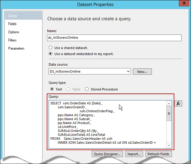
Find the T-SQL script included in this chapter; and build our dataset based on that script. Look for the In-StorevsOnlinePurchases.sql script that comes with the code files for this book. If you haven't changed the project data source from the previous chapter, you can use the same to connect to the AdventureWorks2012 database.
Build an embedded dataset to make it simple. Just copy the script into the Dataset Properties query window as shown in the following screenshot:
Now that we have our dataset, create a new report using our template. Let's create a chart report called In-Store versus Online Sales .
You probably have an idea of what this report is about based on the title. That's one thing to consider in your design practice. Create report titles that are intuitive as much as possible. You'll wonder how this can really help the report consumers.
Drag a graph object into the report designer. That displays the Select Chart Type dialog box:
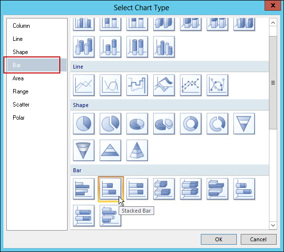
Let's select the Stacked Bar icon.
Since we're trying to show a couple of series in this report, what's sold In-Store versus Online, we're using the stacked bar.
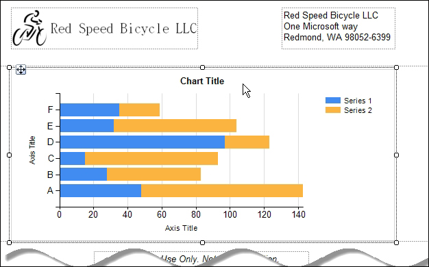
Resize the chart so that it fills the whole body of the report. With the stacked bar chart, our report designer looks like the following illustration: