
Lesson 17
Designing for Mobile Devices
What You’ll Learn in This Lesson:
 How mobile design differs from standard web design
- What the Mobile First design philosophy is
- How Mobile First is important to RWD
- How to build responsive tables and images for mobile devices
- How to use CSS columns to create responsive designs without media queries
According to Statcounter, worldwide mobile usage surpassed desktop usage around October 2016. While desktop computer use still surpasses mobile use in North America, almost 40% of the market share is mobile. And when you include tablets with mobile, that number jumps to closer to 50%. This means that if you’re ignoring or downplaying mobile, you’re alienating nearly half of a North American audience and a majority of the global audience. Not designing websites for mobile devices is a bad strategy.
In this lesson you will learn all about mobile web design—why to do it, how to do it, and some specific techniques for doing it. Mobile web design isn’t the same as responsive web design, but it’s an important consideration when you’re trying to build a responsive website.
Designing for Mobile Devices
Designing a site for mobile devices is more than just testing on your phone after you’ve launched the site. The best mobile designs treat mobile devices as if they are just as important as, if not more important than, desktop computers. This is a difficult leap for many web designers to make. After all, they are most likely building their pages on a computer rather than a tablet or phone, and most courses on web design (including, to some extent, this one) focus on computers as the primary design platform.
Understanding Why Mobile Design Is Important
The main reason mobile design is important is because more and more people are using mobile devices to access the web. People access their phones all the time, for everything. If your web page doesn’t look good or, even worse, doesn’t work on a smartphone, then you can be sure you will lose customers. There is no reason for a customer to stick around trying to fight through a site that is not mobile friendly when there are hundreds of competitors out there.
Another important factor is search engines. If your site receives a significant amount of traffic from search engines, then you should be aware of mobile design. Google started using “mobile-friendliness” as a criterion for ranking in its index in 2015, and other search engine providers followed suit. This means that sites that don’t make any effort at optimizing for mobile devices will be penalized in the results.
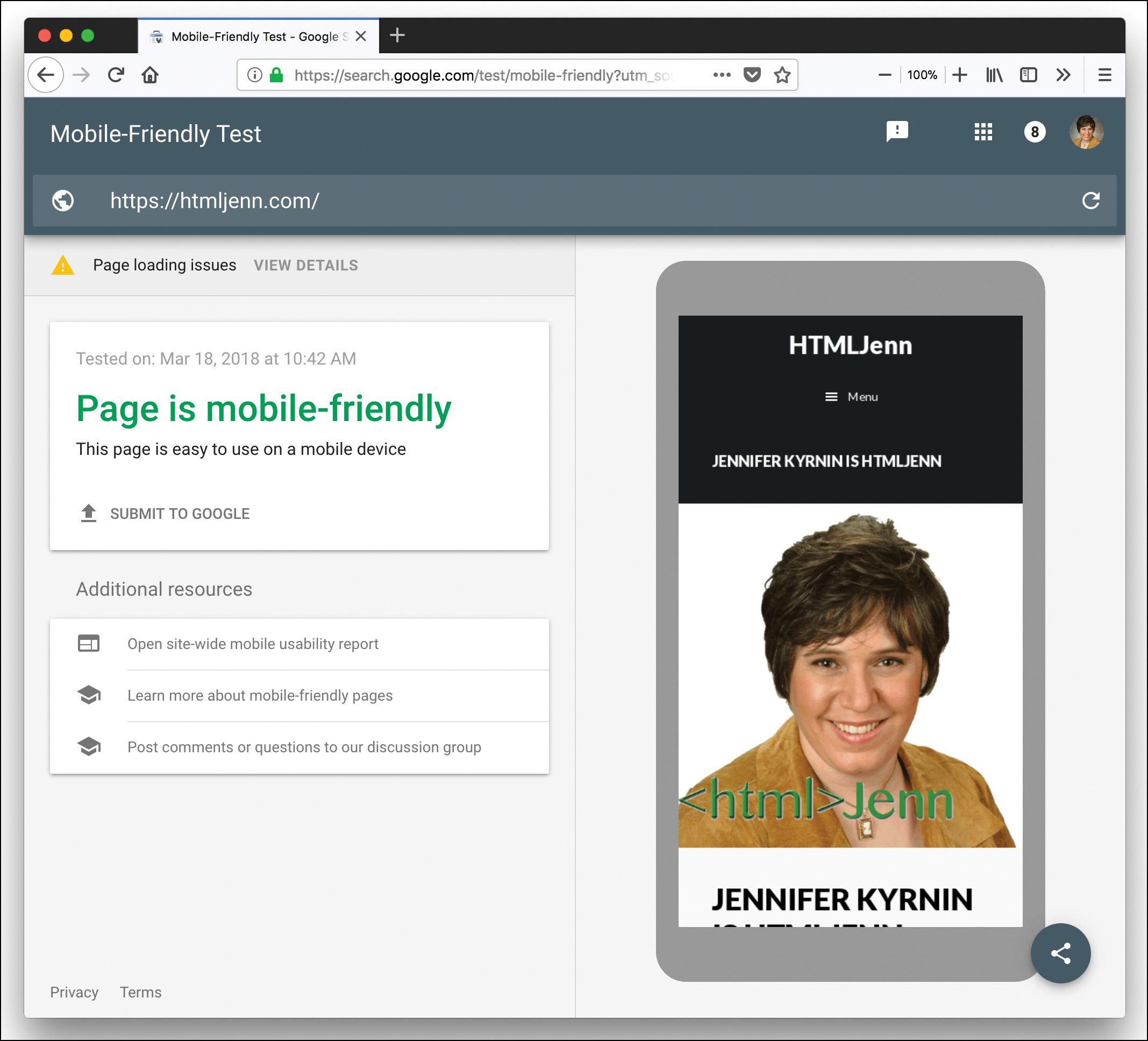
Luckily, you don’t have to guess to find out if Google thinks your web page is mobile friendly. There is a tool at https://search.google.com/test/mobile-friendly that can tell you. Figure 17.1 shows the results for a page that is mobile friendly.
Designing Effective Mobile Interfaces
If you tested your site and it came up as not mobile friendly, you’re probably wondering what to do about it. There are a few specific things that Google looks for when assessing a site for mobile friendliness:
- Using Flash
- Configuring the viewport
- Fixed-width designs
- Image and other box sizes
- Font sizes
- Tappable elements
You should also consider several other things about mobile devices when building a mobile-friendly site:
- Simplifying the layout and the navigation
- Keeping the download times short
- Testing on real devices
Flash Is Not Mobile Friendly
Flash and mobile devices don’t mix. If your site uses Flash in any way, you have instantly lost all mobile devices, including tablets. In fact, if your customers use Mac computers, they will have to download and install a Flash player to be able to use Flash. While this isn’t a total barrier—some customers will do that—the fact is that most will choose the easier path of finding another site that doesn’t use Flash.
Instead of using Flash, consider using animation, as discussed in Lesson 15, “Animating with CSS and the Canvas.” Dynamic web technologies in HTML5 and CSS3 as well as unobtrusive JavaScript can give you similar experiences to Flash without the drawbacks.
How to Configure the Viewport
The viewport is the window in which web pages are viewed. On mobile devices the viewport is typically the full screen, while on computers it’s the browser window, not including the chrome—scrollbars, menus, and edges. Some devices have a pixel density of one size and an actual size that differs. For example, the iPhone X ships with screen dimensions 1125 × 2436, but the device width is 375 × 812. If you don’t set the viewport, your CSS will read the screen as having a width of 1125px, which is as large as the size of a small laptop. If you use media queries based on the width of the screen, your large-screen designs will display instead of your easier-to-read mobile screens. You’ll learn more about how to do this in Lesson 18, “Using Media Queries and Breakpoints,” but for now just remember that a design intended for a browser window that is around 10 inches wide is not going to be particularly usable on a device that is only around 3 inches wide.
Note
This discrepancy in width versus device width is because the device manufacturers make devices with higher and higher pixel densities. In the past, devices had 72 dots per inch. Then the Retina display arrived, placing 2 dots for every 1 dot in a standard display. Newer devices came out with 3 dots per 1 and so on. The number of actual pixels on the screen remained the same, but the amount of data that could be transmitted to those pixels increased.
The fix for this is to set your viewport. And this is easy with the <meta viewport> tag, as shown here:
<meta name="viewport" content="width=device-width, initial-scale=1">
Place this tag in the <head> of your documents.
The width=device-width rule tells the browser that the page should display using the actual device width as the width rather than using the rendered width. The best value is device-width because that sets the width to whatever the current user’s device is.
The initial-scale=1 rule tells the browser that there should be a 1:1 relationship between the device-independent pixels and the CSS pixels. This also allows the page to take advantage of the full landscape width when the device is rotated that way.
Other viewport rules you can assign include minimum-scale, maximum-scale, and user-scalable. You can use these settings to change how much or how little the user can zoom the page, and you can also disable zooming completely.
Caution
Using scaling rules other than initial-scale is not a good idea because it can interfere with accessibility. You can disable zooming on your web pages by setting minimum-scale and maximum-scale to be the same as initial-scale, or you can set user-scalable=no. But if you disable scaling/zooming, you will make your pages very difficult to use for many people.
Avoiding Using Fixed-Width Designs
It is very tempting to use fixed-width designs, as you can set all the elements so they display where and how you want, and you can be sure they will display that way in all browsers. This reflects back to print design, where it was possible to control most variables, so your design looked virtually identical in all situations. But that is not possible on web pages. If you want to use fixed-width designs, you should make sure you have at least two different designs—one for small devices and one for larger ones—and the more designs you have, the more responsive your site will be.
Similarly, while it is possible to set the viewport to a specific width by using the <meta viewport> tag, you should not do it. Some designers set the width of the viewport to a specific number of pixels to try to force devices to display the page correctly. But if you do that, Google and other search engines will define your page as not being mobile friendly. Instead, you should set the viewport as mentioned in the previous section and use responsive design techniques to let the page display effectively at different sizes.
Making Sure Your Elements Fit in the Design
One problem that you might see on web pages when they are viewed on mobile is that the images are too big. If an image is set with a specific width and height and those values are not adjusted for mobile devices, then the image might not fit in the window. For example, as mentioned previously, the iPhone X has a CSS width of 375 pixels. This means that, assuming that you’ve set the viewport correctly, an image that is 400 × 400 is too large for the window and will force horizontal scrolling to see the right side 25 pixels. This can happen with any block-level element that has absolute values for the dimensions.
To fix this, you should use relative widths and position values, such as percentages or rems. You should also make sure that your images scale with the device so they don’t end up running off the edge.
Keeping Font Sizes Legible
One feature of most smartphones is the ability to pinch to zoom. This might be done, for example, to make the text or other elements larger and more legible. The user’s ability to pinch to zoom does not give a web designer license to write pages with tiny font sizes that are illegible for most people.
Instead, you should focus on making your pages legible with responsive design. There are several things to consider in making your text legible:
- Start with a base font size of 16px or larger.
- Define the sizes of various elements relative to the base font size.
- Adjust the line height to keep the text vertically legible.
- Adjust the line length to stay between 8 and 10 words per line.
- Do not use more than three or four font families and font sizes.
The base font size is the size that the page defaults to if no other rule is defined. Define this with either the * selector to select all elements or the body tag selector to select just the body tag, or define it as both, like so:
*, body {
font-size: 16px;
}
Once you have the base font size, you can adjust the internal elements to be larger or smaller with percentage font sizes or rems or ems, like so:
h1 {
font-size: 250%;
}
h2 {
font-size: 2rem;
}
h3 {
font-size: 1.8rem;
}
p {
font-size: 1.2rem;
}
Caution
Don’t be afraid of using larger font sizes for body text. While most web designers have younger, stronger eyes, there are a lot of older people with weaker eyes reading the pages. So, while you might think that 16px is huge, and you might be tempted to decrease the body text size, remember that depending on your site topic, the majority of your users might think that font size is hard to read. Sticking with 16px as the base font size or making the base size larger is a good idea.
The line height or leading is something that many beginning web designers forget about. But if you don’t adjust it, your text can appear too far away from headlines or too close together to be readily legible. Leading is defined with the line-height property. It takes a number that is a multiple of the font size. You can also use lengths, but that is often too rigid for good design. The typical line-height is 1.2, but you can change it for different elements, like so:
h1, h2, h3 {
line-height: 0.8;
}
p {
line-height: 1.1;
}
There is no explicit font property to control the line length. Instead, you should adjust the width of the containers to keep the line length legible with the width property. As mentioned previously, an ideal line length is between 8 and 10 words or around 70 to 80 characters. When the line length gets longer than that, you should add a breakpoint or change the column width.
The last aspect of font legibility is the number of font changes you have on the page. Multiple font sizes and typefaces make the page more difficult to read. Plus, using multiple web fonts increases the download time. A good rule of thumb is to limit your pages to no more than five different font sizes and typefaces.
Making Links Tappable
Most mobile devices use touch screens, which means that the links need to be tappable. If your links are too small or too close together, they will not be easily tapped. The minimum size that can be tapped easily is around 48px × 48px. So, the first thing you should do is ensure that all links and buttons are at least 48px high and 48px wide. Menu links, such as those in navigation bars, should be tappable across the entire block, not just the text. The best way to create such links is to adjust the display property for navigation links, like so.
nav a {
display: block;
}
Simplifying Layouts and Navigation Without Sacrificing Content
Designing layouts for mobile devices can be challenging because most web designers use desktop and laptop computers to build their pages. It’s easy to add new features and interesting design elements when you have a lot of real estate to work with.
To simplify the layouts, start with the number of columns. The ideal number of columns on most smartphones is one. A single column can be difficult to read on larger screens, but the point of responsive web designs is to first design for the mobile version of the site, such as by making the mobile version of the site one column and then adding columns as the screens get larger.
Similarly, the mobile version of a site should include navigation to the same parts of the site as the desktop version, but it should be simplified. Sub-menus are often difficult to use on mobile devices, so avoiding more than one level of sub-menus is a good idea. Place the navigation as links on the pages themselves or add a second navigation menu below the main content.
Download Speed Is Critical
Mobile web pages should be small. While high-speed Internet is common to homes, mobile devices are often on cellular networks and have data plans with bandwidth limits. And while many of your customers may not have limits, cellular networks—even the fast ones—are slow.
Images are the largest bandwidth hogs on most web pages. When writing for mobile, make sure that your images are as small as possible. Consider these best practices:
- Always use JPEG or PNG formats for photographs.
- Use GIF or PNG formats for flat-color clip art and illustrations.
- Crop images to keep the dimensions as small as possible.
- With PNG and GIF images, use a limited palette of colors—as few as possible.
- Use the “save for Web” option in image editing programs.
Testing Mobile Web Pages
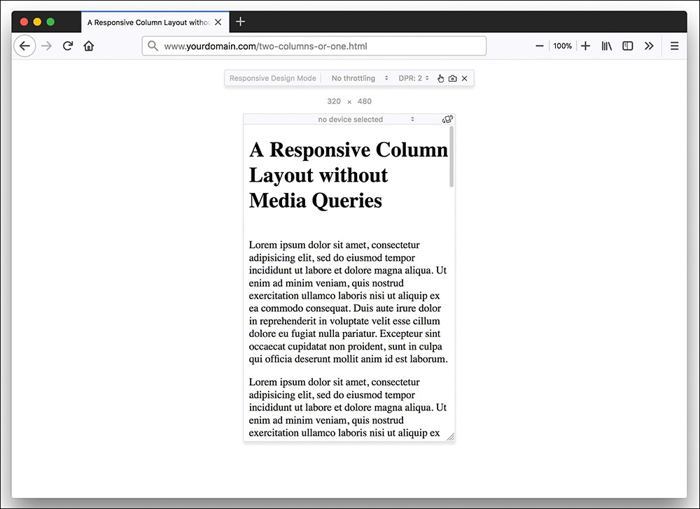
Testing mobile designs can be challenging because of the many different mobile phones and tablets. When testing, start first with your desktop browser. Modern browsers often have a responsive design mode. Figure 17.2 shows a website in Firefox with Responsive Design Mode turned on.

This is a great first step for testing your designs. But for final testing, you should test your mobile designs on mobile devices. You can start by testing on your own devices. It is unlikely that you own dozens of different mobile devices, and you’ll want to test on as many devices as possible. There are three ways to test on multiple mobile devices: buy or rent a device, borrow a device, or use a mobile emulator.
You should consider testing on several types of devices, including the following:
- Small flip phones
- iOS phones
- Android phones
- Windows phones
- Smaller tablets on both iOS and Android
Renting a mobile device may be difficult to do, but there are several emulators you can use. The easiest way to emulate your site is the one mentioned previously—using Responsive Design Mode in modern web browsers. But there are several other emulators for specific devices and operating systems:
- Android Studio—https://developer.android.com/studio/index.html
- Apple Xcode Simulator—https://developer.apple.com/download/
- BlackBerry 10 Device Simulator—https://developer.blackberry.com/devzone/develop/simulator/sim_index.html
- Opera—https://www.opera.com/
- Windows Mobile Emulators—www.microsoft.com/en-us/download/details.aspx?id=9263
There are also online emulators you can use to test live pages, some of which are free and some of which are paid:
- Cowemo Mobile Phone Emulator—www.mobilephoneemulator.com
- Sigos App Experience—https://appexperience.sigos.com
Understanding Mobile First Design
Traditionally, a web designer first built a website for desktop users and then modified that site for mobile users. Mobile First design turns that formula on its head: It says to build a site for mobile users first and then adjust it to work for desktop users.
Designing for Mobile Devices Before Computers
One of the things many designers forget when building a website is that they are not the customers. You are likely to build a site on a computer, but many of your customers (if not most) will access your site on mobile devices. If you start your design by focusing on mobile, you are immediately changing your focus to a much larger market—worldwide. The global penetration of cell phones is between 89% and 97%. So, if you want your website to be accessible to people all around the world, a Mobile First design strategy is really smart.
How to Use Mobile First
The first thing to do with Mobile First is to create the default design for all your pages for mobile devices. Think about the smallest screen that might be used to view your pages. If you do nothing else for mobile devices, this might just be enough. But there are two other things you can do as well: Concentrate on your content and consider the technologies that mobile devices use.
Changing the Focus to Content
When you design first for mobile devices, you have to focus on the content first. You have to determine what content is the core content for the page because the screen size on a mobile device is much smaller than most desktop computers. (Consider that some people even view web pages on the tiny screens of smart watches.) If you don’t know what is the core content or functionality for every page on your site, then your mobile customers won’t know either.
One thing you can do is highlight different content for different devices. For instance, a mobile customer might be more interested in the hours and location of a restaurant, while a computer user might want the menus first. It’s not that mobile customers don’t want the menus, but menus might not be their first focus.
While it’s good to highlight different content for different users, you should provide a way for all your users to get to all the content. If you reduce the main navigation or remove links or other elements for mobile users, you need to decide where you’re going to put them so that those pages can be found if they are needed.
Experimenting with New Technologies
A lot of new technologies have appeared on mobile devices first or are available only on mobile, including the following:
- Geolocation
- Touch-screen interfaces
- Web storage
- Offline applications
- Mobile web applications
While more of these technologies are appearing on desktop computers, there are still a lot more uses on mobile devices. For example, geolocation isn’t terribly useful on a machine that never leaves its current position.
Why Mobile First Works
Mobile First is primarily an implementation of progressive enhancement. You focus on getting the required content and functionality to as many customers as possible and then enhance the site for more diverse devices. There are a lot of different devices out there that can serve web pages, including these:
- Mobile devices (smartphones, basic cell phones, and tablets)
- Smart watches
- Smart speakers and other audio devices (like Amazon Echo, Google Home, and Sonos One)
- Specialized devices (gaming consoles, e-book readers, televisions, refrigerators, and other items in the Internet of Things)
- Traditional computing devices (netbooks, laptops, and desktop computers)
Note
What Is “The Internet of Things”?
The Internet of Things (IoT) is where an object, an animal, or a person is given a unique identifier and the capability to transmit data over a network without requiring a human to initiate anything. It could be a heart monitor, or a farm animal with an embedded microchip, or even a refrigerator that transmits information on its contents so you know when you’re almost out of milk.
The first “thing” in the IoT was a Coke machine at Carnegie Melon University in the 1980s. It was connected to the Internet, and programmers could access its data to determine if there would be a cold drink available—no more getting to the machine only to find that all the root beer is gone!
In addition to this list of common devices in use today, new ones will continue to be invented. By having a Mobile First mindset and using progressive enhancement, you can ensure that any Web-enabled device will have at least basic access to the content and functionality of your website—no matter what that device is.
How Mobile First Fails
One of the biggest drawbacks to Mobile First is that it is hard to implement. You start out the design process with a huge barrier—the size you can design for. If you’re designing for a smartwatch, for example, you need to make sure your pages look okay on a screen no more than 320 pixels square. For older designers out there, this may feel like a huge step backward: We were designing for 640 × 480 screens in the 1990s, and watches are even smaller than that. Not only are you limited in terms of screen size, you’re also limited by the number of design elements you can use, as well as the layouts, the features, the image sizes, and so on.
Mobile First design can move designers into a scarcity mindset. Instead of imagining all the possible things a website can do, they focus on all the things that the mobile devices can’t do. It might be that after you start designing for larger-screen devices you figure out something else you could add to the site. But there’s nothing stopping you from adding it. Just because you think of a feature for the mobile site while working on the larger site version doesn’t mean you can’t add it later.
The best solution is to work on your site architecture before you worry about the design—mobile or otherwise. If you have a strong understanding of what pages your site needs, you can create the navigation menus and define the content needed for each page or section. Once you know all that, you’re ready to design.
What About Mobile Only Design or Building an App Instead?
Another method of doing web design that is gaining popularity is mobile only design. Rather than building a site that will work for both desktop and mobile customers, you focus only on mobile and let the desktop customers fend for themselves.
The benefit of this method is that you have to do a bit less work to create a design that will work effectively than you must do to create a multi-breakpoint responsive web design. You can also customize the content to be 100% mobile friendly.
But most customers are not interested in running just one site optimized for mobile. Chances are they will eventually visit the site from a wide-screen desktop monitor and then be very disappointed by the minimalist style.
However, if 75% or more of your customers are using mobile devices to visit your site, then a mobile-only design makes a lot of sense. In that scenario, it makes sense to worry about desktop customers last or not at all. After all, most desktop browsers will handle any of the designs and scripts that work on mobile browsers.
Some website owners have created mobile apps specifically for their mobile customers. An app can hold onto mobile customers more effectively than a website might. Mobile apps are most useful in certain situations, such as the following:
- Mobile gaming
- Personalized content
- Complex reporting
- With mobile functionality, such as GPS
- Offline access
All of these features can be built into a website, but using an application might make more sense.
Using Responsive Tables and Images
Two aspects of websites that can be difficult to make responsive are tables and images. Data tables are often very big and can thus be very difficult to handle in a responsive design, especially for small devices. Images can be frustrating because they can take up too much space on small screens while being barely visible on larger screens. And they can cause pages to be really slow and take a long time to download.
How to Make Tables Responsive
To make a table responsive, you need to do more than just resize the table. There are several things you need to think about:
- What data is essential to the table and must display on every device?
- How do customers compare the data on the table?
- What are the sizes at which the table no longer displays legibly on the screen?
Mobile First design dictates that you should include the same data in some fashion for even the most limited devices, but you can hide the less crucial information until users need it. So, you need to know what information is most important.
If customers need to compare different rows or columns to each other, such as in a list of features, then your responsive design needs to reflect that. But if the data is in a table to make the information easier to digest, such as a table listing books with their publishing information, then the responsive design doesn’t have to make comparing easy.
Finally, you need to consider where the table breaks. You insert breakpoints at points where you need to rethink how the table is displayed. You will learn more about breakpoints in Lesson 18.
Once you have considered these issues, you can make decisions about how you want to build your data tables so that they are responsive. There are three ways web designers handle data tables in RWD:
- Resize the cells
- Rearrange the table
- Remove or hide content
Resizing Cells in a Data Table
Resizing cells in a data table is the easiest way to handle tables because it’s the way that tables rearrange themselves by default. Listing 17.1 shows the HTML for a simple table. This table has a width of 100%, so it will automatically adjust to the width of the browser.
Listing 17.1 Basic HTML Table
<!doctype html>
<html lang="en">
<head>
<meta charset="utf-8">
<title>Basic HTML Table</title>
<meta name="viewport"
content="width=device-width,initial-scale=1">
</head>
<body>
<table width="100%" border="1">
<thead>
<tr>
<th>Name</th>
<th>URL</th>
<th>RWD?</th>
<th>Windows</th>
<th>Macintosh</th>
</tr>
</thead>
<tbody>
<tr>
<td>Adobe Dreamweaver</td>
<td>http://www.adobe.com/products/dreamweaver.html</td>
<td>yes</td>
<td>yes</td>
<td>yes</td>
</tr>
<tr>
<td>Macaw</td>
<td>http://macaw.co/</td>
<td>yes</td>
<td>yes</td>
<td>yes</td>
</tr>
<tr>
<td>Coffee Cup Responsive Layout Maker Pro</td>
<td>http://www.coffeecup.com/responsive-layout-maker-pro/</td>
<td>yes</td>
<td>yes</td>
<td>yes</td>
</tr>
<tr>
<td>Microsoft Notepad</td>
<td>http://www.notepad.org/</td>
<td>no</td>
<td>yes</td>
<td>no</td>
</tr>
<tr>
<td>Tummult Hype</td>
<td>http://tumult.com/hype/</td>
<td>no</td>
<td>no</td>
<td>yes</td>
</tr>
</tbody>
</table>
</body>
</html>
The problem with this table is that when it gets down to really narrow widths, it becomes unreadable. In browsers around 650px wide, the table grows too large for the screen and causes horizontal scrolling. If you reduce the font size from the default 16px to 14px, horizontal scrolling doesn’t appear until around 480px.
Rearranging Table Rows and Columns
Another solution to responsive tables is to rearrange how the data is displayed. To use this solution, you need to understand how customers will use the data in the table.
Listing 17.1 shows a table in which information needs to be comparable. Listing 17.2 shows a table where each row of data can stand alone.
Listing 17.2 Contact Information Table
<!doctype html>
<html lang="en">
<head>
<meta charset="utf-8">
<title>Contact Information Table</title>
<meta name="viewport"
content="width=device-width,initial-scale=1">
</head>
<body>
<table width="100%" border="1">
<thead>
<tr>
<th>Name</th>
<th>Title</th>
<th>Home Page</th>
<th>Email</th>
</tr>
</thead>
<tbody>
<tr>
<td>Jennifer Kyrnin</td>
<td>Chief Dandylion Officer</td>
<td>https://htmljenn.com/</td>
<td>[email protected]</td>
</tr>
<tr>
<td>McKinley</td>
<td>Dandelion Observation Officer</td>
<td>http://responsivewebdesignin24hours.com/mckinley</td>
<td>[email protected]</td>
</tr>
<tr>
<td>Rambler</td>
<td>Chief Taste Tester</td>
<td>http://responsivewebdesignin24hours.com/rambler</td>
<td>[email protected]</td>
</tr>
</tbody>
</table>
</body>
</html>
Because of the URLs, this table breaks the container at around 720px, and because it includes contact information, we don’t want to mess with the font size, so we need to adjust how the table displays.
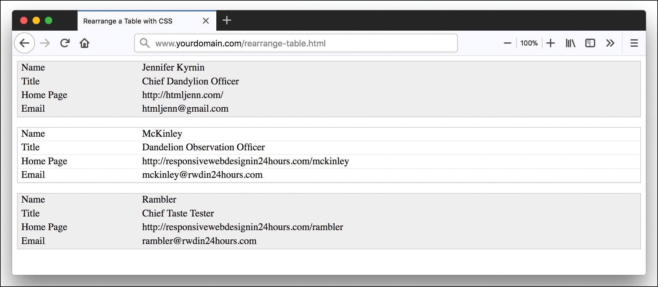
One way to do that is to change the table from a horizontal list of items to a vertical list, with each item displayed individually. Listing 17.3 shows the CSS to display the table, and Figure 17.3 shows what it looks like.
Listing 17.3 CSS to Rearrange a Table
table {
border-collapse: collapse;
}
table { border: none; }
/* display the whole table as a block */
table, thead, tbody, th, td, tr {
display: block;
}
/* Hide the headers */
thead tr {
position: absolute;
top: -9999px;
left: -9999px;
}
tr { border: 1px solid #ccc; margin-bottom: 1em; }
tr:nth-of-type(odd) {
background: #eee;
}
td {
/* Behave like a "row" */
border: none;
border-bottom: 1px solid #eee;
position: relative;
padding-left: 20%;
}
td:before {
/* Now like a table header */
position: absolute;
/* Top/left values mimic padding */
top: 1px;
left: 6px;
width: 45%;
padding-right: 10px;
white-space: nowrap;
}
/* Label the data */
td:nth-of-type(1):before { content: "Name"; }
td:nth-of-type(2):before { content: "Title"; }
td:nth-of-type(3):before { content: "Home Page"; }
td:nth-of-type(4):before { content: "Email"; }
We found this technique on Chris Coyier’s CSS-Tricks site (https://css-tricks.com/responsive-data-tables/). This technique involves turning the table elements (<table>, <tr>, <td>, and so on) into block elements, hiding the <th> elements (but not removing them with display:none; so that the table is still accessible), and adding a separate line header for each row in the table.
But you’re not limited to rearranging the table: You can also change how the data is displayed, such as by changing from a table to a graphic or a chart. As long as the data is available to your mobile customers, displaying a graphical chart instead of a table can work. And you might find that the chart is useful to larger-screen devices as well.
Hiding Table Content
Another option for displaying tables is to hide rows or columns. But to do this, you need to know which items in the table are the most important. You can remove the less important data from the HTML or you can use the display: none; CSS property to remove less important data with CSS.
The problem with hiding the data is that some customers will want to see that data, even if it’s harder to read on their devices. Most tables break the design because the data is too wide for the layout, and so the entire design must scroll horizontally. But while horizontal scrolling of the entire page is bad, most smartphone users understand what is happening when they see a scrollbar below a table and can easily scroll from right to left inside that table.
The trick is to use a <div> tag around the table and put the scrollbars on it. First, surround the entire table with a <div> tag, like so:
<div class="responsive">
<table width="100%" border="1">
...
</table>
</div>
Instead of styling the table, you add overflow values to the <div> itself, like so:
.responsive-table {
width: 100%;
margin-bottom: 15px;
overflow-y: hidden;
overflow-x: scroll;
-ms-overflow-style: -ms-autohiding-scrollbar;
border: 1px solid #ddd;
-webkit-overflow-scrolling: touch;
}
This causes the table to take up as much room as it needs in order to be legible, with any overflow on the <div> hidden by the scrollbar. Customers can then scroll left or right to see the entire table even on small-screen devices.
How to Make Images Responsive
Many web designers automatically include the width and height of images in the HTML, like so:
<img src="my-image.jpg" alt="my image" width="100" height="50">
The <img> tag has a src attribute that defines the location of the image, an alt attribute that provides alternative text if the image can’t display for some reason, and width and height attributes that define how much space the image should take up in the design.
But if you explicitly set the image height and width in either the HTML or the CSS, the images will remain the same size even if the rest of the design is responsive. And in smaller windows, large images don’t work well.
The main problem with many images is that they are too big for mobile screens. The images don’t flex with the design. In fact, they are not responsive at all. There are three ways you can deal with images in a responsive web design:
- Use the images as you always would.
- Set the image width to something flexible.
- Change what images are displayed depending device properties.
The first solution has just one advantage: It’s easy. The other two solutions are much better because they allow the images to be responsive.
Using Flexible-Width Images
Using flexible-width images is often the best solution for most websites because it’s almost as easy as doing nothing and results in images that flex with the browser width. All you need to do is set the width and max-width of your images to 100% and the height to auto, like so:
img { width: 100%; max-width: 100%; height: auto; }
Caution
With most web page editors, when you add an image, the editor automatically includes the width and height attributes on the <img> tag. CSS will override these values, but if you don’t set height for your images, you will end up with some really ugly images. Setting height to auto tells the browser to use a height that has the same ratio as the original image.
To use Mobile First, set the img rule in your global style sheet before any media queries, so that it applies to all devices. Then test your design in several browser widths and see what happens. Chances are you’ll need to add some container width information so that the images don’t blow out the entire browser window in some sizes.
Setting the width so that the images flex with their containers works well, but you will want to upload images that are large so that they look good on large-screen monitors. But the larger you make the images, the longer they will take to download.
Changing the Images Displayed with srcset and sizes
While most responsive solutions are done with CSS, you can create responsive image solutions right in the HTML. The <img> element has two attributes—srcset and sizes—that you can use to define different images to display on different devices.
The srcset attribute is added to the <img> element to define a list of images to use on devices with different pixel densities. For example, as mentioned earlier in this lesson, Retina displays on Apple devices have at least 2 pixels for every 1 pixel on a non-Retina display.
You can define different images to display at different pixel densities in a comma-separated list, like so:
<img srcset="images/myImage.jpg 1x,
images/myImage-2x.jpg 2x,
images/myImage-3x.jpg 3x"
src="images/myImage.jpg" alt="My Image">
In this example, 1x, 2x, and 3x define the densities at which the preceding image should display. You can define any number of densities with the x descriptor, and you can also use the value hd to select for high-density devices. The src attribute is used in older browsers that don’t support the srcset attribute.
But you can also define images based on the device width by using the w descriptor. This describes the width of the image being referenced. You define it in the same way as previously, like so:
<img srcset="images/myImage.jpg 100w,
images/myImage-2x.jpg 200w,
images/myImage-3x.jpg 400w"
src="images/myImage.jpg" alt="My Image">
Then if you want to change the space the image takes up, you can use the sizes attribute. If you have just one size defined, such as sizes="50vw", then the image will take up that much space in all devices—in this case 50% of the viewport window. sizes is especially useful when you add media queries to it, like so:
sizes="(max-width: 40em) 100vw, 50vw"
Media queries are covered in more detail in Lesson 18, but for now, just think of them as a simple if statement. In this case, the browser looks at the maximum width of the device, and if it is 40em or less ((max-width: 40em)), then the image size should be 100% of the viewport window (100vw). Otherwise, it should be 50% of the viewport window (50vw).
Use the srcset attribute alone when you need multiple versions of the same image at different resolutions, and in this case, use the x descriptor. Use srcset with sizes when you need multiple versions of the image at different sizes, and in this case, use the w descriptor.
Changing Images by Using the <picture> Element
What if you need to use different images on different devices but want to adjust those images based on resolution as well? For this you need to use the <picture> and <source> elements. These elements define images in a similar fashion to how you define video and audio with the <video> and <audio> elements.
You can use the <picture> element to contain the different <source> elements. Each <source> has a media query built into it in the media attribute that tells the browser when to use those defined images. In addition, each <source> uses a srcset attribute (and sizes if you want) to define the images for each resolution:
<picture>
<source srcset="images/myImage.jpg 1x,
images/myImage-2x.jpg 2x,
images/myImage-3x.jpg hd"
media="(max-width: 30rem)">
<source srcset="images/myImage.jpg 1x,
images/myImage-2x.jpg 2x,
images/myImage-3x.jpg hd"
media="(max-width: 50rem)">
<img src="images/myImage.jpg" alt="My Image">
</picture>
As before, the src attribute defines the fallback if the browser doesn’t support the <picture> and <source> tags.
Deciding When to Use Different Images
It’s tempting to use different images all over the place, if only to prove that you can. But the best sites adjust the images to suit the design, not the designer. By using pictures that have the same image but are different resolutions, you allow browsers to download the image version that is best for a particular device. This means you can create an image that has a high resolution but small physical size for high-density small screens. Then you can create the same image with a larger physical size (and thus longer download time) for larger screens.
You should create an entirely new image when the size of the device screen makes an image difficult to understand. For example, you might have a photo of a giant vista with a person standing off in the distance. On a large 4k screen, the entire vista would look stunning on the page. But while an iPhone can display the image without a problem, the person standing in the distance might be too small to easily see on the smaller screen. In this case, using HTML or CSS to display a completely different image would make sense. You can zoom in on the subject of the photo to make it more obvious what is important in that image or simply display a completely different image that provides the same information.
Creating Responsive Layouts Without Media Queries
Using media queries is the most common way to create different layouts on devices of different sizes, but one technique that many people overlook is using CSS columns. In Lesson 6, “Working with Fonts, Text Blocks, Lists, and Tables,” you learned about how to write CSS columns to create layouts. What you may not have realized is that you can use CSS columns to create responsive layouts.
You can create columns by declaring the column count or the column width. But if you declare both, such as with the columns property, you create a column layout that will adjust depending upon the width of the browser.
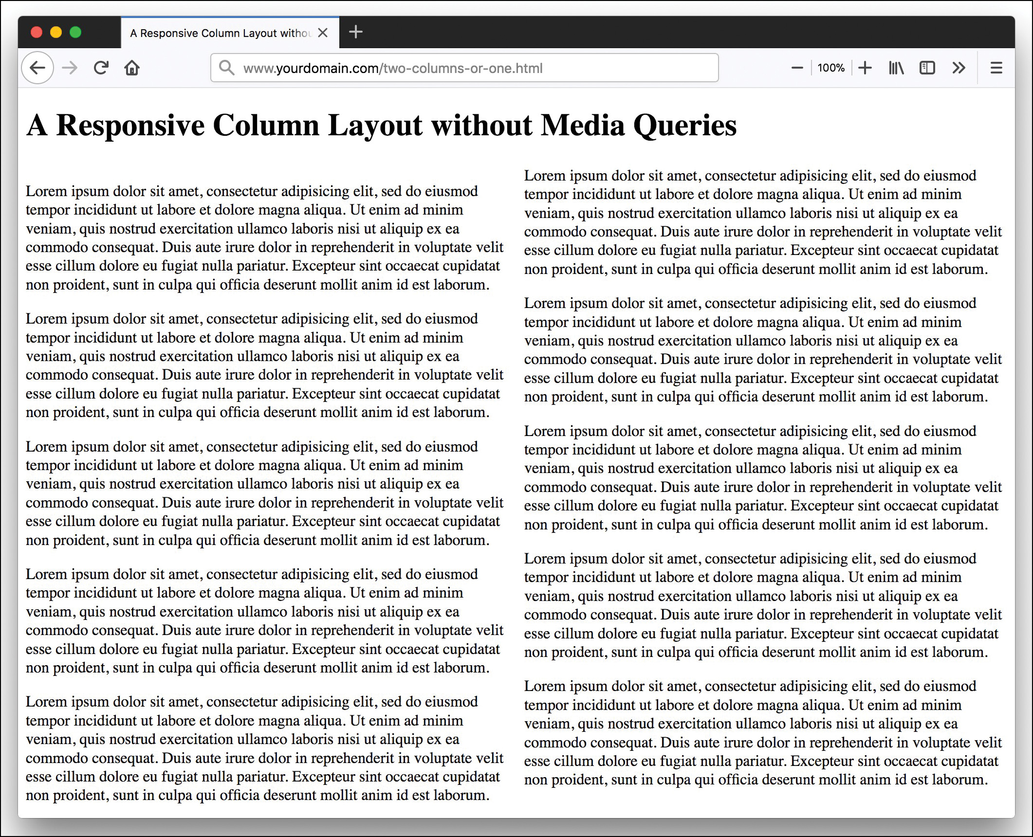
Listing 17.4 shows some HTML that uses columns.
Listing 17.4 Responsive Columns Without Media Queries
<!doctype html>
<html lang="en">
<head>
<meta charset="utf-8">
<title>A Responsive Column Layout without Media Queries</title>
<meta name="viewport"
content="width=device-width,initial-scale=1">
<style>
article {
columns: 2 20rem;
}
</style>
</head>
<body>
<h1>A Responsive Column Layout without Media Queries</h1>
<article>
<p>Lorem ipsum dolor sit amet, consectetur adipisicing el</p>
<p>... additional content here</p>
</article>
</body>
</html>
At full size, as shown in Figure 17.4, the page displays with two columns that fill the screen. But if the browser is smaller than 20rems in width, the page displays as one column, as shown in Figure 17.5.
Another responsive feature of this page is that it uses rems for the column width. The rem unit of length depends upon the size of the font on the page. So, if the customer changes the font size in the browser, the layout size will change as well.
It’s important to remember that responsive design is more than just media queries. By considering mobile devices and taking the time to design for them, you make your pages responsive.
Alternatives for Mobile Design Besides RWD
RWD is not the only solution for mobile design. There are other things you can do to create mobile websites—and there are good reasons to use them. The most common alternatives are using adaptive design and dynamic serving and using completely separate sites for mobile. Some designers also create an app to run on mobile devices as an alternative to the website.
Why RWD Might Not Be the Answer
Responsive web design can be difficult to do well. It’s easy to create a site that is huge and slow to load. This is the opposite of what you want for a mobile site. In most cases, when you use RWD, especially with media queries, the same content, CSS, and scripts are loaded on every device. And this can slow pages excessively.
Another aspect of RWD that is difficult to do well is content management. As mentioned previously, a mobile customer has different goals and desires when viewing a website from a desktop customer. By creating a site that is one-size-fits-all, you make it very difficult for some customers to do what they want to do.
Finally, while most people view web pages in modern, up-to-date browsers and devices, some people don’t. And RWD primarily relies on technology that needs modern, up-to-date browsers and devices. On older devices and browsers, a page might load more slowly or possibly not at all.
What Are Adaptive Design and Dynamic Serving?
With adaptive design, a designer creates multiple versions of a site to better accommodate the devices viewing it. It can be argued that RWD is a form of adaptive web design because it changes the site depending on the device viewing it. It gets interesting when you use the web server to detect information about the device viewing the page and then deliver the different designs appropriately.
With adaptive design, pages are designed for common screen widths, such as these:
- 320px
- 480px
- 760px
- 960px
- 1200px
- 1600px
As with responsive design, you should start with the smallest screen and move up. Use all the same techniques you’ve learned to create good websites but adapt the design to best fit the device size.
The second part of adaptive design is the delivery of the pages. This is why it’s also called dynamic serving. With dynamic serving, the server responds with different HTML, CSS, and JavaScript on the same URL, depending upon the device requesting the page.
Designers commonly make mistakes such as the following when setting up dynamic serving:
- Blocked content—You should let all your content—including JavaScript, CSS, and images—be seen by every device and especially by search engine robots. You should also never display a 404 page to only certain devices.
- Unplayable content—Some types of media are not playable on various mobile devices, and if you feature that content, you will frustrate many of your customers.
- Incorrect redirects—One way that dynamic serving is done is by redirecting customers to specific URLs. But if a desktop customer is redirected to mobile, for example, that can be very annoying.
- Links to incorrect pages—If you have sent a customer to a mobile version of the site, the links should not point to the desktop version.
Using a Separate URL or Domain
Many people consider using a separate domain such as m.yourdomain.com for mobile customers to be an old-fashioned way to handle mobile. But it does work. And some very popular sites use mobile domains, including Facebook and Home Depot.
Creating a separate, parallel website for mobile may seem like a lot of work, but if you have a database-driven site with hundreds, thousands, or millions of pages, it can be a lot easier to simply redirect all mobile customers to a different domain.
You should be aware that creating a separate site/domain for your mobile customers could result in a penalty in search engine optimization. Most sites link to the desktop version of a site rather than the mobile one, and when this happens, you lose out on the back links. You also have to create a separate sitemap for the mobile site so that search engines find and index the pages correctly. You’ll learn more about search engine optimization in Lesson 28, “Organizing and Managing a Website.”
Summary
In this lesson you learned a lot about mobile web design. You learned about how to design effective mobile pages and what design features you should avoid, such as slow-loading pages and images and Flash.
This lesson also covered Mobile First design, where you start with the mobile version of a site design and make sure you have everything there before moving on to larger and larger screens. You learned that your focus should be on content rather than features. But you should stay aware of the technologies that mobile devices use.
This lesson gave you some techniques for making images and tables responsive. You can use what you learned in this lesson along with the media queries you’ll learn in Lesson 18 to create tables and images that work well on both mobile and nonmobile screens.
Finally, you learned some techniques for how to build responsive pages without media queries as well as some alternatives to responsive web design. The fact is that RWD is not the best option in all situations, and you can use dynamic serving or a completely separate domain to ensure that mobile users get the features and content they need and want.
Q&A
Q. How can I implement dynamic serving?
A. The most common method is with server-side browser sniffing or device detection. Most corporate websites that use dynamic serving use a service such as DeviceAtlas (https://deviceatlas.com/) or WURFL (http://wurfl.sourceforge.net/). Some people recommend using user-agent strings, but these are ridiculously inaccurate.
Q. Is Mobile First automatically responsive?
A. The short answer is no. Mobile First is a way of thinking of web design. A site can be designed with Mobile First goals but may not be responsive. And a responsive site can be designed without considering mobile customers first.
Workshop
The Workshop contains quiz questions and activities to help you solidify your understanding of the material covered. Try to answer all questions before looking at the “Answers” section that follows.
Quiz
1. What are three things that a mobile-friendly site should consider?
2. What are three things you should always do when building a mobile-friendly site?
3. What is Mobile First design?
4. What should you focus on when designing for mobile devices first?
5. What are some technologies that can primarily be found on mobile devices?
6. What types of situations work well for mobile apps?
7. Why do data tables fail on mobile devices?
8. What are three ways you can adjust data tables to work on smaller screens?
9. What does the srcset attribute do for images?
10. What CSS property can make a layout change from three columns to one column, depending on the device width?
Note
Just a reminder for those of you reading these words in the print or e-book edition of this book: If you go to www.informit.com/register and register this book (using ISBN 9780672338083), you can receive free access to an online Web Edition that not only contains the complete text of this book but also features an interactive version of this quiz.
Answers
1. There are many aspects to mobile-friendly design, but some specifics include not using Flash, configuring the viewport, avoiding fixed-width designs, making elements fit in the design, using legible font sizes, and making links and buttons tappable.
2. You should always create a simple navigation and layout, make the page load as quickly as possible, and test the design on real devices.
3. Mobile First design is a philosophy in which you design for the smallest devices first and make sure that they have everything they need to view and use the site. Then you create the larger versions of the site.
4. You should focus primarily on the content. Consider what content is required to view and use the site and make sure that even the smallest devices can access it.
5. There are lots of mobile-only technologies, including geolocation, touch-screen interfaces, web storage, offline applications, and mobile web applications. Some of these can be used on desktop computers as well.
6. Mobile apps work best for mobile gaming, personalized content, complex reporting, functionality that is only available on mobile devices (for example, GPS), and offline access.
7. The most common reason data tables fail is that they are too wide for the screen. They often contain more information than is readily consumable on a small device.
8. You can change the size of the table cells or contents, rearrange the table, or remove or hide content to make data tables more usable on small screens.
9. The srcset attribute defines a list of images to display at different pixel densities.
10. The CSS property columns lets you define both the maximum number of columns and the minimum width for those columns. You can create a design that can change from three columns to one column with the style rule columns: 3 200px;.
Exercise
 Consider the site you are building. Would it benefit from a separate mobile site? Why or why not? What are some of the reasons you might not want to design it with RWD?