Lesson 6
Working with Fonts, Text Blocks, Lists, and Tables
What You’ll Learn in This Lesson:
 How to use boldface, italic, and special text formatting
 How to tweak the font
 How to use special characters
 How to align text on a page
 How to use the three types of HTML lists
 How to nest lists within lists
 How to create simple tables
 How to control the size of tables
 How to align content and span rows and columns within tables
 How to use CSS columns
In the early days of the Web, text was displayed in only one font and one size. However, a combination of HTML and CSS now makes it possible to control the appearance of text (typeface, size, color) and how it is aligned and displayed on a web page. In this lesson you’ll learn how to change the visual display of the font—its font family (the typeface), size, and weight—and how to incorporate boldface, italic, superscripts, subscripts, and strikethrough text into your pages. You will also learn how to change typefaces and font sizes and how to use web fonts.
Then, after becoming conversant in these textual aspects, you’ll learn the basics of text alignment and some other text tips and tricks, such as the use of lists. Because lists are very common, HTML provides tags that automatically indent text and add numbers, bullets, or other symbols in front of each listed item. You’ll learn how to format different types of lists.
In this lesson, you’ll learn how to build HTML tables that you can use to control the spacing, layout, and appearance of tabular data in your web content. Although you can achieve similar results using CSS, there are definitely times when using a table is the best way to present information in rows and columns. You’ll also see in this lesson how designers had to use tables for page layout in the past—and how to avoid ever doing that in the future.
Finally, you’ll learn a new technique for displaying large blocks of text—CSS columns. You’ll find out how to create newspaper-style columns out of your content and how to make the columns look nice on the page.
Note
When viewing other designers’ web content, you might notice methods of marking up text that are different from those this series teaches. Some telltale signs of the old way of formatting text include the use of the <b></b> tag pair to indicate when a word should be bolded, the <i></i> tag pair to indicate when a word should be in italics, and the <font></font> tag pair to specify font family, size, and other attributes. However, this method is being phased out of HTML, and CSS is considerably more powerful.
Working with Special Characters
Before we rush headlong into font changes, let’s talk for a minute about special characters in fonts. Most fonts include special characters for European languages, such as the accented é in café. You’ll also find a few mathematical symbols and special punctuation marks, such as the circular • bullet.
You can insert these special characters at any point in an HTML document by using the appropriate codes (see Table 6.1). You’ll find an even more extensive list of codes for multiple character sets at the following URL:
https://www.webstandards.org/learn/reference/charts/entities/namedentities/
HTML uses a special code known as a character entity to represent special characters such as © and ®. Character entities are always specified starting with & and ending with ;. Table 6.1 lists the most commonly used character entities, although HTML supports many more.
Table 6.1 includes codes for the angle brackets, quotation marks, and ampersand. You must use those codes if you want these symbols to appear on your pages; otherwise, the web browser interprets them as HTML commands.
Listing 6.1 and Figure 6.1 show several of the symbols from Table 6.1 in use.
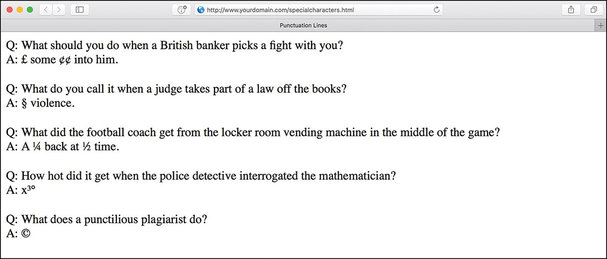
For example, you can produce the word café by using either of the following:
café
café
Note
One of the reasons it’s a good idea to use the line <meta charset="utf-8"> in your HTML is because it reduces the need for these special character codes. By setting your character set to UTF-8, you tell the browser to expect these characters without any special encoding. In other words, in a UTF-8 web page, you can write <h1>My Café</h1> instead of <h1>My Café</h1>, and it will display correctly.
You should still use encodings for characters that are used in HTML, such as < for <, > for >, and & for &. This ensures that the browser knows that these characters are part of the text and not HTML.
Table 6.1 Commonly Used English-Language Special Characters
Character |
Numeric Code |
Code Name |
Description |
“ |
|
|
Quotation mark |
& |
|
|
Ampersand |
< |
|
|
Less than |
> |
|
|
Greater than |
¢ |
|
|
Cents sign |
£ |
|
|
Pound sterling |
¦ |
|
|
Broken vertical bar |
§ |
|
|
Section sign |
© |
|
|
Copyright |
® |
|
|
Registered trademark |
° |
|
|
Degree sign |
± |
|
|
plus or minus |
² |
|
|
Superscripted two |
³ |
|
|
Superscripted three |
· |
|
|
Middle dot |
¹ |
|
|
Superscripted one |
¼ |
|
|
Fraction one-fourth |
½ |
|
|
Fraction one-half |
¾ |
|
|
Fraction three-fourths |
Æ |
|
|
Capital AE ligature |
æ |
|
|
Small ae ligature |
É |
|
|
Accented capital E |
é |
|
|
Accented lowercase e |
|
|
|
Multiplication sign |
÷ |
|
|
Division sign |
Although you can specify character entities by number, each symbol also has a mnemonic name that is often easier to remember.
Note
Looking for the copyright (©) and registered trademark (®) symbols? Those codes are © and ®, respectively.
To create an unregistered trademark (™) symbol, use ™.
Listing 6.1 Special Character Codes
<!doctype html>
<html lang="en">
<head>
<meta charset="utf-8">
<title>Punctuation Lines</title>
<style>
section {
margin-bottom: 20px;
}
</style>
</head>
<body>
<section>
Q: What should you do when a British banker picks a fight
with you?<br>
A: £ some ¢¢ into him.
</section>
<section>
Q: What do you call it when a judge takes part of a law
off the books?<br>
A: § violence.
</section>
<section>
Q: What did the football coach get from the locker room
vending machine in the middle of the game?<br>
A: A ¼ back at ½ time.
</section>
<section>
Q: How hot did it get when the police detective interrogated
the mathematician?<br>
A: x³°
</section>
<section>
Q: What does a punctilious plagiarist do?<br>
A: ©
</section>
</body>
</html>
Boldface, Italic, and Special Text Formatting
Way back in the age of the typewriter, we were content with a plain-text display and with using an occasional underline to show emphasis. Today, boldface and italic text have become de rigueur in all paper communication. Naturally, you can add bold and italic text to your web content as well. Several tags and style rules make text formatting possible.
Note
Although you should use styles wherever possible to affect presentation, an alternative to using style rules when it comes to bold and italic text is to use the <strong></strong> and <em></em> tag pairs. The <strong> tag does the same thing as the <b> tag in most browsers, whereas the <em> tag acts just like the tag <i>, formatting text as italic. Of course, you can style these tags however you’d like, but those are the defaults.
The <strong> and <em> tags are considered an improvement over <b> and <i> because they imply only that the text should receive special emphasis; they don’t dictate exactly how that effect should be achieved. In other words, a browser doesn’t necessarily have to interpret <strong> as meaning bold or <em> as meaning italic. This makes <strong> and <em> more fitting in HTML5 because they add meaning to text along with affecting how the text should be displayed.
The old-school approach to adding bold and italic formatting to text—discussed briefly here because invariably you will see it in the source code of many older websites, if you choose to look—involves the <b></b> and <i></i> tag pairs. For boldface text, you wrap the <b> and </b> tags around your text. Similarly, to make any text appear in italics, you enclose it in <i> and </i> tags. Although this approach still works fine in browsers, it isn’t as flexible or powerful as the CSS style rules for text formatting and should be avoided.
Part III, “Advanced Web Page Design with CSS,” covers CSS style rules in more depth, but a little foreshadowing is appropriate here just so that you understand some basic text formatting options. The font-weight style rule enables you to set the weight, or boldness, of a font by using a style rule. Standard settings for font-weight include normal, bold, bolder, and lighter (with normal being the default). Italic text is controlled via the font-style rule, which you can set to normal, italic, or oblique. You can specify style rules together as well if you want to apply more than one rule, as the following example demonstrates:
<p style="font-weight:bold; font-style:italic;">This paragraph is bold and
italic!</p>
In this example, both style rules are specified in the style attribute of the <p> tag. The key to using multiple style rules is that they must be separated by a semicolon (;).
You aren’t limited to using font styles in paragraphs, however. The following code shows how to italicize text in a bulleted list:
<ul>
<li style="font-style:italic;">Important Stuff</li>
<li style="font-style:italic;">Critical Information</li>
<li style="font-style:italic;">Highly Sensitive Material</li>
<li>Nothing All That Useful</li>
</ul>
You can also use the font-weight style rule within headings, but a heavier font usually doesn’t have an effect on headings because they are already bold by default.
Although using CSS enables you to apply richer formatting, there are a few HTML5 tags that are good for adding special formatting to text when you don’t necessarily need to be as specific as CSS enables you to be. Following are some of these tags:

<sup></sup>—Superscript text
<sub></sub>—Subscript text
<em></em>—Emphasized (typically italic) text
<strong></strong>—Strong (typically boldface) text
<pre></pre>—Monospaced text, preserving spaces and line breaks
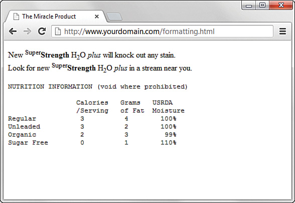
Listing 6.2 and Figure 6.2 demonstrate each of these tags in action.
Caution
In the past, a <u> tag was useful in creating underlined text, but you don’t want to use it now, for a couple of reasons. First, users expect underlined text to be a link, so they might get confused if you underline text that isn’t a link. Second, the <u> tag is obsolete, which means that it has been phased out of the HTML language (as has the <strike> tag). Both tags are still supported in web browsers and likely will be for quite a while, but using CSS is the preferred approach to creating underlined and strikethrough text.
Listing 6.2 Special Formatting Tags
<!doctype html>
<html lang="en">
<head>
<meta charset="utf-8">
<title>The Miracle Product</title>
</head>
<body>
<p>
New <sup>Super</sup><strong>Strength</strong> H<sub>2</sub>O
<em>plus</em> will knock out any stain.<br>Look for new
<sup>Super</sup><strong>Strength</strong>
H<sub>2</sub>O <em>plus</em> in a stream near you.
</p>
<pre>
NUTRITION INFORMATION (void where prohibited)
Calories Grams USRDA
/Serving of Fat Moisture
Regular 3 4 100%
Unleaded 3 2 100%
Organic 2 3 99%
Sugar Free 0 1 110%
</pre>
</body>
</html>
The <pre> tag causes text to appear in a monospaced font—and it does something else unique and useful. As you learned in Lesson 2, “Structuring an HTML Document,” multiple spaces and line breaks are normally ignored in HTML files, but <pre> causes exact spacing and line breaks to be preserved. For example, without <pre>, the text at the end of Figure 6.2 would look like the following:
calories grams usrda /serving of fat moisture regular
3 4 100% unleaded 3 2 100% organic 2 3 99% sugar free 0 1 110%
Even if you added <br> tags at the end of every line, the columns wouldn’t line up properly. However, when you put <pre> at the beginning and </pre> at the end, the columns line up properly because the exact spaces are kept; no <br> tags are needed. The <pre> tag gives you a quick and easy way to preserve the alignment of any monospaced text files you might want to transfer to a web page with minimum effort.
CSS provides you with more robust methods for lining up text (and doing anything with text, actually), and you’ll learn more about them throughout Part III.
Tweaking the Font
Sometimes you want a bit more control over the size and appearance of your text than just some boldface or italic. Before we get into the appropriate way to tinker with the font using CSS, let’s briefly look at how things were done before CSS; you might still find examples of this method when you look at the source code for other websites. Remember, just because these older methods are in use doesn’t mean you should follow suit.
Before style sheets entered the picture, the now-phased-out <font> tag was used to control the fonts in web page text.
Note
We cannot stress enough that the <font> tag is not to be used! It is mentioned here for illustrative and historical purposes only.
For example, the following HTML was once used to change the size and color of some text on a page:
<font size="5" color="purple">This text will be big and purple.</font>
As you can see, the size and color attributes of the <font> tag made it possible to alter the font of the text without too much effort. Although this approach worked fine, it was replaced with a far superior approach to font formatting, thanks to CSS style rules. Following are a few of the main style rules used to control fonts:

font-family—Sets the family (typeface) of the font
font-size—Sets the size of the font
color—Sets the color of the font
Note
You’ll learn more about controlling the color of the text on your pages in Lesson 8, “Working with Colors, Images, and Multimedia.” That lesson also shows how to create your own custom colors and how to control the color of text links.
The font-family style rule enables you to set the typeface used to display text. You can and usually should specify more than one value for this style (separated by commas) so that if the first font isn’t available on a user’s system, the browser can try alternatives.
Providing alternative font families is important because each user potentially has a different set of fonts installed, at least beyond a core set of common basic fonts (Arial, Times New Roman, and so forth). By providing a list of alternative fonts, you have a better chance of your pages gracefully falling back on a known font when your ideal font isn’t found.
Following is an example of the font-family style used to set the typeface for a paragraph of text:
<p style="font-family:arial, sans-serif, 'times roman';">
This example has several interesting parts. First, arial is specified as the primary font. Capitalization does not affect the font family, so arial is no different from Arial or ARIAL. Another interesting point about this code is that single quotes are used around the times roman font name because it has a space in it. However, because 'times roman' appears after the generic specification of sans-serif, it is unlikely that 'times roman' would be used. Because sans-serif is in the second position, it says to the browser “if Arial is not on this machine, use the default sans-serif font.” Every browser has a default serif font, sans-serif font, cursive font, monospace font, and fantasy font. However, they may not look anything like what you would expect, so it’s best to define a list of two or three specific font families and then place the generic family name last.
The font-size and color style rules are also commonly used to control the size and color of fonts. The font-size style can be set to a predefined size (such as small, medium, or large), or you can set it to a specific point size (such as 12pt or 14pt). The color style can be set to a predefined color (such as white, black, blue, red, or green), or you can set it to a specific hexadecimal color (such as #ffb499). Following is a better version of the previous paragraph example, and with the font size and color specified:
<p style="font-family:arial, 'times roman', sans-serif;
font-size:14pt; color:green;">
Note
You’ll learn about hexadecimal colors in Lesson 8. For now, just understand that the color style rule enables you to specify exact colors beyond just using color names such as green, blue, orange, and so forth.
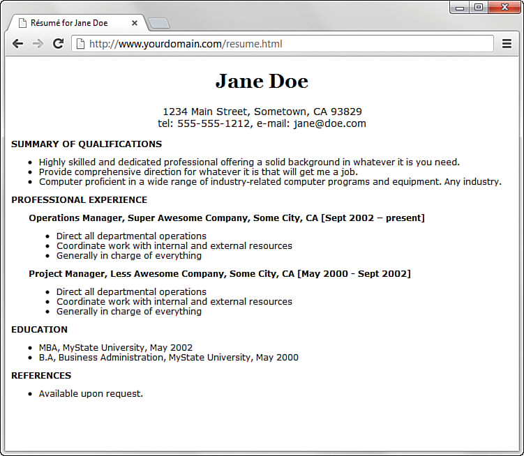
The sample web content in Listing 6.3 and shown in Figure 6.3 uses some font style rules to create the beginning of a basic online résumé.
Listing 6.3 Using Font Style Rules to Create a Basic Résumé
<!doctype html>
<html lang="en">
<head>
<meta charset="utf-8">
<title>Résumé for Jane Doe</title>
<style>
body {
font-family: Verdana, sans-serif;
font-size: 12px;
}
header {
text-align: center;
}
h1 {
font-family:Georgia, serif;
font-size: 28px;
text-align: center;
}
p.contactinfo {
font-size: 14px;
}
p.categorylabel {
font-size: 12px;
font-weight: bold;
text-transform: uppercase;
}
div.indented {
margin-left: 25px;
}
</style>
</head>
<body>
<header>
<h1>Jane Doe</h1>
<p class="contactinfo">1234 Main Street, Sometown,
CA 93829<br>
tel: 555-555-1212, e-mail: [email protected]</p>
</header>
<section>
<p class="categorylabel">Summary of Qualifications</p>
<ul>
<li>Highly skilled and dedicated professional offering a
solid background in whatever it is you need.</li>
<li>Provide comprehensive direction for whatever it is
that will get me a job.</li>
<li>Computer proficient in a wide range of industry-related
computer programs and equipment. Any industry.</li>
</ul>
</section>
<section>
<p class="categorylabel">Professional Experience</p>
<div class="indented">
<p><strong>Operations Manager,
Super Awesome Company, Some City, CA [Sept 2002 –
present]</strong></p>
<ul>
<li>Direct all departmental operations</li>
<li>Coordinate work with internal and external
resources</li>
<li>Generally in charge of everything</li>
</ul>
<p><strong>Project Manager,
Less Awesome Company, Some City, CA [May 2000 - Sept
2002]</strong></p>
<ul>
<li>Direct all departmental operations</li>
<li>Coordinate work with internal and external
resources</li>
<li>Generally in charge of everything</li>
</ul>
</div>
</section>
<section>
<p class="categorylabel">Education</p>
<ul>
<li>MBA, MyState University, May 2002</li>
<li>B.A, Business Administration, MyState University,
May 2000</li>
</ul>
</section>
<section>
<p class="categorylabel">References</p>
<ul>
<li>Available upon request.</li>
</ul>
</section>
</body>
</html>
Using CSS, which organizes sets of styles into classes—as you learned in Lesson 3, “Understanding Cascading Style Sheets”—you can see how text formatting is applied to different areas of this content. If you look closely at the definition of the div.indented class, you will see the use of the margin-left style. This style, which you will learn more about in Part III, applies a certain amount of space (25 pixels, in this example) to the left of the element. That space accounts for the indentation shown in Figure 6.3.
Using Web Fonts
In the preceding section, you saw uses of font families that we’re pretty sure reside on everyone’s computers. That is, you can be assured that most computers would render Arial or Times New Roman or have a go-to default serif font and sans-serif font, if that’s what your style sheet calls for. But with the inclusion of the @font-face feature in CSS3, you can wield even greater design power over the content you place online.
In brief, the @font-face rule enables you to define fonts for use in your HTML5 markup so that they are displayed to users regardless of whether they have those fonts installed on their computers (and chances are incredibly great that users do not have your selected fancy font on their own computer). The definition of the font can be local (to your web server, if you care to include font files there) or remote (in case you link to locations where many fonts are stored).
In your style sheet, to define a new font for use throughout your page(s), you can simply use the following structure:
@font-face {
font-family: 'some_name_goes_here';
src: url('some_location_of_the_font_file');
}
After it’s defined, you can refer to the font-family as you would anywhere else in your style sheet, such as here:
h1 {
font-family: 'some_name_goes_here';
font-size: 28px;
text-align: center;
}
But where do you get fonts? You can obtain fonts from many locations—some free, others not. A widely popular location is Google Fonts (www.google.com/fonts), not only because the fonts are free but also because Google is widely recognized as providing a stable platform, which is important if your web typography relies on a font that’s sitting on someone else’s web server. Some other reliable pay sites for obtaining fonts are Adobe Typekit (https://typekit.com) and Fontspring (www.fontspring.com). Pay sites aren’t necessarily bad—artists have to make money, too. We have used Typekit, but we also use Google Fonts for many projects.
Let’s take a look at modifying the code in Listing 6.3 to include a font from Google Fonts for the h1 element. If you go to www.google.com/fonts and select a font you like, Google gives you code to include in your HTML and CSS. We’ve selected a font called Cherry Swash, and Google has advised us to include the following in our HTML template, in the <head> section:
<link href="http://fonts.googleapis.com/css?family=Cherry+Swash:400,700"
rel="stylesheet">
Note
If you look at the file at the Google link location, you can see that it is Google’s @font-face definition, already done for you. Specifically, it says this:
@font-face {
font-family: 'Cherry Swash';
font-style: normal;
font-weight: 400;
src: local('Cherry Swash'), local('CherrySwash-Regular'),
url(http://themes.googleusercontent.com/static/fonts/cherryswash/v1/
HqOk7C7J1TZ5i3L-ejF0vnhCUOGz7vYGh680lGh-uXM.woff) format('woff');
}
@font-face {
font-family: 'Cherry Swash';
font-style: normal;
font-weight: 700;
src: local('Cherry Swash Bold'), local('CherrySwash-Bold'),
url(http://themes.googleusercontent.com/static/fonts/cherryswash/v1/
-CfyMyQqfucZPQNB0nvYyHl4twXkwp3_u9ZoePkT564.woff) format('woff');
}
Now that the code knows where to look for the font, you just refer to it:
h1 {
font-family:'Cherry Swash';
font-size:28px;
text-align:center;
}
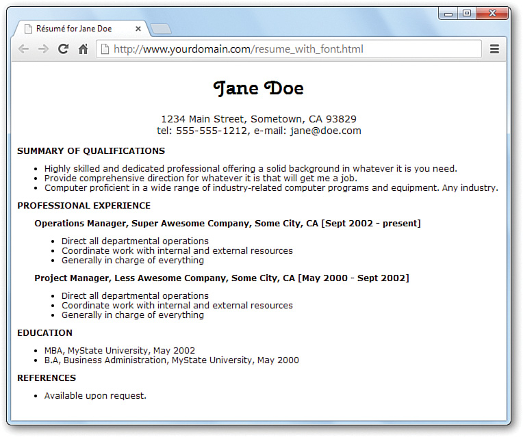
Figure 6.4 shows the new résumé with the web font in use.
Aligning Text on a Page
It’s easy to take for granted the fact that most paragraphs are automatically aligned to the left when you’re reading information on the Web. However, there certainly are situations in which you might choose to align content to the right or justify the text. HTML gives you the option to align a single HTML block-level element, such as text contained within a <p></p> or <div></div> tag pair. Before we get into the details of aligning block elements, however, let’s briefly look at how attributes work.
Using Style, Class, and ID Attributes
Attributes provide additional information related to an HTML tag. Attributes are special code words used inside an HTML tag to control exactly what the tag does. They are very important in even the simplest bit of web content, so it’s important that you are comfortable using them.
Attributes invoke the use of styles, classes, or IDs that are applied to particular tags. If you define a particular class or ID in a style sheet—as you learned to do in Lesson 3—then you can invoke that class or ID by using class="someclass" or id="someid" within the tag itself. When the browser renders the content for display, it looks to the style sheet to determine exactly how the content will appear, according to the associated style definitions. Similarly, you can use the style attribute to include style rules for a particular element without connecting the element to an actual style sheet; this is the inline style format you learned about in Lesson 3.
In the following example, each paragraph could be left-aligned:
<p style="text-align: left;">Text goes here.</p>
<p class="leftAlignStyle">Text goes here.</p>
<p id="firstLeftAlign">Text goes here.</p>
In the first paragraph, the style appears directly in the style attribute. This is useful for debugging or for short-term formatting tests—but not so much for ongoing maintenance of your web content. In the second paragraph, the paragraph will be left-aligned if the style sheet entry for the .leftAlignStyle class includes the text-align statement; remember that using a class means other tags can reuse the class. Similarly, the third paragraph will be left-aligned if the style sheet entry for the #firstLeftAlign id includes the text-align statement; remember that using an id means these styles can be applied to only the one identified tag.
Aligning Block-Level Elements
To align text in a block-level element such as <p> to the right margin without creating a separate class or ID in a style sheet, simply place style="text-align:right;" inside the <p> tag at the beginning of the paragraph (or define it in a class or an ID). Similarly, to center the text in the element, use <p style="text-align:center;">. To align text in a paragraph to the left, use <p style="text-align:left;">.
The text-align part of the style attribute is referred to as a style rule, which means it sets a particular style aspect of an HTML element. You can use many style rules to carefully control the formatting of web content.
Note
Every attribute and style rule in HTML has a default value that is assumed when you don’t set the attribute yourself. In the case of the text-align style rule of the <p> tag, the default value is left, so using the bare-bones <p> tag has the same effect as using <p style="text-align:left;">. Learning the default values for common style rules is an important part of becoming a good web page developer.
The text-align style rule is not reserved for just the <p> tag. In fact, you can use the text-align style rule with any block-level element, including semantic elements such as <section> and <header>, as well as <h1>, <h2>, the other heading-level tags, and the <div> tag, among others. The <div> tag is especially handy because it can encompass other block-level elements and thus allows you to control the alignment of large portions of your web content all at once. The div in the <div> tag is for division.
Listing 6.4 demonstrates the style attribute and text-align style rule with different block-level elements. Figure 6.5 displays the results.

Listing 6.4 The text-align Style Rule Used with the style Attribute
<!doctype html>
<html lang="en">
<head>
<meta charset="utf-8">
<title>Bohemia</title>
</head>
<body>
<section style="text-align:center;">
<header>
<h1>Bohemia</h1>
<h2>by Dorothy Parker</h2>
</header>
</section>
<section>
<p style="text-align:left;">
Authors and actors and artists and such<br>
Never know nothing, and never know much.<br>
Sculptors and singers and those of their kidney<br>
Tell their affairs from Seattle to Sydney.
</p>
<p style="text-align:center;">
Playwrights and poets and such horses' necks<br>
Start off from anywhere, end up at sex.<br>
Diarists, critics, and similar roe<br>
Never say nothing, and never say no.
</p>
<p style="text-align:right;">
People Who Do Things exceed my endurance;<br>
God, for a man that solicits insurance!
</p>
</section>
</body>
</html>
The use of <section style="text-align:center;"> ensures that the content area, including the two headings, is centered. However, the inline styles applied to the individual paragraphs within the <section> override the setting and ensure that the text of the first paragraph is left-aligned, the second paragraph is centered, and the third paragraph is right-aligned.
The text-align property also allows you to justify text so that both the right and left margins are straight. This can cause strange gaps between words on a line but is another way to align your text blocks. Just write text-align:justify; for your style rule.
The Three Types of HTML Lists
For clarity, it’s often useful to present information on a web page as a list of items. There are three basic types of HTML lists:
 Ordered list—An indented list that has numbers or letters before each list item. The ordered list begins with the
 <ol>tag and ends with a closing</ol>tag. List items are enclosed in the<li></li>tag pair, and line breaks appear automatically at each opening<li>tag. The entire list is indented. Unordered list—An indented list that has a bullet or another symbol before each list item. The unordered list begins with the
 <ul>tag and closes with</ul>. As with the ordered list, its list items are enclosed in the<li></li>tag pair. A line break and symbol appear at each opening<li>tag, and the entire list is indented. Definition list—A list of terms and their meanings. This type of list, which has no special number, letter, or symbol before each item, begins with
 <dl>and ends with</dl>. The<dt></dt>tag pair encloses each term, and the<dd></dd>tag pair encloses each definition. Line breaks and indentations appear automatically.
These three types of lists are shown in Figure 6.6, and Listing 6.5 reveals the HTML used to construct them.
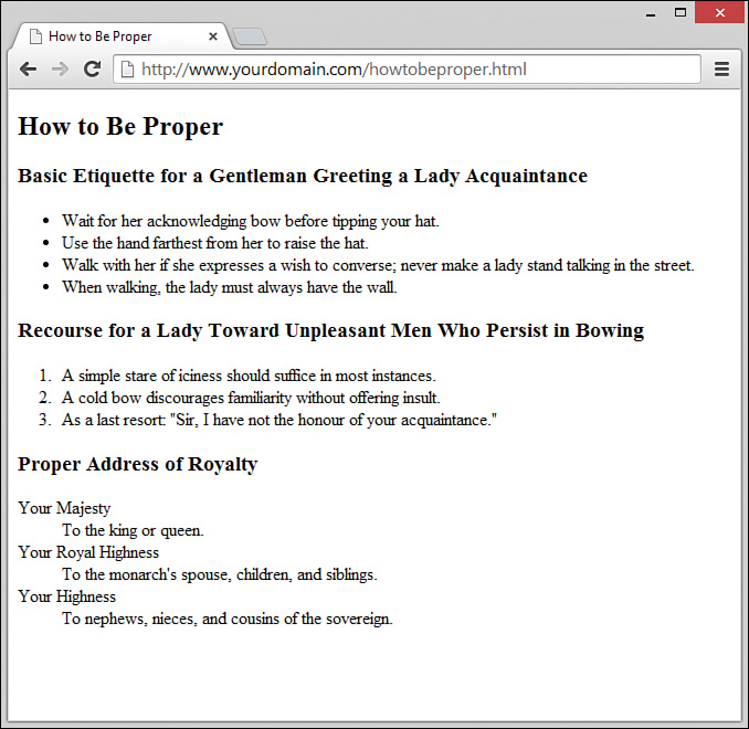
Listing 6.5 Unordered Lists, Ordered Lists, and Definition Lists
<!doctype html>
<html lang="en">
<head>
<meta charset="utf-8">
<title>How to Be Proper</title>
</head>
<body>
<article>
<header>
<h1>How to Be Proper</h1>
</header>
<section>
<header>
<h1>Basic Etiquette for a Gentleman Greeting a
Lady Acquaintance</h1>
</header>
<ul>
<li>Wait for her acknowledging bow before tipping your
hat.</li>
<li>Use the hand farthest from her to raise the hat.</li>
<li>Walk with her if she expresses a wish to converse;
never make a lady stand talking in the street.</li>
<li>When walking, the lady must always have the wall.</li>
</ul>
</section>
<section>
<header>
<h1>Recourse for a Lady Toward Unpleasant Men Who Persist
in Bowing</h1>
</header>
<ol>
<li>A simple stare of iciness should suffice in most
instances.</li>
<li>A cold bow discourages familiarity without offering
insult.</li>
<li>As a last resort: "Sir, I have not the honour of your
acquaintance."</li>
</ol>
</section>
<section>
<header>
<h1>Proper Address of Royalty</h1>
</header>
<dl>
<dt>Your Majesty</dt>
<dd>To the king or queen.</dd>
<dt>Your Royal Highness</dt>
<dd>To the monarch's spouse, children, and siblings.</dd>
<dt>Your Highness</dt>
<dd>To nephews, nieces, and cousins of the sovereign.</dd>
</dl>
</section>
</article>
</body>
</html>
Note the use of semantic elements (<article>, <section>, and <header>) in Listing 6.5 to provide a better sense of the content outline, including how the chunks of text relate to one another. Each of these elements could have its own styles applied, which would provide further visual separation of the elements.
Note
Remember that different web browsers can display web content quite differently. The HTML standard doesn’t specify exactly how web browsers should format lists, so users with older web browsers might not see exactly the same indentation you see. You can use CSS to gain precise control over list items, and you will learn about this later in this lesson.
Caution
Although definition lists are officially supposed to be used for defining terms, many web page authors use them anywhere they’d like to see some indentation. In practice, you can indent any text simply by putting <dl><dd> at the beginning of it and </dd></dl> at the end and skipping over the <dt></dt> tag pair. This is a bad habit to get into, as it reduces your control over the design and implies a semantic meaning to those indented areas that shouldn’t be there. Instead, you should use CSS to indent content.
Placing Lists Within Lists
Lists placed within lists are called nested lists. It used to be common to see designers use nested lists to indent content quickly. Because of the level of control you have over the display of your items when using CSS, there is no need to use nested lists to achieve the visual appearance of indentation. Reserve your use of nested lists for when the content warrants it. In other words, use nested lists to show a hierarchy of information, such as in Listing 6.6.
Note
Nesting refers to a tag that appears entirely within another tag. Nested tags are also referred to as child tags of the (parent) tag that contains them. It is a common (but not required) coding practice to indent nested tags in the HTML code so that you can easily see their relationship to the parent tag.
Ordered and unordered lists can be nested inside one another, down to as many levels as you want. In Listing 6.6, a complex indented outline is constructed from several unordered lists. Notice in Figure 6.7 that the web browser automatically uses a different type of bullet for each of the first three levels of indentation, which makes the list very easy to read. This is common in modern browsers.
Listing 6.6 Using Lists to Build Outlines
<!doctype html>
<html lang="en">
<head>
<meta charset="utf-8">
<title>Vertebrates</title>
</head>
<body>
<section>
<header>
<h1>Vertebrates</h1>
</header>
<ul>
<li><strong>Fish</strong>
<ul>
<li>Barramundi</li>
<li>Kissing Gourami</li>
<li>Mummichog</li>
</ul>
</li>
<li><strong>Amphibians</strong>
<ul>
<li>Anura
<ul>
<li>Goliath Frog</li>
<li>Poison Dart Frog</li>
<li>Purple Frog</li>
</ul>
</li>
<li>Caudata
<ul>
<li>Hellbender</li>
<li>Mudpuppy</li>
</ul>
</li>
</ul>
</li>
<li><strong>Reptiles</strong>
<ul>
<li>Nile Crocodile</li>
<li>King Cobra</li>
<li>Common Snapping Turtle</li>
</ul>
</li>
</ul>
</section>
</body>
</html>
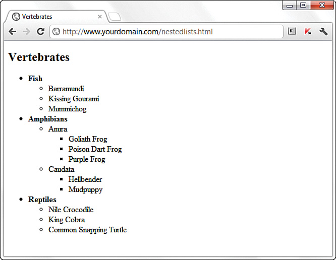
As Figure 6.7 shows, a web browser normally uses a solid disc for the first-level bullet, a hollow circle for the second-level bullet, and a solid square for all deeper levels. However, you can explicitly choose which type of bullet to use for any level by using <ul style="list-style-type:disc;">, <ul style="list-style-type:circle;">, or <ul style="list-style-type:square;"> instead of <ul>, either inline or in a specific style sheet.
You can even change the bullet for any single point within an unordered list by using the list-style-type style rule in the <li> tag. For example, the following code displays a hollow circle in front of the words extra and super and a solid square in front of the word special:
<ul style="list-style-type:circle;">
<li>extra</li>
<li>super</li>
<listyle="list-style-type:square;">special</li>
</ul>
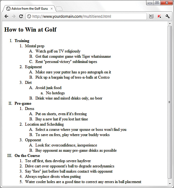
The list-style-type style rule also works with ordered lists, but instead of choosing a type of bullet, you choose the type of numbers or letters to place in front of each item. Listing 6.7 shows how to use Roman numerals (list-style-type:upper-roman;), capital letters (list-style-type:upper-alpha;), lowercase letters (list-style-type:lower-alpha;), and ordinary numbers (list-style-type:decimal;) in a multilevel list. Figure 6.8 shows the resulting outline, which is nicely formatted.
Although Listing 6.7 uses the list-style-type style rule only with the <ol> tag, you can also use it for specific <li> tags within a list (though it’s hard to imagine a situation when you would want to do this). You can also explicitly specify ordinary numbering with list-style-type:decimal;, and you can make lowercase Roman numerals with list-style-type:lower-roman;.
Listing 6.7 Using the list-style-type Style Rule with the style Attribute in Multitiered Lists
<!doctype html>
<html lang="en">
<head>
<meta charset="utf-8">
<title>Advice from the Golf Guru</title>
</head>
<body>
<article>
<header>
<h1>How to Win at Golf</h1>
</header>
<ol style="list-style-type:upper-roman;">
<li><strong>Training</strong>
<ol>
<li>Mental prep
<ol style="list-style-type:upper-alpha;">
<li>Watch golf on TV religiously</li>
<li>Get that computer game with Tiger whatsisname</li>
<li>Rent "personal victory" subliminal tapes</li>
</ol>
</li>
<li>Equipment
<ol style="list-style-type:upper-alpha;">
<li>Make sure your putter has a pro autograph on it</li>
<li>Pick up a bargain bag of tees-n-balls at Costco</li>
</ol>
</li>
<li>Diet
<ol style="list-style-type:upper-alpha;">
<li>Avoid junk food
<ol style="list-style-type:lower-alpha;">
<li>No hotdogs</li>
</ol>
</li>
<li>Drink wine and mixed drinks only, no beer</li>
</ol>
</li>
</ol>
</li>
<li><strong>Pre-game</strong>
<ol>
<li>Dress
<ol style="list-style-type:upper-alpha;">
<li>Put on shorts, even if it's freezing</li>
<li>Buy a new hat if you lost last time</li>
</ol>
</li>
<li>Location and Scheduling
<ol style="list-style-type:upper-alpha;">
<li>Select a course where your spouse or boss won't
find you</li>
<li>To save on fees, play where your buddy works</li>
</ol>
</li>
<li>Opponent
<ol style="list-style-type:upper-alpha;">
<li>Look for: overconfidence, inexperience</li>
<li>Buy opponent as many pre-game drinks as possible</li>
</ol>
</li>
</ol>
</li>
<li><strong>On the Course</strong>
<ol>
<li>Tee off first, then develop severe hayfever</li>
<li>Drive cart over opponent's ball to degrade
aerodynamics</li>
<li>Say "fore" just before ball makes contact with
opponent</li>
<li>Always replace divots when putting</li>
<li>Water cooler holes are a good time to correct any
errors in ball placement</li>
</ol>
</li>
</ol>
</article>
</body>
</html>
Creating a Simple Table
Another method for controlling the layout of information within your web pages is to display that information within a table. A table consists of rows of information with individual cells inside. To make a table, you have to start with a <table> tag. Of course, you end a table with the </table> tag. CSS contains numerous properties that enable you to modify a table, such as the various border properties you learned about in previous lessons.
With the <table> tag in place, you next need the <tr> tag. The <tr> tag creates a table row, which contains one or more cells of information before the closing </tr>. To create these individual cells, use the <td> tag (<td> stands for table data). Place the table information between the <td> and </td> tags. A cell is a rectangular region that can contain any text, images, and HTML tags. Each row in a table consists of at least one cell. Multiple cells within a row form columns in a table.
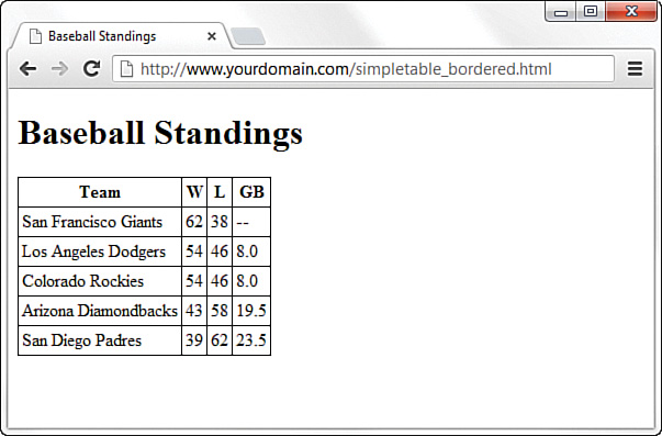
One more basic tag is involved in building tables. The <th> tag works exactly like a <td> tag, except that <th> indicates that the cell is part of the heading of the table. Most web browsers automatically render the text in <th> cells as centered and boldface, as you can see with Chrome in Figure 6.9. However, if your browser does not automatically render this element with a built-in style, you have an element that you can style using CSS without using a class to differentiate among types of table data elements.

You can create as many cells as you want, but each row in a table should have the same number of columns as the other rows. The HTML code in Listing 6.8 creates a simple table using only the four table tags mentioned thus far.
Listing 6.8 Creating Tables with the <table>, <tr>, <td>, and <th> Tags
<!doctype html>
<html lang="en">
<head>
<meta charset="utf-8">
<title>Baseball Standings</title>
</head>
<body>
<h1>Baseball Standings</h1>
<table>
<tr>
<th>Team</th>
<th>W</th>
<th>L</th>
<th>GB</th>
</tr>
<tr>
<td>San Francisco Giants</td>
<td>54</td>
<td>46</td>
<td>8.0</td>
</tr>
<tr>
<td>Los Angeles Dodgers</td>
<td>62</td>
<td>38</td>
<td>—</td>
</tr>
<tr>
<td>Colorado Rockies</td>
<td>54</td>
<td>46</td>
<td>8.0</td>
</tr>
<tr>
<td>Arizona Diamondbacks</td>
<td>43</td>
<td>58</td>
<td>19.5</td>
</tr>
<tr>
<td>San Diego Padres</td>
<td>39</td>
<td>62</td>
<td>23.5</td>
</tr>
</table>
</body>
</html>
Note
You might find your HTML tables easier to read (and less prone to time-wasting errors) if you use spaces to indent <tr> and <td> tags, as shown in Listing 6.8. Remember that browsers ignore spaces when rendering HTML, so the layout of your code has no effect on the layout of the table that people will see.
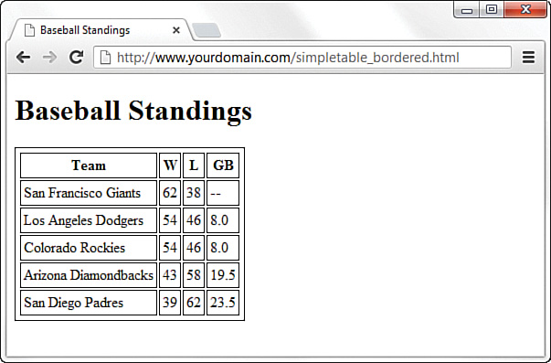
The table in the example contains baseball standings, which are perfect for arranging in rows and columns—but the table is a little plain. For instance, this example doesn’t even have any borders! You’ll learn to jazz things up a bit in just a moment. The headings in the table show the Team, Wins (W), Losses (L), and Games Behind (GB) in the standings.
You can add the following style sheet entries to add a basic border around the table and its cells:
table, tr, th, td {
border: 1px solid black;
border-collapse: collapse;
padding: 3px;
}
You might wonder why you have to specify these styles for all four elements used to create the table instead of just the overall table element itself. Basically, this is because a table is made up of its elements, and each element can have these styles applied. To emphasize this point, the following figures demonstrate how the table would look with various elements styled and unstyled.
Figure 6.10 shows the output of the styles just listed. The border-collapse property, with the value collapse, makes all the borders of the <table>, <tr>, and <th> or <td> elements collapse into one shared border. The padding adds a little breathing room to the content of the cells.
border-collapse.
In Figure 6.11, you can see what the table would look like without the border-collapse property specified. (The default value then takes effect, in this case separate, for separate borders.)
border-collapse property causes borders to appear for all the elements.In Figure 6.12, you can see what the table would look like if you did not specify any of the previous styles for the <th> and <td> elements. Note the lack of border denoting the columns.

<th> and <td> elements.Note
You can use three other useful but not required table-related tags when creating simple tables:
 <thead></thead>—Wrap your header rows in this element to add more meaning to the grouping and also allow these header rows to be printed across all pages (if your table is that long). You can then style the
 <thead>element as well as or instead of individual<th>cells. <tfoot></tfoot>—Much as with the
 <thead>element, use this to wrap your footer rows (if you have any) to add more meaning to the grouping and style it as a whole. An example of a footer row might be a summation of the data presented in the columns, such as financial totals. To be valid, your<tfoot>rows should be listed in the HTML of the table before the<tbody>rows, but the browser will render them after the<tbody>rows. This ensures that, in long tables, the footer data displays while the rest of the table is loading. <tbody></tbody>—Wrap the rows that make up the “body” of this table (everything besides the header and the footer rows) in this element to add more meaning to the grouping. You can also style the
 <tbody>element as a whole as well as or instead of styling individual<td>cells.
Controlling Table Sizes
When a table width is not specified, the size of a table and its individual cells automatically expand to fit the data you place into it. This is different from other HTML elements, like <div> and <p>, which stretch to fit the width of their container. However, you can control the width of the entire table by defining the width CSS property for the <table> element; you can also define the width of each cell through the width CSS property assigned to the <td> elements. The width property can be specified as any length measure, such as pixels, ems, or percentages.
To make the first cell of a table 20% of the total table width and the second cell 80% of the table width, you use the following property definitions:
<table style="width:100%;">
<tr>
<td style="width:20%;">skinny cell</td>
<td style="width:80%;">fat cell</td>
</tr>
</table>
Notice that the table is sized to 100%, which ensures that it fills the entire width of the browser window. When you use percentages instead of fixed pixel sizes, the table resizes automatically to fit any size browser window while maintaining the aesthetic balance you’re seeking. In this case, the two cells within the table are automatically resized to 20% and 80% of the total table width, respectively.
In Listing 6.9, the simple table from Listing 6.8 (plus the border-related styles) is expanded to show very precise control over table cell widths. (In addition, the border-related styles have been added.)
Listing 6.9 Specifying Table Cell Widths
<!doctype html>
<html lang="en">
<head>
<meta charset="utf-8">
<title>Baseball Standings</title>
<style>
table, tr, th, td {
border: 1px solid black;
border-collapse: collapse;
padding: 3px;
}
</style>
</head>
<body>
<h1>Baseball Standings</h1>
<table>
<tr>
<th style="width: 200px;">Team</th>
<th style="width: 25px;">W</th>
<th style="width: 25px;">L</th>
<th style="width: 25px;">GB</th>
</tr>
<tr>
<td>San Francisco Giants</td>
<td>62</td>
<td>38</td>
<td>--</td>
</tr>
<tr>
<td>Los Angeles Dodgers</td>
<td>54</td>
<td>46</td>
<td>8.0</td>
</tr>
<tr>
<td>Colorado Rockies</td>
<td>54</td>
<td>46</td>
<td>8.0</td>
</tr>
<tr>
<td>Arizona Diamondbacks</td>
<td>43</td>
<td>58</td>
<td>19.5</td>
</tr>
<tr>
<td>San Diego Padres</td>
<td>39</td>
<td>62</td>
<td>23.5</td>
</tr>
</table>
</body>
</html>
You can see the consistent column widths in Figure 6.13.
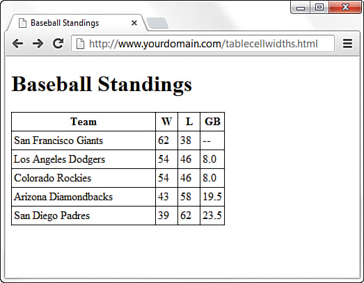
The addition of a specific width style for each <th> element in the first row defines the widths of the columns. The first column is defined as 200px wide, and the second, third, and fourth columns are each 25px wide. In Figure 6.13, you can see whitespace after the text in the first column, indicating that the specified width is indeed greater than the column width would have been had the table been allowed to render without explicit width indicators.
Also note that these widths are not repeated in the <td> elements in subsequent rows. Technically, you need to define the widths in only the first row; the remaining rows will follow suit because they are all part of the same table. However, if you had used another formatting style (such as a style to change font size or color), you would’ve had to repeat that style for each element that should have those display properties.
Alignment and Spanning Within Tables
By default, anything you place inside a table cell is aligned to the left and vertically centered. All the figures so far in this lesson have shown this default alignment. However, you can align the contents of table cells both horizontally and vertically with the text-align and vertical-align style properties.
You can apply these alignment attributes to any <tr>, <td>, or <th> tag. Alignment attributes assigned to a <tr> tag apply to all cells in that row. Depending on the size of your table, you can save yourself some time and effort by applying these attributes at the <tr> level and not in each <td> or <th> tag.
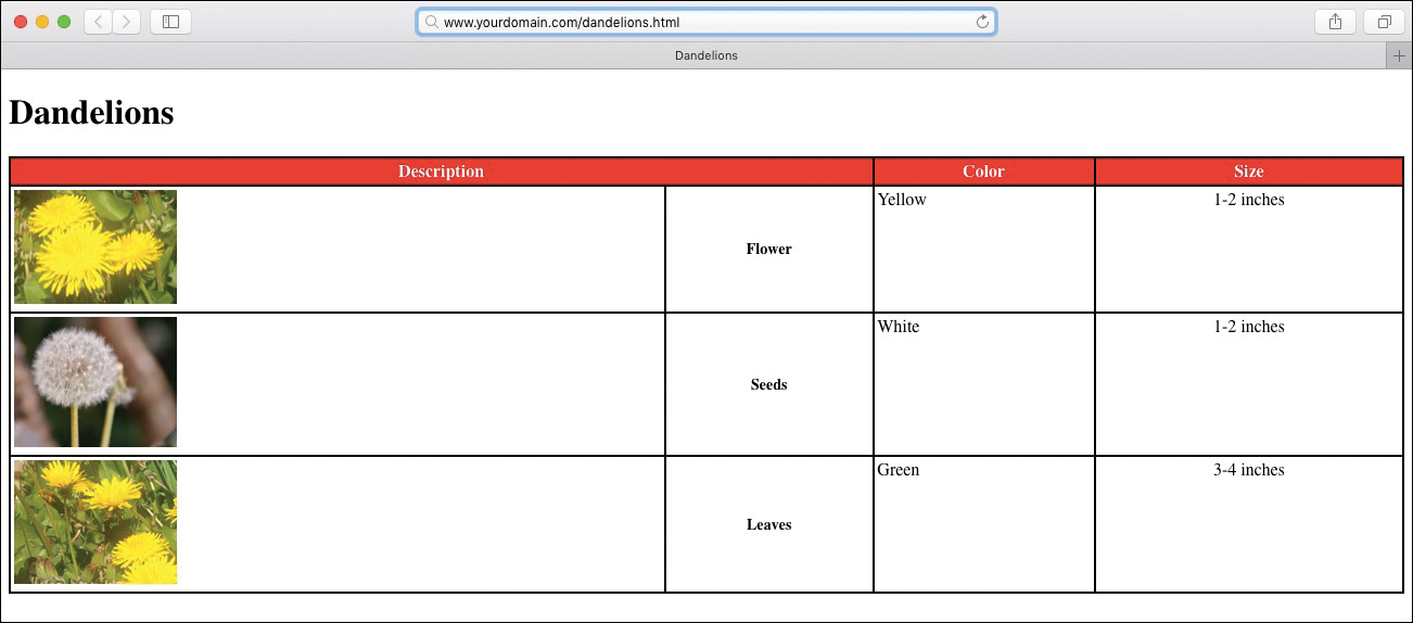
The HTML code in Listing 6.10 uses a combination of text alignment styles to apply a default alignment to a row, but it is overridden in a few individual cells. Figure 6.14 shows the result of the code in Listing 6.10.
Listing 6.10 Alignment, Cell Spacing, Borders, and Background Colors in Tables
<!doctype html>
<html lang="en">
<head>
<meta charset="utf-8">
<title>Dandelions</title>
<style>
table {
border: 2px solid black;
border-collapse: collapse;
padding: 3px;
width: 100%;
}
tr, th, td {
border: 2px solid black;
border-collapse: collapse;
padding: 3px;
}
thead {
background-color: #ff0000;
color: #ffffff;
}
.aligntop {
vertical-align:top;
}
.description {
font-size: 14px;
font-weight: bold;
vertical-align: middle;
text-align: center;
}
.size {
text-align: center;
}
</style>
</head>
<body>
<h1>Things to Fear</h1>
<table>
<thead>
<tr>
<th colspan="2">Description</th>
<th>Color</th>
<th>Size</th>
</tr>
</thead>
<tbody>
<tr class="aligntop">
<td><img src="flower.jpg" alt="Flower"></td>
<td class="description">Flower</td>
<td>Yellow</td>
<td class="size">1-2 inches</td>
</tr>
<tr class="aligntop">
<td><img src="seeds.jpg" alt="Seeds"></td>
<td class="description">Seeds</td>
<td>White</td>
<td class="size">1-2 inches</td>
</tr>
<tr class="aligntop">
<td><img src="leaves.jpg" alt="Leaves"></td>
<td class="description">Leaves</td>
<td>Green</td>
<td class="weight">3-4 inches</td>
</tr>
</tbody>
</table>
</body>
</html>
colspan attribute and some alignment styles.
Following are some of the most commonly used vertical-align style property values: top, middle, bottom, text-top, text-bottom, and baseline (for text). These property values give you plenty of flexibility in aligning table data vertically.
Note
Keeping the structure of rows and columns organized in your mind can be the most difficult part of creating tables with cells that span multiple columns or rows. The tiniest error can often throw the whole thing into disarray. You can save yourself time and frustration by sketching complicated tables on paper before you start writing the HTML to implement them.
Spanning is the process of forcing a cell to stretch across more than one row or column of a table. The colspan attribute causes a cell to span multiple columns; rowspan has the same effect on rows.
At the top of Figure 6.14, a single cell (Description) spans two columns. This is accomplished with the colspan attribute in the <th> tag for that cell. As you might guess, you can also use the rowspan attribute to create a cell that spans more than one row.
In addition, text styles are defined in the style sheet and applied to the cells in the Description column to create bold text that is both vertically aligned to the middle and horizontally aligned to the center of the cell.
A few tricks in Listing 6.10 haven’t been explained yet. You can give an entire table—and each individual row or cell in a table—its own background, distinct from any background you might use on the web page itself. You can do this by placing the background-color or background-image style in the <table>, <tr>, <td>, <th>, <thead>, <tbody>, or <tfoot> tags (or assigning the value in the style sheet for these elements), exactly as you would in the <body> tag. In Listing 6.10, only the top row has a background color; the style sheet defines the <thead> element as having a red background and white text in the cells in that row.
Note
You often see alternating row colors in a table. For instance, one row might have a gray background, and the next row might have a white background. Alternating the row colors helps users read the content of a table more clearly, and it is especially helpful if the table is large. You can do this automatically with CSS, as you’ll learn in Lesson 13, “Taking Control of Backgrounds and Borders.”
Similar to the background-color style property is the background-image property (not shown in this example), which is used to set an image for a table background. If you wanted to set the image leaves.gif as the background for a table, you would use background-image:url(leaves.gif); in the style sheet entry for the <table> element. Notice that the image file is placed within parentheses and preceded by the word url, which indicates that you are describing where the image file is located.
Tweaking tables goes beyond just using style properties. As Listing 6.10 shows, you can control the space around the content of the cell, within its borders, by applying some padding to the cell. If you want to add some space between the borders of the cells themselves, you can use the border-spacing CSS property, which enables you to define the horizontal and vertical spacing, like so:
border-spacing: 2px 4px;
In the example, spacing is defined as 2 pixels of space between the horizontal borders and 4 pixels of space between the vertical borders. If you use only one value, the value is applied to all four borders.
Page Layout with Tables
At the beginning of this lesson, we indicated that designers have used tables for page layout, as well as to display tabular information. You will still find many examples of table-based layouts if you peek at another designer’s source code. This method of design grew out of inconsistencies in browser support for CSS in the mid-1990s to early 2000s. Because all browsers supported tables, and in generally the same way, web designers latched on to the table-based method of content layout to achieve the same visual page display across all browsers. However, now that support for CSS is relatively similar across all major browsers, designers can follow the long-standing standards-based recommendation not to use tables for page layout.
Note
HTML5 has changed the recommendation again. Using tables for layout is still not a good idea, but as long as you define the containing table as a layout table with either a border="0" or role="presentation" attribute on the table, you will be in alignment with the recommendation. But it’s still not a good idea to use tables for layout. In Lesson 12, “Creating Layouts Using Modern CSS Techniques,” you’ll learn several CSS alternatives that work much better than tables.
The World Wide Web Consortium (W3C), the standards body that oversees the future of the web, has long promoted using style sheets as the proper way to lay out pages (instead of using tables). Style sheets are ultimately much more powerful than tables, which is why the bulk of these lessons teach you how to use style sheets for page layout.
The main reasons for avoiding using tables for layout include these:
 Mixing presentation with content—One goal of CSS and standards-compliant web design is to separate the presentation layer from the content layer.
 Creating unnecessarily difficult redesigns—To change a table-based layout, you have to change the table-based layout on every single page of your site (unless it is part of a complicated, dynamically driven site, in which case you have to undo all the dynamic pieces and remake them).
 Addressing accessibility issues—Screen reading software looks to tables for content and often tries to read layout tables as content tables.
 Rendering on mobile devices—Table layouts are often not flexible enough to scale downward to small screens (see Lesson 17, “Designing for Mobile Devices”).
Using CSS Columns
If you have a large amount of text-only information, you might want to present it much like a physical newspaper does: in columns. Over 100 years of research have shown a correlation between the length of a line and reading speed. There is a “sweet spot,” or optimum length of a line that allows for a quick and enjoyable reading experience. The continued presence of this sweet spot—lines that are around 4 inches long—is why physical newspapers still present information in columns.
If you have a lot of information to present to readers, or if you simply want to mimic the aesthetic of a newspaper layout, you can use CSS columns. True, you could also use a table, because tables are made of rows and columns, but the preceding section explained some of the reasons to avoid a table-based layout. Also, columns aren’t just for text; you can put anything you want into defined columns, such as advertisements or related text in a sidebar.
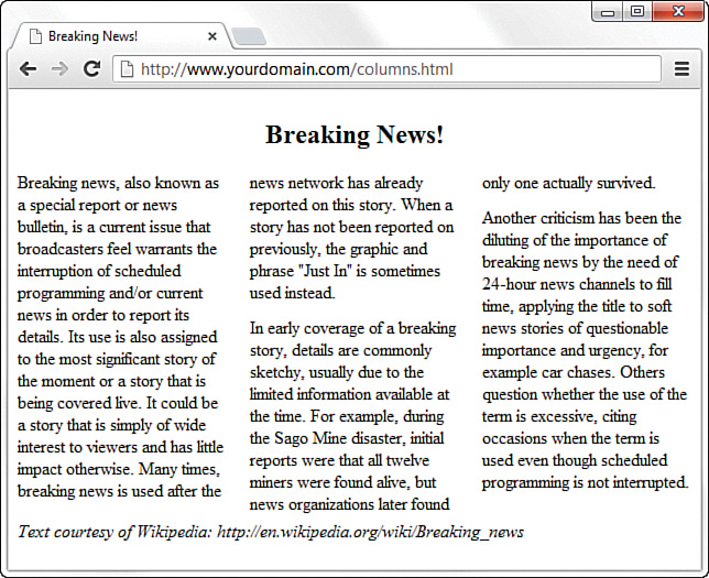
In Figure 6.15, you can see a basic use of CSS columns to define a traditional newspaper-type layout. Listing 6.11 shows the code to create this three-column layout.
Listing 6.11 Alignment, Cell Spacing, Borders, and Background Colors in Tables
<!doctype html>
<html lang="en">
<head>
<meta charset="utf-8">
<title>Breaking News!</title>
<style>
article {
column-count: 3;
column-gap: 21px;
}
h1 {
text-align: center;
column-span: all;
}
p {
margin-top: 0px;
margin-bottom: 12px;
}
footer {
column-span: all;
}
</style>
</head>
<body>
<article>
<header>
<h1>Breaking News!</h1>
</header>
<p>Breaking news, also known as a special report or news
bulletin, is a current issue that broadcasters feel warrants
the interruption of scheduled programming and/or current news
in order to report its details. Its use is also assigned to
the most significant story of the moment or a story that is
being covered live. It could be a story that is simply of wide
interest to viewers and has little impact otherwise. Many
times, breaking news is used after the news network has
already reported on this story. When a story has not been
reported on previously, the graphic and phrase "Just In" is
sometimes used instead.</p>
<p>In early coverage of a breaking story, details are commonly
sketchy, usually due to the limited information available at the
time. For example, during the Sago Mine disaster, initial reports
were that all twelve miners were found alive, but news
organizations later found only one actually survived.</p>
<p>Another criticism has been the diluting of the importance of
breaking news by the need of 24-hour news channels to fill time,
applying the title to soft news stories of questionable importance
and urgency, for example car chases. Others question whether the
use of the term is excessive, citing occasions when the term is
used even though scheduled programming is not interrupted.</p>
<footer>
<em>Text courtesy of Wikipedia:
http://en.wikipedia.org/wiki/Breaking_news</em>
</footer>
</article>
</body>
</html>
The code in Listing 6.11 is from a fake news article, and we’ve used the <article> element to hold all the content. Inside the <article> element is a <header> element that contains the “Breaking News!” heading (at the <h1> level), followed by three paragraphs of text and a <footer> element. All the styling is handled in the style sheet at the beginning of the listing; styles are provided for four of the elements just named: <article>, <h1>, <p>, and <footer>.
In the style sheet, we’re applying the primary definition of the columns within the <article> element. We’ve used column-count to define three columns, and we’ve used column-gap to define the space between the columns as 21 pixels wide. Next, we’ve added a definition for the <h1> element, first to make the text align in the center of the page and second to ensure that the text spans all the columns. We’ve applied the same column-span property to the entry for the <footer> element for the same reason.
After the entry for the <h1> element, we added some specific margins to the <p> element—namely, a top margin of 0 pixels and a bottom margin of 12 pixels. We could have left well enough alone and just allowed the <p> elements to display as the default style, but that would have created a margin at the top of each paragraph. “What’s the big deal?” you might ask, because it looks as though we’ve manually added space between the paragraphs anyway—and that’s true. However, we added the space after each paragraph and took away the space before each paragraph so that the first column doesn’t begin with a space and thus cause the tops of the three columns to misalign.
Note
You will sometimes see related entries with -webkit, -o, -ms, and -moz prefixes, such as -webkit-column-count: 2;. These are added to style sheets when a property is not fully supported by browsers. The -webkit prefix is for Chrome and Safari (and their mobile counterparts Android and iOS), -o is for Opera, -ms is for Microsoft Edge and Internet Explorer, and -moz is for Firefox. While you can use these prefixes for CSS columns, browser support is basically universal now, so the prefixes are necessary only if you need to support older browser versions. A good site to reference what prefixes you might need is www.caniuse.com.
You can even add vertical lines between columns, as shown in Figure 6.16. The style sheet entries we added to achieve this appearance are shown here:
column-rule-width: 1px;
column-rule-style: solid;
column-rule-color: #000;
Note that these style sheet entries look remarkably similar to the ones you use to define borders (which you will learn about in Lesson 13).

You will learn more about how to use CSS columns for responsive layouts in Lesson 17.
Summary
In this lesson, you learned how to make text appear as boldface or italic and how to code superscripts, subscripts, special symbols, and accented letters. You saw how to control the size, color, and typeface of any section of text on a web page, including how to use web fonts for more interesting typefaces. You also learned that attributes are used to specify options and special behavior for many HTML tags, and you learned to use the style attribute with CSS style rules to affect the appearance of text. You also learned how to create and combine three basic types of HTML lists: ordered lists, unordered lists, and definition lists. Lists can be placed within other lists to create outlines and other complex arrangements of text.
Finally, you learned to arrange text and images into organized rows and columns called tables. You learned the basic tags for creating tables and several CSS properties for controlling the alignment, spacing, and appearance of tables. You also learned that tables should not be used for layout purposes but that you can achieve a multicolumn layout by using CSS columns.
Table 6.2 summarizes the HTML tags and attributes discussed in this lesson. Don’t feel as though you have to memorize all these tags, by the way!
Table 6.2 HTML Tags and Attributes Covered in Lesson 6
Tag/Attribute |
Function |
|
Adds emphasis (usually italic). |
|
Adds stronger emphasis (usually bold). |
|
Indicates preformatted text (with exact line endings and spacing preserved—usually rendered in a monospaced font). |
|
Indicates subscript. |
|
Indicates superscript. |
|
Specifies a region of text to be formatted. |
|
Indicates a definition list. |
|
Indicates a definition term, as part of a definition list. |
|
Specifies the corresponding definition to a definition term, as part of a definition list. |
|
Indicates an ordered (numbered) list. |
|
Indicates an unordered (bulleted) list. |
|
Indicates a list item for use with |
|
Creates a table that can contain any number of rows and columns. |
|
Defines the header rows of a table. |
|
Defines the body rows of a table. |
|
Defines the footer rows of a table. |
|
Defines a table row containing one or more cells ( |
|
Defines a table heading cell. (Accepts all the same styles as |
|
Defines a table data cell. |
Attribute |
Function |
|
Specifies the typeface (family) of the font, which is the name of a font, such as |
|
Specifies the size of the font, which can be set to |
|
Changes the color of the text. |
|
Aligns text to |
Attribute |
Function |
|
Indicates the type of numerals used to label the list. Possible values are |
|
Indicates the bullet dingbat used to mark list items. Possible values are |
|
Indicates the type of bullet or number used to label this item. Possible values are |
Q&A
Q. How do I find out the exact name for a font I have on my computer?
A. On a Windows 10 computer, open the Control Panel and go to the Appearance and Personalization section. Then click the Fonts folder, and you see a list of the fonts on your system. On a Mac, open Font Book in the Applications folder to find a list of the fonts on your system. When specifying fonts in the font-family style rule, use the exact spelling of each font name. Font names are not case sensitive, however.
Q. How do I put Kanji, Arabic, Chinese, and other non-European characters on my pages?
A. First of all, users who need to read these characters on your pages must have the appropriate language fonts installed. If you have your browser set to the UTF-8 character set, you should be able to just type the characters onto your page, just as you do English characters.
You can also use the Character Map program in Windows (or a similar program in other operating systems) to get the numeric codes for the characters in any language font. To find Character Map, click Start, All Programs, Accessories, and then System Tools. (On a Mac, look for the Emoji & Symbols option in the Edit menu of any application.) If the character you want has the code 214, use Ö to place it on a web page. If you cannot find the Character Map program, use your operating system’s built-in Help function to find the specific location.
Q. I’ve seen web pages that use little three-dimensional balls or other special graphics for bullets. How do they do that?
A. That trick is a little bit beyond what this lesson covers. You’ll learn how to do this in Lesson 8.
Q. I made a big table, and when I load the page, nothing appears on the page for a long time. Why the wait?
A. Complex tables can take a while to appear on the screen. The web browser has to figure out the size of everything in the table before it can display any part of it. You can speed things up a bit by defining the width and height attributes for every image within a table. Defining specific widths for the <table> and <td> elements also helps. You may want to split extremely large tables into smaller tables, so that they render individually.
Workshop
The workshop contains quiz questions and activities to help you solidify your understanding of the material covered.
Quiz
1. How would you create a paragraph in which the first three words are bold, using styles rather than the <b> or <strong> tags?
2. How would you represent the chemical formula for water?
3. How do you display “© 2018, Webwonks Inc.” on a web page?
4. How would you center all the text on a page?
5. How can you create a simple two-column, two-row table with a single-pixel black border outlining the table?
6. Why should you use character codes to write 3 < 6 on a web page?
7. What typeface will be used in most browsers with this style property: font-family: Geneva, Arial, helvetica, sans-serif;?
8. What is the CSS command to define a web font?
9. What do you call a list enclosed inside another list?
10. What is the CSS property for creating a three-column newspaper layout on a web page?
Note
Just a reminder for those of you reading these words in the print or e-book edition of this book: If you go to www.informit.com/register and register this book (using ISBN 9780672338083), you can receive free access to an online Web Edition that not only contains the complete text of this book but also features an interactive version of this quiz.
Answers
1. You can use this code:
<p><span style="font-weight: bold;">First three words</span> are bold.</p>
2. You can use H<sub>2</sub>O.
3. You can use either of the following:
© 2018, Webwonks Inc.
© 2018, Webwonks Inc.
4. If you thought about putting a <div style="text-align:center;"> immediately after the <body> tag at the top of the page and </div> just before the </body> tag at the end of the page, then you’re correct. However, the text-align style is also supported directly in the <body> tag, which means you can forgo the <div> tag and place the style="text-align:center;" style directly in the <body> tag. Presto, the entire page is centered!
5. Use the following HTML:
<table style="border: 1px solid #000000; border-collapse: collapse;">
<tr>
<td>Top left...</td>
<td>Top right...</td>
</tr>
<tr>
<td>Bottom left...</td>
<td>Bottom right...</td>
</tr>
</table>
6. Because the < character is also the character that starts an HTML tag, by writing 3 < 6, you will ensure that the browser knows to display the less-than sign rather than thinking < is the start of an HTML tag.
7. This will display in most browsers in the typeface Geneva. If the browser doesn’t have that font, it will display in Arial, then Helvetica, and then in its default sans-serif font.
8. You use the @font-face rule to define the name and source URL of a web font.
9. A list inside another list is called a nested list.
10. Use column-count: 3; to define a three-column layout on your page.
Exercises
 Apply the font-level style attributes you learned about in this lesson to various block-level elements, such as
 <p>,<div>,<ul>, and<li>items. Try nesting your elements to get a feel for how styles do or do not cascade through the content hierarchy.Use the text alignment style attributes to place blocks of text in various places on your web page. Try nesting your paragraphs and divisions (
<p>and<div>) to get a feel for how styles do or do not cascade through the content hierarchy. Try producing an ordered list outlining the information you’d like to put on your web pages. This will give you practice formatting HTML lists and also give you a head start on thinking about the issues covered in later lessons.
