Hour 14. User Interfaces
What You’ll Learn in This Hour:
► The elements of a user interface (UI)
► An overview of the UI elements
► The different UI render modes
► How to build a simple menu system
A user interface (UI) is a special set of components responsible for sending information to, and reading information from, the user. In this hour, you’ll learn all about using Unity’s built-in UI system. You’ll start by examining the UI basics. From there, you’ll get to try out the various UI elements, such as text, images, buttons, and more. You’ll finish this lesson by creating a simple but complete menu system for your games.
Basic UI Principles
A user interface (commonly referred to as a UI) is a special layer that exists to give information to the user and to accept simple inputs from the user. This information and input could take the form of an HUD (heads up display) drawn over the top of your game or some object actually located within your 3D worlds.
In Unity, the UI is based on a canvas onto which all the UI elements are painted. This canvas needs to be the parent of all UI objects in order for them to work, and it is the main object driving your entire UI.
The Canvas
A canvas is the basic building block for a UI, and all the UI elements are contained within the canvas. All the UI elements you add to a scene will be child objects of the canvas in the Hierarchy view and must stay as children; otherwise, they’ll disappear from the scene.
Adding a canvas to a scene is very easy. You can add one simply by selecting GameObject > UI > Canvas. Once the canvas is added to a scene, you are ready to begin building the rest of the UI.
The Rect Transform
You will notice that a canvas (and every other UI element) has a Rect transform rather than the normal 3D transform you are familiar with. Rect, short for rectangle, transforms give you fantastic control over the positioning and rescaling of UI elements while remaining very flexible. This allows you to create a user interface and ensure that it works well on a wide range of devices.
For the canvas you created earlier in this hour, the Rect transform is entirely grayed out (see Figure 14.1). This is because, in its current form, the canvas derives its values entirely from the Game view (and, by extension, the resolution and aspect ratio of any devices your game runs on). This mean the canvas will always take up the entire screen. A good workflow is to make sure the first thing you do whenever building a UI is to select a target aspect ratio to work with. You can do this from the Aspect Ratio drop-down in the Game view (see Figure 14.2).

FIGURE 14.1
The Rect transform of a canvas.

FIGURE 14.2
Setting the game’s aspect ratio.
Rect transforms work a little differently from traditional transforms. With normal 2D and 3D objects, the transform is concerned with determining how far (and with what alignment) an object is from the world origin. The UI, however, is unconcerned with world origin and instead needs to know how it’s aligned in relation to its anchor point. (You will learn more about Rect transforms and anchors later, when you have a UI element that can actually use it.)
Anchors
A key concept in making UI elements work is anchors. Every UI element comes with an anchor and uses that anchor to find its place in the world in relation to the Rect transform of its parent. Anchors determine how elements are resized and repositioned when the Game window changes size and shape. In addition, an anchor has two “modes”: together and split. When an anchor is together as a single point, the object knows where it is by determining the distance (in pixels) of its pivot from the anchor. When an anchor is split, however, the UI element bases its bounding box on how far (again in pixels) each of its corners is from each corner of the split anchor. Confusing? Let’s try it out!
Try it Yourself
Using a Rect Transform
Rect transforms and anchors can be confusing, so follow these steps to better understand them:
1. Create a new scene or project.
2. Add a UI image (by selecting GameObject > UI > Image). Note that if you add an image to a scene without a canvas, Unity automatically puts a canvas in your scene and then puts the image on it.
3. Zoom out so you can see the whole image and canvas. Note that it is much easier working with the UI when your scene is in 2D mode (which you enter by clicking the 2D button at the top of Scene view) and you are using the Rect tool (hotkey: T).
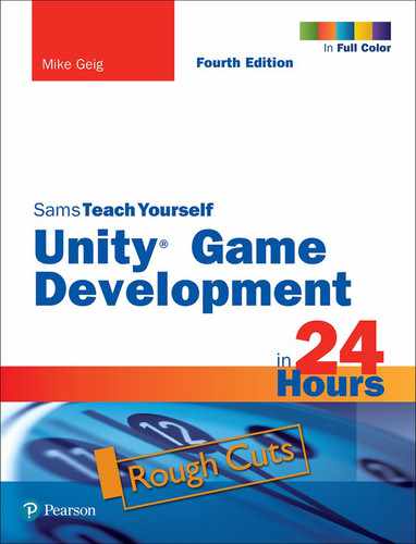
4. Try dragging the image around the canvas. Also try dragging the anchor (four small triangles) around the canvas. Notice that the lines show you how far the image’s pivot (small blue circle) is from the anchor. Also notice the properties of the Rect transform in the Inspector and how they change (see Figure 14.3).
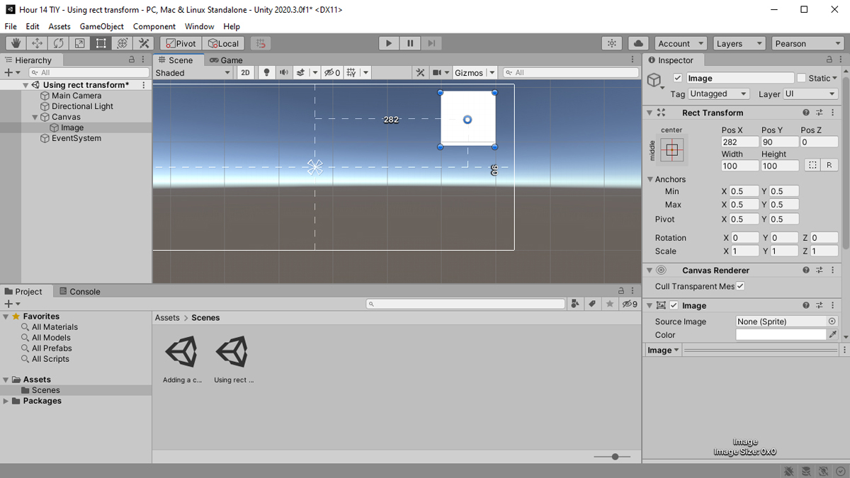
FIGURE 14.3
The anchor at a single point.
5. Now try splitting your anchor. You can do this by dragging any of the corners of the anchor away from the rest. With the anchor split, move your image around again. Notice how the properties of the Rect transform change (see Figure 14.4). (Hint: Where did Pos X, Pos Y, Width, and Height go?)

FIGURE 14.4
The anchor after being split.
So what exactly does splitting an anchor (or keeping it together) do? In simple terms, an anchor that is a single point fixes your UI element in place relative to that spot. So if the canvas changes size, the element doesn’t. Splitting the anchor causes the element to fix its corners relative to the corners of the anchor. If the canvas resizes, so does the element. You can easily preview this behavior in the Unity editor. Using the preceding example, if you select the image and then click and drag the border of the canvas (or any other parent, if you have more elements), the word Preview appears, and you can see what will happen when using different resolutions (see Figure 14.5). Try it out with both a single anchor and a split anchor and notice how differently they behave.

FIGURE 14.5
Previewing a canvas change.

FIGURE 14.6
The anchor button.
Additional Canvas Components
So far, we’ve talked about the canvas a bit but still haven’t even mentioned the actual Canvas component. Truth be told, there isn’t much with the component itself that you need to concern yourself with. You do need to know about render modes, and we look at them in detail later in this hour.
Depending on what version of Unity you are using, you may have a couple extra components. Again, these are very simple to use, so they aren’t covered in detail here (there’s just too much other good stuff to get to). The Canvas Scaler component allows you to specify how, if at all, you would like your UI elements resized as the screen of your target device changes (for instance, seeing the same UI on a web page versus a high-DPI Retina iPad device). The Graphical Raycaster component, which works with the EventSystem object, allows your UI to receive button clicks and screen touches. It allows you to use raycasting without needing to drag in the entire physics engine to do it.
UI Elements
At this point, you’re probably pretty tired of the canvas, so let’s get working with some UI elements (also called UI controls). Unity has several built-in controls available for you to get started with. Don’t worry if you don’t see a control that you want, though. Unity’s UI library is open source, and plenty of custom controls are being created by members of the community all the time. As a matter of fact, if you’re up for the challenge, you can even create your own controls and share them with everyone else.
Unity has many controls that you can add to scenes. Most of them are simple combinations and variations of two basic elements: images and text. This makes sense if you think about it: A panel is just a full-sized image, a button is just an image with some text, and a slider is really three images stacked together. As a matter of fact, the whole UI is built to be a system of basic building blocks that are stackable to get the functionality you want.
Images
Images are the fundamental building pieces of a UI. They can range from background images, to buttons, to logos, to health bars, to everything in between. If you completed the Try It Yourself exercises earlier in this hour, then you already have some familiarity with images, but now you’ll take a closer look. As you saw earlier, you can add an image to a canvas by selecting GameObject > UI > Image. Table 14.1 lists the important properties of an image, which is just a game object with an Image component. Note that some of these properties won’t appear unless you specify a Source Image. If you don’t have a sprite available to use, you can always use the default UI sprite by clicking the circle selector next to the Source Image property and selecting the built in UISprite.
TABLE 14.1 Properties of the Image Component

Besides the basic properties, there isn’t much more you need to know about using an image. Work through the following Try It Yourself to see how easy it is to use images.
Try it Yourself
Using an Image
Let’s try creating a background image. This exercise uses the BackgroundSpace.png file from the book assets for Hour 14. Follow these steps:
1. Create a new scene or project.
2. Import BackgroundSpace.png into your project, ensuring that it is imported as a sprite. (Refer to Hour 12 if you don’t remember how to do this.)
3. Add an image to your scene (by selecting GameObject > UI > Image).
4. Set the BackgroundSpace sprite as the Source Image property of the Image object.
5. Resize the image to fill the entire canvas. Switch over to the Game view and see what happens if you change the aspect ratio. Notice that the image may get cut off or fail to fill the screen.
6. Split the anchor of the image so that the four corners of the anchor reach the four corners of the canvas (see Figure 14.7). Now switch back to the Game view and see what happens when you change the aspect ratio. Notice that the image always fills the screen and is never cut off—although it may skew.
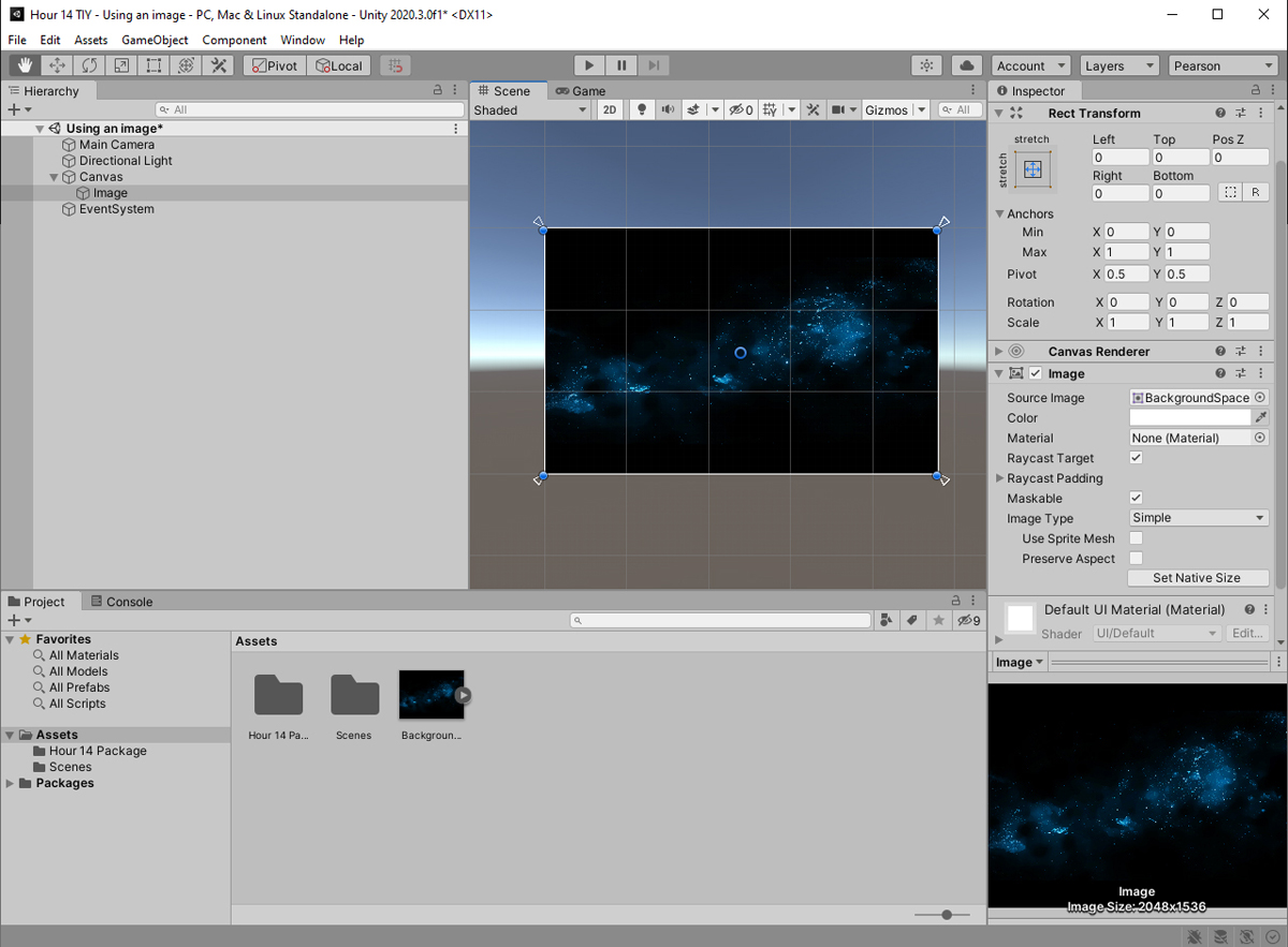
FIGURE 14.7
Expanding the image and anchors.
Text
Text objects (which are really just text components) are elements you use to display text to the user. If you’ve ever used text formatting controls before (think blogging software, word processors like Word or WordPad, or anywhere else you would use and style text), the Text component will be very familiar. You can add a Text component to a canvas by selecting GameObject > UI > Text. Table 14.2 lists the properties of the Text component. Because most text properties are self-explanatory, only the new or unique properties are listed.
TABLE 14.2 Properties of the Text Component
It is worth taking a moment to try out the different settings, especially for Overflow and Best Fit. If you don’t understand how to use these properties, you may be surprised to find your text mysteriously disappearing (because it has been truncated), and it may take time to figure out why.
Buttons
Buttons are elements that allow click input from the user. They may seem complex at first look, but remember that, as mentioned earlier, a button is really just an image with a text object child and a little more functionality. You can add buttons to your scene by selecting GameObject > UI > Button.
Where a button is different from either of the other controls you’ve seen so far is that it is interactable. Because of that, it has some interesting properties and features. For instance, buttons can have transitions, they can be navigated, and they can have OnClick event handlers. Table 14.3 lists the Button component properties.
TABLE 14.3 Properties of the Button Component
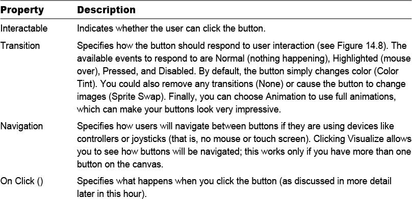

FIGURE 14.8
The transition type selector.
On Click ()
When users are done marveling at your various button transition effects, they may eventually click some buttons. You can use the On Click () property at the bottom of the Inspector to call a function from a script and to access many other components. You can pass parameters to any method you call, which means the designer can control the behavior without entering code. An advanced use of this functionality might be to call methods on a game object or make a camera look at a target directly.
Try it Yourself
Using a Button
Follow these steps to put what you know so far to practice and create a button, give it some color transitions, and make it change its text when clicked:
1. Create a new scene or project.
2. Add a button to the scene (by selecting GameObject > UI > Button).
3. Under the Button component in the Inspector, set Highlighted Color to red and Pressed Color to green (see Figure 14.9 for the finished settings).

FIGURE 14.9
The finished button settings.
4. Add a new On Click () handler by clicking the little + sign at the bottom of the Inspector (see Figure 14.9). Now that the handler is looking for the object to manipulate, it says None (Object).
5. Expand the button game object in the Hierarchy view so you can see the Text child object. Drag the Text object onto the Object property of the event handler.
6. In the function drop-down (which says No Function), specify what you want the button to do to the chosen object. To do this, click the drop-down (see #1 in Figure 14.10) and then select Text (#2) > string text (#3).

FIGURE 14.10
Setting the click event to change the button text.
7. In the value box that appears, type Released.
8. Play the game and try hovering over the button, pressing and holding, and then releasing the button. Notice that the color changes and the text changes when you click.
Canvas Render Modes
Unity offers three powerful options for the way your UI is rendered to the screen. You can choose the mode in the Inspector by selecting Canvas and choosing Render Mode. You then see the modes shown in Figure 14.11. The use of each canvas mode is very complex, so you shouldn’t try to master them right now. Instead, the aim here is to describe the three modes (Screen Space–Overlay, Screen Space–Camera, and World Space) so that you can choose what is best for your games.

FIGURE 14.11
The three different canvas render modes.
Screen Space–Overlay
Screen Space–Overlay, which is the default mode, is the easiest-to-use and also least powerful version of the canvas modes. A UI in Screen Space–Overlay mode draws over the top of everything on the screen, regardless of the camera settings or the position of the camera in the world. In fact, where this UI appears in the Scene view bears no relationship to the objects in the world because it isn’t actually rendered by a camera.
The UI appears in the Scene view at a fixed position, with the bottom-left at (0, 0, 0) in the world. The scale of the UI is different from the world scale, and what you see on the canvas is at a scale of 1 world unit for every pixel in your Game view. If you are using this type of UI in your game and find its place in the world to be inconvenient while you’re working, you can hide it to get it out of the way. To do so, you can click the Layers drop-down in the editor and hide the eye icon next to the UI layer (see Figure 14.12). The UI is then hidden in the Scene view only (through it will still be there when you run your game). Just be sure not to forget to turn it back on, or you might get confused about why your UI won’t show up!

FIGURE 14.12
Hiding your UI.
Screen Space–Camera
Screen Space–Camera mode is similar to Screen Space–Overlay, but the UI is rendered by the camera of your choice. You can rotate and scale UI elements to create much more dynamic 3D interfaces.
Unlike Screen Space–Overlay mode, this mode uses the camera to render the UI. This means effects such as lighting affect the UI, and objects can even pass between the camera and the UI. This can take some extra work, but the payoff is that your interface can feel much more part of the world.
Note that in this mode, the UI stays in a fixed position relative to the camera you chose to render it. Moving the camera also moves the canvas. It can be a good idea to use a second camera solely for rendering your canvas (so it isn’t in the way of the rest of your scene).
World Space
The final UI mode to consider is the World Space mode. Imagine a virtual museum, where every object you look at has detailed information about the object right next to it. Furthermore, this pop-up information could include buttons to allow you to read more or go to other sections of the museum. If you can imagine that, then you are only scratching the surface of what you can do with a World Space mode canvas.
Notice that the Rect transform of the canvas in World Space mode is no longer grayed out, and the Canvas component itself can be edited and resized (see Figure 14.13). Because in this mode the canvas is actually a game object in the world, it is no longer drawn over the rest of your game, like a HUD. Instead, it is fixed in the world and can be a part of or blended with the rest of your scene objects.

FIGURE 14.13
The Rect transform, available with the World Space mode.
Summary
You started this lesson by looking at the building blocks of any UI: the canvas and event system. You then learned about the Rect transform and how anchor points help you make versatile UIs that can work on many devices. From there, you explored various UI elements available for use. You then briefly looked at the fundamentally different UI modes: Screen Space–Overlay, Screen Space–Camera, and World Space.
Q&A
Q. Does every game need a user interface?
A. Usually a game benefits from having a well-thought-out UI. It is rare for a game to have no UI whatsoever. That said, it is always a good idea to be a minimalist with a UI, giving the players just the information they need—when they need it.
Q. Can I mix canvas render modes in a scene?
A. Yes, you can. You might want to have more than one canvas in a scene and give them different render modes.
Workshop
Take some time to work through the questions here to ensure that you have a firm grasp of the material.
Quiz
1. What does UI stand for?
2. What two game objects always come along with a UI in Unity?
3. What UI render mode would you use to put a question mark above a player’s head in a 3D game?
4. What render mode is most likely to be best for a simple HUD?
Answers
1. User interface (This was an easy warm-up question!)
2. Canvas and EventSystem components
3. You would use World Space mode because the interface element is positioned within world space, not relative to the player’s eyes.
4. Screen Space–Overlay
Exercise
In this exercise, you will build a simple but complete menu system that you can adapt for use in all your games. You will make use of a splash screen, a fade-in, some background music, and more.
1. Create a new 2D project. Add a UI panel (by selecting GameObject > UI > Panel). Note that Unity also adds the required Canvas and EventSystem components to the Hierarchy view for you.
2. Import the Hour14Package.unitypackage file provided in the book files. Click clouds.jpg in your Assets folder, and ensure that Texture Type is set to Sprite (2D and UI).
3. Set this image as the source image in the Panel’s Inspector. Note that the image is a little transparent by default, letting the Main Camera’s background color show through. Feel free to adjust the transparency by bringing up the color dialog and adjusting the A slider (where A stands for Alpha).
4. Add a title and a subtitle (by selecting GameObject > UI > Text). Move them so they sit nicely on the panel (see Figure 14.14).

FIGURE 14.14
The complete UI.
5. Add a button (by selecting GameObject > UI > Button). Name the button Start and set its Text child object to say Start Game. Position the button where you wish, remembering to select the button (not the Text child object) before you drag.
6. Save your scene as Menu (by selecting File > Save Scene). Now create a new scene to act as a placeholder for your game and save it as Game. Finally, add both scenes to the build order by opening the build settings (by selecting File > Build Settings) and dragging both scenes into the Scenes in Build section. Ensure that the Menu scene is on top (see Figure 14.15).

FIGURE 14.15
Adding the scenes to the Build Settings.
7. Switch back to your menu scene. Drag the LevelManager prefab that you imported from your Assets folder into the Hierarchy view.
8. Find the Start button and set its On Click () property to the level manager’s LoadGame () method (see Figure 14.16).

FIGURE 14.16
Setting the Start Game button’s On Click () handler.
9. Play your scene. Click the Start Game button, and the game should switch to the empty Game scene. Congratulations! You have a menu system to use in future games!