PART FOUR:
CHARACTER DESIGN: THEORY

SOUL BEAT is about a man trying to escape a fate in Hell. It began as “Dante’s Disco Inferno,” in which many characters, including Dante Alfonse himself, would have outfits you’d see out on the ’70s dance floor: oversized lapels, big shoes, big Afro . . . Basically everything disco! But as the creator, Morganne Walker, continued to refine the idea, this design felt more like a caricature. The outfits, meant for dancing, were just too flashy—she described them as “feeling like a cheap Halloween costume”—and overshadowed other facets of the ccharacter's personality and the seriousness of the story. So while Dante (like his creator) still loves the classic ’70s aesthetic, it not only doesn’t solely define the protagonist but also doesn’t fit the gravity of the story. This design is less disco dancing and more ass-kicking! Taking inspiration from the “blaxploitation” movies of the ’70s like SHAFT and CLEOPATRA JONES, and modern incarnations like BLACK DYNAMITE, the look involves a tactical turtleneck and imposing trench coat. With his accessories—leather gloves, army boots, dark sunglasses, weaponry—Dante’s look here implies a hardened character in a deadly situation. This design is certainly more appropriate for someone trying to survive the forces of Hell that are coming after him. However, the stern expression and mature hairstyle also age Dante noticeably (he’s supposed to be in his mid-20s) and make him look too confident in his abilities. In a way, this appearance comes off as invulnerable instead of a typical shōnen/shōjo hero with a sense of humor and room to grow. The final design featured in SOUL BEAT is a more balanced mix of the two previous looks that meshes nicely with the original premise of the story (i.e., a man who saves his soul . . . with SOUL!). The lapels and flared pant legs connect back to the ’70s aesthetic, along with Dante’s classic Afro Morganne chose pastel colors to help soften his character and reveal a charming personality fit for a shōnen/shōjo hero. The always-cool bomber jacket, fighting pose, and smirking expression show Dante knows how to defend himself, just like other strong Black protagonists that he emulates.SEMIOTICS
VERSION 1:
"DISCO DANTE"
VERSION 2:
"TOUGH DANTE"
VERSION 3:
"REAL DANTE"
Artists can use shapes and lines as a visual language in character design. Subconsciously, we associate specific shapes with different meanings. In this section, we show how you can employ these concepts for your heroes and villains. SQUARE Reliable, trustworthy, uniform, traditional CIRCLE Harmless, charismatic, bubbly, endearing TRIANGLE Cunning, sharp, aggressive, dynamicSHAPE LANGUAGE


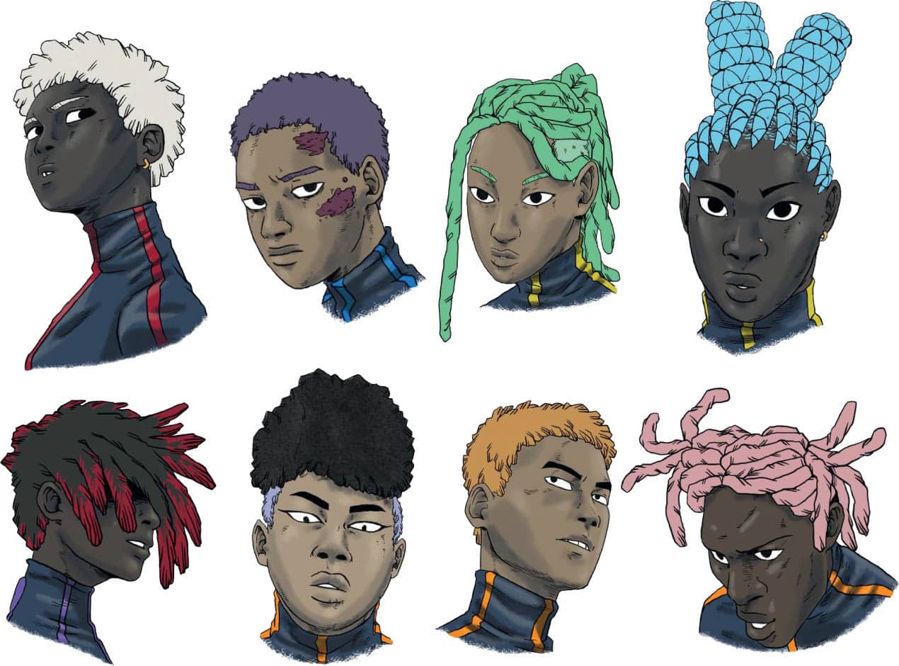
PAP SOULEYE FALL ARTIST OF OBLIVION ROUGE: Skin tones are such a fun area for me! Working with Black characters allows for a real range of color. It’s important to look at the way light effects the skin it helps understand the spectrum. If you’re drawing a darker skin tone think about the way light reflects off of darker skin. There's also something really beautiful about the way you can go from really dark to really light. It’s important to also think about the base color for the skin tone. Black skin is usually either in blue, red, orange, and yellow. For the shading focus on using complimentary colors based on the color you chose for the skin tone. CHARACTERS FROM PAP SOULEYE FALL'S SERIES OBLIVION ROUGE ISSAKA GALADIMA ARTIST OF CLOCK STRIKER One reason I like coloring black-skinned characters is that the skin color can vary a lot. It can be very light or dark, peanut butter or chocolate, cool or warm. This brings tons of variant brown you can use. As for choosing them, it depends on you and the kind of character you want to make. Give it a try and see how you like it. If you are coloring digitally, remember to desaturate it a bit (I'd recommend staying under 50%) to make the character's skin feels natural. And for the shading, you can use dark pink on a semitransparent layer with the blending mode set to multiply. It works well with most skin tones. WHYT MANGA'S BACASSI SERIES FEATURES SEVERAL AFRICAN PROTAGONISTS OF DIFFERENT SKIN COMPLEXIONS, INCLUDING ALIEN CULTURES.SKIN TONES
SENSITIVITY IN DRAWING BLACK FACES AND SKIN TONES