
Appendix. Technical Notes
Writing CSS
CSS is the mechanism for styling HTML. Almost every example in the book begins with a block of HTML code that I then style with CSS. HTML is shown like this:
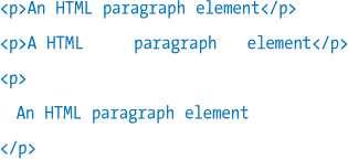
HTML ignores all white space, returns, and tabs, except within text, where single spaces are respected, but more than one space is ignored. This gives you options for formatting. For example, these are all equivalents and display: An HTML paragraph element.
CSS is shown like this:
CSS also ignores white space, tabs, and returns, so these are equivalents:
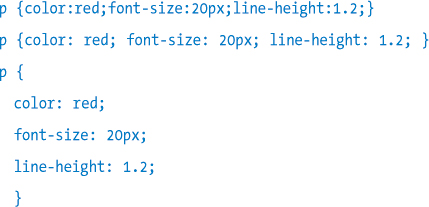
The first two examples show a rule with multiple declarations on one line (the second example simply has more white space). The third example shows a rule with one declaration on each line. All three examples produce the same result. When writing CSS, I mix both of these styles (many declarations on one line, or one declaration on each line). Also, although declarations with a rule can be placed in any order, I organize them in the following sequence:

For example:

This sequence places what I consider the most important information about the element first—how and where it is positioned on the page—and ends with the least important—how it is visually decorated. Sometimes, I’ll change this order and, say, put a margin first if that is the most important aspect of that particular rule. I find this approach of grouping related declarations on the same line to be a good balance: simply putting all of a rule’s declarations on one long line makes the CSS hard to read, but putting each declaration on its own line results in very long style sheets, and a lot of scrolling. It’s a matter of personal preference, of course; there is no right or wrong way. I mix these formats in this book, sometimes to accommodate space issues or so that I can add a callout comment against each declaration.
However, one organization tip that I highly recommend is to list your CSS rules in the style sheet in the same order as the markup they style, rather than just tacking each new rule on the end as you write it. Take a look at one of the longer style sheets in the download files, such as the form in Chapter 6, and you will see that the CSS rules are in exactly the same sequence as the HTML they style. Style sheets can get very long and it’s hard to keep track of which rules apply to an element if they are not sequenced in this way.
Testing Your Code
You will spend part of your time writing CSS and other code, and part of your time debugging; that is, determining why it doesn’t work the way in which you expected. I like the aphorism, “Debugging is the systematic erosion of your assumptions.” In other words, it is about determining the difference between what you believe the code is doing and what it is actually doing.
It is very helpful in this regard to be able to clearly see which CSS rules are being applied to a particular HTML element. Because of the CSS Cascade, many different CSS rules can potentially set a CSS property but only one can have the last say and set that property to its final value. For example, a font style on the HTML body tag will be inherited by all the text elements on the page, but if a different font style is specified for a particular text element, that style will be used, overriding the inherited value from body. Often, identifying the winning style is not so obvious, so here is how you can see all the matching styles for a given element, and determine which ones are actually being applied. I’ll use an extract from my Visual Stylin’ with CSS3 eBook as a demonstration of how to do this.
As Figure Appendix.a shows, by right-clicking a page element in the browser (here, Safari), and choosing Inspect Element from the popup menu, the Web Inspector opens. The Web Inspector displays both the HTML element (bottom-left pane) and a listing of CSS rules that match the element (bottom-right pane) as shown in Figure Appendix.b.
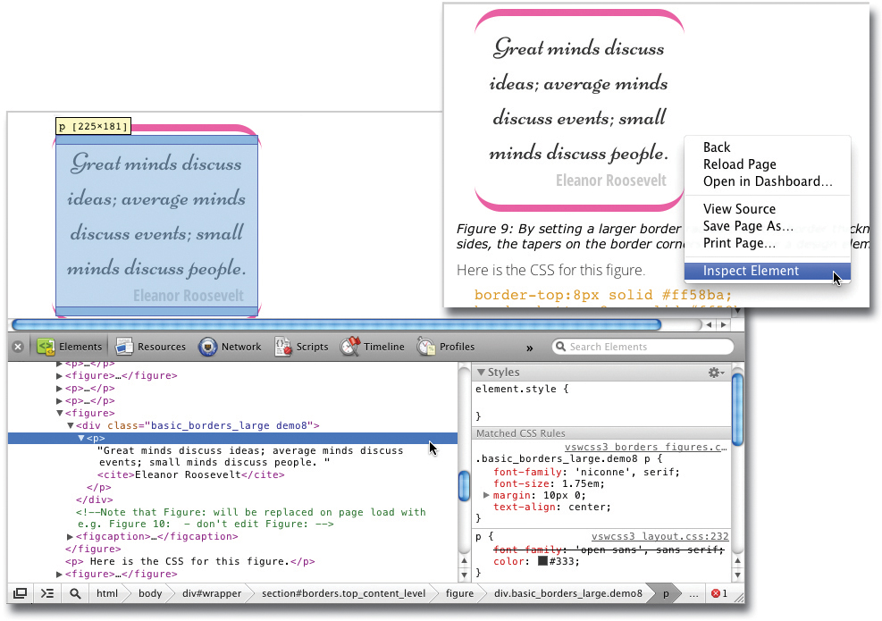
Figure Appendix.A. (On right) Right-click an element and choose Inspect Element to open the Web Inspector (or Inspect Element with Firebug if installed in Firefox).
Figure Appendix.B. (Below) The Web Inspector window for this element.
The CSS listing shows that while the p rule specifies Open Sans as the font to be applied, this style is being overridden (indicated by the strike-through) by the more specific .basic_borders_large .demo8 p rule above it, and the element is being displayed in the Niconne font. You can point at an HTML element in the HTML pane and its styles will then show in the CSS pane.
 I highly recommend Firebug, a more advanced code inspector, that can show the DOM structure and also help debug JavaScript, is available as an Add-on for Firefox. To install, choose Add-ons from the Tools menu of Firefox, search for Firebug in the Add-ons Manager, and follow the simple install steps.
It is, of course, incredibly helpful to see which styles are actually being applied to a given HTML element as you develop your CSS. If you change a style, but the element is not affected, it’s time to pop open the Web Inspector to see if the rule you are changing, or a different one, is actually being applied to element. Note the close (x) button in the top-left corner of the Web Inspector to close the window when you are done.
Supporting Older Browsers
HTML5 and CSS3 offers so many powerful and easy-to-implement features that it’s natural to want to use them and not worry about older browsers that don’t support all this new coolness. However, that is not reality and certain new CSS3 features will simply not work, or in some cases, cause display issues in browsers that don’t support them. Good examples are the display:table and box-sizing properties, which are very handy when creating columns, as I explain in Chapter 5, but can result in broken layouts in IE6 and IE7. So it’s definitely worth testing your pages in older browsers, and providing alternative code for those browsers where needed.
Until recently, the way to support browsers with different capabilities was browser sniffing. This meant using JavaScript to check the browser’s user agent string that contains the browser name, and serve up code to address the shortcomings of that browser. However, ultimately what matters is not what browser is being used, but what features that browser supports. That why today’s approach is not to worry about the browser itself, but to detect the features it does or doesn’t support, and then provide fall-backs or polyfills to work around any missing capabilities.
Fallbacks
A fallback is code that is provided to older browsers as an alternative to the CSS3 that they don’t support.
The most simple fallback is to do nothing, and in many cases, you can get away with this. For example, if you are using CSS3 radiused corners, they will not display in IE6 and IE7; users of these browsers will see square corners. And that is probably just fine—those users won’t know what they are missing, and rounded corners are unlikely to be critical to successfully viewing the content. In other cases, you need to provide alternative CSS for non-supporting browsers.
As a simple example, pre-IE9 browsers don’t support multiple backgrounds, so the fallback is to simply add a single background image declaration before the background images declaration.

All browsers would read the first background rule, but only browsers that can display multiple backgrounds would be then be updated with the second rule. If a browser doesn’t understand a CSS declaration, because it contains CSS it doesn’t support, or the declaration contains an error, then that declaration is skipped, and the browser starts reading again at the next declaration. So IE8 and earlier would ignore this second rule and would display basic_image.jpg.
Conditional Comments
Note that if you truly are only targeting IE, then you can add fallbacks with conditional comments like this:

This special style of HTML comment is ignored by non-IE browsers so the code within it is only executed by IE browsers. Here I load a style sheet with extra styles if the browser is IE8 or lower. You can use lte (less than or equal to), lt (less than), gte (greater than or equal to), gt (greater than), or just a browser number such as IE 6, to specifically target different versions of IE.
Sometimes, if a required feature is entirely missing from a browser, and supplying alternative CSS is not enough, then you need to use a polyfill.
Polyfills
A polyfill is the term given to a piece of JavaScript code that gives a browser functionality that it would not otherwise have. There are numerous polyfills for just about every CSS3 and HTML5 feature, from video playback to drop-shadows, to allow you to teach old dogs (or at least old browsers) new tricks.
Paul Irish has compiled a comprehensive list of polyfills at https://github.com/Modernizr/Modernizr/wiki/HTML5-Cross-Browser-Polyfills.
To add a polyfill, download it and put it in a folder with your site. I create a folder called helpers for this purpose. Then add a script tag into the head of the page.
A useful way to determine if a polyfill is needed is with Modernizr. Modernizr (http://modernizr.com) is a JavaScript file that enables you to determine the HTML5 and CSS3 features that a user’s browser supports by adding a list of classes to the top-level html tag of the page, indicating which features are supported, and by setting the properties of the modernizr JavaScript object so that you can then test for them with JavaScript. The added classes are most useful when working with CSS.
Here are some useful polyfills:
• html5shiv.js (http://code.google.com/p/html5shiv) enables IE8 and below to recognize the new HTML5 elements such as section, article, nav, and so on.
• selectivizr (http://www.selectivizr.com) enables advanced CSS selectors such as ::first-child to work in versions of IE (6, 7, and 8) that do not natively support them.
• IE9.js (http://code.google.com/p/ie7-js) fixes many IE bugs and missing features across IE6 through IE9.
• CSS3Pie (http://css3pie.com) gives IE6 through IE9 the capability to support visual CSS3 features such as radiused corners, background gradients, border images, box shadows, and RGBa colors.
• Respond.js (https://github.com/scottjehl/respond) makes media queries work in older browsers.
• -prefix-free (http://lea.verou.me/projects) adds Vendor Specific Prefixes (VSPs) to CSS3 declarations that need them (see the Vendor Specific Prefixes sidebar in Chapter 4 for details).
• borderBoxModel.js (https://github.com/albertogasparin/borderBoxModel) enables the CSS3 box-sizing property in IE6 and IE7.
These polyfills are the ones that I use most and are incredibly useful when providing support for older browsers, especially Internet Explorer. Additional technical information can be found at www.stylinwithcss.com.