
Chapter 2. Text
2.0 Introduction
The marks card features many different options. One of those is text. The text marks card allows you to display text, which could be labels on a bar or could be used to create tables and text related charts. This chapter will take you through some of those features, including tips and tricks for formatting and basic Table Calculations.
2.1 Tables
Problem
You want a text table showing sales by category and year
Solution
-
Double click Category
-
Double click Order Date
-
Double click Sales
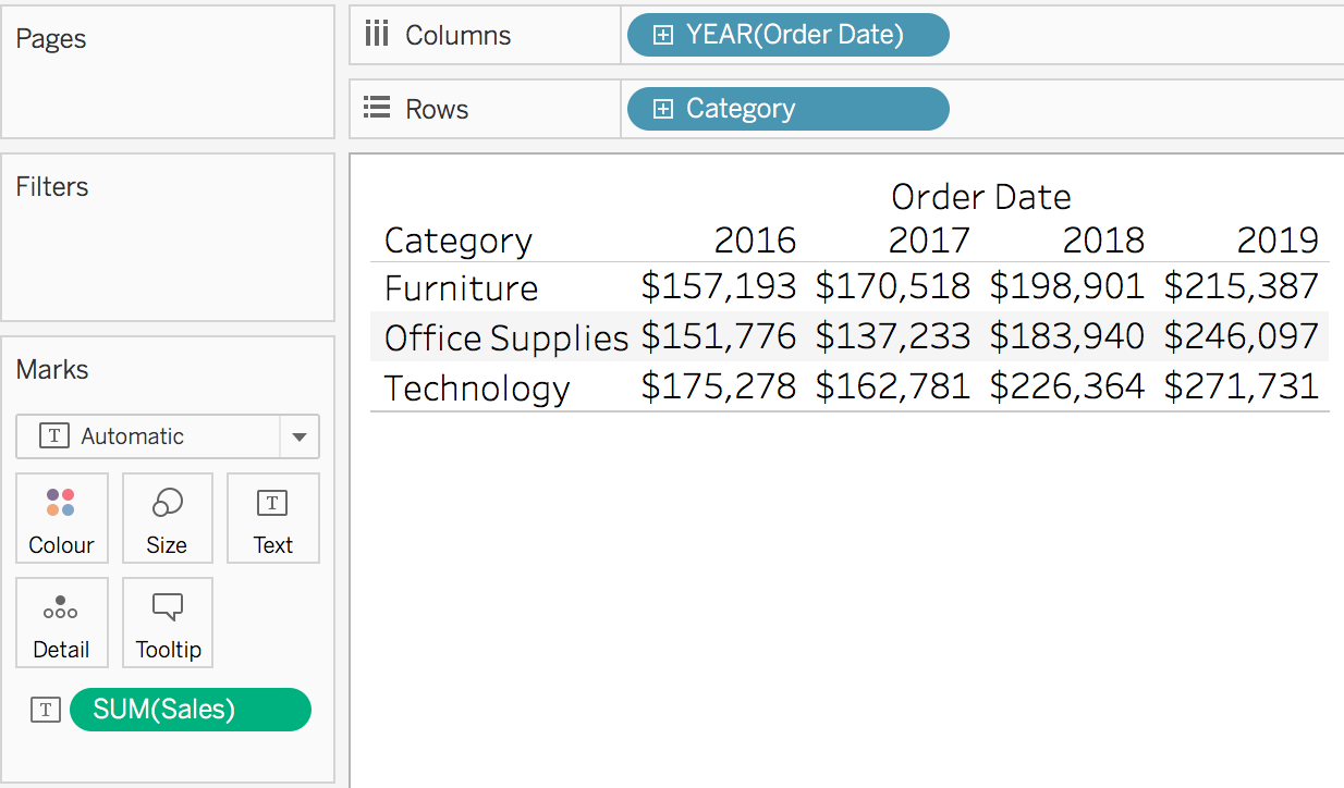
Discussion
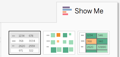
A text table can be used in a variety of different ways. The main use case would be to show the total values by the dimensions you have used. Tables are also great for sense checking the numbers and calculations. You can also use “Show Me” to create a text table:
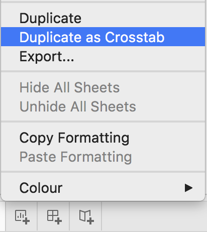
Finally, if you have already created a chart you can right click and duplicate the sheet as a crosstab which will give you the data in a Table format.
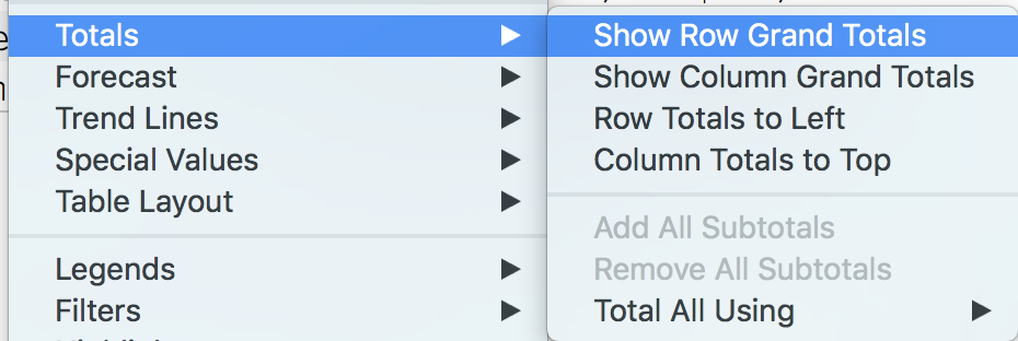
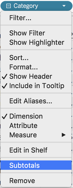
2.2 Adding Totals
Problem
You want to see the totals per Category, per year and grand totals
Solution
-
Go to Analysis in the top toolbar. Then select totals:

-
You want to add row Grand Totals.
-
To add Column Grand Totals, repeat steps 1 and 2.
-
Your final table should look like below.

Discussion
Totals can be used on almost every chart you create in tableau. Tableau defaults the aggregation of totals to automatic, which is based on what field you have in the view. However, you can override the default by going to Analysis, totals, and then total all using one of the options

You can also add subtotals, depending on the level detail in your view. For example, this new table shows Category and Sub-Category sales by Year, you might want to see the sub totals per category.
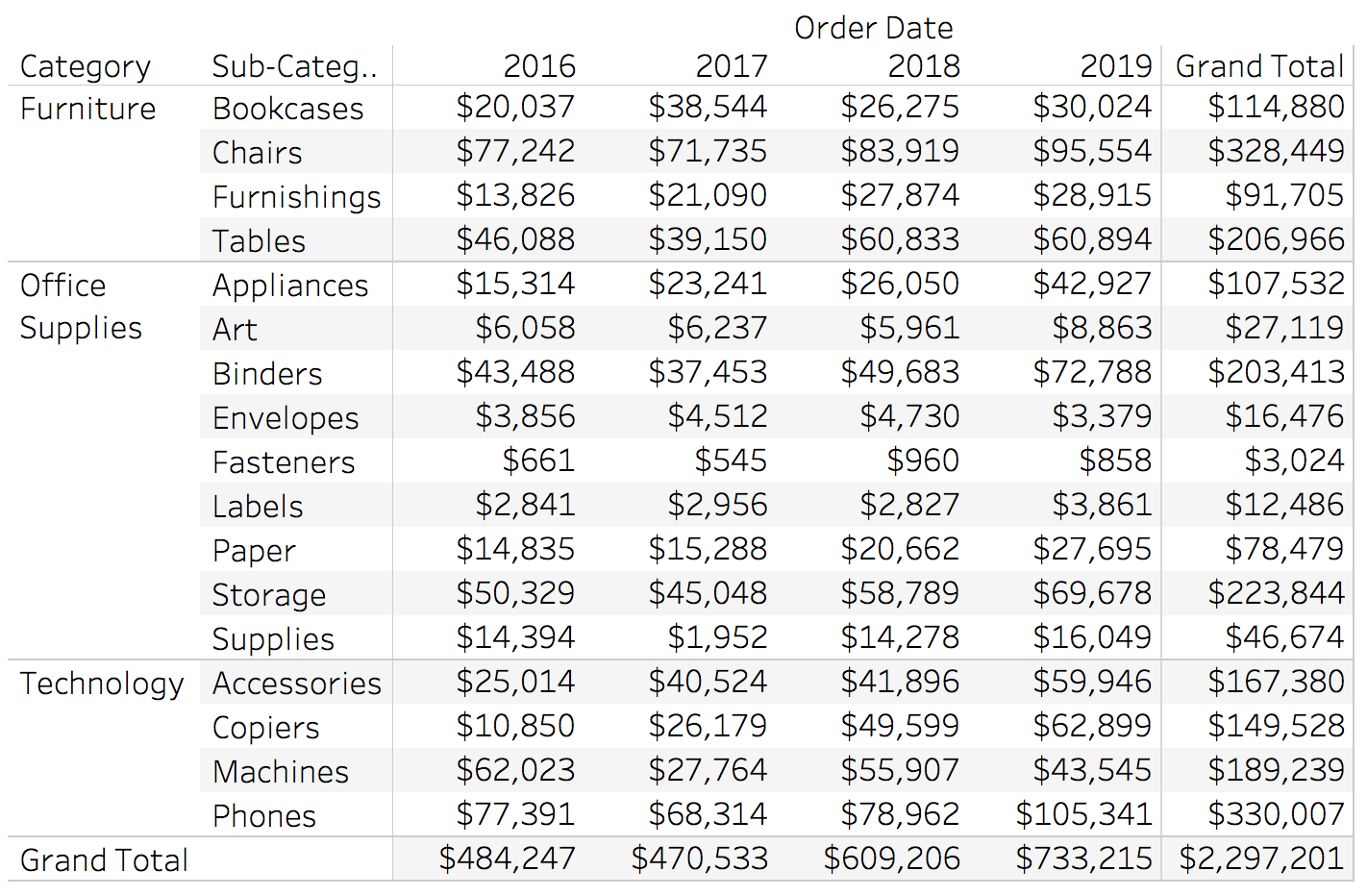
If you right click on the category pill in rows, you will get the option to add subtotals
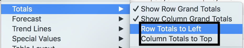
By default tableau puts the totals and subtotals to the bottom or right of any chart. We can move these totals to Top or Left by going to analysis, totals and select either row totals to left or column totals to top
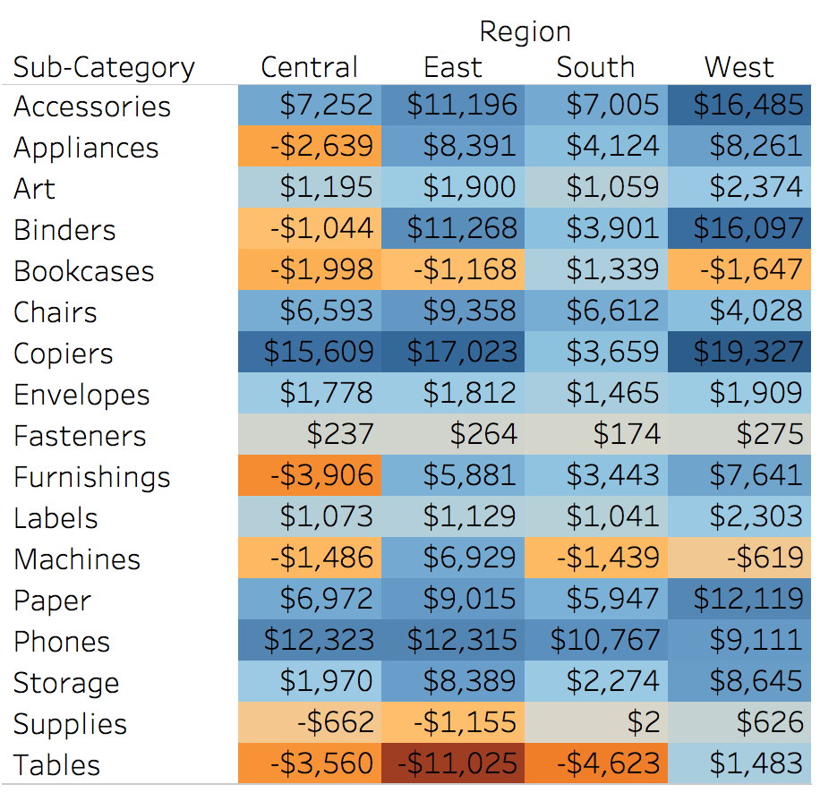
2.3 Highlight Tables
Tables are good for seeing the actual numbers but sometimes you want to make the table more intuitive and effective. One way of doing this is to add colour and transform your table into a Highlight Table.
Problem
You want to visually see the highest and lowest overall profit by category using colour and text
Solution
-
Double click Sub-Category and double click region
-
Drag profit to the colour marks card

-
Your current view should look like this

-
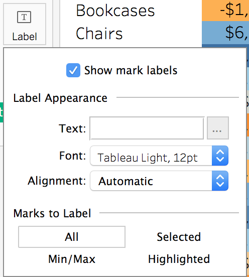
Finally, using the label marks card. Turn the text labels on to show the profit values
-
Your highlight text table should look like below
Discussion
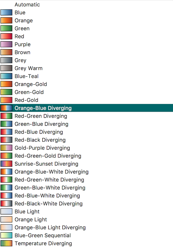
The highlight table shows hotspots in your data, for example Tables in the East, which is a dark orange, is the least profitable and Copiers in the West, which is a dark blue, is the most profitable. Being able to pick those values out quickly was enhanced by the use of colour. The automatic colour palette tableau has used is Orange to Blue Diverging. Diverging colour palettes should be used to show a negative to positive change. If there are only positive or negative values, you should use a sequential colour palette. You can change the colours by clicking on the colour marks card. The pick list of colours depends on the type of values on the colour marks card.
2.4 Rank Table
As mentioned, Tables in Tableau are good for seeing the actual numbers. A rank table allows you to see the rank of numbers per row or per column
Problem
You want to see how each Sub-Category ranks for each region
Solution
-
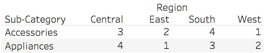
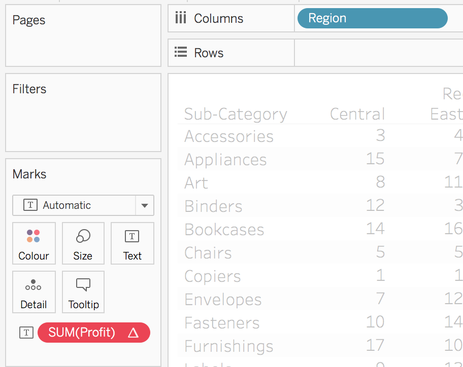
Build a table with Sub-Category on Rows, Region on Columns and Profit on Text
-
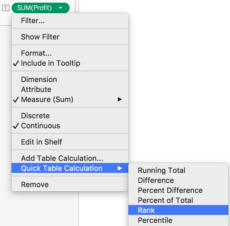
To get transform Profit into a rank calculation you will need to add a quick table calculation
-
Right click the SUM(Profit) pill that is on text. Select quick table calculation and go dow to rank
-
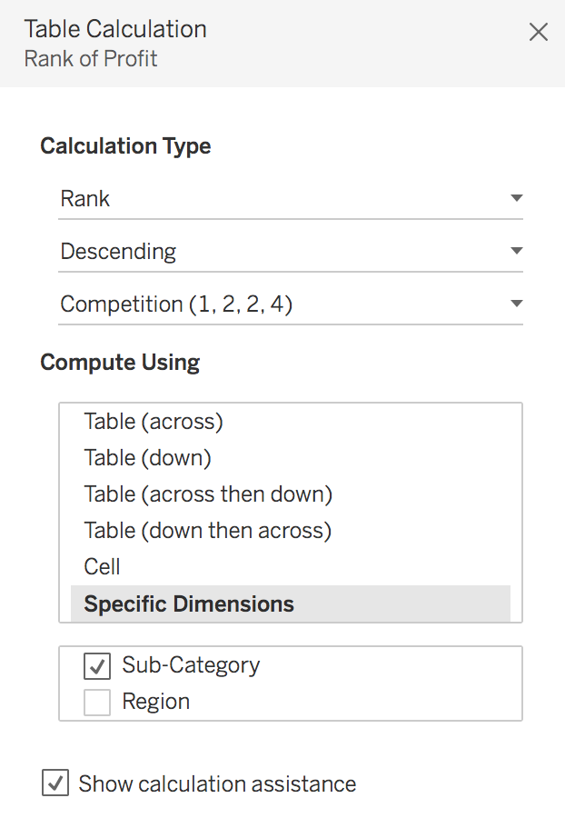
By default, tableau does this rank calculation by region (table across). Which means for every Sub-Category it gives a rank based per region on Profit.
-
To change the way tableau calculates the rank, right click on the sum(profit) pill on text, which now has a triangle to show it is a Table Calculation.
-
Go down to compute using and change this to Table Down. You should now have a table which shows the rank per Sub-Category for each region

Discussion
There are a lot of Table Calculations in Tableau, understanding the compute using depends on the data that is in your view. In the solution, the table calculation defaulted to table across, which in this case is by region, whereas what we wanted was table down, in this case is by Sub-Category. However, with using Table Down or Table Across if you move either of the pills, in rows or columns, it will recalculate based on the new layout in the view. I recommend once you know what compute using you need, go into the edit table calculation option and use the specific dimensions option. This means if you change the view layout the rank calculation will still compute using Sub-Category, as long as Sub-Category is still in the view.
If you remove Sub-Category from the view you will get a red pill.
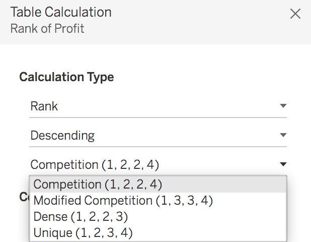
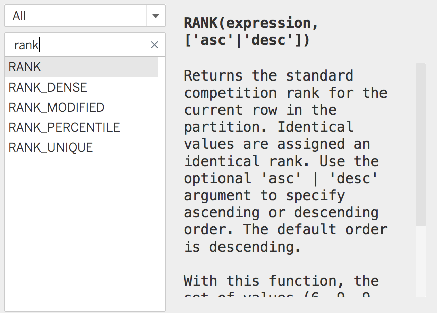
There are also different rank options depending on the use case. If we use the values 100, 95, 95 and 85 to demonstrate the differences. * Competition would give the two 95 values the same higher rank of 2 and give 85 the rank of 4 * Modified Competition would give the two 95 values the same lower rank value of 3 and 85 the rank of 4 * Dense would give the two 95 value the higher rank, but would give 85 the next rank value of 3 * Unique would give each value a new rank
You can also create a rank calculation using the calculated field option, where you can see the description for the calculation.
2.5 BANS
BANS (Big A-- Numbers) are used on dashboards (see chapter 5), to give the viewer high level, most critical information immediately. BANs are usually Key Performance Indicators for the business.
Problem
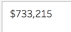
You want to have a BAN for the latest year of sales
Solution
-
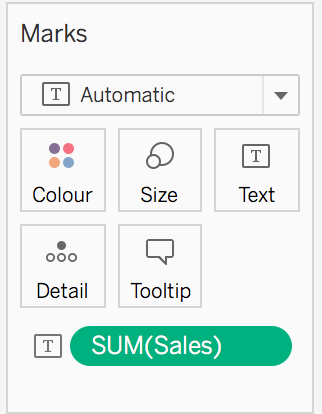
Drag Sales to the Text marks card
-
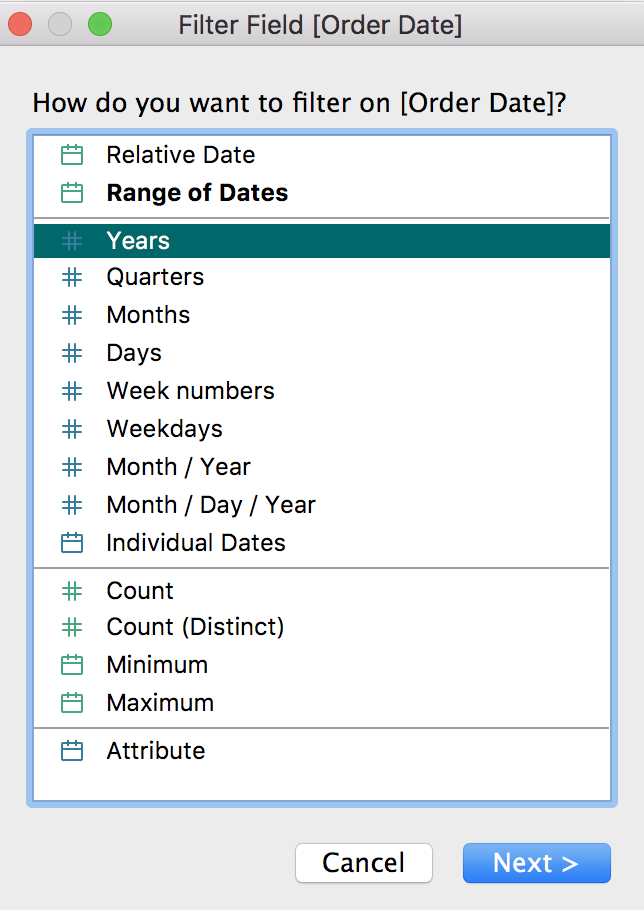
Drag order date to filters, select years.
-
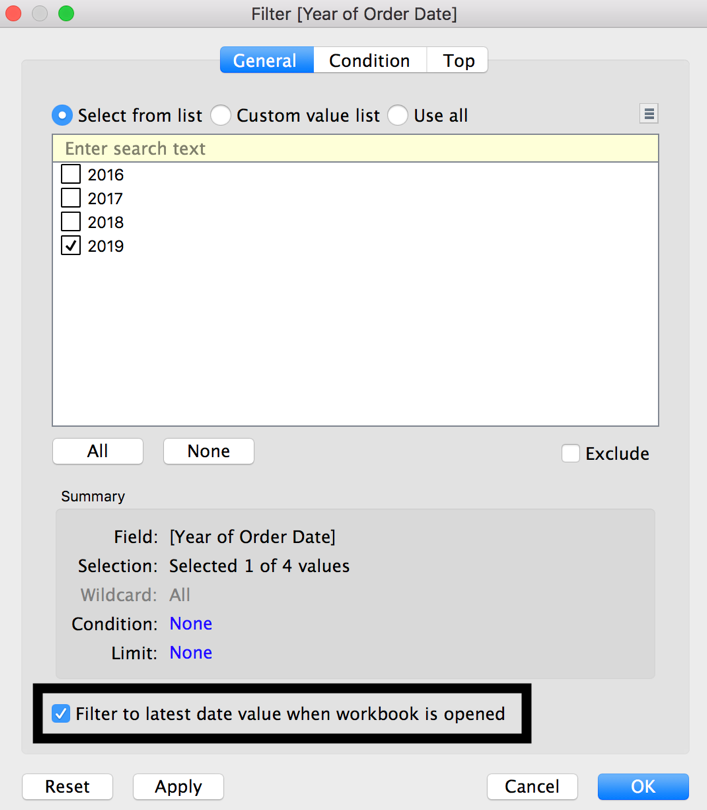
Tick the box at the bottom, filter to the latest year when workbook is opened
-
This then shows the sales value for the latest year of data
Tip
If you double click in columns or rows and type AVG(0). This will make the BAN center correctly, and when using these in the dashboard will allow for it to fill the space more evenly.
Discussion
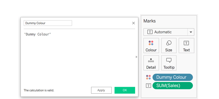
BANs are used for high level, most critical KPI’s on a dashboard. They can be formatted depending on the dashboard. You can increase the size using the size marks card. You can also change the colour of the BAN, which can be done in 3 ways. First, using the colour marks card and using the default colours or a colour picker. Second, if you wanted to use a colour that is in the colour palettes, create a calculated field with any text or letter, this is just a dummy calculation for the colour, then add that calculation to the colour marks card.
2.6 Calculating Percent Difference
BANs can also include a percent change from a previous value or month, this requires multiple table calculations
Problem
You want to see the percent difference for sales from the previous month
Solution
-
Filter to the latest year (see 3.4)
-
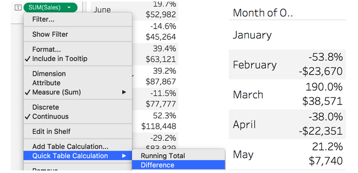
Right click (Option on Mac) and drag order date to rows and select month. Then add sales to text.

-
What you need to do now is find the percent difference from the previous month in the view
-
If you right click SUM(Sales), go down to quick table calculation and select percent difference

-
This now shows the percent difference for sales compared to the previous month of 2020
Discussion
The percent difference calculation has the same compute using options as previously mentioned. The default this time is Table Down, which is computing by Month, because that’s all that is in the view. Make sure the specific dimensions option is selected. The reason January is blank is because it doesn’t have any previous values to compare against, the year filter has removed the option to compare against 2018 December, see 1.2.12 Order of Operations and 3.4.2 Last & Hide. The other option available in the percent difference calculation is relative to. This means you can select which month you want to compare against. Currently the default is previous (month), but you can select to look at a future month (next), the first month (January) or the last month (December).

If you want to show the actual difference between the months. Add another sum(sales) to the text marks card, right click and select quick table calculation and choose difference. You will need to change the relative to option if you have changed the percent difference from default.
Note
If you drag the new sales pill, with the triangle on, to the left towards dimensions and measure, it will save the table calculation as a calculated field. Meaning you can reuse the same calculation across your worksheets. You will need to change the compute using when you drag it into a new sheet.
2.7 Using Last() and Hide
Tableaus order of operations means table calculations come after every filter. Meaning, if you filter out a year or a month you will lose the percent difference calculation. Like below:

This recipe uses the Last table calculation and hiding data.
Problem
You only want to see the LAST month as a BAN but also keep the percent difference to the previous month
Solution
-
Recreate or duplicate exercise 3.4.1
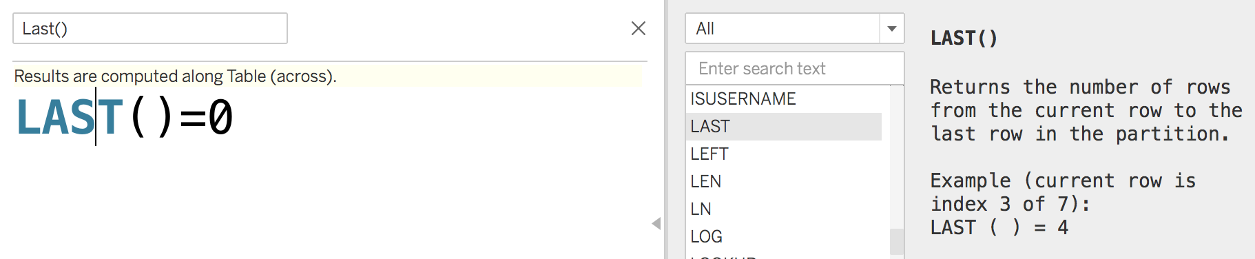
-
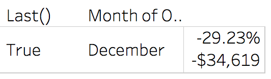
Create a new calculated field and type Last()=0
-
Drag this calculation to rows. Notice how you now have a true or false. December = True because that is the last value using Table Down.
-
Right click on the false header and click hide

-
This then keeps just the original percent difference and difference from previous values as seen below
Discussion
Tableaus order of order of operations means Table Calculations are computed after all the filters and other operations. Using the table calculation Last and hiding false data, you can still keep the table calculations for your BANs and only show the latest month in the dashboard. The Last() function gives each row, in your view, a number from 0, 0 being the first last value, in this solution 0 goes to December, meaning November would be 1. If you wanted to keep the first record in your view, the opposite to the Last() function is using First(), where the same principle applies, the first value gets a number of 0.
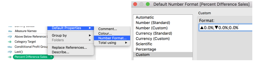
2.8 Custom Number Format
Problem
When using difference or percent difference you want to apply a custom format to the text, negative difference in brackets and an upwards or downwards triangle positive and negative percent difference
Solution
-
Start by either duplicating 3.4.2 or creating a new sheet with a percent difference calculation
-
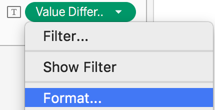
Right click on the difference table calculation and click format
-
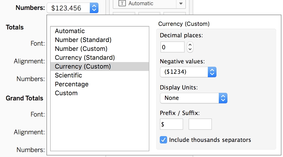
Select the drop down by numbers. Here we can select a variety of different options. For the value difference we want to: change it to a currency, have 0 decimal places and change the negative values to be in brackets
-
Next you want to change the percentage format. Same as above right click on the percent difference table calculation.
-
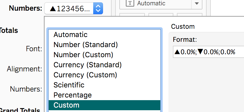
This time in the number format, select percentage and then select custom
-
In this box you now need to tell tableau what you want to do with the positives, negatives and neutrals, which is an upward and downward arrow. Use the following text ▲0.0%;▼0.0%;0.0%
-
Your final view should look like this.

Discussion
Custom formatting is very handy because you can customize each pill with a different number format. You can also change the default format of a pill, which means whenever you use that pill it will use the same formatting throughout. To do that you will need to right click on a measure in the left pane and select default properties. Selecting number format gives you the same options as mentioned above.
When doing the custom formatting, notice how you put two semi-colons to separate the figures. This is to differentiate between positive values, negative values and zero values.
2.9 How to Zero Nulls
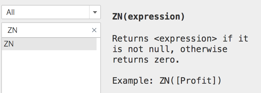
Tableau has a calculation which you can wrap around any calculated field to zero nulls. This is called ZN. If you have a measure with nulls, you can use this calculation to force tableau to report the null as zero.
Problem
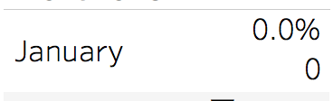
When showing full year difference or percent difference, you want the first value to show 0 value and 0% instead of null
Solution
-
Open a value difference calculation (3.4.1)
-
At the start of the calculation write ZN( and at the end of the whole calculation close the bracket then click ok

-
Repeat for the percent difference sales.

-
Now the January figures show Zero instead of Nulls like below
Discussion
The ZN calculation is especially helpful when you have null values in your data that you know you can treat as zero. The calculation window also describes what the ZN calculation does.
You might also notice that when you converted the table calculations into a reusable calculations, tableau used ZN inside those calculated field. This is to make sure the data doesn’t contain any nulls.
2.10 How to show if a value is positive, negative or neutral
Problem
You want to color the percent difference based on positive, negative and neutral
Solution
-
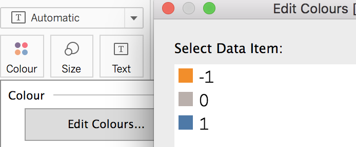
Create a new calculated field using SIGN(Percent difference Sales)

-
Right click on this new calculation and select convert to discrete

-
Add the calculation to the colour marks card and edit the colours. I chose to use orange for negative, grey for neutral and blue for positive
-
Your final view should look like this

Discussion
The sign calculation gives a positive value the number 1, neutral values the number 0 and negative values the number -1. This function reduces the need to write long IF statements
2.11 Calculating RAG Status
Using Sign is useful for positive, neutral and negative values. But what if you wanted a Red, Amber, Green (RAG) status based on the percentage value?
Problem
You want a RAG status for the percent difference calculations, using green for greater than 50%, amber for greater than 0% and anything less than 0% would be red.
Solution
-
Filter to the latest year of data. Create a view with Month of Order date on rows and percent difference sales on text.
-
Create a new calculation and use the following IF statement.

-
Add this new calculation to the colour marks card and edit the colours to match the words

Discussion
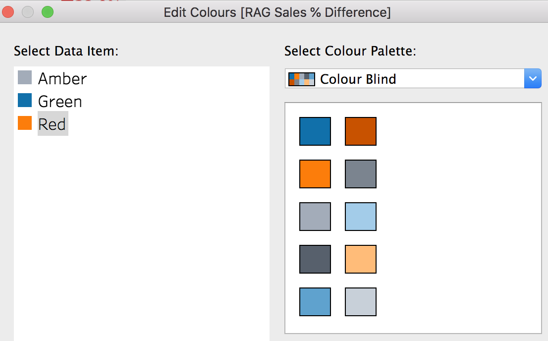
RAG statuses are used in project management and are seen as a traffic light system. They are good for visually seeing when values are above or below a certain target or percentage. When using RAG status, you might want to be careful with the colors, as people viewing your dashboards could be colorblind meaning they would not be able to see the difference. Instead tableau created the color blind palette which uses shades of orange, blues and greys. You could change your Green to Blue for positive or above target, Amber to Grey to show a neutral or middle values and Red to Orange to show negative or below target color.
Having a RAG status on BANs allows for the user to instantly see whether that particular number is above or below the condition that has been set.
Resources
IF statements are mentioned in Chapter 2.
2.12 Using Titles as BANS
Problem
You want a single BAN without a tooltip or clickable action
Solution
-
Right click (Press Option on Mac) and drag Order ID to detail then select Count Distinct (CountD)

-
Double Click your title at the top. Delete <Sheet Name>, click insert and select CNTD(Order ID)

-
This adds the CountD of Order ID to the title
-
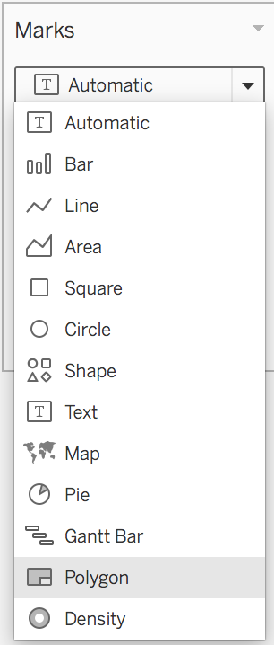
Finally change your marks card to a polygon to remove the text in the middle
Discussion
Using Titles as BANs aids for a better user experience when building dashboards in a later chapter. Titles as BANs are good if you have a single number and you don’t want conditional formatting with RAG status’ and if you don’t want or need a tooltip on this specific value. This way also fills an automatic space better without having to use a fake axis calculation to get the space filled correctly. However, if you need to add another dimension, like a RAG status, you will be better using a normal BAN (3.4)
2.13 Using Size()
Problem
You want to count how many marks in your view
Solution
-
Add order ID to detail
-
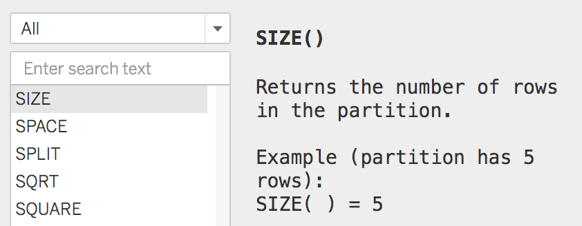
Create a new calculated field with the following syntax

-
Add this to detail. You will need to compute using Order ID in this case
-
Add this calculation to the title and change the marks card to polygon to create a Title as BAN, like in 3.4.7.
Discussion
Size can be used as an alternative to count or count distinct. The difference is it counts whatever details you put in your view and how you compute by. The tableau description is below:
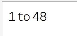
If you added another level of detail to your view, the size value would change, for example adding product name changes the title to show 1 to 48.
If we change the compute using to order ID and Product Name, you’ll notice that the title says none.
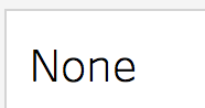
That is because you have changed the compute using and when you edit the title it says missing field. You will need to re-add the calculation to the title.

When you do, you’ll notice the value has increased to over 9000. That is because there is more than one product name to a single order ID and is therefore it is counting the total number of products within the total number of orders.
2.14 Word Cloud
Word clouds are a visual representation of text in your data, with the option adding context to those words.
Problem
You want to see the Sub-Categories by coloured and sized by total sales
Solution
-
Drag Sub-Category to the text marks card
-
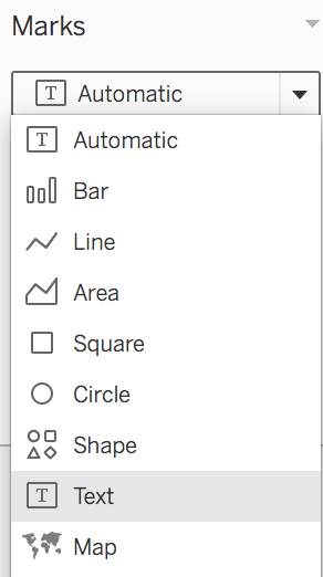
Change the mark type from automatic to Text
-
Add sales to size and colour
-
Your final output should look something like below

Tip
If you press control (command on Mac), select and drag a pill, you can duplicate this pill to another section of the marks card or onto rows and columns.
Discussion
Word clouds have a good visual appeal when looking at text data and users can quickly see the most frequent words. However, word clouds have some weaknesses. They are difficult to compare size and colour of each word used. They also have a messy arrangement, which cannot be sorted by a particular field. The alternatives for this type of chart is a Bar Chart (2.1) or a Tree Map (X.X)