Chapter 10. Filters
Tableau is built on a patented technology called VizQL, which translates what a user is dragging and dropping onto the view into database queries like those in Structured Query Language (SQL). The result of those queries is then reflected on the view as a data visualization. Instead of using a series of WHERE clauses as you would in SQL, a Tableau user can filter out marks on a view by dragging and dropping a field onto the Filters shelf and setting their criteria in user-friendly dialogs. This chapter explains the four core types of Tableau filters, options for scaling filters across a workbook, and how to understand Tableau’s filter order of operations.
Types of Filters
Tableau allows a user to filter marks on a view based on measure values or dimension members. You can also filter rows from the dataset before arriving in the Authoring interface with a data source or extract filter. In Chapter 9, we discovered a correlation between average profit and average discount. If we want to focus on only the states with a profit of less than zero, we can drag the Profit measure from the Data pane to the Filters shelf, which will create our first measure filter.
Upon adding a measure to the Filters shelf, Tableau will ask you to choose the aggregation of the measure. As with the fields we’ve added to the Rows shelf and Columns shelf, this aggregation is done at the visualization level of detail. In the case of our scatter plot, the most granular level of the analysis is the State dimension, meaning the aggregation we choose now and the values we set in the next dialog will be considered for each state. Figure 10-1 shows the options for a measure filter after choosing an aggregation of Average.

Figure 10-1. Measure filter options for average profit
By default, we are seeing the full range of profit values at the state level, which can be filtered by moving the sliders and/or typing different values for the start and end of the range. You can also use the “At least” button to set only the start of the range, the “At most” button to set only the end of the range, or the Special button to filter null or non-null values. Figure 10-2 shows the scatter plot from Chapter 9 after adding a measure filter for average profit and setting the end of the range to zero.

Figure 10-2. Average Profit by Average Discount scatter plot, filtered to average profit less than zero
With this measure filter in place, we can focus on the worst-performing states to see if we can improve profitability.
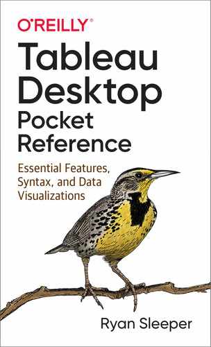
Dimension filters can also be added by dragging a dimension from the Data pane to the Filters shelf. For this example, I have returned to the line graph created in Chapter 8. Let’s assume we are the managers of the Technology category and want to filter the line graph to display only the trend for what’s under our control. Figure 10-3 shows the dimension filter options that appear after dragging the Category dimension from the Data pane to the Filters shelf.
Figure 10-3. Dimension filter options for the Category field
Dimension filters contain four tabs of options:
- General
- Allows you to pick and choose individual dimension members to include or exclude
- Wildcard
- Allows you to use string functions to keep or exclude dimension members that contain, start with, end with, or exactly match specific letters
- Condition
- Allows you to specify numerical thresholds or conditional logic for keeping dimension members
- Top
- Allows you to keep a top or bottom N (number) for a specific field
To demonstrate the functionality of the General tab, I have deselected the Furniture and Office Supplies categories, leaving Figure 10-4 with only the Technology category.

Figure 10-4. Line graph with a dimension filter
With the trend filtered to only the Technology category, as the managers of the category, we can analyze only what is relevant to us.
Options for Scaling Filters
By default, filters apply to only the sheet where they are originally added, but you have the option to carry over the same logic to two or more worksheets in the workbook. To access these options, click into a filter on the Filters shelf (either by right-clicking or hovering the mouse pointer over a filter and clicking the down arrow that appears) and select Apply to Worksheets. In Figure 10-5, I have clicked into the dimension filter on our line graph to see the options I have for applying the same filter to other worksheets in the workbook.

Figure 10-5. Options for applying filters to other worksheets
As pictured, the default behavior is for Tableau to apply the filter to only the sheet it has been added to. The remaining options go in order from the lowest to highest scaling:
- Selected Worksheets
- Allows you to pick and choose specific sheets to apply the filter.
- All Using This Data Source
- Applies the filter logic to any worksheet in the workbook that was built with the data source containing the field
- All Using Related Data Sources
- Applies the filter criteria to any sheet in the workbook that has the same field, even if the field is in multiple data sources
As manager of the Technology category, I may choose to apply this dimension filter to all sheets using this data source. Since we are using a single data source, this option would make the Category filter global and filter our bar chart, line graph, and scatter plot to only the Technology category.
Understanding Tableau’s Filter Order of Operations
You can add as many filters as you want to the Filters shelf, but it can be challenging to track which filters are doing what and in what order. The key to understanding which filters are actually filtering marks on the view is Tableau’s order of operations. Figure 10-6 shows Tableau’s order of operations with the different types of filters highlighted. The higher in this order of operations, the earlier the filter is applied.

Figure 10-6. Tableau’s order of operations with types of filters highlighted
To demonstrate how these filters work together within Tableau’s order of operations, I have created the bar chart in Figure 10-7. Here, the Sales measure is shown with the Product Name and Category dimensions, sorted in descending order.

Figure 10-7. Tableau bar chart with no filters applied
With the combination of Product Name and Category on the Rows shelf, we see 1,849 rows of marks. This results in a long, vertical scroll bar on the right and an unpleasant user experience.
To limit the number of rows, I drag the Sales measure from the Data pane to the Filters shelf, choose an aggregation of Sum, and set the minimum value to 5,000. Figure 10-8 shows the settings of this measure filter.
After clicking the OK button to apply the filter, I am left with 107 rows. This is a substantial improvement, because the 107 rows will be much easier to compare than all 1,849. But let’s limit the rows even more by focusing on the top 10 products.

Figure 10-8. Measure filter keeping marks with values of at least 5,000
To do so, I drag the Product Name dimension from the Data pane to the Filters shelf, navigate to the Top tab, and set up the criteria to keep only the top 10 by Sum of Sales. Figure 10-9 shows the settings of this Top N filter.
We now have two filters on the Filters shelf, but because of Tableau’s order of operations, the Top N filter is limiting the view to the top 10 product names before the measure filter limits the marks to those above $5,000 in sales. Since the lowest value in the top 10 is $17,000 (i.e., already above $5,000), the measure filter is not doing anything in this scenario.

Figure 10-9. Top N filter keeping the top 10 product names by sum of sales
Note
Considering how each filter fits into the order of operations helps determine which filters should be kept on the Filters shelf. In this scenario, we can remove the measure filter, and the view will not change at all. If the top 10 will eventually be filtered to values less than $5,000 and/or we decide to move the minimum value of the measure filter above 17,000, we should keep the measure filter.
As an analyst, the next logical question I have is, “What is the top 10 for a specific category?” Let’s again assume we’re the managers of the Technology category, so we drag the Category dimension from the Data pane to the Filters shelf and keep only the Technology dimension member selected on the General tab. Figure 10-10 shows the bar chart with the combination of filters added during this chapter.
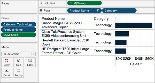
Figure 10-10. Bar chart filtered to the top 10 product names and Technology category
You were likely expecting to see 10 bars, but we see only four. What’s happening is our Top N filter, Product Name, is filtering the product names to those in the top 10 before our dimension filter, Category, filters to the Technology category. What we are left with are the four Technology product names that are also in the top 10.
To get the expected result and see only the top 10 for a specific category, we must elevate the Category dimension filter in the order of operations. To do so, we will convert this dimension filter to a context filter, which you can do by right-clicking any dimension filter on the Filters shelf and choosing Add to Context.
Context filters get a special gray color-coding and are the first type of filter to execute on the Filters shelf. Figure 10-11 shows our top 10 products in the Technology category after changing the Category dimension filter to a context filter.

Figure 10-11. Bar chart filtered to the top 10 product names and Technology category, with the Category filter added to context
The context filter not only helped us get our expected result, but also can have real efficiency benefits when used to reduce the size of a dataset by at least 10%. When a filter is added to context, Tableau limits the number of rows that every subsequent filter queries. In this scenario, the Product Name and Sales filters are happening on the remaining 1,847 rows containing the Technology dimension member instead of the original 9,994 rows in the entire dataset.
Before you get the great idea to just add every filter to context, remember that elevating a second dimension filter to a context filter will have them competing in the order of operations again!
Any of the filters covered to this point can be shown to yourself and your workbook users by right-clicking them from within the Filters shelf and choosing Show Filter. This provides one-click access to defining the criteria that will keep or exclude marks from the view.
Data Source and Extract Filters
The last two types of filters, data source and extract, happen on the Data Source interface, which you can return to at any time by clicking the Data Source tab in the bottom-left corner of the Authoring interface. Figure 10-12 shows the two types of data connections and where to add a data source filter from the top-right corner of the Data Source interface.

Figure 10-12. Types of data connections and where to add a data source filter
As discussed in Chapter 3, if you click the Add button, you are creating a data source filter. With the Extract radio button selected, you will see an Edit button appear where you can add an extract filter. Both of these happen first in the order of operations because they are filtering out rows of data before you begin analyzing further in the Authoring interface.
With these filter options in mind and an understanding of how they fit together in Tableau’s order of operations, you will be able to focus on what’s relevant to you, quickly pivot through analyses, and have your views processing as efficiently as possible.