
Technical writing is all about clarity and efficiency. Sometimes the clearest, most efficient way to present information is to use fewer words in a more effective way. That might mean presenting the information as a numbered or bulleted list, or as an infographic. Or it might mean putting the information across in a flow chart.
The items I’ll describe in this chapter are like salt. Used sparingly they can bring out the flavour of your writing and enhance what you’ve created. Use too much and they’ll overwhelm it and possibly ruin it. As ever, less is more.
From our childhood letters to Santa to the to-do lists pinging on our phones, we use lists for all kinds of things. There’s a good reason for that: lists are very effective.
Numbered lists make it easy to see sequential information – do this and then this and then that and then that – while bulleted lists enable you to present information in a way that’s a lot more attractive than standard blocks of text.
Tables can make numerical information a lot less frightening and related data easier to compare and contrast.
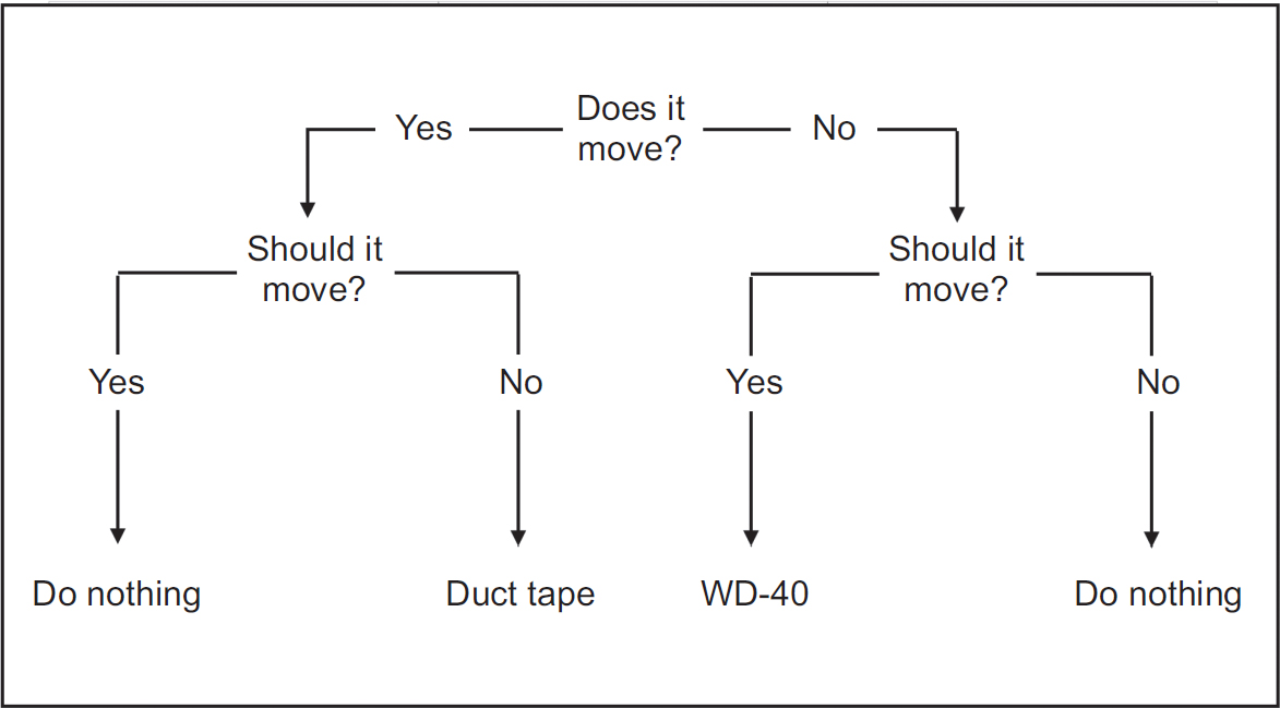
Flow charts are hardly rocket science – unless, that is, they’re used in rocket science. And they are. The National Aeronautics and Space Administration (NASA) used flow charts extensively in its space programme, but flow charts are just as effective in explaining complex mechanical operations like the one in Figure 10.1.
Figure 10.1 Flow chart based on the ‘engineering flow chart’ meme18
If you’ve worked in the chemicals industry you’ll probably be familiar with process flow diagrams, which provide a bird’s eye view of what’s going on in the plant. If you program, you may have used flow charts to set out the structure before you start coding. If you’re involved in project management, you’ll be familiar with deployment flow charts and so on.
Flow charts are particularly useful when the intended reader may not have the time to read a lot of text, where you’re trying to show something that’s a real pain to describe (organisational charts are a good example of this) or where your writing is going to be in a place where normal text isn’t appropriate. For example, details of how to evacuate a building and where to assemble afterwards aren’t the kind of thing you’ll read at a leisurely pace; you read them when the alarm’s going off, everybody’s panicking and you think you can smell smoke.
It’s a similar story with procedures that need to be followed in stressful or time-limited circumstances, or with information that needs to be as clear as possible for the widest possible audience.
It’s important to remember that a flow chart isn’t necessarily a good or a bad way of presenting information. It all depends on how you use it. A flow chart that looks like spaghetti or whose boxes contain impenetrable acronyms isn’t going to help anybody.
There are all kinds of charts that enable us to present information visually. The four most common types are discussed in this section.
Line charts
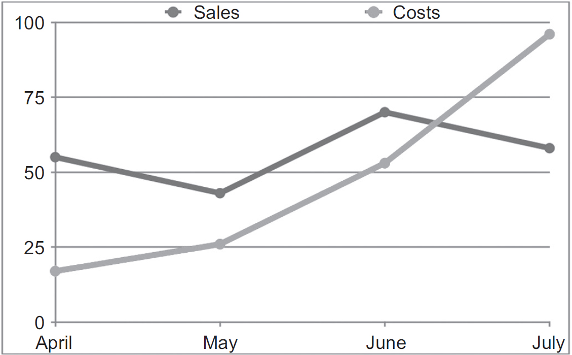
Cartoonists love using these ones when they draw businessmen and women. A line chart (Figure 10.2) shows numerical information as a line, and is commonly used to show trends such as profits over time, increases or decreases in production numbers, fluctuations in exchange rates or anything else that’s gone up or down.
Bar charts
Simple bar charts (Figure 10.3) can be used in the same way as line charts to show changes over time: instead of a line between points, each value is shown as a horizontal or vertical bar. However, bar charts are better suited to showing different pieces of information: for example, a company might use bars to show how many customers bought product X, how many product Y and how many bought product Z.
Figure 10.2 Example line chart

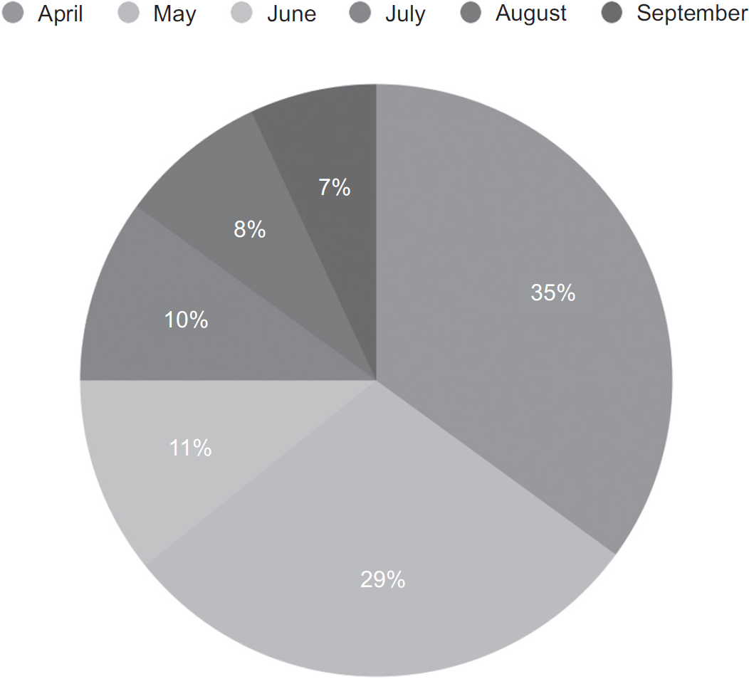
The familiar circle broken into slices (Figure 10.4): each slice shows a percentage or proportion of the whole.
Cartesian charts
Simple charts are designed to present one kind of information: average temperatures, perhaps, or number of tractors produced. That means they usually have one set of numbers, usually on the Y-axis (the vertical line); the X-axis (which runs left to right) shows categories or periods of time. So, to take our tractor example, the X-axis would list each month and the Y-axis would show the number of tractors produced that month.
Cartesian charts have numerical values on each axis. They’re used to show the relationship between two kinds of numbers, so, for example, you might have marketing spend on the X-axis and total sales on the Y, as in the example in Figure 10.5.
Figure 10.5 Example Cartesian chart

Many computer programs such as Microsoft Word and its imitators enable you to add all kinds of items such as shapes, clipart, special text effects and so on. And many people believe that by doing so, Word and its imitators have made the world considerably more annoying as a result. The various tools have certainly helped people create some truly terrible documents, and, as a result, it’s a good idea to steer clear of the most clichéd ones, such as overly fancy text effects and poorly drawn comic characters.
A well-chosen graphic or image with a specific purpose can enhance technical writing. There are lots of great resources for good free images on the internet, but be careful: just because something’s online doesn’t mean you can use it without payment. Look for sites that explicitly give you permission to use their content, such as pexels.com, which states ‘the pictures are completely free to be used for any legal purpose’.19 That includes commercial use.
One of the most common ways creators can give other people permission to use their content is to label images with a Creative Commons license. That enables the person who created the image to specify how it can be used, and you can search for Creative Commons images in Google Image Search. You can find the different licence types at creativecommons.org, but the ones you’re looking for must not contain the tag ‘NC’ for non-commercial. If they do, it means the copyright owner doesn’t want them used by businesses.
Copyright must be explicit. If you aren’t absolutely certain that you have the right to use an image, you must assume that you don’t have the right to use it.
• Use lists to break up forbidding blocks of text.
• Keep away from the clipart.
• Don’t assume you can use a graphic or image from the internet for free.
18 See www.flickr.com/photos/dullhunk/7214525854. Original artist unknown.
19 Under the Creative Commons Zero (CC0) license.