]>
This chapter is devoted to one of the basic colorist tasks: matching shots. This is one of the least subjective areas in which a colorist must be proficient. Either the shots match or they don’t. You’ll see that there are numerous strategies and tips to make these matches easier but that the more experienced you become, the more you simply rely on your eyes. But until then, learning to match shots is a valuable skill and training method in learning to force a very specific look on a shot with a clearly definable and quantifiable result.
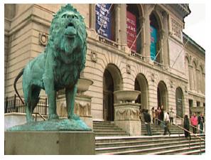
There are four matching scenes in this chapter. The first pair of matching shots includes a shot of the lion in front of the Art Institute of Chicago. One was shot with proper white balance (though fairly warm) and one was shot balanced blue or “cool”. The second pair of shots includes an interview clip and a b-roll shot that need to cut back to back. The third pair includes two clips from the same interview that was shot outdoors as lighting conditions changed.
Matching the Lions of the Art Institute
Craig Leffel, of the Chicago, IL, postproduction house Optimus, starts us out with his take on the match (see Figs. 9-1 through 9-4).
He begins by analyzing the images and correcting the “base” image (see Fig. 9-1 ): “I’m looking at these shadows (pointing to the black areas above the three colored banners), since they’re the darkest shadows that I can see the fastest. This (pointing to the shadowed archways above the doors) is also a good place to see texture; to see if I’m cranking the blacks too hard or too harshly, this stuff will look pretty awful pretty fast. I’m trying to get the blacks not to look milky and trying to get some richness, but richness with separation. Just adding contrast to an image and just crushing the blacks is not the same as trying to get tonal separation and get richness. Especially when I’m working off something that I know is a piece of tape, I try to separate out as much dynamic range as I can. The way I discern that is by the black to midtone relationship and then the midtone to highlight relationship. And to me, when you start out — it’s one thing where you finish — but where you start, it’s nice to have as much range between each stage of black, gamma, and white as you can without any clipping, crushing... just get as full a tonal range as you can. Imagining it’s a photograph and trying to see every bit of the tone from 16 steps of gray that you can or more. Kind of a Zone System kind of a thing. Whenever I’m doing an image I’m always thinking about, not literally the Zone System, but that’s pretty much how I judge an image.”
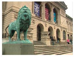
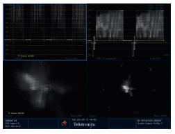
Fig. 9-2 Scopes showing the source image: the YRGB parade (top left quadrant), the vectorscope zoomed 5× (bottom left quadrant), the composite waveform (top right quadrant), and the vectorscope (bottom right quadrant). From Tektronix WVR7100.

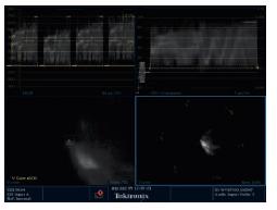
Fig. 9-4 Scopes showing the source image: (a) the YRGB parade, (b) the vectorscope zoomed 5×, (c) the composite waveform, and (d) the vectorscope. From Tektronix WVR7100.
| D e f i n i t i o n |
The Zone System: A photographic concept espoused heavily by famous landscape photographer Ansel Adams. The system was designed to be used for the initial negative exposure right through the final print. It is a system designed to properly expose prints by envisioning, describing, and targeting the exposures of certain tonal “zones.” There are several books on the subject including Adams’ original The Negative: Exposure and Development.
With the base image looking the way he wants (see Fig. 9-5 ), Leffel grabs a still to begin working on the match. Very quickly, without referring to the scopes, Leffel has a pretty close match.
Leffel ignores the fact that the sky in the “cool” image is radically off, knowing that he’ll deal with that later. He switches from the split to cutting back and forth between the still store and the correction. “I have a blue shift in my shadows if you look at the bottom of that lion. The color of the building is right, except the contrast is wrong. You can also see the blue in the shadows in the doorways and in the guy’s jacket on the stairs. However, in a case like this of a misbalanced camera, there’s gonna be a tradeoff of what compromises you’re willing to make in order to make most of the image feel good.”
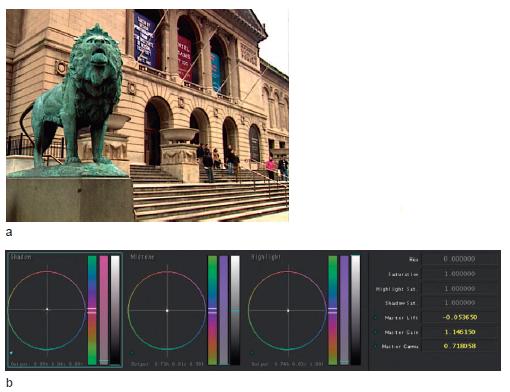
Fig. 9-5 (a) Leffel got the “base” image to a place he was comfortable with and (b) the data from the Primary room.
Still Store
Any good color correction application or system should have some method of storing and recalling visuals to which you can refer. There are a number of important ways to use a still store. Several colorists grabbed stills throughout their corrections so that they could judge whether the direction they were heading was improving the image or not. Others grabbed stills of shots they were trying to match exactly or of scenes in which they were trying to maintain continuity. Also, the still store can be used to maintain consistency over long-form programs.
Learn to use the still store in your application using the keyboard shortcuts. Experiment with ways to use your still store or reference images to improve your corrections. It may seem like pulling these stills and referring to them will slow you down, but they can also keep you from straying too far down an unproductive path.
Also, as you see by the example of the colorists throughout the book, you need to decide in which cases you want to cut back and forth between the still store and in which cases you want to wipe between it and your working image. Some prefer one method and some prefer the other, but most of them use both methods at one time or another.
“So,” I ask Leffel, “Making a perfect match won’t be possible in this case, because one or more of the color channels has either become clipped or compressed in one area and not another?”
“Yes,” he responds. “So you have to say, ‘I want to get as much as I can get right.’ Like this is already better, just to take that blue out of the black.”
I ask him what he sees as the difference in the images. “It’s mostly red gamma. But if you start worrying about that particular detail, you’re going to lose the rest of it. It’s more an overall perception thing. If you just try and watch the whole image, not trying to see too many details, what your eyeball is going to catch is the overall hue shift. Your eyeball is not going to catch necessarily that change in the doorway.” See Figures 9-6 through 9-8.
I ask Leffel to describe what he did as he cuts back and forth between the corrected and uncorrected cool image? “I looked at that blue and said, ‘Most of that is happening in the brightest parts of the picture or gain,’ and I immediately tried to take out that blue tone and lean more toward the target image overall — throwing warmth in. Once I had that even remotely close, I started dialing contrast in. So then it was time to hit blacks and gamma and dial in some contrast, then working black and gamma against each other to try to get full tonal separation again in the shadows and the midtones so that I wasn’t crushing or hitting anything too hard.”
I press him further, asking, “By saying ‘full tonal separation’ and ‘working black and gamma against each other,’ do you mean how far you pull down the blacks and how high you pull up the midtones, or how high you bring up the blacks and how low you pull down the mid-tones? And you’re doing that with both hands. Then you do that on the other side with the highlights?”
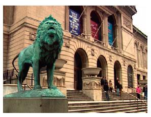
Fig. 9-6 The split between the two corrected shots; the “cool” image is on the top. Yes. There is a split there! Notice that the bottom corner of the dark blue banner is cut off.
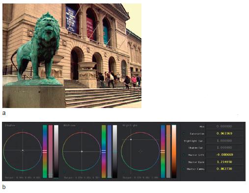
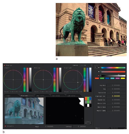
Fig. 9-8 (a) The secondary correction, pulling added warmth out of the sky and (b) the data from the Secondary room.
“Exactly,” he responds. “You open the midtones and darken the whites. It’s a lot easier to match an image if you have some full tones to work with, so I added black. I added gamma. I added color saturation. I mostly manipulated midtones. I brought the black down, but I also brought the whole midtone down. You can see that the white values don’t change a whole lot, but the midtones and the blacks do.”
The tonal separation really makes the detail pop. “It looks like you can see individual bricks in the façade,” I comment.
“Absolutely, and that midtone kind of really stretches out. One of the things I tell colorists is that you have to discern rather quickly, where’s the white? What’s a white point? What is white, what is black, and everything else is midtone. Then if you manipulate that midtone and think of midtone as a curve that you’re kind of sliding down, you can sort of round this image out to have some richness,” he explains.
“So you’ve added a bunch of black and stretched out the image, not to the point where it’s harsh or that you’re clipping anything unnecessarily — in an image like this you kind of have to clip — but you’ve stretched it out to have dynamic range: a black, a little-bit-higher than black, a middle gray, a slightly-higher than middle gray, something approaching white, and then white. If you can get 16 steps of gray into an image, you’re doing a great job... or at least my buddy Ansel Adams said so,” Leffel jokes. “I still use The Zone System every day. I’m really surprised that I do, but I come from printing photographs and the mark of a good printer of photographs is tonal separation. If the creative direction is to eliminate it, then of course that’s what you do, but as a base way to color correct or as a base way to approach an image, I always approach it as a full-tone image,” Leffel concludes.
Craig Leffel
Craig Leffel is a senior colorist and partner at Chicago’s Optimus. He works on national TV spots for virtually every major ad agency in the United States.
Leffel got a B.F.A. in photography from Indiana University in the late 1980s before being hired at Skyview, where he apprenticed under one of this book’s other featured colorists, Pete Jannotta, at the now-shuttered Skyview. From there, Leffel moved on to Editel until it closed and then to Optimus where he’s been for over 12 years.
In addition to his TV spot work, he worked on Hoop Dreams and indie features Yes Men and The Pool with director Chris Smith.
Bob Sliga of Apple Inc. also took on the challenge of the Art Institute lions. His approach was that, even though the “base” image wasn’t ideal, he would treat that as the “hero” grade and would match directly to the uncorrected, slightly warm shot. This is almost the reverse of Kassner’s approach later in the chapter.
Sliga explains, “I look at the waveform monitor, vectorscope. I like to look at the vectorscope blown up a lot. I blow it up as far as I can go, because it helps me find a neutral black and a neutral white. I also look at the RGB parade display, then I look at the picture. What I have up right now is in the still store, I’ve saved a picture that I want to match to. The white balance is extremely different. The exposure level is different on the scope. I can see where I have to put the signals in order to help match the image. I’ll utilize the wipe to the reference image, then I’ll rotate the split so I have a little bit more of the picture,” he says as he rotates the wipe so that it goes from the bottom left corner to the top right corner.
Sliga continues, “So if I go to Primary In [room] and I’m just going to brighten this up really high. So one of the things I’m looking for is a match in the waveform. Then it’ll be by eye after that. So you kind of get it in the ballpark of the overall video level. I’m also looking at the black level; how we’re higher over here, so it’s not balanced out. So as I come back over here to my parade display, what I’m trying to do is balance these off as close as possible. To do this, I’m going to start by making my blacks black.”
Sliga uses the shadow trackball to balance blacks. “You can see as I move around what happens on the vectorscope. You want to have things coming out of the center. We still have a big-time white balance difference and I’m not even looking at the monitor. I can do this in the joyball area and move all three tonal ranges, or I can come over here to the advanced side (the Advanced tab in the Primary room) and grab the channels one at a time. I’m going to bring my red lift down just a little bit more in the blacks. Now that we’re in the Advanced tab, it’s easier than moving three joyballs at once. This is just another way of doing this.”
Sliga switches from adjusting the red, green, and blue shadow levels to working on highlights. “So we’re just going to try to get the highlights in the ballpark,” Sliga states as he checks the waveform monitor. “Now we need to take some of the blueness out of this, which I can look to do in one of a couple ways. First I’m going to start with the blue gamma and bring it down into this area here. Then I’m going to bring the red gamma up a tad and then go back and forth.”
Sliga changes gears again and jumps from the Advanced tab corrections back to the trackball for midtones. “Now this is one of those places where it’s easier to do with the trackballs, so I’m going to do the rest of the correction over here. We’re getting warmer overall. We’re probably not going to match it totally 100% exactly, but the idea is to get it pretty darn close, and we should be able to. If we had to use windows and that, we could. Remember I’m just in the Primary In room for this right now. So I’m just going to add a bit of color to it. Looks like we have a little bit of a green balance,” he says as he adjusts the highlight trackball. “I’m doing this by eye at this point. Then I’ll come back to the gamma with a little bit more green. Now I’m using shadow sat (saturation) and pulling down some of the saturation that was building up in the shadows.” See Figures 9-9 and 9-10.
With most of the work done in the Primary room, Sliga moves to secondaries, explaining, “I’m going to use the Saturation curve. What I really want to do is deal with that yellow that’s coming in to the warmth of the bricks.” He pulls the saturation down on the yellow vector of the curve. “When you’re actually doing matching like this, you end up trying a lot of things to make it happen, because you’re forcing one into the other. And so this one here, by pulling the yellow out, it got our stone (the foundation of the lion) a lot closer, except we’ve got a little bit of color up in there that’s different,” he explains, pointing to the building’s façade between the lion and the first doorway. “So I came back up here figuring I could get away with a gain change, that gets it in the ballpark. And if we wipe between the two just to see where we’re at, the building itself is pretty darn close.”
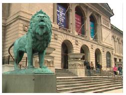
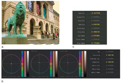
Fig. 9-10 (a) The primary correction of the “cool” shot, (b) the main Primary room data, (c) the data from the Advanced tab of the Primary room.
Using another secondary, Sliga tries to bring the color of the lions closer. He positions the split screen diagonally across the lion, then goes to the Saturation curve and moves the cyan point, moving it up and down radically. “That’s the wrong point. That ain’t going to work, so I’ll try the green point.” Sliga lifts and lowers the green saturation point radically, seeing that it is affecting the right portion of the image. He settles into a lowered saturation on green. “Maybe somewhere in that area,” he determines. “And if we go to the still store and wipe across... I pulled too much out, but we can go back to that and raise it a little.” A few minor tweaks to the Saturation curve later and his match of the lion is complete. See Figure 9-12.
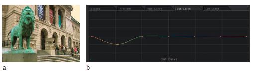
Fig. 9-11 (a) The first secondary correction, pulling yellow out of the façade and (b) the data from the fi rst Sat Curve of the secondary correction.
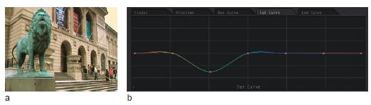
Fig. 9-12 (a) The second secondary correction, pulling saturation out of the “cool” image and (b) the data for the Sat Curve of the second secondary correction.
Sliga then added another correction to match the sky, pulling a luminance HSL (hue, saturation, and luminance) qualification and a circular garbage matte (see Figs. 9-13 and 9-14).
Neal Kassner takes the next crack at matching the lions. His initial corrections are to the “cool” lions. “Alright the first thing I’m going to do is try to balance the blacks a little bit. And I’m looking at a combination of the waveform and the vectorscope. I’m going to warm up the gammas a little. Now, I don’t know what kind of stone that is (referring to the façade of the building), but I know it’s not as yellow as one or as blue as the other, so I’m just going to try to make it neutral. I’m also going to wind down the overall gain and see what that does to the sky.”
Then he switches over to the warmer lion shot. “So now what I have to do is go the other way with it. And I’m going to take some of the warmth out of the lowlights and also out of the midrange. Okay, so this is where it’s getting there, but it’s not close, so I’ll cut back and forth between this and the still. What I’m going to do is match the luminance using the waveform.”
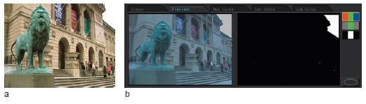
Fig. 9-13 (a) The third secondary correction, pulling warmth out of the sky and (b) the data from the third secondary correction, pulling the Highlight Sat. numerical entry to 0.
In order to get the contrast ratios right between the two images, Kassner plays the gammas and highlights off each other, bringing the gammas down and the highlights up, then bringing shadows up, then playing shadows up and highlights down at the same time, before his correction is in a comfortable range for him. “Okay, the luminance is closer than it was. Now I’m going to concentrate on color. Now I’m running into a situation where I like this better than that ,” he says, preferring his semiadjusted shot two over his completed correction on shot one.
Kassner starts his grade over using grade three in the timeline. I ask him if he’s trying to get the shapes in the waveform to line up. “Exactly. So now there’s a color cast... a little cyan. It appears to be mostly in the gammas. Now I’m looking at the vectorscope, just trying to match the shapes a little better. It almost looks like there’s a black stretch going on in this grade. This,” he says, pointing at the shadow area on waveform monitor, “up to here is a fairly close match, color aside, just luminance. But then, this,” he points at the high midtones, “is getting stretched out more. If I just go and bring up the highlights it’s also dragging up the lowlights with it. So if I work the two against each other... now we’re getting some place. That’s actually a little bit closer.” Kassner has been moving the gammas down and the highlights up at the same time. “Then there’s just a question of trimming the colors. A little overall hue correction would be a good cheat.” See Figures 9-15 through 9-17.
Janet Falcon of Shooters Post in Philadelphia, PA, is next up. She starts in on the correction with her eyes almost completely on the video monitor. “I’m just trying to get it somewhere close to a starting point before I bother going back and forth.” Falcon wipes between the “correct” and “cool” lion, deciding, “There’s way too much red in the blacks. I need to brighten this up. So basically I need more yellow in the highlights because there’s too much blue in the highlights. Then put a little blue back in the lowlights.” Falcon points at the middle of the doorway arch closest to the lion, commenting, “I’m going back and forth between looking here for blacks, here for gammas,” as she points to the top edge of same archway, “and up here for whites,” she says, pointing to the far right square of the building’s façade above the far right archway. “It’s a little pinker.” See Figures 9-18 and 9-19.
Falcon points out that as you get closer to getting a match, it’s easy to forget which side of the correction you’re adjusting. “With FinalTouch (Color) you don’t know if you are looking at the reference frame or live picture because there is no indication in the GUI. On the DaVinci there is a green bar on the Graphical interface that shows whether you are on the reference frame or live picture,” Falcon explains.
With the buildings matching fairly close, Falcon pulls a secondary HSL key for the lion and matches it as well. She also adds a simple HSL qualification to both the images to correct for the clipped sky (see Figs. 9-20 and 9-21). The corrections are nearly identical to those done by the previous colorists in this chapter.
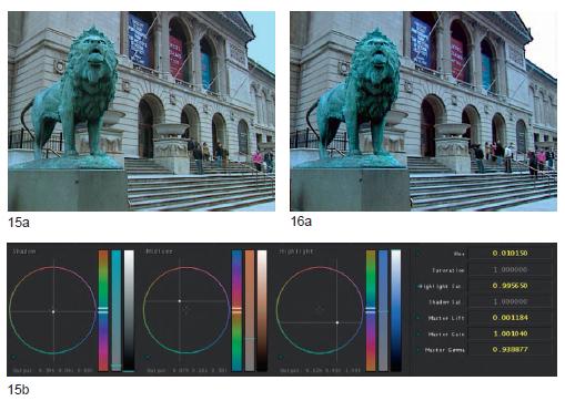
Fig. 9-15 (a) Kassner chose to balance to the Art Institute shot entirely in the Primary room. This is the primary grade for the warm or “base” shot. The sky would be fixed with a secondary. (b) The data from the “base” image in the Primary room.
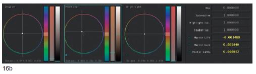
Fig. 9-16 (a) The “cool” image graded in the Primary room and (b) the data from the “cool” image in the Primary room.
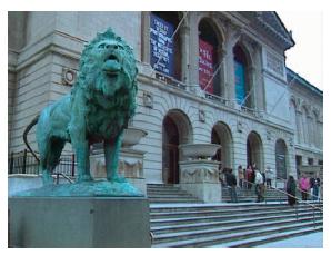
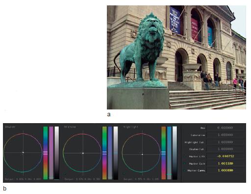
Fig. 9-18 (a) The primary correction on the warm, “base” image and (b) the data from the primary correction to the “base” image.
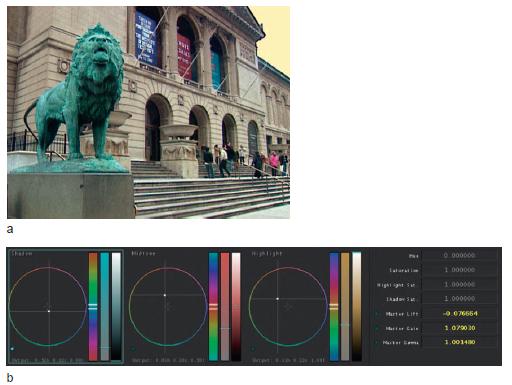
Fig. 9-19 (a) The primary correction on the “cool” image and (b) the data from the primary correction to the “cool” image.
Falcon offers a final tip at the end of her matching session. “Unless the final product will be a split screen or some other type of special effect, where matching details can be very important, matching one shot to another is mostly about overall perception. As long as the basic balance and contrast ratio are the same you can get away with smaller details that may not be exact. Often a shot like the one I worked on here would never be cut to itself, there would be a close up or some other shot next, so by the time the ‘matched’ shot appears again the smaller differences would never be noticed.”

Fig. 9-20 (a) The secondary correction to the hue and saturation of the lion and (b) the data from the secondary correction. Fig. 9-
Matching Scene to Scene
Figs. 9-22though 9-25 are images from footage from a project I produced for Exclaim Entertainment’s “BOZ the Bear.” In the project, these two shots — the “b-roll” shot of the woman with her son (see Fig. 9-22 ) and the interview scene of the woman (see Fig. 9-24 ) — were not cutting together well. I tried trimming the shots one way and then the other with no success. Finally, I decided to color correct the shots so that they’d match better. That was the solution.
Figuring that our panel of experts could match them better than I could, I included the scenes in the sessions for the book. Here Bob Sliga takes a crack at matching the scenes. Follow along using the images in the tutorial folder of the DVD: “Jackie_and_Nick_b-roll.mov” and “Jackie_ interview.mov”
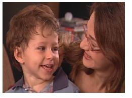
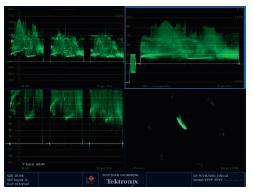
Fig. 9-23 Scopes showing the source image: the RGB parade (top left quadrant), the RGB parade zoomed in to show the black balance (bottom left quadrant), the composite waveform (top right quadrant), and the vectorscope (bottom right quadrant). From Tektronix WVR7100.
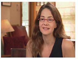
Fig. 9-24 An image from the source footage of the interview. Image courtesy of Exclaim Entertainment.
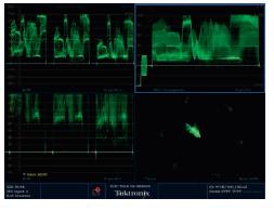
Fig. 9-25 Scopes showing the source image: the RGB parade (top left quadrant), the RGB parade zoomed in to show the black balance (bottom left quadrant), the composite waveform (top right quadrant), and the vectorscope (bottom right quadrant). From Tektronix WVR7100.
Bob Sliga
Bob Sliga graduated from Illinois State University and has been a colorist since 1979. He has been senior colorist for three different facilities.
In 1983, he moved to Post Pro Video in Chicago, IL, with the first Rank Cintel Mark III C with full zoom and repositioning capability. Sliga was then recruited by Henninger Video to open the first film transfer suite in Baltimore, MD. He returned to Chicago in August 1997 to oversee the opening of The Film & Tape Works Datacine Suite. Bob has served as a demo colorist for da Vinci and the Spirit Datacine.
Specializing in commercials for 20 years, his clients have included Leo Burnett USA; DDB Needham; Foote, Cone, & Belding; J. Walter Thompson; Ogilvie & Mather; ESPN; NBC; CBS; ABC; Major League Baseball; and The Discovery Channel.
In the fall of 2001, he began teaching a telecine and color correction course at Columbia College in Chicago. In September 2005, he became a freelancer to pursue digital intermediate (DI) color correction with Silicon Color’s FinalTouch HD. In June 2006, he became the director of training for Silicon Color and served as demo artist for Silicon Color’s FinalTouch HD. In December 2006, Sliga was hired by Apple Inc. for Color’s new quality assurance team in Cupertino, CA.
Sliga starts by correcting the interview scene first. “I’m bringing the whites down out of clip. Then I balanced my blacks and brought them down a bit, which got me to here (See Fig. 9-26 ). I forgot I even did it. Sometimes it seems like my hands think for me.”
With a basic correction to the interview scene, Sliga turns his attention to the shot of the mother and son. “Okay, so now we come over here. I’m going to balance him out too. I’m just going to pull the blacks down to zero. I’m going to bring the overall warmth of this down a little bit in the gain because we see how high that is,” Sliga remarks, referring to the red channel in the RGB parade scope being much brighter than blue or green. “I’m going to choose to do it this time on the individual channel. It’s a little easier.” Sliga brings the gain of the red channel down, but not so that it is perfectly even with blue and green. “It is still slightly higher, which it should be because the image is mostly skin tone,” he explains. See Figure 9-27. Then he plays the shot through. “A lot of times I’ll advance the clip to the next scene and then back it up one frame to see how the shot ends.”
Sliga returns to the interview shot. “So this shot is a lot warmer than the other shot. I could pull the warmth out. People generally look better warmer, so I try to use the warmth to its advantage. I’m going to try to richen her up at first, then I’ll match the other to this.”
Sliga continues, “I’m going to keep what I’ve got here and go to the Secondary room. The reason is that if I like where I’m at in primaries, but I want to do some more, then I don’t have to sacrifice what I’ve already done. There’s more than one way to color correct with this software, and it all depends on the type of job and the type of work that you’re doing. So I’m going to richen her up a bit by pulling the gammas down a bit. I’m going to warm it up a tad. The black is looking nice and black and we’ve got a nice clean white back here. I just richened it up a bit, okay? And by doing that, the saturation kind of came into play on its own.... I added more saturation by just darkening it down. So I’m going to keep this and hit control-I, which will make a still of this.”
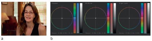
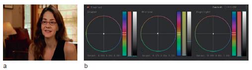
Fig. 9-27 (a) The primary correction to “b-roll” scene, (b) the data from the Primary room, (c) the data for the Advanced tab of the Primary room.
| T I P |
Sliga explains his workflow for setting his “hero” grade. “I copy it to number one. There’s a reason why I use grade one. It’s a quick check. Because we have four grades available, what I’ll do is I’ll always drag the real grade that I want into event one. And if I go to the Final Print room and choose Add All, I can see instantly that I didn’t load the correct grade in, because there’s a column in Final Print that shows which grade has been selected.”
Sliga continues with his explanation of his workflow. “Then I’m going to call up the other scene and cut back and forth to the still. I’m more of a cut person instead of using a wipe. First thing I’m going to do is richen this up, warm it up a little here. I’m going to leave primaries where they’re at and I’m going to come into secondaries.” See Figure 9-28.
Sliga enables a secondary, but doesn’t qualify anything at all, using it as another layer of primary. “I’ll richen it up a bit,” he continues, pulling down the gamma. Then he warms the image by dragging the midtone wheel toward red/yellow. “Now I’ll kick up the whites a bit, bring my blacks back down. That’s going to be a little too warm, I have a feeling,” he speculates as he brings red back down in the midtones. “Let’s just see where this is at,” he says as he hits control-U, checking his match. “So I’ve made this a little bit too warm in comparison,” he says, altering the shot slightly, before completing his grade. See Figure 9-29.

Fig. 9-28 (a) The secondary correction of the interview image used “unqualified” as essentially an additional layer of the primary correction and (b) the data from the Secondary room.
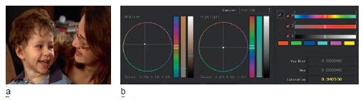
Fig. 9-29 (a) The secondary correction of the “b-roll” image used “unqualifi ed” as essentially an additional layer of the primary correction and (b) the data from the Secondary room.
Matching When Lighting Changes in a Scene
The following shots (see Figs. 9-30 through 9-33) are from a documentary I produced about my family’s bicycle trip across the United States. During the interview with my brother, which I shot on BetaSP without lights, the sun started to go down, so the beginning (see Fig. 9-30 ) and end (see Fig. 9-32 ) of the interview look somewhat different. Follow along with the “brian_overexposed.mov” and “brian_low_contrast.mov” files from the Tutorial folder on the DVD. The color temperature didn’t actually change much, but the contrast as it got closer to dusk definitely changed.
Fig. 9-30 The image from source footage of the interview from early in the day called “brian_overexposed” on the DVD.
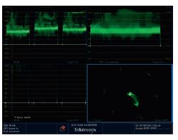
Fig. 9-31 Scopes showing the source image: the RGB parade (top left quadrant), the RGB parade waveform zoomed in to show the black balance (bottom left quadrant), the composite waveform (top right quadrant), and the vectorscope (bottom right quadrant). From Tektronix WVR7100.
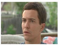
Fig. 9-32 The image from source footage of the interview from later in the day, called “brian_interview_low_contrast” on the DVD.
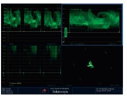
Fig. 9-33 Scopes showing the source image: the RGB parade (top left quadrant), the RGB parade waveform zoomed in to show the black balance (bottom left quadrant), the composite waveform (bottom left quadrant), and the vectorscope (bottom right quadrant). From Tektronix WVR7100.
Nolo Digital’s Mike Matusek starts by correcting the first shot from the interview, then he corrects the second shot to match the first. “This would be a combination of midtones and blacks that I’d bring down. Midtone may not have enough range,” he says as his eyes go back and forth between the scopes and the monitor as he adjusts.
I ask him what the challenge is in getting these shots to match. “I think you said that the sun was out in this first image and then it started to go down in this second image,” he replies. “The first shot has more contrast and the highlight of his right side is up, so I’ll probably put a window on it, then, probably increase the contrast on [the second shot] to try to get them closer, then just match the flesh tone.” See Figs. 9-34 and 9-35.
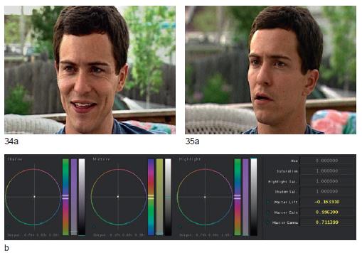
Fig. 9-34 (a) Early “overexposed” interview footage with the primary correction, and (b) the data from the Primary room.
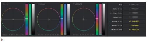
Fig. 9-35 (a) Later interview footage with the primary correction and (b) the data from the Primary room.
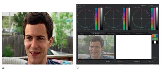
Fig. 9-36 (a) Early “overexposed” interview footage with the secondary correction and (b) the data from the Secondary room.
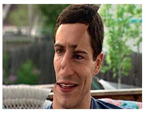
Fig. 9-37 The split between the two shots shows how close the skin tones and background tonality match (and this Picasso-like image is sure to make my brother laugh).
Matusek puts a window on left side and lowers the brightness of the background and the face highlight. “See? That’s all it really needed.” See Figures 9-36 and 9-37.
Conclusion
The colorists I did sessions with for this book have such a depth of experience that most of them did these matches very much by eye. For the less experienced colorist, you will find that one of the greatest ways to match shots is by using the split screens and the RGB parade waveform monitors, matching the various "shapes" in the trace between each color channel or cell.
Another good way to assist your eye in matching is rapidly cutting back and forth. At first, you can look at the overall image and try to ascertain the differences, but as you get closer, your eye will have to isolate various tonal ranges as the shots cut back and forth. Therefore, you can determine if the thing making one shot look redder than the other shot is red coming from the shadows, midtones, or highlights.