
CHAPTER 4
WHAT CHARTS
YOU SHOULD KNOW
AND LOVE
(AND SOMETIMES LOATHE)
I could easily fill an entire book with hundreds of different chart types and their appropriate uses, but I want to focus specifically on arming you with the chart types that are most useful for communicating business data. The good news is that as you learn how to decode and appreciate these charts, your graphicacy (that’s the term for graphic literacy) will improve and you’ll be better at understanding any charts that come your way.
BAR CHARTS AND ALTERNATIVES
We’ve already looked at examples of highlight tables and bar charts, but there are a few more considerations and variations everyone should know.
Horizontal and Vertical Orientation
Bar charts are particularly versatile in that they can be displayed with either a horizontal or vertical orientation. Figure 4.1 shows an example of a horizontal orientation.
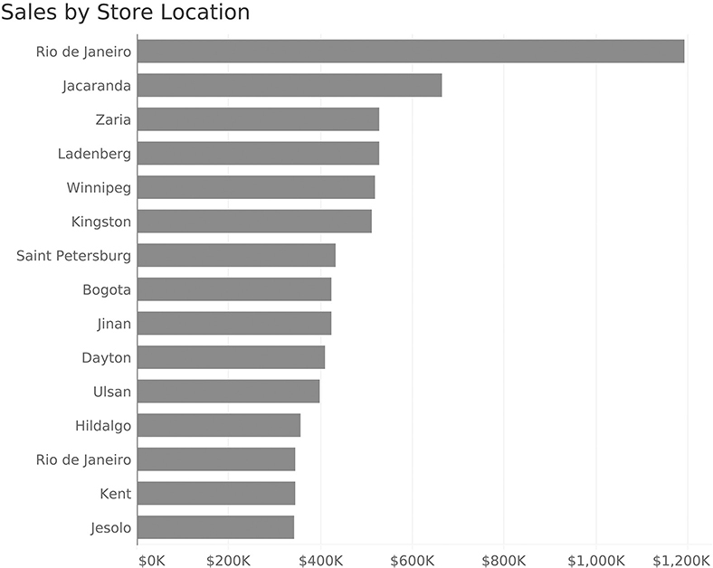
FIGURE 4.1 A bar chart showing sales by store location, sorted from highest to lowest, using horizontal orientation.
Figure 4.2 displays the same chart vertically. Bar charts with vertical orientation are sometimes called column charts.

FIGURE 4.2 A bar chart showing sales by store location, sorted from highest to lowest, using vertical orientation.
So why the scaredy-cat? Look at the labels along the x-axis at the bottom. To fit all the letters, we either need to display the text vertically (as we do here) or on a diagonal. Both vertical and diagonal text are hard to read. Sometimes something as simple as turning a bar chart 90 degrees makes it much easier to use. Note that I have no problem with displaying bars vertically, as long as the text labels are easy for the audience to read. In this example, they are not.
Dot Plots and Lollipop Charts
Dashboard designers often get pushback from their stakeholders who tell them that bar charts are boring. I’d argue that the bar charts are fine and it’s the data that’s boring, but there are some analytically sound and aesthetically pleasing alternatives that you should know about. One alternative is a dot plot, also called a Cleveland plot (Figure 4.3).

FIGURE 4.3 Sales data displayed using a dot plot, also called a Cleveland plot.
The Cleveland plot is named for William Cleveland who worked at Bell Labs. In the early 1980s, he and his colleague Robert McGill published seminal research on how well audiences could estimate values using different charts. Cleveland and McGill’s research showed that people make better estimates using position from a common baseline than they do guessing the size of circles, the size of a slice in a pie chart, and so on.
Noticed that I italicized the word position as Cleveland and McGill’s research shows that people are a little better at judging position than they are at estimating length. This, combined with the dot plot’s uncluttered appearance (it uses a lot less ink than bars), is why many data visualization experts prefer the Cleveland plot to bar charts.*
Figure 4.4 shows another alternative to the bar chart, the lollipop chart.
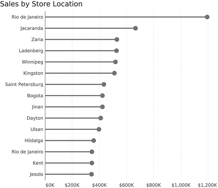
FIGURE 4.4 Sales data displayed using a lollipop chart.
I like both the Cleveland plot and lollipop chart a great deal, but some of my colleagues point out that the circle introduces some imprecision, as it is unclear if you should be comparing the left, center, or right edge of the dot. I will confess that I used to make my lollipop dots larger, and this critique convinced me to make them smaller. You can also ditch the candy portion and replace it with a vertical line at the end (Figure 4.5).
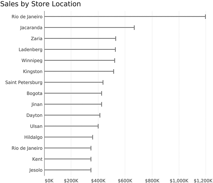
FIGURE 4.5 Thin bar chart with vertical lines.
Which of these variations do I think your organization should use? While the designers should strive to find the one that stakeholders find most valuable, I’ll be happy if your organization uses any of these instead of packed bubbles or pie charts!
Bar Chart with Average Reference Line
Suppose we wanted to see which stores were above and below average, and by how much? Figure 4.6 is an example of a bar chart with a reference line.
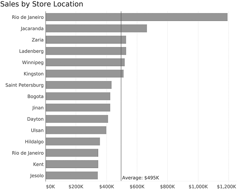
FIGURE 4.6 Bar chart with reference line.
Here we can see that six stores are above average and the rest are below. We can also see how much above or below average they are because the average line provides a common baseline from which we can estimate position.
Bar Chart with a Goal Reference Line
Suppose we want to know which stores performed above and below their individual goals, and by how much? We could have a reference line for each bar (Figure 4.7).
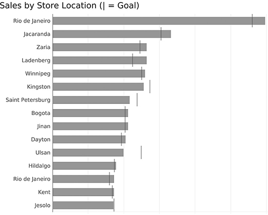
FIGURE 4.7 Bar chart with reference lines, making it easy to see which stores are above or below goal, and by how much.
Maybe we want to make it easier to see which stores are below goal? We can do that by sorting and grouping (Figure 4.8).
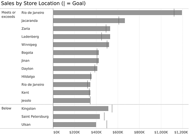
FIGURE 4.8 Grouping and sorting to segregate stores that meet or exceed their goals from those that do not.
We can also color code the bars (Figure 4.9).
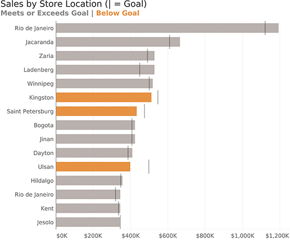
FIGURE 4.9 Bar chart with reference lines and underperforming stores highlighted in orange.
Here’s another technique that is remarkably useful to help people notice important information: the little red dot (Figure 4.10)!
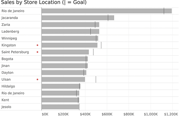
FIGURE 4.10 Can you see which stores are underperforming? Easy! Just look for the little red dots.
The Paired or Clustered Bar Chart and Alternatives
How do you compare data for two or more segments across multiple categories? For example, maybe you want to compare sales for three product categories across five different countries. How do you show this?
The go-to approach is the clustered bar chart, but this type of chart can be dense and confusing if you have lots of categories, so you should be aware of some good alternatives.
Let’s start first with the simple paired bar chart and see how it works.
Paired Bar Chart
The paired bar chart is a very popular way to compare a single measure for two segments (in this case profit for 2019 and 2018) across multiple categories (Figure 4.11).
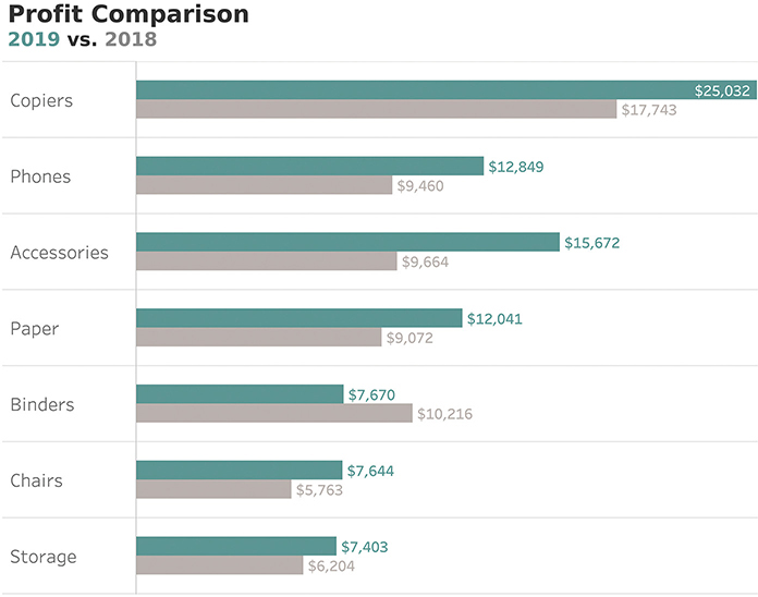
FIGURE 4.11 A paired bar chart showing sales for 2019 and 2018 across multiple categories.
This approach is solid analytically because we show length/position from a common baseline; however, the chart is very dense and will become very cluttered if we were to show more than two years of data. What are some possible alternatives?
Bar Chart with Reference Line
The reference line we used earlier to compare actuals against a goal also works well to compare the profit for two different years. Figure 4.12 shows a bar chart with a reference line where the bars represent profit for 2019 and the vertical lines represent profit for 2018.

FIGURE 4.12 A bar chart with a reference line is a great way to compare one period (the bars) with a previous period (the vertical lines).
Notice that this enables us to gauge the magnitude of profit for the different categories in 2019 and see which categories’ profits were more (or less) than the previous year, and by how much.
Another advantage is that this takes up much less space than the paired bar chart (Figure 4.11). That said, we will run into problems if we try to compare more than two periods as we’ll need either another bar, another line, or some other symbol.
Bar-in-Bar Chart
Another approach that works well is a bar-in-bar chart (Figure 4.13).

FIGURE 4.13 A bar-in-bar chart allows us to compare the current period (green) with the previous period (gray).
It shares the same pros and cons as the bar chart with a reference line: it is more compact than the paired bar chart, but would not be able to display more than two years of data well. For three years, we’d need a bar-in-bar-in-bar chart, and that could get unwieldy.
Horizontal Gap Charts
Let’s take a very brief break from this profit data set and consider the question: how do organizations that are really good at visualizing data show this type of thing? One of my favorites is the Pew Research Center. How might they show the gaps between different years or segments? Consider the example in Figure 4.14, which shows the difference in opinion among Black, Hispanic, and White survey respondents to a survey Pew Research Center conducted in late 2018.

FIGURE 4.14 A Pew Research Center gap chart (Pew Research Center).
I’ve labeled this a gap chart, but there are a lot of names for this chart type (connected dot plot, dumbbell chart, and barbell chart). Gap charts do a very good job of showing the differences across three different segments (in this case Black, Hispanic, and White respondents) across multiple measures. Here’s how this approach would work for our profit data (Figure 4.15).
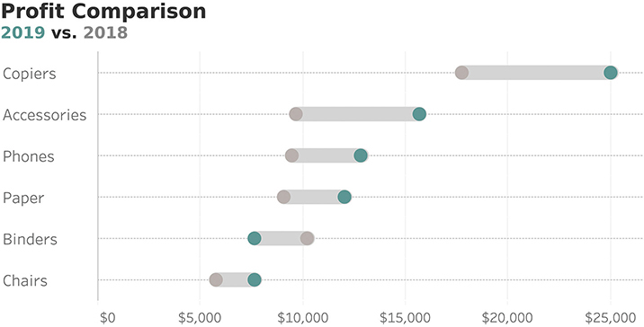
FIGURE 4.15 A connected dot plot shows the difference between 2019 and 2018 profits across multiple categories.
This type of chart is very versatile. Not only is it very compact, but it can also show more than two segments. That said, if you have four or more segments (e.g., four years of data), this chart, like the clustered bar chart, can become difficult to read. We’ll explore how to address this in Chapter 7.
Comet Chart
While I think the gap chart is the most versatile, the comet chart (Figure 4.16) has become my go-to when showing the change between two periods, or in any type of situation where there is ordinal data (e.g., older to newer, junior to senior, etc.).
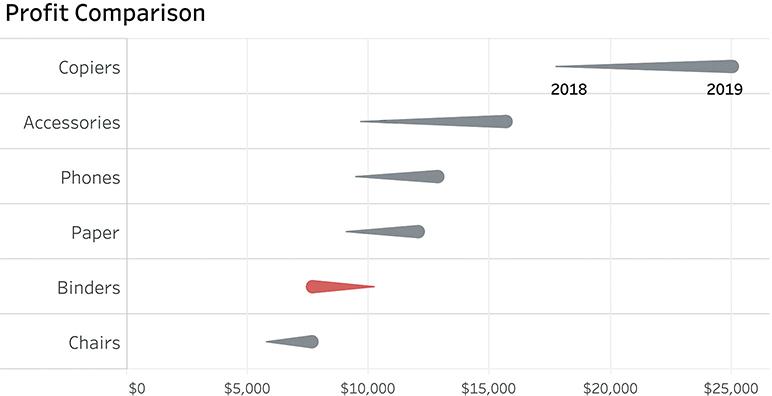
FIGURE 4.16 A comet chart where the head is 2019 and the tail is 2018.
It’s very easy to see which categories had an upswing, which had a downswing, and by how much. (The Binders category immediately stands out, which was not the case in Figure 4.15.) This chart would also allow me to add a reference for each category to specify a goal. This means I could easily compare this year to last year and see if we are ahead of or behind our goals (and by how much) for this year.
I love the comet chart, but I’ve got colleagues who think both the tadpole or the arrow chart work as well, if not better (Figure 4.17).

FIGURE 4.17 Showing the changes from 2018 to 2019 using a tadpole and an arrow chart.
An Introduction to the Slopegraph
I’ll discuss this chart in more detail in the section on timelines, but I would be remiss if I did not show the slopegraph because it is a great way to present the change in profit over two years (Figure 4.18).

FIGURE 4.18 A slopegraph showing the change in profit for different categories between 2018 and 2019.
Like the other charts in this section, it shows the position from a common baseline to allow people to make easy and accurate comparisons.
Scatterplots
You may have no trouble understanding bar charts, stacked bars, pie charts, and so on, but maybe you are less comfortable with scatterplots.* Or maybe you understand them, but you have colleagues who aren’t sure why they would be useful. Let’s look at some examples that will help you show how they work and why they can be so valuable.
Example 1: Ice Cream Parlor
Let’s say you manage an ice cream parlor. There are probably a lot of different factors you track, including number of customers, sales of cups versus cones, inventory, weather’s effect on sales, and so on. Suppose you were curious to see if there was a relationship between outside temperature and how much ice cream you sell; specifically, do you sell more on warm days? If so, how much more?
You have a year of data at your disposal, and you decide to start by looking at just three days’ worth (Figure 4.19.).
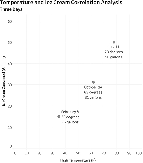
FIGURE 4.19 A simple scatterplot that shows the relationship between temperature (along the bottom, on the x-axis) and ice cream sold (along the left side, on the y-axis).
Looking at the bottom dot, we can see that the high temperature was quite cold on February 8 (35 degrees Fahrenheit), and we sold only 15 gallons of ice cream. Compare that with the top dot for July 11 when the high temperature was 78 degrees, and we sold 50 gallons of ice cream.
It looks like there may be something to our theory, but three data points is not enough to draw a meaningful conclusion. Let’s see what this looks like when we plot 365 days’ worth of data (Figure 4.20).

FIGURE 4.20 Plotting temperature versus ice cream eaten for a full year. There are 365 dots on this scatterplot, each dot representing a different day.
In this scatterplot each dot represents a different day. With the exception of that one dot that’s all by itself, can you see that dots that are toward the right are also toward the top, and those toward the left are closer to the bottom? Statisticians often want to see if there is a clear linear relationship between two measures and will calculate and plot a linear regression line (Figure 4.21).
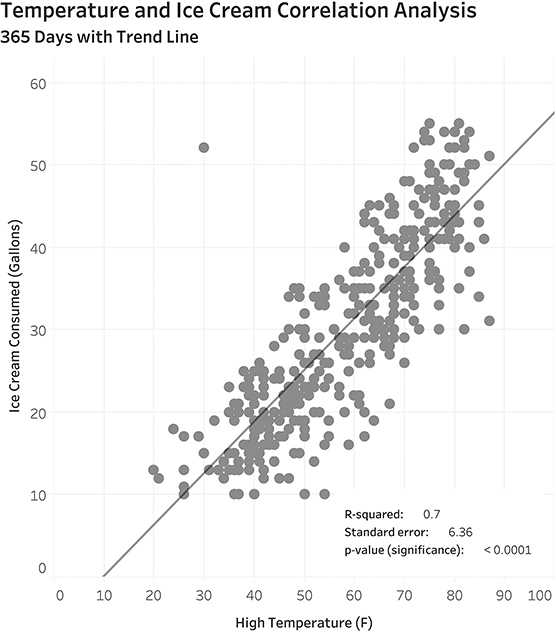
FIGURE 4.21 Scatterplot with linear trend line. The line is there to help predict the amount of ice cream consumed according to the temperature.
I won’t get into the particulars of what the statistical values mean, except to say that this is a pretty good model to be able to predict the dependent value (the amount of ice cream eaten) based on the independent value (the temperature outside). It is the convention to always place the independent variable on the x-axis and the dependent variable on the y-axis. In this case determining which is which is pretty easy because consuming ice cream won’t change the temperature outside, but the temperature outside clearly has an impact on the amount of ice cream consumed.
If you’re curious about that outlier, here is a triple-encoded version of the chart that includes an annotation that explains the lonely dot (Figure 4.22).
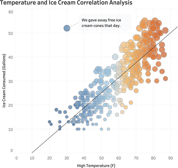
FIGURE 4.22 Fully-rendered scatterplot with additional encoding showing the relationship between temperature and amount of ice cream sold.
OK, so now we understand why, even though it was cold, we sold a lot of ice cream that one day: we were literally giving it away! As for the term triple encoded, it refers to adding some elements that we don’t need to decipher the graph. The primary encoding is position because a dot further to the right means the weather was hotter and one further up means we sold more ice cream. But we’re adding two more ways to encode the data: color (orange for hot and blue for cold) and size (a large dot means more ice cream and a small dot means less ice cream).
To be clear, the most important element in this scatterplot is position from a common baseline. Color and size just help amplify the findings.
Example 2: Salary Distribution
Let’s leave the ice cream parlor behind. In this second example, we’ll look at a data set of the salaries of 400 employees in an organization, with each dot representing an employee (Figure 4.23).
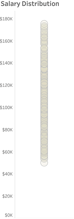
FIGURE 4.23 Employee salaries presented in a strip plot.
If you’re thinking, “What good is this? There’s just a bunch of dots, and I can’t tell where there’s a high concentration,” then you are not alone. That is why statisticians and scientists will often overlay a box and whisker plot (Figure 4.24).
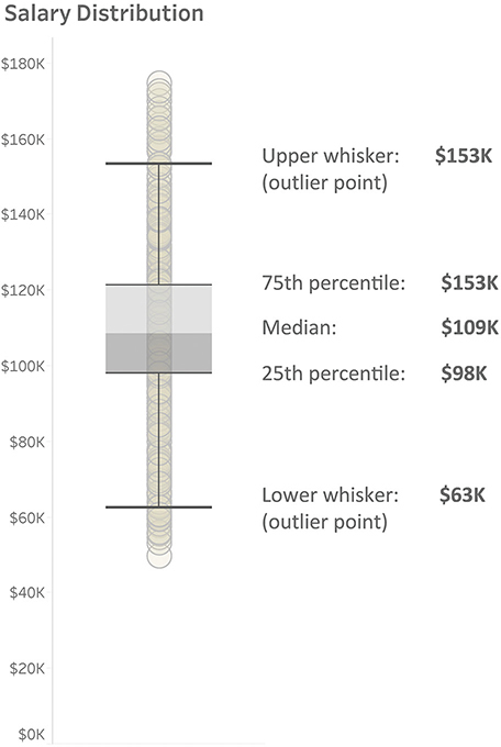
FIGURE 4.24 Salary for each employee as a strip plot with a box and whisker plot superimposed.
The box portion shows quartiles. The point where the boxes connect is the median (fiftieth percentile), the upper part of the box is the seventy-fifth percentile, and the lower portion is the twenty-fifth percentile. The whisker at each end represents a demarcation point; any dots beyond them are considered outliers.*
I’m not a fan of box and whisker plots, and most of my audience does not understand how to read them. I prefer showing the distribution using lines and shaded areas (Figure 4.25).

FIGURE 4.25 A strip plot with lines and shaded areas showing quartiles.
Actually, my first choice would be to show this distribution as a jitterplot.
Jitterplots
Our salary data contains 400 dots, and it’s hard to see all of them in a strip plot because so many are on top of each other. To show this data another way, we can randomly jitter the dots left and right to get a sense of how many dots there are and where they are concentrated (Figure 4.26).
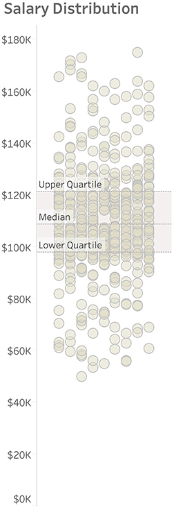
FIGURE 4.26 Salary data presented as a jitterplot.
I’ll admit that upon first seeing this, some people wonder if there’s any difference between a dot that’s toward the left and one that’s toward the right. I need to explain that all I’ve done is take the dots that were in a single vertical strip and moved some of them to the left and some to the right so we can see all the dots. In short, it makes no difference how far left or right a dot lands.
Is seeing the disaggregated data worth the trouble? Again, why not just show summary statistics?
Consider an interactive system in which a person can log in and see her/his performance compared to peers with respect to sales, bugs fixed, support tickets closed, or other metrics.
Let’s look at a salary dashboard where you can see how much you are being paid compared with others in the same industry, job level, and so on. Consider Figure 4.27, where you can see your salary versus the average salary of all your peers.

FIGURE 4.27 Comparing an individual’s salary with the average of all others.
When I show this to workshop attendees, I ask them how angry this makes them. Most say they aren’t really angry as they imagine they may not have as many years of experience or haven’t been with the company as long as others in a similar position. I then show them the exact same information, but with disaggregated data (Figure 4.28).

FIGURE 4.28 The same individual compared with everyone else using disaggregated data.
This is a major eye opener. How would you ever see this with just a spreadsheet? We’re looking at the same information (your salary of $89,349), and we see exactly where you stand with respect to others in the disaggregated example. This reminds me of one of my favorite illustrations from Ben Orlin’s book Math with Bad Drawings (Figure 4.29).
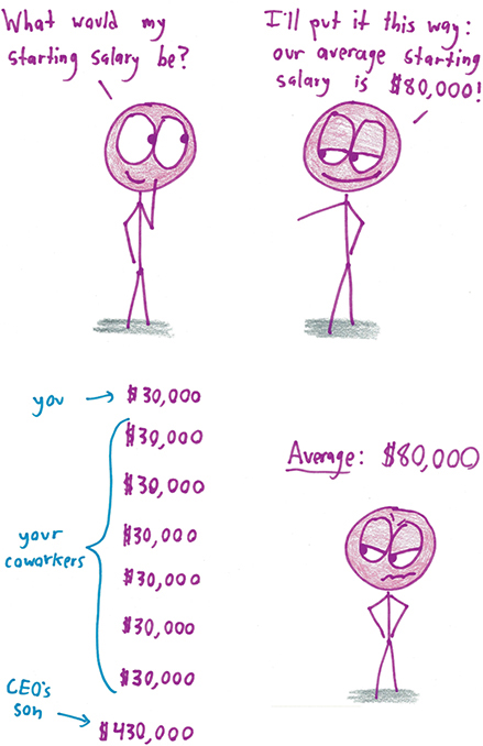
FIGURE 4.29 The problems with summary statistics (in this case, the arithmetic mean or average), as illustrated by Ben Orlin (Illustration by Ben Orlin from Math with Bad Drawings: Illuminating the Ideas that Shape Our Reality by Ben Orlin).
In Figure 4.30 we see another way to present an individual’s salary compared with others’ using a Wilkinson dot plot (also called a unit histogram).

FIGURE 4.30 Salary data presented using a Wilkinson dot plot.
Many of my clients prefer this approach to the jitterplot because they get a better sense of how the measure (in this case, salary) is distributed.
What Happens if There Are Many More Dots?
I admit that this approach (“here’s what interests you, and here it is with respect to everyone else”) doesn’t scale if you have thousands, let alone, millions of dots. Fans of Douglas Adams’s The Hitchhiker’s Guide to the Galaxy may recall the Total Perspective Vortex. It was a torture device designed to show how insignificant an individual is with respect to the vastness of all time and space. Putting the torture aside, one way to address this problem of scale is first to compare a group you are in with other groups, and then show where you are within your respective group.
I like both the jitterplot and the Wilkinson dot plot and, depending on the situation, would work with my stakeholders to decide which one better serves the intended audience.
We’ll look into the power of comparing an individual data point with a larger data set in Chapter 5.
Stacked Bar Charts and Area Charts
When used properly, stacked bar charts and area charts can be great to show both an overall comparison as well as a part-to-whole comparison, but it’s important to be careful with them.
Consider the image shown in Figure 4.31, where visualization designer Matt Chambers compares the number of punches thrown in the Floyd Mayweather Jr.–Conor McGregor heavyweight prizefight in 2017.
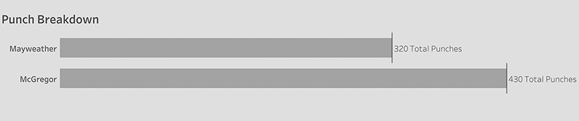
FIGURE 4.31 A comparison of overall punches thrown in a 2017 heavyweight prize fight (Matt Chambers).
Goodness, McGregor threw so many more punches. He must have won.
Now let’s see what happens if instead of just showing the total punches thrown, we also compare the punches that landed (Figure 4.32).

FIGURE 4.32 Punches landed versus punches thrown (Matt Chambers).
Now, it’s very easy for me to make the comparisons and get a good idea of why Mayweather won the fight. Look at how many more punches McGregor threw than Mayweather (430 versus 320). That must have been exhausting for McGregor. And look at how many more of Mayweather’s punches actually landed (170 versus 111). You can also see that Mayweather landed more than half of his punches, while McGregor landed only about one-quarter. I think this is a great stacked bar chart.
Where Stacked Bar Charts Fail
You may recall my earlier discussion about trying to compare the length of floating bars (see Chapter 2, Figure 2.14). I mentioned that chart designers inadvertently ask you to make difficult comparisons when they present their audience with stacked bar charts that have more than two categories.
Consider the dashboard shown in Figure 4.33.

FIGURE 4.33 A sales dashboard with a stacked bar chart and an area chart.
I often see stacked bar charts (and their cousin, the stacked area chart) in marketing materials for many of the major data visualization tool vendors. Maybe it’s because they look cool, but cool and useful are two different things. We need to remember that we want to play into what people do well (comparing bar length from a common baseline) and avoid what they’re not good at, (comparing those inner bars).
Here’s the problem: try to compare the length of segments that aren’t hugging the baseline (Figure 4.34). For example, are sales for Storage in the East bigger or smaller than Machines in the East (the third and sixth bars)? What about sales for Binders versus Copiers (the fifth and eighth bars)?
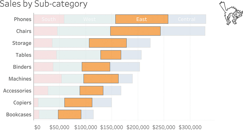
FIGURE 4.34 It’s difficult to compare the lengths of bars that don’t have a common baseline.
There are elements of this stacked bar chart that are useful; for example, it’s easy to compare the overall sales, as we see in Figure 4.35.
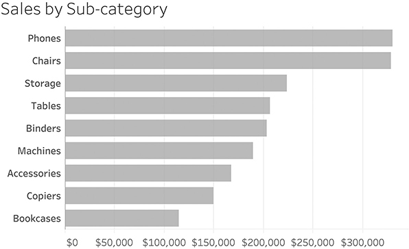
FIGURE 4.35 Comparing the overall sales; we’re not taking region into account.
Highlighting the South region is also useful because we can easily make comparisons across the sub-categories and gauge the part-to-whole ratio within a category (Figure 4.36).

FIGURE 4.36 Highlighting one region (the one along the baseline) and comparing it with the sub-category’s overall sales.
It’s easy to see that the sales for the South region for Phones (the top red bar) is about the same as the sales in the South for Machines (the sixth red bar). We can also see that the South region doesn’t account for much of the sales across any of the sub-categories with the exception of Machines, where it accounts for about one-quarter of total sales.
Note that we are sorting the sub-categories from overall highest to overall lowest. Since we are focusing on the South, maybe it would be easier to understand the data if we sorted from highest to lowest within that region (Figure 4.37).

FIGURE 4.37 Sorting from highest to lowest based on sales in the South region. An interactive dashboard would allow you to sort the bars.
How Do We “Un-scaredy-cat-ify” the Main Visualization?
These last few visualizations have been very useful in showing that we can compare whatever category is hugging the baseline as well as the overall sales. Is there a way to change what is at the baseline and compare that? Yes! Many modern data visualization tools allow the audience to change the featured region (Figure 4.38). This is a huge argument for offering your audience interactivity (more in Chapter 7).
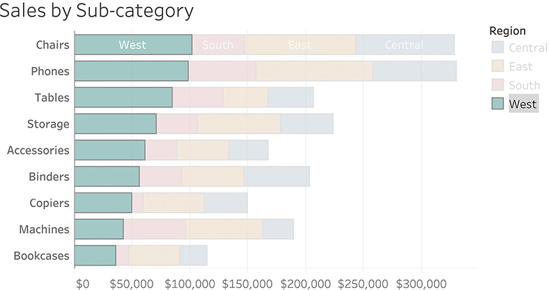
FIGURE 4.38 A dashboard that makes it easy to focus on any region. Here the West is selected.
By allowing your audience to focus on the overall sales and one region at a time, we can turn a “scaredy-cat” into a truly useful visualization.
Understanding Area Charts
What is an area chart? It’s a version of a stacked bar chart in which you show measures over time and connect time periods, much like a line chart. Let’s start with a stacked bar chart and turn it into an area chart.
Figure 4.39 shows how we might track sales over time by region, using a bar chart.

FIGURE 4.39 Stacked bar chart showing sales trends by year.
Figure 4.40 shows the same data as an area chart.

FIGURE 4.40 Area chart showing sales by region over time.
The area chart suffers from the same problem as stacked bar charts: you can easily compare the overall amounts and whatever is along the baseline, but you can’t compare any of the other segments. There’s an interesting fact about the Central region that is not apparent, unless it’s shown along the baseline (Figure 4.41).
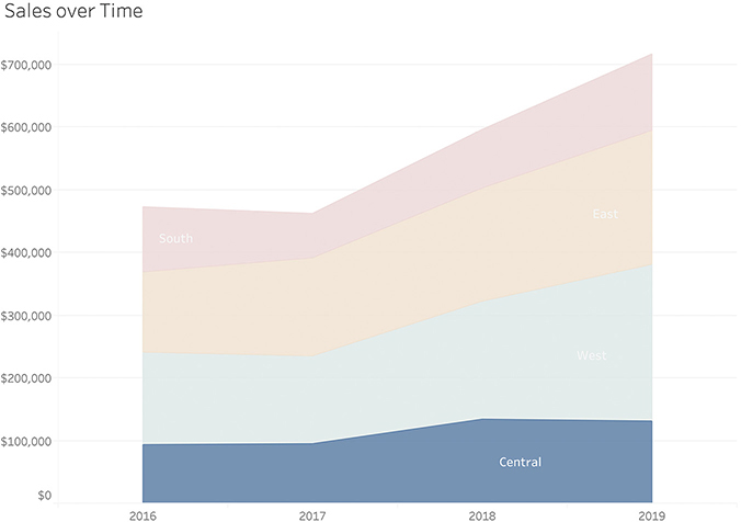
FIGURE 4.41 Changing order of regions reveals something interesting about the Central region.
Central is the only region that saw a decrease between 2018 and 2019, but we can only discern that easily if Central is displayed along the baseline.
Line Charts and Other Ways to Visualize Time
The line chart is the go-to chart for showing trends over time. Consider the example in Figure 4.42, where we see sales trends over a 12-month period.
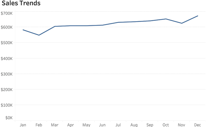
FIGURE 4.42 A line chart showing sales trends over a 12-month period.
If you are like me, you can see that, for the most part, sales appear to be increasing, with the exception of February and November when there were dips.
Why a line chart? We could certainly use a bar chart (Figure 4.43), but I don’t think it is as easy to see the dips, plus the continuous nature of the dates is lost. The line shows the flow of one month into the next. This is probably why, going back to the eighteenth century, the world settled on this type of chart to show trends over time.*

FIGURE 4.43 A bar chart showing the same sales trends.
The bar chart does have one big advantage over the line chart: we can flip it 90 degrees and still read it. Look what happens when we flip the line chart by 90 degrees (Figure 4.44).

FIGURE 4.44 Timeline flipped 90 degrees.
Yikes! The chart that was so easy to read when oriented left to right is very difficult to interpret when it goes from top down. Why is that?
People in most cultures, even those that read from right to left or from top down, have learned to look at time as going from left to right in equally spaced increments, with dinosaurs all the way to the left and Star Trek a bit to the right. That said, I encourage you to get used to seeing the timeline on its side, as mobile devices and scrolling are already starting to shift how people view time (Figure 4.45).

FIGURE 4.45 A vertical timeline with a scroll bar displayed on a mobile phone.
I also want people to be familiar with ways of visualizing time that don’t simply go from oldest to newest, as there are insights you will miss if you look at time only chronologically.
Consider sales data showing trends over a four-year period (Figure 4.46).
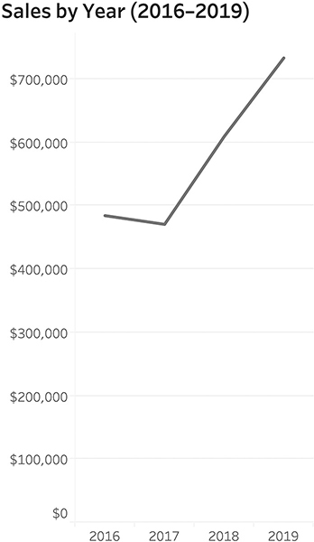
FIGURE 4.46 Sales by year, 2016–2019.
Suppose you wanted to know in which months sales were particularly good. Let’s see what happens if we look at the same four-year period but show monthly data (Figure 4.47).

FIGURE 4.47 Sales by month over a four-year period.
Can you tell in which months sales were good? Not month and year, but over the four-year period, are there particular months that are good and those that are bad? If you can answer this question, you have skills few people have, as it’s hard to group the same months together because they are separated by different years. Suppose, instead, we combined the results for each month (e.g., all the January results, February results, etc.), and show the totals by month for all four years (Figure 4.48)?
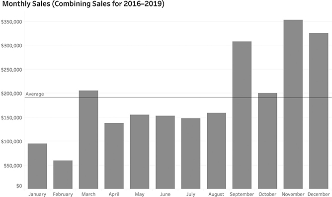
FIGURE 4.48 Group sales for all four years into each month to see which months have the best sales.
Now the question is very easy to answer: November is the best month and February is the worst month. But was that always the case? Maybe there was just one year in which November had amazing sales. We can determine this by taking the same number of data points as we had in the noisy chart in Figure 4.47 and changing the order of how we group things. That is, instead of starting with year and breaking it down by each month, we start with the month and break it down for each year, as in Figure 4.49.

FIGURE 4.49 Sales by month, broken down by year.
November was always a good month for sales, but particularly in 2019. This is much easier to understand than the traditional approach to displaying dates (year then month, going from old to new).
You may use the same technique to see on which day of the week you have the greatest sales. Figure 4.50 shows the same data, broken down by year and then day.

FIGURE 4.50 Sales by day over a four-year period. Unless you have an a very fine eye for this, there’s little signal and lots of noise.
Yes, it it’s easy to see when we had some terrific sales, but it’s impossible to determine on which day of the week, overall, sales are good or bad. Contrast that with the approach in Figure 4.51, which shows sales by day of the week and year.
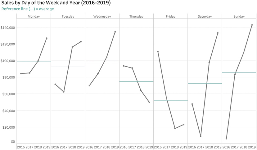
FIGURE 4.51 Sales by day of the week broken down by year.
Look at how many questions this chart answers. Better than that, look at how many questions it poses (e.g., Why did sales drop so much on Thursday and Friday? Why the huge increase in sales the past two years for Saturday and Sunday?) You can’t see any of that with the more traditional approach (Figure 4.50).
Index Charts
“How are we doing this quarter compared to last quarter and compared to a year ago this quarter?” Goodness, if I had an actual quarter for every time this type of analysis has come up in my career. This seems like an easy question, but maybe we’re only halfway into the current quarter. How do you compare something that is only half-finished with something that happened previously and is completed? Consider the typical timeline view in Figure 4.52.

FIGURE 4.52 Line chart showing sales by date over a two-year period, highlighting selected quarters.
There’s a really big spike early in the most recent quarter, but we want to know cumulative sales, so instead of showing sales per day let’s try a running sum of sales for the quarter (Figure 4.53).
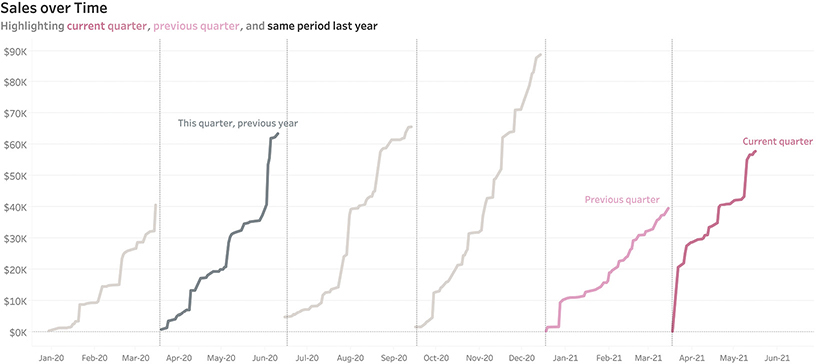
FIGURE 4.53 A line chart showing cumulative sales by date over a two-year period and highlighting selected quarters.
We can see that sales for the previous quarter weren’t that good, but it’s still hard to compare the different quarters because they’re spaced out by older dates to newer dates. Suppose, instead, we aligned them all to start at the same point: the first week in any given quarter. We can do this using an index chart (Figure 4.54).

FIGURE 4.54 An index chart allows us to compare events that started at different times by imagining they all started at the same point.
Instead of dates along the x-axis, we see week numbers. Here we’re comparing 22 quarters of data. Note that there were no sales on Week 1 of the previous quarter. And we can see that even though we’re only 10 weeks into the current quarter, it is on track to be one of the best quarters ever.
The index chart went mainstream during the coronavirus pandemic as people needed to be able to compare how their country (or state or city) was faring compared to other locales. In Figure 4.55 we see an index chart from the Financial Times that allows us to compare Covid-19 cases in different countries, even though the pandemic broke out at different times during the year.
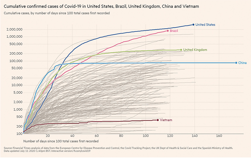
FIGURE 4.55 A Financial Times index chart comparing cumulative confirmed cases of Covid-19 from a common starting point of days since 100 total cases were first recorded, as of July 11, 2020. (Financial Times/FT.com, July 11, 2020. Used under license from the Financial Times. All rights reserved. See BigPic.me/ftcharts for an interactive version.)
The line for China is longer than all the other lines because the first cases were recorded there weeks before Covid-19 appeared in other countries. If you look carefully, you will also notice that the y-axis is using a logarithmic scale and not a linear scale. This logarithmic scale increases in powers of 10. If you are curious about why these jumps are so useful for this data, see the video at BigPic.me/logscales.
Let’s Take a Break and Let You Try
Armed with what you’ve seen so far, let’s see how you would do visualizing a simple data set. Consider the data in Figure 4.56, which shows the market share for Pizza Hut and Domino’s over a 10-year period.

FIGURE 4.56 A text table showing market share over time.
I encourage you to take a piece of paper and two different colored pens, and try to come up with a way to display the data. Don’t worry about making it accurate or neatly drawn. Just take a stab at something that would help you and others see and understand the data.
There are many different ways you can present this data clearly. Let’s look at some of them, including how the Wall Street Journal presented it in an article, a facsimile of which is shown in Figure 4.57.
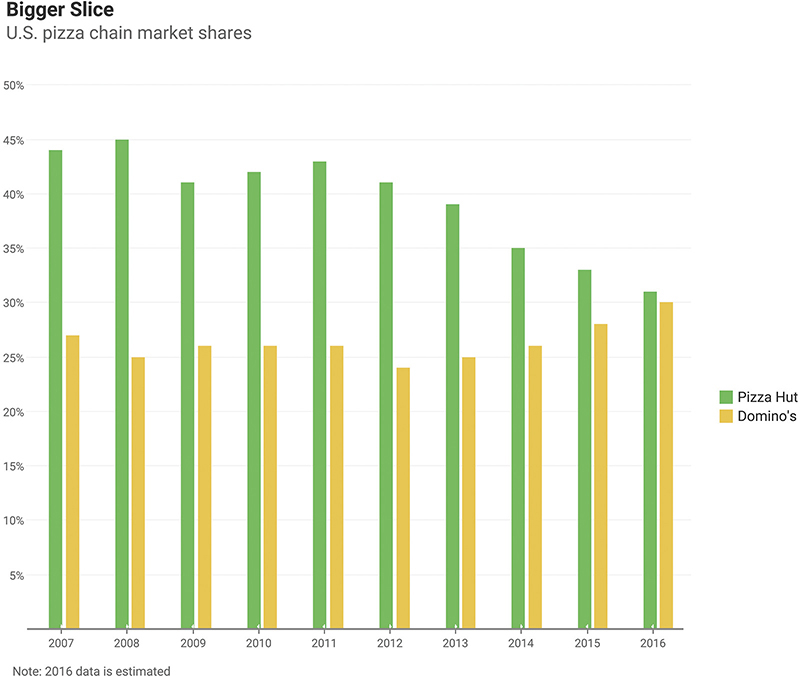
FIGURE 4.57 A paired bar chart showing market share over time (data from Restaurant Research via Hedgeye).
I remember when I saw this, I thought, “Why these colors?” and “Would I have presented the data differently?” You may recall that I’m not a big fan of the paired bar chart because it takes up a lot of room and is dense, but it is analytically sound, so I have no quarrel if this is how you would want to present it. By the way, I don’t have an answer about the colors, as they don’t appear to be in the official color palette of either company.
Let’s look at some different approaches that workshop attendees have developed for this data.
Bar-in-Bar Charts
Figure 4.58 shows the data rendered using a bar-in-bar chart.

FIGURE 4.58 A bar-in-bar chart showing market share over time (data from Restaurant Research via Hedgeye).
The pushback I’ve gotten from clients and colleagues is that we’re giving more heft to the wider bar and may be tipping the scales unfairly toward Pizza Hut. The bars aren’t just taller; they are also wider.
Vertical Gap Chart
Figure 4.59 presents the same data rendered using a gap chart, which you’ll remember can also be called a connected dot plot or a barbell chart.

FIGURE 4.59 A gap chart showing market share over time (data from Restaurant Research via Hedgeye).
Line Chart
Figure 4.60 shows the same data rendered as a line chart.

FIGURE 4.60 A line chart showing market share over time (data from Restaurant Research via Hedgeye).
Line Chart with Shading
Figure 4.61 presents the same data rendered as a line chart/area chart hybrid where the gap between the two lines is shaded.*
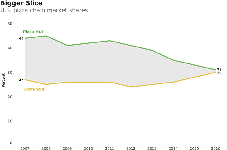
FIGURE 4.61 A line chart/area chart hybrid showing market share over time, accentuating the gap (data from Restaurant Research via Hedgeye).
Divergent Bar Chart
Figure 4.62 shows another way to render the data that I don’t think is OK. There’s nothing inherently wrong with a divergent stacked bar chart (they are particularly useful for survey data), but here it only allows me to compare the brand against itself because there’s no common baseline for both Pizza Hut and Domino’s. That is, I can see that 2008 was the best year for Pizza Hut and 2016 was the best year for Domino’s, but I can’t compare values for Pizza Hut and Domino’s.
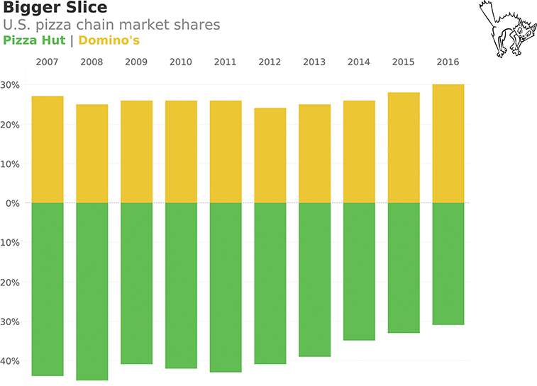
FIGURE 4.62 A divergent stacked bar chart that makes it hard to compare market share over time (data from Restaurant Research via Hedgeye).
And the Winner Is . . .
The winner, in my opinion, is a slopegraph (Figure 4.63).

FIGURE 4.63 A slopegraph showing the starting and ending periods only (data from Restaurant Research via Hedgeye).
Here we show only the beginning and ending periods and skip the years in between. Yes, that’s a judgment call, but given that there were no spikes or dips in the years in between, I think focusing on the start and finish makes a lot of sense.
Here’s another take on the data that shows the other players in the pizza chain market (Figure 4.64).
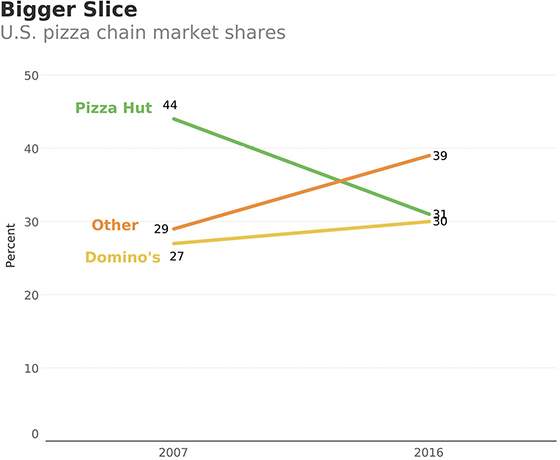
FIGURE 4.64 A slopegraph showing the starting and ending periods only. Here we add Other into the mix (data from Restaurant Research via Hedgeye).
I can’t take credit for this. When I created the assignment, I focused on the data from the Wall Street Journal. It was a workshop attendee, EJ Wojtowicz, who suggested that we were missing a very important insight: all the other brands combined are eating into Pizza Hut and Domino’s market share.
This is yet another reason why I encourage workshop attendees to speak up and disagree with me. Good things happen when you have discussions about the data. The decisions about what data to include and what not to include are essential. We will discuss this more in Chapter 6.
Is It Ever OK NOT to Have the Value Axis Start at Zero?
Why do I (and many of my colleagues) think the charts in Figure 4.65 and Figure 4.66 are misleading?

FIGURE 4.65 A misleading bar chart from a major news network in which the value axis does not start at zero (data from the U.S. Census Bureau, 2011; graphic reenactment by Randy Krum).

FIGURE 4.66 A misleading bar chart from a major news network in which the value axis does not start at zero (data from the U.S. Congressional Budget Office; graphic reenactment by Randy Krum).
But the charts in Figure 4.67 and Figure 4.68, which also truncate the value axis (meaning it doesn’t start at zero), are fine. Let’s look a little more closely to figure out why.
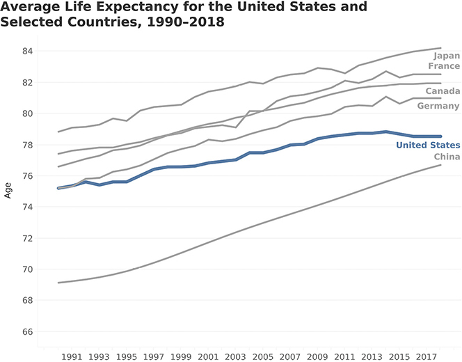
FIGURE 4.67 An honest line chart in which the value axis does not start at zero (data from the World Bank).
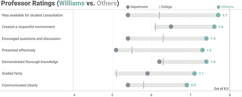
FIGURE 4.68 An honest connected dot plot comparing ratings for Professor Williams (teal) to other professors in the same department (dark gray) and to the college average (light gray line). Notice that the value axis begins at 4. (Based on Jeffrey A. Shaffer’s Course Metrics dashboard from The Big Book of Dashboards.)
Continuing our analysis, why is the chart in Figure 4.69, which has the axis starting at zero, considered deceptive?

FIGURE 4.69 An intentionally misleading line graph that minimizes temperature fluctuations and also uses a value axis that starts at zero (data from NOAA National Centers for Environmental Information).
So why is the line chart in Figure 4.70 considered honest?

FIGURE 4.70 An honest chart that correctly accentuates the temperature fluctuations (data from NOAA National Centers for Environmental Information).
It might look like I’m cherry-picking based on my personal preferences and worldview, but there is good reasoning behind when it’s OK and when it is not OK to truncate the axis—and you absolutely should know and understand it.
Let me explain why I think accentuating the temperature fluctuations is warranted, but instead of using global warming, let’s consider another example. Suppose you want to monitor the temperature of little Billy, who is four years old. Billy lives in Europe, so we’ll use the Celsius scale on which a normal temperature would be 37 degrees (98.6 F) and a high temperature would be 39.4 (103 F). If you start the value axis at zero, the chart looks like Figure 4.71.
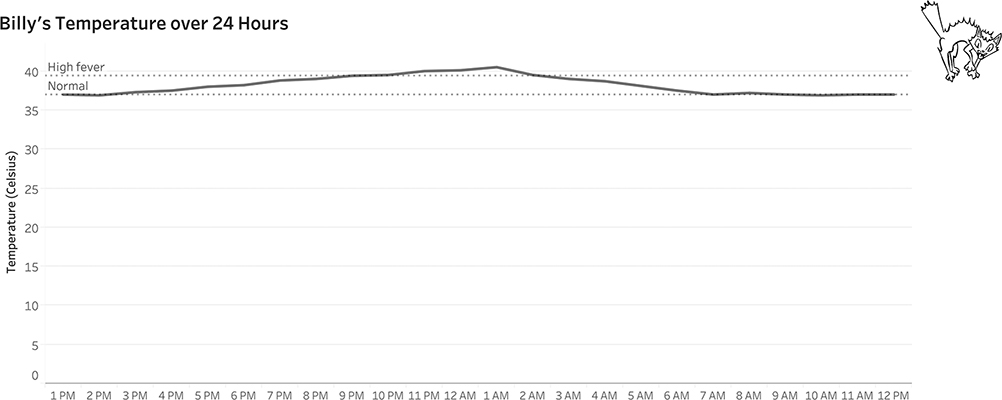
FIGURE 4.71 A line chart showing Billy’s temperature over a 24-hour period using a 0 baseline.
Why start at zero? What does that have to do with a person’s temperature? Figure 4.72 shows the same chart type starting at 35 degrees Celsius (95 F, which would indicate hypothermia), a much more logical baseline for this type of data.

FIGURE 4.72 A line chart showing Billy’s temperature over a 24-hour period using a more logical baseline. Note that Billy made a full recovery.
To tie in with some of our discussions of color and preattentive attributes, I would probably indicate the period when Billy’s temperature was very high using color as shown in Figure 4.73.
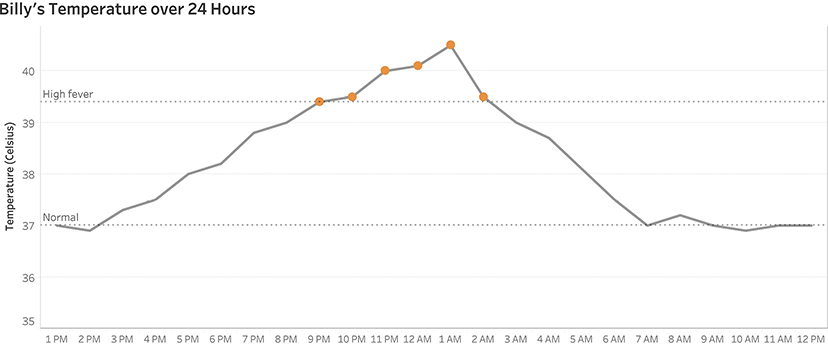
FIGURE 4.73 A line chart showing Billy’s temperature over a 24-hour period using a logical baseline and color-coding the points when he had a high fever.
This same logic applies to the dot plot in Figure 4.68 where we saw the professor ratings for Professor Williams. No professor had a score below 4, and there’s a big difference between a professor who has a 5.0 rating and one who has a 7.5 rating. The professor ratings dashboard accentuates these important differences, but a chart that had a value axis starting at zero would not.
Another important thing to consider: these are not bar charts!
It is never OK to have a bar chart not start at zero. Why? The consensus among data visualization experts is that with a bar chart, you are asking the audience to compare the lengths of the bars. This means they are predisposed to see that, for example, one bar is three times as big as another. Even if they notice the truncated axis, it’s hard for them to shake their initial interpretation. With a dot plot or a line graph, you are asking people to compare the distance between the dots. Instead of just looking at the locations of the dots, they’re more likely to think, “Look how big that gap is.”
Sometimes, truncating the axis is warranted because it helps accentuate important differences, but other times it’s done to bamboozle you (e.g., “Look how much sales have increased since last year!”). How can you tell the difference?
If you see a bar chart where the value axis does not start at zero your BS detector should be sounding an alarm. Consider this seemingly innocuous bar chart, which appears to show a really big increase in sales (Figure 4.74).

FIGURE 4.74 A misleading bar chart with a y-axis not starting at zero suggests sales have increased more than they really have.
Let’s take away the numbers and just focus on the bars (Figure 4.75).

FIGURE 4.75 A misleading bar chart, with a focus on just the bars.
Just looking at the bars, the one for 2017 looks to be about twice as tall as the one for 2016. This is likely to be interpreted as meaning that sales doubled in 2017. Figure 4.76 shows the sales comparison using a value axis that starts at zero. This reveals that the sales increase was much more modest.

FIGURE 4.76 An honest bar chart with the y-axis starting at zero.
A word of caution: this doesn’t mean that any dot plot, comet chart, or a line chart with a truncated axis will always be honest. Figures 4.77 and Figure 4.78 show how you can mislead people by overamplifying the difference between the two years.
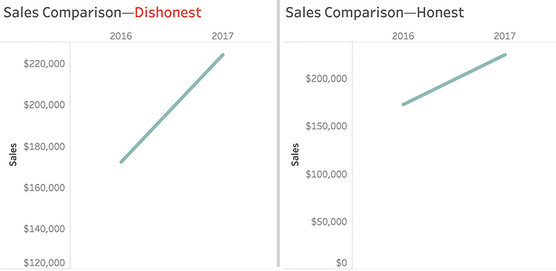
FIGURE 4.77 Comparing honest versus dishonest line charts.
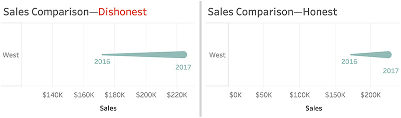
FIGURE 4.78 Comparing honest versus dishonest comet charts.
Perhaps you’re asking, “Is there a rule we can follow?” I’m wary of establishing rules, as there are often reasonable exceptions. Instead, here are my guidelines:
• Truncating the value axis with a bar chart is almost always misleading.
• Truncating the value axis with a dot plot or line chart may be misleading.
• Truncating the value axis may be essential.
Look carefully. If you determine that you have, in fact, been hoodwinked, please push back on the person or people who created the chart. It may have been an honest mistake. Or they may prove to be an untrustworthy source of information.
More “Axistential” Angst
In fashioning the jitterplot salary example earlier in this chapter, I grappled with whether I should start the value axis at zero or at $50,000, the lowest value in the data set (Figure 4.79).
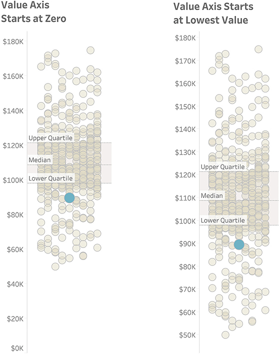
FIGURE 4.79 To truncate the axis or not to truncate the axis? That is the question.
I elected to leave the axis at zero, but would it have been deceptive to start at $50, 000? What do you think?
(I think it would have been OK.)
MAPS
In Chapter 3 we saw some examples of filled maps and how they could help us compare life expectancy in different countries in Asia. There are many other types of maps with which people should be familiar, especially since filled maps (also called choropleth maps) often don’t work well for comparing measures that are not related to the size of land area.
We will explore several of these map types, but first, let’s see why filled maps can cause problems.
Filled Maps
When I show people the map in Figure 4.80 and ask them to guess what it is about, practically everyone answers that it shows election results, with the red representing Republican areas and the blue Democratic locations. They then state that because there’s so much more red than blue, this probably shows results from the 2016 election, in which Donald Trump defeated Hillary Clinton.

FIGURE 4.80 A filled county map showing the 2012 presidential election results for 48 of the 50 U.S. states. Alaska and Hawaii are not shown. Does the year surprise you? (Kelvinsong, Wikimedia Commons.)
I then say that this is a county map showing the 2012 election in which Barack Obama (blue) defeated Mitt Romney (red). “How can that be?” they wonder. “There’s so much more red than blue.”
I then show them the same election results, but by state rather than county (Figure 4.81).
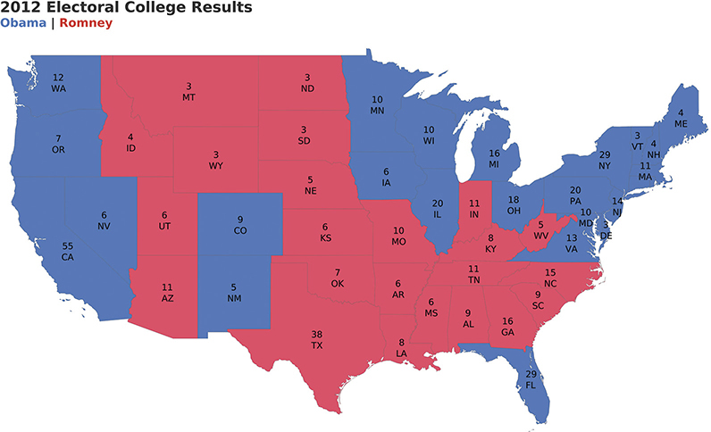
FIGURE 4.81 A filled state map showing the 2012 presidential election results for 48 of the 50 U.S. states. Alaska and Hawaii are not shown.
It still looks like there is more red than blue, and if we added Alaska to the mix, there would be way more red than blue because Alaska is huge.
So why doesn’t this work?
Maps are great for showing how much land there is, how that land is shaped, and the proximity of one location to another. It’s not great at representing population, and the electoral college (the delegates that select the president) are a reflection of each state’s population. For example, Montana has more land than California, but it has about 1 million people compared with California, which has about 37 million.*
Despite its popularity with news organizations, a filled map is not a great way to relate electoral college results. What might work better?
Symbol Maps
Drawing circles on a map worked well in the mystery map example we saw in Chapter 2 (Figure 2.13). Maybe that would work here, too (Figure 4.82).
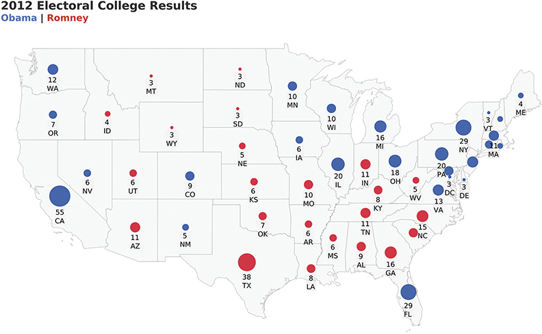
FIGURE 4.82 A symbol map showing presidential election results for 48 of the 50 U.S. states.
With a symbol map, workshop attendees report that they see more blue than red (and have an appreciation for the population of California when compared to that of Montana and Wyoming), but they still feel like it’s a difficult comparison. What else might work?
Cartogram
A cartogram is a type of diagram in which we substitute land and distance with some other measure. Here’s one attempt that uses a gridded cartogram/hexagram (Figure 4.83).
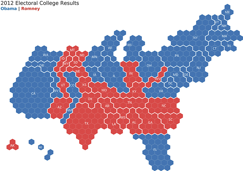
FIGURE 4.83 Electoral results from 2012 presented using a gridded cartogram/hexagram in which each hexagon represents an electoral vote (Ken Flerlage).
There are many more examples that work considerably better than the traditional symbol map and filled map. This begs the question: when do you need a real map, and when might a cartogram or other type of map work?
If you want to visualize anything having to do with land or distance, then a traditional map is the way to go. Otherwise, a cartogram or tile map may be a better way to go.
Here’s a standard filled map showing the popularity of the most visited state park in each state in the continental U.S. between 2006 and 2016 (Figure 4.84).

FIGURE 4.84 The popularity of U.S. national parks by state from 2006 to 2016 shown on a filled (choropleth) map.
You should be able to see that California and North Carolina had the parks that were most popular. But what if you wanted to explore information about Rhode Island (RI), Maryland (MD), the District of Columbia (DC), or Delaware (DE)? Can you even find them? Because they occupy so little land mass, they are so tiny that it’s hard to tell what color they are.*
Tile Maps
We could instead present the same data using a hexagon tile map (Figure 4.85).
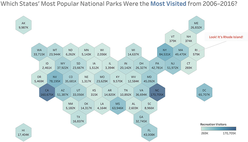
FIGURE 4.85 The popularity of U.S. national parks by state from 2006 to 2016 using a hexagon tile map.
Assuming you have a rough familiarity with the geography of the United States, it should be easy to find a particular state. Thanks to its compact form, this approach also makes it easier to include Hawaii and Alaska.
This tile map also allows us to display additional information that would be impossible to encode on a filled map. In this case, we’ve included the total number of visitors to each state’s most popular park. Figure 4.86 is Matt Chambers’s rendition of that same data. As you can see, Chambers has placed a timeline within each tile to show how attendance within each state’s most popular park had changed from 2006 through 2016.
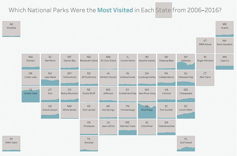
FIGURE 4.86 The popularity of U.S. national parks by state over time, embedding an area chart within a tile map (data from the U.S. National Park Service, chart created by Matt Chambers, https://twitter.com/sirvizalot).
Do Tile Maps Work for Other Parts of the World?
Tile maps work for more than just the United States (although they fail for many European countries). Figure 4.87, published by the nonprofit organization ONE in 2017, combines a tile map with another chart type. We haven’t yet defined this second chart type, but study it for a minute or two and stretch your graphicacy skills.
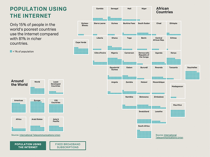
FIGURE 4.87 Percentage of population in different countries who have access to the internet (data from International Telecommunications Union, chart from ONE.org).
Were you able to surmise that each turquoise square represents 1 percent of the population of the corresponding tile’s country? If so, you are really coming along nicely. If not, no worries; we’ll explore it together now.
This tile map is combined with a type of waffle chart. In this case, each tile contains a series of 10 by 10, dividing it into 100 small squares. For each small square that is filled in, 1 percent of the population of that country has access to the internet. While it’s not as easy to make exact comparisons as in a bar chart, it works well here, where one large square demarks one country. You can get a rough sense of internet penetration by how many small squares each large square contains.
Treemaps
How else might we show the 2012 election results? Just because you have geographic data doesn’t mean you must create a map. Figure 4.88 uses a treemap.
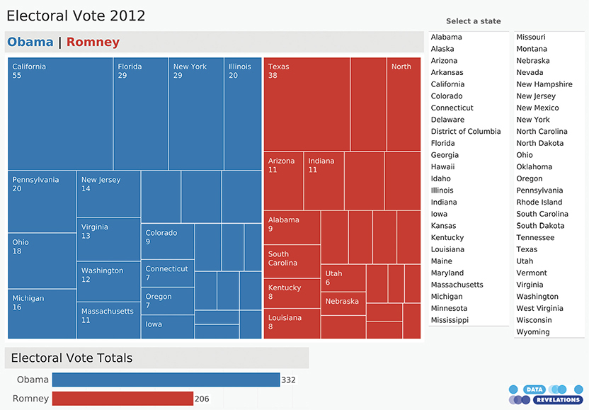
FIGURE 4.88 A dashboard featuring a treemap of the 2012 election results (Data Revelations).
The treemap is a creation of professor and computer scientist Ben Shneiderman.* It’s great for seeing the big picture when you have a lot of hierarchical data and two or more subcategories. Here we have two categories that make up the hierarchy (Obama and Romney) and lots of sub-categories (the states).
There’s also a bar chart that shows the overall electoral tally of 332 versus 206.
You may notice that some of the rectangles in the treemap are very small, so you cannot make out the state and the number of electoral votes. This chart is part of an interactive dashboard, so you can select any state from the list on the right and see just how much that state contributes to the whole (Figure 4.89).
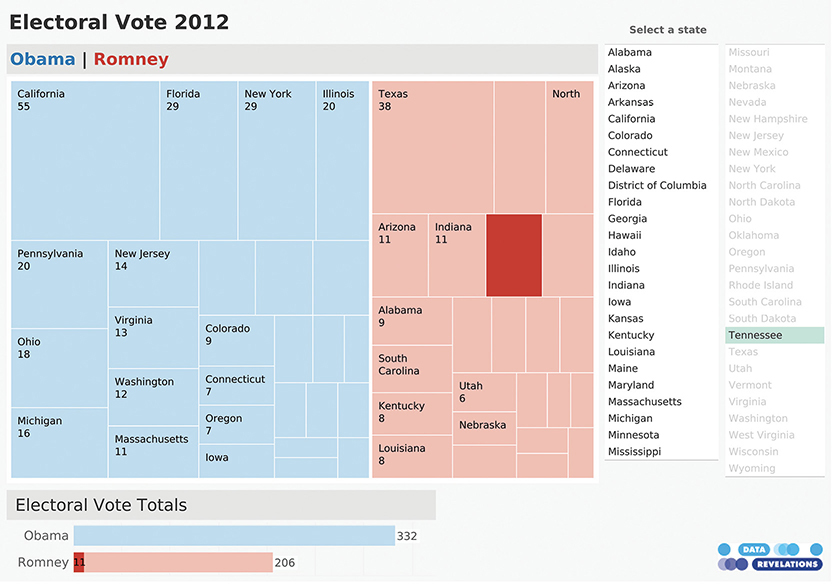
FIGURE 4.89 Interactivity allows you to select a state and see that state’s impact on the election results (Data Revelations).
PIE CHARTS
Without question, the pie chart (and its cousin, the donut chart) are the most reviled by data visualization cognoscenti. You may be thinking, “Wait, why don’t people like pie charts? I understand them without an explanation. What’s the problem?”
The problem is that a pie chart does one thing well, and most people don’t use it for that one thing. Specifically, they’re great at giving you a fast and accurate estimate of the part-to-whole relationship for two of the slices. Other than that, pie charts are terrible.
And don’t even think about comparing two pie charts side by side.
Let’s explore this.
Consider the pie chart in Figure 4.90.
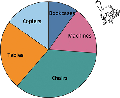
FIGURE 4.90 A pie chart divided into five segments.
Some questions are easy to answer; for example, “Which slice is the largest?” Chairs. But lots of other questions are difficult, including ranking the slices or trying to figure out how much larger one slice is than another (more on that in a moment).
The one thing that pies are supposed to do well only works if the slice is in a certain location. Let’s focus on Tables. Looking at Figure 4.91, can you figure out how large a percentage of the whole it takes up?
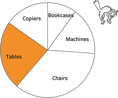
FIGURE 4.91 A pie chart comparing Tables with everything else.
It’s not so easy, but if we move that slice so it starts “at midnight” (Figure 4.92), we can see that it’s just under one-quarter (23 percent to be exact).

FIGURE 4.92 A pie chart comparing Tables with everything else, where the segment of interest, if you were to imagine a clock, starts at midnight.
If we try the same thing for Chairs, we can see with little effort that this slice takes up about one-third of the total (Figure 4.93).
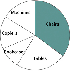
FIGURE 4.93 A pie chart comparing Chairs with everything else, where the segment of interest, if you were to imagine a clock, starts at midnight.
Think back to the stacked bar charts we explored earlier in the chapter. For those, we could compare things only if they shared a common baseline. (Notice that I intentionally have not placed any numbers in the pie or bar charts so you can better gauge the strength of the visualization itself to help you make comparisons.)
When each segment starts at midnight, we can quickly see if something is one-quarter, one-third, and so on. That is why these brilliant measuring cups (Figure 4.94) can be read in an instant.

FIGURE 4.94 Measuring cups from Welcome Industries LLC.
Another problem with pie charts is that it’s very hard to see how much larger one segment is than another. Look at Figure 4.95 and see if you can determine which is larger, Copiers or Machines.
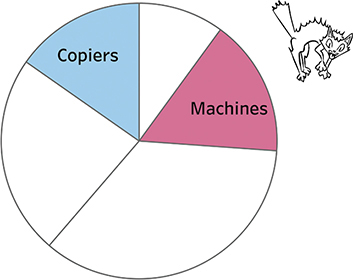
FIGURE 4.95 Trying to compare two slices that are of similar size using a pie chart is difficult.
Now compare the pie chart with a bar chart showing the same data (Figure 4.96).

FIGURE 4.96 A bar chart comparing the same five categories.
It’s easy to see that the bar for Machines is longer than the one for Copiers. We can also see that the bar for Chairs is about twice as long as the one for Machines.
Even so, the bars make it difficult to determine what percentage of the total any single segment represents. (It’s no easier if you add several segments together.)
This is why I like to combine bar charts and pie charts, so they can answer questions related to “Which is larger, and by how much?” and the “What is the part to the whole?” Consider the bar chart in Figure 4.97, which shows sales in 30 different states.
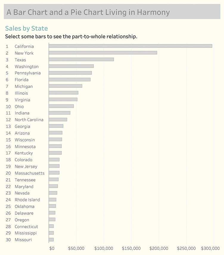
FIGURE 4.97 A sorted bar chart showing sales in 30 states.
Using an interactive dashboard, if we select California, the state with the highest sales, we can quickly see that it accounts for a little under 25 percent of sales (Figure 4.98).

FIGURE 4.98 Selecting a state displays a pie chart showing the part-to-whole relationship.
Selecting several states will further show the part-to-whole relationship in a way that people can immediately see. In Figure 4.99, we see that the seven states account for a little under half of the total sales.
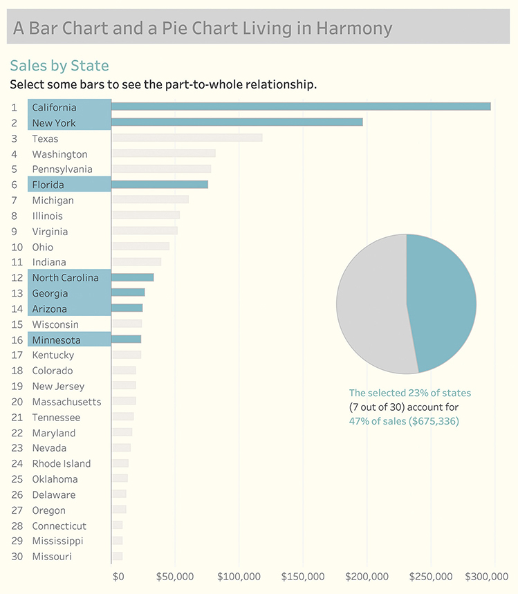
FIGURE 4.99 Selecting several states displays a pie chart showing the part-to-whole relationship.
DONUT CHARTS
The same strengths and shortcomings that apply to the pie chart also apply to the donut chart. Consider Figure 4.100, where we show progress toward a goal (the full donut would represent 100 percent).

FIGURE 4.100 A donut chart showing progress toward a goal for a single segment (South).
This is an easy read. Even without the number in the middle, which is what people seem to love most about donut charts, it’s easy to see that we’re a little less than halfway toward our goal.
What happens if we have more than one region (Figure 4.101)?
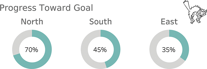
FIGURE 4.101 A donut chart showing progress toward a goal for several regions.
This is a much more difficult comparison, and it would be even harder if the numbers were not in the center of the donut. Recall the recommendation to test the effectiveness of a visualization by removing the numbers. If a chart is difficult to decipher without visible numbers, it may not be that good a visualization.
Now, what would happen if one of the regions exceeded its goal? How do you show more than 100 percent with a donut chart?
The answer is that you can’t, which is why the bar chart with a reference line is a much better choice for this situation (Figure 4.102).

FIGURE 4.102 A bar chart with reference lines showing progress toward a goal for all the regions. Look at North and East. You can see that North is twice as long as East, which you cannot do with side-by-side-by-side donut charts.
Here are four guidelines (iron-clad rule and three recommendations):
1. Iron-clad rule: the slices/segments must add up to 100 percent.
2. If you are going to have a pie or donut chart, make sure it’s just one pie or donut because comparing multiple pie charts is difficult.
3. If you are going to have more than two segments, make sure that the two segments you most care about each start at midnight, with one moving clockwise and the other going counterclockwise. In Figure 4.103 it’s easy to see that Pemrose has a little more than half and Abdala is around one-third because we have that common baseline reference point.
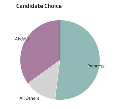
FIGURE 4.103 With a pie chart, only the segments that start at midnight are easy to estimate. The others are much more difficult.
4. Never use 3D (and that goes for bar charts, too).
BEWARE OF “XENOGRAPHPHOBIA”
Several years ago, I got a big kick out of this tweet from Maarten Lambrechts:

Avoid xenographphobia: the fear of unusual graphics/foreign chart types (Maarten Lambrechts via Twitter).
Xenographphobia! What a wonderful neologism meaning fear of unusual graphics.
Why do I bring this up? You should not be afraid to learn how to parse a chart that is unfamiliar. If you are a chart designer, you should not throw your hands up and exclaim, “Oh, our executive team will never understand that chart!”
Is the chart so complex or are the executives so closed-minded that they won’t invest a little bit of time getting up to speed with an approach that may be new but very worthwhile? I’m not talking about novelty for novelty’s sake (or because the designers are tired of making bar and line charts), but something that truly engages and better informs the audience.
I’ll confess that I suffer from this problem as well. The first time I saw what I thought were some unnecessarily esoteric chart types, I thought, “What is this nonsense?” It turns out they weren’t nonsense. It took all of 60 seconds for somebody to explain how the charts worked, and I immediately saw how valuable they were.
So What Should We Do?
For the person creating charts and dashboards, I’ve argued that you should always try to make it as easy as possible for people to understand the data, but you should not go crazy trying to make the perfect dashboard, nor should you oversimplify your visualizations. Simple is good; simplistic is not.
I also argue that while you should understand the skill set and mindset of your audience, you should not be afraid to educate them about new chart types, especially if it’s the type of situation where they’ll learn something once and use it over and over again.
If you are a consumer of the content, I hope you feel the same way. An investment of one minute of your time to understand how to read a chart may lead to hours of engagement and enlightenment.
* See Cleveland, William S. 1984. “Graphical Methods for Data Presentation: Full Scale Breaks, Dot Charts, and Multibased Logging.” The American Statistician, 38:270-280, and “Dot Plots: A Useful Alternative to Bar Charts” by Naomi B. Robbins at https://www.perceptualedge.com/articles/b-eye/dot_plots.pdf.
* In 2015 Pew Research conducted a survey asking people to see if they could correctly choose a statement that described the data presented in a scatterplot. Sixty-three percent correctly interpreted the chart. See https://www.pewresearch.org/fact-tank/2015/09/16/the-art-and-science-of-the-scatterplot/.
* What constitutes an outlier? The person who added the whiskers to the box plot was John Tukey, and he defined it as 1.5 times the interquartile range (1.5 times the difference between the twenty-fifth percentile and seventy-fifth percentile). The box and whisker plot is also called a Tukey plot, but bragging rights to the box plot belong to Mary Eleanor Spear who first proposed the idea of “range bars” in 1952. Maybe we should call it a Spear plot? See https://medium.com/nightingale/credit-where-credit-is-due-mary-eleanor-spear-6a7a1951b8e6.
* In 1753 Jacques Barbeau-Duborg published his Chronographie Universelle, a 54-foot-long chart mounted on an apparatus with cranks that allow the reader to scroll through the history of the world as shown by the births and deaths of every famous person going back to the beginning of creation (thought to be about 4,000 years earlier) through the present day. Many historians consider this ground zero for the regularly spaced x-axis to depict time. A copy of the Chronographie on its scrolling apparatus is part of the Princeton University Library rare book collection. Barbeau-Duborg came up with the idea of presenting the data going left to right in equal increments. It was William Playfair who expanded on this in 1786 and published the first line graphs in his The Commercial and Political Atlas. I got to see and touch both of these works, along with Joseph Priestly’s Chart of History and Chart of Biography in 2019 when I visited Princeton with two of my friends and colleagues, Andy Cotreave and RJ Andrews. Andy wrote about our bucket list visit at BigPic.me/timelines.
* This technique of shading the gap was first employed by William Playfair in 1786. Playfair is credited with inventing the bar, line, area, and pie charts.
* U.S. Census 2010. See https://www.census.gov/quickfacts.
* Anyone who does not live in the United States gets a pass on this one. And if you are wondering about Delaware, and why it’s even harder to find than normal, the data is missing for that state.
* Shneiderman promotes an “information-seeking mantra” which is overview first, zoom and filter, then details-on-demand. In Chapter 9, you’ll see lots of good examples that adhere to this ideal.