5. The Case of the Devilish Details
IN THIS CASE, WE’LL SEE HOW A HARRIED HARRY Terry tarries and finds that the devil indeed is in the details.
The Crime Scene
Renée Lilldeh of FarfallaEffect Design is suffering from an embarrassment of good fortune. A blossoming in business has prompted an expanded office, a move to bigger quarters, and a website redesign. But exhausted by the demands of clients, new-business pitches, employee training, and settling into a new space, she and her staff have handed the initial website development to their newest intern, Harry Terry.
Passionate about design and front-end coding, Harry is eager to impress, but also still a little unsure of his skills. He’s come to the CSS Detective for help with a coding mystery that currently stumps him. Follow along and see if you can spot where Harry’s code went wrong.
Initial snapshots
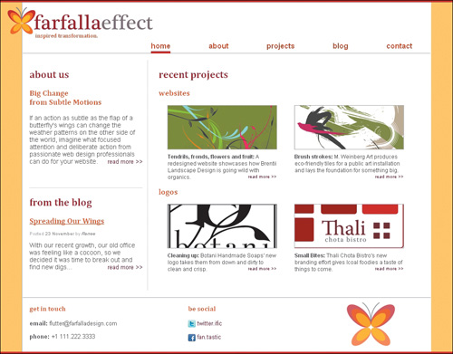
Harry shares the original design comp of the FarfallaEffect home page with us (Figure 5.1).
Figure 5.1. FarfallaEffect’s home-page design comp
However, Harry’s late-night coding endeavors have left him with this (Figure 5.2):
Figure 5.2. Harry’s version of the FarfallaEffect home page

Follow the Evidence
Harry is a closet procrastinator. He waited until the 11th hour to start on the coding, thinking it would be easy, given the simplicity of the design. But the developed page is due this afternoon, and his fatigue from late-night hours and growing anxiety leave him unable to decipher the cause of the problems in the page.
Identifying suspicious characters
I listen carefully to Harry, who, despite his fatigue, is talking a mile a minute, pausing only long enough to burn his mouth with too-hot coffee. The first thing I wonder is whether he has validated the page. As you know, validation is one of the most important tools in our detective toolkit, because it’s so useful for showing the small but important details that one can miss—especially when in a hurry. Validating both markup and CSS should be the first practice in solving any coding mystery.
Mug shots
Harry’s page code seems benign on first glance. He is using an HTML 4.01 strict doctype, and he has the correct syntax for the style tag. But something is askew:
<!DOCTYPE HTML PUBLIC "-//W3C//DTD HTML 4.01//EN" "http://www.w3.org/TR/html4/strict.dtd">
<html>
<head>
<title>FarfallaEffect Design</title>
<meta http-equiv="Content-Type" content="text/html; charset=utf-8">
<style type="text/css">
body {
background-color: #ffcc66;
border-top: 5px solid #C0272D;
border-bottom: 5px solid #C0272D;
color: #444444;
font-family: Arial, "Trebuchet MS", sans-serif;
font-size: 1em;
margin: 0;
padding: 0;
}
h1, h2, h3 {font-family: Cambria, serif;}
h2 {color: #96222A;}
#logo {
position: relative
top: 0;
left: -33px;
}
#tagline {
color: #BF4B1D;
font-size: .8em;
margin: -13px 0 0 28;
}
h3, #blogteaser h3 a {color: #D85623;}
container {
background-color: #ffffff;
border-left: 1px solid #aaaaaa;
font-size: .9em;
margin: 0 auto;
padding: 10px 1px 0 1px;
text-align: left;
width: 900px;
}
#container h1 {
color: #ffffff;
display: none;
font-size: 1px;
margin: 0;
}
#navigation {
border-bottom: 1px solid #aaaaaa;
font-size: 1.1em;
margin: 5px 0 15px 0;
padding: 0 0 6px 0;
text-align: right;
width: 899px;
}
#navigation li {
display: inline;
list-style-type: none;
}
#navigation a {
color: #BC4622;
font-weight: bold;
margin: 0 40px;
text-decoration: none;
}
li.current a, #navigation a:hover {
border-bottom: 5px solid #C0272D;
font-weight: bold;
padding-bottom: 2px;
}
#mainbody {
border-right: 1px dotted #aaaaaa;
float: left;
margin-bottom: 15px;
padding: 0 10px 30px 15px;
width: 250px;
}
#introcontent {
margin-bottom: 50px;
}
.readmore a {
color: #990022;
float: right;
font-size: .9em;
text-decoration: none;
}
#blogteaser {
border-top: 1px dotted #aaaaaa;
margin-top: 10px;
}
.postinfo {
color: #aaaaaa;
font-size: .70em;
line-height: .5em;
}
.postinfo a {
color: #777777;
text-decoration: none;
}
#recentprojects {
float: right;
margin: 0 0 10px 0;
width: 600px;
}
#recentprojects h3 {clear: both;}
#recentprojects img {border: 1px solid #aaaaaa;}
dl.projects {
float: lefr;
margin: 0 10px 10px 10px;
text-align: center;
width: 260px;
}
dl.projects dd {
font-size: .8em;
margin: 0;
padding: 5px 10px;
text-align: left;
}
#footer {
clear: both;
border-top: 1px solid #aaaaaa;
font-size: .9em;
overflow: hidden;
padding: 0 0 0 15px;
}
#footer div {
float: left;
margin: 0;
padding: 0 0 10px 0;
}
#contactinfo, #sociallinks {width: 350px;}
#sociallinks img {
border: 0;
vertical-align: middle;
}
#sociallinks a {
color: #990022;
text-decoration: none;
}
#footerlogo {text-align: center;}
#footerlogo img {margin-top: 10px;}
</style>
</head>
<body>
<div id="container">
<div id="logo">
<img src="logo_farfallaeffect_serif_alt.png" alt="logo">
</div>
<h1>farfalle design</h1>
<h2 id="tagline">inspired transformation.</h2>
<ul id="navigation">
<li class="current"><a href="#">home</a></li>
<li><a href="#">about</a></li>
<li><a href="#">projects</a></li>
<li><a href="#">blog</a></li>
<li><a href="#">contact</a></li>
</ul>
<div id="mainbody">
<div id="introcontent">
<h2>about us</h2>
<h3>Big Change<br>
<span class="">from Subtle Motions</span>
</h3>
<p>If an action as subtle as the flap of a butterfly's wings can change the weather patterns on the other side of the world, imagine what focused attention and deliberate action from passionate web design professionals can do for your website. <span class="readmore"><a href="#">read more >></a></span></p>
</div><!--end introcontent -->
<div id="blogteaser">
<h2>from the blog</h2>
<h3><a href="#">Spreading Our Wings</a></h3>
<p class="postinfo">Posted <a href="#">23 November</a> by <cite><a href="#">Renee</a></cite></p>
<p>With our recent growth, our old office was feeling like a cocoon, so we decided it was time to break out and find new digs...
<span class="readmore"><a href="#">read more >></a></span></p>
</div><!--end blogteaser -->
</div><!--end mainbody -->
<div id="recentprojects">
<h2>recent projects</h2>
<h3>websites</h3>
<dl class="projects">
<dt><img src="example1-1.gif" alt=""></dt>
<dd><strong>Tendrils, fronds, flowers and fruit:</strong> A redesigned website showcases how Brentii Landscape Design is going wild with organics.
<span class="readmore"><a href="#">read more >></a></span></dd>
</dl>
<dl class="projects">
<dt><img src="example1-2.gif" alt=""></dt>
<dd><strong>Brush strokes:</strong> M. Weinberg Art produces eco-friendly tiles for a public art installation and lays the foundation for something big.
<span class="readmore"><a href="#">read more >></a></span></dd>
</dl>
<h3>logos</h3>
<dl class="projects">
<dt><img src="example1-3.gif" alt=""></dt>
<dd><strong>Cleaning up:</strong> Botani Handmade Soaps' new logo takes them from down and dirty to clean and crisp.
<span class="readmore"><a href="#">read more >></a></span></dd>
</dl>
<dl class="projects">
<dt><img src="example1-4.gif" alt=""></dt>
<dd><strong>Small Bites:</strong> Thali Chota Bistro's new branding effort gives local foodies a taste of things to come.
<span class="readmore"><a href="#">read more >></a></span></dd>
</dl>
</div><!--end recentprojects-->
<div id="footer">
<div id="contactinfo">
<h3>get in touch</h3>
<p><strong>email:</strong> [email protected]</p>
<p><strong>phone:</strong> +1 111.222.3333</p>
</div><!--end contactinfo-->
<div id="sociallinks">
<h3>be social</h3>
<p><a href="#"><img src="twitter_16.png" alt=""></a> <a href="#">twitter.ific</a></p>
<p><a href="#"><img src="facebook_16.png" alt=""></a> <a href="#">fan.tastic</a></p>
</div><!--end sociallinks-->
<div id="footerlogo">
<img src="farfalle_bf.png" alt="logo"
</div><!--end footerlogo-->
</div><!--end footer-->
</div><!--end container-->
</body>
</html>
The Evidence Never Lies
Our initial review of the HTML page code indicated that the markup is well structured, and a routine validation produced no errors. Harry grins with self-satisfied relief.
The CSS validation results, however, are another story (Figure 5.3):
W3C CSS Validator results for TextArea (CSS level 2.1)
Sorry! We found the following errors (3)
18 #logo Value Error : position attempt to find a semicolon before the property name. Add it.
25 #tagline Value Error : margin only 0 can be a length. You must put a unit after your number : -13px 0 0 28
119 dl.projects Value Error : float lefr is not a float value : lefr
Figure 5.3. FarfallaEffect’s page-validation results

Confirming suspicions and naming the culprit
My first hunch was correct: Harry’s knowledge of HTML and CSS is solid, but he missed some minutia that made the difference between the page he was shooting for and the one he was getting.
Upon reviewing the validation results, it’s clear that we need to make the following fixes:
- The logo is out of position because Harry forgot the semicolon at the end of the following declaration:
#logo {
position: relative;
top: 0;
left: -33px;
} - The tagline is slightly off because Harry forgot the unit of measurement after the value:
#tagline {
color: #BF4B1D;
font-size: .8em;
margin: -13px 0 0 28px;
} - The list items aren’t floating to the left because of a misspelling:
dl.projects {
float: left;
margin: 0 10px 10px 10px;
text-align: center;
width: 260px;
}
Once these changes are incorporated, the validation results produce no errors, but the look of the page shows that something is still amiss (Figure 5.4 on the next page).
Figure 5.4. Page after validation errors were fixed

The logo is still not where it’s supposed to be and didn’t the main body area have a white background in the original design spec? There is something wrong with the styles that control the main body of the page. Let’s go back to the styles to see what small detail could elude both the validator and Harry’s tired eyes.
Did you spot it yet? If not, go back to the code and read it through from the top, keeping in mind that the problem will probably be with a selector that controls the main section of the page. Also remember that it may be a simple detail that makes the difference.
Aha! Something just isn’t quite right about the selector created for the <div id="container">, is it? In typical Harry Terry fashion, he forgot to put a # in front of the container selector. Thus, none of the #container styles show up: the middle alignment from the margins, the background color and the border, and the font size as well. If you found it, then bravo! Your apprenticeship has already served you well!
#container {
background-color: #ffffff;
border-left: 1px solid #aaaaaa;
font-size: .9em;
margin: 0 auto;
padding: 10px 1px 0 1px;
text-align: left;
width: 900px;
}
With the addition of the # sign, voilà! The main container shows up as expected, the logo and tagline finally fall into place properly (Figure 5.5) and the relative text sizes all render as desired (Figure 5.6).
Figure 5.5. FarfallaEffect Design’s logo in place

Figure 5.6. Relative text sizes are fine and dandy.

Case Closed!
With these simple fixes, Harry is up and running again and on top of the world. I commend him on his clean markup, but warn him to make sure to give himself more time, remember the little details, and to validate before panicking. He thanks us both profusely, and leaves to finish his preparation for the big presentation—and his inevitable promotion.
Harry’s problems were simple ones, but also small and detail-oriented. They could be easily missed by the untrained eye or without a reasonable dose of patience. Obviously, the validators are invaluable for finding the sorts of problems that a human can easily miss, but there are some problems that even the validator will overlook that a keen eye won’t. After validating, a great place to start is with the basics: spelling, punctuation, and proper syntax. Often, something as small as a missing period can make a huge difference.
In addition to validating and starting with the basics, remember to start searching for the culprit at the top of the document and work your way down. Many of Harry’s problems were in the top third of the CSS code, but had large effects on the way the page appeared.
Finally, using a process of elimination to focus on the elements that are out of place will most often take you straight to the heart of the problem.
Our first case together was a success. However, I suspect that our problems may get more complicated.