
Chapter 12
Color Correction and Grading
Color has always been an obsession in movies. Before movies could be shot with color film, colorists hand-tinted, dyed, and stenciled film in order to satisfy the moviemaker’s vision. The advent of movies shot with full color was met with enthusiasm; finally the film world reflected the colors of life and, most importantly, the colors of our imaginations. Color is still an obsession for moviemakers, and the color of the image is a crucial part of that vision.
The topic of color encompasses not just creating the look of the movie but also correcting color problems and creating a seamless image that is technically satisfactory. DSLR moviemaking has unique challenges in the color process.
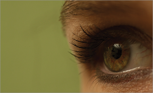
As you work with the coloring of your project, your eyes (Figure 12-1) are going to be the most important aspect of the process. In the end, there are technical changes that can be made and certain rules that must be followed in order for the piece to be broadcast ready, but most of the decisions ultimately are going to depend on whether you think the image is pleasing to your eye.
Figure 12-1: The human eye can see anywhere from 2.5 to 10 million colors, depending on who you ask.
Eyes perceive color in a way that has influenced many decisions in the color universe. A “color universe” may seem like an overstatement until you consider that there is an international organization devoted to many aspects of color including color standards and measurement. Color is a serious business.
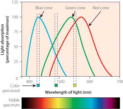
The eye contains rods and cones named according to their general shape. There are greater numbers of rods in the eye than cones, and each serves a distinctive function. Rods are sensitive to levels of brightness or darkness, black, and white. There are three types of cones (Figure 12-2), and each type is sensitive to either red, green, or blue. Often, the red and green cones outnumber the blue sensitive cones.
Figure 12-2: The human eye has three types of cones, which are sensitive to red, green, or blue.
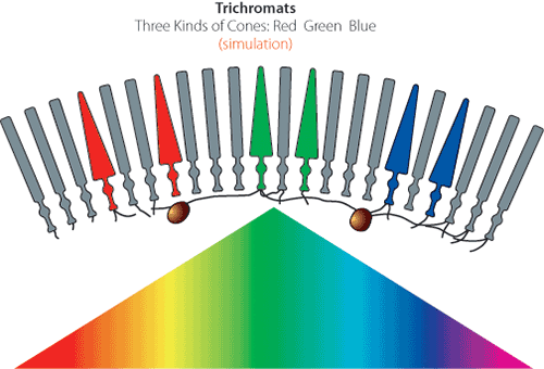
These three colors, combined with the rod’s ability to determine brightness or darkness, allow the eye to see not just red, green, or blue but a whole spectrum of colors (Figure 12-3).
Figure 12-3: The red, green, and blue cones together make up the total visible spectrum of colors.
Light rays reflected from objects make the color we see. Light can work additively when emitted rather than being reflected.
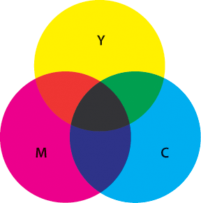
Figure 12-4 shows color as an additive color system. Color is represented as a mixture of red, green, or blue. The choice of red, green, or blue is linked directly to the way the human visual system processes color. The RGB (red, green, blue) system is an additive color system that is crucial to color correction. The colors red, green, and blue are the primary colors. In between the primary colors are the secondary colors: yellow, cyan, and magenta. The secondary colors are created by mixing the primary colors in equal proportion, and in general the more color that is added, the lighter the color. In the middle of the color wheel is white.
Yes, the technical meaning of primary color used in color theory differs from the everyday meaning. Most people use primary to mean red, yellow, and blue.
The color system can also be thought of as representing light. Additive color systems are important in moviemaking; the various types of light going through the lens and hitting the sensor add to each other, and this is especially evident when using a filter. Additionally, projection equipment, video systems, and many software programs use additive color language or theory in their design structure.
There is another color system known as the subtractive color system (Figure 12-5), which is best demonstrated when mixing paint or ink. When red and green are added together in an additive system, the result is yellow. In a subtractive system, it’s more of a dull brown. It is also the method by which we see color in objects. An orange, for example, absorbs all other colors except orange, giving us the color it has.
Figure 12-4: Additive color (notice how the center is white)
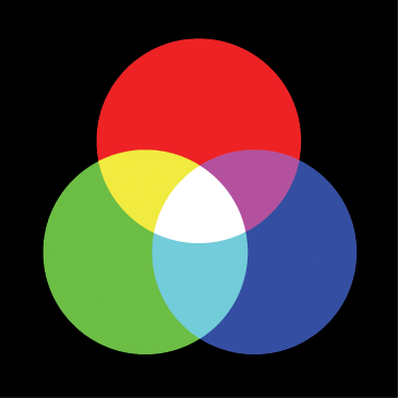
Figure 12-5: Subtractive color (notice how it is black in the center)
Subjective Properties of Color
Colorimetry, or chromatics—the technical term for the scientific measurement and description of color—is important for color correction and movie color design because some of its tools and terms are also used by filmmakers. While a filmmaker won’t be sitting in a lab measuring color properties in a vacuum, color properties will be involved in many areas of production. On-set color temperature is a critical concern, as are what filters to use, the relative quantity of light or the colorimetry standards used to broadcast, how to ensure that the desired color is able to be achieved with the video-recording system being used, and so on.
Colorimetry encompasses the two categories of the properties of color: subjective properties or objective properties. Color properties are a major component of color correction and grading. Understanding these properties as distinct characteristics is necessary for making and discussing color adjustment. The subjective properties for color are the value, hue, and saturation of a color. A subjective color system judges and categorizes colors based on these properties:
Value How light or dark is the color? The brightness of a light source or the lightness of an opaque object is measured on a scale ranging from dim to bright for a source or from black to white for an opaque object (or from black to colorless for a transparent object).
Hue What is the actual color? Hues are the color names you learned as a child, and what is called a color in regular conversation is normally referring to hue. A hue is red, green-blue, orange, and so on. For the purposes of depiction on a color spectrum or color wheel, hue is the direction the color is oriented toward.
Saturation How intense is the color? Saturation is the richness or brightness of a hue. Anything without saturation is depicted in grayscale.
Many color correction programs or systems for examining color rely on color wheels. A color wheel (Figure 12-6) simplifies complex color information and relationships in a simple visual.
Figure 12-6: Simple color wheel showing Hue, Saturation, Value (HSV) relationships
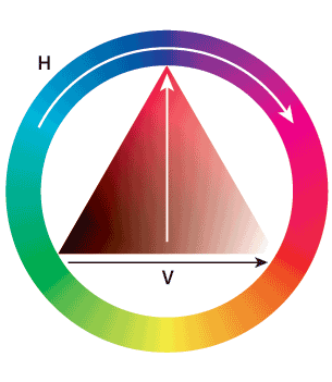
Understanding the color wheel is essential for making grading decisions. Primary colors are equidistant from each other on the color wheel and split the wheel into thirds. Secondary colors or complementary colors are equidistant from each other on the color wheel and also split the wheel into thirds. The perimeter of the color wheel measures hue; saturation is measured by the distance from the center of the wheel, with less saturation closer to the center and more as you move closer to the perimeter.
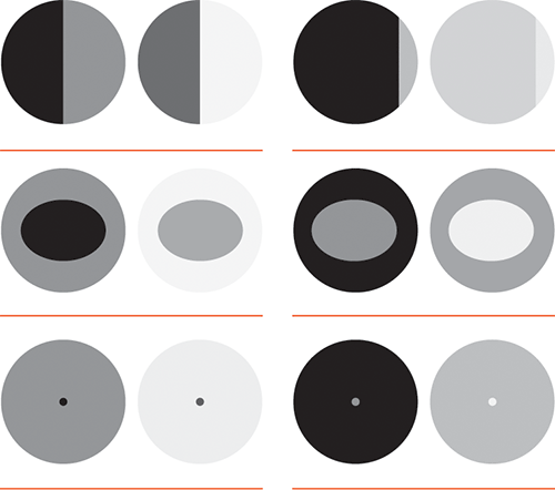
The perception of color is relative. Color’s property of darkness or lightness is affected by the colors, darkness, or lightness surrounding it. A color interacts with what is around it on the screen. This relative value of aspects of the image can be helpful when creating a look for the final image.
The three subjective properties of color can be relative when viewed by the human eye when the final image is watched.
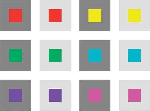
Relative Value A color will appear dark if it is surrounded by lighter colors, and the same color can appear light if it is surrounded by darker colors (Figure 12-7). The value of a color is defined in relation to the values of the colors around it. This linked definition forms a relationship between the colors in your image that can be manipulated based on what you want the viewer to notice the most.
Figure 12-7: Actual vs. perceived lightness/darkness value of an image
Relative Hue White seems like a pretty simple color to recognize until you walk into any paint store with the objective of picking out “white paint.” It is soon clear that “white” is a relative term. You can pick anything from a pure white that would stand out as white in nearly any setting to a white with creamier tones that would still appear white against walls painted chocolate brown. The relative nature of hue is present when discussing terms like warm and cool because these aspects of hue are dealing with psychological issues with color and perception (Figure 12-8).
Relative Saturation The saturation of a color can be relative if the saturation levels around it are diminished. A color will pop if it is surrounded by parts of the image that are muted or less intense (Figure 12-9). Saturation as a rule is perceived as more intense when it takes up more of the image. To make an image pop, put a saturated color on parts of the image that are less intense.
Figure 12-8: Notice how the center square is the same color, but your perception of it changes based on the surrounding hues.
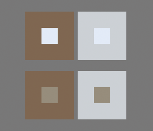
Figure 12-9: Notice the saturation levels may appear different depending on what is surrounding the color.
This relative nature of color is crucial for color correcting and grading purposes because eventually the end product will be viewed by a human eye that will perceive the colors and the image as a whole. This relative nature means that the colorist can guide the eye toward a particular part of the image or maybe trick the viewer by first leading them with color in one direction and letting the action surprise them.
Objective Properties of Color
The subjective properties of color can make color feel fluid and somewhat arbitrary. However, the objective system of color is anything but arbitrary. In an objective system for color, the color properties are dominant wavelength, purity, and luminance.
The dominant wavelength is the measured wavelength of light that is combined with a reference standard light and matches the given color sample. Essentially, it is a measurement ensuring the colors match. Color and light are directly linked, and a measurement of light can indicate color.
Light itself is a measurable thing. The electromagnetic spectrum is composed of many different types of radiation, or energy that is moving. Visible light is part of this spectrum, as shown in Figure 12-10. Light is emitted at different wavelengths, and each wavelength corresponds to a specific color.
Figure 12-10: Visible light spectrum
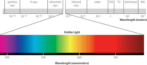
The visible portion of the electromagnetic spectrum begins at wavelengths measured at about 380 nanometers, which is the measurement of a color perceived as violet. The range of the visible spectrum continues to wavelengths of about 700 nanometers, which is red. These different wavelengths hit the human eye light receptors (rods and cones) and are translated as different colors.
Purity is the degree to which a color is devoid of gray, white, or black. This is often linked with the definition of chroma. A color with high purity, or high chroma, will appear very strongly as that distinct color and not have the impression of being diluted.
Luminance is the term most crucial for DSLR color correction. Luminance is technically a measure of the intensity of the light through complex wavelength measurements of reflected light in specific areas when the light is traveling in a set direction. In colloquial terms, luminance is often described as the brightness of the light.
Luma Luma is the brightness of a captured image. Luma is the black and white parts of the image and is represented by Y prime.
Luminance Luminance is the measurement of light being reflected off a surface.
Chroma Chroma, or chrominance, is the color part of the image. Chroma consists of two parts: hue and saturation. Chroma is represented by CbCr in digital component video.
One last color concept that is crucial is contrast. Many stylistic decisions will involve color directly; however, contrast is equal to color in importance.
Contrast is the relationship between light and dark areas in the image. When contrast is described in terms of value, low-contrast images have a “low value difference,” and high-contrast images have a “high value difference.”
Adjusting the contrast will direct the eye of the audience. Our eyes are highly adapted to contrast variations. People are generally attracted to the highest point of contrast and are more interested in images with a high contrast ratio. To increase the visual power of contrast, a scene with large objects and high contrast can be very compelling. Parts of the scene with low contrast will keep those aspects in the background, and they will not draw as much attention.
As decisions are made regarding coloring for the project, remember that the whole point is to add dimension to your image, tell the story through color, and create a look that fits the project’s style and dramatic tenor. Through symbolic uses of color and controlled color planning, you can tell the story through image alone. Color decisions will show the audience where to look, how to feel, and ultimately shape their entire experience.
Color Correction on Set: Outside of the Camera
The final look of your project and the coloring for your piece start with on-set color choices. It pays to take still images of your basic setups and locations, play with the lighting, and plan the overall color scheme prior to the shoot. Choices about color should be made at every stage of production, even in pre-production and on set. Pre-production is the time to test footage to make sure that the final outcome matches the vision. On-set decisions from wardrobe to light temperature will guide the look of the final piece.
Multiple Light Sources and Color Temperature
One of the biggest decisions will be the type of lighting used for the shoot. The color temperature is a defining characteristic of the overall color look of the final product.
Every light source will have a specific color temperature. These various color temperatures are useful when trying to design color to simulate realistic light on a set. For example, knowing the color temperature of firelight will help when setting up a close-up of an actor who is supposed to be lit by firelight, and knowing how certain light temperatures influence mood may help decide the ideal color temperature.
Color temperature is a literal term; color is measured in degrees Kelvin. This temperature and corresponding hue can be charted (Table 12-1) to give the moviemaker an idea of what color temperature is going to result. Color temperature is actually opposite the cultural view of color, which states that warmer colors are redder and cooler colors are bluer. On a color temperature scale, higher numbers indicate bluer tones, and lower numbers indicate redder tones.
Table 12-1: Temperatures for some common light sources
| Light source | Temperature (Kelvin) |
| Match flame | 1700K |
| Candle flame | 1850K |
| Incandescent light bulb | 2800–3300K |
| Sunrise, sunset | 3350K |
| Midday sun, electronic flash | 5000K |
| Sun through cloudy sky | 5500–6000K |
| Cloud cover, shade | 7000K |
| Blue sky | 9300K |
On-Set Changes in Light
Although digital technology allows for all sorts of adjustments in post-production, it is always better to get the shot as close as possible to the desired look in the camera and then make more subtle adjustments later. Here are some reasons to consider monitoring and, if necessary, changing lighting on-set.
Scene Consistency As a commonsense precaution, make sure that your lighting (including contrast) matches the takes that will be cut together to form the same scene. The shot changes, the lens may change, the camera position may change, the lighting setup may change, and so on. This is essentially color correction/balancing on set.
Shot Consistency Watch the entire shot play out to make sure the lighting is what is envisioned. Make sure your lighting works for all of the movement within the shot. If there is a camera or actor movement, double-check that all of the parts are properly lit and the color temperature is what you envisioned. If there is an undesired color temperature change midway through a shot, it will need to be tweaked in post.
Available Light and the Sun Consistency As the sun moves across the sky, the angle and intensity of its light will change throughout the shoot—or even within the scene if the scene is long enough. Efforts will need to be made to keep consistency. The color of the sunlight will also change as the day progresses (Figure 12-11). The color can range from pure white to shades of orange, red, and yellow.
Proportion of Light, Keeping Contrast, Keeping Brights Bright It may be necessary to think about lighting ratios on set, especially if the final image is supposed to be high contrast. Keeping track of the proper lighting ratio with light strength, angle, and distance will be important to ensure that if the contrast is tweaked in post, the high-contrast look can be achieved without the blacks becoming noisy or the image blowing out.
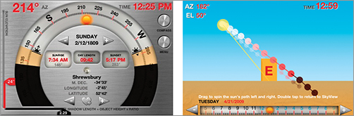
Figure 12-11: The Helios Sun Position Calculator for the iPhone and iPad helps you predict where and at what angle sunlight will be shining on the day of your shoot.
Gels and Filters
You can add filters to the lens when the entire image needs to be altered. This change in color temperature can help create an even image or correct color casts when using different types of lights in a single shot. This ability to blend several kinds of light sources to a single visual look can be useful if you have little control over how many types of lights are in a scene. You can also use filters if the color temperature or overall color needs to be changed for an effect. An ND filter can be useful to lower the overall intensity of a light source while retaining the desired color temperature.
Filters use a slightly different method of indicating color temperature, known as the MIRED. When using gels to change the color temperature of a light source, MIRED values are used to calculate how much the temperature will change with a particular gel or how much change is needed on a particular light source. You can think of MIRED as a relative value for color vs. degrees Kelvin, which is an absolute one.
A gel, which mounts on the light instead of on your lens, can be used to affect the color temperature or brightness of a single light source. They are easily movable and adjustable to allow for many variations on a set. Color temperature decisions are a primary concern and influence the entire visual image and tone. It can be useful to adjust the some of the lighting’s color temperature by using gels or use a second color temperature to provide a visual effect. If the lighting setup is complicated or many different color temperatures or color hues are desired, gels will allow the lights to be easily altered and adjusted to fit the vision.
Sometimes the Camera Sees Things You Don’t
Occasionally a situation may arise where light doesn’t respond the way your eyes perceive it or a “phantom” light may show up on the image that wasn’t seen on set. Being aware of this potential and double-checking will help eliminate unwelcome surprises in post. The following are a few circumstances where the lighting can be altered unexpectedly.
The color of lights that are visible on set or location may not show up on the final image if the light is too bright. The DSLR camera sensor is very sensitive to light, but one trade-off is that if a light is too bright, the actual color of the light may be blown out and appear simply as a white-toned light. So, if there are bright lights that you desire to have colored in the final image, they may need to be dimmed to the point where the color will be picked up by the sensor.
The white balance that your eye sees can be different from the white balance that will be in the final image because of the chromatic adaptation of the human eye. The human eye makes white balance adjustments constantly in the overall area or when moving from one white balance to another. The adjustments our brain and eyes make allow us to see color contrasts in many color temperature settings. This means that on set you may not see what white balance will show up or how dramatic the light temp changes in the scene may be as the actor moves from one area to another. Our eyes and brain are constantly adjusting the white balance to give us coherent vision, but the camera has only eyes.
The color of the area surrounding the shot may influence the color that appears in the image. If very prominent and strong colors are near the shot, these colors may be reflected into the shot and create a color cast over part or all of the shot. In short, the shot is influenced by all nearby light.
Color Correction Card
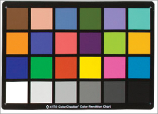
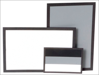
For extra insurance or when the lighting is tricky, shooting a color correction card before taking the shot will help the color correction process. The color correction card is a simple card with preset colors in squares (Figure 12-12). The card is a guide on set for the proper exposure of colors. Later, the card image allows the color correctionist to match to the colors and apply those corrections to the entire piece of footage.
Figure 12-12: You can use something like the ColorChecker 24 Patch Classic target to help you get the correct colors from your footage in post.
Single Camera Shoot vs. Multiple Cameras
Often film shoots or larger-budget projects will shoot with multiple cameras. Multiple cameras have a huge advantage that applies to color correction. When multiple cameras are used for a shot, the lighting, setup, and balance will stay the same for each camera, and the footage can be cut together with little variation in the color of each camera. This assumes that the white balance of each camera was the same, which can be a challenge because the color settings for cameras from different manufacturers can be slightly different.
When shooting with a single camera, lighting might be reset between shots, and the angles can change, creating more room for error in lighting continuity. This means that the colorist will likely have to do some major balancing to ensure that the scene can cut together with continuity of color. Because DSLR footage has limited latitude for change, it is important to make sure that the look of the shot stays consistent as camera setups change.
Checking the Details
It may be useful to take test shots of the basic lighting and setup and have a colorist correct test shots to ensure that the final project is attainable based on technical decisions and budget.
When testing footage, the test will be far better if the level of detail in the test shot is as close to the real thing as possible. Even things like the skin tone of actors and the time of day, especially if you are using sets that are influenced by outside light. Even small details like wardrobe choice can influence the project. It is important to test the colors of the wardrobe and sets to ensure that as color is adjusted, the look stays consistent and that the colors complement the project. Take note of any area that may reflect color on the entire scene or any large swatches of the image creating odd color tints or color casts. Take every detail of the project and examine it with the same strict eye that has just been given to wardrobe color; the test footage will help you make sure that your on-set color choices are informed.
Checking the shot with a properly calibrated monitor and on the camera screen will help make sure that the footage has the proper color. The footage should also be checked after it is shot so adjustments can be made. Adjusting color on the set is usually always better than waiting until post to color correct. DSLR color correction in post is most effective when the footage was shot as close to the ideal as possible.
Color Correction on Set: Inside of the Camera
To capture video with correct color, it is important to set up your camera properly. First, you need to set the white balance of your camera. By setting the proper white balance, you are able to tell the camera what white is and have all other colors fall into the correct range. Second, and a bit more confusing, is the picture-style settings or custom image styles of the camera. These picture styles can be modified to help change things such as contrast, saturation, sharpness, and more. All of these not only can help you get the proper color set but can also assist you in achieving the best results in post in terms of final color correction of your footage.
White Balance: Setting It in the Camera and Changing for Effect
The white balance control of the camera adjusts colors so that white objects are actually recorded as white in various lighting conditions. The point of this is to get the whites in the shot to match perception. If you stand under an incandescent bulb holding a white sheet of paper, it will “appear” white to you because your eyes have adjusted to the color of the bulb. However, a camera will record it as orange. The goal is to record what you would perceive in that situation rather than the actual lighting conditions.
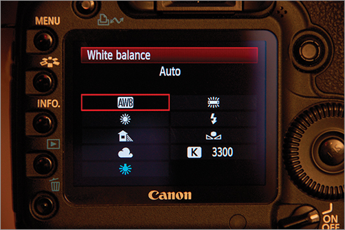
The DSLR camera that you are using will likely have automatic white balance settings. You can use automatic white balance settings on the camera if you like, but auto settings are not as accurate as manual methods (Figure 12-13). Also, if you are going to do any post color correction, manually setting the white balance on the camera will ensure that the post process starts with footage that is in need of less correction. Accuracy with desired white balance is the first step for color correction that can be done with your camera.
This process can also be achieved by using the camera’s white balance presets. These presets are designed to give proper white balance under various lighting conditions across several color temperatures. These presets can also be used artistically to add various tints to your image. The presets can also be used for a simple “day for night” effect by using the tungsten setting and altering the exposure. This makes for a somewhat convincing bright moonlit night.
Figure 12-13: You can always select the automatic white balance setting on your camera in a pinch.
To increase the flexibility of the white balance settings, you may be able to fine-tune the white balance preset. The automatic white balance settings can often be tweaked by adjusting the warmth or coolness of the setting.
Manually adjusting the white balance allows customized settings for each shot. Before shooting, the camera is pointed at an area in the scene that should be white or a target card that is white or gray, and an image is taken (Figure 12-14). The camera is then set to make this the custom white balance for the shot. For more precision, this same process can be used, but instead of shooting part of the scene, the frame can be filled by a card. There are specially designed cards with calibrated colors that are the proper gray shade for white balance settings of the camera. People often use simple white or neutral gray cards. Once again, an image is taken of the card, and the white balance is set to that image. These white balance settings can often be saved to provide a quick custom white balance for a location.
Figure 12-14: In addition to using color cards, you can use white or gray cards to help you achieve the proper white balance for your footage.
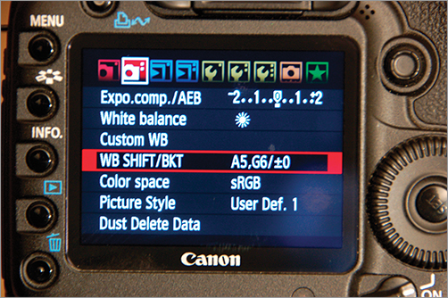
The presets for white balance in a camera may not be exactly what is desired. Some cameras may have a bent toward a slight tone in one color, or you may need a specific color bent. The white balance can be altered by shifting the white balance using the white balance shift options (Figure 12-15). The white balance shift selection allows for adding or subtracting color tones and essentially allows for color correction to happen in the camera.
Figure 12-15: In the Canon 5D Mark II, you can manually shift your white balance to compensate for color pollution from your sensor in your footage.
If multiple cameras are being used for a shoot, it is helpful to have them all set to the same white balance. The white balance of different camera brands, and even different cameras within the same line, often has subtle differences. With DSLR video, it is important to maximize color space because digital video is much less flexible than film. Keeping the white balance perfectly matched maximizes the color space because if you are shooting the whites as close to the white tone you desire and the overall color temperature is being used, the post team will have more room to play with the look, and the color latitude will not be spent merely color matching.
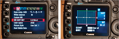
To adjust several cameras to the same white balance, pick the master white balance camera and set its white balance to your approval. Put the footage of the master white balance camera and the other camera side by side on-screen or on two identical and calibrated monitors. At this point, it’s a matter of tweaking white balance shift options until the look of the white balance matches (Figure 12-16).
When you are testing the white balance, bracket your test shots. White balance bracketing works like exposure bracketing to give you several images: the original, one brighter, and one darker (Figure 12-17). This is useful if you have a shot and a white balance selected but aren’t sure exactly how much of a color shift you want. The bracketed shots will give you test images to allow you to pick your final white balance custom setting.
Figure 12-16: The settings on this 5D Mark II shows the white balance being shifted toward the green and red spectrum.

Figure 12-17: You can set the 5D Mark II to bracket up to three times so you can better pick your final white balance setting.
Picture-Style Settings
DSLR cameras are consumer cameras and were not designed to be “professional” cameras in that they are set at the factory to provide a standard image that consumers find pleasing to the eye. This causes a problem for filmmakers who want to control the image.
In general, the camera’s settings have sharpening, saturation, and contrast set too high. All of these functions are best done in post-production rather than in the camera. Once these have been applied to your image, they are very difficult to remove.
To Shoot Flat or Not? Sharpening or Not?
You may have heard the phrase “shooting flat.” Shooting flat means setting your camera to shoot an image that is not sharpened, has a low contrast ratio, and has the color saturation turned down. If you compare a “flat” image with an image that is shot with the factory presets, you will find the footage shot with the factory settings more appealing. Don’t let that fool you as you look at the flat footage. In post you will clean up the image, and the result will be better than the factory settings. If you aren’t familiar with working with flattened footage, this takes some time to get used to.
In short, it’s best to set your camera to the most “neutral” setting for color saturation, sharpening, and contrast. The details will vary with each camera, but in short, turn off sharpening, turn off any “enhancements” the camera may be adding, and set any brightness and contrast settings to off or neutral.
Shooting When There Aren’t Going to Be Any Post-Production Changes
The best practice with DSLR cameras is to shoot flat and correct in post, but there may be times where you don’t have the resources or tools to do much correction in post. If you are just starting your career and want to focus more on techniques on set than in post, you can set your camera to split the difference. Turn down the sharpening, contrast, and saturation, but just don’t go as far as to turn them off. Any editing program can make minor adjustments, but if you leave your footage as it is right out of the camera, you should still be good to go.
Remember, the look of your film is your vision. Shoot some tests and try adjusting all of the settings. You may find the right combination of settings that gives you a unique look that doesn’t require much or any post-production color. The camera is flexible, and test footage, unlike the film days, is essentially free. Test, test, test, and test some more.
What Is This Camera Shooting Anyway and Why Do I Care?
The first thing that is important to know is what kind of color space and color information the DSLR camera is capturing. All of the current DSLR cameras will capture the video in a codec that will compress the color. DSLR cameras will produce 8-bit video with a 4:2:0 color space. The importance of these technical specifications becomes clear when post-production color correction is on the agenda.
When planning for color correction, the available color space needs to be considered. A color space is an agreed upon way of defining colors, usually involving the mathematics of color. Knowing what color space is available will help in determining what colors are going to be available for color correction and what range of color is going to be able to be captured by the video. You don’t get to pick what color space you want to work with when dealing with a DSLR camera. It is predetermined by the internal camera device, and only color variations that are capable of being produced by the camera are available both in capturing the image and in post color correction.
Video color space is device-dependent color space, meaning that it’s color space that is determined by a device—in this case the camera system that reproduces the color in a predetermined color gamut.
A gamut consists of the actual colors or variations of the colors that appear in a color space. The phrase “run the gamut” works as a reminder; the gamut is the entire subsection of colors available or that can be accurately reproduced in a given color space.
Color Spaces in Video and Encoding
Color space is independent of any particular device or method of capturing the colors. Another way to think of this is as an absolute reference to a particular color. If I describe a car as red, how do you know which red I’m referring to? A color space is a universal, accurate, and consistent way of referencing color. However, the point of the movie process is to actually get these colors onto the recording device, in this case a DSLR camera, which has a system for encoding the color information.
A color encoding model or color mapping system is a method where the image can be reproduced or generated to another device. Color mapping specifically refers to encoding that is necessary when one color space and gamut is mapped into another color space.
In the post-production color process, the color space and gamut determined by the camera must also be reproduced by monitors. The monitor is not reproducing the actual color space (because that was already determined when the image was shot) but must be able to reproduce the captured color space.
Color Space Encoded
Figure 12-18: A YUV color space visual example - Top to bottom: composite image, luminance channel, blue-luminance channel, and the red-luminance channel
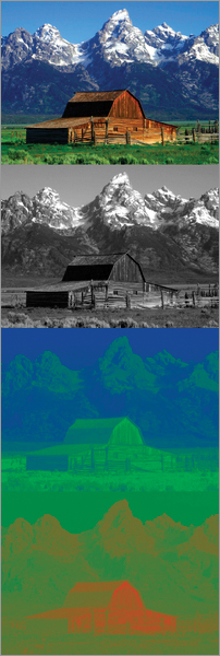
DSLR video deals with color by encoding it in the signal. During encoding, the brightness/luminance of the video is given higher priority than color. This is because the human eye is more sensitive to luminance than it is to chroma. Luminance is given a dedicated channel, the Y channel.
The color information is then split into two channels, a blue channel and a red channel. These channels have several different names; they are often named Cb and Cr for “blue-difference chroma” and “red-difference chroma,” or in some models they’re named U and V. Many types of video are broken down or encoded in this fashion. These channels have a range of values between 0 and 255. Most major video formats all use some flavor of the YUV color space.
Here are the several different ways of naming the component video:
- Y, R-Y, B-Y; Y = luminance, R = red, B = blue
- Y, Cb, Cr; commonly written as YCbCr or YCBCR
- YPbPr
- YUV
The crucial point to remember is that this method of encoding the RGB color space provides for three channels: one channel that essentially is a grayscale image that is focused on luminance and two channels with color information. This means that when color correcting, most programs such as Apple Color allow for separate manipulations of luma and chroma. Because the luma and chroma are separate, it is possible to manipulate hue and saturation without making color lighter or darker, and vice versa.
Bit Depth and Color Depth
Bit depth indicates the number of bits that are used to represent color in a pixel.
A bit is not the same as a byte. A bit is the smallest data amount. It can be 1 or 0, black or white, on or off. An ordered group of 8 bits is a byte.
When light hits the sensor, it is converted to numeric data. Every pixel has a set of numbers available for assigning colors. Typically zero represents black, and the highest available value represents white. The maximum value in each bit depth represents the same signal; however, lower bit depths simply have fewer numbers to work with over that same range, and this results in fewer color values and more distance between the colors. Think of a box of 64 crayons vs. a box of 8. Having fewer color choices also means that it is harder to get a smooth flow from one color hue or tone to the next; colors can be moved only in whole numbers. For example, if the 129 red looks too dark, you have to move to 130 red, but you can’t move to 129.5 red. Full steps are the only available option. In this instance, having more red numbers or steps to pick from, like in higher bit depths, would enable the color changes to have greater flexibility and smoothness. In 8-bit, even a single step in color can be significant in comparison to a one-step increase in a higher bit depth system.
The more bits per pixel dedicated to color, the higher the bit depth and broader the range of color is available. The bit depth will indicate the range of color that is available in a given color model. Many color models are 8-bit or 16-bit, but they can be much higher. There is a good reason why smaller bit depth is chosen: as bit depth increases, the requirements for space, processing speed, and storage also grow.
Current DSLR video is 8-bit, which means that the bit depth offers considerably fewer colors and less adjustment latitude than film or higher-bit-depth color models in the post process. Obviously, 12-, 16-, or 32-bit color would provide much more latitude for color correction, but take heart, 8-bit color is not new in the video world, and amazing amounts of color correction work can still effectively be done in post.
The bit rate (or bitrate) should not be confused with bit depth. Bit rate refers to rate at which data is being transferred over a unit of time.
RGB 8-Bit
Looking at 8-bit color helps to know where the limitations are in using this color mode. In 8-bit there are 256 (that is, 28) tonal values. Those shades of gray are then multiplied over three color channels (256 red values × 256 green values × 256 blue values) to show how many theoretical colors you can describe in that color space. The result is that there are more than 16 million possible color combinations, which sounds like it would be plenty (and in many ways, it is). The challenge comes when those colors are shifted during the color correction process. What once seemed like a vast array of colors gets compressed quickly and reveals issues like posterization and color banding.
8-Bit and YUV or Other Encoding
Another factor contributing to this challenge is that DSLR video isn’t technically 8-bit RGB; it is 8-bit YCrCb or other similar encoding. The colors for YUV and YCrCb or similar encoding work a bit like RGB. The luminance channel starts at 0 for black and has the white at a maximum number, which for 8-bit is 255. The two color channels consist of positive and negative numbers because the color channels are covering more than one color tone. For example, the negative numbers or steps in the blue channel will produce a yellow color, and the color will be set based on a mix of the two colors at the ends of each channel.
Posterization and Color Banding
Posterization occurs when there is the breakdown of a smooth color gradation into a grainier appearance. This is most often seen in a blue sky. Color banding occurs between color levels. Color banding is distinct and abrupt color changes consisting of small color lines or bands appearing on the image where the color is supposed to be shifting shades more gradually. This happens most often in low-color bit depth systems like 8-bit when the tonal range is being stretched past the scope of bit depth in the image.
Working in 16-Bit When Dealing with 8-Bit Reality
Even when capturing 8-bit color, sometimes the post color correction will be working with 16-bit color. This doesn’t mean that colors are magically added to the final image; rather, the available color values are allowed the latitude to work within a wider range. As the modifications are applied, the full range of color is available, and the results may be smoother even when going back to 8-bit. In the end, there may be some value in working in a 16-bit environment even with an 8-bit project.
Compression, Subsampling, and Color
Video shot with current DSLR cameras is highly compressed. Compressed video reduces the file sizes, which makes the files more manageable, extending memory card storage, and makes them faster to move and easier to store. It also allows for lower-speed memory cards because the data rate is lower. Compression is perceptual, which means that the method uses visually similar colors and shapes to represent those areas with less detail. Obviously, there are compromises with compression, specifically a functional decrease in quality and lack of information in comparison to uncompressed images even if the results aren’t readily visible.
See Chapter 14, “Fixing It in Post,” for a complete discussion of compression.
Color Sampling or Chroma Subsampling
Chroma subsampling or color sampling is similar to compression in that it results in smaller file sizes, but the process is very different. Subsampling reduces the color information by simply discarding it. This reduction in color information captures less data and produces video files that are smaller.
To understand how the pixels are recording color information through subsampling, keep in mind that the human eye is more sensitive to changes in brightness than to changes in color. This rule comes in handy because each pixel has a unique luminance/brightness value that indicates how light or dark that pixel is—this is the “Y” value. However, individual pixels aren’t given color information as a distinct number. Instead, color information from several adjoining pixels is averaged into a single value. In short, while each pixel has its own brightness value, two or more pixels may share a single color value.
To see how subsampling affects color, it helps to examine uncompressed color on an individual pixel level. Uncompressed color is portrayed as 4:4:4. The first digit indicates how many pixels out of four have a unique luma (“Y”) value. The next two digits indicate how many pixels out of four have a unique color number for the two color information spaces (Cb and Cr). In YCbCr, 4:4:4 color space, each pixel would have their own Y value, a Cb value, and a Cr value. Every pixel is providing both color and luminance values, and nothing is being lost or discarded.
This is easier to see when looking at the actual pixels. Figure 12-19 shows how brightness values are per-pixel but color values are averaged across two or more.
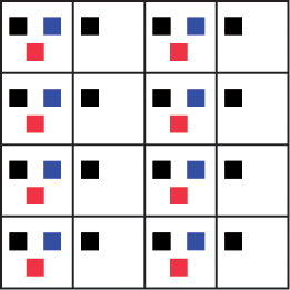
Now compare Figure 12-19 to the example of 4:2:2 subsampling shown in Figure 12-20. This type of subsampling is commonly seen in DigiBeta video content. Here, the first digit indicates that four pixels each have unique luma values. The second digit indicates that pixels 1 and 2 share color information averaged together into a single-color information space. The final digit indicates that pixels 3 and 4 also have colors averaged together into one color information space. Essentially, color is being sampled at half the rate of luma. This decrease isn’t visually significant for many formats, and it greatly reduces file size.
Figure 12-19: A visual representation of 4:4:4 uncompressed color
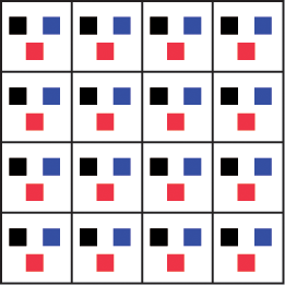
Figure 12-20: A visual representation of 4:2:2 color subsampling
4:1:1 subsampling (Figure 12-21), which is used in DV video, has four pixels with unique luma values, but all four pixels share a single color value averaged across all four pixels. Hence, the color is being sampled at only one-quarter the rate of luma.
DSLR video uses 4:2:0 subsampling (Figure 12-22). Here all four pixels have a unique luma value, and the color information is sampled in a different way. The color information is sampled on every other line. It gives a greater depth of color information or resolution on each line for one particular color or channel but at the loss of half the original color information.
Figure 12-21: A visual representation of 4:1:1 color subsampling
Figure 12-22: A visual representation of 4:2:0 color subsampling
There are several different ways in which 4:2:0 subsamples the chroma information. Essentially it will read a combination of pixels in various formations for the chroma information, but the concept is the same. There are luma values for each pixel, but the chroma information is sampled from every other pixel for every other line.
This subsampling has an effect on color post-processing methods and planning. For color post-processing, the more color information that you have, the better; but DSLR video is literally lacking some color information. This means that certain problems, such as color artifacting and color smearing, can occur more easily, making it crucial that the footage look better on set than to rely on major post color correction changes.
Post-Production Color Correction and Grading
Color correction is divided into fluid categories. In general, color correction refers to changes made in order to get the image to look “correct”—in other words, actions to fix things. Grading generally refers to changes made to create a “look” or a specific change made to footage for overall effect. However, these terms are often used interchangeably and can overlap.
A simpler way of breaking down post-production color is into primary correction and secondary correction and grading:
Primary corrections are usually done first in the process, and they are corrections that apply to the entire image or shot. These corrections include removing color casts, changing contrast, fixing exposure problems, correcting white balance, fixing color balance, tweaking saturation, and checking to make sure the footage is constrained to broadcast legality parameters. A goal of the color correctionist is to provide continuity in color across each scene, and corrections will be made so that the shots flow smoothly.
Secondary corrections and color grading are usually tackled after primary corrections are done. Secondary corrections refer to changes that are done to just part of the image or one aspect.
Color grading is done to give the footage a stylized look and is where creative vision really kicks in. Creating a look is the driving force behind many high-end color production software packages, and color grading is likely the part of color most commented on when watching the final project. The look is not just a technical aspect of the project but rather how the story is told through color and how mood is conveyed visually.
Evaluating Footage
It helps to plan the processing and color correction of the footage before all the footage shows up on your computer or with your color correctionist. Even if you aren’t personally going to be color correcting, understanding certain terms and tools is helpful in discussing the process. This section will not show you how to use a specific program or give detailed steps for the color correction process. Instead, it is an introduction to the terminology and techniques and will provide a jumping-off point either for a specific program or for overseeing a color correction process.
The first step is to evaluate the footage. The primary tools that are going to be used in the process of determining what needs adjusting are scopes and histograms, but your eyes will be your ultimate tool. Color correction is a science and is technical, but even the greatest color corrector still goes back to “what looks right,” and the look of a movie is created by the moviemaker’s aesthetic choices.
When preparing for color correction, the following are some initial questions that need to be addressed:
- Is there an exposure problem?
- What parts of the image should be white? Are they actually white? What parts of the image should be black? Are they actually black?
- Should the image be warmer or cooler?
- Did the skin tones hold up?
- Is the footage too dark or too light?
- Is it too flat? Too much contrast? Where should contrast be added? Does a certain aspect need to pop more?
- Is there a color cast?
- Is there too much saturation? Should some colors have saturation increased?
- How should this image be altered to achieve the desired look?
- Are there specific isolated problems?
Scopes and How to Read Them
Scopes are the tools used to measure video signal. When properly configured, scopes will give the most accurate view of what is happening color-wise with the footage. A scope provides a visual graph of information about video and color levels in all sections of the footage.
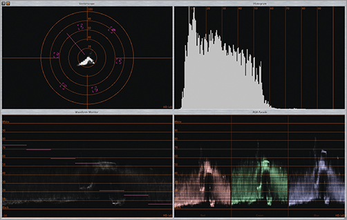
There are different types of scopes, hardware, rasterizers, software, and scopes used in dedicated software. Most people shooting DSLR video will rely on scopes built into the editing package or compositing tool (Figure 12-23).
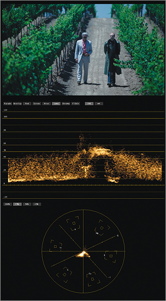
Figure 12-23: In your NLE, you will have access to a vectorscope, histogram, waveform monitor, and RGB parade.
Rasterization is a process where a picture based on vectors or equations is converted into an image that is made of pixels or pattern of dots, usually so it can be outputted to a monitor, television, or film negative.
Software scopes are present in color correction software. These programs have scopes that evaluate the footage within the software itself. They are simple to use and often have adjustable elements that allow the footage to be viewed and adjusted in a minimum of steps. There are also stand-alone software scopes, but these tend to be very high end and outside the needs of most DSLR shooters.
Let’s look at the various settings available on your scopes.
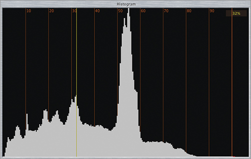
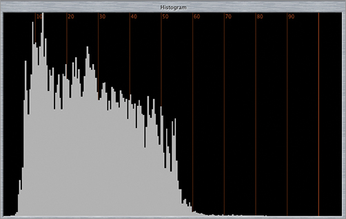
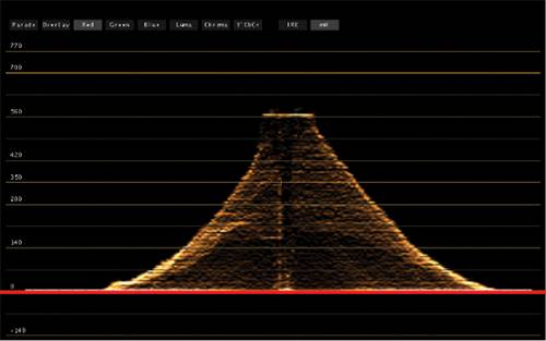
Histogram A histogram is a graph that charts every pixel based on luminance value and shows a breakdown of pixels through the entire tonal range. The histogram shows the quantity of darker pixels on the left and lighter pixels on the right. Every shade of gray in the image is represented in the space between either end. The relative quantity of pixels at each luminance level is represented vertically (Figure 12-24), so the higher the peak, the greater the quantity of a particular light or dark value. When set to RGB, the histogram also can show each color channel graphed individually.
Figure 12-24: The lines in your histogram are a representation of the luminance of the overall image
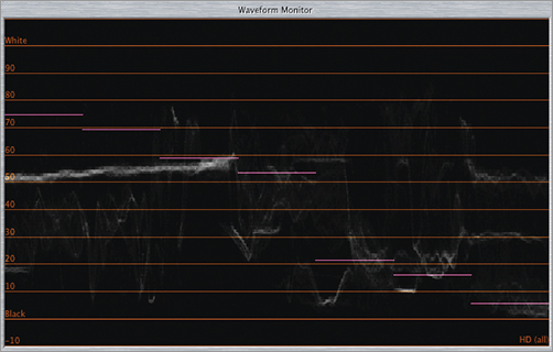
Waveform Scope or Monitor The trace (the dots or lines representing the data) on the waveform scope is a mirror of the image on the footage. The left side of the scope corresponds to the left side of the image, and the right side of the scope corresponds to the right side of the image. The trace mirrors the image completely but doesn’t show the picture. The trace shows the white and black levels with the entire grayscale. The trace is positioned on a scale; the bottom represents the black, dark pixels, and the top represents the white, light pixels. The middle is the area for the gray pixels. The trace is positioned to match where those pixels appear on the image (Figure 12-25).
Figure 12-25: The same image viewed through the waveform monitor
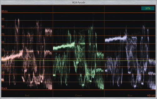
RGB Parade and YCbCr Parade The luminance information is broken up into red, green, and blue channels and displayed separately in a row. Each color has its own section, called a cell, and the information about the amount of the color is repeated for each color. Occasionally there will be a fourth section or cell for luma displayed. The YCbCr parade works exactly the same way, but the first section is for luma, and the next two are for the color channels. When you are using color correction software, the RGB parade scope will be used because the color correction software techniques are based on RGB additive color theory, but the YCbCr parade is a nod to the fact that the video footage was encoded in YCbCr or a similar encoding (Figure 12-26).
Figure 12-26: When the same image is viewed through the RGB parade, you can see the red, green, and blue values in your image.
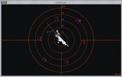
Vectorscope Knowledge of the color wheel is key to understanding how the vectorscope works. The scope follows the color organization on a color wheel and follows all of the color wheel precepts. The angle around the scope is for hue, and the distance from the center indicates saturation. The vectorscope trace mirrors the colors displayed on the footage in terms of hue and saturation. The vectorscope has information about each color and displays a trace about what colors are in the scene. Nothing is shown about black and white; further gray is just a single dot in the center (Figure 12-27).
Figure 12-27: The same image when viewed through the vectorscope
You may run across tools such as an Info palette, RGB readouts, or an eyedropper within color correction programs. These tools will allow you to take RGB readings from a set of pixels of your choice. It will allow for color information evaluations for just certain parts of the image. Numerical values for each color will be provided. These tools can provide useful shorthand ways of adjusting the color of the footage.
Contrast Ratio and Tonal Range
When using these terms in color correction, they refer to the relationship and distance between the darkest and lightest portions of the clip.
Tonal range describes all the various shades of gray between white and black and the size of the field between the white and black. The term tonal range applies to many concepts such as contrast, contrast ratio, and lightness; often these terms are used when describing the same thing.
Contrast ratio is related to tonal range and often used interchangeably. Contrast ratio is the difference between the lightest and darkest parts of the footage. A wide tonal range will have dark and light areas of gray between white and black, and a narrow tonal range will have less of a difference between whites and blacks. The tonal range and where these different values of gray, black, and white appear define the contrast of the image.
Primary Corrections
Primary color corrections begin after you have analyzed the footage. They are wide-reaching corrections that apply to the entire image and all (or most) of the footage. Balance and matching are key concepts for this phase of color correction. The primary goal is to match the color and contrast between scenes, between takes, and between shots to provide a consistent visual flow throughout the piece. You began by analyzing the footage; now is the time to start making the changes.
Evaluating Contrast and Tonal Range with Scopes
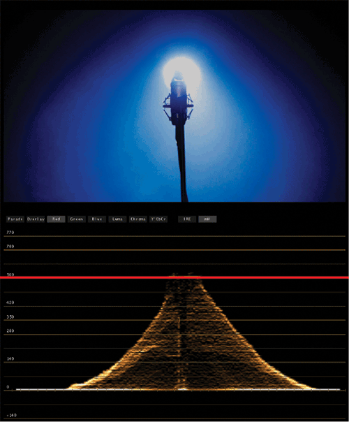
The contrast of the image can be evaluated by waveform and histogram scopes set to luma.
Waveform Set to Luma or to Y Waveform At this setting, the waveform shows only the luminance information. The bottom represents the blacker or darker parts of the tonal range, and the top represents the whiter or lighter parts of the tonal range. If the footage is overexposed, there will be a concentration of trace toward the top of the scope at 100 percent IRE or even above. If the footage is washed, there won’t be much if any trace at the bottom of the scope. Having a lack of trace at the bottom indicates that there isn’t any black. When more trace is around 0, the footage will be darker. To plan for adjustments, look at the footage, and note what parts need to be white or lighter and what parts need to be black or darker. The waveform scope set to luma will indicate when these changes have been made (Figure 12-28).
Figure 12-28: In Apple Color you can view your footage in the waveform monitor set to luma.
IRE Numbers
There are units of measurement for waveform monitors. The units of measurement are set in IRE units. The numbers go into the negatives and go above 100. Practically speaking, to achieve broadcast-safe color and proper black and white settings, the blacks should go as close as possible to 0 IRE, and the whites should go as close to 100 IRE as possible without going above it.
Histogram Scope Set to Luma The histogram on luma can help evaluate contrast. The spokes represent the different concentrations of pixels in the footage at that part of the tonal range. With the luma setting, the contrast between lights and darks with the range of gray in between will be apparent when looking at how the pixels are arranged among the darker part of the image or the shadows, the grays or midtones, and the lighter parts of the image or highlights (Figure 12-29).
Figure 12-29: Same image as Figure 12-28: looking at your footage through the histogram can help you evaluate the contrast.
Contrast Corrections
If part of the footage is under- or overexposed or the black and whites just aren’t “popping” as they should, you need to adjust the contrast. Contrast corrections can adjust lightness or darkness in images, correct exposure problems, or adjust the contrast ratio by expanding or reducing it. In general, you’ll need to increase contrast because it is what gives the audience a place to focus. These corrections are most often done prior to corrections that involve the color.
So, how do you go about actually doing these corrections? That’s where knowing your program comes into play. Often you are looking for Levels controls with slider buttons or Curves, basic Master Levels controls, Primary In Room controls, or equivalents.
Setting Blacks and Whites
A critical step for all contrast adjustments and footage is making sure that the whites and blacks are set properly. To check this, you can use the waveform set to luma or the Y waveform. Setting the whites and blacks is crucial because many further adjustments will take this into account. Whites that are dirty or muddy blacks not only look horrible but also can throw off the whole luma palette of the image.
The procedure for adjusting blacks and whites is often simple. Keeping in mind that the overall goal is to expand tonal range—that is, distance from black to white—look at the image to see where whites and blacks are, and adjust accordingly by bringing up the whites and bringing down the blacks. Keep adjusting until the whites are as close to the top and the blacks as close to the bottom as possible. “As close as possible” is usually determined by how much you can move the levels and still keep detail in the darkest and lightest parts of the image. If thin lines start to appear at the bottom or top of the waveform scope, it is a sign that detail is being lost and the image is being clipped or crushed.
When some detail is lost because it was brighter than the range that could be captured, it is called blown out or clipped. When the lost detail is too dark for the available capture range, it’s said to be crushed.
When setting for black and white, you can easily see whether the tonal range is wide, the blacks and whites are at the proper settings and if the blacks are close to or at 0 IRE and the whites are close to but still under 100 IRE. In general, you are trying to stretch the range between black and white as far as it can go.
Clipping is indicated by a thin line of trace at the very top of a waveform monitor (Figure 12-30). When setting whites, clipping is an important consideration because white levels should be raised only to the point where clipping does not occur and should stay in the correct range. If clipping begins to occur, the white levels should not be raised further.
Figure 12-30: As you can see in the image, the light is so bright it blows out all detail. When you look at the waveform monitor, you can see the flat line that represents the clipping.
Crushing is indicated by a thin line of trace at the bottom of the waveform monitor (Figure 12-31). When setting black levels, making the footage darker or darkening shadows, crushing happens if the levels are lowered too far.
Figure 12-31: In the same shot you can see the dark areas where there was no data crush along the bottom of the waveform.
Increasing or Spreading the Tonal Range with Highlights, Shadows, and Gamma/Midtones
The tonal range is typically split into three sections: shadows, midtones, and highlights. Setting the whites and blacks is the first step in expanding the tonal range, but there are the gray area and midtones in between that still need to be addressed. The midtones are tied to black and white, and as gamma is altered, the black and white relationship—specifically, the transition between them—is changed. The gamma is the area where the full detail of the footage and the contrast can be fully realized.
Evaluating Color
Evaluating color is essential at all stages ranging from capture to post-production. There are many tools and terms that are crucial to be aware of when evaluating color in your footage.
Vectorscope or Waveform
When evaluating color and deciding where alterations should occur, the vectorscope is the scope used to evaluate hue and saturation. The vectorscope mimics the color wheel with targets for primary and secondary colors, trace appears where the color is both for hue and for saturation, and angle around the vectorscope and the distance from the center are crucial. The distribution of the trace will show where the color in the footage is in terms of both hue and saturation.
Another way to evaluate color is with the waveform scope set to parade. This makes it easy to see the relative color balance between all color channels. When one color channel has a trace that is much higher on the scale than the others, it is an indication that there is a color cast and makes apparent in what color channel the cast is happening.
Fixing Color Casts
Often a color cast appears prominently when the whites are not white or blacks are not totally black but appear to have a slight tint (Figure 12-32). When the color cast is gone, the white and black should appear normal. A color cast can be neutralized by adding color from the opposite side of the color wheel. The tools to fix color casts are usually the color balance controls or curves.
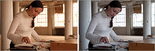
Figure 12-32: In the first image, you can see the white balance setting was off; the second shows the color adjustment to correct for the reddish orange hue that was originally in the footage.
Color Balance and Contrast
The waveform and vectorscope can give good color information to help with color balance issues. However, you can also use the histogram to evaluate color balance when set to RGB. This graph will be important if you are trying to figure out whether a specific color channel has problems in shadow or blacks, midtones, and highlights or whites. Color balance controls allow for mixing RGB in shadows, midtones, and highlights.
Color balance is an attempt to match the hue and saturation of two shots. The color targets of the vectorscope likely match the colors of the color balance controls, and this can be a useful checkpoint to see how far off the footage is from matching. Some of the theory in adjusting color balance is working with color opposites. You can adjust one color that may lighten the overall channel and then work with the opposite to balance. Saturation can also be adjusted to influence the overall intensity of the color or with certain color channels.
Increasing contrast between colors will shift the eye to the part of the image the moviemaker wants to be of primary focus. To do this, contrast between two colors may have to be increased, or the saturation of one color may have to be adjusted.
Noise
A little noise in the overall image can be a great addition to a movie. This is because moviegoers are accustomed to seeing film grain, and noise can emulate this look. Noise evenly spread throughout the entire image can enhance the look and color of the piece, but high ISO settings can have distracting noise problems.
One problem with noise vs. grain is that noise mostly occurs in certain parts of the image. The highlight and lighter parts of the image are usually free of noise; however, the shadows and darker parts of the image will have noise if underexposed.
Linear Light Images
A digital camera sensor converts linear light to linear numbers, but film converts linear light to logarithmic densities. Film responds to light the way our eyes do. Film noise or grain is evenly distributed because films’ noise is proportional to its logarithmic response to the light. Digital sensors have noise evenly distributed across the sensor’s response to light; however, if the sensor simply did not have a response to light or didn’t have a number, then the noise would appear in that area only. For example, on an DSLR sensor, the shadows or underexposed images simply will not have linear numbers, and noise will appear in this area. When increasing contrast or moving darks, noise may be revealed during this process.
The first step to noise reduction is to be careful on set that the image is exposed properly. For post-production, be careful when adjusting contrast. If further noise is a problem, the solution may involve noise reduction filters, plug-ins, or software.
Secondary Corrections
Secondary corrections are targeted corrections concerned only with part of the footage or even just a portion of the image. Secondary corrections can be very subtle such as a vignette to focus interest visually, or they can be extreme color changes. Secondary corrections are generally done after the primary corrections are completed but are occasionally done before. For example, a blemish on skin may need to be fixed first, and then the primary corrections will ensure that this “fixed” part fits in with the rest of the footage.
Vignettes, Spot Color Corrections, and Masks
Localized corrections allow for an effect to apply only to the selected area within a mask or shape. These can be layered to add complexity and a near infinite variety of possibilities for adjustment. The edges of the masks or shapes can be blended into the rest of the image and, through keyframing, can be applied throughout moving shots. These localized corrections can be used to adjust the lighting of the footage by lightening or darkening specific areas, or a vignette can be added to increase the visual focus.
Sometimes one particular color will need adjustment throughout the image. The best examples of this are changing the color of various objects on the screen while leaving the background the same. To do this correction, the particular color will need to be defined, and the change will be made to that color.
Skin Tones
When creating looks and changing colors, the skin tones of the actors should still look like skin and shouldn’t take on a color cast. Skin tones can be examined using the vectorscope, because all skin tones sit in a narrow range on the vectorscope. In fact, there is a target line that identifies skin tones between yellow and red. The saturation and brightness will vary, but every flesh tone will appear along this line.
The trick is to maintain skin tones while doing corrections. In general, it is better to have warm skin tones than it is to make the tone cooler, unless of course a cooler effect is what you are going for.
Broadcast-Safe Color
There are guidelines for video that are set by the FCC that make it possible for the video to be broadcast properly, and depending upon how your project will be broadcast, it may be necessary to take these guidelines into account during color correction. Following them ensures that your footage is “broadcast safe,” meaning that it can be broadcast without color smearing, distortion, or loss. Often color correction software will have filters or built-in steps to ensure that the footage stays within the guidelines.
Scopes offer the only true method of adhering to a broadcast signal, making sure that luminance levels are within broadcast-safe ranges. The vectorscope makes sure that colors are broadcast safe if shown on a TV set, and so on.
Colorista Color Correction Software
Doing vignettes, face lights, or any correction for exposure are all easily done with Colorista’s Power Mask, shown here. But there are a few other advantages compared to the color correction tools in Final Cut Pro, Premiere Pro, and After Effects.
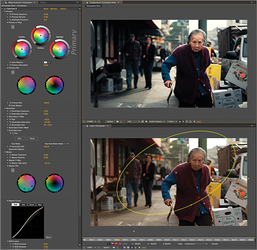
Image courtesy of Red Giant Software
The color model that Colorista uses does not try to split the image into three masked areas based on luma ranges. Instead, it uses a standard Lift, Gamma, Gain model like that proposed for the ASC Color Decision List (CDL) standard. The most important part is that the Lift controls offer more visually pleasing results for shadow adjustments, letting you pollute the shadows with a blue or red tone without causing a shift in the blacks of the image. Final Cut Pro and Premiere Pro both use an offset model for shadow adjustments, which causes a shift in the color tones—kind of flashing the blacks with the target color that just looks wrong.
All the video editors that Colorista supports do not have a way to create a masked area with the color correction. Both Premiere Pro and Final Cut Pro offer secondaries with a color selection, but often these tools fail because of issues like noise in the source, and it is very hard to constrain a correction to just a small area in the frame with just a color selection tool. Additionally, Colorista supports the GPU chip in most video cards. Because Colorista utilizes the GPU, it can offer the highest-quality results with constant processing in 32-bit/channel floating-point color. Quality means that you can apply multiple instances for different types of treatments and never worry about posterization or banding. Another huge benefit of GPU support is that Colorista is fast. Colorista can be up to five times faster than the built-in color correction tools with masks enabled.