In this chapter we will explore the built-in styling tools that Squarespace offers. These tools are user friendly and require no custom coding. The styling tools are all found in the Design panel. The main style tool is the Style Editor. The Style Editor contains different settings based on the template. Each of these settings is called a Tweak. Tweaks can be anything from layout options to colors and fonts. The newer template families have more Tweaks than the older templates. Older templates can usually achieve the same style customization using CSS if the template lacks a Style Editor Tweak. We will discuss customizing the site using CSS later in this book.
Logo & Title
The first Design panel option is called Logo & Title . This is where the Site Title and optional Tag Line are set and where a Logo can be uploaded. The Site Title is the name of the website and is usually the business or organization’s name. The Site Title can appear in multiple places on the website. The Tag Line is an option that appears on some templates but not others. If a Logo is added to the site then the logo is displayed in place of the Site Title. Some templates have Style Editor Tweaks to change this behavior. Figure 3-1 shows the Site Title / Tag Line and Logo Image settings. The Site Title and Tag Line are just typed into the corresponding boxes. To add a logo, click the upload arrow and select a logo file from your computer.

Figure 3-1. Site Title, Tag Line, and Logo settings
The Logo & Title section also has the option to add a Browser Icon (Favicon) and a Social Sharing Logo. If you do not add a Browser Icon then the default Squarespace icon will display. Figure 3-2 shows the default Browser Icon and the Browser Icon and Social Sharing Logo input areas. It is important to note the information above the Social Sharing Logo (Optional) input. The Social Sharing Logo will be used as the sharing preview image for all non-collection pages. This includes Regular Pages and Index Pages. For Collection items (like blog posts and events) the thumbnail image for the item will be used for sharing. It isn’t possible to add individual sharing images to specific Regular Pages. If you do not include a Social Sharing Logo then the social site will take its best guess at what image to use.
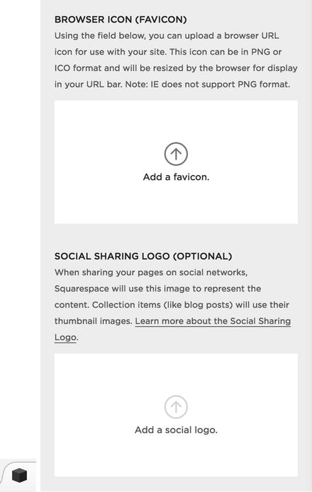
Figure 3-2. Default Browser Icon and Browser Icon and Social Sharing Logo input sections
Template Selector
The Template selection area is where the template for the website can be changed. The site’s current template is listed and marked as “LIVE.” Figure 3-3 shows the Brine template marked as “live.” Select the Install New Template button to view the overview of templates. The template selection process is the exact same as it is for starting a site. The overview of Templates is displayed and you can navigate between them to view the template options. When viewing a particular template, the Preview button will open the demo site for the template. When adding a template from the Template Selector, the Start button installs the template into your existing site account rather than starting a new website. Figure 3-3 shows the Start and Preview buttons for the Farro template.
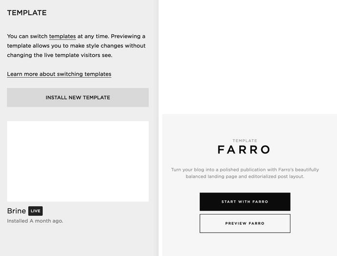
Figure 3-3. Brine template marked as “live,” Start, and Preview buttons for Farro template
The newly installed template will display in the Template menu section of your site. Figure 3-4 shows where the Farro template was added to the example website. The Brine template is still marked as “live” and the Farro template now appears below it. Hovering over the template will display the options to preview the template or uninstall it. Previewing the template will change the template only inside the Squarespace interface. This allows you to update and style the site while the original site continues to be live. It is possible for some adjustments to appear on the live site. If both templates have the same tweak, or if you remove background images, the changes will appear on the live site. I recently completed a project moving a site from the Marquee template to the Brine template. For these types of conflicting changes, I kept a list and made the changes right before making the new template live. Figure 3-4 also shows the Preview and Uninstall buttons.
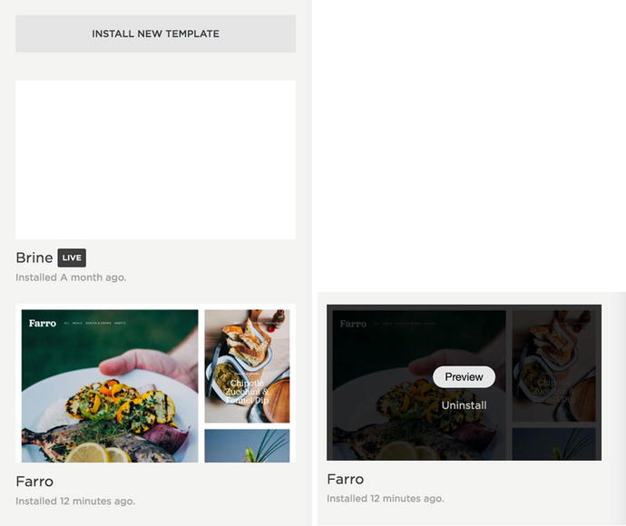
Figure 3-4. Installed template listing, and Preview and Uninstall buttons
When previewing a template , a utility bar shows at the bottom of the main section. The utility bar has two buttons: “Cancel Preview” and “Set as Live Template.” Choosing “Cancel Preview” will exit preview mode returning you to the live template. Choosing “Set as Live Template” will make the template you are previewing, along with the selected settings, the live template. Figure 3-5 shows the utility bar with buttons. Custom code doesn’t always appear or work correctly in preview mode. Previewing custom code will require using a different approach to updating a live site, which we discuss later.
Figure 3-5. Preview template utility bar with Cancel Preview and Set as Live Template buttons
Style Editor
The Style Editor is where the majority of the site styling is done. Every template within a template family will have the same set of Tweaks. The Tweaks and their names will vary between template families. Some Tweaks will only appear in the Style Editor if you are viewing a page that corresponds to that Tweak. For example, the Blog Tweaks will only appear if you are on a Blog Page.
Finding a Style Tweak
All of the Tweaks in the Style Editor are organized into categories. The categories group the Tweaks by location or purpose to make it easy to find the Tweak you are looking for. For example, in Figure 3-6, the Site category groups together the Tweaks that implement site-wide styles. Areas of the site can also be selected in the right-hand panel to display only the Tweaks related to that area. For example, if I click the logo on the example site then a blue box appears around it and the Tweaks in the Style Editor are filtered to show just the related Tweaks. Figure 3-6 also shows the blue box around the logo and the filtered Tweaks. The filtered tweaks list the positioning options and the Logo Width Tweak.
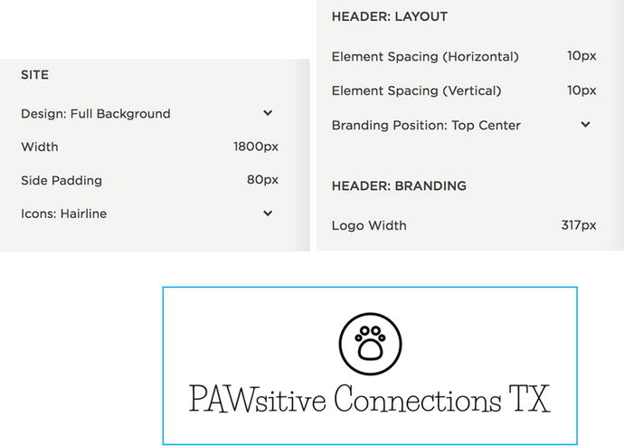
Figure 3-6. Site category Tweaks, Logo selection, and corresponding filtered Tweaks
Style Editor Controls
The controls for the Style Editor include Save, Cancel, undo, redo, show all, and recent change indicator dots. Figure 3-7 shows the main controls. Changes to Tweaks are only saved one you click Save. If you click Cancel the Tweak values revert to the last saved version. The undo and redo controls allow you to undo or redo recent changes. If there are no changes to undo or redo then the corresponding indicator is gray instead of black. If you are viewing the filtered Tweak list, a Show All link appears next to “Style.” Clicking Show All clears the filter allowing all Tweaks to display. The recent change indicator appears as a dot to the left of the Tweak name. The dot appears next to any Tweak value that has been changed since the last time the Tweaks were saved.
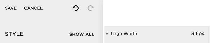
Figure 3-7. Style Editor controls and recent change indicator dot
Typography
Font styling , also known as typography , is a common style change. Many businesses have specific fonts they like to use. Font settings also define the personality of the site. Squarespace has a number of Typekit and Google Fonts built in to the Style Editor. Figure 3-8 shows what a couple of the font Tweaks look like in the Brine template family. The first tweak sets the body text for the site. Clicking on the drop-down arrow next to the Body Text tweak causes the Font selection tool to appear. The second image in Figure 3-8 shows the font selection tool. The first drop-down menu allows you to pick the font. The second defines the weight of the font. A font weight is how thick the lines are. For example when a font is bold it has a higher weight value. Some fonts have more weight options than others. The Style drop-down lets you choose between normal and italic. The Size selector allows you to pick the font size. The font size is determined in pixels, which is abbreviated px. Letter Spacing is the amount of space between each letter. Letter spacing is defined in ems. Ems is a unit of measure relative to the current font size. So 2em would be twice the size of the current font. Line height is the space between lines of text and is also defined in ems. If you prefer to use px rather than ems, you can skip using the size slider, click on the value, and type in your new value with px as the unit. The second Tweak sets the color of the font.

Figure 3-8. Typography options for Body Text Tweaks
Color Selection
The color selection tool is the same for all types of color tweaks. Therefore the process of selecting a background color is the same as selecting a font color. There are four areas to the color selection tool. Figure 3-9 shows the color selection tool. The first area is the rainbow bar across the top. This is a slider that selects the color hue. The second area is a square indicating the different brightness and saturation options. The Third input area is the transparency slider. This is very useful for color overlays and allows you to determine how much of the image underneath should show through the color. The final area is the direct color input area. If you have not put in a color code then this area shows the color code for the current color selection. If you would like to use a specific color, you can enter the color code in RGB, RGBa, HSL, HSLa, HEX, and HTML format.
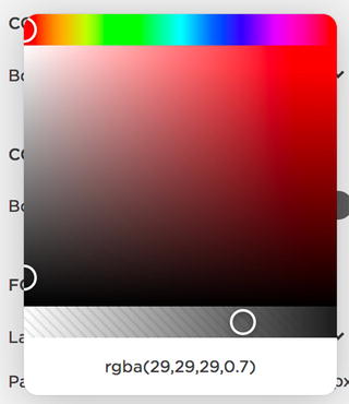
Figure 3-9. Color Selection tool
Color codes are different ways of defining color . RGB and RGBa stand for red, green, blue, and opacity. RGB color is referred to as light color. This is how computer screens and stage lights make different colors. This is different than pigment color, like CMYK, which is used for printing. HSL and HSLa is another method for defining color. HSLa stands for hue, saturation, luminosity, and opacity. The Squarespace color selector tool works off of this principle. Hex codes are six-digit codes that define a color. For example, white is #ffffff and black is #000000. Hex codes do not support an opacity value making RGBa and HSLa more robust options. The final type of color code that the color tool accepts is the HTML color code. These are names of colors like ‘white’, ‘red’, and ‘blue’. There is a limited number of HTML colors and they are not frequently used.
Sizes and Values
The Style Editor offers a slider control to set sizes and values. The slider bar with indicator dot appears when you hover over the Tweak. In addition to dragging the dot, you can click on the number and type in your own value. This is useful if you would like your value to be bigger than the slider bar allows. Even though you can type in a value you cannot change the unit of the number. For example in Figure 3-10 the unit has to stay pixels (px).
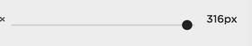
Figure 3-10. Size and Value slider selector
Background Images
Earlier in Chapter 2 we discussed how to add Background Images to particular pages. Some templates have a Tweak allowing you to set a side-wide background image. Figure 3-11 shows a background image tweak and its image upload tool. Clicking on the Tweak name or circle will open the image upload tool. The image upload tool has four selectors in addition to the actual upload area. The Size setting has options for auto, contain, and cover. Auto allows the background image to default to its actual size. The contain option will ensure the entire photo is visible in the container. This often results in blank areas around the photo. The final option, cover, ensures that the photo covers the container area. Some of the image may be cropped off if the image shape doesn’t match the browser window shape.
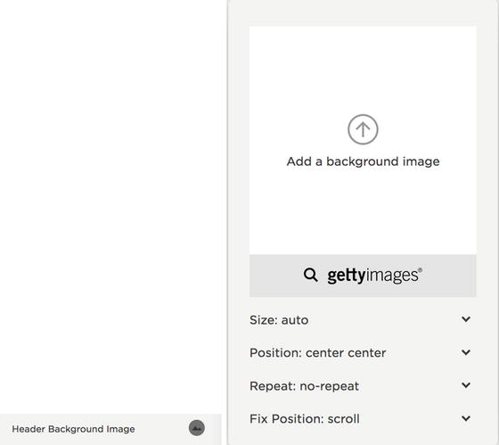
Figure 3-11. Background Image Tweak and image upload tool
The Position option indicates where the photo lies in relation to the container. The first value is the vertical positioning and the second is the horizontal positioning. If the top left is selected then the top left corner of the image will always be visible in the top left corner of the container. The Repeat field indicates if the image should repeat. The options are no-repeat, repeat, repeat-x, and repeat-y. Repeat will repeat the image in a pattern that covers the whole container. Repeat-x and repeat-y allow the image to only repeat in the specified direction. Repeats can be useful for creating a border out of a single small image. The Fix Position: Tweak has the options of fixed and scroll. If fixed is selected then the image will stay in the same place while the content scrolls over it. If scroll is selected then the background image moves along with the content.
Layout Options
Many of the templates have drop-down selectors for different layout options . Figure 3-12 shows some of the layout options for the Brine template family. The Brine template family has six header areas. There are two rows each with a left, center, and right section. The drop-downs provide the option for the branding and navigation menus to be in any of these six areas. Figure 3-12 also shows the example website header with the Logo in the center and navigation on the left and right.
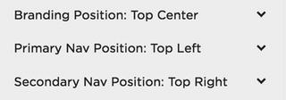
Figure 3-12. Layout Tweaks in Brine template family and example website header
Mobile Styles
The newer templates all include mobile style Tweaks. The older templates have far fewer mobile style options. Since the different template families have different types of mobile navigation, the Mobile Tweaks are very specialized to the template family. There are Tweaks for color, size, and layout. Figure 3-13 shows some of the mobile menu Tweaks for the Brine template family. There is a special Tweak that some templates have called the Mobile Breakpoint. The Mobile Breakpoint is the browser width when the layout switches from the Desktop view to the Mobile view. For example, in Figure 3-13 the Mobile Breakpoint is set to 640px. This means that for browsers larger than 640px wide the Desktop navigation layout will show. For browsers smaller than 640px wide the mobile navigation layout will show. When a site has a large number of navigation menu items, the menu items may wrap to two lines on tablet size screens. If this is happening then the Mobile Breakpoint should be set to a higher value to so that tablets display the mobile navigation.
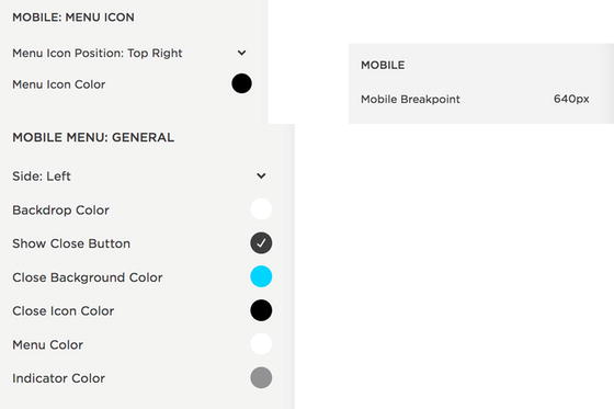
Figure 3-13. Mobile Tweaks in Brine template family
Page Specific Styles
The Blog, Event, Gallery, Index, and Product page types all have specific styles that only appear in the Style Editor when viewing one of those pages. For example, Figure 3-14 has some of the Blog Tweaks that appear when viewing a Blog page in the Brine template family. In the Brine template I can select between a grid blog layout and a stacked layout. For the Skye template family this is where the Blog layout can be changed from a grid layout to a masonry layout. There are Tweaks for the location of metadata and different pagination options. The page specific Tweaks are very unique to each template family. You can read more about the Tweaks available for a particular template on the Squarespace website.
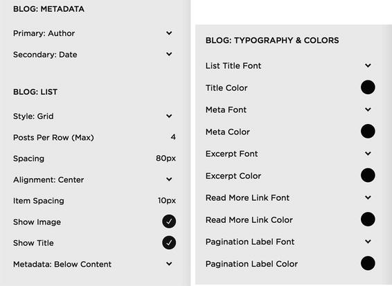
Figure 3-14. Blog Tweaks in Brine template family
Image Block Example
Like the Blog styles, the style options for the Image Block only appear in the Style Editor on Regular Pages that have an Image Block added. I have added a collage layout Image Block to the example website. Figure 3-15 shows the default styling of the block based on my current Style Editor selections. The title obviously isn’t in a good location since it covers the puppy’s face.
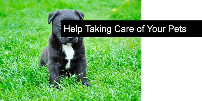
Figure 3-15. Default Styling of Collage Image Block
Now that the image block has been added to the page the Tweak options appear in the Style Editor. Figure 3-16 has the full list of Tweaks for the Collage Image Block. I can use the second Tweak Content Position to move the content to the bottom of the image and off of the puppy’s face. I also select a different font, change the size of the image and the text, and update the background color of the text. Figure 3-16 also shows the new Tweak values and the final style of the Image Block.
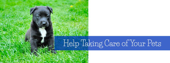
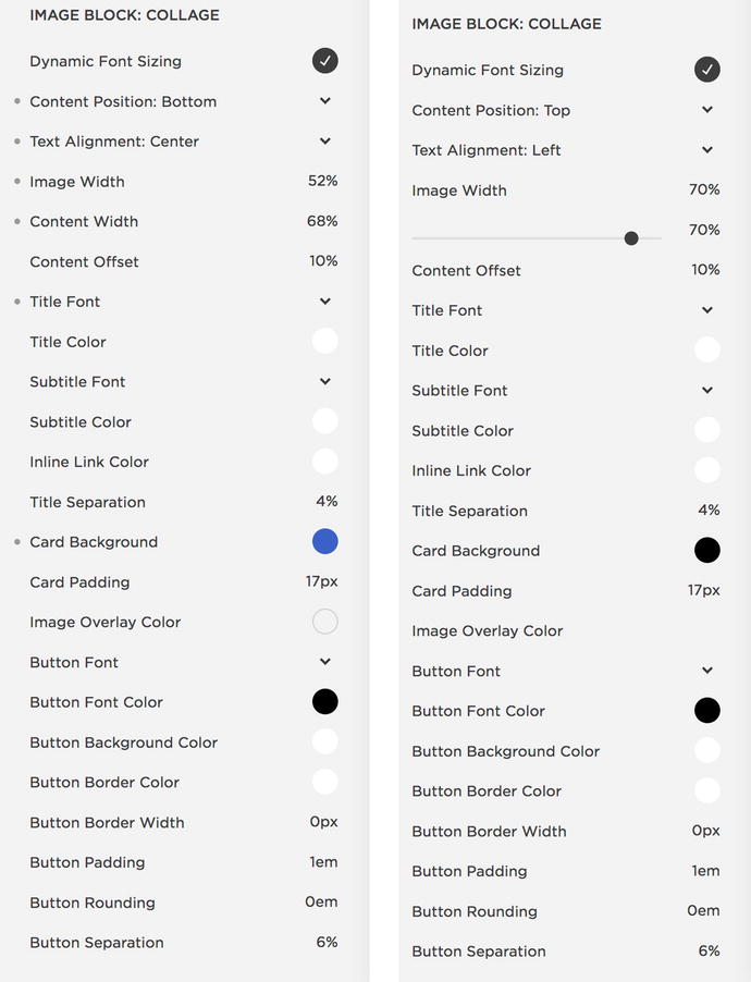
Figure 3-16. Updated Image Block , original Tweak values, and updated Tweak values
Checkout Page Style Editor
The Checkout Page Style Editor is a mini Style Editor for just the checkout page. The checkout page is what the site visitor sees after they click the “checkout” button on the shopping cart page. The checkout page is where the actual payment transaction takes place. Checkout pages run on separate special e-commerce servers. This separation is great for the security and protection of your customer’s information. The separate checkout process does mean that there is limited customization available for the checkout transaction. The Tweaks are limited to colors and header alignment. There isn’t the option to change the font, layout, or actual text. Figure 3-17 shows the Checkout Page Style Editor menu and the example website’s checkout page.
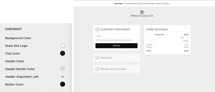
Figure 3-17. Checkout Page Style Editor and example site Checkout Page
Lock Screen
The lock screen displays when a website visitor views a password-protected page or website. The Lock Screen option in the Design panel contains the styling options for the lock screen. Like the Cover Page, there are style options and several different layouts to choose from. The lock screen is useful for providing a client or group of people access to private content. A lock screen can also be put up site-wide when a site is under construction. There is only one lock screen, so it cannot be customized on a per-page basis. A password can be added to a particular page in the page’s Settings menu. A site-wide password can be set by selecting the Settings panel, clicking Security & SSL in the Website Category, selecting Enable Site-Wide Password, and adding a password. Figure 3-18 shows the Site-Wide Password selection in the Security & SSL section. We will explore these settings further in the next chapter.
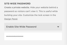
Figure 3-18. Enable Site-Wide Password menu settings
Using a site-wide password and lock screen is a popular method for updating an existing Squarespace website with a new template. If it is possible given the business’s needs, then a site-wide password can be added and a lock screen put up while the website is under construction. This allows you full access to the site, including testing any custom code, without the site being available to the public. The final option for updating a site is to create a new website account for the updated website. When the new site is ready, Squarespace customer service can transfer the subscription from the original site to the new site.
In the Lock Screen panel there are four setting menus to choose from. Figure 3-19 shows the Lock Screen menus. Unlike other Squarespace options, the Lock Screen doesn’t need to be enabled in order for the menu options to appear. In the case of a photographer, the lock screen can be styled and used as necessary to give clients private access to their photos. A running club could password-protect their routes and training schedule, allowing just their members to access the information.
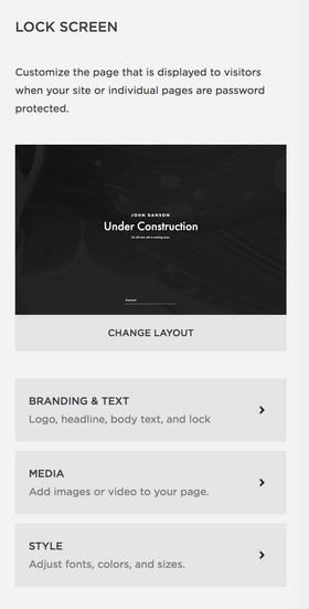
Figure 3-19. Lock Screen menu options
Selecting the “Change Layout” menu brings up the lock screen layout options. For the example site, I have chosen to use the “Under Construction” layout for the lock screen. Figure 3-20 shows some of the lock screen layout options. The layouts are all very simple and do not allow for the addition of Blocks. The main difference between the layouts is where the password and content fields are located on the page.
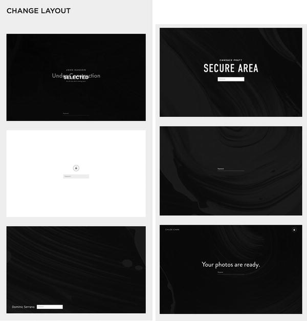
Figure 3-20. Lock Screen layouts
Once a layout has been selected, the content can be added in the Branding & Text menu option. The settings include Text or Logo, Headline, Body content, and lock icon option. For the example website I have chosen to go with the Text option for the organization name. If Logo is selected then the input to upload the logo image appears in the menu. The Headline text is typically a single line of text. The Body area can have a little more text with bold, italic, and linked content. The Display Lock Icon selector displays the lock icon if selected.
Figure 3-21 shows the Branding & Text menu .
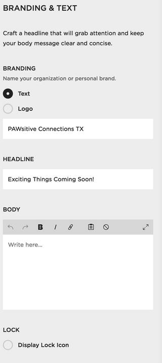
Figure 3-21. Branding & Text menu options
The next menu option is the Media menu. This is where a single image, gallery of images, or a video can be added to the lock screen. For the example website I added the puppy picture as the lock screen background. Adding multiple images creates a slideshow. Figure 3-22 shows the media menu for adding an image or a video. The background video option allows you to add a YouTube or Vimeo background video. There are also settings for filter effects, playback speed, and setting a Mobile Fallback Image. The Mobile Fallback Image displays on mobile devices. Mobile browsers don’t support background videos.
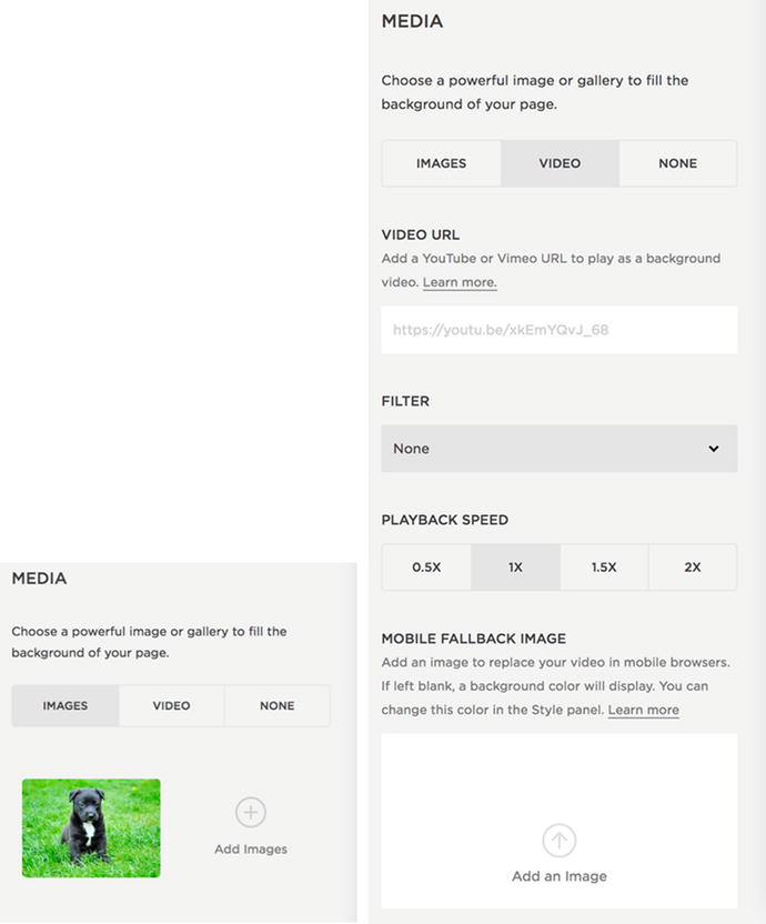
Figure 3-22. Media menu showing Image and Video options
The final Lock Screen menu is the Style menu. It is a mini Style Editor just for the Lock Page. The style Tweaks include font and color all text, background color, page border, image overlay, and password input styles. The layout selected determines the placement of the text and password input. Therefore there are no layout Tweaks in the Style menu. Figure 3-23 shows the Lock Screen Style menu and the styled Lock Screen for the example website.
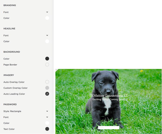
Figure 3-23. Lock Screen Style menu and example website styled lock screen
Announcement Bar
The Announcement Bar adds a text banner to the top of the website. This is often used to announce upcoming events, promotions, new releases, or any other type of time-sensitive information. It is important to keep in mind that the Announcement Bar can be closed by website visitors and won’t appear repeatedly. The Announcement Bar adds an extra area to the site, drawing attention to the information, without changing the rest of the page layout. When enabled, the Announcement Bar appears at the top of every Page except for Cover Pages. I have seen the Announcement Bar used as a permanent feature of the site. When being used as a permanent design feature custom code was added hide the close button. This prevented the site visitor from closing the Announcement Bar.
The Announcement Bar option is disabled by default. Enabling the Announcement Bar will allow the menu options to appear. Figure 3-24 shows the Announcement Bar menu when it is disabled and enabled. The Announcement Bar allows for text to be added. The text can be bold, italic, and linked. The entire Announcement Bar can be made clickable by adding a link to the Clickthrough URL field. There is also an Announcement Bar Visibility option that appears when you have closed the Announcement Bar. Clicking the Reset Visibility button will allow the Announcement Bar to appear in your browser window. This is useful for testing purposes. The Reset Visibility button does not reset visibility for your website visitors. You can reset the visibility for your visitors by updating the content of the Announcement Bar.
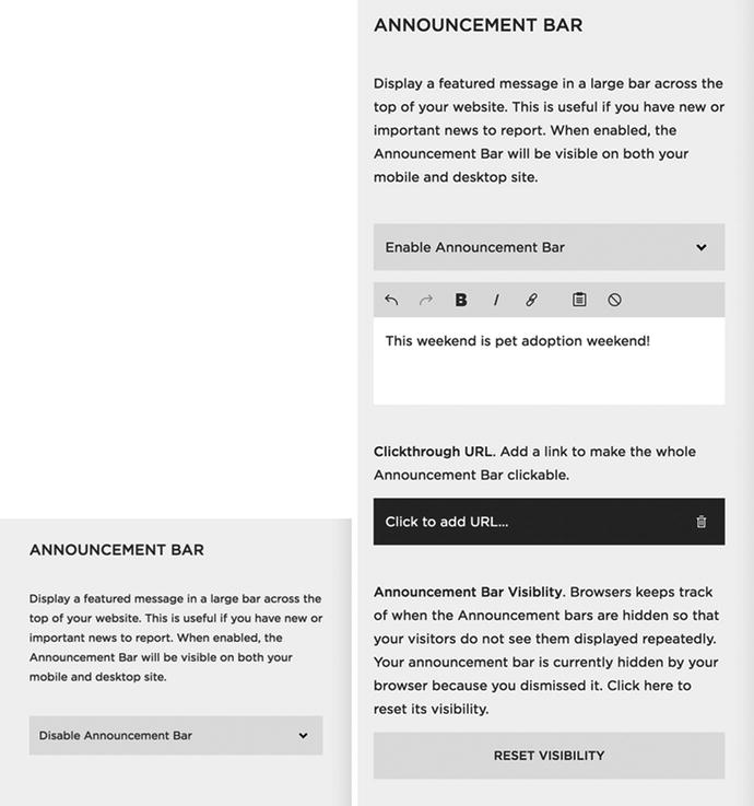
Figure 3-24. Announcement Bar Disable menu options and Enable menu options. The Announcement Bar Visibility option only appears if you have dismissed the Announcement Bar by closing it.
The Style Editor Tweaks for the Announcement Bar appear when the bar is enabled. The style options include changing the font, background color, and text color. Figure 3-25 shows the Style Editor Tweaks and the default view of the Announcement Bar for the example website. I want to draw attention to the Announcement Bar text so I update the color to green and change the font to Life Saver. The result is the second screen shot of the Announcement Bar shown in Figure 3-25.
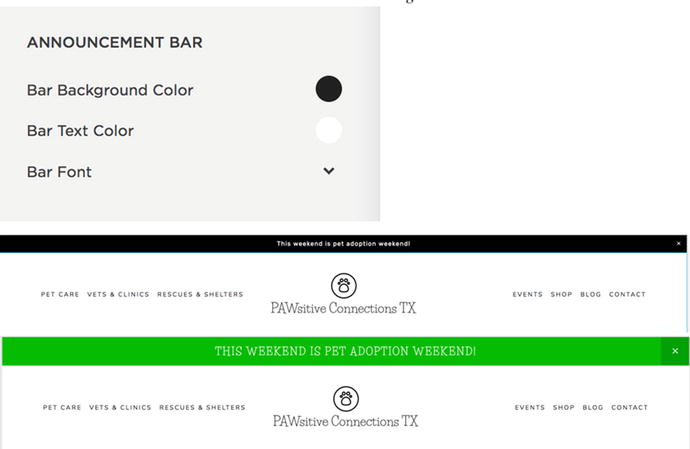
Figure 3-25. Announcement Bar Style Editor Tweaks, default bar styling, and updated styling
Mobile Information Bar
The Mobile Information Bar is a great way to give mobile device users quick access to important information. It is disabled by default. When the Mobile Information Bar is enabled, the menu options appear. The Mobile Information Bar can include an email address, phone number, location, and hours. Checking any of the circles adds an icon for that information to the Mobile Information Bar. The actual content for the Mobile Information Bar is added to the Business Information menu under Settings. Figure 3-26 shows the default view for the Mobile Information Bar and the menu when it is enabled. Some templates have their own customizable Mobile Information Bars. The Brine template has two mobile bars, one at the top and one at the bottom of the site. If a template has special mobile bars then the standard Mobile Information Bar won’t display.
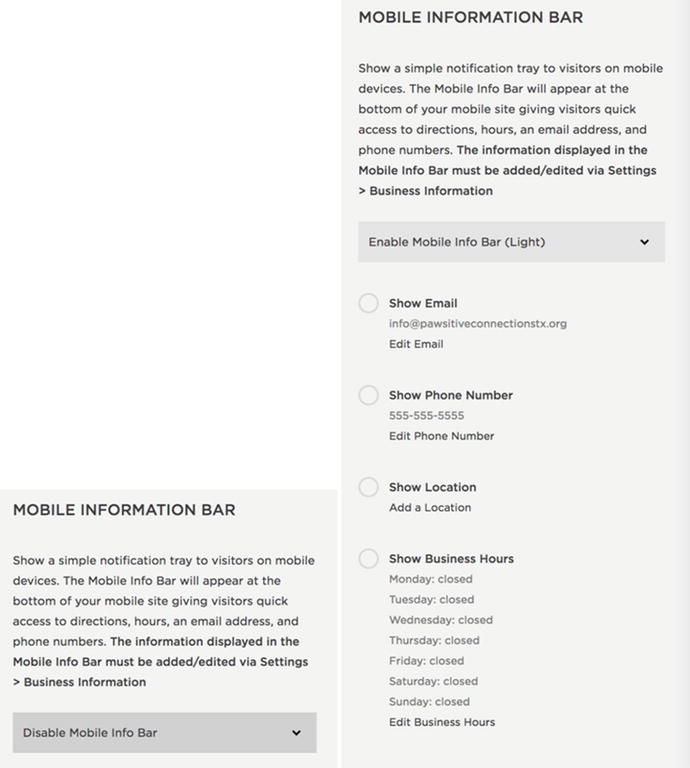
Figure 3-26. Mobile Information Bar default menu and enabled menu options
There are two color schemes for the Mobile Information Bar: light and dark. Figure 3-27 shows the light and dark color schemes. The Mobile Information Bar can have any combination of these icons based on the checked options. The icons will always appear in this same order and be centered. The icon order is email, call, map, and hours. There are no Style Editor Tweaks for the Mobile Information Bar. The color and layout can only be changed using custom code.
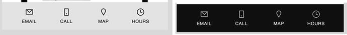
Figure 3-27. Mobile Information Bar Light and Dark color schemes
Squarespace Badge
When starting a site some templates will have a text block with “Powered by Squarespace” in the footer blocks area . This block can be removed or edited just like any other content block. The Squarespace Badge menu provides different options for adding Squarespace recognition to your site. The default setting is Disable Squarespace Badge. The drop-down selector gives the options to add a black or white Squarespace Badge to the site. For the example website I will choose the black badge. Figure 3-28 shows the default view of the Squarespace Badge menu as well as the menu when the black badge option is selected.
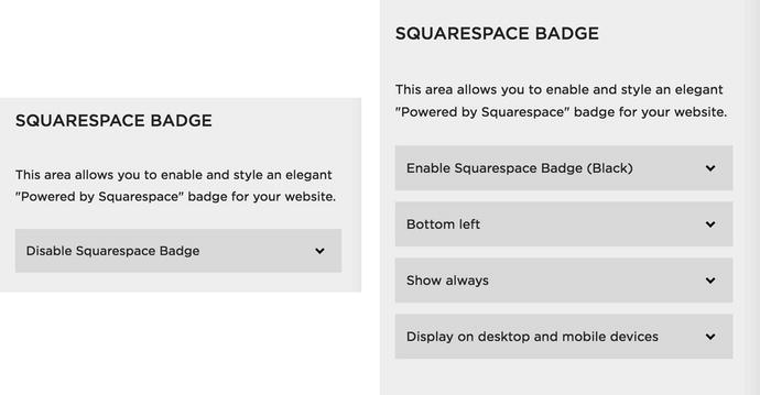
Figure 3-28. Default menu for Squarespace Badge and menu when Enable Squarespace Badge is selected
Three style options appear when the option to Enable Squarespace Badge is selected. The first new menu option sets the location of the badge. The badge can be left, center, or right at the top or bottom of the site. The next option allows the badge to always show, known as a fixed position, or only when the web page is scrolled to the bottom. This option only works for the bottom of the page badge locations. The final option allows the badge to display on only desktop devices or on all devices. Figure 3-29 shows the black Squarespace Badge as it appears on the bottom of the example website and its hover effect. The hover effect expands the badge and adds a semi-transparent overlay over the rest of the web page.
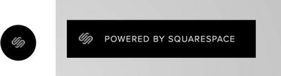
Figure 3-29. Squarespace Badge and hover effect
Custom CSS & Advanced
The Custom CSS menu option allows you to add CSS code to your site. We will be covering this extensively in future chapters. The Advanced menu option allows you to add a Typekit kit ID to your site. Typekit is a web font service provided by Adobe. Adobe offers a subscription to just Typekit and Typekit is included in the Creative Cloud subscription plan. Squarespace already includes some Typekit fonts. If you have a Typekit subscription and want to use additional Typekit fonts, then you can create a kit in your Typekit account. The kit will have its own ID. This ID is then added to Squarespace in this field. Figure 3-30 shows the Typekit kit ID input field.
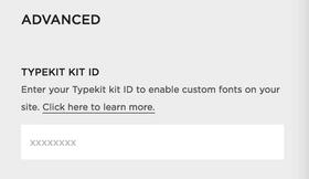
Figure 3-30. Typekit kit ID input area
Wrap-Up
You should now feel comfortable with all of the built-in styling tools that Squarespace provides. It is very common to develop a favorite template to work with. Different web professionals find that their personal design style fits best with a particular template family. As you get more comfortable with the templates and their Style Editor Tweaks, you may develop a favorite as well. Now that we have covered building and styling the site, we will explore other site settings and best practices in Chapter 4.