In this chapter we will begin putting content into the website that we created in Chapter 1. For all my website projects I put together a sitemap and an overview of what content goes on each page prior to designing the site. This helps me ensure that the design takes into account all of the content. For the book’s example website, we will work through creating a site for a Houston, Texas, area organization: PAWsitive Connections TX. PAWsitive Connections seeks to connect homeless pets with new owners and provide pet owners with resources to care for their animals. Figure 2-1 shows the sitemap that was created for the PAWsitive Connections TX site website .
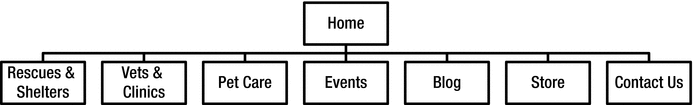
Figure 2-1. PAWsitive Connections TX sitemap
In addition to a sitemap, wireframes are another tool for planning content. A wireframe is a draft of the layout for a webpage without any of the styling elements. For a typical project I will put together a wireframe for the homepage, mobile view of the homepage, and any other unique pages. Wireframes help in planning the site content without the distraction of specific pictures, fonts, and colors. Wireframes can be created in Sketch, Photoshop, and many other programs. My preferred method for creating wireframes for Squarespace websites is to use the Starter Page Layouts and demo content to create a live and clickable wireframe.
Demo Pages
When you first log into your new website the Pages panel will have demo pages for all content that is included in the template’s demo website. Figure 2-2 shows the demo pages having “DEMO” after the page name. There are a few ways to handle these demo pages. Depending on your personal preference you can delete them, move them to the “Not Linked” section to save as a reference, or use them as the basis for a page. I will typically delete all the pages that I definitely won’t need and use some as a starting point for my wireframes.
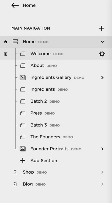
Figure 2-2. Brine template demo pages
To delete the demo pages , hover over the name of the page and a trashcan icon will appear on the left side. Click on the trashcan to delete the page. Figure 2-3 shows the trashcan icon. Once clicking the trashcan, a confirmation message will appear ensuring that pages aren’t accidentally deleted. The icon directly to the left of the page name indicates the type of page that it is, in this case a regular page. The gear icon on the right opens up the settings panel for each page type. We will explore these features later in this chapter.
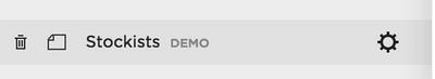
Figure 2-3. Page Controls and icons
To use a page as a starting point for a wireframe click on the demo page name and a prompt will appear asking you to delete the demo page or create a page like it. Figure 2-4 shows the prompt for a Regular Page as well as a Blog. The prompt will be slightly different depending on the demo page type. To keep a demo page for future reference you can click on the page name and drag it down to the Not Linked section of the Pages panel. This will allow the page to exist in your site but not appear in any of the navigation menus.
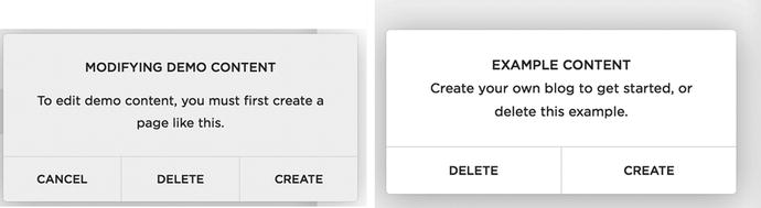
Figure 2-4. Regular Page and Blog demo content prompt
For this example I will keep the Contact page demo for the PAWsitive Connections TX website since we included a contact page in the sitemap. The Contact page contains all of the filler content and some of the content blocks already. Figure 2-5 shows the wireframe content for the Contact page. I will keep the Shop, Blog, and Contact pages for use in the PAWsitive Connection TX site.
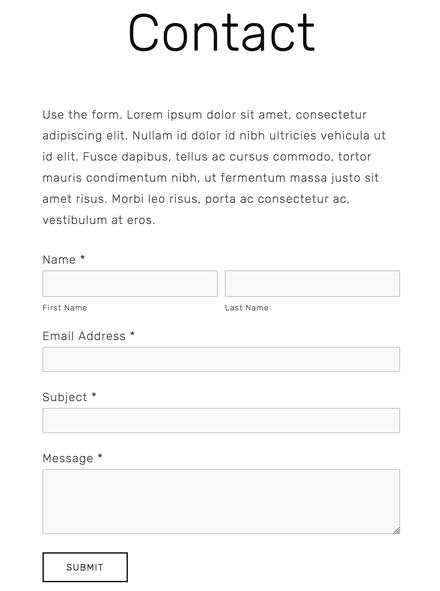
Figure 2-5. Contact page wireframe content
For this site I want to start with my own homepage rather than using the demo homepage. The demo homepage is indicated with a house icon next to the page type. However, when I go to delete the demo homepage, I get a prompt telling me that I cannot delete the homepage. A new homepage needs to be assigned before deleting the demo homepage. Figure 2-6 shows the home icon and the Cannot Delete Homepage message.
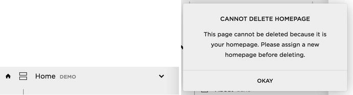
Figure 2-6. Home icon and Cannot Delete Homepage prompt
Adding Pages
In order to delete the demo homepage we will first need to create a new homepage and assign it as the homepage. To create a new page, click on the + sign to the right of the section name. In this instance we want to add a page to the Main Navigation. The Create New Page menu will appear with all of the options for creating a new page. These new pages are not limited to a page in the traditional sense of the word. The Create New Page options include Page (Regular Page), Products, Cover Page, Folder, Album, Blog, Events, Gallery, Link, and some template-specific page types. Figure 2-7 shows the + sign next to the Main Navigation section as well as the Create New Page prompt.
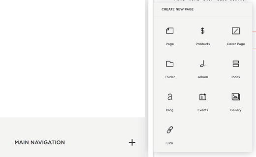
Figure 2-7. Add new page + icon and Create New Page menu
We will go through the different page types later in this chapter, but for now I will select Index since that is the same page type as the demo homepage . I will name it “Home” and then open the Page Settings menu by clicking on the gear icon. Figure 2-8 shows the prompt to name the new page and the Page Settings gear icon.
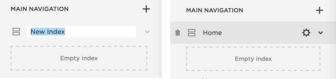
Figure 2-8. New page name prompt and Page Settings gear icon
Inside the Page Settings menu there are three menus of page settings. The options are Basic, Media, and Advanced. Scroll down to the bottom of the Basic menu and there is a button that says “Set As Homepage.” Select this button and then hit save. Now when we go back to the Pages menu we see that the home icon is now next to our new Home index page. Figure 2-9 has the Basic page settings menu, the scrolled down view of the Basic menu, and the home icon next to our new Home page. The demo page named Home can now be deleted.
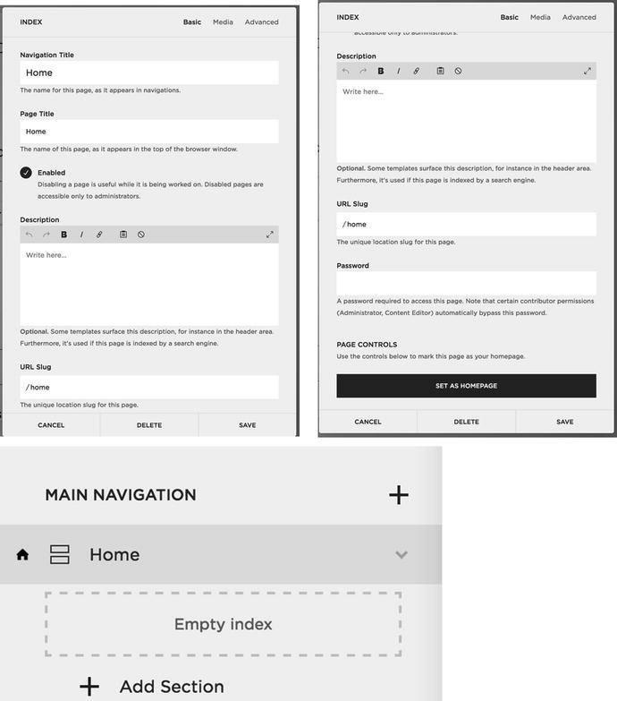
Figure 2-9. Basic Page Settings menu, scrolled down view of Basic Page Settings menu, and newly set homepage with icon
Page Settings
The first menu screen in the Page Settings is the Basic menu, as shown in Figure 2-9. The Navigation Title is the way that the page appears in the navigation menu for the site. The Navigation Title is also how the page appears in the Pages menu. The Page Title is the actual title of the page. For all templates the Page Title appears at the top of the browser window or tab. On some templates the Page Title is also displayed as text in the header area of the page layout. Search engines index the Page Title. The next setting in the Basic Page Settings menu is the Enabled button. If a page is Enabled it can be viewed by everyone. A disabled page is only accessible to site administrators. Search engines use the Description as the meta description for the page. It is also displayed on some templates in the banner area. The URL Slug sets the URL for the page. It is the portion of the URL that comes after the main domain of the site. The Password field allows you to set a password for a specific page. This is useful for providing clients with a page for their specific content.
The Media menu is the second menu option in Page Settings. This is where a banner or thumbnail image is uploaded for a specific page. For templates that support video backgrounds, YouTube and Vimeo videos can be added here as well. The third menu option in Page Settings is the Advanced menu. This is where you can add and manage Tags and Categories. For collections like a Blog, Tags and Categories will include all tags and categories used within the collection. The Page Header Code Injection is where custom code can be added to that specific page. We will explore all of the Code Injections later in this book. Figure 2-10 shows the Media menu and the Advanced menu.
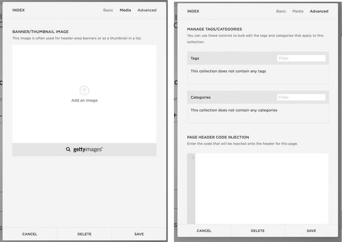
Figure 2-10. Page Settings Media menu and Advanced menu
Types of Pages
A Regular Page is the basic page type of the site. A Regular Page has a header area, content area, and footer area. The header and footer areas are global, meaning they appear the same on all pages. Changes made to the footer of one page will make the change on all pages. According to the sitemap we need a page for the local Rescues and Shelters listing. I will click the + icon opening up the New Page menu and select a Page.
The Create New Page menu asks me to give the page a Page Title and provides options for a Starter Layout. Starter Layouts populate the page with an initial set of Squarespace blocks with filler content. This is great for visualizing a page layout as a clickable wireframe. For the Rescues and Shelters page, I will select the Details 1 Starter Layout and click the Start Editing button. Figure 2-11 shows the Starter Layout menu screen and some of the layout options.
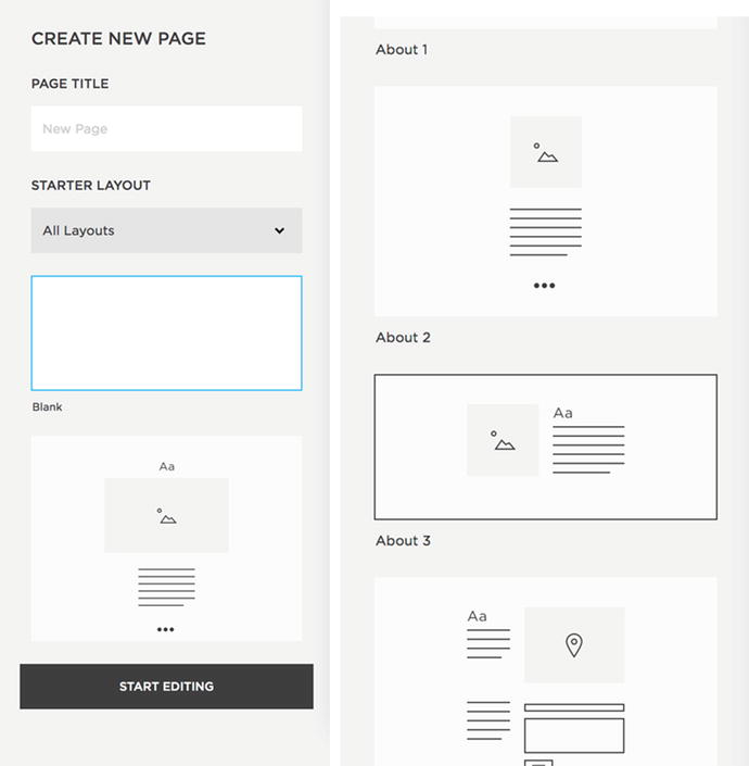
Figure 2-11. Create New Page menu and Starter Layout selection
Cover Pages are special page layouts and do not have the header or footer of the rest of the site. Cover Pages can be used as a splash page to put up while you work on the rest of the site or as a landing page for a particular campaign. Like a Regular Page with Starter Layouts, Cover Pages have a number of layouts to choose from. Figure 2-12 shows the Cover Page layout menu. Unlike other page types, you cannot add or remove content blocks from Cover Pages. Each cover page has specific fields for entering content into the Cover Page and a dedicated style editor that has Cover Page only styles. Additional content and styles can be added to a Cover Page but it has to be done through Code Injection.
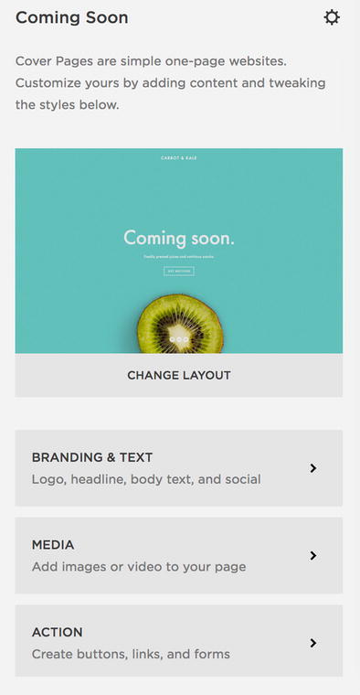
Figure 2-12. Cover Page layout menu
Albums are a special type of page for adding audio files to the site. They would typically be used for a CD or other collection of songs. An Album Page is very similar to the Record Cover Page. Like the Record Cover Page, additional blocks of content cannot be added to the Album Page. The main difference is that the Album Page will display the regular site header and footer where the Record Cover Page does not.
Folders are a non-content type of item that can be added to the site. Folders can contain any of the other page types. A folder in the navigation will create a sub-navigation section. Folders can also be used to organize your content. When a folder is added it has a section underneath that says + Add Page. Clicking on + Add Page will bring up the regular Create New Page menu and allow you to add any type of page to the folder. Figure 2-13 shows a Folder and the + Add Page section. It also has an example of a page having already been added to the folder. The example Test Page would appear in the sub-navigation for this Folder. The sub-navigation takes a different form depending on the template. Most templates have drop-down menus that appear under the main navigation item for Desktop view. For mobile view the sub-navigation is often an accordion that expands or another overlay panel that slides onto the screen.
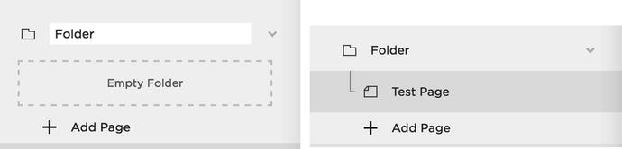
Figure 2-13. Folder and new page within the Folder
Links are another type of non-content item. Links can be a Content link, File link, or External link. Content links are links to other pages within the website. File links are links to a PDF or other file that is stored in the Files section of the site. External links are links to other websites. It is always recommended to open external links in a new window. When adding a link in the Pages menu the Configure Link panel opens and asks you for the Link Title and the Link itself. Figure 2-14 shows the Configure Link panel and the Content link, File link, and External link options.
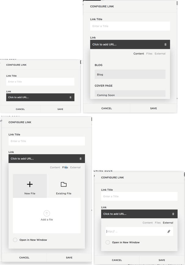
Figure 2-14. Configure Link menu, Content, Files, and External links options
Squarespace Collections
Collection is the term used by Squarespace to reference a group of items. There are a number of page types that are collections. Index Page, Gallery, Blog, Events, and Products are all types of Collections in Squarespace. Some templates have additional specialized Collections. It is also possible to create a custom collection with Developer Mode.
Earlier I created an Index Page for the Home page of the example site. An Index Page is a collection of Regular Pages. The Index Page groups Pages together and uses them as sections in the layout. In the Brine template the Index Page is a Stacked Index where each is Page a full-width panel in the Index. As you can see in Figure 2-9 the empty Home index has a + Add Section option to add sections to the Index. For the Brine family template the Index can contain Page and Gallery sections. Some templates have special page types that can also be added to the Index. Index Pages pull the content of the Regular Pages, and not the entire Regular Page; therefore it is not possible to password protect a single page within an Index. The entire Index can be password protected in the Index Page’s Settings.
Gallery Page
Gallery Pages are used for displaying a group of images or videos. Most templates use the standard Gallery Page, which displays the images or videos in a slideshow or a grid. Some templates have special Gallery Pages with additional features or layouts. In the example site I will create a Gallery Page named Furry Friends and add pictures of animals that have been helped by PAWsitive Connections TX. The Gallery Page initially begins empty. Click the + sign to add items to the gallery. A menu appears with the items that can be added to the gallery. The options are an Image, Video, or a Getty library image. Figure 2-15 shows the empty gallery and the menu for adding items to the gallery.
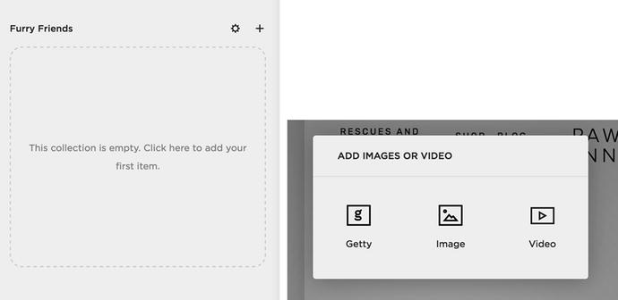
Figure 2-15. An Empty Gallery Page named Furry Friends and the options for adding items to the gallery
After the type of item to add to the Gallery is selected the item’s settings appear. There are four pages of options for a Gallery item. The Content menu is where the actual image is uploaded and the Title for the item is entered. The text editor area adds a description to the item. Other controls like Tags, Categories, Comments and publishing are also part of the Content menu. Gallery items can be published immediately, scheduled to publish in the future, marked as needing to be reviewed, and marked as a draft. Figure 2-16 shows the Content menu and the publishing options.
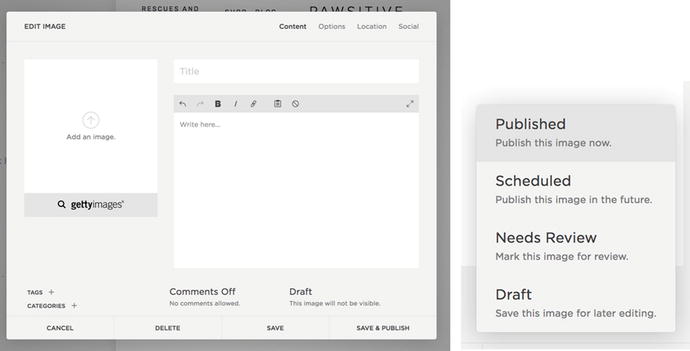
Figure 2-16. Content menu and publishing options
The Options menu contains the Image URL, Author information, and the ability to select the image as a Featured Image. The Source URL provides a source for the item or a reference link for further reading. The Source URL is often displayed below the image. A Clickthrough URL allows the gallery item to link to another webpage.
The Location Menu sets a specific location for that gallery item. The Social menu allows the gallery to be connected to social media accounts. Figure 2-17 shows the Options, Location, and Social menus.
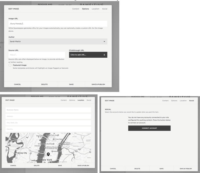
Figure 2-17. Options, Location, and Social item menus
Once items have been added into a Gallery Page it no longer appears empty. Thumbnails of the Gallery items now appear as shown in Figure 2-18. Adding a Video to the Gallery Page is the same process as adding an image. The Video item has an additional field to enter the embeddable URL of the video. There is also a Use Thumbnail option that will display the video thumbnail image rather than the videos default preview image. The video Content option is also shown in Figure 2-18.
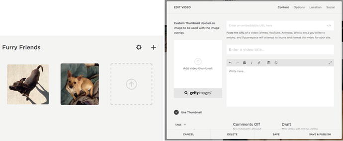
Figure 2-18. Gallery with two image items and Video item Content options
Blog
The Blog , or blog list, is another type of Collection that contains blog posts. The Blog displays the blog posts in a list or grid, depending on the template. The Page Settings for the Blog contain additional blog-specific settings. In the Page Settings Basic menu there is a Posts Per Page setting that determines the number of Posts to display on the Blog page. The Features menu determines if the Full blog post text or the Excerpt is displayed on the blog list. The Syndication menu allows the blog to connect to podcasting and RSS feeds. The Advanced menu has an additional code injection called Post Blog Item Code Injection. Figure 2-19 shows the Basic, Advanced, Syndication, and Features menu options.
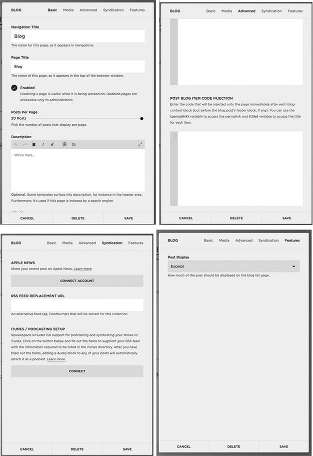
Figure 2-19. Blog Settings Basic, Advanced, Syndication, and Features menu
The Blog Post Editor opens when the + sign is clicked to add a new post. The Blog Post Editor has Content, Options, Location, and Social sections. The Content section is where the actual content for the post can be added. It contains a section for the post title, the content for the title, Tags, Categories, Comments and publishing settings. Once a blog post is created the content can also be edited in the page editor. The Options section is where a thumbnail image can be uploaded. Some templates display the post’s thumbnail as a banner image on the individual post page. Other templates use it as the image in the blog list grid. The Options section also includes settings for Post URL, Author, Source URL, Excerpt, and Featured Post. Some templates and blocks will highlight a Featured Post with additional styling or layout changes. Figure 2-20 shows the Blog Post Editor Content and Options menus .
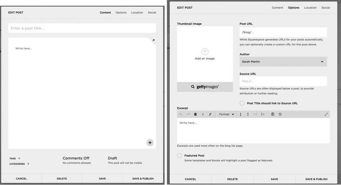
Figure 2-20. Blog Post Editor , Content, and Options sections
Events
The Events Page is a Collection of individual Event items. In the Events Page’s Basic menu there is a select field to choose the Default Event View. The options are a list or calendar layout. Figure 2-21 shows the Default Event View in the Basic menu. The major limitation with the Squarespace Events Page is that there is no support for recurring events. This means that weekly or other recurring events have to be repeatedly duplicated. Recurring events is an often-requested feature. Squarespace has indicated that recurring events is on the road map for development. In the meantime if a client needs easy recurring events, or has a large number of events, there are other calendar tools that can be added to the Squarespace site via a Code Block.
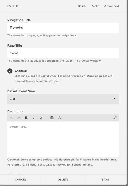
Figure 2-21. Events Page Settings Basic menu
The Event Editor opens when a new Event is added and is very similar to the Blog Post Editor. The Content menu contains the settings for event title, content, Tag, Categories, Comments and publishing. The Event Editor Content menu also includes fields to set the start and end times for the event. Event items can last for a single day or span several days. A date and time must be set for each Event item. An Event item cannot be set as an all day event; it must have a start and end time. The Event Editor Options menu contains the settings for Event URL, Author, Source URL, Excerpt, Featured Event, and the Thumbnail Image. Depending on the template the thumbnail image may appear only in the Events list or it may also appear on the Event item page. Figure 2-22 shows the Event Editor Content and Options menus .
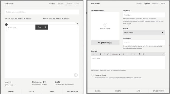
Figure 2-22. Event Editor Content and Options menus
Products
The Products Page is the online store. It is a Collection that contains all the items for sale in the store. Some templates have advanced features including additional category and display options. This section will only go over the basic settings and features available in every template. Squarespace supports three types of products: digital, service, and physical. Digital products are purchased and then downloaded. The customer receives the download link in the purchase confirmation email. The download link will expire after 24 hours. Service products are for services provided by a person. Service products are not shipped and therefore do not include shipping information in the checkout process. Service products also don’t require sales tax. Physical products are products that are shipped to a customer or require the collection of sales tax. Figure 2-23 shows the new product menu with the three types of product selections.
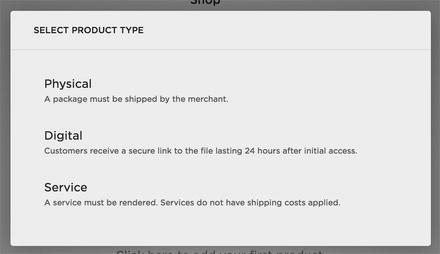
Figure 2-23. Product type, Physical, Digital, and Service
Squarespace is actively improving their e-commerce offerings with new features being released regularly. It is important to understand that there is very little about online stores that can be customized outside of the Squarespace interface. All transactions are processed on separate secure Squarespace servers. This is fantastic for protecting a customer’s privacy and personal information, but it makes it very difficult to change the checkout process. It is important to check the Squarespace documentation to ensure that all your client’s needs are met before starting a Squarespace e-commerce site. It is especially important to ensure that Squarespace can meet the shipping, tax, and discount code needs.
Each item for sale will be a Product in a Products collection. Each Product has a number of settings in the Product Editor. The menus in the Product Editor include Item, Pricing & Variants, Additional Info, Form, Options, and Social. The Item menu has settings for product name, description, thumbnail image, tags, categories, and publishing status. The Pricing & Variants field opens the Pricing & Variants menu. Settings in the Pricing & Variants menu include the SKU, Price, Stock, Weight, Dimensions and custom fields. Figure 2-24 shows the Item and Pricing & Variants menus.
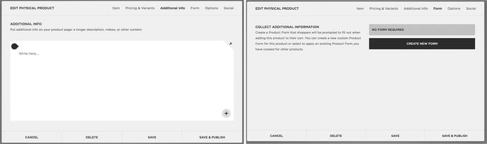
Figure 2-24. Product Editor Item and Pricing & Variants menus
The Additional Info menu contains the main content for the item. This is where any content Blocks can be added. The content in the Additional Info section typically appears underneath the product thumbnails, name, description, and add to cart button. If you are duplicating products the Additional Info section is not duplicated into the new product. The Form menu allows a custom form to be added to the product. This is useful if additional information needs to be collected from the user to customize their purchase. For example, if the product were a mug with a custom message, the custom form would be used to collect the message . Figure 2-25 shows the Additional Info and Form menus.

Figure 2-25. Product Editor Additional Info and Form menus
The Service and Digital products have similar Product Editors. The Digital Product Editor has an additional field to upload the digital file. The Services Product Editor doesn’t have the weight or dimensions of the product since that isn’t necessary for Service products. Please refer to the Squarespace documentation for detailed descriptions of all the Product settings .
Setting Up Navigation Menus
Once pages have been added to the site they need to be organized into menus. Every template has a Main Navigation menu area and a Not Linked area. Some templates have additional menu areas. The Brine template has three menu areas: Main Navigation, Secondary Navigation, and Footer Main Navigation. I would like the header navigation to appear on the left and right around the site’s logo. I will use the Main Navigation on the left of the logo and the Secondary Navigation on the right. I will also move the Home index out of the Main Navigation and down to the Not Linked section. If the homepage is in the Not Linked section it won’t appear in the navigation menus, but the site’s logo or site title will link to the homepage. Figure 2-26 shows the Main Navigation and Secondary Navigation set up and the Not Linked section containing the Home index. An existing page can be clicked and dragged within a menu section, or between menu sections, to reorder the navigation.
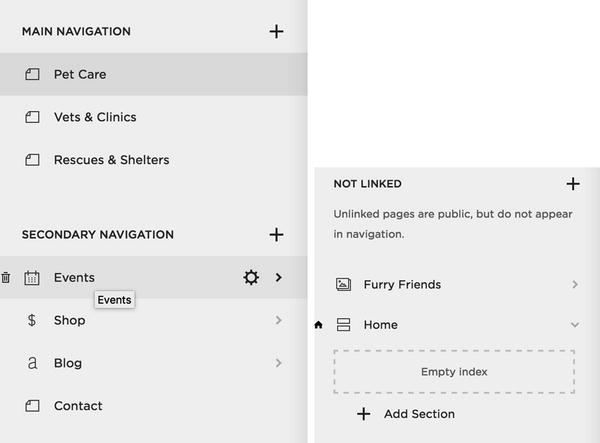
Figure 2-26. Main Navigation, Secondary Navigation, Not Linked menus for PAWsitive Connections TX website
Adding Content Using Blocks
Squarespace Blocks are used to add content to the website. The main content area of each page or post accepts content Blocks. Blocks can also be added to the footer area of most templates. Some templates have special regions for adding Blocks to a sidebar or navigation menu area. There are many different types of Blocks and Squarespace is regularly adding Blocks to the platform. This section will discuss some of the core blocks but there are many more. There are Blocks for specific services, filtering options, calendars, and many more. Please refer to the Squarespace documentation for a list of all Blocks and their functionality.
The Text Block allows you to add a section of text. The Text Block has a basic text editor controls, bold, italic, ordered list, bulleted list, tabs, text alignment, and text style selection. The text style is limited to Normal, Heading 1, Heading 2, Heading 3, Quote, and Code. This limitation can be frustrating but exists to help users keep a consistent look and feel to their website. If text needs a special style this can be accomplished with a code block. Text Blocks also have the ability to add a link. This is especially important to note because this is the easiest way to add files to the file management system. I typically create a Text Block and start to make a link. Then I upload files and delete the Text Block. The files will stay stored in the file management system even when the Text Block is deleted. Any item added to the file management system will have a URL of ‘/s/filename.pdf’. When customizing a site I will often use this technique to add an image or file to the file management system to be used in my custom code. Figure 2-27 shows the editor for a Text Block.
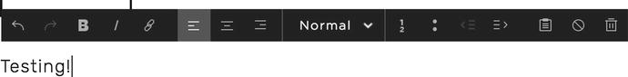
Figure 2-27. Text Block Editor
The Image Block is another core block . The Image Block is for adding a single image to a section of the site. The Image Block has a content menu to upload an image and the Design menu to style the Image Block. Image Blocks on Regular Pages have six different layouts to choose from. Other types of pages have only the Inline layout. The Inline layout has style options for caption placement, opening the image in a lightbox, and adding a clickthrough URL. Figure 2-28 shows the Image Block Content and Design menus.
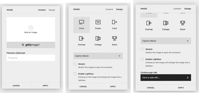
Figure 2-28. Image Block Content and Design menus
Gallery Blocks add a collection of images to the page. Gallery Blocks have four different layouts: Slideshow, Carousel, Grid, and Stack. Images can be added directly to a Gallery Block or an existing Gallery Page can be selected to use in the Gallery Block. Gallery Blocks can display the image and the image’s title and description. The Content menu is where the images are uploaded or a Gallery Page is selected. The Design menu lists the four layout options and the controls for each option. Figure 2-29 shows the Gallery Block Content and Design menus. Later in the book we will use custom code to add cool hover effects to a Grid Gallery Block .
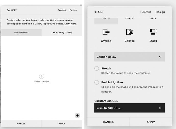
Figure 2-29. Gallery Block Content and Design menus
Summary Blocks are similar to Gallery Blocks in that they display a group of information. Summary Blocks can only be used with Product, Event, Blog, and Gallery Collections. The Summary Block has four layout options: Wall, Carousel, List, and Grid. Summary Blocks can display the item’s title, thumbnail, excerpt, and metadata. Since the Summary Block can display so much information it is great to highlight blog posts and events across the site.
The Code Block is another extremely useful block that we will use in the example website. Code Blocks can accept HTML, CSS, and JavaScript code. Code Blocks are used for adding third-party plug-ins to the site as well as creating custom features not already included in Squarespace.
Arranging Blocks
Any section where Blocks can be added uses a 12-column grid. The columns make it easy to add rows and columns of Blocks. It’s easy to make block 1/2, 1/3, 1/4, and 1/6 the width of the grid. It also allows for columns of 1/3 and 1/4 with the rest of the content spanning 2/3 or 3/4 of the page respectively. Figure 2-30 shows a 12-column grid with various size blocks to illustrate some of the possible layouts. There are limitations with the 12-column grid. The Blocks can’t span part of a column. For example, the 12-column layout also doesn’t allow for 5 equally sized items in a row since 5 cannot equally divide 12. Five items in a row can be done within some of the Block settings but the Block itself must span whole columns. The other scenario I have run into problems with the 12-column grid is adding sponsor logos. Using an image block to add a sponsor logo has occasionally resulted in a logo that is too big or too small, depending on the number of columns it spans. In this case I have sometimes created a gallery for the logos as a workaround.
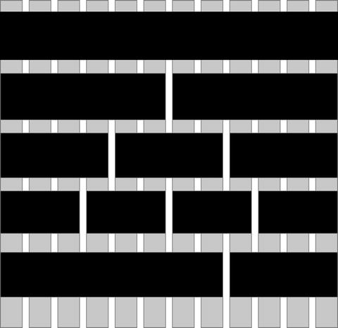
Figure 2-30. Twelve-Column grid with example block sizes
When working in the 12-column grid, teardrop-shaped insertion markers appear indicating where another Block can be added. Clicking on the insertion marker will open the new Block menu . Guidelines also appear indicating where the new block will be placed. If the guideline spans the full width of the grid then it will create a new row. If the guideline spans the full height of the page then it will create a new column. Figure 2-31 shows the teardrop insertion marker and a full-width row guideline.
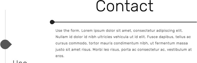
Figure 2-31. Teardrop insert marker and insert marker with new row guideline
Squarespace automatically wraps all blocks into a single column for mobile size screens. Rows wrap from left to right into a single column. Columns stack from left to right. To get the desired mobile layout the blocks must be added in the correct place. A typical scenario is three columns of images and a paragraph of text under the image. For desktop view the images appear in a row and the text appears in a row under the images. However for mobile view the text needs to appear directly below its associated image. Figure 2-32 shows how the guidelines could appear when adding the blocks and the corresponding mobile view. The image blocks were all added first and a new row was created for the text blocks. Following the Squarespace layout rules the first row of images wraps into a single column and then the next row. This results in the mobile view showing three images and then three text blocks.
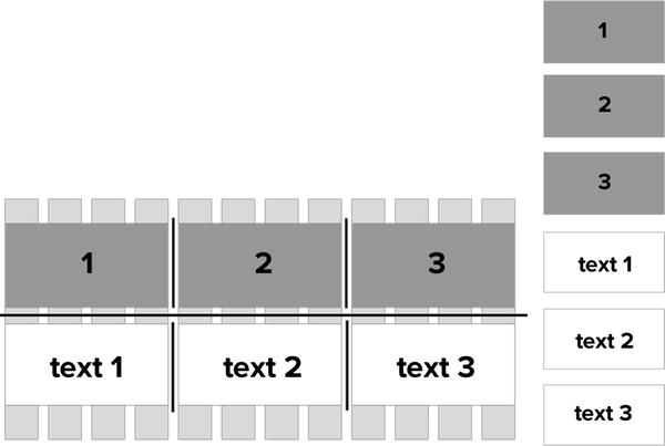
Figure 2-32. Layout option 1 with corresponding mobile view
The layout can be adjusted to appear correctly on mobile view by having the image and text be contained in the same row. This is accomplished by using the guidelines to “stick” the text block to the bottom of the image block. This ensures that the text blocks are part of the same column and outer row as the image blocks. Figure 2-33 shows the guidelines for laying the blocks out correctly. I would first add the three image blocks and then add each text block ensuring that the guideline for inserting it is only as wide as the image block. This creates three columns of images with a second row of text within each column. Then when the layout wraps for mobile view the image / text sections wrap together creating the desired layout.
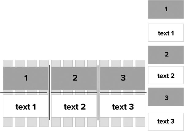
Figure 2-33. Layout version 2 with corresponding mobile view
There are some scenarios where the desired desktop layout does not wrap to the desired mobile view. There are ways to use custom code to force the blocks to wrap to the desired mobile view. However, it is best practices to always get the layout as close as possible using the built-in Squarespace layout tools .
Wrap-Up
You should now feel comfortable adding pages and content to your site. A strong understanding of the 12-column grid layout will aid in the design of the site. I recommend overlaying a 12-column layout when working on the design files to ensure that the website can match the approved client design. The next chapter will start exploring the Style Editor and other style settings for the site.