Access isn't typically a tool you would think of when considering a dashboard style reporting tool. The reporting tools in Access, as slick as they are, don't readily lend themselves to data visualizations. That is to say, Access doesn't offer a whole lot in the way of dashboarding graphics. What's so great about visualization?
When you present your data through a visual interface, you can highlight key trends, point out comparisons, and focus in on outliers. Think of how much time it takes your end-users to process the table-driven reports you produce. Now imagine giving your users a visual interface that they can absorb at-a-glance. Adding visual components to your reporting arsenal not only makes you more effective at reporting data, but it helps your end-users become more effective at consuming data.
In this chapter, you explore some of the techniques that will help you go beyond tables filled with numbers. At the end of this chapter, you'll be turning your bland queries and reports into innovative visual interfaces.
Data visualizations don't always refer to fancy graphics. In fact, something as basic as specially formatted font or colored fields can be considered visualizations. In this section, you start with some simple techniques that will help spruce up your reporting.
As a general rule, you should always make your reporting easy to read and absorb. To that end, you should consider formatting the numbers in your reports to help your audience consume the needed information they need without confusion or hindrance. Why? Because it's never fun to count the zeros in a large number, especially when you're staring at 10 pitch font.
Here are some general best practices when it comes to formatting numbers for reporting:
Always use commas to make numbers easier to read (for example, instead of 2345, show 2,345).
Only use decimal places if that level of precision is required. For instance, there is rarely benefit for showing the decimal places in a dollar amount such as $123.45. Likewise in percentages, use only the minimum number of decimals required to represent the data effectively. For example instead of 43.21 percent, you may be able to get away with 43 percent.
Only use the dollar symbol when you need to clarify that you are referring to monetary values. If you have a chart or table that contains all revenue values, and there is a label clearly stating this, you can save room and pixels by leaving out the dollar symbol.
Format very large numbers to thousands or millions place. For instance, instead of displaying 16,906,714, you can format the number to read 16.9 M.
You can easily format numbers in Access by adjusting the Format property of your value fields. To test this, go to the sample database you downloaded with this book, and open the Access Report called "Revenue By 2007 vs 2008."
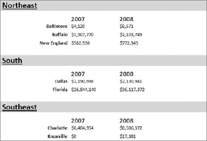
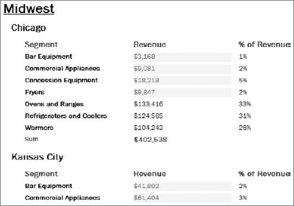
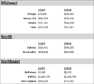
As you can see in Figure 13-1, there are a ton of numbers here. Instead of inundating your users with unnecessary digits, you can truncate the dollar values to thousands.
Follow these steps to format the numbers:
Switch to Design View by going up to the Ribbon and clicking View

Click the 2007 field to set focus on it.
You will see a Design tab in the Ribbon. Go to the Design tab and click the Property Sheet button.
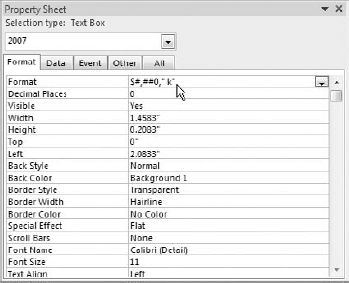
This activates the Property Sheet pane. Here, click the Format tab and enter $#,##0," k" into the Format property (see Figure 13-2).
Click the 2008 field and apply the same number formatting.
Let's take a moment to analyze the syntax you just used: ($#,##0," k").
The dollar symbol ($) obviously tells Access that this is a currency value.
The pound signs along with the first comma (#,##0) defines a basic structure for any number that uses this format. In this case, #,##0 tells Access that commas should be used in any number larger than 999.
The comma after the 0 tells Access to truncate the number to the thousands place.
The letter k wrapped in quotes ("k") adds a visual indicator that these numbers are in thousands.
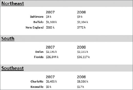
Switch back to report view to see the result of your change. If all went well, your report should now look like one shown here in Figure 13-3.
This is just one example of a custom number format you can apply to reduce the clutter in your reports. You can employ literally hundreds of alternative formats. Table 13-1 lists just a few of the common format syntax and how they can affect your numbers.
Conditional Formatting is the term given to the functionality where Access dynamically changes the formatting of a value based on a set of conditions you define. Conditional formatting allows your audience to, at a glance, make split-second determinations on which values are "good" and which are "bad," all based on formatting.
Conditional formatting is one of those functionalities in Access that offer countless ways of achieving a result. In this section, you cover a few basic examples of how conditional formatting can visually enhance your Access reporting. If you've worked with conditional formatting in Excel, this will be familiar territory.
The simplest way to apply conditional formatting is to test whether a field's value meets a specific criterion. For your first encounter with conditional formatting in Access, take a moment to walk through an example.
Go to the sample database you downloaded with this book, and open the Access Report called Revenue by Segments.
Switch to Design View by going up to the Ribbon and clicking View

Click the SumofSales_Amount field; then find the Format tab on the Ribbon. There, click the Conditional Formatting button shown in Figure 13-4.
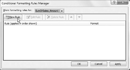
The Conditional Formatting dialog box will open (see Figure 13-5). Click the New Rule button.
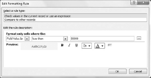
The New Formatting Rule dialog box will activate. Take a look at Figure 13-6. Because you are applying a condition to the current field based on its own values, the only adjustments that have to be made are to the operator dropdown and the criteria field.
As you can see in Figure 13-6, you are applying a formatting rule to any value less than 50000. Select less than from the operator dropdown, and then enter 50000 in the criteria input.
While you are still on this dialog box, assign a format you want applied to any value meeting your criteria.
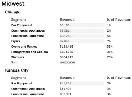
Click the OK button to finalize your conditional formatting. Figure 13-7 illustrates what your report will look like when you switch back to Report View.
With your newly applied conditional formatting, you can easily pick out the entry under 50,000. Although this is a relatively benign example, conditional formatting can prove useful in guiding your end-users toward key metrics on your report.
Often times, you may need to set conditional formatting on a particular field based the values of another field. In these cases, you'll have to configure your conditional formatting slightly differently.
Open the Revenue By Segment report again in Design View.
Click the SumofSales_Amount field, and then click Conditional Formatting on the Format tab in the Ribbon.
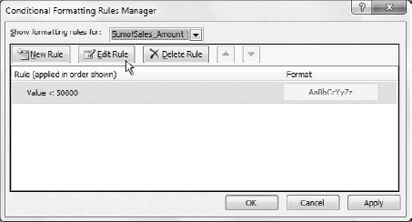
Because you have already set up a conditional format, you now have the Edit Rule button illustrated in Figure 13-8. From here, you can choose to create a new rule, or to edit the existing rule. Click the Edit Rule button.
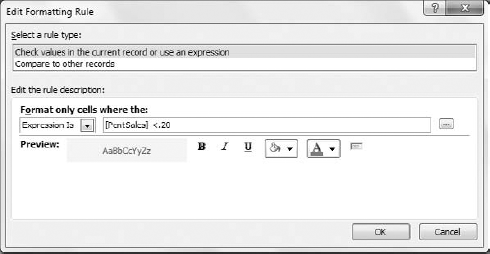
At this point, you will be taken to the Edit Formatting Rule dialog box shown in Figure 13-9. In this example, you want to edit the rule to check the PcntSales field. If the PcntSales Field is less than 20 percent, you want to apply your conditional formatting.
As you can see in Figure 13-9, the Expression Is qualifier is being used this time. Any time you are evaluating your criteria against another field, you will choose the "Expression is" qualifier. On the same dialog box, enter [Pcnt Sales] <.20. This expression tells Access to evaluate the PcntSales field. If the value in that field is less than 20 percent, then the SumofSales_Amount field will be formatted.
Click the OK button to finalize your conditional formatting. If you're following along, your report should look similar to the one shown here in Figure 13-10.
If you find that you no longer need to conditionally format a particular field, you can follow these steps to clear the conditional formatting rule.
Open your report in Design View.
Click the control from which you want the conditional formatting removed.
Click Conditional Formatting on the Format tab in the Ribbon.
In the Conditional Formatting dialog box, select the condition you want removed and then click the Delete Rule button.
Click OK to confirm.
Up until now, you've been working with the visualization tools that are native to Access. Now it's time to move off the reservation a bit.
In this section, you explore a few techniques that go beyond the built-in functionality of Access. As you go through the rest of this chapter, you'll discover how a little outside-the-box thinking can expand your reporting capabilities and improve your ability to communicate through dashboard-style visualizations.
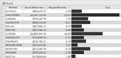
Figure 13-11 shows a query that contains what seems to be a bar chart. This type of data visualization is typically referred to as in-cell charting (charting directly in a table, providing a visualization of the data shown). The cool thing is that the in-cell charting achieved here is the result of a simple calculation and the STRING function.
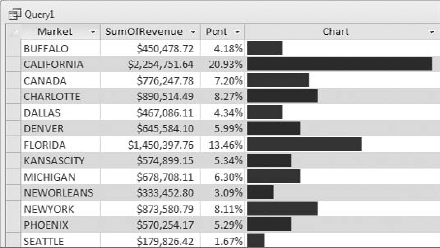
Figure 13.11. The in-cell charting seen here is nothing more than a query trick using the STRING function.
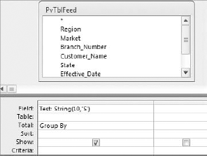
The STRING function repeats a given character a specified number of times. For example, if you were to type the expression =STRING(10, 's'), the returned value would be ssssssssss (the "s" character repeated 10 times). To see this in action, build the query you see in Figure 13-12.
When you run this query, as promised, you will see a series of ten S's. Now you can alter this query so that instead of using a letter, you would use a character that, when repeated, looks kind of like a chart.
For this, you can use the ChrW function. The ChrW function returns Unicode characters based on a character number. For instance, ChrW(9608) returns a block that, when repeated several times, looks like a bar chart. Here is how you would use it with the STRING function.
String(10, ChrW(9608)
Figure 13-13 demonstrates how this is used in a query.
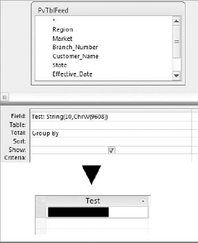
Figure 13.13. Using ChrW(9608) with the STRING function in a query produces a series of block characters reminiscent of a bar chart.
Obviously, it doesn't make sense to hard-code the number of times to repeat the character. You would ideally point the STRING function to some sort of field or mathematical operation that gives you a number of times to repeat. Figure 13-14 illustrates an example where the Revenue field is used in a mathematical operation to arrive at an appropriate number of times to repeat the block character.
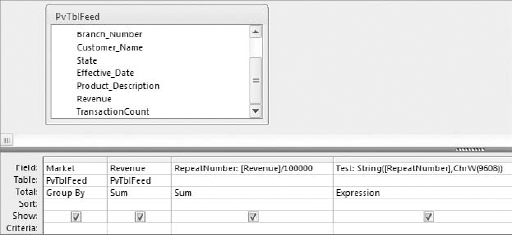
Figure 13.14. In situations where you have large values, you can divide the vales by 10, 100, 1000, etc. in order to calculate an appropriate repeat number.
As you can see in Figure 13-15, you couldn't just use the raw Revenue field to feed the STRING function. There would be too many block characters, and the function would fail. So the RepeatNumber field is calculated to derive a repeat number that works.
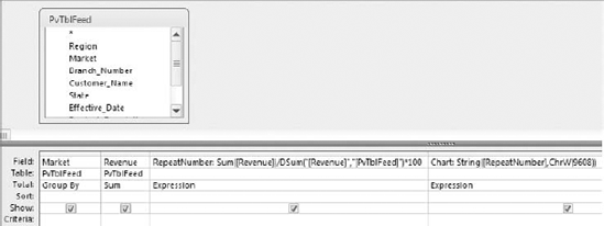
Another way to limit the number of times a character is repeated is to calculate a maximum repeat number. You can do this by getting a bit fancy and using Access' DSUM function. To understand this, take a look at Figure 13-16.
The expression in the RepeatNumber column basically tells Access to take the value being referenced and divide it by the sum for the entire range. This returns a percent weighting, which is then multiplied by 100. Stand back and think about what this means. The maximum number of characters that can possibly be returned by this formula is 100, no matter how big the revenue figures are.
Note
You may be wondering why you would not just use the data bars conditional formatting feature, or for that matter, a chart? First, data bars are not backwards compatible. Meaning anyone who doesn't have Access 2010 won't be able to use them. Second, their gradient style may not conform to the overall look and feel of your dashboard. As for standard charts, they take up much more space than in-cell charting. Plus they add overhead to your file. In-cell charting gives you an easy to implement alternative that doesn't require a lot of real-estate or setup.
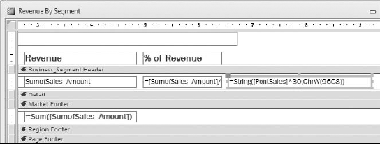
Because these clever new data bars are expression driven, they can be used practically anywhere you can use an expression. In Figure 13-17, a new TextBox has been added to the Revenue by Segments report, and a STRING expression is used to create a data bar.
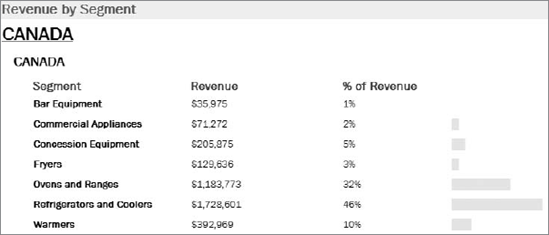
Figure 13-18, shows the data bars in Report view. Note that because these data bars are text based, they can be formatted just like any other text.
With the release of Office 2007, Excel introduced new conditional formatting rules that allow you to show dashboard-esque icons to your cells. With these icons, you can represent performance using different shapes and colors. Unfortunately, no such functionality exists in your cache of Access 2010 tools.
A creative alternative is using the fancy characters and symbols you can get from the ChrW function. You were introduced to the ChrW function earlier in this chapter ("Enhancing Queries and Reports with Data Bars"). If you'll remember, the ChrW function returns Unicode characters based on a character number. For instance, ChrW(9608) returns a block character. These characters allow you to mimic Excel's icon sets, using symbols to provide users a visual representation of performance.
Before walking through an example, look at Table 13-2. Here, you will see some of the Unicode characters often seen on dashboard reports. Again, the idea is to pass the character number through the ChrW function. For example, ChrW(9650) would return an up arrow symbol.
To understand the benefit of using symbols in reporting, go to the sample database you downloaded with this book, and open the Access Report called Revenue By 2007 vs 2008.
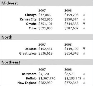
As you can see in Figure 13-19, this report compares revenues in 2008 to those in 2007. Obviously, the goal of this report is to convey the movement up or down in revenue from one year to another.
Table 13.2. Unicode Character Codes and Their Associated Symbols
CHARACTER CODE | ASSOCIATED SYMBOL |
|---|---|
8592 | |
8593 | |
8594 | |
8595 | |
8598 | |
8599 | |
8600 | |
8601 | |
8678 | |
8679 | |
8680 | |
8681 | |
9607 | |
9608 | |
9650 | |
9658 | |
9660 | |
9668 | |
9670 | |
9671 | |
9679 | |
9680 | |
9681 | |
9682 | |
9683 | |
9684 | |
9685 | |
9698 | |
9699 | |
9700 | |
9701 | |
10003 | |
10007 | |
10025 |
In order to help absorb this data faster, let's add a set of up and down arrows representing the increase or decrease in revenue from 2007 to 2008.
Switch to Design View by going up to the Ribbon and clicking View

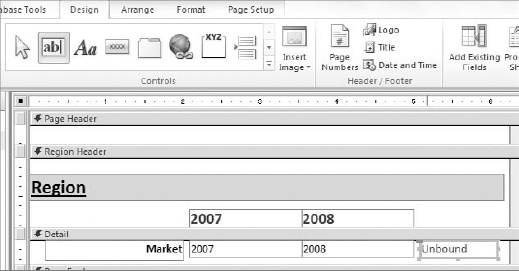
Add a new TextBox next to the 2008 field (Figure 13-20).
In the newly added TextBox, enter the following IIf statement: =IIf([2008]>[2007],ChrW(9650),ChrW(9660)). This checks if the 2008 revenue is greater than 2007. If so, then an up arrow is return via the
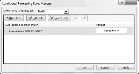
ChrWfunction. If not, a down arrow is returned. Your screen should look similar to that shown in Figure 13-21.Since you're knee-deep in creating a visualization, you might as well add some conditional formatting. Click your newly created TextBox and select Conditional Formatting from the Format tab. This activates the Conditional Formatting Rules Manager dialog box.
Click the New Rule button.
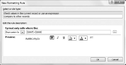
Select the "Expression Is" qualifier, then enter [2008]>[2007] in the condition input (see Figure 13-22). This formats all arrows where the revenue from 2008 is greater than 2007 (up arrows). Needless to say, you want to select formatting that corresponds with good performance. Format the Font Color green.
Press OK to confirm your changes and to return to the Conditional Formatting Rules Manager.
Now you'll need to add conditional formatting to those records where 2007 is greater than 2008. Click the New Rule button.
Select the "Expression Is" qualifier, then enter [2007]>[2008] in the condition as demonstrated in Figure 13-23. This formats all arrows where the revenue from 2007 is greater than 2008 (down arrows). For the down arrows, format the Font Color Red.
Take some time to format your arrows; make them bigger, align them to the other fields, and so on. If all went well, your report should look similar to Figure 13-24.
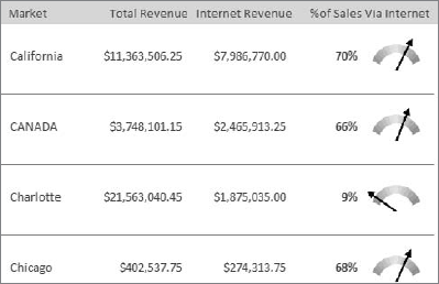
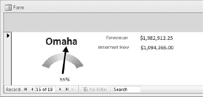
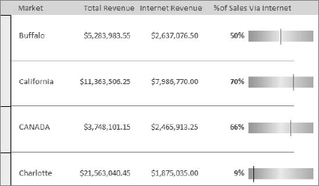
Figure 13-25 shows a dashboard report (gauges included) that contains data related to internet revenue. Believe it or not, this report was done in Access. If you open the sample database for this book, you will find a Report object called Dashboard Report.
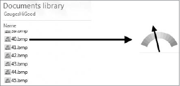
The starting point to this technique is obviously graphics. You'll need to decide which graphics to use. For illustrative purposes, Figure 13-26 shows a directory that has several bitmap files (each one containing a representation of a gauge). Note how the title of each file is a number. When creating graphics for dashboarding purposes, the idea is to name each file a number corresponding to a value from 1 to 100. So file 50 represents 50 percent, file 40 represents 40 percent, and so on.
Note
The sample database for this book already contains a table ('DashboardGraphics' ) which contains a series of images ideal for dashboarding. This section is an illustrative look at how you would go about building your own dashboard graphics table.
Once you have graphics, you'll need to store them someplace. This is where Access tables come in. Figure 13-27 demonstrates a basic structure for a table designed to hold graphics. As you can see, you need only three columns to start.
A number column that holds numbers 1–100
A percent column that holds .01–1
An OLEObject column that holds the Bitmap graphics
Tip
OLE (Object Linking and Embedding) is a Microsoft technology that allows an application to store data packages such as text files, sound files, or picture files. The OLE Object field type in Access uses this technology to embed and store external data files directly into an Access database. Embedding files using an OLE Object field ensures that the embedded files travel with the database when distributed or moved.
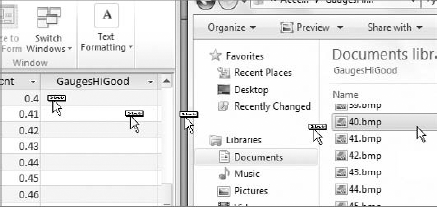
Once Access has a place to store your graphics, you'll need to get your graphics into the table. Several multiple methods are available to do this. The easiest manual way is to drag them into the OLEObject field. Simply drag each graphic into the record corresponding to its value. For example, the bitmap file titled 40 would go into the record where the ValueNum field is 40 and the ValuePcnt field is .40. Figure 13-28 demonstrates how you would drag graphic files into the OLE Object field.
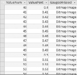
When all is said and done, you would have a "graphics table" where each record represents a number value from 1 to 100. Each number and percent value corresponds to the appropriate bitmap file (see Figure 13-29).
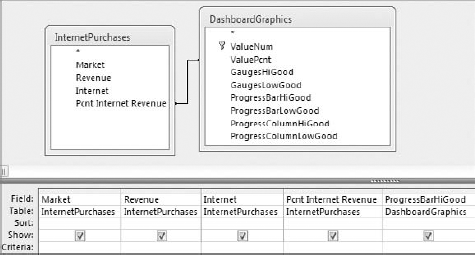
Using a graphics table is as easy as linking it to any analysis using the ValueNum or ValuePcnt columns. Figure 13-30 demonstrates how you would use a query to tie your graphics table to another dataset. In this case, the Pcnt Internet Revenue field is joined to the ValuePcnt field I the graphics table. This results in the appropriate image being associated to each value in the Pcnt Internet Revenue field.
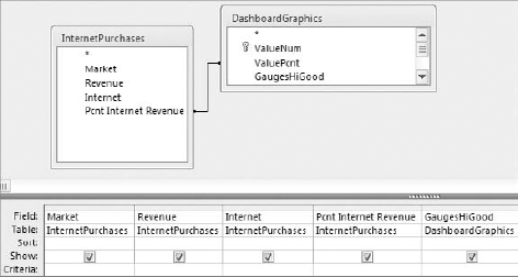
Figure 13.30. The OLEObject column (the column that holds the bitmaps) in this example is called "GaugesHiGood."
After the query is saved, you can use it as the source for various reports and forms. Figure 13-31 shows that you can build reporting views in Access forms as well as Access reports.
Keep in mind that you can have more than one OLEObject field in your graphics table. This allows you to have all kinds of different visual representations of 1–100. If you open the DashboardGraphics table found in the sample database for this book, you will see multiple columns representing different graphics.
Figure 13-32 demonstrates how using multiple graphics fields is as easy as selecting the desired graphic in a query.
Running this query produces the report in Figure 13-33.
Adding data visualizations to your reporting allows you to highlight key trends, point out comparisons, and focus in on outliers. It not only makes you more effective at reporting data, but it helps your end-users become more effective at consuming data.
Using Access' conditional formatting functionality is an easy way to quickly add visualizations to your reports. Conditional formatting allows your audience to, at-a-glance, make split-second determinations on which values are "good" and which are "bad," all based on formatting.
Outside of rudimentary conditional formatting, Access doesn't offer a whole lot in the way of data visualization and dashboarding graphics. But with a bit of imagination, you can create your own visualizations. Two examples covered in this chapter are data bars using the STRING function and fancy symbols using the ChrW function. Alternatively, thanks to Access' ability to store OLE objects, you can store and use your own graphics in reporting.

