A pivot table is one of the most robust analytical tools found in Excel. With a pivot table, you can group, summarize and perform a wide variety of calculations in a fraction of the time it takes to do so by hand. The most impressive functionality of a pivot table is the ability to interactively change its content, shape data, and alter its overall utility. You can drag and drop fields, dynamically change your perspective, recalculate totals to fit the current view, and interactively drill down to the detail records.
If pivot tables are your passion and the reason you use Excel, then you had better lean in close as I tell you a secret: You have the power of pivot tables at your fingertips right there in your Access database. That's right. Access comes with its own version of the pivot table, allowing you to customize your analysis on the fly without re-writing your queries or turning to code.
In this chapter, you will discover that you can apply your knowledge of Excel pivot tables to Access, creating both pivot table and pivot chart analyses. You will learn how leveraging these powerful tools to change the way you analyze your Access data and the way you create your Excel exports.
Tip
This chapter focuses on using the power of pivot tables and pivot charts in Access. We assume that you are familiar with both the mechanics and the benefits of using pivot tables and pivot charts in Excel. If you are new to pivot tables altogether, consider picking up Excel 2007 Pivot Table Data Crunching, ISBN: 0789736012.
For years, pivot tables could only be found in Excel. The closest equivalent to this functionality in pre-2000 versions of Access was the traditional Crosstab query, which didn't come close to the analytical power of pivot tables. The first attempts at an "Access pivot table" came with Access 2000 where users had the ability to embed an Excel pivot table report inside of a Form. Unfortunately, this feature was a bit clunky and left users with an interface that felt clumsy at best. However, Access 2000 also introduced a promising new technology in the form of Office Web Components. Office Web Components allowed users to create interactive web pages with functionality normally found only in Excel. One of these components was the PivotTable Component. Although this component did expose pivot table functionality to Access, the fact that it was limited for use only on Data Access Pages (asp and html-based Web pages), made it an impractical tool for day-to-day data analysis.
With the release of Office XP, Microsoft gave Access users the ability to use the PivotTable and PivotChart components in both the Query and Form environments. This finally allowed for practical data analysis using pivot tables in Access. Alas, this functionality remained relatively untouched by many users, as it was relatively difficult to find in previous versions.
In later versions of Access, the PivotTable and PivotChart components still exist and have been brought to the forefront. So the only question for you is, why should you get excited about using pivot tables in Access?
From a data analysis point of view, pivot tables and pivot charts are some of the most powerful data-crunching tools found in Access today. Consider these capabilities:
You can create multi-dimensional analysis that far surpasses the limitations of traditional Crosstab Queries.
You can interactively change your analysis without re-writing your query.
You can dynamically sort, filter, group, and add custom calculations with a few clicks of the mouse.
You have drill-down capabilities that allow you to collapse and expand analytical details without writing code.
You can perform more of your analysis in Access instead of spending time exporting raw data back and forth to Excel.
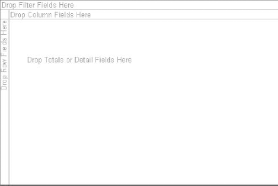
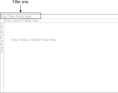
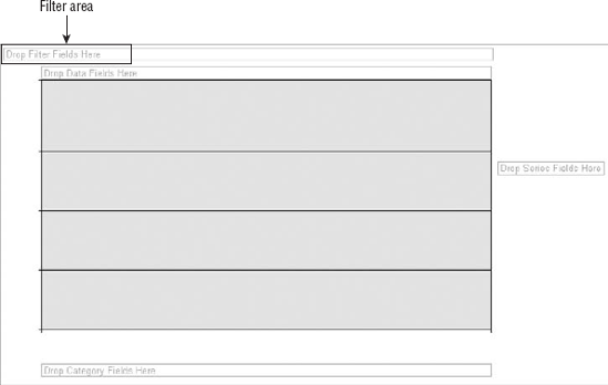
Figure 12-1 shows an empty pivot table. As you can see a pivot table is comprised of four areas. Because how you choose to utilize these areas defines both the utility and the appearance of your pivot table, it's important to understand the functionality of each area.
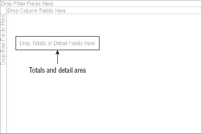
The Totals and Detail area, highlighted in Figure 12-2, is the area that calculates and supplies the details for your report. You can recognize this area by the words Drop Totals or Detail Fields Here. This area tends to be confusing for first time users because it has a dual role. First, it displays aggregate totals such as Sum of Revenue, Count of Units, and Average of Price. Secondarily, it stores detailed row data that is exposed upon expansion of Row and Column fields.
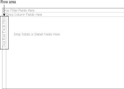
The Row area, highlighted in Figure 12-3, is the area that creates the headings down the left side of the pivot table. You can recognize this area by the words Drop Row Fields Here. Dropping a field into the Row Area will display each unique value in that field down the left side of the pivot table. The types of data fields that you would drop here are things you would want to group and categorize; for example, locations, customer names, and products.
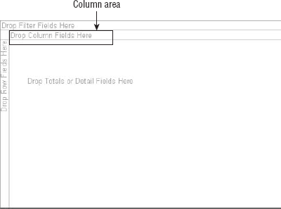
The Column area, highlighted in Figure 12-4, makes up the headings that span across the top of the pivot table. You can recognize this area by the words Drop Column Fields Here. Dropping a field into the Column area will display each unique value in the field in a column-oriented perspective. The Column area is ideal for showing trending over time. Some examples of fields you would drop here would be Months, Periods, and Years.
The Filter area, highlighted in Figure 12-5, allows for dynamic filtering of your pivot table based on a value in a field. You can recognize this area by the words Drop Filter Fields Here. The fields dropped here would be things you would want to isolate and focus on, such as locations, employee names, and products.
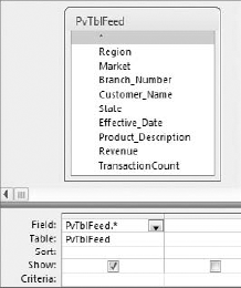
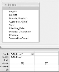
Start by building the query you see here in Figure 12-6, and then do the following:
Click the Design tab and click View

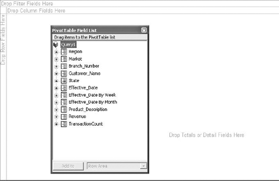
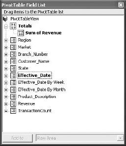
At this point, you will see an empty pivot table, shown here in Figure 12-7 and a list of fields that are in your dataset.
Drag the fields you need into the pivot table's drop areas. How do you know which field goes where? To answer this question, consider two things: what are you measuring, and how do you want it presented? The answer to the first question tells you which fields in your data source you need to work with, and the answer to the second tells you where to place the fields. For example, to measure the amount of revenue by region, you automatically know that you need to work with the Revenue field and the Region field. In addition, you want regions to go down the left side of the report and revenues to be calculated for each region. Therefore, you know that the Region field will go into the Row area while the revenue field will go into the Detail area.
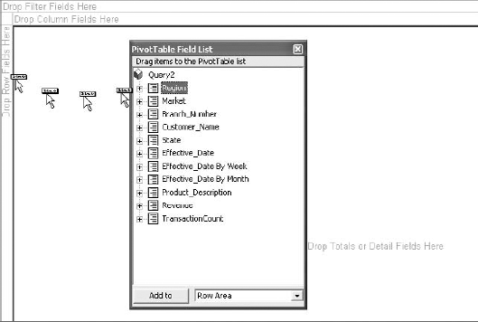
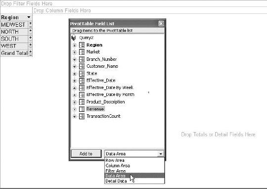
Start by selecting the Region field from your field list and drag it to the Row area as shown here in Figure 12-8.
Tip
If you accidently close out your PivotTable Field List, simply right-click inside the pivot table and select Field List to reactivate it. You can also find this command on the PivotTable Tools Design Tab in the Show/Hide group.
Select the Revenue field, then select Data area from the drop-down box at the bottom of the PivotTable field list as shown in Figure 12-9. Click the Add To button.
Note
Why not just drag the Revenue field to the Detail area? The reason is that the Pivot Table Web Component requires that you view detail data before you add totals. So, if you simply drag the Revenue field to the Data area, the pivot table does not display the sum of revenue. Instead it displays the detailed revenue for each record in your dataset.
Note
Keep in mind that in order to use the method shown in Figure 12-9, the field you are adding must be a numeric or currency field.
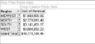
At this point, your pivot table should look like the one shown in Figure 12-10.
You can add some dimension to this report by the dragging the ProductDescription field to the Column area. As you can see in Figure 12-11, doing this you now have a cross tabular view of revenue by region and product.
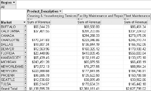
Add the Market field to the Row area and drag the Region field to the Filter area (the area that reads Drop Filter Fields Here). Your pivot table should look like the one shown in Figure 12-12. With just a few mouse clicks, you not only have a totally new perspective on the same data, but you can now filter by region.
This section, demonstrates how you can incorporate record details into your pivot table, effectively building an analysis that can drill down to the record level. First, create the pivot table shown in Figure 12-14 by following these steps:
Start by building the query you see in Figure 12-6, then in the Design tab and click View

Drag the Market and Product_Description fields to the Row area of the pivot table.
Select the Revenue field, then select Data area from the drop-down box at the bottom of the PivotTable Field List and click the Add To button.
Take a moment and look at what you have so far. You've created a basic analysis that reveals the amount of revenue by product for each market. Now you can enhance this analysis by adding customer details to the pivot table. This will allow you to drill into a product segment and view all the customers that make up that product's revenue.
Select the Customer_Name field; then select Detail Data from the drop-down box at the bottom of the PivotTable field and click the Add To button.
Select the Effective_Date field; then select Detail Data from the drop-down box at the bottom of the PivotTable field and click the Add To button.
Select the Revenue field, then select Detail area from the drop-down box at the bottom of the PivotTable field and click the Add To button.
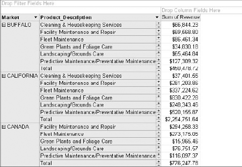
At this point, it looks as though your pivot table hasn't changed. However, if you click the plus sign next to any one of the products segments, you now see the customer details for every customer that contributed to that segment's total revenue. Figure 12-15 illustrates this.
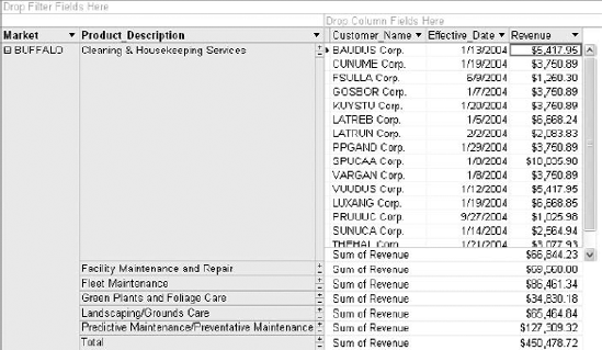
Figure 12.15. Your now have the ability to drill down into the details that make up your revenue totals.
Tip
You can drill into all details at one time by right-clicking the column field names and selecting Show Details. Conversely, you can hide the details by right-clicking the column field names and selecting Hide Details.
Warning
Incorporating record details into your pivot tables is a technique that should be limited to smaller datasets. Because the PivotTable component opens a separate ADO recordset for each cell it contains, accessing a large amount of details through your pivot table can lead to performance issues. If you absolutely need to view all row and column details for a large dataset, you should consider using a Query or a Form.
It's important to remember that when you are building your analysis with a pivot table, you are actually working with a query in a PivotTable View. Therefore, when you save your analysis it will save as a query. You will notice that the next time you open the query it will open in Datasheet View. This doesn't mean your pivot table is lost. Just switch back to PivotTable View to see your pivot table.
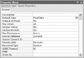
If you want your query to run in PivotTable View by default, just change the Default View property of the query. To do this:.
Open your query in Design View. You will see the Property Sheet button in the Design tab under the Show/Hide group.
Select the Property Sheet button. This activates the Property Sheet dialog box shown in Figure 12-16. Change the Default View property to PivotTable. The next time you open your query, it will open in PivotTable view.
Once you are happy with your Access pivot table analysis, you may want to share your pivot table with the world. You can distribute your Access-made pivot table via Excel. To do so, open your query in PivotTable view. Then in the Design tab, click the Export to Excel button. This will send your pivot table to Excel where you can format it and mail it out as a professionally made analysis.
The nifty thing about this technique is that only the pivot cache is sent to Excel. That is to say, the raw data behind the pivot table is not sent to the workbook to be placed in a separate sheet. This means a smaller file size and a cleaner looking workbook.
Tip
What if you also want your users have access to the raw data? Because Access only transfers the pivot table and not the raw data, are you out of luck? No. To get the raw data, simply double-click the bottom-right-most Grand Total value of your pivot table. This drills into the pivot cache and outputs the raw data that makes up your pivot table. The output goes to a separate worksheet in the same workbook.
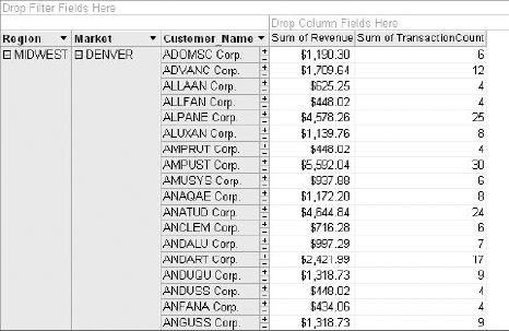
You will often find that the pivot tables you create often need to be tweaked in order to get the result you're looking for. This section covers some of the pivot table options you can adjust in order to enhance your analysis. To prepare for the examples in this section, create the pivot table shown in Figure 12-17 by following these steps:
Build the query you see in Figure 12-6, then in the Design tab, select View

Drag the Region, Market and Customer_Name fields to the Row area of the pivot table.
Select the Revenue field, then select Data area from the drop-down box at the bottom of the PivotTable Field List and click the Add To button.
Select the TransactionCount field; then select Data area from the drop-down box at the bottom of the PivotTable field and click the Add To button.
It's always difficult to perform an effect analysis on a large volume of data. So when you are analyzing a large amount of data in a pivot table such as the one shown in Figure 12-17, it's helpful to see small chunks of data at a time.
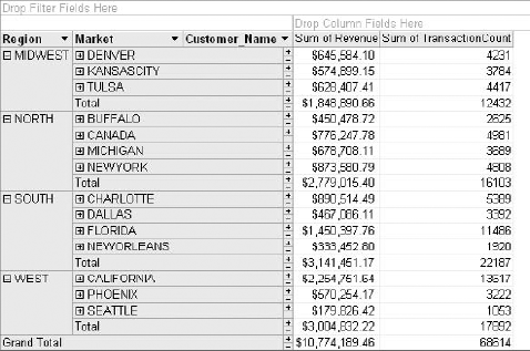
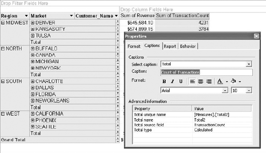
To facilitate this need, Access allows you to expand or collapse detail easily when you click the plus and minus signs shown in the pivot tables. You can also expand or collapse all values in a field at once. For example, when you right-click the Market field and select Collapse, as seen in Figure 12-18, all the customer details for each market are hidden, which makes this pivot table easier to read. Now you can analyze the customer detail for one market at a time when you click the plus sign for that market.
As you know by now, Access often attempts to name aggregated fields with its own name such as Sum of TransactionCount. You can imagine how titles like this can be confusing to the consumer. You can customize your field captions by changing the Caption property of the field.
To demonstrate this, follow these steps:
Right-click Sum of TransactionCount field heading and select Properties. This activates the Properties dialog box shown here in Figure 12-19.
Click the Captions tab and enter Count of Transactions in the Caption input box.
Close the dialog box and your changes will immediately take effect.
By default, pivot tables are initially sorted in ascending order. However, you may prefer to present your data in an order that makes more sense in your situation. To change the sort order of a particular field or aggregation, simply right-click the chosen field or aggregation and select Sort and then Sort Ascending or Sort Descending.
A particularly useful feature in pivot tables is the ability to create a new layer of analysis by grouping and summarizing unrelated data items. Imagine that you need to group the products shown in Figure 12-20 into two segments: outside services (Green Plants and Foliage Care and Landscaping/Grounds Care) and inside services (the rest of the items on the list).
To accomplish this task, follow these steps:
Hold down the Ctrl key on your keyboard and select both Green Plants and Foliage Care and Landscaping/Grounds Care.
Right-click and select Group Items as shown here in Figure 12-21.
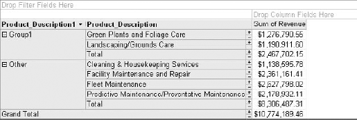
At this point, your pivot table should look similar to the one shown in Figure 12-22. As you can see, you have essentially created a new field with two data items: Group1 and Other.
All that's left do is to change the captions on these newly created objects to reflect their true meaning. You do this simply by right-clicking the field name and select Properties. This activates the Properties dialog box where you can click the Captions tab and edit the Caption input box.
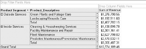
Figure 12-23 illustrates what the final report with a new Product Segment field should look like.
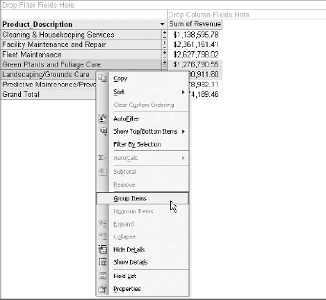
Figure 12.21. Include fields in a group by selecting them and choosing Group Items from the right-click menu.
Note
The Properties dialog is non-modal. That means you can select different objects without closing it. This is especially helpful when you're changing the caption on multiple objects. For example, you can change the Product_Description1 caption, and then select the Group1 object and change its caption–all without closing the Properties dialog.
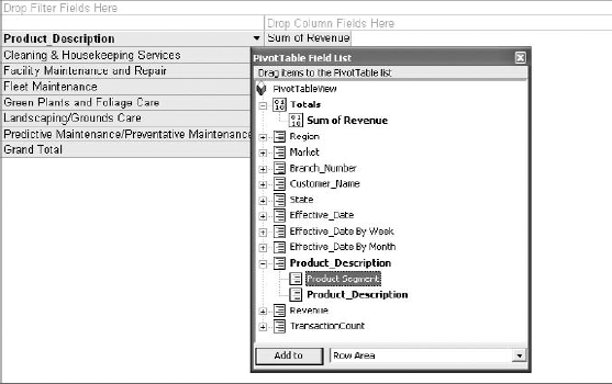
One last note about grouping data. If you activate your field list and drill into the Product_Description field, as shown in Figure 12-24, you will notice that you newly created grouping is listed there as a sub field. This means you can treat this field as any other in your field list. To delete your grouping, right-click its entry in the field list and select Delete.
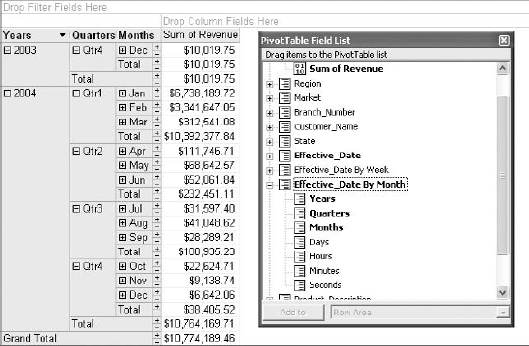
Notice that in Figure 12-25, you have a field called Effective _Date and directly underneath that field you see Effective_Date by Week and Effective_Date by Month. Unlike Excel where you would have to explicitly create date groupings, Access automatically creates these groupings for any field that is formatted as a date field.
Figure 12-26 illustrates how you can simply drag these date grouping onto your pivot table just as you would any other field.
Note
If your dates aren't expanded as shown in Figure 12-26, you can expand a field by right-clicking on the field header and choosing Expand.
One drawback to using the Access-provided date groupings is that you can't separate them. For instance, you cannot drag the Year grouping into the Column area then drag the Month grouping into the Row area.
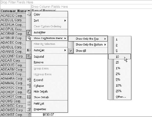
Filtering your pivot table to show the top or bottom Nth records can be done with just a few clicks of the mouse. In the example illustrated in Figure 12-27, you have a list of customers and want to limit the list to the top ten customers by sum of revenue. Right-clicking the Customer_Name field heading will expose a shortcut menu where you can select Show Top/Bottom Items
As you can see in Figure 12-27, the filtering options also include the ability to filter by percent of records. You can remove the applied filter by right-clicking the field heading and selecting AutoFilter.
Tip
There are actually two methods you can use to remove an applied filter from a field.
Method 1: Right-click the field heading and select AutoFilter.
Method 2: Right-click the field heading and clicking Show Top/Bottom Items

Method 1 has an added advantage in that it allows you to reapply the last known filter to the field at any time by right-clicking the field heading and selecting AutoFilter. Method 2, however, clears the filter settings altogether.
Once you create a pivot table, you may find it useful to expand your analysis by performing calculations on summary totals. To demonstrate this, follow these steps:
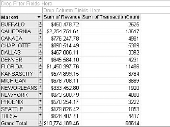
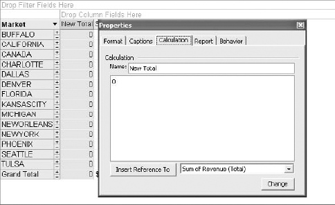
Create the pivot table shown here in Figure 12-28. This analysis calculates total revenue and total count of transactions. Upon reviewing these results, you determine that you need to get an average dollar per transaction.
In the Design tab, click Formulas

The idea here is to enter the calculation you need into the dialog box.
Enter Dollars per Transaction into the Name input box.
Delete the 0 from the large input box below Name.
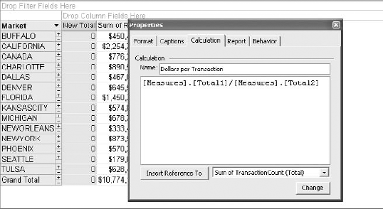
Select Sum of Revenue (Total) from the drop-down then click the Insert Reference To button.
Type a forward slash (/) to indicate division.
Select Sum of TransactionCount (Total) from the drop-down, then click the Insert Reference To button.
At this point, your dialog box should look similar to Figure 12-30.
Click the Change button.
In the Format tab, click Currency from the Number input box.
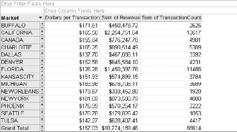
As you can see in Figure 12-31, your new calculation looks and acts like any other Totals field in your pivot table.
To adjust the calculation behind your calculated total, right-click on the field heading and select Properties. This will open the Properties dialog box where you can change the calculation in the Calculation tab.
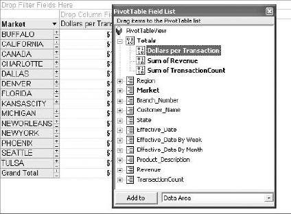
To delete your calculated total, right-click on its entry in the field list, shown here in Figure 12-32, and select Delete.
Note
You can also create Calculated Detail Field using the same steps illustrated above. However, it's generally a better idea to perform calculations on details in the actual query as opposed to a pivot table. This way, Microsoft ACE (ACE is the Access replacement for Microsoft Jet) performs the calculation instead of the PivotTable component, making your PivotTable view perform better.
A pivot chart is essentially a pivot table in chart form. Once you learn the basics of using a pivot table, a pivot chart will feel quite intuitive.
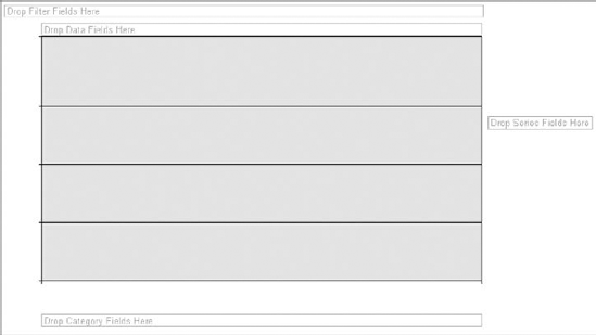
There are slight differences in the anatomy of a pivot chart. Figure 12-33 shows an empty pivot chart where you can see four distinct areas. Just as in pivot tables, how you choose to utilize these areas defines both the utility and the appearance of your pivot chart.
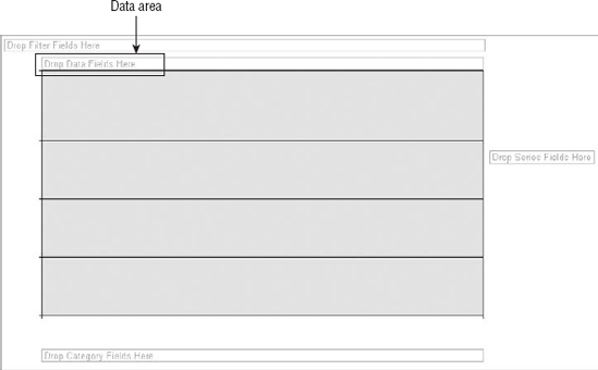
The Data area, highlighted in Figure 12-34, is the area that calculates and supplies the data points for your chart. You can recognize this area by the words Drop Data Fields Here.
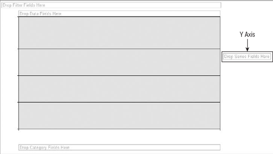
The Series area, highlighted in Figure 12-35, is the area that makes up the Y axis of your chart. You can recognize this area by the words Drop Series Fields Here. This area corresponds is equivalent to the Column area of a pivot table. In other words, if you create a pivot table and switch to PivotChart view, the fields in the Column area of the pivot table will become the Y axis series.
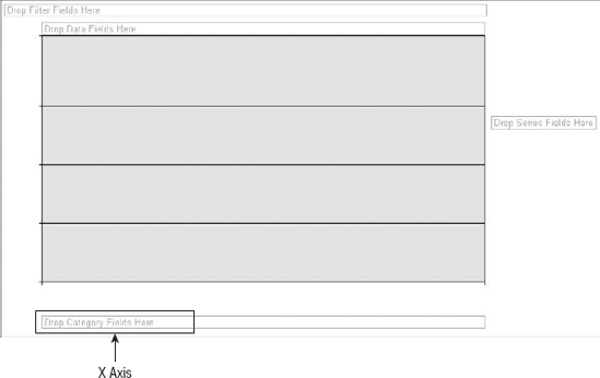
The Category area, highlighted in Figure 12-36, is the area that makes up the X axis of your chart. You can recognize this area by the words Drop Category Fields Here. This area is equivalent to the Row area of a pivot table. In other words, if you create a pivot table and switch to PivotChart view, the fields in the Row area of the pivot table will become categories in the X axis.
The Filter area, highlighted in Figure 12-37, allows for dynamic filtering of your pivot chart based on a value in a field. You can recognize this area by the words Drop Filter Fields Here. This area is identical to the Filter area of a pivot table.
To create a pivot chart, start by building a query in design view, as shown here in Figure 12-38. Next, follow these steps:
In the Design tab, click View

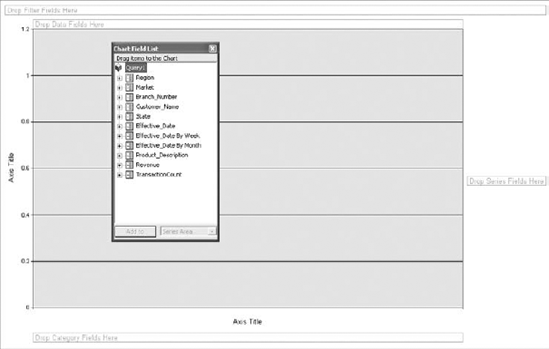
At this point, you will see an empty pivot chart, shown here in Figure 12-39 and a list of fields that are in your dataset.
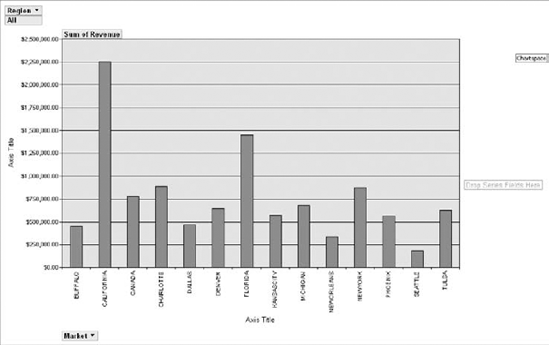
Just as in a pivot table, the idea is to drag the fields you need into the pivot chart's drop areas. Build a basic chart by dragging the Revenue field to the Data area, then the Market field to the Category area.
Drag the Region field to the Filter area. Your completed chart should look like the one illustrated here in Figure 12-40.
Note
You may notice that the pivot charts produced by Access are not as polished as the ones Excel produces. This is because Access uses the old Office Web Component technology that was primarily designed for reporting on the web. Excel, on the other hand, uses the slick new graphics engine introduced with Office 2007.
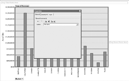
The key to formatting a pivot chart in Access is to remember that everything revolves around property settings. Each object on the chart has its own properties that you can adjust. To demonstrate this, follow these steps:
Right-click your pivot chart and select Properties. This will activate the Properties dialog box shown in Figure 12-41.
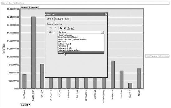
Go to the General tab. The idea here is to select the object with which you want to work in order to expose the adjustable properties. For example, if you wanted to add labels to your series, you would select Series from the Select drop-down as demonstrated here in Figure 12-42.
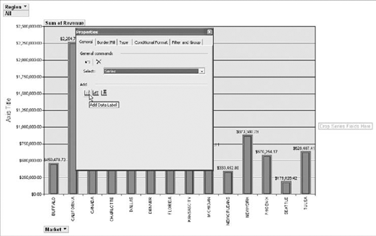
With the Series properties exposed, you can tailor its properties to suit your needs. In Figure 12-43, you are adding data labels to you pivot chart.
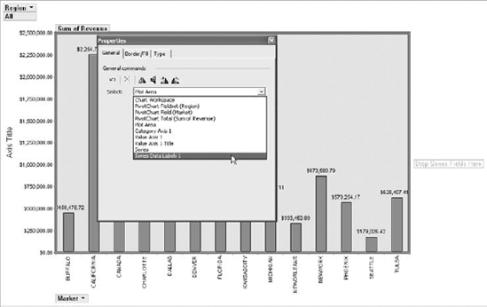
Of course, data labels have properties that can be modified as well. In the General tab of the Properties dialog box, select the series data labels you just added. As you can see in Figure 12-44, the Select drop-down list has been updated to include "Series Data Labels 1."
Twenty minutes of experimenting with each object's properties will give you a solid level of proficiency at formatting pivot charts in Access.
Note
As of this writing, you cannot export pivot charts from Access to Excel. Again, this is due to the fact that Access and Excel use entirely different charting engines.
From a data analysis point of view, pivot tables and pivot charts are some of the most powerful data-crunching tools found in Access. With a pivot table, you can group, summarize, and perform a wide variety of calculations in a fraction of the time it takes by hand. In addition, you can interactively change the content and shape of your analysis by dragging data fields to one area of the pivot table to another. This allows you to dynamically change your perspective, recalculate totals to fit the current view, and interactively drill down to the detail records. Pivot charts enhance your analytical tools by allowing you to display your pivot tables graphically—in chart form. By applying your knowledge of Excel pivot tables to Access, you can completely change the way you analyze your Access data.

